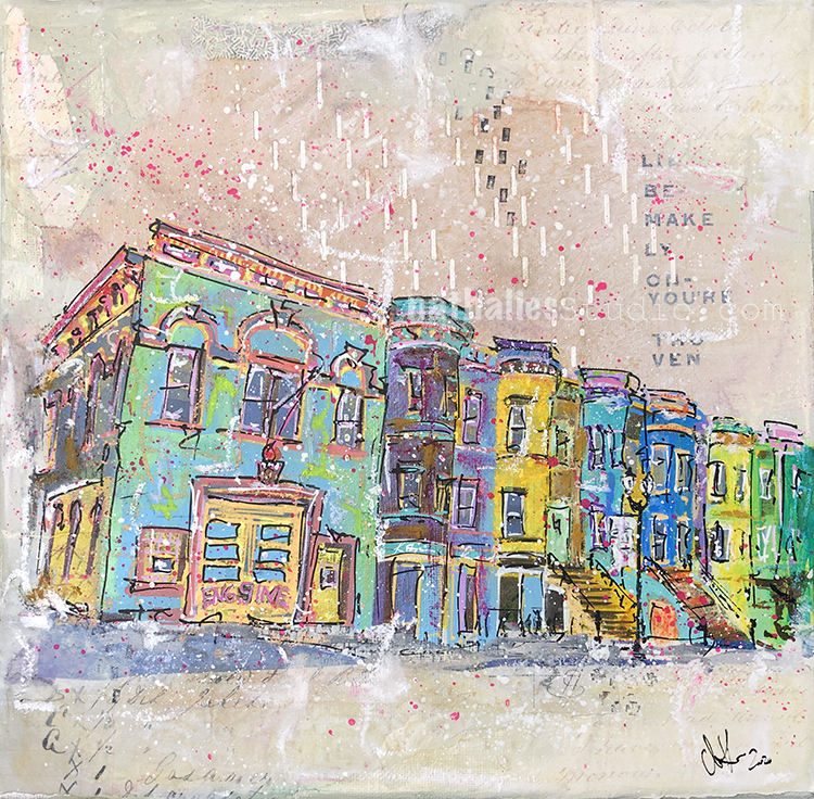
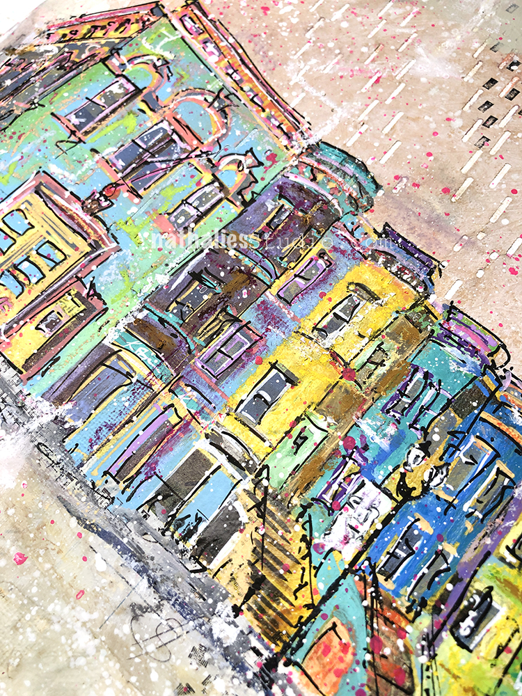
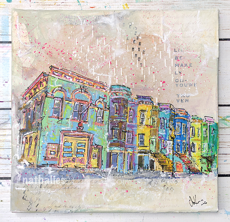
“Dressed to the 9s” is a new painting I made using spray paint, acrylic paint, gouache, collage, markers, pastels, and oil pastels on canvas.
I was inspired by my Strolls through the Hood in Jersey City for this mixed media painting, and specifically a charming historic firehouse and line of elegant row houses in my neighborhood. I love seeing the firemen of Ladder 9 taking the trucks out once in a while and cleaning them – there is something really fascinating for me about American Firetrucks :)
I used some long treasured vintage player piano paper- I always waited for the perfect piece to use it for and when I was thinking of this street scene I knew I had to use it as part of the collage elements.
Dressed to the 9s measures 10×10″ and is available in the store. It would love to find a new home. found a wonderful home in Wisconsin!
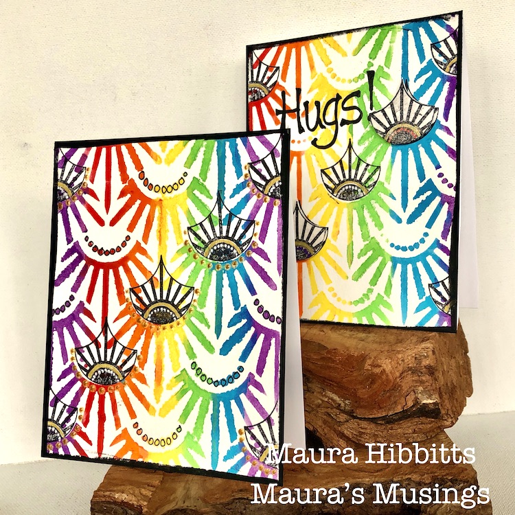
Hello from my Creative Squad! Today we have some super colorful and happy cards from Maura Hibbitts that are sure to lift anyone’s mood. She is using my Art Deco Empire stencil and my Fan-tastic Small rubber stamps for this project and our theme: WildandFree – After so many months of careful living, it’s time to go WildandFree… In our Art Journals! Go a little crazy in there and live it up with bright colors, exuberant mark making, bold colors – however you want to go a bit bananas. It’s time to let loose!
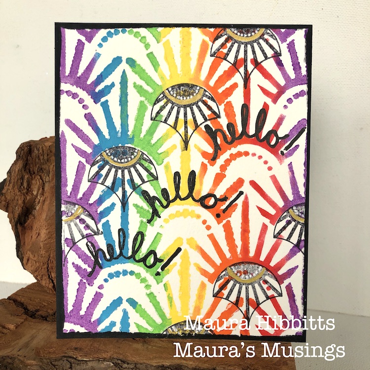
There is something liberating in keeping your choices simple, and just letting your creative muse go wild and free. I was drawn to the colors of the rainbow, a symbol of hope for many of us, and decided to make a set of cards that I can mail out.
I’ve definitely had my wild and free moments in the wilderness, and some youthful follies. I can remember a rafting adventure on the Salmon River in New York in February, and no, I was not wearing a wetsuit. Crazy right, when I think about how cold that water was, and the thick ice lining the shoreline. Oh, I could share a lot more! Heck, I still have a few of those moments even now that I am much older, and apparently not much wiser.
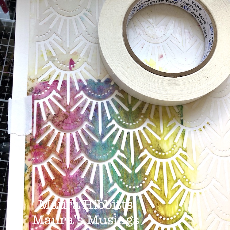
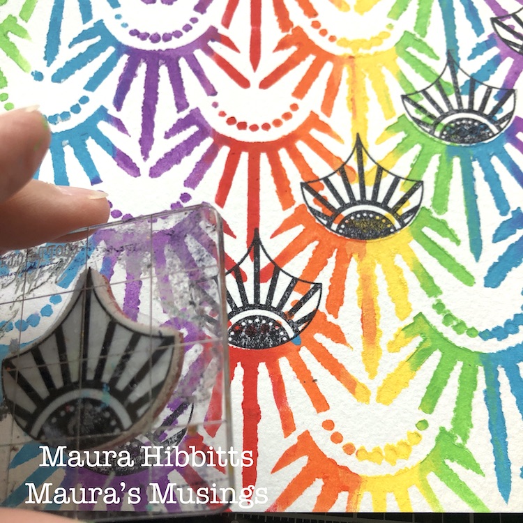
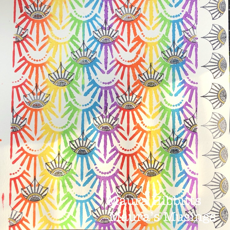
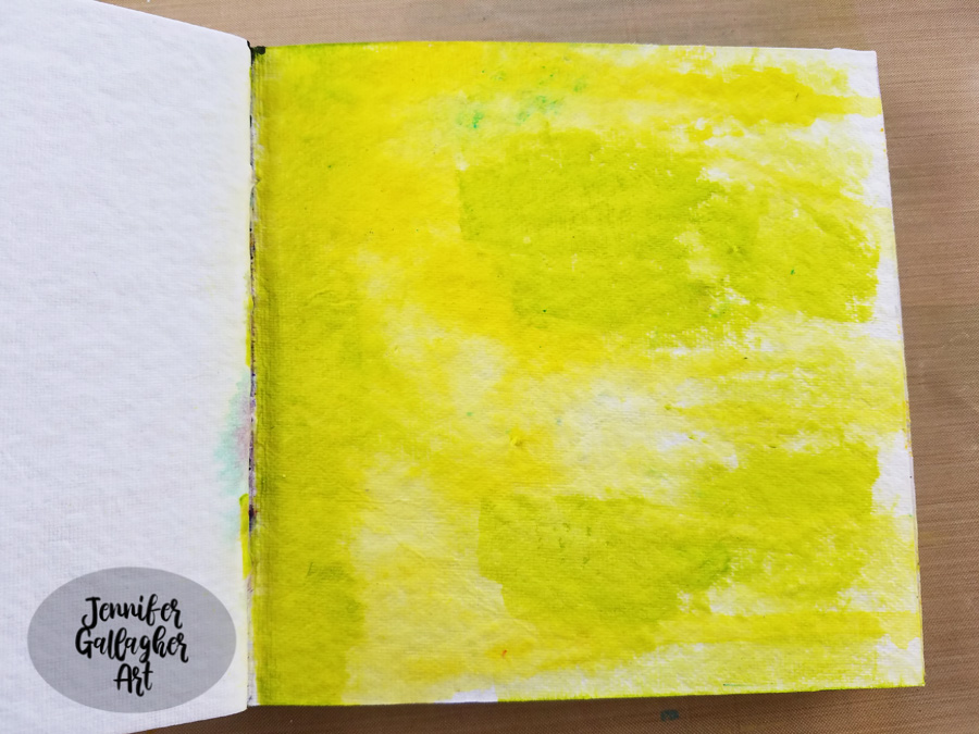
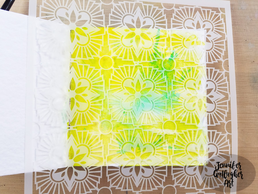
So, back to the project…I started by taping the Art Deco Empire stencil down over my watercolor paper. I don’t usually do this, but because I was adding multiple colors, I didn’t want it to move.
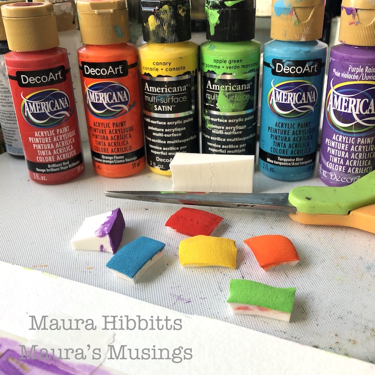
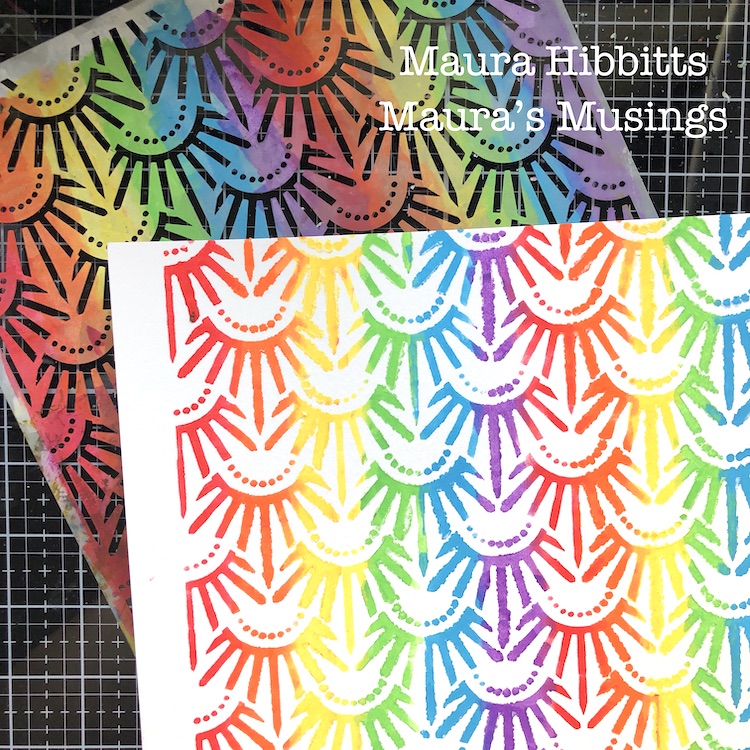
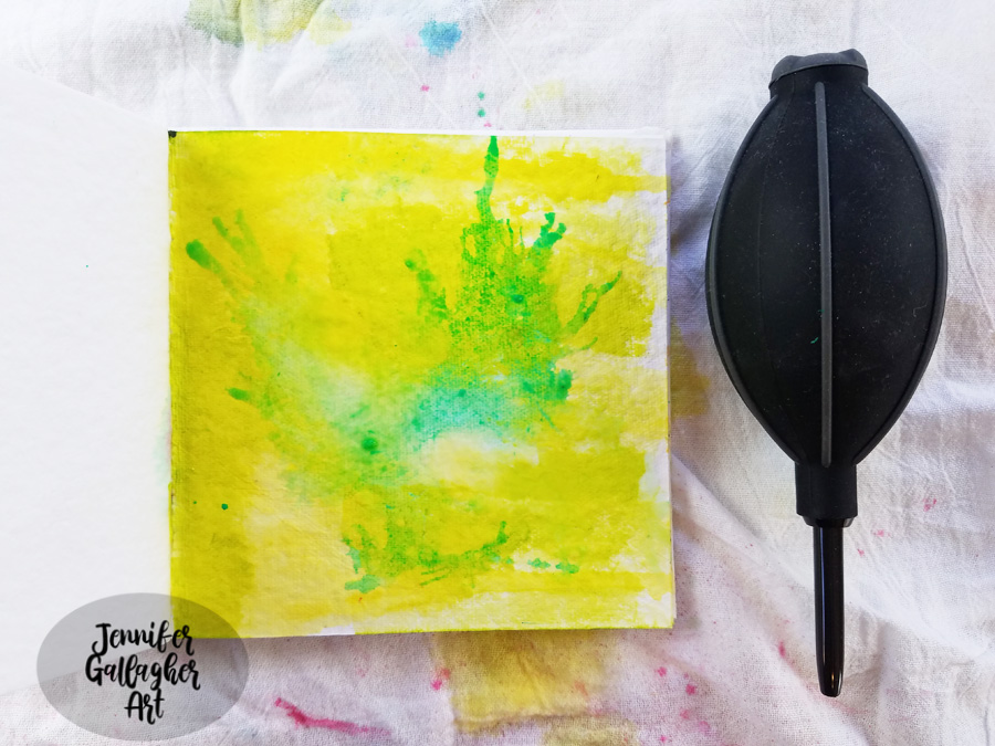
To create a rainbow effect with the stencil, I used a cosmetic sponge with a light amount of paint. I started with the red, and dabbed two columns down the paper leaving space in-between for all the other colors. Repeat this with orange, yellow, green, blue and violet. Here’s a thrifty tip for you: when changing colors, don’t use a new sponge, instead just cut off the top layer. I managed to use one sponge for all six colors this way.
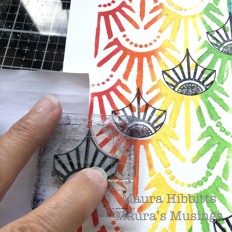
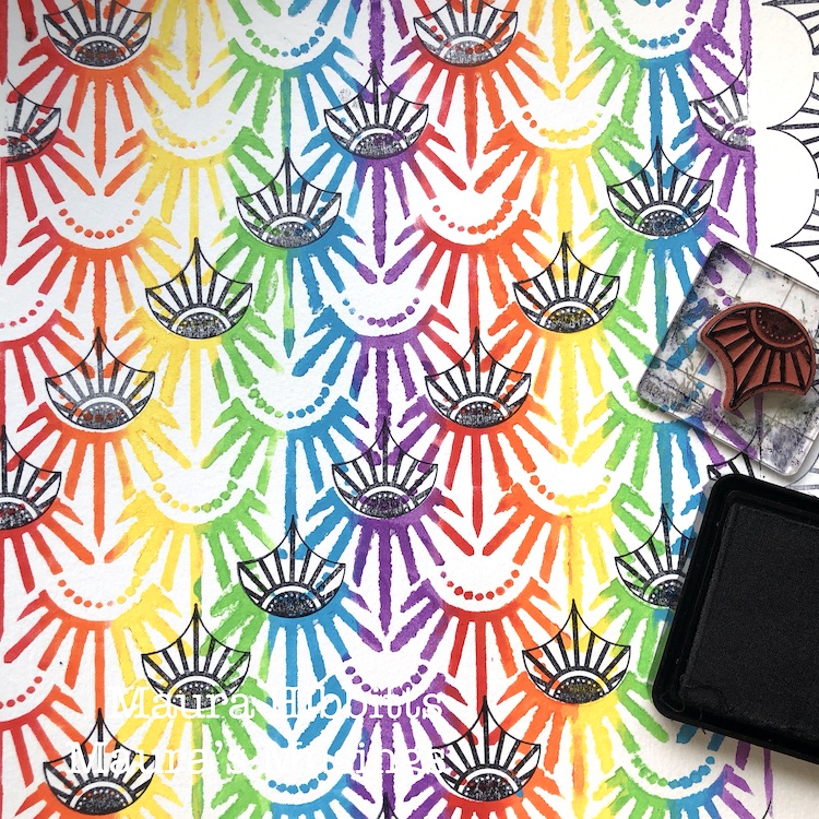
Next, stamp diagonal rows into the stenciled design using Nat’s small Broadway Fan stamp and black ink. Along the edges, place a piece of paper as a mask for the partial images before you stamp.
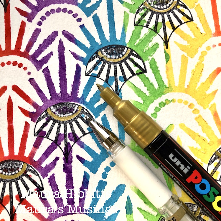
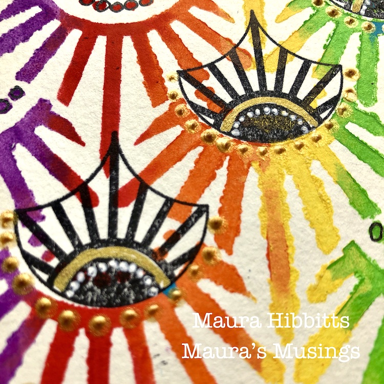
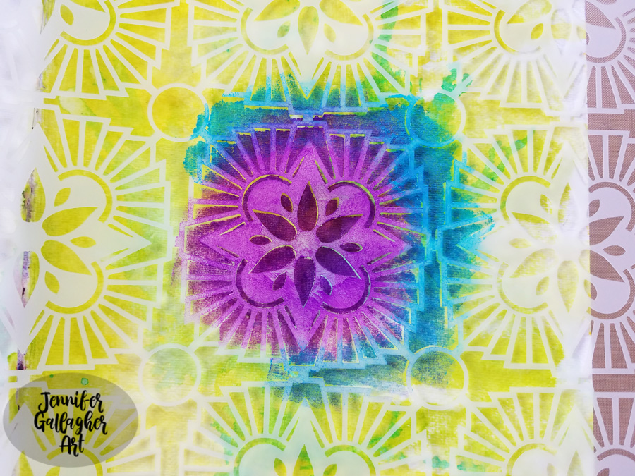
Add some detail to the stamped images with white and gold pens. I love adding a bit of gold in to colorful projects. Cut the large stenciled sheet into four smaller pieces (4.25×5.5”) and cut the white card stock for the card base.
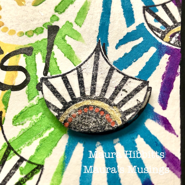
Add more detail with gold relief paste and some sparkle with Wink of Stella. Cut out a few fans and pop them up on some of the bases.
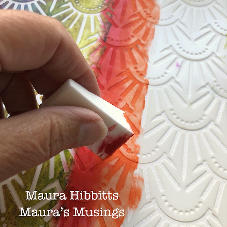
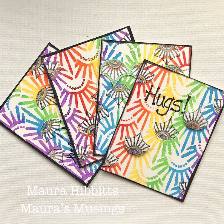
Finally, using black paint and a cosmetic sponge, edge the stenciled card bases. Let dry, then adhere these to the card front. Hand letter greetings like Hugs, Hello, and some doodling with a black pen. I wanted to make each card unique for some variety, so you may notice some have the designs going up and others going down. I’ve also left some without words so I can add them in as needed. You could also stamp a greeting.
Four bright and colorful cards are ready to mail out and bring cheer to someone who needs it. I am definitely a fan of bright colors, so it was fun pulling in all the colors of the rainbow into my project. You could use any palette for your own cards…I think an ombre effect would look awesome too! Have a creative August, Maura
Thank you Maura! Wow that Art Deco Empire stencil in rainbow looks just amazing! Some lucky people are going to be so happy when they open their mailboxes :)
Give it a try: you can find all my Stencils and Rubber Stamps in my Online Shop and here are some of the other supplies Maura used:
Feel inspired? Working on something yourself that you’d like to share? I love to see how you interpret our monthly themes. Email me how you used my stencils and stamps with the theme and email me an image – I would love to share your projects in my next “n*Spiration From Around the Globe“.
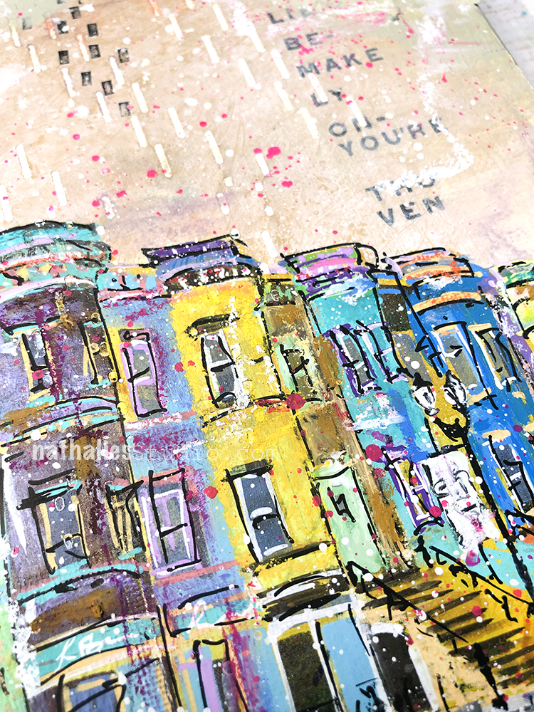
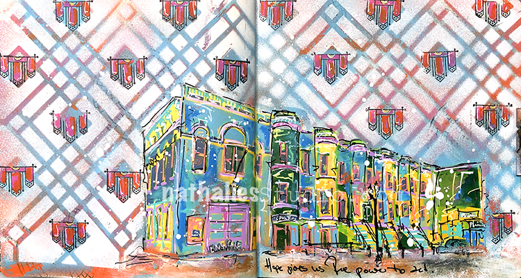
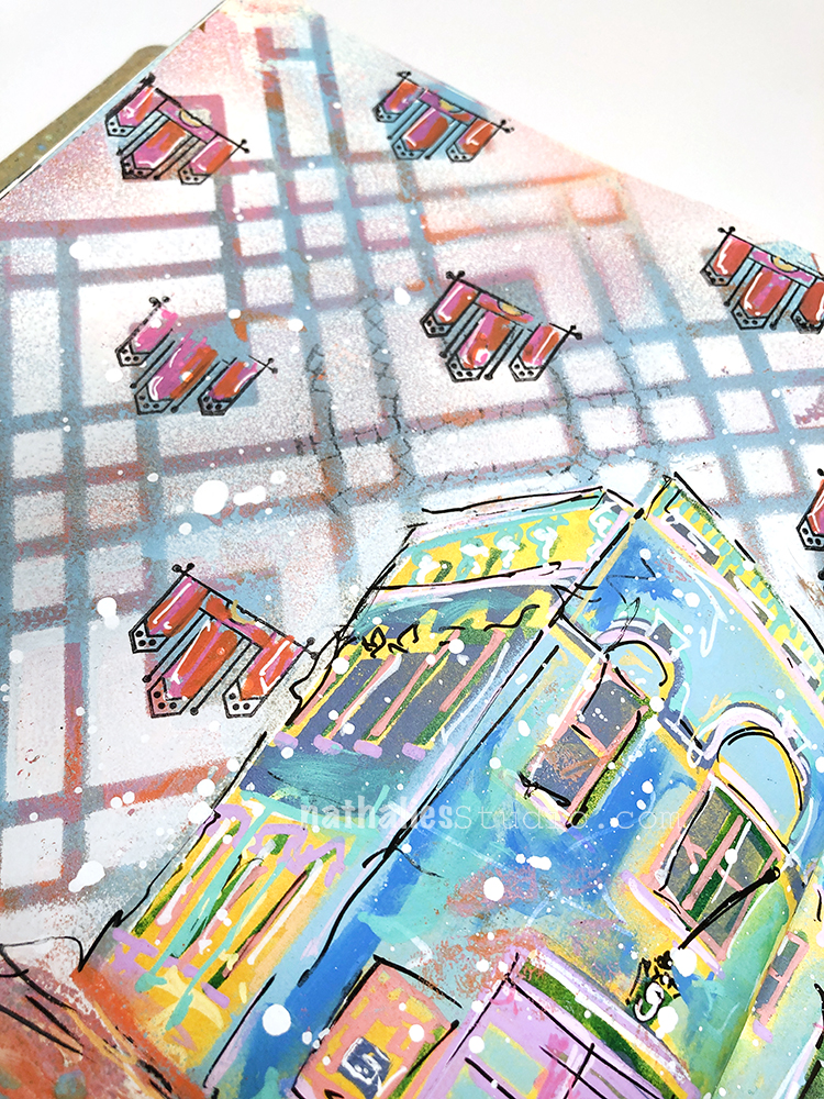
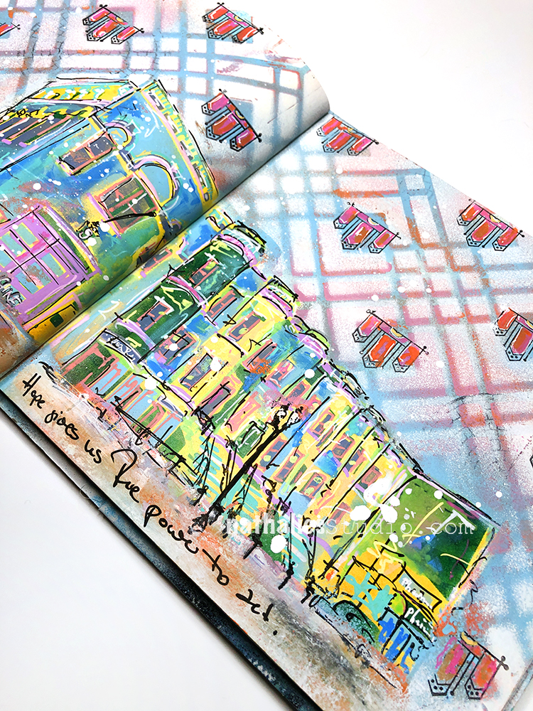
“Hope gives us the power to act.” – Remaining hopeful on so many levels and trying to act as well :)
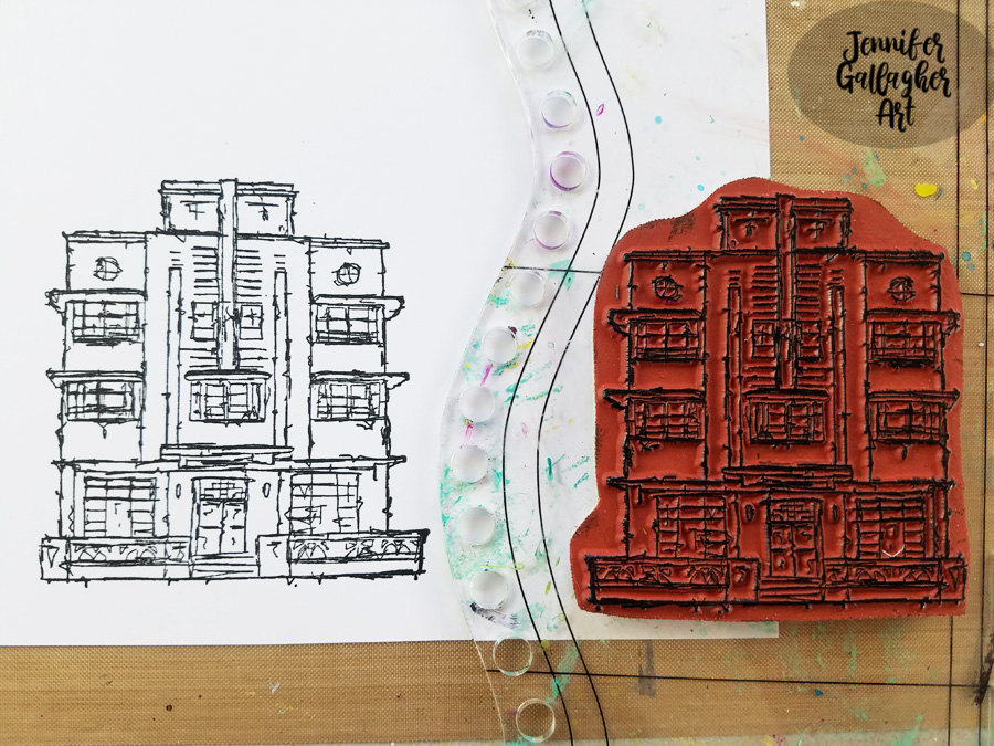
I used spray paint and my Chicago stencil over a colorful background to tone it down a bit. Then I stamped one of my Mini Motifs rubber stamps to give the pattern some more intricacy.
I used acrylic paint and posca markers to sketch the buildings and add my quote. I splattered a little white to unify everything.
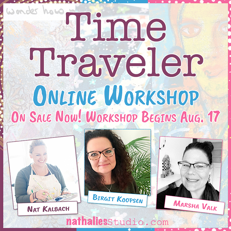
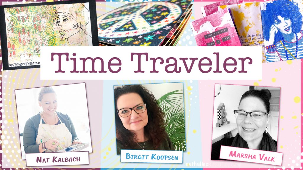
Super happy to announce this very special workshop that I am releasing today – Time Traveler. I’m teaching along with my amazing friends Birgit Koopsen and Marsha Valk in this 3 week online workshop that goes on sale today and begins on August 17th.
Become a Time Traveler with us! With this course each teacher will help guide you through space and time, finding inspiration from different eras in history. Each teacher has chosen a time period and will show you mixed media techniques and design motifs inspired by their modern take on that period. The goal of this is to create 3 different handmade book projects using gelli plate printmaking techniques and favorite mixed media techniques unique to each teacher. You will get 3 different artistic perspectives and oodles of fun and creative ideas to try.
Sign up TODAY for Early Bird pricing: Today, Aug 5 through Aug 8, 11.59pm EST this course is just $89 USD. From Aug 9 to Aug 17, 11.59pm EST Time Traveler will be $99 USD. From Aug 18 the course will be its regular price of $139 USD.
Check out the promo video below:
Time Traveler will begin on August 17 and will run for 3 weeks, with a new video publishing each day. There will be a total of 21 videos, over 5 hours of video in total, as well as supply lists and additional lesson content in the classroom to help you along the way. All the videos are downloadable and available to you to enjoy at your own pace.
Here are some of the topics covered in this workshop:
Mixed Media techniques
Gelli plate printmaking techniques
Bookbinding techniques
Tips and tricks for translating inspiration into art
Creative ideas to take to all your artmaking, art journaling, cardmaking, and beyond!
Sign up HERE for this one-of-a-kind take on creating personal, expressive mixed media art in book form from 3 talented teachers.
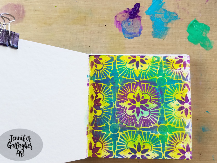
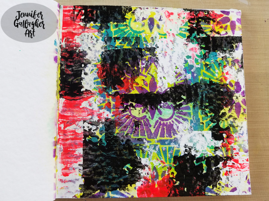
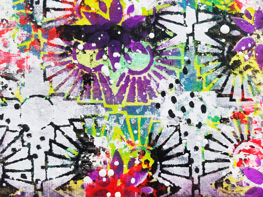
Hello from my Creative Squad! Today we are starting a new theme for the Squad for August and we have Jennifer Gallagher kicking it off in her art journal with my Hamilton Stencil and my Art Deco stamp. This month’s theme is: WildandFree – After so many months of careful living, it’s time to go WildandFree… In our Art Journals! Go a little crazy in there and live it up with bright colors, exuberant mark making, bold colors – however you want to go a bit bananas. It’s time to let loose!
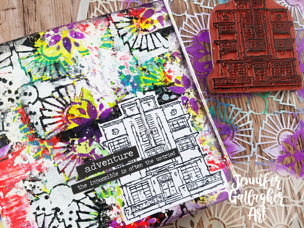
This month we are going wild in our art journals using some of our favorite n*Studio products. I threw caution to the wind and layered lots of bold color and pattern along with mark making and a fun stamped focal image. It’s super easy so let’s get started.
I started by applying a layer of clear gesso onto a page in my square Dina Wakley Media journal. I applied a little Distress Stain in Mustard Seed on the left hand side of the page and then spritzed some water over it. I held the journal up so the color would run down the page.
After that dried,I applied some olive green acrylic paint in some of the open spaces with a cosmetic sponge.
Next, I spritzed on some Aquamarine Marabu Art Spray and added a small spritz of water. I blew the color around with an air puffer.
I chose Nat’s Hamilton Stencil and placed it down on the page, working to center the design from the inside of the page. Then I applied Blackberry, Cobalt Teal Hue, and Emerald Green acrylic paint with cosmetic sponges.
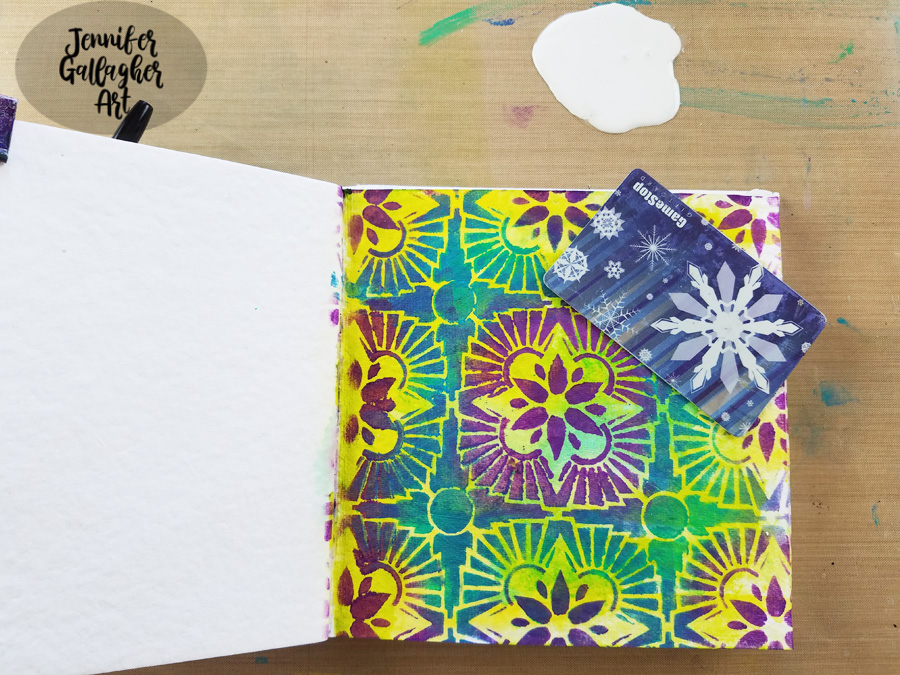
Using an old gift card and some white acrylic paint, I scraped white in various areas of the page.
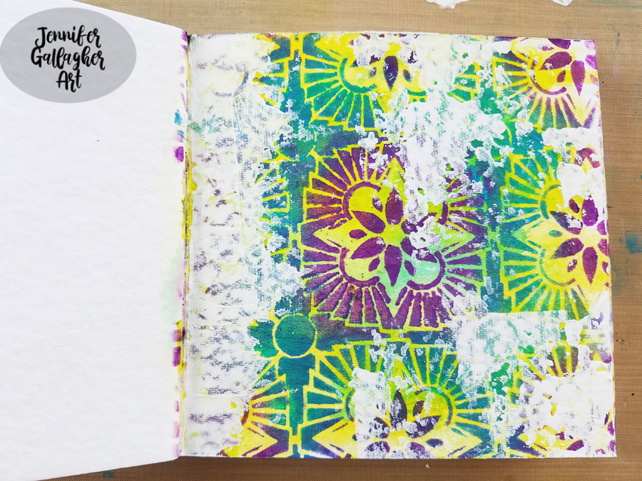
I repeated the process with fluorescent pink and black.
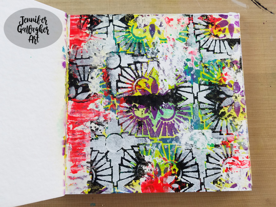
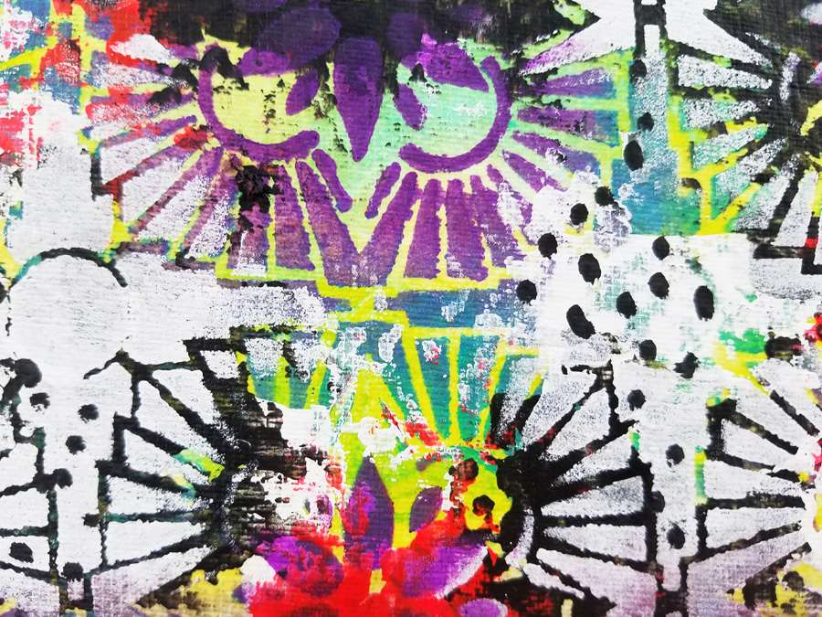
To bring back some of the design, I laid the stencil back over the page, exactly where it was before. Any place that had black paint was painted white through the stencil.
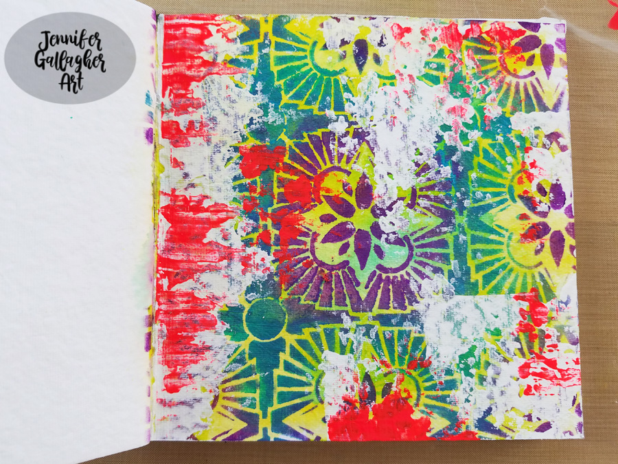
Using a black posca pen, I added some dots in a few of the white areas.
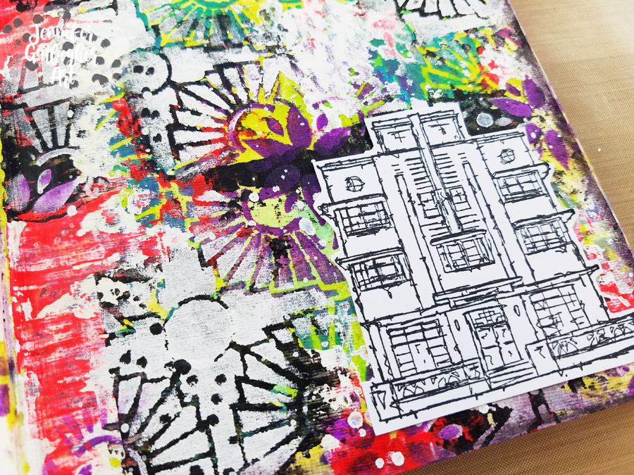
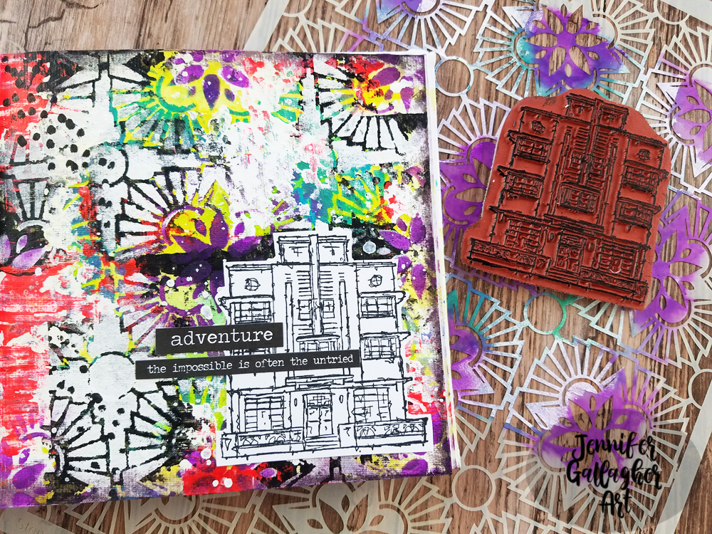
Using the Art Deco stamp from Nat’s Stroll Around the Block Set, I stamped a focal image onto multifarious card with Versafine Clair ink ink Nocturne. Before applying the image, I splattered some Distress Spray in Picket Fence around the page. Once dry, I fussy cut the image out and applied it to my page with 1/8 inch scor-tape.
The final touch was to add a few stickers from Tim Holtz idea-ology Big Chat and Small Talk sticker sets. I hope you have enjoyed this art journal page. I really went wild with the layers, colors, and pattern. Be sure to play along with us this month and create something bold in your art journal.
Thank you Jennifer! Loved watching this wild background come together with all those yummy layers :)
Give it a try: you can find all my Stencils and Rubber Stamps in my Online Shop and here are some of the other supplies Jennifer used:
Feel inspired? Working on something yourself that you’d like to share? I love to see how you interpret our monthly themes. Email me how you used my stencils and stamps with the theme and email me an image – I would love to share your projects in my next “n*Spiration From Around the Globe“.
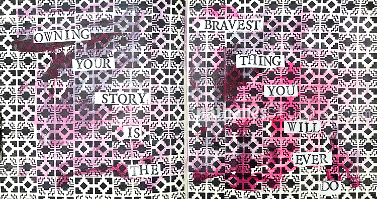
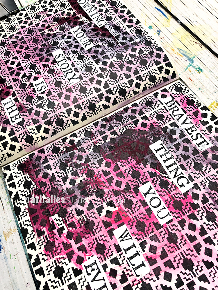
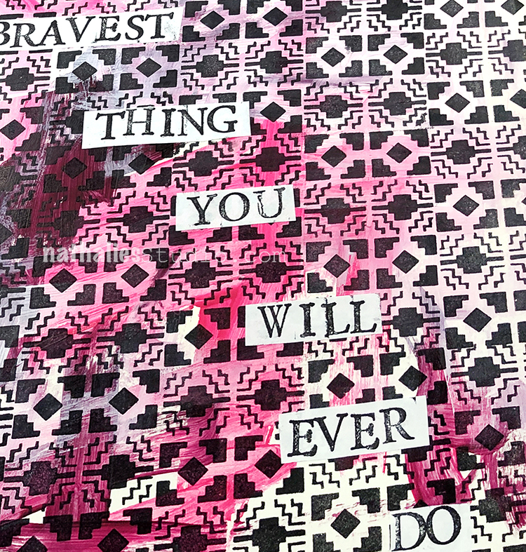
“Owning your story is the bravest thing you will ever do”
I started with some acrylic paint on my background and then created the all over pattern with my new Mini Santa Fe foam stamp and black ink – love this little repeating pattern.
I used little mini alphabet wooden stamps – stamped on printing paper and cut out the words and glued them down with a glue stick.
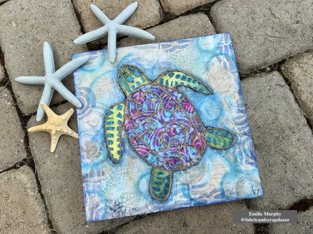
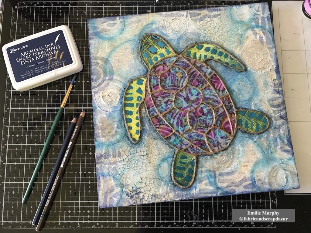
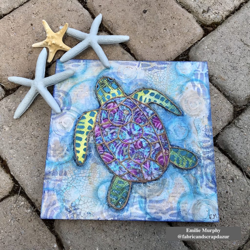
Hello from my Creative Squad! Today we have a wonderful wood panel piece by Emilie Murphy demonstrating some cool techniques and using my Fairview Fan, Mini Batik 1 and Mini Batik 2 foam stamps. The theme this month is: Under the Sea – There is something so fascinating about water. We love being in it, floating on it, relaxing next to it, and it remains one of the last frontiers here on the planet. Create something that is an ode to the sea.
Hi there! Hope you are doing well.
The Sea theme always inspires me. The first thing that came to my mind was “fish”, of course! Meanwhile I was thinking of what project to make, I went to visit my in-laws and saw this pillow with a beautiful sea turtle on it that my mother-in-law had just got. So that’s how I got the idea to make a sea turtle on a cradled wood panel.
Let me guide you how I made it.
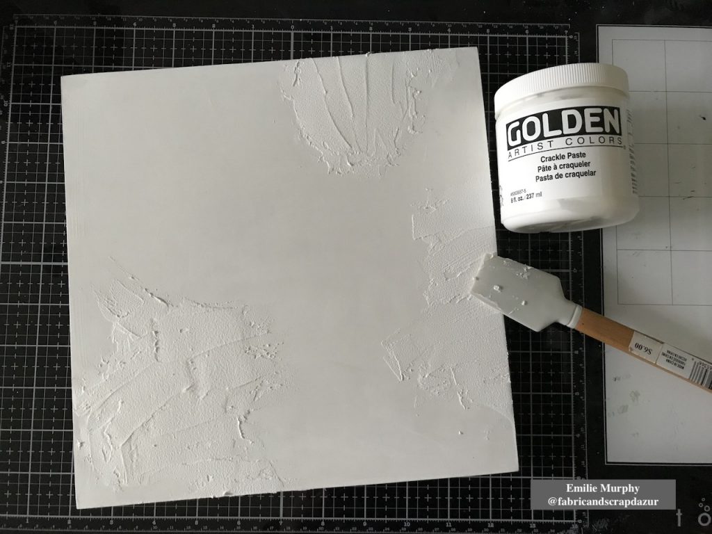
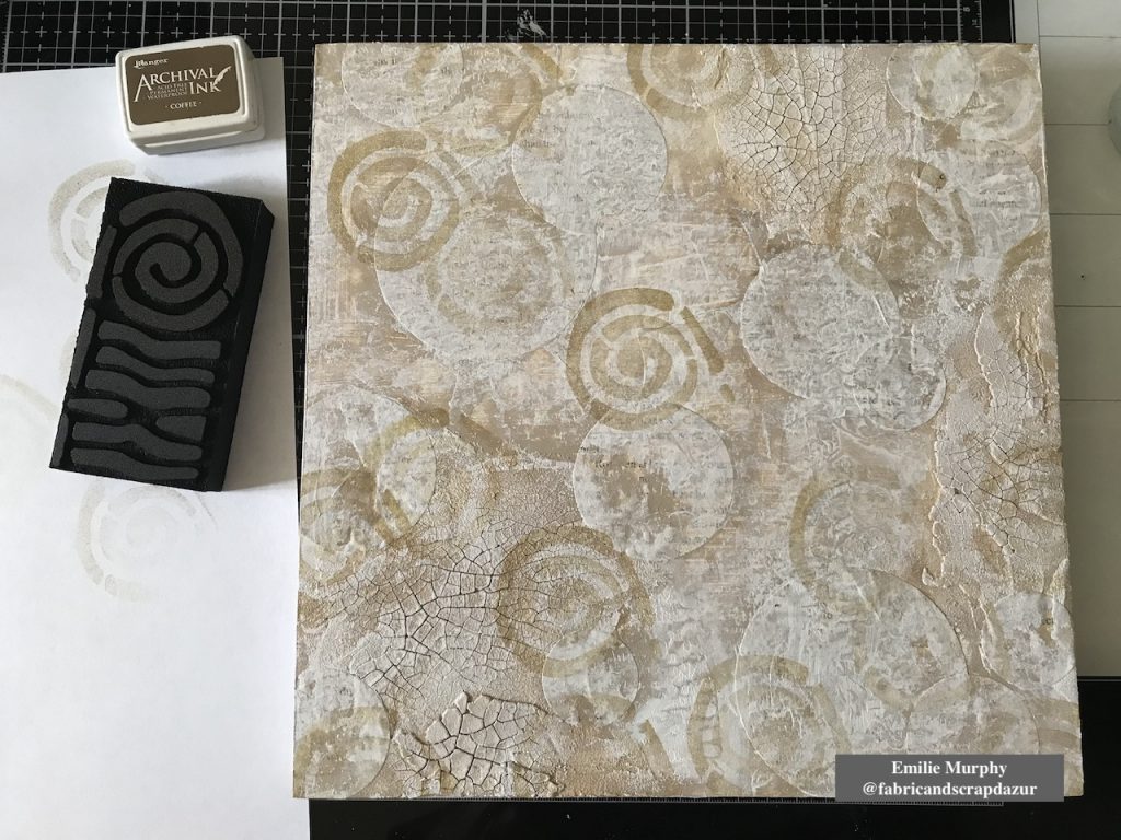
I started to apply some crackle paste on a 10×10 wood panel coated with white gesso. I let it dry overnight.
Tip: The coat of crackle paste has to be thick enough to be able to get some significant crackles.
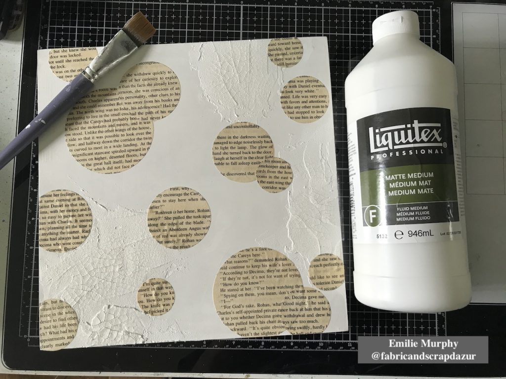
Then I glued down with matte medium some circles cut from old book paper to bring some interest to the background.
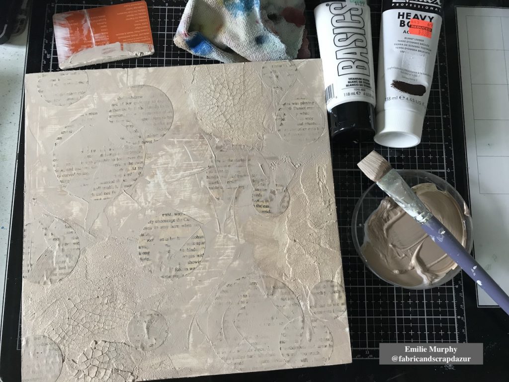
As I didn’t have any “sand” color acrylic paint ready to use, I mixed some “Burnt Umber” acrylic paint with some white that I applied on my panel with a brush and plastic card.
I toned down the color I mixed with some white acrylic paint because it was a little too dark than expected. I applied it with a brayer. The purpose of the brayer is just a preference to add texture.
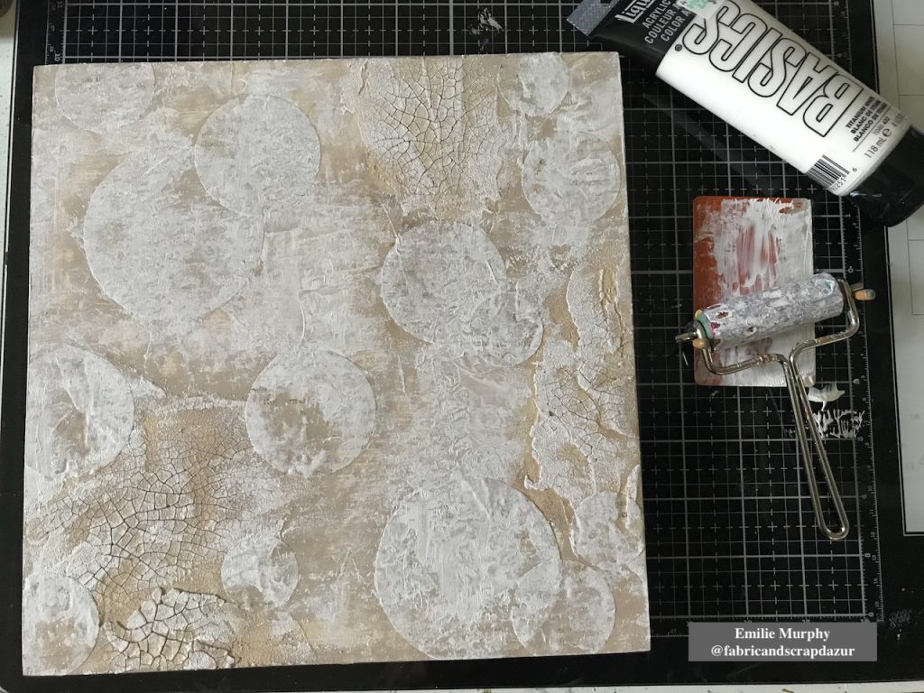
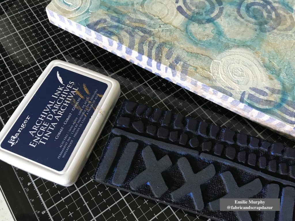
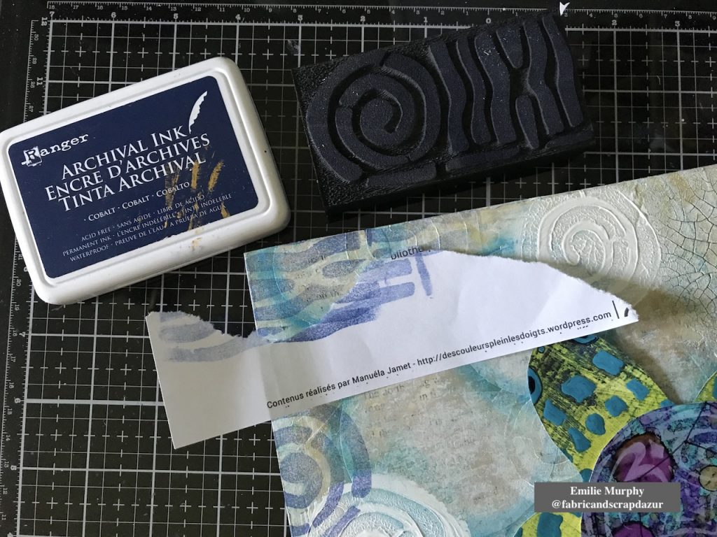
Then I stamped the circular part of “Mini Batik Pattern 2” foam stamp with “coffee” archival ink to evoke shells. I wanted here a tone-on-tone effect.
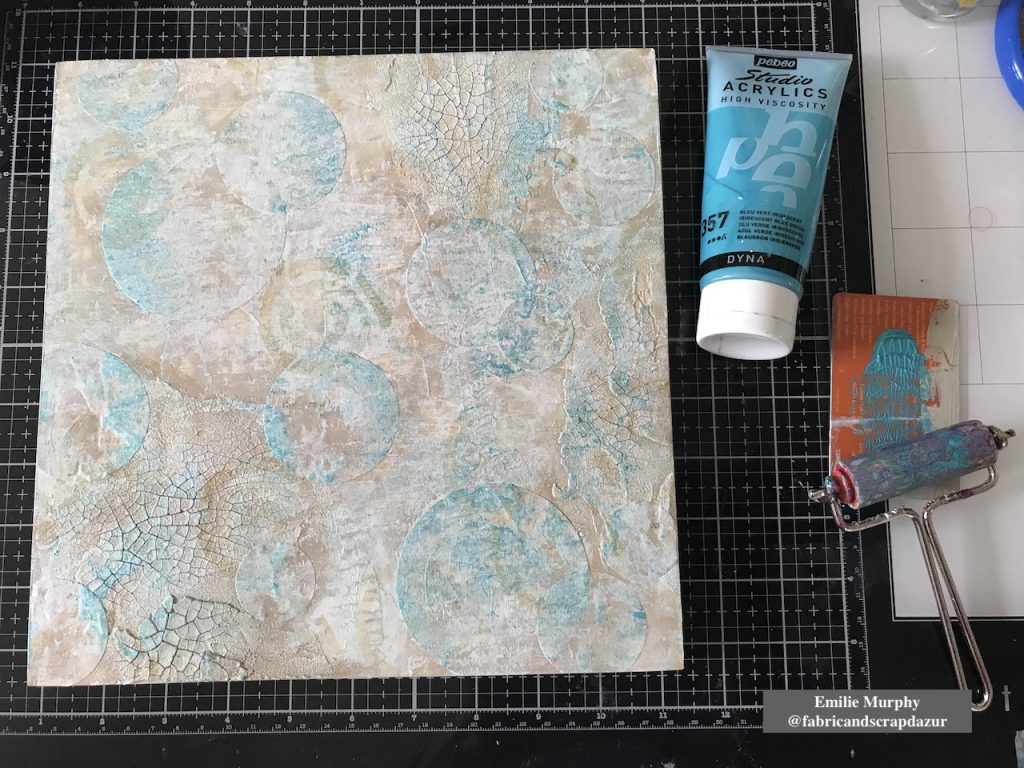
To add some brightness and not have something too uniform, I applied some iridescent blue acrylic paint again with my brayer.
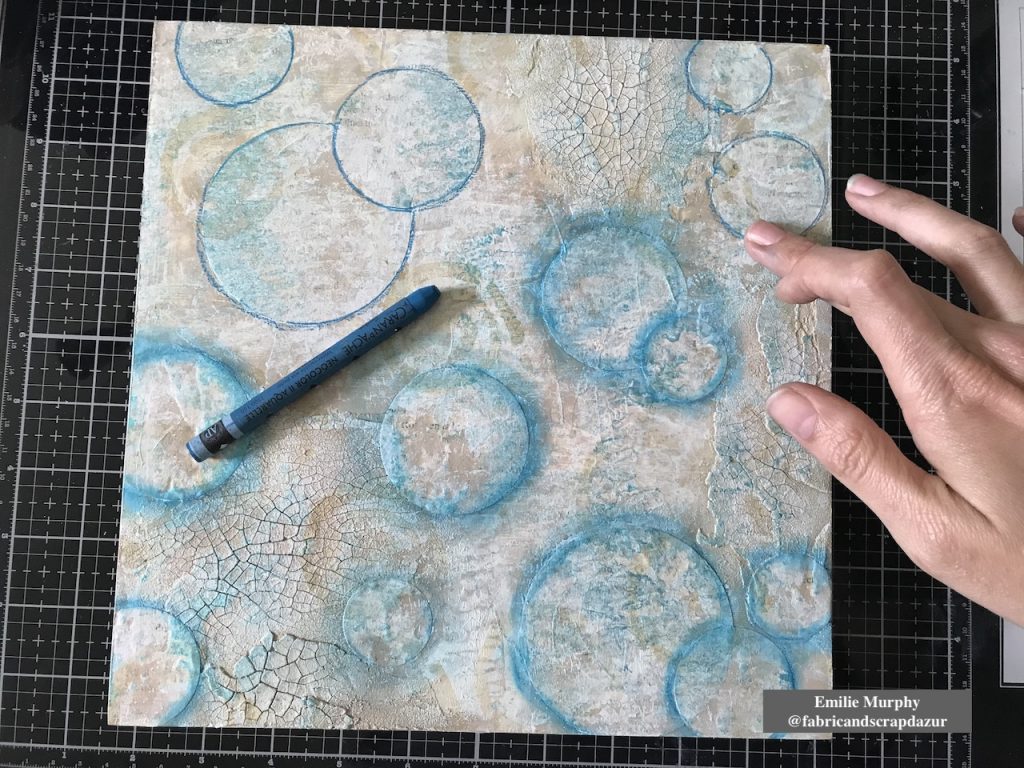
In order to build layers, I darkened the edges of my circles with a Neocolor II crayon “Blue Cobalt”. I think it gives the illusion of bubbles.
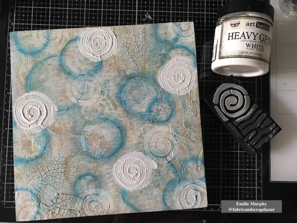
For the next layer, my intention was to add some dimension. Therefore I applied with my finger some pretty thick “puddles” of heavy gesso and stamped on it using again the “Mini Batik Pattern 2” foam stamp. Isn’t it cool! This is such an easy way to add dimension. I kept stamping around here and there to clean up the gesso left on my stamp.
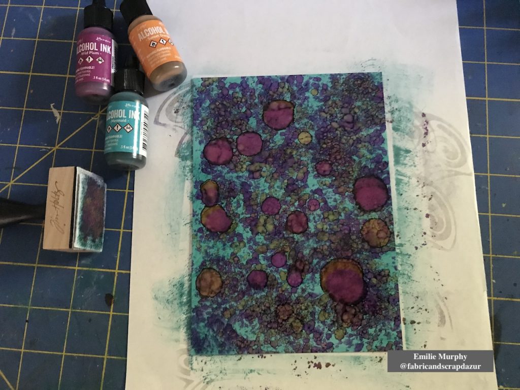
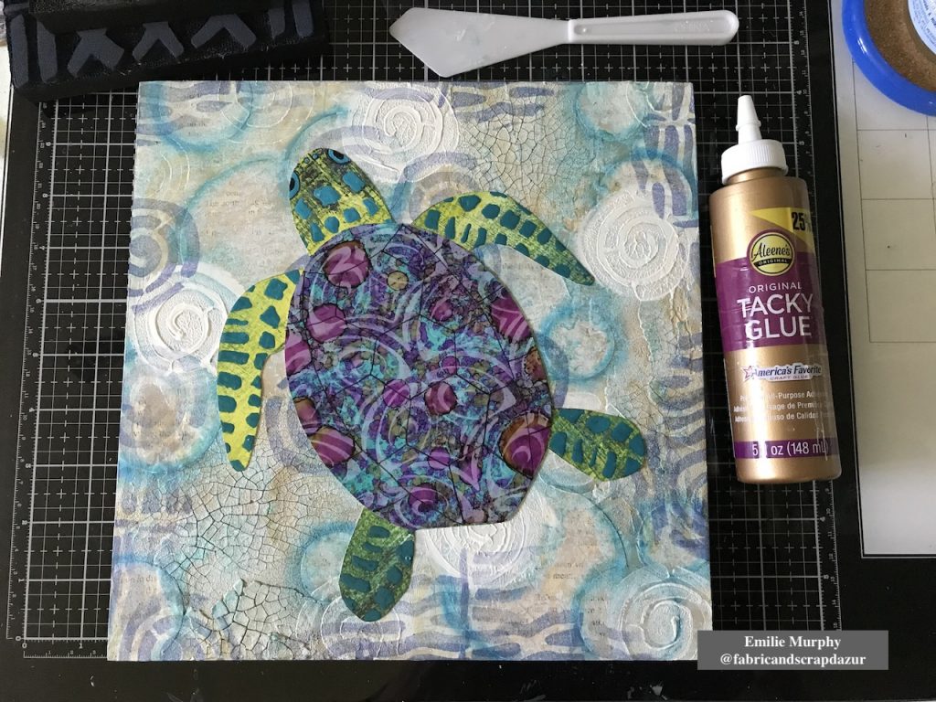
Next, I played with some alcohol inks on yupo paper to use for the turtle shell. I wanted something bright and vivid.
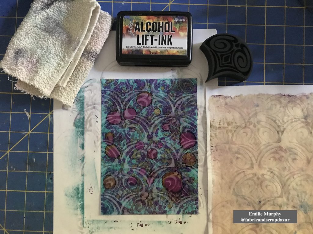
Using the “Fairview Fan” (positive) foam stamp, I lifted off some alcohol inks and got this beautiful pattern.
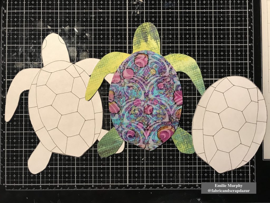
Then I drew a turtle on printer paper to use as template. I made two copies; one copy for making the turtle body and the second one for the turtle shell. I used the Yupo paper, previously made, for cutting out the turtle shell and I choose a scrapbook paper for the turtle body.
Let me tell you why I choose this particular scrapbook paper.
Few weeks ago, I received my stencils order from Nathalie. She had wrapped the stencils with this scrapbook paper sheet. When I look at it, I saw that she designed this paper few years ago. Yes!!! Isn’t it awesome! So it was a perfect opportunity to use it for my turtle body.
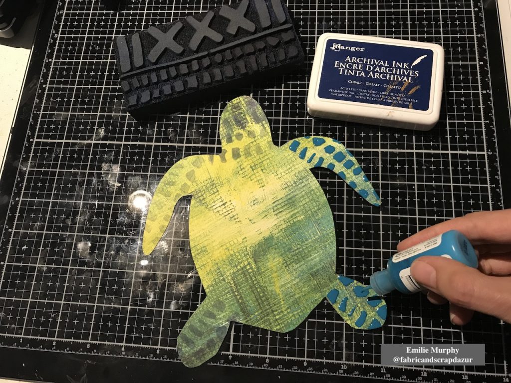
Then, to embellish my turtle, I used the “Mini Batik Pattern 1” foam stamp for the head and legs and covered the stamped pattern with enamel accents to create the skin.
With the same foam stamp, I stamped the edges of my cradled wood panel.
Before gluing down my turtle, I used again the “Batik Pattern 2” foam stamp to stamp only the “strips” part of the stamp, just to add more interest and introduce a different pattern than having just circles on my background.
I finally glued down my sea turtle with tacky glue and traced the pattern of the turtle shell. At that point, something was missing and I was not satisfied with my turtle shell like it was.
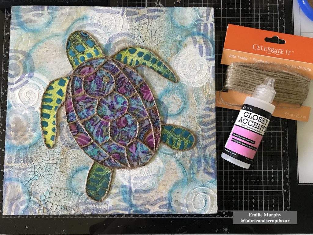
After reflection, I had the idea to glue some jute twine on the turtle shell and all around the turtle. I used some Glossy Accent as preference because it dries clear and shiny. I really love the look of it and think it was the perfect thing to do to make my turtle as the centered piece.
At last, I used some blue and brown Stabilo pencils to darken the edges of my turtle. And I finished off the edges of my cradled wood panel rubbing my “cobalt” archival ink pad all around.
Hope I got you inspired. Personally, I have so much fun doing this project that I’m thinking of making a series of smaller panels with other shapes like fishes and shells. This project can easily be made also on canvas or even in your art journal…
Have a good rest of the week and see you next month!
Thank you Emilie! I love how this turned out and that yummy texture is great!
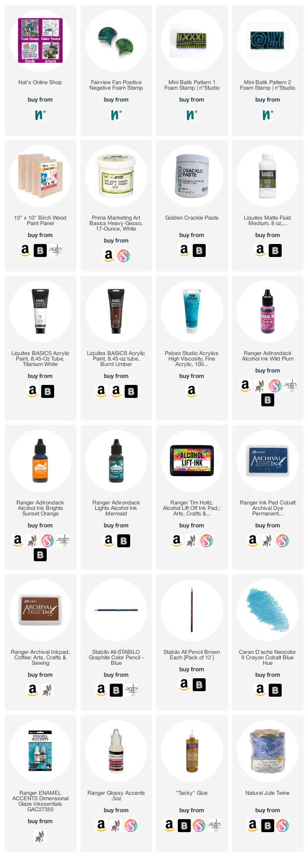
Give it a try: you can find all my Foam Stamps in my Online Shop and in addition to some yupo and old book paper, here are some of the other supplies Emilie used:
Feel inspired? Working on something yourself that you’d like to share? I love to see how you interpret our monthly themes. Email me how you used my stencils and stamps with the theme and email me an image – I would love to share your projects in my next “n*Spiration From Around the Globe“.
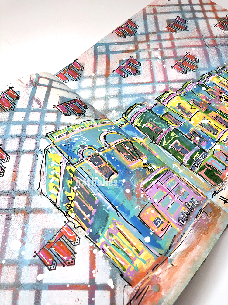
I love the message and really like how the colors came out. The background screams London to me.
Reply