Art Journal

n*Lab Tales – Today featuring Ranger Tim Holtz Distress Paints

nlablogo


Some of you know this sign already – n*Lab Tales are just a little summary of my experiments with a certain products that are either new or new to me. When I get something new I need to take it apart and examine it in all kind of different ways in order to be able to make it my own and add it to my stash.  Sometimes I take it even further and integrate the product into my workshops. n*Lab tales are not tutorials -just basic narratives of what I found out, how I used it and what I liked/disliked. It is little peek into my n*Studio life.

DistressPaint01

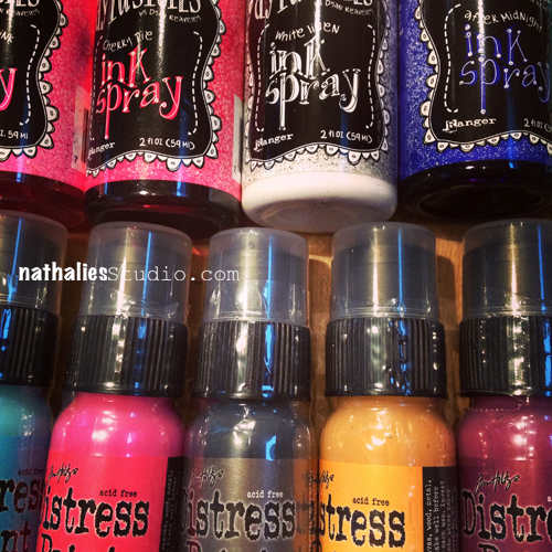
I got the new Ranger Dylusions’ Colors -six there is- and there is not secret I really love these Ink Sprays – and there was no surprise I loved the new ones too. The new White Linen btw- is awesome – I will show a little spot where I used it.

What was totally new was the new Distress Paints by Ranger and I was told they are unlike any other paint product out there. AHA…mmmhhh – really? LOL- sorry Ranger, I love your products- but I am like that- I need to know for sure plus everything paint makes me excited to try. So let me first give you the known gist of the Distress Paints – 24 colors,  fluid water-based acrylic paints, reactive with water and coming with a dabber.

I will admit – that the description at first did not knock me out of my shoes- because I know fluid acrylic paints, acrylic paints are water-based and react with water – so what is the big deal besides that the colors are appealing if you are already familiar with and you love the other Distress Products from Ranger, which I do.

DistressPaint02

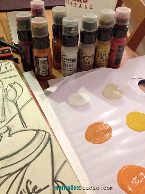
So…with a bit of a MEH-approach (I am honest) I started experimenting with those paints. I actually almost thought they would be more a Gouache like paint- until I realized “nope- they are permanent, once dried”. So what I started doing was just playing with them in my art journal. Seeing how they are with different brushes, how I can control them , how they react when I mix them dry and wet with a brush.

BelleAJ01


This is when I started to like the paint already quite a bit. I liked how you can work them and that they are actually VERY controllable although so fluid. I also like the very long opening time of the colors on the palette/ranger mat. I like that the mixing and blending is nice in a wet on wet technique- while it is very opaque on a wet on dry technique. I also love the matte still very vibrant appearance the matte finish by the way perfect for art journals as they help with the “sticking” problem. I also like this chalky like effect.

DistressPaint03

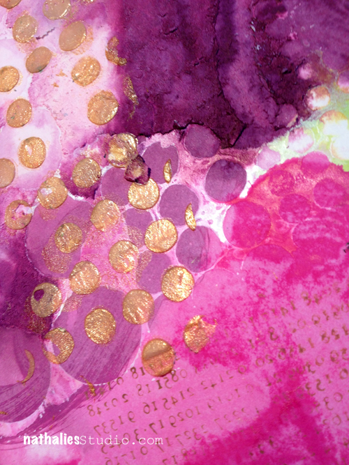
Next I played and experimented a bit with the reaction to other water-based products while wet. I liked the marbling effect. Here you see the Broken China Distress Paint mixed with some Dirty Martini Dylusions Ink Spray. It takes  a bit practicing on when to mix those for the best and still vibrant result, as you want to avoid the matte Distress Paint mixing too much into the nice vibrant Dylusions Ink Spray…so that it is not just a matte finish in the end- but it is doable and fun. Love it.

DistressPaint04

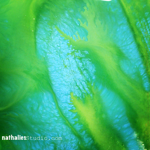
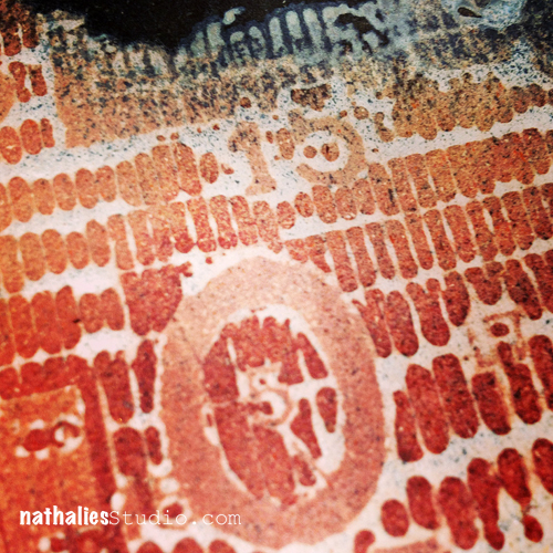
I started playing with different paper surfaces. On the top you see ripped and very rough paper and on the bottom very smooth paper from Dyan’s Dylusions’ Journal. What I found was that the rougher the surface -like the torn paper- the faster the paint dries. It was almost impossible without wetting with water to work the paint on rough paper, while it was without water super easy and nice (even with your hands a fun thing) on smooth paper. Well once you know that – all is good and you can work with that knowledge – plus you can use it for more visible texture as the rough paper parts getting darker of course :)

FoodGroup01


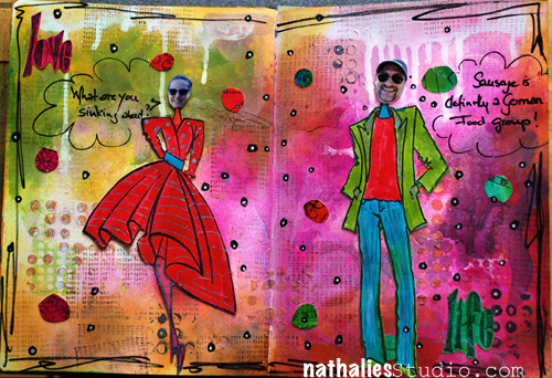
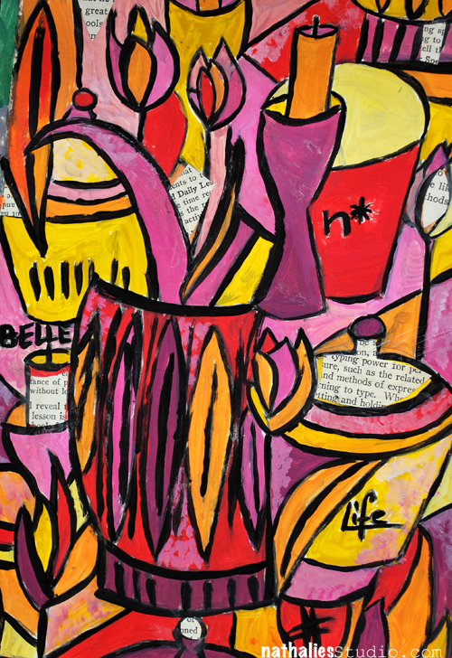
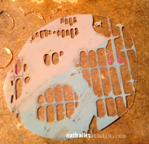
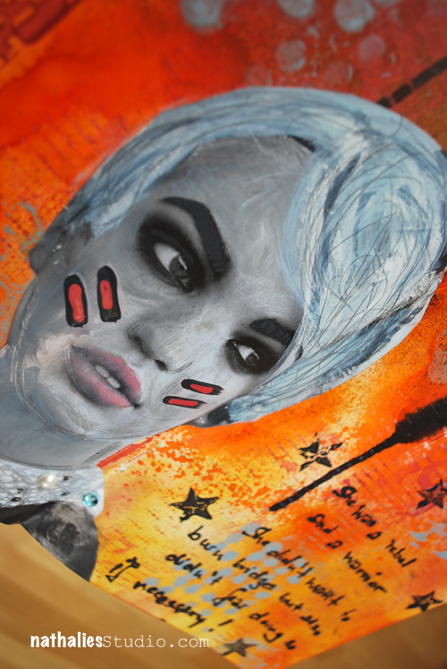
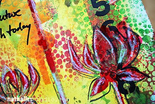
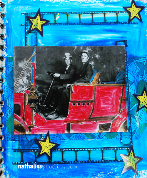
here you see the whole page- the background was just playing and trying things- I used a lot of the Dylusions Ink Sprays with the background too to see the results with the dried Distress Paints, and then as you can see the white that is the new Dylusions White Linen – love it. I also used Dyans new Couture stamps- I had fun- as you can tell ;) I worked a bit more with Wendy Vecchi’s new Golden Embossing Paste – yum. I also tried a bit stenciling with the Distress Paint Dabber but the paint is definitely too fluid for crisp results with stencils, so you would still need a cosmetic sponge or similar to apply the paint in a thinner matter – or maybe I need to practice more ;).

DistressPaint05


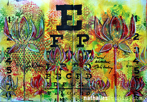
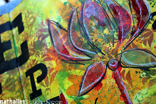
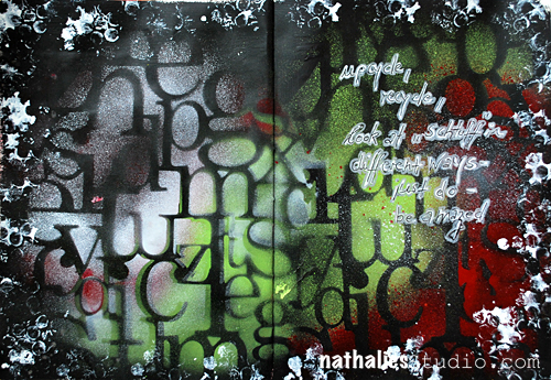
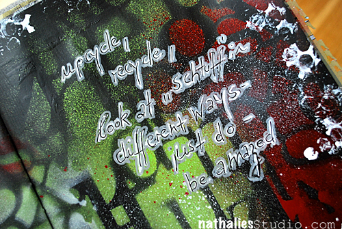
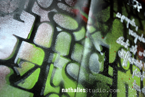
And then came the part that made me like super exciting. Stamping! Indeed a very nice paint to be able to stamp with ruber stamps- and super easy to apply because the dabber and you can also add different colors- and you can then stamp directly on Transparencies (remember that one Creative Jumpstart video I did? ;) ) – LOOOOVEEEE. But wait there is more….

DistressPaint06


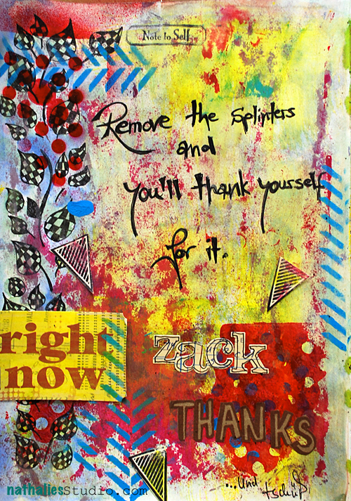
This made my heart pitter patter – The resist results with the paints. I used here Picket Fence and Weathered Wood Distress Paints and stamped with my favorite Stampers Anonymous Stamp. Then I sprayed with Black Marble and Squeezed Orange Dylusions Ink Sprays and also applied some Distress Inks – I think – Spiced Marmelade and Fired Brick over it. I loooooveee how this came out. That was one of my highlights, as yes – you can do resists with all acrylic paints- but this so far- had the best result for me.

So before I show you another art journal page- my favorite features of the Ranger Distress Paints:

  • Resist Results 
  • Matte but yet vibrant finish – perfect for art journals
  • Capability of applying to plastic and metal
  • Dabber cap – in the hope it won’t dry out
  • Possibility to use it with my rubber stamps
  • Color Range – love the colors and wonderful to mix with other Ranger Paint Products
  • Texture when dried – more visible texture than tactile
  • Opacity when applied over dried areas

Warrior01


supplies by Ranger: 
Distress Paints
Distress Inks
Distress Stains
Dylusions Ink Sprays
Dylusions Stencils
Inkssentials Glue Stick
Inkssentials Mini Mister
Other: 
Pearls, Stampers Anonymous Stamps, Derwent Sketching Pencils

Warrior02

I will definitely use those in my stash and I see them also in future classes as I have some more ideas to use them with techniques already  ;)

Have a gorgeous day

Nat

Related Links:

n*Lab Tales- Derwent Artbars

n*Lab Tales – Letraset Promarkers with Letraset Airbrush System

n*Lab Tales- Ice Resin

Comments (22)

  • Michaela "Micki" Harper

    |

    Hi Nat,
    Ok, so just to make sure I read right (I’ve got the flu and been in bed – still in bed) once these paints dry I can add other media on top and the paints will not reactivate or smear like the Distress Inks or the Spray Inks, right? Ohhhhh for mixed media that’ll be awesome…. :-). Loved your experiements.

    Reply

    • Nathalie Kalbach

      |

      Hi Micki,
      yep- it is permanent once dried :)
      hugs
      nat

      Reply

  • andrenesmith

    |

    Thanks for the in-depth review! I got my distress paints yesterday and immediately had to try them out. Made a card with 3 blues sprayed with water and added sea salt. Worked great!! Here’s a link to the card…..

    C&S2 Day 8

    Reply

  • Lisa Flaherty

    |

    Great review! I assumed that the Distress Paints were unique only in their color line. I LOVE the painted still lifes you’ve done, the one near the top of this post with the collage of book text, and the other blue and green one of your art supplies posted to Instagram.

    Reply

  • Sue Clarke

    |

    These are on my “to get” list and now I will try several colors since I liked the results you got in your art journal. I am TOTALLY in love with the Dylusions ink sprays already!

    Reply

  • rains

    |

    I’ve been so curious about these paints, even after watching TIm Holtz play with them on a video. Thank you so much for this thorough report! Just what I’d been craving. I will definitely get some, and will watch your other “Lab tales”.

    Reply

  • Rob

    |

    Thanks Nat for your report, I was pretty reticent to try them because I still have the last range of Paint Dabbers with dried up tops. But now I’m tempted after reading your report.

    Reply

    • Nathalie Kalbach

      |

      Rob- I hope they won’t dry – that of course I cannot say yet. I know though what you mean …

      Reply

  • Milagros

    |

    Gracias por compartir tus experimentos, preciosos resultados.
    abrazos

    Reply

  • mjmarmo

    |

    Wow – amazing results!

    Reply

  • Kathy P

    |

    Thanks, Nat, for that very throrough and honest evaluation of these new fun paints. Sounds like I need some in my stash! And will be looking for that class…..!

    Reply

  • Carrie

    |

    Thank you for sharing your experiments! I was curious to see what people other than Tim would do with them. They’re really exciting to me, because I love the Distress colors but wanted something more permanent for some applications, so it’s good to see that they live up to the excitement! Love what you’ve done with them :)

    Reply

  • Betty

    |

    Thanks Nathalie
    I did not know if I need the dabbers I am not a fan of the normal paint dabbers they never work when I need them.
    So maybe I must try these.

    Reply

  • Nadège

    |

    Love love love, everything!

    Reply

  • isisimaginings

    |

    Thank you for doing such comprehensive testing, the paints sound great & I must have the white Dylusions spray. Your pages are gorgeous, I especially like the second one.

    Reply

  • butterfly

    |

    Fantastic to hear such a detailed and comprehensive breakdown of different techniques with the paints. Mine are still on the way, definitely looking forward to some play time!!
    Alison x

    Reply

  • Gunvor

    |

    Thanks for sharing!

    Reply

  • Michelle Hernandez (@willieburgscrap)

    |

    I had no idea Dylusions was coming out with a white- I have so many white sprays and I love them ALL! Into my shopping cart that goes! I also love the vibrancy of the new Distress daubers- I’m not big into brown edges and the red, turquoise and yellow colors look nice and bright. Thanks for this write up- I’m still a little hesitant to buy lots of new paints since some of my old ones have dried out but this is my year of multi media experiments so I’ll just get one of each and completely used them up before I buy all the colors I like to use. Pinning this column!!!

    Reply

  • Djam

    |

    love it!!

    Reply

  • zoegakatten

    |

    Oh, I was thinking the same thing as you when reading about Distress Paints…! I don’t know if I should be happy or not so happy, reading that they have lots of good qualities. ;) I probably will have to try them, and I’ve been wanting to try the Dylusions for quite some time too. I love what you created while trying the supplies out Nat!

    Reply

  • Martha Richardson

    |

    Thanks for sharing your results…I loved them when I saw them at CHA but just wasn’t sure. You have convinced me I must have them!

    Reply

Leave a comment

New Adventures – ArtJournal Page

This time when I came back from CHA I made an effort to play at least half an hour in my studio in my artjournal with the new CHA stuff before tackling all the emails and other things that had to be taken care of.

LockDown01

2013 is a very exciting year for me and the adventure started on the day I did this journal page. I will fill you in later in a couple of months- LOL.  The bright colors of this page are a good indicator how excited and full of hopes and happiness I am for things to come :)

LockDown02

I used Julie Fei Fan Balzer’s and Dina Wakley’s new stencils for Crafter’s Workshop – love! Also used Ranger Distress Inks, Liquitex Acrylic Paints, Liquitex Professional Spraypaints, Derwent Artbars and Posca Markers.

LockDown03

Are you going to spend some time in your studio today?

Have a wonderful day

Nat

P.S.

As you know the Creative JumpStart 2013 is over. Almost 6000 Subscribers – I am speechless…as I am wading through the comments -last time I checked it was over 500 on my final post…I got all teary eyed, in a good way ;) … thank you for all the sweet words about Creative JumpStart 2013- it means a lot to read all those wonderful comments!

Comments (34)

  • Annette Husband

    |

    wahoo nat…I SSSOOO love your journal page its GORGEOUS!!

    Reply

  • Lisa Flaherty

    |

    Very cool spread, Nat! Love all the colors and layers. The white highlight and black sketched outline on the Corn Flowers is awesome, adds such dimension to them. Can’t wait for you to spill on the new adventures!

    Reply

  • Gunvor

    |

    I love your pages – they´re really vibrant and full of life! And I love the flower stencils.
    Could the happy news be a book? with your awesome art and the techniques you use?

    Reply

  • Florence

    |

    Thank you so much for sharing with us. I didn’t get to see them all but lovd the ones i watched. Thank you again

    Reply

  • anna

    |

    I love the page you did Nat. The colors are bright and shiny and stencils are wonderful!

    Reply

  • muriel

    |

    Such a great page! The colours are amazing. Hope to be able to buy Julie Fei-fan balzer’s new stencils soon.

    Reply

  • skye soard

    |

    so….don’t we need a Mid Year Summer DREAMY????

    Reply

Leave a comment

Just Do it – Artjournal Page or…Such a dork

JustDo01

When I created this page for Artists in Blogland using their prompt:

Headline prompt:  Radical to Mundane and to Radical Again:  What once seemed new that now feels old and boring?  How can you see it as new again?  How do you “jump charge” creativity when you’re feeling stuck?
Color:  black & neons – bold contrasts
Quote:  Creativity is piercing the mundane to find the marvelous.  Bill Moyers

something in me finally clicked. Here is my confession: I use my artjournal to try out new techniques and new supplies and tools BUT I am one of those people who don’t like an artjournal anymore if a page turns out ugly. Like in “blech” !

yeah yeah…bla bla – I know all the comments about “oh, don’t worry, this is your playbook. You shouldn’t be uptight with it. Let it go”

Been there done that…tell other people that…doesn’t follow it myself though. Dozens of unfinished Artjournals are occupying my shelves because of that.

It isn’t so much that the page couldn’t be covered anymore…it is that all of a sudden the page that was wonderful say on the left side got a serious punch in the intestines by the ugly page on the right side…making me not finish the artjournal and start rather with a new one. Insane, I know!

JustDo02

But on this spread here, something accidentally happened. While in Scrapbooking I really don’t care about double-sided Layouts and I totally love the look of two opposite sides looking differently, with this one I just started working on both sides. And I loved the big surface and I loved the crease in the middle – I just loved it. And when I started the next pages  and they looked like hot chocolate on a nice white fluffy carpet…I didn’t care…because…whatever, turn page, cover it, glue it- pretend it never happened, doesn’t affect the spread before. I can go back and look at my nice page- no worries. YES….I am a dork…I know…but I told you…what can you do ? ;)

JustDo03

So ever since…I work on double spread pages in my artjournal and I LOVE it. Will show some more pages over the next days.

Please tell me I am not the only one who is so weird? LOL

Have a gorgeous day

huge hugs

nat

Comments (18)

Leave a comment

The Pain of Parting…OR …Charles Dickens was a smart guy

I recently read an article about Charles Dickens and I was intrigued by his interesting life and his amazing urge to bring the poverty of people to other’s people attention through his words. BTW- he also worked in a law office and then wanted to write and became a freelance writer. Must be something in these law offices that make you crave for creative stuff ;) He was a wise man and an awesome storyteller for sure.

PartingPain


“The pain of parting is nothing to the joy of meeting again”, Charles Dickens.

PartingPain2


played with USArtquest Pigment Colors, Acrylic Paints, Scrapbook Adhesives by 3L Adhesive Sheets and Stampendous Aged Embossing Enamel


Only a couple more days till ….counting down ….any clue? ;)

Nat

Leave a comment

The Whatevers #7…or If Father Knew…

Are you ready for the 6th Whatevers? If you missed the what the Whatevers is all about…check it out here.

Click here to see what Cat made out of this photo and which story she tells

Click here to see what Vicki made out of this photo and which story she tells

Here is my take on it

iffatherknew02

Heinrich felt really uneasy! When he was asked to play a little role in a gangster movie, he had no idea how close this role would reflect his nightly life. All the scenes bringing alcohol over the State Boarder from Canada…and it didn’t help that in the movie he would get shot….If father knew….

iffatherknew05

His Name: Heinrich – son to Wilhelm

iffatherknew04

I used some scraps of hoarded Danyeela Paper, some film stripes by Tim Holtz and painted over it with a glaze made out of Gel Medium and Liquitex Acrylic Inks. I cut out the stars from my old line eMOTions and painted them from behind with yellow acrylic paint.

iffatherknew03

I also painted the photo with Liquitex Acrylic Inks.

iffatherknew01

And here is the photo for you:

07_December2012

Here is how it works if you want to play along:

  • Vicki, Cat and I have made a one-year commitment to each other and picked twelve photos with Whatevers whom we will give a story.
  • Every month – if possible always on the 15th –  each of us will do a post with an individual story that goes along for us with the same photo.
  • If you want you can play along and we will have the photo for you – just right click on it to safe it to download and show us your version of The Whatevers.
  • There is no rules to the story itself- it can be funny, sad, uplifting, breathtaking- WHATEVER
  • There is no rules on the length or the form of the story– it can be a short sentence, an essay, a poem or a soap opera – WHATEVER
  • There is no rules on the artform you choose – it can be a scrapbook layout, an altered art project, an artjournal page – WHATEVER
  • Here is a rule though: if you take the photo you have to link back to us andshow us your story.
  • These pictures are from our personal stash and are for personal use for you only! If you want to use them for a publication whether a book or magazine in print or digital form please ask for permission!
  • If you want to participate we’ll have a linky list for each Whatever Post.
  • You can also join our The Whatevers -Facebook Page

You can grab the blinkie here if you want to add it to your sidebar

You can share your work with us by submitting here:

Huge hugs

Nat

Leave a comment

Thank Yourself ….OR….Remove the Splinters

Splinters


a new artjournal page. I am one of these people who like to run around with splinters in their feet..kind of like …maybe if I ignore them or pretend they are not there, they will not hurt as much. But …guess what…they need to be removed…and then you thank yourself. I did this this month with a splinter that hurt for many years…I feel better already… I am healing…. :)

Splinters2


I played with a lot of stuff here- with: USArtquest Mica Color and Perfect Pigments, Liqutex Acrylic Paint and Spraypaint, Crafter’s Workshop Templates, Posca and Zig markers, Cocoa Daisy Banner Stamp, 7Gypsies Tag, FastFoodChain-Paperbag with awesome writing on it etc. Essentially everything that was close to me when I was traveling to New Jersey :)


Artjournaling seems to fulfill two main needs for me: 1. Getting emotions out and 2. playing with artmedia for new ideas and techniques

If you artjournal what are your main reasons to do it?

huge hugs

nat

Leave a comment

The Whatevers #5 – or Why…?

Are you ready for the 3rd Whatevers? If you missed the what the Whatevers is all about…check it out here.

Click here to see what Cat made out of this photo and which story she tells

Click here to see what Vicki made out of this photo and which story she tells

Here is my take on it

Why look so far if the good is so close by? Wilhelm would never understand why his son Heinrich went to America. Being a tram conductor wasn’t a shabby life! At least Karl was still with him.

Their Names: Wilhelm – grandfather to Elizabeth and Karl – Elizabeth’s Uncle

played with Derwent Inktense Blocks and Liquitex Acrylic Inks

And here is the photo for you:

Here is how it works if you want to play along:

  • Vicki, Cat and I have made a one-year commitment to each other and picked twelve photos with Whatevers whom we will give a story.
  • Every month – if possible always on the 15th –  each of us will do a post with an individual story that goes along for us with the same photo.
  • If you want you can play along and we will have the photo for you – just right click on it to safe it to download and show us your version of The Whatevers.
  • There is no rules to the story itself- it can be funny, sad, uplifting, breathtaking- WHATEVER
  • There is no rules on the length or the form of the story– it can be a short sentence, an essay, a poem or a soap opera – WHATEVER
  • There is no rules on the artform you choose – it can be a scrapbook layout, an altered art project, an artjournal page – WHATEVER
  • Here is a rule though: if you take the photo you have to link back to us andshow us your story.
  • These pictures are from our personal stash and are for personal use for you only! If you want to use them for a publication whether a book or magazine in print or digital form please ask for permission!
  • If you want to participate we’ll have a linky list for each Whatever Post.
  • You can also join our The Whatevers -Facebook Page

You can grab the blinkie here if you want to add it to your sidebar

You can share your work with us by submitting here:

// <!–[CDATA[

// ]]>

Comments (5)

Leave a comment

Customize Your Voyeur Eyes

I love music…and I can’t create without listening to music. I often also dream of creating an album cover in the future for a band. So when Vicki Chrisman asked me if I would be up for a fun project regarding a band called Saint Motel from L.A together with Vicki Chrisman, Louise Nelson, Ronda Palazzari, Cat Scanlon and Martha Richardson. – I was like all excited and agreed in a second. Saint Motel debuted their first album called Voyeur – and I do like the music quite a bit :)


So the project was to incorporate the eyes on the CD in a piece of artwork of ours. And here is my take with an art journal page:


“She never could get rid of the odd feeling of being WATCHED”

So fun- I used Liquitex Spray paint and Acrylic Paints to create the background, scanned it in and then printed it out on a Claudine Hellmuth Sticky Canvas Sheet. I had found the photo months ago at a flea market and when I heard of the project I instantly had the photo and a kind of living room setting in mind. For the “frames” of the CD Cover – i spray painted some German Scraps in gold and then assembled the stripes around the print outs. Fun and different :)

My two fave songs from the album are 1997 and Honest Feedback and actually I also sooo love the video for Honest Feedback:

[youtube=https://www.youtube.com/watch?v=akCigogPNUI]

Check also out the other girls and how they voyeur-zed their projects:

Vicki Chrisman

Louise Nelson

Ronda Palazzari

Cat Scanlon and

Martha Richardson


Have a rockin’ day

Huge hugs

Nat


Comments (10)

Leave a comment

The Whatevers #3 or Become

Are you ready for the 3rd Whatevers? If you missed the what the Whatevers is all about…check it out here.

Click here to see what Cat made out of this photo and which story she tells

Click here to see what Vicki made out of this photo and which story she tells

Here is my take on it

Become

“Stop looking grumpy into the camera”, mother said between her teeth. “I am not looking grumpy, just squinting because of the sun!” But of course Elizabeth was lying. Why would she have to come a seamstress? She wanted to be a painter…a painter!

Her Name: Elizabeth – Cousin of Maria and Mathias and Niece of Myrtle

I used the pages to try some stuff with wax paper- it turned out la-la- LOL. But I love how bright the Liquitex spray paints show up :)

Also played around more with the Liquitex Acrylic Inks- just love them .

And here is the photo for you:

Here is how it works if you want to play along:

  • Vicki, Cat and I have made a one-year commitment to each other and picked twelve photos with Whatevers whom we will give a story.
  • Every month – if possible always on the 15th –  each of us will do a post with an individual story that goes along for us with the same photo.
  • If you want you can play along and we will have the photo for you – just right click on it to safe it to download and show us your version of The Whatevers.
  • There is no rules to the story itself- it can be funny, sad, uplifting, breathtaking- WHATEVER
  • There is no rules on the length or the form of the story– it can be a short sentence, an essay, a poem or a soap opera – WHATEVER
  • There is no rules on the artform you choose – it can be a scrapbook layout, an altered art project, an artjournal page – WHATEVER
  • Here is a rule though: if you take the photo you have to link back to us andshow us your story.
  • These pictures are from our personal stash and are for personal use for you only! If you want to use them for a publication whether a book or magazine in print or digital form please ask for permission!
  • If you want to participate we’ll have a linky list for each Whatever Post.
  • You can also join our The Whatevers -Facebook Page

You can grab the blinkie here if you want to add it to your sidebar

You can share your work with us by submitting here:

// <!–[CDATA[
// <!–[CDATA[
_
// ]]>

Nat

Comments (12)

Leave a comment