nathalie-kalbach

Song Bird or… In My Art Journal Today

NatkalbachSongbirds01

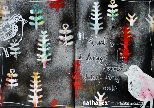
Free after E. E. Cummings “My head is a living forest full of song birds.”

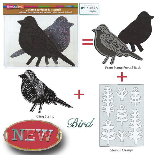
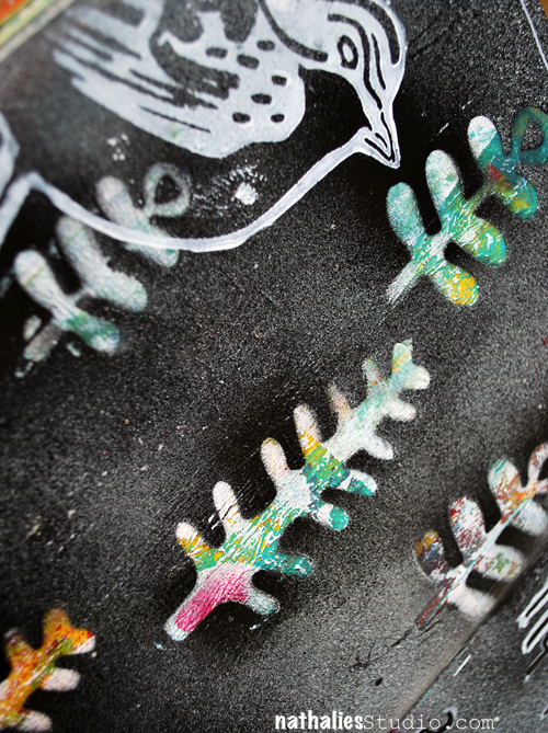
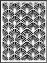
I made this page based on a background that to be honest was really really bad. The colors were just awful on the spread, so I used some gesso here and there to tone it down and then I layered my new frond masks which are part of my new Bird StampSet on top of the background. You can pop the fronds out of the plastic and that gives you a stencil and masks in one :)

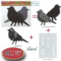
Bird

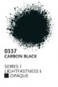
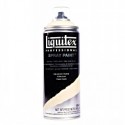
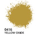
I then used Carbon Black and Parchment Spray Paint and sprayed over the masks, which revealed after lifting them, the really cool colors and designs. I used a brayer to layer some white paint on top of the foam stamp and the patterned and the solid side to stamp the birds onto the spread.

NatkalbachSongbirds02

An easy way to make something nice out of a really ugly beginning :) And a great way to start the day with a little art journaling warm up.

Thank you all for your wonderful comments about the new stamp sets- I am so excited! They are being shipped right now to the Brick-and-Mortar stores and they are already available at some Online Stores. I will list the stores as soon as I have an update from the Stores. I will also have them soon available on my website for you to purchase direct if you cannot buy them locally. I cannot wait to see what you are doing with them and I am also excited to share some more projects and tutorials with them soon :)

SuppliesCJS


Hope you have a wonderful day- with or without song birds in your head ;)

hugs

Comments (5)

  • colourfly

    |

    Liebe Nat, Ich finde deine neuen Stempel so supertoll…. Kann eskaum erwarten diese zu kaufen!!! Ich hoffe, dass sie auch in good old Germany zu haben sind?!
    Die Journal Seite ist super!
    Ganz liebe Grüße, Sabine

    Reply

    • nathalie-kalbach

      |

      vielen Dank Sabine! Ja- in Deutschland sollte es sie auch geben – ich poste sobald ich weiß, welcher Shop in Deutschland sie führt :) Liebe GRüße in die Heimat :)

      Reply

  • Jenny Petricek

    |

    Love this spread, Nathalie! I love the dark background and the colorful fronds that pop out in front of it!

    I appreciate that you explained the process of how you arrived at this particular background. Sometimes the most delightful surprises come from adding to and covering things that we weren’t happy with originally!

    Reply

  • gloz

    |

    Hi Nathalie, Thanks so much for leaving a comment on my blog. I am really enjoying my Creative Jumpstart 2016 and I have decided to use it as a new diet ploy for myself! I tend to nibble all night long in the winter, there-by gaining weight. But of I am doing art projects between 8 and midnight, I can’t eat at the same time!

    Reply

Leave a comment

Upcoming In-Person Classes

This year I will not be able to teach as much as in the past years, as I am writing my book (which is exciting and scary at the same time :) ) But here are a couple classes that I will be teaching in the next couple months in person. I would be super thrilled to have you!

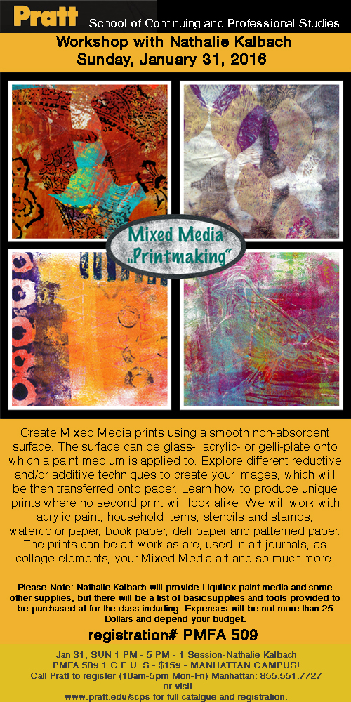
January 31st, 2016 – Mixed Media Printmaking in NYC at PRATT – Manhattan Campus

PrintmakingPrattSpring

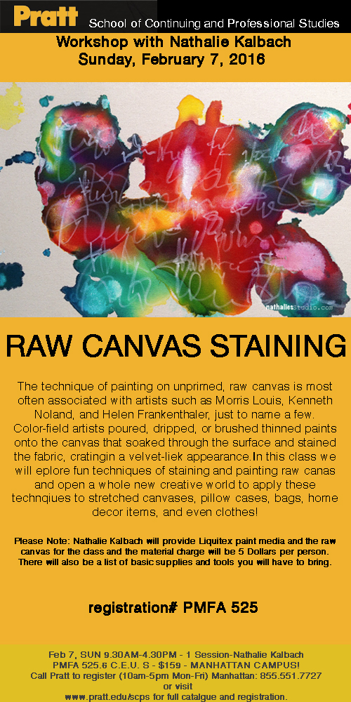
February 7th, 2016 – Raw Canvas Staining in NYC at PRATT – Manhattan Campus

RawCanvasPratt

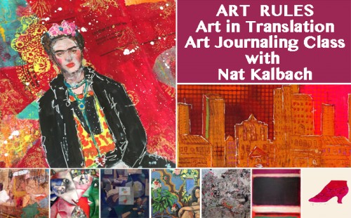
March 4-6, 2016 – Art Rules- Art in Translation – at My Heart’s Fancy in Edmond, Oklahoma 

ArtRulesWorkshopNat

Let’s explore several master artists and get inspired by their artwork and techniques to create wonderful and unique art journal pages.Whether it be Andy Warhol’s cheating technique or Rothko’s amazing color combinations, there are many different Master Artists whose masterful skills can serve as a starting point for your own artwork.  Find out what you like and what works for you.  Learn about opacity and layering, colors, troubleshooting, mixing materials, making your own tools, creating backgrounds and patterns.  We will work with acrylic paints, inks, markers, wax bars and other paint media to create dimension and texture.  We will make the most of stencils, stamps, mono printing plates and generic tools to make our own mark.  Get ready to Rule Your Art Journal!

Class hours:
Friday, the 4th: 4 pm to 8 pm
Saturday, the 5th: 10 am to 6 pm (1 hour for lunch)
Sunday, the 6th: 10 am to 2 pm

More details and Sign-Up Information here

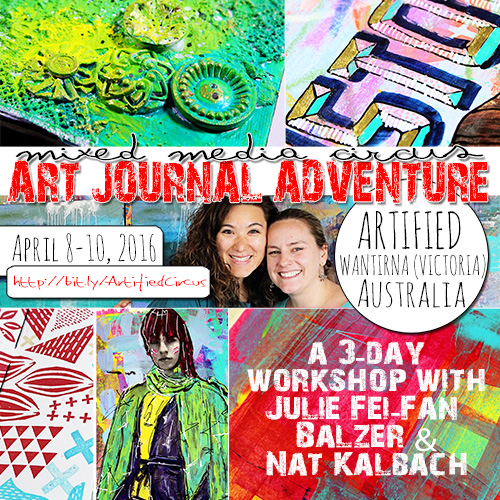
April 8-10, 2016 – Mixed Media Circus Art Journaling Adventure with Nat Kalbach & Julie Fei-Fan Balzer – at Artified in Wichita (Victoria),Australia

More details and Sign-Up Information here 

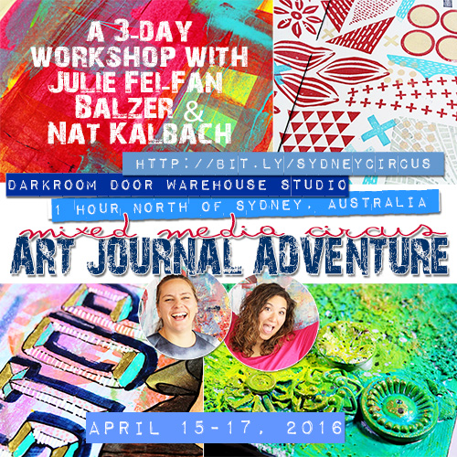
April 15-17, 2016 – Mixed Media Circus Art Journaling Adventure with Nat Kalbach & Julie Fei-Fan Balzer – at Darkroom Door Art Studio – 1h north of Sydney, Australia

More details and Sign-Up Information here


Hope I will see some of you at any of those workshops! I always love seeing you in person!

Have a wonderful day!!

Comments (4)

  • Linda on the Prairie

    |

    I am so excited that you are coming back to My Heart’s Fancy in Oklahoma! That will be the best weekend of 2016.

    Reply

    • nathalie-kalbach

      |

      Awe- cannot wait to see you again, Linda!!! We are going to have loads of fun!!!

      Reply

  • Sue Clarke

    |

    I would love to meet you in person Nat!
    Maybe I’ll put the workshop you do with Julie in Australia on my bucket list. Wising you a creative day and how exciting about your upcoming book!!

    Reply

    • nathalie-kalbach

      |

      That would be a hoot to have you – Julie and I would be so happy to see you :)

      Reply

Leave a comment

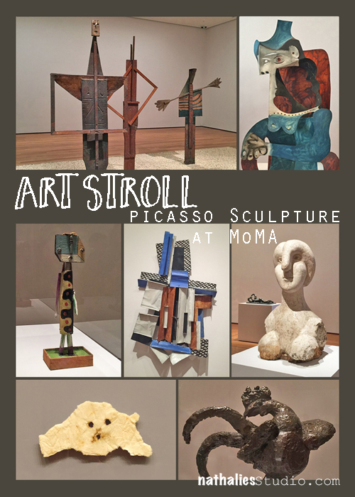
Art Stroll: Picasso Sculpture at MoMA

Picasso-Collage-01

Disclaimer: This post includes artwork with abstract or not so abstract nudity – it is not called Sodom and Gomorrah – it is called ART . If you have a problem with art, all I can say ” so sorry for you!” . Don’t email me to complain, don’t visit my blog anymore because I might post things like this again and, farewell!

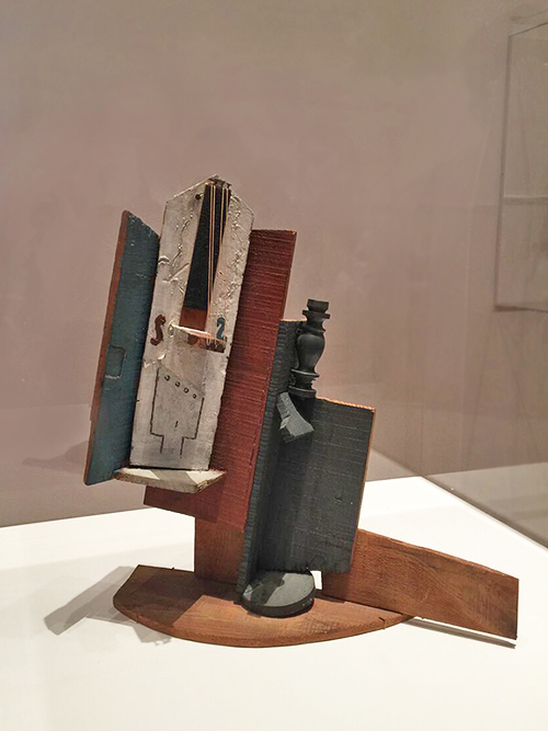
For a couple weeks now Picasso Sculpture is on view at MoMA (until February 7th, 2016). It is AMAZING! I have been there four times and I really hope I can sneak in a fifth time. The work shown was created between 1902 and 1964. Every time I go, I am entranced by something else. The scope of Picasso’s work and the range of materials he used in his sculptures is just mind-blowing.
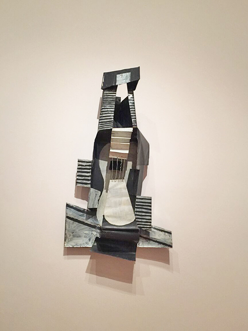
 

Kalbach Picasso 06

– Guitar, Paris, 1924. Painted sheet metal, painted tin box, and iron wire. –
Kalbach Picasso 05

– Violin and Bottle on a Table, Paris 1915 –
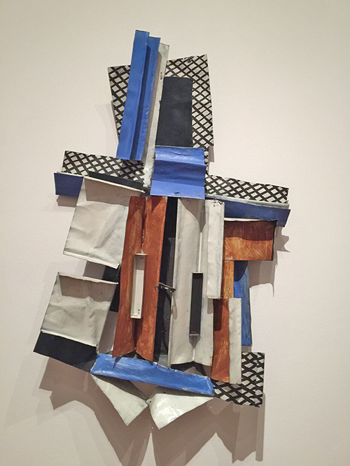
Kalbach Picasso 07

– Violin Paris 1915 – Painted sheet metal and iron wire.

All those sculptures make me feel as if Picasso Paintings came alive in a 3D installation  – so brilliant!
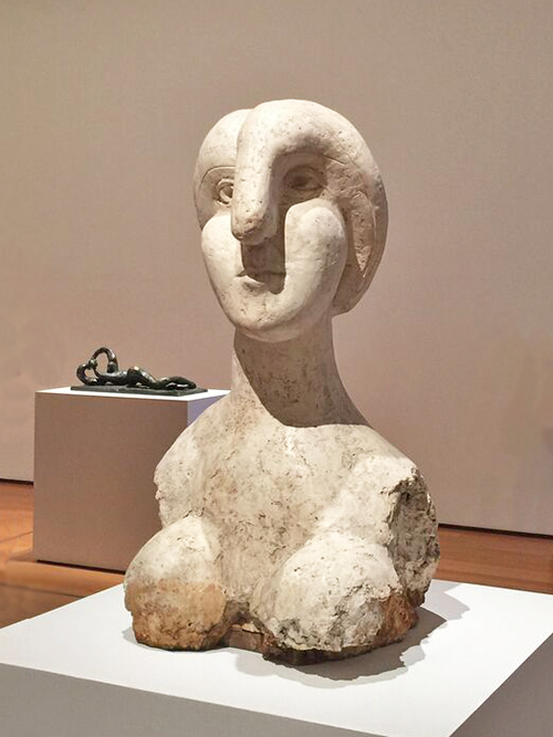
Kalbach Picasso 10

Bust of a Woman, Boisgeloup 1931 . Plaster.
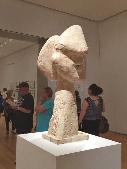
Kalbach Picasso 11

Head of a Woman, Boisgeloup 1932. Plaster
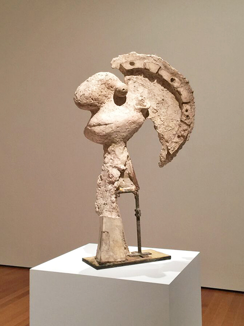
Kalbach Picasso 26

Head of a Warrior, Boisgeloup 1933 . Plaster, metal and wood.

This somehow made me think of a cartoon and smile- there is so much fun and joy and many puns in Picasso’s sculptures.
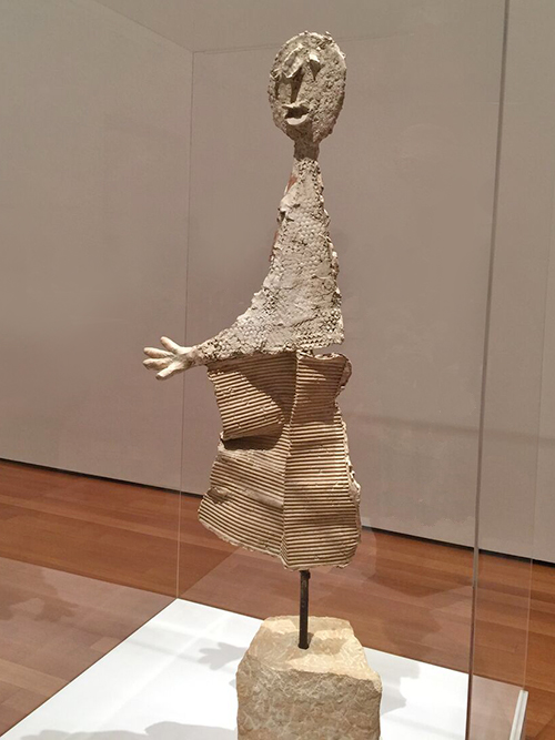
Kalbach Picasso 16

The Orator, 1933-34, Plaster, stone, and metal dowel
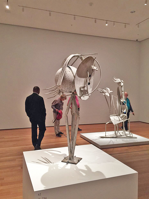
Kalbach Picasso 08

Head of a Woman. Paris 1929-30. Iron, sheet metal, spring and metal colanders.

Again this and the one below made me think of a Bugs Bunny Cartoon . Loving it!
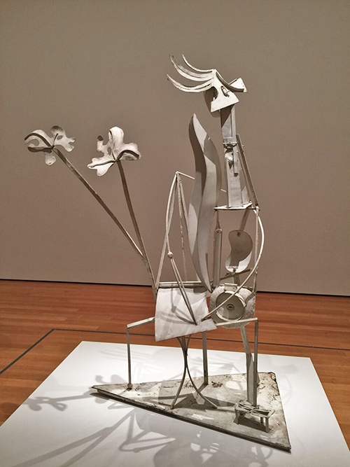
Kalbach Picasso 09

Woman in the Garden, Paris 1929-30. Welded and pained iron.
Kalbach Picasso 14

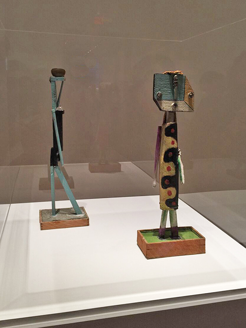
left: Woman Carrying a Vessel, 1935. Painted pieces of wood, objects, and nails in a cement and wood base.

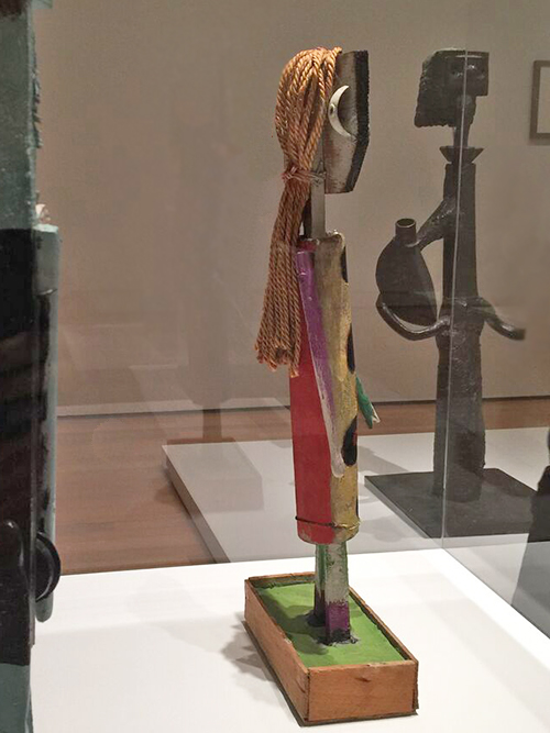
right: Figure, Mougins, 1938. Painted wood, nails, and screws with string, wire, paintbrush fragments, and push bell hardware on an unfired clay and wood base.

These were probably my favorites in the exhibition. I love the colors, and the materials and how they were put together – and look at the back of the figure!
Kalbach Picasso 15

Again these made me smile. You can almost see how someone who is so creative can never stop playing and transforming anything close by.
Kalbach Picasso 28

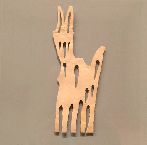
Goat. Paris, 1943 – Torn Paper

Kalbach Picasso 29

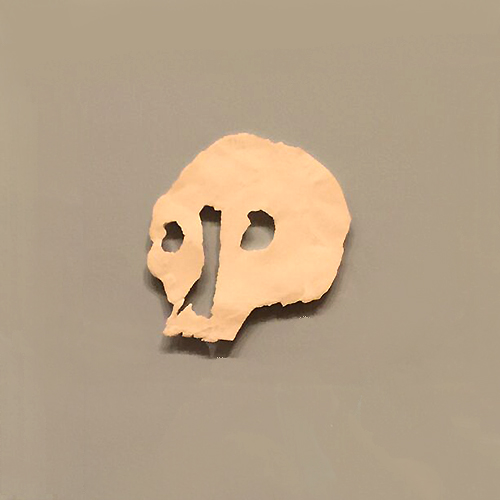
Death’s Head, Paris, 1943 . Torn and scratched paper.
Kalbach Picasso 18

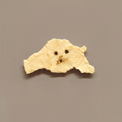
Head of a Dog, Paris 1943, Torn and burnt napkin
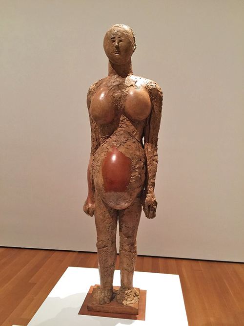
Kalbach Picasso 20

Pregnant Woman, Vallauris, 1950. Plaster with metal armature, wood, ceramic vessel, and pottery jars.
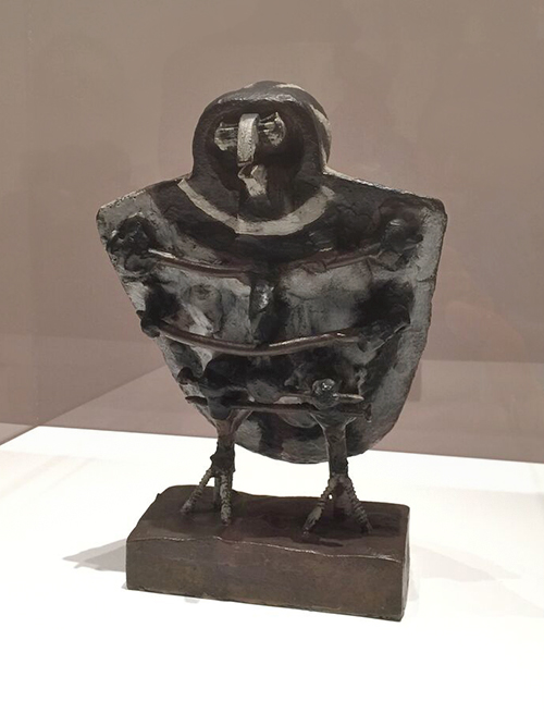
 

Kalbach Picasso 30

Little Owl, Vallauris, 1951-52. Painted Bronze
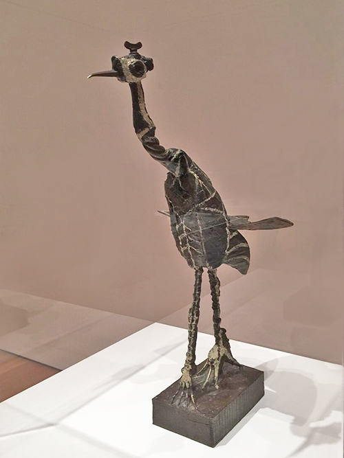
Kalbach Picasso 19

Crane, Vallauris, 1951-52. Painted Bronze
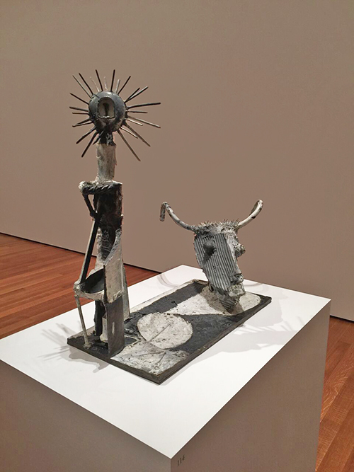
Kalbach Picasso 21

Goat Skull and Bottle, Vallauris, 1951. Painted Bronze
 

Kalbach Picasso 13

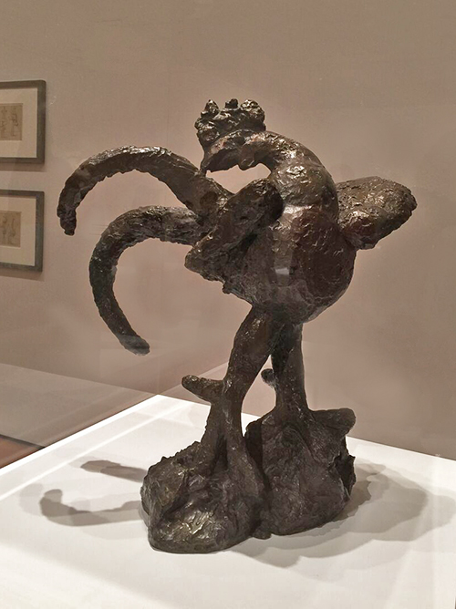
Cock, Boisgeloup, 1932, Bronze

Kalbach Picasso 31

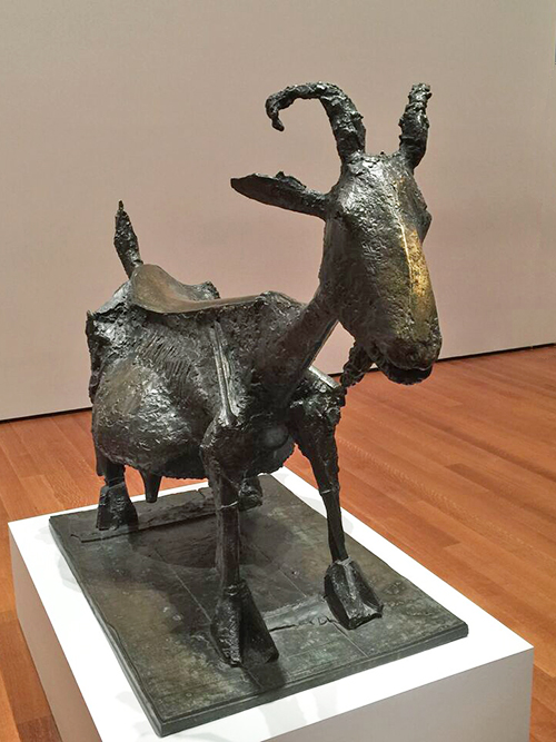
She-Goat, Vallauris, 1950, Bronze


Kalbach Picasso 22

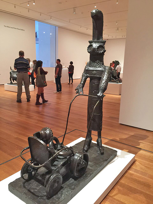
Woman with a Baby Carriage, Vallauris, 1950-54 . Bronze
Kalbach Picasso 23

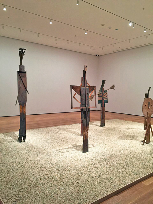
The Bathers – two times I was there, I saw a group of kids. They loved loved loved this – they recognized the faces and arms right away and they were totally entranced by the installation.
Kalbach Picasso 24

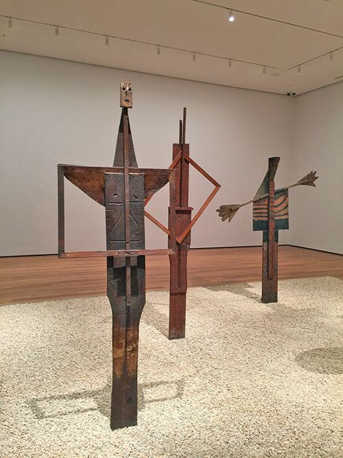
The Bathers: Man with Folded Hands ; Fountain Man; Woman with Outstretched Arms – Cannes 1956 – Wood
Kalbach Picasso 27

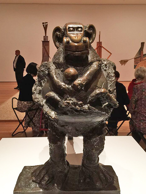
Baboon and Young, Vallauris, 1951, Bronze

Come on …this makes me laugh – this is awesome!!!! a car as the monkey head? I will never be able to look at a toy car again and not think of this!
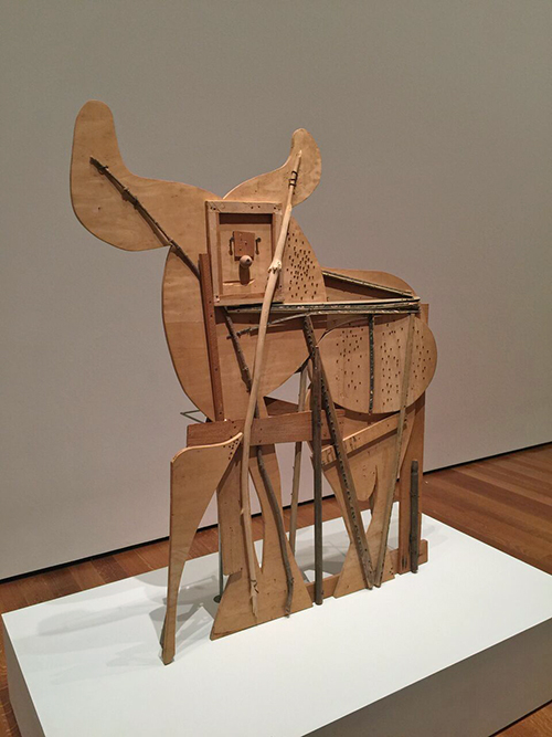
Kalbach Picasso 25

Bull, Cannes 1958 – Block board, palm frond, and various other tree branches, eyebolt, nails and screws, with drips of alkyd and pencil markings.
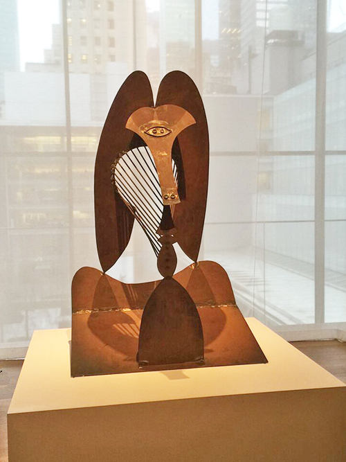
Kalbach Picasso 32

Maquette for Richard J. Daley Center Sculpture, 1964. Simulated and oxidized welded steel
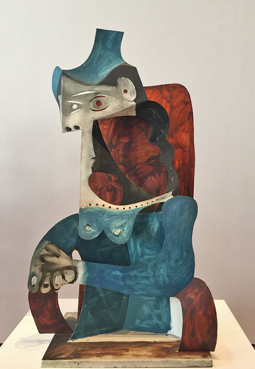
Kalbach Picasso 01

Woman with Hat,Cannes 1961. Painted sheet metal
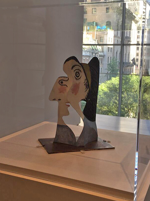
Kalbach Picasso 02

Head of a Woman, Mougins, 1962. Painted sheet metal and iron wire.
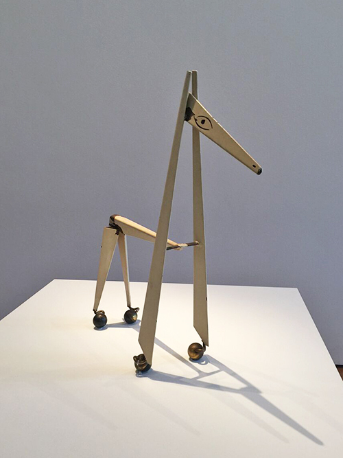
Kalbach Picasso 03

Little Horse, Vallauris, 1961. Painted metal with wheels.
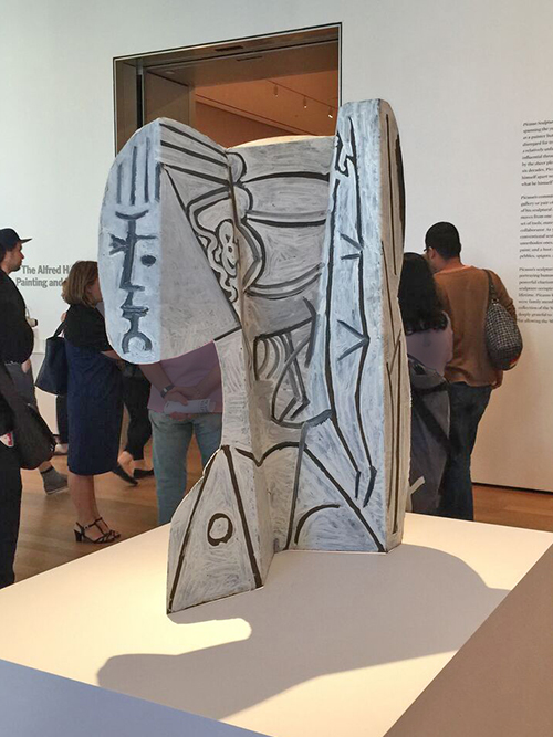
Kalbach Picasso 04

Sylvette, Vallauris 1954. Painted sheet metal.

What struck me the most was really how Picasso constantly changed his medium, his style and just totally indulged into the next and explored it, made it new and exciting! Looking at all the different work I felt super inspired and couldn’t wait to go home into my studio. Furthermore, I told people I took to the exhibition that this is exhibition feels like a therapy – it makes you happy and smile and just leaving in a very good mood. Yes- not the most art criticy en vogue thing to say, but you know…I think Pablo would have approved ;)

If you are anywhere near NYC and can make it before February 7th, 2016 to MoMA – RUN! Do it – don’t wait!

Hope you enjoyed the little art stroll!

 

Comments (14)

  • michelleward

    |

    Wow! What a great show! Thanks for sharing all the details. I feel like I’ve been there. Love those first few….1915. Amazing. What a visionary. Love your enthusiasm for Picasso – thanks for taking us along.

    Reply

    • nathalie-kalbach

      |

      Michelle, you would love to go- come and go with me before it closes :)
      I take you in! My treat!

      Reply

  • Mary W

    |

    Thank you for the guided tour. It was fun to walk through with you and your ideas! That is the best part of art – sharing and evolving. Also, I won’t be able to look at my grandson’s cars without laughing now. Fun stroll.

    Reply

    • nathalie-kalbach

      |

      I am glad you enjoyed it Mary! I agree sharing and evolving is the best part- how fortunate we are to live in a time like this where the internet can bring us all together and make it possible to share.

      Reply

  • Jane LaFazio

    |

    Thank you for the fascinating visit to the exhibition. I recently saw an exhibit of Picassco’s lithographs and block prints that was also fabulous. What a rich original imaginative body of work. I feel I have much more to learn about his work. Thanks Nat!

    Reply

    • nathalie-kalbach

      |

      thank you Jane, glad you liked it. I wish I could have seen the exhibition you saw, that sounds so interesting!

      Reply

  • sunmoongal

    |

    I love love love this post. Your descriptions, photos, discussion right on spot. I could not agree more. I love the car face too. I kept looking at it before I read your comments. Just like your walks through the hood. I love reading your thoughts. Also loved your disclaimers! So glad to follow you and attend jump start. I am always smiling, learning and inspired. I am leaving this post with a big smile.

    Reply

    • nathalie-kalbach

      |

      so glad to have you Denise! Happy I made you smile! huge hugs,Nat

      Reply

  • Sue Clarke

    |

    Pregnant Woman and Woman with a Carriage jumped out at me for some reason and NO I am not planning to have another baby.
    Thanks for posting these delightful photos!

    Reply

    • nathalie-kalbach

      |

      fun, right? I love those too. Thanks for coming by Sue!

      Reply

  • roncasw002

    |

    Thank you for sharing. Very fun and interesting.

    Reply

Leave a comment

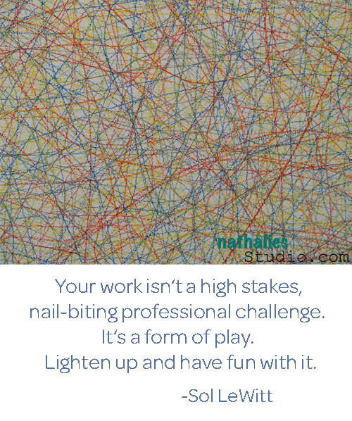
Artist Quote of the Week – Sol LeWitt

QuoteLeWitt

Comments (4)

  • Jenny Petricek

    |

    Great thoughts to keep in mind! When it becomes drudgery, it’s time to hit the “reset” button and get back to the fun!

    Reply

  • BarbaraBGood

    |

    Great quote. When I make anything, whether I am crocheting or card, or even cooking, I will have to remember this quote. Lighten up and have fun.

    Reply

Leave a comment

Designed by n*Studio: NEW Stampendous Stamp Sets

NewStampsetsNatKalbach

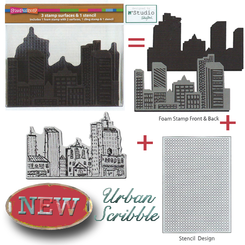
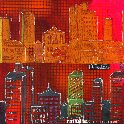
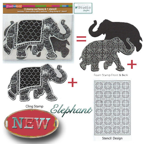
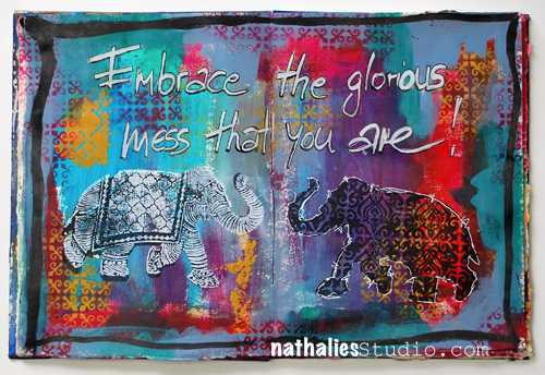
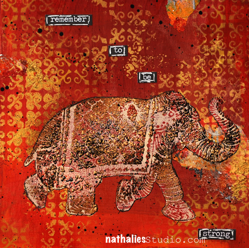
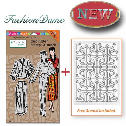
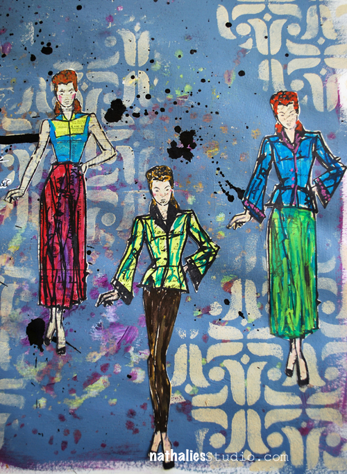
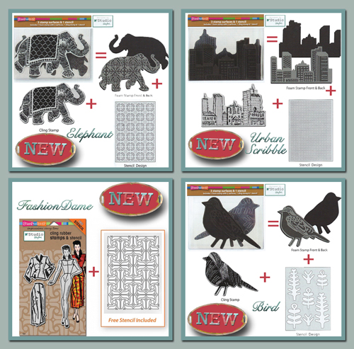
I am so excited that there are four new stamp sets coming out this year designed by me through Stampendous. And I am even more excited that these are something that I have been wanting to do for a couple years now- I am a huge foam stamp fan and I have been including foam stamps in a lot of my classes throughout the years. Over the years I told many people I would love to do my own foam stamp designs and I so hope that you will like those 3 Sets (Elephant, Bird and Urban Scribble) including 1 foam stamp with 2 stamping surfaces,  and the Fashion Dame Set with 1 rubber stamp and 1 Stencil and the one set with layering rubber stamps.

Let me show you in a video how they look like and some of the many ways to use them:)

New n*Studio+Stampendous Stamps from Nathalie Kalbach on Vimeo.

Coming Soon to Mixed Media & Craft Stores and My Website nathaliesstudio.com

There are so many possibilities with those sets!

UrbanScribble


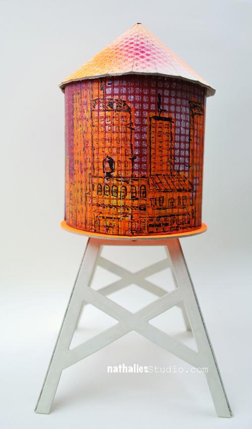
City_WaterTower01

City_WoodenCanvas_Inspire01

Elephant

Elephant_ArtJournalspread01

Elephant_WoodenCanvas_Strong01

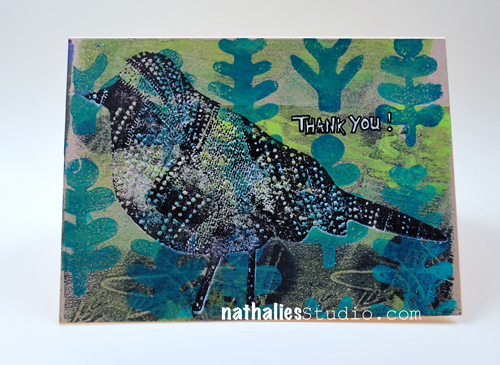
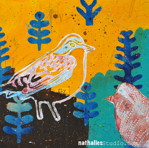
Bird

Bird_ThankYou_Card01

Bird_WoodenCanvas_Fly01

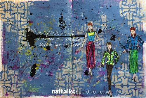
FashionDame

FashionDame_ArtJournal_01

FashionDame_ArtJournal_02

Which one of the new sets do you like best?


Comments (48)

  • Join Stampendous at Creativation

    |

    […] some fun from last year’s CHA MegaShow with Nathalie Kalbach! She’s demonstrating her fantastic Foam and Cling Rubber Stamps Sets. Boy, have we had a […]

    Reply

  • michelleward

    |

    Genius! Love how you have a mix of items in the collection. They are all fabulous – and your samples and your video!

    Reply

  • Jackie Smith

    |

    I love the elephants the best! Love all the stamps!

    Reply

    • nathalie-kalbach

      |

      who can’t resist an elephant, right? ;) thank you Jackie!

      Reply

  • florenceturnour

    |

    So great! Nathalie, since I make my own stuff, I’m not often tempted to buy stamp sets, but I think I’ll make an exception for yours. Fabulous work!

    Reply

  • Sue

    |

    URBAN SCRIBBLES!!! I love this, Nathalie! Thank you for designing it….how did you know????

    Reply

  • Ann-Marie

    |

    Fashion Dame set is fabulous

    Reply

  • SeattleSuze

    |

    Instant fave was the urban scribble, but the longer the video played, the more I shifted from one to another. I can only say that my conclusion is that I love your art and can’t wait to integrate the stencils (ALL of them) into my own work. So exciting to anticipate their release.

    Reply

  • Darcie

    |

    I have to have Urban Scribble (cuz I live in da hood lol) and Fashion Dame. Love them and congratulations on your new line!

    Reply

    • nathalie-kalbach

      |

      LOL- well if you live in da hood the urban scribble is a must ;) Thank you Darcie

      Reply

  • linda-faber

    |

    Wow! I’m not sure I can resist! For me, I love the bird set and the urban scene. For sale when??? Great demos too. So helpful.
    Congrats on a great new product!

    Reply

    • nathalie-kalbach

      |

      Thank you Linda! They are on sale for retailers now and should be shipped soon and in store soon :) I will also have them on my website :)

      Reply

  • jamcam2022

    |

    Love, love, love Urban Scribble!!! They are all fabulous!!

    Reply

  • aissa99

    |

    I like the Urban Scribble and Fashion Dame the best!

    Reply

  • Andrene

    |

    EEK!!!! I love the elephant!! Cant wait to get it and use it with your elephant stencil which is one of my faves! All of the sets are fantastic and will definitely find a home with me! Congrats!!!!

    Reply

    • nathalie-kalbach

      |

      Awe. thank you Andrene- glad you like them and yes- the stamp elephant and the Stencil elephant will be buddies then :)))

      Reply

  • Tracy Evans

    |

    Oooh great release looking forward to getting my hands on that city scale and birds especially. Tracy x

    Reply

  • Joi@RR

    |

    Ahh – loved that video showing the ways you used them. I have never seen a foam stamp like that Nat. Wow. I can tell you what I love… it that the foam stamp can go either way. For instance… I get so frustrated because I have a bird but he only faces the WRONG WAY!!! So that is very exciting. And YOU KNOW… I love the city scape the best…. because your city scape artwork is always my fav!!! They are all four wonderful… truly. I am soooooooooooo excited that you have these. I just used once of your floral stamps on my Matisse flower!!! Thanks bunches for such a great post – loved reading and watching it ALL. Congratulations – sooooo proud for you!!! j.

    Reply

    • nathalie-kalbach

      |

      Thank you so much Joi for your super sweet comment ! Yes- I know- the facing the wrong way…I hope that this will help! BTW- easy solution for facing wrong way …you can always stamp on a geli plate or mono printing plate and then use the plate image- it will be reversed then :)

      Reply

  • Carol K

    |

    like them all. . . that elephant is pretty cool. . . the versatility of your sets is amazing. . . . . love the texture and rubber stamps matching and a bonus stencil . . . . SWEET!

    Reply

    • nathalie-kalbach

      |

      Thank you Carol, yes it is a pretty versatile set …I am still finding ideas on how to use them …will share of course :)

      Reply

  • Cindi Walsh

    |

    These sets look like so much fun! Thanks for the video. It’s so hard to choose just one favorite … but if forced I would probably choose the Urban Scribble, no wait, the bird … ugh! It’s hard to choose. I think it’s the bird.

    Reply

  • Jean Marmo

    |

    Oh my goodness! These are so you! And, with them maybe I could create like you! LOVE them!

    Reply

    • nathalie-kalbach

      |

      Awe – thank you Jean!!! You create your own magic – I know it!!!

      Reply

  • gunvor

    |

    Awesome sets Nat! Exactly what a stamper who dabbles with mixed medab techniques wants! The birds ant the city scribble are at the top of my wishlist, but I love the elephant too.

    Reply

  • maura

    |

    Oh boy, that’s tough! I like them all, but am leaning to the elephant and bird ones…if I have to choose!

    Reply

  • Kelly Belton

    |

    Ummm – I love all of them – but I must get my hands on the elephants and the fashion dame . Seriously Nat – these are awesome. Congrats!

    Reply

  • Marit

    |

    Wow, love them!
    I adore the city scribble, it’s definately on my wish list. :D

    Reply

  • cuchy

    |

    congratulations! On my wish list. You know we have the 3 wise men coming this week :)
    Those urban stamps are fantastic and the foam… many possibilities. Love them all!!

    Loves

    Reply

    • nathalie-kalbach

      |

      thank you so much Cuchy, hope the 3 wise man brought many gifts ;)

      Reply

  • bibliofil

    |

    Hallo Nathalie,

    Well, first of all I have to tell you that “Kaffe Klatch” was my all time favourite stamp set last year. Out of this release, the first one I will buy is the elephant (on a budget otherwise I would buy more!). But! I love the city scape and the bird as well. And I can see so many uses for the fashion doll….Hmm, as one of my new years resolutions is to loose weight, perhaps I can buy stamps instead of sweets? Two flies in one swat? Have a lovely and prosperous 2016!

    Reply

    • nathalie-kalbach

      |

      Eva, I am so glad you liked the Kaffee Klatsch :) Thank you for your sweet words and wishing you a wonderful and lovely 2016 as well!
      Reply

  • Kathy P

    |

    Who hoo, Nat—-congrats on this cool new release! I especially love Urban Scribble and Fashion Dame! And the elephant is my fave animal, soooooo……..
    They are ALL great!

    Reply

  • Nurse Ratchet

    |

    LOVE them all…but am quite partial to the birds and the elephants….loving the stencil with that fab elephant ?

    Reply

Leave a comment

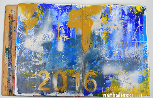
Bada$$ery ….or In My Art Journal Today

Instead of a New Year’s Resolution I, amongst many others, pick a word that I try to live by in the new year. Last year it was light. Well…that didn’t work out too well to be honest. It was as if 2015 was Opposite Year just that I didn’t get the memo ;)

But …I have high hopes for 2016 – It is going to be an awesome year – I know it!

NatKalbachBadaW01

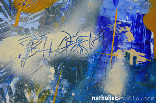
Now my word choice might sound harsh to some , please don’t feel offended by it – that is not the intention behind it. I have no plan on being a rude or mean person, no worries! I just feel like I have to take more action in several parts of my life, instead of waiting for others to come to me, be more firm in some ways and to some people, stop procrastinating and seize the day,  take opportunities without questioning myself too much or what others might think of me and also …just finally feel more at ease with myself. I think I can call it summed up “Badassery” – LOL

NatKalbachBadaW02

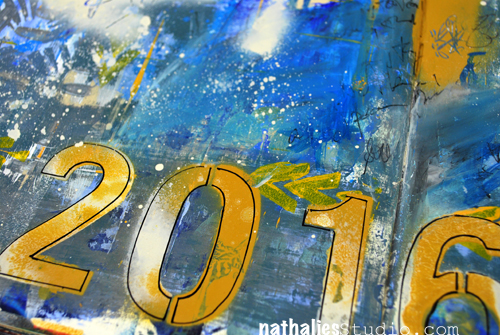
I felt pretty badassery scratching the work into wet spray paint …hahaha- see how “far” this word takes me ;) I also obscured some of my writing around my feelings and thoughts by spray painting and painting over it. I made some marks with stencils, brushes, self made foam stamps, palette knifes and dripping. I think the beautiful decayed houses and graffiti I admired in Buenos Aires last month influenced this page a lot.

NatKalbachBadaW03

Do you have a word for 2016? And did you visualize it in your journal or sketch book? Share with me if you want- I would love to see it!

Here are the supplies I used for this spread

nSupplies


Comments (10)

  • Andrene

    |

    EEK!!!! I love the elephant!! Cant wait to get it and use it with your elephant stencil which is one of my faves! All of the sets are fantastic and will definitely find a home with me!

    Reply

    • Andrene

      |

      Sorry! For some reason this posted under the wrong blog entry!

      Reply

  • Joi@RR

    |

    Heheheh – I love this post… even read it to hubby who also keeps up with you thru me Nat!!! We both were totally laughing and saying YES YES YES…. you got it… sounds GREAT – you go girl!!!!

    Loved your journal page too – it’s soooo fun.

    I don’t have a word. I have never done that before…. and I have thought and thought and thought but I just don’t have one. I have been a giver ALL my life… in fact find it hard to receive. I’m not a gracious receiver at all!!! So… I thought of the word FAVOR… because for once… it would be so fun to see something I did succeed (like to seel a painting – heheeheh) or for some tiny dream of mine related to my art to come true. But then I decided that sounded so selfish!!!!!! And I have no respect for selfish people so I threw Favor out too!!!!!!!!!!!!!!!!!!!!! I KNOW… I’m overthinking!!! Anyway – enough rambling!!!

    WE LOVE YOUR WORD….. j.

    Reply

  • michelleward

    |

    Awesome page Nathalie. And great word for you. Taken with the spirit intended. I don’t do word-for-the-year, but if I did I might swipe yours :)

    Reply

  • Donna B.

    |

    Interesting you chose that word, Nat. For many of the same reasons, I’m going to choose the word “Movement” for me — but not only for the reasons you meant, but also, my word means that I have to get out there and exercise as well. Let’s hope our words work for both of us!!

    Reply

  • Gayle

    |

    I was slow deciphering that word, then looked it up! YEAH! LOVE IT! Here’s was a great definition: “Engaging in seemingly impossible activities and achieving success in a manner that renders all onlookers completely awestruck.” Now that’s a tribe I definitely want to be a part of. All the best in living out your marvelous word.

    Reply

  • Sue Clarke

    |

    Love your word and not sure what mine will be this year.
    Leaning towards SIMPLIFY with a focus on getting rid of many physical belonging that are taking up too much space in my house and getting in the way.

    Reply

  • Denise Spillane

    |

    I love your word and your spread. Very cool. You are badass and always inspire. Happy New Tear my Badass Teacher and friend (FB). You are great.

    Reply

  • Jenny Petricek

    |

    Gritty textures and great color combo! A perfect way to ring in 2016!

    Reply

  • Kelly Belton

    |

    It ‘s a great word Nat – always empowering!

    Reply

Leave a comment

Winding Down the Year: My Top Ten Creative Results 2015

It has become a tradition of mine and other blogger friends to wind down the year with some  Top “insert number”- Lists of work , posts and photos, before the year ends. It makes me go back and look at what I have done and accomplished and it also makes me dwell in memories. Too often we forget about the things we did and accomplished throughout the year- often just bashing ourselves for not fulfilling all the wonderful new year’s resolutions from last year.  Maybe this makes you wanna do it too – if so – share :)

In no particular order here my personal faves of my art journal pages and paintings:

1. High Line – Mixed Media Painting

I fell in Love with the background a soon as I had it laid down, causing quite some struggle to let go and go ahead- but that is why I like it the more :) Not my usual color scheme, but one that I am glad I plaid with.

2. Good Bye – Art Journal Spread

I love the grungy yet romantic feeling of this page and I had a good time getting some journaling out in an obscured way.

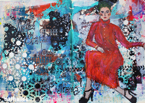
3. Stay Out of The Drama – Art Journal Spread

I loved playing with different media and my Stampendous Stamps and Stencils and the drama of the red dress…the only drama which you might wanna get into ;)

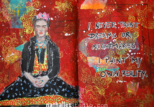
4. Reality – Art Journaling Spread

Speaking of Red …This one is also one of my favorites, I did a lot of collaging in the background and I just love how this one came together.

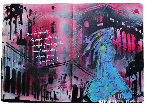
5. The Real Weird Magical Person – Art Journaling Spread

I made my own building stencil and layered it and did positive and negative imagery with it – I love the bold black and the almost translucent magical person ;)

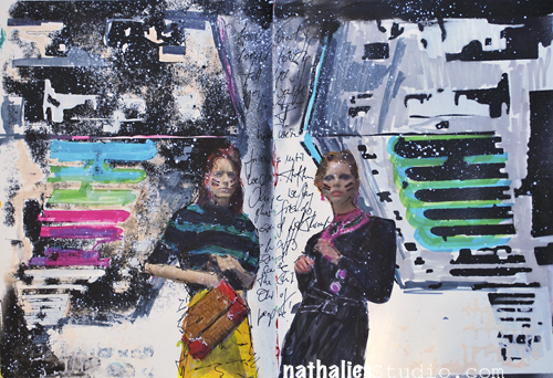
6. Girlfriends – Art Journal Spread

This is another page that I really like- I like the journaling in the middle of the spine – and the difference yet similarity of the pages. Also some white space…which I know, is unusual for me.

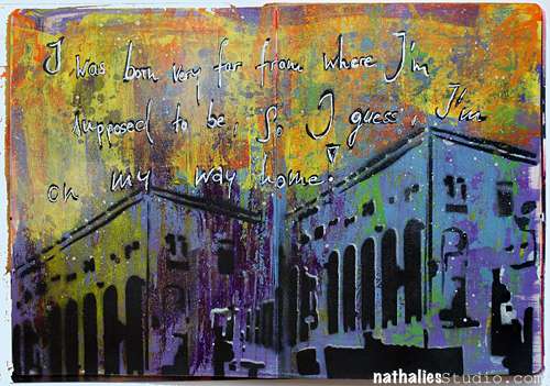
7. On My Way Home – Art Journal Spread

HA- I guess I really liked my building stencil…which btw is based on the Jersey City Powerhouse. I do love the background and how the building really is prominent in here.

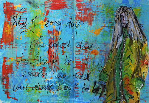
8. Finally Be You – Art Journal Spread

It is kinda scary but kinda cool – and I love the texture and layers.

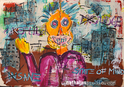
9. State of Mind – Art Journal Spread

hahaha- I know I am a weirdo, but this one just makes me laugh every time I see it. I guess…the title is fitting ;)

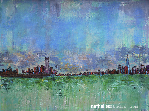
10. 2 Tallest – Mixed Media Painting

This is a bigger painting, so it doesn’t translate well as a photo on a blog. I like the colors and I achieved what I had in mind when I was going for only a small city skyline. I had a good time creating it.

What I learned:

I definitely took more of the things that I explored in my art journal onto a canvas. I also did more hidden or obscured journaling which I find a great exercise in the morning to start the day and also do something creative. I also learned that starting off with playing in the art journal before continuing painting on canvas, freed me up and made me ready to start. A good habit to keep.

My goal for 2016:

My goal for 2015 was working in general on way bigger surfaces- but that didn’t work out too well. I really want to make an effort to do that in 2016 …a bit hard in a small studio space, but I will figure it out. I also just want to paint more …when I looked at my work in 2015 I realized that I did pay less when I actually thought I had, not a big surprise given that I was traveling madly for workshops this year and an art journal is bit more handy to lug around ;) Cross fingers 2016 will be the year of bigger paintings

Hope you had fun joining me in winding down the year. If you did it too- share with me- I would love to see your best of list!

I hope I see you at Creative Jumpstart– starting tomorrow and wish you all a

HAPPY NEW YEAR 2016!!!!!

love&hug

Comments (3)

  • chesley

    |

    Nathalie…do I see Stencil Girl in your future? As you designing stencils…buildings, in particular? I would love to have asset of these….very awesome work!

    Reply

  • Jenny Petricek

    |

    Beautiful, gorgeous pages–each and every one is so inspiring! I think it’s amazing to look at the pages of art journals, and to see the ways in which artists try new techniques, color palettes, and styles. Thanks for posting all of them!

    Reply

  • Joi@RR

    |

    HAPPY NEW YEAR Nat.

    Oh how I loved seeing all of these. Each one is special in a different way. My very favorite is the first one – the high line. You are so right – that background is spectacular. And the buildings – they just put me in a state of awe… I love everything about those buildings. But you know how much I love your buildings.. Your building stencil is sooo great – I so enjoy when you use it. And the large painting is stunning – WOW.

    So after we leave the buildings…. it gets harder but… I believe my next favorite – you won’t believe it…. is “state of mind”. It reminds me of me!!! I used to be so concerned about being “right” and “proper” when in reality – I never was… I am just so “weird”! BUT, I finally realized – that’s ok. It’s me and I can’t change it!! So – this journal creation really speaks to me. And… that’s one thing I love about you Nat – you are just YOU – and I like YOU too!!!

    And then….next fav – “stay out of the drama”. Sheer perfection there – the background – the gal – the sentiment – it’s just says it all in such a fabulous way.

    Each one of these is just wonderful in it’s own way… such a GREAT way to start my New Year – seeing your FANTASTIC creations. Thanks bunches. Wishing you a BLESSED, HAPPY, PROSPEROUS and BRIGHT 2016 with LUSCIOUS SURPRISES along the way!! Hugs. j.

    Reply

Leave a comment

Winding Down The Year: Best Nine of Instagram 2015

IMG_9903

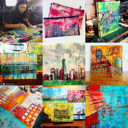
According to #bestnine2015 these are my most liked photos of 2015 on instagram. I loved seeing this.

Top Row – left to right: 1. Julie while we prepare our Australia Workshop, 2. Bags I had printed with one of my paintings, 3. My self bound new Art Journal

Middle Row – left to right: 4. Painting of the Stanley Theatre in Jersey City, 5. The 2 Tallest Painting in Progress, 6. Water tower Painting and Water towers – kinda geeking out here ;)

Bottom Row – left to right: 7. Art Journal Spread in Progress, 8. Shipping some of my paintings to a show, 9. Playing with a baster in my art journal

If you want to do this too on your instagram account just go here to http://2015bestnine.com/ – be patient -it takes a long time until it loads- and don’t go to the other stuff they pop up- that was a little bit annoying- but in the end – it is fun to see the collage :)

Have a wonderful day


Comments (2)

  • Joi@RR

    |

    Wow – this is so neat – and true to you… colorful!!! Love the theater and your WIP of two talls is FAB. But my fav is still the water tower – I have loved that one from day one. It just has such character and such incredible colors. Those mini water towers are perfect to go with it too! This was a great treat.. Thanks bunches for a WONDERFUL 2015 from N*Studio and YOU dear Nat…. looking forward to another “HAPPY NEW YEAR” with you and your art work!!!! Hugs. j.

    Reply

  • Seth

    |

    Great to see these 9 pics Nat. And thanks for the link. I found my best nine. And, as you said, had to deal with a zillion pop-ups. But worth it in the end.

    Reply

Leave a comment

Sign up NOW! Six more days until Creative JumpStart 2016 starts!

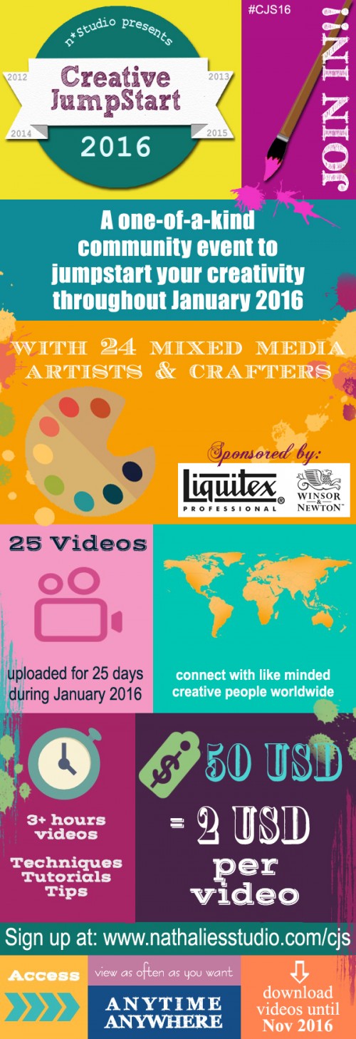
Have you signed up for Creative JumpStart 2016 yet? Get your creative groove and mojo back with 24 artists and 25 inspiring downloadable videos – Art in Translation – during the month of January! Check out who is part of CJS2016 this year:

And the best thing? Right now it is on SALE: You get 25 videos for just $45 (USD) for a limited time if you sign up before December 31, 2015 at 11:59 pm (EST)! After December 31st, 2015 it will be 50 USD. Sign up here!

CJS2016InfoGraphic

Don’t forget: On Sale now for 45USD!!!

It is going to be a lot of fun and super inspiring! It will give you a huge kick with inspirational ideas, tutorials and insights into other artists’ work! Make 2016 your art year!!!

We are looking forward seeing you January 1st, 2016!

Comments (2)

  • Maude Leake

    |

    I signed up when you first offered this thru Julie’s site. I got charged, but did not get anything else saying I was set. I may of put wrong e-mail address on the paypal. My credit card was charged.

    Can you help???

    Reply

    • nathalie-kalbach

      |

      Maude, I actually emailed you three times, and the email bounced, so I think you did indeed provide a faulty address. I am going to email you right now again to the email I see here and hope you receive it. If you see this comment and have still not received anything, can you check your spam folder, and if not there- can you contact me directly? Thank you! I got you and we get you in :)

      Reply

Leave a comment