nathalie-kalbach

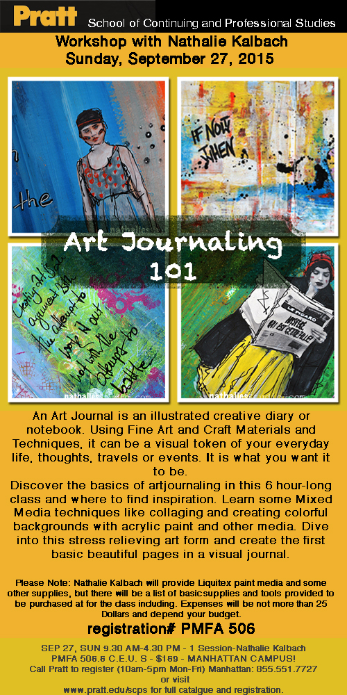
Sign up for my Art Journaling 101 Class in NYC this weekend!

Just a reminder that I am teaching an Art Journaling 101 Class in NYC at Pratt Institute at the Manhattan Campus this coming sunday. Anyone can join – just call 855.551.7727 and register for PMFA506! You more or less only have to bring a book or watercolor paper and some brushes – all else will be provided!

ArtJournaling

I would love to see you there if you are in the area!!!

Leave a comment

I am in Love … or In My Art Journal Today

NatKalbach_InLove01

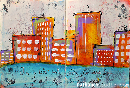
I’m in Love with cities I’ve never been to and people I’ve never met.

It is true. I love to travel and I love to meet new people …but I also love to go back to places and to see people I know again.

NatKalbach_InLove02

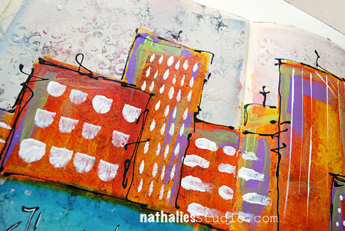
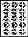
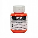
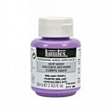
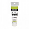
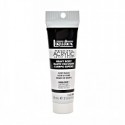
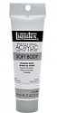
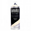
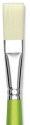
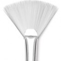
I love the texture of this spread. I had painted the background with red and yellow acrylic paint and stenciled with my Ornament Wallpaper Stencil and some Spray Paint. The spray paint left a nice dimension on the background. So I lightly covered the whole spread with Liquitex Titanium Spray Paint – leaving the painted area peak through a bit but also create a nice textured area of the stencil. It gave it a bit of a grungy shabby chic look….if I want to label this look – LOL . Then I took some Liquitex Acrylic Inks and started painting the city skyline as well as the water- choosing contrasting colors to make it more pop. I mixed the Yellow Azo and Naphthol Crimson for a nice orange right on the spread, as the spray painted area was less absorbent than paper and left me longer time to work on it. I added some green and purple accents in the houses with Soft Body Paints. For the Windows and marks in the houses I used my Filbert brush and Fan Brush in different ways- it was fun to limit myself to the brush as a tool in creating those elements.

NatKalbach_InLove03

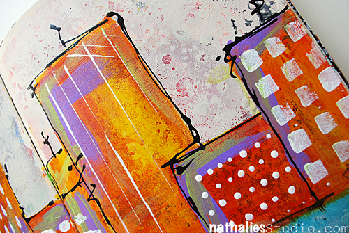
I used a Fine Line Applicator filled with Black Acrylic Ink and Black Soft Body Paint and added the scribbly lines around the houses. The quote was written with a black marker and then overwritten with a white Signo pen.

Do you like to travel?

Here is a list of all supplies I used:

nSupplies


Have a wonderful day

Comments (7)

  • Joi@RR

    |

    I only like to travel – WITH YOU!!! I seldom leave the ranch but I soooo love your posts when you travel Nat. Oh well heck – I love all your posts but I do enjoy seeing all your photos of the sights and the things that you do. AND… you know – I always love your skyline projects. This one is no exception. LOVE LOVE the bright colors and the wonderful backgrounds. Great way to start my week – seeing your SUPER FINE post. Hugs. j.

    Reply

    • nathalie-kalbach

      |

      Joi – I see- I want to see pictures of a real ranch in the States- share some pictures with me :) Have a gorgeous day and hugs to you too, Nat!

      Reply

  • cat2468

    |

    Hey Nat!!
    I am a country girl who grew up on a farm. So it never ceases to amaze me how drawn I am to cityscapes……especially yours!! And the large piece you did before you moved here (sorry, my memory sucks these days!!) it was a waterfront/city painting for a contest?) despite my embarrassment I shall forge on to tell you how much that piece blew me away!! Maybe that’s where my memory went!!! Love your work and teaching style!! Hope to catch more on-line classes!l. Having trouble getting this comment to post!!! I’ll try later!!!
    Cat

    Reply

    • nathalie-kalbach

      |

      hi Cat, thank you so much for your wonderful words. I did a couple paintings before I moved to the States- maybe you find the particular one here in the gallery: http://nathaliesstudio.com/ngallery/ I hope I see you in class :) Have a wonderful day!!!

      Reply

  • cat2468

    |

    Hey Nat!!
    I am a country girl who grew up on a farm. So it never ceases to amaze me how drawn I am to cityscapes……especially yours!! And the large piece you did before you moved here (sorry, my memory sucks these days!!) it was a waterfront/city painting for a contest?) despite my embarrassment I shall forge on to tell you how much that piece blew me away!! Maybe that’s where my memory went!!! Love your work and teaching style!! Hope to catch more on-line classes!
    Cat

    Reply

  • Sue Clarke

    |

    I love to travel and wish that I could do more of it.
    It’s so fun to meet new folks and see that we are really after the same things in life.
    Plus the different designs and colors in different areas are inspiring.
    Nice colors in this art journal page Nat.

    Reply

    • nathalie-kalbach

      |

      Thank you Sue! I love that we can find so many things in common with many other people we have yet to meet :)

      Reply

Leave a comment

Inspired by Jean-Michel Basquait

InspiredbyBasquiat

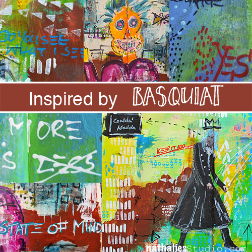
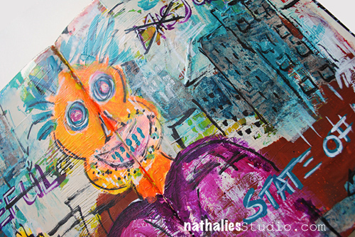
You might have read about my Art Stroll to the Basquiat: Unknown Notebooks Exhibition at the Brooklyn Museum. It was a very inspiring Art Stroll and so I started to try to implement some of Basquiat’s elements into my art journaling since I saw this substrate as the best fit for it.

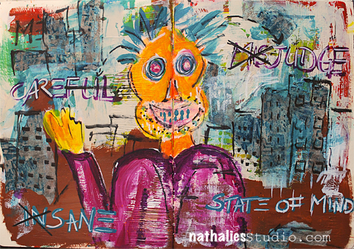
– State of Mind –

Kalbach_StateOfMind01

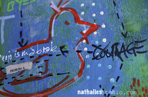
Prominent in his work is the use of figures or heads …something I usually not do and though this really turned out weird and hilarious- it made me laugh in a good way and I like it a LOT. And hey, anything that puts a smile later on your face was well worth doing it – so this wasn’t wasted time.

Kalbach_StateOfMind02

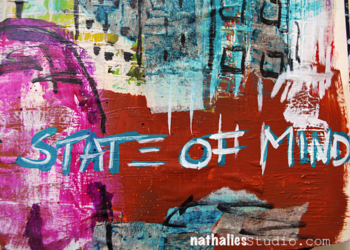
I also used Basquiat’s way of layering paint on top of drawn or written areas, highlighting or hiding elements.

Kalbach_StateOfMind03

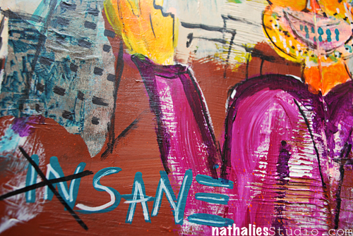
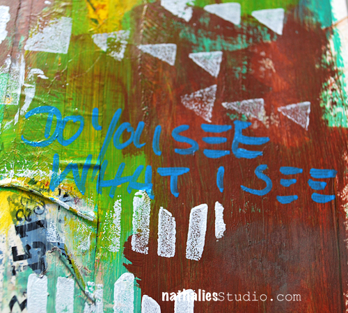
I was super intrigued by Basquiat’s way of writing the letter E with just three horizontal lines – I shamelessly copied that and love it a lot :)

Kalbach_StateOfMind04

– Full Circle –

Kalbach_FullCircle01

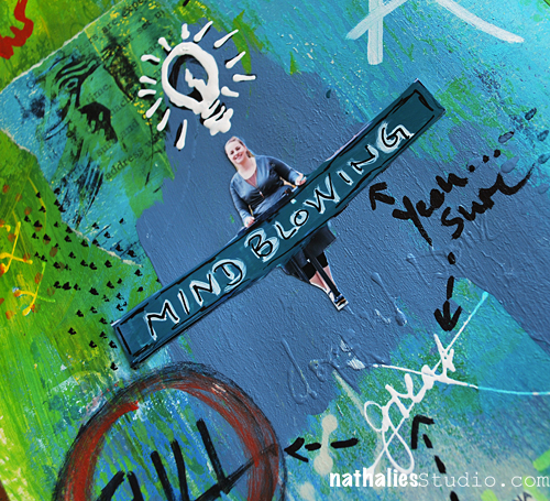
Then one day I was really really unmotivated and as we say in German “bocklos” which doesn’t translate well – but kind of means” not being in the mood for anything”.  I thought of Basquiat’s way of jotting down overheard conversations and/or thoughts and I used snippets of my thoughts while working on the spread. It was actually quite fun and freeing.


Kalbach_FullCircle03

While this is not a spread that I find particularly beautiful – LOL -I can read this as a diary entry and it got me over my uninspired mood. I might do this more often and will gave this particular way of art journaling the name  “Visual Brain Farts” . No worries- I won’t share all my visual brain farts with you ;)

Kalbach_FullCircle04

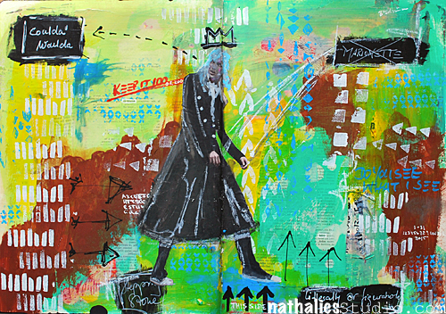
– Coulda Woulda –

Kalbach_couldawoulda01

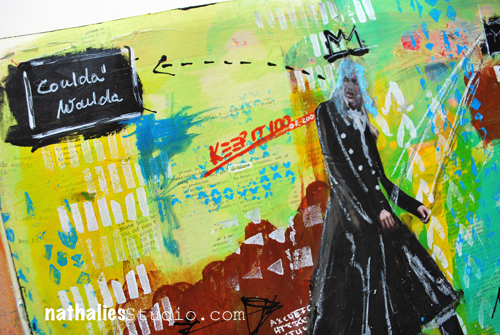
Ok …maybe I lied about not showing more visual brain farts ;) But I actually combined the thought-jotting with my usual art journaling style. And I like the outcome a lot.

Kalbach_couldawoulda02

I also incorporated more collage elements as I saw with Basquiat’s work.

Kalbach_couldawoulda03

And repeated patterns and marks. And I might have “stolen” his signature crown.

Kalbach_couldawoulda04

I enjoyed this process – I was inspired by Jean-Michel Basquiat’s work and translated what inspired me into my own art work and I am keen on taking it further. I love how this rejuiced my Mojo!

Which artist do you think fits your style and could you take as an inspiration to get a new kickstart?

Comments (5)

  • padkins

    |

    I think this is one of my new favorites. I am loving the symbology and mark making. Thanks.

    Reply

  • florenceturnour

    |

    I like scary orange face guy. He looks maniacally happy.

    Reply

  • gloz

    |

    Okay, I looked and was a little scared! His work seems angry to me. I like the written areas, but not sure how I am going to handle the scary faces! But I will give it a try. I like many of the mixed media with warm and cool colors and text partially hidden multiple layers peaking through and I usually like things with a theme. I also like Western landscape paintings by current artists Lorenzo Chavez and Frank Serrano.

    Reply

  • Terisa

    |

    Impressionism – Van Gogh, Manet, Monet, Cezanne
    Natural settings, brilliant colors, purposeful brush strokes

    Reply

Leave a comment

Wanderlust 2016 – NEW Online Workshop

unnamed

Super Excited :) In 2016 I am one of the teachers of a new Online Workshop Wanderlust 2016!

Wanderlust is a whole year long journey – an online event offering you videos from 24 guest teachers and 2 resident teachers one every week (each one downloadable and with PDF instructions provided), 50 amazing videos, which will run for over 50 hours in total, access to a forum with an amazing and friendly community, inspirations, challenges, discussions, galleries, workshops, giveaways and generous discounts from our partners. The perfect alternative to in-person classes!

Follow the teacher’s reveals every day on Everything Arts Social Media.

Every day somebody new!

As far revealed are: Kate Crane, Teresa McFayden, Rachel Greig, Beckah Krahula, Joanne Sharpe, Flora Bowley, Mystele, Andy Skinner, Finnabair, Birgit Koopsen, Lindsay Weirich, Magda Polakow, Carolyn Dube, Stephanie Schutze, Maryia Potapovich, Jennifer Lee and Leslie Wood and myself

unnamed

If you’d like to join us on this year long art journey click here for details!

w16_af_6_200x400-2

Cannot wait and I am looking forward sharing my tutorial with you and being part of this wonderful artful journey :) Hope you will join me!

Comments (3)

  • Kasia

    |

    It’s an honour to have you on the team! Thank you Nathalie for going on this journey with us :)

    Reply

  • Stampendous Stamps

    |

    Wow, Nathalie!! Sooo exciting! This will be a wonderful journey!

    Reply

Leave a comment

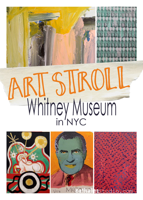
Art Stroll: The Whitney Museum, NYC

ArtStroll

Finally, months after the Whitney Museum reopened, my friend Karen and I went to see the permanent collection and kind of breezed through the whole building to get an overview. The good thing is when you live so close you can do that as you can come back again :)
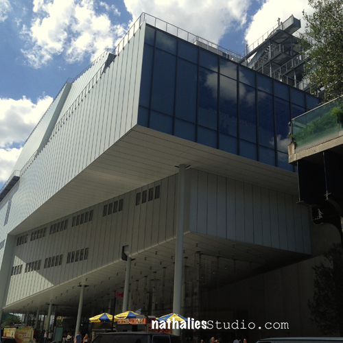
Whitney_NK01

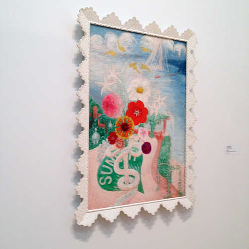
One of the things that I noticed right away was the framing of the artwork at Whitney.
Whitney_NK02

(Florine Stettheimer, Sun, 1931)

I have taken several classes with Corey d’Augustine at MoMA and as an art conservator one of the things that are very dear to Corey’s heart is the topic of the frames of artworks. He made me aware of the fact that museums in the past often times have just discarded or destroyed the frames that artist had made or picked. The reason was that museums wanted to fit the frames to the museum’s aesthetics or whatever was hip at the time of the exhibition. The frame above on the painting by Florine Stettheimer was designed by herself and she had it specially fabricated.
Whitney_NK04

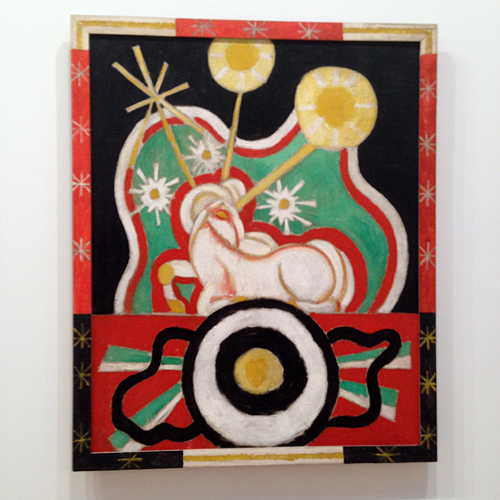
(Marsden Hartley, Forms Abstracted, 1913 – Frame painted by artist)

With lot’s of passion Corey would elaborate in his classes, why he thinks this was and is such a sin and while I kind of understood what he meant, I fully became appreciative of the frame “problem” when I went to the Whitney museum. It just dawned on me when I was looking at the first couple paintings in the collection.  I was totally AWARE that the frames were not overpowering the artwork, they were part of the artwork or made the artwork WHOLE. And there I tipped my imaginative hat to Corey thinking “thanks man, – I got it!”
Whitney_NK17

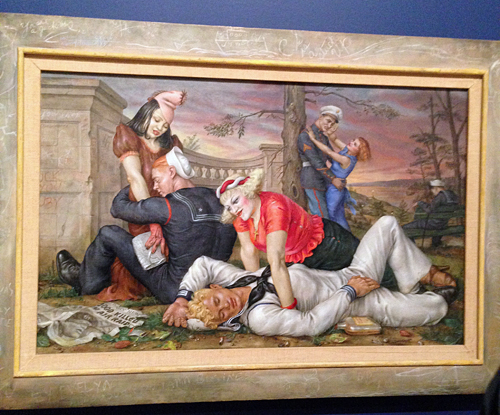
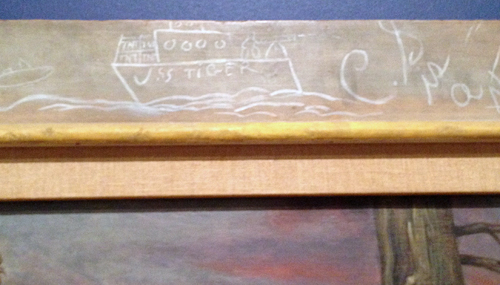
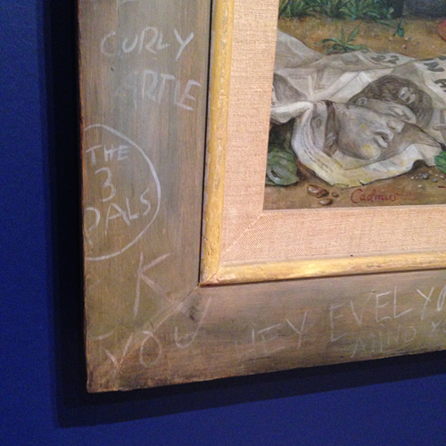
Paul Cadmus created the frame for his painting Sailors and Floosies (1938) and continued the graffiti depicted in the painting onto the frame. What a shame it would be if that frame would have gotten destroyed!
Whitney_NK18

Whitney_NK19

Apparently the Whitney Museum wasn’t happy with the wrong frames that some paintings lived in and they had a framer built 20 new frames for paintings that were ill-fitted in their frames. In the linked article, the framer talks about the detective work on how to find out how the frames have looked like back in the days. What an interesting work and topic.

Of course there was other work that highly inspired my at this visit at the Whitney Museum:
Whitney_NK16

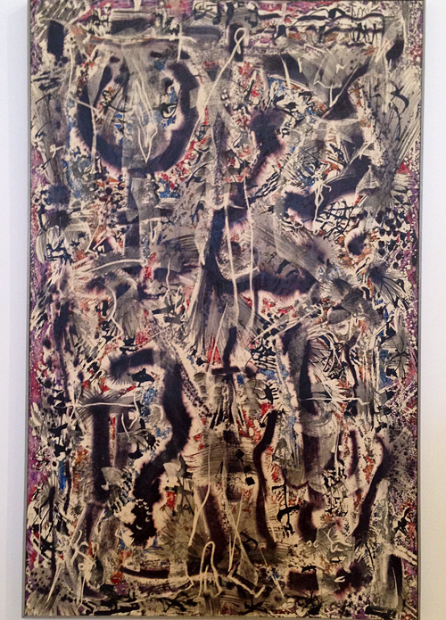
Alfonso Ossorio, Number 14 – 1953 . Ossorio developed a wax resist technique in the late 1940s to create layered abstract paintings. He would first draw using melted wax and then use water-pigments or ink on top which would be resisted by the waxed parts. He then scraped away pats of the hardened wax and repeat the process multiple time. While I have used different resist techniques- I never thought of repeating the process over and over …on my “play-list” now :)
Whitney_NK26

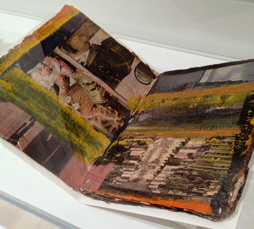
Al Held – Untitled – Oil, ink and printed paper collage on Life magazine . Can you tell why this intrigued me? I almost ran to the case and I might have elbowed my way through as it looked so much like an art journal to me. Love this!
Whitney_NK30

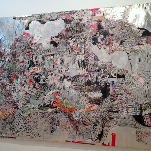
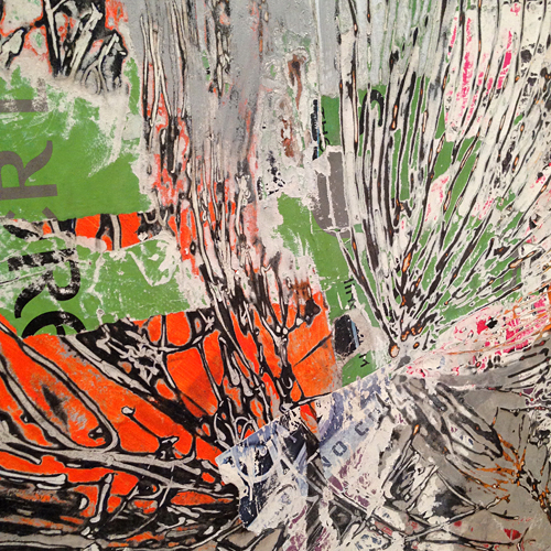
This is an gigantic piece by Mark Bradford – Bread and Circuses, 2007- Found paper, metal foil, acrylic, and string on canvas. It looks like a map – amazing. Bradford builds up a composition with layers of paper—often fragments of posters or ephemera salvaged from the street—that he soaks in water and combines with string, tape, and scraps of copy and magazine paper. He then sands down the collaged strata, and repeats the process in several layers.
Whitney_NK31

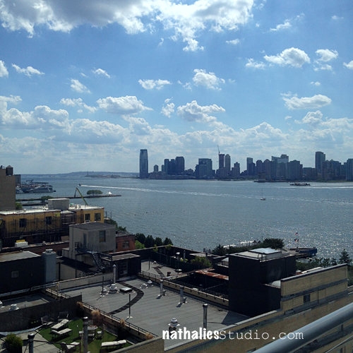
Of course there was way more inspiring art work – but this is for a different visit – there is only so much input you can handle when you visit a museum. I leave you with some wonderful views that are revealed when stepping onto each of the floors’ balconies of the Whitney Museum:
Whitney_NK08

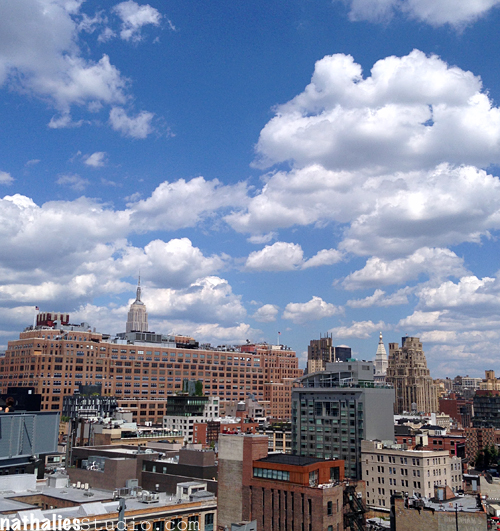
Waving over to Jersey City!

Whitney_NK09

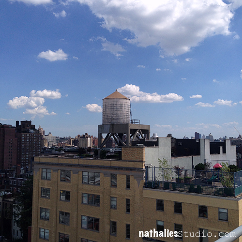
Watertower and roof gardens – <3

Whitney_NK13

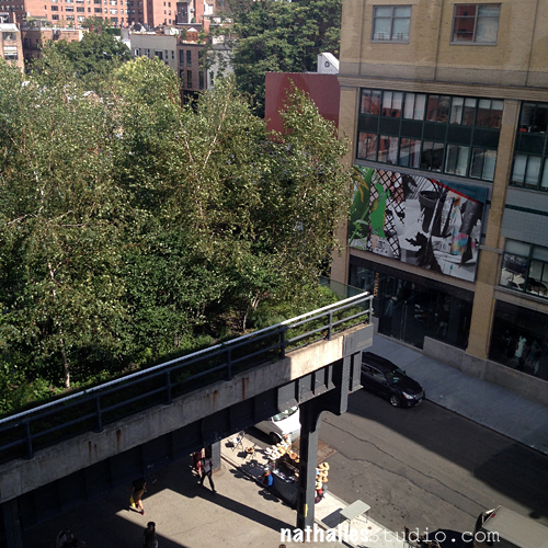
Around the Highline.

Whitney_NK32

That was a fine visit – totally enjoyed the time there with Karen and cannot wait to come back many more times.

What do you think about the frames? Does this make you see frames in a new light?

Hope you enjoyed this art stroll too!

Comments (6)

  • Sue Clarke

    |

    I see what you’re saying about the frames and it is especially evident on Sailors and Floosies! I must say that I’ve often thought that the ornate gold frames take away from the paintings that I’ve seen in political offices.

    Reply

    • nathalie-kalbach

      |

      I know- those super crazy ornate gold frames that have nothing to do with the painting itself either

      Reply

  • Cindy L

    |

    Thanks so much for sharing this Nathalie! I am definitely going to put The Whitney on my ‘To Do’ list the next time I’m in NYC. I had no idea about the history behind the frames but I find it fascinating and will always look at them in a different way in the future. As always, love the photos you share of the beautiful views too!
    Reply

  • Maura

    |

    Totally get the frame thing through your observations. Thanks for sharing.

    Reply

Leave a comment

Art Tapas – Bite Sized Tips for the Mixed Media Artist – Tip #3 Brush Care

Art Tapas are short videos (1- 3 mins) that will give some practical tips or advice about anything that is related to tools, art supplies or processes and any Mixed Media or Hobby Artist might appreciate. Lots of times these reflect some mistakes that I made along my journey, so to speak, things that I learned the hard way and sometimes they are just some things that I would have loved to have known when I actually started in Mixed Media.

Brush Care Tip No. 1

Art Tapas – Bite Sized Tips for the Mixed Media Artist – #3 Brush from Nathalie Kalbach on Vimeo.

I hope you enjoyed this Art Tapa –  and if you have questions that you would love to have answered in some of the Art Tapas videos- let me know and I might just cook one up for you to nibble on :)

Happy Creating !
Comments (9)

  • Sabine Schneider

    |

    Great tip!!!! Love it.
    Und vierundzwanzig Stunden sind echt kurz…. Seufz. Bei mir oft viel länger! Aber Pssst!
    Liebe Grüße, Sabine

    Reply

  • Rebecca Buchanan

    |

    Okay this is such a great tip! It never occurred to me (duh), so thank you Nathalie!!! Also, love your title for this series “Art Tapas”–thanks so much for sharing.

    Reply

    • nathalie-kalbach

      |

      Thank you so much Rebecca- glad you like the title too :)

      Reply

  • Gill K

    |

    This was really helpful. I did not realise the need to keep the join of ferrule & handle dry, so many thanks.

    Reply

  • Laura Weed

    |

    Thanks, Nathalie… your Art Tapas are great advice!!

    Reply

  • annettia

    |

    Short and to the point. I really enjoyed this concept. Thanks for the tip on brushes.

    Reply

Leave a comment

Positive Everything or … In My Art Journal Today

Natkalbach_Positive01

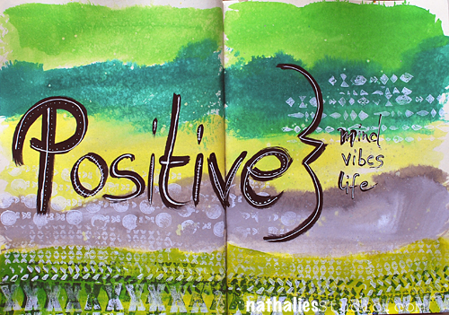
Positive Mind, positive vibes, positive life

Truth!

Natkalbach_Positive02

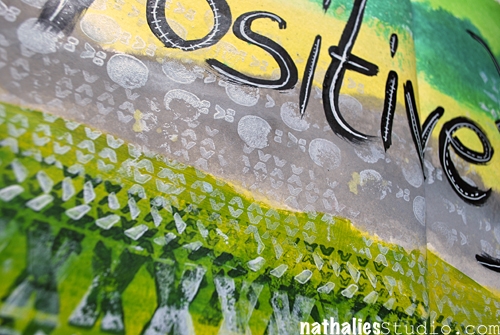
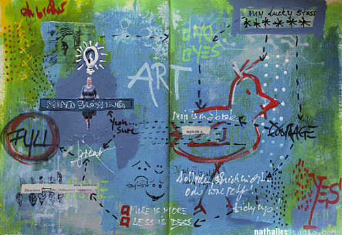
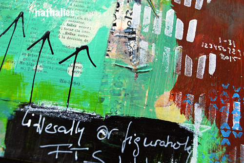
I used Liquitex acrylic inks for the background. In order to make sure that the ink can be blended a bit longer and also does not create big blobs where ever you apply them first, I usually mist the background with some water.

Natkalbach_Positive03

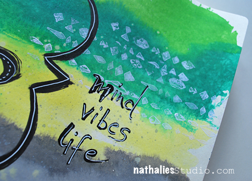
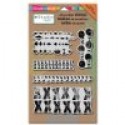
I used my Mark Maker Stampset by Stampendous with soft body paints to create some patterns and tie the different colors together. I love the textured and dimensional look those stamps get when used with acrylic paint.

Here are the supplies:

nSupplies


Do you own any of my stamps? Share what you created with them – I would love to see!!!

Comments (4)

  • susan salyer

    |

    I am loving all the products you all carry. I love journals far more than cards and now I will have to try new products and stamps..I just love this hop!

    Reply

  • Autumn

    |

    Such amazing texture, love the white on this colorful background!

    Reply

  • D.Ann C

    |

    Truth, indeed! Fab colors!! Coming here from FL via Stampendous : )

    Reply

  • Denise Spillane

    |

    Love this page. I am a green/teals gilt and I want to pet it. Hee hee. And of course positive is always good.

    Reply

Leave a comment