
Nat


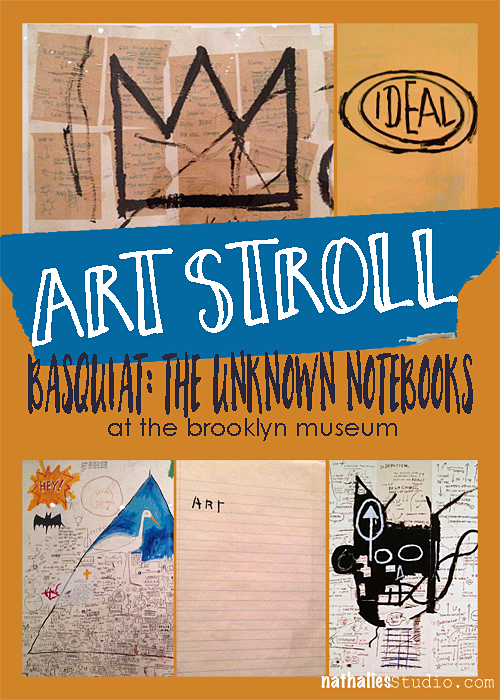
My friend Karen and I went on an art stroll recently and checked out the Jean-Michel Basquiat exhibition at the Brooklyn Museum. Rene Ricard, an American poet, art critic and painter once said: “If Cy Twombly and Jean Debuffet had a baby and gave it up for adoption it would be Jean-Michel. The elegance of Cy Twombly is there …and so is the brut of the young Debuffet”. I can see that – and I am drawn to all three of those artists.
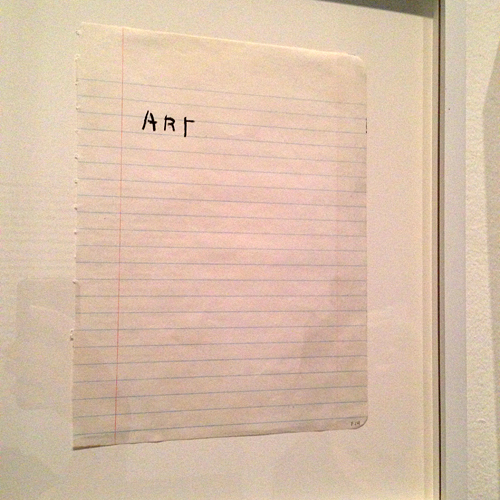
Basqiuat stated once that he uses words like brushstrokes. They are visual key elements of his artwork. He explored strategies such as inverted spelling, crossing out certain words and the repetition of text in his notebooks, which were the highlight of this exhibition at the Brooklyn Museum.
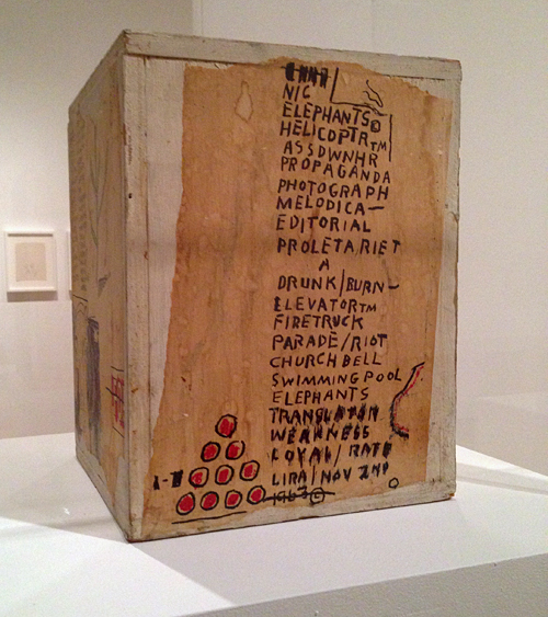
Basquiat used words not only for their descriptive quality – he would also use them for their lyrical qualities.
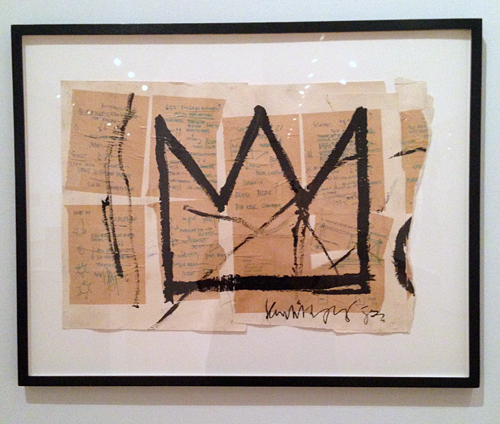
He emphasized repeating words and letters for their sounds and meaning.
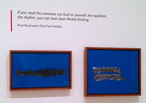
Basquiat produced a huge number of notebooks. Some of the pages only contain one sentence or word and he generally left the opposite side of each page blank.
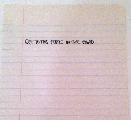
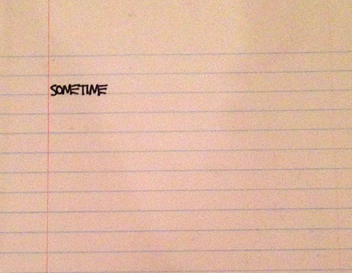
One of the things Basquiat said about his own artwork stuck to me the most: “I cross out words so you will see them more. The fact that they are obscured makes you want to read them.”
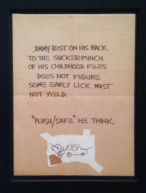
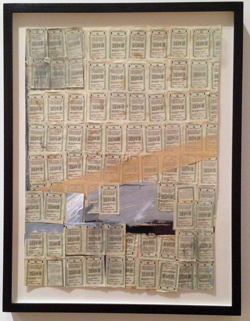
I also loved is use of collage elements and mark making.
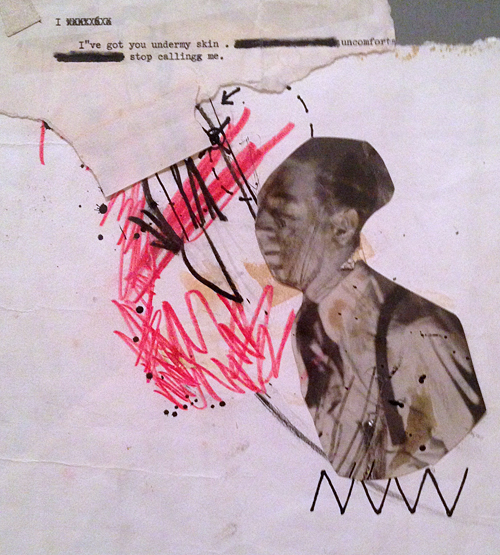
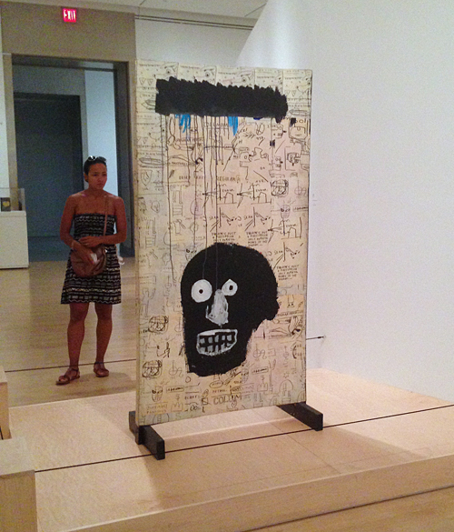
His works are often fragments of overheard conversations or isolated phrases – like the one below. Used in different contexts these conversation pieces or phrases can activate a wide and complex range of possible narratives – how intriguing.
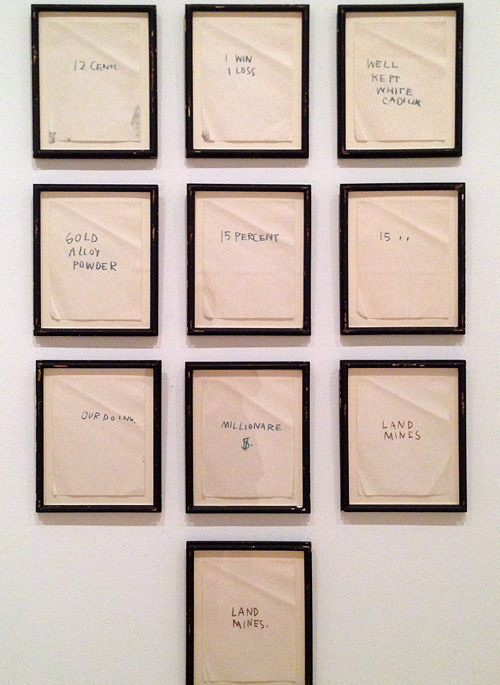
The work shown in the exhibition wasn’t his most colorful work – which I am usually more drawn too but the pages with words and little scribbles and drawings used for the background were so compelling and interesting, I couldn’t stop looking at them.
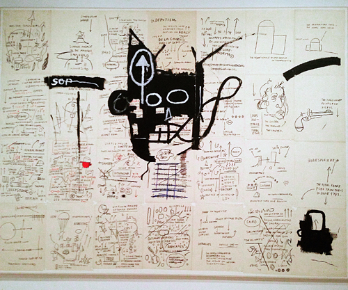
I felt very inspired by this exhibition and will show you soon how I translated some of this inspiration into my own work.
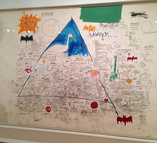
By the way, if you like Jean-Michel Basquiat and haven’t seen the Movie “Radiant Child” yet – I highly recommend it. It is a wonderful homage to Basquiat and also a great document of the 80s New York City art scene.
Do you keep a notebook where you jot down ideas for your art work? For me my notebook is my art journal as this is where ideas are tested out and noted ready to maybe taken out for bigger surfaces later.
Hope you enjoyed this art stroll!

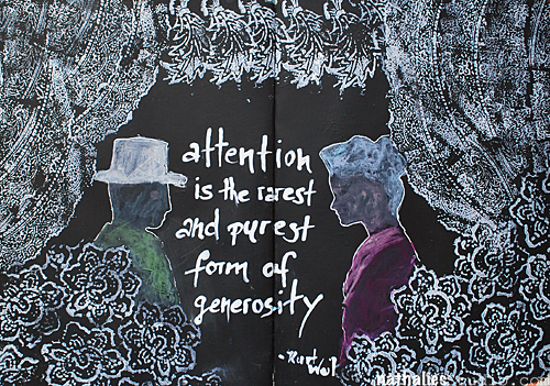
Attention is the rarest and purest form of generosity – Kurt Weil
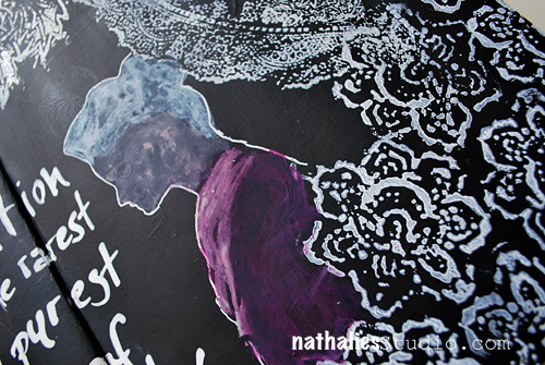
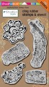
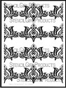
The page spread I used for this, was covered with different colors and and some collage from a class demo and I wasn’t super keen on keeping it, so I covered the page up with black gesso, giving it a nice smooth black coating. Then I pulled out my Stampendous n*Studio Fiesta stamp set and a white Ink pad and created some pattern repeatedly stamping each individual stamp in clusters – kind of forming a drop curtain.
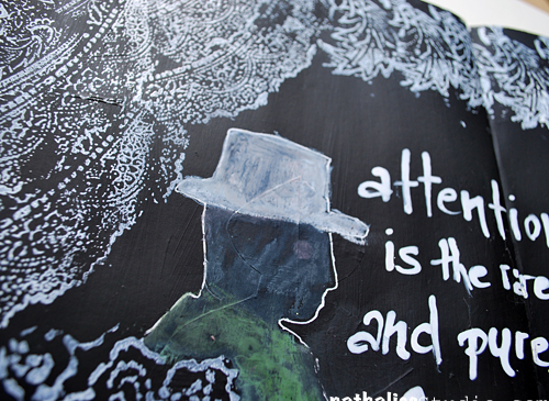
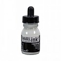
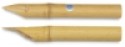
I also used the stencils and mask included in the stamp set and outlined the man and woman silhouette with a white Signo pen, then added some color with Derwent Artbars inside and blended the colors with a waterbrush. I love the effect of the Artbars (water-soluble wax bars) on top of the black gesso. For the quote I simply dipped my bamboo sketching pen into white acrylic Ink and kept writing.
It was fun – and I love how the white pops off the black and I had lot’s of fun using the stamps in this way.
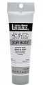
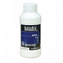
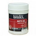
Here is a supply list

Are you doing lot’s black and white themed art journal pages? I feel drawn to it although I am a total color gig ;)

This is a WONDERFUL new take with your FIESTA stamp set Nat. Love how you made them look like curtains around the folks. It looks like they are inside their living room chatting with a planter of flowers under their window!!!! The FIESTA set is my fav so this was a great way to start my morning with it and you! Hugs. j.
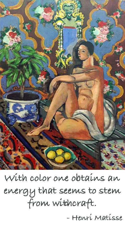

All artists quotes mean more to those are really and truly have great talent like you and can understand the meaning of the quotes.
Sending you this. I enjoy him so much. Amazing talent.
Thanks for sharing
What a beautiful summer this is – perfect to stroll through the hood :)
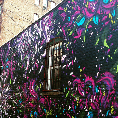
Graffiti by Emilio Florentine – love the energy!
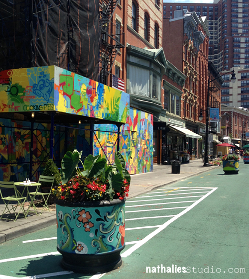
Pedestrian Area down town – someone started painting those ugly planters – YES . so much better and making me really happy!
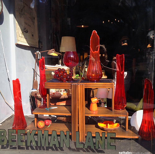
Beautiful window display by one of my favorite stores in Jersey City – Beekman Lane . It’s even prettier from inside with the light coming through the glassware into the store !
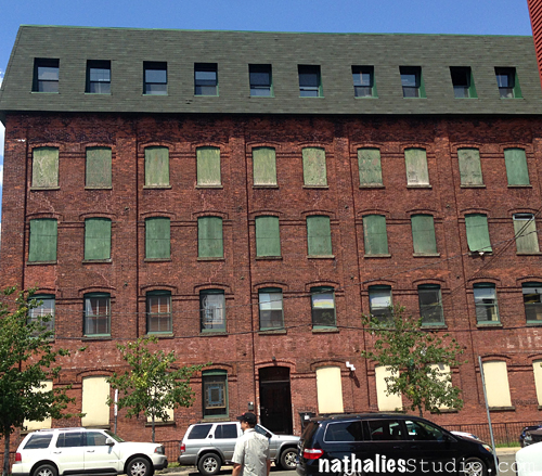
Loved the colors of the boarded windows against the brick – would love to have a studio in this building.
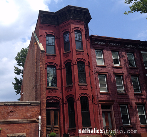
Another awesome brick house – I love the details of the the windows and around the window as well as the alcove.
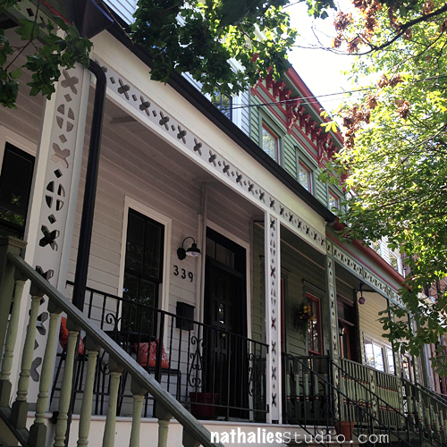
Not sure what this frame around a porch is called in english – but look at the gorgeous cut outs – super inspiring as a pattern for an Art Journal Spread.
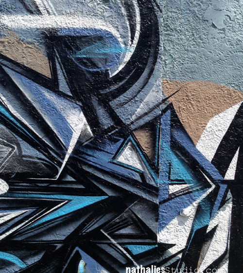
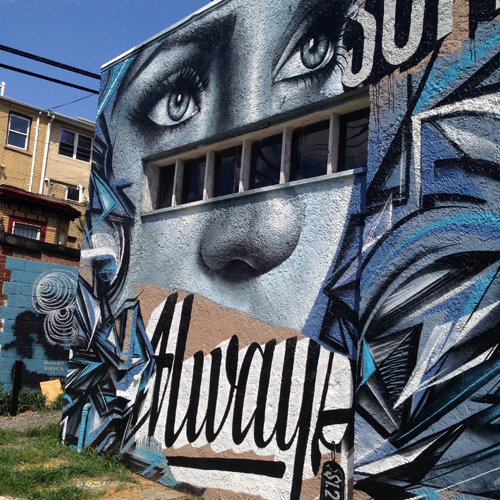
Loving the colors, the lines, the font, the face – everything – about this by Christina Angelina aka @starfightera
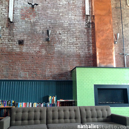
And for the first time while waiting for my trainer in our community room of the building I realized these awesome textures -loving the brick, copper, wood, ceramic and textile mixture and the color scheme is speaking to me for fall.
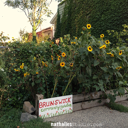
Since I am a sucker for sunflowers, this makes me happy. I love those little community garden oases all over Jersey City.
Hope you enjoyed the stroll through the hood this month – until next time!

I love reading your posts because they are always so upbeat and positive. I am a country girl through and through, but I enjoy your insight into the beauty that can be found in an urban setting. I find street art to be totally amazing, and I love seeing all the buildings you find on your strolls. Thank you for showing us the beauty to be found in our older cities if only one is willing to make the effort to find it.
I especially love that first photo of the black and purple design.
I always enjoy your strolls thru the neighborhood.

Sue, glad you like the strolls! I love that black and purple design too – so striking!

Wow—living here would be such a delight! A feast for the eyes everywhere you look! Thanks for sharing, Nat—Jersey City is now on my bucket list of places to see.
It is fun to live here- and if you are visiting the Big Apple a great place to stay as it is so close by and way cheaper.
Art Tapas are short videos (1- 3 mins) that will give some practical tips or advice about anything that is related to tools, art supplies or processes and any Mixed Media or Hobby Artist might appreciate. Lots of times these reflect some mistakes that I made along my journey, so to speak, things that I learned the hard way and sometimes they are just some things that I would have loved to have known when I actually started in Mixed Media.
Labeling of Acrylic paints
Art Tapas – Bite Sized Tips for the Mixed Media Artist – #2 Labeling from Nathalie Kalbach on Vimeo.
I hope you enjoyed this Art Tapa – and if you have questions that you would love to have answered in some of the Art Tapas videos- let me know and I might just cook one up for you to nibble on :)
Happy Creating !

Great tip Nathalie! Thanks!
Great labeling tip, Nat! And I’m so happy to read that I am not the only messy painter!
Glad you liked it Kathy!

What an excellent idea! And my mess just goes on up my arms when I’m painting. Still trying to figure out how I got paint on the back of my knees last week!
LOL- I hear you on the mess ;) I have probably not one single piece of clothing that does not have a spot of paint on it ..the paint on the back of the knees though, I still have to accomplish ;)
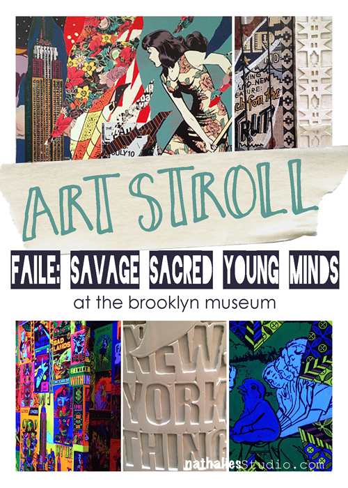
My friend Karen and I went on a daylong Art Stroll hitting the Brooklyn Museum as well as the Whitney Museum last week – It was pretty cool. Our first stop was the “Faile: Savage Sacred Young Minds” Exhibition at the Brooklyn Museum which was an unplanned surprise. The exhibition speaks to Faile’s (Artists Patrick McNeil and Patrick Miller) “interest in youth culture and it’s often coherent contradictions. Young minds insatiably search for meaning but they also rebel against sanctioned systems in order to create their own language that is at once sacred and profane”.
Disclaimer: This post includes photos of limestone boobs and profane language …get over it, it is called ART . If you have a problem with art, you might be better off looking at something else . Don’t email me to complain, don’t visit my blog anymore because I might post things like this again and, farewell!
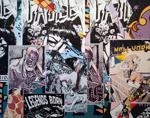
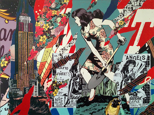
These two big acrylic and silkscreen on canvases were part of a series of six and very enthralling. I love the layering, collage, poster and color effects.
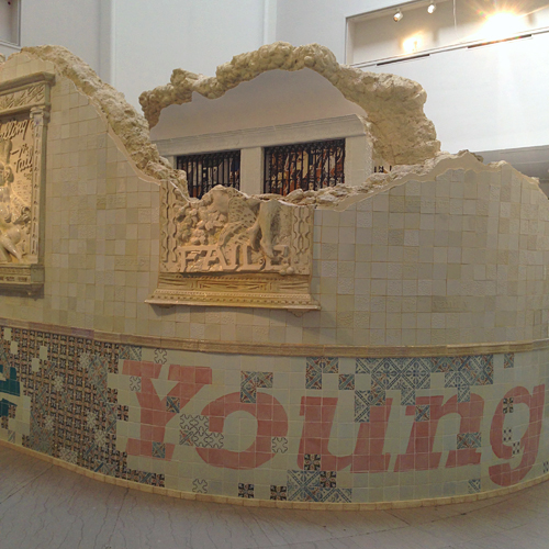
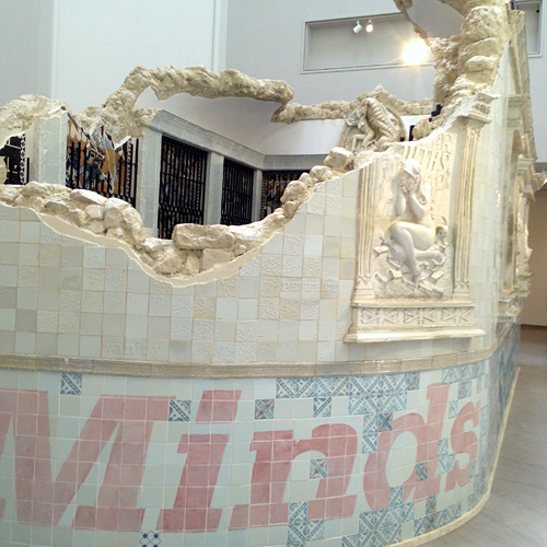
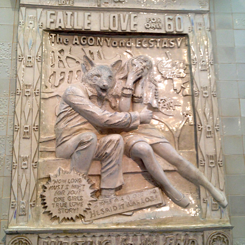
In the middle of the room under the rotunda was a an installation called: temple. Mimicking the ruins of an ancient house of worship which you were invited to enter. The temple was built with ceramic, marble, bronze, cast iron steel and limestone. It really did remind me of some of the temples that I visited last year in Malaysia and Hong Kong.
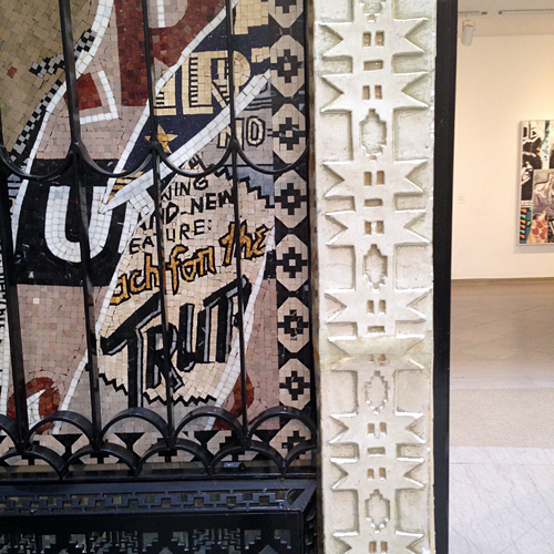
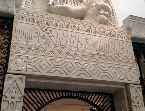
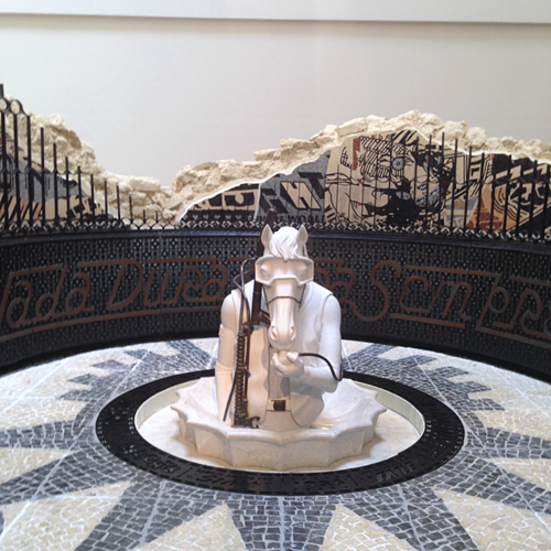
It was an interesting experience to walk around and into the temple, familiar and traditional religious elements were juxtaposed with modern and present mythology. It took often times a double take to realize that something that looks familiar was resembling something else then expected. Inside the temple were spinning prayer wheels like those used by Tibetan Buddhists in daily spiritual practice.
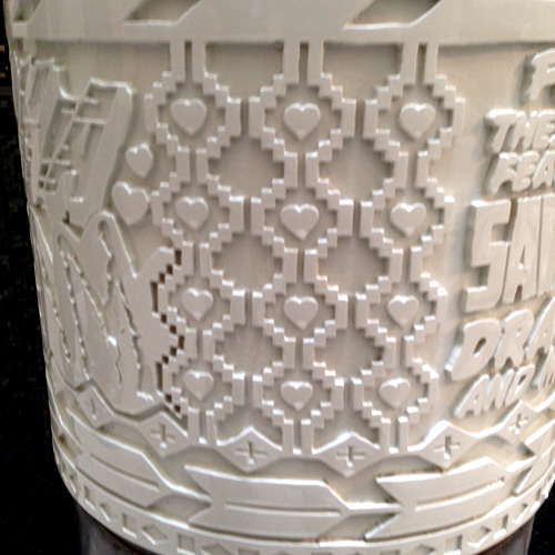
It was fun to touch those prayer wheels and spin them finding different messages and enjoying the tactile dimension of the art.
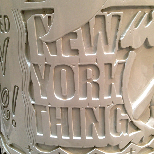
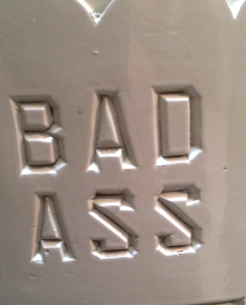
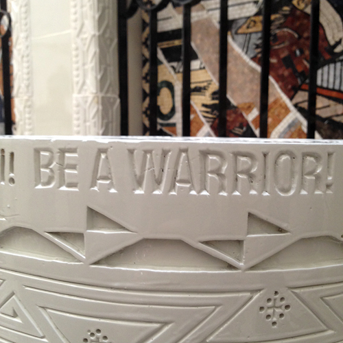
I was very intrigued and amazed by the craftsmanship of this work – it just blew me away.
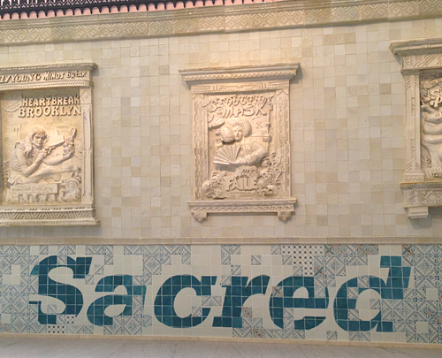
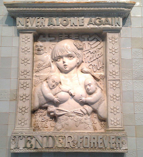
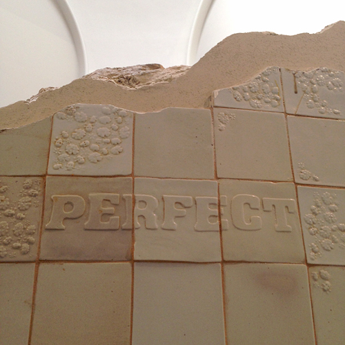
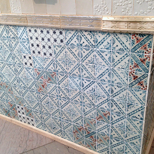
The FAILE & BÄST Deluxx Fluxx Arcade, an interactive environment came next.
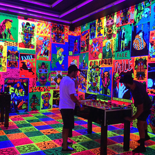
The installation was created in “collaboration with Brooklyn artist Bäst that includes video games, pinball machines, and foosball tables that are simultaneously sculptures and functioning games. The installation is a nostalgic nod to video arcades and punk rock and graffiti culture.”
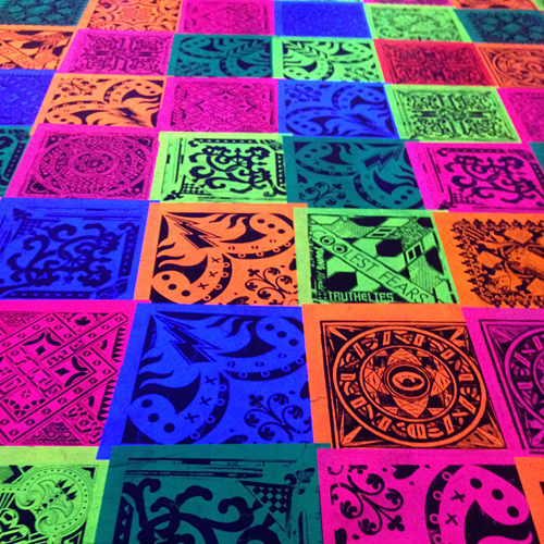
Besides the wall and floor covered neon posters and tiles, you were also surrounded by the Arcade sound. This one had a physical effect on me. While I wasn’t disliking it, I felt sick and confused – everything was competing to get my attention and it just made me want to get out of there.
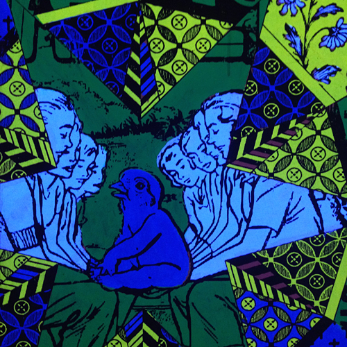
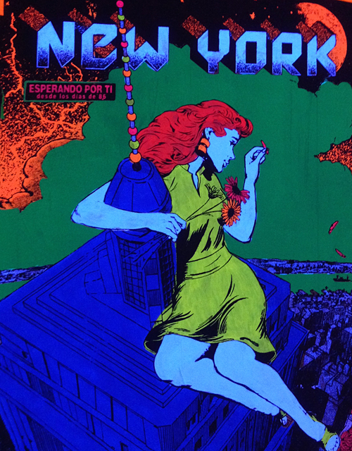
But not before I was able to focus on some smaller details- again – this just amazed me. LOVE.
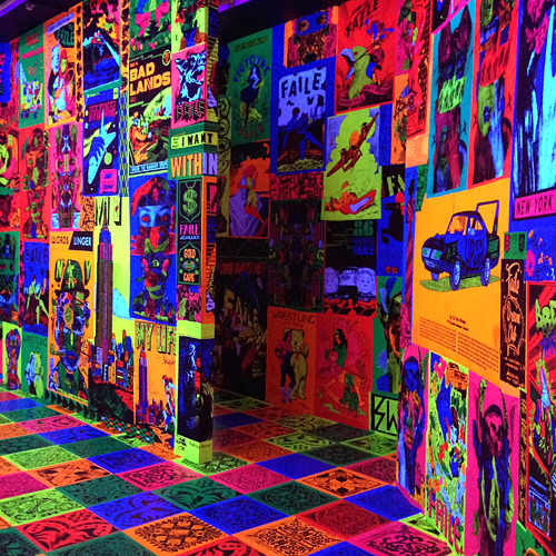
I enjoyed walking this exhibition with Karen, seeing her sometimes similar and sometimes very different reactions and I loved how we would point out different things to each other that otherwise would have gone unnoticed. I was fascinated and overwhelmed by the exhibition. I am definitely inspired by many small elements …but it made me feel like I missed out on seeing the bigger picture. It was the same feeling I often times have in regards to NYC – I love it and sometimes I hate it. You always miss out on something, you are intrigued and sometimes you detest it, it is loud, it wants your attention, it doesn’t care if you care. It can inspire but it can also overwhelm you. It gives a fly if you enjoy it – you take what you can, if you want. Maybe that is exactly what this exhibition was about.
What do you think?
Hope you enjoyed the Art Stroll – more from this day to come soon :)

This was an exceptional sneak peak into a fascinating art exhibit. How wonderful for you to experience this in person and then share it. Your definition of NYC was so real, honest and true…I think that is the draw to the City. Thank you so much, only wish I could get up there to see it in person.
Thank you Carolyn – so glad you enjoyed the post.
Your first and last paragraphs were amazing alliterations Nat. Wow. I read them both to hubby twice – trying to get the images of what you were saying clear in our minds!! So true – youth minds and insatiable search for meaning… but then again… does that ever end???!!! And then your comparing the exhibit to N.Y. – wow – that was incredible. Not to forget… the wonderful pictures you took for us. Loved seeing them. The temple was incredible. All the art is. And the video arcade – my brothers used to love to LIVE there when we were kids but it always made me feel weird – like someone was sucking the air out of me!!! So I understand a bit how you felt! BUT… so glad you took pictures – they are so interesting. GREAT POST Nat. Loved it all. Thanks bunches. j.
thank you so much Joi, I am so glad you enjoyed the art stroll! Love your analogy to sucking the air out!
I love temple and would really like to spend some time in it!
The fluorescent room would hurt my eyes.
THANKS so much for the tour Nat.
LOL- I hear you on the hurting eyes- neon is cool in small quantities :) you would have loved the temple- I am sure if someone goes several times every time something new gets revealed.

Loved this post! Thanks for sharing this amazing experience, would really love to see this exhibition. A very interesting combination of installations, as you said, it seems both fascinating and overwhelming at the same time.
Thank you Karen- glad you enjoyed the art stroll.

WOW! How long must it have taken to assemble such an exhibit?
I totally get what you mean about the fluorescent room- my head is spinning just viewing from here!
thanks for taking us along Nat!
so glad you liked it Jackie! Yes- it must have taken forever – crazy to think this is not permanent.
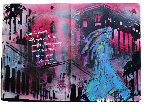
Just be yourself! Let people see the real, imperfect, flawed, quirky, weird, beautiful, magical person that you are!
YES!
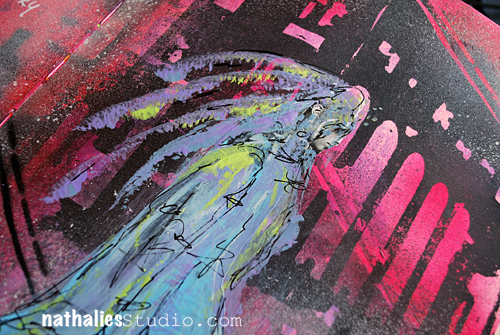
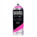
I used some smaller stenciling and paints in the background – leaving a lot of white space. Then I took the building stencil I made and used in my Art Journal spread last week again – this time playing with the negative and positive usage. I brushed some magenta acrylic ink over the spray painted areas as this always sets it off so nice.
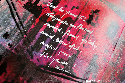
For the journaling I use a fine line pen and filled it with white acrylic ink.
Very grungy spread but also happy- and I might fall more and more in love with the building stencil :)
Easier said than done! Great message and what a SUPER journal page Nat. Love the “architecture” in the background – looks so good with the colors you chose. The quirky person in the front is perfect. Really special creation…. soooo inspiring. j.
True – it is easier said than done- but hey…we keep trying ;) Thank you!
So true about wanting to read the crossed out words.
The page with “sometime” on it really struck me for some reason. Maybe I saw it as a prompt to certain thoughts.
I have several notebooks which contain words that I consider noteworthy (one for quotes that I like and one that I carry in my purse to jot down ideas or thoughts that I want to capture).
Hope you have a nice Labor Day weekend Nat!
Reply