Blog: Liquitex Professional Paint Markers

When Beauty Begins – Art Journal Spread

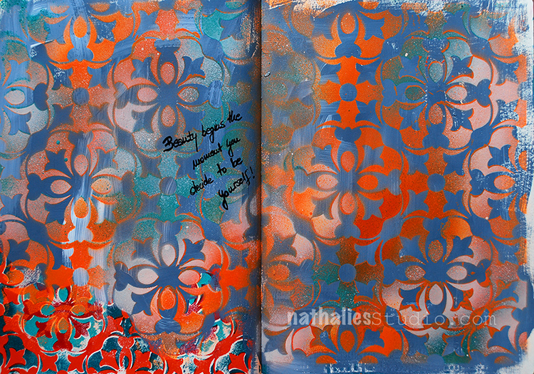
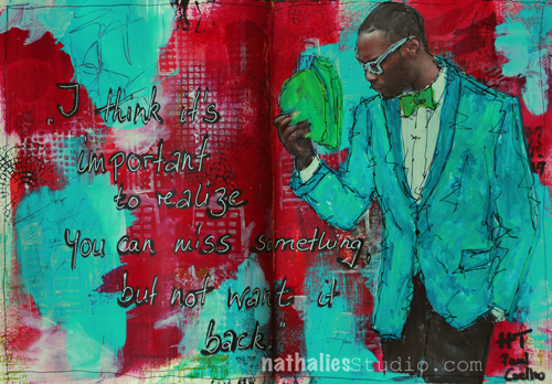
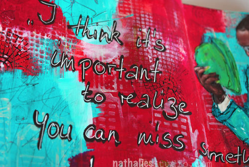
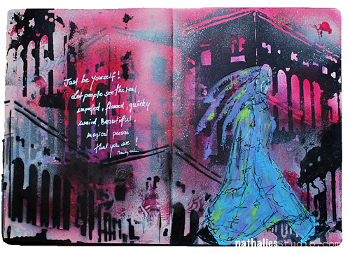
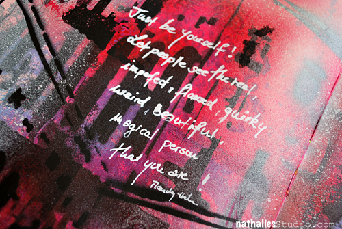
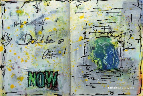
Beauty begins the moment you decide to be yourself!

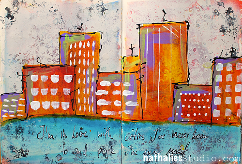
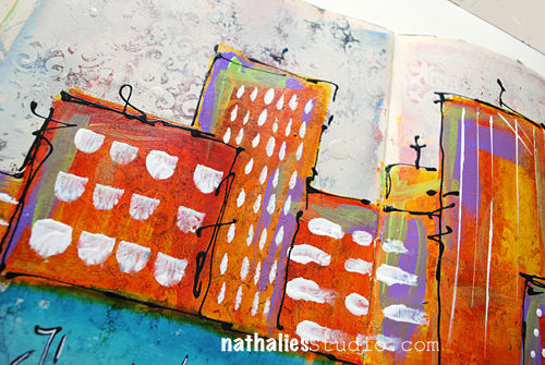
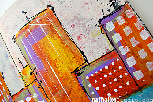
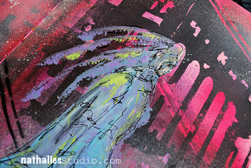
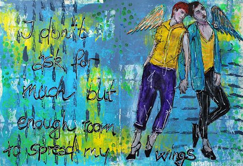
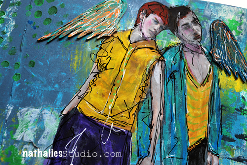
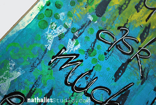
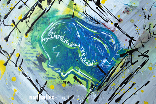
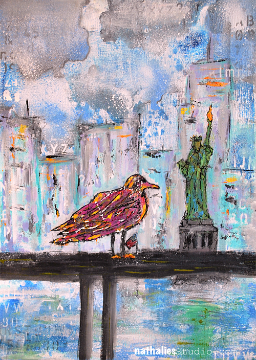
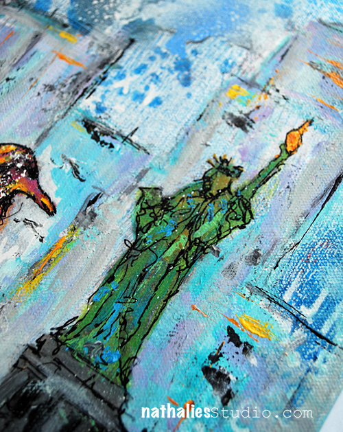
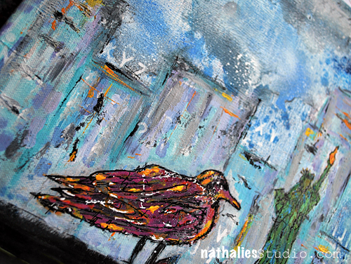
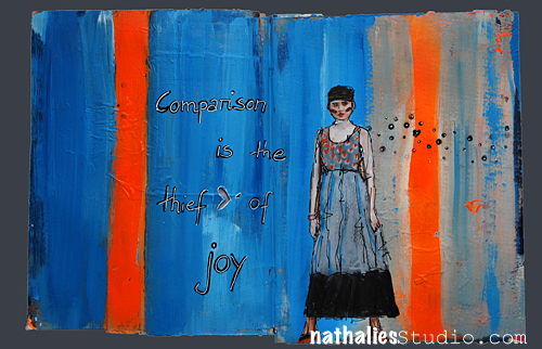
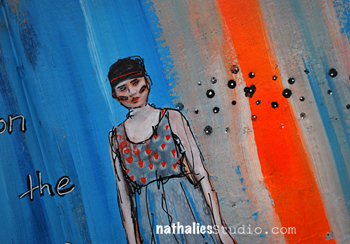
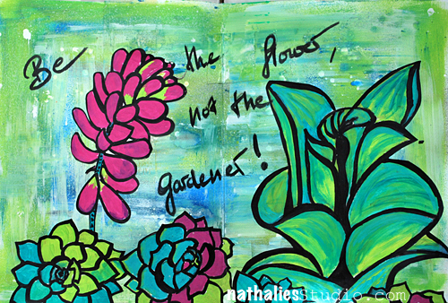
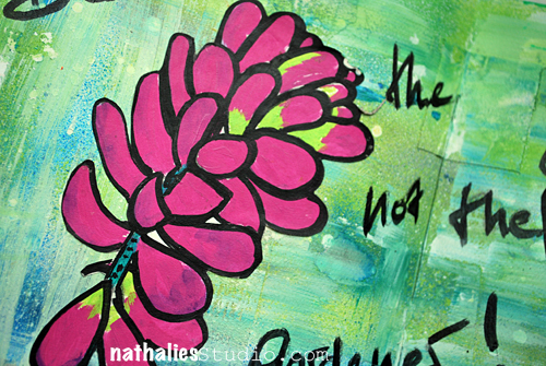
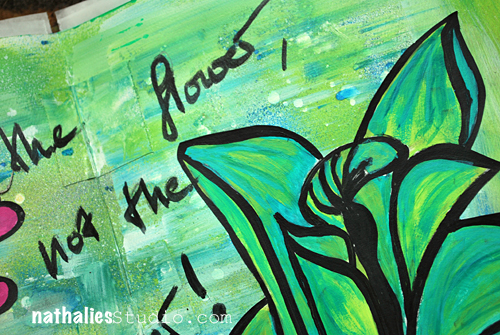
I painted the background with different blue and teal acrylic colors – also mixing some white gesso in there in between.

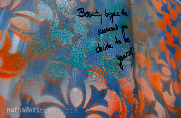
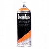
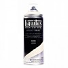
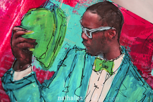
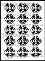
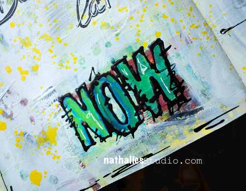
I layered the Versailles 9×12 Stencil on top and sprayed some orange and parchment colored acrylic spray paint over the stencil.

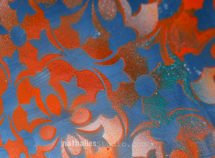
I love the dimension spray paint layered up can give and this is definitely one of my favorite stencils.

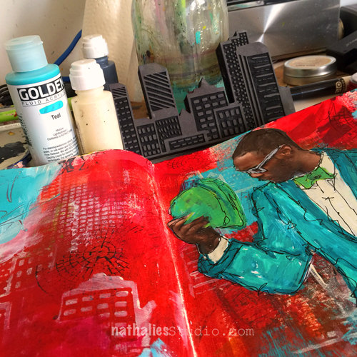
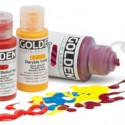
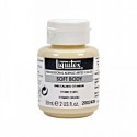
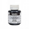
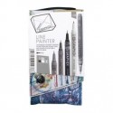
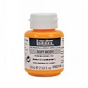
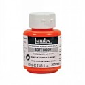
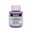
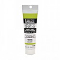
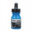
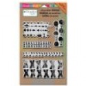
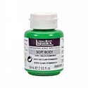
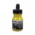
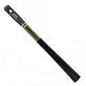
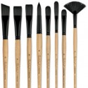
Here are the supplies I used for this art journal spread – some links are affiliate links:


have a beautiful day!!!

Comments (1)

  • joi

    |

    Absolutely FABULOUS – wow… wow… love this. And…. YOU dear Nat are always just YOURSELF and BEAUTIFUL! Xj.

    Reply

Leave a comment

Don’t Want it Back or … In My Art Journal Today

dontwantitback01

I think it’s important to realize you can miss something, but not want it back. – HT Paul Coelho

What a great and true quote!

dontwantitback4

I limited my self for the background to Red painted over some collaged areas, titanium white and black and added some swatches of teal here and there. I stamped with the Urban Scribble, the Mish Mesh and the Mark Maker Stampset and also used the stencil in the Urban Scribble set, adding paint and taking it off with black and titanium white too.


dontwantitback02

For the journaling I used a brown acrylic marker and overwrote with a white signo pen to make it pop a bit more. The image was also overpainted with markers.

dontwantitback03

Fun – I love the teal and red – now I want to wear it :)


SuppliesCJS


Have a wonderful day!

Comments (2)

  • Jenny Petricek

    |

    Luscious colors and textures! Love the quote, too!!

    Reply

  • Joi@RR

    |

    You are so right Nat – the red and teal are luscious together! What an interesting quote – I like it. This is a super journal creation. What I love the most is that you used your stamps in such an artistic way. They are not ‘obvious’ – they are just part of the art. I love using stamps that way but I have had some folks be a bit offended because it “alters” the stamp so to speak! You know that your Urban Scribble is my fav so I am just thrilled to see it on this project but not really SEE it in it’s full beauty! The Mish Mash is there and looks great but it’s not intact – love that. You cannot image how often I use your Fiesta stamps in my backgrounds and they are perfect… but many times they are not totally there!!! Anyway – I’m rambling but just wanted to say… as always… I LOVE YOUR ART – in whatever form it displays itself :) XXj.

    Reply

Leave a comment

I am in Love … or In My Art Journal Today

NatKalbach_InLove01

I’m in Love with cities I’ve never been to and people I’ve never met.

It is true. I love to travel and I love to meet new people …but I also love to go back to places and to see people I know again.

NatKalbach_InLove02

I love the texture of this spread. I had painted the background with red and yellow acrylic paint and stenciled with my Ornament Wallpaper Stencil and some Spray Paint. The spray paint left a nice dimension on the background. So I lightly covered the whole spread with Liquitex Titanium Spray Paint – leaving the painted area peak through a bit but also create a nice textured area of the stencil. It gave it a bit of a grungy shabby chic look….if I want to label this look – LOL . Then I took some Liquitex Acrylic Inks and started painting the city skyline as well as the water- choosing contrasting colors to make it more pop. I mixed the Yellow Azo and Naphthol Crimson for a nice orange right on the spread, as the spray painted area was less absorbent than paper and left me longer time to work on it. I added some green and purple accents in the houses with Soft Body Paints. For the Windows and marks in the houses I used my Filbert brush and Fan Brush in different ways- it was fun to limit myself to the brush as a tool in creating those elements.

NatKalbach_InLove03

I used a Fine Line Applicator filled with Black Acrylic Ink and Black Soft Body Paint and added the scribbly lines around the houses. The quote was written with a black marker and then overwritten with a white Signo pen.

Do you like to travel?

Here is a list of all supplies I used:

nSupplies


Have a wonderful day

Comments (7)

  • Joi@RR

    |

    I only like to travel – WITH YOU!!! I seldom leave the ranch but I soooo love your posts when you travel Nat. Oh well heck – I love all your posts but I do enjoy seeing all your photos of the sights and the things that you do. AND… you know – I always love your skyline projects. This one is no exception. LOVE LOVE the bright colors and the wonderful backgrounds. Great way to start my week – seeing your SUPER FINE post. Hugs. j.

    Reply

    • nathalie-kalbach

      |

      Joi – I see- I want to see pictures of a real ranch in the States- share some pictures with me :) Have a gorgeous day and hugs to you too, Nat!

      Reply

  • cat2468

    |

    Hey Nat!!
    I am a country girl who grew up on a farm. So it never ceases to amaze me how drawn I am to cityscapes……especially yours!! And the large piece you did before you moved here (sorry, my memory sucks these days!!) it was a waterfront/city painting for a contest?) despite my embarrassment I shall forge on to tell you how much that piece blew me away!! Maybe that’s where my memory went!!! Love your work and teaching style!! Hope to catch more on-line classes!l. Having trouble getting this comment to post!!! I’ll try later!!!
    Cat

    Reply

    • nathalie-kalbach

      |

      hi Cat, thank you so much for your wonderful words. I did a couple paintings before I moved to the States- maybe you find the particular one here in the gallery: http://nathaliesstudio.com/ngallery/ I hope I see you in class :) Have a wonderful day!!!

      Reply

  • cat2468

    |

    Hey Nat!!
    I am a country girl who grew up on a farm. So it never ceases to amaze me how drawn I am to cityscapes……especially yours!! And the large piece you did before you moved here (sorry, my memory sucks these days!!) it was a waterfront/city painting for a contest?) despite my embarrassment I shall forge on to tell you how much that piece blew me away!! Maybe that’s where my memory went!!! Love your work and teaching style!! Hope to catch more on-line classes!
    Cat

    Reply

  • Sue Clarke

    |

    I love to travel and wish that I could do more of it.
    It’s so fun to meet new folks and see that we are really after the same things in life.
    Plus the different designs and colors in different areas are inspiring.
    Nice colors in this art journal page Nat.

    Reply

    • nathalie-kalbach

      |

      Thank you Sue! I love that we can find so many things in common with many other people we have yet to meet :)

      Reply

Leave a comment

The Real Weird Magical Person … Or In My Art Journal Today

NatKalbach_justbeyourself01

Just be yourself! Let people see the real, imperfect, flawed, quirky, weird, beautiful, magical person that you are!

YES!

NatKalbach_justbeyourself02

I used some smaller stenciling and paints in the background – leaving a lot of white space. Then I took the building stencil I made and used in my Art Journal spread last week again – this time playing with the negative and positive usage. I brushed some magenta acrylic ink over the spray painted areas as this always sets it off so nice.

NatKalbach_justbeyourself03

For the journaling I use a fine line pen and filled it with white acrylic ink.

Very grungy spread but also happy- and I might fall more and more in love with the building stencil :)

nSupplies


Comments (2)

  • Joi@RR

    |

    Easier said than done! Great message and what a SUPER journal page Nat. Love the “architecture” in the background – looks so good with the colors you chose. The quirky person in the front is perfect. Really special creation…. soooo inspiring. j.

    Reply

    • nathalie-kalbach

      |

      True – it is easier said than done- but hey…we keep trying ;) Thank you!

      Reply

Leave a comment

I don’t ask for much but …or … in My Art Journal Today

NatKalbach_Spread01

“I don’t ask for much but enough room to spread my wings” – I love this – and isn’t that the truth as an artist and as a person – all you need is room to spread your wings.

NatKalbach_Spread02

While thinking of the quote, I painted the background loosely with soft body paints:  paynes grey, brilliant blue and yellow azo and then stenciled with green permanent using the What’s the point and Ornamental stencil.

NatKalbach_Spread03

Stamping in white was done with a pigment ink pad -loved how it popped off the page. I should have heat set the stamped images though as it took forever to dry on the acrylic paint and I smeared it accidentally when adding the images. Markers were used on the images. The wings are chipboard wings which I found in one of my drawers …I have to use up some of my chipboard- I hoarded a lot of chipboard shapes thinking one day I will have the best opportunity to use it – hey but the best opportunity is now ;)

Here is a list of what I used

nSupplies


Comments (4)

  • Joi@RR

    |

    Definitely a unique one! The background is super – so YOU – Nat. Your sentiment made me “think”!!! I like it. It never took much room for me to spread my wings… but I know folks that take lots of room! Somehow I put you in that category Nat. You are so talented and have so much to give in so many different ways… I’m hoping you have an abundance of room to “fly high” when you need it! j.

    Reply

    • nathalie-kalbach

      |

      Awe – thank you Joi! I think we all need space to fly – gladly enough I am surrounded by wonderful people in my live- including my blog readers- that give me loads of space to fly- thank you:) Nat

      Reply

  • JackieP Neal

    |

    way cool Nat! I always dig your palettes!! hugs “)

    Reply

Leave a comment

Don’t be a Later …or In My Art Journal Today

NatKalbach_Dontbealater03

Note to myself: Don’t be a later

Nat Kalbach ;)

NatKalbach_Dontbealater02

I am such a huge procrastinator sometimes – for fear I might be failing big time. I am telling myself, I can do this later. In some parts of my life I am a huge later. Time to be a NOW ;) I used to be a NOW – LOL- and it lead to all good things ;)

NatKalbach_Dontbealater01

The lettering for the NOW was done with some wood blocks and acrylic paint. Then I used Liquitex Markers inside to pop it up a bit and outlined the outside of the letters with a fineline applicator which I had filled with Liquitex Soft Body Paint and some drops of Liquitex Ink . Love the fine and dimensional effects you get this way. The woman’s face is a stamp I carved.

Here are the supplies I used for this spread

nSupplies


Have an amazing day!

Comments (2)

  • Joi@RR

    |

    Now is good Nat – it spells WON – backwards!!! At to me… you are always a WINNER at everything you do. I like this pages because of there is lots of white so your incredibly artistic doodles show up so well. The colors are nice – clean – like a new beginning – no build up – open – free – ready for a NEW NOW! j.

    Reply

  • Sabine Schneider

    |

    Oh, ich bin oft auch ein later…..Tolle Seite!!!!
    Liebe Grüße, Sabine

    Reply

Leave a comment

Whose Front Yard? – Canvas

NatKalbach_WhoseFrontYard01


A new canvas finished – I had a great time painting. It took me quite a while to finish it deciding when to finish :) That is always the hardest part, don’t you think?

NatKalbach_WhoseFrontYard02

I used Liquitex Soft Body and Heavy Body Acrylic Paints as well as Markers, Inks and Spray Paints. I made a lot of marks with the Liquitex Freestyle Palette knife – I love using it to create texture and marks into the wet but also into the dried paint.

NatKalbach_WhoseFrontYard03

I am thinking about having this one scanned, too, and make it available as prints. What do you think? (I will add the prints to my shop as soon as they are ready.)

nSupplies


Wishing you an amazing start into the week!

Comments (2)

  • Nurse Ratchet

    |

    I love that in your world the sea gulls are pink and orange!!

    Reply

Leave a comment

The Thief of Joy or…In my Art Journal Today

NatKalbach_ThiefofJoy01

Comparison is the thief of joy – Theodore Roosevelt


NatKalbach_ThiefofJoy02

It is something I have to keep in mind.

Here is what I used for the spread:

nSupplies


have a joyful day!

Comments (3)

  • Sue Clarke

    |

    Quote to ponder and I often remind my 11-year-old son this because it is so important!

    Reply

  • Laura S

    |

    Gorgeous journal entry, Nat! The title is so true and one I like to use to often remind myself. Thank you!!

    Reply

Leave a comment

Be The Flower …Not The Gardener

NatKalbach_BeFlower01

is something a dear friend said many many years ago to me and I have tried to follow this advice in certain fields of my live and also told other’s to follow it ;) It is good to be the flower sometimes ;)


NatKalbach_BeFlower02


I created the background by using spray paints and then dry brushing them after they had already dried a tiny bit. I love the effect. The flowers itself come from some drawings on watercolor paper which I had done a couple months ago and then colored in with the Liquitex Paint Markers. I do love how you can blend them and create also a nice texture with them. I cut the flowers out and collaged them onto the background.


NatKalbach_BeFlower03


You see you can use other art work or projects and include them in your art journal.

nSupplies


Hope you are the flower today :)

Have a great one


Comments (2)

  • stephanie

    |

    Nice work. Good quote. Did you use the paddle brush on the spray paint?

    Reply

Leave a comment