Nat

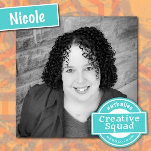
Hello from my Creative Squad! Today we have a stunning art journal page from Nicole Watson to help motivate you to create and maybe even in life :) Nicole is using my Broadway Fan Pos Neg set, my Solid Hex Large rubber stamp, and this month’s theme: Motivated in March – What keeps you motivated to create? Is it a certain material? Your favorite colors that you can’t get enough of? Maybe you get motivated when you see artwork in a museum or out and about? Share with us your creative motivation and then create something inspired by it.
There are several things that motivate me to create. This list includes color palettes, new supplies, a visit to the museum, a random photo or advertisement, an Instagram hashtag challenge such as the hundred-day project, or a design team prompt like this one. One of my favorite parts about majoring in art were the assignments or challenges to solve with my supplies and creativity. However, lately, one of my biggest motivations is YOU! Comments on my tutorials or other social media posts mean the world to me. I absolutely love inspiring other people to create and sharing tips and tricks along the way.
Recently, I received a beautiful message from someone thanking me for my inspiration. Through a random search after purchasing an art journal, she found my tutorials during her cancer fight. She used her art journal as a way to cope and understand her story. This beautiful lady was not expected to make it through her fight, but she did. This page is for her, as she has also inspired me.
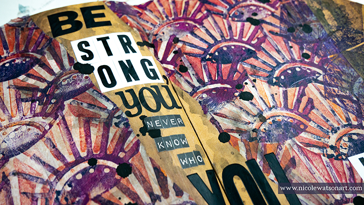
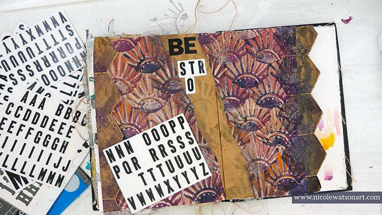
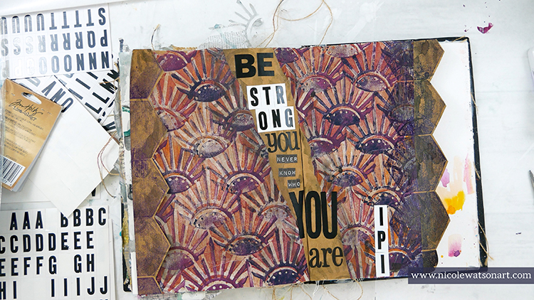
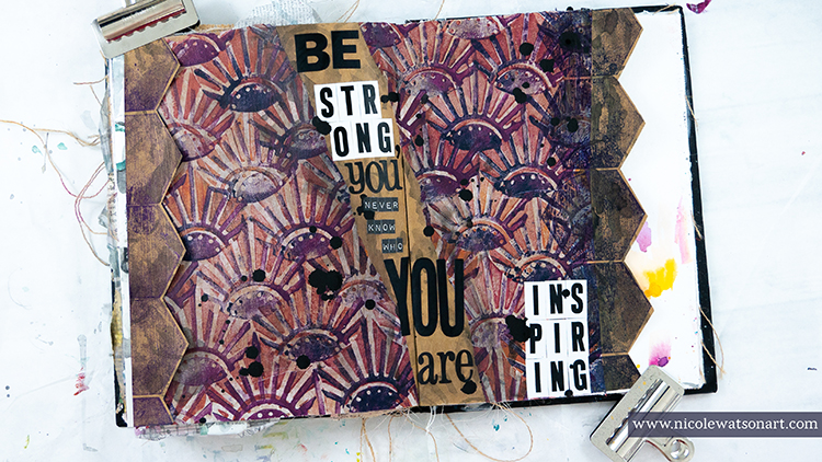
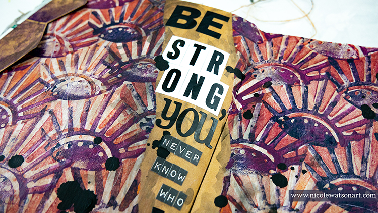
“Be strong, you never know who you are inspiring.”
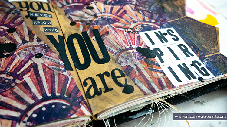
When I ran across this quote on Pinterest, I knew I wanted to use it on a simple journal page to showcase the message and as a reminder to myself to be strong, even in my own weaknesses.
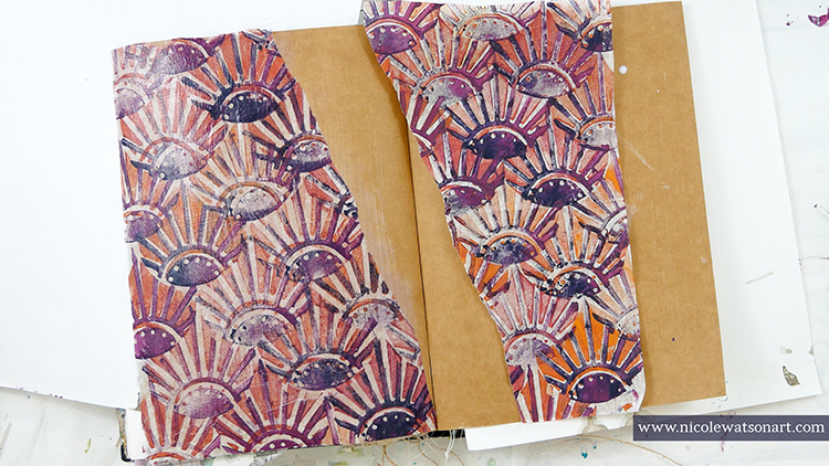
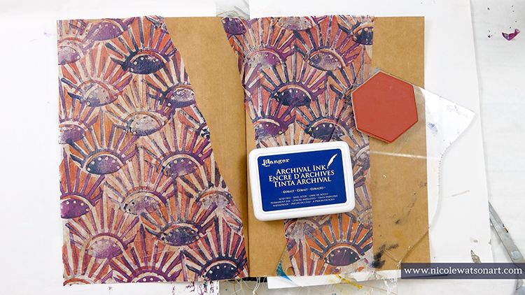
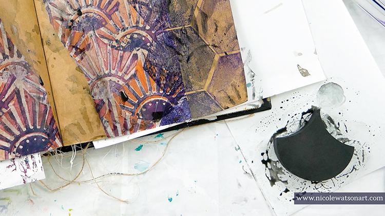
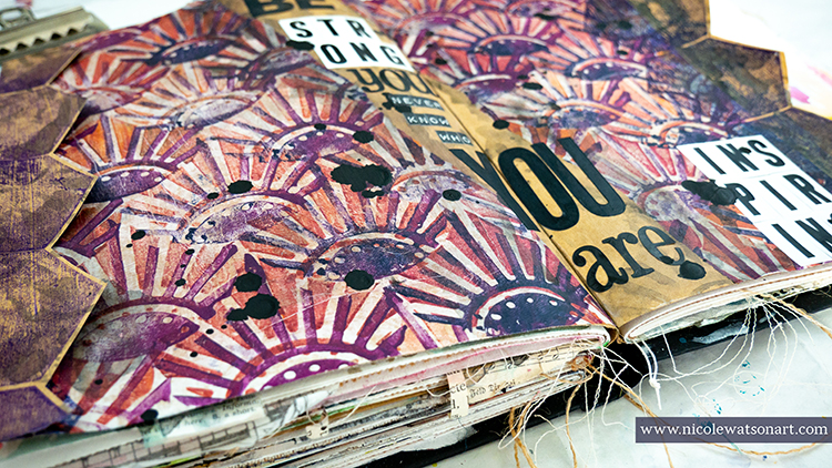
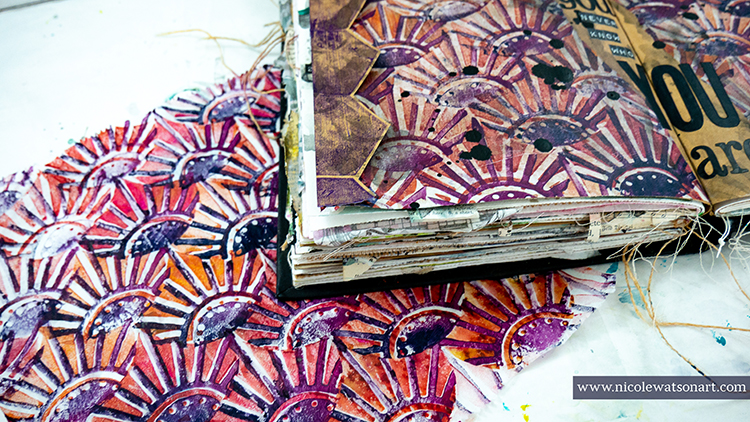
So, I grabbed some deli paper that I had previously stamped with Nat’s Broadway Fan Positive Negative ArtFoamies. I loved how it had turned out, and was waiting for the perfect occasion! I simply stamped the negative stamp first all over the deli paper in a mixture of warm colors plus a little umber to tone them down and then stamped the positive image with a mixture of navy and eggplant. I wanted a variation in the colors throughout the paper.
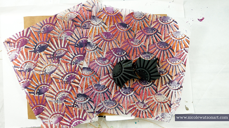
Here’s a quick video of how I stamped with the ArtFoamies on deli paper:
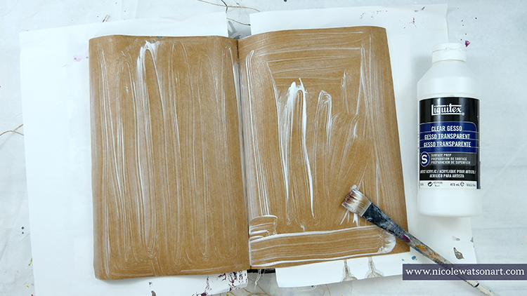
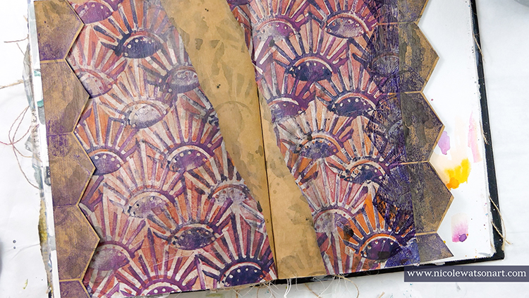
I thought this paper would look amazing on the kraft paper, so I spread clear gesso over the kraft paper spread in my art journal and then ripped the deli paper in half and adhered it to the page with matte medium. I left a gap between the two sides for my quote and also a large space on the right side.
Wanting to add more interest and another graphic element, I grabbed Nat’s Solid Hex Large stamp and stamped the right side with cobalt archival ink. My first thought was to then cut around those hexagons, but I experimented with stamping another line of hexagons with deep purple ink. Then I stamped the same navy hexagons over to the left side.
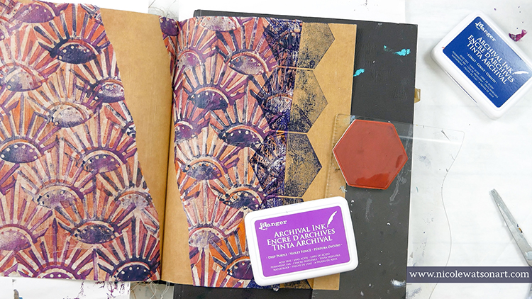
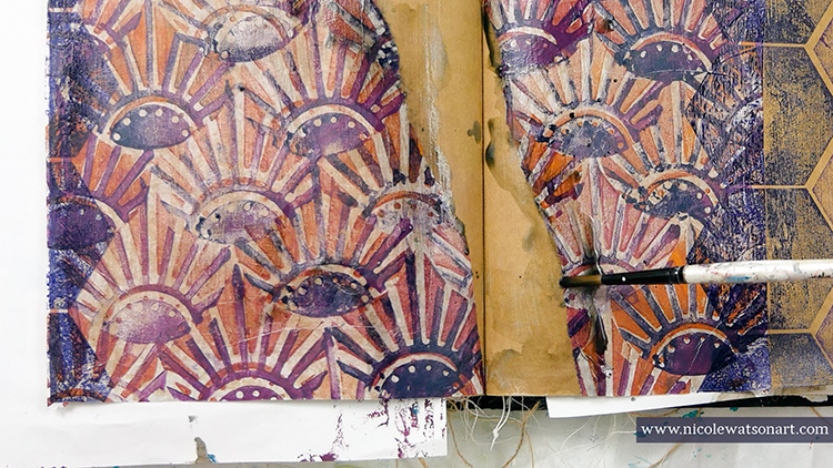
The pages seemed a little flat to me, so I grabbed my stabilo all pencil and created a puddle. (Scribble the stabilo on a piece of palette paper and activate it with water.) I used this as watercolor paint and spread it around the page on the stamped hexagons for shadowing and on the torn edges. Then, I stamped the ArtFoamie into the puddle and stamped some shadowed Broadway fans in the gap and over the hexagons.
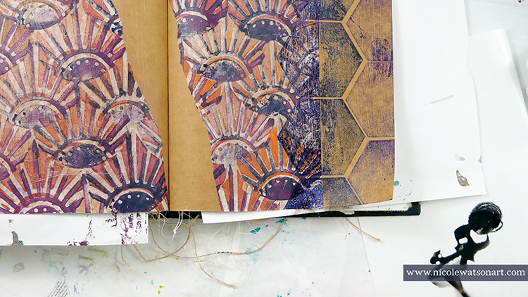
Looking at my pages for several minutes, I decided to go back to my original idea and cut the purple hexagons off the page! I’m so glad I experimented first, because then I had this awesome line or purple hexagons to adhere to the left side! I stuck it down with one strip from a tape runner, because I liked the dimension created from not sticking it down all the way to the page.
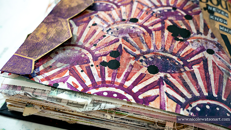
Finally, it was time to add the quote. I grabbed a bunch of different black and white stickers to spell out the quote and then went over them with matte medium to make sure they would stick. I felt the page needed one more element to tie in the black, so I grabbed my Bombay India ink for a few ink drops.
The perfect reminder in the middle of my art journal to motivate me. It is truly a gift and a huge motivation to inspire you. I’ve often heard it say that art heals, and I sincerely believe it’s one amazing tool we have to care for our body, mind, and spirit.
Thank you Nicole and what a touching story about the power that art can have in our lives!
Want to give Nicole’s project a try? You can find all my Foam Stamps and Rubber Stamps in my Online Shop and here are some of the other supplies Nicole used:
Feel inspired? Working on something yourself that you’d like to share? I love to see how you interpret our monthly themes. Email me how you used my stencils and stamps with the theme and email me an image – I would love to share your projects in my next “n*Spiration From Around the Globe“.
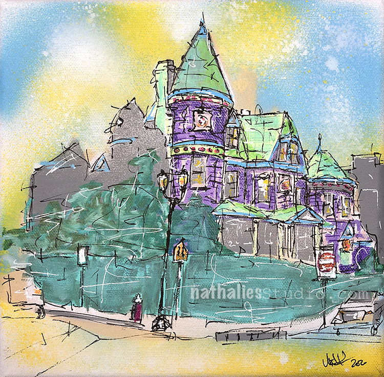
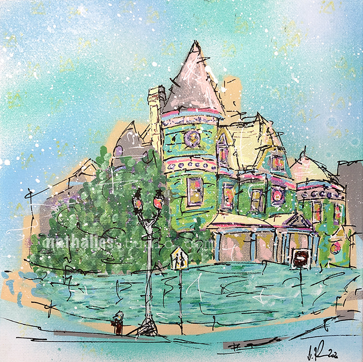
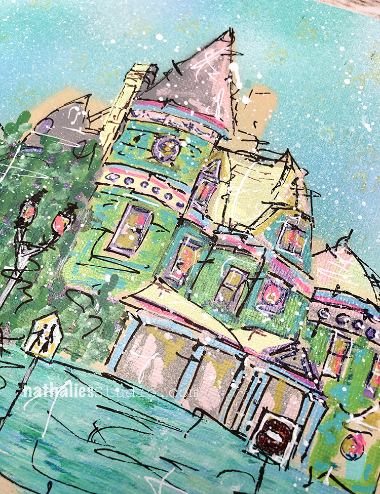
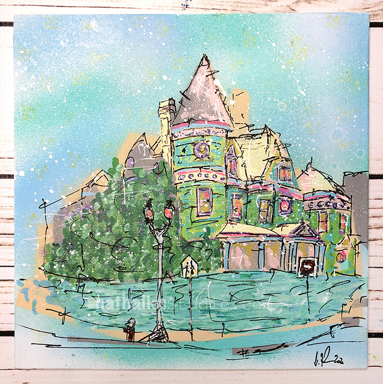
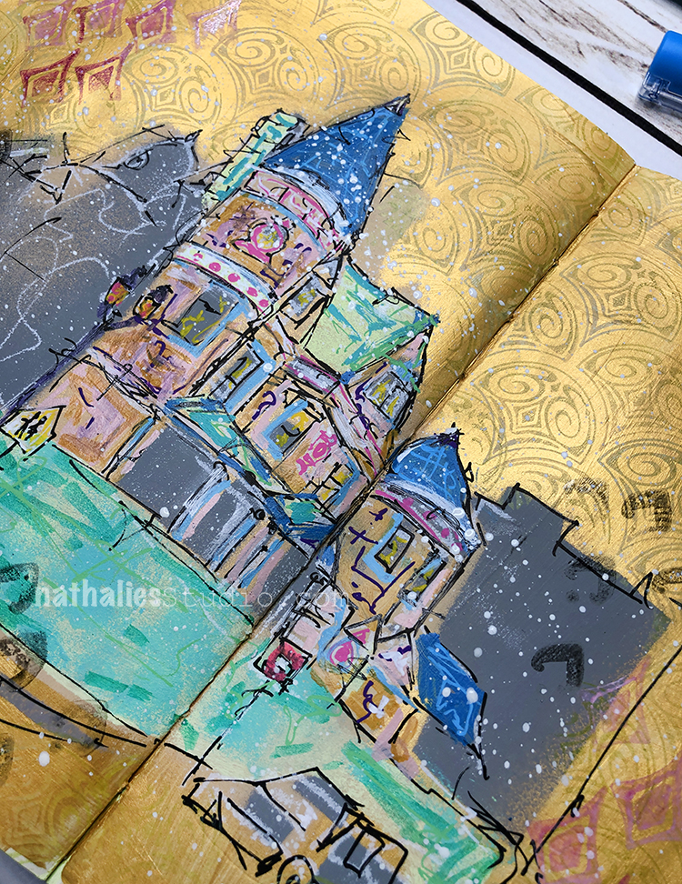
Here is another painting of the beautiful Queen Anne Mansion I walk by almost every day.
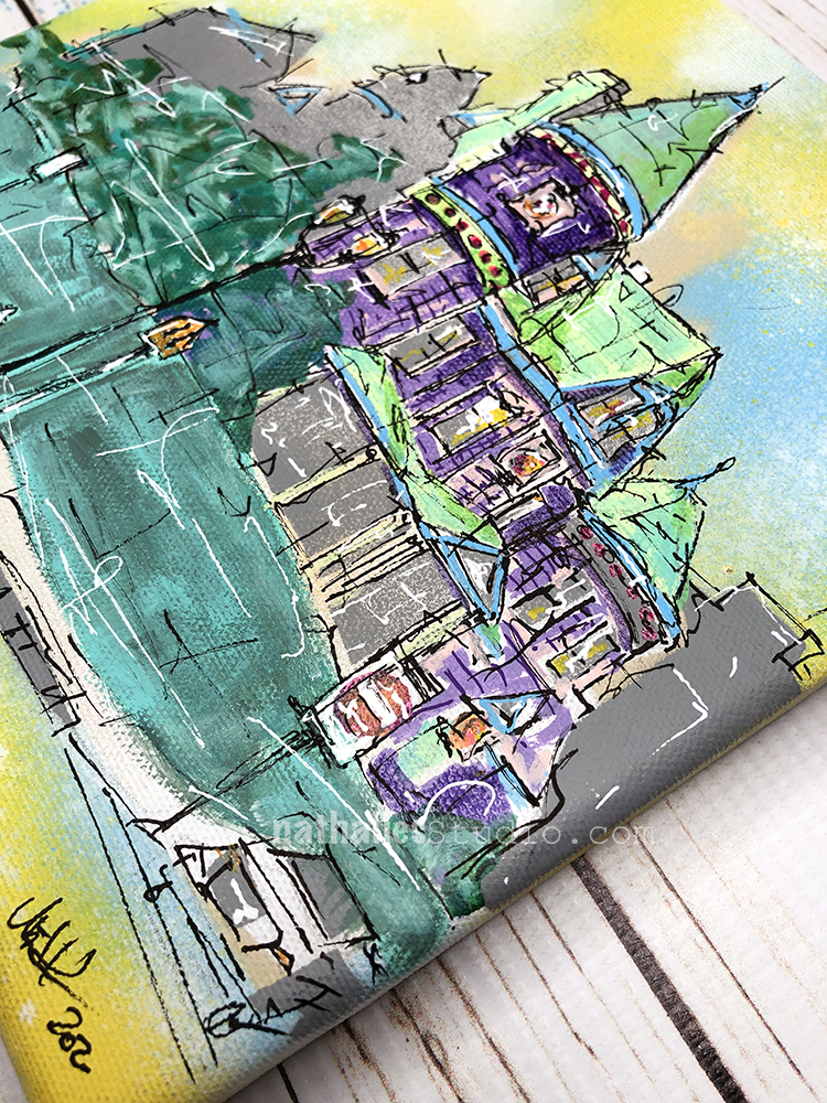
I wonder what the original colors have been back in the days- a lot of those houses have been actually painted in very jarring colors – but at some point house owners toned everything a bit own I guess.
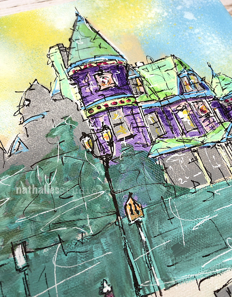
I had fun with this painting on a 8×8 canvas with Acrylic paints, gouache, spray paints and markers.
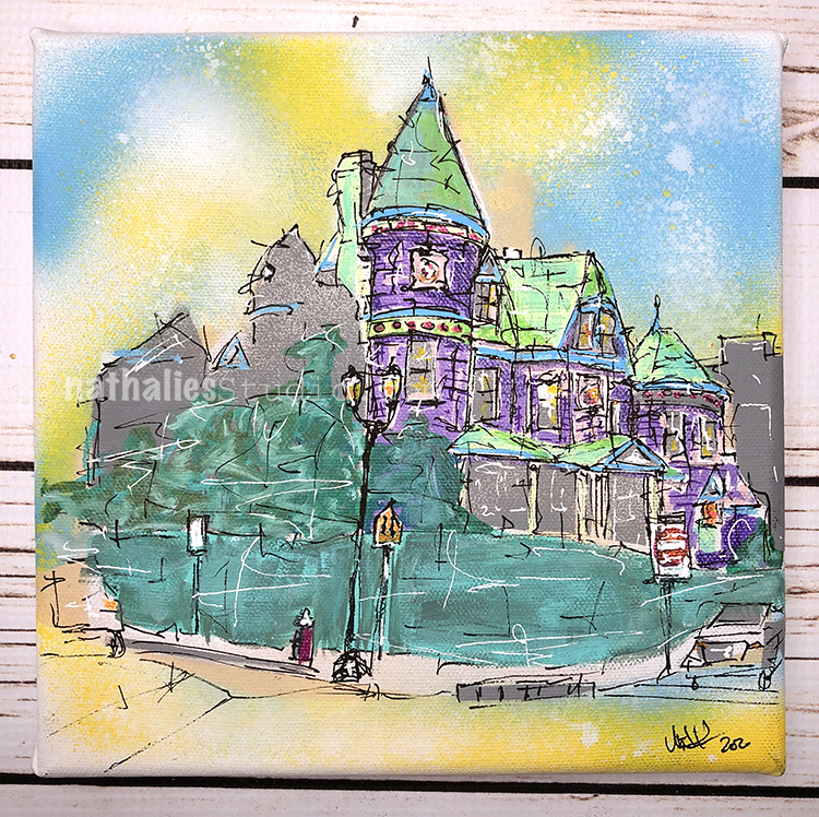
And you can give it a home if you want – it is available in my store – Check it out :)
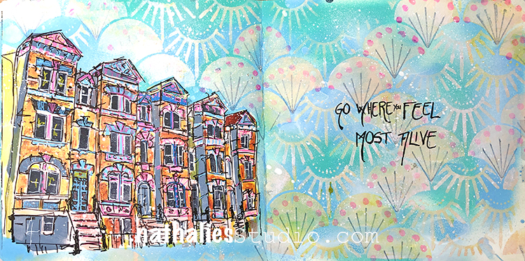
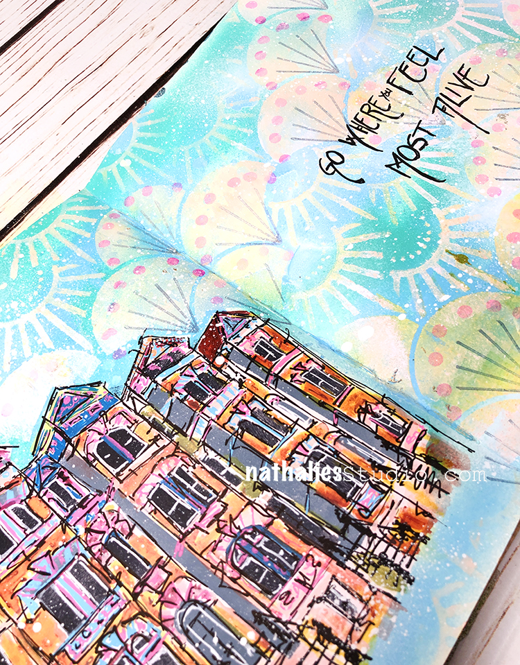
“Go where you feel most alive”
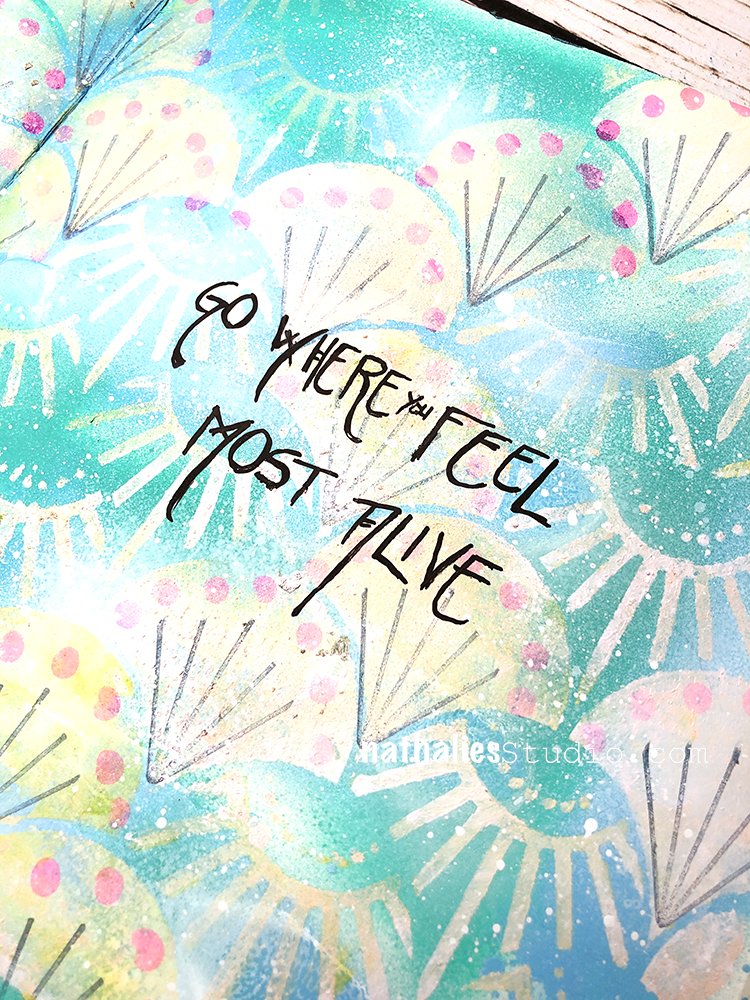
I created my background with water based spray paints, acrylic paint, and my Art Deco Summit stencil. I went back in with one of my Hex Small rubber stamps for the black lines, and used my pencil eraser for the dots.
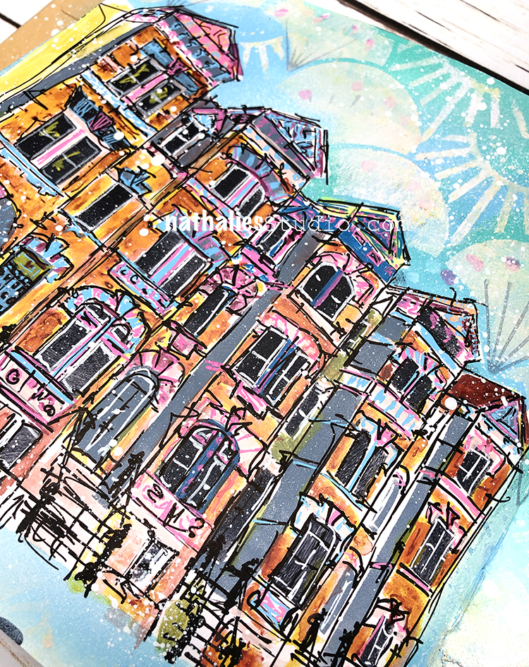
This was a neighborhood scene study, and I sketched this block of row houses with acrylic markers.
Here are some of the supplies I used:
Dear Nat: I love the combination of colors, which remembers me of historical buildings here in San juan, P. R.
So long time i have not contacted you, because had a big problen with Internet after H. María. Now i cannot reach my classes! My identification with your company: elenajuga2015 – Grandscraperona. Can this be fixed? Hope the personnel in charge can do something about, because i need to revise those classes!… Thanks in advance, hoping everyone is healthy around!
I so love these colors Nat. The rich tones of the building and the pastels on the right hand side that scream beautiful spring day to me! Thanks for all your inspiration!
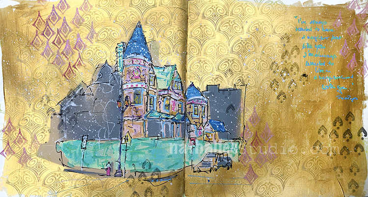
This year I really found my groove to make sure to paint every morning before I do anything else -and slowly I am getting around the hood as I am painting scenes from my strolls from the hood.
“Yas Queen Mini” is an original painting made with spray paint, acrylic paint, gouache, and markers on canvas board. I am usually starting out with a study of the scene in my art journal and then create one small painting on canvas board and a slightly bigger one on canvas and last but not least also add a version of the painting to a big old ledger (I will show you a glimpse of it once it filled up a bit more) .
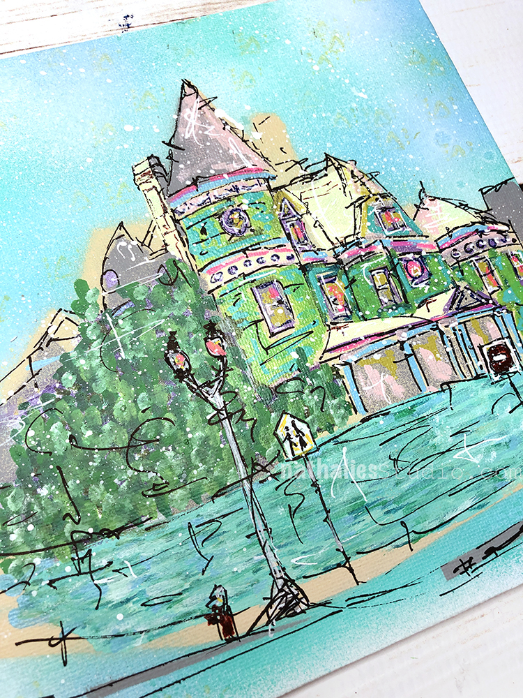
As I said, I was inspired by my Strolls through the Hood in Jersey City for this little mixed media painting, and specifically a magnificent Queen Anne style mansion that I often stroll by. I am really fascinated by the over-the-top style of architecture and it is sad that the house is slowly dilapidating.
Yas Queen Mini is now available in the store and would love to find a new home!
“I have always wanted to have a neighbor just like you, I’ve always wanted to live in a neighborhood with you.” – Fred Rogers. We didn’t have this program in Germany when I was a kid but I’ve come to know of it now that I live here in the US. Definitely gives you warm fuzzy feelings :)
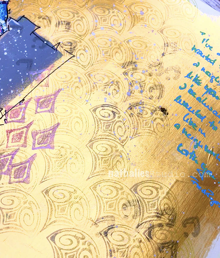
My background is Daniel Smith gold gesso – love this stuff. And then I stamped with Moonlight Duo inks and my Fan-tastic Small stamps and Fan-fare stamps.
The hood scene was sketched with acrylic markers and painted with gouache. I like the matte gouache contrasting with the high shine of the gold gesso.
Here are some of the supplies I used:
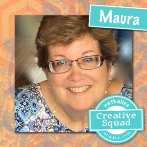
Hello from my Creative Squad! Today we have a post from Maura Hibbitts sharing with us a suite of cards inspired by St. Patrick’s Day and all those lovely shades of green. Maura is using my Fairview Fan and Clam Hex foam stamps and our theme: Motivated in March – What keeps you motivated to create? Is it a certain material? Your favorite colors that you can’t get enough of? Maybe you get motivated when you see artwork in a museum or out and about? Share with us your creative motivation and then create something inspired by it.
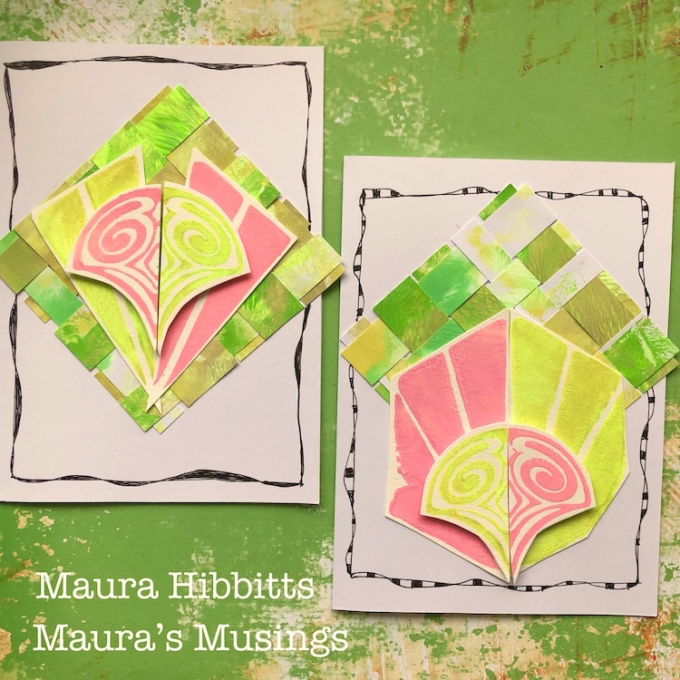
March is known for many things…the Ides of March, March Madness, St. Patrick’s Day, Spring Equinox, and so much more, that there is a lot to motivate us! I chose to use my favorite holiday, St. Patrick’s Day as my motivation, and to use those glorious greens that Ireland and this holiday are all about. When I was just a little girl, my mother and the lady next door always had a competition to see who would get their St. Patrick’s Day decorations up first and have the most. Then I learned that her husband was not Irish (he was German), so I told him he could be Irish on St. Patrick’s Day. So, this month, I have filled my project with many shades of green, and a bit of pink like some of the shamrock plants. This month, it’s all about being motivated by color, inspired by a holiday!
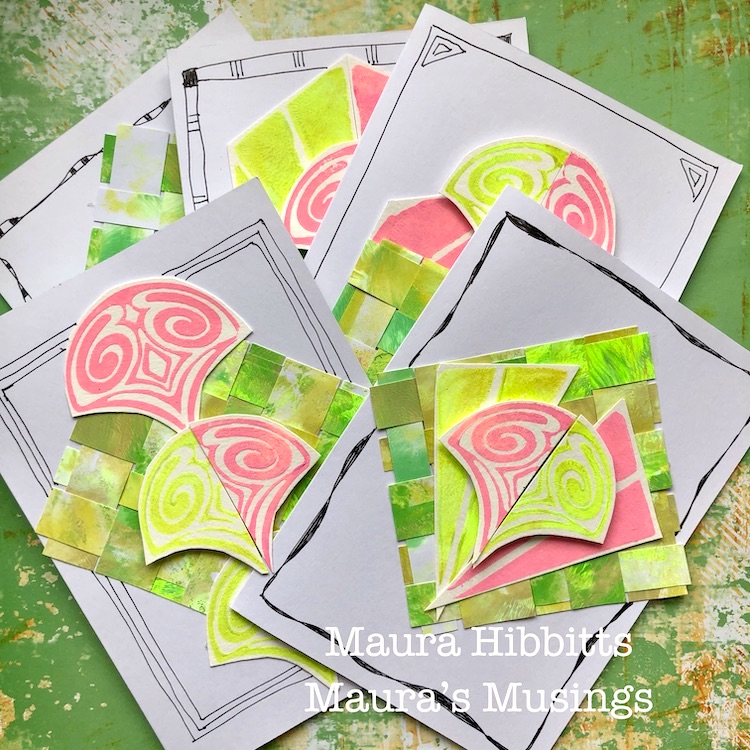
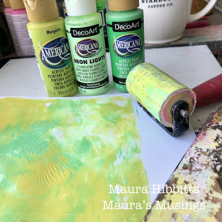
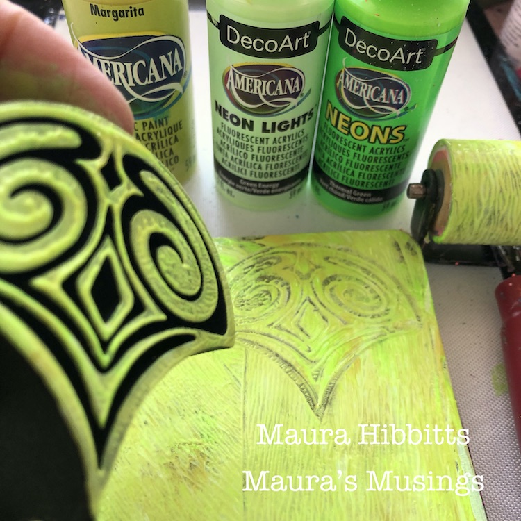
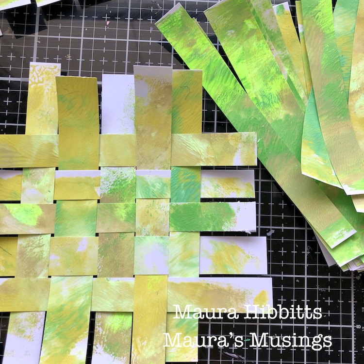
I started by printing several sheets of card stock with a blend of greens. I mixed a bit of three greens on my gel plate and blended it with a brayer, then I pulled two prints to have some variety, and set these aside to dry.
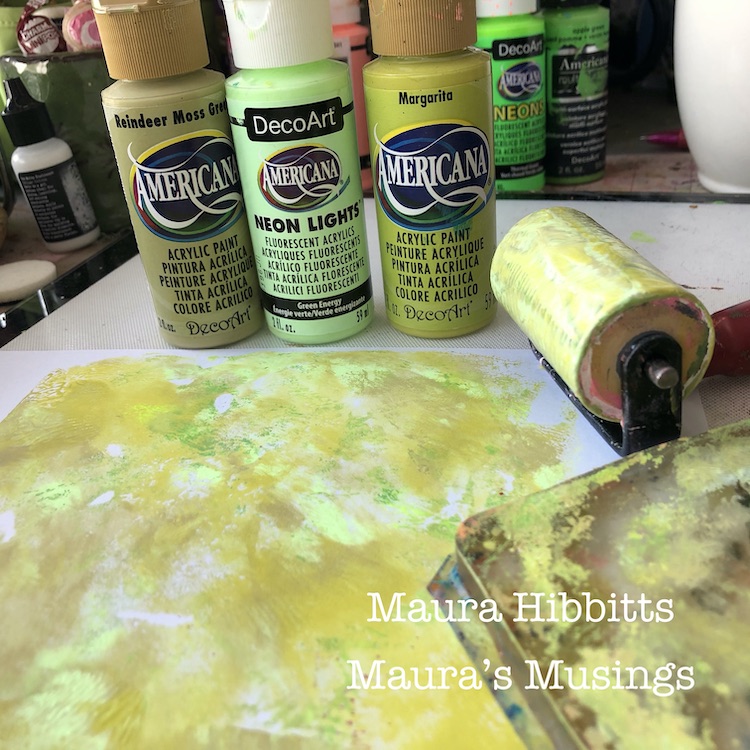
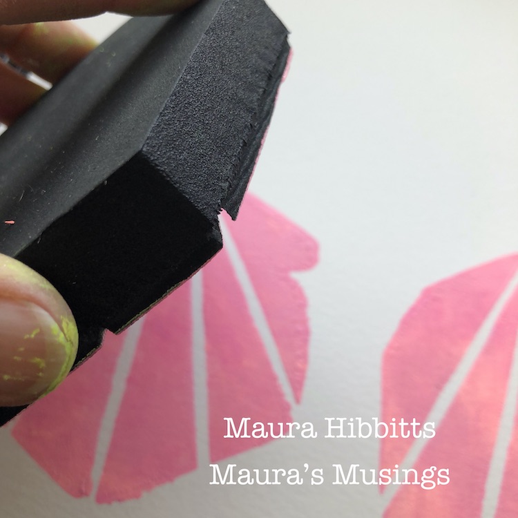
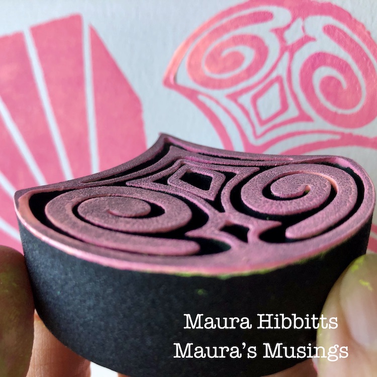
I continued working with the green on my gel plate, adding in some more of the neon colors to get a very bright green. I stamped into this with the Clam Hex ArtFoamie and stamped off on watercolor paper several times.
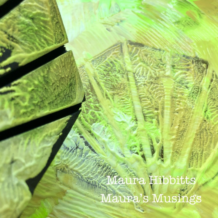
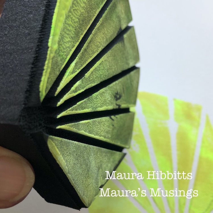
More greens! This time, I used the blended greens on the gel plate with the Fairview Fan ArtFoamie, and stamped several images onto watercolor paper.
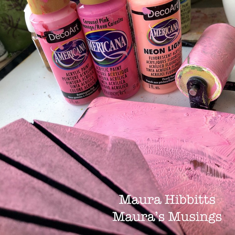
Now it’s time for a blend of pinks – once again, I squirted a small amount of each of three colors and lightly blended it on the plate with the brayer. I stamped into this with the Clam Hex and Fairview Fan stamps to pick up the paint, and stamped onto watercolor paper.
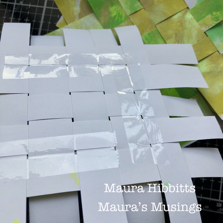
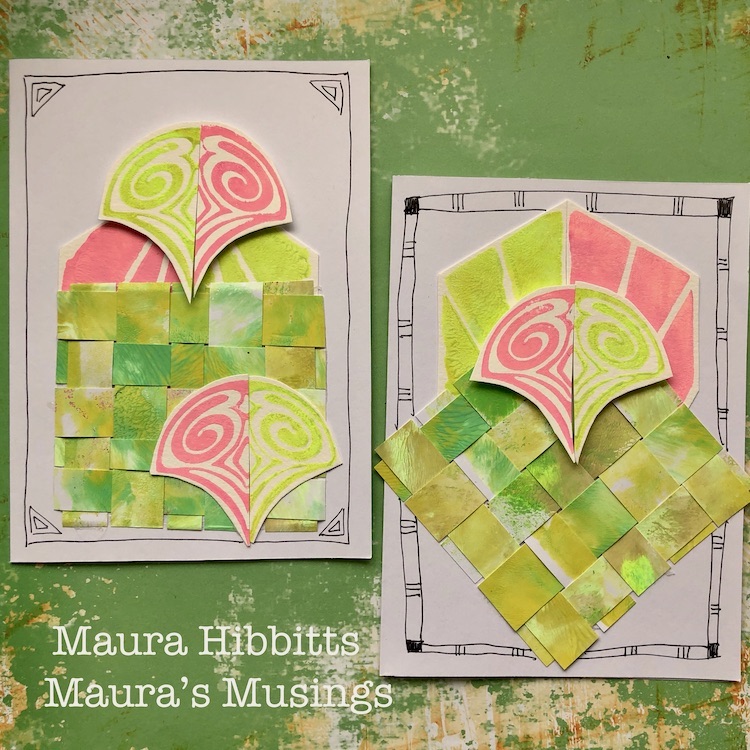
Meanwhile, now that the first set of papers is dry, I cut them into strips with a paper trimmer. I laid five strips down, and wove five strips into them. I pushed them close together, then turned it over and taped it in place with clear tape. Once that was done, I trimmed off the edges.
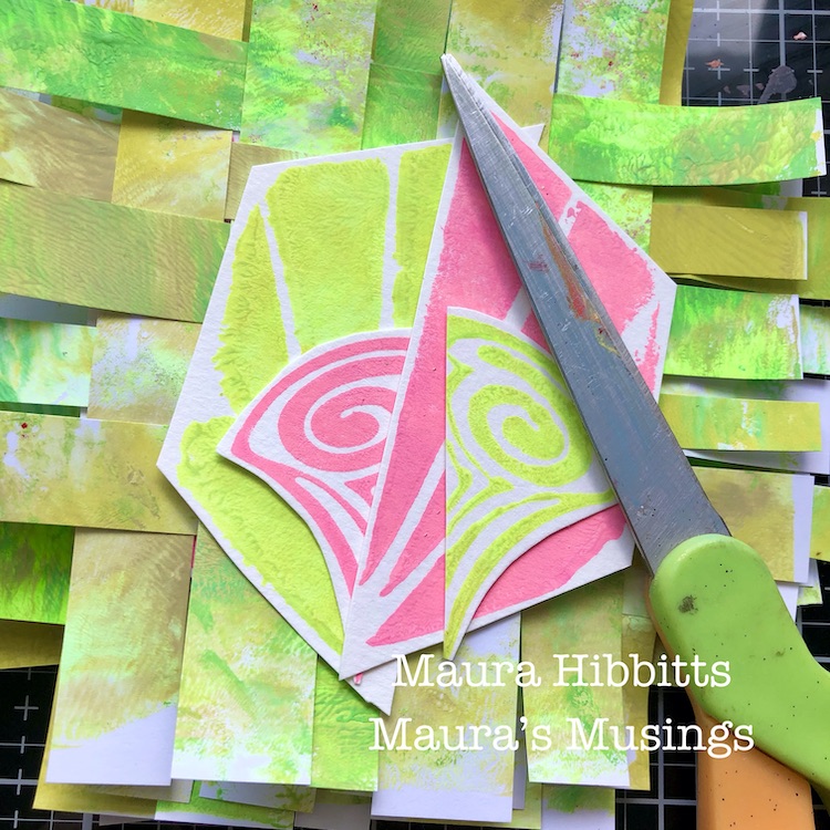
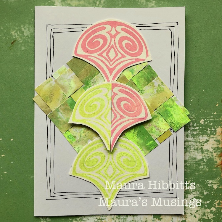
I cut out my stamped images and cut each in half, so that I could put a green and a pink image together.
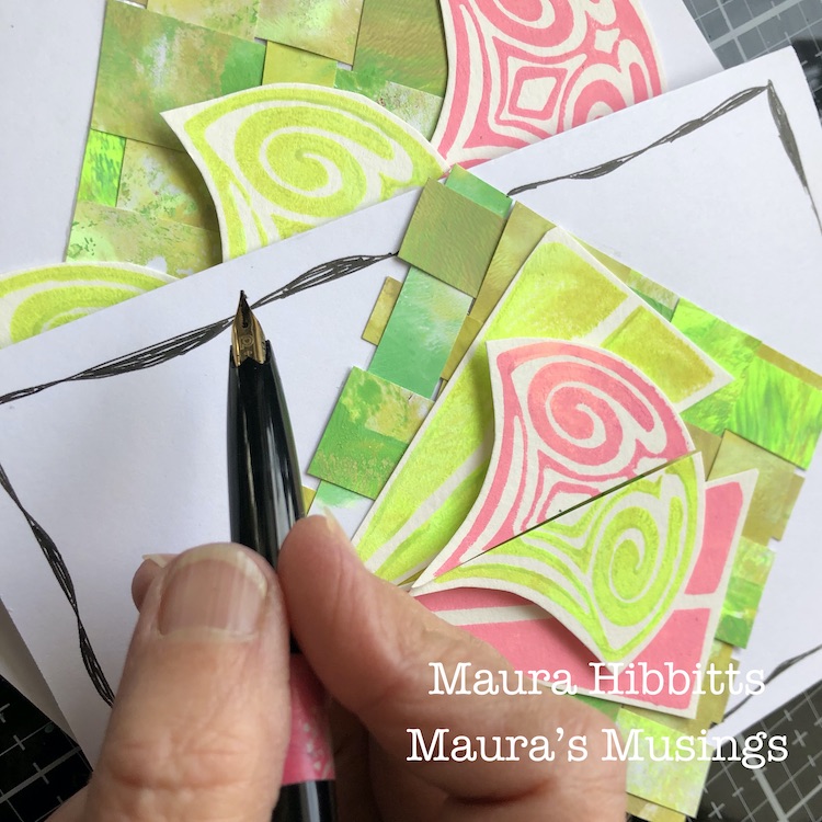
Once I laid out each card with the woven layer and stamped images and adhered them in place with adhesive tape and pop dots, I doodled frames around them with my carbon ink pen.
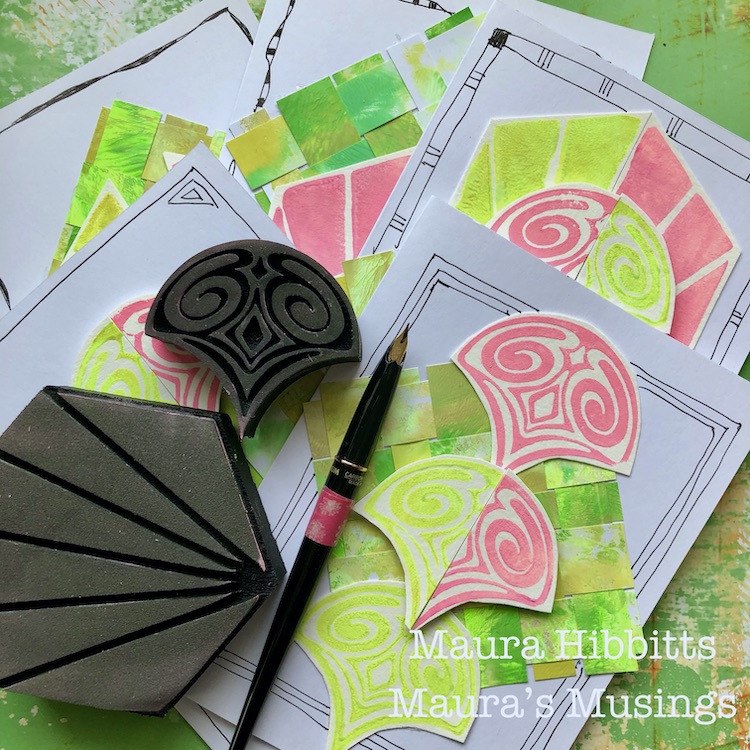
I now have a set of five cards in very bright spring colors. Next, I need to get motivated to write a letter in them and mail them out! It was fun mixing in neon paint to get a very vibrant image. I also liked how I mirrored the images in both the pink and green, which got me to thinking about watermelon colors. Wouldn’t you know it, my husband just brought home a watermelon from the grocery store! LOL!
Motivated by bright and cheerful colors, my favorite holiday, and the plan to write some letters to friends, I’ve created my set of notecards. Happy March! – Maura
Thank you Maura – I love these happy spring colors this time of year :)
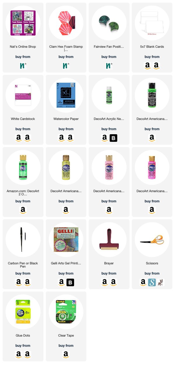
Want to give Maura’s project a try? You can find all my Foam Stamps in my Online Shop. Here are some of the other supplies Maura used:
Feel inspired? Working on something yourself that you’d like to share? I love to see how you interpret our monthly themes. Email me how you used my stencils and stamps with the theme and email me an image – I would love to share your projects in my next “n*Spiration From Around the Globe“.
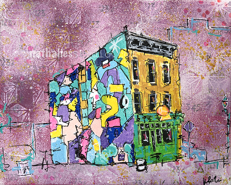
Block Party is a different take on a painting of this building and is inspired by my strolls through the hood. It is part also of my neighborhood series.
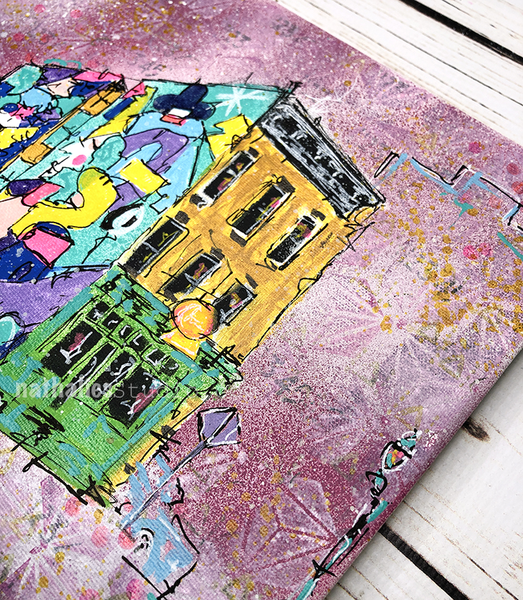
I created it with spray paint, markers, ink, and acrylic paint on canvas. You will often see the combination of classic row house architecture and a colorful contemporary mural in our city and I am big fan of that.
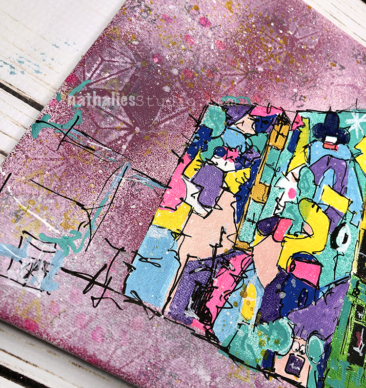
In this scene the mural depicts a festive block party, you can almost hear the old skool hip hop (maybe Sugarhill Gang’s Rapper’s Delight?) and get a feel for the vibe.
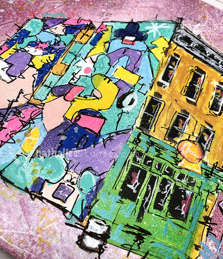
I carried this energy throughout the piece in the bright colors and rhythmic patterns in the background.
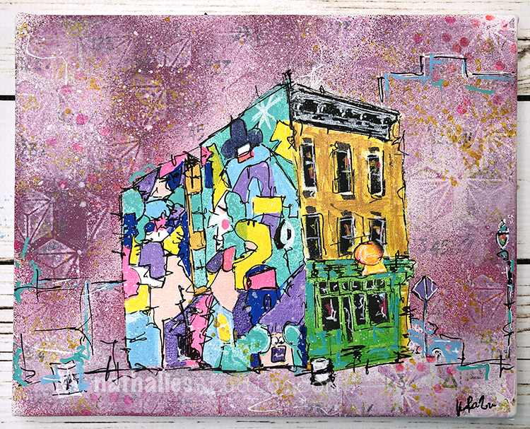
“Block Party” is an original painting on canvas and measures 10″x8″ -It is available in the store and would love to find a new home.
Comments (2)
Sue Clarke
| #
Nat, your package made my day yesterday.
I’m stuck in the house (with the exception of walking the dog) and mail is the best!
Reply
nathalie-kalbach
| #
YEAHHH – I am so glad it made you happy and you got it! Stay safe and healthy – big virtual hugs!!!
Reply