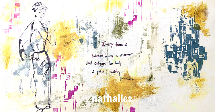
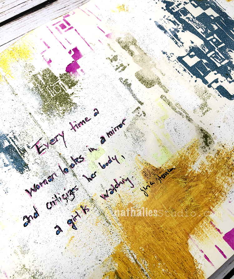
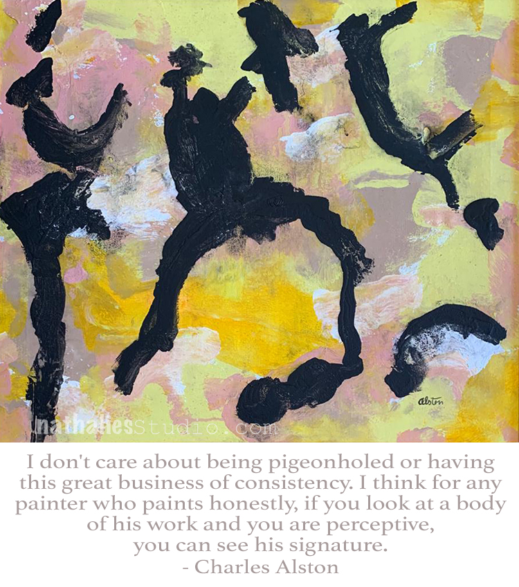
“Every time a woman looks in a mirror and criticizes her body, a girl is watching.” -Gloria Steinem
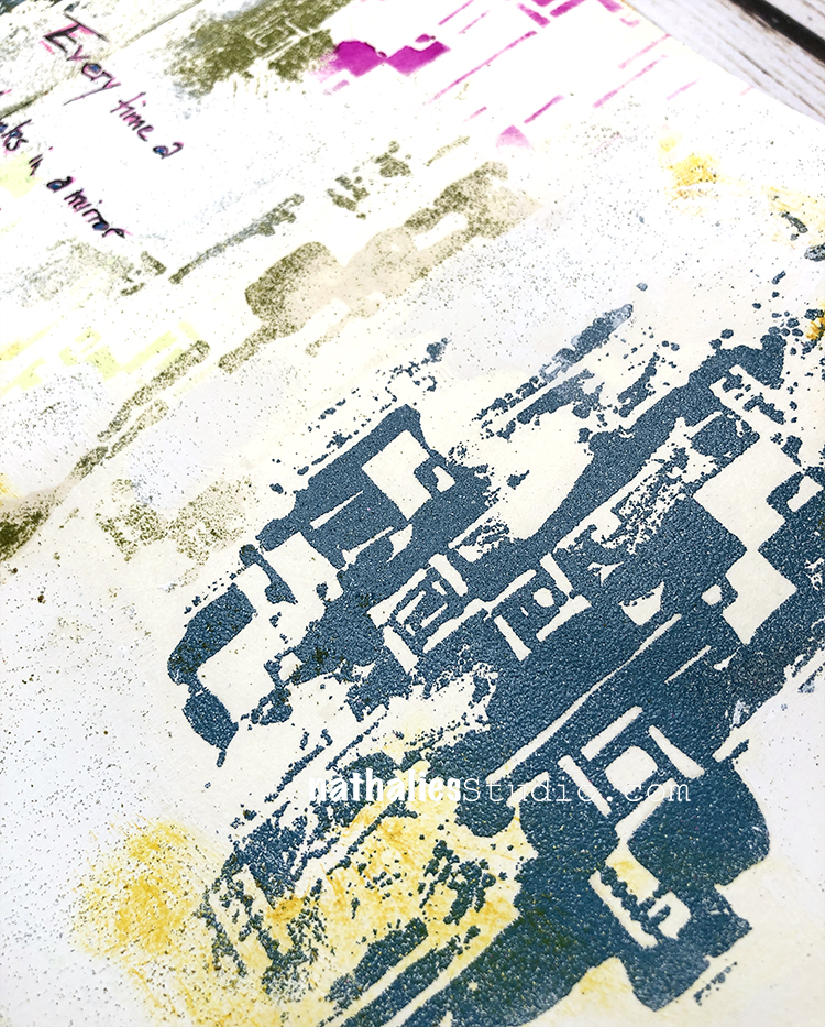
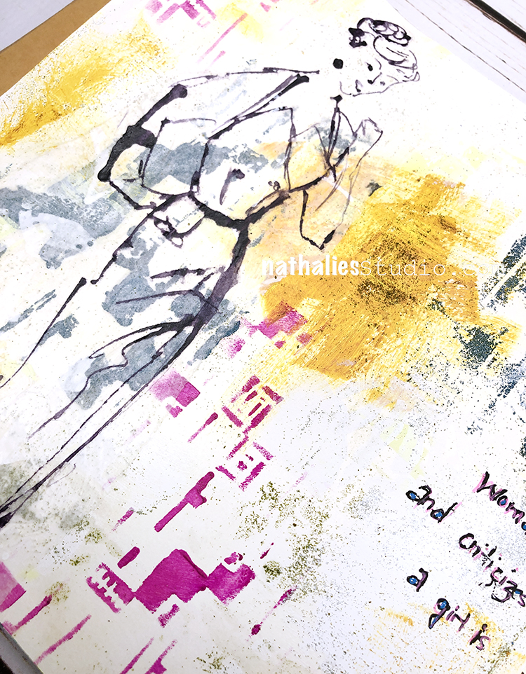
For the background I used my Space Age Modern stencil on both pages – with embossing powder and acrylic paint. I love all the texture and I think it’s a nice balance with the white showing through too.
I sketched the figure with ink and kept it very loose in style.
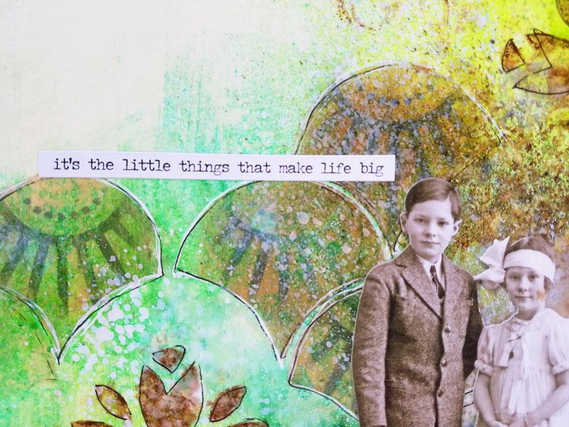
And here my quote with a bit of color too to tie everything together.
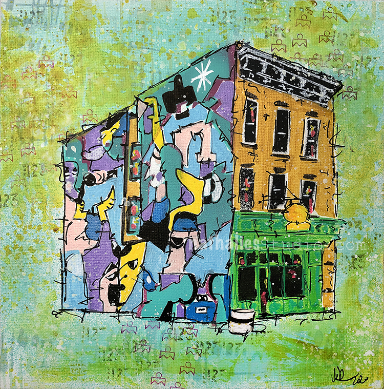
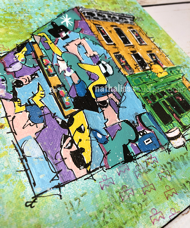
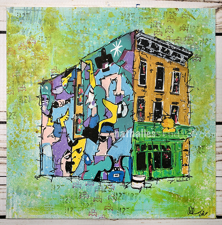
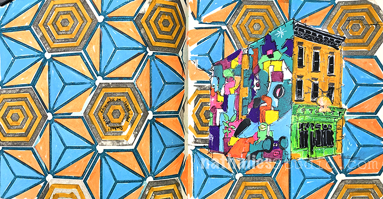
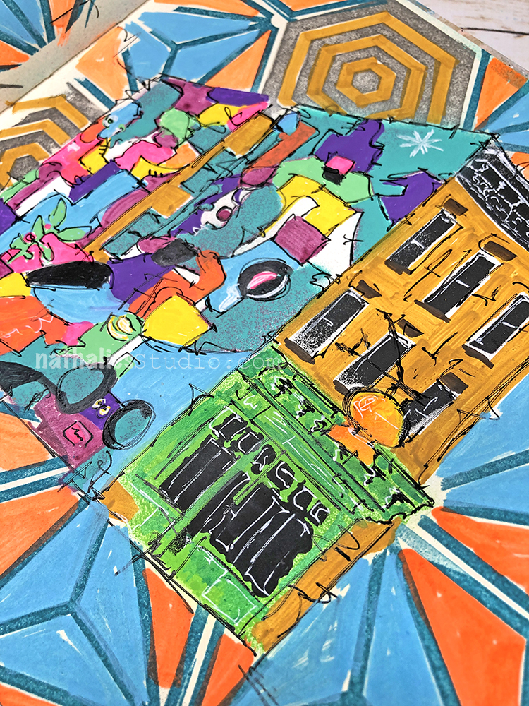
Block Party Mini is another painting inspired by my strolls through the hood and is part of my neighborhood series. I am having so much fun with this series and also really enjoy making multiple versions on different substrates.
The combination of classic row house architecture and a colorful contemporary mural is something that is not uncommon in this city – and I am a fan of it. In this scene a wonderful mural by @zoonchez (on instagram) depicts a festive block party, you can almost hear the old skool hip hop (maybe Sugarhill Gang’s Rapper’s Delight?) and get a feel for the vibe.
There will be a dessert place coming soon in the storefront and boy I cannot wait :)
“Block Party Mini” is an original painting made with spray paint, markers, acrylic paint, gouache, and stencils on canvas board and measures 8″x8″ and available now in my store! EDITED: SOLD
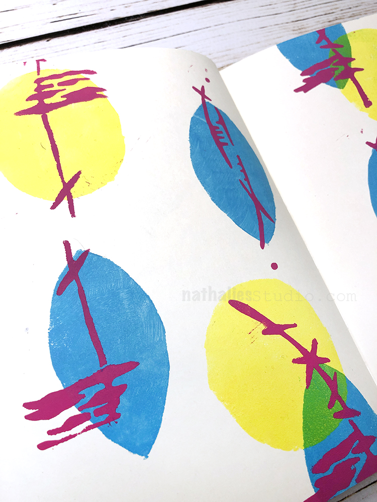
I wanted to share a little Flip Through video of my newly finished art journal.
I keep about 4-5 journals at the same time so they are always filled with an eclectic mix. This one highlights some pages I made using my last batch of new stencil designs as well as some pages that you may recognize from some of my Online Workshops.
Do you keep several art journals at once or do you work through one at a time?
Loved the journal flip through. I like the style you mostly used with this one. I keep several journals at a time also. Not all of them are art based. I love to create with words mostly. Happy March! Thanks for sharing!
Hello from my Creative Squad! Today we are kicking off a new monthly theme with Jennifer Gallagher in her art journal. She is using my Art Deco Summit stencil, my Jewett foam stamp set and my Floral Tile Large rubber stamps and our theme: Motivated in March – What keeps you motivated to create? Is it a certain material? Your favorite colors that you can’t get enough of? Maybe you get motivated when you see artwork in a museum or out and about? Share with us your creative motivation and then create something inspired by it.
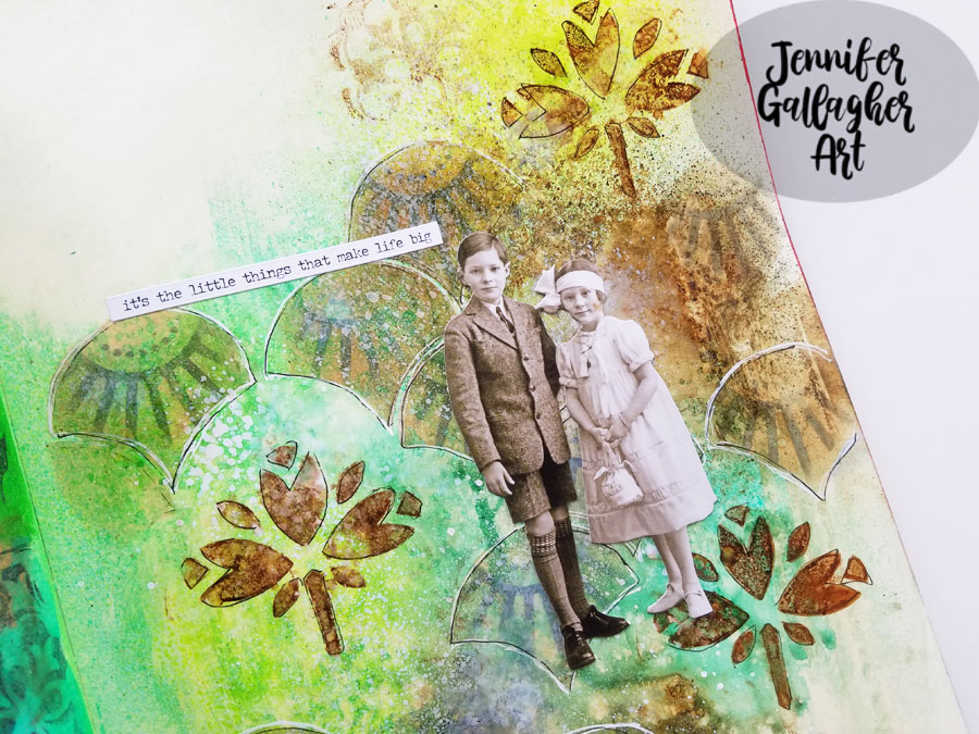
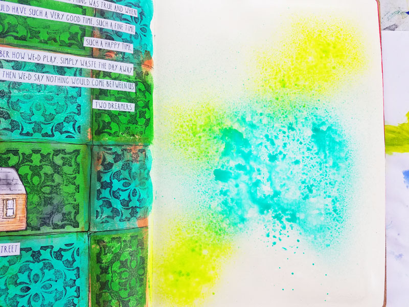
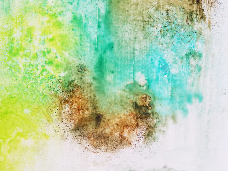
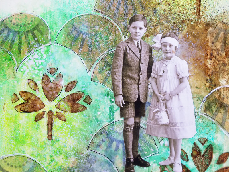
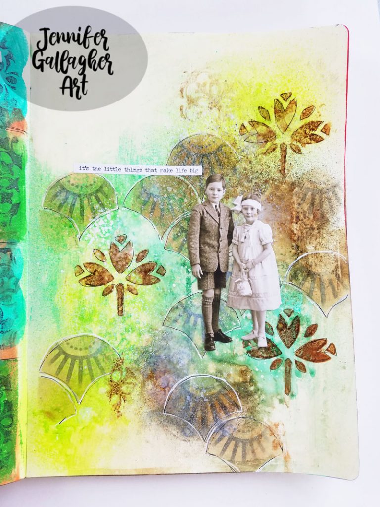
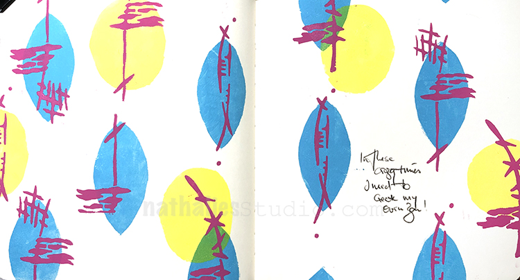
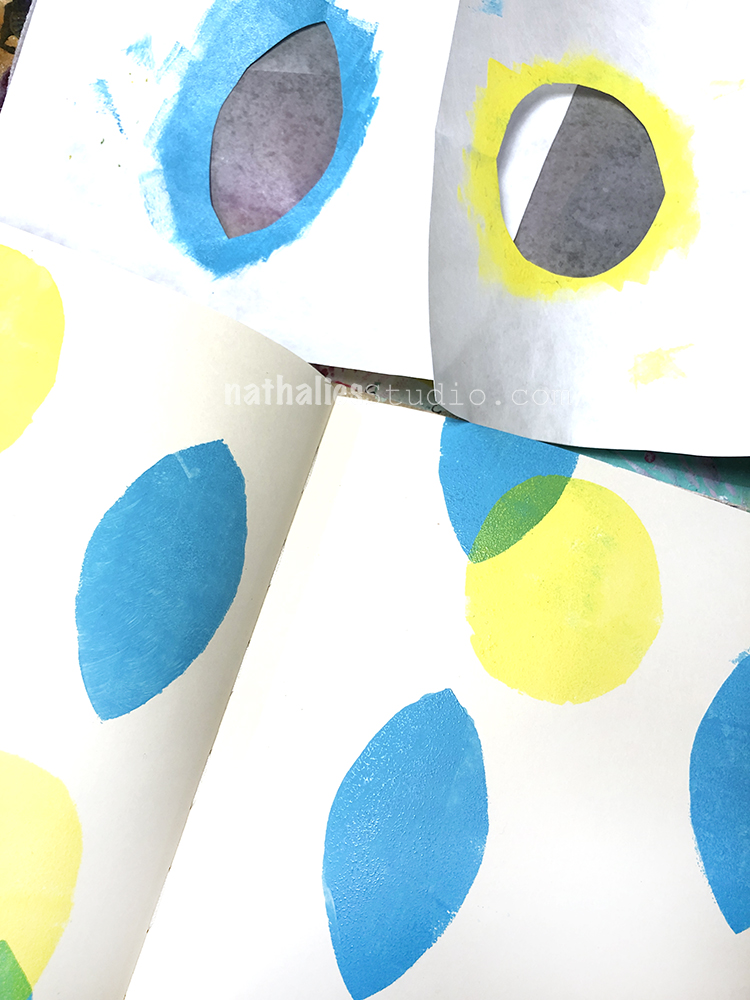
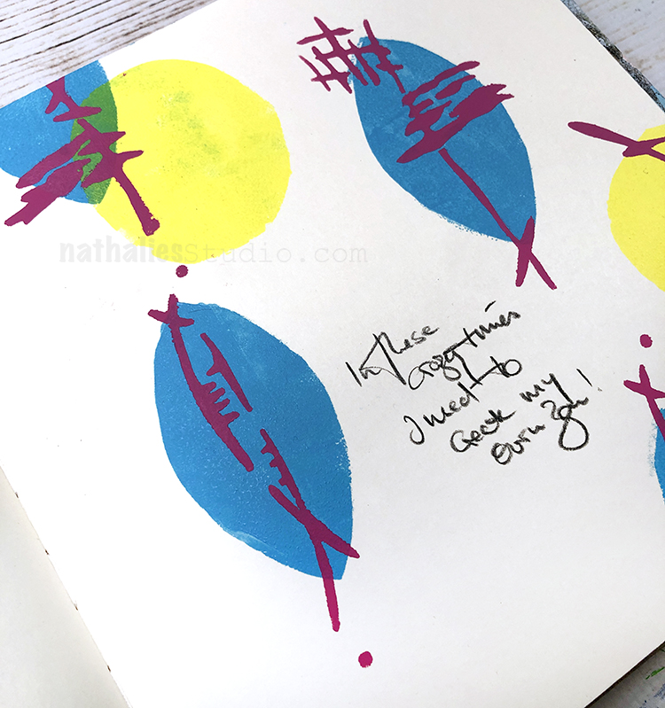
This month we are discussing our creative motivations. It’s Motivation March! I get motivated by experimenting with new products and seeing what I can make them do. A fun product that is pretty new to me is acrylic paint sprays. I have had so much fun learning how to use them that I am motivated to continue to try new color combinations and techniques. This month I am sharing a vintage inspired art journal page using some of my newest n*Studio favorites. Let’s get started.
In my large dylusions journal, I prepped the surface by applying a thick coat of clear gesso. Then I sprayed Aquamarine and Reseda Marabu Art Sprays.
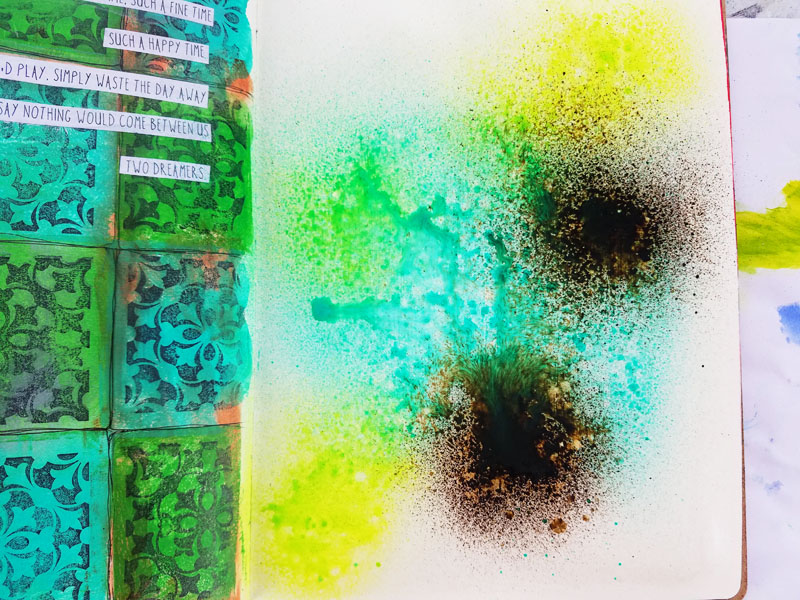
Moving quickly, I sprayed some Marabu Art Spray in Sienna. Then I spritzed the page with a fine mist of water.
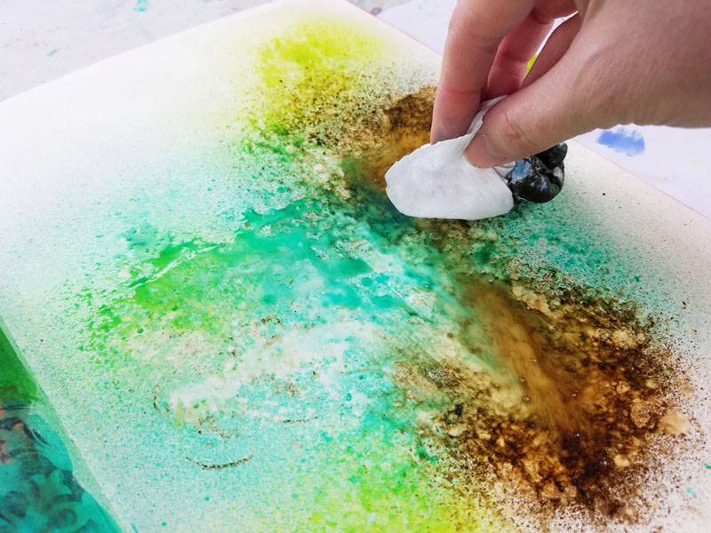
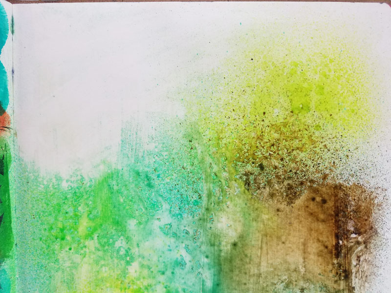
Using a baby wipe, I dabbed up the excess moisture and color.
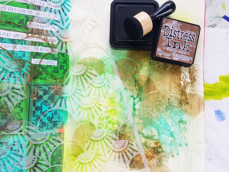
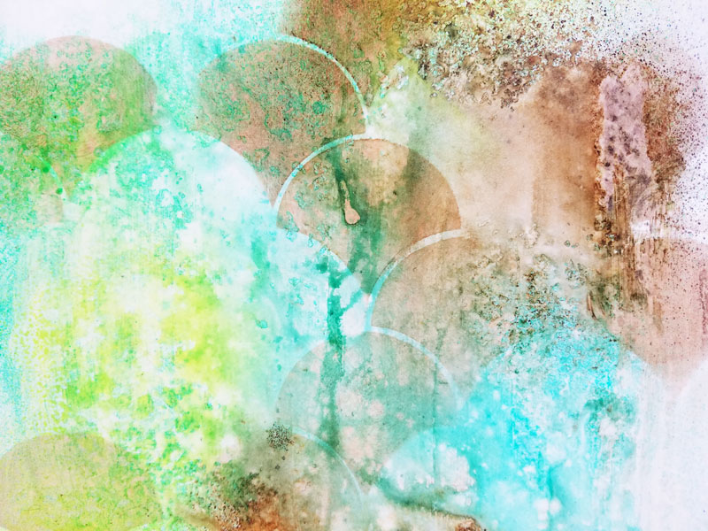
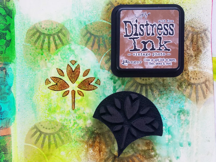
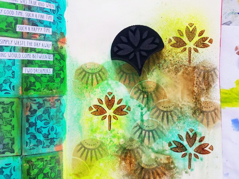
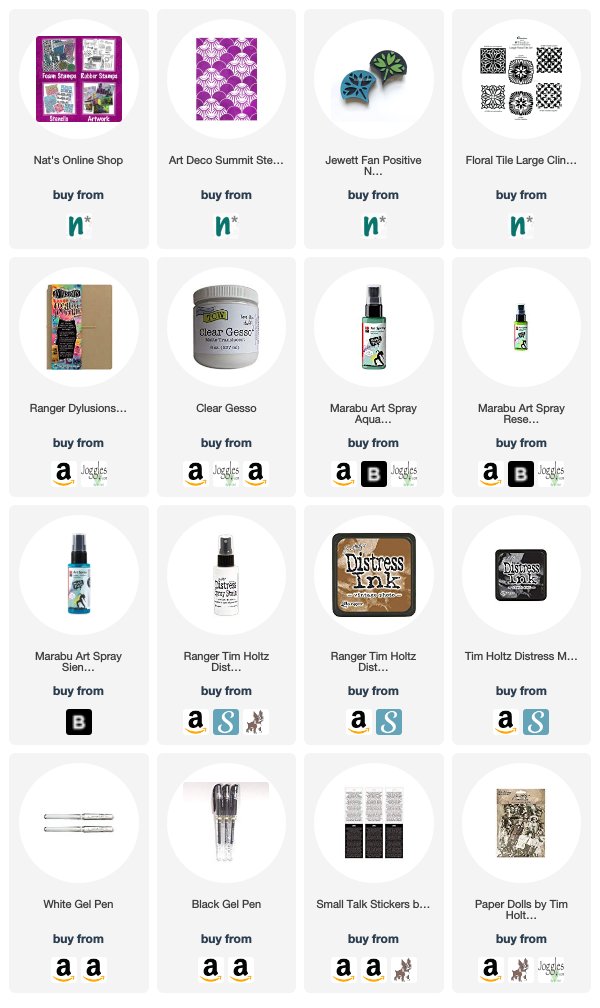
Using Nat’s Art Deco Summit stencil, I applied vintage photo distress ink through the open sections of the shell designs.
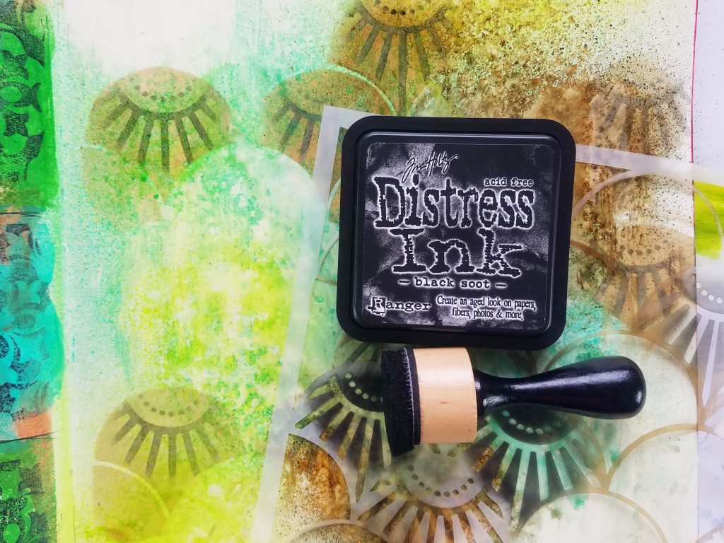
Next, I overlaid the design portions of the stencil back over the previous shell layer. I applied black soot distress ink.
For a vintage design element, I loaded up vintage photo distress ink onto Nat’s Jewett foam stamp and pressed it onto the page. Adding design elements in odd numbers is pleasing to the eye.
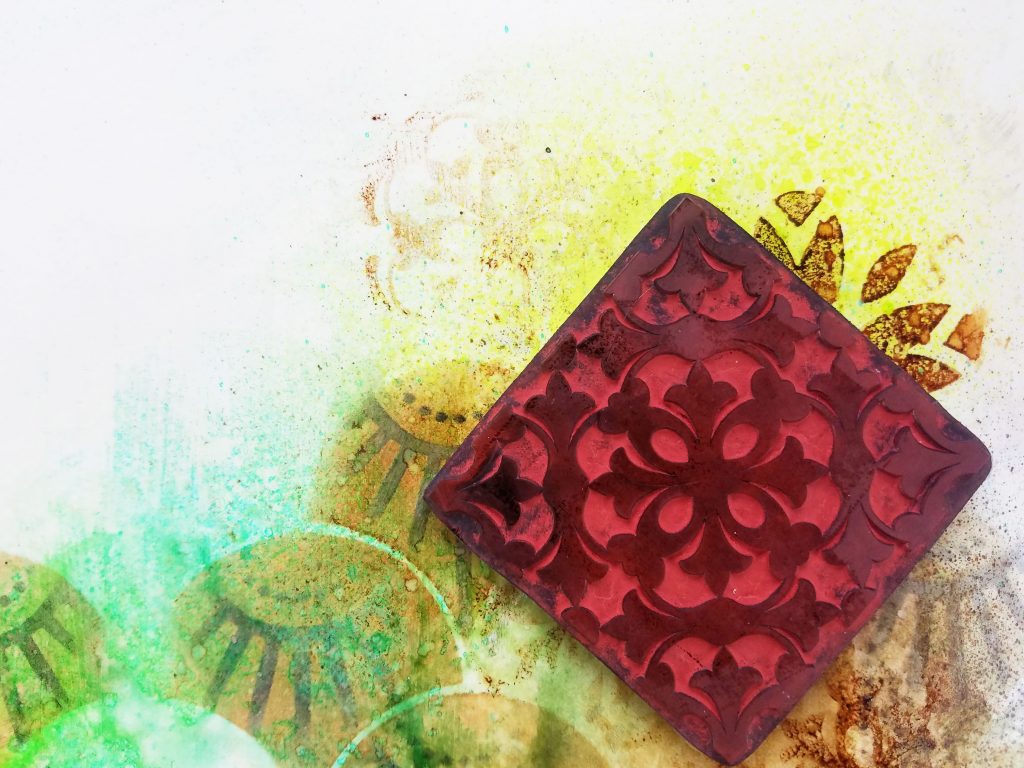
To make the right hand page feel more harmonious with the left hand page, also a n*Studio project, I am mirroring the stamped design from that page onto this one. I applied a very thin amount of vintage photo distress ink onto the Versailles positive rubber stamp and pressed it into a few places on my page.
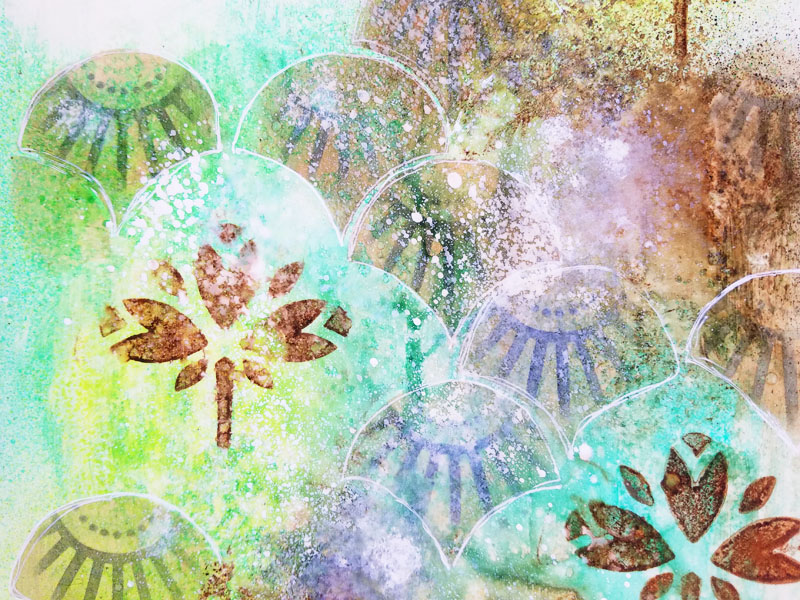
To add to the vintage look, I sprayed Distress Spray Stain in picket fence onto the page. Once dry, I doodled around the shapes with a white gel pen.(Later, I also doodle around them with a black gel pen.)
Using double sided tape, I added a paper doll cut out from Tim Holtz Idea-ology. Then I finished it off with a sticker from Tim Holtz Small Talk sticker package.
I hope you have enjoyed this tutorial. I hope you have found it – motivational!
Thank you Jennifer – I love the beautiful colors and blending for the spread!
Feel inspired? Working on something yourself that you’d like to share? I love to see how you interpret our monthly themes. Email me how you used my stencils and stamps with the theme and email me an image – I would love to share your projects in my next “n*Spiration From Around the Globe“.
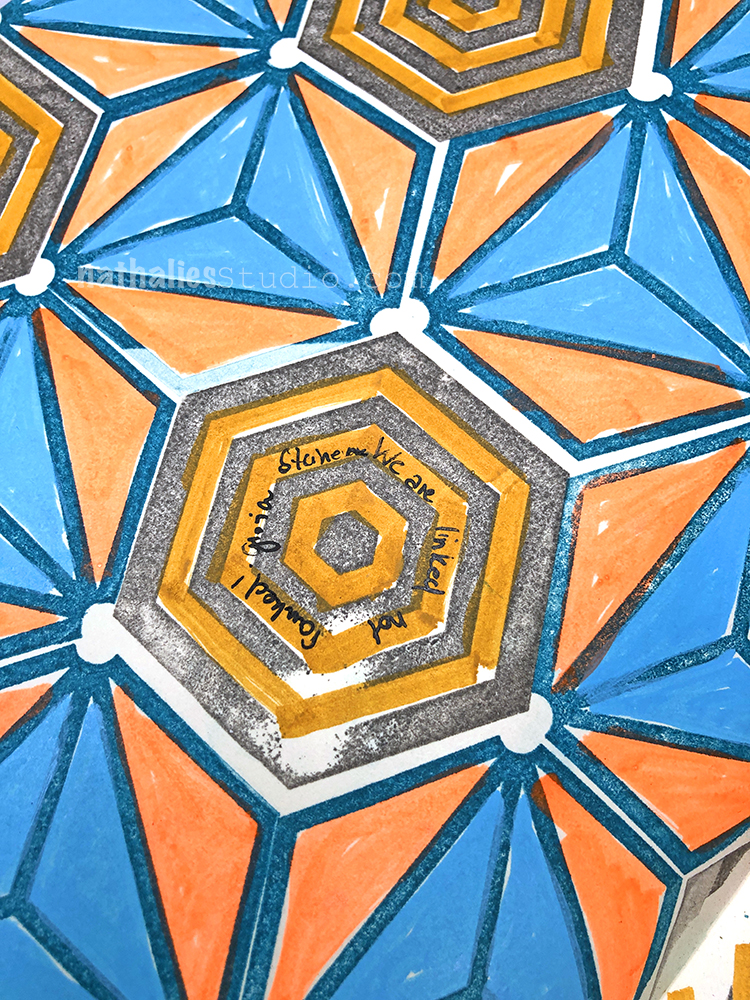
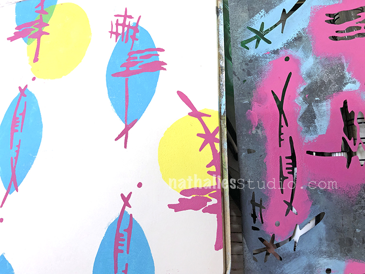
“We are linked not ranked” – Gloria Steinem This was neighborhood stroll inspired and a study for a painting. I love putting the the first idea for a painting into my art journal.
I used markers, spraypaint, and my Hex Set Large rubber stamps. It’s vibrant – just like my hood :) Pretty wild LOL
I will show the paintings I maid on canvas in the next couple days.
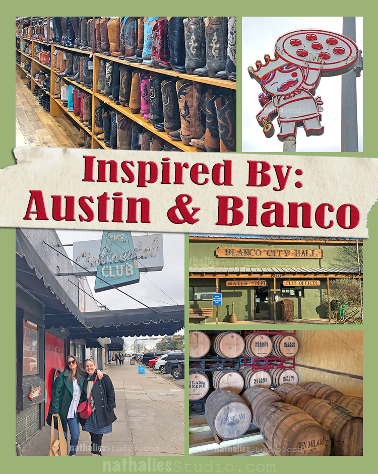
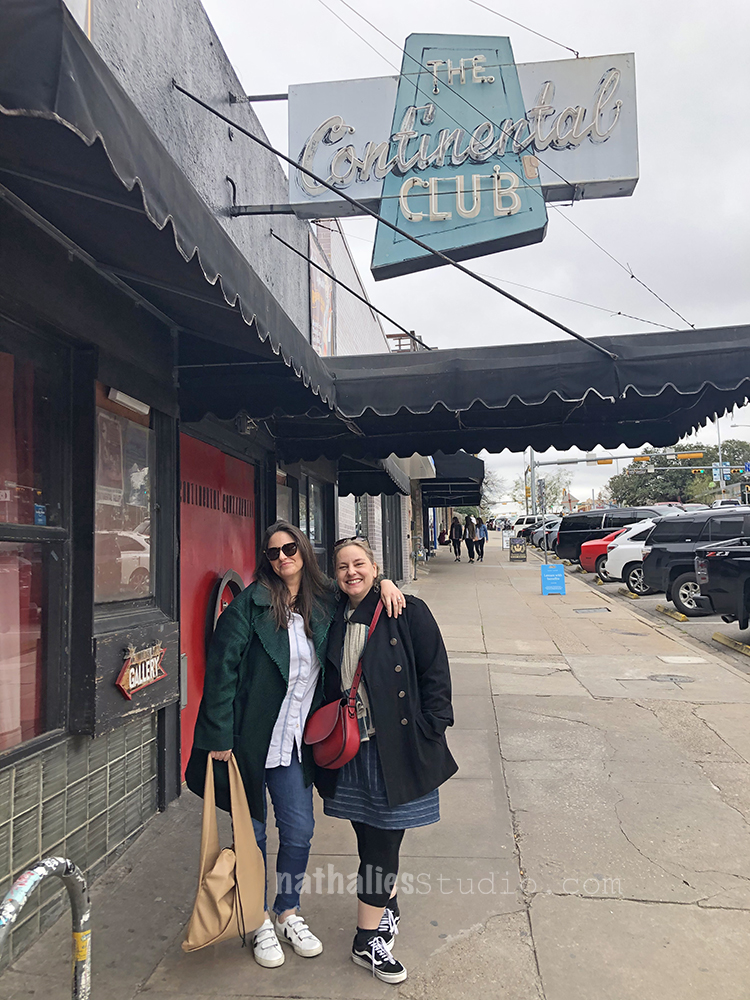
At the beginning of the month my girlfriends and I went to Austin to celebrate a special birthday with our friend Heather. It was a super fun and also very inspiring long weekend.
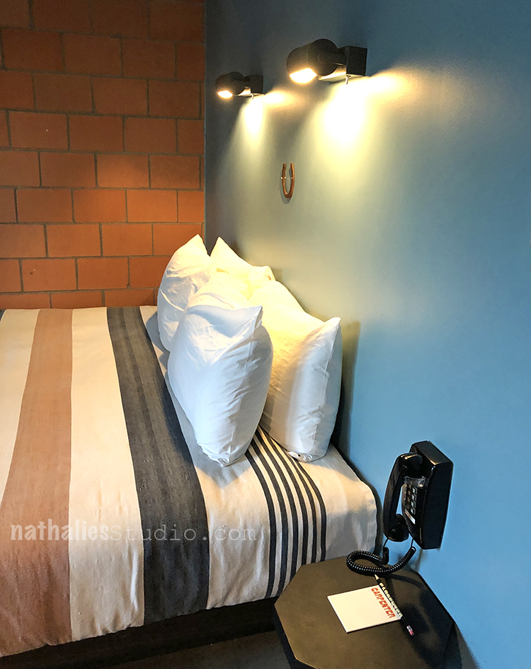
We stayed in an old Union house turned Hotel and I just loved the very slick but warm design of the rooms. Everything about it made me happy. Blue, brown, grey, black …ahhh swoon.
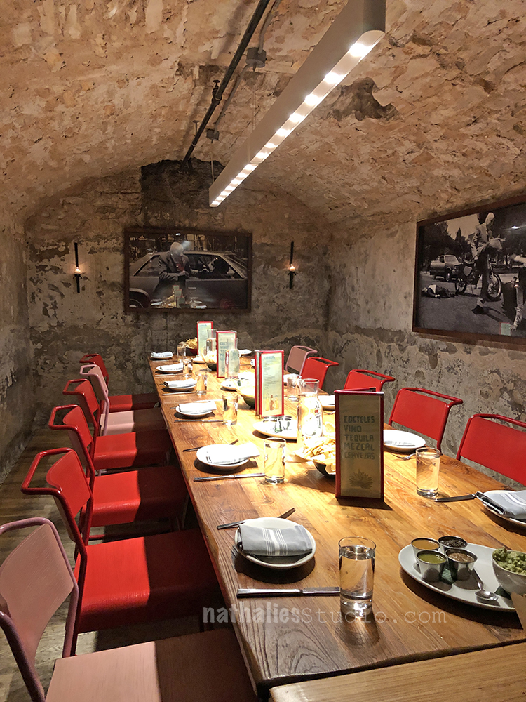
We had an amazing dinner in a private vault in the basement of a restaurant -That was super fun … no other photos “what happens in the vault – stays in the vault”
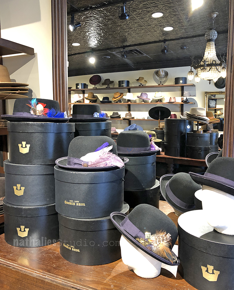
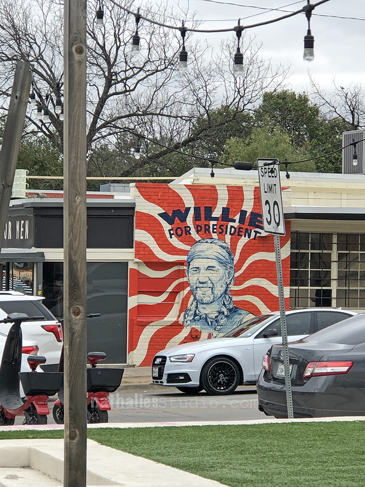
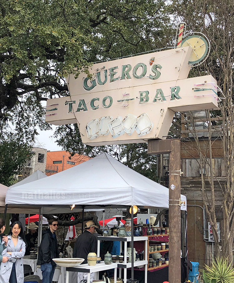
We went downtown for a little shopping trip on Congress South – of course I didn’t check the weather app again before I left and the temperature dropped significantly from the prediction I had seen- hence the interesting layered look – oh well. I loved the wonderful old signs on the stores
and realized once again that even though I badly want a cool hat- I am jhsut not a hat person.
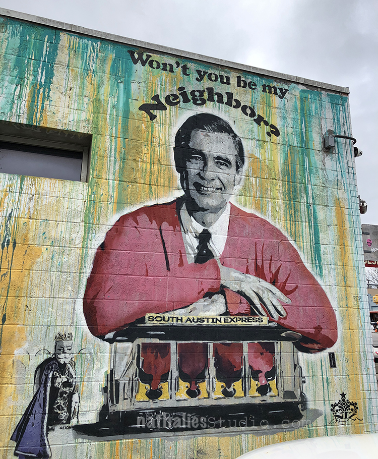
But I am a Mural person – and that was way cheaper too – LOL
Super fun !
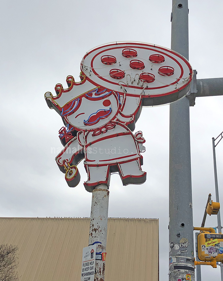
And I want this pizza sign -it is the cutest!
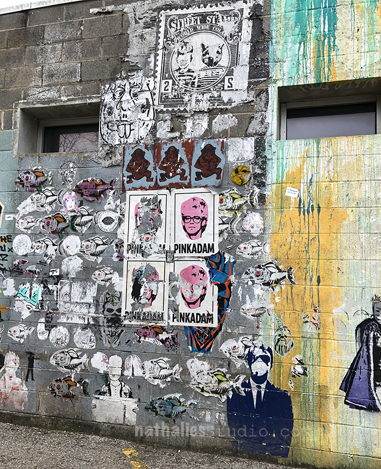
Also — why not- LOL- I like it!
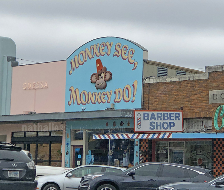
More amazing signs and storefronts
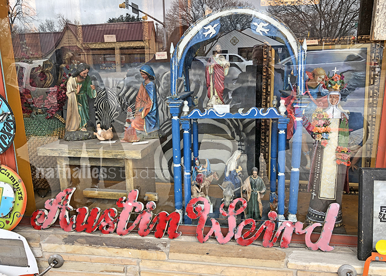
And def. liked how Austin celebrates their “Keep Austin Weird” motto.
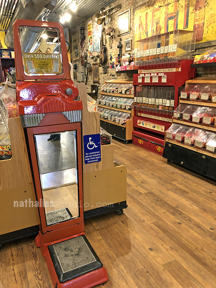
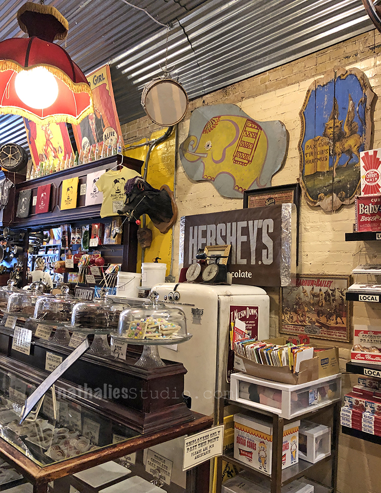
which was proven once again in the candy store- Who puts a scale in a candy store? That is soooo weird – LOL.
That Candy store was really cool!!!!
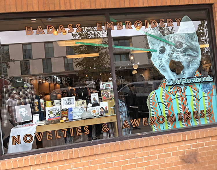
This store window was cooler than the store- but I like the name …I wish it was a real yarn and embroidery store LOL.
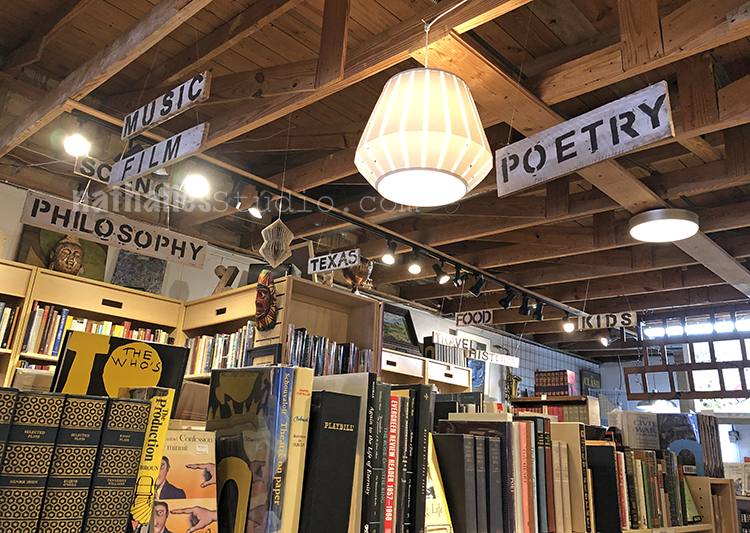
This book store had a beautiful set up and book art everywhere – I could have spent hours in there.
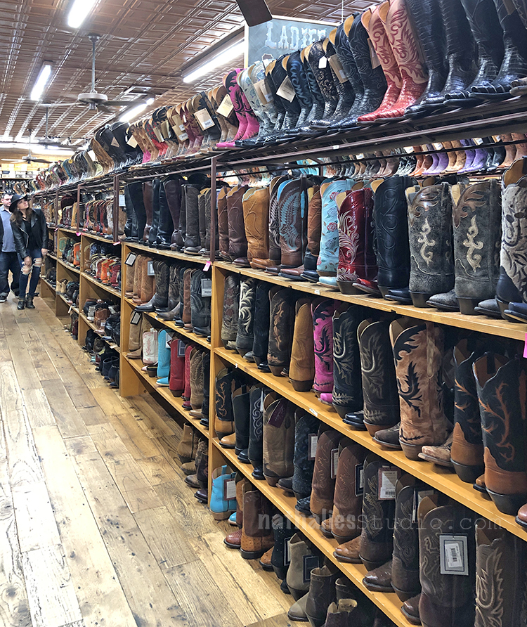
Fun – and famous Boot Store – I am not a Cowboy boot person but some of these were pretty pretty cool.
More cool signs – I am a sucker for awesome vintage signs.
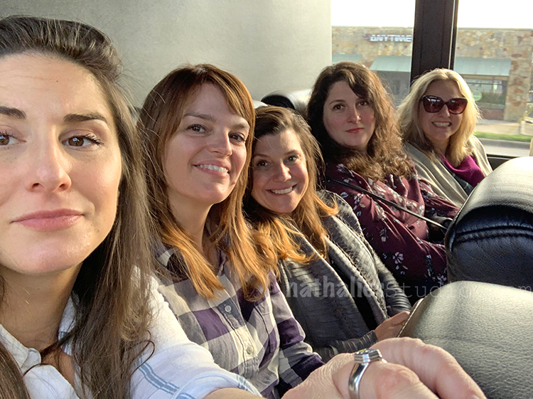
Here our “old gang” in the back of a rented bus to bring us to our friend’s party – Don’t be fooled- this is a tame picture from the beginning of the trip and …well what happens in the back of the bus stays in the back of the bus ;)
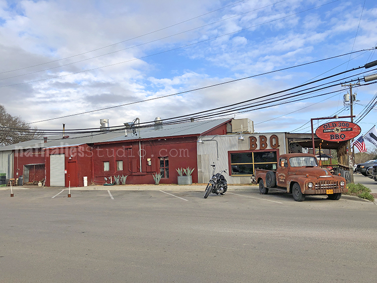
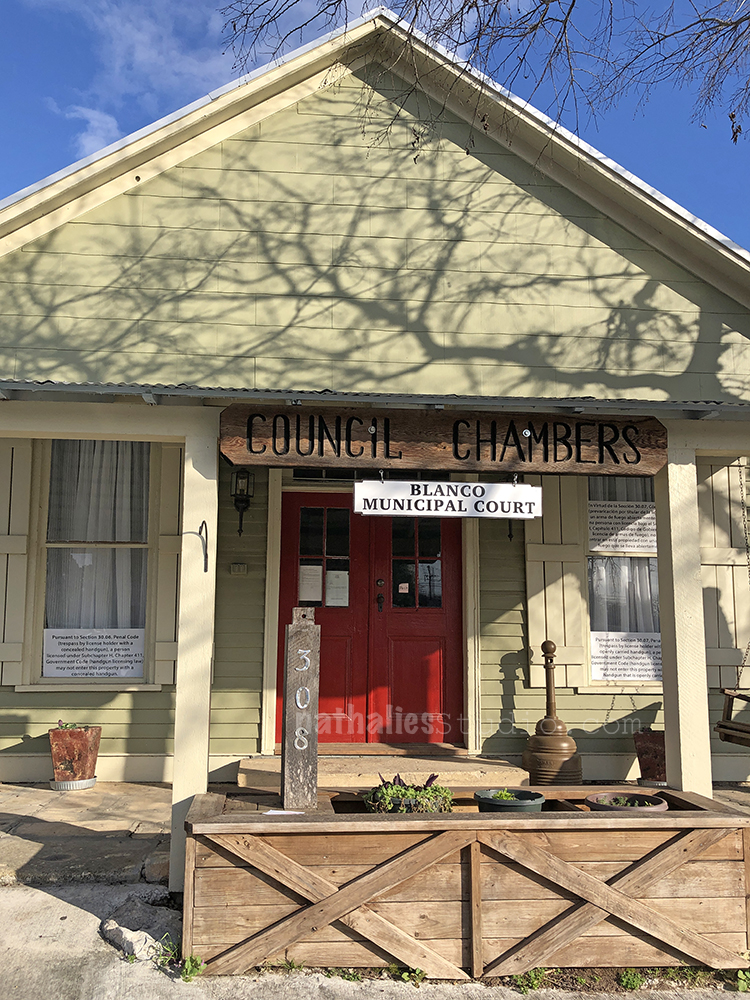
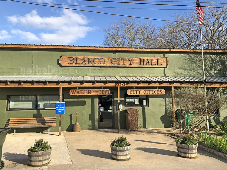
We stoped in Blanco- what a cute little town. Very picturesque.
And I just fell in love with those city buildings
I want to paint those!
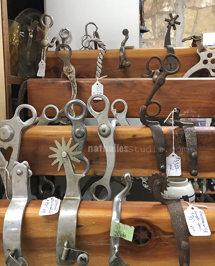
And what do you find when you go to an antique store in Blanco? Spurs – I had no ideas there are so many different designs – these are so cool.
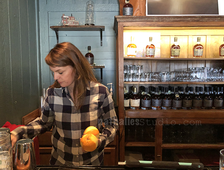
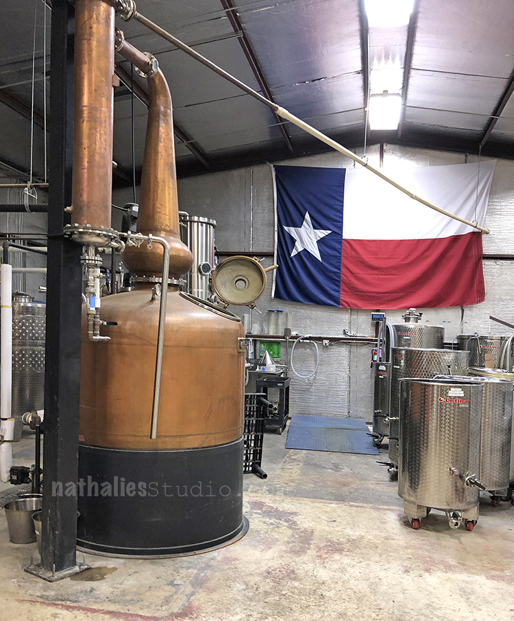
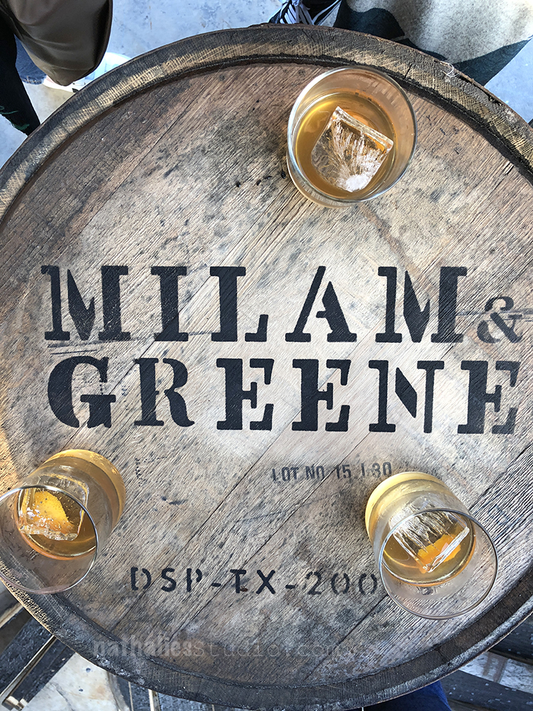
Our friend making drinks for us. She is the Greene in Milam&Greene Whiskey and the party was at the Distillery. We are so proud of her even though that means she moved away from us :(
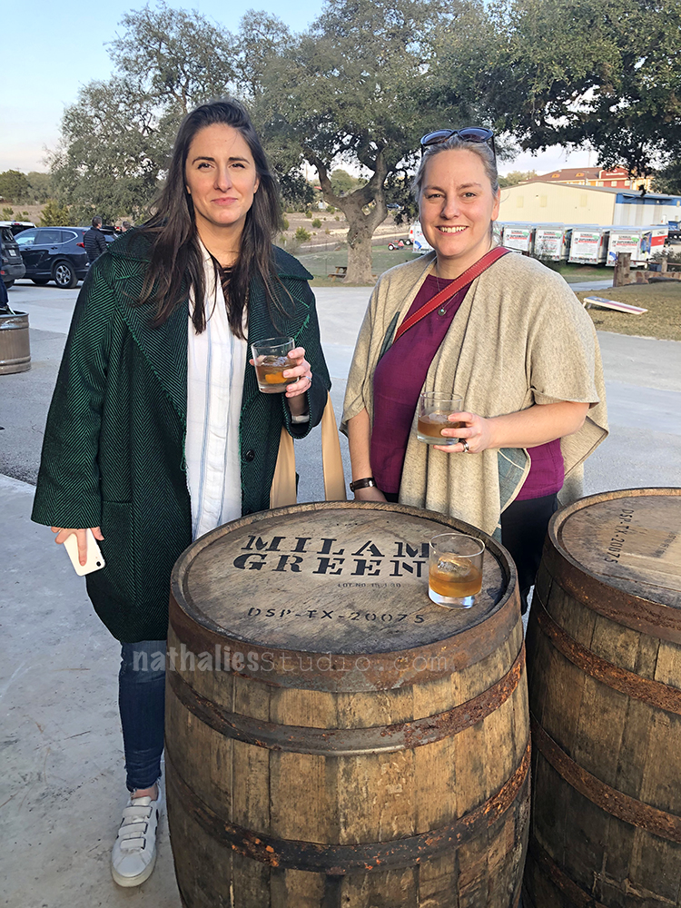
We had a great time seeing the distillery and spending time with old and new friends
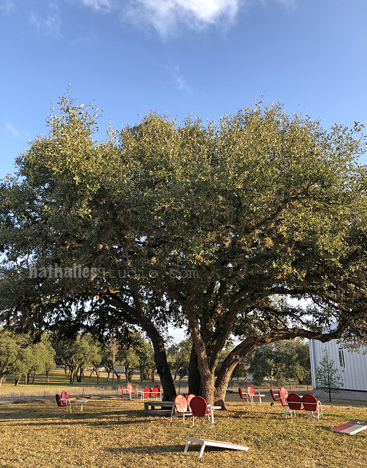
I love this oak tree right outside of the tasting room
It is a great place to visit -if you are ever in the area take a spin and visit the tasting room! And if you see my friend Heather -say hello from her friend Nat in Jersey ;)
I cannot wait to go back some time later this year- it was a lot of fun and there is so much more to see. Next time I make sure to bring my sketch book …for before the tasting of course ;)
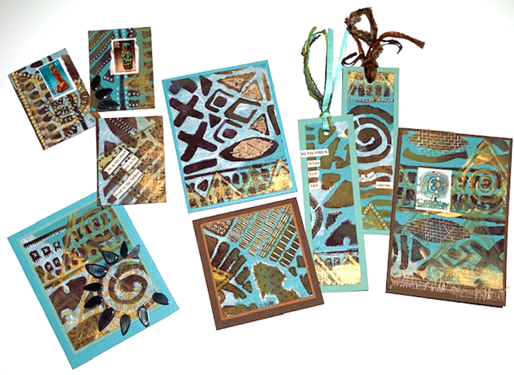
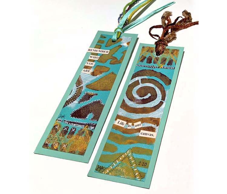
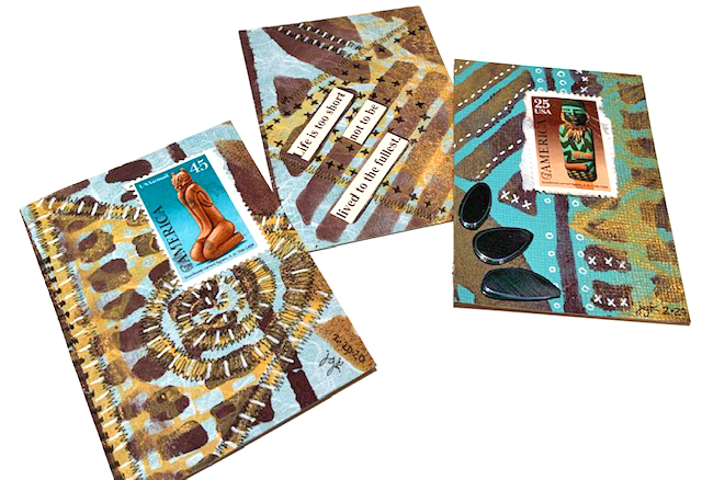
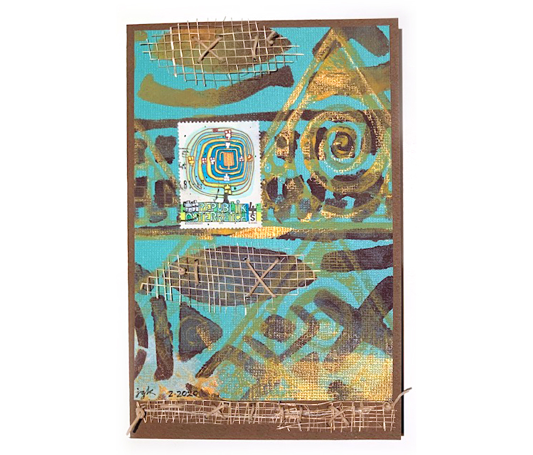
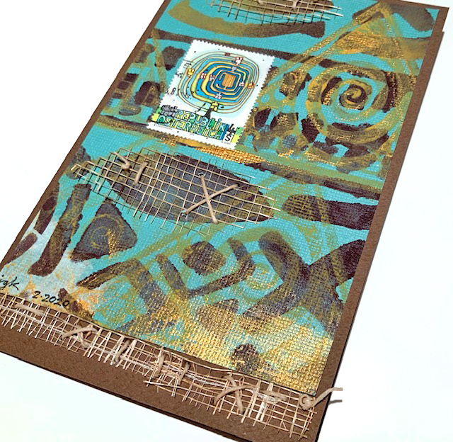
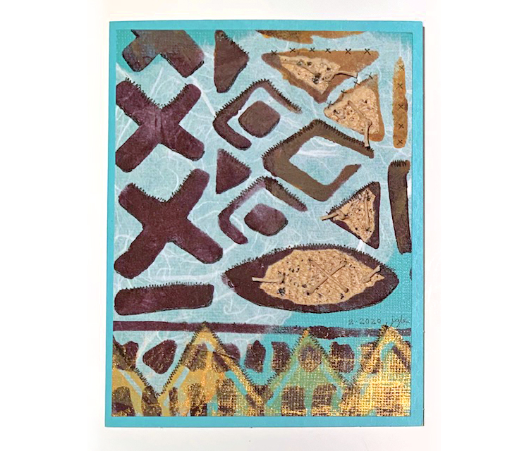
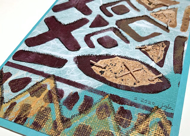
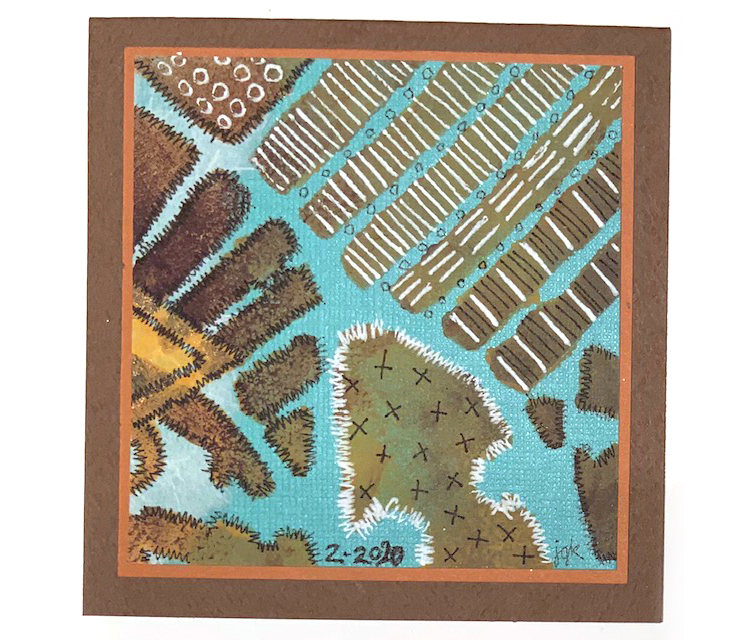
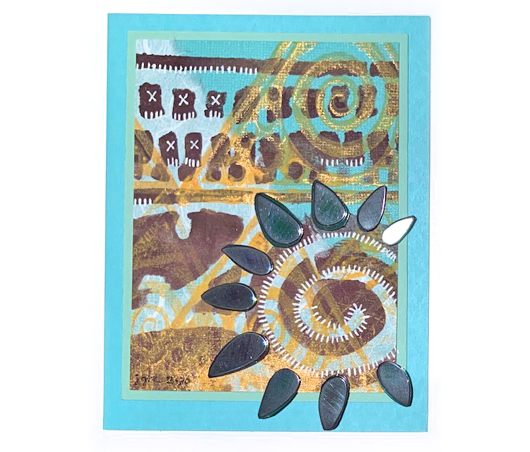
We have some very yummy creations from Creative Squad member Judi Kauffman to share with you today: cards, ATCs, and bookmarks! You know I love the brown and teal color combination – makes me happy. And there are so many other touches in these that catch my eye too: the handmade paper for texture and visual interest underneath the stenciling (so cool), the mesh she put in there (again- soo cool!), and the white mark making.
Where did these projects originate? When Judi planned her 2020 calendar project her goal was to use each month’s page for other projects. What you see above was made with the January page!
So here we go from Judi: 2 bookmarks, 3 ATCs, and 4 cards for you today.
Bookmarks with stitching and some of my artfoamies stamps.
ATCs with postal stamps, my batik design, and lots of excellent markmaking.
More Batik pattern, mesh fabric, and postage stamps on a card…
Batik pattern, stitched elements, and handmade paper on this card…
A square card with lots of wonderful stitching…
And a card with some embellishments that makes me think of sunshine :)


Love it Nat and could you please stop selling out of your minis so quickly! ;-)
Reply