Blog: Acrylic paint

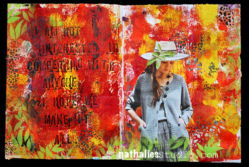
Hope We Make It All or …In my Art Journal today

NatKalbach_Hopewemakeitall01

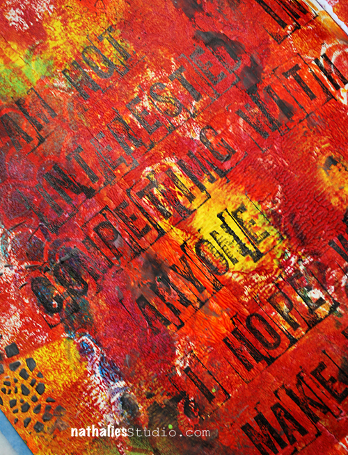
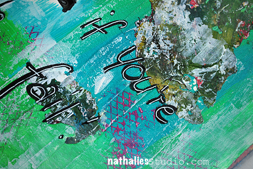
Journaling says: I am not interested in competing with anyone. I hope we make it all.

NatKalbach_Hopewemakeitall02

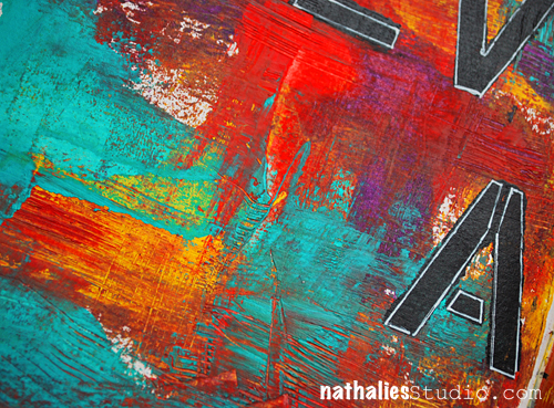
had a good time playing with heavy body acrylic paint to get a nice background texture. Used Flexible Modeling Paste with black over my Crackle Stencil and green Spray Paint over Jessica Sporn’s Leave Stencil. Here is a list of the materials I used:

nSupplies


Have a beautiful day!

Comments (2)

  • Sue Clarke

    |

    Flexible modeling paste just added to my list of wants.
    Lovely colors Nat.

    Reply

Leave a comment

Lady Liberty Goes San Francisco – Canvas

NatKalbach_LadyLibertyGoesSF01

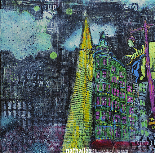
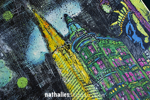
Another city for a change – yep – Lady Liberty went San Francisco ;)

NatKalbach_LadyLibertyGoesSF02


I guess I have a crush on Flat Iron Buildings  – we have a tiny one here in Jersey City too – I think it is time to add that one to my J.C. Canvas Collection :)

Have an amazing day

Comments (4)

  • Laura S

    |

    Gorgeous, Nathalie! I wonder if every metropolitan city has their token Flat Iron? It might be cool to travel to each city in the US or the world, and visit these historical beauties. Have a beautiful week!

    Reply

  • Laura

    |

    A flat iron building would make a great stencil ;)

    Reply

  • Nurse Ratchet

    |

    Love this piece Nat..I have a love of the Flatiron buildings as well, especially the one in my home town.

    Reply

Leave a comment

When The Why Is Clear or… In my art journal today

NatKalbach_WhenTheWhy01

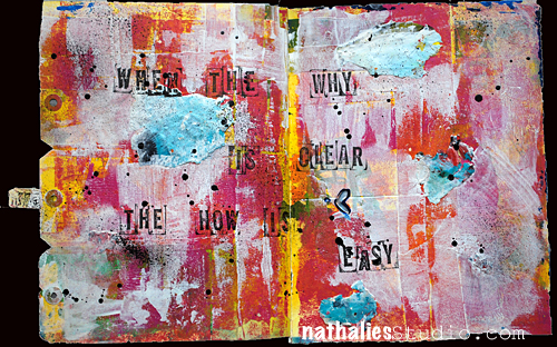
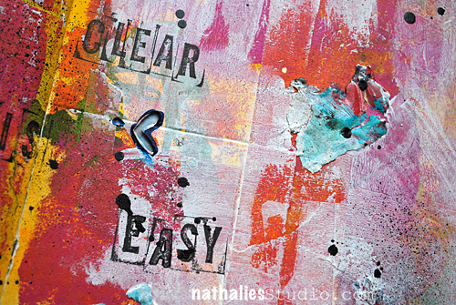
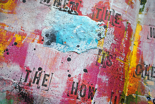
When the why is clear, the how is easy. – unknown

I love this – makes so much sense in so many parts of your life :)

NatKalbach_WhenTheWhy02

Used Soft Body Acrylic Paints on the background and layered them adding gesso here and there. I also used some paint skins and applied them with Gloss Medium and Varnish – I love how they fuse into the background and yet add texture and visual interest.

NatKalbach_WhenTheWhy03


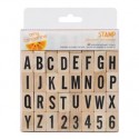
Then I just stamped the quote with the wooden alphabet stamps.

Done :)

nSupplies


Have a gorgeous day!

Comments (8)

  • Jean

    |

    Love the quote. It really does answer a lot of questions, don’t you think?!
    As always, your art is so inspiring. Thanks for sharing.

    Reply

    • nathalie-kalbach

      |

      Yes it does Jean :) I take it as a reminder when I sometimes struggle on the things that need to be done ;) thank you for your sweet words!

      Reply

  • Ashley

    |

    Love the grungy effect!! And the colours are great!

    Reply

  • Gunvor

    |

    Awesome – love the texture! And I can totally relate to the quote :)

    Reply

  • Sue Clarke

    |

    Interesting quote which I need to give more thought to.
    Hope you have a bright day as well Nat.

    Reply

Leave a comment

Try to Fail or…In my Art Journal Today

NatKalbach_TryToFail01


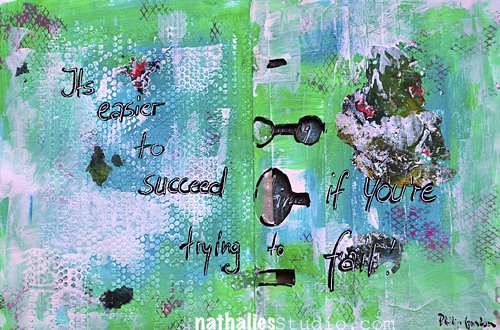
“It’s easier to succeed if you’re trying to fail” – Philip Guston

So very true  – and something I tell my students quite often  too – if you just enjoy the process and don’t care about the outcome – the result usually rocks for you!

NatKalbach_TryToFail02


I love using some of my left over color chips on my palette – I peel it of and apply it with Gel Medium – gives texture and interesting little color fields in the art journal. Texture in the background was achieved with heavy gesso through punchinella and then I painted over and applied again a thinner layer of gesso here and there to lighten areas up.

NatKalbach_TryToFail03


Here are the supplies I used for this page:

nSupplies


Have a wonderful day


Comments (2)

  • Sue Clarke

    |

    Cosmetic sponges have changed the way that I play in my art journal.

    Reply

Leave a comment

Witnessed – Canvas

NatKalbach_Witnessed01

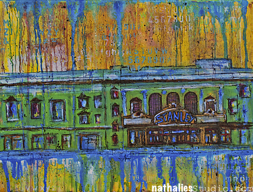
A new canvas is done- I call it “Witnessed” . It shows the Stanley Theatre on the right – a very beautiful theater here in Jersey City- right across another beautiful one- the Loew’s Theatre.
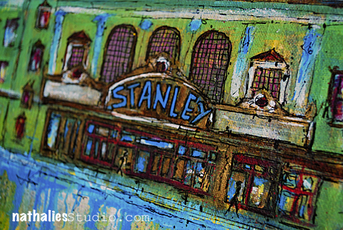
NatKalbach_Witnessed02

As the story goes the theatre was terribly neglected and falling apart, until it was purchased by Jehovah’s Witnesses. Loads of volunteers worked on brining it back to old time glory- and I heard it looks beautiful inside.
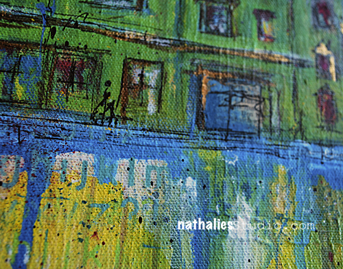
NatKalbach_Witnessed03

I find it fascinating how a building can be saved and used for something else as it was intended when it was built. It reminds me on the many discussions if it is ok to use a church that falls apart and turn it into an apartment building.  I am glad this building is still here and I stopped when I walked by and enjoyed and witnessed it’s outside beauty.
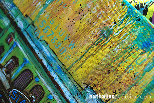
NatKalbach_Witnessed04


Do you have a building in your neighbor hood that was turned into something surprisingly?

I used Acrylic Paints, Inks, Markers and Spray Paints, as well as some water-soluble wax bars – and some collage items. Here is a list

nSupplies


Have a wonderful day!


Comments (6)

  • AnnaB

    |

    Your paintings are so cool Nat! I love the strong colours and the black details!

    Reply

  • Gina Sismilich

    |

    This is a gorgeous painting – I love your colorful paintings of buildings/cityscapes!

    Reply

  • Laura Strack

    |

    Not in my neighborhood, but in the historical part of my home town, there are old cottage homes that are now little stores that sell vintage and antique goodies or homemade cup cakes etc. It is always fun to stroll their sidewalks and shop till you drop!

    Reply

  • Sylvia

    |

    It’s an amazing building and I am so happy it’s in your neighborhood and you painted it so beautifully!

    Reply

  • Sue Clarke

    |

    Not in my neighborhood, but I have been in a small church that was made into an art museum. It was nice and I do consider art to be very spiritual (in many cases).

    Reply

Leave a comment

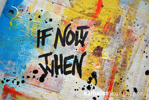
So When? or …In my Art Journal today

NatKalbach_IfNotNow01

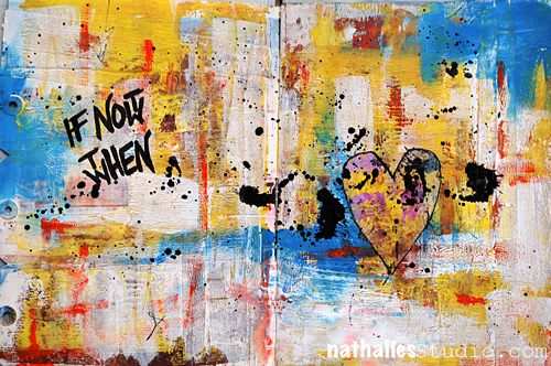
I used this before in a canvas- but I do love it so much- I wanted to use it again.

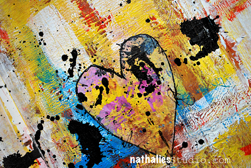
NatKalbach_IfNotNow02


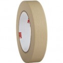
The texture comes from the masking tape underneath – I just scraped the paint over it to reveal the texture and then used a brush to add some orange marks here and there into the still wet paint.

NatKalbach_IfNotNow03


The heart is a cut out from a deli paper mono print and I created the big black splots by using my beloved Liquitex splatter tool with black acrylic ink.

Here is the supply list for you:

nSupplies


have a wonderful day!!


Comments (3)

  • stephanie

    |

    the texture is awesome!

    Reply

  • Sue Clarke

    |

    I am so drawn to that texture and was happy to read that you used masking tape to get it. I have some masking tape. Creative play here I come.

    Reply

Leave a comment

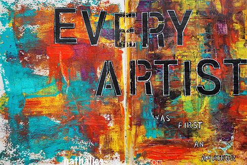
Every Artist … or in my Art Journal today

NatKalbachEveryARtist01


For this page I was going for the colors – I love these colors together. On top just some stenciling – I love it – not every page has to be super complicated and full of different techniques.

NatKalbachEveryARtist02


The sgraffito texture is my favorite here- scratching through the layers and then using the back of the painting knife again to cover up parts.

nSupplies


What are you up to today?

hugs


Comments (3)

  • Laura Strack

    |

    Love your sgraffito texture. I’d love to learn this technique!! I’m getting ready to take mini vaca and I will get to visit with 2 of my sisters. Can’t wait to have some crafty girl time, you know therapy!

    Reply

  • susan salyer

    |

    making journal pages with stamps..so many stamps I never use
    hugs
    susan s

    Reply

  • Sue Clarke

    |

    Well I’m taking my dog to a dog island but your question might have been about crafting so for that I sprayed some inks for backgrounds in my art journal. I’ve been stuck on blue, orange and wine.

    Reply

Leave a comment

She Became Dangerous or … In my Art Journal today

NatKalbachDangerous01

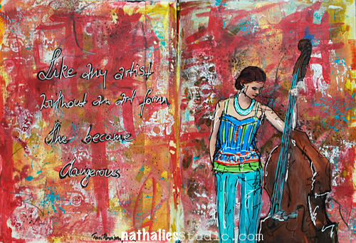
“Like any artist without an art form she became dangerous”


NatKalbachDangerous02

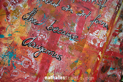
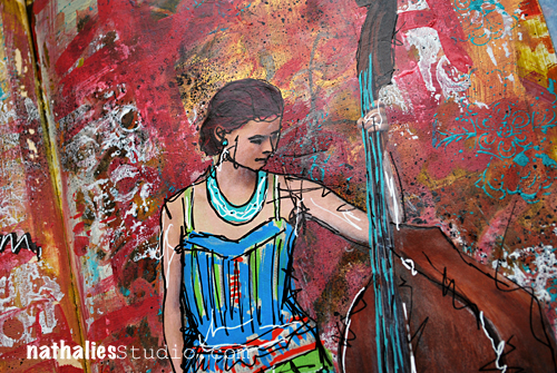
In this background I played with different brushstrokes and I do really like how it worked out. I also stamped with white to lighten up the page a bit again.


NatKalbachDangerous03


It fascinates me how many different looking backgrounds you can create with just acrylic paint – my favorite medium ever!

nSupplies


Have a beautiful day

Nat

LogoBlogSignature

Comments (2)

  • Myra Caballero

    |

    I like how vibrant & dynamic the line work in the lady looks against the textured background. Very nice work!

    Reply

  • Sue Clarke

    |

    I admire the texture and the combination of colors.

    Reply

Leave a comment

Perfect Is Boring or… In My Art Journal

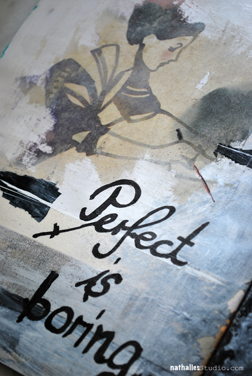
NatKalbach_PerfectBoring01

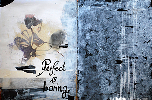
Don’t you agree?

NatKalbach_PerfectBoring02

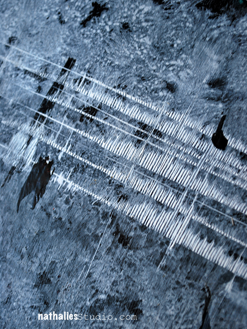
I did a newspaper image transfer with Gloss Medium & Varnish and then played with black and white acrylic paint – stippling the white onto the black surface which makes it almost look bluish. I wrote the title with a Bamboo Nip Pen- I have mine forever and love using it with paint medium to handwrite title. Here I used acrylic ink.

NatKalbach_PerfectBoring03

And some mark making. I love this – it was a great outside the box play for me, which I often do in my art journals but I totally loved the background and I think you might have noticed I applied this to my “On The Flip Side” Canvas.

Here are the supplies I used:

nSupplies


Have a gorgeous day!
Nat

LogoBlogSignature

Comments (6)

  • Tracy

    |

    Perfect is indeed boring! I really like the markings in white, made me think of a barcode or music equalizer. Very cool!
    Reply

  • Andrene

    |

    Really beautiful page. The transfer is perfect and I love the b&w background with those really cool marks…hmmm? On The Flip Side is one of my favorites of yours for 2014!

    Reply

  • Myra Caballero

    |

    Yes, perfect is boring! Perfect lacks personality & character. I really like what you achieved with your journal. The textures & layers give it a lot of movement. The white markings remind me of a music equalizer or a pulse. Very interesting! Thanks for sharing!

    Reply

  • Amante del Papel

    |

    Wow this is so beautiful!!!

    Reply

  • Sue Clarke

    |

    This page stood out when I watched the flip through and I love the black and white…it really catches my eye and then pushes me back to the lady on the left. Different for you and stunning as well.

    Reply

  • nanou49

    |

    i love your work with bamboo pen
    gorgeous background!

    Reply

Leave a comment