nathalie-kalbach

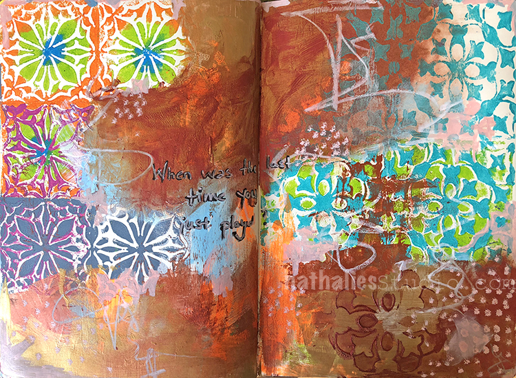
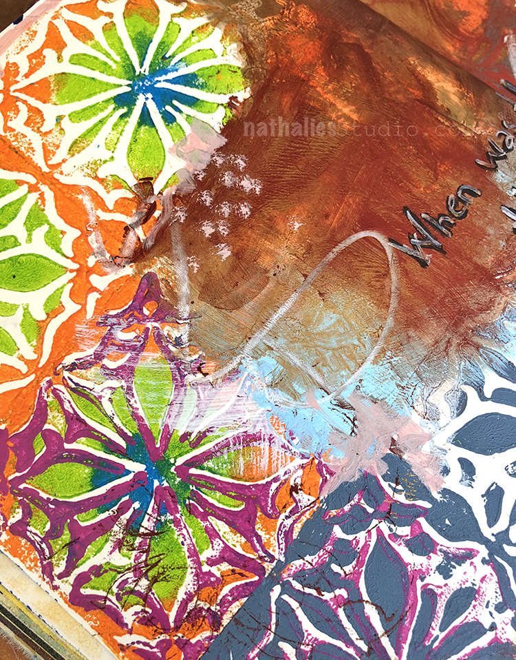
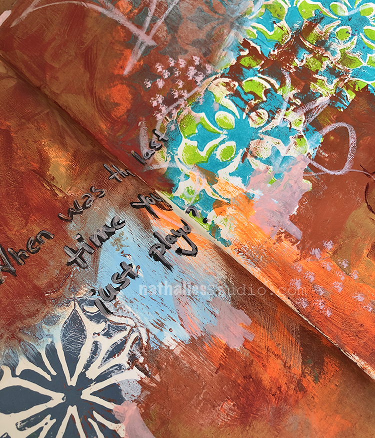
When was the last time you just played? Art Journal

The last couple weeks I was working on a lot of “schtuff” that was kind of deadline infused and when I was looking at the page here and wondered where I should take it- I decided I would just play and do whatever …

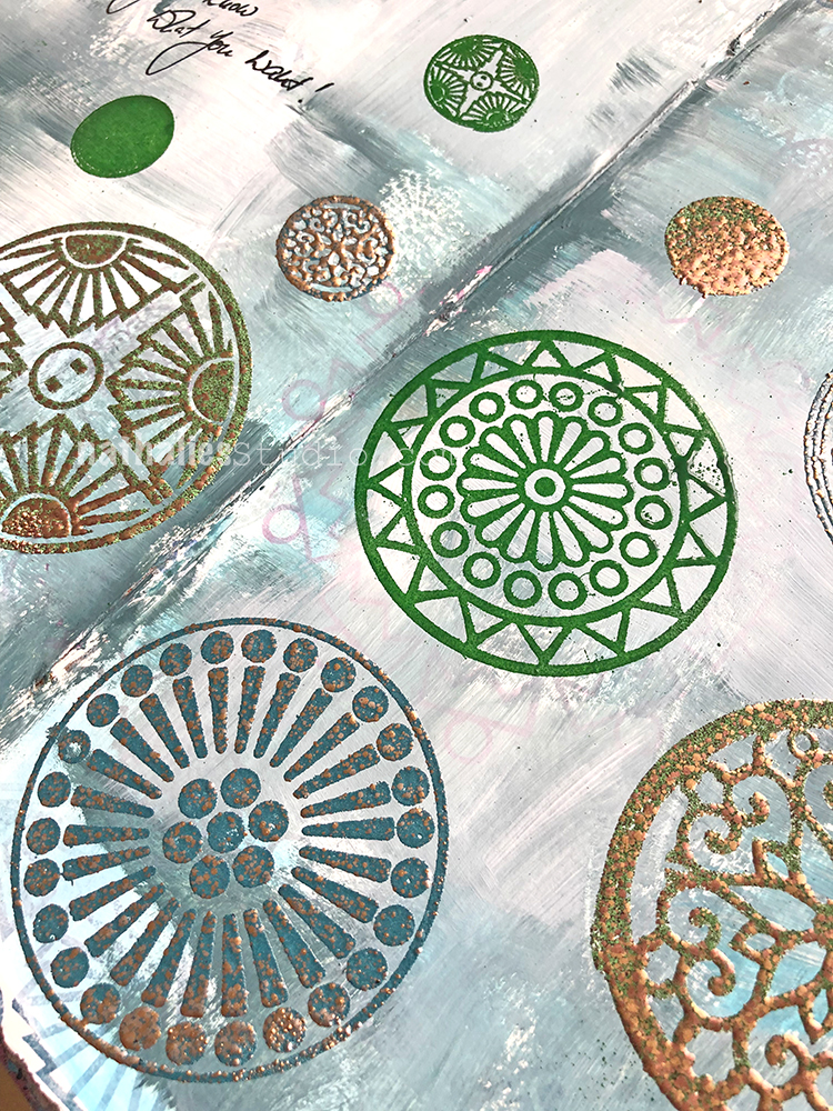
I had used my Versailles Positive and Negative Foam Stamp Set and layered them on top of each other

as well as the Van Vorst Positive and Negative Foam Stamp Set.

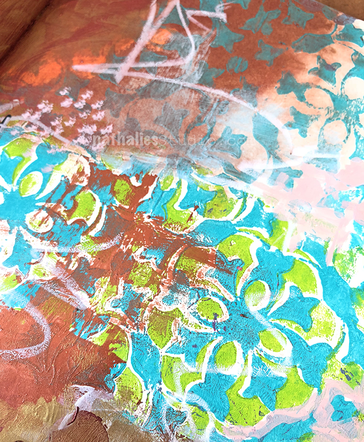
I played with some colors and wax paste , new graphite sticks and weathering areas- and had a really good time. And that is all that counts.

Now…when was the last time you just played? :)

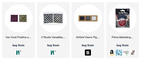
Here are some of the supplies I used for the spread:


Leave a comment

Back to School: Watercolor Class at JCAS

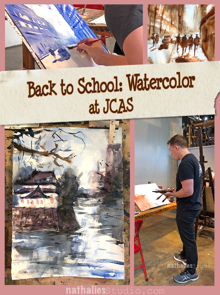
Last Sunday was the last lesson of six in a Watercolor class with John Duval at the Jersey City Art School. As some of you might know I have taken two printmaking classes already there and I really love being able to do something different over several weeks, and just being able to walk there.

This was the first time I took a Sunday morning class and I have to say, despite my first hesitance of getting up early on a Sunday it was really awesome – having my friend Mary join helped ;)

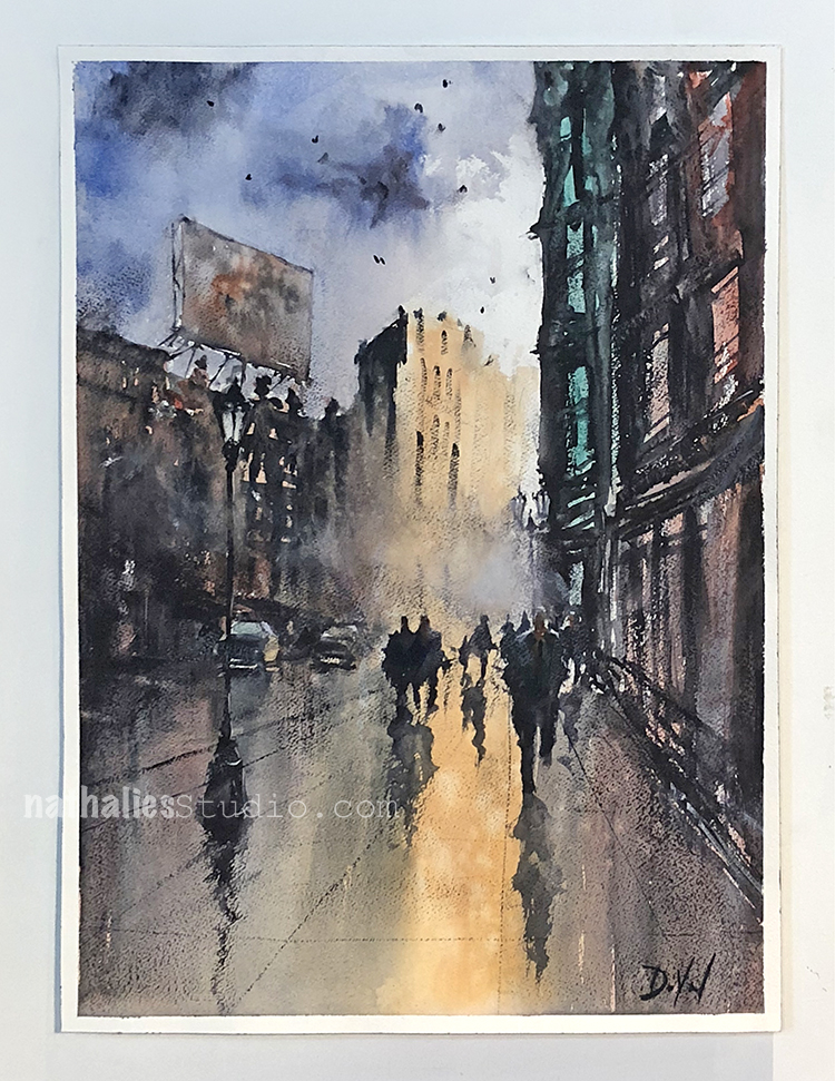
What drew me in taking the class were several factors – I really suck in painting with watercolors and I love John’s loose expressionistic style depicting urban landscapes. Here are three gorgeous samples of John’s work- check out his website for more or follow him on instagram!
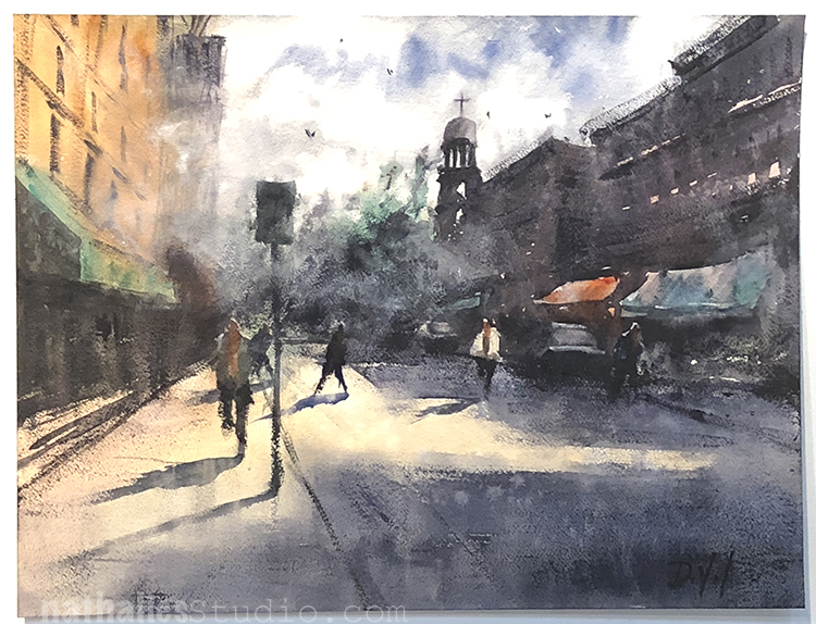
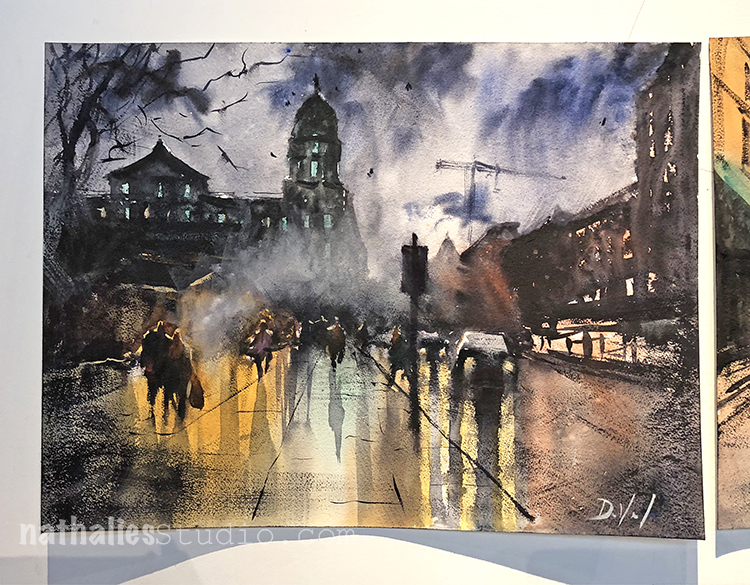
John started with explaining and showing the different applications of watercolor he uses for his watercolor paintings- from very wet application (wash), to medium wet and sticky watercolor application, to dry brush application.
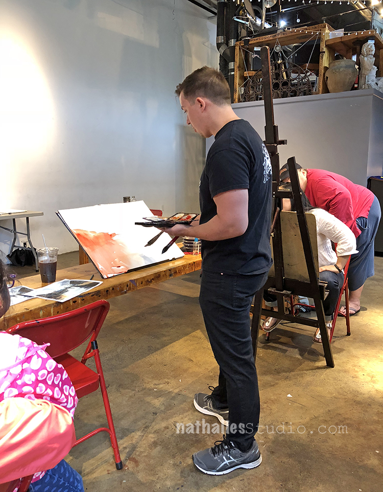
He talked about the importance of planning a painting and how to not shift your plan. You can imagine that was a tough one for me ;)
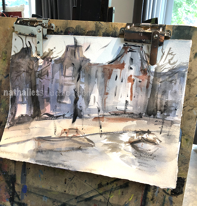
Above one of my first attempts …gosh …sigh …but hey- it was fun and I learned a lot

One of my favorite aspects of the class was his usage of a limited color palette (yeah I know guys- awkward right?) and how to play with alternating warm and then cool colors and vice versa in the layers.
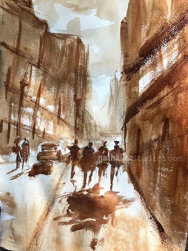
Me trying out the one tone approach – there are areas that I like and some I am like “WTH”?

I loved seeing his demos of painting from start to finish and talking through his process as well as how he chooses a subject to paint. At first I was really itchy to get back to the easel and paint myself, but I realized very soon that a lot of what he talked about and went through sticked in my head and was helpful for my own process. Very dear to my heart was his approach of not being afraid of changing up the scene so that it looks interesting or reflects how you feel rather than the actual depiction of the place.
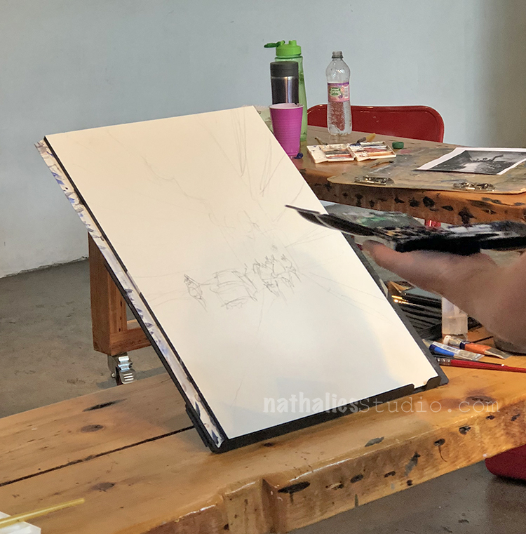
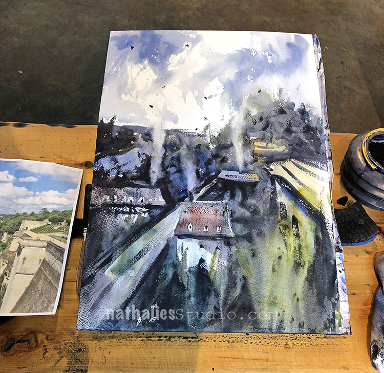
John about to start after sketching a rough scene from a photo.
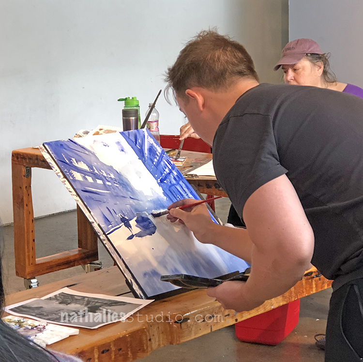
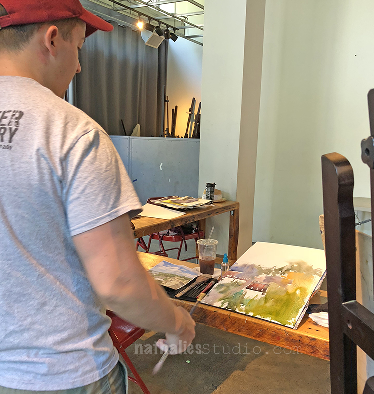
John’s finished piece piece from one of the demos- you can actually see a bit of the original photo on the left.

As we progressed in the class we picked our own images and I loved seeing what everyone was doing and talk through it.
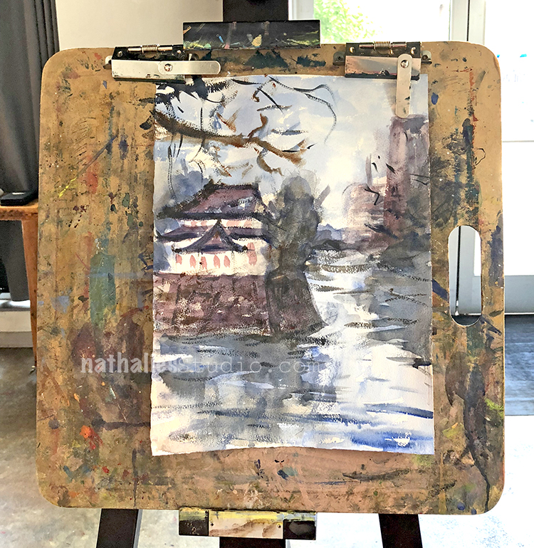
I focused on the house and the water …as you can tell trees and foliage …not so much ;)
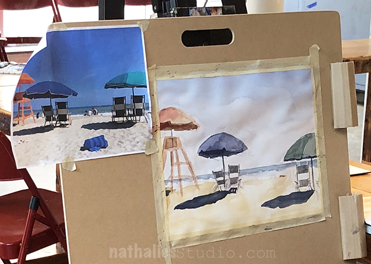
Love the beach scene of one of the fellow students- especially her shadows.
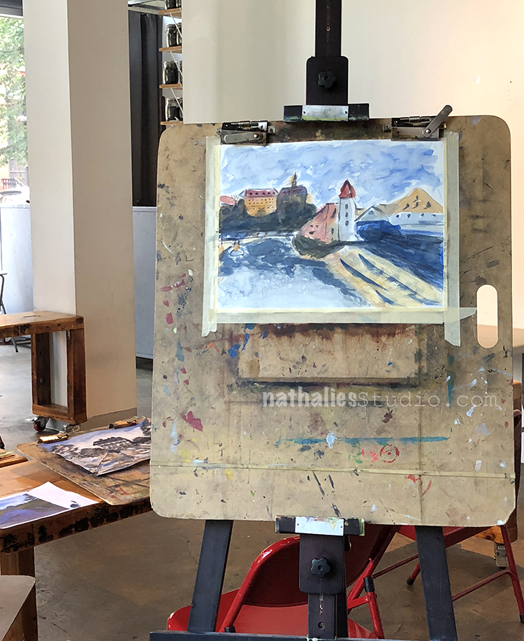
Such a great water texture here and I love the color scheme.
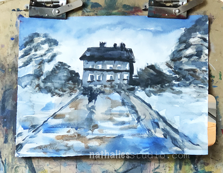
And I really loved the mood in this one- so gorgeous!

John is a great teacher, he is very good in explaining what he does and why he does it and he is good showing students why and where things work and where not. I loved taking a class from him and I will def. do so again …yes in watercolor —gasp ;)

If you are in the Jersey City – NYC area- take a class with John Duval – I am sure he sends out class informations through his newsletter !

What I learned in this class:

  • Watercolor is fun and sometimes you just need it to let it do it’s own thing
  • “Never say die until it’s dry” – John Duval – meaning once it is dry you cannot fix things so be quick
  • think about warm and cool colors more and how this can create visual interest and contrast
  • The watercolor consistency is defined by the water in the brush not on the palette – so don’t dip your paint brush all the time into the water (I only learned this so far in theory- still working on it)
  • Don’t give too much visual information – our little brains do a lot to fill in the gaps

What I take away for the future:

  • Why not add some “people” into a painting to make the scene more lively
  • Change scenes up – you can take a photo if you are going for reality
  • Have the wash or underpainting in my acrylic paintings look through a bit more often
  • Work with a limited color palette or even just one color and play with the tones, tints and shades for a study
  • Why not paint a bit more in watercolor – it is quick and it is just paper and I can actually only improve ;)

Comments (2)

  • Sue Clarke

    |

    What a fun post! I love the limited colors that you used in that first piece that you did (I do bet that it killed you to use limited colors).
    The beach piece is delightful.
    He really is talented and I just don’t know how artists can do so much with watercolors.

    Reply

    • nathalie-kalbach

      |

      ha. you know me well -yes it was really challenging to only use a limited palate but it was really good to do so . :)

      Reply

Leave a comment

Behind the Museum -Painting

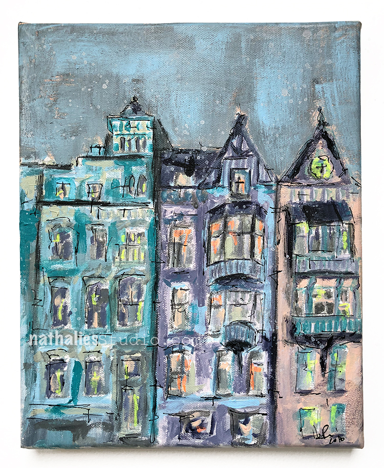
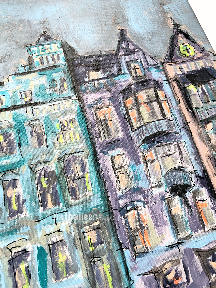
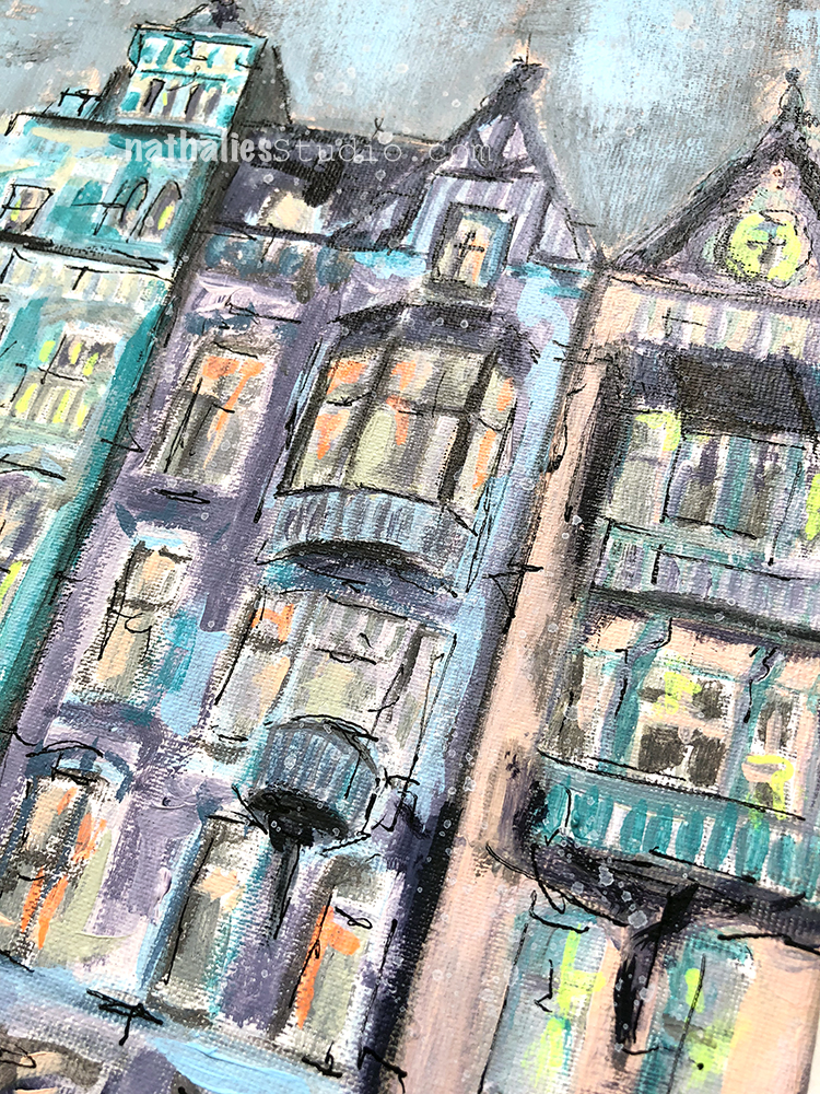
I finished up this painting last week – and called it “Behind the Museum”

It depicts a quintessential streetscape in the city of Amsterdam, with it’s unmistakable architecture and one-of-a-kind beauty. On a recent trip to the city, after an afternoon spent enjoying the Rijksmuseum, I took in this lovely view while waiting for a tram. Since it was  a pretty long wait I just looked for 20 minutes at the details and contemplated about who used to live there, how the street looked like when it was built and who might live in there now.

I used acrylic paint, gouache, graphite and marker on canvas and the painting measures 10″ x 8″. It is available in the store now :)

Comments (2)

  • Sue Clarke

    |

    Nat, it just blows me away how far your art has come. From colorful scrapbook pages and cards to paintings that evoke feelings of warm neighborhoods that I want to visit! You go girl…you have the creative world by its heart strings.

    Reply

    • nathalie-kalbach

      |

      aweee- thank you so so much for your wonderful words! <3

      Reply

Leave a comment

Stroll Through the Hood – August 2018

Time for a Stroll Through the Hood . Strolls through my hood get me out of my studio, they help me unstuck and often I get inspired by what I see and to get new ideas to create something. It is part of my philosophy about Artful Adventures in Mixed Media – which is the subject of my book. Here are some photos that I gathered in the last couple weeks.

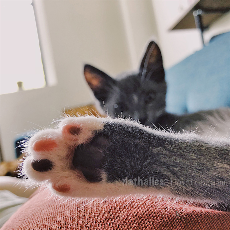
Well- first of all meet Bobby Pretzel- our new cat. Bobby is adorable and just 13 weeks old now -he also has his own instagram account @bobbypretzel . He is an awesome studio kitten, super cuddly, and very adventurous – makes me laugh – so that is good :)

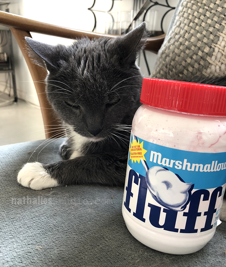
What Niles thinks about this? “What the Fluff” sums it up – LOL. He is very curious, sniffs and plays with the kitten, they have also slept two time for five minutes cuddled together but most of the time Niles looks at me like he looks at this weird Marshmallow stuff in a jar.

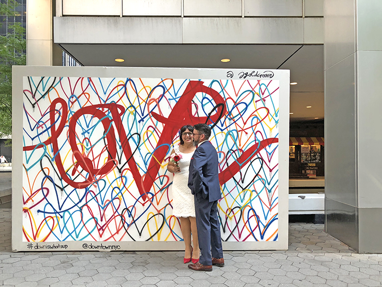
I was out and about in the city last week – for a wedding of a very good friend of mine from Germany – and saw the fun mural above at the WTC station. Good, the area needed some color and I love the contrast.

Here is the gorgeous couple- so happy for them – they are adorable and it was a wonderful day! I still cannot believe how they managed in the clothing in this insane heat that day -I looked like a wet towel- they looked gorgeous!

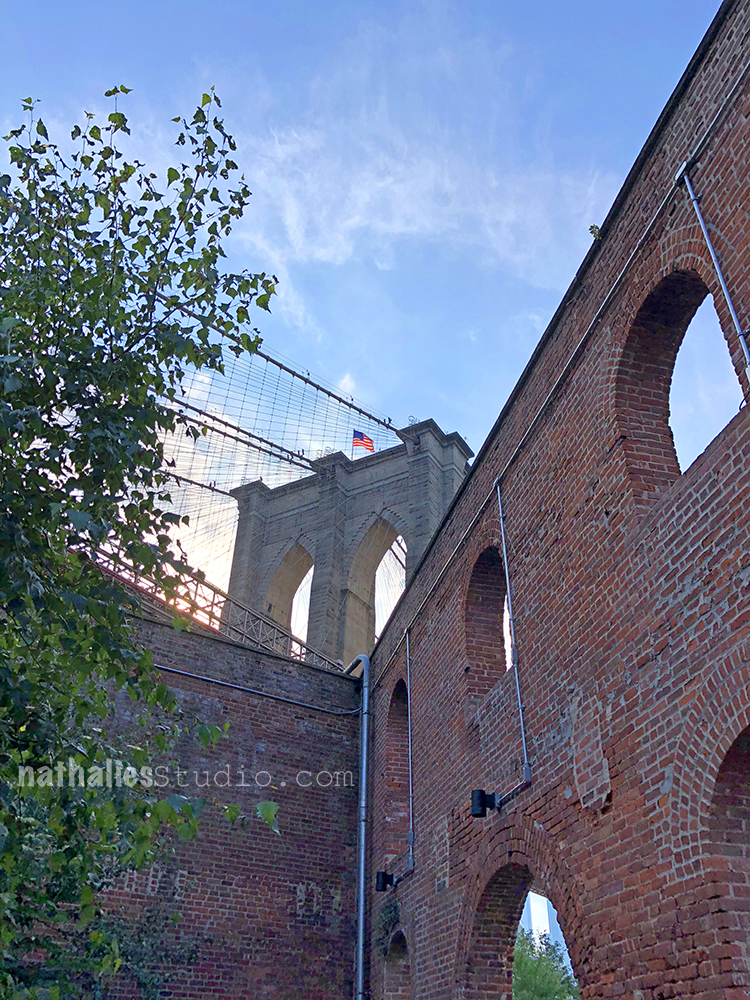
Spent some nice time at DUMBO and took the ferry from DUMBO to 33rd street which was really nice – for 2.75 Dollars you have a cool ferry ride – on my list for future visitors.

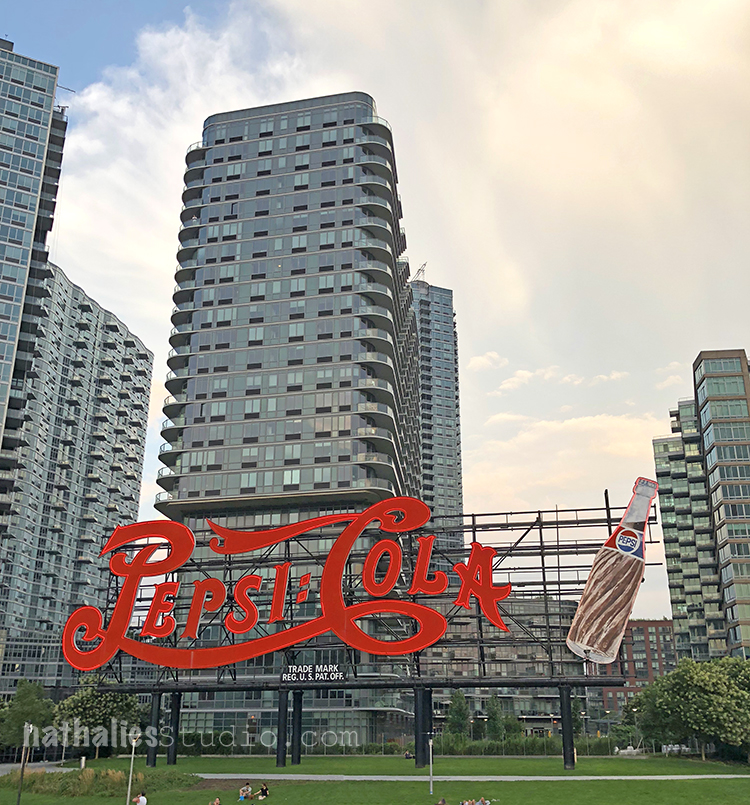
I never saw the sign above – also kind of funky- LOL- two days later I saw an article with that sign in the New York Times and learned that “Brad’s Drink” as it was called first 120 years ago was advertised as a medicinal drink …go figure! LOL

Speaking of friends

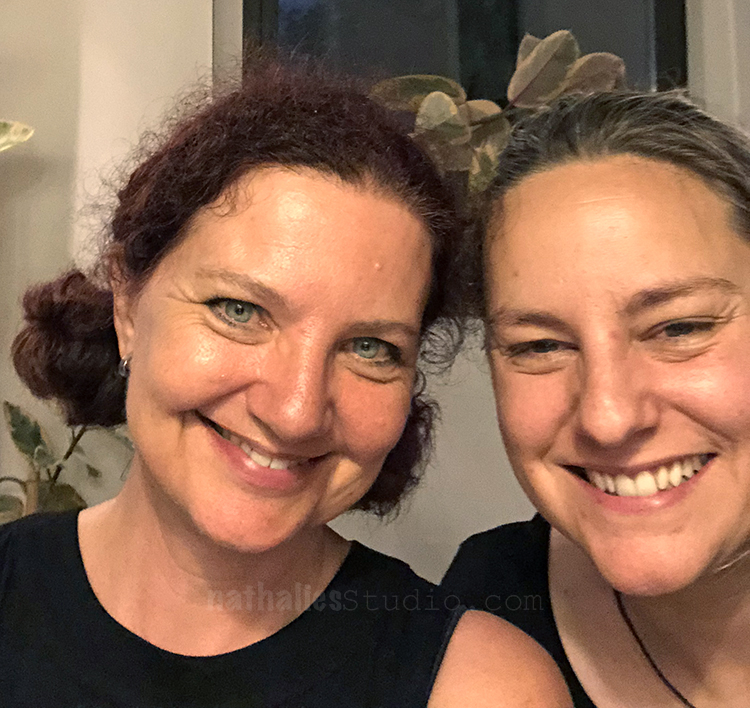
I also got to spent some time with my wonderful friend Birgit Koopsen – who I was lucky to see twice during her family vacation in the States. I always love seeing her ! We took one photo together …guess we had too much fun to think about photos :)

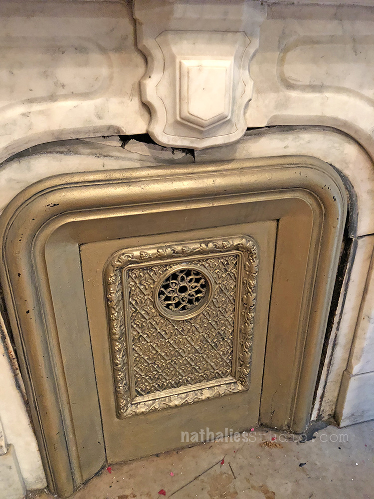
Looking around at open houses is also super interesting and inspiring -love the old fire place and the grate – the pattern intrigues me but then of course also how original this is.

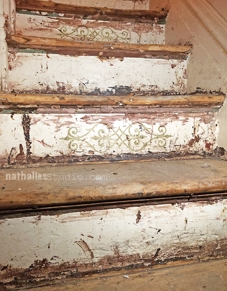
and be still my heart- look at the stenciling on the stairs – I am wondering where those designs came from and how common that was in the 1880s and a bit later -anyone has an idea?

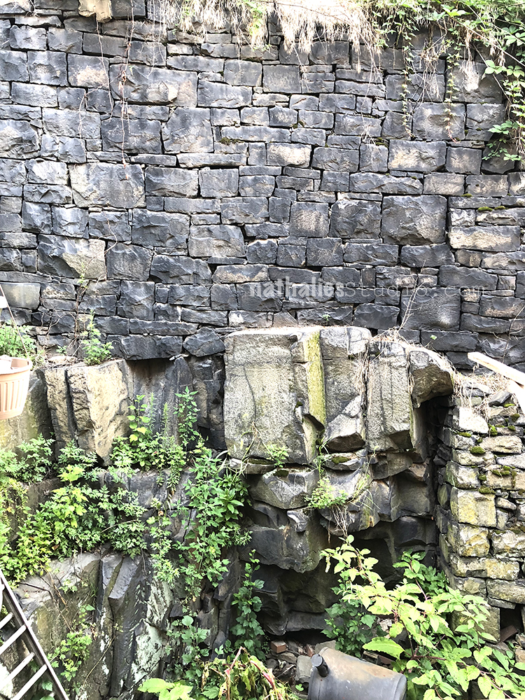
Part of a back yard of a house- love the man made old wall – so cool!

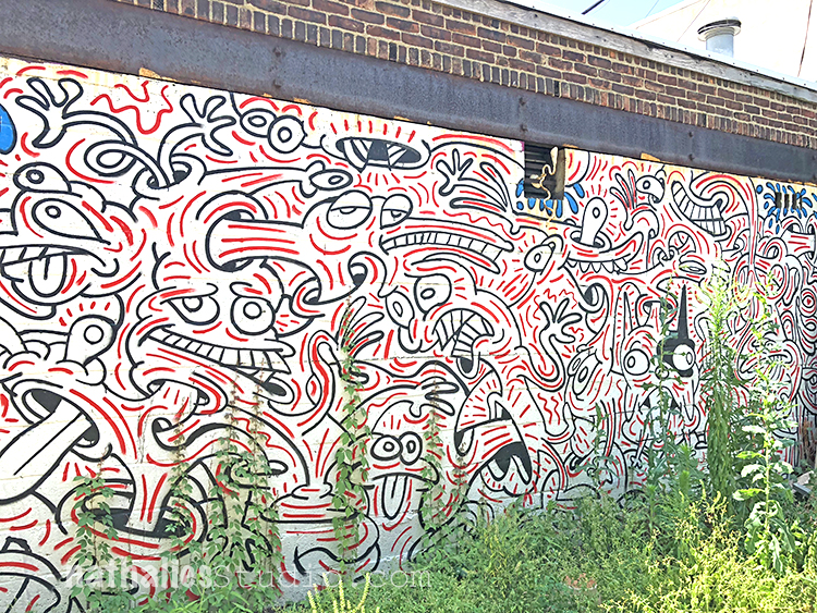
Also getting around a lot to see more murals –

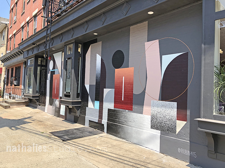
Always love Rubin415 geometric shapes but I also dig the colors he used here

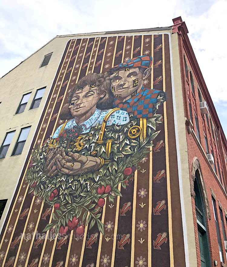
and of course pixelpancho – fun!

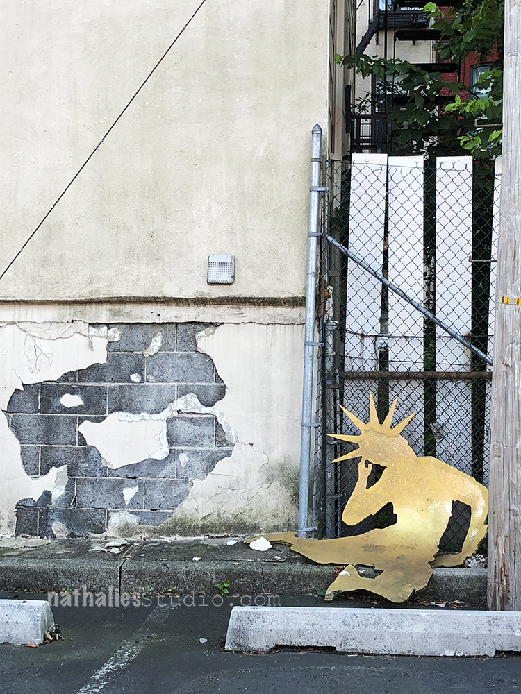
Meanwhile Lady Liberty in our parking lot in front of the apartment building is still suffering -I hear you Lady- I am with you!

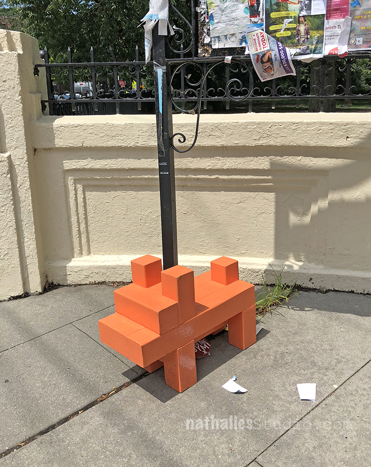
And someone tied up their lego dog in front of Hamilton Park.

I hope you enjoyed my monthly Stroll Through the Hood – I hope to see you next month again!

Comments (1)

  • Sue Clarke

    |

    Congrats and welcome to Bobby. Niles…be the big brother and try to be kind.
    The Lady Liberty is stunning yet so sad (reflecting towards concerns for many of us).

    Reply

Leave a comment

Struggling – Art Journal

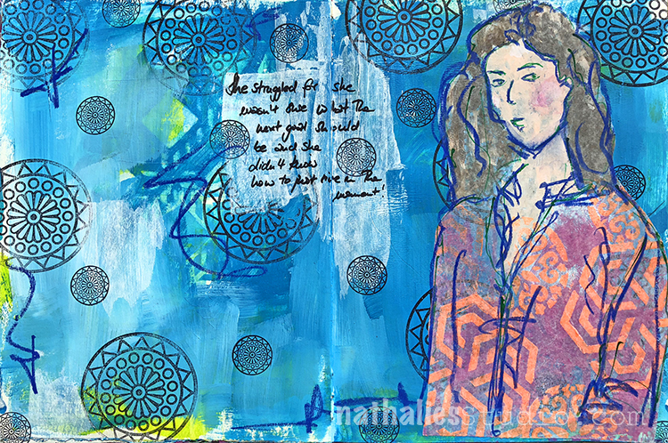
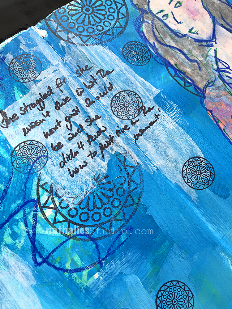
She struggled for she wasn’t sure what the goal should be and she didn’t know how to just live in the moment.

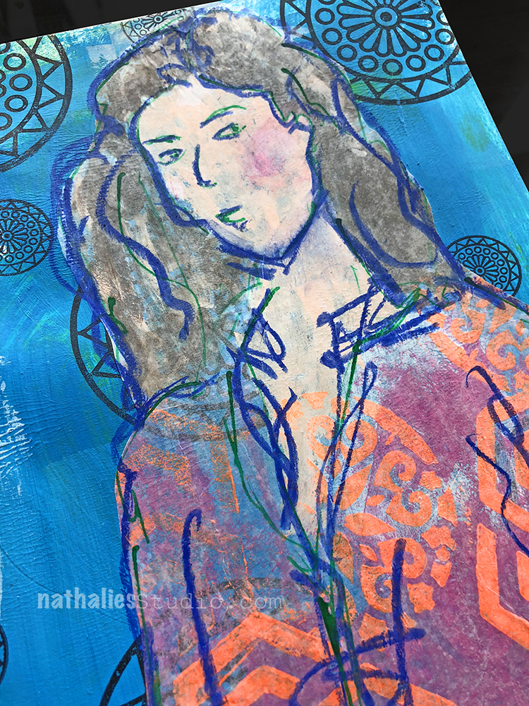
I stamped with Archival ink and the Valley Road stamps from my Large and Small Circle Jumble Rubberstamp Set on top of a blue painted background.

I used a blue Stabilo Woody Pen to create some scribbles and went over the sketch again – I like the soft texture of the pencil versus the brush strokes and surface of the acrylic painted background.

Here are some of the supplies I used – as always you can find most of my stamps and stencils in my store here.


Comments (2)

  • Sue Clarke

    |

    I particularly like how you’ve been making patterns on clothes with your stamps.
    That statement just about sums up life.
    Have a delightful day Nat.

    Reply

    • nathalie-kalbach

      |

      Thank you sue- I love making those patterns – and I wish some of those clothes would magically appear in my wardrobe LOL! Have a delightful weekend Sue!

      Reply

Leave a comment

XOXOXO

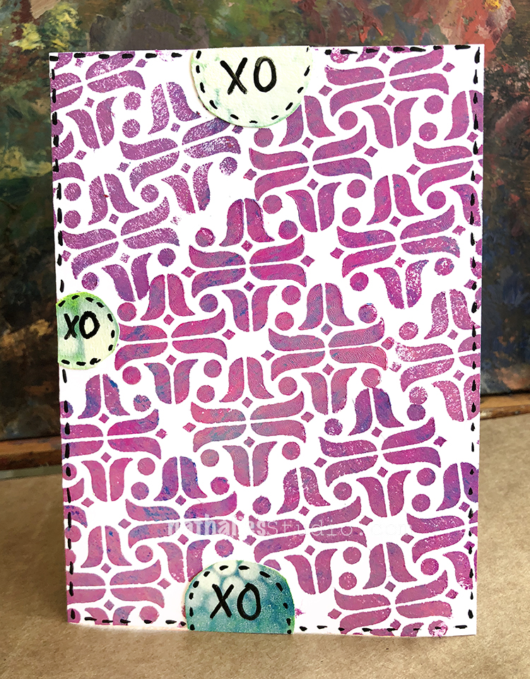
Just a little card using some acrylic paints and my new Amsterdam Foam Stamp – some collage paper and dashes- done :) I do have two sizes of the Stamp in my store – check it out.

Wishing you a wonderful weekend, what are you up to ?

xoxoxo


Comments (1)

  • Jill Adamy

    |

    Love your card… it’s adorable! Great job!

    Reply

Leave a comment

At The Center – Art Journal

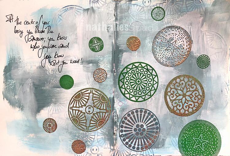
At the center of your being your being you have the answer; you know who you are and you know what you want!

Great…lol- off to the center ;)

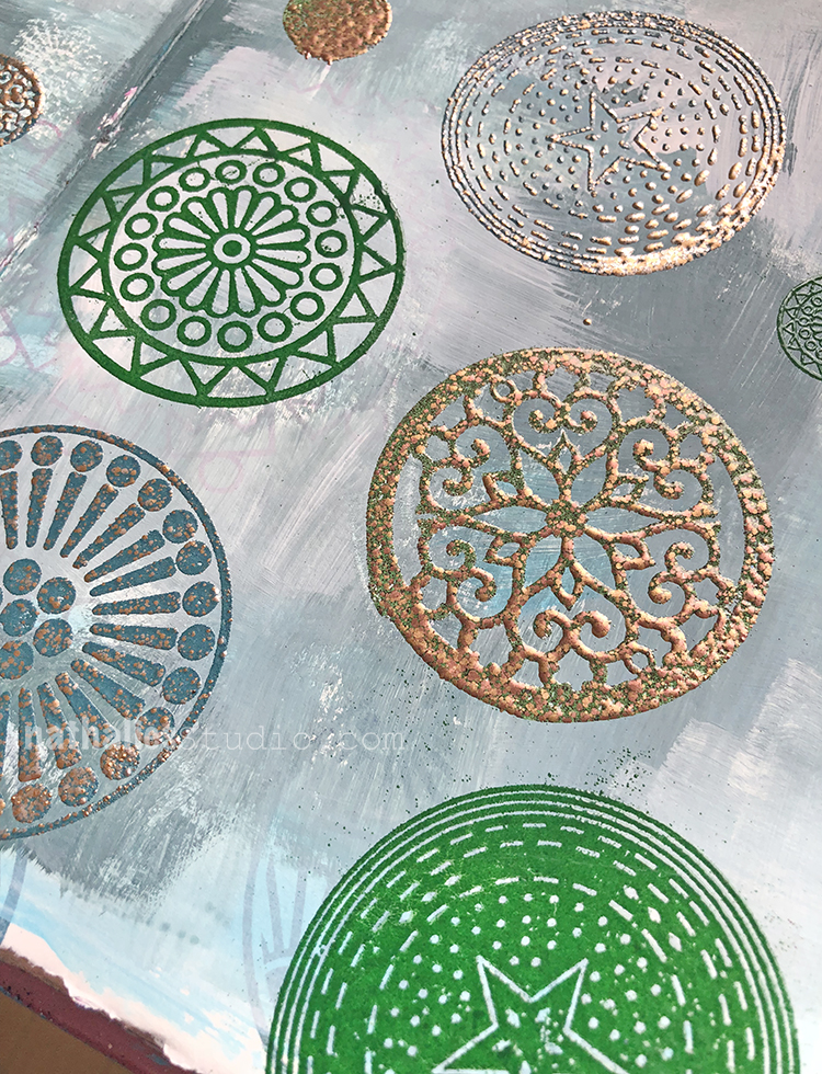
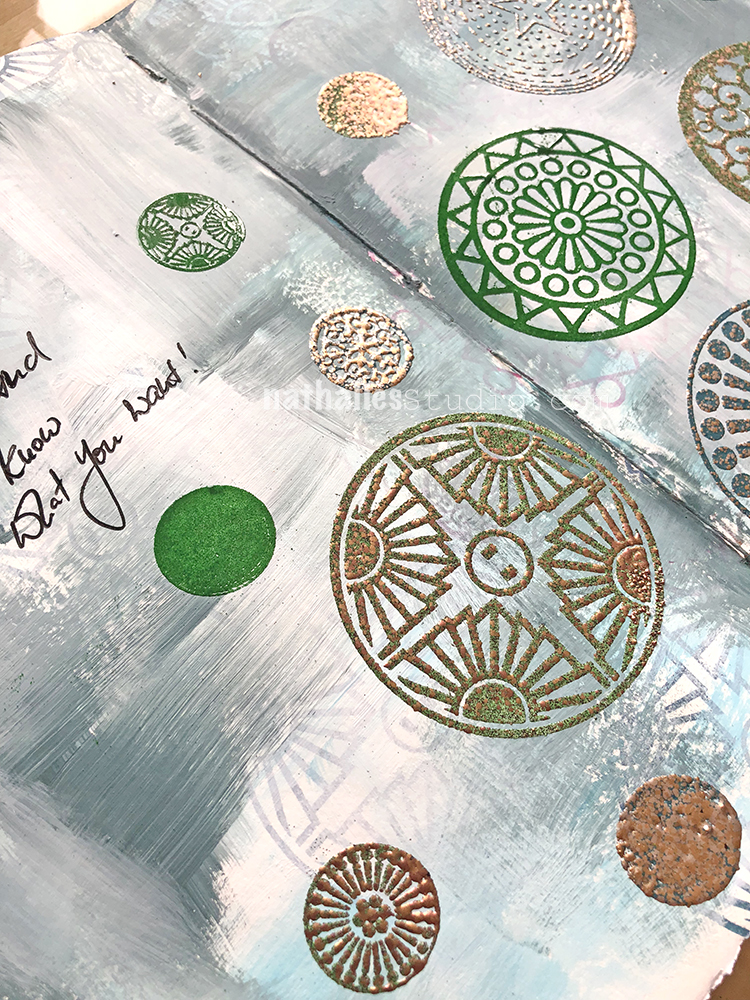
Using my new Small and Large Circle Jumble Rubber Stamp Sets to create some fun patterns. I loved playing with fine and more chunky embossing powders – it has been ages since I used those. I used the small circles only for the bolder pattern with the thick embossing powder as it works better on bigger stamps as the design doesn’t just bleed and melt together.

It is funny how a certain supply keeps you enthralled for a long time and then it is suddenly totally gone from your mind- and then it come back. Actually since all of a sudden all the mixed media world is into it, I kind of was reminded how much I used it to create texture on mixed media canvases etc.

yum! Have you lately pulled out something you haven’t used in ages?

Here are some of the supplies I used besides acrylic paints:


Comments (2)
  • Sue Clarke

    |

    Love the embossing. I always struggle with it.
    The gold tones are wonderful and the words are right on.

    Reply

    • nathalie-kalbach

      |

      Sue, it is so much fun. It is usually just a matter of watching closely the changes that appear when heating it up.

      Reply

Leave a comment