nathalie-kalbach

Blooper Reel! Acrylic Painting Workshop Outtakes

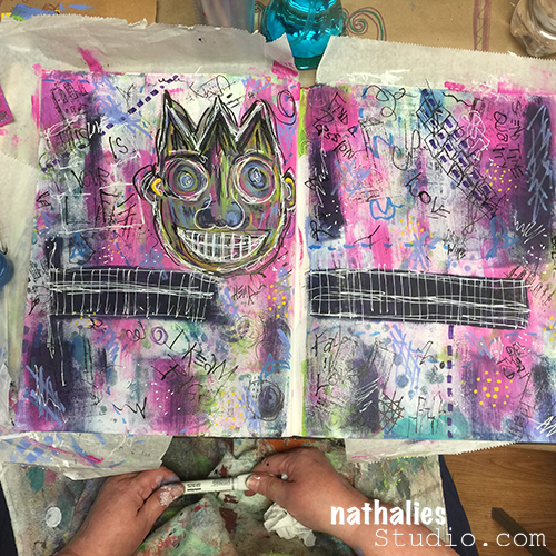
KalbachDVD Collage

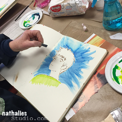
Last year in November I went to the F+W studio to record some Acrylic Painting Workshop videos, which are being released at the moment. But…because I like to laugh…I thought, you might enjoy this blooper reel with all kinds of silly outtakes from the 4 day shoot.

Did you hear me snort? I snort when I laugh hysterically, are you a “laugh-snorter” too?

I hope you laughed as much as I did because, hey – we all need a good laugh once in a while ;)

I will share all links to the videos and more about the content soon :) I promise that the videos are seriously loaded with tons of information and techniques!

Have a wonderful day

Comments (8)

  • Margie

    |

    That was so funny…You all really enjoy your work day. Looking forward to the workshops.

    Reply

  • Joi@RR

    |

    YES, Yes, YESSSSSSSSSss… I am still laughing. Totally cracked me up Nat. This is just INCREDIBLY fun…. heheheheheheh. Love your laughter and even your snort – eheheheheh!! PRICELESS!!! XXj.

    Reply

  • Sue Clarke

    |

    Thanks for the morning giggle Nat.
    You have such a playful nature!

    Reply

  • Gayle

    |

    LOL! That was so endearing you guys!

    Reply

Leave a comment

Opposites Attract – Michelle Rydell

CS Opposites Attract logo

It is Tuesday and that means it is time for my Creative Squad to show you a fun project. The theme for March is Opposites Attract and the team will use my new Bird Foam Stamp, Rubber Stamp and Stencil Set. Just as opposite colors on a color wheel highlight one another, or yin and yang fit together so comfortably, sometimes the best is brought out when we celebrate extreme differences!

This week we’re happy to show you an art journal page by Michelle Rydell, which has us singing along with her! Take a look at her musically inspired interpretation of our theme.

—————————————————————————————————–

Michelle March Headshot

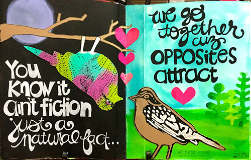
The first thing I thought of when I heard this month’s theme, was the song “Opposites Attract,” by Paula Abdul. I thought it would be fun to use that as inspiration for my journal spread!

Michelle Rydell Opposites Attract 04

Here’s how I made the spread (the song running thru my head the whole time)…

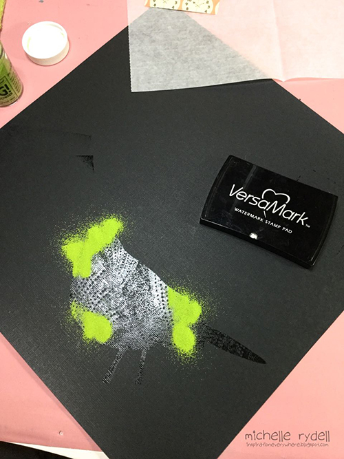
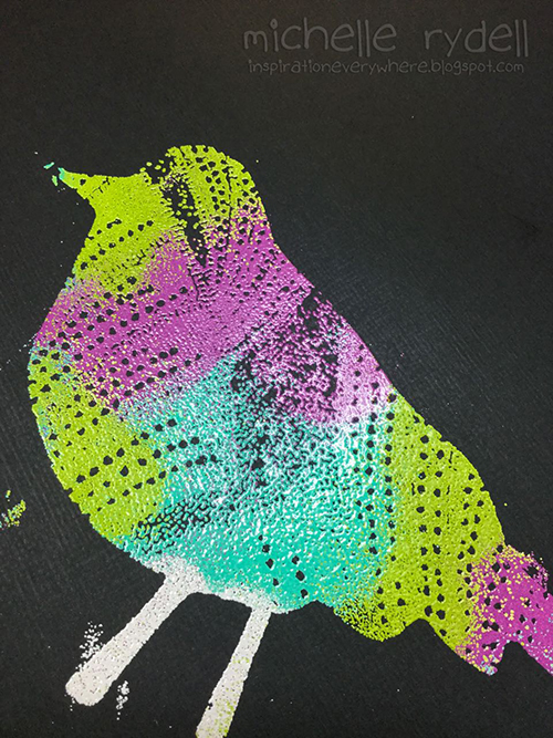
I used the cling stamp bird first, and stamped her with versamark ink, so I could emboss her in a variety of bright colors. I poured each color of embossing powder on separately, so that I could shake the extra off and back into the jar, without the colors getting mixed up.

Rydell Opposites Attract 1

When I was done, this is how my bird looked. The stray bits of color don’t matter because I will be cutting her out.

Michelle Rydell Opposites Attract 2

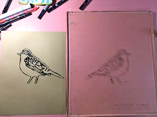
Next I used the foam stamp bird. For my vision to come to life, I needed this guy to be facing left, instead of right. In order to accomplish this, I stamped him onto my gelli plate, and then pressed my kraft paper onto the plate, and voila, a left facing bird! (Just a note: If you don’t have a gelli plate, you could probably accomplish the same thing by substituting any non-porous surface, such as a piece of acetate or a plastic placemat.)

Michelle Rydell Opposites Attract 3

Once I had my two birds cut out, the rest of the page came together quickly. I painted a simple nighttime background on the left, with a paper-pieced tree branch. On the right side of the spread, I used the stencil that comes with the set to create some bushes in the background for my daytime bird. The hearts were cut from some underpaper on my desk that had pink paints and sprays on it. The lyric from the song was written with markers for a finishing touch.

Michelle Rydell Opposites Attract 04

I just loved working with this fun set! The birds are adorable and I love how you can mix and match them to create all kinds of different looks!

———————————————————————————————————
I love how Michelle showed us step-by-step her process for creating this fun page.  Her placement of the bird up-side-down on the tree really made me smile and her lettering is just gorgeous too!
Besides the supplies listed below, Michelle also used kraft paper and underpaper to create this art journal page.
SuppliesCJS

And maybe you will even play along -we would love to see how you interpret the theme – email me how you used my stencils and stamps with the theme and email me an image – I would love to share what you did at the beginning of next month!

See you next Tuesday for project inspiration from around the globe.

Comments (17)

  • Dee Ann O'Brien

    |

    Fun use of the birds to cleverly send a message!

    Reply

  • Karen Petitt

    |

    I have to play in my journal tomorrow now! All these gorgeous journal pages have made me want to get covered in paint or ink and play with my stamps and stencils. Just awesome inspiration and awesome art! Many thanks for the blog hop, the fabulous inspiration and for sharing your art with us Karen x

    Reply

  • gwenlafleur

    |

    Really beautiful page! Love the colors and lettering, really love the way that you used the different colors of embossing powder. So cool!

    Reply

  • Joi@RR

    |

    Ahhh so darling Michelle – and so true – opposites attract!!! Love your upside down bird – eheheheheh!! And all the bright colors on black and on white – you thought of everything!! SUCH a fun page. Nat’s stamps look FABULOUS once again!!! Happy Easter! j.

    Reply

  • Sharon Fritchman

    |

    I LOVED this song so much and Michelle’s creativity really shines here! Awesome!!!!!

    Reply

  • Jenny Petricek

    |

    Wonderful spread! (And a great old song from my 1990’s childhood!)

    Reply

  • Sue Clarke

    |

    LOVE it. The phrase, the colors and the birds being opposite each other (plus day and night). Nice job!

    Reply

  • marsha.

    |

    Love it Michelle! Love the colours, the night and day contrast, the bird upside down and your lettering <3! And the lyrics… I had totally forgotten about that song!!

    Reply

    • Michelle LaPoint Rydell

      |

      Thanks Marsha! It was such a fun set to work with! I love what you did with it too!

      Reply

  • Gayle

    |

    Exquisite! What a clever interpretation of the theme!

    Reply

  • phinner

    |

    This is super Michelle!!! Its all very cool, I especially like how you formatted the lyrics with the cursive and block lettering! Now I’m off to find my Paula Abdul cassette, LOL!

    Reply

    • Michelle LaPoint Rydell

      |

      thank you Phin! I appreciate you noticing that about the lettering! Have fun looking thru your cassettes!

      Reply

  • Julie Tucker

    |

    Love love love this! LOVING what you did with the bird .. and now I have that song in my head! LOL!!!!

    Reply

Leave a comment

Won’t Be Easy or … In My Art Journal Today

AJKalbachWorthIt01

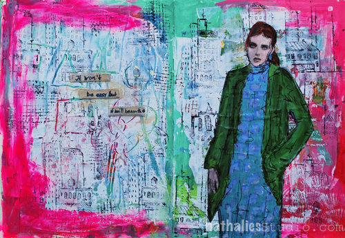
“It won’t be easy, but it’ll be worth it”

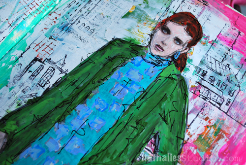
I have to remind myself ;) This page started actually out as a demo page in class and I had shown my students how to apply gesso over a pre-painted page and then scratch into the still wet gesso to reveal the under layer. This is a technique called sgraffito.

AJKalbachWorthIt034

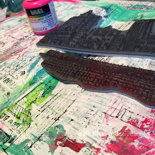
Once the gesso was dry, I stamped loosely parts of the Urban Scribble rubber stamp and parts of the Mish Mesh stamp onto the background.

AJKalbachWorthIt02

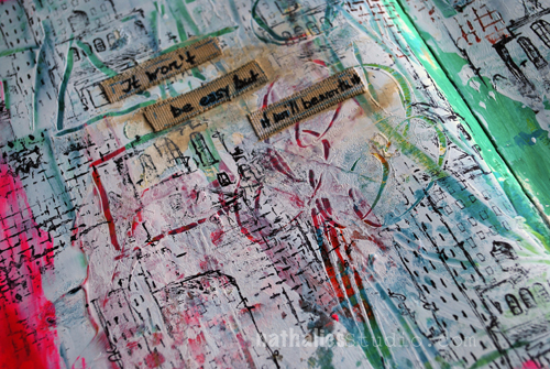
I cut some self adhesive canvas sheet for journaling, fringed the edges and added some titanium white before journaling because i didn’t like the stark white of the canvas pieces.

AJKalbachWorthIt03

It was a fun page ….actually easy and still worth it ;)

Here is a list of the supplies I used:

SuppliesCJS


I wish you a wonderful day !!!


Comments (1)

  • Joi@RR

    |

    What an art journal treat this is Nat. I have never tried scratching thru paint like that but… I”m ready now!!! Might just try it today!! It looks wonderful and so do the stamps. Perfect background for your very chic gal. Love her outfit and face. You always inspire me girl. Thanks bunches! Have a happy Sunday and a super fine week. Hugs. j

    Reply

Leave a comment

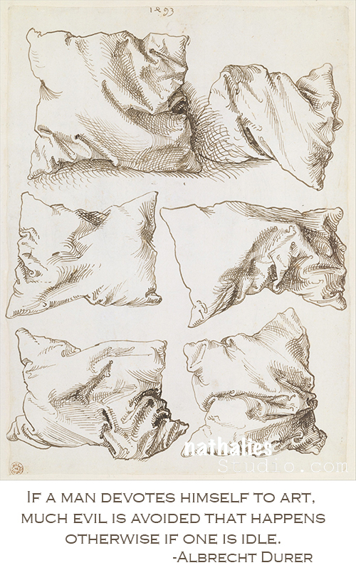
Artist Quote of the Week – Albrecht Dürer

QuoteDurer

Comments (2)

  • jvmetz

    |

    This packs one powerful message. …. You’re awesome with knowing just what to put up on the best of days…. sending hugs and kisses

    Reply

  • Gayle

    |

    Thank you Nathalie for today’s quote. It was exactly what I needed to read today!

    Reply

Leave a comment

Opposites Attract – Marsha Valk

CS Opposites Attract logo

It is another Tuesday and therefore time for my Creative Squad to show you a fun project. The theme for March is Opposites Attract and the team will use my new Bird Foam Stamp, Rubber Stamp and Stencil Set. Just as opposite colors on a color wheel highlight one another, or yin and yang fit together so comfortably, sometimes the best is brought out when we celebrate extreme differences!

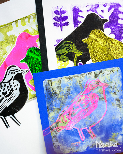
We’re very excited to share with you the very colorful, layered mono prints by Marsha Valk.  Take a look at her nifty interpretation of our theme!

—————————————————————————————————–
Marsha March Headshot


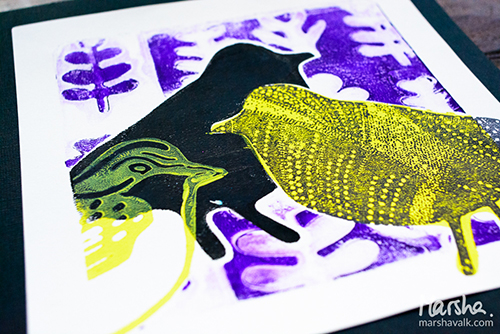
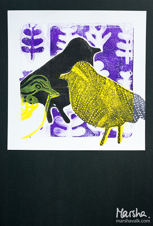
My thoughts on the theme ‘Opposites Attract’ were positive vs. negative and opposite colours on the colour wheel. And that immediately made me think… monoprints!
MarshaValk_nStudioCS_OppositesAttract-2
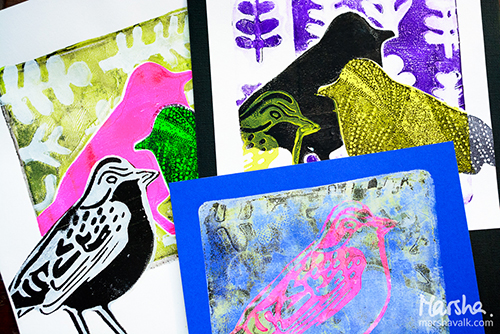
I started with sketching different placements on a scrap of paper so I could figure out how many masks and stencils I would need of the bird shape. Turned out I needed one stencil and three masks. I made them by stamping the solid foam bird shape onto transparencies and scraps of paper and then cutting them out.
MarshaValk_nStudioCS_OppositesAttract-5
I decided to use my 6 x 6 inch Gelli Plate so I could have a nice white border around my monoprinted images. I started with the yellow/purple print: added black acrylic paint to the Gelli Plate, put my handmade bird stencil on top, masked off part of the stencil with a handmade bird shape mask and then pulled the print and cleaned the plate.
I added yellow paint to the plate, positioned my bird stencil on the print with repositionable adhesive, pulled another print and cleaned the plate.
MarshaValk_nStudioCS_OppositesAttract-4 ver2
When the print was dry I masked off three birds on the paper using repositionable adhesive. Then I added purple paint to the Gelli Plate, created a pattern on top using the stencil and masks that come with the Bird Foam Stamp and pulled a print on a scrap piece of paper. Then I removed the stencil and masks and pulled a ghost print with my original paper.
Once I had removed all masks and any adhesive residue that was left on my print, I stamped the foam stamp bird with yellow paint on top of the negative (white) bird shape and the cling rubber bird with black ink on top of the yellow bird shape.
MarshaValk_nStudioCS_OppositesAttract-3
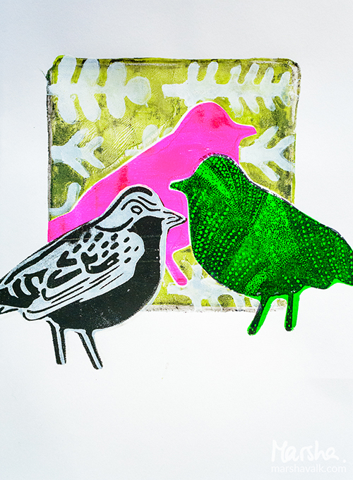
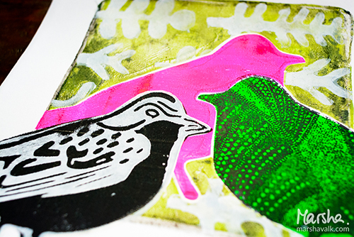
The second print was created in a similar way, but this time my black ghost print background didn’t work out as I wished. So I ended up adding another green colour and I stenciled the plant shapes over it with white paint.
MarshaValk_nStudioCS_OppositesAttract-6
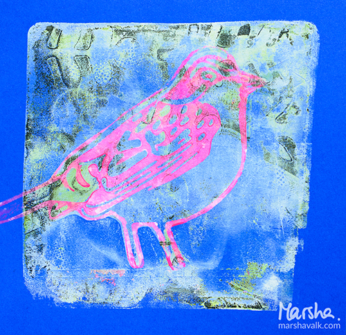
The last print on blue paper was a ghost print that I pulled to clean the Gelli Plate and that I stamped over with the foam stamp bird.
MarshaValk_nStudioCS_OppositesAttract-7
Monoprinting like this is always a puzzle and rest assured that I had a few misprints too. I will keep those around for other projects! Whilst choosing my paint colours, I discovered that I hardly ever go for opposites on the colour wheel. It was fun to try this with a limited colour palette, out of my comfort zone!
MarshaValk_nStudioCS_OppositesAttract-1
———————————————————————————————————
I love how Marsha showed how to use all three stamp surfaces together, by creating a reverse print of the solid foam stamp, and using the patterned side of it to stamp on top.  The layering and colors are super intriguing.
Besides the supplies listed below, Marsha also used black and blue cardstock to create these prints:
SuppliesCJS


Maybe you will even play along -we would love to see how you interpret the theme – email me how you used my stencils and stamps with the theme and email me an image – I would love to share what you did at the beginning of next month!

See you next Tuesday for the another project with the theme ‘Opposites Attact’.

Comments (6)

  • A Year of Favorites from 2016

    |

    […] Creative Squad joined our team for a week of mixed media fun! You can see from this peek at Marsha Valk’s project during the hop that it was full of vibrant […]

    Reply

  • Karen Petitt

    |

    Please come teach me how to use a Gelli plate like that! Your projects are stunning. And the more I see of these new stamps the more I want them. Many thanks for the blog hop, the fabulous inspiration and for sharing your art with us Karen x

    Reply

  • gwenlafleur

    |

    Love how these turned out! Such cool compositions… and I really love your interpretation of the theme!

    Reply

  • Joi@RR

    |

    So unique and fun Marsha. What great colors. It’s so amazing to see how Nat’s birds look so different in so many settings. HAPPY ST. PATRICK’s DAY!!! j.

    Reply

  • Michelle LaPoint Rydell

    |

    Beautiful work with the theme Marsha! I love your opposite colors, and how you layered the birds!

    Reply

Leave a comment

At 2nd Glance or … In My Art Journal Today

2ndGlance01_NatKalbach

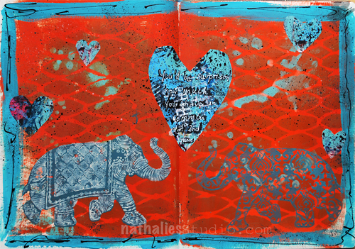
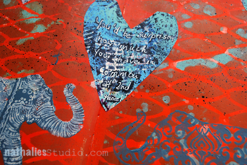
“You’d be surprised how much you have in common at 2nd glance!”

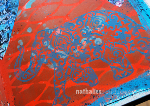
On this page I used teal acrylic spray paint over a stencil and then covered the spread with translucent orange acrylic paint taking off some of the paint while still wet to reveal the color underneath.

2ndGlance02_NatKalbach

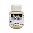
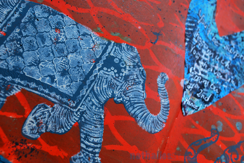
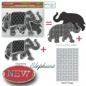
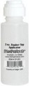
I stamped the silhouette side and the pattern side of the Elephant Foam Stamp with baltic blue acrylic paint onto the art journal spread. For the elephant rubber stamp, also in the set, I applied paint through a dauber bottle and then stamped on top of the elephant silhouette created with the foam stamp. I had mixed the paint in the dauber using 1/2 of Unbleached Titanium White Soft Body Acrylic Paint and 1/2 Titanium White Acrylic Ink. I love the texture the dauber creates but also the easy application method.

2ndGlance03_NatKalbach

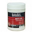
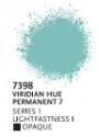
Then I painted a turquoise border -actually only to try out the new paint I had just received ;)  Next I cut heart shapes out of a sheet of deli paper which I had used to run off paint and stamps while demoing and applied them with some Matte Gel Medium.

I flicked some black ink with a brush to tie the hearts into the background and added some black lines with a fine liner to the border. The fineliner is filled with a mix of 1/2 Black Carbon Acrylic Ink and Mars Black Soft Body Acrylic Paint.

The journaling was added with a black acrylic marker overwritten with a white Signo pen – my go to pen when it comes to white journaling pens.

2ndGlance04_NatKalbach

Here is a list of the supplies I used:

SuppliesCJS

Can you tell I am still obsessed with elephants? What animal do you like to use in your art?

Comments (3)

  • lorenagm07

    |

    I just picked up the elephant stamp set @ My Hearts Fancy. Can’t wait to use it. I love the color combination!
    That is a good question, I didn’t realize that I don’t use very many animals in my art but the one that I seen always go for are bees. Thanks for the inspiration!

    Reply

  • Joi@RR

    |

    GREAT COLORS – wow. What a fun page. So vibrant and unique. Love the sentiment too – hehehehe – so true!!! I’d be obsessed with elephants too if I created LUSCIOUS ones like you do Nat!!! I have used a bunch of animals in my art but strangely enough – my favorite animal, I have never used – a rooster. One of these days I am going to have to remedy that!!! I recently did a painting with Puffins in it – now THAT was a trip – they are funny creatures!!! Have a super fine week sweet girl. XX j.

    Reply

  • Delores Azary

    |

    I love elephants too! Thanks for feeding my obsession with your stencils and new stamp set! Love these pages ❤️

    Reply

Leave a comment

Art Rules Workshop in Oklahoma – Photos

Kalbach Oklahoma title Collage

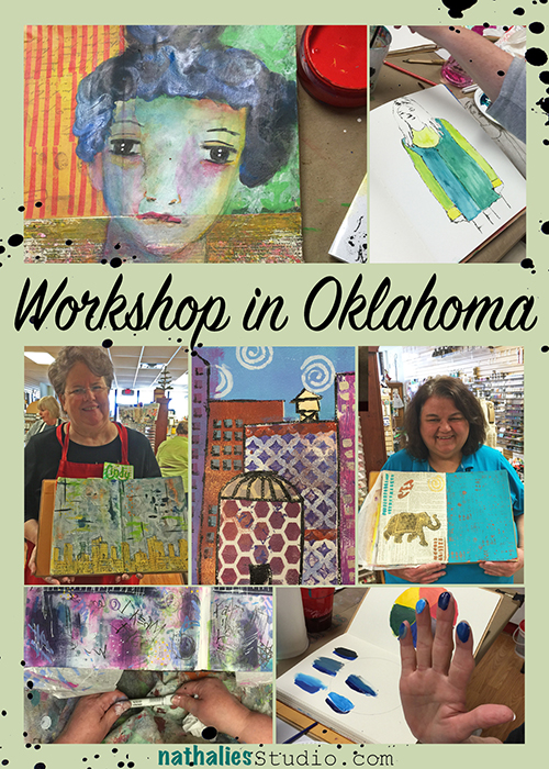
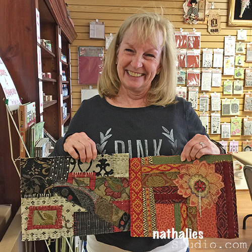
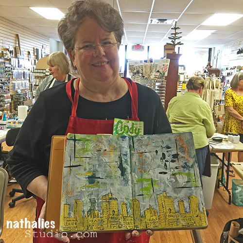
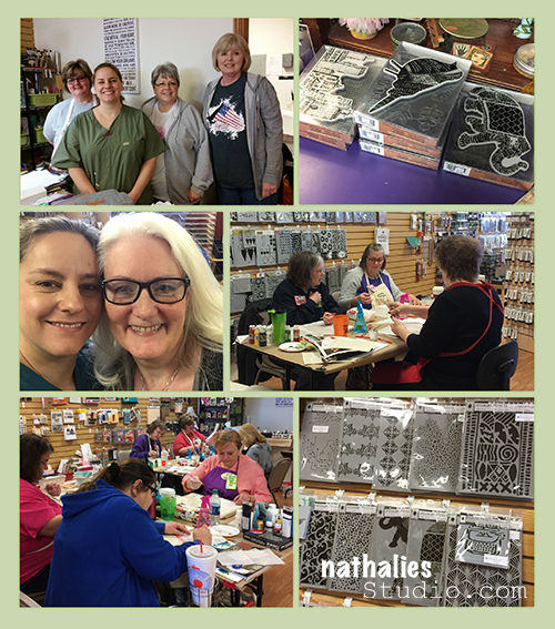
Last weekend I flew to Oklahoma City to teach a three day workshop – Art Rules – at My Hearts Fancy. It is one of the very few workshops I am teaching this year in person. It was so much fun coming back and seeing so many familiar faces in the awesome group of 12 students. It was like coming home :)

Kalbach Oklahoma 01

Here is Carol showing her wonderful boards she made inspired by Creative JumpStart 2016 and Natalya’s video – such a treat to see this in person. BTW- you can still sign up for the class and download all videos!

Kalbach Oklahoma 02

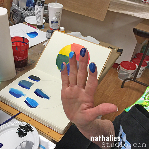
We started Friday with some color theory and some color exercises. As you can see…they went all in :) We went on a journey to discover every student’s own style and preferences.

Kalbach Oklahoma 03

Kalbach Oklahoma 04

Kalbach Oklahoma 05

Kalbach Oklahoma 06

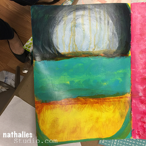
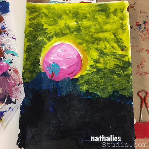
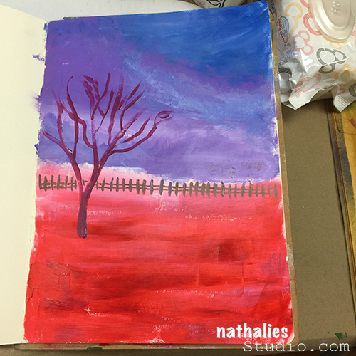
Saturday I showed some fun techniques, gave some guidelines and tips as well as samples. I loved seeing what they all came up with – it was awesome to see how everyone’s style was different and how they embraced the freedom to create.

Kalbach Oklahoma 07

Kalbach Oklahoma 08

Kalbach Oklahoma 09

Kalbach Oklahoma 10

Kalbach Oklahoma 11

Kalbach Oklahoma 12

Kalbach Oklahoma 13

Kalbach Oklahoma 14

So cool, right?

Kalbach Oklahoma 15

Kalbach Oklahoma 16

Kalbach Oklahoma 17

Kalbach Oklahoma 18

Kalbach Oklahoma 19

I also loved seeing my new stamp sets as well as stencils being used in the class – that always makes me super giddy and happy!

Kalbach Oklahoma 20

Kalbach Oklahoma 21

Kalbach Oklahoma 22


Kalbach Oklahoma 24

They were inspired by Henri Matisse

Kalbach Oklahoma 23

Kalbach Oklahoma 26

Paul Klee

Kalbach Oklahoma 25

Jean-Michel Basquiat

Kalbach Oklahoma 27

and many more – Art Rules :)

And besides a lot of art making there was a lost of chatting, sharing stories and big hugs. It was a wonderful, inspiring and relaxing time. I also really loved teaching the workshop and it’s context.

Collage

Thank you so much Maura for inviting me to teach Art Rules, and to Lisa for being such a big helper and sweetheart and a big thank you and hug to all of my students- you rock and make me happy!

What is the last new mixed media technique you explored?

Comments (14)

  • Sue Clarke

    |

    Looks like a delightfully relaxing and inspiring creative day!
    I haven’t tried many new techniques lately, but I do want to use embossing paste and stencils again. Love the texture.

    Reply

    • nathalie-kalbach

      |

      Oh yes, you will love that, Sue! The Stampendous embossing paste is pretty awesome (need to show it) and I fell in love with the DecoArt Crackle Paste.

      Reply

  • Robin

    |

    Loved this workshop!!! So fun to learn new techniques inspired by the Masters. Nathalie, I truly enjoyed your teaching style. I am so glad I went!

    Reply

    • nathalie-kalbach

      |

      It was so awesome to have you Robin, you rock! I love love love the Jazzplayer you drew! You knocked it out of the park with that one! Thank you for coming and hope to see you some time again!

      Reply

  • Carol Moore

    |

    Awesome workshop. Loved every minute. So thankful I was able to come to another one of your events. You are totally awesome.

    Reply

    • nathalie-kalbach

      |

      Awe- Carol! thank you so much for coming – you are such a talented lady!!! I loved your patterns and awesome geometric approaches, totally amazing.

      Reply

  • Maura

    |

    This was one of the best workshops ever taught at my store. Thanks Nathalie for teaching us so many amazing techniques and sharing your love of art with us. I can’t wait til you can return to teach us even more!

    Reply

    • nathalie-kalbach

      |

      Thank you so much Maura for your amazing hospitality! It was wonderful as always and I cannot wait to see you again next year :)

      Reply

  • Joi@RR

    |

    These pictures are priceless. I always just love seeing how your art and your life and your vibrant personality touches the lives of so many when you do a workshop. What lovely art you inspired them all to create Nat. Such a great treat to see these ladies learning and growing and loving their art. XXj

    Reply

    • nathalie-kalbach

      |

      Awe- thank you Joi! It was an amazing group – hopefully someday I will see you in person too :)

      Reply

  • michelle ward

    |

    wow! look at all those fabulous pages and happy artists! bravo!!!

    Reply

  • nathalie-kalbach

    |

    It would have been so much fun to see you there and you would have loved seeing Carol’s boards inspired by your video in person. It was really cool!

    Reply

  • Natalya

    |

    Wish I could have come to this workshop!

    Reply

Leave a comment

Opposites Attract – Cheiron Brandon

CS Opposites Attract logo

It is another Tuesday and therefore time for my Creative Squad to show you a fun project. The theme for March is Opposites Attract and the team will use my new Bird Foam Stamp, Rubber Stamp and Stencil Set. Just as opposite colors on a color wheel highlight one another, or yin and yang fit together so comfortably, sometimes the best is brought out when we celebrate extreme differences!

So here is the gorgeous Cheiron Brandon with her beautiful interpretation of the theme in form of an art journal page

—————————————————————————————————–

Cheiron March Headshot

I had all kinds of thoughts when I heard the theme “opposites attract”.  I decided that since I love bright rainbow colors so much, I would try to mix up some paints that were a bit of a different palette this month for my art journal page. So for me my opposite was to start out with colors I would not normally use.  I mixed up a bunch of pastel greens, yellows and pink and just went with it!
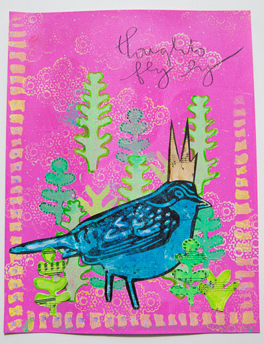
cheiron thoughts fly by page
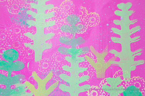
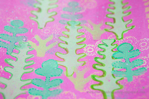
I created the pink background with a brayer, then used a stamp from the Kaffee Klatsch stamp set along with some yellow paint to create some texture on the background. I gave my page a border using the Batik stencil.
cheiron thoughts fly by 1_
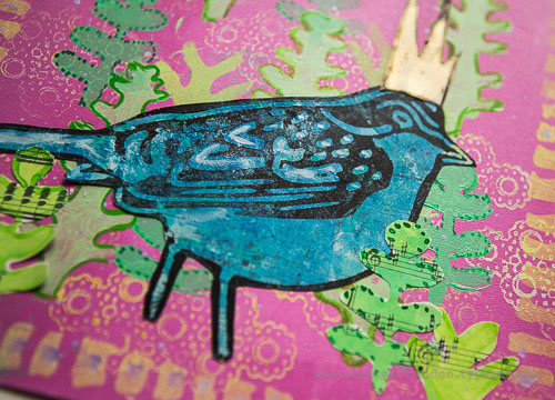
I wanted to create a scene for my bird so I used the stencil included in the Bird Foam stamp set to create a little garden. I layered the “trees” in different greens and then painted around them with acrylic ink to make them pop a bit. To create the bird I painted some blues onto a separate piece of paper and once it was dry, I stamped over it with the outline bird from the Bird Foam stamp set that I “inked” up with black paint using a foam tool.
cheiron thoughts fly by 2
Once I created my bird, I added some more trees to ground him to the page. Once he was all done, I added a tiny crown, some lavender splatter and a few words to complete the page.
Not my normal color palette, but in the end I love how the colors look!  It’s always great to try something new :)
cheiron thoughts fly by 3
———————————————————————————————————
 I hope you enjoy Cheiron’s project as much as I do. I love how she stamped the patterned bird side of the foam stamp on a pre-painted piece of paper and then cut it out, as well as her layering of the stencil shapes in the background and in the foreground. And the crown…too cute!
Besides the supplies listed below, Cheiron also used acrylic paints, music sheet paper and a pencil to create this art journal page:
SuppliesCJS


Maybe you will even play along -we would love to see how you interpret the theme – email me how you used my stencils and stamps with the theme and email me an image – I would love to share what you did at the beginning of next month!

See you next Tuesday for the another project with the theme ‘Opposites Attact’.

Comments (6)

  • Karen Petitt

    |

    I love how you have used this new bird, in fact checking back through the posts I have been completely and utterly inspired by all of the DT! The way you have used colour and the paints really works for me because it feels like it’s something I too could achieve! Many thanks for the blog hop, the fabulous inspiration and for sharing your art with us Karen x

    Reply

  • Joi@RR

    |

    Bright, springish, and fun Cheiron. You made a lovely world for Nat darling bird! j.
    Reply

  • Gwen L.

    |

    Great page Cheiron! I love the way you used the stencils to create a scene… and the little crown on the bird! Great idea to use colors that are the opposite of your usual palette – I love that idea!

    Reply

  • Michelle LaPoint Rydell

    |

    This is such a beautiful page Cheiron! I LOVE the colors you used, and the way you created a scene with the stamps and stencils – the stamps in the background make awesome clouds! Cute crown too!

    Reply

  • Miriam Prantner

    |

    Wonderful page! I love the bright pink with the greens and how that cool blue of the bird contrasts.

    Reply

Leave a comment