nathalie-kalbach

Don’t Want it Back or … In My Art Journal Today

dontwantitback01

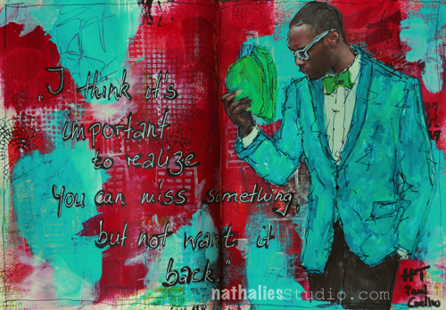
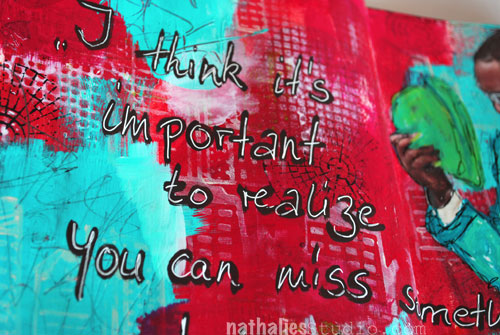
I think it’s important to realize you can miss something, but not want it back. – HT Paul Coelho

What a great and true quote!

dontwantitback4

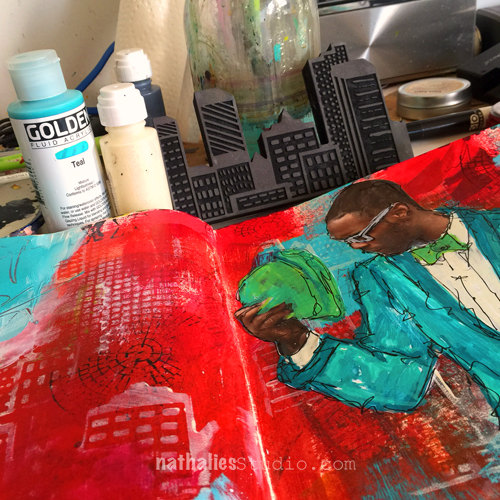
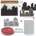
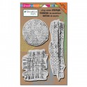
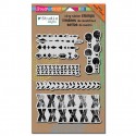
I limited my self for the background to Red painted over some collaged areas, titanium white and black and added some swatches of teal here and there. I stamped with the Urban Scribble, the Mish Mesh and the Mark Maker Stampset and also used the stencil in the Urban Scribble set, adding paint and taking it off with black and titanium white too.


dontwantitback02

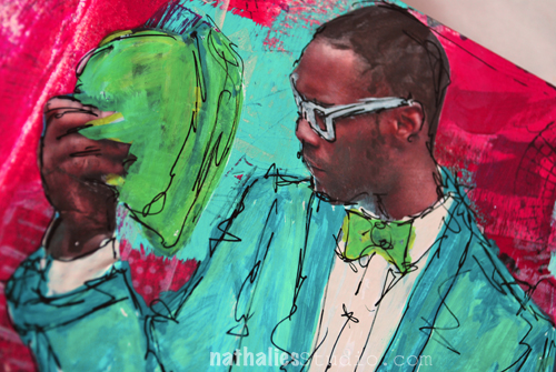
For the journaling I used a brown acrylic marker and overwrote with a white signo pen to make it pop a bit more. The image was also overpainted with markers.

dontwantitback03

Fun – I love the teal and red – now I want to wear it :)


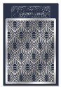
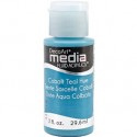
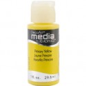
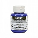
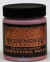
SuppliesCJS


Have a wonderful day!

Comments (2)

  • Jenny Petricek

    |

    Luscious colors and textures! Love the quote, too!!

    Reply

  • Joi@RR

    |

    You are so right Nat – the red and teal are luscious together! What an interesting quote – I like it. This is a super journal creation. What I love the most is that you used your stamps in such an artistic way. They are not ‘obvious’ – they are just part of the art. I love using stamps that way but I have had some folks be a bit offended because it “alters” the stamp so to speak! You know that your Urban Scribble is my fav so I am just thrilled to see it on this project but not really SEE it in it’s full beauty! The Mish Mash is there and looks great but it’s not intact – love that. You cannot image how often I use your Fiesta stamps in my backgrounds and they are perfect… but many times they are not totally there!!! Anyway – I’m rambling but just wanted to say… as always… I LOVE YOUR ART – in whatever form it displays itself :) XXj.

    Reply

Leave a comment

My City Speaks to Me – Cheiron Brandon

CS April My City Speaks to Me Blue

It’s Tuesday so it’s time for my Creative Squad to share a project with you! The theme for this month is “My City Speaks to Me” and throughout the month, the team will be using my new Urban Scribble Foam Stamp, Rubber Stamp and Stencil Set. This month’s theme is all about expressing what your hometown or city is all about.  What makes it special, vibrant, and important to you?  This month, our Creative Squad will take us on a trip to their city!

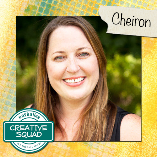
Here is Cheiron Brandon and her super colorful interpretation of the theme, which happens to feature a city that’s my neighbor too!

—————————————————————————————————–

Cheiron April Headshot

Even though I am a Jersey girl, New York City has always been my city. I live about 8 miles from NYC and get a beautiful view of the skyline on my drive to work each morning and most times, I see the sun coming up. It is like the city is saying hello to me each morning.

cheiron_urbscribble1_

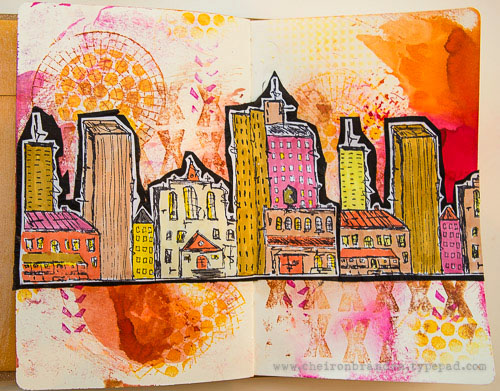
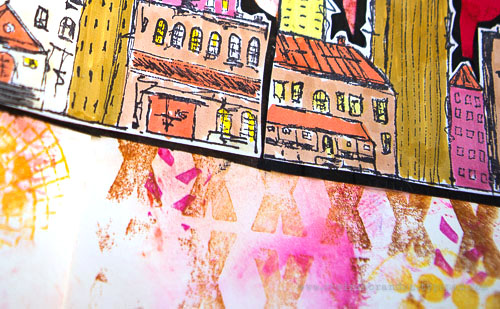
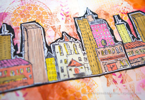
For my project this month, I created a journal page with all the colors of the morning sunrise using the Urban Scribble stamp as the main focal point.

cheiron_urbscribble3

To start I used a page where I had wiped up some Distress stains from another creative adventure. I stamped the page using stamps from the Marks, Wired, and Mish Mesh stamp sets along with various Archival Inks to create a background. Then I stamped the skyline twice and colored it in with Faber Castell PITT artist pens. This stamp was so fun to color! I fussy cut around the stamp and adhered it to some crinkled black tissue paper to use as my focal piece. Once my piece was done, I adhered it to the background with matte medium.

cheiron_urbscribble2

———————————————————————————————————-
I hope you enjoyed Cheiron’s gorgeous art journal page! We are both Jersey Girls so I totally understand her love of the NYC skyline – it inspires me all the time. I love her choices of color too and the way she layered several stamps in the background to capture the energy of the city.
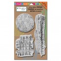
Besides the supplies listed below, Cheiron also used black tissue paper and Tim Holtz Distress Stains in Picked Raspberry and Wild Honey:
SuppliesCJS


And maybe you will even play along -we would love to see how you interpret the theme – email me how you used my stencils and stamps with the theme and email me an image – I would love to share what you did at the beginning of next month!

See you next Tuesday for the another project with the theme ‘My City Speaks to Me’.

Comments (5)

  • Dee Ann O'Brien

    |

    What a beautiffully happy city -so warm and inviting1

    Reply

  • gwenlafleur

    |

    Beautiful pages! Really love your colors and how you filled in the city stamp. Lovely!

    Reply

  • Joi@RR

    |

    Sooo vibrant and fun Cheiron. I love orange so you had me captured immediately!!! Love that background and you definitely put a whole new pizzazz into Nat’s Urban Scribble city scape. BRILLIANT!!! j.

    Reply

  • Miriam Prantner

    |

    What a fantastic page! I love those sketchy buildings, a wonderful cityscape!!!

    Reply

  • Brenda

    |

    I love the colors of the morning sunrise too! Love how you applied them here on your page.

    Reply

Leave a comment

Studio Stroll – Adam Cvijanovic in Brooklyn, New York

StudioStroll Cvijanovic Collage

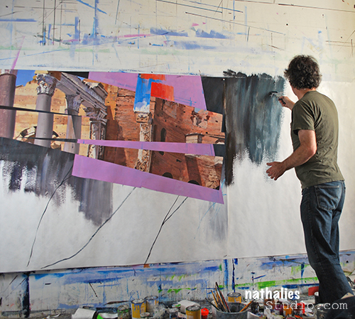
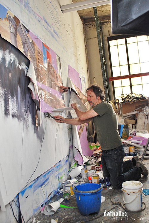
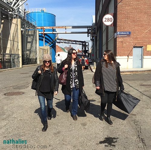
A couple weeks ago my friends and I took a day off to visit our friend Adam Cvijanovic in his studio in Brooklyn, New York.
KalbachCvijanovic01

Adam is a noted painter working mostly large-scale, often on tyvek with flashe paint (vinyl-based professional grade of matte permanent colors). He calls these tyvek paintings wallpapers or portable murals. Adam dropped out of high school when he was 17 because he wanted to be an artist and cut himself off a Plan B or the possibility to do anything else but art. His work has been on view amongst many other places at the Kemper Museum of Contemporary Art in Kansas City, MI, Blindarte Contemporary in Naples, Italy , Pennsylvania Academy of the Fine Arts, Philadelphia, PA, Shanghai Museum of Contemporary Art, Shanghai, China; Pushkin State Museum of Fine Arts, Moscow, Russia, The Royal Academy of Arts, London, England. He has been an adjunct professor of the Rhode Island School of Design. Adam is represented by Postmasters Gallery in New York.

Pretty impressive and something to tell someone who says to you “you have to go to art school to be an artist”.
KalbachCvijanovic02

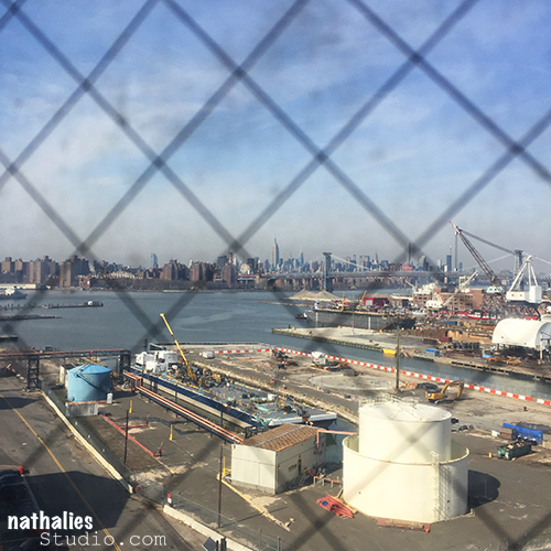
I have seen Adam’s work at galleries and I couldn’t wait to see his working space and spend some time with him while he was working. His studio is located in the Brooklyn Navy Yard offering quite some cool views from different spots of the building.
KalbachCvijanovic03

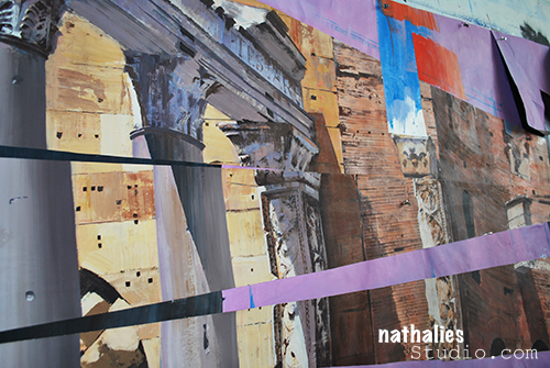
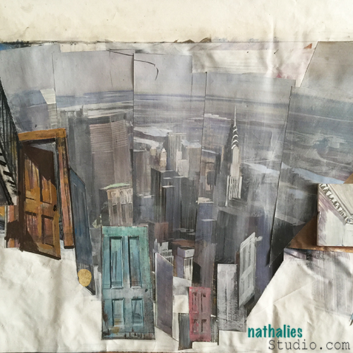
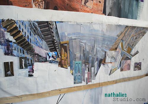
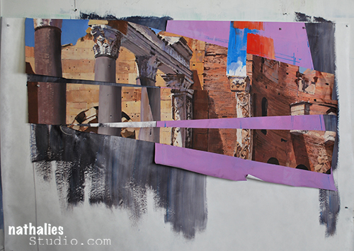
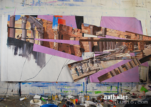
Adam is telling stories with his fascinating, fractured, layered and detailed work. He often adds 3-D elements like painted wood panels and oil painted acrylic panels on top. The perspective in his artwork changes constantly making the viewer linger for a long time to get a grab of the subject matter and the narrative behind it.
KalbachCvijanovic04

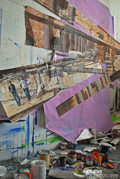
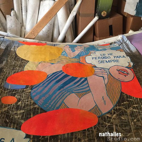
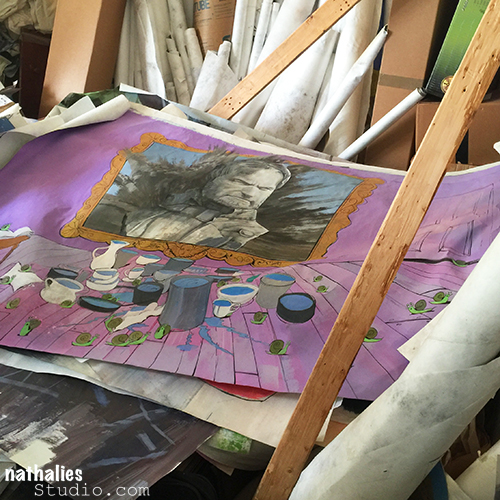
He often cuts up his artwork, fracturing it or using elements of it as collage objects in other work.
KalbachCvijanovic05

KalbachCvijanovic06

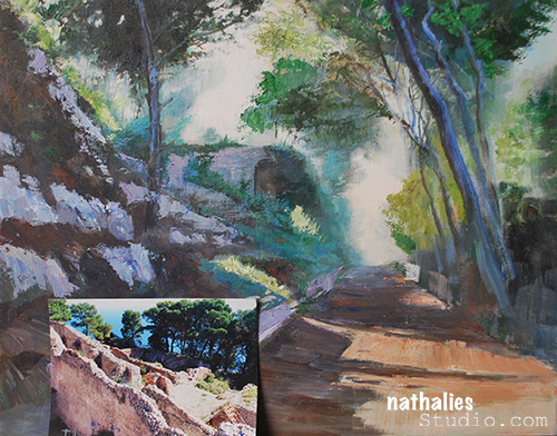
He also works small – like here – in oil on canvas.
KalbachCvijanovic07

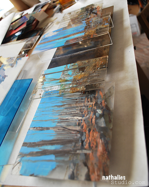
Here is an acrylic panel painted with oil paint.
KalbachCvijanovic08

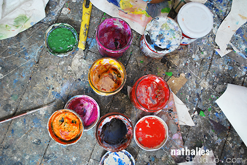
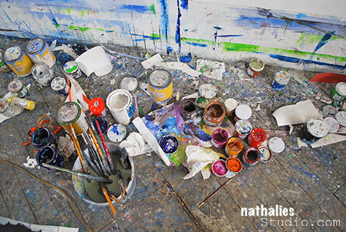
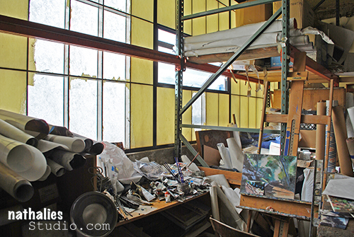
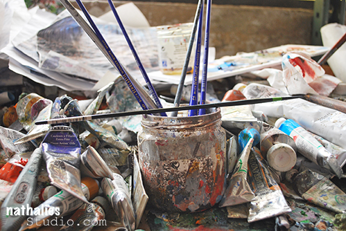
I loved Adam’s studio – the light was amazing and it was like a treasure box – full of creative chaos but only to us visitors, he pretty much knows where everything is located in his studio.
KalbachCvijanovic09

KalbachCvijanovic10

KalbachCvijanovic11

KalbachCvijanovic12

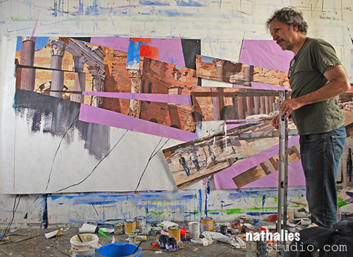
He was working on a new piece, auditioning fragments and adhering it to differently painted backgrounds. The detail work of his paintings is just insane, and he sources images for his ideas from photographs and movies and puts them together in his paintings into new images- reflecting something known but also non existing.
KalbachCvijanovic13

KalbachCvijanovic14

KalbachCvijanovic15

KalbachCvijanovic16

KalbachCvijanovic17

KalbachCvijanovic18

It was such a great experience to see him work and change things, audition those changes and then start over again, with sometimes just tiny little adjustments. I hope I will get to see the finished piece soon!
KalbachCvijanovic19

This visit also made me  interested in trying out to paint on tyvek – I can see the advantages AND – canvas is super expensive here in the States- so large scale has just become a bit more into reach for me …unless…I put my small studio into account ;)

This was a super inspiring studio stroll, I hope you enjoyed it too and I hope this is the beginning of a new series. Thank you Adam for letting us peek into your studio!!!

Comments (8)

  • Ann Arnold

    |

    Thank you so much for the tour of Adam’s studio.He is a masterful painter. I knew him as a child when he roamed about Boston painting old brick buildings and used his tee shirt as a paint rag.
    Please give him my best wishes. He knew me as Arno.

    Reply

  • Branko Miokovic

    |

    Hi, I like your review of Adam’s work process and his studio. If you have a chance self my regards to Adam. I am his uncle from Canada.

    Reply

    • nathalie-kalbach

      |

      Hi Branko – how fun! i just passed it on to him and Julia!!!

      Reply

  • Joi@RR

    |

    I have looked at these photos three time Nat…. thank you so much for sharing. Sooooooooooooooooo interesting. I HOPE you DO go BIG with the tyvek – for sure. What a wonderful experience it must have been to be there in his studio – wow. Even hubby was totally awed by your photos. What a HUGE TREAT. XXj.

    Reply

  • Sandy

    |

    Natalie
    I hear about tyvek all the time but not how to locate it or prep it for painting. The stuff I see builders use has the name boldly printed on it so it would need to be coated so the word tyvek does not bleed through. A subject for your next video hummmmm.

    Reply

  • Carolyn

    |

    So interesting! Thanks for the tour and insight into his work.

    Reply

  • Jane LaFazio

    |

    This was great! Thanks Nat for the tour. Looking forward to more in this new series.

    Reply

Leave a comment

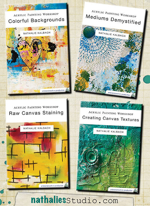
My new Acrylic Painting Workshop DVD’s and Downloads are out!

KalbachDVD Collage

My new Acrylic Painting Workshop Videos: Colorful Backgrounds, Acrylics Demystified, Raw Canvas Staining and Creating Canvas Texture are out now and I am super excited. It was so  much fun to make them and I love how they came out. They are loaded with techniques, tips and fun things. Here is a preview for all four videos:

You can purchase the videos as DVD’s but also download them. Here are the links:


Which one sounds the most interesting to you?

Have a wonderful day!

Comments (2)

  • Joi@RR

    |

    ALL OF THEM sound the most interesting Nat because YOU are teaching them! Perhaps the colorful backgrounds would be my first choice but not sure that’s right either!!!!!!!!!!!!!!!! SUPER choice of topics. So excited that you did these. I know they will be a great resource for us all. XXj.

    Reply

Leave a comment

My City Speaks to Me – Gwen Lafleur

CS April My City Speaks to Me Blue

It’s Tuesday so it’s once again time for my Creative Squad to show you a fun project, and we are at the start of April now, so we have a new theme too!  The theme for April is “My City Speaks to Me” and throughout the month, the team will be using my new Urban Scribble Foam Stamp, Rubber Stamp and Stencil Set. This month’s theme is all about expressing what your hometown or city is all about.  What makes it special, vibrant, and important to you?  This month, our Creative Squad will take us on a trip to their city!

So without further ado, here is the uber creative Gwen Lafleur with her gorgeous interpretation of the theme!

—————————————————————————————————–

Gwen April Headshot

I live in a suburb of Salt Lake City, Utah, but I work downtown and one of my favorite views is when I’m driving in and the city comes into view up against the mountains. I especially love it when the sun is coming up in the background (or the sunset behind the mountains on the other side of the valley when I’m driving home at night!) There are frequently spectacular colors and I never get tired of the view; the contrast of the man-made city with the rugged mountains really draws me. It also influences a lot of the culture here – my office mates are frequently off doing morning ski tours before work and lunchtime discussion usually centers around outdoor activities. I’m not particularly outdoorsy, but I love the views and the openness of this area, and after recently moving back here from Chicago, I’m especially loving the more laid back and less crowded lifestyle!

500 Salt Lake City Mixed Media Painting - Gwen Lafleur - WM

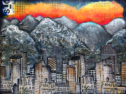
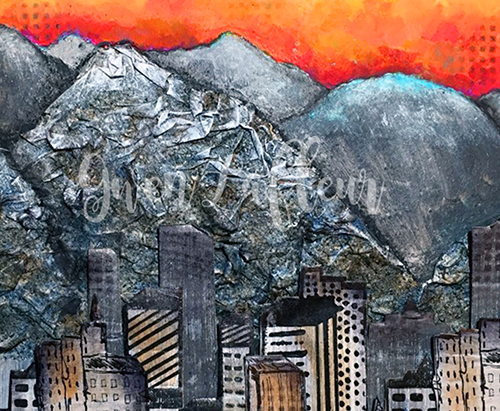
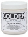
With those thoughts in mind, when I got this month’s challenge I immediately knew that I needed to use the Urban Scribble stamps backed by mountains of some kind. I started by taking an 11″x14″ sheet of heavy weight mixed media paper and I sketched out where I wanted the mountains to be. I used pages torn from a telephone book along with Mod Podge mixed with water and put crumpled paper within the outline of the mountains in the foreground.

detail Salt Lake City Mixed Media Painting Close-up 2 - Gwen Lafleur - WM

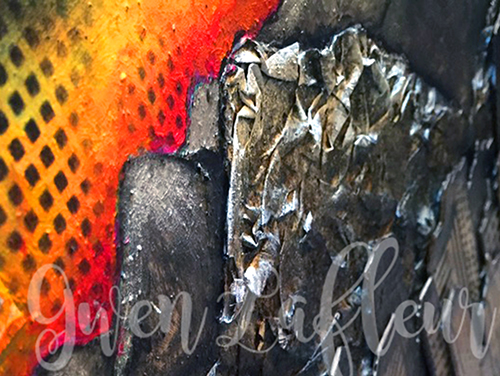
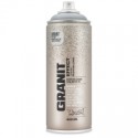
Once they were dry, I used Montana Granit Effect spray paint and gave them a good coat – it really helps them look like rock! I used a few washes of acrylic paint on top to add a little shading and dry brushed some white on the tops (since the mountains still have their snow caps right now.)

detail Salt Lake City Mixed Media Painting - Gwen Lafleur - WM

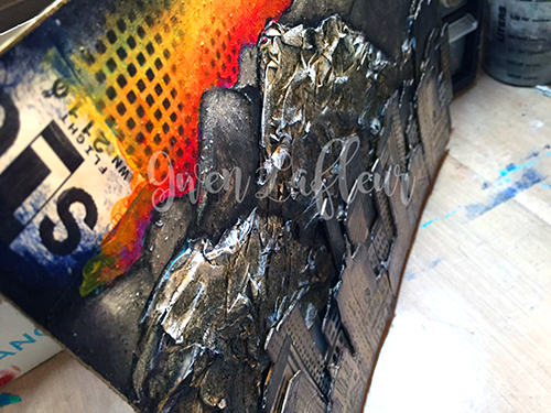
Next, I gesso’d the area above my mountains and painted in some more in the background, then I added a sunrise with lots of fluorescent paints. For the city, I took a few sheets of drawing paper and gesso’d them, then painted them with different shades of gray and silver. When they were dry, I stamped on them twice with both the detailed side of the foam stamp and the rubber stamp. I also stamped in gray with the solid side of the foam stamp. I cut out each individual stamped image and mounted them all on a thin sheet of cardboard, then cut them out again. I lined them up in front of the mountains on my piece and started adhering them in layers, using stacked cardboard on the back of each piece to add dimension. I cut some of the cityscapes into smaller pieces so I could arrange them the way I wanted.

500 Salt Lake City Mixed Media Painting Close-up 2 - Gwen Lafleur - WM

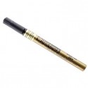
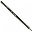
Once that was done, I added a wash of color here and there. I used a black Stabilo All pencil to add some definition to the mountains, then I finished the piece by using the stencil that comes in this set in the sky and in the bottom corners and on some of the buildings and outlined the whole piece with a gold paint marker.

I really love the contrast of the texture from the mountains with the stamped buildings, as well as the colorless early morning city against the beautiful colors of the sunrise. I think it even looks a bit like Salt Lake!

———————————————————————————————————-
I hope you enjoyed Gwen’s project! I think we’re all wishing we had a scenic commute like hers :) I love how she created really dimensional texture with layers upon layers of stamped cityscape and the crumbled paper mountains in the background.  And that orange sunrise!  It literally glows.
Besides the supplies listed below, Gwen also used cardboard, phone book pages, and pieces from a luggage tag with SLC on it:
SuppliesCJS


And maybe you will even play along -we would love to see how you interpret the theme – email me how you used my stencils and stamps with the theme and email me an image – I would love to share what you did at the beginning of next month!

See you next Tuesday for the another project with the theme ‘My City Speaks to Me’.

Comments (18)

  • Dee Ann O'Brien

    |

    Amazing mountains that really enhance the city!

    Reply

    • gwenlafleur

      |

      Thanks so much! I just wish I could capture a fraction of how beautiful it is in real life, but it’s sure fun to try!

      Reply

  • Karen Petitt

    |

    I have no words to express how wonderful this is. I get it completely because we lived in central London for a long time and the one thing I love about coming home was the city behind and the country ahead. Its beautiful, gorgeous, wonderful, awesome – not enough words to express how great it is. Thank you for sharing some of your process too. As I recent convert to mixed media I would not have had a clue how you created those mountains – it’s genius! Many thanks for the fabulous inspiration and for sharing your art with us Karen x

    Reply

    • gwenlafleur

      |

      Thank you Karen! There’s just something about the contrast of city and nature that really speaks to you, isn’t there? You’re also making me want to go back and visit London again :D

      Reply

  • Joi@RR

    |

    Oh my gracious – THIS is a FABULOUS creation Gwen. I am just blown away by the dimension and texture of this piece. YOU – dear girl – totally GLORIFIED Nat’s Urban Scribble. And since it’s my very fav one – I am just THRILLED to see this. HIGH FIVE!!!! Your entire piece is SPLENDID – your mountains are beyond GORGEOUS. LOVE love love this. j.
    Reply

    • gwenlafleur

      |

      Aw, thank you so very much! I really love this set too and it was so much fun to use. So glad you liked it!

      Reply

  • cheiron

    |

    This is one amazing page Gwen! I love the texture…what a beautiful city.

    Reply

    • gwenlafleur

      |

      Thanks Cherion! The texture is definitely my favorite part :)

      Reply

  • Karenliz Henderson

    |

    WOW amazing piece. Just gorgeous! I love the way you created the mountains plus the sky is gorgeous.

    Reply

    • gwenlafleur

      |

      Thank you so much! It was lots of fun to put together :)

      Reply

  • Lynn Reed

    |

    Wonderful artwork! Love the buildings and the mountains and the bright accent color of the sky.

    Reply

  • Sue Clarke

    |

    I LOVE the texture in the mountains Gwen. Nice piece for sure!

    Reply

    • gwenlafleur

      |

      Thanks Sue! The mountains are my favorite part as well… it was a bit of an experiment, but I love how it came out!

      Reply

  • Michelle LaPoint Rydell

    |

    Wow! Gwen, your page is StUNNING!!! The dimension is fabulous, and that sunrise is breathtaking!
    Reply

    • gwenlafleur

      |

      Thanks so much Michelle! I had a lot of fun putting this one together :)

      Reply

  • Laurie Hunt

    |

    Gwen this is beautiful! I totally get how you feel about those mountains. I recently moved from Detroit to Phoenix and I love every time I go out seeing those mountains over the valley — and our mountains are nothing compared to yours! I tell my husband all the time I hope I never lose that awe inspiring feeling as I look around this beautiful southwest. Great work. Loved the step outs and the commentary.

    Reply

    • gwenlafleur

      |

      Thanks so much Laurie! Yeah, I can imagine that going from Detroit to Arizona would be very similar… that’s a beautiful area too :) I’m with you… I never want to lose that sense of awe!

      Reply

Leave a comment

The Only One or … In My Art Journal Today

AJOnlyOne01

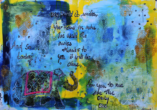
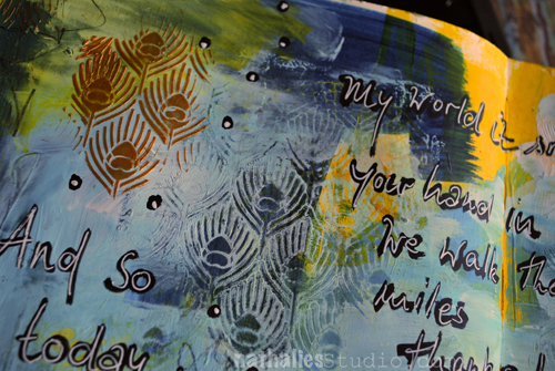
“And so today, my world it smiles, your hand in mine we walk the miles,

Thanks to you it will be done, for you to me are the only one.” Led Zeppelin

AJOnlyOne04

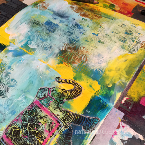
Over a painted background I added a mix of blue paint and gesso and while the mix was still wet, I layered the Peacock Background Stencil on top and using a babywipe removed parts of the paint again. This revealed the underlying paint once again. I layered the stencil on top again and spread some embossing paste through it.

AJOnlyOne03

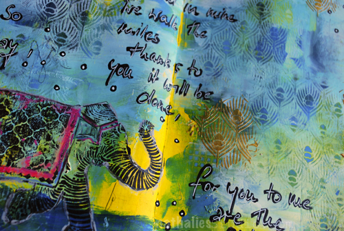
I stamped the Elephant rubber stamp with archival ink on top of the background and enhanced some areas of the elephant design with markers and pencils.

AJOnlyOne02

For the journaling I used a black acrylic marker and then overwrote it with a white signo pen.

Here are all supplies I used:

SuppliesCJS


Hope you have a wonderful day!!!

Comments (5)

  • Darcy Shannon

    |

    I love the colors and the texture of this journal page. Just beautiful!

    Reply

  • Theresa De Shon

    |

    Just getting into Journaling at the cancer center, learning a LOT from this blog…look forward to all the posts and pics. Thank you!

    Reply

  • Joi@RR

    |

    The peacock stencil reminds me of an India type tapestry – perfect for accenting your wonderful elephant. This is just gorgeous Nat. You colors are so unique – I would never have thought to put them together but you – are so good at making colors look unique. They truly look wonderful on your pages. And that pop of pink on your elephant is just perfect too. How I adore your work. Have a super fine weekend sweetie. Hugs. j.

    Reply

Leave a comment

Inspiration from Around the Globe

This Tuesday we’re taking a break from our Creative Squad (don’t worry, they will be back next week with a new theme to play with!) to bring you some super fun projects from around the world.  As you may know, my stamps and stencil designs are available for purchase online and maybe even in your local craft store, so crafters and mixed media artists and art journalers from around the world are using them.  I am always excited to see how YOU use my products in your own projects.  I am even more excited to share some of the beautiful and creative examples of these projects with you today. Enjoy this inspiration from around the globe!

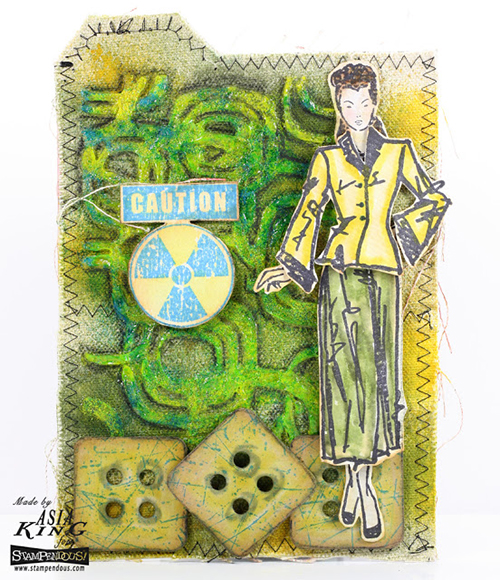
Global Inspiration Asia King Fashion Dame Card

From the UK:  I absolutely love Asia King’s use of my Fashion Dame stamp set for this mixed media panel.  Her combination of neon green, that cool Caution stamp, and my Fashion Dame really made for an image with a lot of attitude.  It goes great with my word of the year ;)

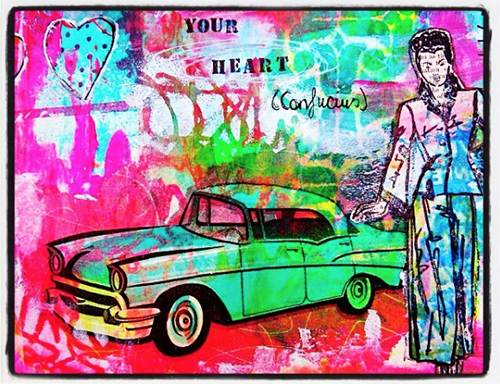
Global Inspiration Frieda O Fashion Dame

Frieda Oxenham also from the U.K. paired my Fashion Dame stamp set gal with a funky car and some great colors for a really nifty art journal page.  I love how she built up all those layers in the design to give a real sense of dimensionality.

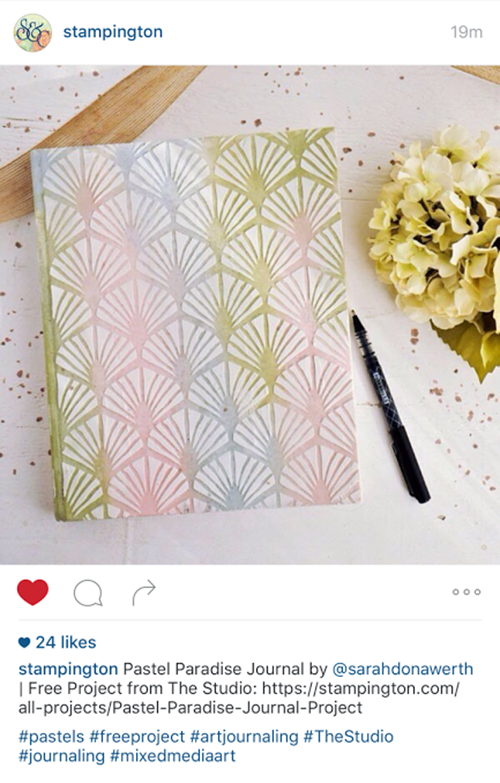
Global Inspiration Sarah Donawerth Stampington Art Deco

Stampington Magazine based in California, featured a free project using my Art Deco Wallpaper stencil on their website and social media.  You can follow along to create this beautiful journal with a super nice textured cover!

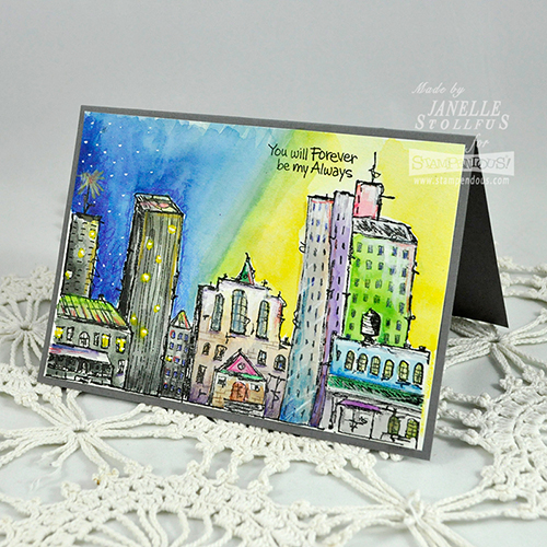
Global Inspiration Janelle Stolfus Urban Scribble

Janelle Stollfus in Idaho created this gorgeous card using my Urban Scribble stamp set.  I love how she filled in the cityscape to make it her own.  The little touches really give it a personalized look that is so unique.

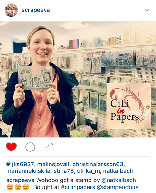
Global Inspiration Eeva Urban Scribble-2

And finally, here is Eeva from Sweden, purchasing one of my Urban Scribble Stamp sets at her local craft store!  So fun to see all of you shopping for my designs and inspiring us with your creativity :)

Join us again next Tuesday for another great project from one of our Creative Squad members!  They will be working with a new theme for April.  And in the meantime, share with me what you’ve been working on with my stamps and stencils.  I would love to feature your project in an upcoming post!

Comments (2)

  • Asia King

    |

    Thank you so much Nat for featuring my panel on your blog! I feel really honoured that you enjoyed my Girl with attitude project :). I absolutely adore this stamp! And what a gorgeous collection of projects – it’s such a fabulous company to be in! :). Thanks again, Asia xx

    Reply

  • Joi@RR

    |

    What a wonderful post. I just LOVE LOVE LOVE seeing how folks all over the world are being touched by your INCREDIBLE CREATIVITY Nat. THRILLING. I saw Asia’s design on her blog and thought that your Fashion Dame could not look more FABULOUS – that is an awesome make. But I have to say that I also just ADORE that abstract fun of your DAME on the art journal page with the old car – Wow – this could be a huge painting on a wall!! And your Art Deco Wallpaper Stencil looks BEAUTIFUL – wow. But of course, my favorite has always been the cityscape and WOW WOW WOW did Janelle do it up SUPER FINE???!!! YES. LOVE it. OK – Nat – are you busting your buttons???? You should be totally swelled with pride girl. So proud of you!!! This was great treat to see – thanks bunches. XXj.

    Reply

Leave a comment

Rule of Three #1 – Three Ways to Ink up Foam Stamps

Let me introduce you to my new series of mini-videos: “Rule of Three”. As we all know all good things come in three and these mini-tutorial-videos will show you all kinds of fun and practical things and techniques in coming in three.

+ Expand this article
5comments

Comments (5)

  • Joi@RR

    |

    YES Nat – loved seeing your ‘rule of 3’! And you are so right – the fun of foam is that it’s not a perfect imprint – which is what I love best about your foam stamps. But then, I have always been weird that way – never wanted to do anything the same as anyone else!!!! I think your foam stamps are INCREDIBLE…. just like YOU!!!! XXj.

    Reply

  • Tommy McDonell

    |

    Thanks. I bought your bird and it and I can tell you ways that it doesn’t work well! Looking forward to trying it again!

    Reply

    • nathalie-kalbach

      |

      Tommy, glad you liked the video and yes give it another try. Just keep in mind that a foam stamp is not providing a perfect image as a rubber stamp and that is the wonderful thing about it. You can create texture with it – visual and actual texture and there are many more ways than the three I showed in the videos to apply paint – I will share some other tricks and tricks in the coming months. Hope you have fun with the bird stamp! Nat

      Reply

  • Sue Clarke

    |

    I’m glad that you showed how to store the cut and foam with paint on it. I would not have thought of that. Thanks for the tips.

    Reply

Leave a comment