nathalie-kalbach

A Look Back – Cool Stuff You May Have Missed 08

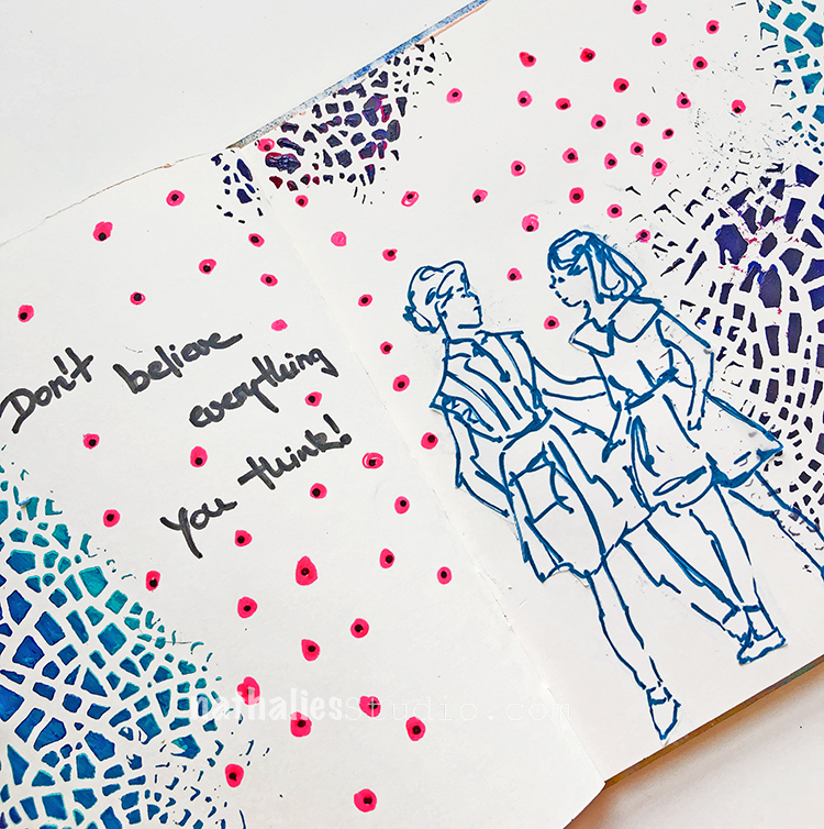
A Look Back – a blog series to show you some projects and posts that you may have missed – sometimes going WAY back in the archive. I think it will be fun to revisit a few ideas that we haven’t seen for a while. I’m excited to see how a little look back might inspire something new in the future :)

This time I’m looking at some beautiful stenciled background from my Creative Squad alumni archives. These are some gorgeous and inspiring ideas using my stencils. Here’s a look back. Enjoy!


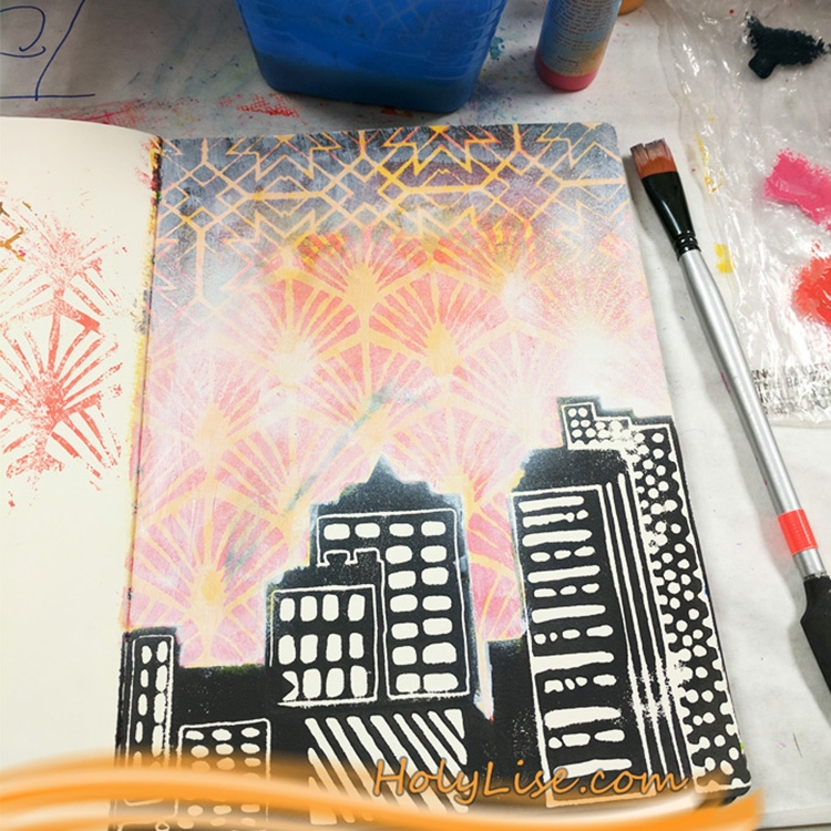
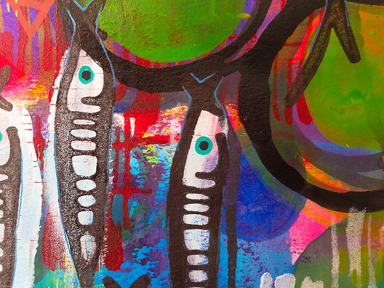
First up we have an art journal page from Creative Squad alum Josefine Fouarge. She blended my Toledo stencil down into my Art Deco Wallpaper stencil for a dramatic sky. I love the idea of an ombre effect that uses both color AND pattern! And that cityscape? That’s my Midtown foam stamp set :)

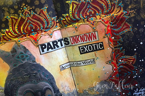
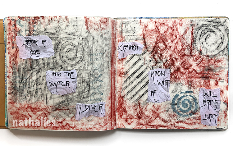
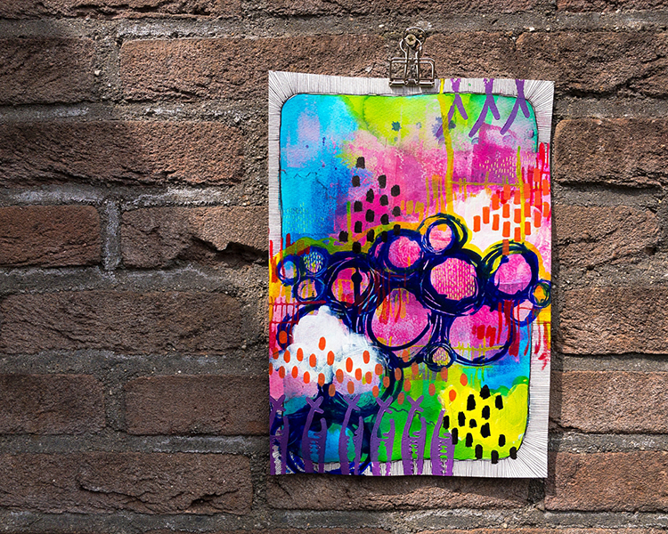
Next we have an exotic touch from Creative Squad alum Gwen Lafleur. She used my What’s the Point stencil and my Lily Wallpaper stencil for this art journal page devoted to adventures. The black, red, and gold color palette definitely transports us somewhere far off and interesting :)

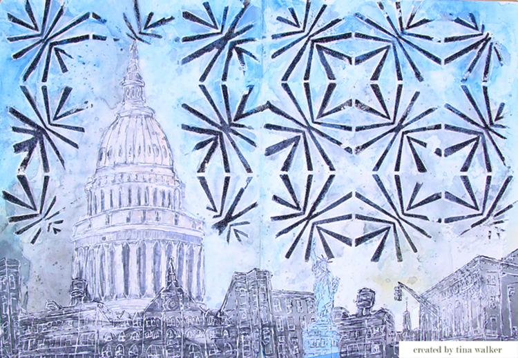
From Creative Squad alum Tina Walker we have this fun background using my Beacon stencil that has me thinking about fireworks. You can reinterpret stencils in so many ways and see different things in the designs.

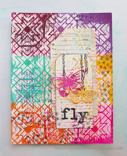
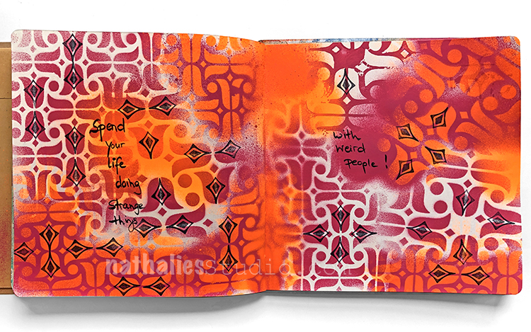
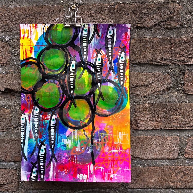
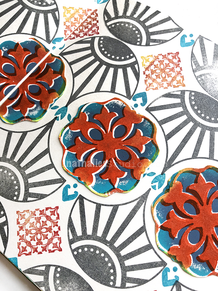
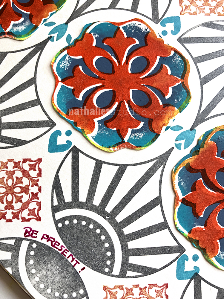
I absolutely love this colorblocked pattern using my Toledo stencil by Creative Squad alum Cheiron Brandon. Using blocks of color like this across a pattern is a cool way to mix things up with a stencil.

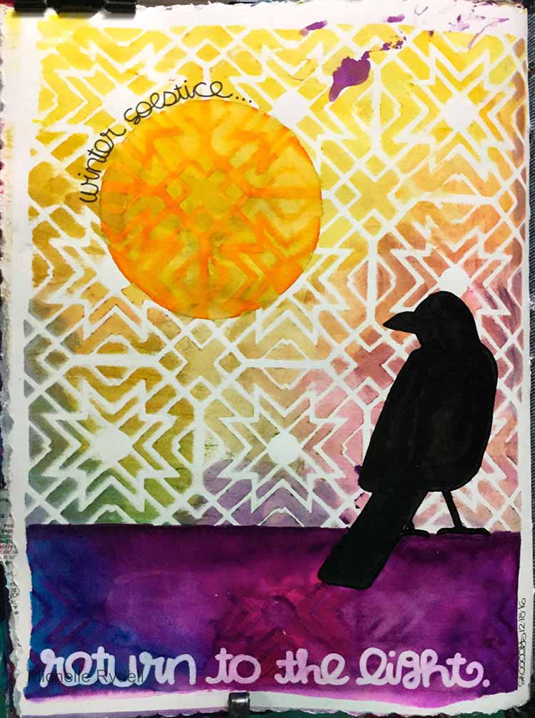
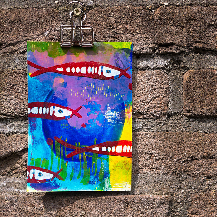
And finally we have this beautiful sunset from Creative Squad alum Michelle Rydell. She used my Toledo stencil with a bunch of spray inks for a gorgeous wash of color that we can’t get enough of!


I hope you enjoyed A Look Back through my Creative Squad archive and maybe you are inspired to try some different things now too.

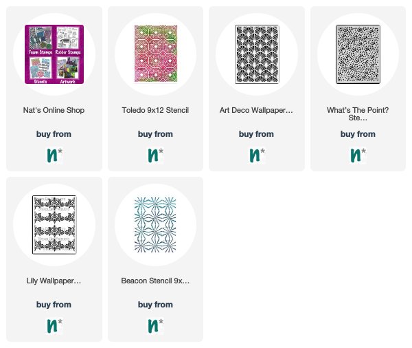
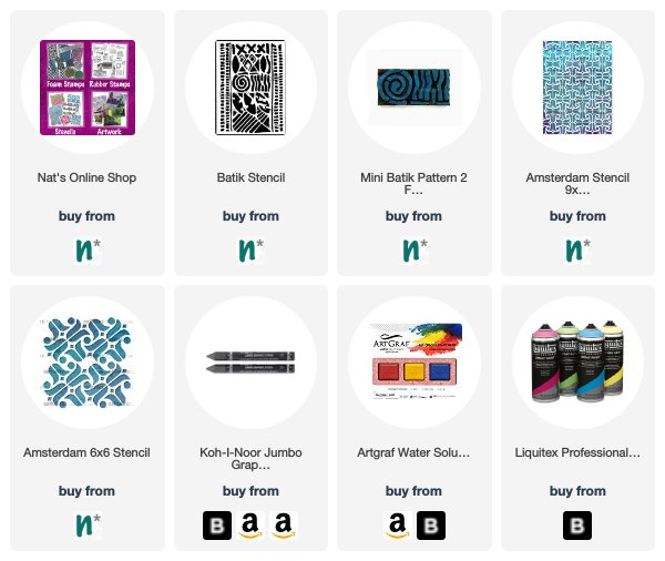
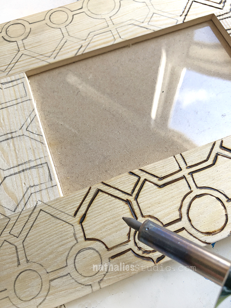
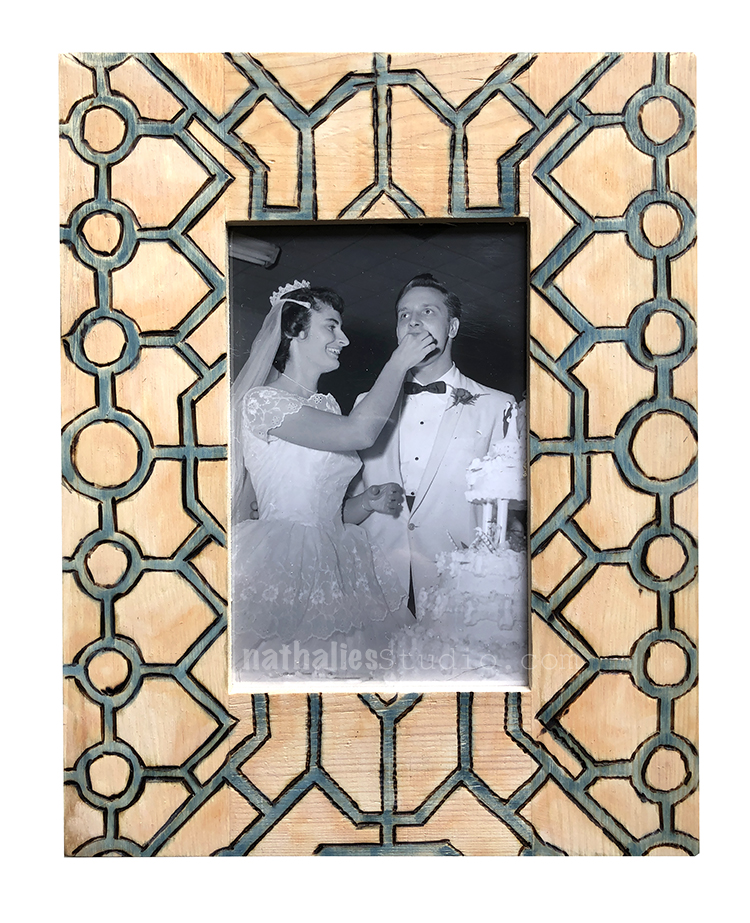
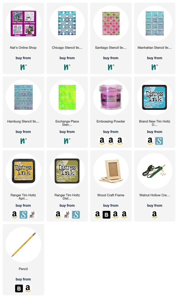
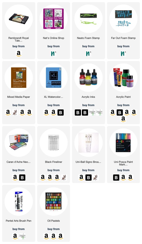
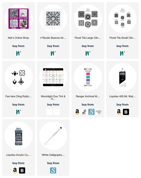
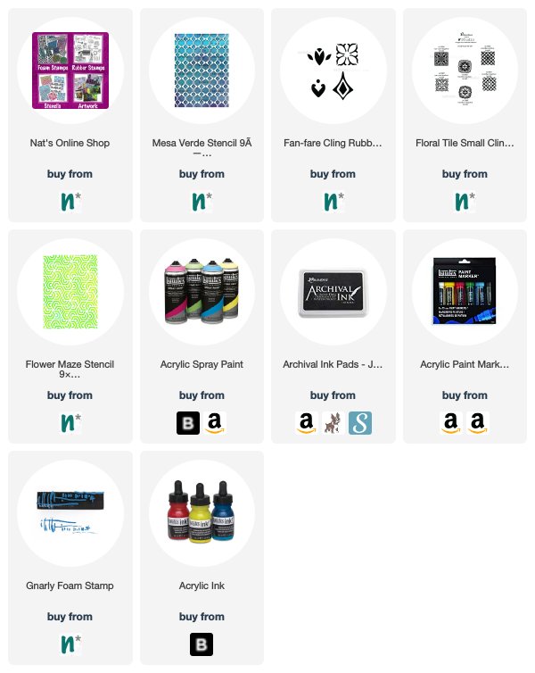
Here are some of the supplies that were used in these pieces:

And hurry into the shop because my Exchange Place ArtFoamie is now just $4!!! Super cool pattern and super great price!

Leave a comment

Stencilbop Challenge Prompts 15 & 16

Here is a recap of prompts 15 and 16:

August 15 – Rub!

Max Ernst used plants or texture of wood planks and other items in the house to create some wonderful artwork and the technique is called Frottage. 

For this art journal spread I layed my Batik Stencil underneath the art journal page and with the flat side of a graphite pencil and tailor chalk shaped graphite block I rubbed over the paper to reveal the texture of the pencil. 

I moved the stencil around to repeat certain elements of the stencil at specific areas of the journal spread. 

To repeat some of the pattern I stamped on top with my Batik foam stamps. 

August 16 – Scale

Some of my stencils and stamps that are similar in pattern but different in size can be used together as repetition and scale are great ways to create beautiful and cohesive backgrounds. 

For this art journal spread I used my Amsterdam 9×12 and my Amsterdam 6×6 Stencil. While the design element of the tulips are the same – the layout and size of them are different in each stencil making for a great way to use them together and layer them up like I did on this art journal spread with acrylic spray paint. 

Here are some of the supplies that I used:

Play along with us on on my insta feed! Here are the prompts:

Leave a comment

Stroll Through the Hood – August 2019

Strolls through my hood get me out of my studio, they help me get unstuck and often I get inspired by what I see and get new ideas to create something. It is part of my philosophy about Artful Adventures in Mixed Media – which is the subject of my book. Here are some photos that I gathered in the last couple weeks.

The past couple weeks were a whirlwind of emotions and things happening. We had a surprise good bye party for some very close friends who are moving to Texas -very sad and fun at the same time.

We made T-Shirts with a drawing I made of their house and to commemorated all the parties we had on that stoop. The back of the t-shirt had all the “famous” stoop sayings and we even had strangers asking us for t-shirts LOL. Maybe this could be a side business – Stoop Shirts – LOL.

By far the saddest moment though was when we had to say good bye to our wonderful little man Niles. He was with us for 19 1/2 years and he brought us so much joy and laughter over the years, he is truly missed. It is hard to not think of him during our daily routine because he was such a big part of it. I am sure anyone who ever had a pet can relate.

This fire hydrant is such an iconic American picture for me – LOL . I still wonder is that something that just happens or does someone open it up? It would be an even better picture with some kids jumping through the water.

Look at this wonderful color combination – we get these flowers at a farmers stand in NJ along with corn and tomatoes . Oh I am in love with Jersey tomatoes!

Our house is slowly progressing -the wall is out in the first floor – it is such a huge difference in space and light. This is going to be our living room, dining room area and in the back will be the kitchen.

One of our iron cast radiators – we had to remove one – but will keep the others. This thing is HEAVY!

How the kitchen looks right now …new electric stuff and since we passed the rough electric inspection it will soon be drywalled.

Big opening in the kitchen which will soon have a door going out on the new deck.

And here is our little Bobby Pretzel – he really misses Niles as well – and for the first couple days didn’t eat. He is very cuddly and I enjoy hanging out with him right now …maybe I should sketch this little guy :)

As you can see a lot of the strolls are simply to our house – LOL – we are on pins and needles at the moment but it looks as if we can move in at the end next month – wish us luck!

I hope you enjoyed the little stroll – until next month!


And check it out: my Exchange Place foam stamp is now just $4 in the shop! Love this stamp!

Comments (3)

  • silinsunnyfl

    |

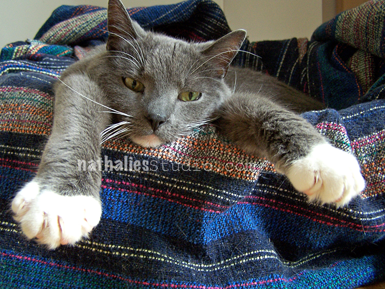
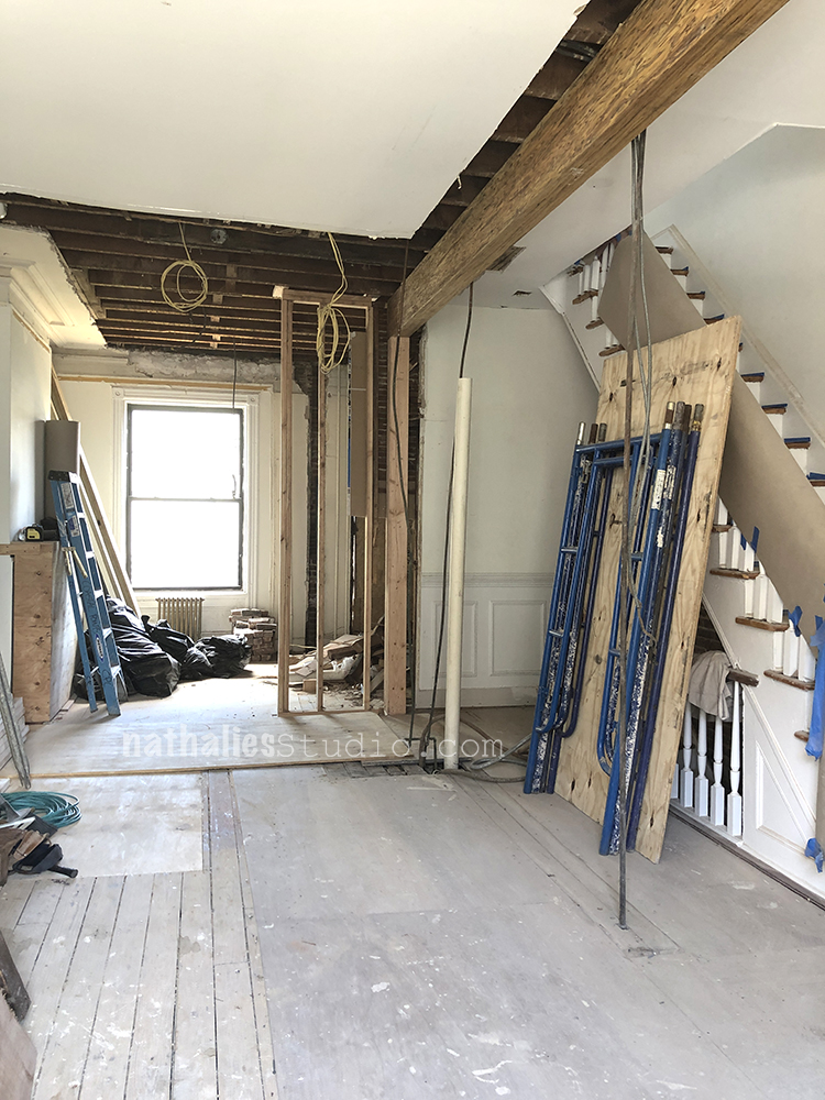
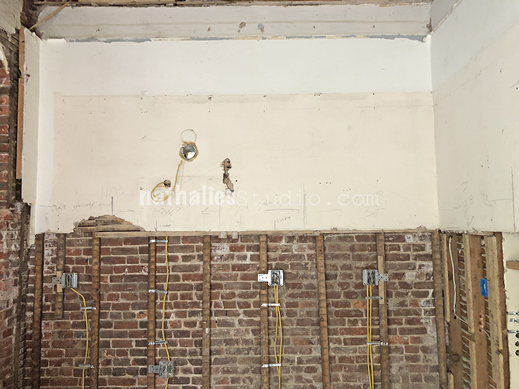
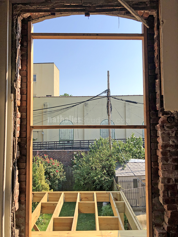
    I just happened to be looking thru your website & came across the pics of your home and your fur babies – I’m so sorry for your loss, and you’re absolutely right. You think about them throughout the day, it’s really tough, they become part of the family & when they’re gone, there’s a void. We waited 8 months before adopting again. I imagine your remodeling has come a long way since it’s now Dec, good luck with everything. Regards, Silvana

    Reply

  • Sue Clarke

    |

    RIP Niles…so sorry for your loss Nat.
    The tees are wonderful.
    The deck looks like it’s boxing for gardens right now (looking through the openings).
    Is that your yard?
    Your home is quite the work in progress and it will be just what you want once done (well worth the wait)!

    Reply

  • Diane

    |

    Thank you for sharing your house renovations. I am sure you will enjoy.
    Sorry about your kitty. Little one is cute too. Hope he helps fill the void.
    All the best.

    Reply

Leave a comment

Stencilbop Challenge Prompts 12, 13, & 14

Here is a recap of prompts 12, 13 and 14:

August 12 – Emboss!

Heat embossing has always been a way to add texture to my mixed media and art journaling – seeing the embossing powder turn into a glossy plastic haptic surface is pretty fun! 

For this spread I used my Chicago and my Santiago Stencil and defined a big square by taping the edges of the design with masking tape. 

I used acrylic paint through the square off part of my Chicago stencil. Then I layered the squared off area of the Santiago stencil on top and applied embossing ink through the opening. I sprinkled embossing powder on top- used the heat gun and voila. 

Fun to try out different color combinations!

August 13 – Subtraction

Usually paint gets applied through a stencil to create a pattern but you can also take paint off through a stencil to create a pattern. 

When you do so with acrylic paint you usually layer the stencil on top of still wet acrylic paint and then take the paint off through the stencil. Here I applied some Distress Oxide inks on top of the paper.

Since those can be reactivated with water, I used a slightly moist rag and rubbed the ink off through the Manhattan and Hamburg stencils. 

The result is subtle but so effective especially when you then also add some areas of the usual way of stenciling to create a reverse/non reverse effect. 

August 14 – Wood

Leaving the art journal for this one. My parents in law are celebrating their wedding anniversary next week and I thought it would be fun to create a fun pattern on a wooden frame using my Exchange Place Stencil. 

I love the stencil and it is perfect with it’s bigger opening for this project. I traced the pattern through the stencil with a pencil onto the frame.

Then I simply followed the line with my wood burning tool.

I used some ink pads to add a little bit of color to the pattern but to not loose the wood effect. 

Here are some of the supplies I used in these prompts:

Play along with us on on my insta feed! Here is the prompt list:

Leave a comment

Boldly Going – Marsha Valk

Hello from my Creative Squad! Today we have Marsha Valk and a series of wonderfully colorful mixed media pieces using my Neato and Far Out foam stamps. This month’s theme is: Boldly Going – Go BOLD with color or pattern this month and really make something that is packed with visual POP! This is no time to be subdued or subtle. Go Bold!!!


As I tend to go bold with colour and pattern all the time, I thought about how I could go even more courageous.

I envisioned an abstract work incorporating acrylic inks as a watercolour because that’s something I have wanted to try for some time now.

For my colour palette, I decided to use all the colours of the rainbow + pink, black and white.

I started with applying the acrylic inks by brushing clean water onto my paper and then adding in acrylic ink a few drops at a time. I used another brush to spread and push the ink around.

As could be expected, this technique has a learning curve, and the result wasn’t what I was hoping for. I ended up creating six or seven backgrounds on different types of paper that then all had to dry completely.

The next step was to try and make a visually popping abstract work out of at least one of these backgrounds.

I decided to work on all of them at the same time. Adding some paint here, then some ink there, some stamping on this page and some marks on that page. Making sure I use ROYGBIV on all of the pages.

Somewhere along the way, it became apparent that I’m obsessed with making inky circles and I had to admit that my attempt at making abstracts had turned into making graffiti.

I also let go of the idea of not having anything recognizable on the pieces, because nearly all of the images I stamped with the Neato Foam Stamp practically begged me for an eye.

I ended up with four sheets successfully packed with visual pop. I kept two A4size, and I cut two of them into smaller cards.

All of the leftover pieces will go onto my basket of printed and painted papers for use in future projects.


Thank you Marsha! Love how this experiment in materials and methods lead to some gorgeous results! You can find all of my Foam Stamps in my online shop. Here are some of the other supplies Marsha used:

Feel inspired? Working on something yourself that you’d like to share?  I love to see how you interpret our monthly themes. Email me how you used my stencils and stamps with the theme and email me an image – I would love to share your projects in my next  “n*Spiration From Around the Globe“.

Leave a comment

Let It Go – Art Journal

My inspiration for this page was Mary Oliver’s poem In Blackwater Woods. To create the background I stamped with my Buenos Aires foam stamp and my Floral Tile Large rubber stamps. Then I added the Floral Tile Small and Fanfare stamps.

To soften the background I used a thin layer of white spray paint and then painted areas with black gesso.

I journaled with a white calligraphy pen.

Here are some of the supplies I used:

Leave a comment

Stencilbop Challenge Prompts 10 & 11

Here is a recap of prompts 10 and 11:

August 10 – Paste

There is something utterly satisfying about spreading modeling paste or embossing paste through a stencil and create a nice small crisp raised pattern on top of a flat surface ….or it might be that I am just weird. But try it yourself ;) 

I used my Hamilton stencil on top of my Hamilton stamp – the middle part is almost identical in size. I found some metallic embossing paste in my stash and applied it with a palette knife over the middle. 

I love how this turned out. A little bit of sparkle and a little bit of texture- nom!

August 11 – Texture

Texture is – besides Color – one of my favorite elements to use in my artwork and it is no coincidence that one of my very first stencils I designed in 2013 was my Crackle Stencil. 

I loved adding crackle texture to my artwork but boy did I dislike how long the different applications with mediums took – or how messy it was with some of the “old school” ways like Vaseline and acrylic paint. And so I was dreaming of a Crackle stencil – there was none out there and I am so glad Stencil Girl liked my idea and design. 

To this day it is one of my favorite and apparently one of your favorite stencils of mine as well. It has found a home more than any other stencils of mine. One of my favorite ways to this day to use the Crackle stencils is with heavy bodied acrylic paint. Simply spread over the stencil with a palette knife- let dry and there crackle bliss!

Here are some of the supplies I used:

Here are the daily prompts. I hope you play along with us on on my insta feed!

Leave a comment

Be Present – Art Journal

“Be present!” – always a good thought to remember :)

The colorful centers are from collage paper which I had stamped using a stamp buddy and the Versailles Foam stamp with different acrylic paint colors. I cut out the centers and glued them to the art journal.

Around it I stamped my Fanfare stamps in teal archival ink and my Fantastic Large stamps in gray archival ink. Then I filled in with the Floral Tile Small set and Moonlight duo inks.

Here are some of the supplies that I used:

Comments (2)

  • Gunvor

    |

    I just love the colour contrasts! Thanks for the inspiration!

    Reply

Leave a comment

Stencilbop Challenge Prompts 8 & 9

Here is a recap of Prompts 8 and 9:

August 8 – Jam Session

Mixed Media always has been my super love – mixing different materials, paint media and tools is just my jam. 

Besides looking for which paint media work together with a stencil , I love to go on a hunt and see which of my stamps fit with my stencils to get to a total new pattern. Here is combined my Mesa Verde Stencil with one of my Floral Tile rubber stamps and Fan-Fare Rubber stamps. 

I love how this came together. As for paint media, I used Spray paint over the stencil, an inkpad for the stamping and an acrylic ink marker for the little dots. 

Can’t wait to see how you interpret the theme Jam Session.

August 9 – Reverse

I love using the reverse of the stencil – meaning the opposite of what the stencil usually shows when applying paint media over it. Sometimes that can be archived by stenciling and then taking the stencil that still has some paint on top and printing with it. 

For this spread I sprayed over my Flower Maze stencil on a different piece of substrate and then flipped the stencil over and printed onto my art journal. I love using white as well as other colors.

The reason I love to use spray paint is that the pattern is applied in a nice thick “plasticky” way, which actually is perfect when you apply thin paint or ink on top. The spray painted pattern will resist the ink longer and can be wiped off the pattern making for a nice and really cool effect. 

Here are some of the supplies I used:

Here are the daily prompts. I hope you play along with us on on my insta feed!

Leave a comment