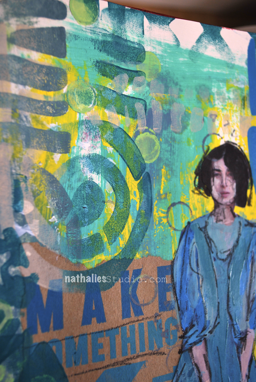
Actually, I can or … In my Art Journal today

actuallyican_natkalbach01

Actually, I can!

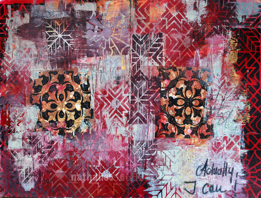
Sometimes, when you think things are just not working out and you want to give up, this is a good reminder. As you can see I was in the mood for a grungy art journal spread.

actuallyican_natkalbach02

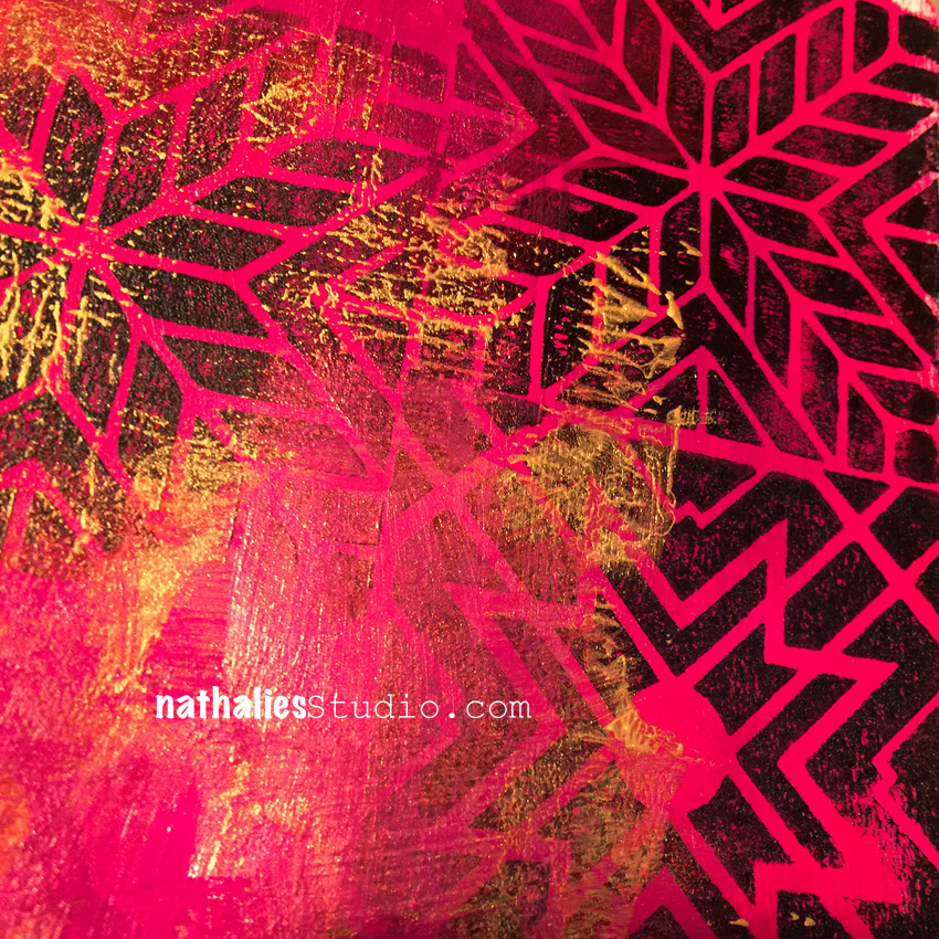
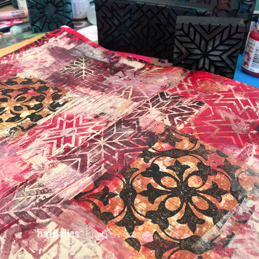
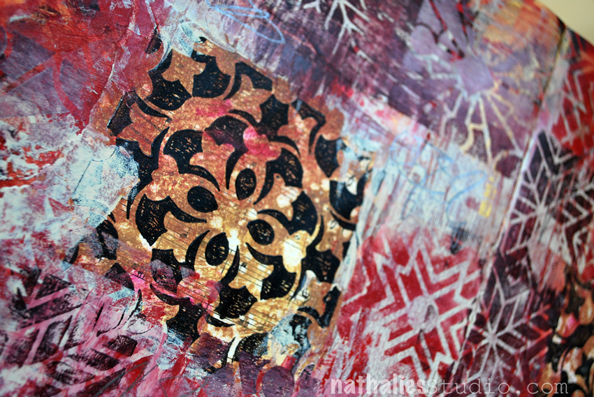
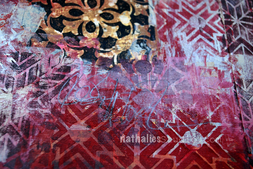
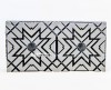
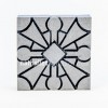
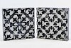
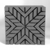
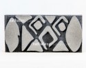
I painted the art journal background background in different red and magenta acrylic paints and stamped a border using the Toledo, Santiago, and Buenos Aires  Foam Stamps and black acrylic paint.

Next, I layered gesso and unbleached titanium and scraped away some parts. Then I stamped with the same foam stamps using the red and magenta colors of the background on top. I stamped mixing different tints and shades with the colors I already used but also incorporated gold and copper in between.

actuallyican_natkalbach03

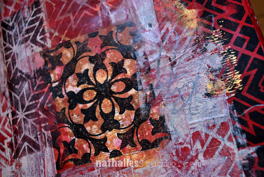
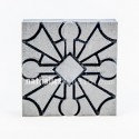
For the middle section of each side of my journal spread, I painted a music sheet with gold and copper acrylic paint, and then stamped using the positive and the negative Stamp of the Versailles set and black paint on top of it.

actuallyican_natkalbach05

I tore the music sheet up and pasted it to the spread left and right and added  a couple more layers of stamping and over-painting.

actuallyican_natkalbach04

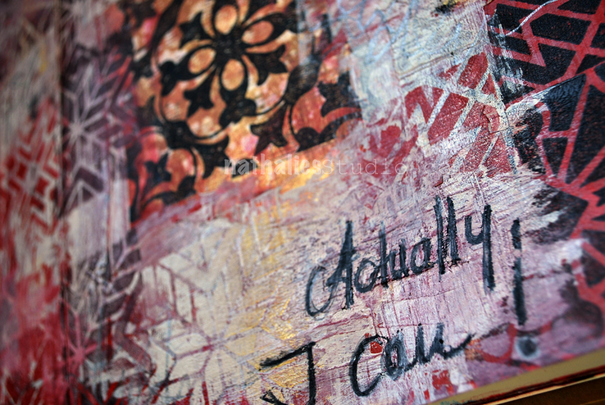
I added some charcoal pencil marks and wrote out the text.

actuallyican_natkalbach06

I love the result and the weathered pattern look.

actuallyican_natkalbach07

I felt so much better when I was done with this spread  – yeah for art journaling *wink

Here is what I used for the page – some links are affiliate links:


Wishing you a wonderful day and – hey – remember “You actually can!”

Leave a comment

Art Stroll: Making Modern at MFA Boston

kalbachmfamakingcollage

When I was in Boston a couple months ago to visit my friend Julie Fei Fan Balzer we went to the MFA in Boston and saw the Making Modern Exhibition. The exhibition explored “what it meant to be in the vanguard of Modern art in the 20th century. Modern artists working in the Americas were influenced by a variety of contemporaries, teachers, rivals, and friends. Incorporating diverse sources of inspiration, 20th-century painters took their artistic practice in dramatic new directions.”
kalbachmfamaking02

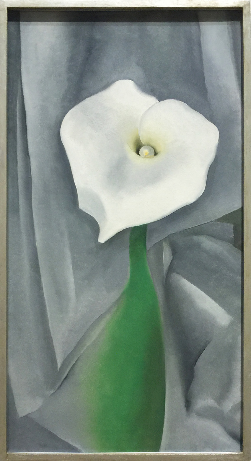
Georgia O’Keeffe, Calla Lily on Grey, 1928 – Oil on Canvas. O’Keeffe was influenced in the composition of this piece by her teacher Wesley Dow who taught that artists should not copy from nature, but rather capture nature through the exploration of composition with elements like lines and colors.
kalbachmfamaking03

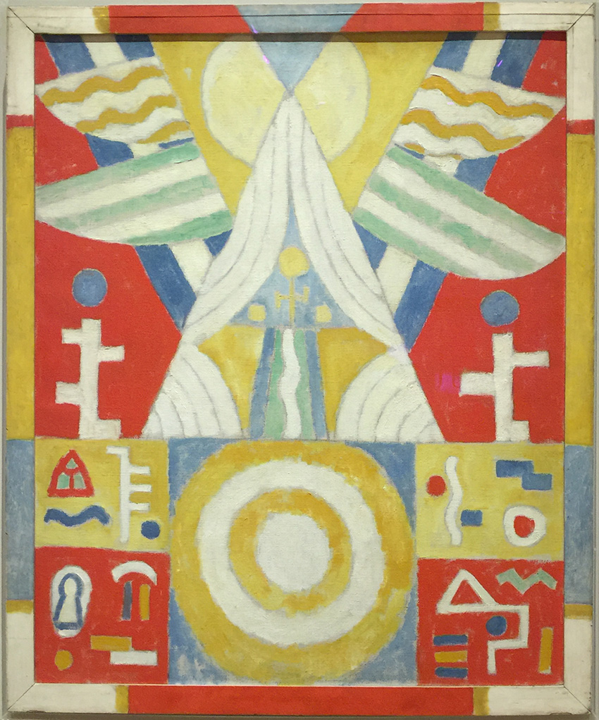
Marsden Hartley, Arrangement – Hieroglyphics (Painting No. 2), 1914 – Oil on Canvas. Hartley who lived in Germany between 1913 and 1915 was deeply inspired by Native American art which he encountered at Berlin’s ethnographic museum and also by artist Wassily Kandinsky. I do love his frame, a perfect sample how artist often made frames being part of their artwork.
kalbachmfamaking04

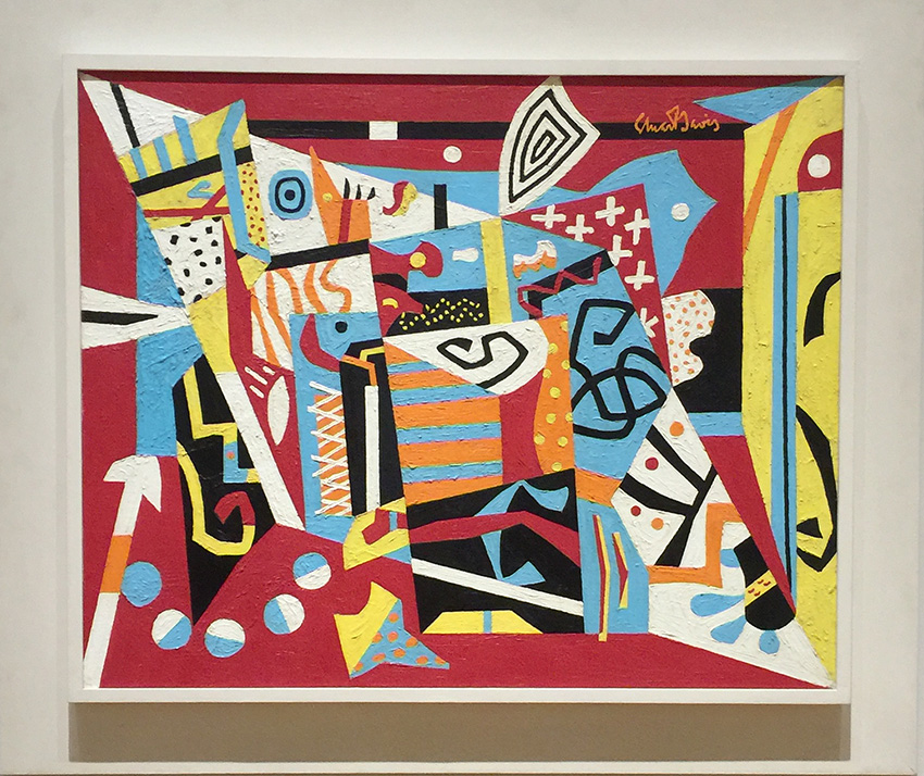
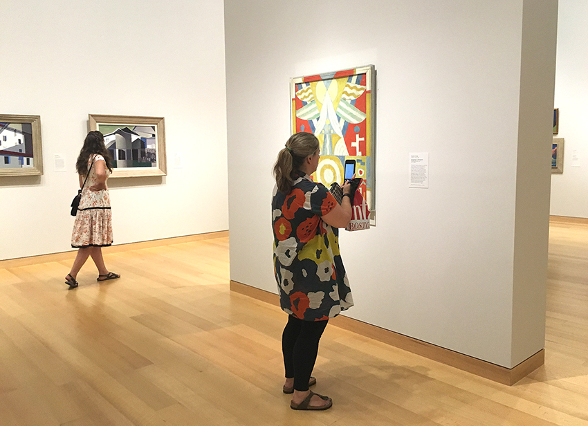
Stuart Davis, Hot Still-Scape for Six Colors- 7th Avenue Style, 1940 – Oil on Canvas. Davis painted this in his studio in Greenwich Village and it was as he said himself a “product of everyday experience in the new lights, speeds, and spaces fo the American environment” I love the colorful energetic composition and it does speak 1940s-jazz-time-NYC to me.
kalbachmfamaking05

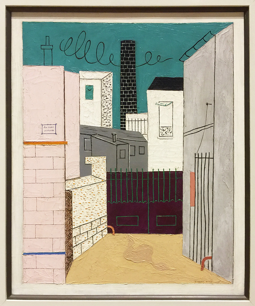
Stuart Davis, Adit, No. 2, 1923 – Oil on Canvas. Davis visited Paris in 1928 and this painting is inspired by the urban landscape of Paris.
kalbachmfamaking06

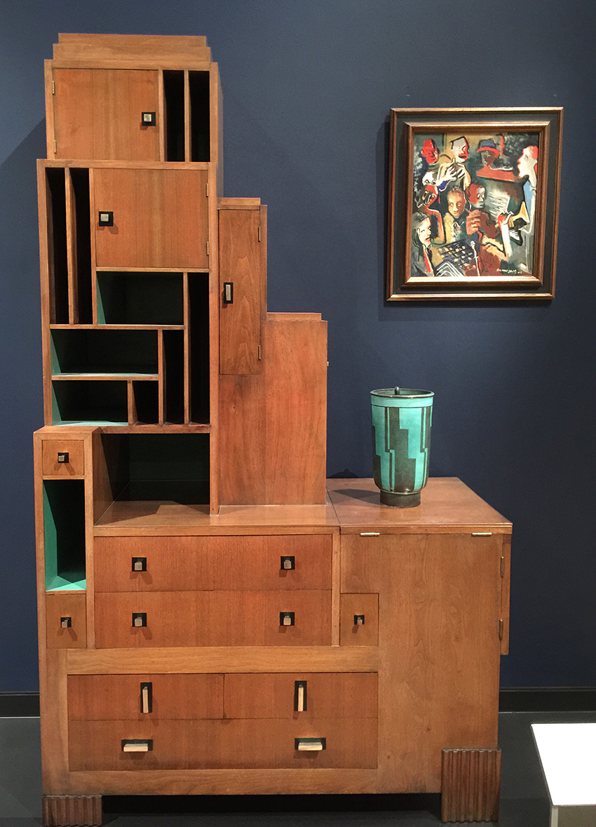
In the 1920s and 1930s Artists and designers tried to capture the excitement, the speed, the intrigue and surprising loneliness of urban life, in their paintings, music, writings, fashion and furniture.

I love love everything in the above picture- can I have this in my living room, please!
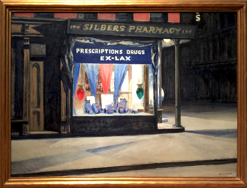
kalbachmfamaking07

Edward Hopper, Drug Store, 1927 Oil on Canvas. This painting conveys an eerie nocturnal solitude through the brilliance of electric light. It is slightly discomforting.
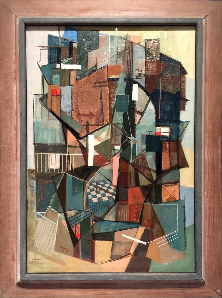
kalbachmfamaking08

Walter Augustus Simon, 715 Washington Street Greenwich Village, 1947 Oil on canvas with additional Mixed Media. Simon lived in this building as a student and later with his family. It shows the intimate space with the ground level shops, failings, walls and fire escapes.
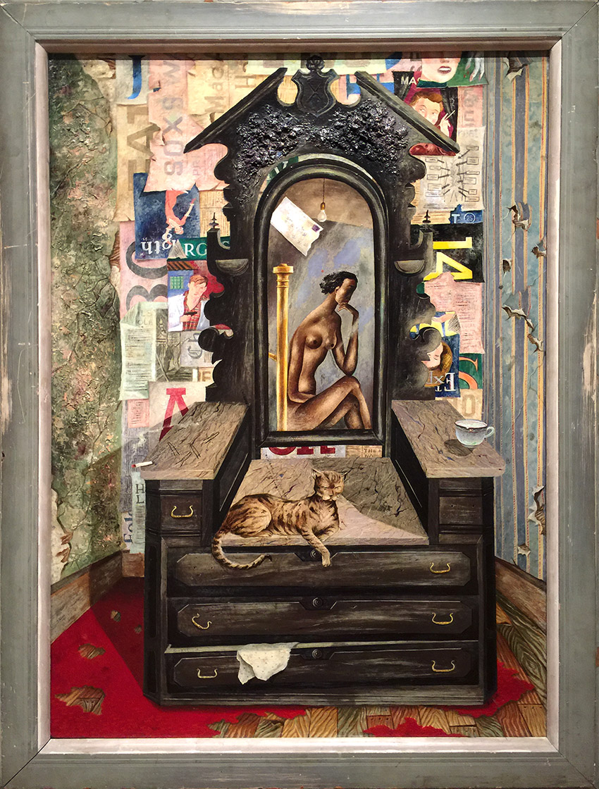
kalbachmfamaking09

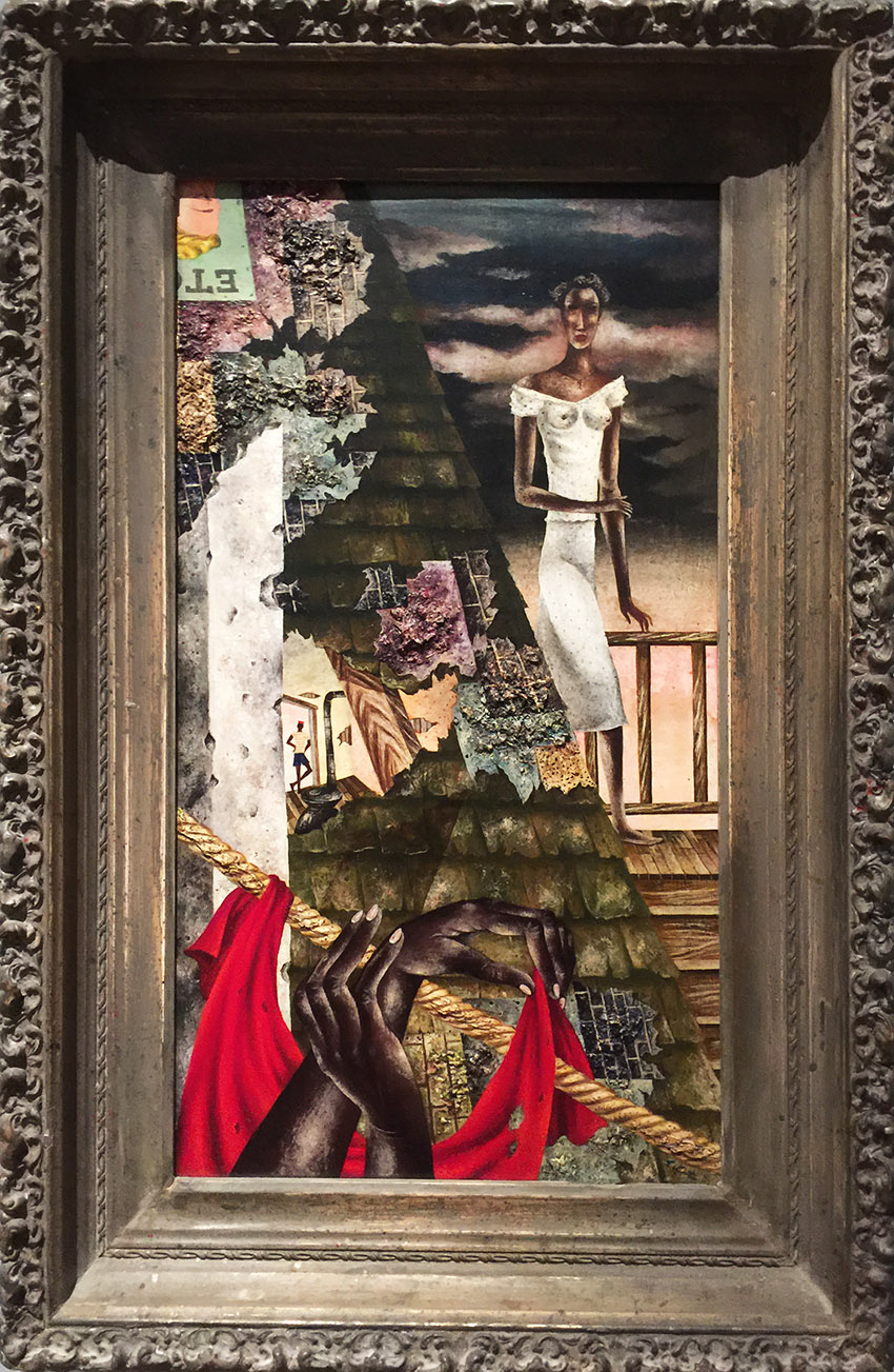
Eldzier Cortor, Room No. V, 1948 Oil on Masonite. Cortor build up the painted surface with delicate skins of color that suggest cracked walls. He also chose the distressed and old frame with this painting.
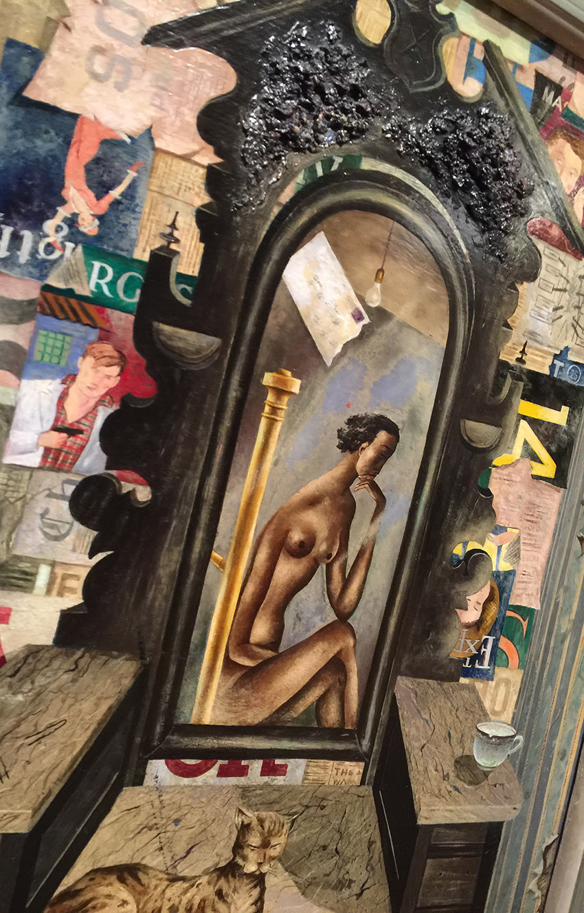
kalbachmfamaking10

I love the visual and actual texture in this painting.
kalbachmfamaking11

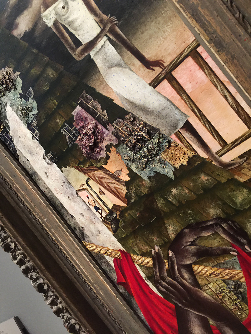
Eldzier Cortor, Environment, 1947 Oil on board. Cortor extends the thickly painted rooftop patched by newspapers and other items into our space.
kalbachmfamaking12

Amazing!

kalbachmfamaking14

Hans Hofmann, Swamp Series II – Autumnal Glory, 1957 -Oil on canvas. Hoffmann once said ” A picture should be made with feeling, not with knowing. The possibilities of the medium must be sensed. Anything can serve as a medium …” He taught his students to layer color and form, creating as in this painting, movement and depth.
kalbachmfamaking16

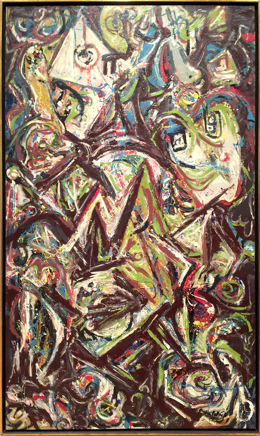
Jackson Pollock, Troubled Queen, 1945 -Oil and alkyd on canvas. Pollock was familiar with Picasso’s early works, which often display masklike treatment of heads and interpenetration of figure and ground. This painting also marks a transitional moment in Pollocks career as he already moves toward the “drip” paintings for which he later becomes most known. I love this sample of where inspiration from another artist meets a different artists’ own interpretation and style.
kalbachmfamaking21

I really loved this exhibition and its attempt to explore what influenced and inspired the work of those artists. It is amazing to see the connection between old ideas and new ideas, surroundings and Zeitgeist and how new movements are being born. It is what makes art so incredibly interesting and provides such a trove of inspiration while taking an Art Stroll.

I hope you enjoyed this Art Stroll as much as I did!

Comments (3)

  • JoAnn

    |

    Thank you so much for sharing – JoAnn

    Reply

  • Joi@RR

    |

    Many of the designs in these and the buildings (of course) remind me of your art Nat. Thanks so much for sharing – I always enjoy your art walks! j.

    Reply

    • Mary Jane Huth

      |

      Thanks so much I love all your art walks! It’s soo great to see all the amazing art from all over the world!
      Reply

Leave a comment

Workshops at The Queen’s Ink in Maryland & Giveaway Winner

kalbachqueenscollage

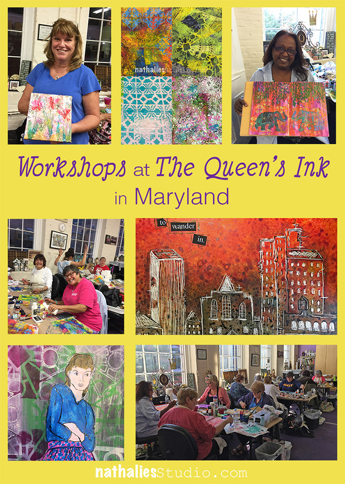
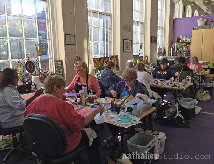
I had such a wonderful time in Maryland at The Queen’s Ink last weekend.

kalbachqueens02

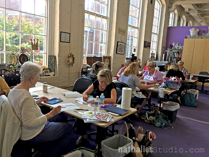
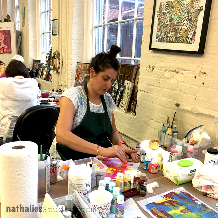
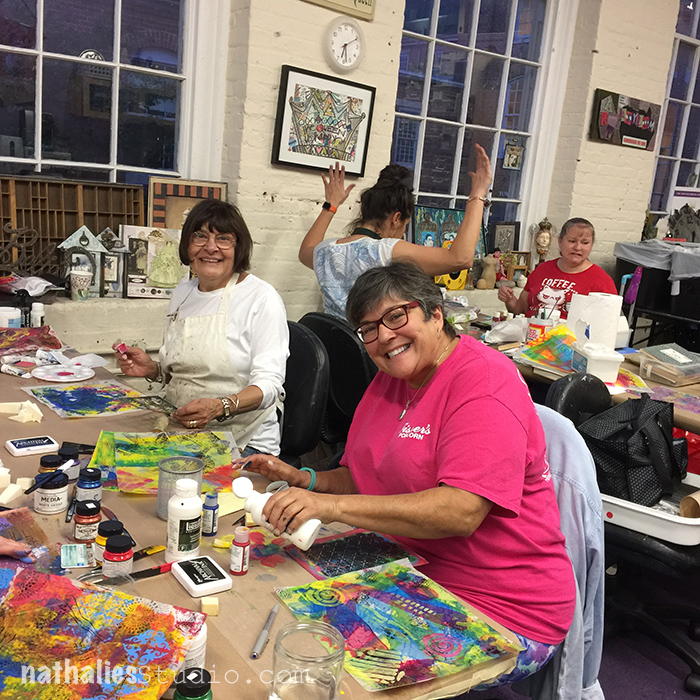
The Queen’ s Ink is an amazing store located in a historic mill and the classroom has gigantic windows giving a wonderful light.

kalbachqueens03

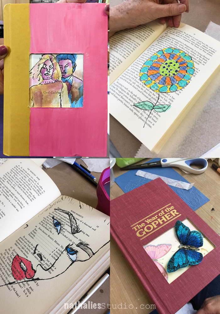
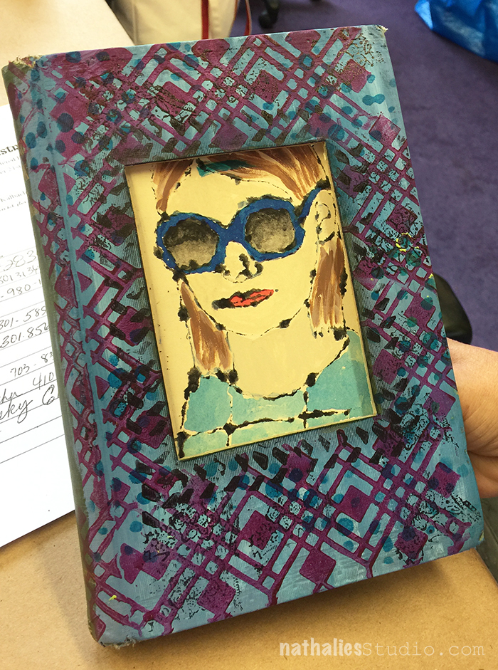
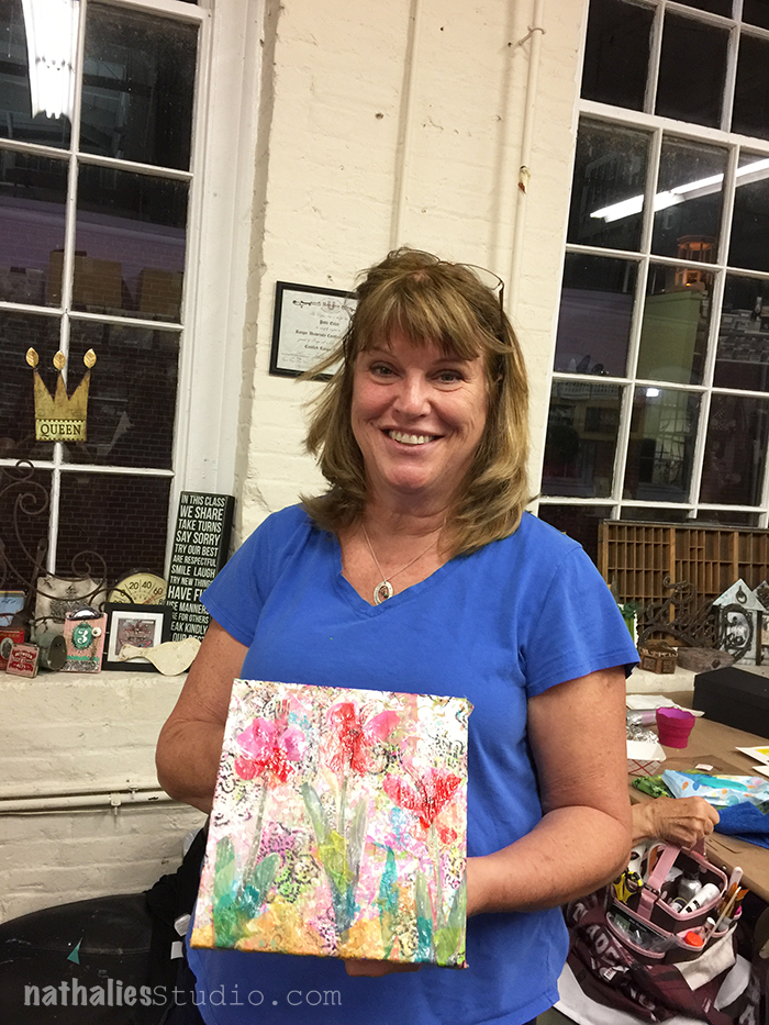
The first class was a an altered book class and it was wonderful to see how the students interpreted the techniques to fit into their own books and styles.

kalbachqueens04

Isn’t this fun?

kalbachqueens06

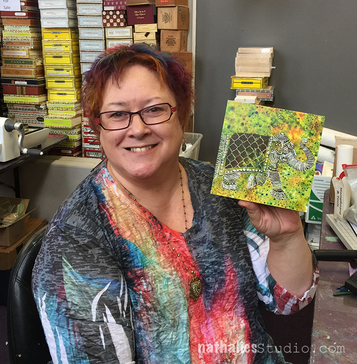
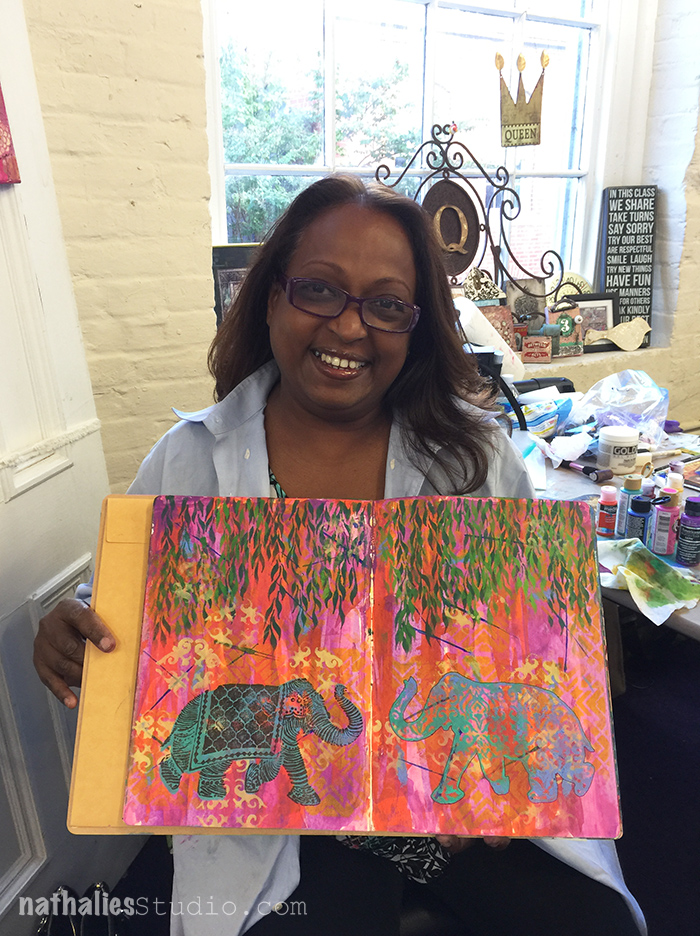
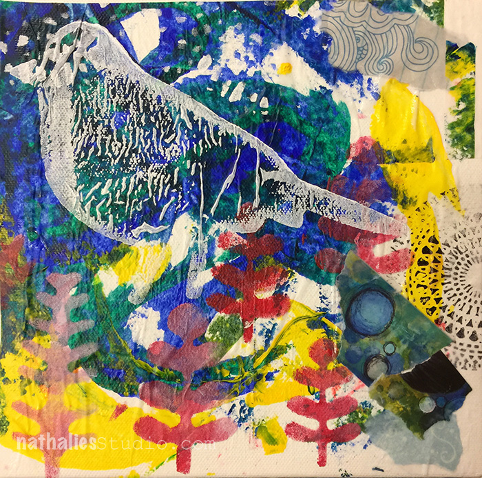
Patti, the owner of The Queen’s Ink and master of colorful and beautiful Mixed Media projects herself worked on some beautiful Ampersand Stampboards using my Stampendouds Elephant, Bird and Urban Scribble stamp set. So love it!
kalbachqueens15

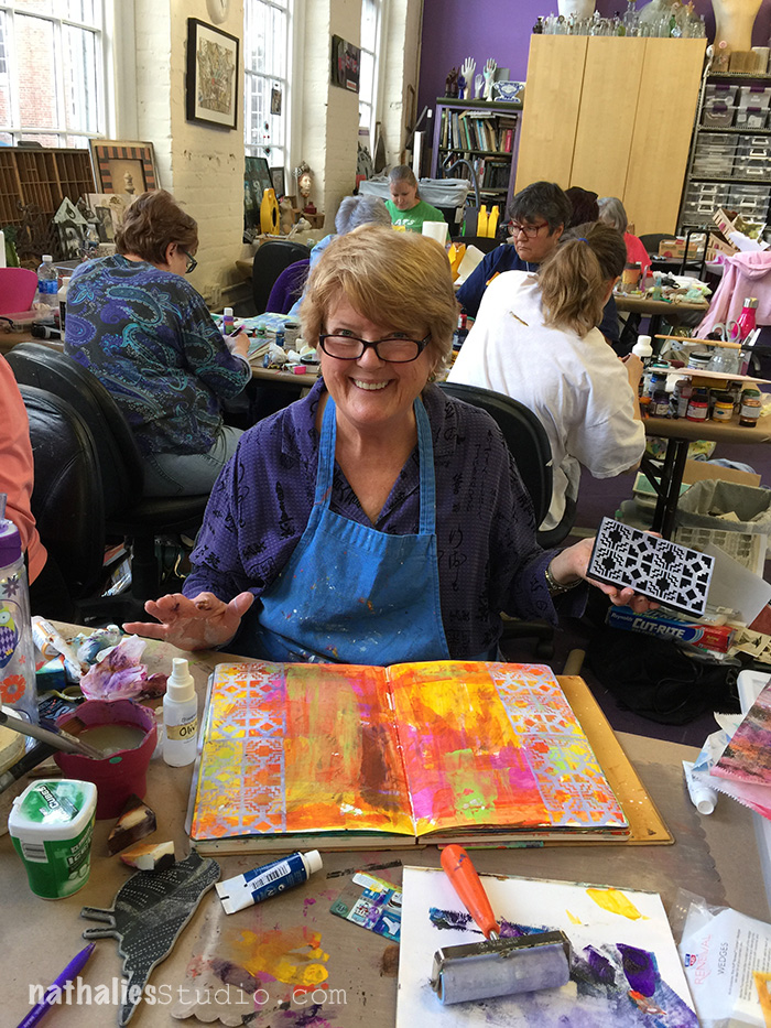
The students were so much fun and I loved seeing some familiar faces and also to meet some students which I have known for a long time from my online classes – you guys are the best!

kalbachqueens08

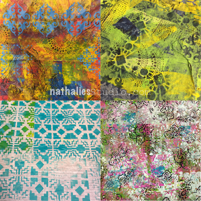
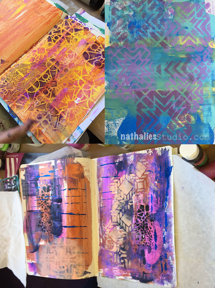
Lot’s of yummie pattern play in the collage class

kalbachqueens09

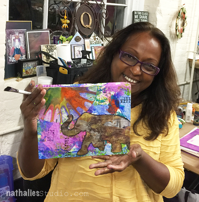
and happy smiles :)

kalbachqueens10

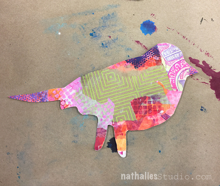
the collages were so different and fun and colorful!

kalbachqueens11

hey …little birdie!

kalbachqueens12

kalbachqueens13

kalbachqueens14

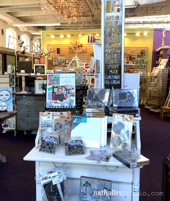
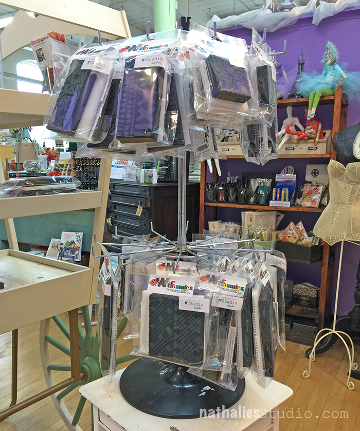
And I know it is dorky- but it was so fun to see my stamps and stencils displayed in the store. Still a pinch me moment!

kalbachqueens01

kalbachqueens16

On the second day I taught my Artvergnugen class and we exhilarated layers :)

kalbachqueens17

kalbachqueens18

kalbachqueens19

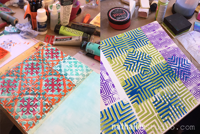
Look at all those colorful patterns made with the new ArtFoamies and ….shhhhh some still secret stencils (hint hint …check in next week ;) )

kalbachqueens20

kalbachqueens21

I had a fantastic time at The Queen’s Ink – thank you Patti for having me ! Rumor has it …I might be back next year ;) ;) ;)

And on another Note- here is the Winner, drawn by my friend Kim,  of the “Art Journal your Archetypes Book by Gabrielle Javier- Cerulli” Post ! Congratulations Gill!

screen-shot-2016-10-28-at-10-49-24-am

I hope you have a wonderful day weekend!
+ Expand this article
0comments

Leave a comment

New Website Celebration

I’ve “Creatively JumpStarted” things around here! I am so excited :)
I wanted to redo the look and the accessibility for my website for a long time and we have been working on this for two years. I hope you will love it as much as I do.  We’ve completely redesigned nathaliesstudio.com to make your experience even better. In addition to improving my online workshops, like Creative JumpStart, we’ve made it even easier to learn, find inspiration, and to shop for your favorite n*Studio products on my website.

Celebrate the launch of my NEW Website and
Enjoy 20% Off in the Online Store and Online Workshops from October 27 – November 6, 2016!

nstudiowebsitelaunch-coupon-code-graphic
Cruise around a little bit and let me know what you think. Thank you for your support!

Comments (8)

  • Gunvor

    |

    I love your new look! Fresh colours and really easy to navigate so I can find all the wonderful inspiration you provide.

    Reply

    • nathalie-kalbach

      |

      Yeah- glad you like it and the navigation too , Gunvor! have a wonderful day! Nat

      Reply

    • nathalie-kalbach

      |

      Thank you Michelle!!! Have a wonderful weekend my friend – at last the sun is nice to us today here in Jersey ;)

      Reply

  • stresso

    |

    looks fab! congrats

    Reply

    • nathalie-kalbach

      |

      Thank you Stephanie, so glad you like it :) Wishing you a wonderful weekend!nat

      Reply

  • Joi@RR

    |

    Wow – so colorful. Looks SUPER Nat! j.

    Reply

    • nathalie-kalbach

      |

      Thank you Joi, so glad you like it :) Have a wonderful weekend!
      nat

      Reply

Leave a comment

Today is the Day – Marsha Valk

cs-october-theme

Today, Marsha Valk from my Creative Squad is sharing two brilliant projects to help us get organized!  She is using my new Santa Fe, Batik Pattern 3, and Buenos Aires Tile foam stamps, and this month’s theme: “Today is the Day.”  I invite you to join me and my Creative Squad to stop procrastinating and to make today the day you finally tackle that artsy thing you’ve been meaning to get to for so long.  Start that new project you’ve been planning for months.  Try out that new product you bought ages ago.  Experiment with that new technique you read about last year.  Try it!  Today is the Day!


marsha-october-headshot

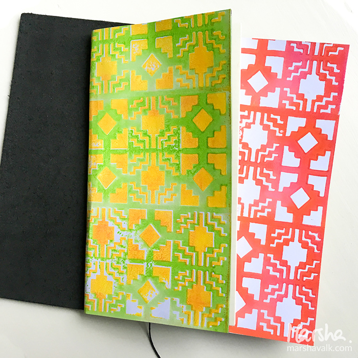
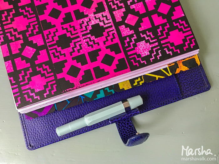
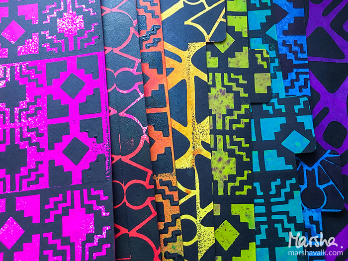
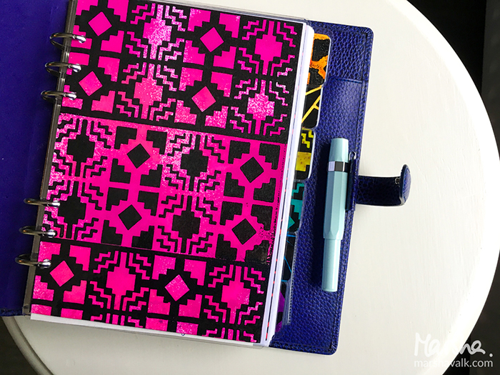
Today is the day that I got organized and ready for 2017! I know it’s still early days, but my first try-outs with the new Art Foamies ended up as covers for a couple of Travelers Notebooks and that inspired me to create new planner dividers for my Filofax planner in similar patterns.

marshavalk_nstudio_todayistheday-14

marshavalk_nstudio_todayistheday-5

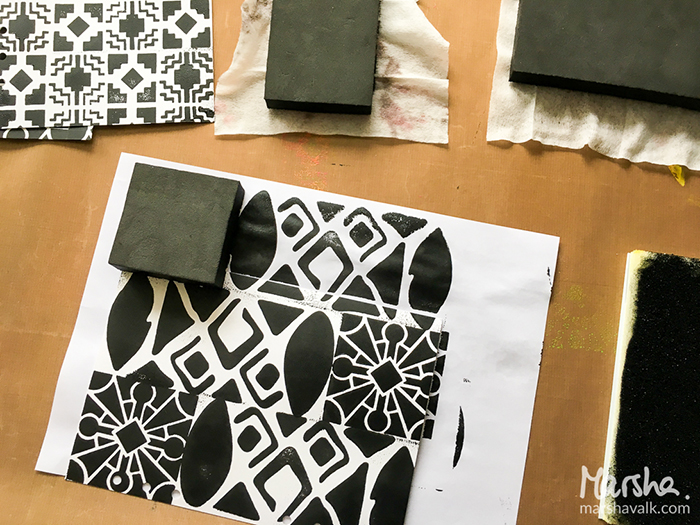
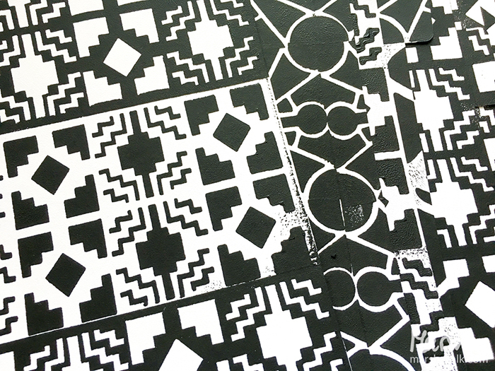
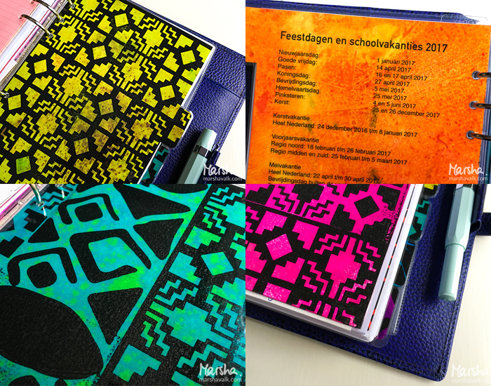
I bought a Silhouette cut-file to cut the tab dividers months ago, so this was the chance to finally put that to use too. I cut the tab dividers from sturdy cardstock and then I stamped black acrylic paint patterns onto them with the Santa Fe, Batik Pattern 3 and Buenos Aries Tile Foam Stamps.

marshavalk_nstudio_todayistheday-1

marshavalk_nstudio_todayistheday-2

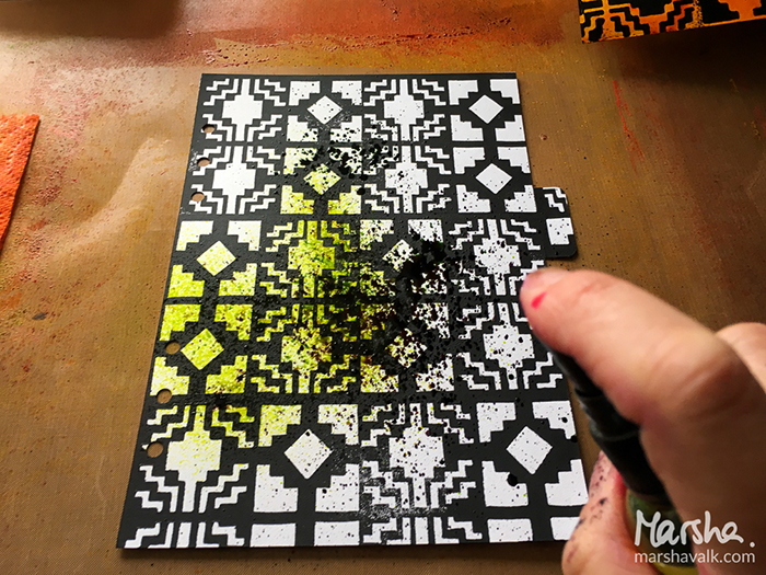
Once the paint was dry I applied spray ink in rainbow colours on top of the patterns so that I could have 8 tabs in rainbow order. I hadn’t really used my spray inks in a while and it was fun to get inky again!

marshavalk_nstudio_todayistheday-3

marshavalk_nstudio_todayistheday-4

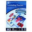
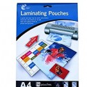
I took the new divider tabs for a test run first. I like to print handy stuff like school holidays on the back of my tabs, so I did that first before I laminated them all. I used A5 pouches for the two dividers without tabs and A4 pouches for the ones with tabs. I just trim the excess after laminating.

marshavalk_nstudio_todayistheday-9

marshavalk_nstudio_todayistheday-6


Marsha just made organization look really awesome!  I love how she used black paint to make the stamp designs extra bold against those beautiful ink colors.  Here are the supplies Marsha used – note that some of the links are affiliation links:

supplies

Maybe you will even play along with us -I would love to see how you interpret our monthly themes. Email me how you used my stencils and stamps with the theme and email me an image – I would love to share your projects in my “n*Spiration From Around the Globe“.

See you next time for another project from the Creative Squad!

Comments (4)

  • Dee

    |

    Love these, the black makes things pop!

    Reply

  • Michelle Rydell

    |

    Great idea Marsha! I love how the bright colors really made the designs pop!

    Reply

    • marsha.

      |

      Thanks Michelle!!

      Reply

Leave a comment

Today is the Day – Michelle Rydell

cs-october-theme

This Tuesday, Michelle Rydell from my Creative Squad is happy to share with you a gorgeous art journal spread using my new Versailles ArtFoamies and inspired by this month’s theme: “Today is the Day.”  I invite you to join me and my Creative Squad to stop procrastinating and to make today the day you finally tackle that artsy thing you’ve been meaning to get to for so long.  Start that new project you’ve been planning for months.  Try out that new product you bought ages ago.  Experiment with that new technique you read about last year.  Try it!  Today is the Day!


michelle-october-headshot

I have seen Art Foamies videos on youtube and always thought they looked like fun. I love their chunky look, and have been especially intrigued by the concept of the “stamp buddy” that comes with each foam stamp!  I was so excited to find out that Nat has a new line of gorgeous Art Foamies stamps! So finally, Today is the day I get to try them out!  I decided to use the Versailles set – I love how the intricate patterns of the two stamps fit together!  Here’s what I did to create my page…

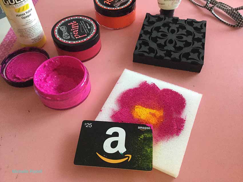
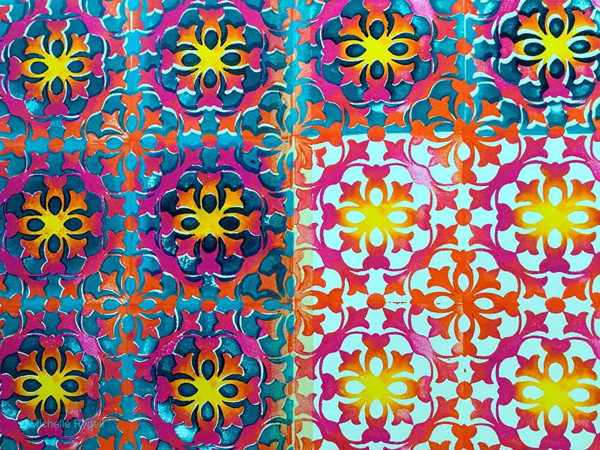
I got out some warm colors of acrylic paint – yellow, pink and orange; and scraped them onto the stamp buddy, with the lightest color in the middle and the darker colors radiating outward. At first I used a credit card, but then decided it would be more fun to use my fingers – ha…

rydell-today-1

rydell-today-2

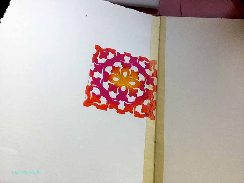
I pressed the stamp into the stamp buddy to distribute the paint, and stamped it onto my art journal spread. WOW it looked gorgeous!  I was so excited to see how the colors created an ombre effect!

rydell-today-3

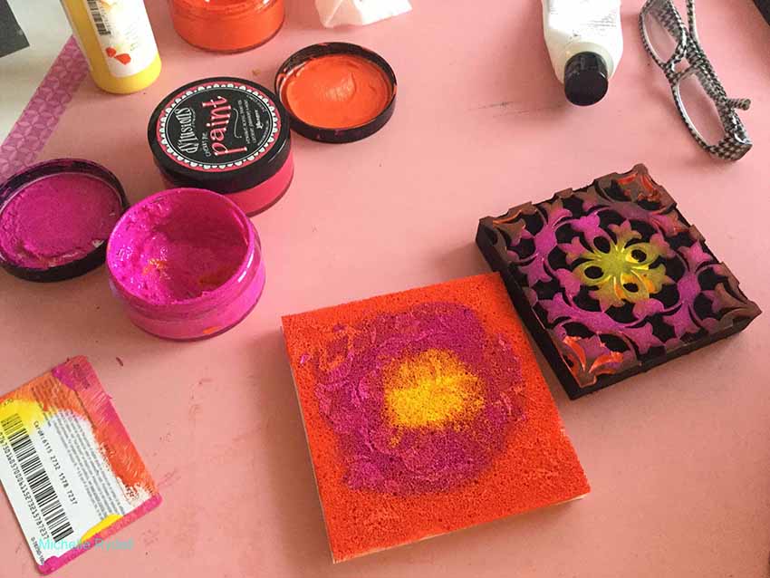
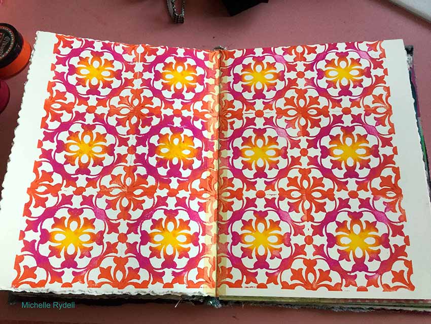
I decided to cover the whole page with this stamp, and I did not have to re-ink the stamp buddy at all!  That thing really holds a lot of paint!!! When I was done it reminded me of a tiled wall.  I almost didn’t want to do anything else to it!

rydell-today-4

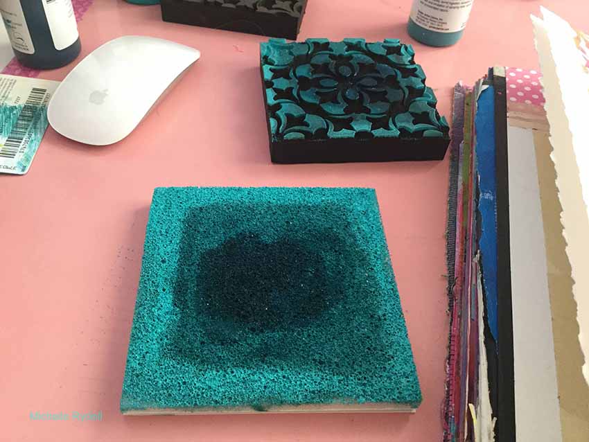
I decided to repeat the ombre effect with the second stamp in the set; only this time use all cool colors, and instead of having the lightest color in the middle, I put the darkest.

rydell-today-5

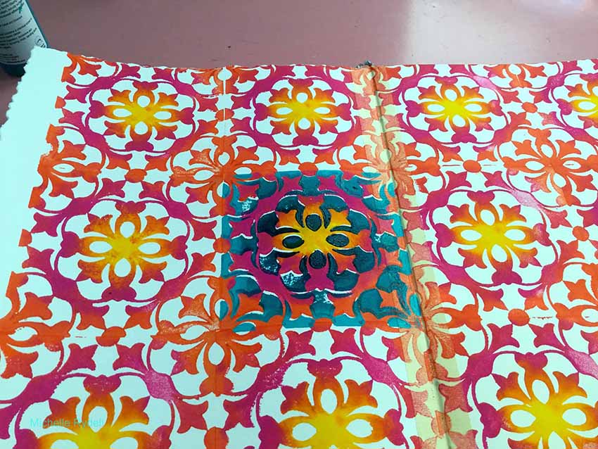
I stamped the second stamp onto my page and actually said EEK out loud – it looked so pretty!  I LOVE how the images fit so easily together.  This is truly a new experience in stamping!

rydell-today-6

rydell-today-7

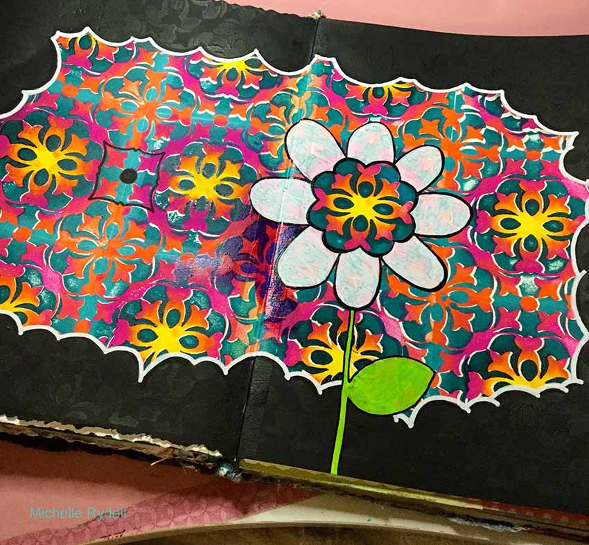
I wanted to cover up the blank edges of the page, so I decided to paint a black, cloud-like frame to make the colors pop even more.  At that point I just stared at the pattern for a minute, to see what I could see… and out came a flower!  I used part of the pattern for a colorful center, and drew and colored the petals and stem with paint pens. After that I realized that I needed to differentiate the flower from the background a little more, so I added a magenta glaze to the background.  You can just see the beginnings of that behind the bottom left few petals in this photo…

rydell-today-8

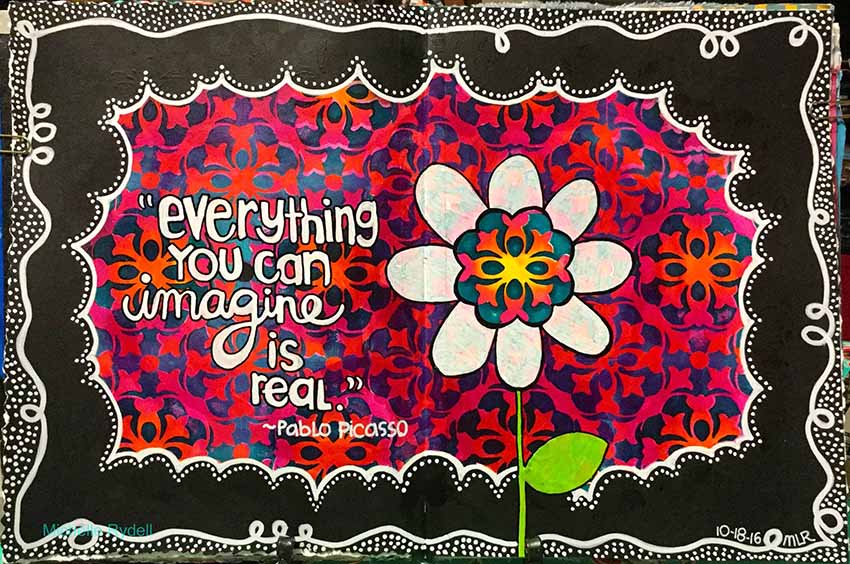
And here is my finished page.  I finished glazing the background, did some doodling in the black frame area, and added a quote with a white paint pen…

rydell-today-9-1


I love the super juicy background that Michelle created by using both the positive and negative Versailles stamps together!  And the whole thing really pops with that cute black and white frame around it.  Here are the supplies Michelle used – note that some of the links are affiliation links:

SuppliesCJS

Maybe you will even play along with us -I would love to see how you interpret our monthly themes. Email me how you used my stencils and stamps with the theme and email me an image – I would love to share your projects in my next “n*Spiration From Around the Globe“.

See you next Tuesday for another project from the Creative Squad!


Comments (10)

  • Dee Spillane

    |

    Wow! This is wonderful. Fantastic stamps with great color yay!

    Reply

  • Cindy

    |

    Always love your work, Michelle … so colorful and bold, and happy!

    Reply

  • Jessica Sporn

    |

    This is just beautiful. I love Nat’s foams and what you created with them. Gorgeous.

    Reply

  • Meg

    |

    Michelle, this is gorgeous!!! ❤️

    Reply

  • Kim

    |

    This is just a stunning page … big fan of Julie’s ArtFoamies, so the product is wonderful, but this takes it to a whole new level with the negative stamp included as a set, WOW. Always love seeing your work … thanks for sharing!

    Reply

  • Marit

    |

    I love how you explain every step and thought along the way from beginning to end… awesome post Michelle!

    Reply

  • Kandy Gordecki

    |

    So creative! You amaze me how your ideas just keep coming!

    Reply

  • Sue Clarke

    |

    I really enjoyed seeing how the pages progressed and ended up with such a colorful, full two pages of pattern. Delightful!

    Reply

  • Kathy P

    |

    Totally awsome—I love it!!!! So colorful, cool design!

    Reply

  • Julie Tucker

    |

    This is GORGEOUS! LOVING how you created that background!!!!!!!!!!!!

    Reply

Leave a comment

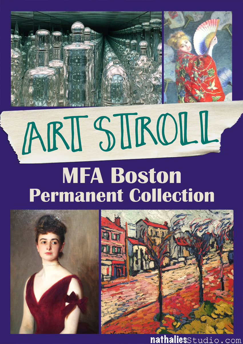
Art Stroll: MFA Boston Permanent Collection

kalbachmfapermcollage

At the end of August I visited my friend Julie Fei-Fan Balzer in Boston and of course we took some Art Strolls.

kalbachmfaperm01

I wanted to share with you some inspiring pieces from the permanent collection …

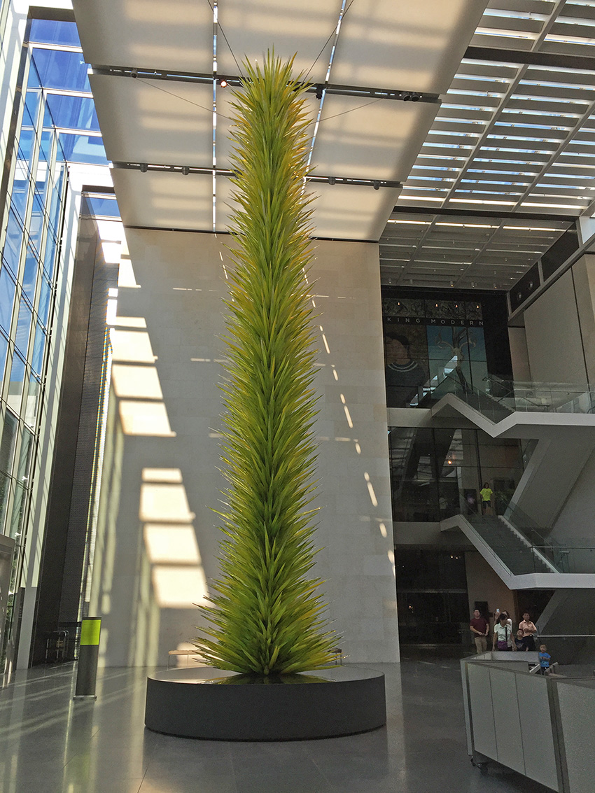
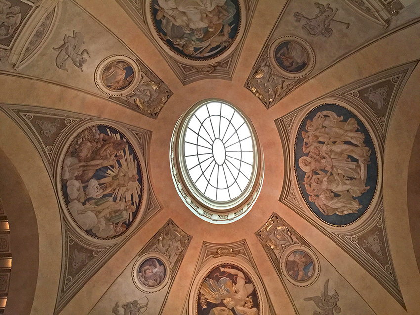
kalbachmfaperm02

besides this amazing view up

kalbachmfaperm03

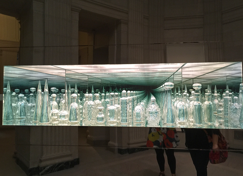
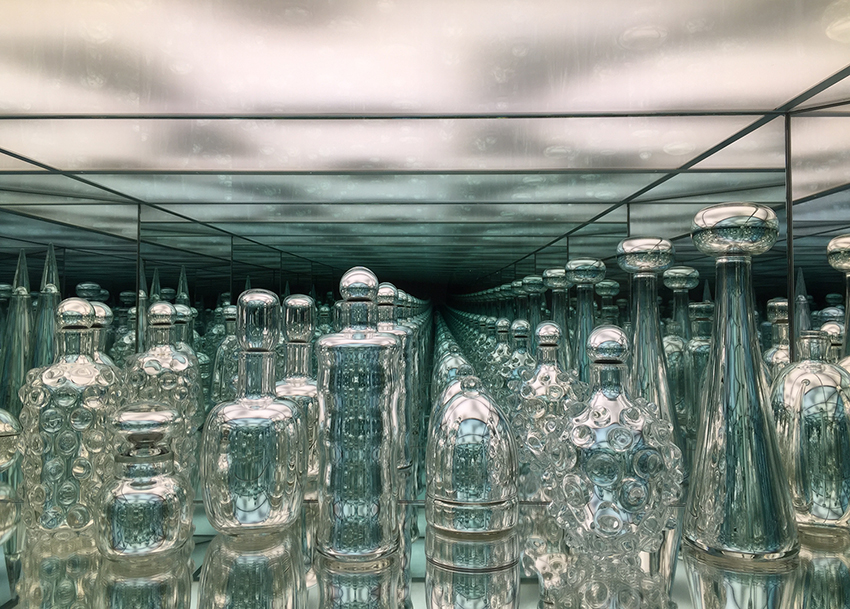
Endlessly Repeating Twentieth Century Modernism by Josiah McElheny

kalbachmfaperm04

It is a fascinating mirrored installation and McElheny hand-blew each glass vessel based on Italian, Austrian, Czech and Scandinavian designs from 1920-1990. I loved it so much and couldn’t stop looking at it. I wonder how I can incorporate the idea of endless elegance into a piece of my own art.

kalbachmfaperm05

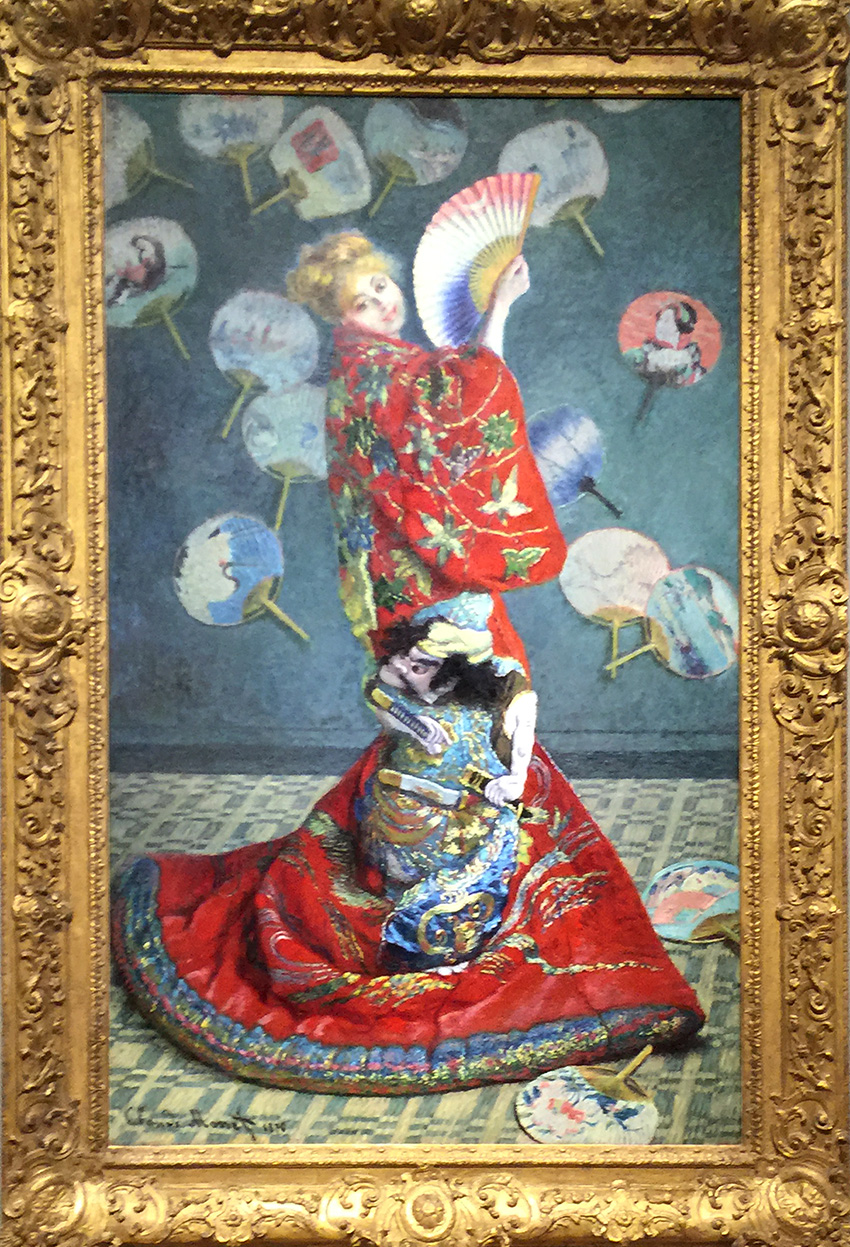
La Japonaise (Camille Monet in Japanese Costume), Claude Monet, 1876
The colors and details in this picture- from the Costume to the carpet are just mind blowing.  I did not like the frame around this painting- it is sooo pompous and takes away so much from the painting – I am sure it is not the original frame and one of those Museum’s early “let’s make sure all artwork gets the same frame” craziness, as I wrote about in my Art Strolls here.

kalbachmfaperm06

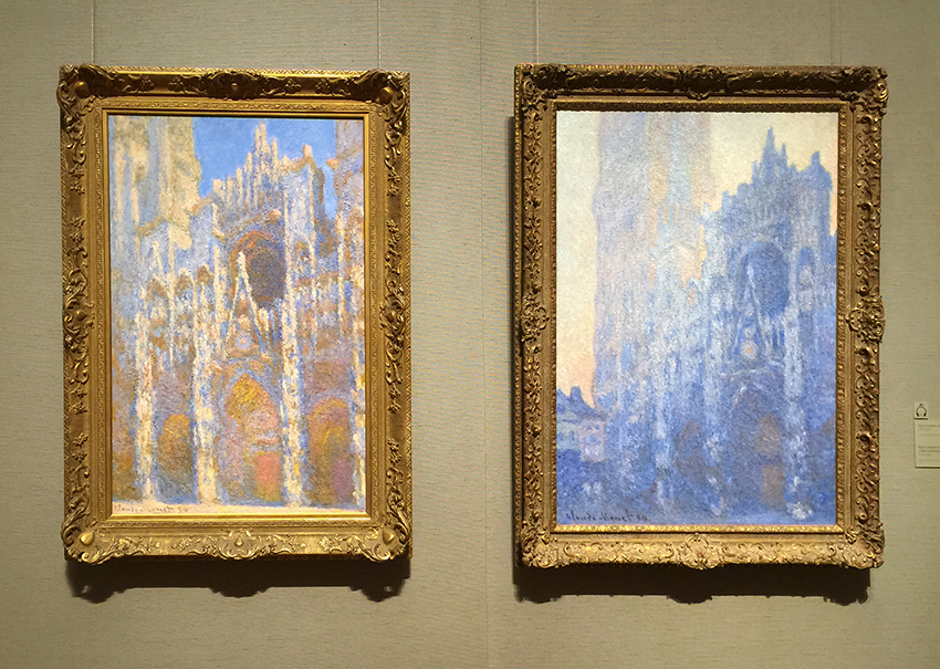
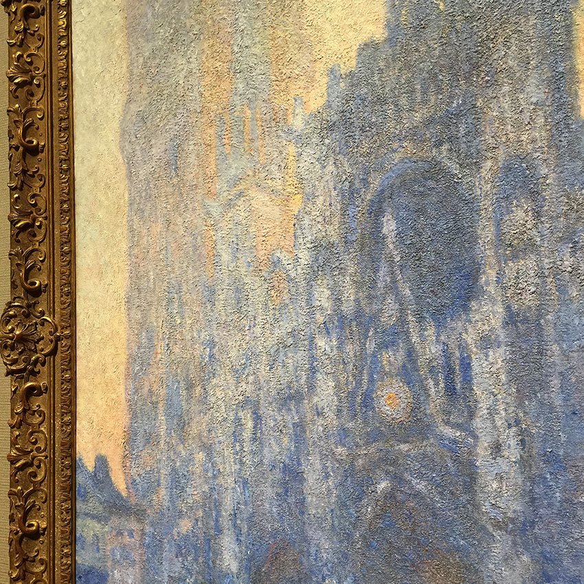
Rouen Cathedral Facade, 1894 and Rouen Cathedral Facade and Tour d’Albane (Morning Effect), 1894 by Claude Monet – Oil on Canvas

kalbachmfaperm07

I love those paintings. They glow, atmosphere and the texture and impasto is just unreal. It makes me want to touch it.

kalbachmfaperm08

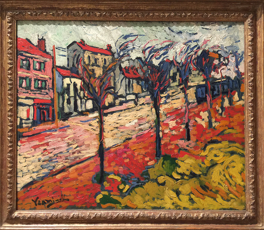
Paysage de Banlieue, 1905 by Maurice de Vlaminck. Students of my Art Rules class might remember that we talked about a couple of his paintings in the Fauvism part of the class. I always love how my students are as intrigued as I am by the marks and colors . It is truly inspiring to discover this style in your own art journal.

kalbachmfaperm09

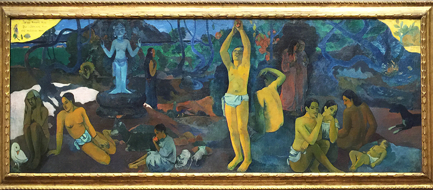
Where Do We Come From? What Are We? Where Are We Going?, 1897–98 by Paul Gauguin. “In 1891, Gauguin left France for Tahiti where he created paintings that express a highly personal mythology. He considered this work to be his masterpiece and the summation of his ideas. Gauguin’s letters suggest that the fresco-like painting should be read from right to left, beginning with the sleeping infant. He describes the various figures as pondering the questions of human existence given in the title; the blue idol represents “the Beyond.” The old woman at the far left, “close to death,” accepts her fate with resignation. ” (from MFA Website). It is a massive painting and keeps you with it’s Narrative and Symbolism.

kalbachmfaperm10

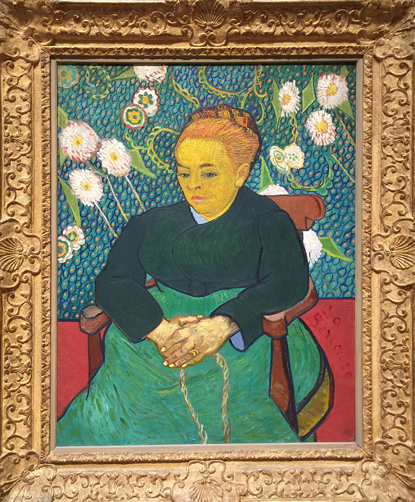
Lullaby: Madame Augustine Roulin Rocking a Cradle (La  Berceuse), 1889 by Vincent Van Gogh. I love the vividly colored patterned background! The texture of her hair – and the colors are just glowing.

kalbachmfaperm11

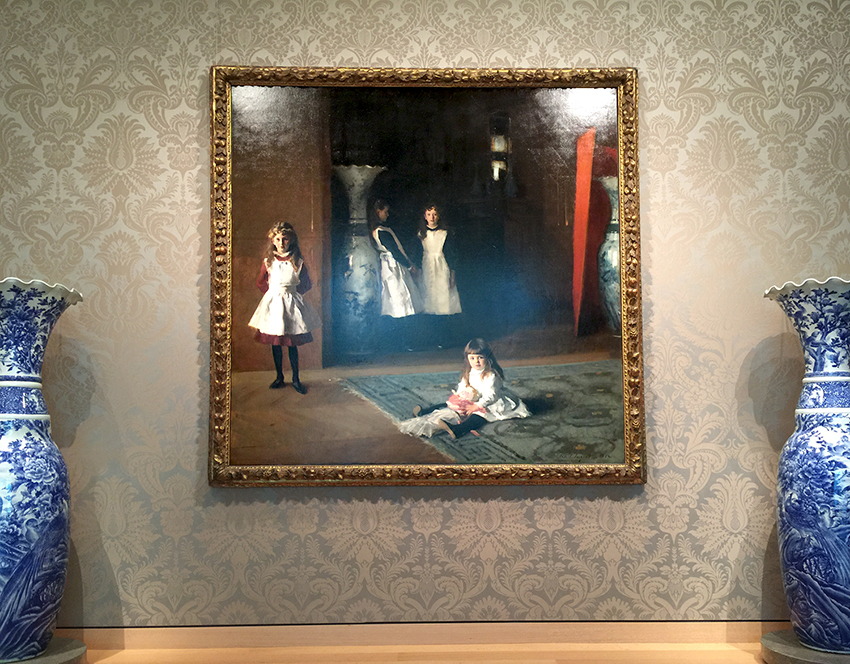
The Daughters of Edward Darley Boit, 1882 by John Singer Sargent.

kalbachmfaperm13

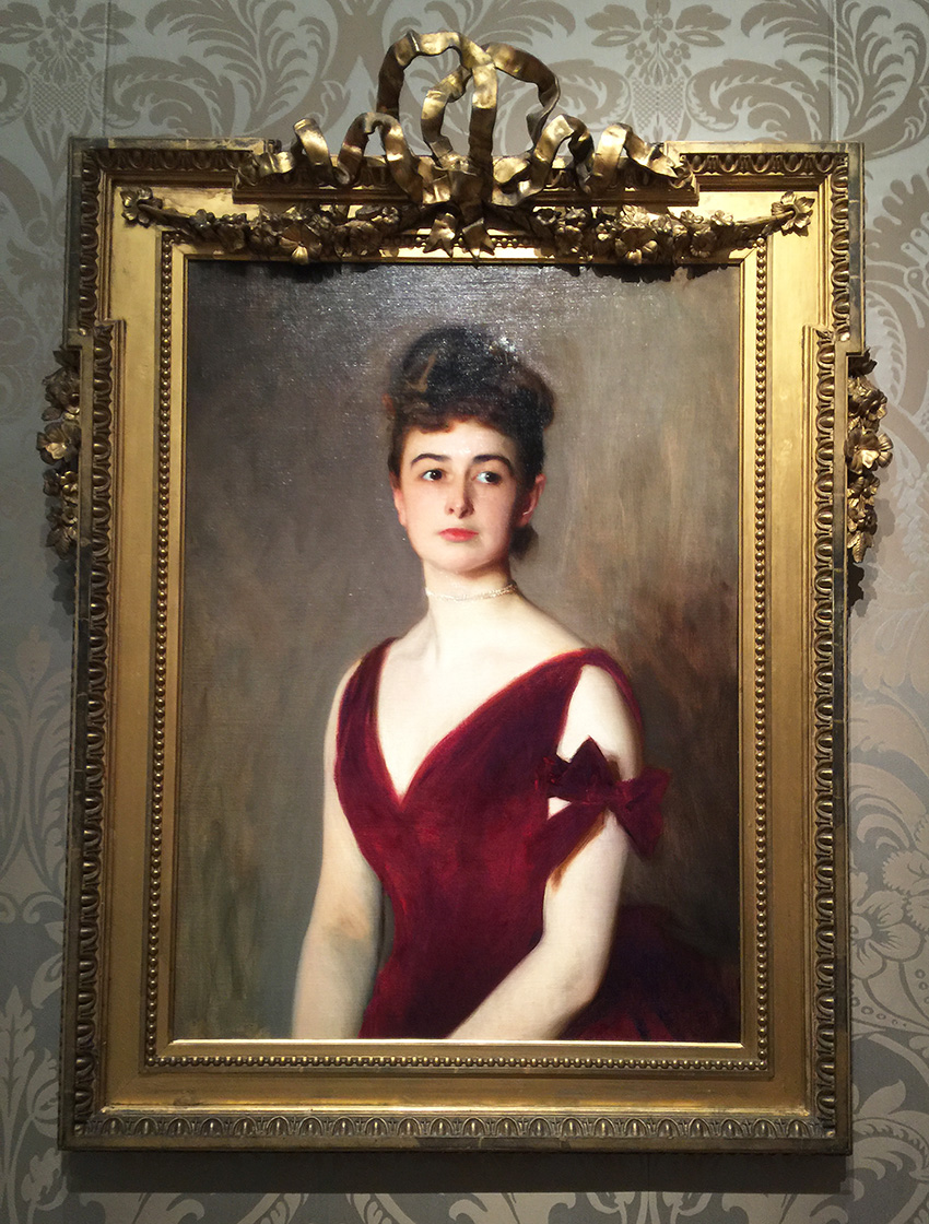
Mrs. Charles E. Inches (Louise Pomeroy), 1887 by John Singer Sargent.

kalbachmfaperm14

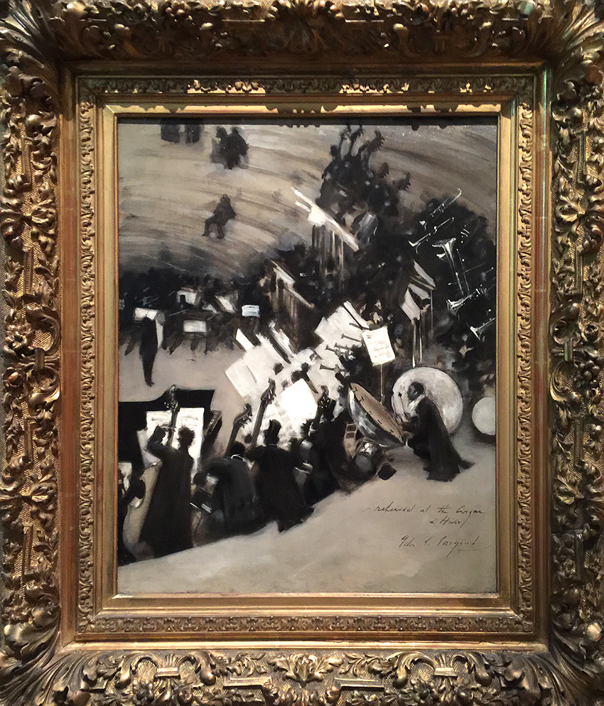
Rehearsal of the Pasdeloup Orchestra at the Cirque d’Hiver, about 1879–80 by John Singer Sargent. This last painting was actually my favorite of his paintings. I love the monochromatic color palette and that you can almost hear the music. Apparently John Singer Sargent was influenced by artwork by Edgar Degas he had seen in 1877 (check out my Art Stroll through the Degas Exhibition at MoMA recently) – and that makes total sense to me. Love how he took the inspiration and made his own piece.

Hope you enjoyed the Art Stroll through the Permanent Collection of the MFA in Boston. If I could I would go every week to a museum for a little art inspiration.

Comments (2)

  • Jean Goza

    |

    What an amazing collection you shared this morning. I am hard pressed to pick a favorite. Thanks for the “stroll”.
    Jean

    Reply

Leave a comment

Yes to all or … In my Art Journal today

natkalbach_yestoall_01

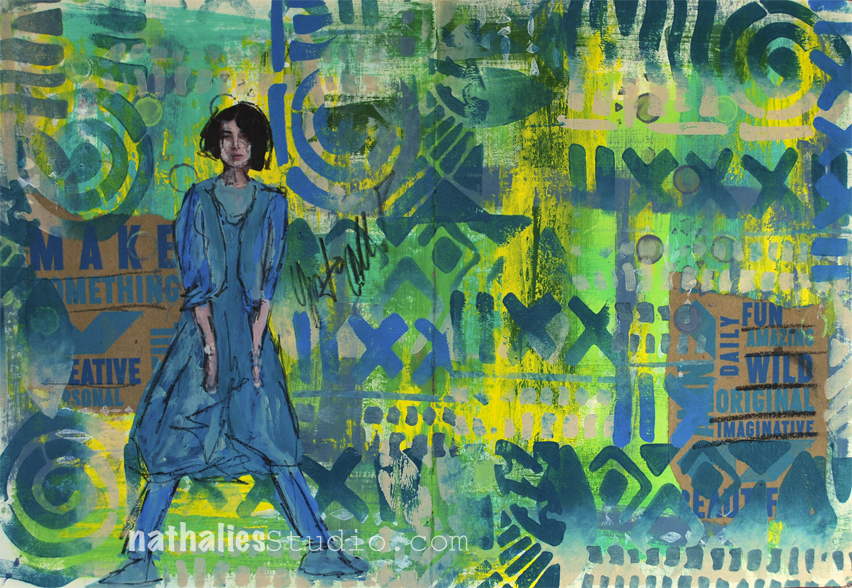
Make something, be creative, be fun, wild, original, imaginative….etc ….YES to all

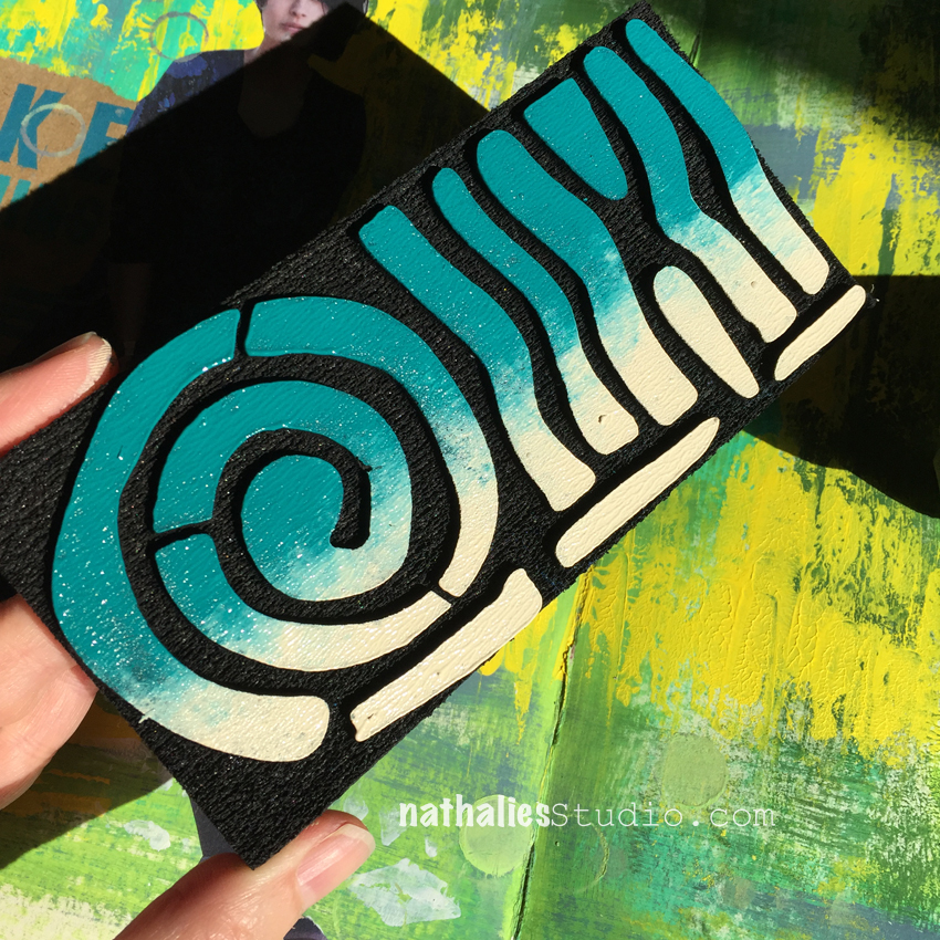
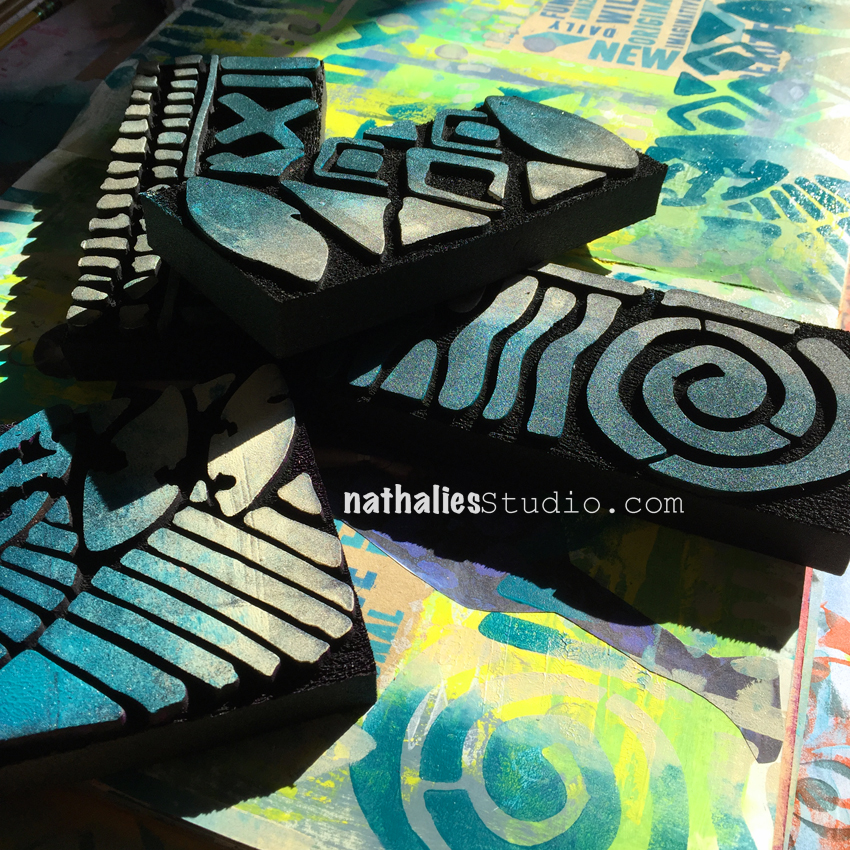
So much fun to play a bit in my art journal using the new ArtFoamies Batik Stamps 1, 2, 3 and 4

natkalbach_yestoall_02

I painted the background and then rolled out two different color next to each other with a brayer- so half the brayer was covered in cobalt turquoise and the other half in unbleached titanium and applied the brayer to the stamps

natkalbach_yestoall_03

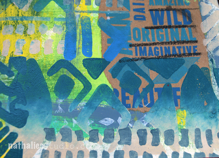
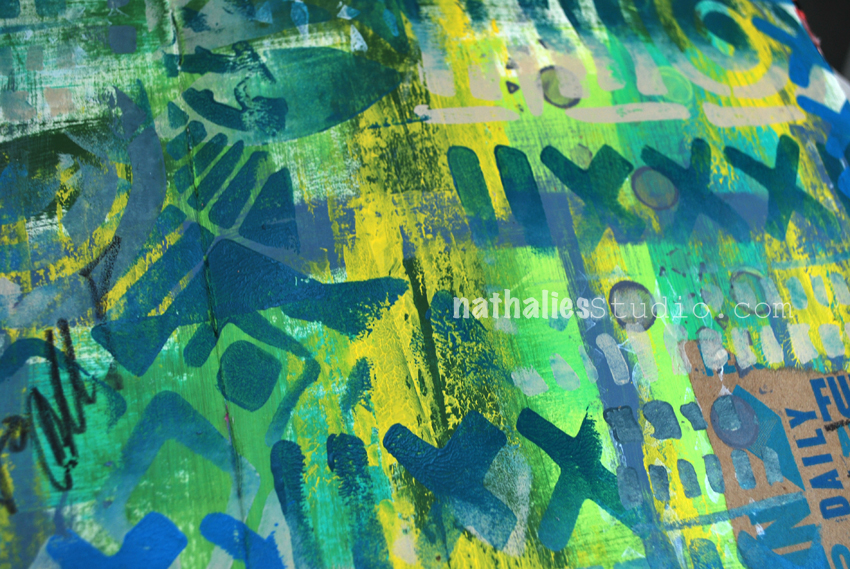
and just went with it. Loved the two colored patterns and the texture this created.

natkalbach_yestoall_04

It tied the background and collaged paper snippets together. The text on the kraft paper is actually from a paper bag.

natkalbach_yestoall_05

I overpainted a magazine image with the same colors using a small brush and then went over with a soft pencil.

natkalbach_yestoall_06

It was a quick and fun art journal page – a much needed creative time after a bit of a long stretch working on a computer.

Here are some of the supplies I used for this spread – note that some links are affiliate links

SuppliesCJS


Hope you have a wonderful day full of happy YES :)

Comments (2)

  • Sherri Scott

    |

    Dear Nathhalie
    I wanted to tell you I had the best weekend ever when you where at the Ink Pad. Thank you

    Reply

  • Kathy P

    |

    Awesome journal pages, Nat—& I love those bold new stamps!

    Reply

Leave a comment