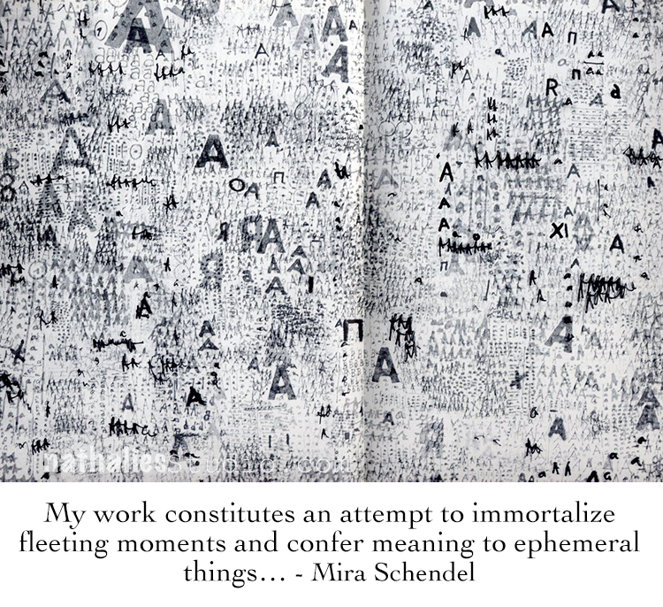
Nat

Hello from my Creative Squad! Today we have a wonderful wood panel piece by Emilie Murphy demonstrating some cool techniques and using my Fairview Fan, Mini Batik 1 and Mini Batik 2 foam stamps. The theme this month is: Under the Sea – There is something so fascinating about water. We love being in it, floating on it, relaxing next to it, and it remains one of the last frontiers here on the planet. Create something that is an ode to the sea.
Hi there! Hope you are doing well.
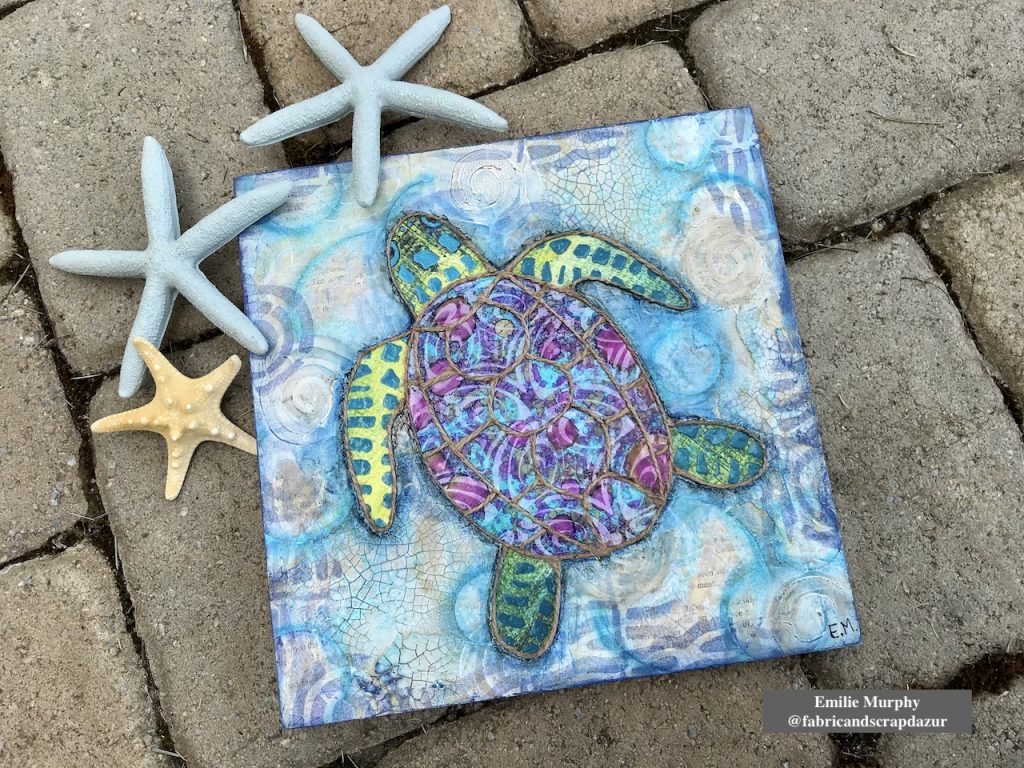
The Sea theme always inspires me. The first thing that came to my mind was “fish”, of course! Meanwhile I was thinking of what project to make, I went to visit my in-laws and saw this pillow with a beautiful sea turtle on it that my mother-in-law had just got. So that’s how I got the idea to make a sea turtle on a cradled wood panel.
Let me guide you how I made it.
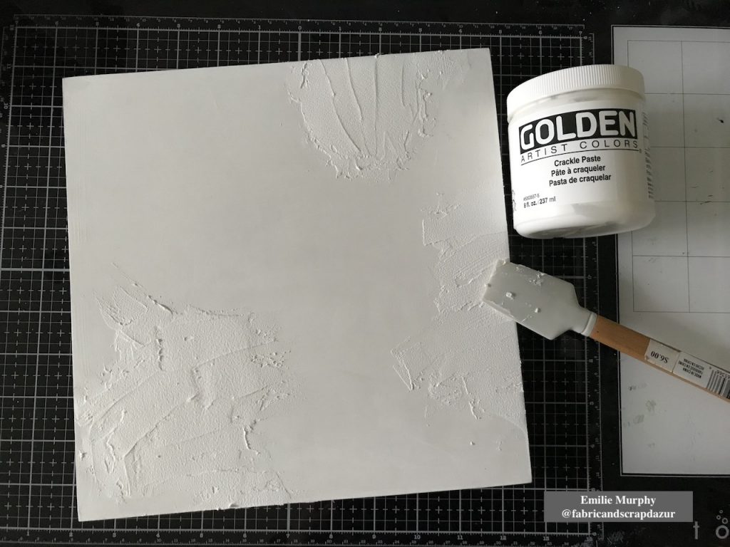
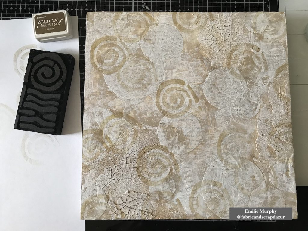
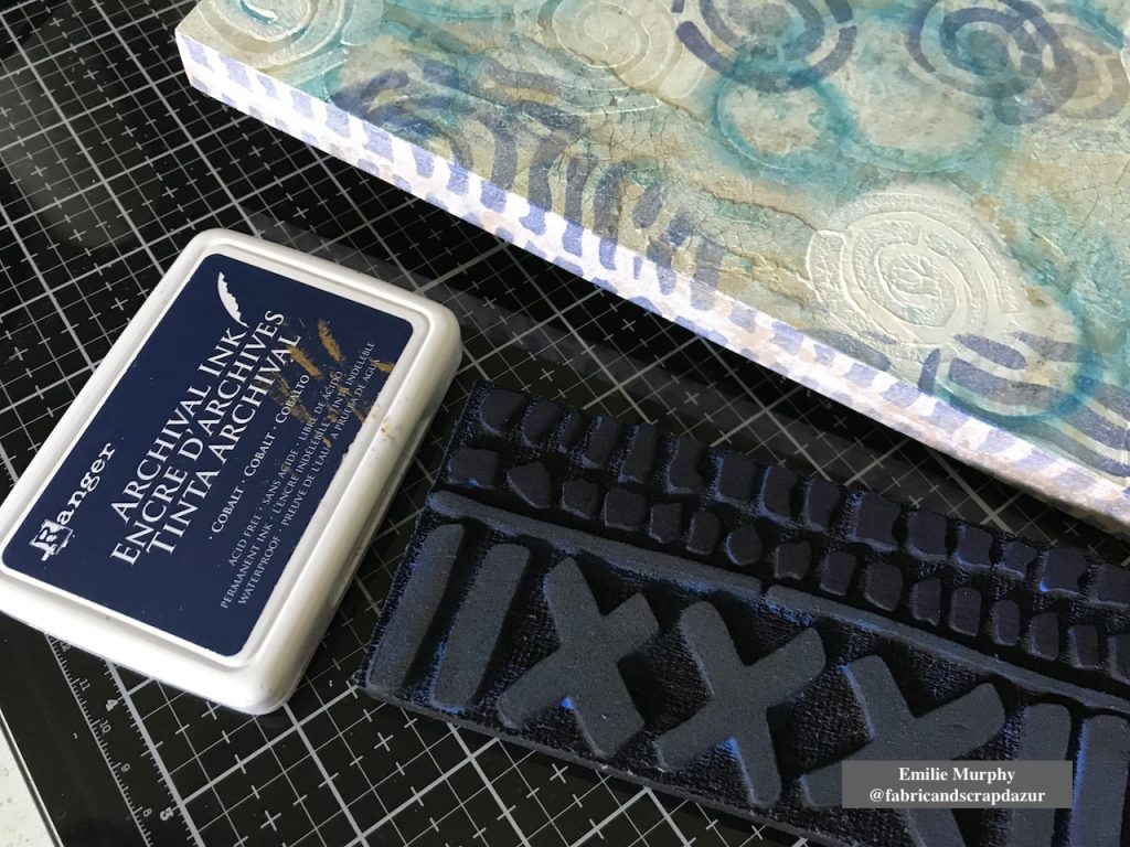
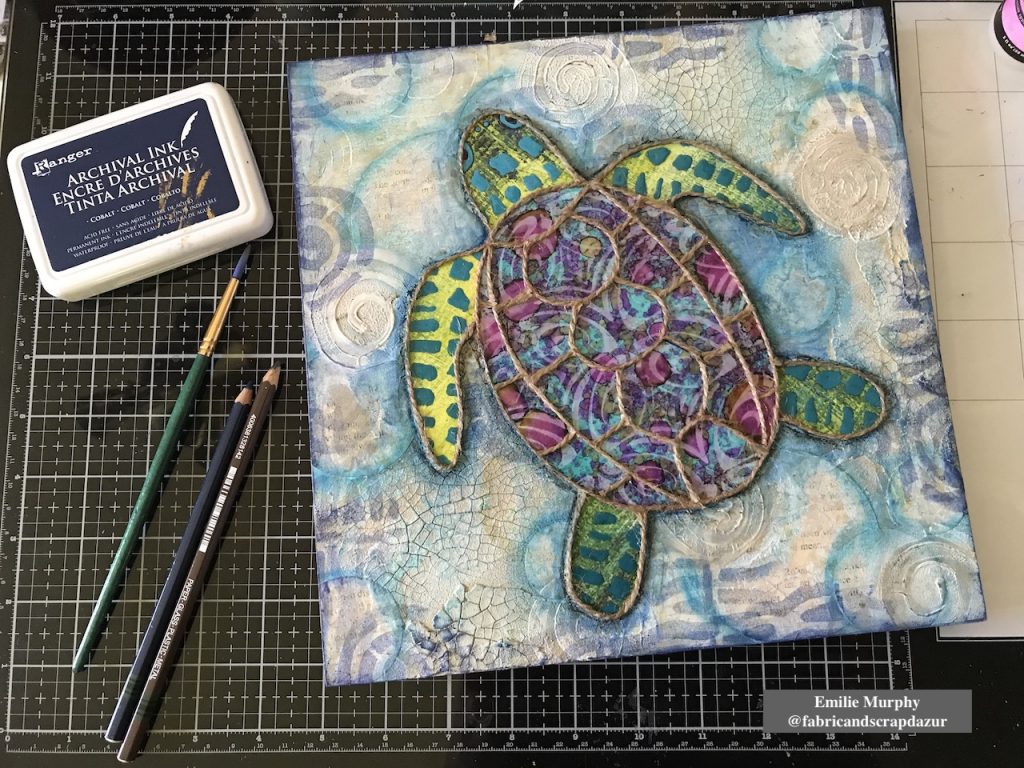
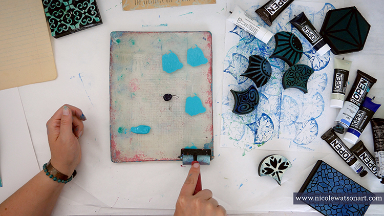
I started to apply some crackle paste on a 10×10 wood panel coated with white gesso. I let it dry overnight.
Tip: The coat of crackle paste has to be thick enough to be able to get some significant crackles.
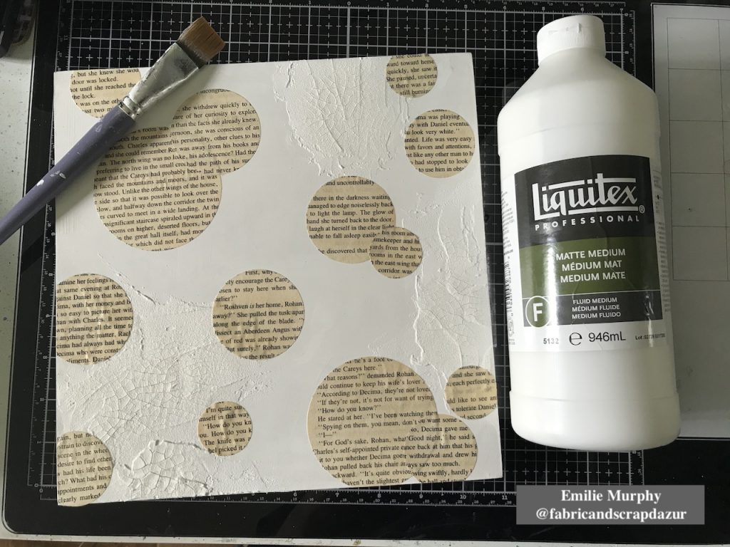
Then I glued down with matte medium some circles cut from old book paper to bring some interest to the background.
As I didn’t have any “sand” color acrylic paint ready to use, I mixed some “Burnt Umber” acrylic paint with some white that I applied on my panel with a brush and plastic card.
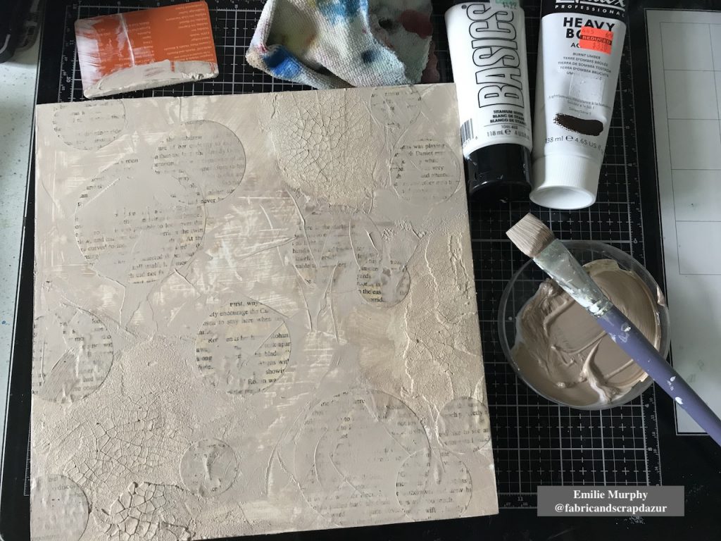
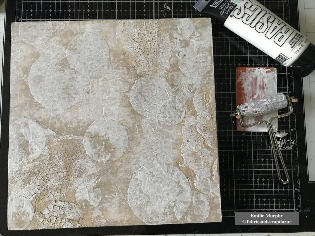
I toned down the color I mixed with some white acrylic paint because it was a little too dark than expected. I applied it with a brayer. The purpose of the brayer is just a preference to add texture.
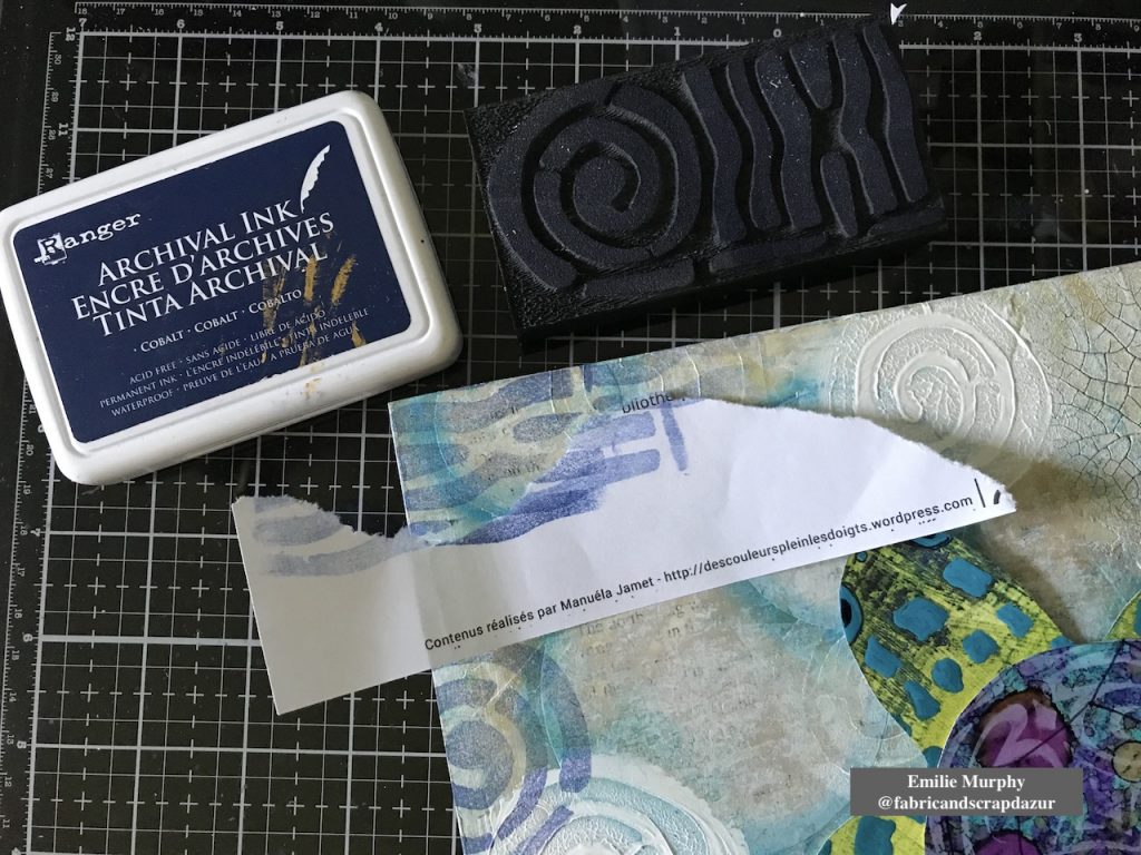
Then I stamped the circular part of “Mini Batik Pattern 2” foam stamp with “coffee” archival ink to evoke shells. I wanted here a tone-on-tone effect.
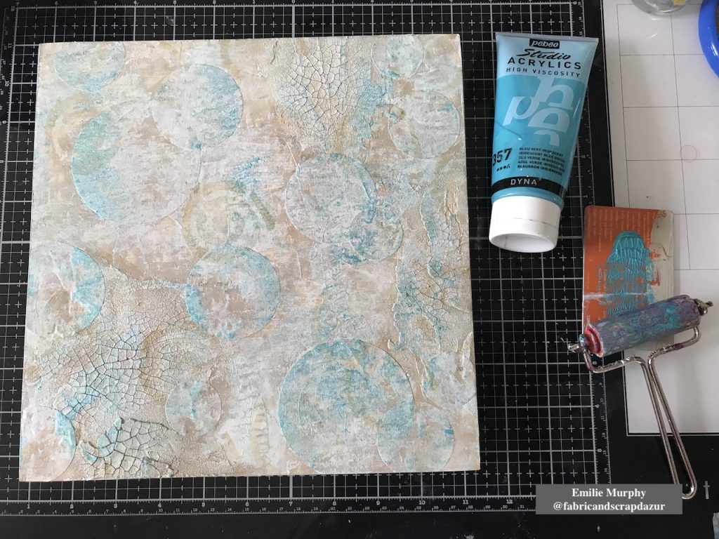
To add some brightness and not have something too uniform, I applied some iridescent blue acrylic paint again with my brayer.
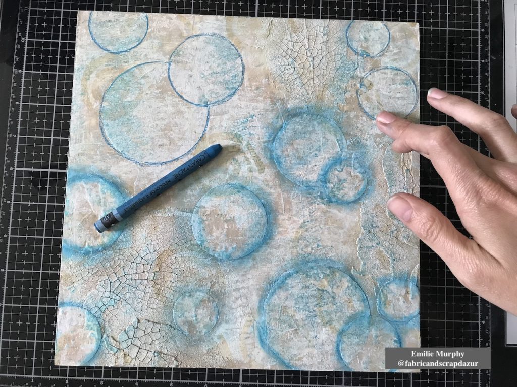
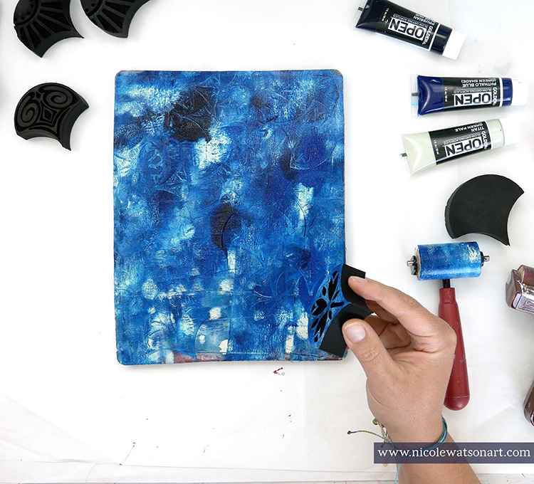
In order to build layers, I darkened the edges of my circles with a Neocolor II crayon “Blue Cobalt”. I think it gives the illusion of bubbles.
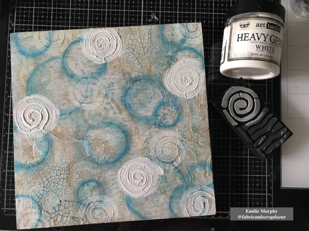
For the next layer, my intention was to add some dimension. Therefore I applied with my finger some pretty thick “puddles” of heavy gesso and stamped on it using again the “Mini Batik Pattern 2” foam stamp. Isn’t it cool! This is such an easy way to add dimension. I kept stamping around here and there to clean up the gesso left on my stamp.
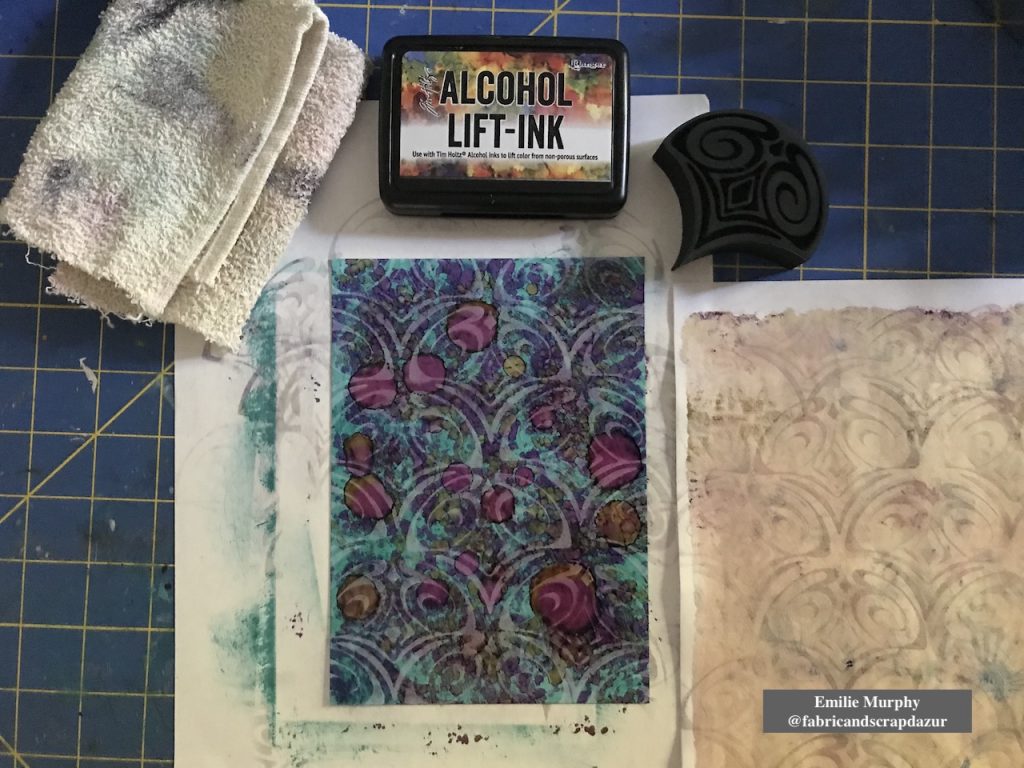
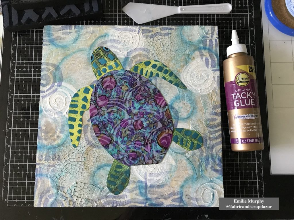
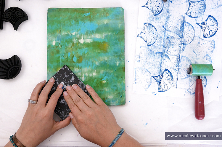
Next, I played with some alcohol inks on yupo paper to use for the turtle shell. I wanted something bright and vivid.
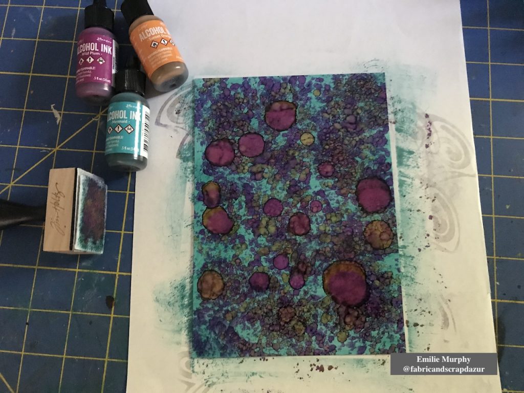
Using the “Fairview Fan” (positive) foam stamp, I lifted off some alcohol inks and got this beautiful pattern.
Then I drew a turtle on printer paper to use as template. I made two copies; one copy for making the turtle body and the second one for the turtle shell. I used the Yupo paper, previously made, for cutting out the turtle shell and I choose a scrapbook paper for the turtle body.
Let me tell you why I choose this particular scrapbook paper.
Few weeks ago, I received my stencils order from Nathalie. She had wrapped the stencils with this scrapbook paper sheet. When I look at it, I saw that she designed this paper few years ago. Yes!!! Isn’t it awesome! So it was a perfect opportunity to use it for my turtle body.
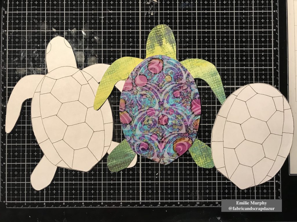
Then, to embellish my turtle, I used the “Mini Batik Pattern 1” foam stamp for the head and legs and covered the stamped pattern with enamel accents to create the skin.
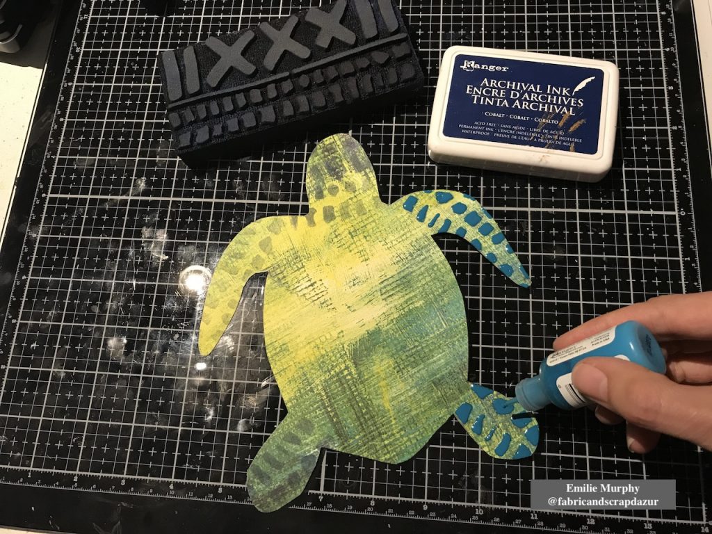
With the same foam stamp, I stamped the edges of my cradled wood panel.
Before gluing down my turtle, I used again the “Batik Pattern 2” foam stamp to stamp only the “strips” part of the stamp, just to add more interest and introduce a different pattern than having just circles on my background.
I finally glued down my sea turtle with tacky glue and traced the pattern of the turtle shell. At that point, something was missing and I was not satisfied with my turtle shell like it was.
After reflection, I had the idea to glue some jute twine on the turtle shell and all around the turtle. I used some Glossy Accent as preference because it dries clear and shiny. I really love the look of it and think it was the perfect thing to do to make my turtle as the centered piece.
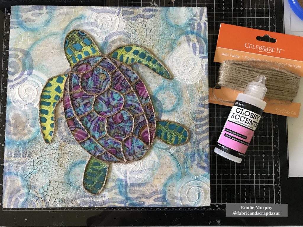
At last, I used some blue and brown Stabilo pencils to darken the edges of my turtle. And I finished off the edges of my cradled wood panel rubbing my “cobalt” archival ink pad all around.
Hope I got you inspired. Personally, I have so much fun doing this project that I’m thinking of making a series of smaller panels with other shapes like fishes and shells. This project can easily be made also on canvas or even in your art journal…
Have a good rest of the week and see you next month!
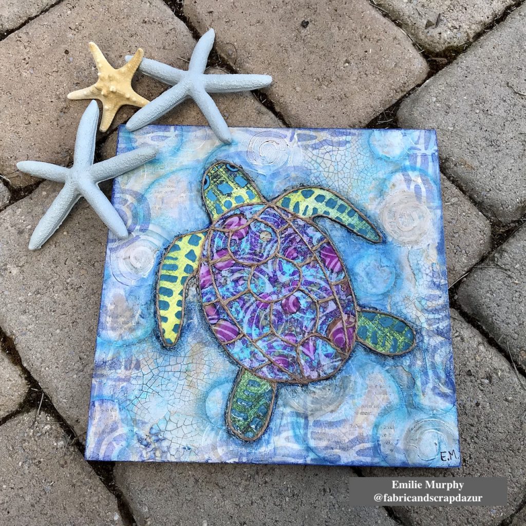
Thank you Emilie! I love how this turned out and that yummy texture is great!
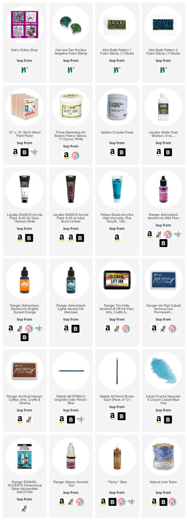
Give it a try: you can find all my Foam Stamps in my Online Shop and in addition to some yupo and old book paper, here are some of the other supplies Emilie used:
Feel inspired? Working on something yourself that you’d like to share? I love to see how you interpret our monthly themes. Email me how you used my stencils and stamps with the theme and email me an image – I would love to share your projects in my next “n*Spiration From Around the Globe“.
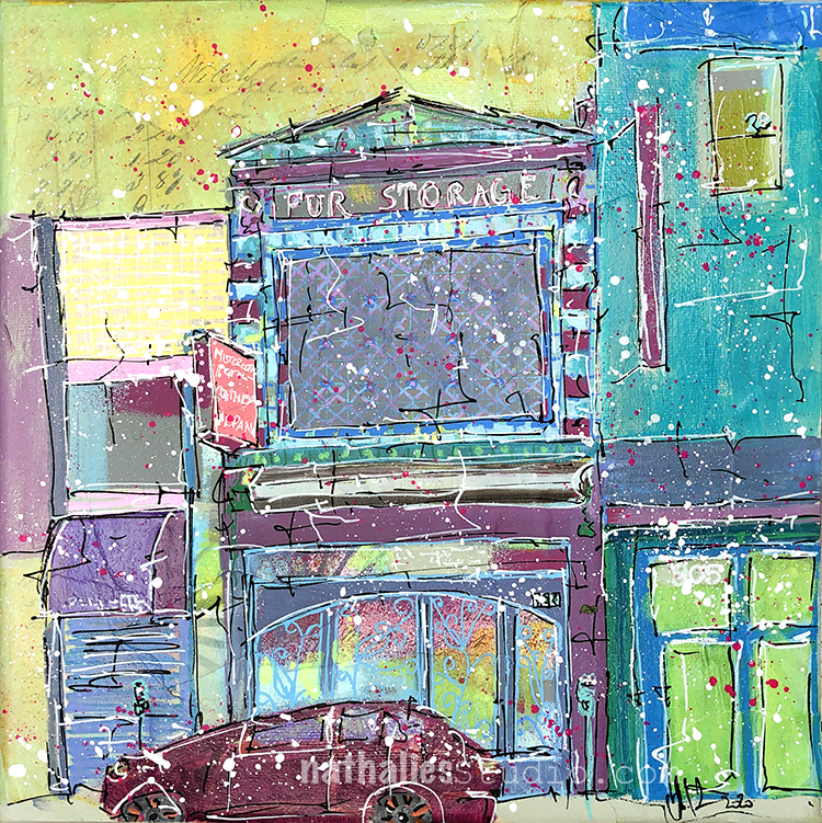
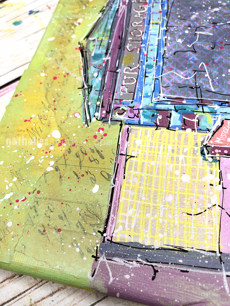
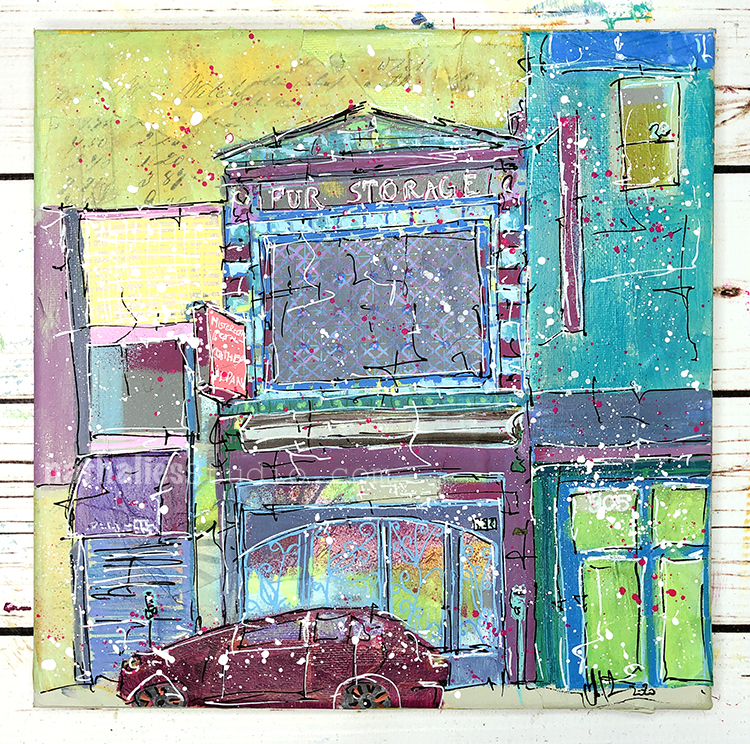
“All Fur Coat and No Knickers” is new painting made with spray paint, acrylic paint, gouache, collage, and markers on canvas.
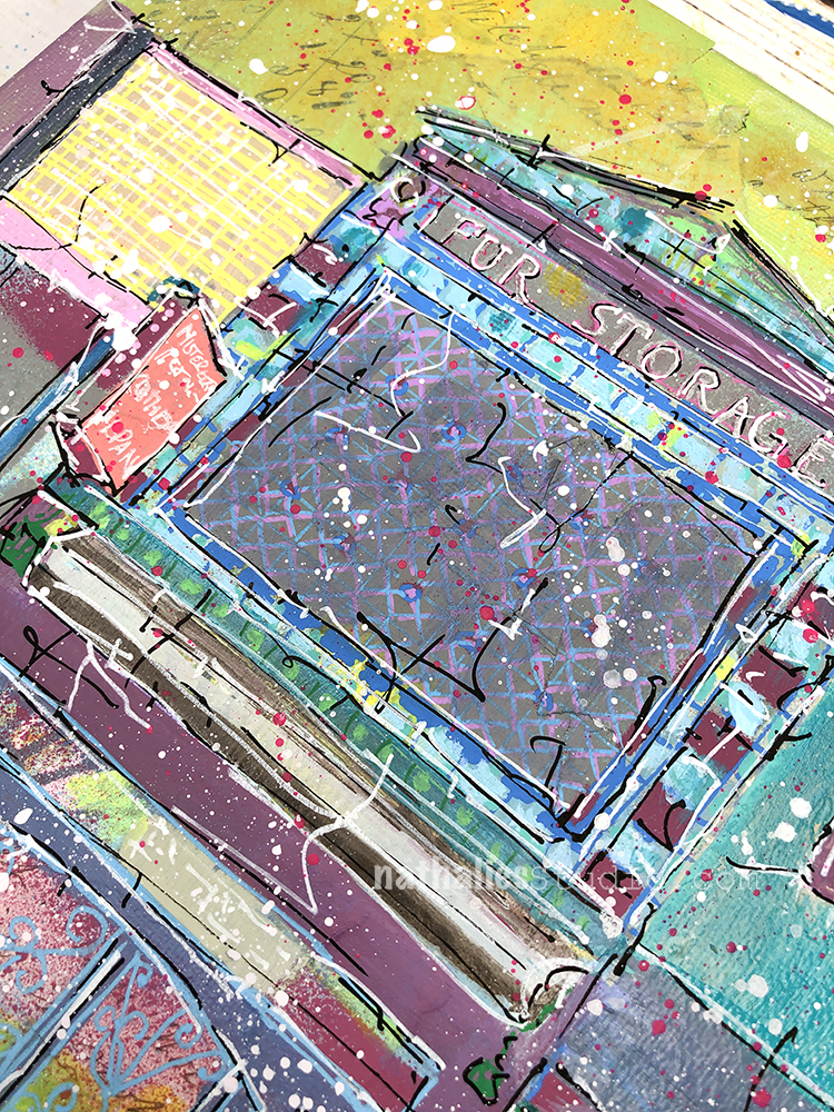
I was inspired by my Strolls through the Hood in Jersey City for this mixed media painting, and specifically a building that was used to cold store fur coats in the summer months for the people in the neighborhood (glad that’s not needed anymore).
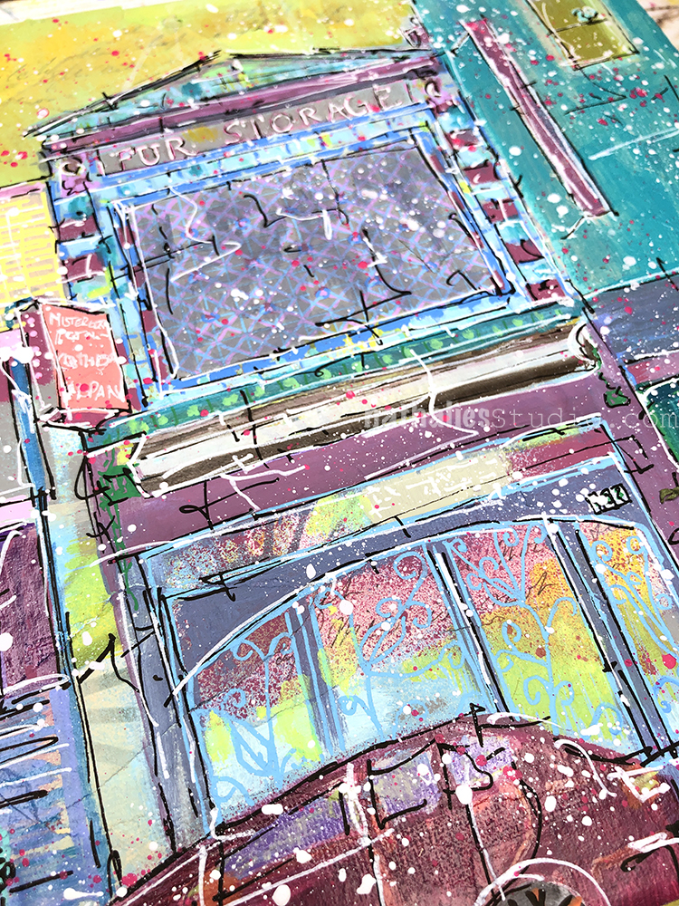
Nowadays there is a restaurant in the building but the story intrigued so I researched a bit. I found that a 1932 issue of The Jewish Standard featured an advertisement for a company called Kriegel Furriers offering “cold fur storage” at the address, with a storage rate of 1% of the value of each item with a minimum charge of $2. Those were different times for sure.
The painting is available in my store and would love to find a new home.
what fun who’da thunk it?! a place to store ur furs ladida! love the title and ur yummy pallette! the presence of the car a little wonky in my book, but luckily it does blend in nicely ? thnx for sharing! ???(funny fur story… my ex was wearing his mum’s full length?! raccoon?! (sigh, poor animales! but i do eat them so can’t get tooo indignant ?) when he and his 3 bros plus dad rolled their open jeep in river… it was thanksgiving (we the sensible.were waiting at home.for them) so what did they think?! (re depth/strength of water….) the coat survived! tho i wouldn’t want.to smell it at the time… wet racoon, yum! ?
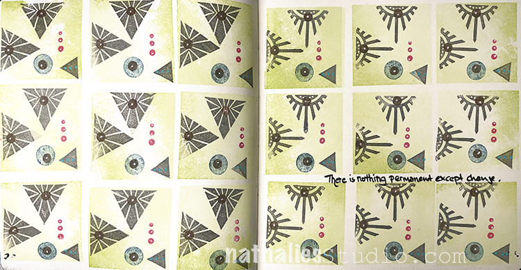
“There is nothing permanent except change.” Hard to accept sometimes but oh so true.
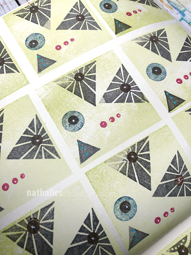
I created a repeating pattern using Moonlight Duo ink pads and some of my rubber stamps – the Triangle Love set and my Solid Square Large.
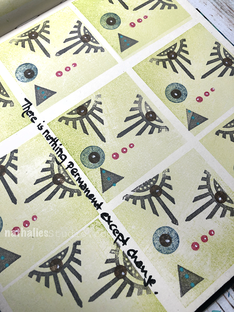
I used a Fude pen for my quote and added some details with a white Signo pen.
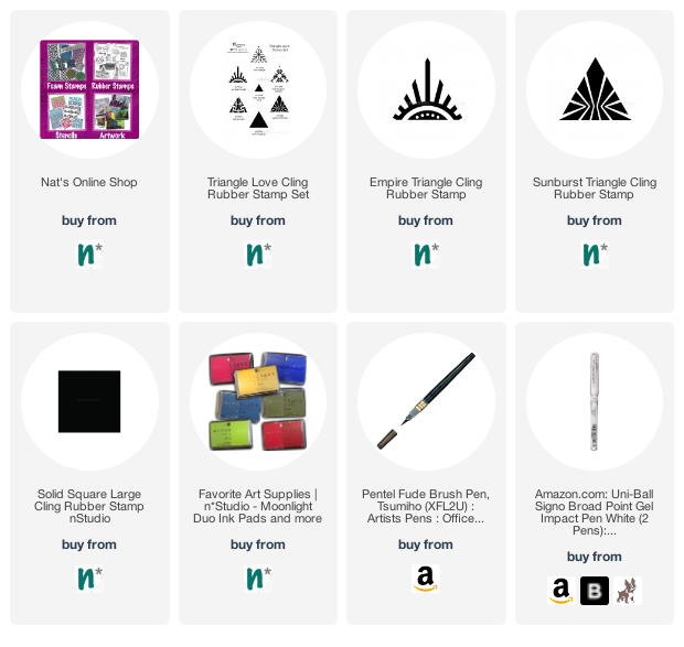
Here are some of the supplies I used:
Strolls through my hood get me out of my studio, they help me get unstuck and often I get inspired by what I see and get new ideas to create something. It is part of my philosophy about Artful Adventures in Mixed Media – which is the subject of my book. Here are some photos that I gathered in the last couple weeks – as New Jersey and New York are slowly going to Phase 4 after the lockdown.
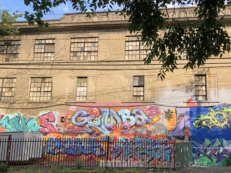
What a heat wave week – wowsers. Early mornings are the best for bike rides and stroll through the hood right now for sure :) The picture above is showing an old Cigar Factory – the Parodi Company. The Parodi’s were a brand of cigars made in Jersey City up until 1929. The company was started in 1913 in New York City, in the Village by three Italian immigrants who came from a wealthy family in Northern Italy. In 1916, they built this factory here in Jersey City.
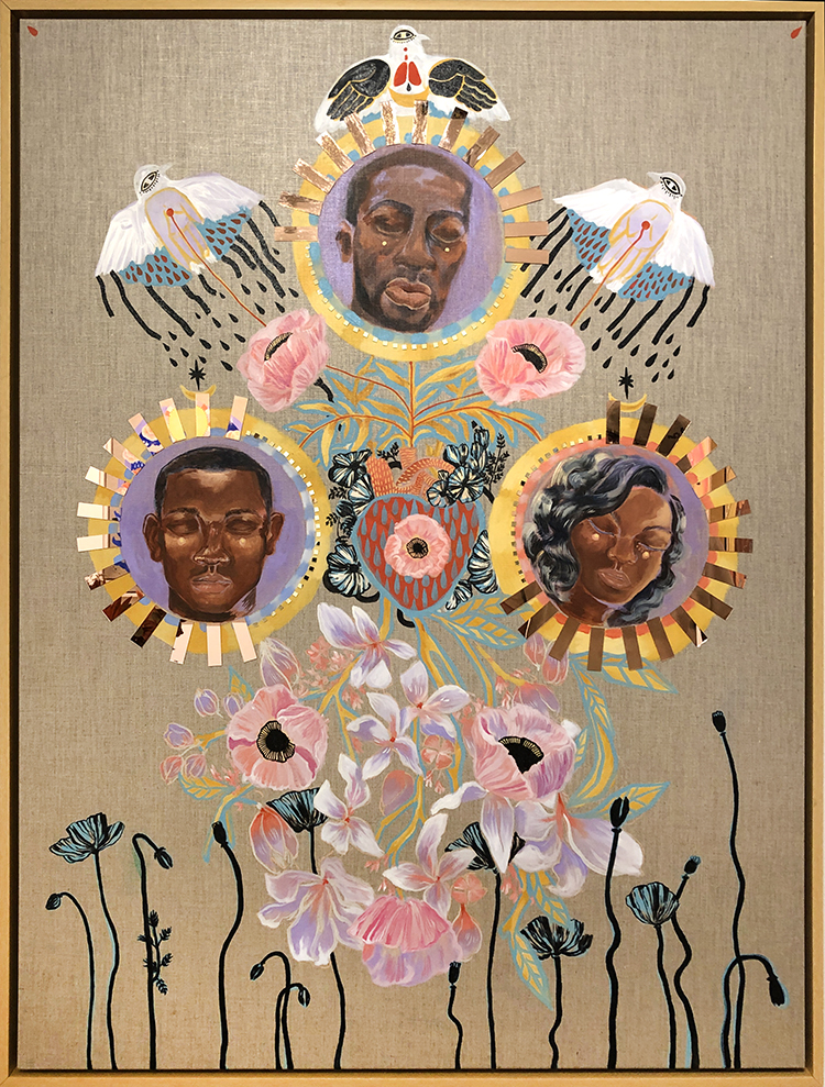
We spent a nice time at the Deep Space Gallery– now open again – appointments only. The painting above by Rebecca Johnson was very touching.
If I Die Too Young , or the Gunmen Come, I’m Full of Love, 2020
Acrylic, lime wash and mirror on linen
Mazunte – also by Rebecca Johnson – this is a close up of a wonderful painting. Love the usage of little mirror pieces.
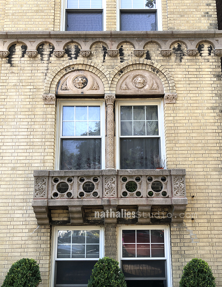
Interesting facade – the little balconies are funny- and nothing seems to fit together.
A wild style of architectural fun back then :)
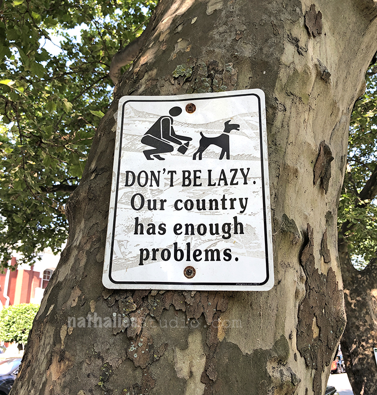
X-actly. Dog Poop is after parking the most discussed issue in this neighborhood.
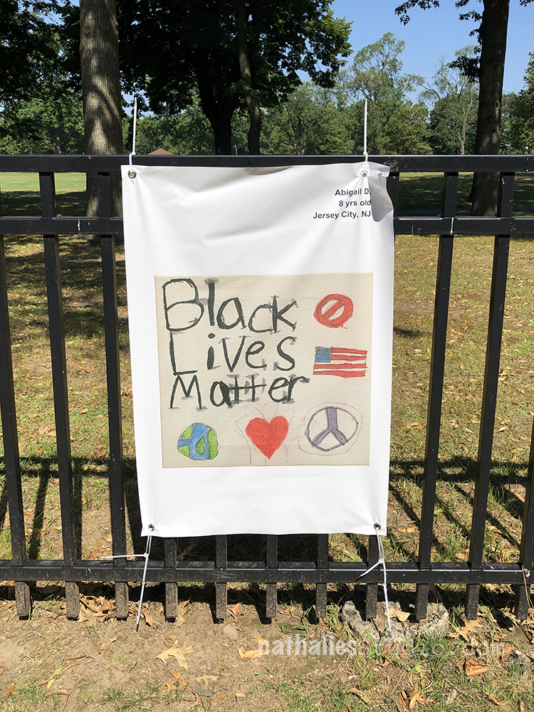
This was a walk bye poster project with artwork and poems written by school kids in Jersey City.
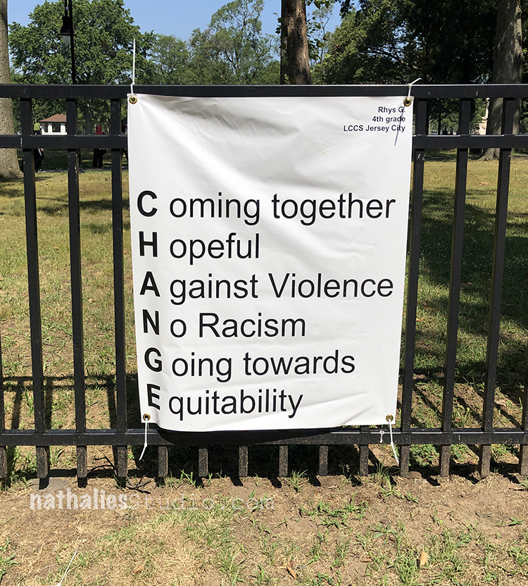
Very powerful – and it seems as if it is now moving from park to park throughout Jersey City.
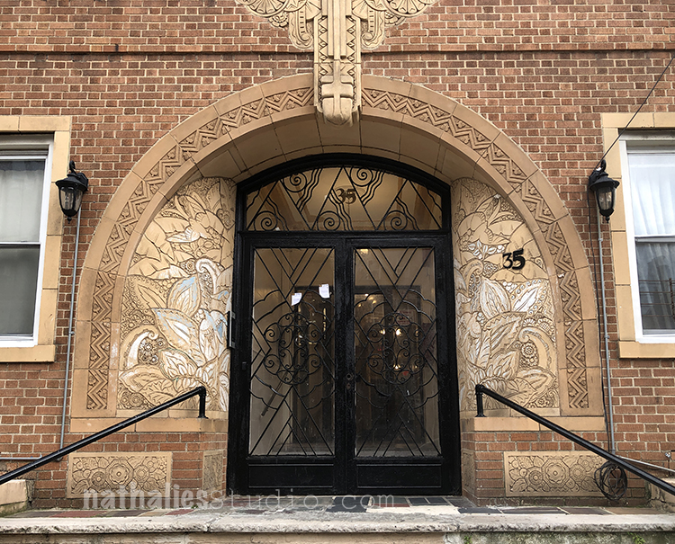
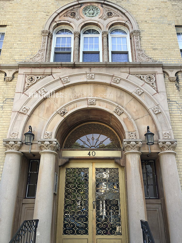
Oh my oh my- I cannot stop taking photos of this magnificent Art Deco Entrance …Swoon.
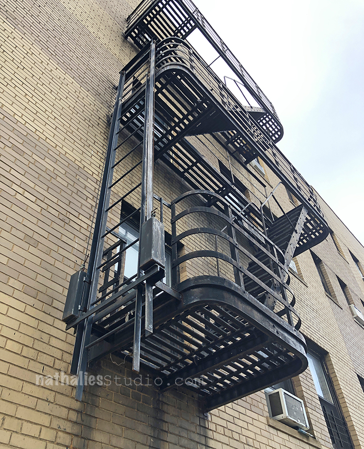
Speaking of ..I love those Art Deco Fire Escapes – It is funny because the building itself is a bit plain and boring but those curved escapes – so awesome.
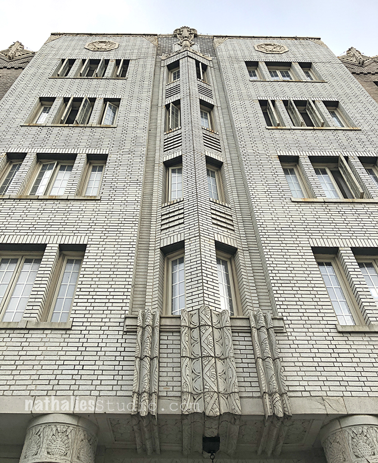
Another Stunning Art Deco Building in my neighborhood.
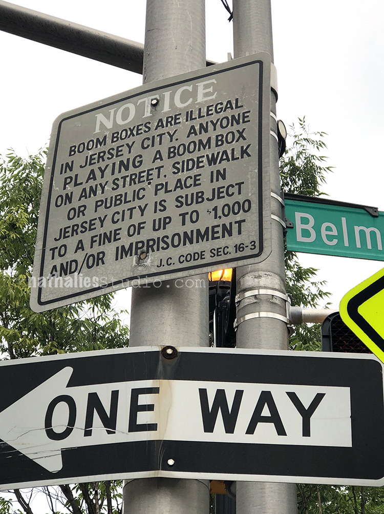
I see this sign every time I go to drop of packages at the postoffice and it makes me laugh ! I think this neighborhood is boom box free since 1983 …LOL.
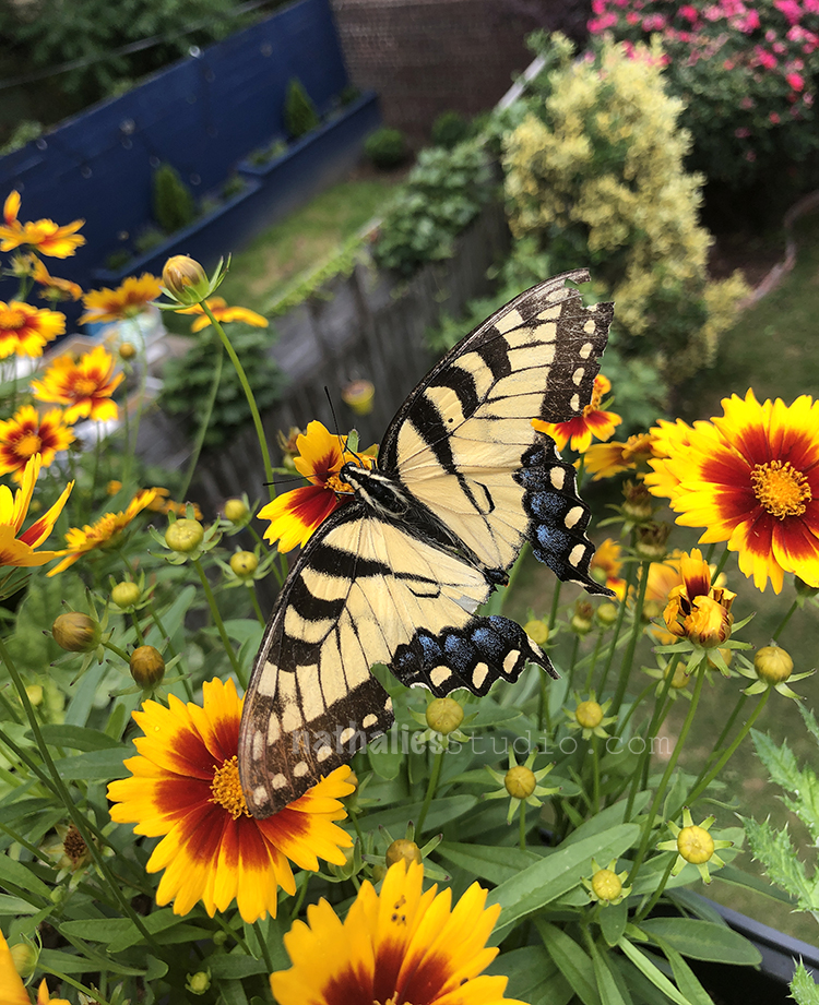
This guy visited me one afternoon on the deck – pretty pretty big and apparently had a little fight in his live as the right wing shows. Made my day.
I hope you are all well – sending you Love!!! Until next month with hopefully more strolls through the hood.
Wonderful photographs, Nathalie.
Thank you so much!!
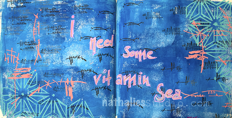
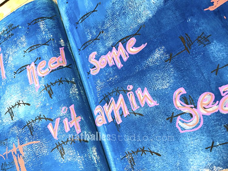
I need some vitamin Sea! How about you? I was inspired by our Creative Squad theme this month – Under the Sea. Are you longing for the ocean too?
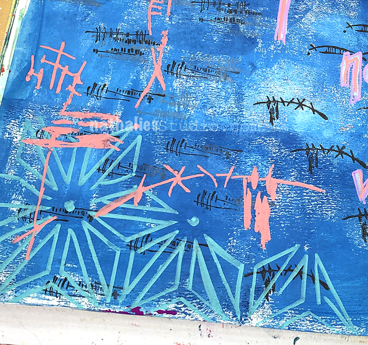
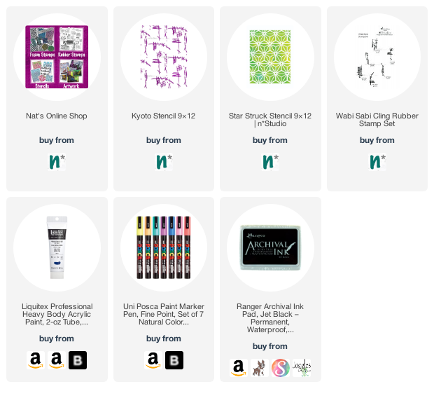
I used acrylic paints for my background and posca markers with my Kyoto and Star Struck stencils. I also threw in my Wabi Sabi rubber stamps with archival ink so a little play with changing up scale with the same design elements.
I tried out a new set of Posca markers and really like the colors and pastel shades of them. You can find those in the links below.
Here are some of the supplies I used:
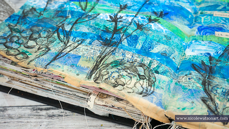
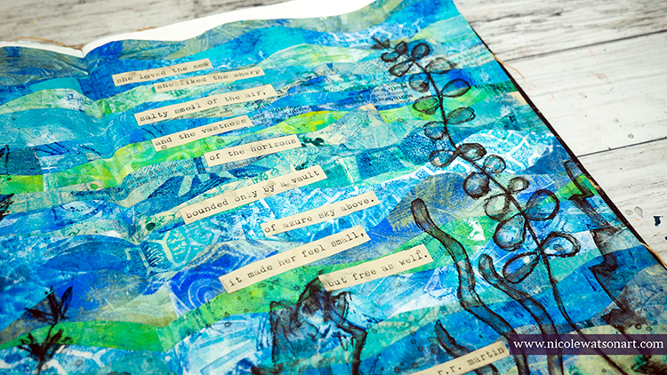
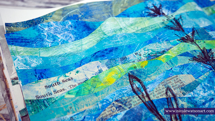
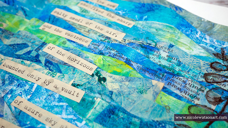
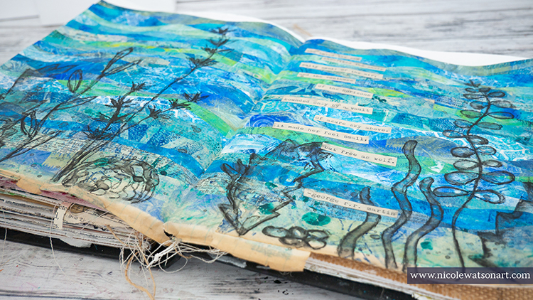
Hello from my Creative Squad! Today Nicole Watson is sharing her longing for the sea with us, with a beautiful art journal spread using a bunch of my foam stamps and this month’s theme: Under the Sea – There is something so fascinating about water. We love being in it, floating on it, relaxing next to it, and it remains one of the last frontiers here on the planet. Create something that is an ode to the sea.
Traditionally, my husband and I have taken a fall vacation to the beach in Florida. It’s one of our favorite vacation spots, right on the panhandle with white sands and emerald green water. I love to spend hours watching the ocean and its waves, walking the shore, hunting for shells while spotting a dolphin or two. I spend afternoons water coloring in my beach chair and exploring all the neat shops full of beach art. Unless something changes, this will be the third year in a row that we are not going to make it to Florida. A hurricane, moving, and now the pandemic.
I am so longing for our beach vacation, and these journal pages play homage to my love for the sea.
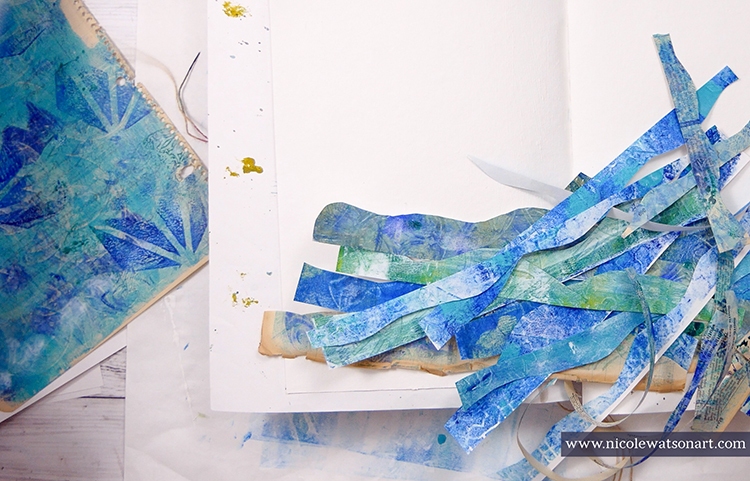
First, I spent an hour gel printing papers using Nat’s ArtFoamies. I layered ocean colored paint on my plate, stamped the foamies, and pulled prints. The magic happened when I added layers to each pull creating depth in the prints.
One simple recipe I used a lot: Layer paint on the gel plate, stamp with art foamies, pull a print and a ghost print or two.
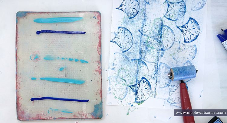
Then, once dry, create a small puddle of contrasting paint in the corner of the gel plate as a palette and stamp another foamie all over. Use the original prints to add this second layer of interest. You can see in the video how I layered the texture of different ArtFoamies with contrasting paint to create beautiful, gel printed pages.
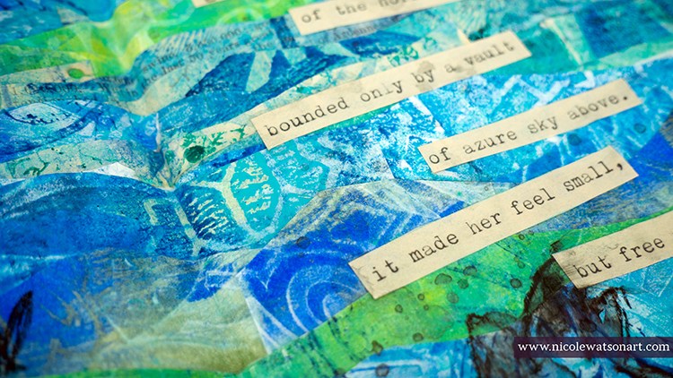
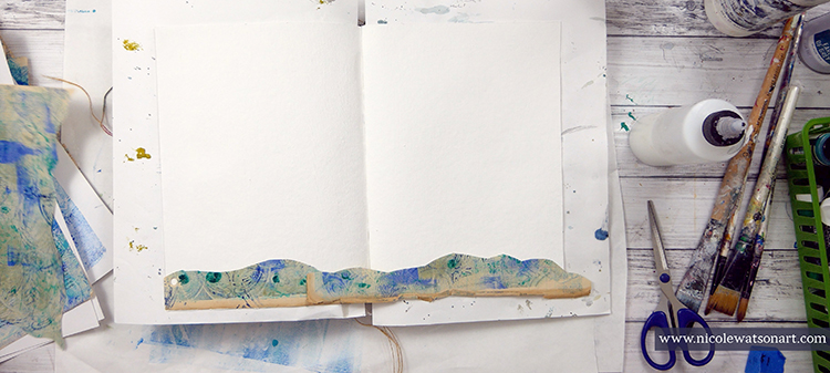
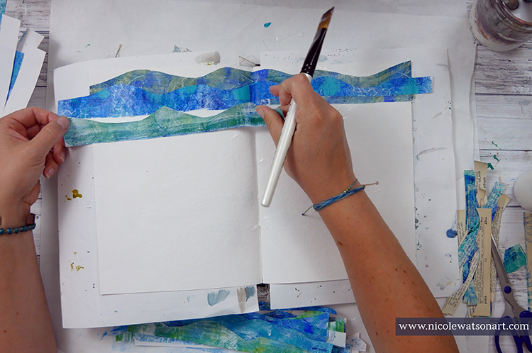
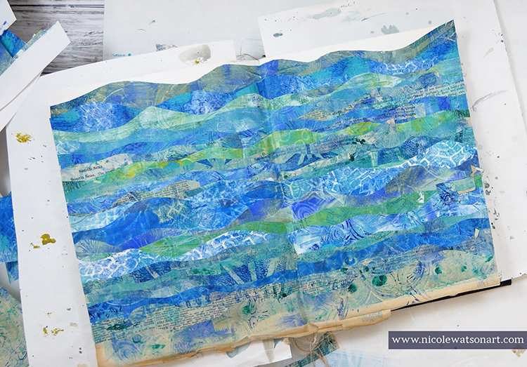
Next, I needed to decide what I was going to do with these prints! I had in mind that I wanted to create an ocean, so I just went with it. I cut strips of paper in wavy lines from the gel prints, then I layered them on my journal pages with matte medium.
I picked a specific page that looked more like the ocean floor or beach shore for the bottom layer and kept in mind to vary the colors as I layered the papers. I let my ocean dry overnight, which was also my excuse to think about what to do next.
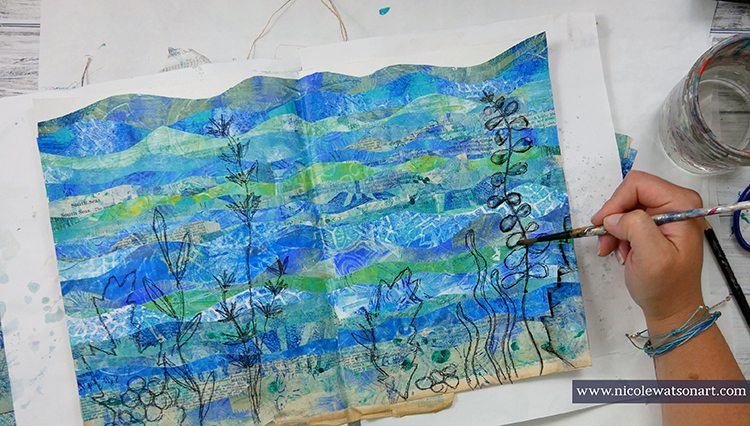
I honestly had no idea on what the next layer should be. I wanted to keep the pages simple and just add a quote or poem until my husband inspired me. The screen saver was playing on the TV and he suggested I look at it to get an idea for my journal pages. On the screen were layers of seaweed in the ocean.
The next day I trimmed the edges of my pages and then sketched some seaweed (I looked online for some seaweed pictures as inspiration.) with a charcoal pencil and then with a stabilo-all pencil. I wanted it to not stand out too much and have a watercolor feel, so I activated the stabilo with water. Then, I flicked some of the stabilo to look like water bubbles.
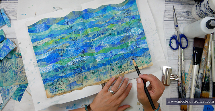
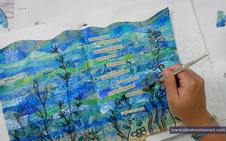
I topped my pages off with the perfect quote that touches on my love for the sea. I typed it out on some aged paper, cut it apart, and adhered it with matte medium.
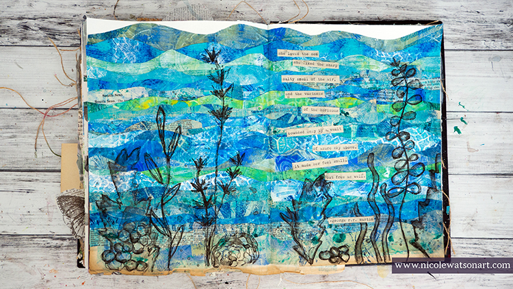
I love how my faux ocean turned out with the ArtFoamie prints, and now I have several beautiful pages of prints to use in other projects as well. In fact, I already have one in mind. You’ll have to watch my Instagram to see what I create next.
Thank you Nicole! Love hearing how this project came together even though you didn’t necessarily have a clear plan at first… What beautiful results in the end!
Give it a try: you can find all my Foam Stamps in my Online Shop and in addition to her typewriter and a selection of printer, book, and scrap paper, here are some of the other supplies Nicole used:
Feel inspired? Working on something yourself that you’d like to share? I love to see how you interpret our monthly themes. Email me how you used my stencils and stamps with the theme and email me an image – I would love to share your projects in my next “n*Spiration From Around the Globe“.
Gorgeous Nicole!
I just love the colors and the waves as it seems like I can feel the water wash over me.
Delightful on this hot day!
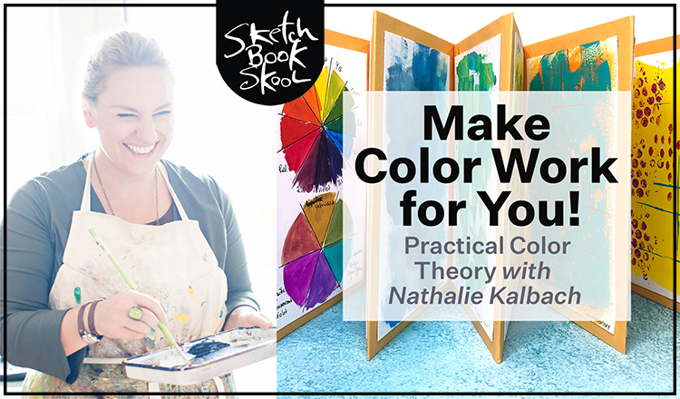
I’ve got a new Online Workshop coming on Sketchbook Skool – Make Color Work for You!
It’s time to get more confident with color. ?
In my newest workshop with Sketchbook Skool, get to know the fundamentals of color theory, craft a personal color wheel, & build your own style, no matter your medium.
Express yourself in color! Play with the fundamentals of color theory to create a personal palette, no matter your medium.
Using color is an essential building block for any artist, but it can be challenging to control and harmonize. In this workshop, you’ll learn the core concepts of color schemes and gain confidence in your color choices, resulting in art that’s cleaner, sharper and more uniquely you.
Essential for artists who work in mixed media, watercolor, or color of any kind, this workshop is a practical and tactical lesson in going deeper into the world of color theory and use.
Topics Include:
Basic Supplies:
The workshop is on August 8, 12-2pm EDT live and online . If you do not make it to the live session you will have access to the recording later. And you can sign up right HERE
Check out my promo video for a peek at what to expect:
Emilie, delightful colors and TEXTURE!
Reply