Blog: Art Deco

Rubber Stamped Waterless Snow Globes – DIY Playdate

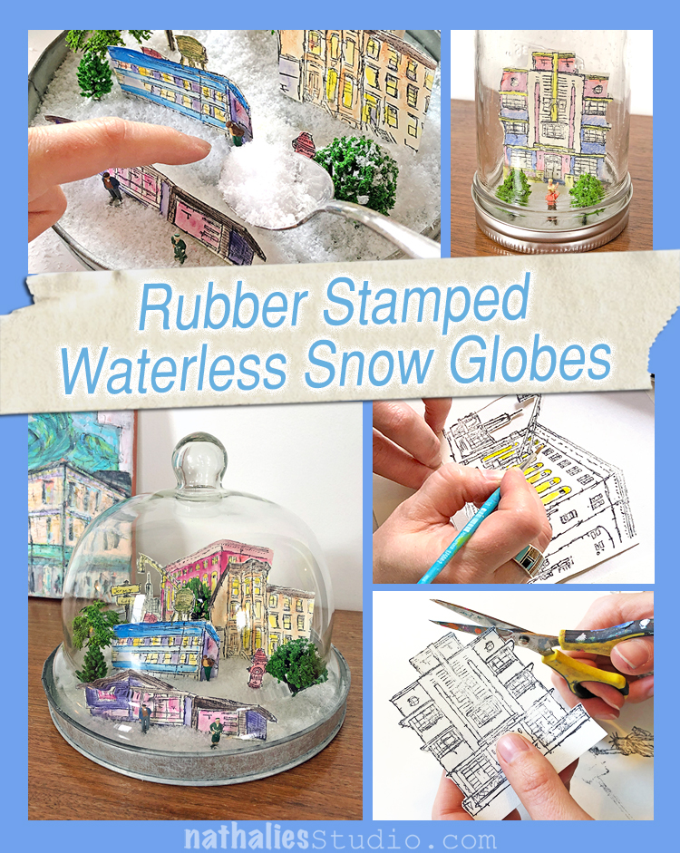
This is my favorite Play Date with Kim yet!!! Seriously, I geeked out on this and had too much fun making a little Winter Wonderland under glass. We knew we wanted to do snow globes and waterless is the way to go – easy peasy and sooooooo cute! Here we go – waterless snow globes filled with little rubber stamped scenes to warm your heart this holiday season and into the winter beyond.

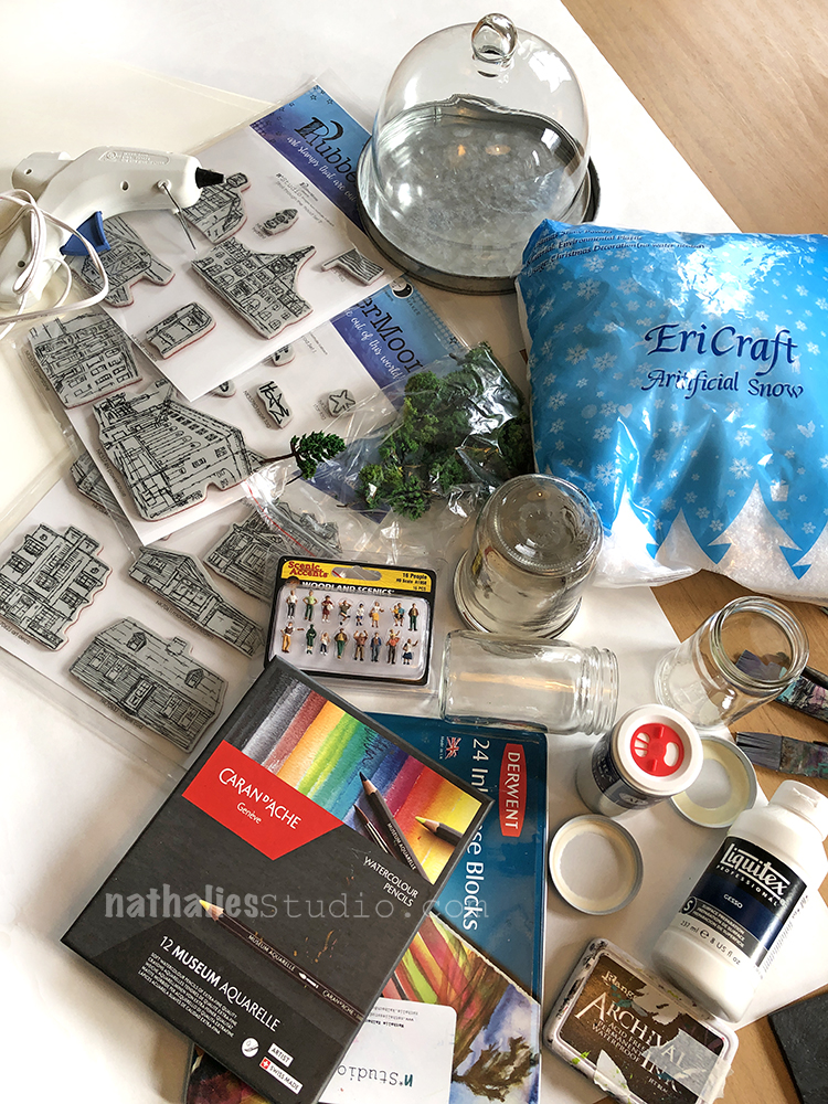
You’ll need a jar or cool glass cheese dome like I found. The size of the jar and lid will determine what rubber stamps you can use. We went right for my Stroll Around the Block house stamps, and the little street elements and buildings in my My Home is my CastleStroll Through the Hood 1 and 2 sets. Then we got some fake snow, some tiny trees and tiny people, heavy card stock, archival ink, colored pencils and ink blocks to color our stamped images, scotch tape, a hot glue gun and scissors. How many accessories you want to add is up to you – there are so many choices when it comes to miniature scenery – plants, animals, different people, etc.

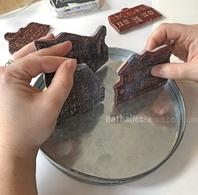
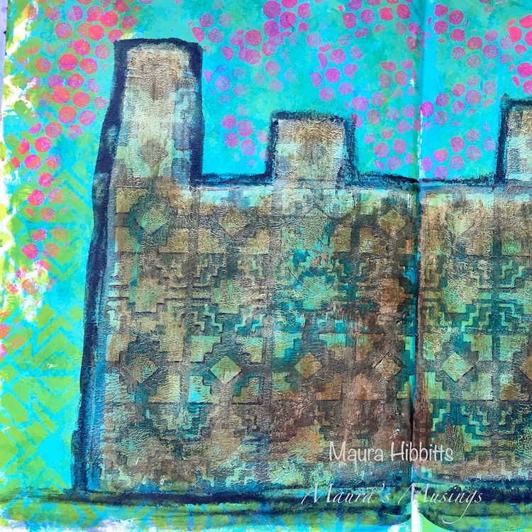
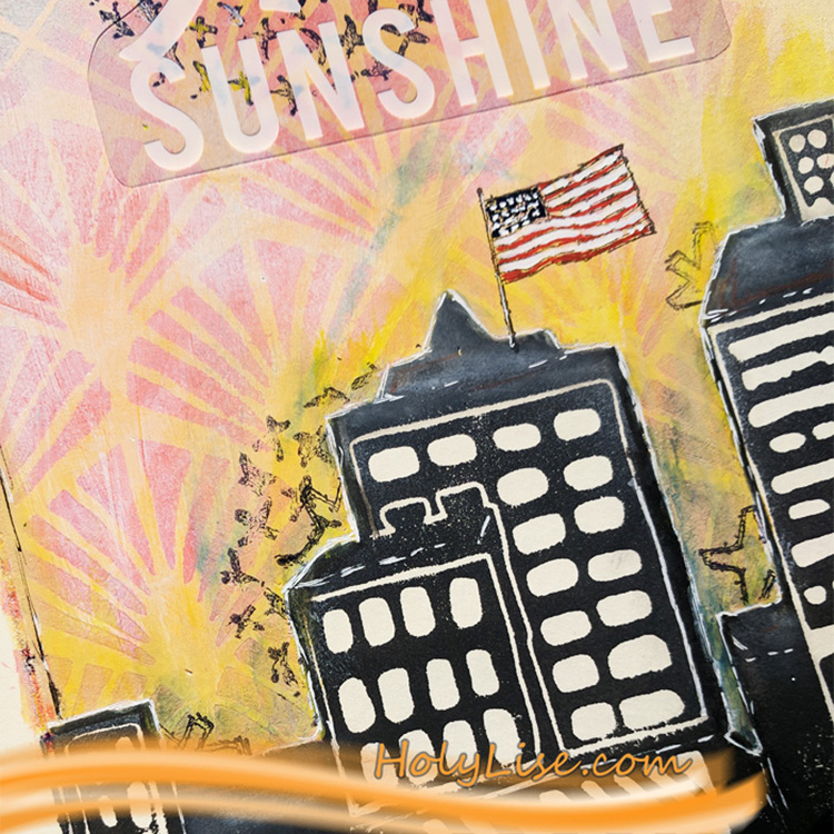
My cheese dome was wide enough to have a little city scene in it, so I played with various arrangements to see what fit. Here I am testing out my Powerhouse, Queen Anne, and Brownstone stamps. You can use the stamps to see what will actually fit in your jars.

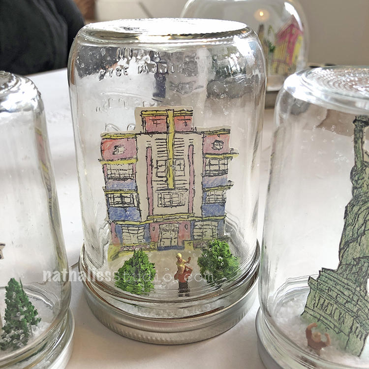
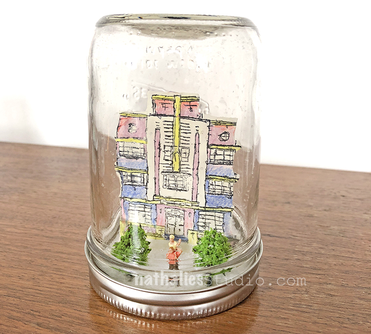
Kim had a canning jar that she found the Art Deco image would fit right into.

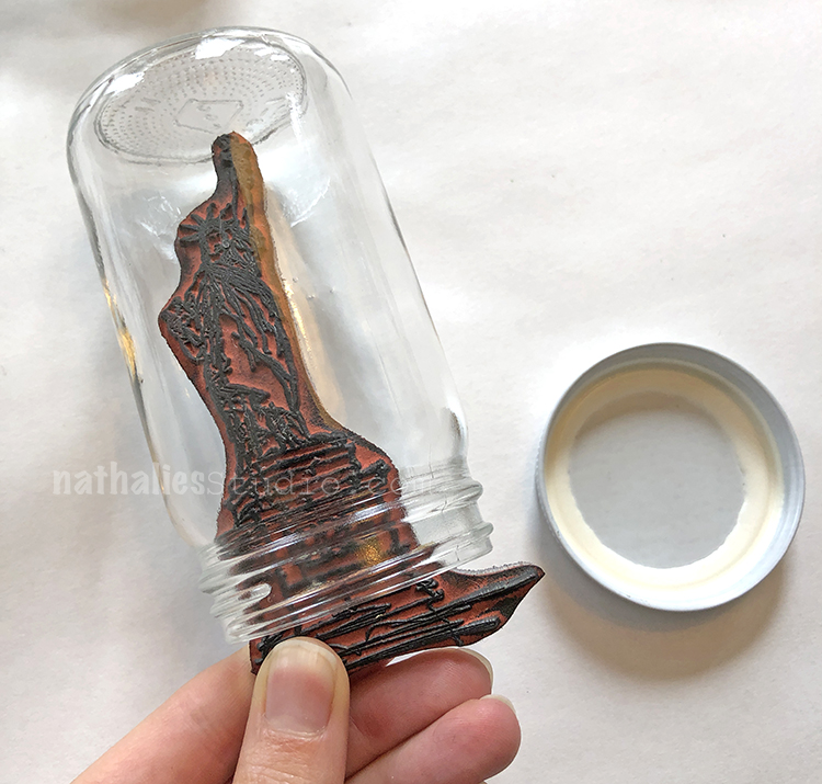
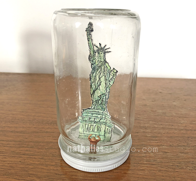
And another smaller jelly jar for a Lady Liberty snow scene :)

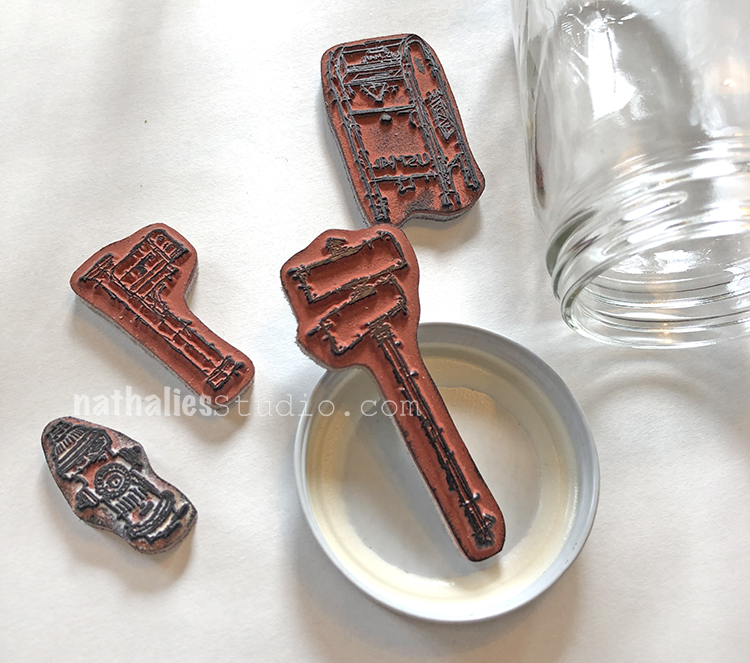
If you have small jars like baby food jars, you can choose small stamps like my Hydrant, Snail Mail, Mailbox, or Street Sign stamps.

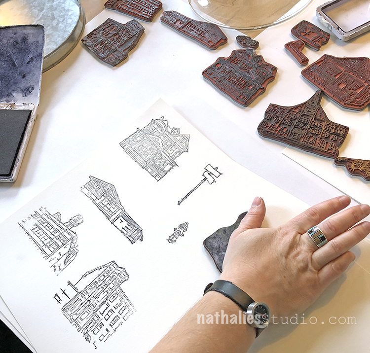
Ok time to stamp! I’m using a few different stamps to build my snow globe neighborhood.

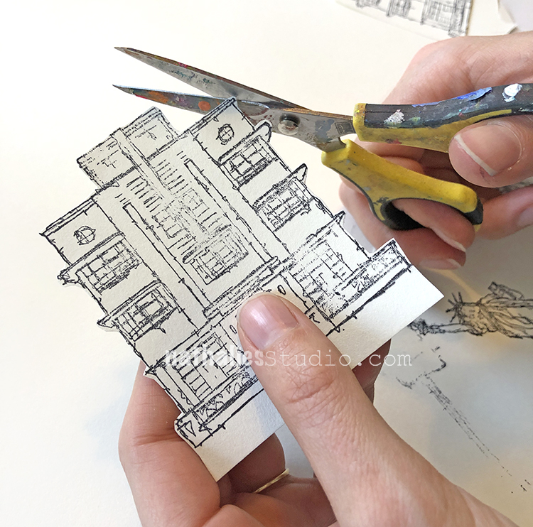
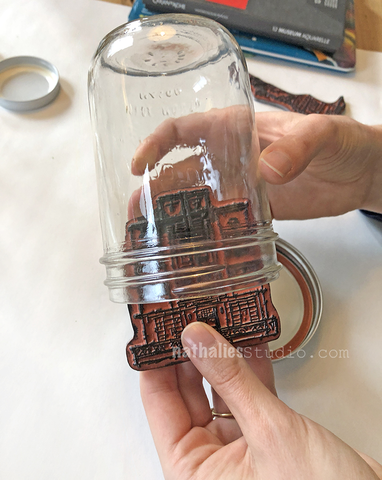
Next you cut them out, leaving a “foot” at the bottom to fold over and tape onto the lid. You can cut them out before or after you color them.

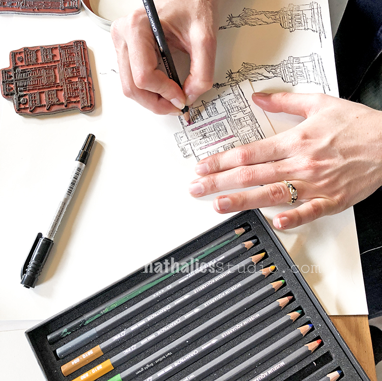
Color your stamped images with watercolor pencils – after all these snow globes won’t have any water :)

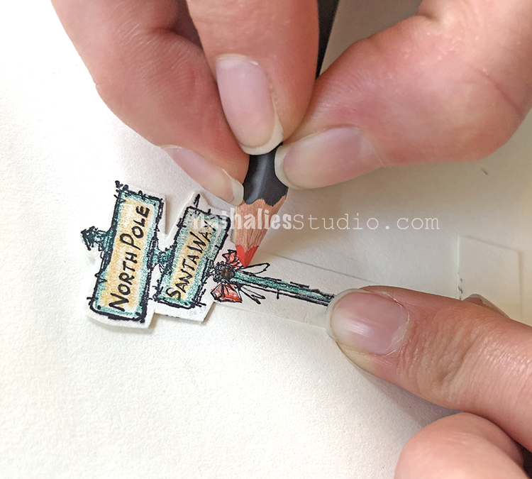
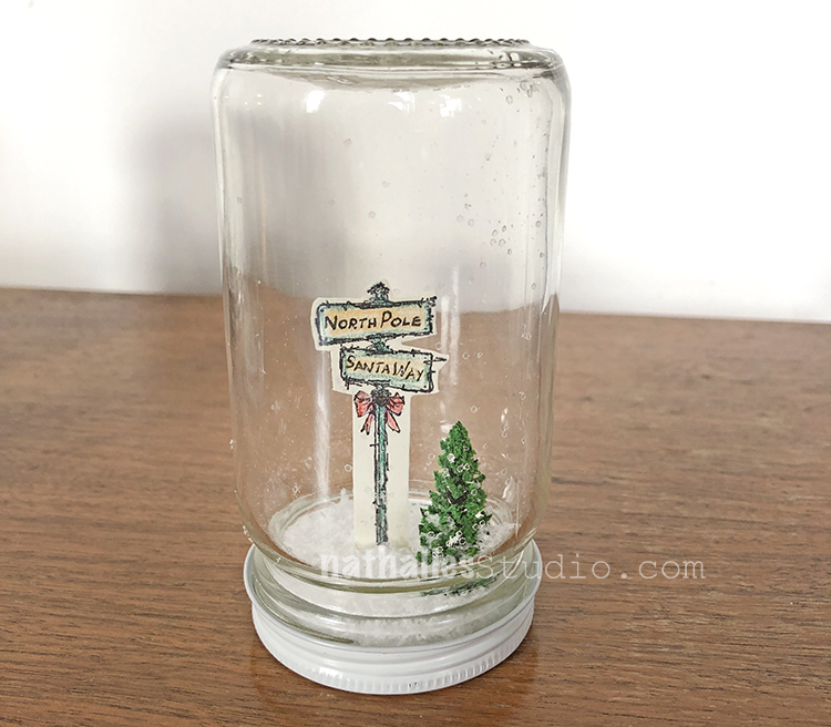
Kim added some seasonal details to the Street Sign stamp.

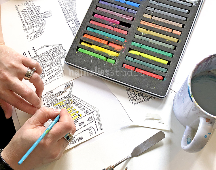
I love to use Derwent Inktense blocks with water and a brush, almost as watercolors to color in my stamps. They have beautiful rich colors and you can use a fine brush to get very detailed with them. Here I am adding some color to my Powerhouse stamp.

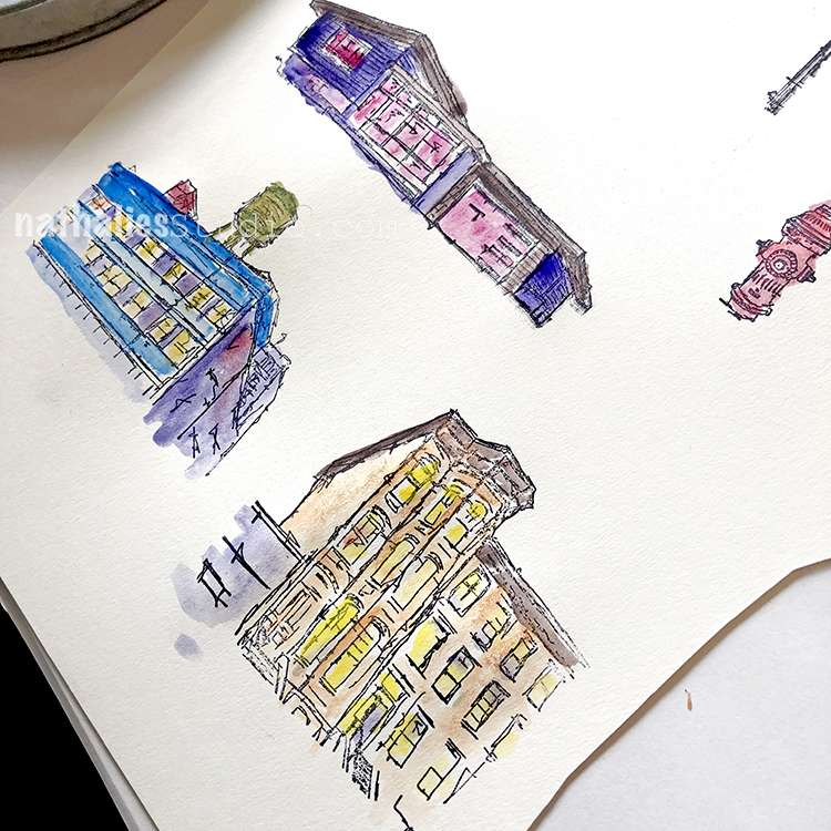
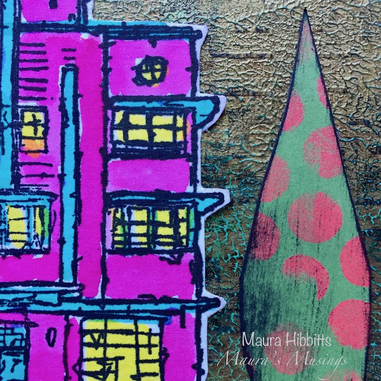
I chose a lot of different colors for my snow globe scene.

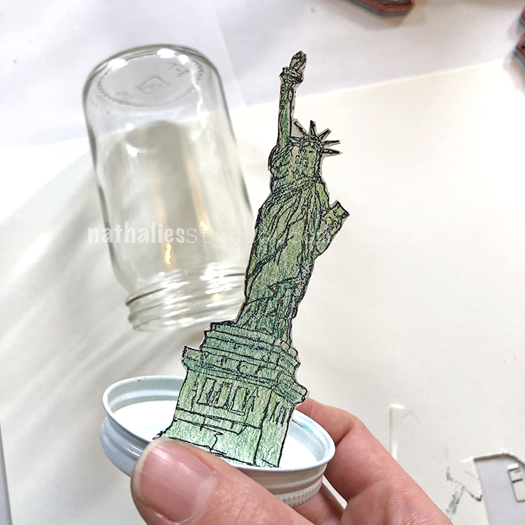
Use some tape to tape the image into the lid. Here is Lady Liberty, ready for winter I hope lol
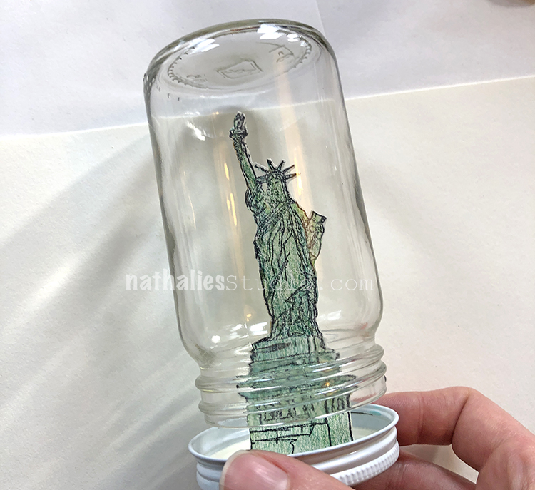
She just fits.

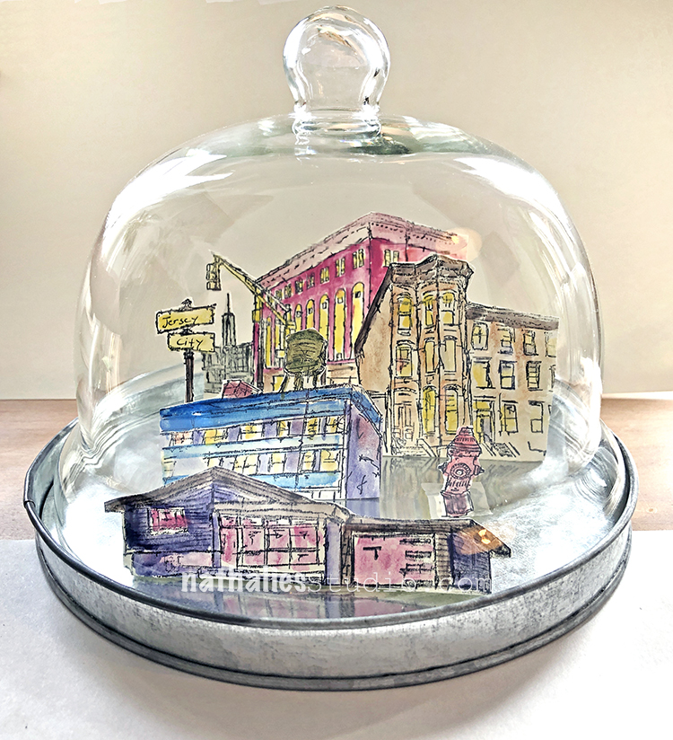
Here is my scene and SQUEEEEEEL it is coming together so amazing!!! This was a test to make sure the lid fit.

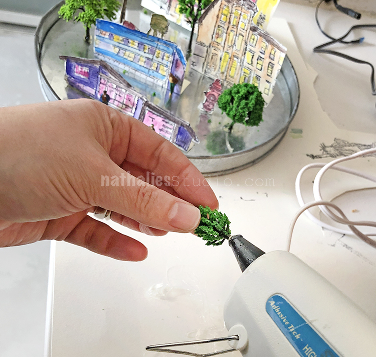
Now I glued in some trees and shrubs with hot glue.

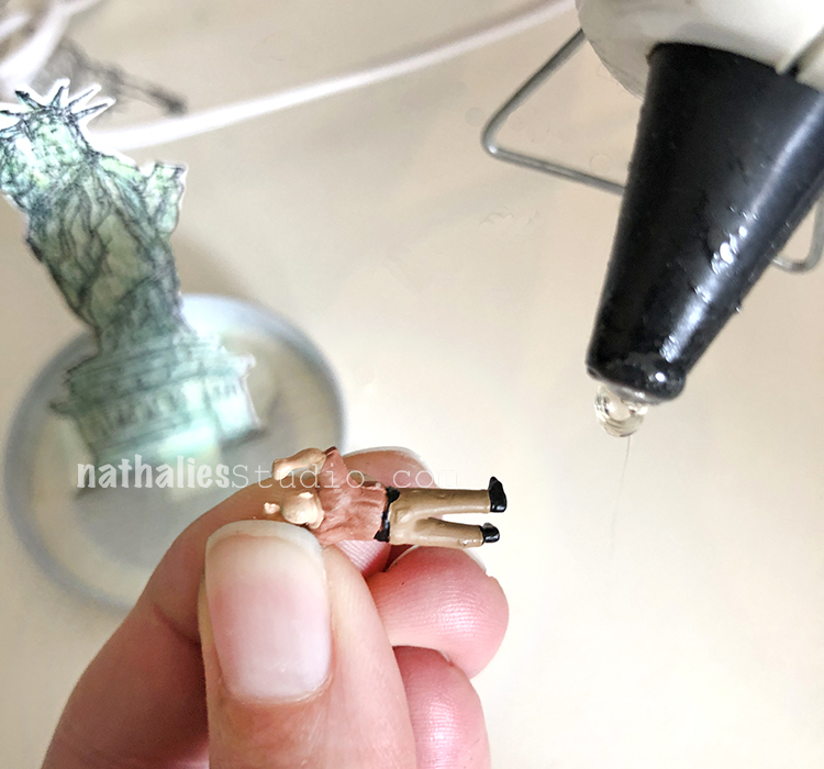
And people to bring your snow globe to life.

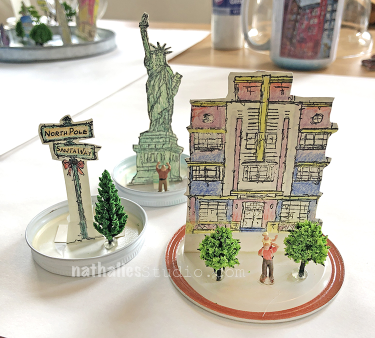
Kim put together 3 scenes.

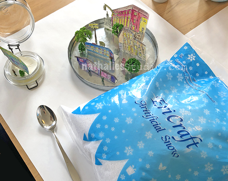
Time for the blizzard!!!

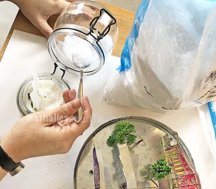
Just spoon some snow into the jars.

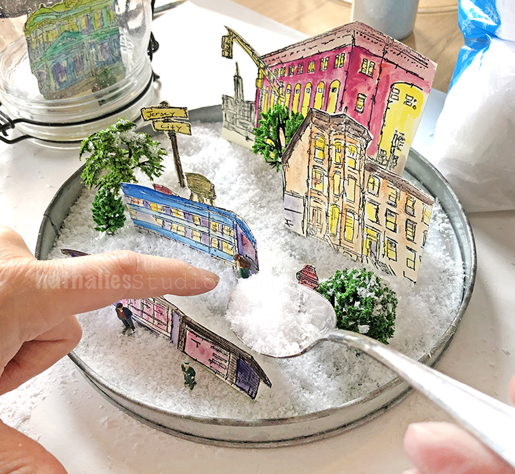
Or gently spoon around the elements in the cheese dome.
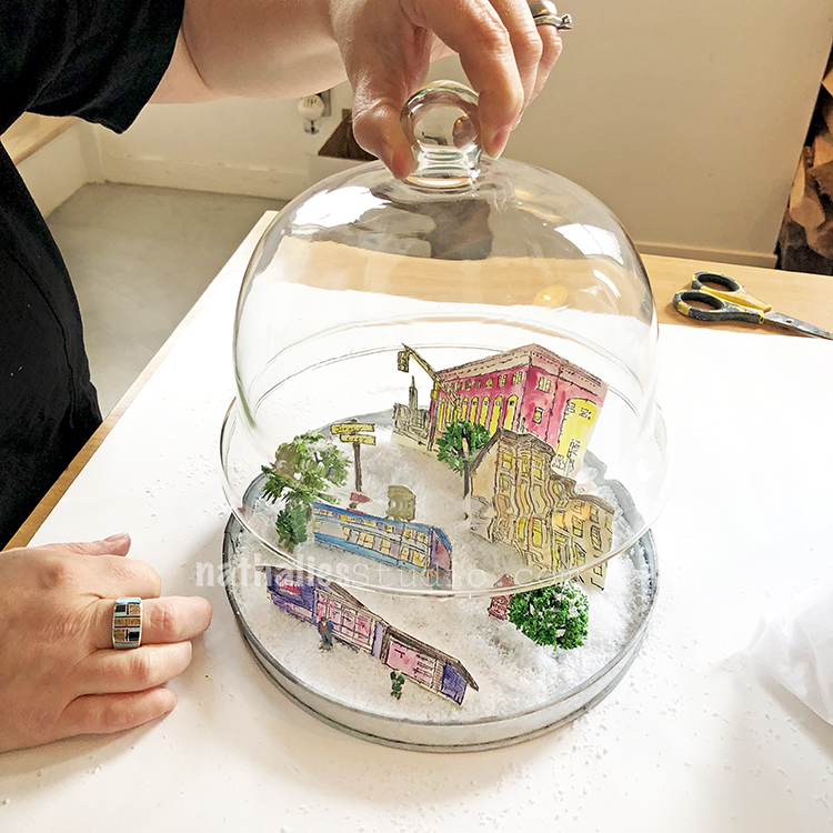
On goes the lid

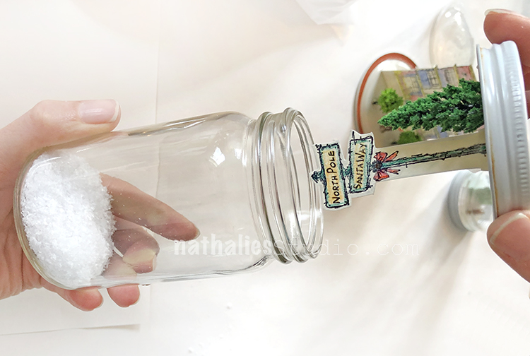
Kim assembled her North Pole snow globe :)

This is where we realized that for lidded jars, you may want to build your scene up a bit so it sits above the bumpy rim at the bottom of the jars. You could cut out a cardboard circle and paint it white and stick it in the lid first, then put buildings etc on top. We would definitely do that next time. Also if your jar has a colored lid, you may want to paint it with gesso before you begin.

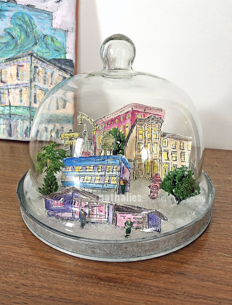
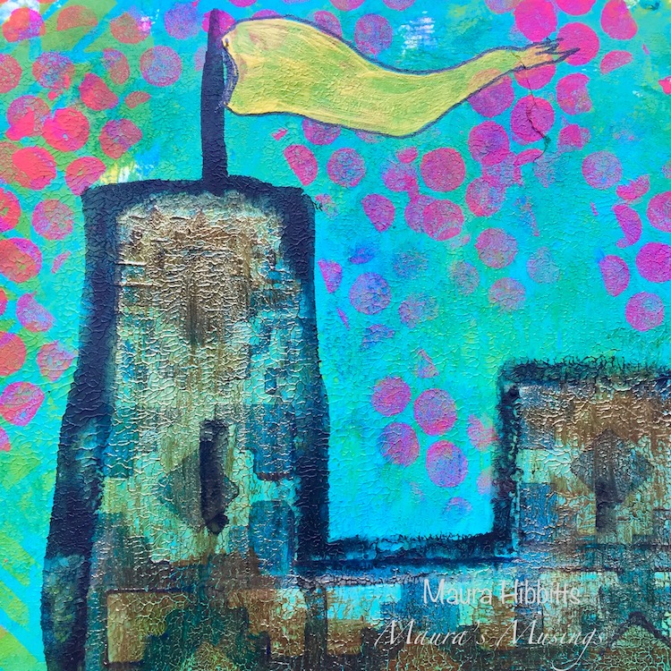
But oh WOW this was sooooo fun! And looksie at my little winter wonderland!!! What a success and done in under 2 hours.

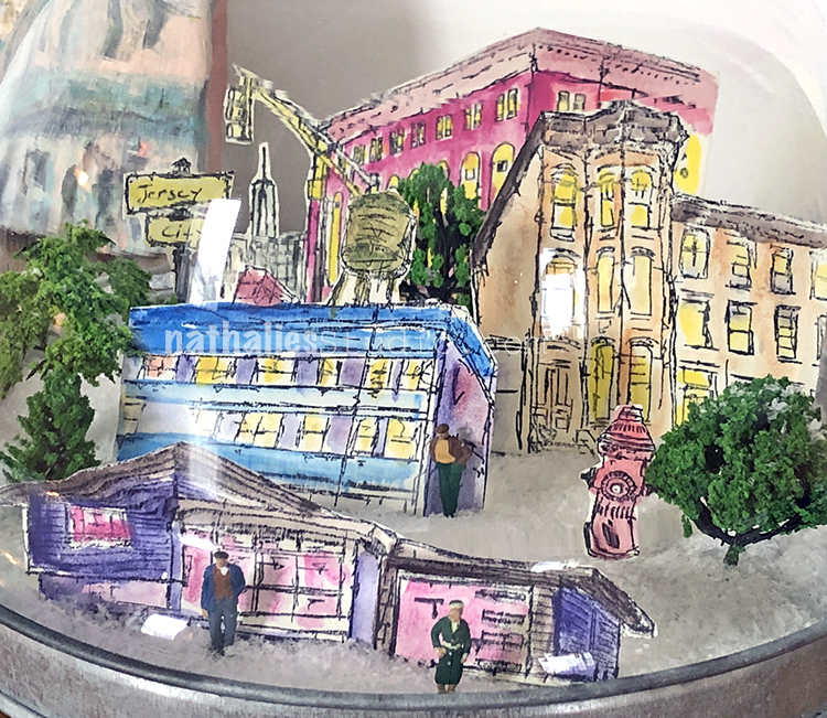
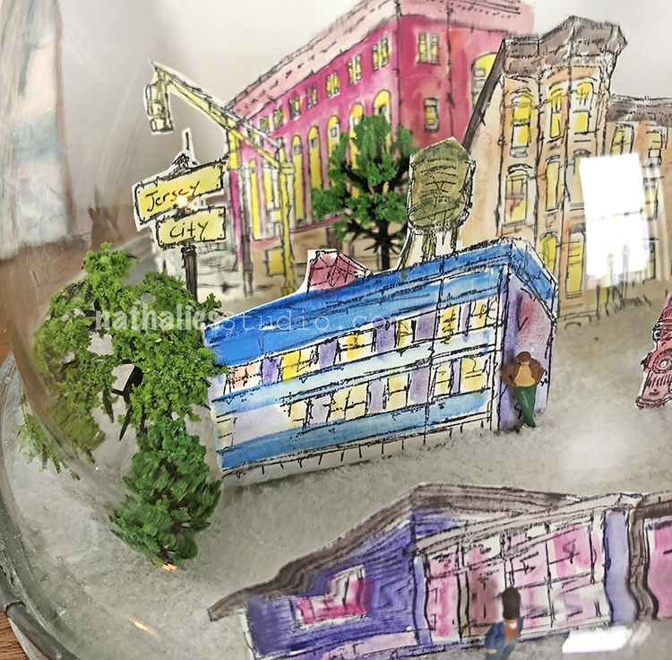
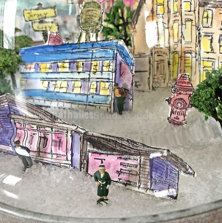
Take a stroll through my snow dome :)

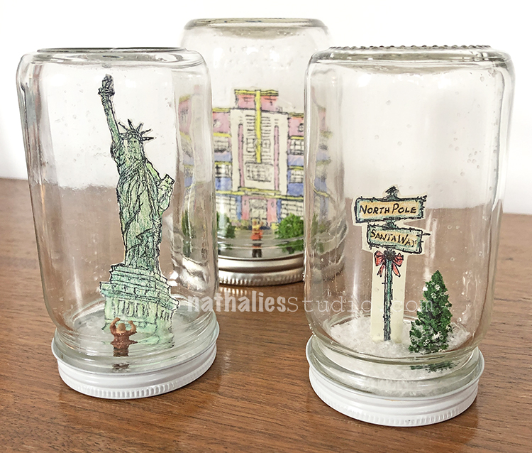
Kim’s waterless snow globes – waaaaay cute!

That guy in the bottom cracks me up!

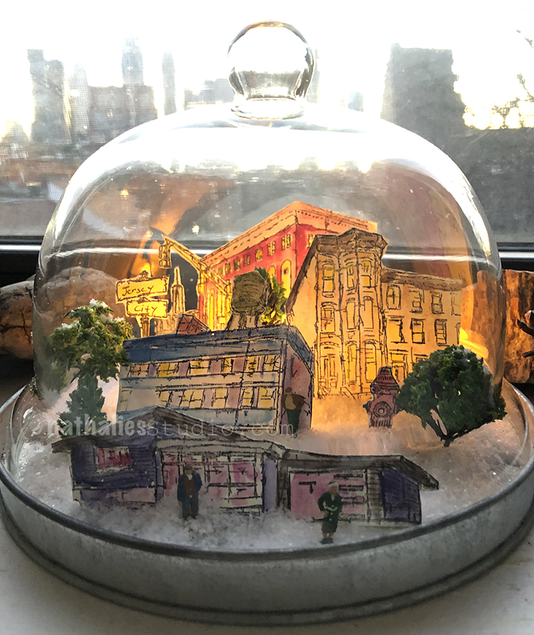
And for even more fun, I added a small battery operated tea light into the back of my snow globe so now it glows at night. Ooooooo!

I hope you try this project and I hope you have as much fun as we did. It’s a nifty way to get into the holiday spirit :)

In addition to my Rubber Stamps from my Online Shop, here are some of the supplies that we used:


Comments (4)

  • Sue Clarke

    |

    Love love love these Nat!
    Now maybe make some on shrinky material and you can use water too???
    Super fun project that you and Kim made.

    Reply

    • nathalie-kalbach

      |

      Great Idea Sue! We really wanted to have no glycerin or water involved – it was so much easier and gives more possibilities to add candles and use a cheese dome too :) It was so quick and I bet it is fun to make with kids too!

      Reply

  • stresso

    |

    oh my gosh – how fun!!!

    Reply

Leave a comment

Endless Summer – Josefine Fouarge


Hello my friends and hope you are enjoying your summer (if you are in our hemisphere I guess lol, otherwise Happy Winter!). Today we have a post from Josefine Fouarge from the Creative Squad, sharing with us some absolutely gorgeous cards using my stencils and the happiest summer colors. This month the squad is using the theme:  Endless Summer – The days are long, the sun is shining, the air is soft… it must be summer! Let’s take a stroll down memory lane and save a summertime memory forever.


Summer has started, it’s official. We are having the first days with over 100 degrees in California, so I spend a lot of time in my pool. When we bought our house, we fell in love with the pool. It is plastered with a variety of blue tiles which shine amazingly when the sun hits them. The colors of the pool were my inspiration for this month’s theme – Endless Summer. But as always, I started with those colors and then couldn’t stop.

But let’s start at the beginning. I decided to create a few greeting cards. I haven’t done a lot of ink blending lately, so that’s the technique I went for. It all started with picking 4 stencil designs and then heat embossing the patterns with clear embossing powder. For that, I placed the stencil onto a 4 ¼ x 5 ½ piece of card stock, dapped the Versamark ink pad through the stencil, added the powder and heat set it. I did that with the Manhattan, Chicago, Toledo and Art Deco stencils.

My original plan was to use the same blue shades of Distress Inks and Oxides for the cards (which were inspired by our pool), but after the first card I changed my mind and went all over the rainbow.

I always started with the lightest color, inked the background up and then switched to the second color. I went over the same areas a couple of times to get a bright color.

When I added the second color, I always went back to the first color and blended over it.

At last, I added the darkest color. Usually, I didn’t ink up the darkest color too much to not overpower the cards with it.

At the end, I cut two of the panels into 4 x 4 squares and adhered them onto a 4 ¼ x 8 ½ card base. The other two are cut to 4 x 5 ¼ and adhered to a 4 ¼ x 8 ½ card base. I also added one sentiment sticker to all of the cards.

Here are all 4 cards with the colors I used:

Manhattan stencil with Distress Ink in Squeezed Lemonade, Carved Pumpkin, Abandoned Coral

Chicago with Distress Oxide in Squeezed Lemonade and Distress Ink in Twisted Citron and Mowed Lawn

Toledo with Distress Ink in Peacock Feathers, Evergreen Bough, Mermaid Lagoon

Art Deco with Distress Oxide in Worn Lipstick, Picked Raspberry, Wilted Violet

I hope that these colors got you into a summer mood, at least a little ;)

Thanks for stopping by and don’t forget to come back every Tuesday for more inspiration from the Creative Squad.


Thank you Josefine! I love how that embossing sets off those lovely colors. Here are some of the supplies that Josefine used:


Did we inspire you? Working on something yourself that you’d like to share?  I love to see how you interpret our monthly themes. Email me how you used my stencils and stamps with the theme and email me an image – I would love to share your projects in my next  “n*Spiration From Around the Globe“.

Leave a comment

Inside Outside – Jennifer Gallagher


Hello my friends from the Creative Squad! Today we have a boldly patterned and colorful art journal page from Jennifer Gallagher. She uses my Batik stencil for some awesome background patterns and my Stroll Around the Block stamp set for the houses. This month’s inspiration was our theme:  Inside Outside – Inside can be cozy and warm. Outside is about fresh air and freedom. Are you a homebody or do you suffer from cabin fever? We’re creating with these opposites in mind.


This month we are creating with opposites in mind. I immediately thought of positive and negative and wanted to play with this idea through stenciling. I went straight to my Dylusions large journal to create a fun art journal spread. Nat’s Batik stencil is one of my favorites and the bold designs would be perfect for the play on positive and negative space. On the right hand side page, I laid my stencil down and painted with Dylusions Mushy Peas, leaving some parts of the design not painted. I then filled in those spots with the matching Dylusions Ink Spray in Mushy Peas. This is where the fun starts. There will be a lot of ink left on the stencil. Carefully turn the stencil over and press it down on the left hand page. This will leave the opposite, yet complementary, design of your stencil. Do this technique multiple times until you are satisfied with the left hand page.


I knew I wanted to add another color and decided to go with a complementary color choice. Red is the complement to green but this always makes me think of Christmas. I tend to avoid this direct combination in my art. I decided to go with a deep pink and peony blush was just perfect. I sprayed my peony blush ink spray through the stencil on the right page and then pressed the leftover ink onto the page on the left. Repeating the process the same as before.

At this point I added a third color for a visual pop. Yellow is always great for this, so I used my Distress Stain in mustard seed. And no page in my art journal is complete without a little black paint. The ‘x’ design on Nat’s Batik stencil makes a cool design detail.

I stamped up a few of Nat’s rubber stamps from her Stroll Around the Block Set and finally, keeping the theme of opposites in mine, I settled on the Art Deco stamp and the Queen Anne stamp. I colored them with my Dina Wakley Media scribble sticks.

I cut out the stamped images and placed them on my pages with scor-tape. I added journaling on both pages with my fude ball pen and ran a stripe of Dina Wakley Media washi tape down the center of where the pages meet. I hope you have enjoyed this page. Be sure to play along with the Creative Squad each month and share your creations with us.


Thank you Jennifer! I love all the different elements you pulled out of my Batik stencil for that gorgeous background! Here are some of the supplies that Jennifer used:


Feel inspired? Working on something yourself that you’d like to share?  I love to see how you interpret our monthly themes. Email me how you used my stencils and stamps with the theme and email me an image – I would love to share your projects in my next  “n*Spiration From Around the Globe“.

Comments (2)

  • maura

    |

    Love how you’ve layered the Batik stencil, Jennifer! It’s one of my faves too. Your pink houses are so fun! Maura

    Reply

  • Sue Clarke

    |

    Thanks Jennifer…you’ve inspired me to play in my art journal!

    Reply

Leave a comment

Layers of Love – Maura Hibbitts


Hello and welcome to a post from my Creative Squad! Today we have a gorgeous art journal page from Maura Hibbitts, layering up my Fashion Dame stamp set, my  Art Deco Wallpaper, Amsterdam, and New Orleans stencils and totally rocking this month’s theme: Layers of Love – We love layers and all the juicy yummy goodness they bring to mixed media. This month we’re layering it up and letting viewers discover all the different strata of our artistic mark making.


I headed to my Dina Wakley Media Journal and started by brushing on a layer of Turquoise paint in a rather imperfect way so some white would still show. While the first layer dried, I worked on creating the “fabric” for the outfit. I used Prima watercolors and painted a couple of different designs on watercolor paper.

I stamped the Fashion Dame onto watercolor paper with black archival ink, then used a water brush and watercolors to color in the skin tones. I stamped the clothing onto the “fabric” designs I created earlier, then put her outfit on, and added some gold highlights.

Back to the art journal page for a stenciled layer. I used the Art Deco Wallpaper stencil and Green Gold paint and a cosmetic sponge to stencil in the design. Once that dried, I turned the stencil upside down and added another sponged layer, this time with Ultramarine Blue paint.

With the cool colors laid down and completely dry, next up are the warm colors to layer on top. I used the Amsterdam stencil from the Fashion Dame, and dabbed in yellow and orange with a sponge. I only stenciled parts of the background in each color.

While I loved the layers I had created in the background, I knew my Dame would be lost, and anything I wrote would be hard to read, so I whitewashed the page. I used a translucent white and painted a thin layer over the page. I went in with a baby wipe and scrubbed back some areas since I still wanted color to show through.

Time for a little gold. I really like adding a bit of metallic, and the gold adds a subtle layer to the page. I used the New Orleans stencil and a pale gold and randomly sponged gold onto the page.

I adhered the Dame with foam tape, then scribbled around her with a Stabilo graphite pencil. Next, I softened it with a water brush. This is a great way to create more depth on your page. I also added in some scribbly lines underneath her to ground her.

I hand-lettered a great quote on beauty by Hedda Sterne – “For the sublime and beautiful and the interesting, you don’t have to look far away.” It is always interesting to me how my mind can work in the background when I am creating. The Fashion Dame has an Asian look to her, and the Art Deco Wallpaper has the appearance of fans. I really was not thinking about this while working, but when I stepped back I saw that connection.


Thank you Maura! I love all those layers and what a great quote – I definitely think if you look, the sublime and beautiful are all around us :) Here are some of the supplies Maura used:


Feel inspired? Working on something yourself that you’d like to share?  I love to see how you interpret our monthly themes. Email me how you used my stencils and stamps with the theme and email me an image – I would love to share your projects in my next  “n*Spiration From Around the Globe“.

Comments (2)

  • Sue Clarke

    |

    Gorgeous layers and colors Maura!

    Reply

    • Maura

      |

      Thanks Sue!!

      Reply

Leave a comment

Nice to Meet You! with Sarah Donawerth

It’s time to get to know an artist with… Nice to Meet You! Today I’d like to introduce you to the inspiring art and story of Sarah Donawerth!

From time to time I learn about some amazing artists out there who are working with my stamps and stencils and are creating some fun and exciting projects. It’s always inspiring to see what others do with my designs. Sometimes they even introduce me to a new way of seeing the pattern or a new technique to try on my own. That’s why today I’d like to share with you Sarah Donawerth:


Please introduce yourself to our readers and tell us where you live:

I am Sarah Donawerth, a writer, blogger, and artist from Orange County, CA. By day, I work in the marketing department at Stampington & Company and by night I am trying to use my creativity to make a lasting impression on the landscape of the world. I have two little dogs, Mr. Darcy and Mr. Bingley, and I love playing violin, knitting, crocheting, reading Jane Austen, and making mixed-media art.

How do you make time to be creative?

I am dreadful at finding time to be creative. I am fortunate that I get to create art as part of my day job, but I also find that my creative time is sporadic. I will create for an entire weekend and then not pick up a brush for the next month. I’ve had to accept that life gets in the way, but it will never stop me from trying to make time and to make art a priority in my life.

What are some of your favorite n*Studio stamps / stencils? How do you love to use them?

I absolutely love the Art Deco Wallpaper stencil from StencilGirl Products. I absolutely love that it is a repeating pattern that can be used as an entire background, but the fans can also be used to decorate corners, used in strips, and used in so many ways. I have used this stencil so many times that it is completely mangled. It has been melted in one corner by a failed wood-burning experiment, it is stained with permanent ink, and it has clumps of gel medium still clinging to it from previous projects.

Art Deco Wallpaper Stencil

What is your favorite medium to work in?

There is something so satisfying about spreading paint out onto canvas. I like to collage a background so that it has plenty of texture, then rely on the paint and finishing touches to create the foreground picture. My absolute favorite materials to use in my artwork are vintage book text and the Stabilo All Marking Pencil. The vintage book text provides the perfect neutral-colored, patterned background for my work. I enjoy using the lines of text to create different designs in the background. The Stabilo All Marking Pencil is a great way to distress a painting. Just draw all over, wet with a brush, and dab away with a paper towel until the effect is achieved. It also helps to cover a myriad of mistakes with distressed, grungy goodness.

What inspires you to be creative?

I am constantly on the look out for new ideas and visual inspiration. I look on Pinterest, in magazines, on Instagram, and on blogs. I continually store information so that I can reference it later. I have clippings from magazines in folders, hanging on bulletin boards, and even taped to the supplies that I want to use for that project. My Pinterest boards are usually filled to the brim with paintings, images, and photos that I can use as the jumping off point in my own work. I also like to have my phone available while I’m creating so that I can google things along the way. Surrounding yourself with creative people is also a great way to stay inspired. With my job, I am able to share ideas with a great group of artists and also be challenged to try new techniques and ideas.

Do you have a favorite artist?

It would be too hard to name just one. Right now, I am so inspired by the work of Danita, Laly Mille, Mindy Lacefield, and Jane Davenport. I absolutely love these sort of whimsical, romantic, melancholy, and delicate images that these artists are producing right now. I love plenty of distressed details on artwork and a very free style that allows for splatters, scribbles, and whimsy. These artists are always getting my gears working to create new things.

How did you get into art-making?

I have always been creative (I was banned from taking trash out of the trash can to turn into art when I was young). I was encouraged to have plenty of hobbies when I was in elementary school, which greatly helped during bouts of illness I experienced later in life. It was my knitting and music and drawing that got me through the tough instances of life. My first job out of college was at Michaels, which allowed me to be surrounded by the latest trends and supplies. Eventually, I was teaching classes in crochet, knitting, jewelry making, and paper crafting. Every time a new class was scheduled, I had to review the materials and learn how to make the new project. It was a great foundation for my life as an artist because it exposed me to all the basic techniques I would build upon later. When I began my job at Stampington, I started making some basic jewelry projects and they asked if I had ever done any mixed-media work. I said yes, but in reality I had only done one basic class at Michaels! It was a big learning curve and my first piece of mixed-media artwork is posted on their site. I have picked up loads along the way, but it wasn’t until I was thrust unexpectedly into the job of Project Designer that I truly began to understand my journey as an artist. It was the first time I viewed myself as an artist and it was amazing to transition from thinking of myself as a hobbyist to treating myself like an artist.

In three words, how does art-making make you feel?

Joyful, Accomplished, and Challenged


Thank you Sarah for sharing with us! I love all the ways you’ve rocked my Art Deco Wallpaper stencil and I just love your can do attitude – it’s something we can all use a little reminder of now and again :) Be sure to check out all our Nice to Meet You! posts to learn about all the inspiring artists we’ve featured.

Comments (3)

  • Renee Zarate

    |

    I have enjoyed watching Sarah’s journey through the Stampington & Co. publications. She had an amazing piece pictured recently on the cover of one of the magazines. Go, Sarah, Go!

    Reply

  • Jeanette Ross

    |

    Love the article and the artist!!! You are the bomb Sarah Donawerth! You keep on creatin’ and making the world a better place.

    Reply

  • Laura Weed

    |

    Super loved seeing Sarah on the blog today since she’s a dear family member. Her family always loves, appreciates and cherishes her art (yes we do, Sarah!), and she is so generous in sharing it with all of us. Very exciting to see two people I value highly get to meet each other. What a small world!

    Reply

Leave a comment

My Home is My Castle – Maura Hibbitts


Hello from the Creative Squad! Today we are super happy to introduce to you our newest member: Maura Hibbitts! Maura is a master of colorful layers and we are so happy she will be with us to share some of her projects. Today she brings us an art journal spread with tons of yummy texture. Maura uses my Stroll Around the Block stamp set, the My Home Is My Castle cling stamp, my Santa Fe foam stamps, and my Toledo stencil. She is also working from this month’s theme: My Home is My Castle – Home means many different things depending on who you ask and where you are in the world. This month we’re thankful to have a place to call home, a place where we can rule and be King – or Queen :) – of the castle!


I am honored and excited to join you this month on the Creative Squad!

When I started thinking about this month’s theme, “My Home is my Castle”, I started to imagine a castle behind my own little house. There are so many sayings that relate to this idea, like Queen of the castle (me, I guess), or a man’s home is his castle (hubby), that I knew where I wanted to head with this. In real life, I am glad I don’t live in a huge, drafty castle that I would have to clean, as housework is a much lower priority than creative work.

I headed to my big Dylusions art journal, and squirted on some yellow and turquoise paint and blended it together with a brush. While the paint was still wet, I closed the book and pressed the pages together. Open them up immediately and let dry to create a nice texture.

Next, I used dark blue paint with a brayer on the Art Foamies large Santa Fe stamp and stamped a repeating pattern across the pages to create the main part of the castle. Then, I used the small Santa Fe stamp to make the upper part of the castle. Once that dried, I went over the castle with Quinacridone Gold.

I wanted to add a bit of a dreamy quality to my castle, so added a layer of Interference Gold. I like how this brought out more of my paint texture too. I also added bright green with the Toledo stencil around the edges of my pages.

I outlined the castle with a graphite pencil and went over it with a water brush, and added in some window slits and an entrance. Using bright pink paint with the Wired stamp, I added pops of color for contrast, and also stamped some color pops onto a sheet of green card stock for later use.

Here’s a closeup of the colors and textures on the page.

I chose Nathalie’s Art Deco home stamp for my pages, so I could use bright colors on it. I was thinking of those wonderful turquoise and pink homes in Florida (maybe because it is so darn cold here). I stamped it onto watercolor paper, added color with watercolors and markers, then fussy cut it out. I cut out a few funky trees with the paper I’d previously stenciled, and distressed them a bit with black ink.

Of course, I had to add a flag flying from one of the turrets of the castle. I painted it in yellow and went around it with a black pen.

Behind each of our homes, whether an apartment or house, is the castle of our imagination. I hope you’ve been inspired by my art journal pages to create your own awesome project!


Thank you Maura! I love that cute little pink Art Deco house in front of the giant castle :) Here are the supplies that Maura used:


Play along with us too: I love to see how you interpret our monthly themes. Email me how you used my stencils and stamps with the theme and email me an image – I would love to share your projects in my next  “n*Spiration From Around the Globe“.


SaveSave

SaveSave

Comments (1)

  • Joi@RR

    |

    CONGRATULATIONS Maura. What a great addition Nat!!! Loved your creativity – your home/castle are WONDERFUL. Super textures too!! Xj.

    Reply

Leave a comment

My Fire Burns Bright – Josefine Fouarge


It’s Tuesday and time for a post from my Creative Squad.  Today we have a beautiful art journal page from Josefine Fouarge that shows how sometimes you just gotta go with your gut and create! Josefine is using my Midtown Foam Stamp Set, Toledo 9×12 stencil, Art Deco Wallpaper stencil, and a few of my cling rubber stamps along with this month’s theme: My Fire Burns Bright – Creativity is a passion that can come from deep within the heart and soul of the maker. Sometimes this fire gets ignited by an event or an influential person in our lives, and other times it can be ignited by a love for a material or just simply the enjoyment that comes from making. What makes your creative fire burn bright?


Welcome to the December Creative Squad topic “My fire burns bright”.

I don’t know why, but my first thought when I read this theme was sunrise. Instead of trying to analyze it, I decided to just go with it and create a scene using the Midtown foam stamps. I stamped three of them onto my art journal page. One of them is actually supposed to be standing up, but I think it works out pretty well laying down.

Next up I created some simple masks for the houses to cover them while I was working on the background. I used a yellow paint for the first layer. Then I added some texture using the Art Deco Wallpaper stencil. In order to blend the orange colors in, I used my brush in a dapping motion. I mixed the paint with water, so it was a little easier to blend them as well.

For the night sky I decided to use the Toledo stencil and a few darker shades of red and blue. After I was done, I felt that the background was too bright, so I sprayed gesso over it. That helped blend the two areas together a little more and made the skyline pop again.

Now on to the finishing touches. I started by stamping Nat’s Star Tag stamp and Cross Circle stamp all over the page. I added more dimension by “hiding” them behind the skyline. For that effect, I covered the house with my mask and stamped over it. When I removed the mask only the partially stamped image stayed on the page.

To make the sun even brighter, I outlined the skyline with two different shades of yellow using my Liquitex ink pens and blended the ink out with my finger. My scene was all set, it just missed a little extra – the U.S flag stamp on top of one of the skyscrapers.

At the end the page needed a frame and a sentiment. I started with adhering the “hello sunshine” acetate piece to the middle of the page. Then I drew in a scribbled border and some random text.

The fires are now burning bright on this page, introducing a new day for whomever lives in that city J


Thank you Josefine! In addition to her art journal, Josefine used the following (some are affiliate links):


Play along with us too: I love to see how you interpret our monthly themes. Email me how you used my stencils and stamps with the theme and email me an image – I would love to share your projects in my next  “n*Spiration From Around the Globe“.

SaveSave

Leave a comment

Nice to Meet You! with Mary Thoma

Hello and welcome to a blog feature I call Nice to Meet You! From time to time I learn about some amazing artists out there who are working with my stamps and stencils and are creating some pretty fun and exciting projects. It’s always inspiring to see what others do with my designs. Sometimes they even introduce me to a new way of seeing the pattern or a new technique to try on my own. Today I’d like to introduce to you Mary Thoma:


Please introduce yourself to our readers:

My name is Mary Thoma. I am a native Oklahoman, making art in my own home in the small rural and diverse community of Spencer, Oklahoma. I am a recreational activities director at an adult day center and I am called on daily to use my creative energy.  I consider myself an artist serving other artists living with dementia or other cognitive disorders.  Many times, the artists I serve just don’t know they are artists until they are engaged in creative opportunities.

How do you make time to be creative?

I am an early riser, before the phone, TV, food or even coffee some mornings. 4AM many days I can usually get 3 good hours of standalone art time even on work days. There are mornings I barely have time to get my hands washed up before it’s time to run out the door. I get lost in “artistic flow” and the time just rockets by. Recently a Facebook follower asked me to illustrate a children’s book she had written so I will be adding illustration to my creative time as well.

What are some of your favorite n*Studio stamps / stencils?

Urban Scribble Foam Stamp Set
Buenos Aires 4×4 Stencil
Ornament Stencil
Art Deco Stencil


How do you love to use them?

I usually stamp with acrylic paint, not ink so Nathalie’s foam stamp designs hold up well in that application. I love using the stencil designs with my abstract work and with texture paste for incorporation into collage work. The structure of n*Studio Designs are beautifully and perfectly repeated so I don’t have to reinvent or recreate these dynamic elements to add to my own work.


What is your favorite medium to work in?

Mixed Media, graphite, pastel pencils, markers, color pencils, acrylic paint, Marabu Art Sprays, Ink and spray inks, texture pastes, watercolors, and collage. My art combines representational work with abstraction and Nathalie’s designs add a structured accent to my compositions.

What inspires you to be creative?

I will say it’s hard to beat Creative Jump Start. I also start running through emails and social media, I listen to audio books about great artists, I watch You Tube documentary videos on art and artists, and also manufacturers’ and retailers’ demonstration videos. I am very blessed to have a job that calls on my creativity. I take art tools like stencils and stamps to work with me to help my Adult Day Center Participants create artwork.

Do you have a favorite artist?

Presently, I am studying the work of Francis Picabia. It’s likely I am just too fickle to name just one favorite artist. I find the mid-century modern artists awe inspiring and continue to be highly motivated to study them and their work.

How did you get into art-making?

I think it might be the same way I started breathing. I must make art, it is sustenance for my soul. My parents encouraged my talent. Around 1959, I watched an advertisement for a mail order art course and drew the subjects demonstrated from memory.  My father said, “You didn’t do this, you traced it” I reacted viscerally to his accusation. He finally concluded I did the work. He and my mother provided me with art supplies. My mother was quick to take me to art exhibits.  I saw Jackson Pollock’s work in person on a national tour in the 1960’s. Western art by Catlin, Remington and Russel were introduced via the National Cowboy Hall of Fame and Western Heritage Center right here in my home town. I was a smart kid, but, not a very good student.  My public-school arts education kept me engaged academically sufficient to get me to graduation and into college with a major in fine arts. Otherwise you would be interviewing a high school dropout. I do not suffer “artist’s block” everything blank looks like a canvas to me.  I am looking forward to working full time as an artist and teaching artist. I have my very understanding family to thank for my artistic encouragement, now that my parents are gone, I have my husband, siblings, children and friends to cheer me along on my artistic journey.

In three words, how does art-making make you feel?

Art-making, makes me feel like an “artistic living fountain” flowing deep and wide.


Thank you Mary for sharing your art and story with us! Stay tuned for more Nice to Meet You! posts to learn about other artists!

Leave a comment

Inspiration From Around the Globe! January 2017

This Tuesday we’re taking a short break from our Creative Squad (they will be back next week with a new February theme to play with!) to bring you some amazing projects from around the globe. My stamps and stencil designs are available for purchase online and maybe even in your local craft store, so crafters and mixed media artists and art journalers from around the world are using them. I am always excited to see how YOU use my products in your own projects. I am even more excited to share some of the beautiful and creative examples of these projects with you today. Enjoy this inspiration from around the globe!


Mary Beth Shaw had some fun with my NEW Lady Liberty Cling Rubber stamp in her art journal in Missouri, USA.

From Virginia, USA, Dana Tatar created this fun mixed media board using my Bird Foam Stamp set and she cleverly used the trouser stamp from my Fashion Dame Stamp set to create the purple stripes in the background.

Gunvor Andersson Storck in Sweden brings us a really cool Happy New Year card using my Urban Scribble Foam Stamp set.

From the USA, Cindy Gilstrap has created a cute pencil case using my Typewriter stencil.

Mary Thoma from Oklahoma, USA has used my Art Deco Wallpaper stencil to create a background in this beautiful mixed media piece.

From the Netherlands, Jacqueline van Zuiden created this uplifting mixed media piece using my Bird Foam Stamp set and my Urban Scribble Foam Stamp set.


Finally, Kristie Taylor shares this amazing underwater shrine with us and in the video above she shows how she used my Crackle stencil to create such gorgeous texture.


Join us again next Tuesday for another great project from one of our Creative Squad members! They will be working with a new theme for February. And in the meantime, share with me what you’ve been working on with my stamps and stencils. I would love to feature your project in an upcoming post!

Try some of the above techniques for yourself with these n*Studio supplies:


Leave a comment