Hello from my Creative Squad! Today we have a post and video from Riikka Kovasin who is sharing an art journal page that is an abstract and thoughtful take on our theme this month: I am a Collage – We are all complex beings with many different facets. Create a “self portrait” piece using collage to represent parts of yourself, either literally or in an abstract way.
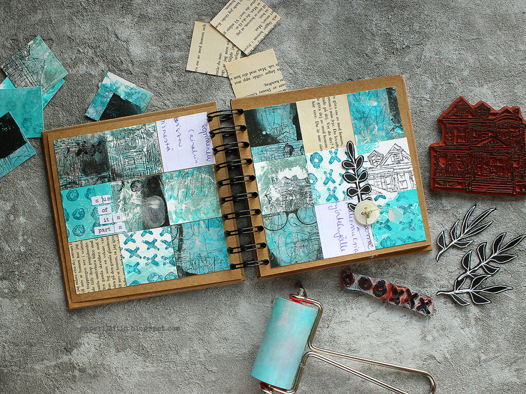
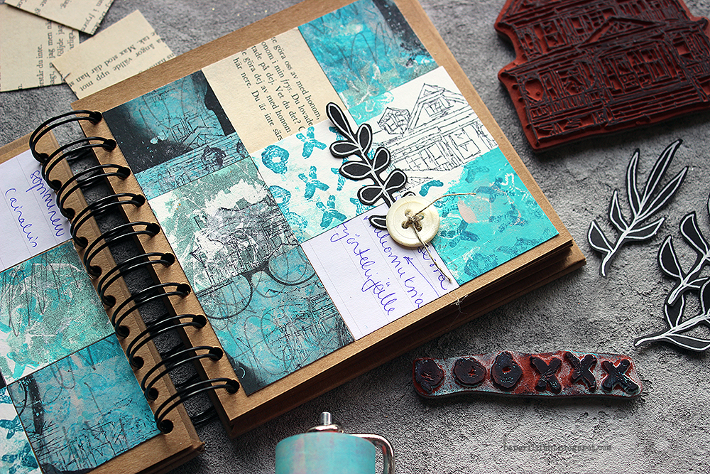
Moikka! It’s Riikka Kovasin here today with a project for the monthly theme “I am a collage”. If you look at the photo of the project, I’m fairly sure you don’t immediately recognize me from it. But I’m in there! It’s a kind of jigsaw “Where’s Wally”.
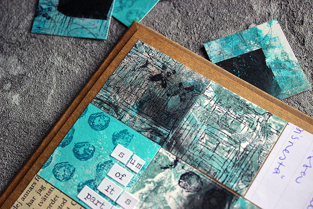
Usually, when reading the month’s theme, my head starts spinning with all the possible ideas. But this time, funnily enough, I had a clear picture in my head from the start. I wanted to do a photo transfer and then hide it by cutting the surface apart. In a way going cubistic, but not quite.
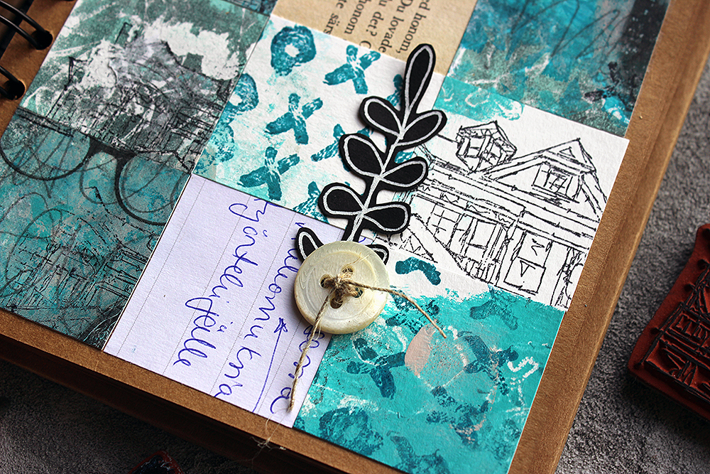
Besides the photo transfer, I wanted to use other papers, too. As in my mind collage is a sum of various parts, acquired differently. Like some old book paper, a bit of painted paper and then maybe a cut out photo. Various sources, different textures. As this collage was about me, I wanted to add different aspects of me in a way. For example, like I say in the video, I stamped the “Queen Anne” house to the piece several times as home is important to me. Maybe I should have said “family” instead of “home” as it’s not that much about the building itself but more who are in it and what that building represents.
If you want to see how this quilt came into being, please see the video below!
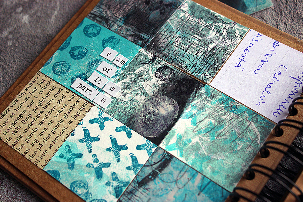
When making the surface for the photo transfer, I added some of my handwriting in it. My mind drew a complete blank at that point, and I didn’t want to scribble a shopping list this time, so instead I used the first quote that popped in my head. Those were the opening words of Kalevala, Finnish national epic. The opening words in a way were appropriate in several ways – the theme of the phrase is about getting started, the speaker declares that he has an urge to begin the story, much like I was eager to get started or continue with the project. The other thing is that the words are in Finnish, my mother tongue, which bring my nationality to the piece. After all, that’s the culture I’ve grown up with and it’s rooted in me in ways I might not even come to realize.
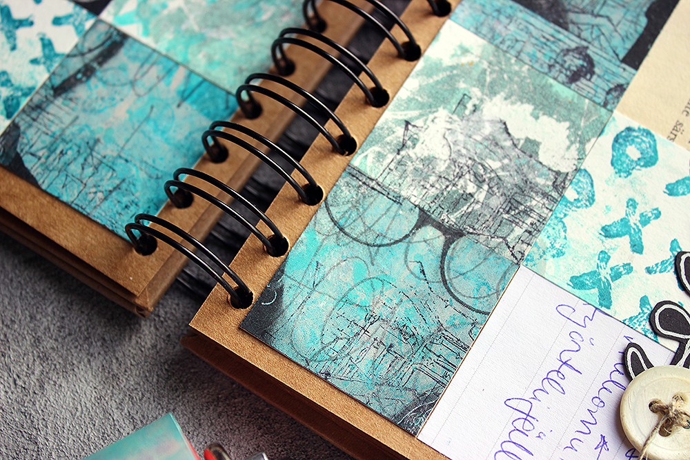
Even though I had the idea of cutting the photo apart from the start, I needed some pondering when it came to the size and amount of the cuts. Cutting it into same sized squares seemed the easiest solution, although I first played with the idea of different sized rectangular bits. When I had the decision about the squares, it then came down to thinking about the size. Not to have the squares too tiny, I pondered between four and three centimeters, which meant three or four squares in a row. As you could see, I chose the bigger squares and three in a row as I thought that might be more pleasing to the eye.
Throughout the project I also used a lot of the “Love Knots” stamp. I love the graphical design of it, but also what it stands for – the combining, integrative force of love.
Thank you for stopping by today! Wishing you a lovely, love filled day!
Xoxo Riikka
Thank you Riikka! Love all the different levels of you in this piece and reading your post too. Sometimes abstract work can be tricky to understand at first glance, but by spending time with it we are gratified with new ideas and ways to create art. This piece is certainly inspiring!!!
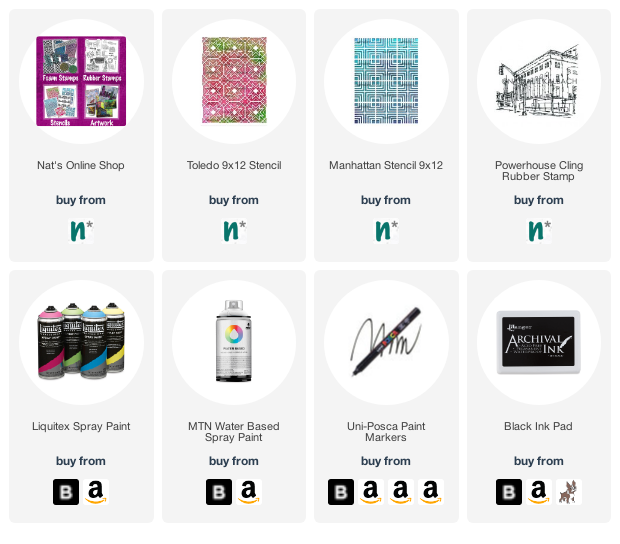
Give it a try: you can find all my Rubber Stamps in my Online Shop and in addition to a laser printed image and some ephemera, here are some of the supplies Riikka used:
Looking for more projects? Follow the Creative Squad on Instagram here.
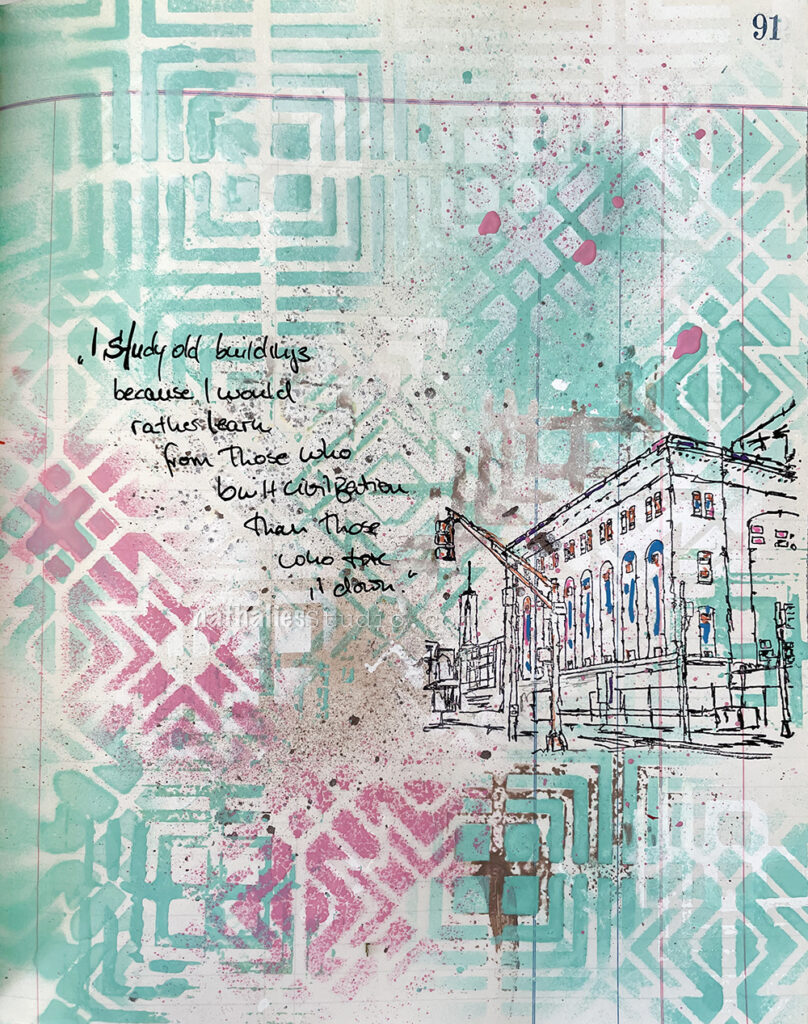
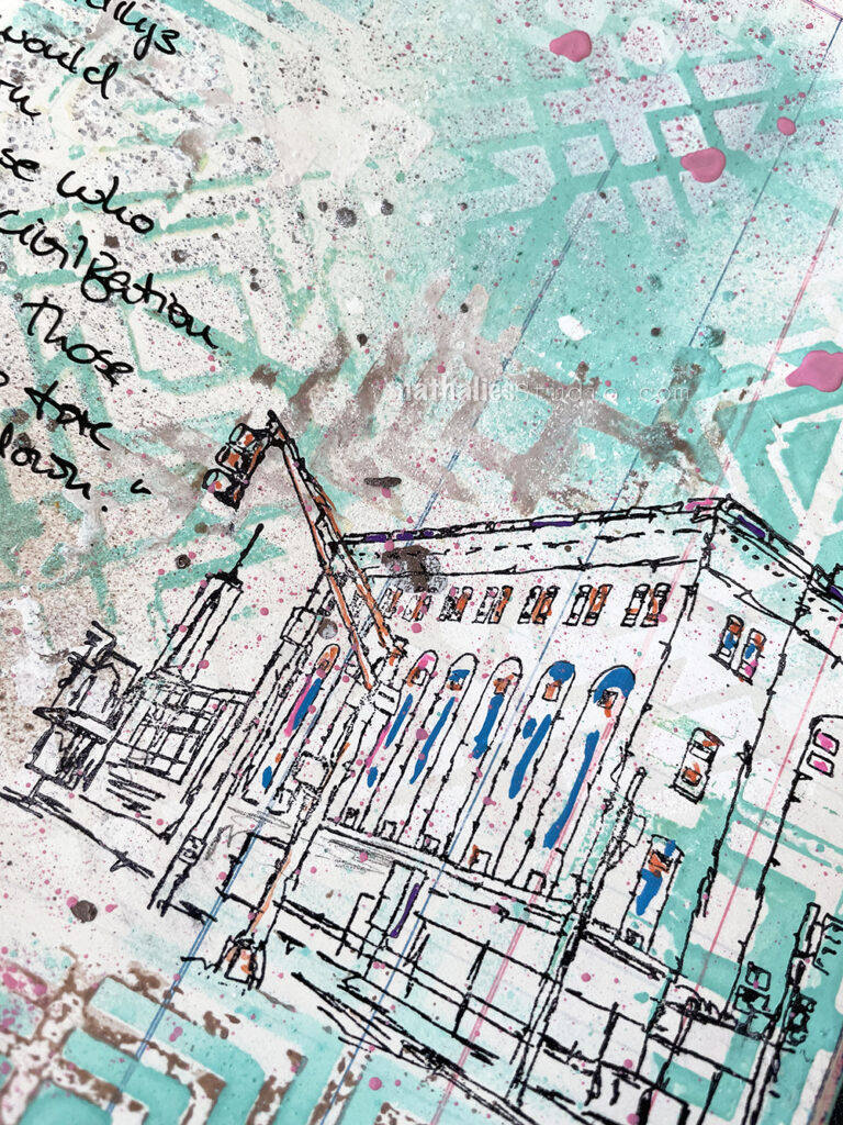
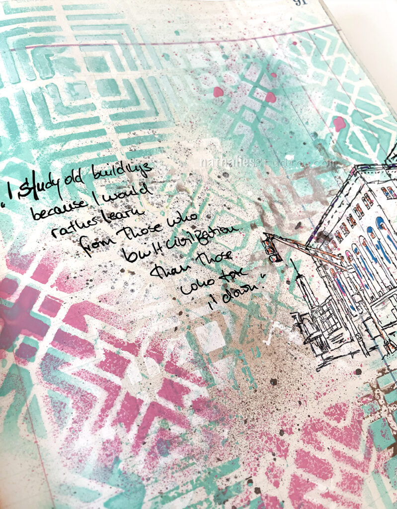
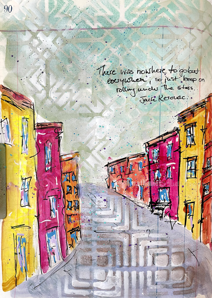
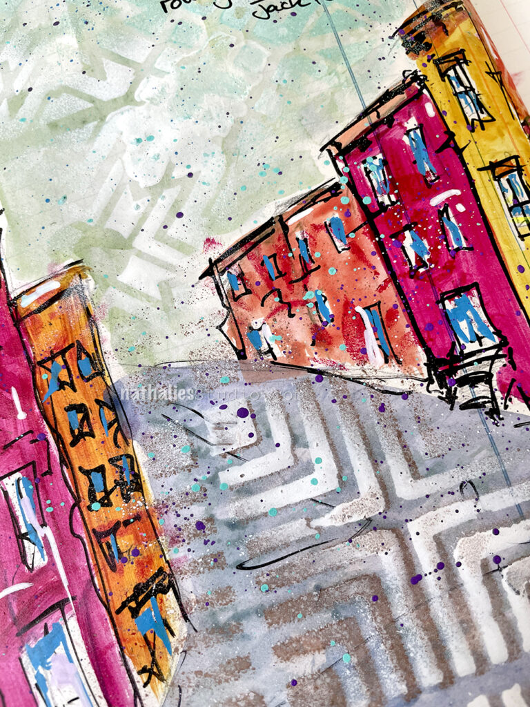
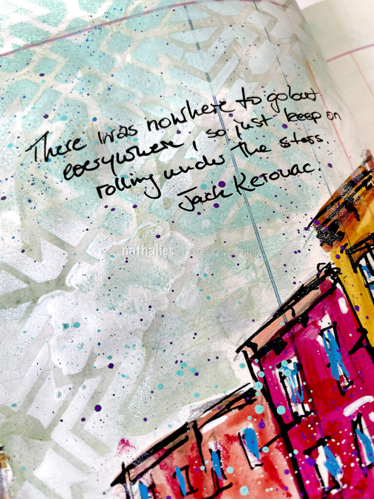
I painted a loose street scene with acrylic paints in this art journal spread. I added some details and definition with markers and used stencils and spray paint over the “sky” (my Toledo stencil) and the “street” (my Manhattan stencil).
To add a little bit of pattern into the house I reached for my ATC Mixup stencil. It’s very subtle – basically in the same color as the house where it was painted, just to give some texture and oomph to the colors.
A Look Back – I’ve got the blues. The art journal blues. No, no, I’m not sad or anything :) I’m talking color today! I’m keeping it simple and taking a look back at some art journal pages that are blue. All shades of blue, but definitely LOTS of blue. Let’s have a look:
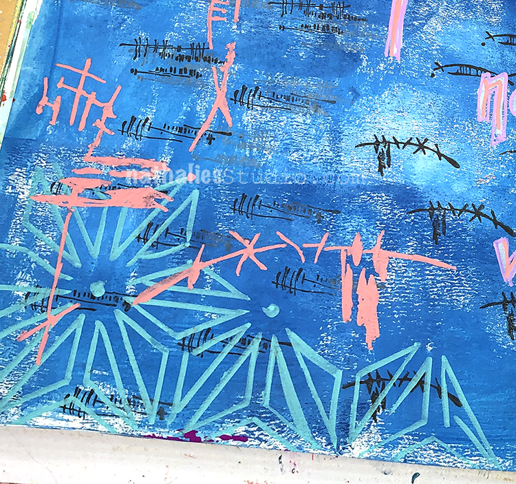
Let’s kick things off with this spread from 2019 where I created a background with blue acrylic paint and gesso, mixing them on the page to create some tints. On top I stamped my Jazzed and Gnarly foam stamps but blue is the dominant color for sure. Take a look at the whole page here.
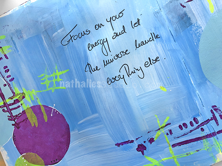
This is another spread from 2019 that began with blue acrylic paint right onto the page. Then I used my Space Age Modern stencil with white acrylic paint and collaged on top of all of that. I called this spread Fantastic Bad Ideas hahaha and you can see the whole thing here :)
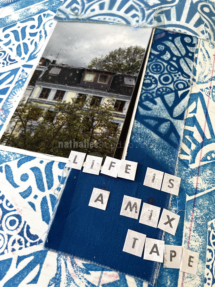
Cyanotype or sun printing creates one of my favorite shades of blue and in this page I combined sun printed fabric with some stamping in blue too. Both patterns are created with my Triple Play foam stamp set. You can check out more of the story behind this spread here.
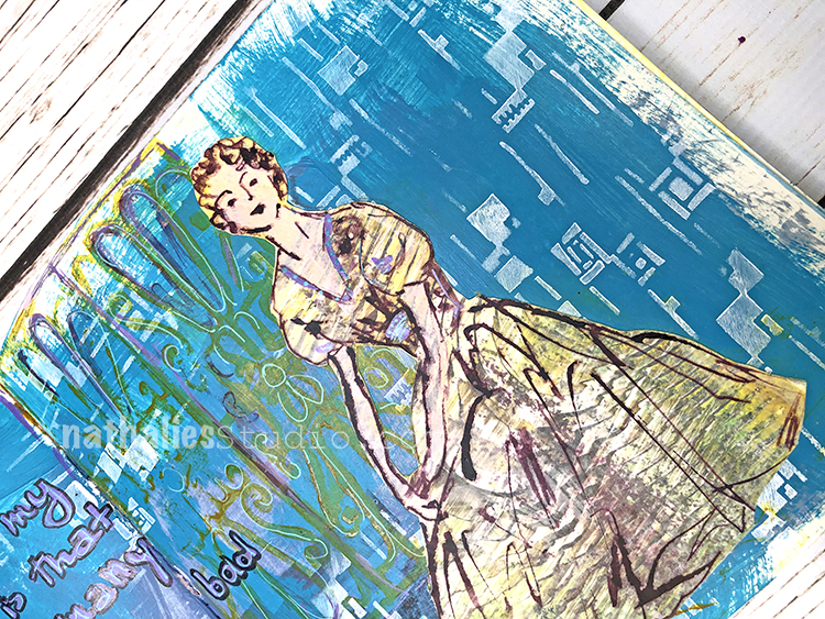
Blue plays so nicely with lots of other colors and I love to experiment with colors that harmonize and colors that pop. Here I started my background with blue acrylic paint, then used my Wabi Sabi rubber stamps in black, an aqua posca marker with my Star Struck stencil, and finally finished things up with peach colored acrylic paint and my Kyoto stencil. I love how that last one really stands out too! You can see the whole spread here.
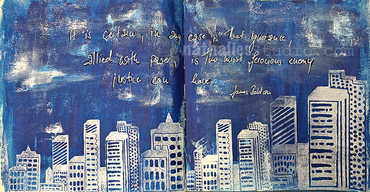
I wanted to end with this spread because I think sometimes simple can be very powerful. Here I was just working with blues and white. I painted my background with those colors and then stamped my Midtown and Midtown Minis foam stamp sets on top in white. You can read more about this page from June 2020 here.
I hope you enjoyed this Look Back post all about the blues :) Maybe you’ll be inspired to pull those blue paints and inks out of your stash and concentrate on letting them shine in your next art journal page or mixed media piece.
A Look Back is a blog series to show you some projects and posts that you may have missed – sometimes going WAY back in the archive. I think it will be fun to revisit a few ideas that we haven’t seen for a while. I’m excited to see how a little look back might inspire something new in the future :)
Here are some of the supplies used in these projects:
I was listening to a playlist Basquiat’s family put together sharing what he used to listen to when he was out partying and of course there were a lot of memories of the 80’s connected with it. (Check out my Art Stroll of the Basquiat: King Pleasure exhibit here and also give a listen to the playlist here.)
I was just doodling around and those colors (surprise LOL) were what I gravitated to.
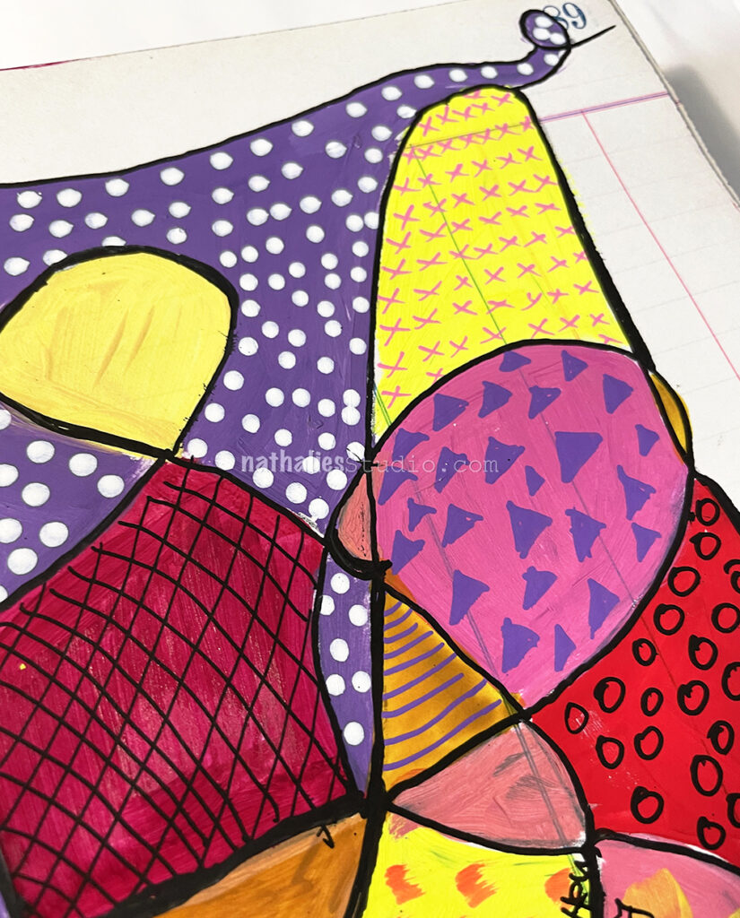
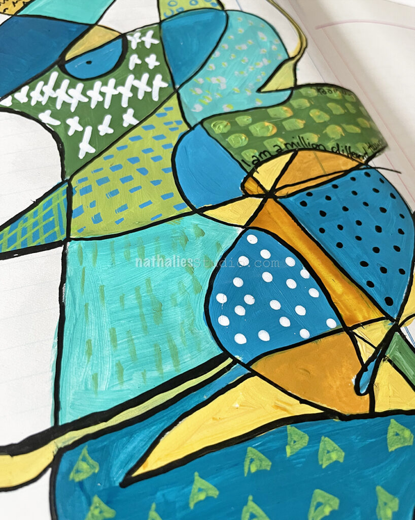
Again, I just used a pencil playfully in one continuous line over the page and then painted in the shapes with different acrylic paints. For the mark making and pattern making I used Posca and Liquitex markers.
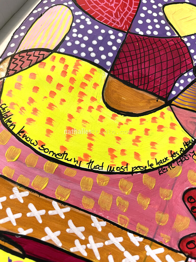
“Children know something that most people have forgotten.” – Keith Haring
I had some fun just scribbling with a pencil and then filling in the different areas with different bodied acrylic paints – from fluid Golden, to soft body Liquitex, to heavy body Liquitex acrylic paint. I made marks with a brush but also used Posca and Liquitex markers.
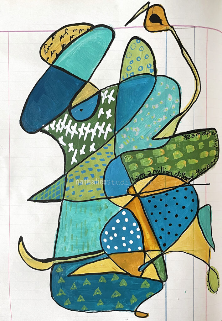
I loved how for me this kind of dude started to show up – tongue, nose, eyes and a funny hat included :) What do you see?
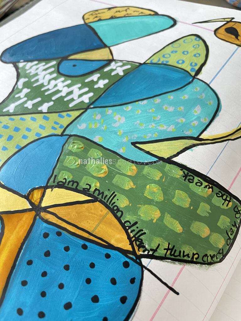
The quote reads – “I’m a million different things every day of the week.” – Cecelia Ahern
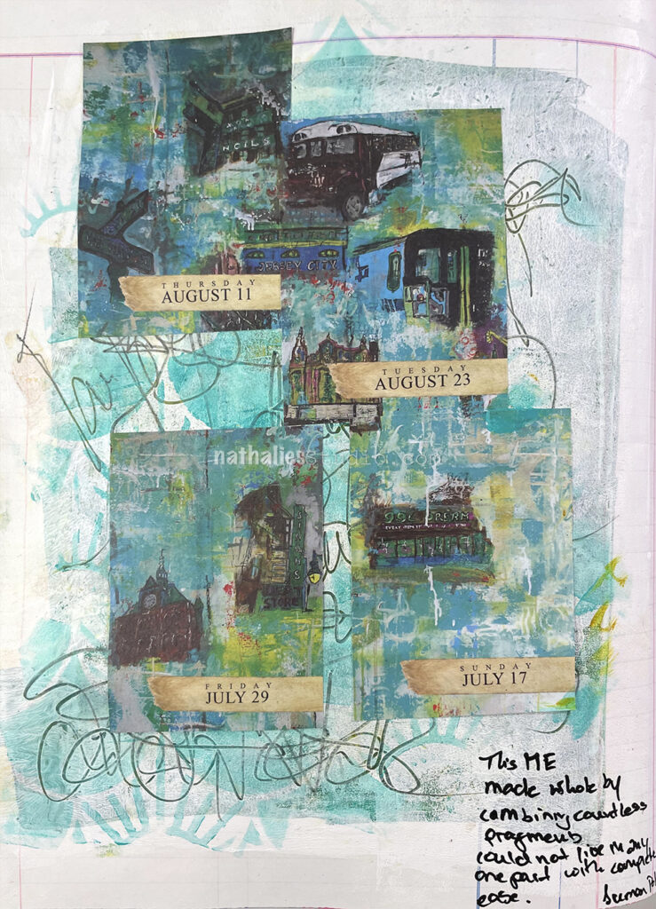
could not live in any one part with complete ease.”
– Suman Pokhrel
I added some leftover greens and yellow acrylic paints to the background, then brayered white acrylic paint over it. I used a pencil to scribble some neighborhood names into the still wet paint, layered my Art Deco Summit stencil over and used a cosmetic sponge and teal acrylic paint over it. The scribbles are still showing and I love the texture.
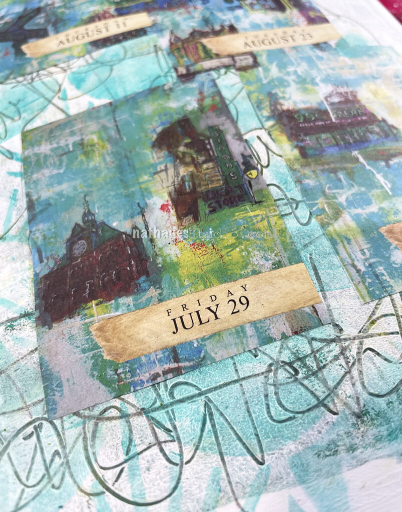
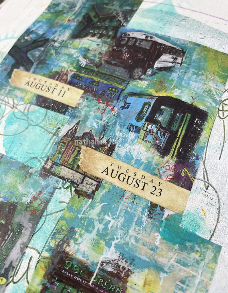
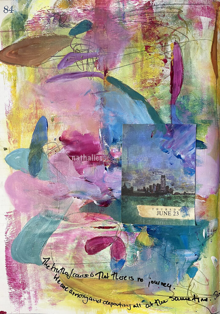
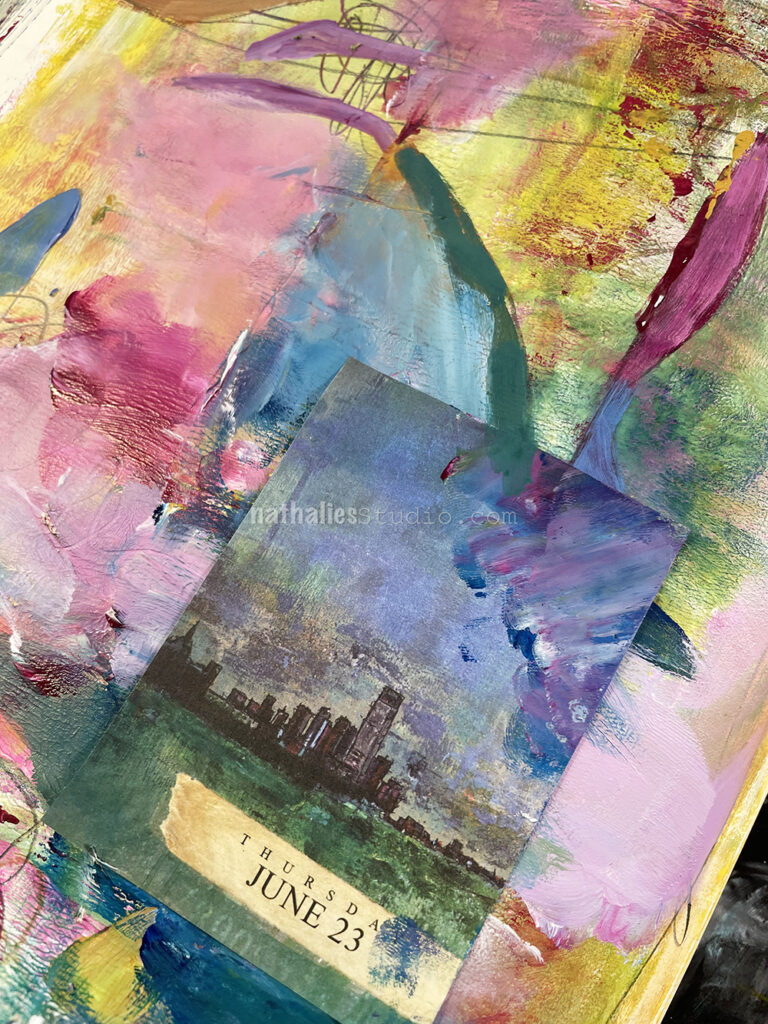
I added the different almanac pieces (from the sold out 2022 Artist Almanac Calendar) which were taken from a big painting I once made about Jersey City. Some of the images are of buildings or sights that either do not exist anymore or have changed significantly over the last couple of years since I painted the original painting, titled 99 Cent Dream.
I included in this art journal spread one of the Artist Almanac Calendar pages featuring my Two Tallest painting of both the Jersey City and New York City skylines. Although the calendar and original painting are no longer available, you can still pick up a giclee print of the work and enjoy the scene :)
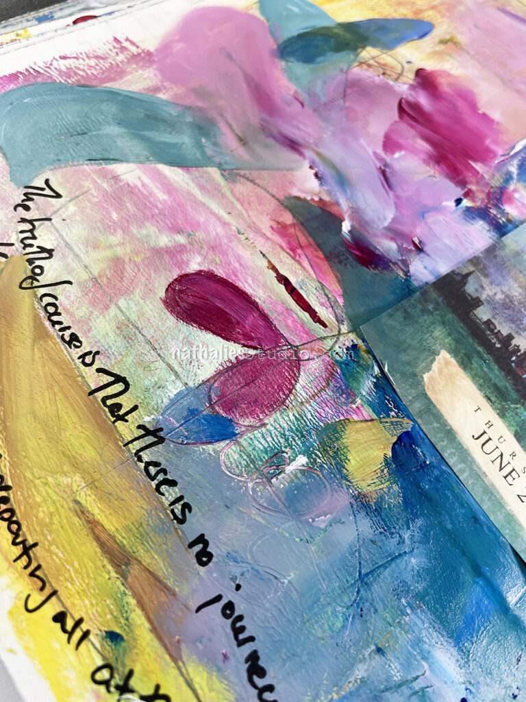
The background here was just some loose layering of leftover acrylic paints with a brayer. Then I used a pencil into the wet paint to create some intersecting scribbles. I used the same colors again to fill in some of those shapes that appeared, with a brush and with a finger- it was a fun and freeing to play.
“The truth of course is that there is no journey. We are arriving and departing all at the same time.” – David Bowie
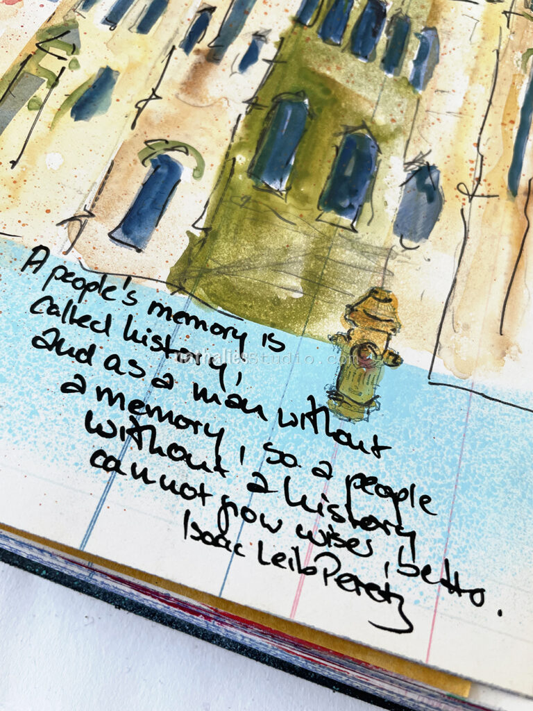
This study for a painting depicts a Synagogue that is now a Baptist Church in my neighborhood – a very intriguing building. I used spray paints, my new fav Caran D’ Ache water soluble pencil set, Art Graf water soluble tailor chalk, and a black fine Posca marker. I also used my Hydrant rubber stamp to help set the scene.
I love the history you share with your ‘strolls’ and your ART.
Sharing what you see and what you have learned…things I would never see or know
without you.
THANKS


Nat, I just love how the street came out!
Reply