Blog: Stamps

Be Brave Art Journal Page and Stampendous Giveaway

STM_NatNfriendsSummerHop_FBpost

Today is the last day of the Nathalie Kalbach & Friends Stampendous Summer Hop – so much fun :)

What better way to celebrate summer than with some summer colors, I thought and created this Art Journal spread with all kinds of bold summer colors and different sets of the stamps I designed for Stampendous.

BeBrave_NatKalbach01

I layered some acrylic paint onto my art journal pages and set it aside for later. A list of all supplies can be found at the end of this post.

BeBrave_NatKalbach05

For the Bird, Elephant and Urban Scribble image I wanted to create my own patterned paper and I love to use deli paper for this because it is cheap and thin enough that you can use it to wrap up small presents, and can be used easily as collage material in your mixed media art work. I used the same colors over and over again, first adding big patches of colors to the deli paper, then stamping with acrylic paint and all kinds different Rubber and Foam Stamps. Later I layered some of the stencils which are included in my stamp sets on top to tie some areas together. Last but not least I used the Urban Scribble rubber Stamp and black archival ink and stamped randomly here and there.

BeBrave_NatKalbach06

I traced the Foam Stamps onto the back of my new patterned paper and cut out an elephant, bird and the urban skyline. I glued all the cutouts down onto my earlier painted art journal spread using Matte Medium and a cosmetic sponge. Then I added a couple more marks and colors to the page and outlined the shapes in a sketchy manner. Added some Journaling- and voila :) It was a lot of fun to just play with all the different stamps. I cannot wait to make more patterned paper to use this way for wrapping paper – a good way to use up some of your left over paints and stamp off your inked stamps. Here are the details of the elements on the finished page

BeBrave_NatKalbach02

BeBrave_NatKalbach03

BeBrave_NatKalbach04

I hope you enjoyed this fun and colorful post :)

STM_NatNfriendsHop_prize

Do not forget that you can win all three of my Stamp Sets by commenting today on the blogs with projects of my stamp sets in this list from the whole week. Check out all those amazing projects my friends posted – I am blown away:

Stampendous Blog Post Monday

Pam Bray Monday

my blog – Creative Squad – Cheiron Brandon on Tuesday

Katy Leitch on Tuesday

Stampendous Blog on Tuesday

Stampendous Blog Post Wednesday

Gwen Lafleur Wednesday

my Creative Ice Breaker Wednesday

Louise Healy Wednesday

Stampendous Blog Post Thursday

Rae Missigman Thursday

Marsha Valk Thursday

Katy Leitch on Thursday

Allison Heikkila on Thursday

Mark Gould on Thursday

Stampendous Blog Post Friday

Tina Walker Friday

Pam Bray Friday

Lea Fritts Friday

Katy Leitch on Friday

Tenia Nelson on Friday

my blog- you are here :)


Have a wondeful day and good luck!!! Stampendous and I will post about the winner on our blogs next week!

Here are all supplies including the stamps I used (some are affiliate links).

SuppliesCJS


Comments (35)

  • Linsey

    |

    Oh goodness! Your art journal pages are SO gorgeous and completely inspiring!!! Thank you so much for sharing your awesome creativity and talent and for coming together to bring your fans this super cool mixed media hop!! I’m thoroughly enjoying seeing your marvelous designs come to life!!!

    Reply

  • D.Ann C

    |

    Oh, I have a serious crush on your user of neon colors!!! I have also developed a serious crush on your stamp/stencil sets this week. Can’t wait till my budget let’s me indulge in getting some!!! -FL

    Reply

  • Leadonna Fritts

    |

    I absolutely love your style of creating, Nat. Like me, you love color and it shows beautifully in your work. Your art journal pages just speak to my heart. Thank you for sharing!

    Reply

  • Janet Staples

    |

    I LOVE this! So bright while being subtle and bold! Brilliant. I’m glad I ran across this…can’t wait to see the other artists’ interpretations! Thank you so much for all of your inspiration Nat!

    Reply

  • nicole n

    |

    Love all of the bright colors and the elephant!

    Reply

  • Jackie Schachter

    |

    When I reached this page I just said to myself “wow’. Love the
    brilliant colors of the backgrounds and stamps. You and your
    designers are so talented. Have enjoyed this week’s blog
    hop – it was fun. TFS.
    Jackie, Tel Aviv, Israel

    Reply

  • Sarah P.

    |

    The journaling pages are so colorful and make a statement. I love them, they catch your eye for sure.

    Reply

  • jacqvz

    |

    So inspiring! Love the hold colors!

    Reply

Leave a comment

Creative Ice Breaker – Morning Art Journal Play Video #2

In the mornings I play in my art journal to get myself into the creative groove and break the ice – so to speak- and get ready to paint. I recorded and fast forwarded my morning ritual – and hope you enjoy it. Take it as what it is – a morning art journal play- not a tutorial ?

Creative Ice Breaker June 2016 from Nathalie Kalbach on Vimeo.

Here are the supplies I have used in my Creative Ice Breaker video above – some links are affiliate links.

SuppliesCJS

I hope you enjoyed the video ? Have a wonderful and creative day

Comments (30)

  • Teresa Godines

    |

    Love all of your great colors. TFS

    Reply

  • Deborah S

    |

    Wow what a great way to start your day kind of like stretching before your morning run. I really enjoyed your video it was very inspiring. I can’t seem to find my way into mix media. My style is to controlled and stay in the lines. I guess I just need to be brave and jump in. What do I have to lose right. OBTW you ARE the best, best colorer lol tfs!

    Reply

  • Christine Dring

    |

    Gorgeous journal page! Love your sentiment – very empowering!

    Reply

Leave a comment

Elephants Never Forget – Gwen Lafleur

CS May Elephants Never Forget

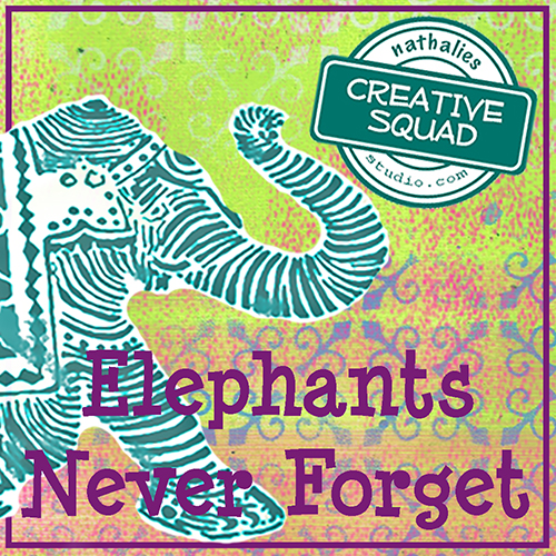
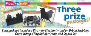
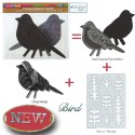
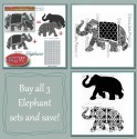
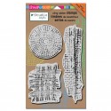
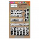
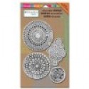
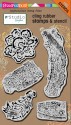
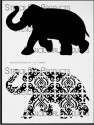
Happy Tuesday! It’s time for my Creative Squad to share a project with you with this month’s new theme: “Elephants Never Forget”. Throughout the month of May, the team will use my new Elephant Foam Stamp, Rubber Stamp and Stencil Set to interpret the theme. I asked them to draw from a childhood memory, and to use the elephant as a symbol of something that fascinated them as a child, inspired awe, or just got their little brain all wrapped up with wonder. And if you want to hear a little bit about my childhood, you can read about my personal connection to elephants here (just scroll down to “WHY an elephant…”) :)

Today we have a super vibrant art journal page from Gwen Lafleur. As a travel enthusiast, her interpretation of the theme is definitely close to my heart.
—————————————————————————————————

Gwen May Headshot

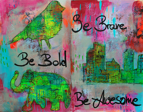
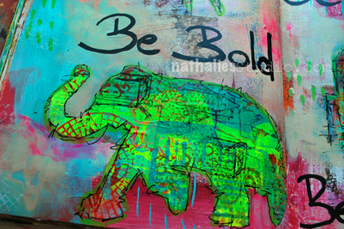
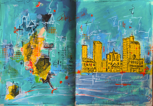
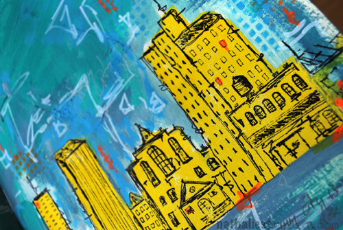
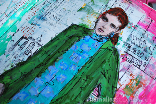
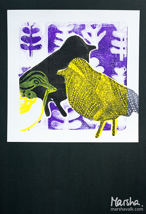
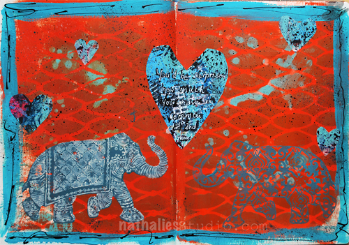
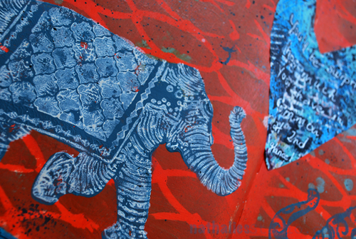
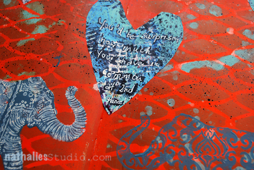
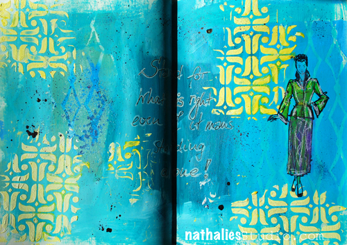
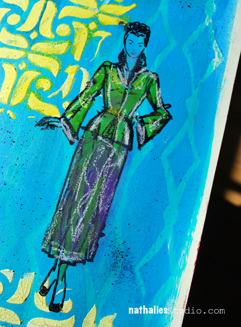
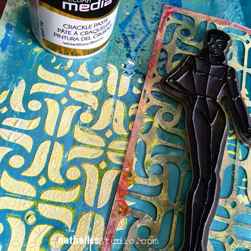
With this month’s theme of working from a childhood memory that fascinated me, the Elephant Stamp & Stencil set couldn’t have been more perfect! In my art journal spread, the elephant represents this memory and the object of my childhood inspiration perfectly. The memory that jumped out at me was one of me laying on the floor of our living room on my stomach poring over a book. Not just any book, but “Lands and Peoples of the World.” I was obsessed with it, and this particular scenario played out many times. Looking back, the book probably wasn’t all that great – the cover was brown with a photo of a tribe of some kind, and most of the pages were black and white. I’m guessing it was printed in the 70s. But it enthralled me completely. I can’t remember precisely what it was that I loved about it, but I think just the idea of all of those places and cultures that were so different from what I knew, really captured my imagination. As an adult, I’ve been blessed to take that fascination and act on it, traveling all over the world and seeing many of those places and cultures first hand. I’ve since looked for it at my parents’ house on many trips home, and have finally accepted the fact that the book is gone, but the memory remains. As for that childhood fascination with exotic locales? Some things never change!

Never Forget - Art Journal Spread - Gwen Lafleur - wm

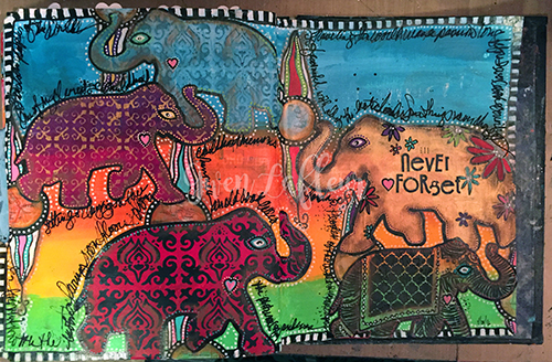
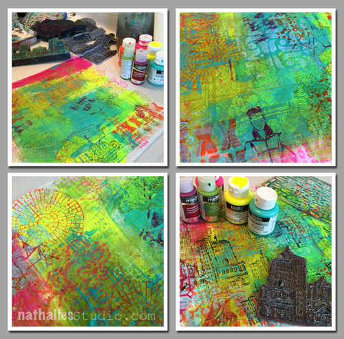
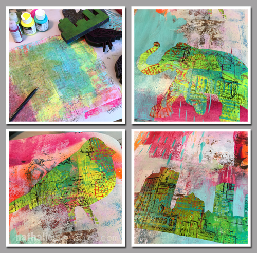
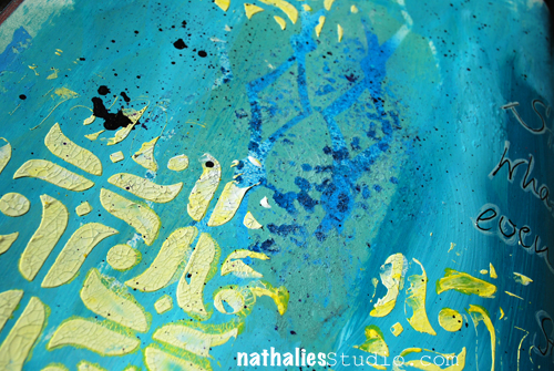
For my art journal pages, I decided I wanted to go really bright to represent all of the intense colors and patterns of many of the places I dreamed about visiting and have since gone to. I painted some stripes of paints in different shades of blue, yellow / orange, and green acrylic paint – all different brands, I just randomly grabbed what I had.

Never Forget - Art Journal Spread Step 1 - Gwen Lafleur

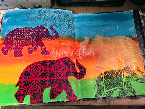
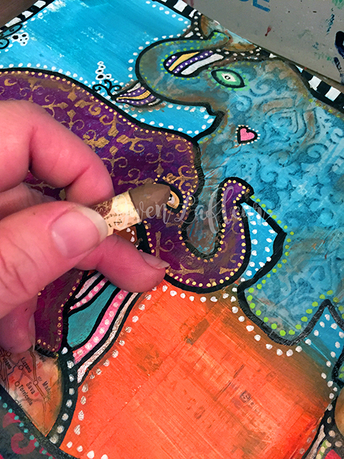
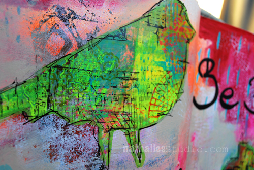
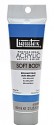
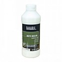
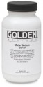
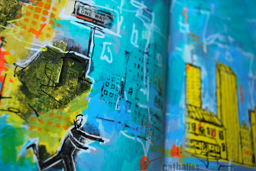
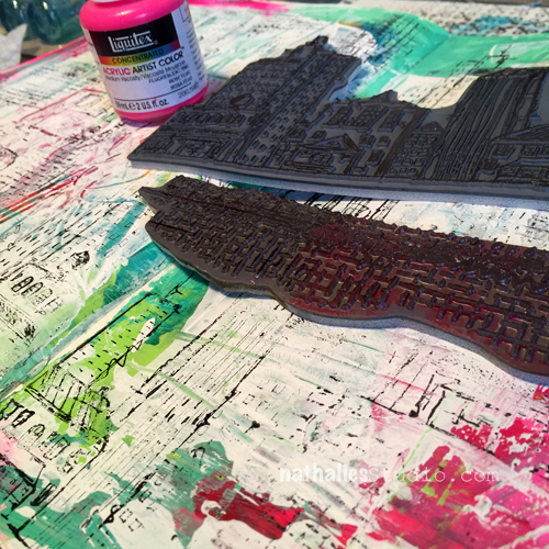
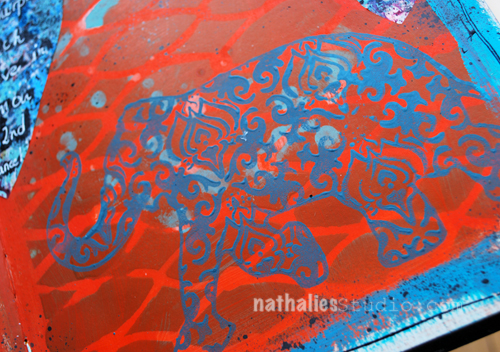
Then I used all three of the stamps in the set to stamp out elephants on to deli paper. I used paint with the foam stamps and black Archival Ink with the rubber cling stamp. I used the stencil from the kit on top of the plain stamped elephant to add some pattern with gold paint. Then I pulled out Nathalie’s Elephant Parade stencil that matches this set and stenciled the larger open elephant with Golden Gold Iridescent heavy body paint, and I stenciled the patterned version with black acrylic paint onto a red background. I cut out each elephant and adhered them onto the background with Golden Matte Medium.

Never Forget - Art Journal Spread Step 2 - Gwen Lafleur

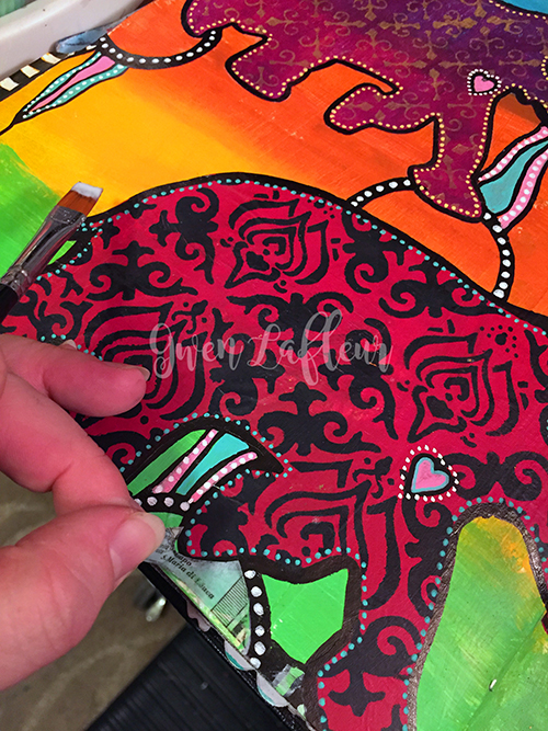
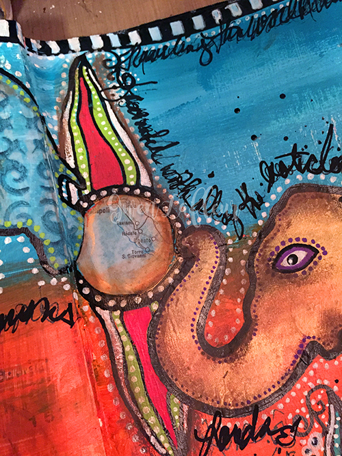
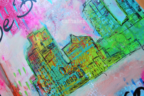
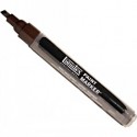
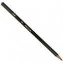
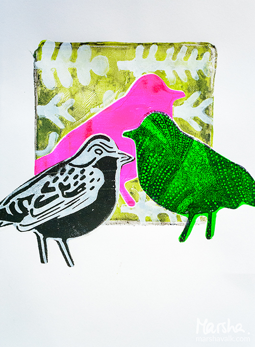
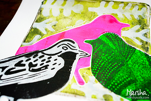
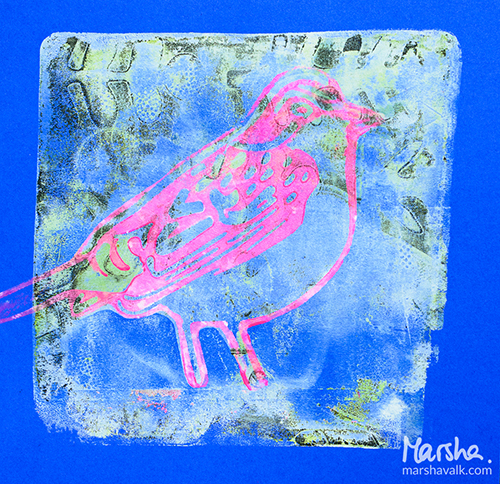
Next, I started adding details. I used a black PermaPaque marker to outline each elephant. I also added some embellished circles to connect and ground the images. I colored in the different sections with various paint markers and started adding dots. I knew I wanted to use maps on the page to reinforce the theme, and I wanted to put them in the middle of each of the circles. Since I needed to be able to see through and trace the area to cut out, I decided to do a quick packing tape transfer. I just put two strips of clear packing tape over a section of a map. Then I soaked it in warm water until the paper on the back started to pill when I rubbed it. I gently rubbed off all the paper leaving just the image on the tape. This made it pretty transparent, so I traced the shape of the circles onto the tape with a Stabilo All pencil and cut them out, then adhered with more matte medium.

Never Forget - Art Journal Spread Step 3 - Gwen Lafleur

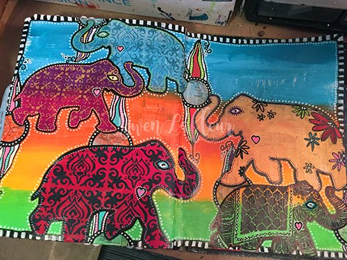
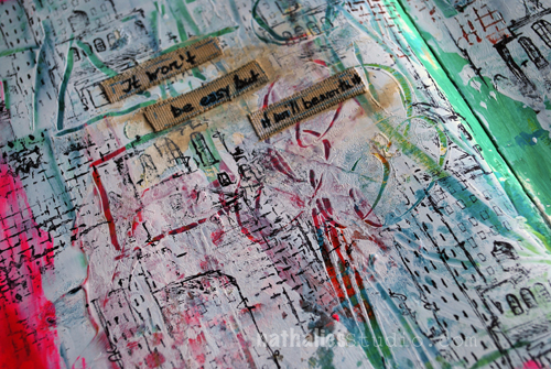
For the third phase, I added white dots around everything to create unity on the page, and went through and added a bit more detail here and there. To add depth to the piece, I used oil pastels to put in a bit of shading. I really like using these on top of acrylic paints; you just have to be careful not to put them where you want to add more layers or acrylic or do any writing – the paint won’t stick to it and the pens won’t write on it, so this needs to be one of the top layers.

Never Forget - Art Journal Spread Step 4 - Gwen Lafleur

Finally, I used some old rubons to add a title to the page, then just went around randomly adding writing around the elephants and journaling about this memory.

Never Forget - Art Journal Spread Close-up 1 - Gwen Lafleur

I hope you enjoyed today’s project! I’m really looking forward to hearing about the rest of the team’s memories, and hopefully some of you will play along as well!

—————————————————————————————————

Oohhh this is so much fun!  I love all the ways Gwen incorporated the Elephant stamp in her page and her use of pattern definitely suggests exotic far-off places. I hope she finds that book again!

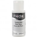
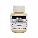
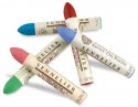
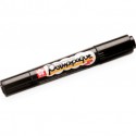
Besides the supplies listed below, Gwen also used acrylic paint, markers, maps, clear tape, and old rubons:

SuppliesCJS

And maybe you will even play along -we would love to see how you interpret the theme. Email me how you used my stencils and stamps with the theme and email me an image – I would love to share what you did at the end of the month!

See you next Tuesday for the another project from the Creative Squad, with the theme Elephants Never Forget.

Comments (4)

Leave a comment

Nathalie Kalbach & Friends Blog Hop – Win all three Stamp Sets!

BLOG TEMPLATE[20]

Woot Woot- so stoked that the Stampendous Design Team and my wonderful Creative Squad is doing a blog hop together this week. It always is my favorite thing to see how others use my stamp and stencil designs – makes me so happy. Loads of yummie projects – check it out!!!

Here are the links for today:

Louise Healy 

Janelle Stollfus

Marsha Valk

Gwen Lafleur

Michelle Rydell

Cheiron Brandon

Lea Fritts

Pam Hornschu

Stampendous Blog

I thought I would play along with my awesome team’s theme this month “My City Speaks To Me” and I used the Urban Scribble Stamp Set as well

NatKalbach_FollowShinyBall01

My city – Jersey City – is such a city of juxtapositions. Grungy – Spotless, Old – Modern, Artsy – Financial, Jersey – NYC, Loud – Calm ….and so much more. I love it – it is such an inspiring place to live.

NatKalbach_FollowShinyBall03

I stamped with the solid side of the Urban Scribble Foam Stamp and yellow acrylic paint into my art journal and then used the Rubber Stamp with black ink to stamp over it. The Solid Foam Stamp and the Rubber Stamp pattern fit perfectly together. I painted the background and for the grungy side on the left I used the rubber stamp on purpose rudimentary and in a non perfect manner to enhance the juxtaposition of the two sides.

NatKalbach_FollowShinyBall02

Watch this video if you want to know how to apply acrylic paint to the foam stamps:

Rule of Three – #1 “Three Ways to “Ink” up Foam Stamps from Nathalie Kalbach on Vimeo.

Check out all the wonderful posts, comment on any of those posts and win a price and join us :)

STM_NatNfriendsHop_prize[8]
Stampendous is offering three prize packages that consist of ALL THREE of the foam/cling/stencil sets. THEY’ll ship them to anyone who wins (yes, internationally, too) just comment on this post here or any of the posts the teams or Stampendous or here to be eligible to win. Good luck!!!!
Thank you so much for visiting- I hope you like my new Bird, Elephant and Urban Scribbles Foam, Cling Rubber and Stencil Sets ! Have a beautiful and creative weekend!

Comments (32)

  • Keitha

    |

    Love all three sets Nathalie; it will be hard to decide which one to get first. Great blog hop!

    Reply

  • Agata

    |

    Such a beautiful layout you have created! Love your products!

    Reply

  • Tracy Moloney

    |

    EXCITING pages, your city is ALIVE – LOVE IT!!!
    THANK YOU for sharing your video too, these sound like such an ADVENTURE to CREATE with :)
    Tracy from Australia

    Reply

  • robynseaniger

    |

    I love these new stamps Nathalie and I thoroughly enjoyed using them at your recent Mixed Media Circus Workshop at Darkroom Door. I know I need these for my art journaling :)

    Reply

  • Sandra L.

    |

    Love your project and love the stamp set. I live in New Jersey and you summed up your area perfectly. Thanks for sharing.

    Reply

  • Gayle Kush

    |

    Love your tutrials and all the things you so graciously share with all of us on your blog. Including your friends in the form of this blog hop! Thank you for the tips on inking your stamps. I work in fabric but almost everything you do I can use in my fiber arts adventures. I love your stamps and use them all the time in my work. Thanks again!

    Reply

Leave a comment

Won’t Be Easy or … In My Art Journal Today

AJKalbachWorthIt01

“It won’t be easy, but it’ll be worth it”

I have to remind myself ;) This page started actually out as a demo page in class and I had shown my students how to apply gesso over a pre-painted page and then scratch into the still wet gesso to reveal the under layer. This is a technique called sgraffito.

AJKalbachWorthIt034

Once the gesso was dry, I stamped loosely parts of the Urban Scribble rubber stamp and parts of the Mish Mesh stamp onto the background.

AJKalbachWorthIt02

I cut some self adhesive canvas sheet for journaling, fringed the edges and added some titanium white before journaling because i didn’t like the stark white of the canvas pieces.

AJKalbachWorthIt03

It was a fun page ….actually easy and still worth it ;)

Here is a list of the supplies I used:

SuppliesCJS


I wish you a wonderful day !!!


Comments (1)

Leave a comment

Opposites Attract – Marsha Valk

CS Opposites Attract logo

It is another Tuesday and therefore time for my Creative Squad to show you a fun project. The theme for March is Opposites Attract and the team will use my new Bird Foam Stamp, Rubber Stamp and Stencil Set. Just as opposite colors on a color wheel highlight one another, or yin and yang fit together so comfortably, sometimes the best is brought out when we celebrate extreme differences!

We’re very excited to share with you the very colorful, layered mono prints by Marsha Valk.  Take a look at her nifty interpretation of our theme!

—————————————————————————————————–

Marsha March Headshot


My thoughts on the theme ‘Opposites Attract’ were positive vs. negative and opposite colours on the colour wheel. And that immediately made me think… monoprints!
MarshaValk_nStudioCS_OppositesAttract-2
I started with sketching different placements on a scrap of paper so I could figure out how many masks and stencils I would need of the bird shape. Turned out I needed one stencil and three masks. I made them by stamping the solid foam bird shape onto transparencies and scraps of paper and then cutting them out.
MarshaValk_nStudioCS_OppositesAttract-5
I decided to use my 6 x 6 inch Gelli Plate so I could have a nice white border around my monoprinted images. I started with the yellow/purple print: added black acrylic paint to the Gelli Plate, put my handmade bird stencil on top, masked off part of the stencil with a handmade bird shape mask and then pulled the print and cleaned the plate.
I added yellow paint to the plate, positioned my bird stencil on the print with repositionable adhesive, pulled another print and cleaned the plate.
MarshaValk_nStudioCS_OppositesAttract-4 ver2
When the print was dry I masked off three birds on the paper using repositionable adhesive. Then I added purple paint to the Gelli Plate, created a pattern on top using the stencil and masks that come with the Bird Foam Stamp and pulled a print on a scrap piece of paper. Then I removed the stencil and masks and pulled a ghost print with my original paper.
Once I had removed all masks and any adhesive residue that was left on my print, I stamped the foam stamp bird with yellow paint on top of the negative (white) bird shape and the cling rubber bird with black ink on top of the yellow bird shape.
MarshaValk_nStudioCS_OppositesAttract-3
The second print was created in a similar way, but this time my black ghost print background didn’t work out as I wished. So I ended up adding another green colour and I stenciled the plant shapes over it with white paint.
MarshaValk_nStudioCS_OppositesAttract-6
The last print on blue paper was a ghost print that I pulled to clean the Gelli Plate and that I stamped over with the foam stamp bird.
MarshaValk_nStudioCS_OppositesAttract-7
Monoprinting like this is always a puzzle and rest assured that I had a few misprints too. I will keep those around for other projects! Whilst choosing my paint colours, I discovered that I hardly ever go for opposites on the colour wheel. It was fun to try this with a limited colour palette, out of my comfort zone!
MarshaValk_nStudioCS_OppositesAttract-1
———————————————————————————————————
I love how Marsha showed how to use all three stamp surfaces together, by creating a reverse print of the solid foam stamp, and using the patterned side of it to stamp on top.  The layering and colors are super intriguing.
Besides the supplies listed below, Marsha also used black and blue cardstock to create these prints:
SuppliesCJS


Maybe you will even play along -we would love to see how you interpret the theme – email me how you used my stencils and stamps with the theme and email me an image – I would love to share what you did at the beginning of next month!

See you next Tuesday for the another project with the theme ‘Opposites Attact’.

Comments (6)

Leave a comment

At 2nd Glance or … In My Art Journal Today

2ndGlance01_NatKalbach

“You’d be surprised how much you have in common at 2nd glance!”

On this page I used teal acrylic spray paint over a stencil and then covered the spread with translucent orange acrylic paint taking off some of the paint while still wet to reveal the color underneath.

2ndGlance02_NatKalbach

I stamped the silhouette side and the pattern side of the Elephant Foam Stamp with baltic blue acrylic paint onto the art journal spread. For the elephant rubber stamp, also in the set, I applied paint through a dauber bottle and then stamped on top of the elephant silhouette created with the foam stamp. I had mixed the paint in the dauber using 1/2 of Unbleached Titanium White Soft Body Acrylic Paint and 1/2 Titanium White Acrylic Ink. I love the texture the dauber creates but also the easy application method.

2ndGlance03_NatKalbach

Then I painted a turquoise border -actually only to try out the new paint I had just received ;)  Next I cut heart shapes out of a sheet of deli paper which I had used to run off paint and stamps while demoing and applied them with some Matte Gel Medium.

I flicked some black ink with a brush to tie the hearts into the background and added some black lines with a fine liner to the border. The fineliner is filled with a mix of 1/2 Black Carbon Acrylic Ink and Mars Black Soft Body Acrylic Paint.

The journaling was added with a black acrylic marker overwritten with a white Signo pen – my go to pen when it comes to white journaling pens.

2ndGlance04_NatKalbach

Here is a list of the supplies I used:

SuppliesCJS

Can you tell I am still obsessed with elephants? What animal do you like to use in your art?

Comments (3)

Leave a comment

What’s Right or … In My Art Journal Today

WhatsRight01

“Stand for what is right even if it means standing alone!”

For this art journal spread I used my new DecoArt Media Acrylic Paints which the wonderful people of DecoArt sent me to try out. They are fluid and most of the colors in this range are transparent or translucent which makes for some nice and interesting layering effects as you can see where I played with a hand cut diamond stencil in the background.


WhatsRight02

I used my new Fashion Dame Stamp Set

Fashion Dame Stamp Set

and layered the three included stamps – the dame, her skirt and her jacket on top of each other – stamping with archival ink and then painted it in with  DecoArt Media Acrylic Paint and some Derwent ArtBars.

WhatsRight04

I also used the stencil in the stamp set and mixed white DecoArt Crackle Paste with some Primary Yellow Acrylic Paint and scraped it with a palette knife over through the stencil. I might have squealed a little bit …after a short drying time these tiny little perfect cracks started to appear and oh boy…I think this Crackle Paste and I just became buddies!

WhatsRight03

It was fun playing with new paints and a new medium! Not knowing a art medium a hundred percent frees you up to experiment and give new things a shot, it made for a great journey for this spread :)

What was the last new art medium you tried out?


SuppliesCJS


Comments (2)

Leave a comment

Put a Stamp on it or… Check it out

Today is all about stamps :) Stamps on Video and about Stamps in a podcast:

Christine Urias from ScrapTime visited me at the Stampendous booth at CHA – Check out her video of me

Screen Shot 2016-02-16 at 6.13.37 PM


Thank you Christine for coming by and doing such an awesome job every year to cover what is new at CHA – always fun to see you and Mark!

And now…if you are tired of seeing me …how about  listening to my kraut-accent on this Adventures in Arting Podcast hosted by Julie Fei-Fan Balzer. Julie, Rachel Greig and I talk about how we each started designing stamps, both the why and the how of how we each design stamps, the experience of seeing work that people make with our stamps, the appeal of stamping in general, and we give some stamping tips too!

Screen Shot 2016-02-16 at 6.20.48 PM


Thank you Julie for having me and to Julie and Rachel for this fun and interesting discussion about stamps.

I hope you enjoyed the visual and auditory stamp information !

Which kind of stamps would you love to see?

Comments (5)

Leave a comment