Art Journal

Do Things Different – Art Journal Spread

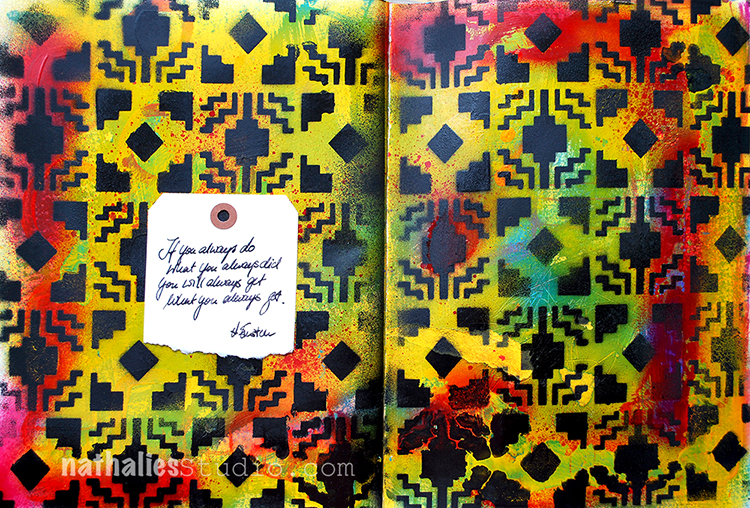
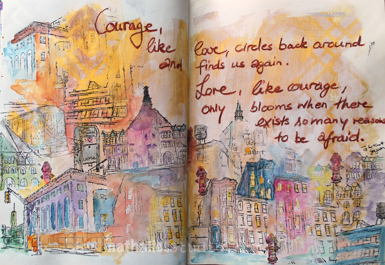
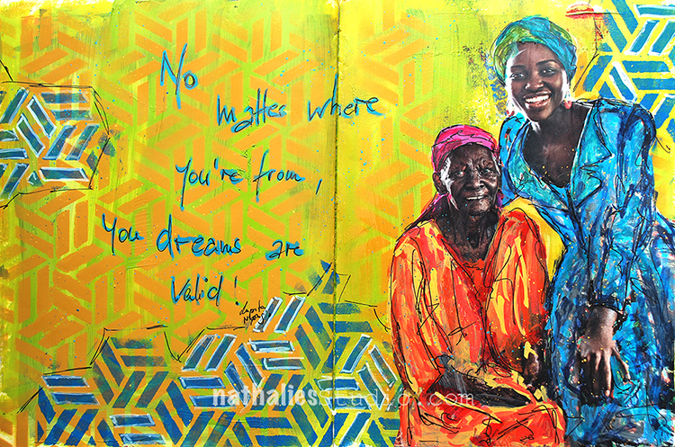
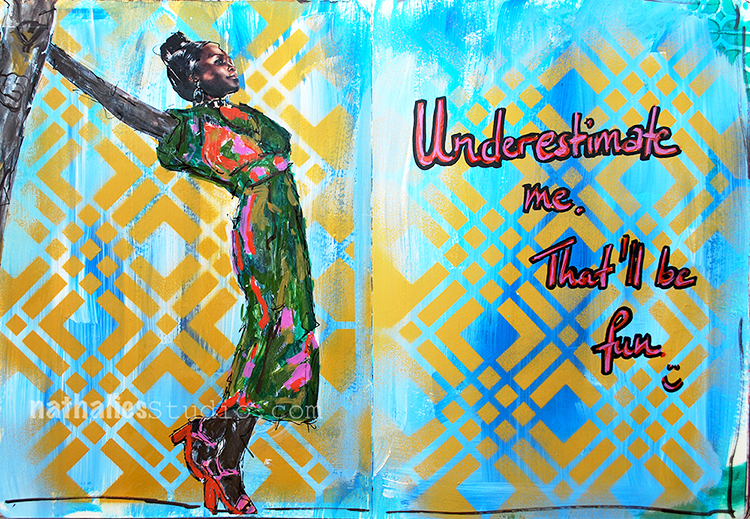
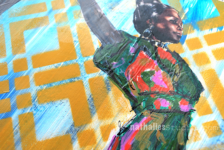
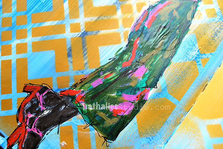
“If you always do what you’ve always done, you will always get what you’ve always got” attributed to many- including Albert Einstein. Regardless who said this…smart ! A good reminder to change things up once in a while!

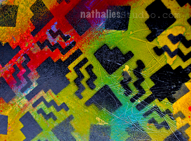
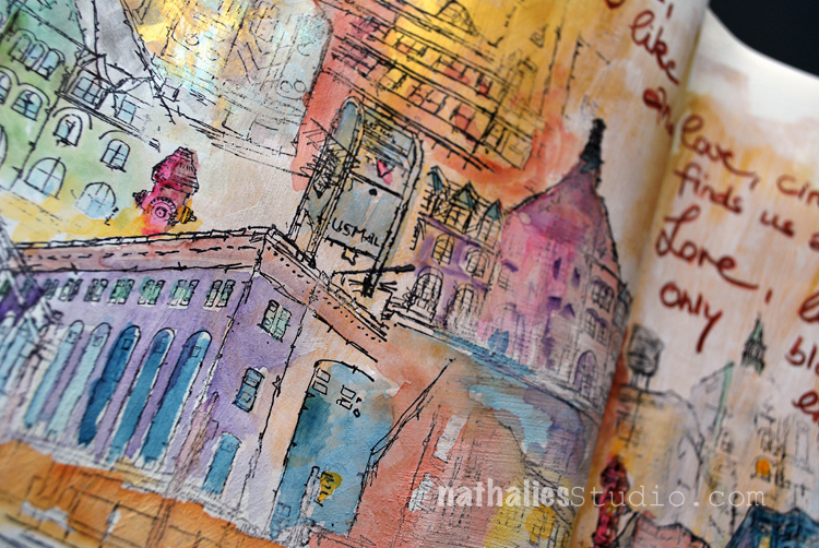
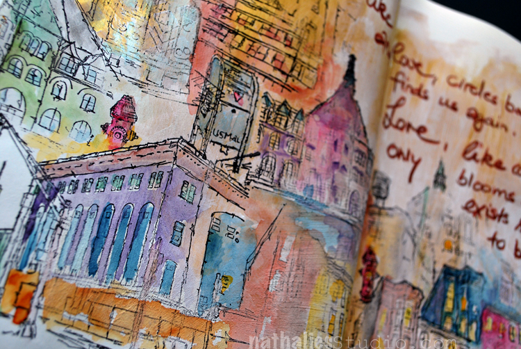
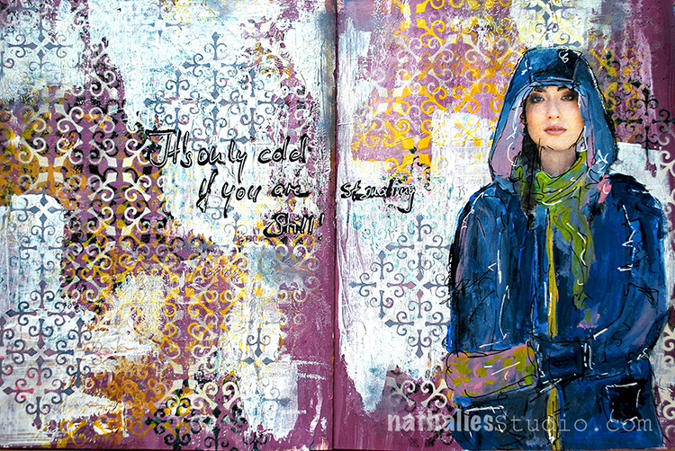
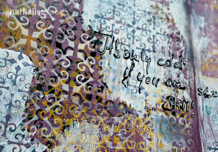
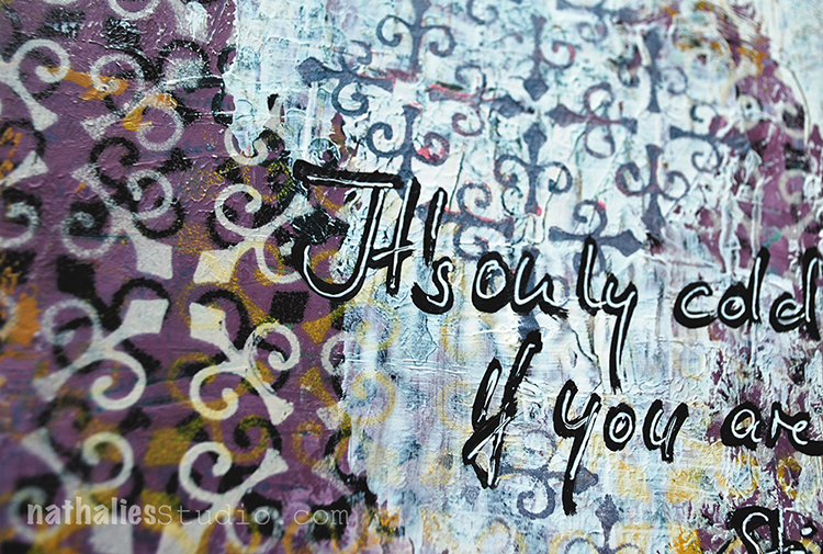
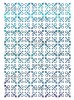
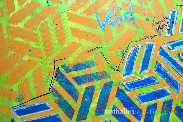
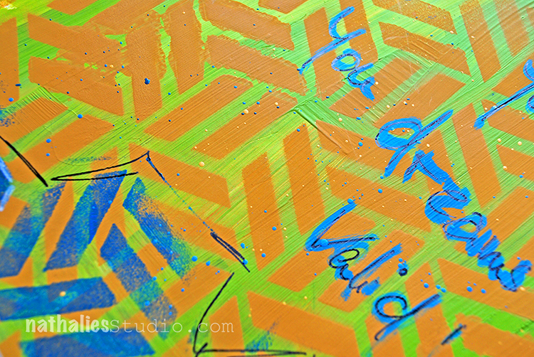
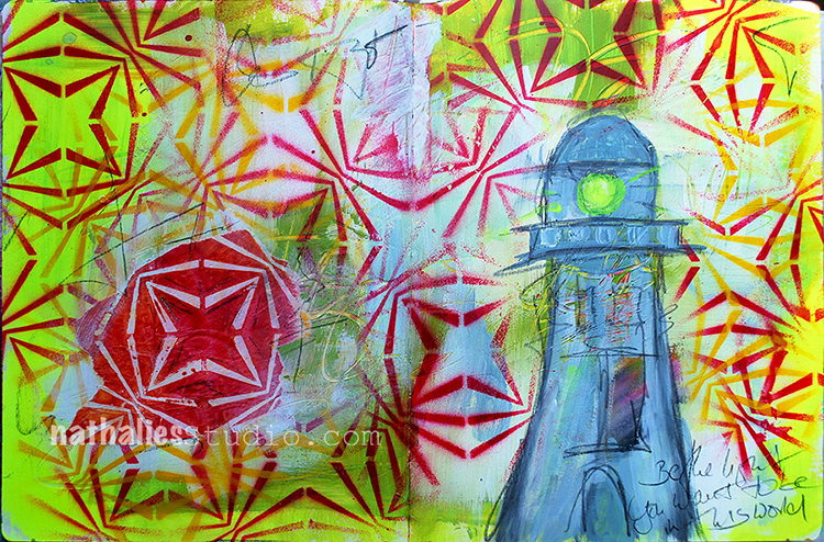
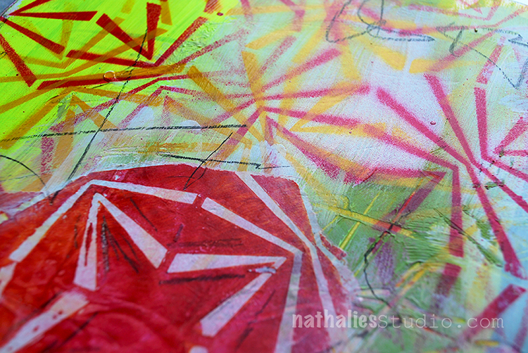
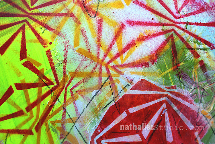
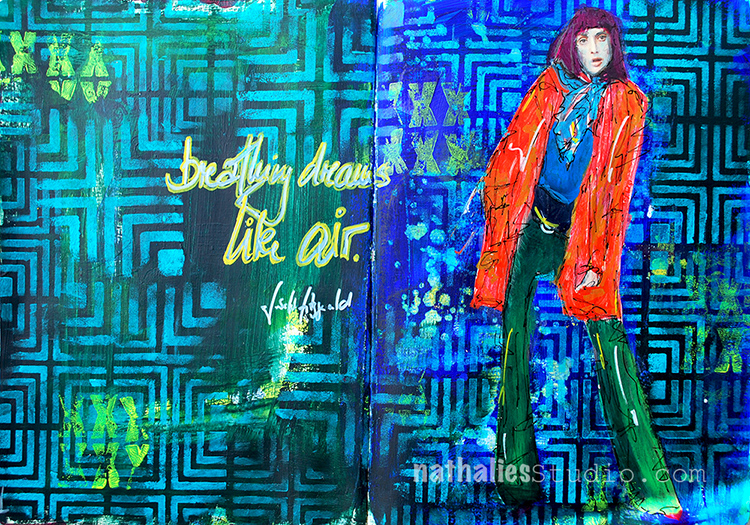
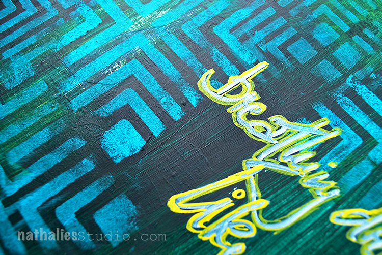
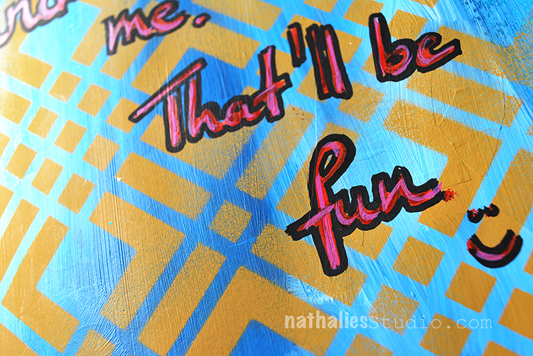
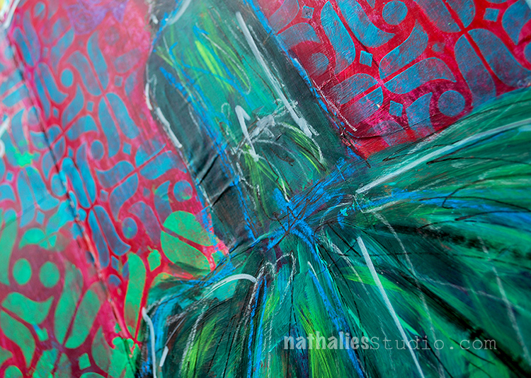
I saturated the background with different colors of acrylic spray paints and used the back of a brush to scratch some marks into it. I layered the Santa Fe 9×12 Stencil on top and sprayed over it with black spray paint. As you can see some of the areas – on the right bottom – are a little bit blurred- that is because I did not wait until the background was totally dried …- I am so impatient sometimes. But, I am ok with this. This page was a 10 minute affair and it made me happy to just do something creative that morning that was followed by loads of paper- and computerwork. 

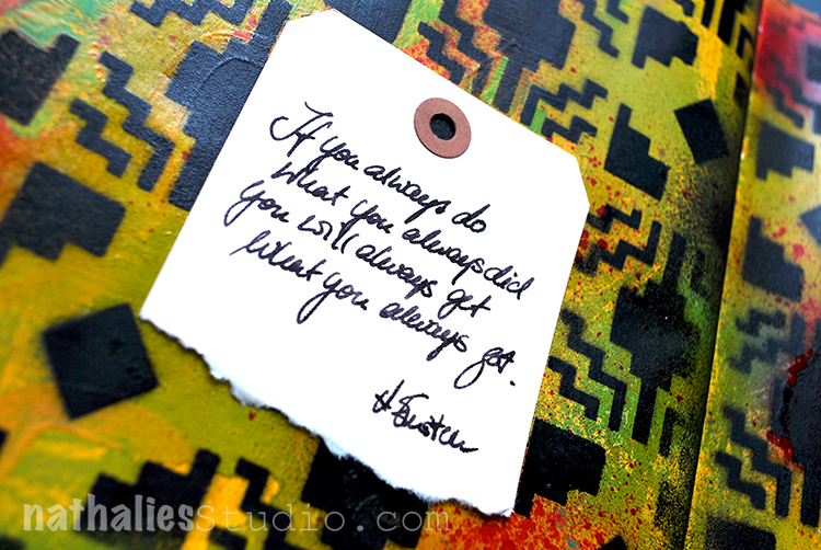
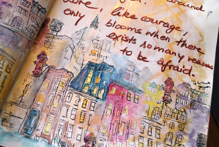
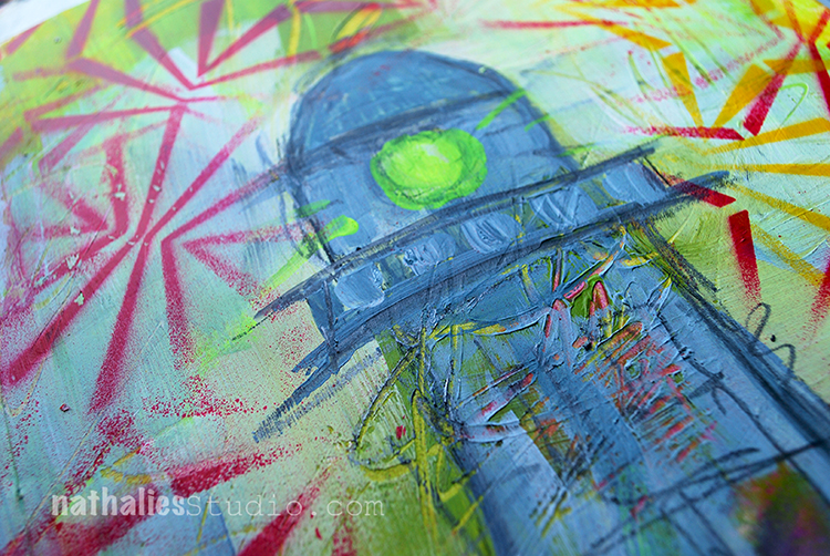
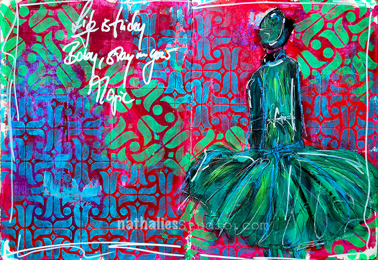
I tore a manilla shipping tag and added the journaling with my fountain pen. Anyone else still loves to write with a fountain pen, besides me? I just love the feel of a fountain pen.

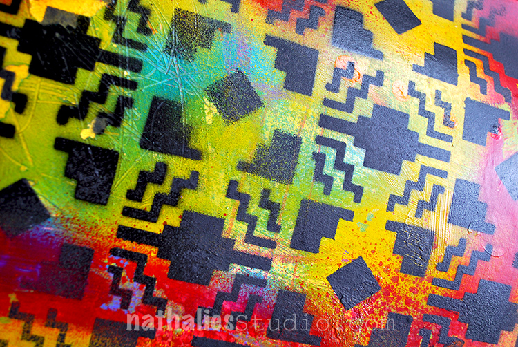
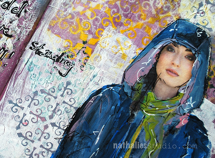
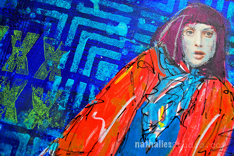
I like how the black pops the pattern off the colorful background. This spread makes me long for some traveling in the South West, yummie food and summer :)

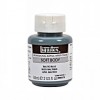
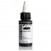
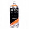
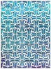
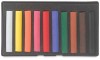
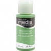
Here are the supplies I used for this super quick art journal spread- some links are affiliate links:


Wishing you a fantastic day!

Leave a comment

Courage and Love – playing with Watercolor in my Art Journal

“Courage, like love, circles back around and finds us again. Love, like courage, only blooms there exists so many reasons to be afraid.” Tyler Knott Gregson

I had such a wonderful time creating the page and playing and trying new things. I tested the Daniel Smith Gold Iridescent Gesso, which the wonderful people at Daniel Smith gave me for that purpose at Creativation and applied it loosely to the art journal pages. The gesso was thinner then I expected but oh my oh my once it dried the load of gold pigment fully revealed itself. And I was in Love.

Next I used my Chicago 9×12 Stencil here and there dabbed some white watercolor ground through it – and then painted the bottom of the page also loosely with the ground. Watercolor ground is a primer like Gesso which creates a porous surface on which you can later apply watercolor. I am totally intrigued by this medium and also bought a clear version to further play later and mix up watercolor and acrylics more in my work. I let everything dry overnight as it was stated on the jar.

Then I stamped with my Stroll Through the Hood set 1 and Stroll Through the Hood Set 2  and archival ink and created a city scene. I used the cling stamps and layered them up, using only parts of buildings- and just had a fun time with them.

And then I played with watercolor and just had a good time. I love how the watercolors pop off the background and how the white watercolor ground and gold elements are making it sparkly. I also love the texture created with the watercolor ground.

I added the journaling with one of the ArtGraf Graphite and went over it with a wet brush again. I guess I have a new crush …on watercolors …oh brother ;)

Here are the supplies I worked with  – some links are affiliate links:


Do you have a new art supply /medium crush this year?

Comments (1)

  • Julie B

    |

    This is absolutely STUNNING! Just stunning! Thank you for sharing your process……love the watercolors with your stencils and stamps; love the gold throughout. Hmmm…..you have me very curious about this medium. Thank you!

    Reply

Leave a comment

Don’t Stand Still – Art Journal

“It’s only cold if you are standing still!” – Let’s keep on moving :)

I painted the background with acrylic paint and then layered the New Orleans 9×12 Stencil onto it and moved it around using different colored spray paints. The New Orleans stencils were inspired by the beautiful wrought iron balconies, gates, and fences known as “Iron Lace” in and around the city of New Orleans. New Orleans was one of the cities I visited on my very first trip to the U.S. in 1994 – and I really have to go back – I loved it a lot.

I pushed back the background by scraping some gesso using an old gift card over certain areas of the spread and stenciled over those gesso-ed areas using the New Orleans 4×4 Stencil.

For the catalogue image that I pasted onto the spread I used markers and acrylic paints.

Which city have you been to once and really want to go back to?

Here are some of the supplies I used for the spread – some links are affiliate links


have a wonderful day!

Comments (4)

  • Julie

    |

    What lovely layers and great quote! thank you for the process….I have a page with too much gesso on it to push back the color. Laying down stencils over it is the perfect solution (I’m slapping my forehead as I can’t believe I did not think to do this LOL!) I love how the white marker makes the page & image pop (another “why didn’t I think of this). Thank you for the inspiration, as always.

    Reply

    • nathalie-kalbach

      |

      Thank you Julie! Yeah- got and stencil over that spread- hope you share what you did!!! hugs, nat

      Reply

  • Sandi Miaskoff

    |

    This piece is beautiful. And the way you integrate pictures from different publications is awesome.
    I have a question about that, when you use a marker or paint on an image, does the paper warp?
    Keep ’em comin’. Sandi

    Reply

    • nathalie-kalbach

      |

      Thank you so much Sandi! As for the wrapping – When I use an acrylic marker, I don’t have any problems at all as the flow of paint is pretty low. As for using paint – I make sure to dry brush the paint on and use not super fluid paint. So with all that I so far never had a problem with the paper warp. It can wrap more likely when I apply it to the background – so I try to do that slow and make sure I apply the gel medium evenly. Hope that helps Sandi! have a wonderful weekend, nat

      Reply

Leave a comment

A Stroll Through the Hood – Art Journaling Page

Strolling through my hood really makes me happy – I love my city and I love the inspiration I get from it. I wrote a little about these warm feelings towards my home city in this journaling spread. For the page I painted with white gesso over a spread which I had used before to clean off some paint during painting on a canvas. I applied the gesso in areas more like a wash, as I like to have the underlaying background showing through for visual interest, but it does look way better knocked back a lot.

I had used the Beacon 9×12 Stencil on a different art journal spread with spray paint and cleaned off the access paint on the stencil with a deli paper sheet, resulting in the negative imagery of the Beacon Stencil- I love it- I love both versions. I ripped out an area of the printed deli paper and applied it with Gel Medium to the Background.

I also used the Granada 9×12 Stencil after using it on a different spread to clean it off on this page. Since it has the same colored red spray paint those marks here and there add some nice marks.

I stamped  using black archival ink with the stamps included in the Stroll Through the Hood 1 and Stroll Through the Hood 2 and applied them around the page- I love how the black ink makes the images really pop off the page

I also used a red ink pad to stamp with the Love Knots Stamp here and there and to repeat the read color used yet again.

I like this spread a lot- it is a bit different from my usual very paint filled page – but I think you can still see me :)

Here are the supplies I used in this spread- note that some links are affiliate links:


Comments (4)

  • gerriejohnnic

    |

    Had to wipe my keyboard off…..I drooled on it staring at this print you made! Really, really love your work GF!

    Reply

    • nathalie-kalbach

      |

      LOL- Gerrie that made me laugh! Thank you so much for your sweet words! have a fantastic weekend!!!

      Reply

  • Joi@RR

    |

    Oh yes… even though it’s different – definitely can see YOU all over these pages Nat. And… this is SPECTACULAR. Love the openess but with so much dimension and hidden treasures to discover. One of my favorites now!! Xj.

    Reply

Leave a comment

Your Dreams Are Valid – Art Journal

“No matter where you are from, your dreams are valid” Lupita Nyong’o

I created this art journaling spread a couple weeks ago when I was making samples for my new stencil release and as I am writing this blogpost right now the quote resonates with me more than ever.

I used my new Kassel 9 x 12 Stencil with this spread. This stencil was inspired by the modern elements that can be found in Kassel, Germany (where I went to school for a couple years) , home to the Documenta art fair for modern and contemporary art.

I used this magazine image with Lupita and so I think a family member (I don’t remember anymore because I tore the image out of the magazine a while ago to use it later) and painted over it with acrylic paints and markers.

Hope you like the spread and the stencil :)

Here is what I used for it – some links are affiliate links:


Comments (6)

  • pandygirl12

    |

    I love this one, Nathalie. Your style really inspires me. I’m a self-taught novice when it comes to all of this. I did my first CJS this year and enjoyed it so much. Do you ever teach classes in the Raleigh, NC area?

    Reply

    • nathalie-kalbach

      |

      Janice, thank you so much! So glad you enjoyed CJS. I would teach in NC if I would get invited. I am always open to travel to teach. Hopefully some day. I always post my classes on my blog or on my Facebook page. HOpefully we will meet each other some day. Have a wonderful rest of the week, nat

      Reply

  • aksusan

    |

    Nathalie,
    Thanks for sharing this awesome quote and your beautiful page with us!
    s

    Reply

  • Cheryl

    |

    Oh, this is just wowzers! I love the color pops and dresses. Especially love the scribble details on both dresses. Awesome journal spread!!❤

    Reply

  • Barb Charlotte, NC

    |

    Just a note to tell you how much I enjoy your work. Thanks for sharing.

    Reply

Leave a comment

Be the Light – An Art Journal Spread

“Be the light you want to be in this world”

I love this quote – such a beautiful thought and call to action!

For this spread I used my new Beacon 9×12 Stencil . The stencil design itself was inspired by the gorgeous Art Deco era buildings known as The Beacon in Jersey City. It used to be a hospital and some people believe they are haunted. The Beacon towers sit on a hilltop not far from me and I can see them from the deck.

I used different colored spray paint through the stencil. I cleaned the access paint off the stencil by dabbing a deli paper onto it – you can see a torn out piece of the “clean up” deli paper as an collage element revealing the negative image of the stencil.

I added the journaling and some marks with a pencil.

Do you have a building close to where you live, that inspires you?

Here are some of the supplies I used in this spread- some of the links are affiliate links:


Comments (2)

  • Julie

    |

    I got this stencil but stumped for inspiration so thank you for this post. Love the layers, colors and message. There you go again with the spray paint LOL! I had so much fun playing with them in class. Thank you!

    Reply

    • nathalie-kalbach

      |

      Yeahhhh- so glad you liked the post and hey there will be more with that stencil to come :) And …do the spray paint —it is so much fun! So glad I was able to show you girls in the San Jose weather :)

      Reply

Leave a comment

Breathing Dreams Like Air

Dreams, we all have them, or so I hope ;) I have a couple more dreams, right now a very easy one … SUMMER – LOL. Yeah- that is one dream, but of course I have a couple more.

I used my new Manhattan Stencils on this page with acrylic paint- the 9×12 and the 4×4 – different sizes, same pattern- BLISS.

I also used the Grunge XXX Stamp with acrylic paint, yup, that’s how I roll. Just make sure to clean the stamp right away so that you don’t ruin it. Baby Wipe is your friend!

Hope you like my pattern play and you are breathing dreams like air today.

Here is a short list of supplies- some links are affiliate links:


Comments (2)

  • jbonomo

    |

    Love that stencil and the Manhattan stamp too……but seriously, how did i miss the Mark Maker Stamps in class. That’s been on my wish list for awhile….guess I will have to go shopping once again.

    Reply

    • nathalie-kalbach

      |

      Thank you so much Julie – Yeah the Manhattan stencil and stamp are one of my faves – it feels to me super vibrant, just as Manhattan – LOL ! The Mark Maker stamps are out of stock but should be back in stock in a couple days again – I reordered them :)

      Reply

Leave a comment

Go ahead, underestimate me! – sassy Art Journal Spread ;)

I thought it was funny :) And I love Lupita Nyong’o and I wanted to use her image from a magazine.

I used my new Chicago Stencil and sprayed over it with acrylic spray paint.

I used different markers to paint over the magazine image. When I applied the magazine image, it crinkled up a bit, which I add to “oops, oh – good now it has some wrinkles and texture- good”

I added the journaling with a red and pink marker and traced the outside of the letters in black. I like the page- even though it is a pretty simple one in terms of layering

Here are the supplies I used – some links are affiliate links:


Wishing you a gorgeous day!!!!

Comments (6)

  • Julie B

    |

    Love this (and even better in person)……can’t wait for the stencil; love how clean the image from this stencil is with spray paint and the quote cracks me up. Thank you!

    Reply

    • nathalie-kalbach

      |

      Thank you Julie! HA and now that you played with spray paint in my class…maybe you are on it yourself ;)

      Reply

  • LauraB

    |

    yaaaassss, Queen, yaaaaasssss!

    Reply

  • Barb Charlotte, NC

    |

    Very creative. Thanks for sharing.

    Reply

Leave a comment

Life is tricky

Life is tricky, Baby, stay in your magic.

I had a good time creating this page when I wasn’t really cheery but playing with those colors and with my new Amsterdam Stencils – 9×12 and 6×6 – made me happy again :)

I used red and green as complimentary colors on purpose to make everything pop a bit more. I applied acrylic paint with a foam stamp through the stencils.

I love that the pattern is slightly different in the 6×6 stencil and the tulips are also bigger- different size, different pattern but same elements – an easy way to tie the design together and apply some layering.

I used a small brush to paint over the magazine image and added some highlights with pastels – I love how the blue pastel pops off the dress.

Here is the supply list- some links are affiliate links:


I hope your day is super magic today!

Comments (12)

  • jbonomo

    |

    Stunning page! This stencil is one of my favorites (there are too many favorites like Chicago) and thank you for your color theory tutorial at AWOH. I love how everything pops off the page. Me thinks that your next venture will be high couture.

    Reply

    • nathalie-kalbach

      |

      Awe- thank you Julie! It was wonderful to have you at AWOH!!!!

      Reply

  • sunmoongal

    |

    Hi, love this spread. Have to get some stamps!

    Reply

  • Linda Faber

    |

    Wow! I so love this page! So dynamic in color and style. Great stamps too.

    Reply

  • joi

    |

    What SUPER pages Nat. Love your sentiment and the neat dress PLUS your amazing patterns and colors! Xj.

    Reply

    • nathalie-kalbach

      |

      Awe- thank you Joi – I want to own that dress :) Have a wonderful day !!!

      Reply

  • Sandra

    |

    Nathalie, I’ve signed up for one of your classes at Artiscape this year. Excited to meet you. Will your stencils and foam stamps be available for sale there?

    Reply

    • nathalie-kalbach

      |

      Sandra, so happy you will be there and I will meet you! I think stencil and foam stamps as well as my rubber stamps will be there – I am in the midst of organizing that ;)

      Reply

Leave a comment