Blog: canvas

Behind the Museum -Painting

I finished up this painting last week – and called it “Behind the Museum”

It depicts a quintessential streetscape in the city of Amsterdam, with it’s unmistakable architecture and one-of-a-kind beauty. On a recent trip to the city, after an afternoon spent enjoying the Rijksmuseum, I took in this lovely view while waiting for a tram. Since it was  a pretty long wait I just looked for 20 minutes at the details and contemplated about who used to live there, how the street looked like when it was built and who might live in there now.

I used acrylic paint, gouache, graphite and marker on canvas and the painting measures 10″ x 8″. It is available in the store now :)

Comments (2)

  • Sue Clarke

    |

    Nat, it just blows me away how far your art has come. From colorful scrapbook pages and cards to paintings that evoke feelings of warm neighborhoods that I want to visit! You go girl…you have the creative world by its heart strings.

    Reply

    • nathalie-kalbach

      |

      aweee- thank you so so much for your wonderful words! <3

      Reply

Leave a comment

Pattern Lovers – Tina Walker


Happy Tuesday from the Creative Squad! Today Tina Walker is starting us off on a new theme for June with a super cool canvas and a fun art journal spread using my Hamburg stencil and my Cardboard stamp set. This month’s theme is: Pattern Lovers Love Patterns: We admit it – sometimes we go a little crazy over cool patterns. We see them everywhere and whether it’s in the human-made stuff all around us or in the designs by Mother Nature, we love them all. So this month we’re playing with pattern and giving it the attention it deserves!


Hi! Tina Walker here today with a new month and a new theme. June’s theme is a theme that I am super excited about – Patterns!

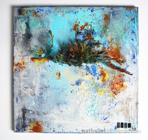
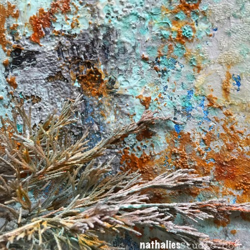
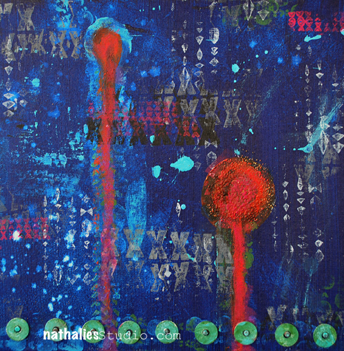
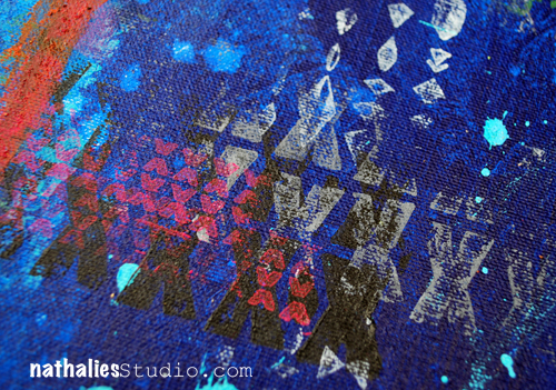
Patterns and repeating images are some of the best ways to create interesting and eye-catching art. I am always looking for patterns in nature and for ways to create patterns out of patterns. My main project this month uses 1 stencil and 1 stamp to create an interesting piece full of pattern on pattern. Not only was it fun to make, it was quick and easy.

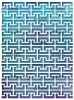
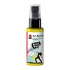
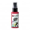
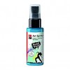
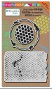
Place your favorite Nat StencilGirl stencil over a primed canvas, I used Hamburg. Using spray-mist, acrylic paint, or inks, paint over the entire canvas. I used Marabu Acrylic Art sprays that are permanent. Once they dry, you can layer one spritz over another without creating a muddy brown color. Love!

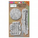
Randomly stamp canvas. Here I used Pie Top from Nat’s Cardboard stamp set.

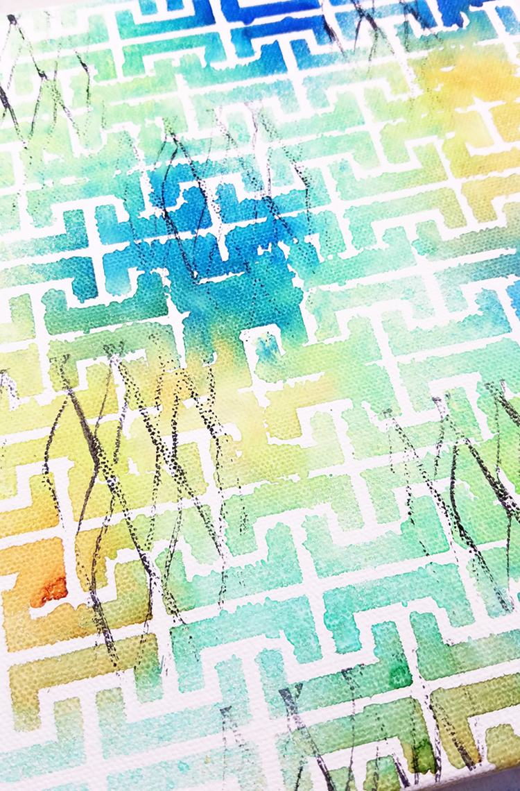
Repeat this step, rotating the stencil 90 degrees so that the stenciled image overlaps the previous layer.

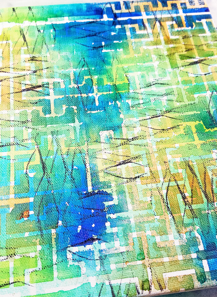
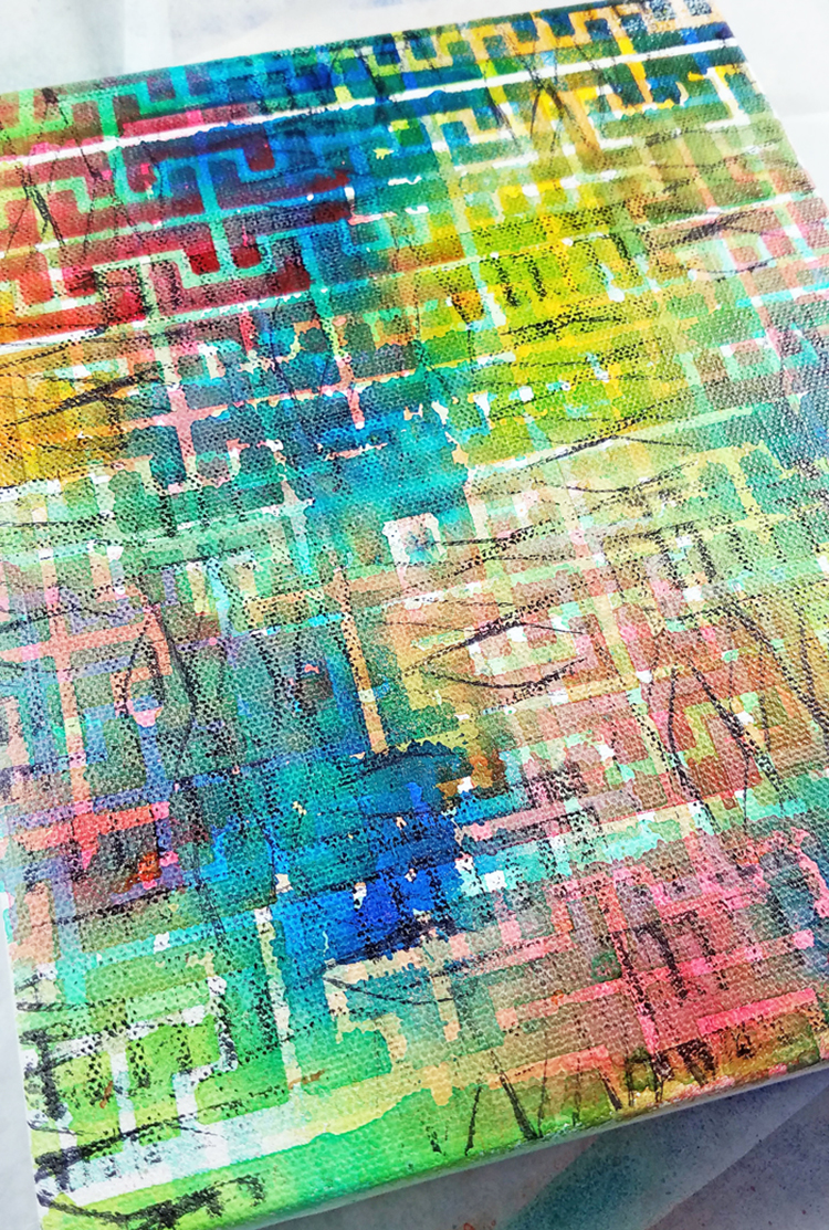
Repeat until you have a base that is full of yummy layers and pattern on pattern.

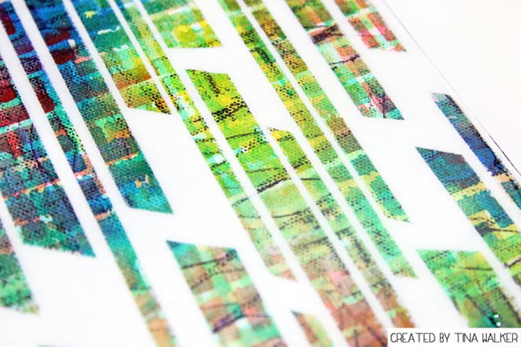
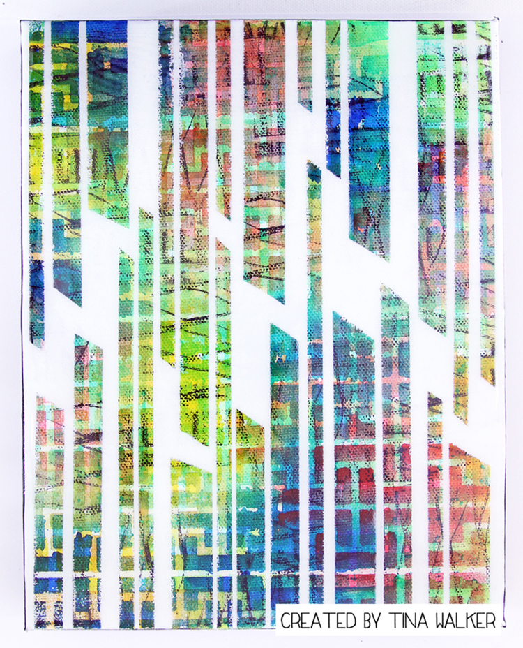
Place several widths of artist or masking tape over your stenciled/stamped canvas to create a pattern. I trimmed the edge for an interesting look.

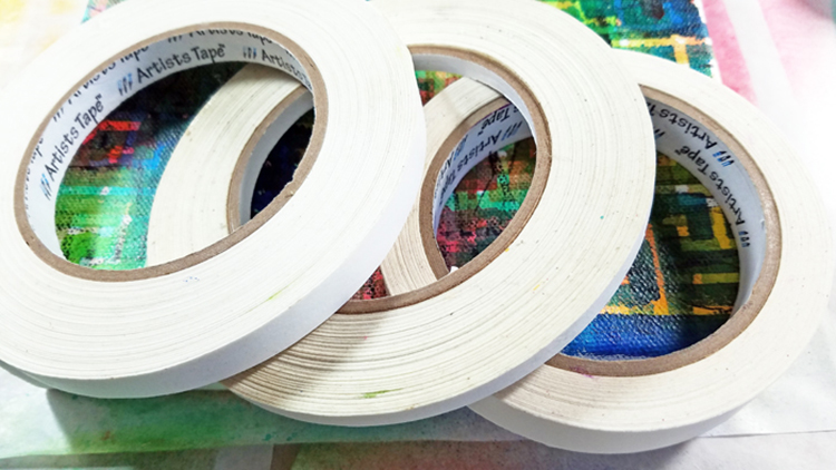
Make sure the tape is securly adhered to the canvas.

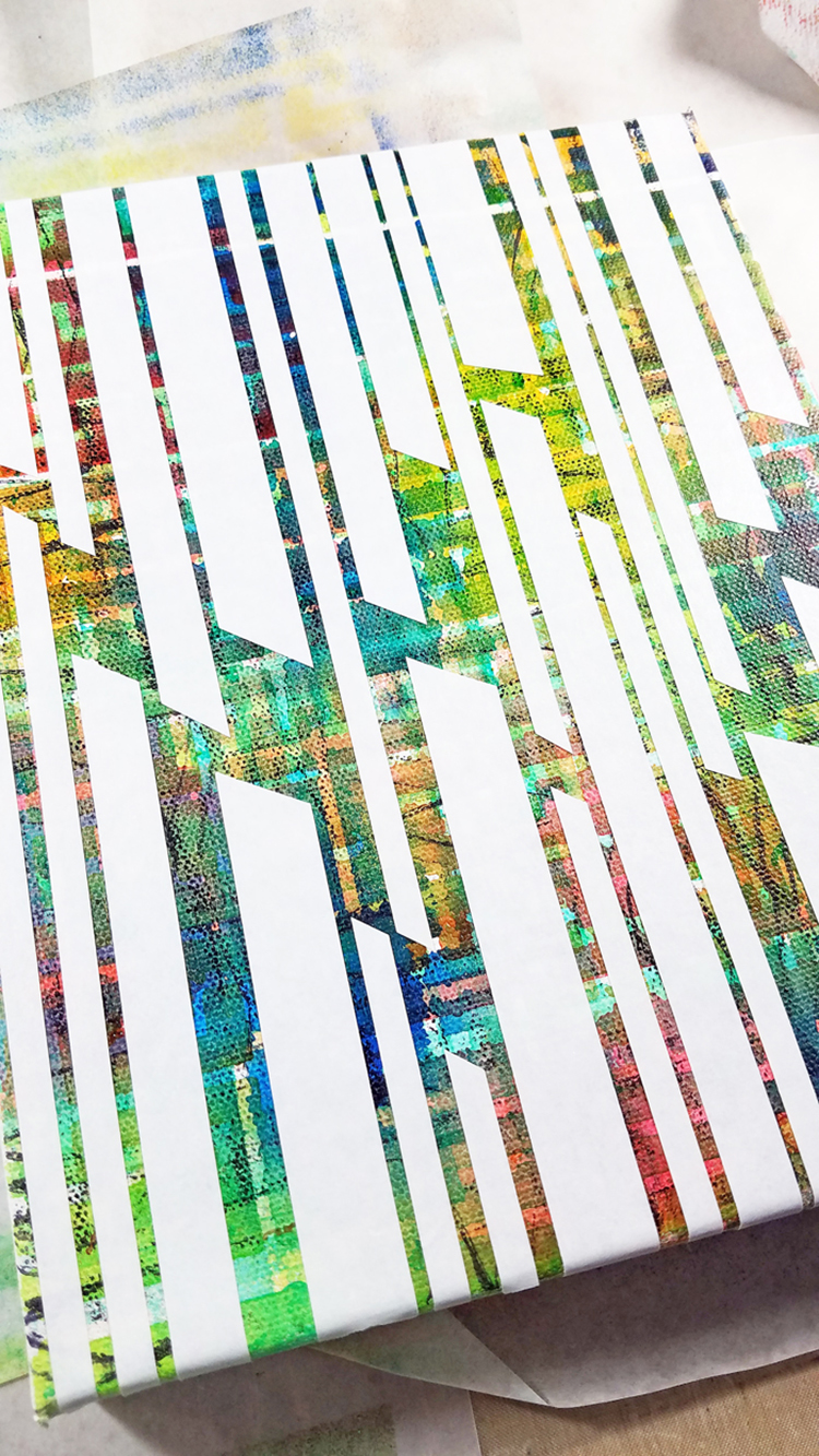
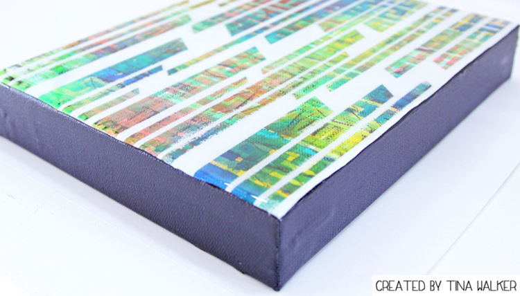
Using your favorite spray paint, spray entire canvas in contrasting or coordinating color, I chose white. Then allow to dry completely. Remove tape.

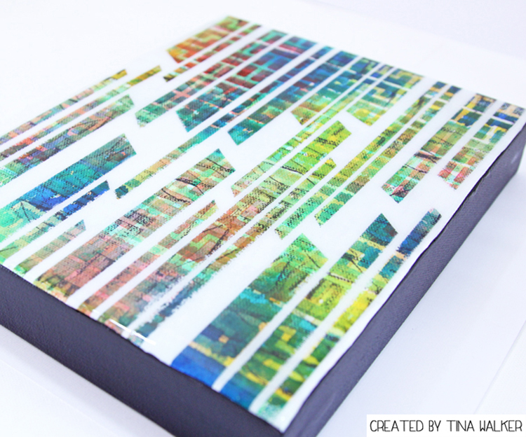
Reveal the magic of pattern on pattern. This project took approximately 30-45 minutes, from start to finish! My kind of art.

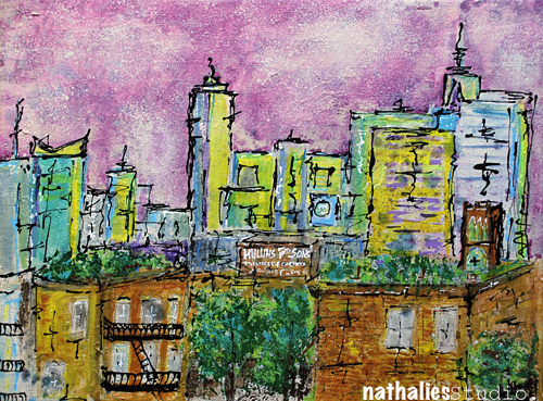
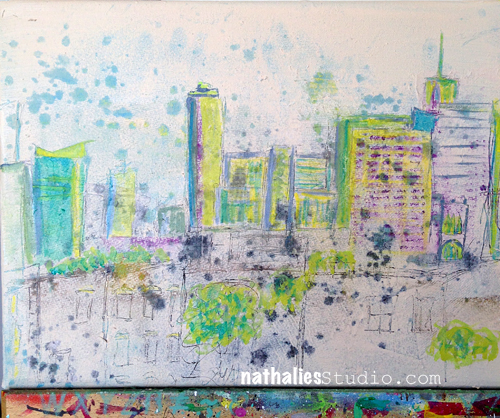
As I was adding my stenciled layers to my canvas, I didn’t want to waste the gorgeous paint on the surface of the Hamburg stencil, so I ‘stamped’ the stencil to an art journal page. Not only did my patterned canvas create a super easy and fun piece, I had an instant background started on an art journal spread.

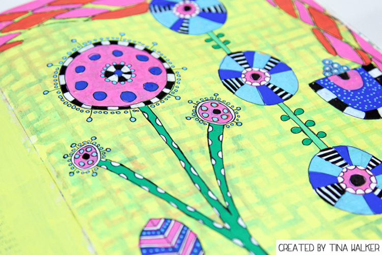
Here’s the spread I created with ‘stamp off’.

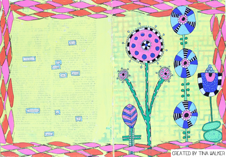
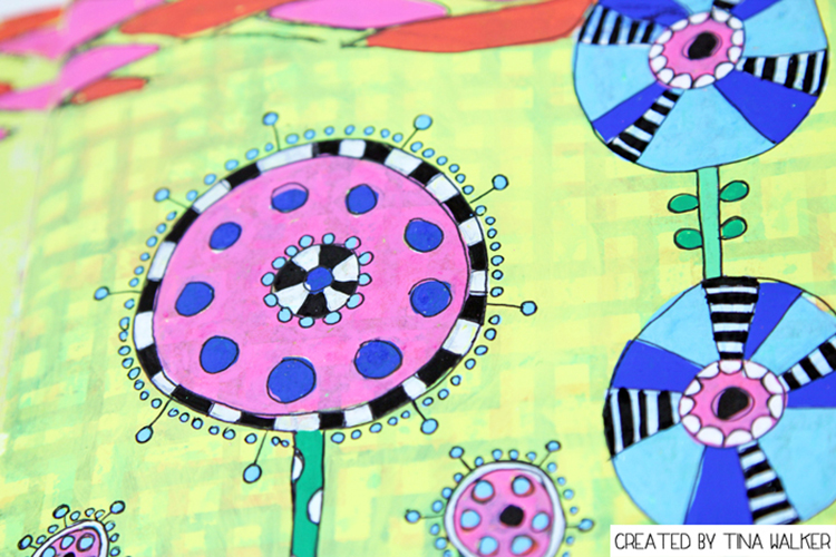
I love it when one project creates another. And pattern on pattern…be still my heart! ♥

I hope you enjoyed my projects today. Have a great day!


Thank you Tina for two projects that definitely celebrate PATTERN! Tina used these supplies – some links are affiliate links:


Play along with us this month and join the 30 day Artful Adventures Stroll Challenge! I love to see how you interpret our monthly themes. Email me how you used my stencils and stamps with the theme and email me an image – I would love to share your projects in my “n*Spiration From Around the Globe“.

Leave a comment

CJS 2016 – Texture Explorations

Nat

Today is my day on Creative JumpStart with some Texture Explorations in an extra bonus long video showing my whole thinking and creating process for this canvas:

TextureCanvas01

TextureCanvas05

It has been such a blast and the community is so much fun! Loving all the projects everyone is sharing based on the Creative JumpStart videos! I am so sad that the live event is ending tomorrow. But no worries- if you still need to catch up – you have time until November to watch the videos and also download them. AND you if you haven’t signed up – you can still sign up here and do the same :)

Comments (2)

Leave a comment

The Chunky Monkey Painting or … City Spring

NatKalbach_CitySpring01

I started a new urban painting and wanted to change things up in how I start my paintings . So instead of the normal procedure I forced myself to do it a bit differently.

I was inspired by some sgraffito in paintings by Paul Klee and Jean Dubuffets – which I have just shown in my Post here. Here is how my painting looked for a couple days when I was undecided if I should leave it like this or not. I actually really liked it.

NatKalbach_CitySpring04

I love taking photos of my work in progress to see in hindsight what I did and sometimes also …where I should have not taken the next step. As in this. Now that I look back …I almost ;) wish I would have just stopped. But I didn’t …a weird “this cannot be it” – feeling kicked in …and so I continued. And I went a bit overboard with it … kind of like when you hand me a jar of Ben and Jerry’s “Chunky Monkey” Ice Cream …nothings gonna stop me there either ;) although I know pretty much after two scoops that should be it.

NatKalbach_CitySpring02

Pretty soon I realized that it is not going into the right direction, but then I just wanted to see how far I could push it and I painted a lot with palette knifes -which I usually only use for texture. That was cool.  And then I also got totally addicted to sketching with a mixture of Soft Body Paint and Ink (Titanium White and Carbon Black) filled into a Fineline bottle. I know now exactly the consistency of the mixture of those two paint media I need to make it work. I just loved the way the lines came out and the erased dimensional look.

NatKalbach_CitySpring03

Do I regret going further although I am not loving the outcome? Nope …absolutely not. I learned a lot by doing this and I found some new things I definitely want to incorporate more into new paintings. I also learned that less is sometimes more and not boring …although overall more is more for me… I might just sulk and eat some Chunky Monkey now  ;)

I think it is important to do things in our creative process that we are not loving in order to stretch ourselves and learn . I really enjoyed the process and keeping track of this, so the time was not wasted.  And you know what …I can always make a new painting … maybe I even just gesso over this one …the texture underneath will probably already define the city skyline …what do you think? Now that makes me excited about this again … LOL – maybe it will be the continuing City Spring Canvas Saga.

Are you a less is more or more is more person? 


Comments (10)

  • Cheryl

    |

    I really like it, for it looks quite professional. I loved all the colors you used, and it looks and feels like an inner city. I hope you will keep it, frame it, a d. E pleased with the results of pushing yourself. I would hang it in my home!

    Reply

  • JanJ

    |

    Wow! I like both. In the original the colors are soft and light. I struggle trying to keep in pastel colors. To me, your completed one is more dynamic and powerful. I just can’t choose. Thumbs Up!

    Reply

    • nathalie-kalbach

      |

      yeah- the pastel was my problem too – it is just not me – mmmh mhhh – LOL

      Reply

  • Joi@RR

    |

    Good morning Nat. I like the first one – the more pastel one BUT… here’s the thing… if I went in a gallery looking for your paintings – I would never have picked the first one as YOURS. Sooooooooo…. my fav is the second one. PLEASE don’t gesso over it!!! It’s really Wonderful. Totally love the brown building especially the staircase and the sign on top. To me… it just is so you and also – to me – it’s a work of art. The first one is lovely – and it could be a new side of you – but the second one is FABULOUS… I love it. j.

    Reply

    • nathalie-kalbach

      |

      Thank you for your feedback Joi! I agree- the first one was just not feeling me – but I liked it :)

      Reply

  • Deborah A. Pierro

    |

    Nat, I like the soft look of your new urban painting. I also like your previous urban paintings.

    Reply

  • Bea

    |

    sorry, i like it…b

    Reply

Leave a comment

Fiesta Girl Canvas

NatKalbachFiesta01

I created this canvas board with my new Stampendous Fiesta Stamp Set for the CHA Booth.


NatKalbachFiesta02

I first painted the background with different green shades. Then I stamped the background with different acrylic colors and the Fiesta stamps. Next, I masked off the background with the woman silhouette and used Parchment and a light mist of Black Liquitex Spray Paint over it.

NatKalbachFiesta03

I took some paint at some areas off again and then used Titanium White Spray Paint and an alphabet stencil moving over the whole canvas with the lady still masked off. The letters were applied in the end with Gel Medium.

Here are the supplies I used:

nSupplies


have a wonderful day and do something creative!

Comments (16)

  • Jacquelene L

    |

    This canvas is my favourite piece from cha. When I saw it, I went to the stampendous website to try and figure out what stencil you used. I love the women stencil and the stamps. Thank you for sharing your inspiring techniques for this canvas. In the future this stencil and stamps will be used in my art journals and cards. Thank you for sharing your creativity with all of us.
    Jacquelene L
    Canada

    Reply

  • D.AnnC

    |

    Really love the colors in this! The more I see of this set, the higher it climbs on my wishlist!!

    Reply

  • jo-murray-art

    |

    LOVE the under printing in the silhouette.

    Reply

  • Stampendous Stamps

    |

    This canvas just has the most soothing color palette with such an exciting design idea. Love the use of type as an element as well. Always eye-catching. Another masterpiece, Nathalie!! Thanks so much for sharing!

    Reply

  • tesa

    |

    Beautiful!!

    Reply

  • andrene

    |

    Really beautiful! I love the colors you’ve used and the stamped images were the perfect choice for that silhouette.

    Reply

  • yankeegirl

    |

    This is really awesome, Nat! Love the greens and blues on the grey, and the numbers really set the shape off!

    Reply

  • Jackie P Neal

    |

    Gorgeous canvas Nat! Love those stamps as well as the colors you chose!

    Reply

  • Joi@RR

    |

    She is so unique… love the florals inside and the numbers outside… so many thought provoking meanings come to mind. Beautiful.

    Reply

  • smokeysmom

    |

    I love this Nat! Is the female portrait one of your masks? Where can I buy it? This piece really speaks to me, it’s just perfect:)

    Reply

  • Seth

    |

    Great piece Nat. Thanks for taking the time to share the process as well!

    Reply

  • Nurse-Ratchet

    |

    Love it!! Just picked up my Fiesta Stamp set yesterday ….. It is more amazing in person!!

    Reply

Leave a comment

Mark Maker

NatKalbachMarkMaker01

This Canvas was created for the CHA Show (Craft and Hobby Association – which has a yearly trade show in Anaheim) and where my new Stamps with Stampendous are released at the moment…I am waving from there right now.

NatKalbachMarkMaker02

I used the Mark Maker Stamp Set with it- that also includes a stencil

The stamps will be available soon. I used them with acrylic paint on top of the canvas – my favorite way to use stamps.

NatKalbachMarkMaker03

For texture I added Frantage Aged Embossing Powders and smoothed and mixed some acrylic paint over the heat embossed areas with my finger. The washers and metal pins are also heat embossed with Frantage Embossing Powder.

NatKalbachMarkMaker04

Here is a list of all the supplies I used

nSupplies


Hope you like it – have a great day!


Comments (31)

  • susan salyer

    |

    wow wonderful canvas love the layers and the wonderful goodies you used to make this happen

    Reply

  • Liz Lumsden

    |

    Wonderful fabric stamping!

    Reply

  • Autumn

    |

    What an amazing mixed media project – oh makes me want to get into some paint! ;0

    Reply

  • D.Ann C

    |

    LOVE the look and ingenuity of embossing the washers!! Warm hugs from Florida

    Reply

  • Linda on the Prairie

    |

    Nathalie, you make everything fun! These sets are so versatile.

    Reply

Leave a comment

Winding Down: My Top Five Mixed Media Paintings of 2014

It has become a tradition of mine and other blogger friends to wind down the year with some  Top “insert number”- Lists of work , posts and photos, before the year ends. It makes me go back and look at what I have done and accomplished and it also makes me dwell in memories. Too often we forget about the things we did and accomplished throughout the year- often just bashing ourselves for not fulfilling all the wonderful new year’s resolutions from last year.  Maybe this makes you wanna do it too – if so – share :)

2014 was definitely a year I did more work on canvas than any other years before – here are my personal top five canvases:

1. On The Flip Side

This one might be my absolute favorite of the year – it has a lot of personal meaning for me and that might be actually the only reason why it is a favorite- LOL- the personal meaning – although- I do like that I for a change was also working in a bit different color rage than usual.

2. The Powerhouse

I like this one because of the colors and …because I stopped- LOL. I wasn’t sure in the beginning if that was done and then I decided to let it go and I am so happy I did. This canvas taught me that it is ok to have long breaks in between and come back after a while, just to decide to call it finished.

3. Standing Strong

This canvas does not have as much texture as usual- but I did like creating it a lot. I started mixing very intrigue parts of buildings with undefined parts and it gave me a push from there on to explore this a bit more.

4. Everything is Gentrified

This painting gave me a lot of headaches- meanwhile and after – I do love it -but I learned a lot about light sources. How important it is in which light you work and in which light you then maybe hang it. It is a painting that needs a well lit area and it changes it’s looks during the day from vibrant and uplifting to dark and oppressing. For sure interesting for me and while not perfect- it goes with the topic and title.

5. In the Same Boat?

This one was also a canvas of headaches – LOL. I had a finished picture in my head when I started it- which was a huge mistake and then I also started mixing some colors which at first I totally did not like. It took me forever to finish this work up- the canvas was sitting on the easel and I would look at it contemplating for weeks if I should just paint over it. And then I didn’t …and it grew on me – and now I really like it -I do like the colors I mixed …another canvas that taught me to be patient.


What I learned:

2014 marks definitely a year where I feel I have learned to be patient with me, my skills and my work. I also learned that I shouldn’t give up too early on something.


My goal for 2015:

All of those canvases are a smaller scale (12×24 is I think the biggest one- still not having the U.S. sizes in my head- LOL) – so my goal for next year is to go bigger – so we will see :) . I started a bigger canvas a couple weeks ago- I will show you the process in a couple days. It feels pretty daring to me but is a lot of fun :)

Hope you enjoyed this little journey – next up will be photos and art journal pages!

have a gorgeous day


Comments (9)

Leave a comment

In The Same Boat? Canvas

NatKalbach_InTheSameBoat01

One of my favorite views in Jersey City at Liberty Landing . At least the view is accessible for everyone :)

NatKalbach_InTheSameBoat02

I played with different paint viscosities to achieve a different kind of texture. Fun.

NatKalbach_InTheSameBoat03

Here are the materials I used:

nSupplies


What is the place with your favorite view?

Nat

Comments (9)

Leave a comment

Whose Front Yard? – Canvas

NatKalbach_WhoseFrontYard01


A new canvas finished – I had a great time painting. It took me quite a while to finish it deciding when to finish :) That is always the hardest part, don’t you think?

NatKalbach_WhoseFrontYard02

I used Liquitex Soft Body and Heavy Body Acrylic Paints as well as Markers, Inks and Spray Paints. I made a lot of marks with the Liquitex Freestyle Palette knife – I love using it to create texture and marks into the wet but also into the dried paint.

NatKalbach_WhoseFrontYard03

I am thinking about having this one scanned, too, and make it available as prints. What do you think? (I will add the prints to my shop as soon as they are ready.)

nSupplies


Wishing you an amazing start into the week!

Comments (2)

Leave a comment