nathalie-kalbach

New Art Foamies Stamp June 2018 Release!

I am so excited about my new ArtFoamies Foam Stamps. They can be used with acrylic paint, ink and other paint media on paper, canvas, wood and other surfaces. Are you ready for some samples?

Let’s start with my new Hexagon shapes.

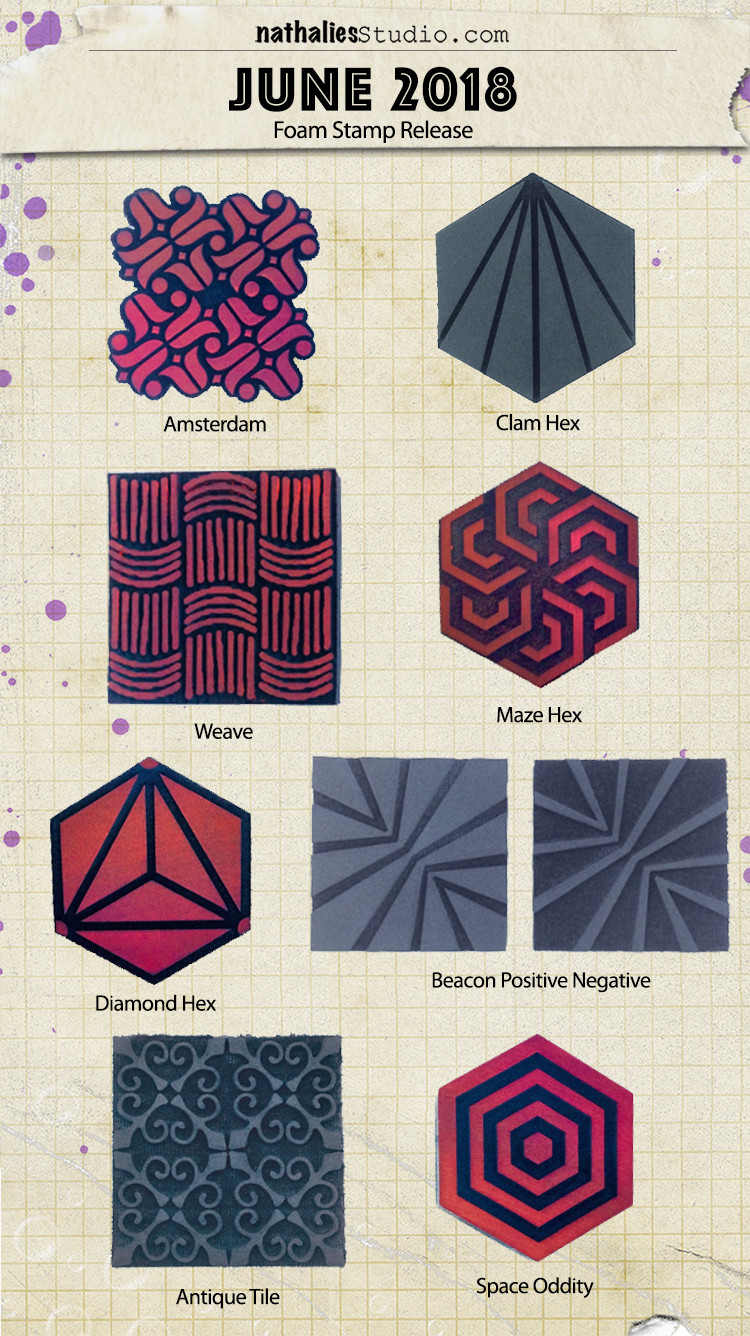
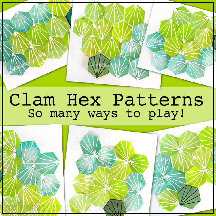
Clam Hex – This stamp is inspired by the simple beauty of a clam shell. With the versatile hex shape you can tile it up in a bunch of different ways, depending on how you orient the markings, and create different fields of pattern. Backgrounds, layers, focal points and more are possible.
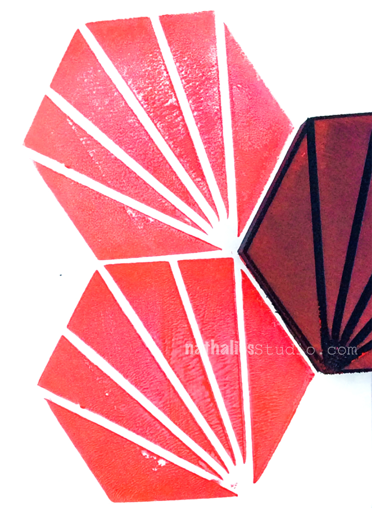
Here is an art journal page using the Clam Hex alternating the direction of the stamp up and down.
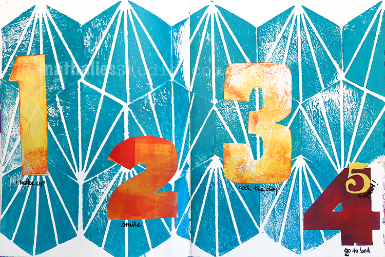
The many possibilities of this stamp actually makes my head spin- I will go into details about those in the next couple weeks for sure :)
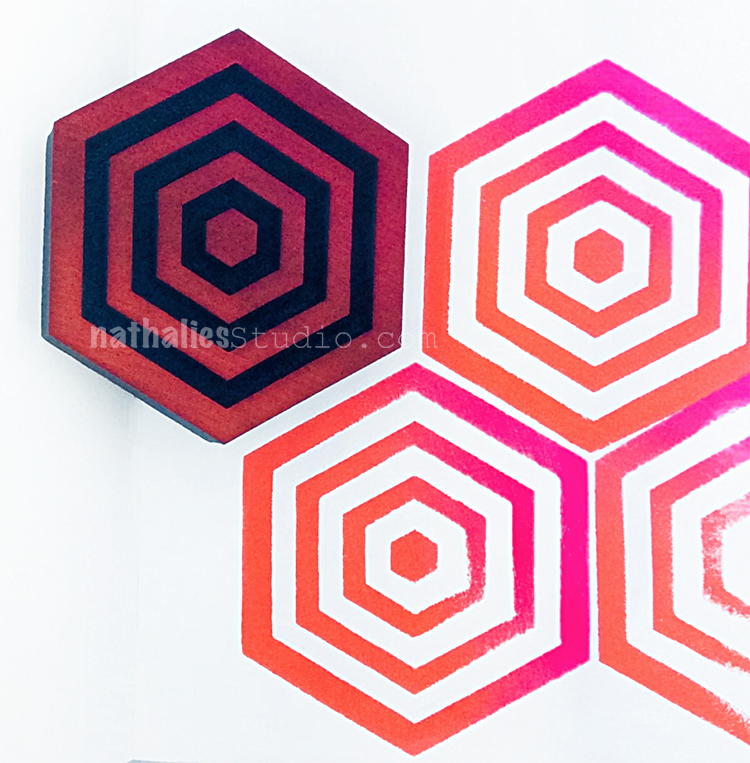
Space Oddity is inspired by none other than the amazingly talented David Bowie and the utterly unique and otherworldly places he transported us to through his music, style, and many personae. Look deep into this hex shaped design and begin your own creative journey. Designed with radial symmetry, you can tile this baby up and create an entire field of op art hex shapes. Backgrounds, layers, focal points and more are your destiny.
Here is an art journal spread with this puppy :)
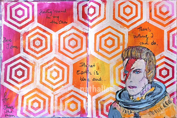
This stamp makes me so happy :)

Maze Hex – This hex style foam stamp has a radial design that can be interpreted in so many ways.
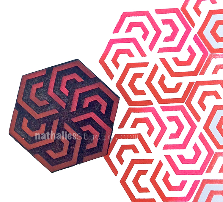
Maybe you see a flower in its design? Maybe the winding pathways of a maze? How about the motion of a spinning piece of machinery?
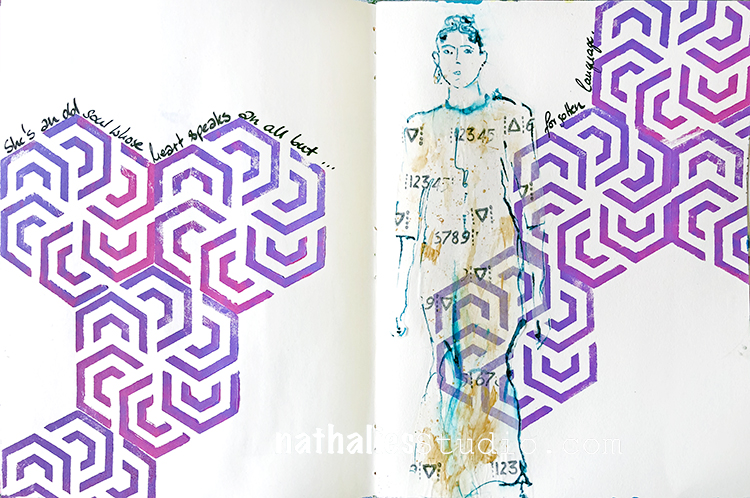
Your choice ;) Use the Maze Hex on its own as a hypnotic focal point or tile it up to create a field of flowers background.

Diamond Hex– This stamp is inspired by the geometry of a faceted stone.
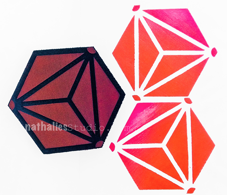
You can create fields of interesting patterns by repeating this pared down and modern interpretation.
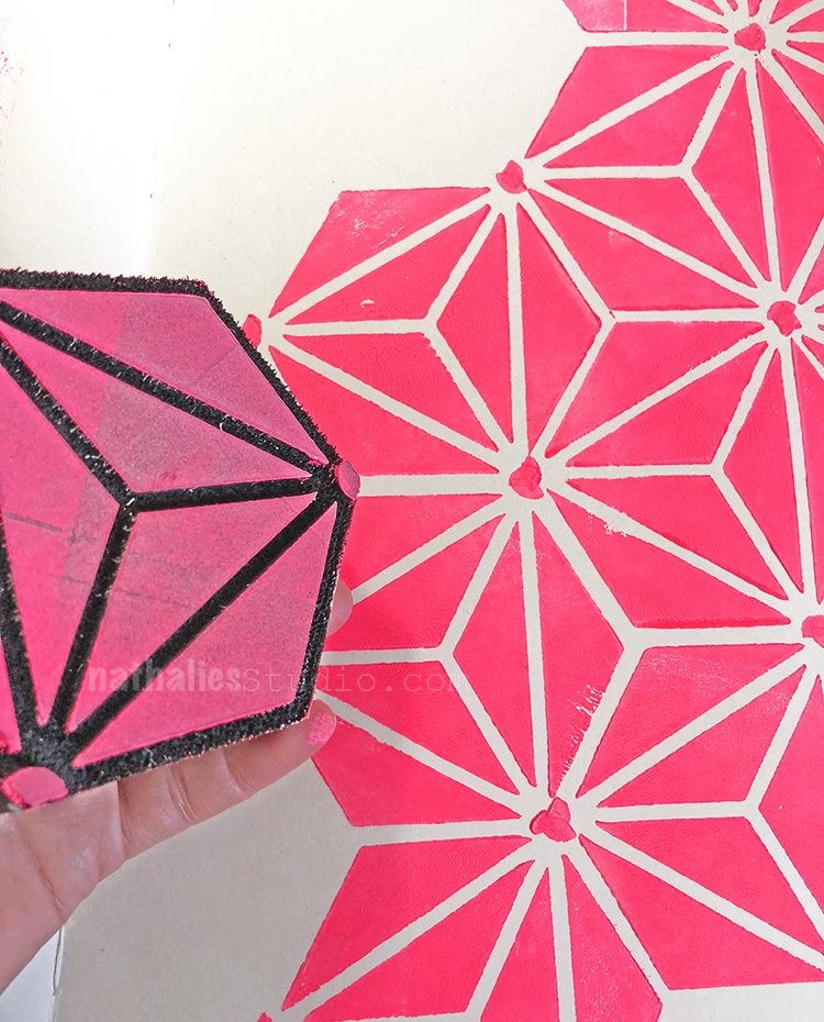
Rotating the design as you go will give you additional variations to the field. Backgrounds, layers, focal points – yes, yes, and yes! Remember: “Diamonds are a girl’s best friend” LOL
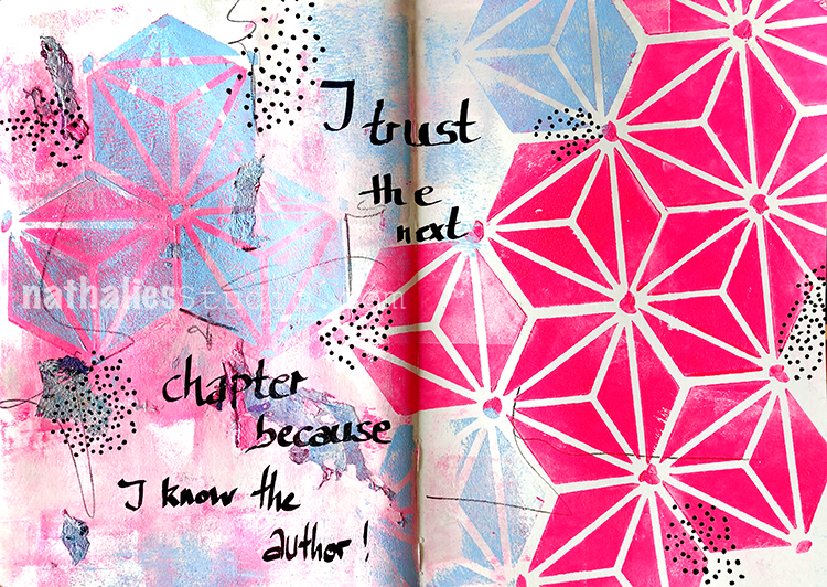
did I get you hooked on those hexagon stamps yet?

But wait there is more ;)

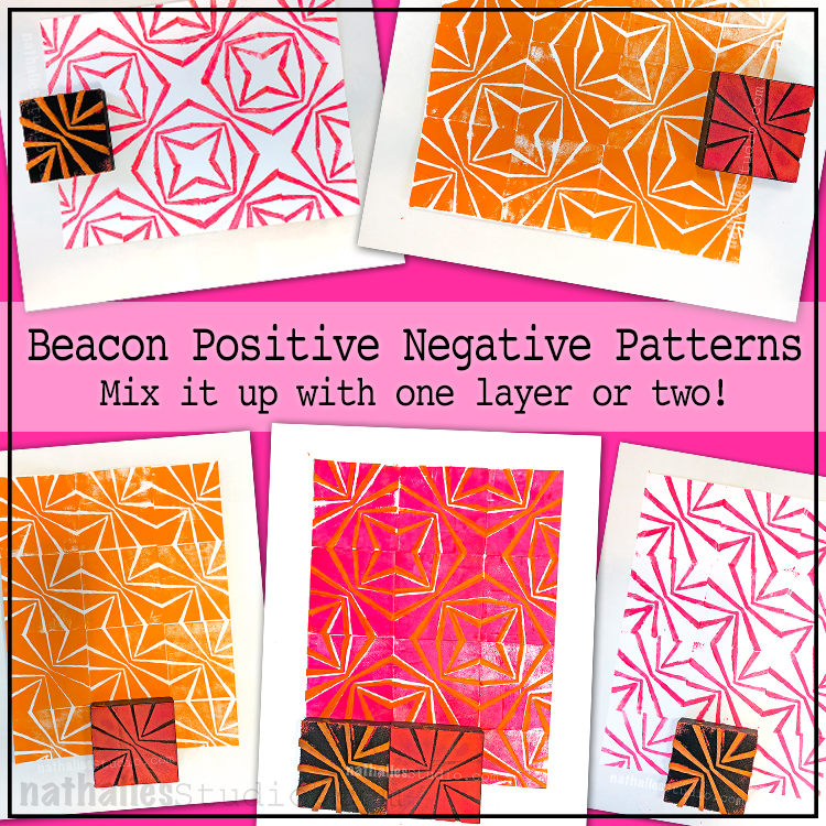
Beacon Positive and Negative – set with two stamps, inspired by the gorgeous Art Deco era buildings known as The Beacon in Jersey City.  These towers sit on a hilltop not far from where I live, and can be seen from miles around in the night sky.
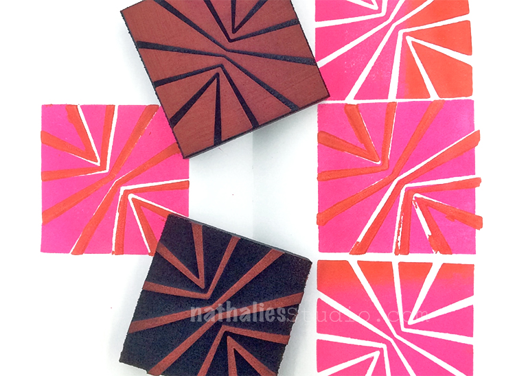
Just as a beacon guides travelers on their way and provides safe passage to ships in the night, these stamps offers a radial, starburst style design to call attention to your art, mixed media projects, and art journal pages.
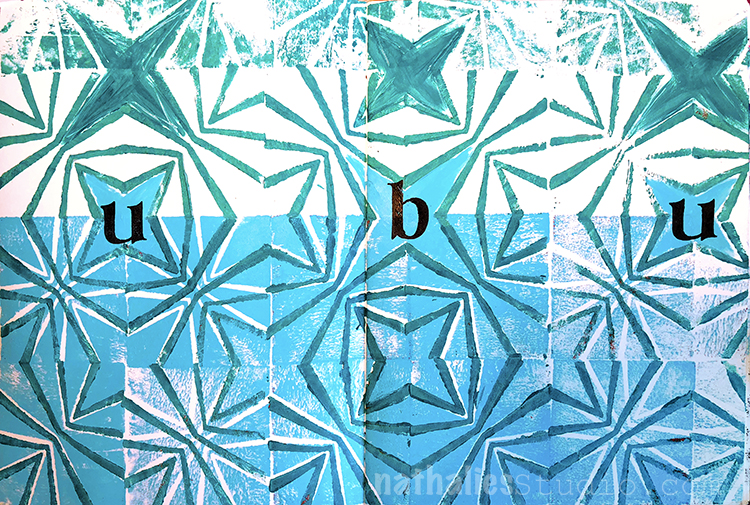
Use the positive and negative stamps as single designs or together for a unique layering effect.
Weave – was inspired by the simple, visual rhythm of woven fabric.
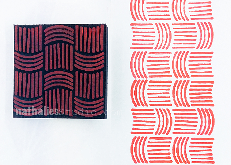
The repeating design is great for stamping multiple times to create continuous patterned backgrounds. Where? In your artwork, mixed media projects, block printing, art journal, fabric and textile projects, on your gelli plate, and wherever you CREATE!
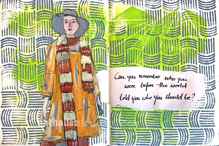
I love it, simple yet pretty cool.

Antique Tile – was inspired by the beautiful wrought iron balconies, gates, and fences known as “Iron Lace” in and around the city of New Orleans.
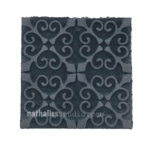
Add a bit of Antique Victorian style, old world Spanish tradition, or French Creole flair with this pattern.
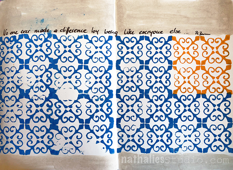
The ornate design of this one is perfect for layering or creating intricate backgrounds in your artwork, mixed media projects, block printing, in your art journal, etc.

And last but not least…

Amsterdam – was inspired by the beautiful and progressive city of Amsterdam.
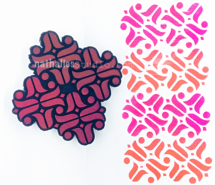
Traveling to Amsterdam I always enjoy the lush markets overflowing with bundles of tulips and flowers, and the old and new architectural styles living side-by-side.
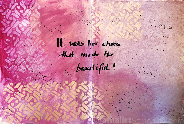
and that is it for now :) All of the designs are in the store now and ready to be shipped out :)


But… WAIT …..WAIT…..

Do you want to win the new stamps? I am giving away to one lucky winner a nice package of ALL the new stamps!

UPDATE: This contest is closed. Congratulations to our winner Nancy Faulls!!!

Here is how you can win:

  1. Comment on this blog post which of the new stamps is your favorite.  You can can actually get another entry if you
  2. join me at my Facebook Live event today starting at 4pm EST here and share the recorded video afterwards with your Facebook Followers.
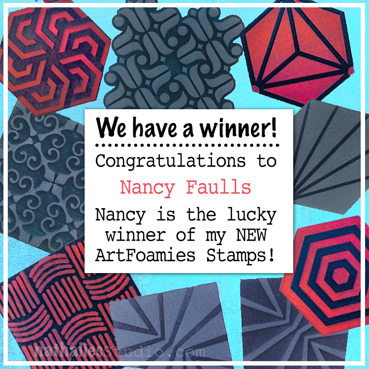
I am very happy to announce that the winner of my new foam stamps is Nancy Faulls! She will receive the full set of my 8 new designs to use in her creative projects. We’d also like to say a BIG thank you to EVERYONE who tuned into the Facebook Live event yesterday to join the fun Kaffeeklatsch we had and all those who shared that video. We also send a BIG thank you to everyone who read the blog post announcing the new stamps and who made such nice comments on there. Half of the fun of these new product reveals is getting to share my excitement for the new designs with you and hopefully inspiring you to try your own style of using them in your artmaking. You guys rock!

 

SaveSave

Comments (21)

  • goofmeister1949

    |

    Oh my gosh, all of the designs are wonderful but my absolute favorites are Antique Tile and the Weave. Cutting the weave up is so intriguing. Thanks for all you do

    Reply

  • pam hansen

    |

    Oh how can I choose just one. They are all so fabulous. I really like Space Oddity and Weave, but I’m pretty sure they all have a place just waiting for them in my studio!
    Reply

  • Martha Christopher

    |

    How can I choose, but if I do then it would be clam hex… I wasn’t really drawn to it when I saw the foamie stamp but when I saw it stamped I fell in love!

    Reply

  • Marelle Jackman

    |

    OH wowwwwwwww yes please would love to use these in Australia!

    Reply

  • Liz Thayne

    |

    Love all these new foamies, but my favourite is the diamond hex as it looks so versatile.

    Reply

  • Anita Rodway

    |

    LOVE THEM ALL!!!! But my fave has got to be the Diamond Hex. They look fantastic Nat <3

    Reply

  • Nancy Faulls

    |

    Nat:
    As always, I love them all. My favorite is Maze Hex.
    Nancy

    Reply

  • Jennifer Henrichs

    |

    I love them all but I think my fav is the diamond hex ?- Jenn Henrichs

    Reply

  • AnnetteD

    |

    Clam Hex without a doubt!

    Reply

  • Marit Warnitz

    |

    I love them all. Hard to choose just one of them. I love Amsterdam obviously, because I live in the Netherlands. And Clam Hex because it reminds me of a sea shell. <3

    Love, Marit

    Reply

  • Eeva Hall

    |

    oooh I love yhe clam hex, and amsterdam the most <3 <3 <3.

    Reply

  • Sue Clarke

    |

    Weave is my most favorite but the others are just as much fun (I just happen to have a crush on baskets/weaves).
    The David Bowie page is AWESOME!
    Thanks for the chance to win Nat.

    Reply

  • julie b

    |

    So, are you asking me to pick a favorite child? Fabulous release of stamps! Amsterdam is one of my favorite stencils of yours so it would make sense that this stamp would be a fave but clam hex makes for a beautiful collection of umbrellas (think card idea like you showed) and then there are the hex designs for gorgeous backgrounds and ah, there is the weave stamp for the upcoming fall/winter months. On the other hand tile patterns have my heart; does this stamp have the positive/negative too? Thank you for all your inspiration!

    Reply

  • Marcia

    |

    Thanks for the new stamps Natalie and the examples! I love them all but I think diamond hex is my favorite.

    Reply

  • Yvonne B.

    |

    I am loving the Diamond Hex. They are all so cool and I really like the examples you have for each. Makes me want to try them all out even more!

    Reply

  • Jean Goza

    |

    Congrats on your new foamies line. They are all wonderful and I love the art samples you shared for each of them. My favorite is Weave. I’m sure it is influenced by the fact I have been working with fabric lately. ;-)

    Reply

  • Bea

    |

    I like them all but Amsterdam is my favorite…

    Reply

  • Tania

    |

    Congratulations on the fabulous release Lovely! ?

    Reply

  • Delores Azary

    |

    They are all great, but Maze Hex is a favorite!
    How exciting! Congratulations on your new stamps!

    Reply

  • Lynda

    |

    It’s difficult to pick a favorite as they’re all wonderful. Swayed by your examples, I’d have to choose clam hex, followed closely by Beacon positive negative. Your Artfoamies make playing so much fun!

    Reply

  • Brenda

    |

    They’re all wonderful! Especially after seeing all of your samples! My favorite at the moment is the Amsterdam.

    Reply

Leave a comment

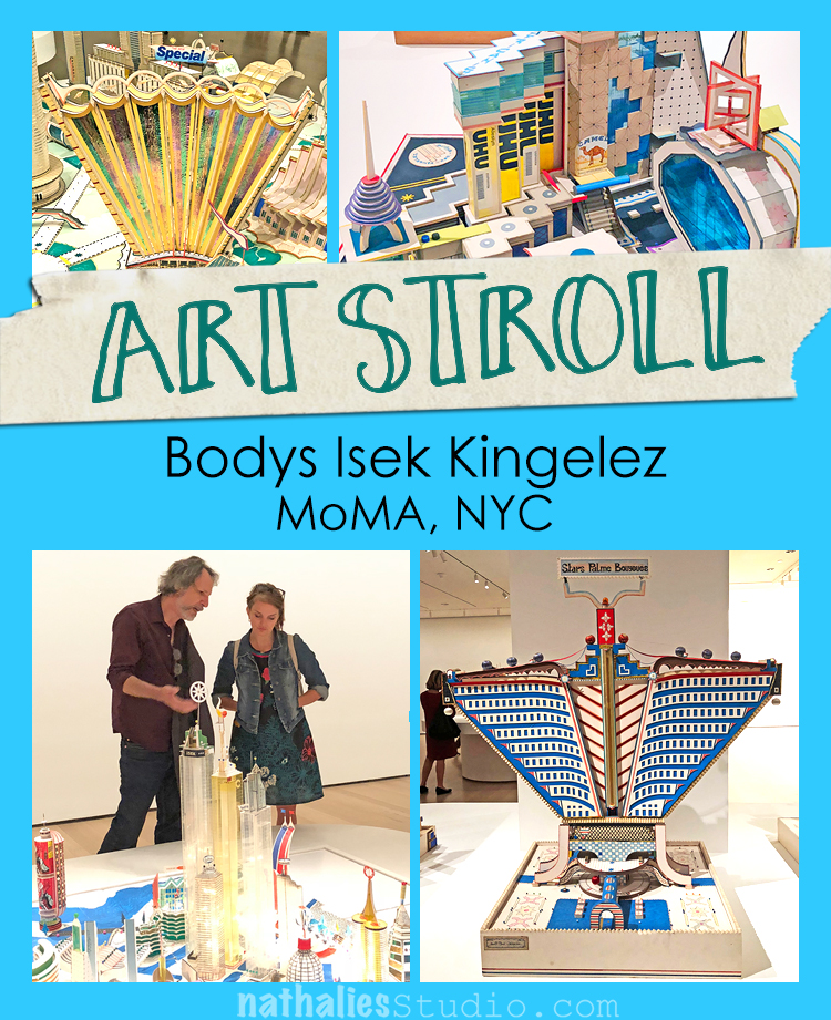
Art Stroll: Bodys Isek Kingelez at MoMA

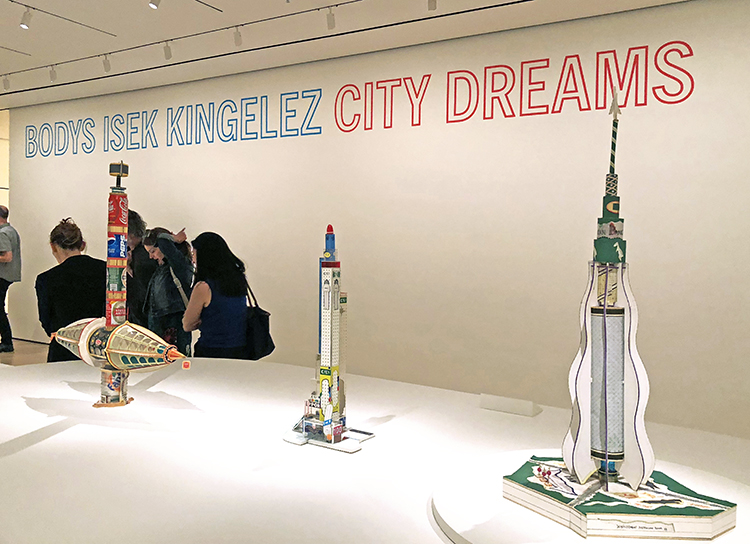
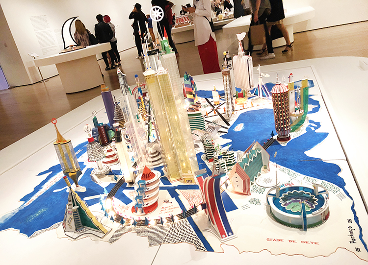
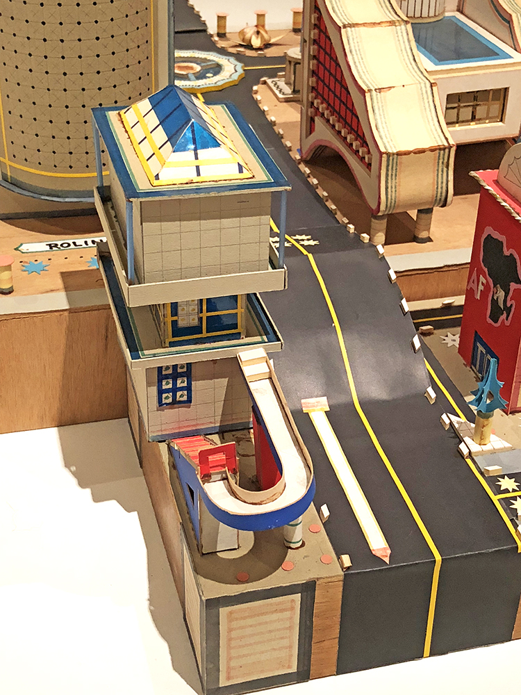
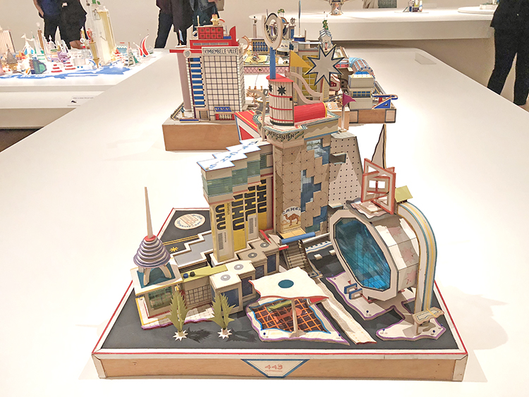
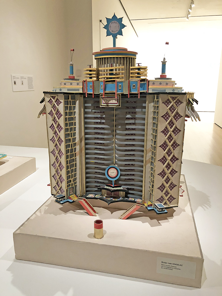
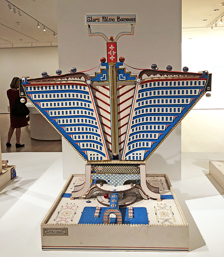
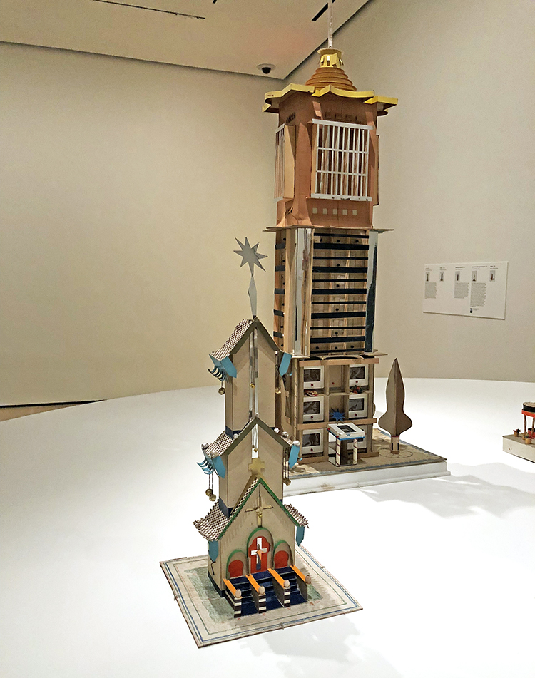
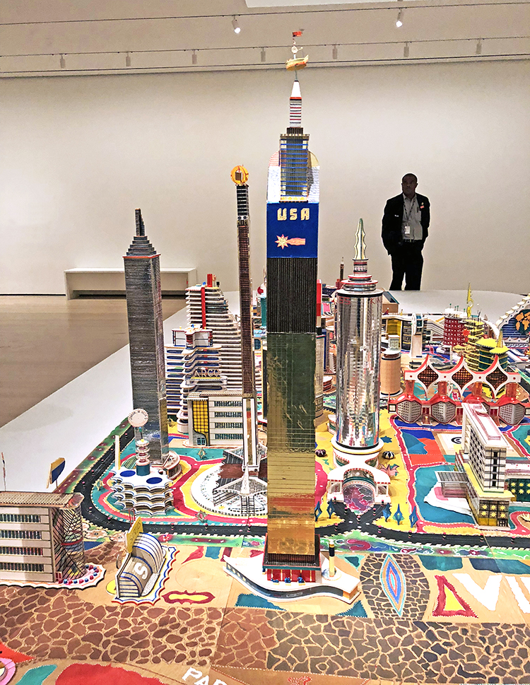
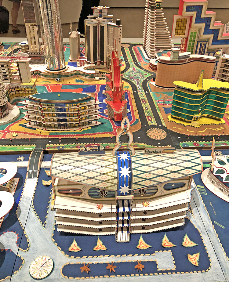
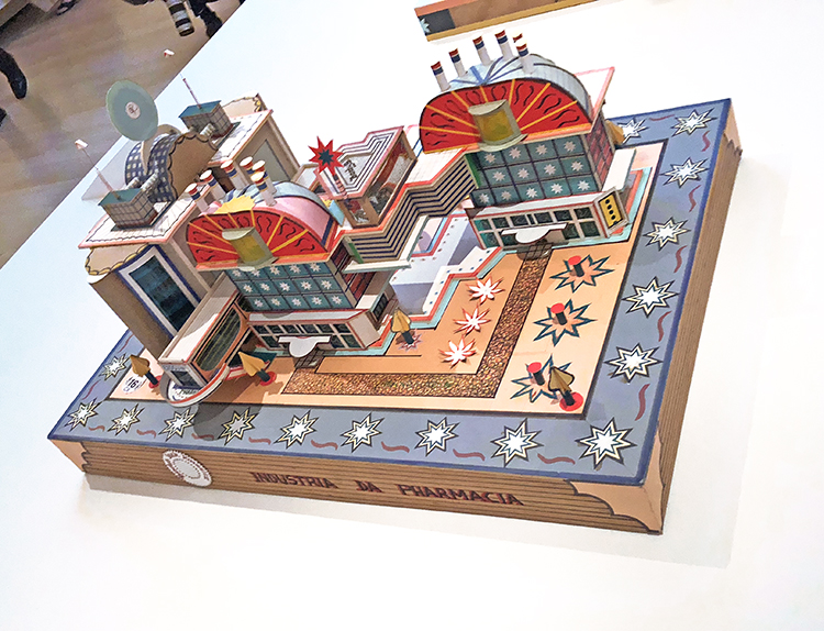
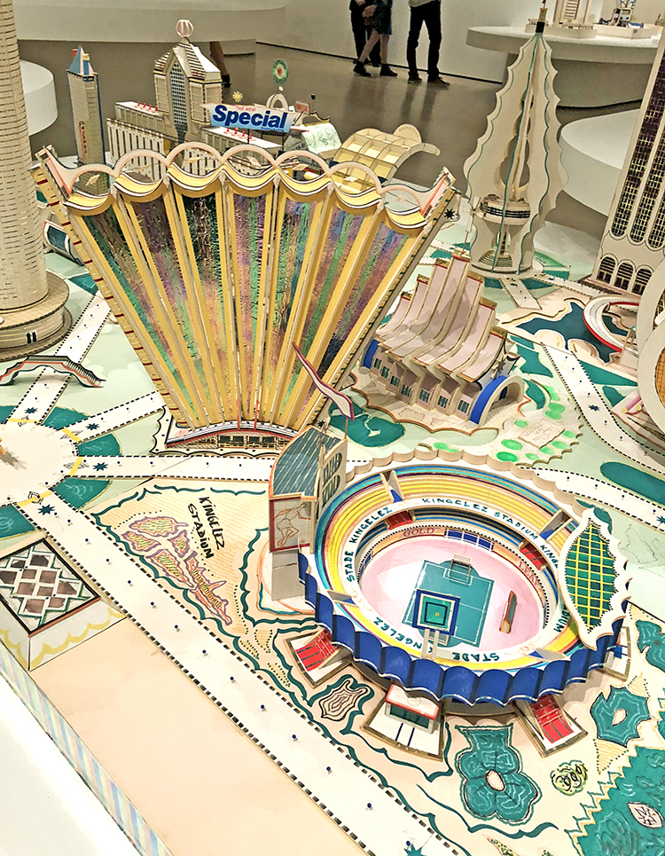
A couple weeks ago my friends and I went to the opening of Bodys Isek Kingelez – City Dreams at MoMA.

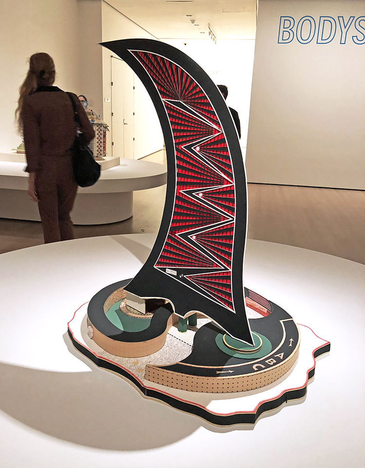
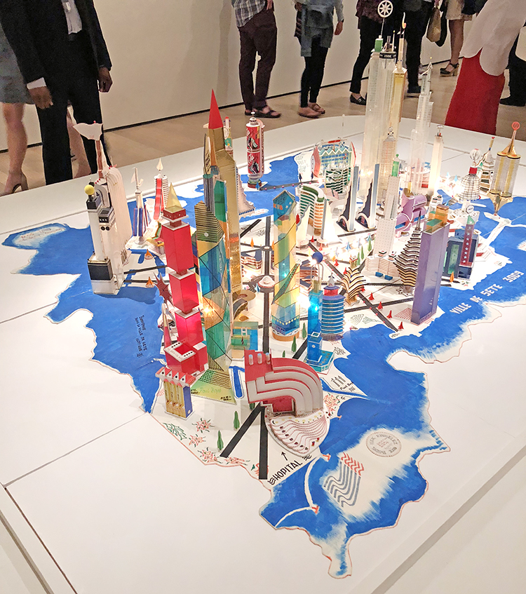
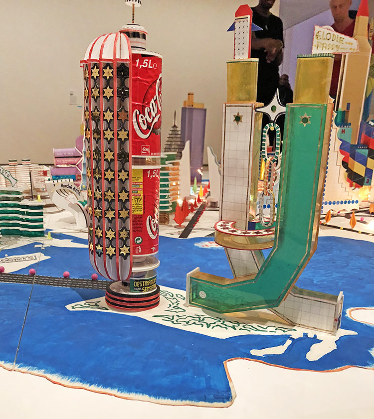
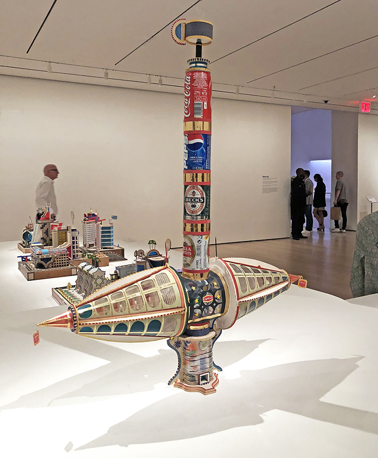
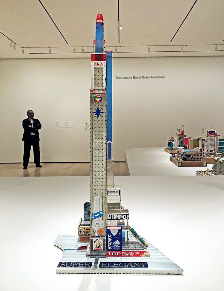
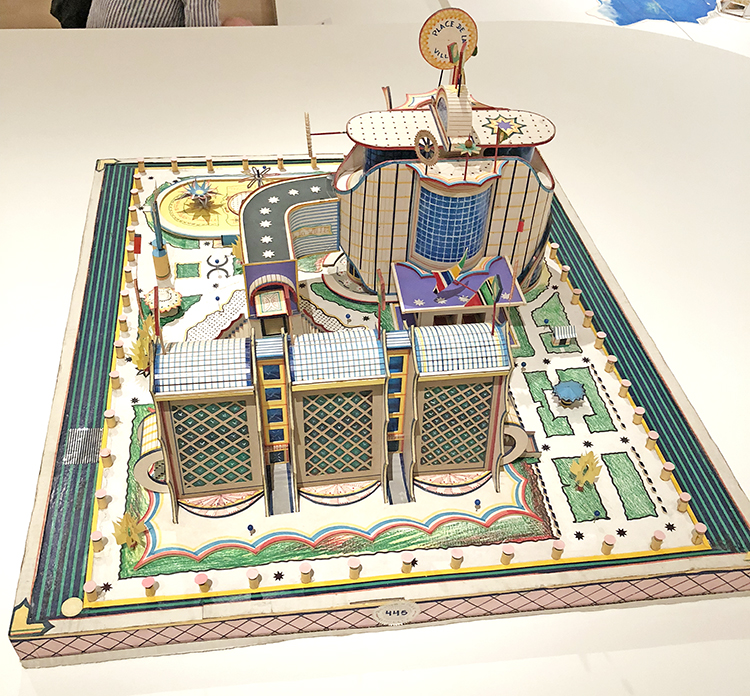
Bodys Isek Kingelez (1948 – March 14, 2015) was a sculptor and artist from the Democratic Republic of Congo, mostly known for his models of fantastic cities made of cardboard and packaging.

This exhibition is the first solo retrospective the institution has ever organized for a black African artist. Wow …hey MoMA what took you so long?

Kingelez started to build his city sculptures in the beginning of the 80s.

To make a living he worked as a restorer at the Institut des Musées Nationaux du Zaïre. He got the job after he took one of his maquettes to the museum. The staff there found the sculpture so sophisticated that they accused him of stealing it and demanded that he’d create another one in front of them, so they could proof he was lying. Kingelez created a piece in front of them and the institution offered him a position.

Though the cities and buildings he created were fictional, they were built as an optimistic view of architecture’s power to change a city’s circumstance.

The curator Sarah Suzuki said ” He saw himself as able to help people understand how to live in a more harmonious, peaceful, beautiful, lively, world, one with candy-colored, translucent structures that constitute a proposal for how to live better.”

He once said, “A building without color is like a naked person.”

there is a lot to take in with this show

First the details as you zoom in

then all the different materials used

then the recognition of known or unknown architectural structures

and lastly more complex the search for meaning.

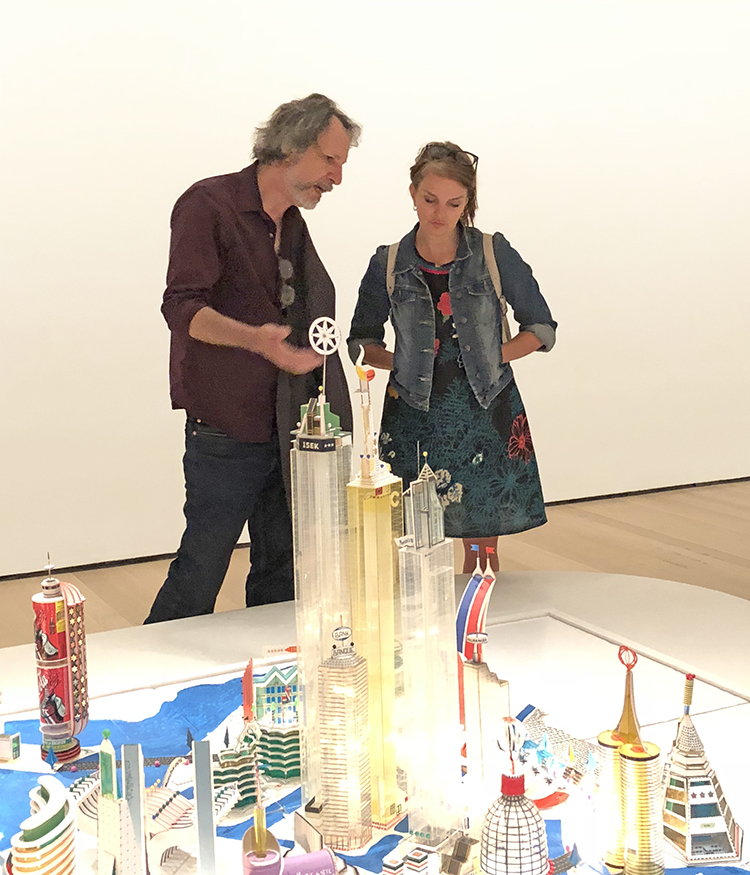
Going with my friends was as always wonderful – it is always fun to see what your friends point out and see.

The exhibition runs until the end of January and I will for sure come back.

It just spoke to me in a joyful way- exploring and figuring out what he used and how it works.

I wouldn’t want to live in a city like this in real live- thinking of it in a real way actually seems oppressive.

I hope you enjoyed this little art stroll :) What did you think about it?


Comments (3)

  • Curtis

    |

    Lovely article Nat. I appreciate your take on this exhibit, and your insightful detail photos. I especially appreciate the shot of the twin-cone building.

    Reply

  • Sue Clarke

    |

    Funny, the first thing that I thought of while looking at your photos was when I went to Legoland in FLA and saw the cities that took years to create. So much detail!

    Reply

Leave a comment

Important – Art Journal Spread

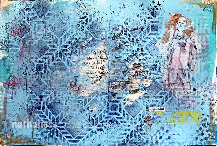
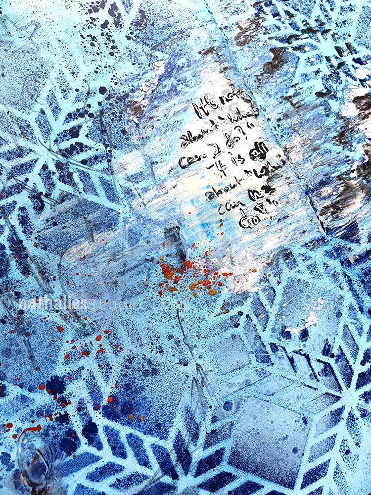
“It’s not about “What can I do?” – It is all about “What can WE do?”.

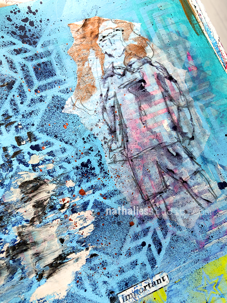
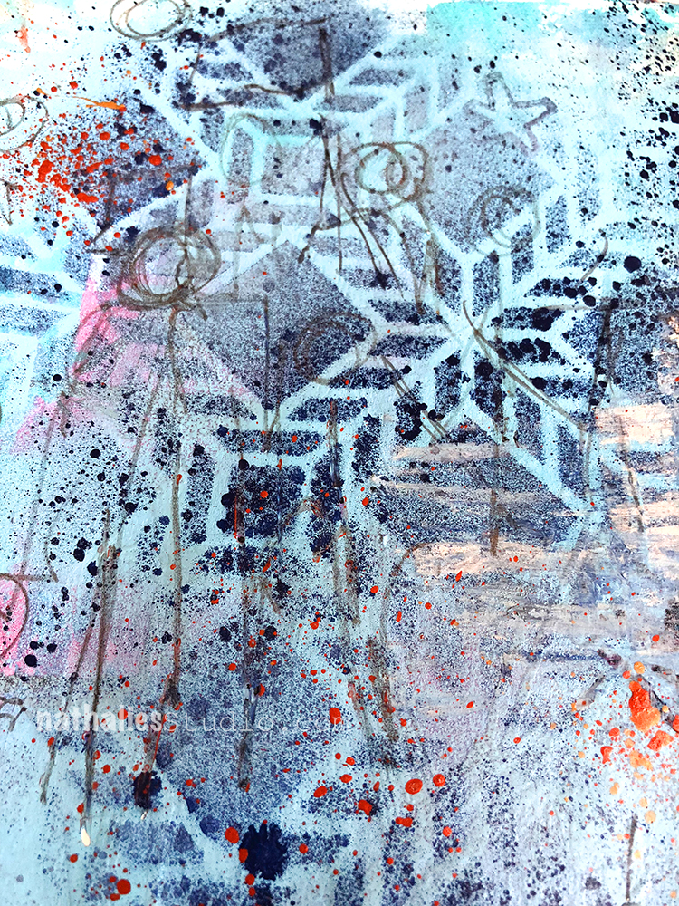
I Used acrylic paints and spray paints with my Santiago and Manhattan Stencil.

I sketched with ink on deli paper and then added it to the page.

while the paint was still wet I added some black and titanium white acrylic paint with a palate knife

I also used some rub ons that I found why cleaning up my studio – the “important” note as well as the green stars are from an old set.

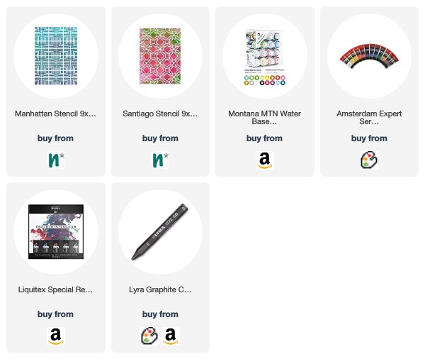
Here are some of the supplies that I used in my art journal:


Leave a comment

Inspired by Paducah, Kentucky

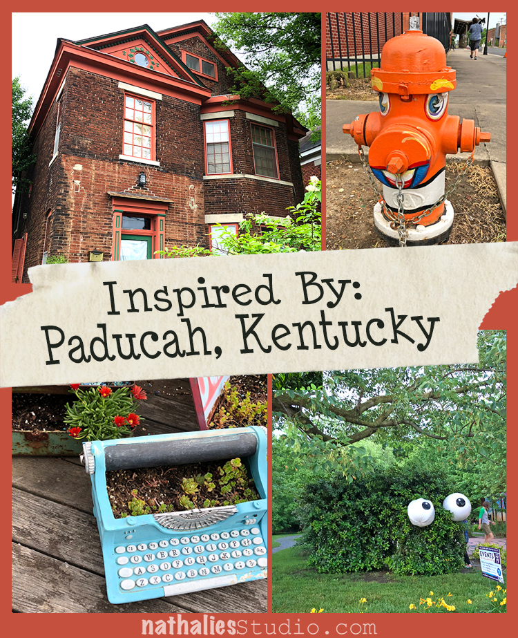
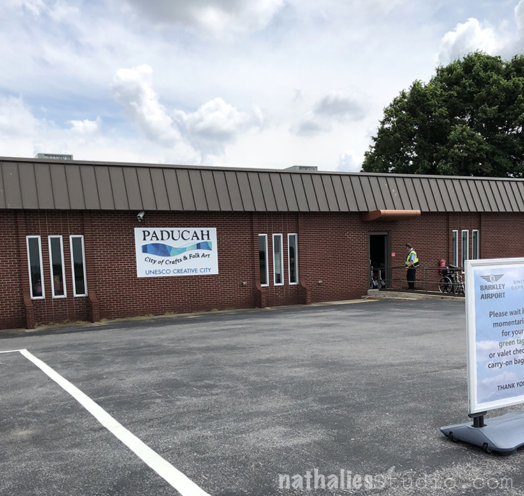
A couple weeks ago I taught some workshops in Paducah Kentucky, which was so much fun – but on top of it I also loved how inspirational this town is.

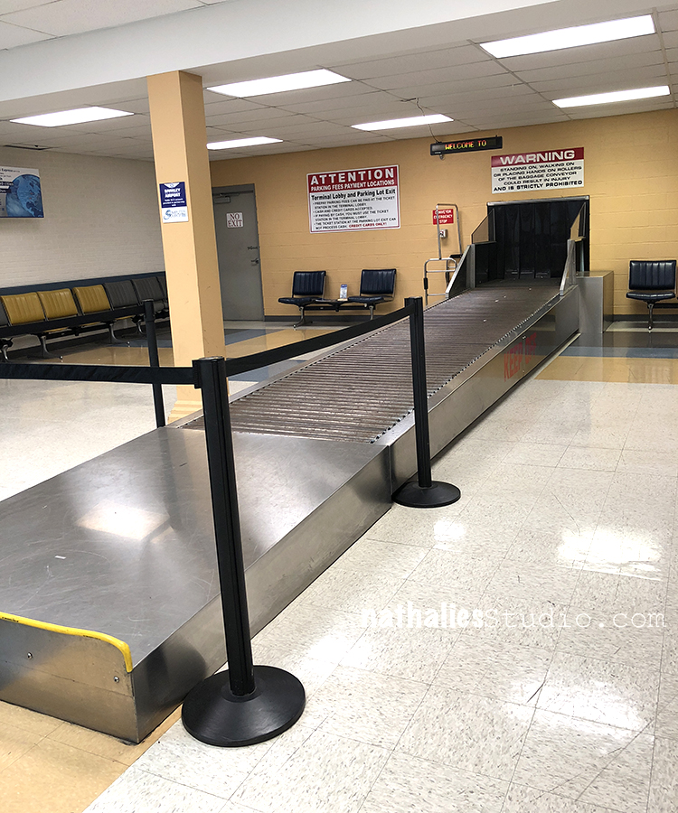
Well …first of all- the tiny airport made me smile …

when the one and only and tiny baggage belt started ringing an alarm indicating the baggage comes out I snorted and laughed out loud ….

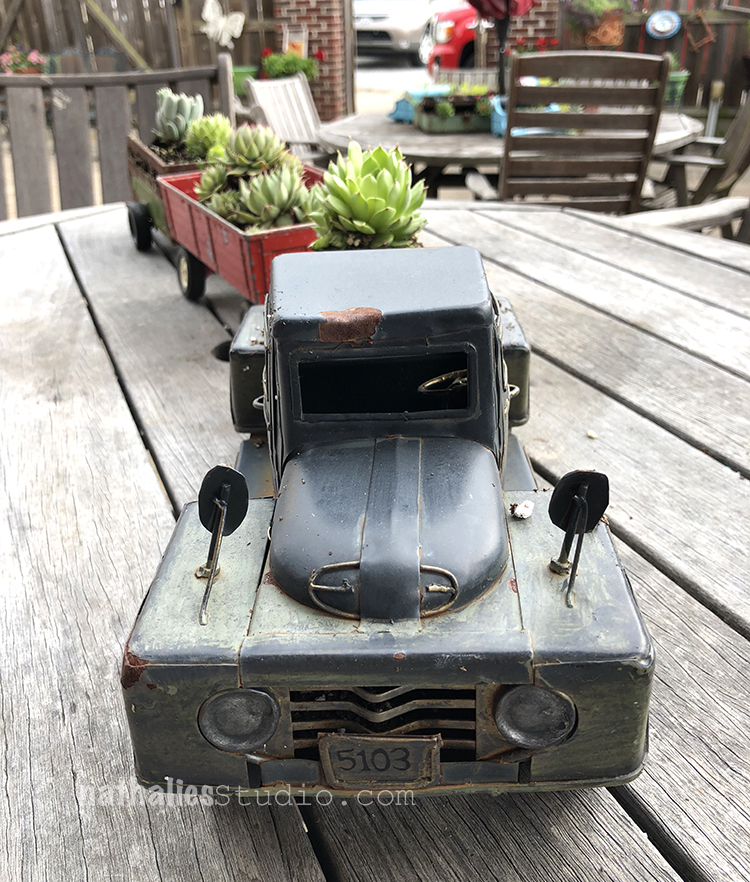
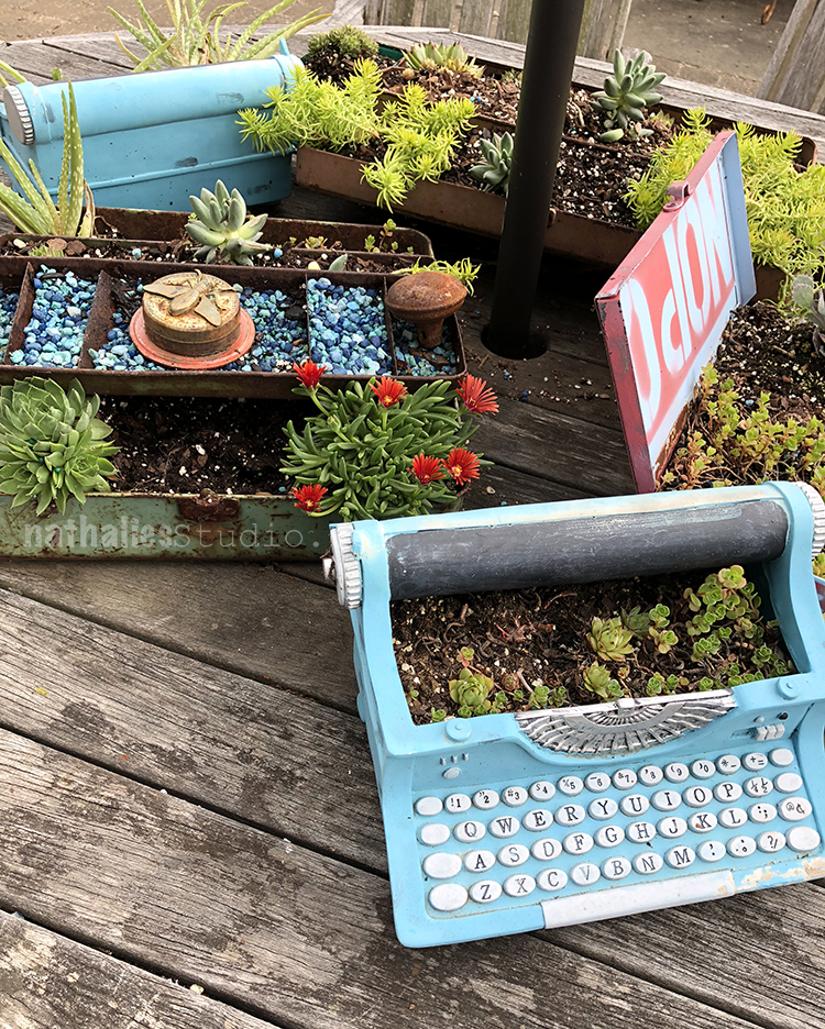
I loved Kristin’s gorgeous planters with succulent outside the studio

tiny typewriter platers, what is not to love about it?

Wooden Sculpture – amazing!

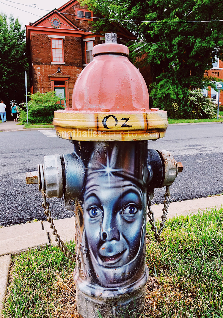
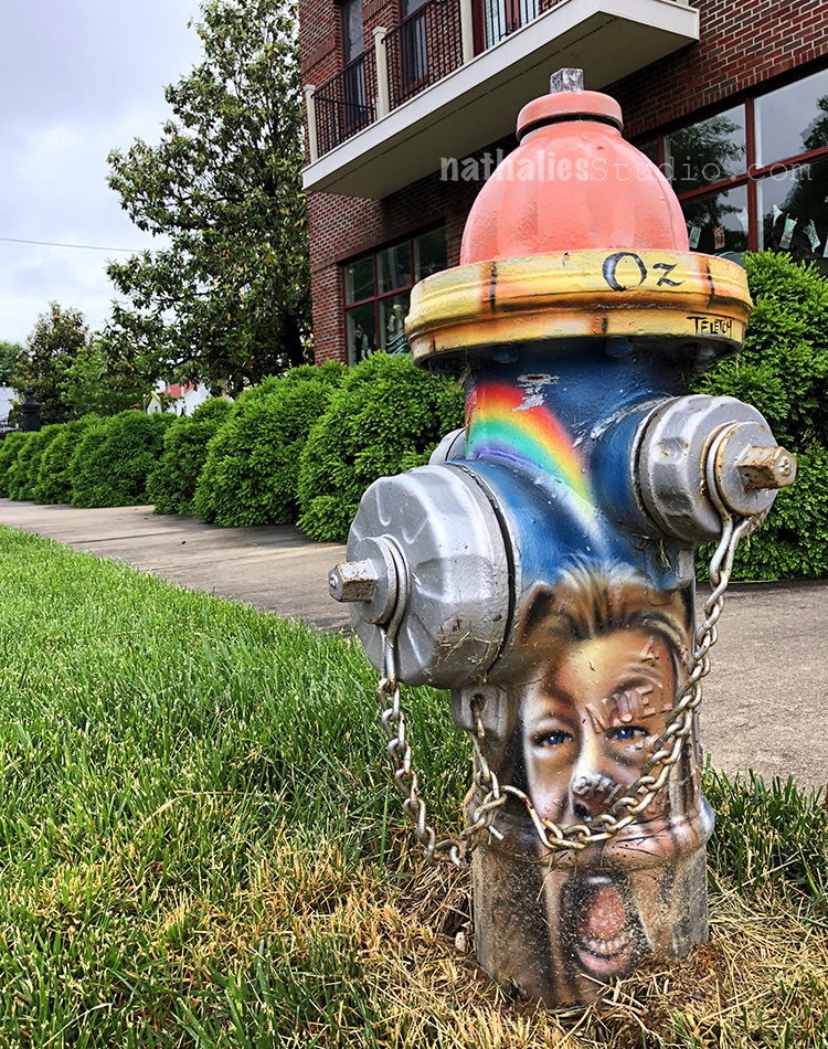
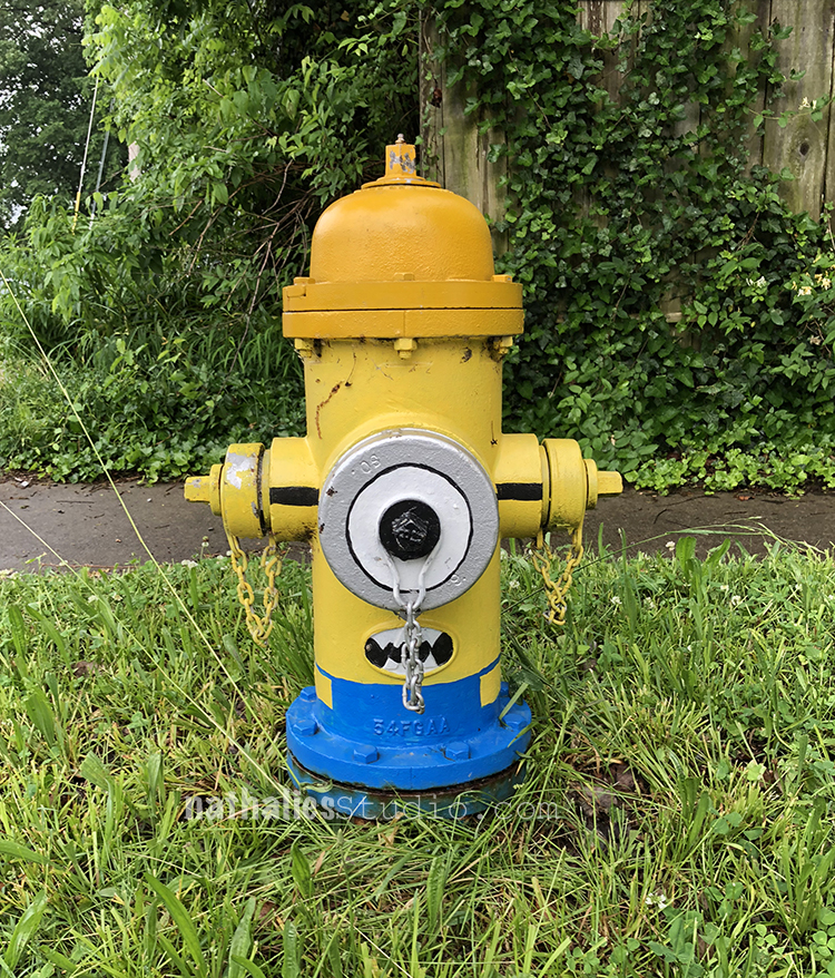
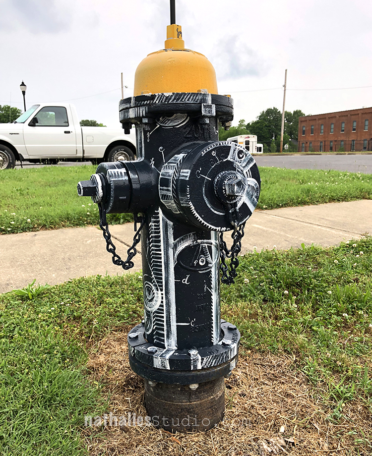
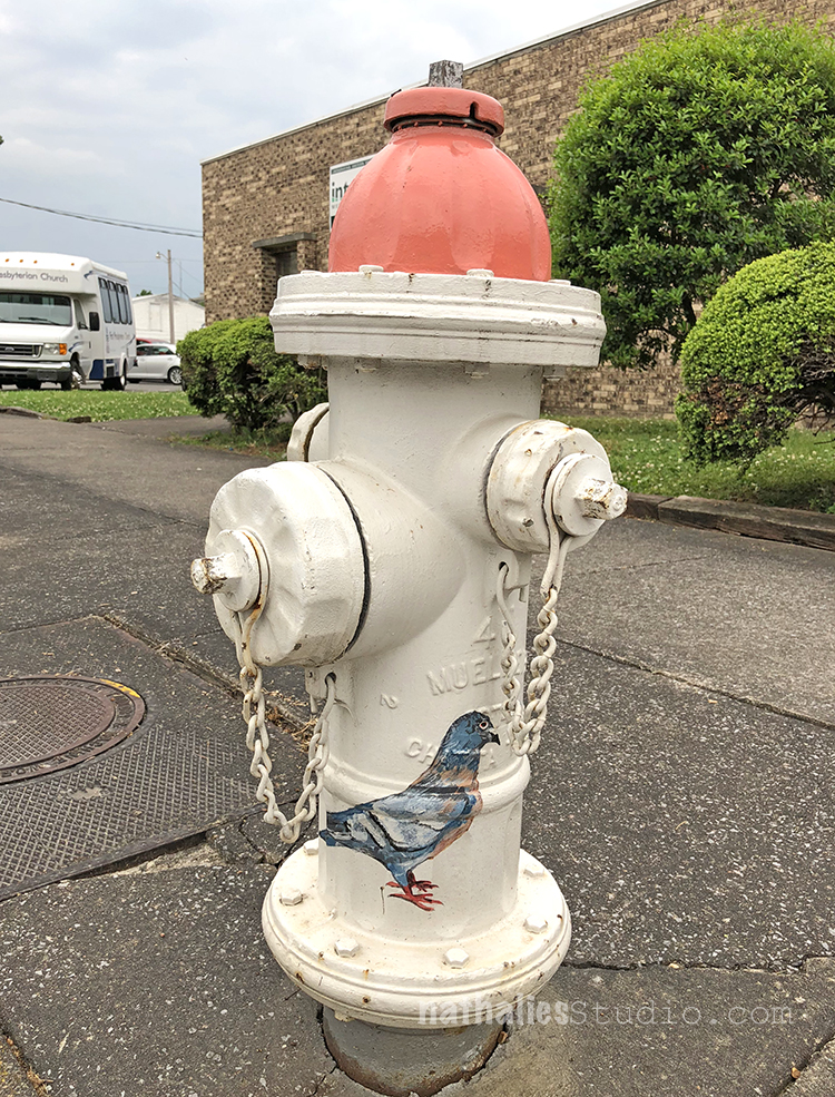
Also all around the store were differently painted hydrants – it was fun to look out for them.

Aren’t those cool?

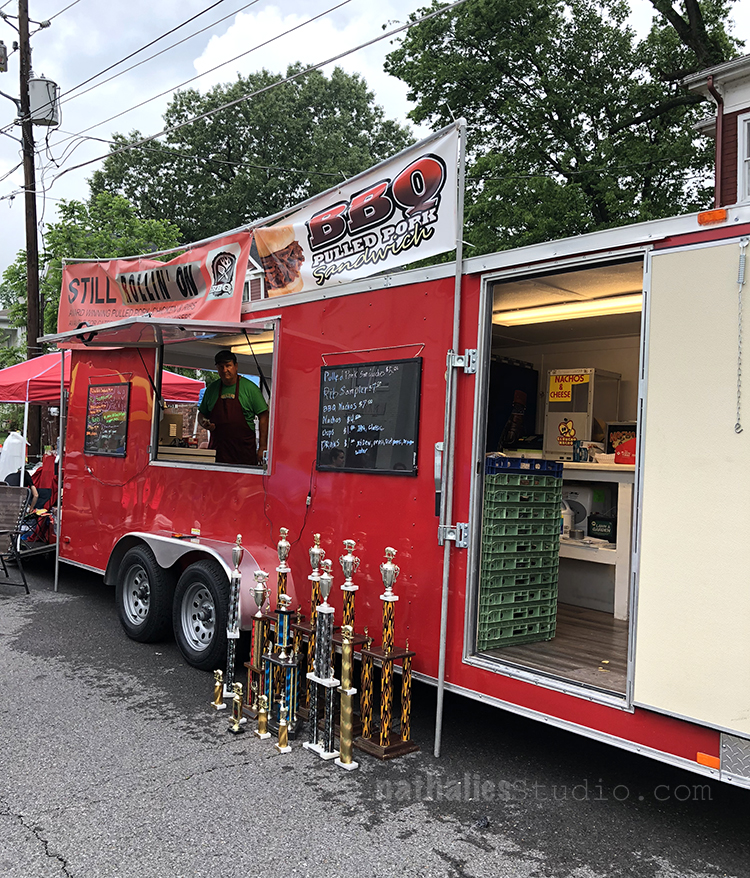
At the same time I was there there happened to be a Art and Music Festival and of course, there were tons of BBQ stands- this one proudly displayed all the trophies they won. And yes…I ate BBQ – lots of BBQ LOL

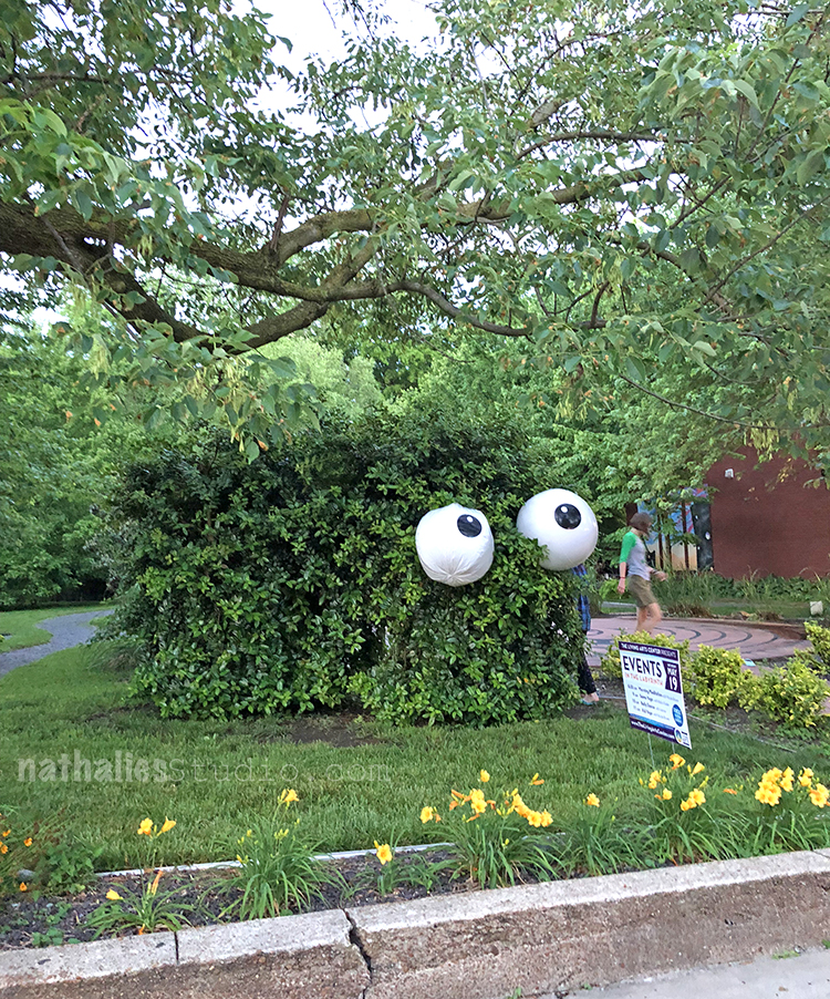
I loved those goggly eyes in a bush

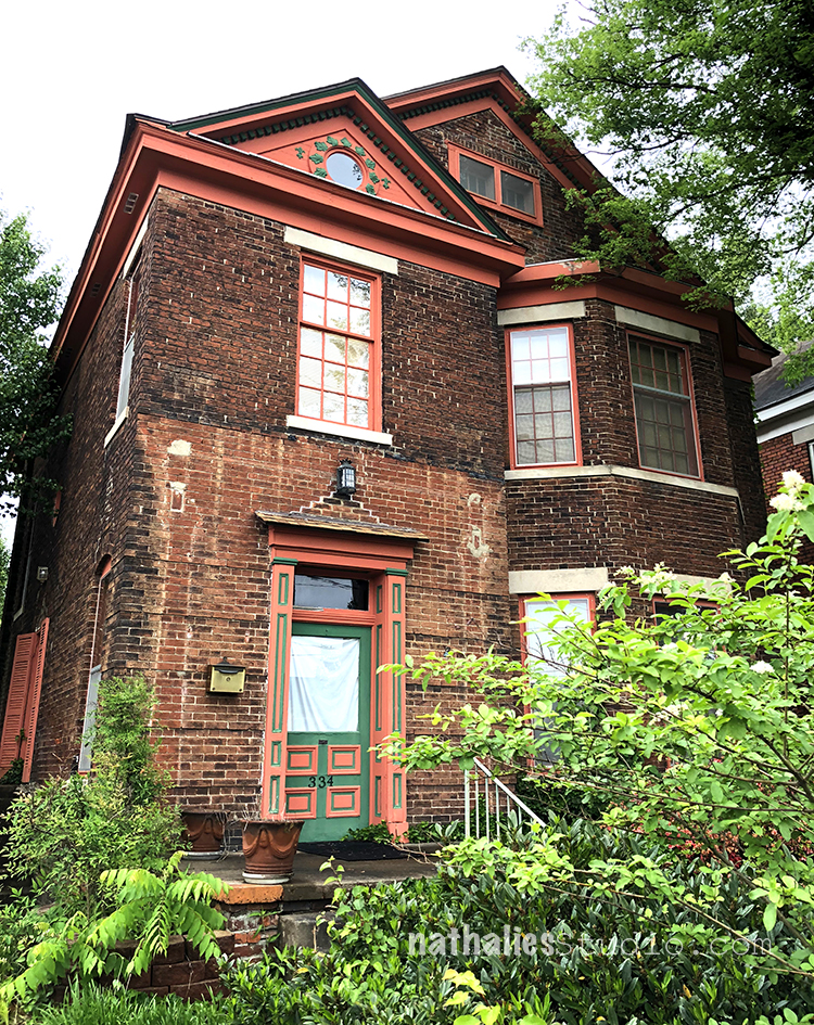
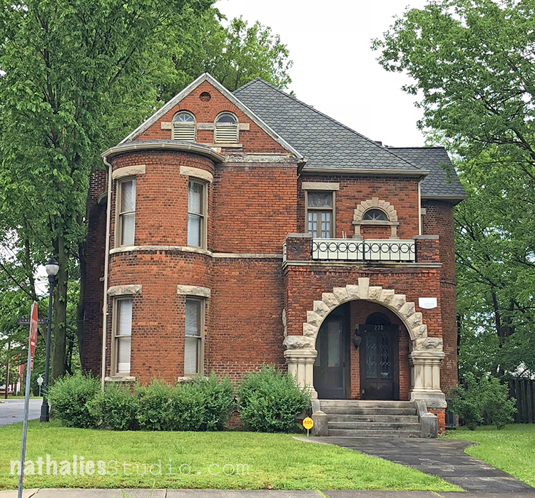
But my favorite part of Paducah def. were all the beautiful and unique old houses. So gorgeous – look at the brickbuilding on top – that one was abandoned and had a secret garden in the back


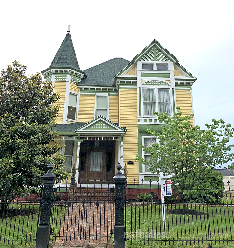
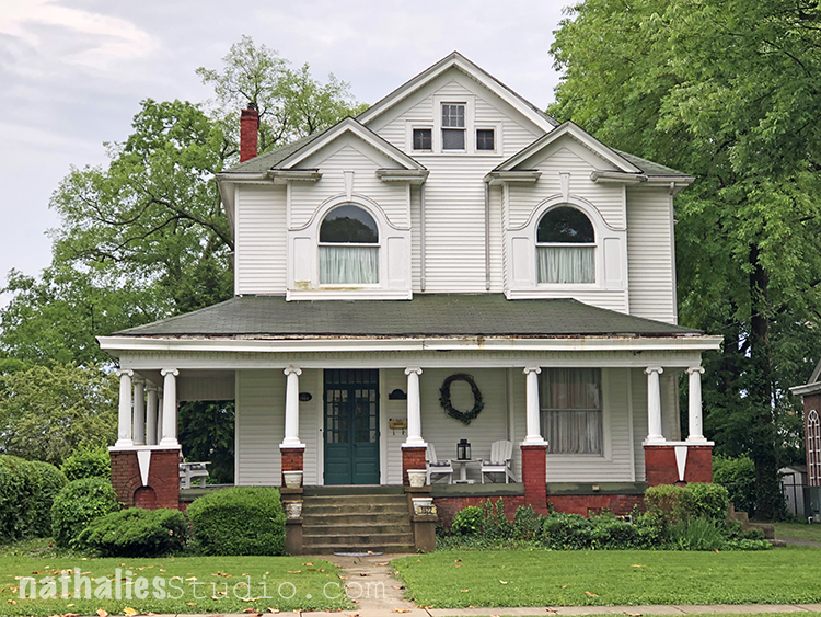
Look at this one – so so so beautiful

This building looked like a little castle

and I love the porch and the windows on this one.

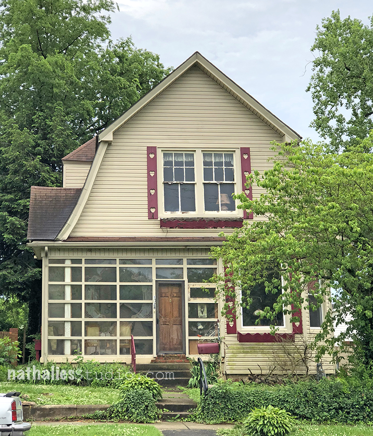
And I totally lost my heart on this cute litte Dutch Colonial …look at the cute heart shutter boards – swoon!

Cannot wait to sketch  more houses :) Hope you enjoyed the little stroll through Paducah !

Comments (4)

  • Kristin Williams

    |

    Loved seeing Paducah through your eyes! Come back, soon! xoxoxo K

    Reply

  • Kathy

    |

    Love the photos capturing the charm of Paducah.

    Reply

Leave a comment

Swapped – Painting

A new finished painting which I call Swapped. I was intrigued by the story of the Morton F. Plant House, located on the prestigious Fifth Avenue in NYC.

Apparently Cartier wanted the building, and Plant exchanged it in 1917 for 100 Dollars and a double stranded pearl necklace worth about 1,000,000 Dollars at the time. Then the necklace “only” made 151,000 USD in 1957 at an auction, so I guess that swap didn’t really work out. And so there is a jeweler and watch store up to this day in the building. There are quite some weird real estate exchange stories in NYC …this is certainly one of them. I imagined the building being just an “ordinary” apartment building -it is still so beautiful and one could only guess at how many necklaces would be needed for such a swap today! These are the things that went through my head when I painted Swapped.

The painting is 24″x18″ in size, acrylic paint, spray paint and marker on canvas.

It is available in the store here and meanwhile waits for a new home on my living room wall.

SaveSave

SaveSave

Leave a comment

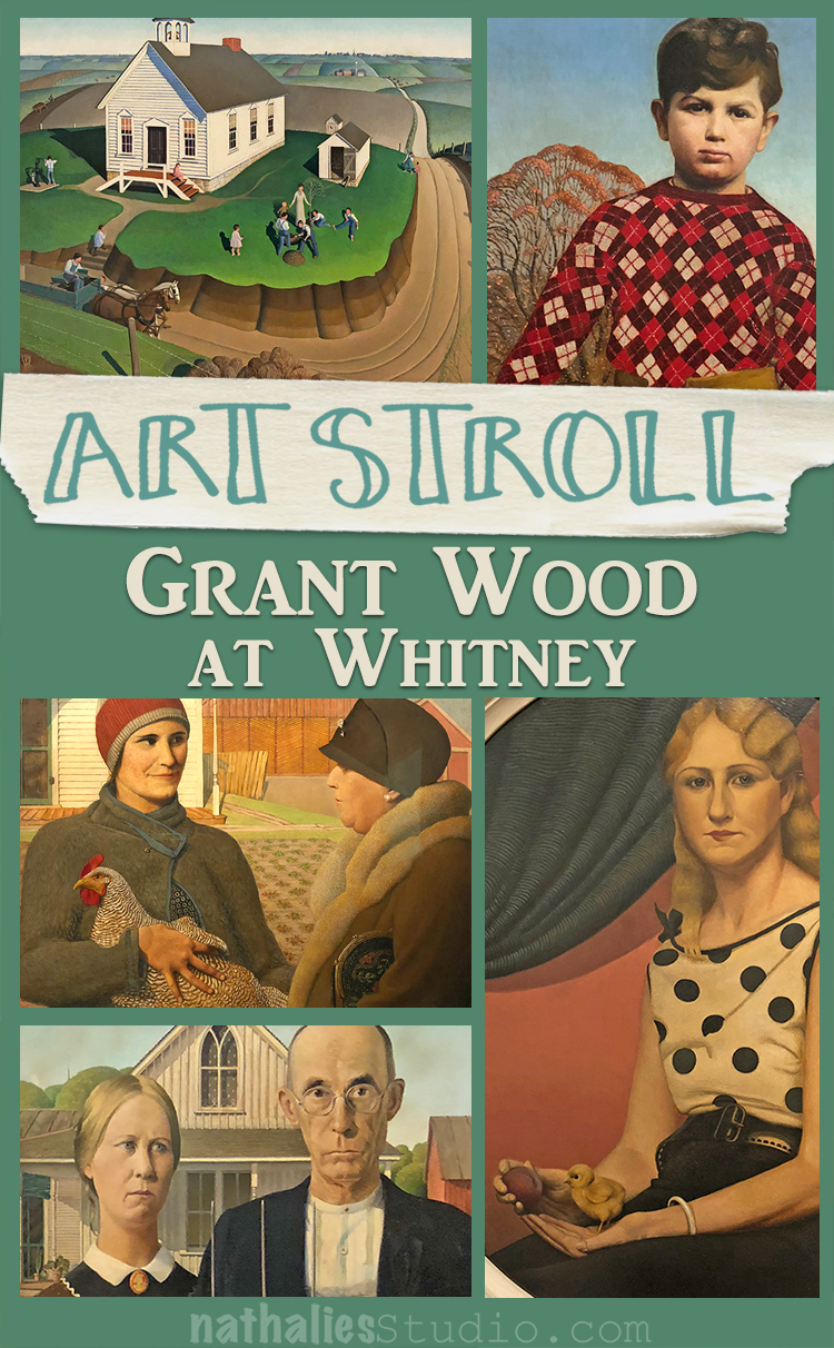
Art Stroll: Grant Wood at Whitney

A couple weeks ago I went to see Grant Wood: American Gothic and Other Fables at the Whitney Museum.

To be honest besides American Gothic I wasn’t very familiar with his work and I was curious about the show.

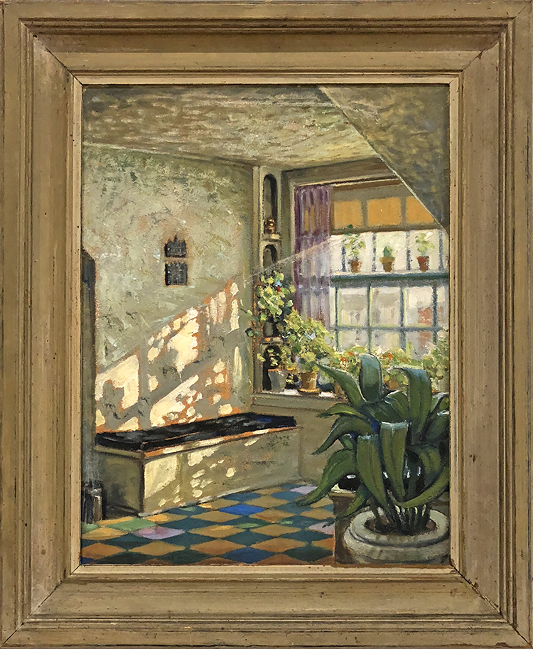
Sunlit Studio, ca. 1925-26, oil on composition board

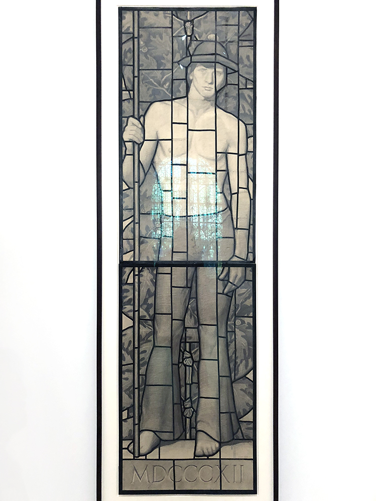
The exhibition started with his earlier work and then went to the first portraits.

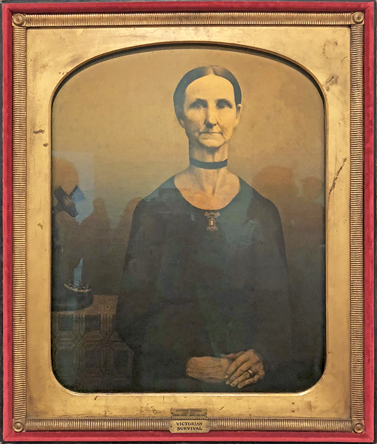
Victorian Survival, 1931 – Oil on composition board

With it’s rounded edges, elaborate frame, and sepia tones, Victorian Survial purposely resembles the late 19th century tintype of Wood’s great aunt on which this work is modeled. With her stiff upright pose and tightly combed hair, the sitter’s old fashioned demeanor contrasts sharply with the modern technology of the rotary dial phone. Wood’s ambiguous symbolism inspires many interpretations. To some the contrast between the figure and the telephone is a humorous commentary on the trope of the gossipy spinster, while to others it has been interpreted as a clash between Victorian insularity and modernity.

Whatever it means…it made me smile

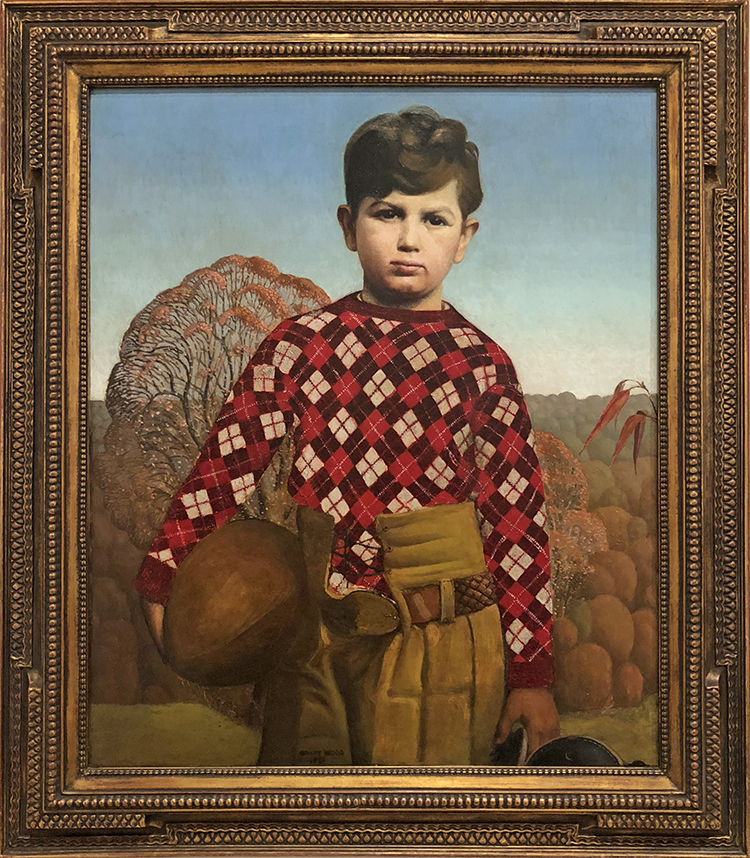
Plaid Sweater, 1931. Oil on composition board

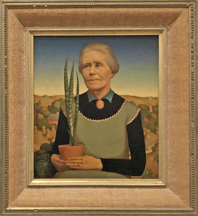
Woman with Plants, 1929 – Oil on composition board

Wood used his mother as the model for this portrait. Taking his cue form the practice in Northern Renaissance art of depicting portrait subjects against a landscape background with symbolic objects, Wood presented his figure holding a sansevieria plant, known for its ability to survive under the most inhospitable growing conditions, in front of a backdrop of rolling Iowa hills.

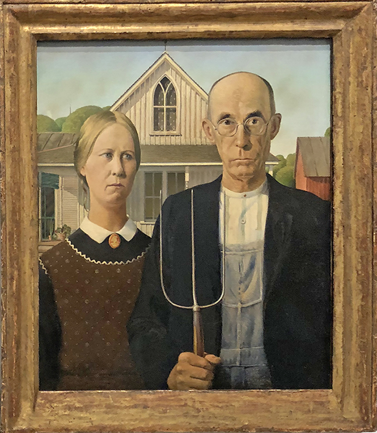
American Gothic- we all know that one :)

The American Golfer, 1940 – Oil on board

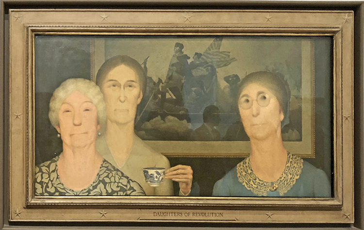
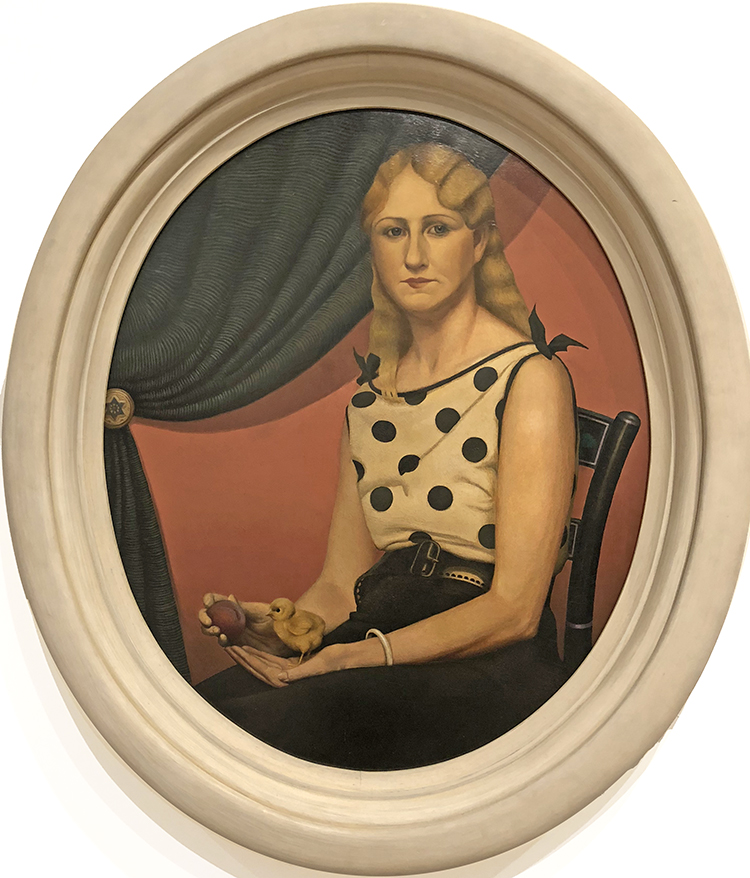
Daughter’s of Revolution, 1932, Oil on composition board

In this painting Wood aimed to ridicule the Daughters of the American Revolution for their claims of nobility based on ancestry, which  he saw as antithetical in their celebration of democracy. The artist painted three of the group members in front of a reproduction of Emanuel Leutze’s painting of General George Washington crossing the Delaware River, contrasting the future president’s dynamism and bravery with the Daughter’s stiff poses, contemptuous expressions, and the inconsequential action of raising a teacup. New York critics celebrated the painting’s biting satire when it premiered at the Whitney Biennial in 1932, with one calling it “as delicious as it is wicked”  but it was met by protests from various DAR chapters that deemed it un-American.

mhh- why a chicken and a peach (?) – see I did not read up on this …what is your interpretation?

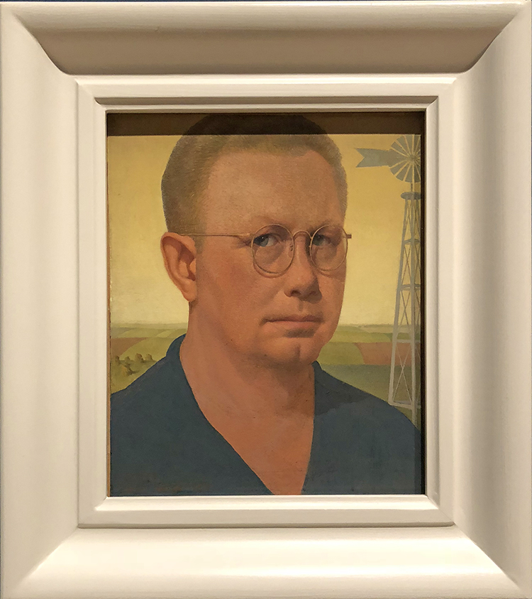
Self-Portrait- 1932

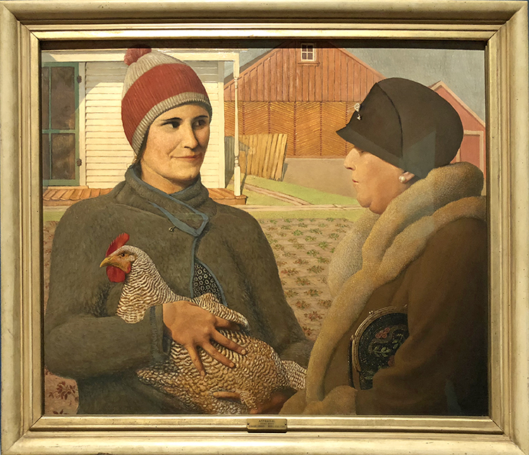
Appraisal, 1931 – Oil on Composition Board

I love this painting the difference between the rich lady and the lady from the farm, the look – the clothing – with little hints- a security pin on the jacket on the left, a brooch pin on the hat of the lady on the right. One holding a hen, one holding a handbag.

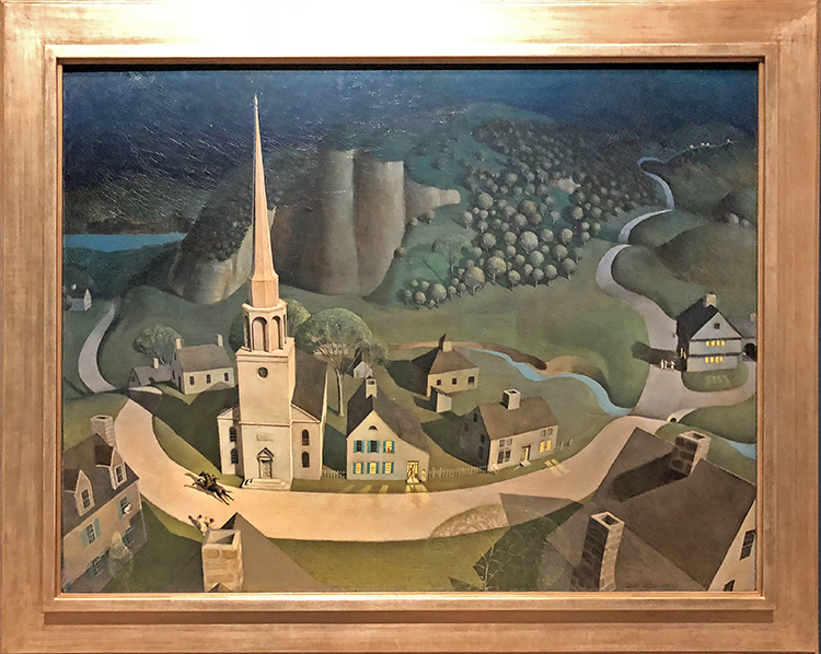
The Midnight Ride of Paul Revere, 1931 – Oil on composition board


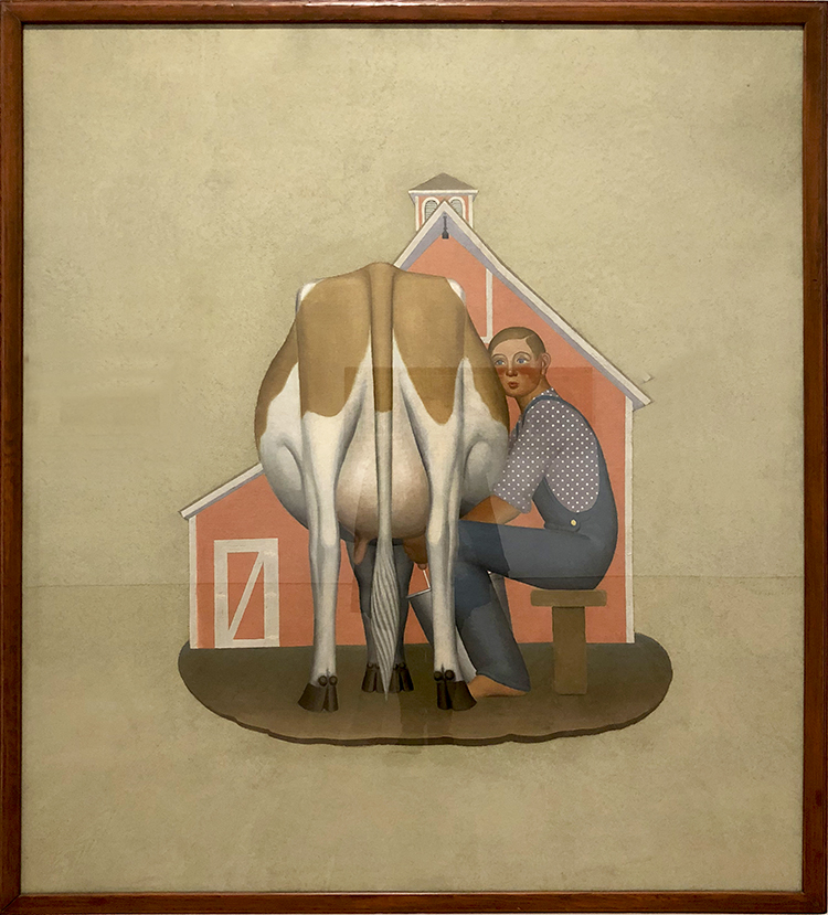
Boy Milking Cow, 1932 – Oil on canvas, cut out and mounted on fiberboard

Very iconic yet so different form this portraits in the beginning

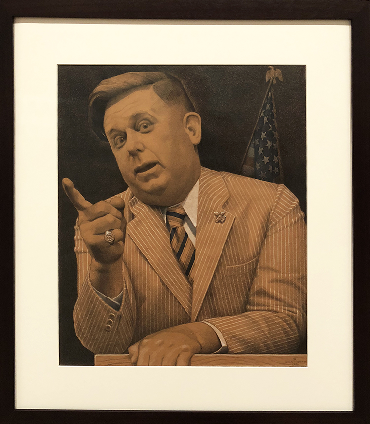
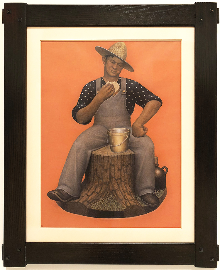
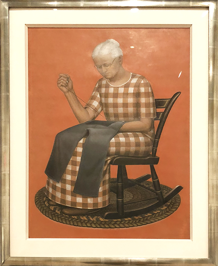
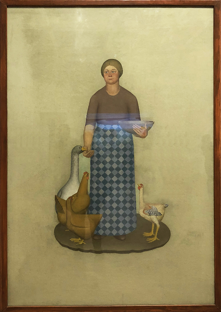
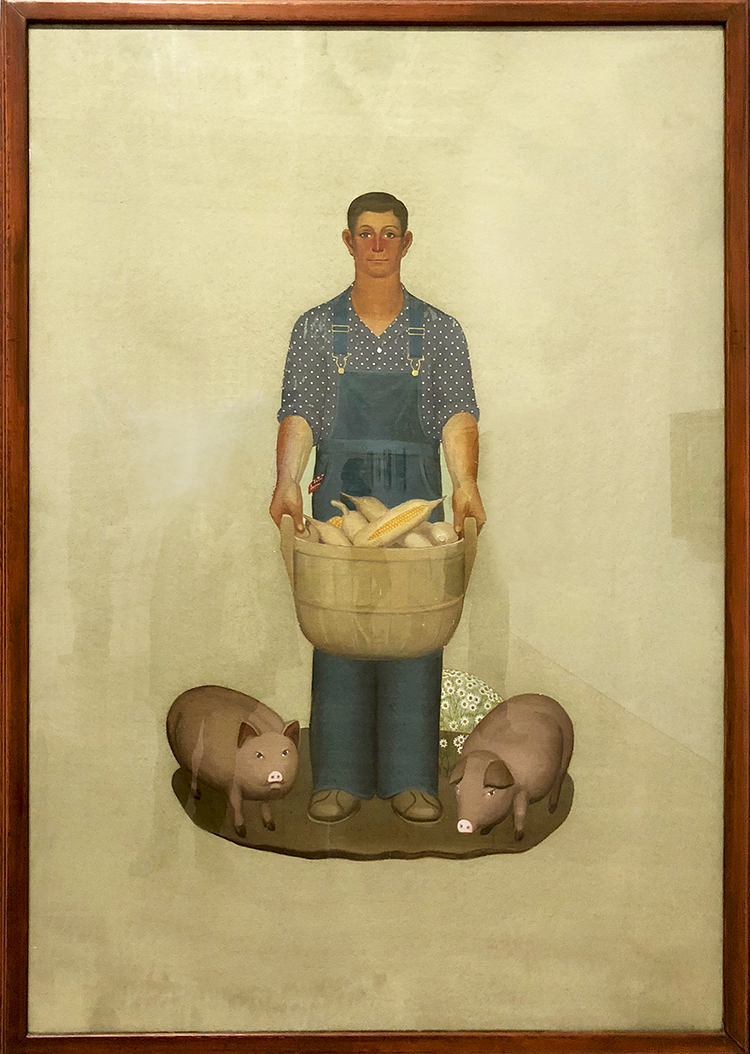
Grant Wood’s Farmer With Pigs and Corn (1932)

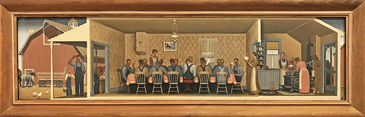
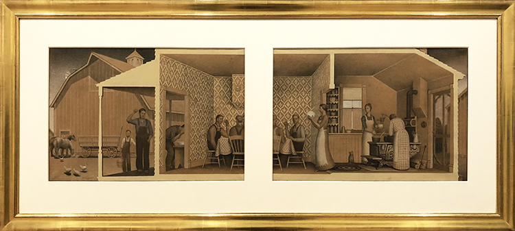
on the top and button are Studies for “Dinner with Threshers”, 1933 – Graphite pencil, opaque watercolor, and colored pencil on paper

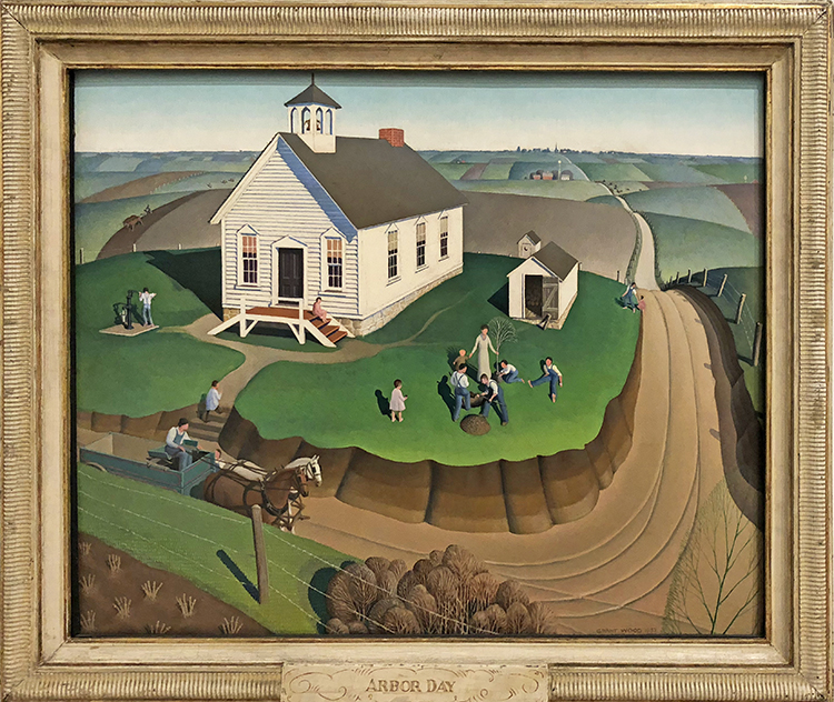
Arbor Day, 1932 – Oil on composition board

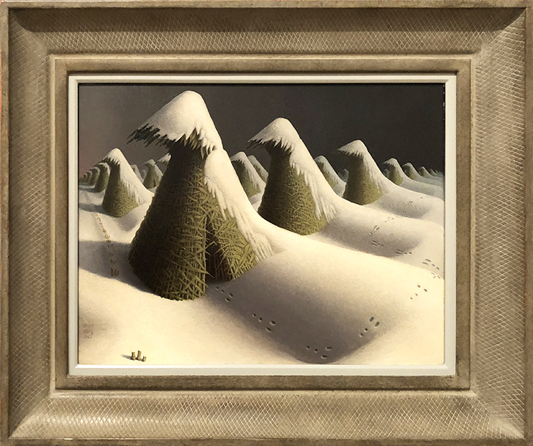
January, 1940-41 – Oil on composition board

I actually really love this painting. It is one of the last paintings Wood created before his untimely death from liver cancer, January has a decidedly nostalgic cast. According to the artist, the painting was “deeply rooted in the memories of my early childhood on an Iowa farm. . . . it is a land of plenty here which seems to rest, rather than suffer, under the cold.”

It was an interesting exhibitions, and good to learn that Grant Wood was much more than just American Gothic. Some of the portrait paintings where truly fun and interesting it makes you wonder how to decipher the symbolism in them. Hope you enjoyed this Art Stroll.

Comments (4)

  • Sue Clarke

    |

    I could look at Sunlit Studio for a while…such detail and shadowing.
    I was not familiar with any of these except American Gothic and it’s nice to see some different and fun symbols used.
    Thanks for the stroll Nat.

    Reply

    • nathalie-kalbach

      |

      so glady you enjoyed his work especially Sunlit Studio. It was awesome for me as well to learn more about his work. thank you for joining the stroll!

      Reply

  • Bea

    |

    Yes, I enjoyed it. Would love to see it in person. Thanks…

    Reply

Leave a comment

My Closest Friends – Art Journal Spread

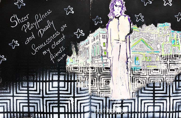
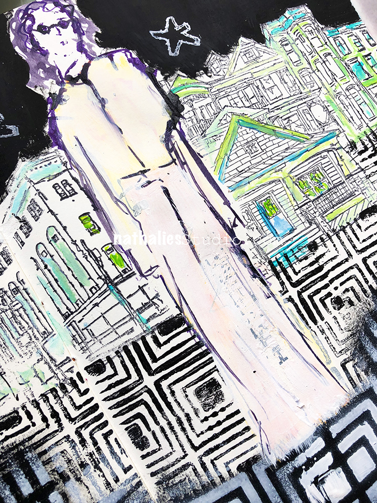
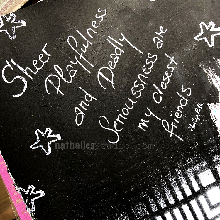
“Sheer Playfulness and Deadly Seriousness are my closest friends” – Philip Roth

Totally resonates with me :)

So sad to hear that one of my favorite authors died.

This spread started as a demo in my art journaling class in Paducah – I always love coming home and finishing or changing those spreads.

Black gesso was a big friend this time :) Here are some of the supplies I used besides Acrylic Paints


Leave a comment