nathalie-kalbach

Currently Digging – June 2018 AIT

Once in a while I thought I would share with you some nifty finds – like an Artist who’s work caught my eye…, some Inspiration or the what, when and where that caught my eye and got my creative juices flowing, and Tools & Techniques I am currently digging like a new way to use a material or an application that I’m taking away. Hope you enjoy this.

Here we go for this month:

Last Wednesday my friends and I went to a MoMA opening which I will tell in a later posts about. They had opened another Gallery and my friend Adam pointed out this painting by Alice Neel.
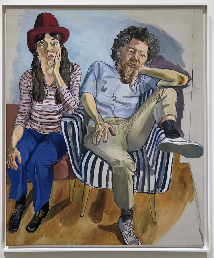
To be honest, I had never heard about her but Adam talked in such a passion and with so much love about her work that I knew I had to check her out.

Her portraits strike something in me – they let you stop and feel with the person in the painting. Her life sounds interesting and I cannot wait to watch the movie about her. I hope you check her work out as well :)

With the better weather daily bike rides are back and on top of that my husband and I are also scouting out some other neighborhoods in the city. As most of you know I am always intrigued by old buildings especially if they also show a lot of patina like this one
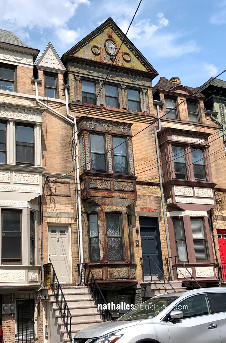
I love this one so much with all the patina and also because you can see on the left and the right how it looks like when painted (restored?). All the intricate patterns in the tin, the lacy curtain -I wonder how this building looks like inside and who lived in this building, what stories could it tell.  I find this so inspiring and def. want to paint it some time.

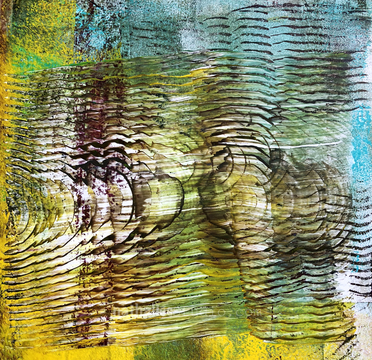
As I have relentlessly mentioned (for the purpose of holding myself accountable to it- LOL), I am reorganizing my studio and while I was getting through one of my drawers I found one of my super super favorite tools again a woodgrain making tool.
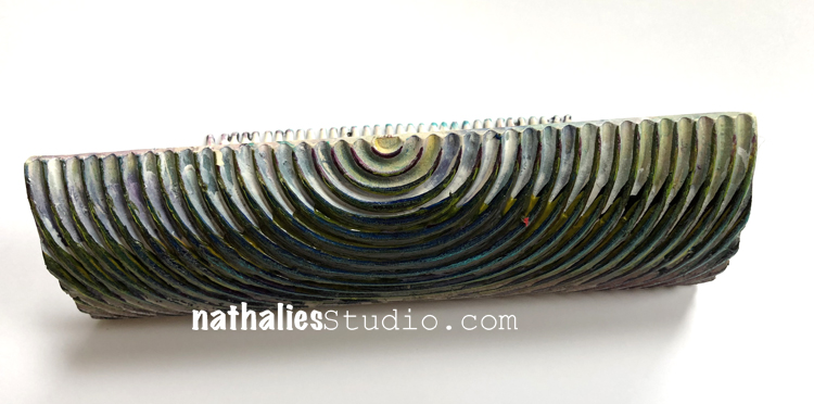
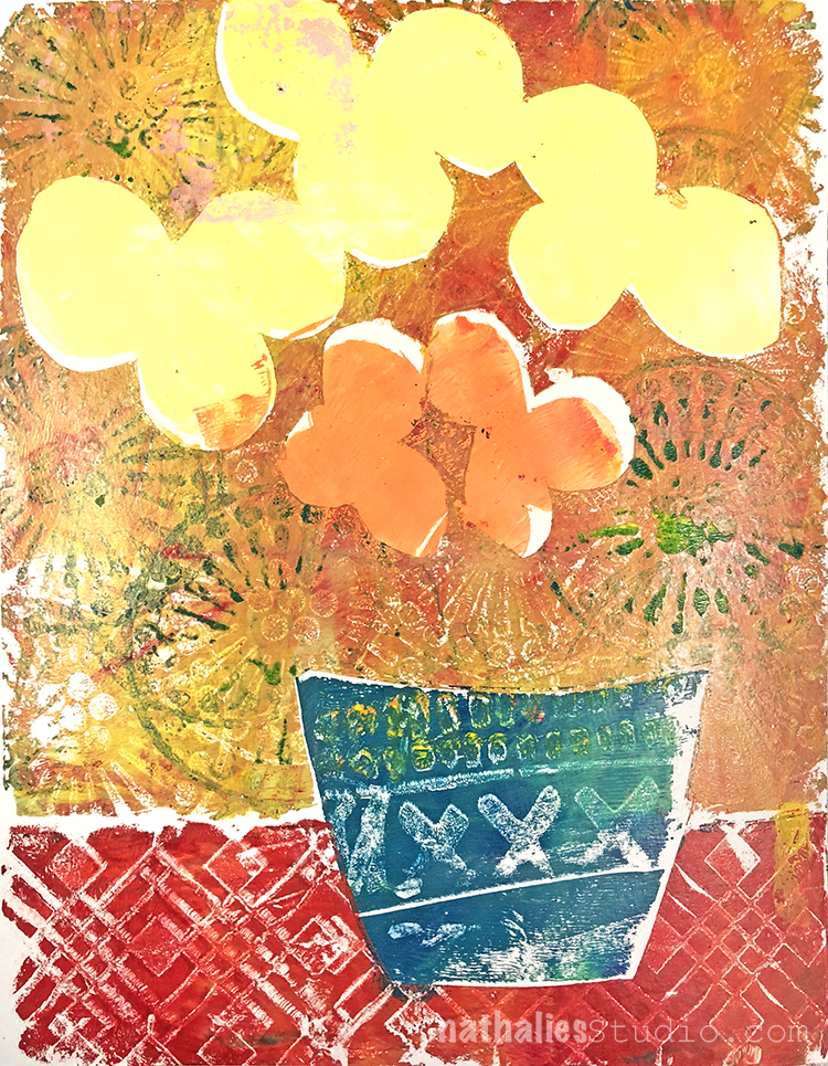
I bought it about 15 years ago and have used it like a mad woman with modeling paste, heavy body paint, heavy gesso – oh man …anything that is a thicker paint medium. But then I kind of lost it in the move and when I found it again I jumped up and down and took it to town with my Gelli plate to make collage paper:
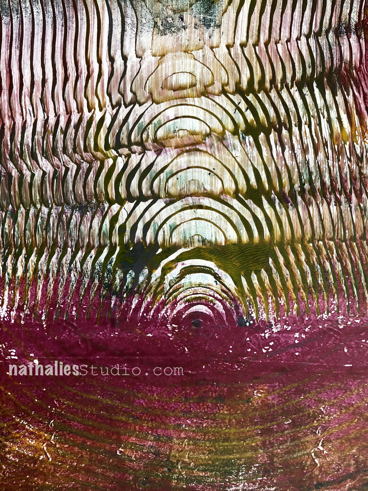
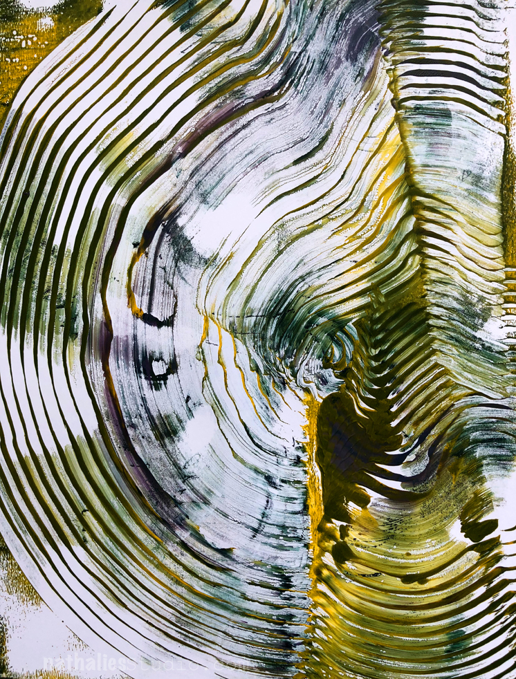
Twist, turn, drag …many options- oh Woodgrain tool – thank you for coming back into my life :) Now I am really excited about organizing my studio- who knows what else I re-discover- LOL

See you soon again with some new finds that I am currently digging !

Leave a comment

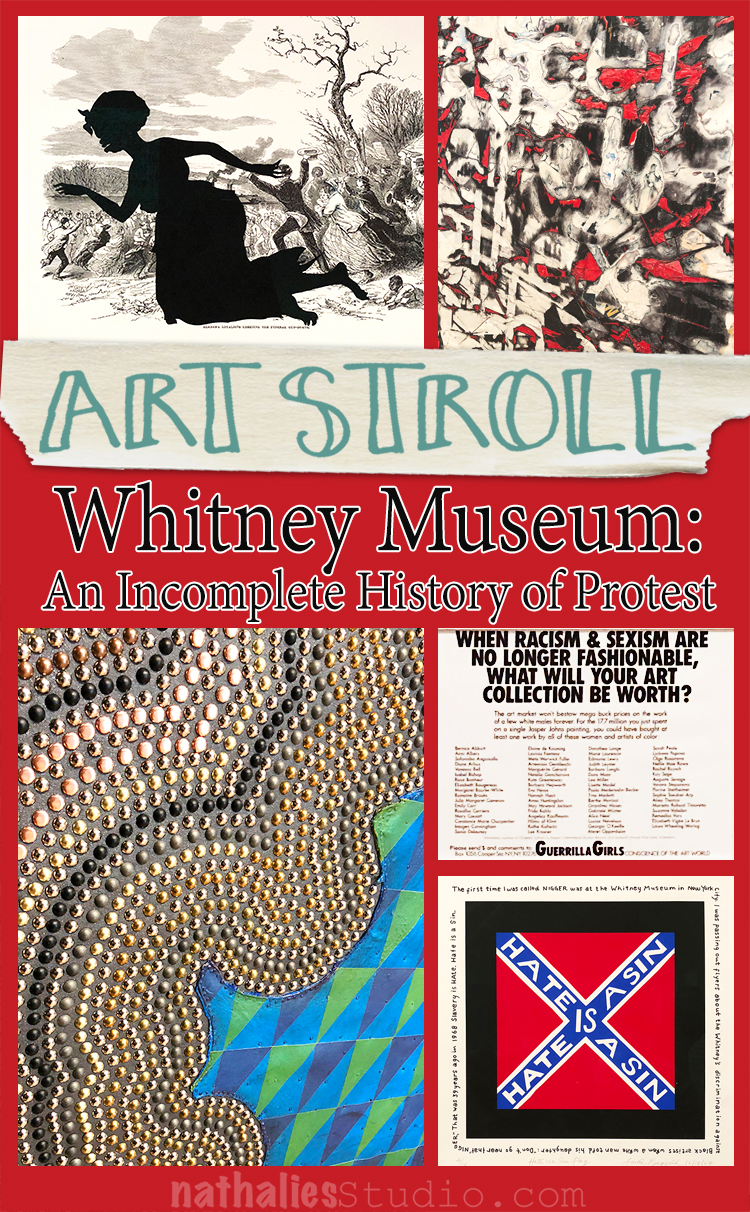
Art Stroll: Whitney Museum – An Incomplete History of Protest

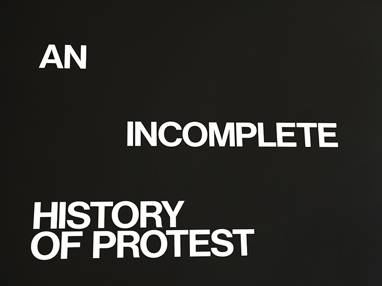
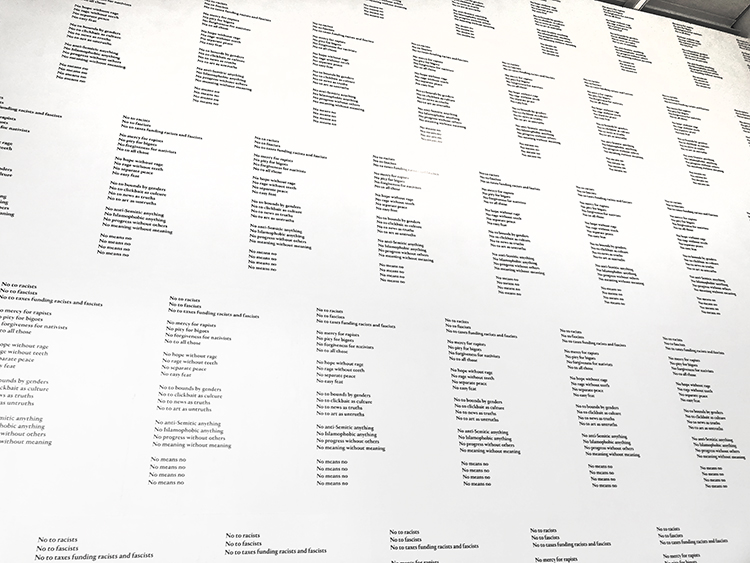
In April my friend Thomas and I visited the Whitney and the exhibition

It was interesting, thought provoking, strengthening, powerful, emotional and…incomplete…So many different ways to protest, so many different topics to protest, so important to think about this today.

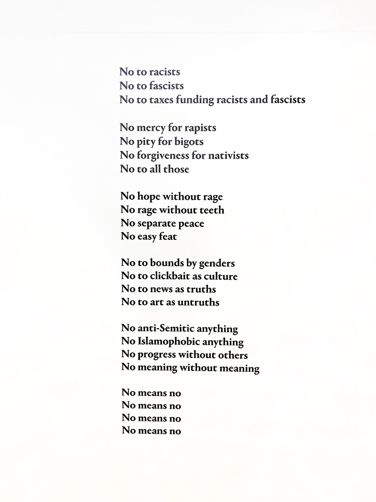
Detail of what covered the whole entrance wall

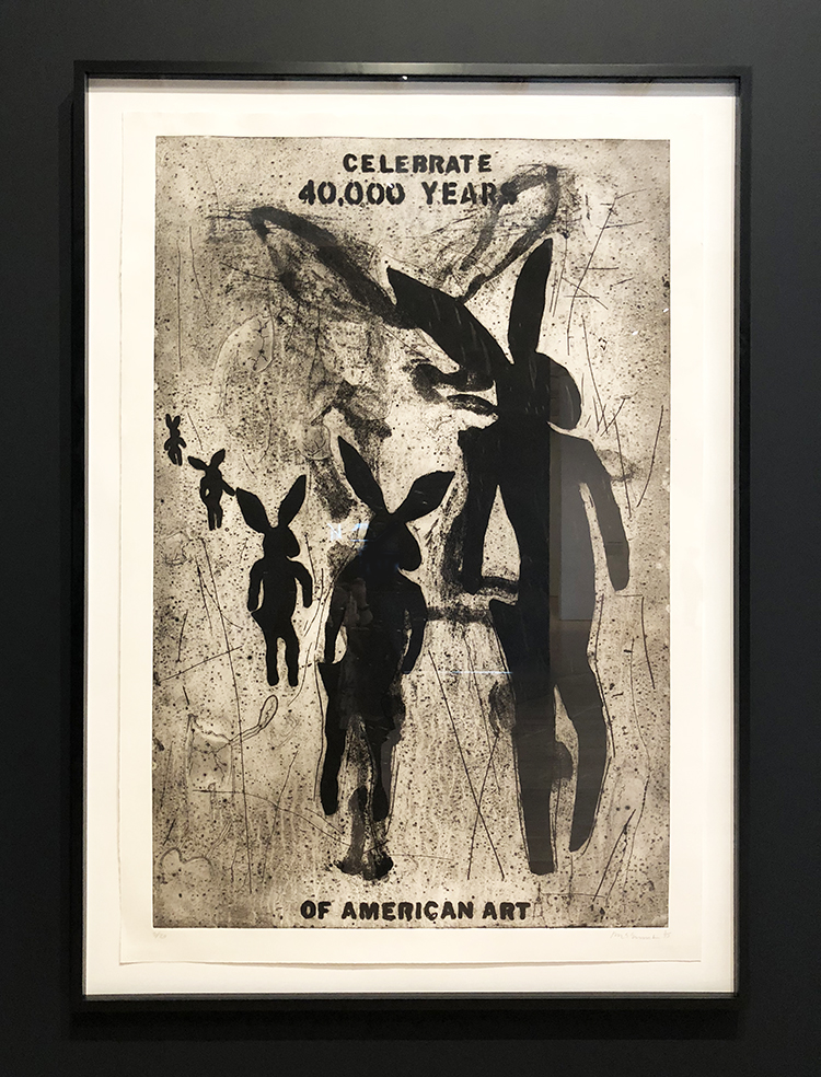
Jaune Quick-to-See Smith – Celebrate 40,000 Years of American Art, 1995 – Collagraph.

Quick-to-See Smith baded the standing rabbits in the collagraph on ancient North American petroglyphs. She has noted that dominant narratives of American history typically beging with the arrival of Eurpeans in the “New World”. Her work counters this notion.

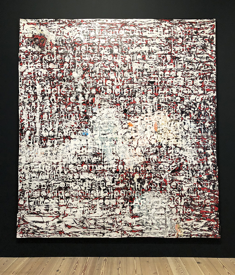
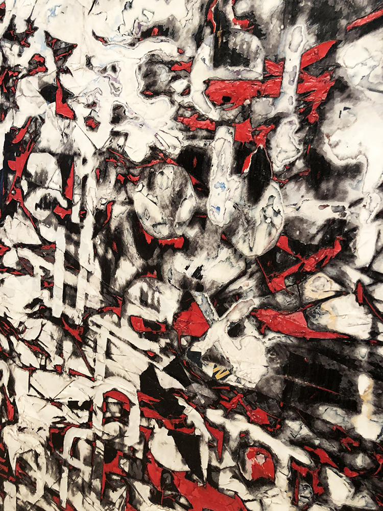
Mark Bradford, Constitution III, 2013  Found and cut paper and acrylic on canvas

While initially resembling a purely abstract painting, Mark Bradford’s piece contains excerpts from the United States Constitution. His embedding of this language within an aggressively worked surface suggests that the founding document is also a living one, subject to modication and debate.

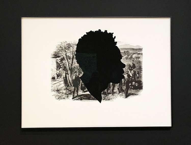
Above and below – Kara Walker -Photolitograph and screenprints.

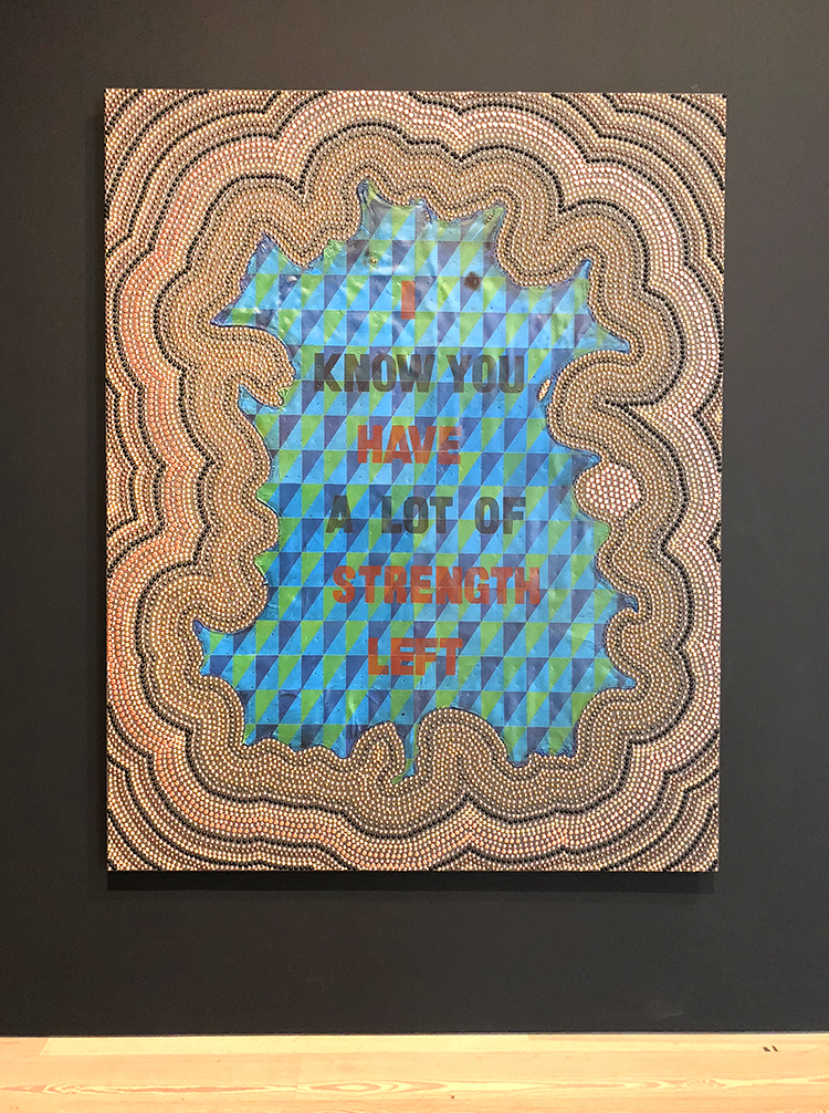
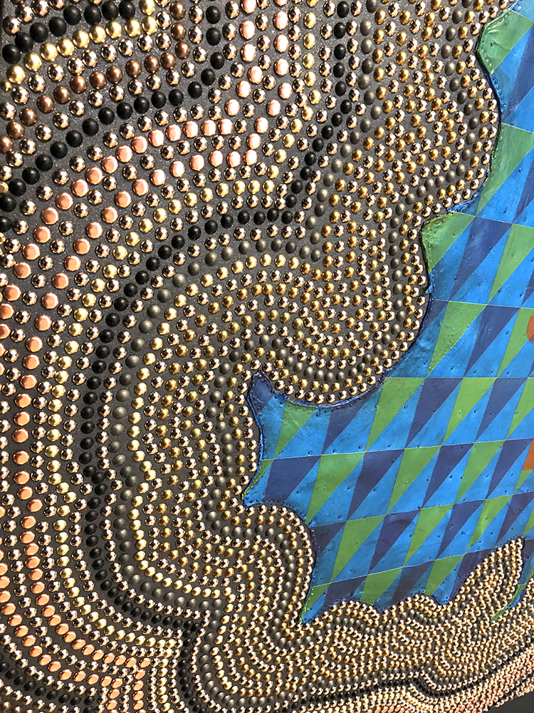
Jeffrey Gibson, I Know You Have a Lot of Strength Left, 2017 Rawhide, acrylic , graphite, metal tacks and canvas on panel.

M

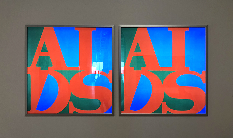
General Idea – active 1969-1994 – Toronto, Canada – AIDS, 1988

The collaborative General Idea altered Robert Indiana’s well known “LOVE” icon from the 60s and changed it to read AIDS. The images appeared on the streets in different cities, in the NY subway system, in art galleries, and in mass media. The concept behind the works was akin to advertising: spread awareness about AIDS by making art so ubiquitous that it would become part of the social unconscious. Six years later, in 1994 the two of the three members of the collaboration, Felix Partz and Jorge Zontal died within month of another from AIDS related complications.

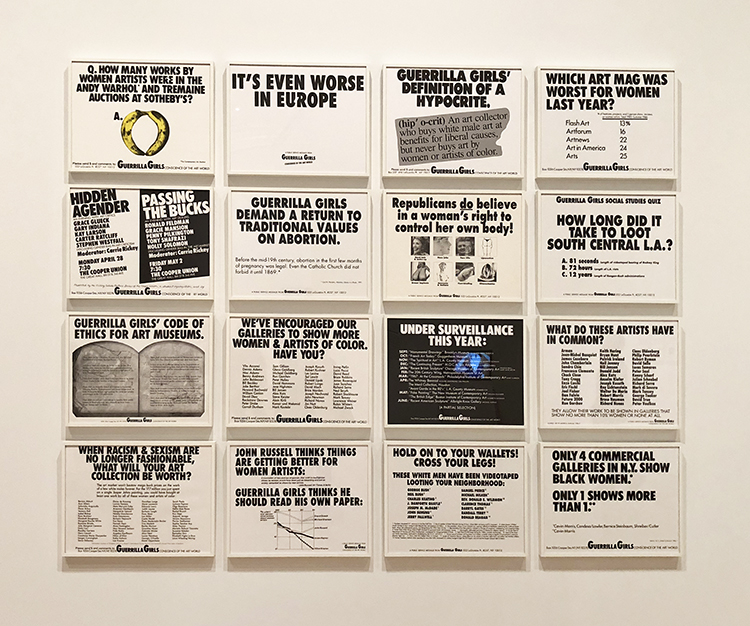
Guerrilla Girls is an anonymous group of feminist, female artists devoted to fighting sexism and racism within the art world

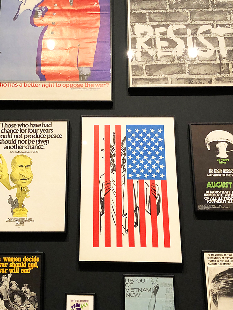
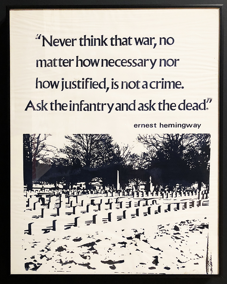
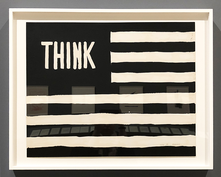
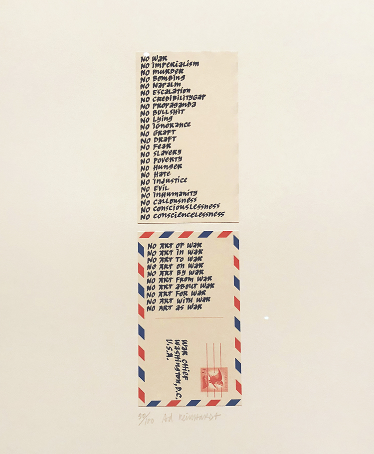
Anti Vietnam War Posters

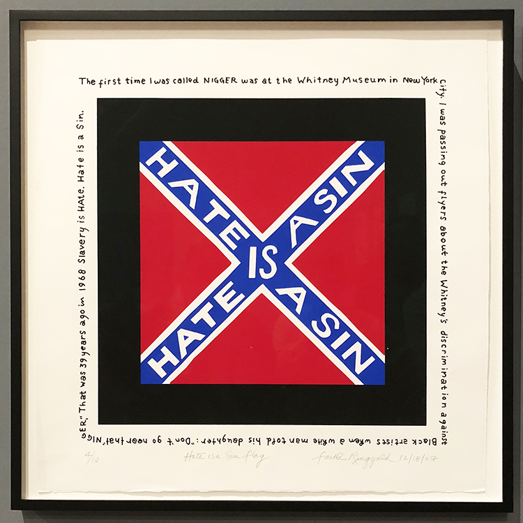
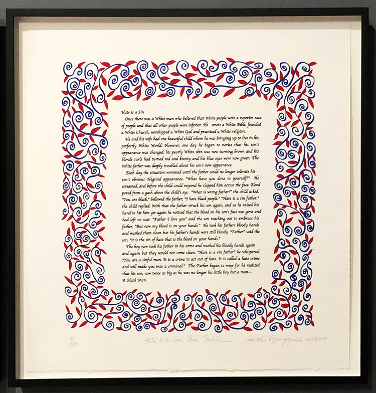
Faith Ringgold (b. 1930), Hate Is a Sin Flag, 2007. Acrylic, graphite, and ink on paper

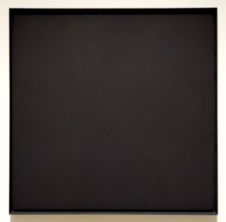
Ad Reinhardt, Abstract Painting 1960-66 – Oil on linen

“From 1953 until his death in 1967, Ad Reinhard focused exclusively on a series of untitled works that came to be known as the “black paintings”. The paintings are pared down to a predetermined arrangement of elements with little sign of the artist’s hand  immediately evident. In the 1950s and 1960s Reinhardt contributed his time, art and money to civil rights causes and he vocally opposed the war in Vietnam. ”

I am always intrigued by the way how artists create artwork that are political statements, it is a powerful. I am not a political artist but I am a political person and I welcome art that makes me think, provokes feelings, or consider maybe even other views. I hope you found this little art stroll interesting, it made me think a lot about the past and the now and the future, about symbols, and words, and most of all, about the power of art.

Comments (2)

  • Sue Clarke

    |

    Wow. Mark Bradford’s piece really makes me think.
    Hate Is A Sin is hard to read and so powerful.

    Reply

Leave a comment

Stroll Through the Hood May 2018

Time for a Stroll Through the Hood . Strolls through my hood get me out of my studio, they help me unstuck and often I get inspired by what I see and to get new ideas to create something. It is part of my philosophy about Artful Adventures in Mixed Media – which is the subject of my book. Here are some photos that I gathered in the last couple weeks.

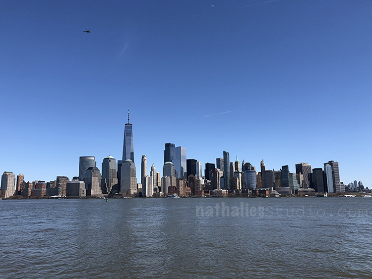
This view gets never old for me.

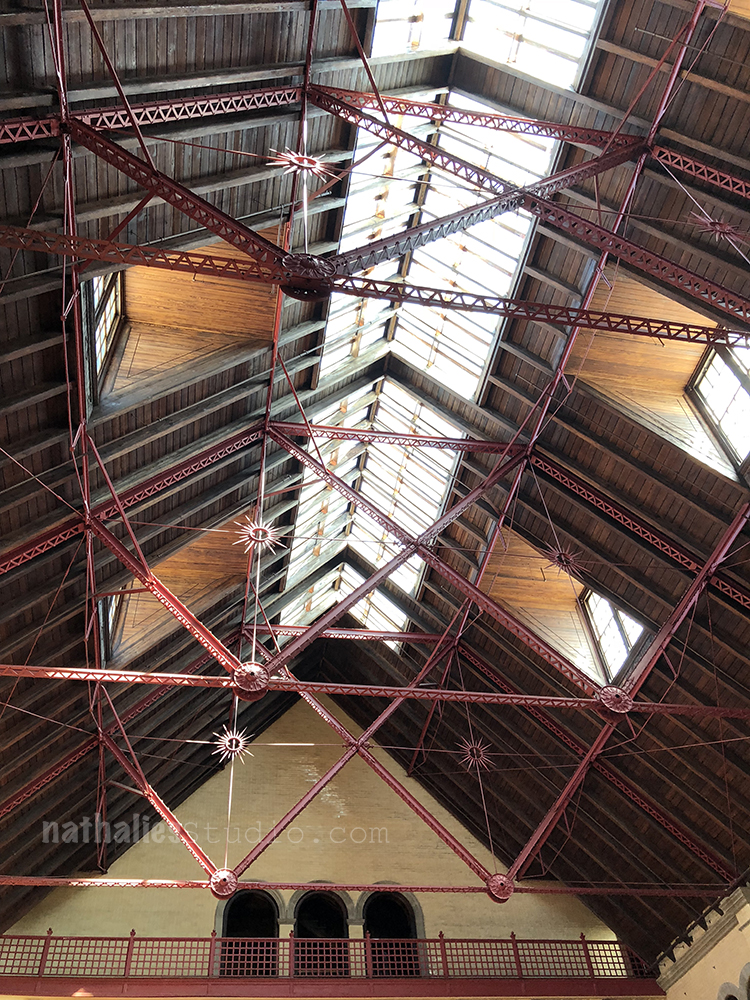
The inside of the Liberty State Train Station – I love the ironwork and woodwork

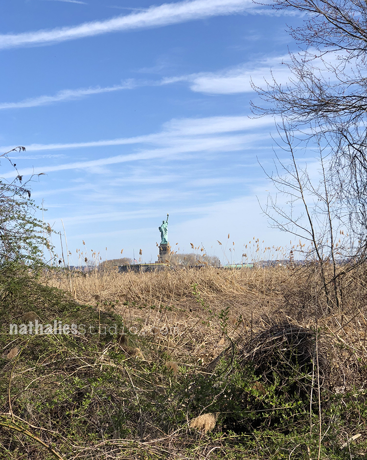
A different view of Lady Liberty

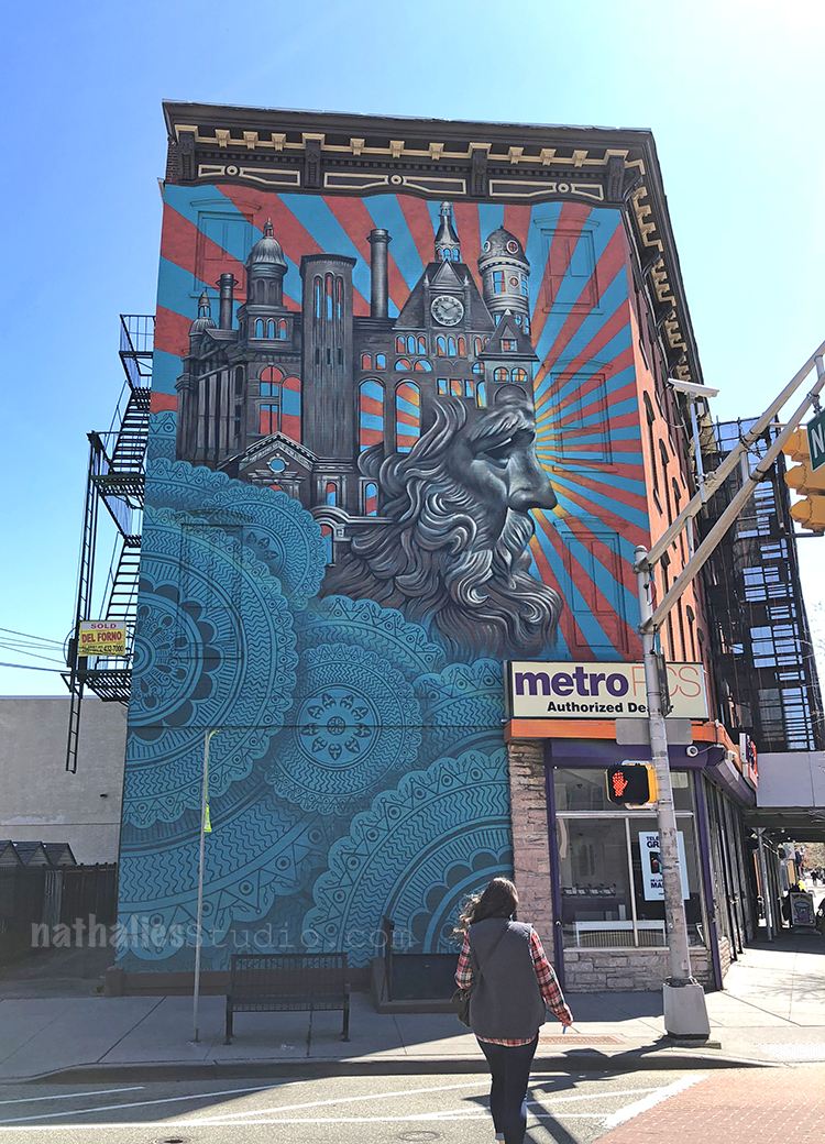
shown before but still always making me happy. It depicts many buildings I love and sketched – the Lady Liberty train station , the powerhouse…

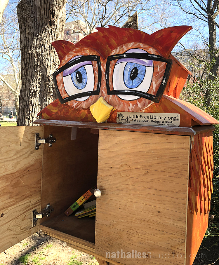
Come on- that is the cutest free library EVER – in our Hamilton Park

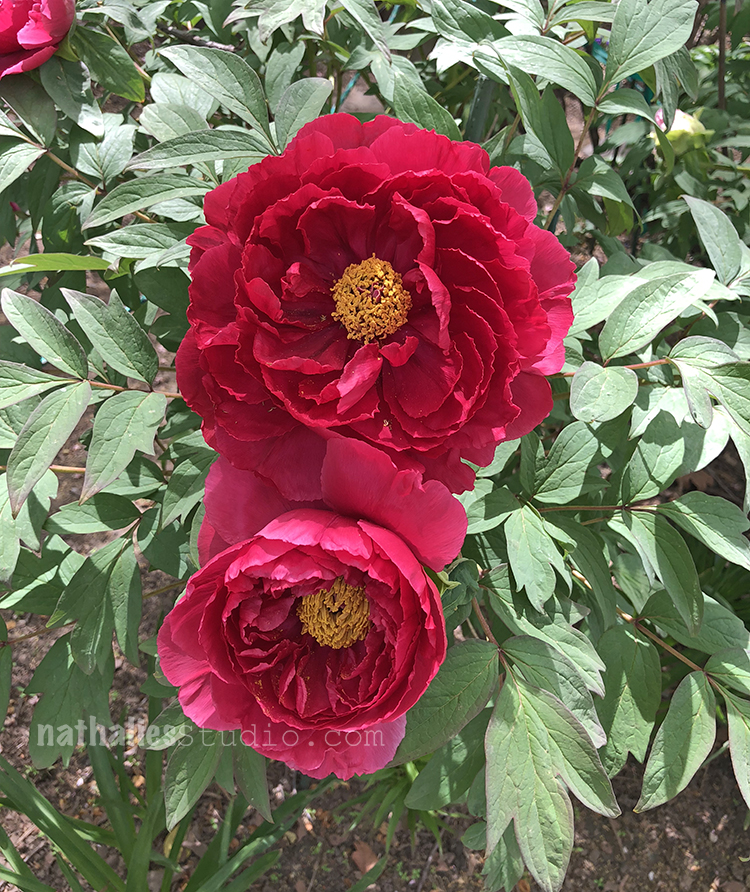
So Van Vorst Park competes with some beautiful peonies :)

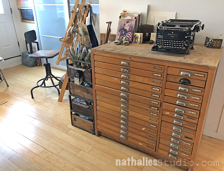
A little bit of progress in my studio reorganization – I moved the letterpress to the other side of the wall and arranged my stackable industrial drawer next to it , instead of on top of the letterpress.

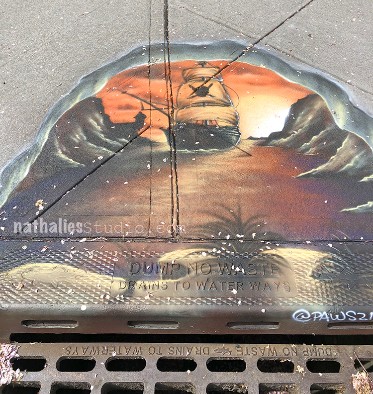
new spray painted drain …interesting.

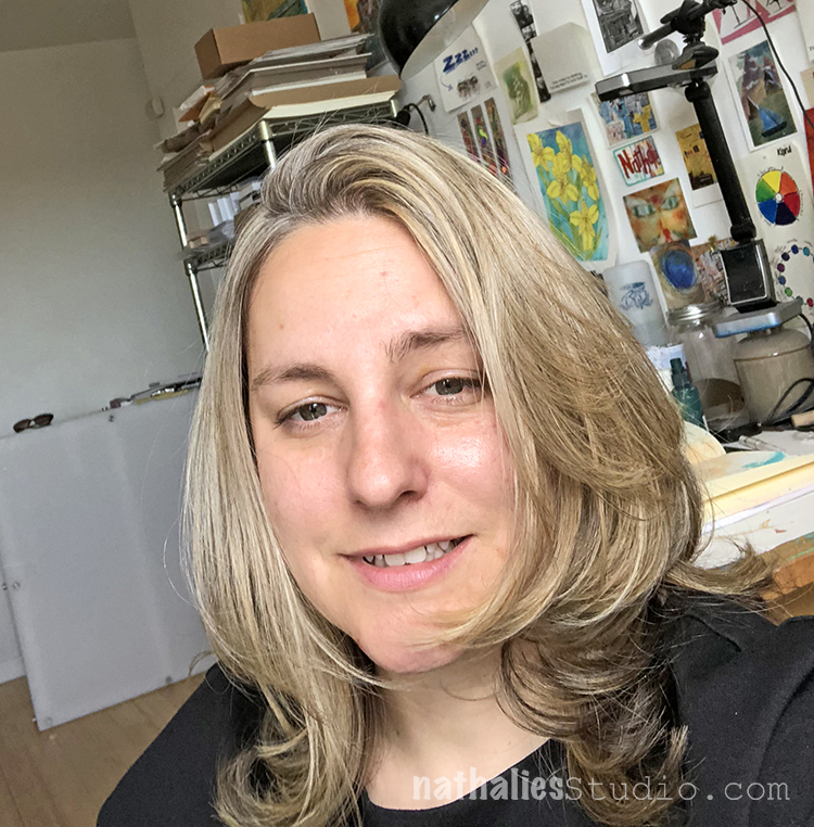
New hairdo …hey …you don’t see me much so I thought I sneak this one in ;)

And this is how I felt when I came from the vet – happy the cat was doing well ….kind of going nuts that the bill was crazy :) LOL.

Hope you enjoyed this little stroll through my hood – thank you for strolling along

Comments (2)

  • Sue Clarke

    |

    Love the ironwork also.
    Nice do and lighter color for a change. I want to do eggplant to dye my grays and maybe it will show up better than on my dark brown hair?
    Sewer drain painting…who does that? Gorgeous.
    Have a nice creative weekend Nat.

    Reply

    • nathalie-kalbach

      |

      That sounds like a cool color choice- go and try it! Have a wonderful creative rest of the week , Sue!

      Reply

Leave a comment

Courage – Art Journal

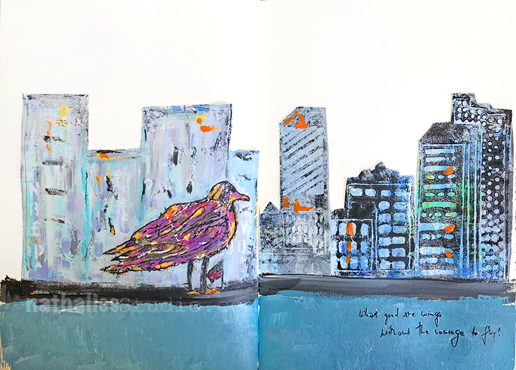
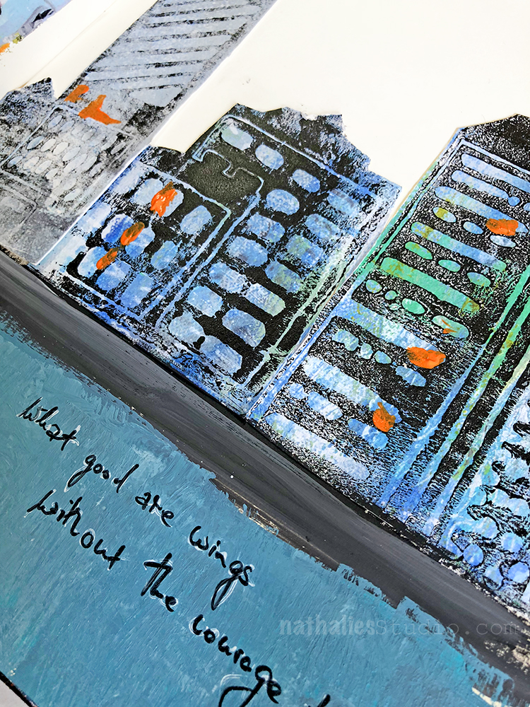
“What good are wings, without the courage to fly!” . yessss FLLYYYYY :)

I used my Midtown Foam Stamp Set on a print of mine and added some collage elements of the print of the painting to the Art Journal.

You can buy prints and the original painting of Whose Front Yard? in my store.

Have a wonderful courageous day!

Leave a comment

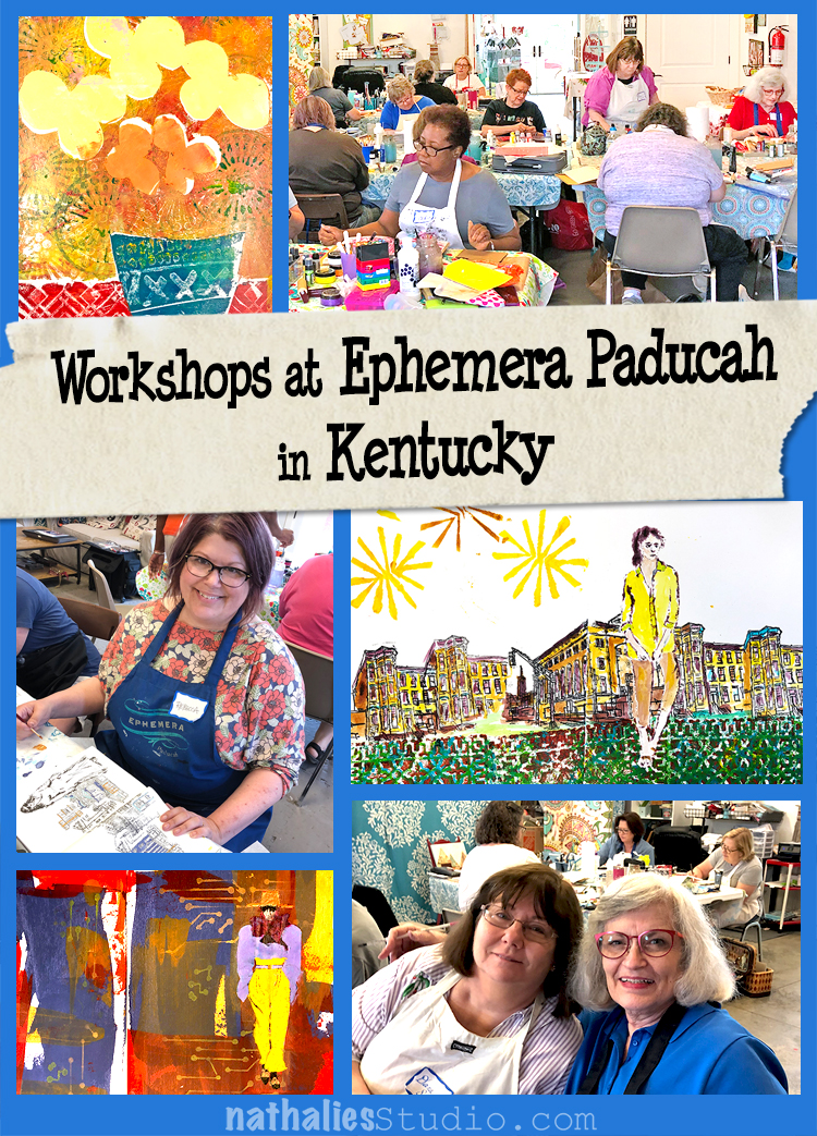
Photos of my Workshops at Ephemera Paducah in Kentucky

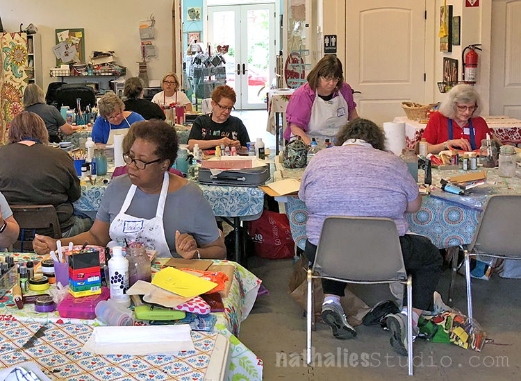
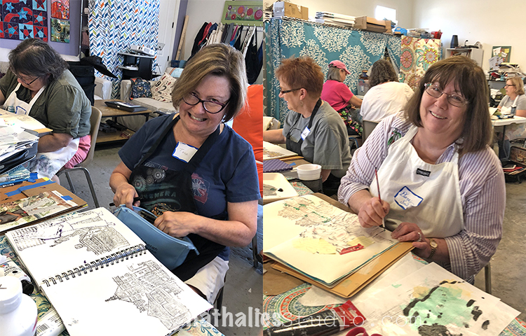
Last weekend I taught three days at Ephemera Paducah in Kentucky. It was so much fun!

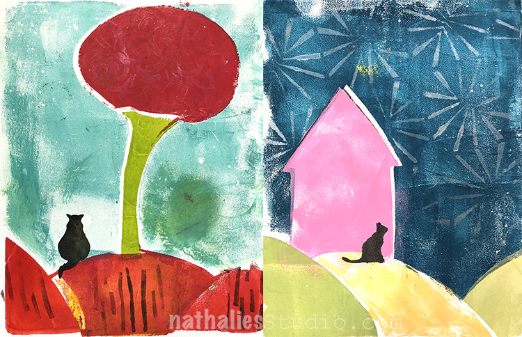
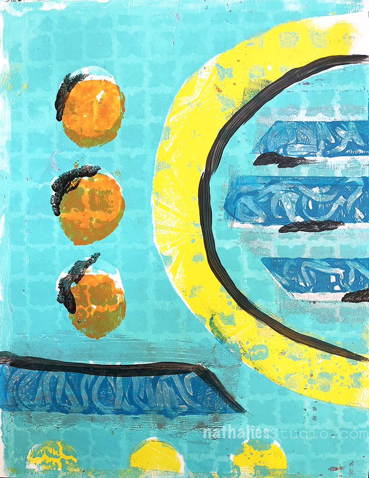
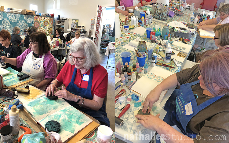
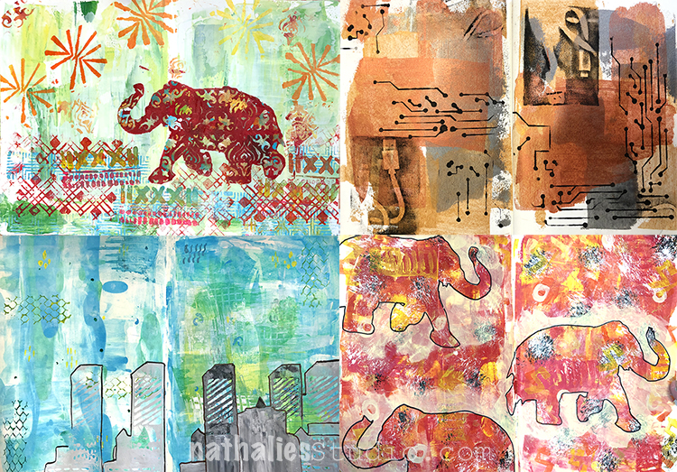
We started off with my Mono Print Painting Workshop and worked our way up with some basics. Kathy and Valerie did approve – no, really :)

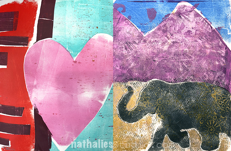
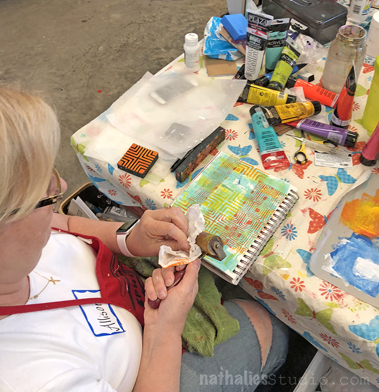
After some basics we were ready for some fun and more and more elaborate prints.

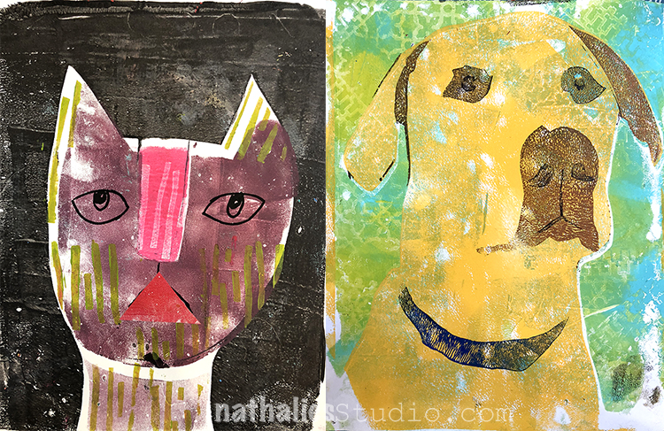
Lot’s of cats :)

and beautiful happy colors.

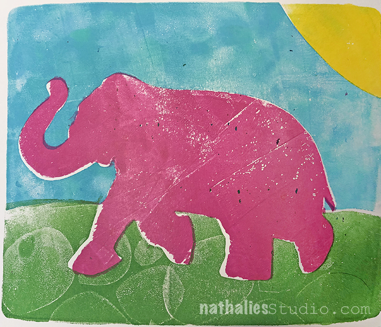
And of course Elephants :)

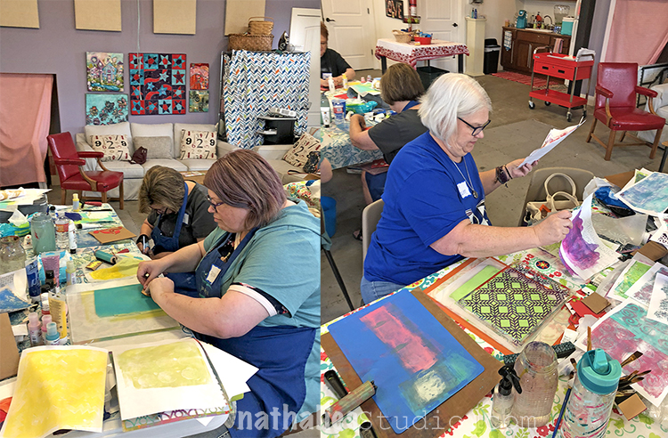
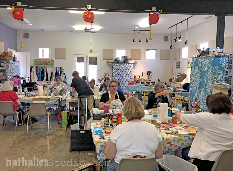
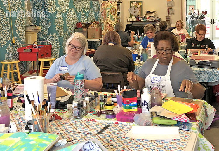
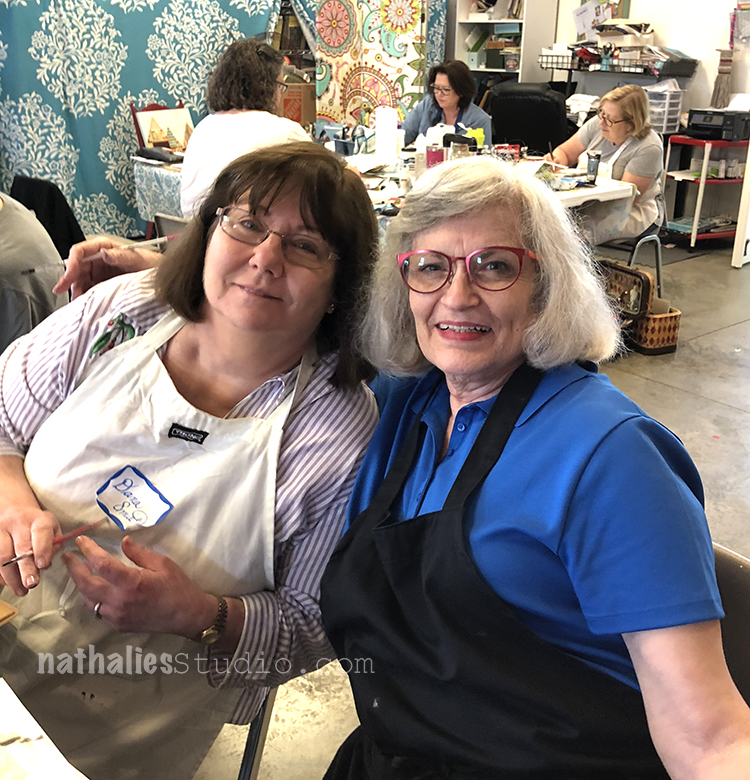
It was easy to be inspired in this wonderful classroom! Rebecca and Gwen are totally in the zone

Such a cool space!

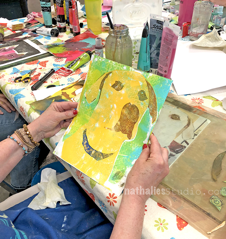
Cats and Dogs- fun!!! Allison did the one on the left and Kristen was like- hey – I am a dog person ….

and Lisa thought, cats, dogs, I do abstract ! All at one table- cool, right?
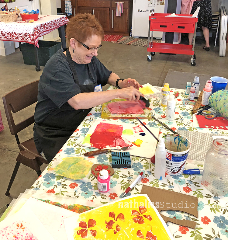
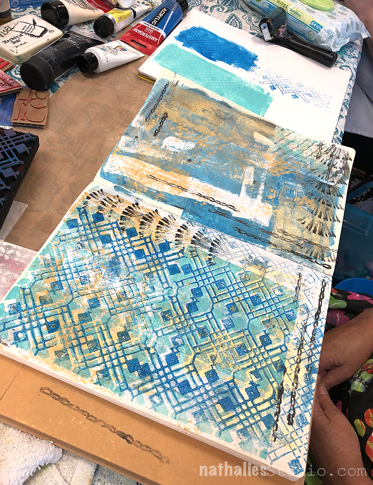
Saturday and Sunday I taught a two day Artful Adventures in Art Journaling class

I loved meeting all those wonderful students from 11 different States ..yes 11- isn’t that amazing!
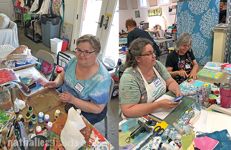
It is my favorite thing of a class – getting to know the students and spending some extended time with them.

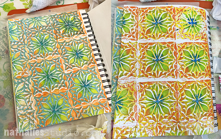
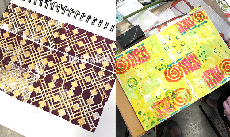
Look at all the yummie pattern – Art Foamies were used left and right :)

Those patterns and colors- yummie!

How can you not get in a good mood seeing this.

Here are some different pages – can you see the Elephant Stencil was quite the star LOL.

Lots of mark making and color play and layering.

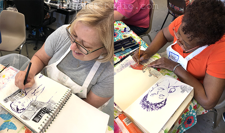
And here is Jackie – she drove 11 hours – WAHHHH -thank you so much for coming from so far !

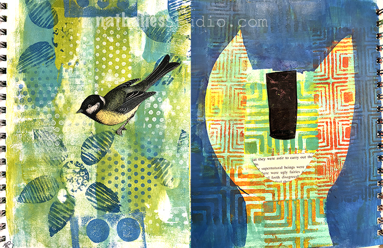
Mhhh that bird better watches out! ;)

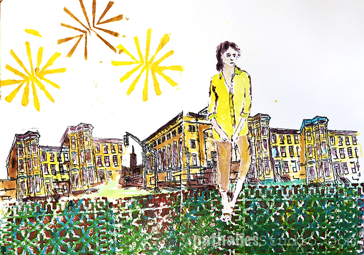
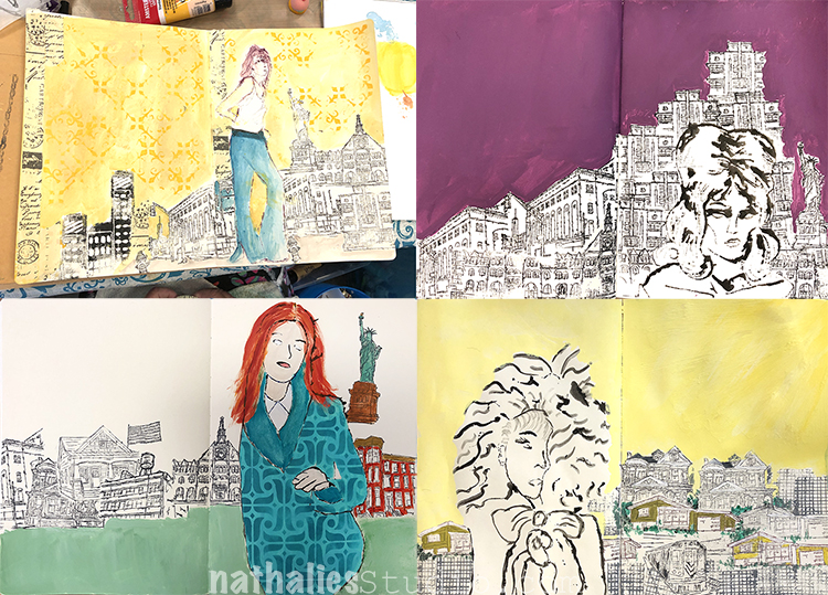
City scapes – here with one of the Midtown Stamps.

and some Chicago love and Batik love as well :)

Some serious easy peasy sketching :)

And hey lots of smiling faces

in those gorgeous city scapes created with the help of my RubberMoon Stamps.

Just looking at those pages makes me all smile – I hope my students had as much fun as I had.

I really love Karen’s grid ! And do you see John Travolta below …well I did and I showed my Travolta imitation …you have to take a class if you wanna see it- LOL

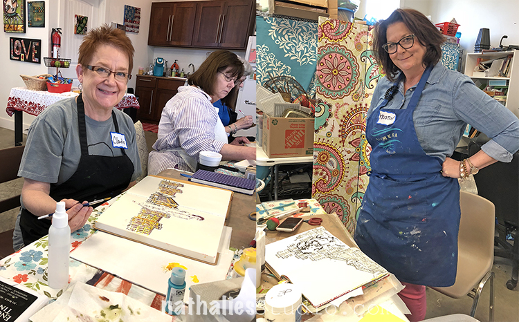
Claudia smiling at us  and Kristen, the owner and wonderful host of Ephemera , checking what shenanigans I am up to now-

Tana and Dana smiling beautifully and no …I did not rhyme their names during class- this is a coincidence here !

Oh looksie !!!

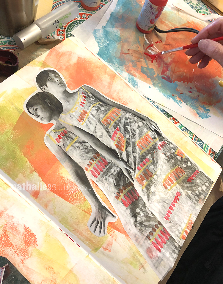
It was just so so cool how all those pages came together and incorporated techniques and materials we used throughout the workshop.

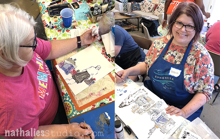
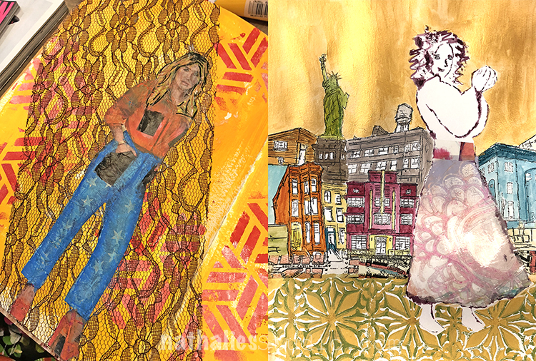
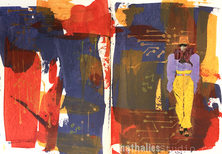
I want the the funky pants on the top left , the skirt on the top right and the dress on the bottom- woot woot.

Dana and Laura from Memphis

and here are cool collage of some more pages.

Thank you so much Kristen for having me – I truly enjoyed my time in Paducah! And thank you to all some of you traveling so much -and for your super sweet help!!! You were awesome and I hope I will see you some time again!

You missed this class? I am teaching a couple more classes this year which you can check on my In-Person Class here- but the next one is in San Jose at A Work of Heart. I will be teaching my Mono Print Painting Class there on July 29

and an Art Journaling Class on July 30th

there are still spots available and I would love to see you there. Let me know if you go !!!

Have a wonderful day!

Comments (2)

  • Lisa

    |

    Great post!! We had so much fun with you in class. I enjoyed every minute of it. Ephemera Paducah is an awesome place to take classes! Thank you for making it fun. I’m obsessed with drawing people now thanks to you. ?

    Reply

    • nathalie-kalbach

      |

      It was so so good to have you! Thank you for coming and thank you for bringing me to the airport at this terrible time :) You are the best!

      Reply

Leave a comment

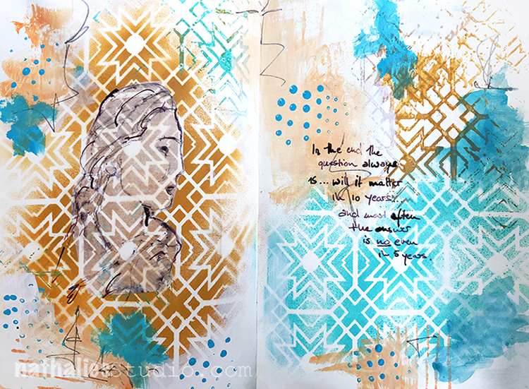
Does it really matter? Art Journal

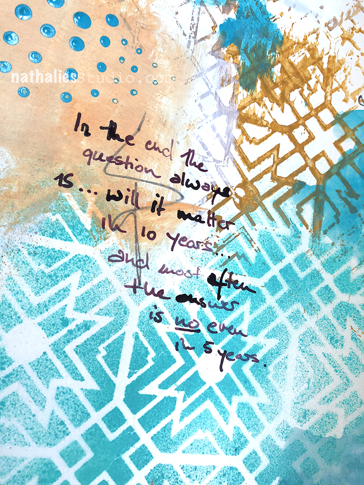
In the end the question always is…will it matter in 10 years?…and most often the answer is NO even in 5 years.

Thoughts that went through my head about something that didn’t work out the way I would liked it to work out- I was actually really disappointed but to be honest …it really won’t matter even in one year …so I will get over it ;) LOL

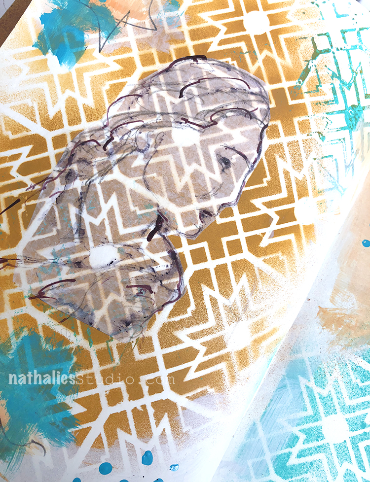
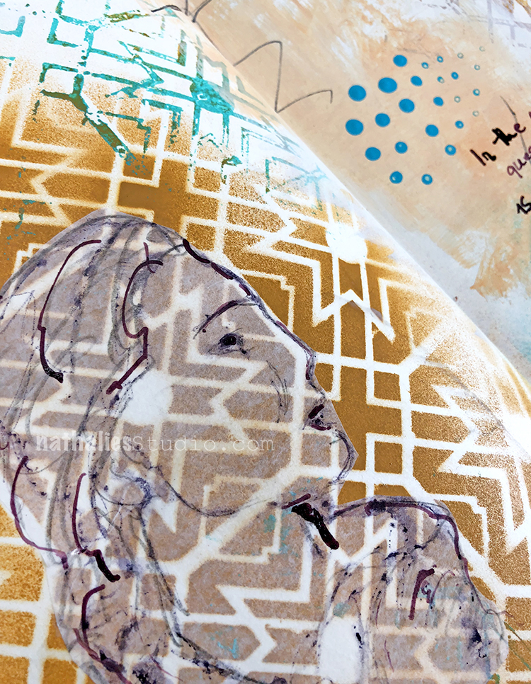
I played with spray paint and tried to keep it just to teal, beige and purple. I used my Toledo Stencil and sprayed over- then flipped the stencil to also get the reverse pattern transferred to the background.

The journaling and sketch on deli paper was done with acrylic ink and a bamboo sketching pen and I added some marks by dipping the end of a pencil into paint and stamping with it.

It was a freeing page to do :) Sometimes art journaling just helps you to get some stuff straight ;)

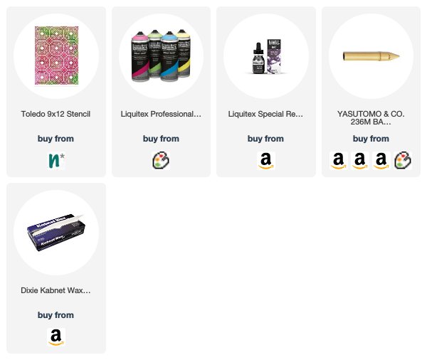
Here are some of the supplies I used


Leave a comment

Farewell Painting

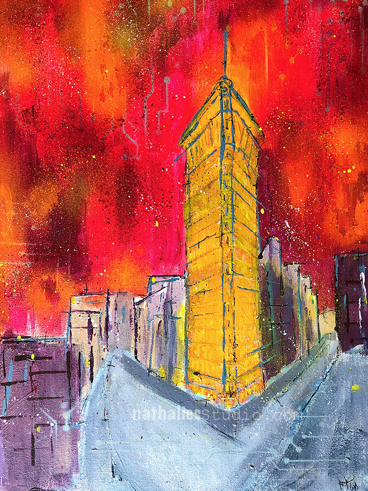
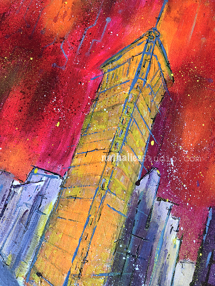
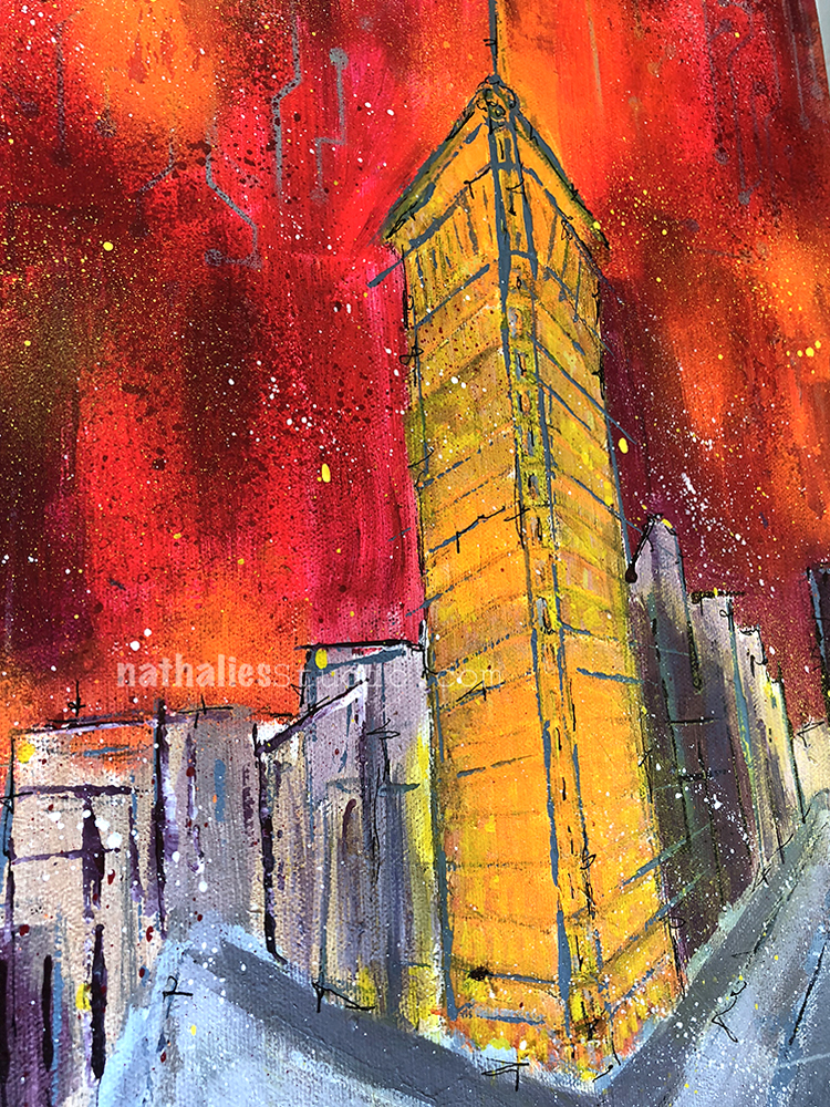
I finished this painting last week – some of you might have seen it in some of my Facebook Live Videos.  The painting captures the iconic Flatiron building in New York City, located in the wedge created by the intersection of Fifth Ave and Broadway. I am always fascinated by the Flatiron building and it’s story.

Although it has stood strong at this busy intersection for over a century, the world around it is always in constant flux. The city weeds out the weak, and businesses and people who may once call it Home may find themselves bidding it Farewell another day.

The bold colors represent the energy of the city and the sweeping lines suggest a place where nothing stays still for long. Yet the Flatiron remains, a focal point of stability in a very busy place.

The original “Farewell Painting” is up for sale now in the store. Maybe it will find a new home :) Acrylic paint, acrylic ink, spray paint, and pencil on 12”x16” canvas.

Have a gorgeous day you all :)

SaveSave

Comments (4)

  • Sue Clarke

    |

    I love buildings that are on corners like this and have seen several in person in Boston.
    This painting is wonderful, especially the firy colors!
    I hope it finds a deserving home.

    Reply

    • nathalie-kalbach

      |

      Thank you Sue! I actually just saw one of those buildings in Amsterdam and thought it was fun because the architecture in general was so different :) Tiny rooms I guess in the corner part- LOL

      Reply

  • Janene

    |

    Whew! You scared me with the title “Farewell Painting”. I’m thinking, Nathalie is moving? She’s giving up painting? Whaaaaaaat? In all seriousness – the Flatiron building glows in contrast to the gray streets and nearby buildings — fabulous! — and I love the title now that I understand it. :-)

    Reply

    • nathalie-kalbach

      |

      Aweee- sorry to have scared you Janene- that wasn’t my intention! I am not going anywhere right now – LOL- and a new canvas is up on the easel- just thinking of what I want to paint next :)

      Reply

Leave a comment

Forget the rest – Art Journal

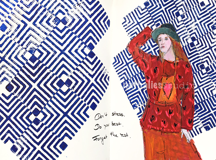
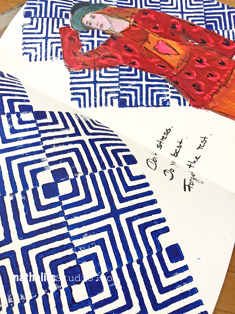
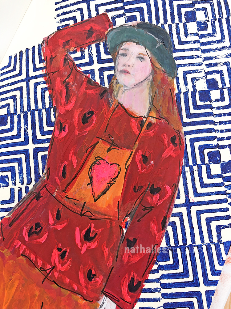
“Don’t stress. Do your best. Forget the rest.” A good mantra …I will do my best but not stress to remember- LOL

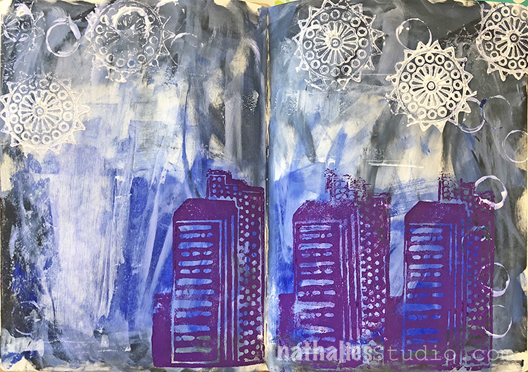
I kept the background simple by stamping alternating the positive and negative Manhattan Foam Stamp on the left- and then doing the same on the right with the Mini Manhattan version. It is fun to not only use the two stamps in the sets on top of each other or each on their own, but to also create fun pattern by using them alternating and in different directions.


I painted over a lady from a catalogue with acrylic paint in red and orange for some pop and added the journaling with a Fude Pen – quick and easy yet fun to create. I am in this weird mode of trying more ways to do less with more breathing space in my art journals – maybe a part of my reorganizing, purging urge right now.

Here is what I used for this spread:


Leave a comment

It’s getting interesting – Art Journal

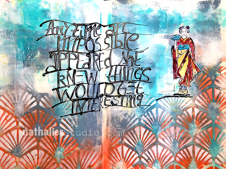
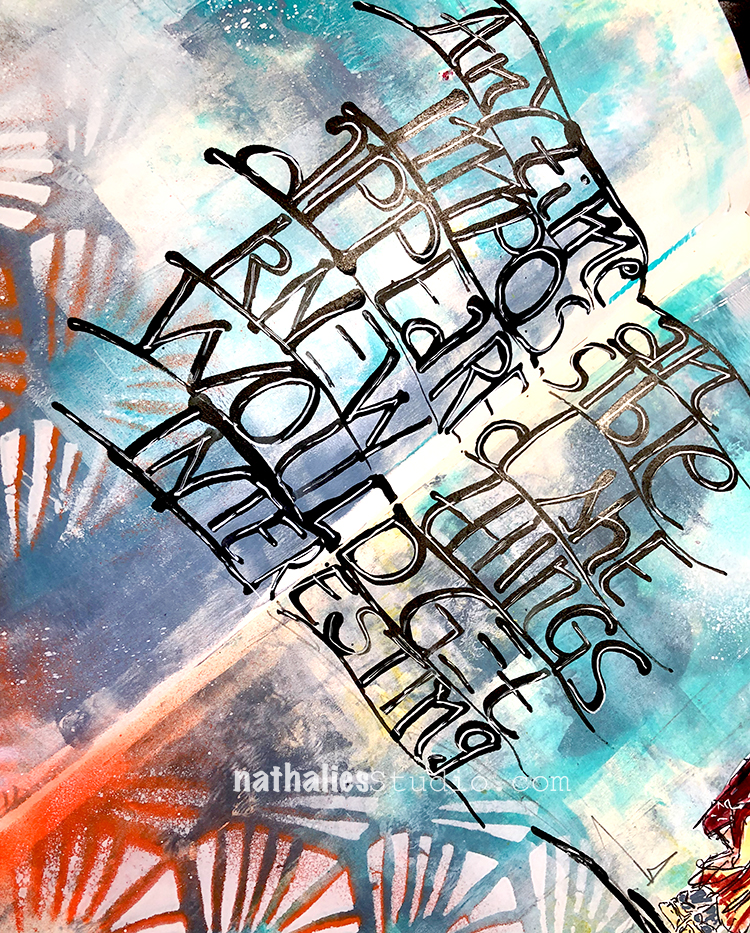
“Anytime an impossible appeared she knew things would get interesting. ”

I pretty much feel that way- LOL – and sometimes that is a struggle. Like oh wait- that is a hard way and then I go ” oh …let’s go that path”

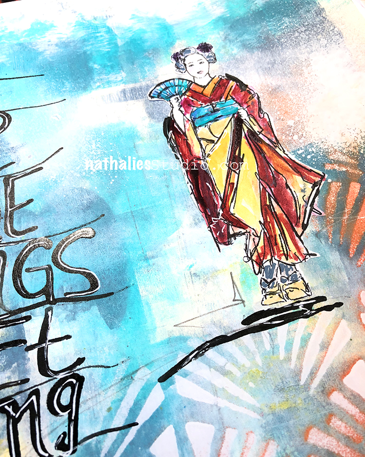
I wrote the journaling using black ink and a bamboo sketching pen, going over it again with a white signo pen later.

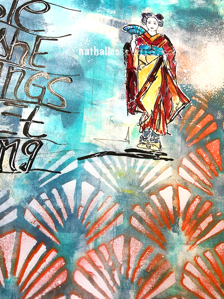
The Maiko is a little sketch I did, I cut it out and then painted inside. The background in blue was created by rolling out thin a think layer of teal and blue  as well as white acrylic paint with a brayer.

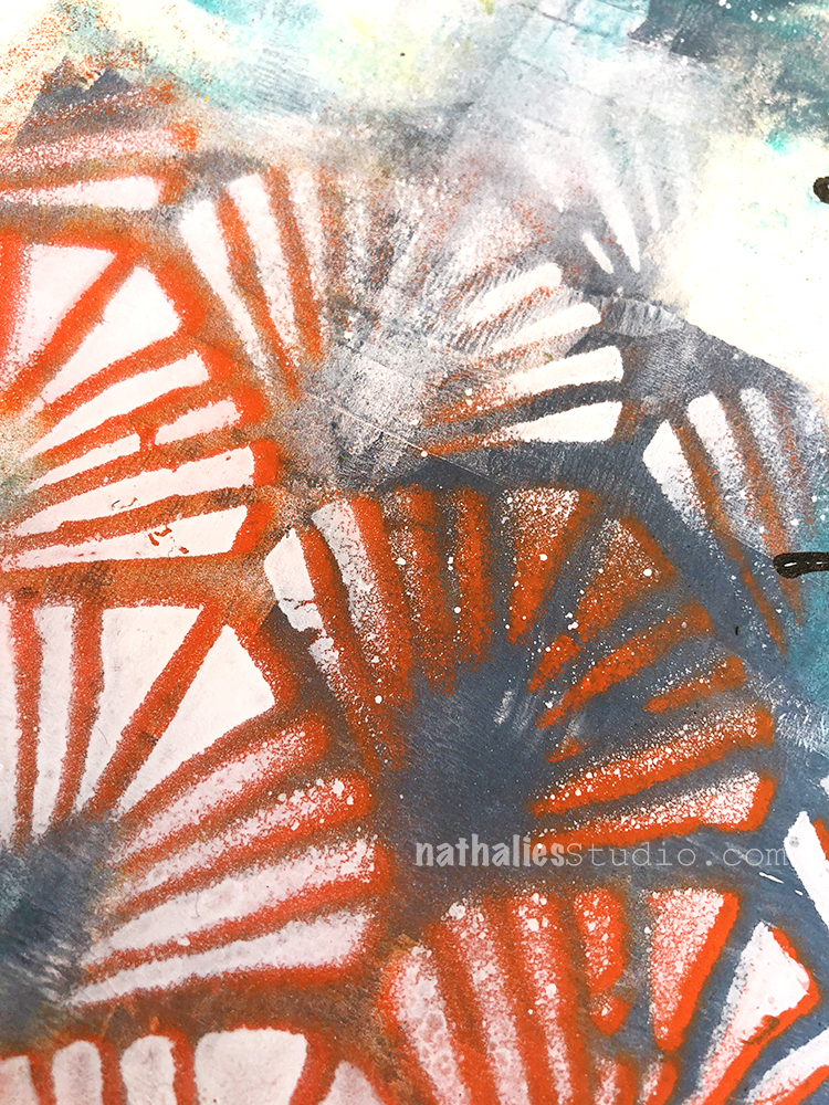
Using my Art Deco Wallpaper Stencil I sprayed over with some orange first and then moved the stencil slightly and sprayed over with white again to get more dimension but also to knock the orange back a bit.

And that was it- it was a fun and fast page …not impossible- LOL- but maybe still interesting ;)

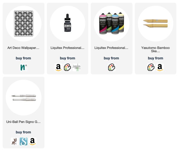
Here are the tools and supplies I used for the spread:


Leave a comment