nathalie-kalbach

Be the Light – An Art Journal Spread

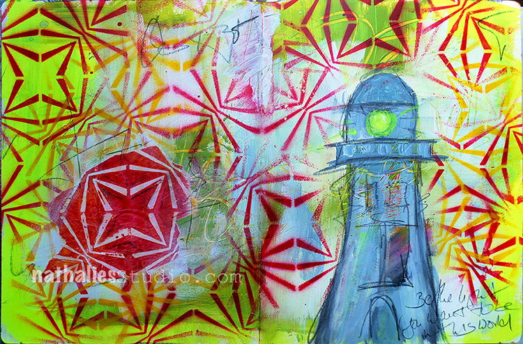
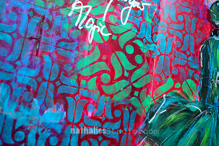
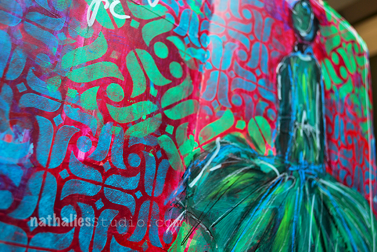
“Be the light you want to be in this world”

I love this quote – such a beautiful thought and call to action!

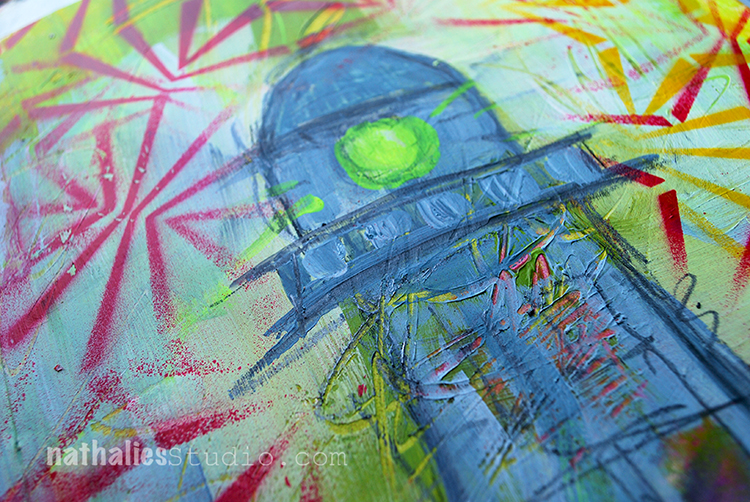
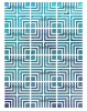
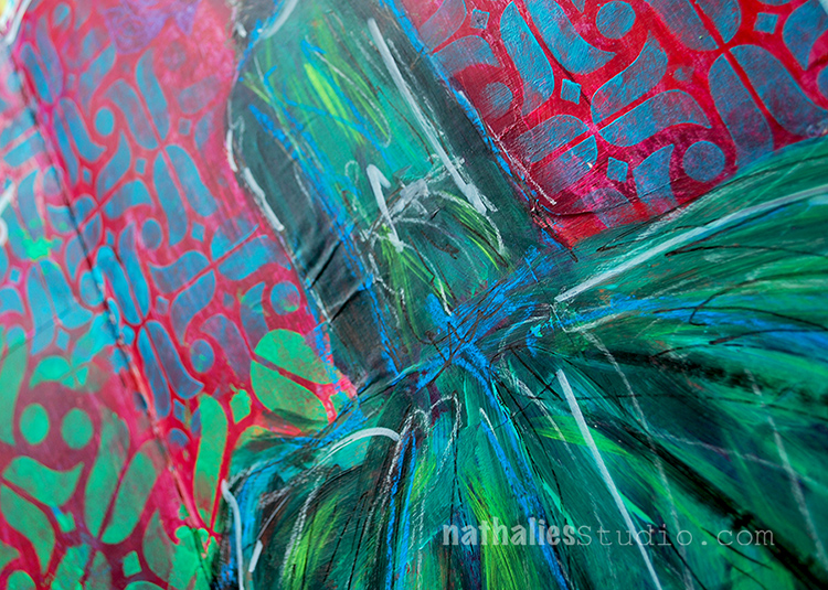
For this spread I used my new Beacon 9×12 Stencil . The stencil design itself was inspired by the gorgeous Art Deco era buildings known as The Beacon in Jersey City. It used to be a hospital and some people believe they are haunted. The Beacon towers sit on a hilltop not far from me and I can see them from the deck.

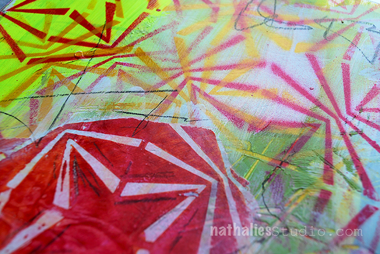
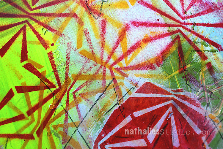
I used different colored spray paint through the stencil. I cleaned the access paint off the stencil by dabbing a deli paper onto it – you can see a torn out piece of the “clean up” deli paper as an collage element revealing the negative image of the stencil.

I added the journaling and some marks with a pencil.

Do you have a building close to where you live, that inspires you?

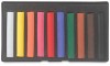
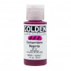
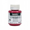
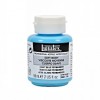
Here are some of the supplies I used in this spread- some of the links are affiliate links:


Comments (2)

  • Julie

    |

    I got this stencil but stumped for inspiration so thank you for this post. Love the layers, colors and message. There you go again with the spray paint LOL! I had so much fun playing with them in class. Thank you!

    Reply

    • nathalie-kalbach

      |

      Yeahhhh- so glad you liked the post and hey there will be more with that stencil to come :) And …do the spray paint —it is so much fun! So glad I was able to show you girls in the San Jose weather :)

      Reply

Leave a comment

Photos of my Workshops at A Work of Heart in San Jose, CA

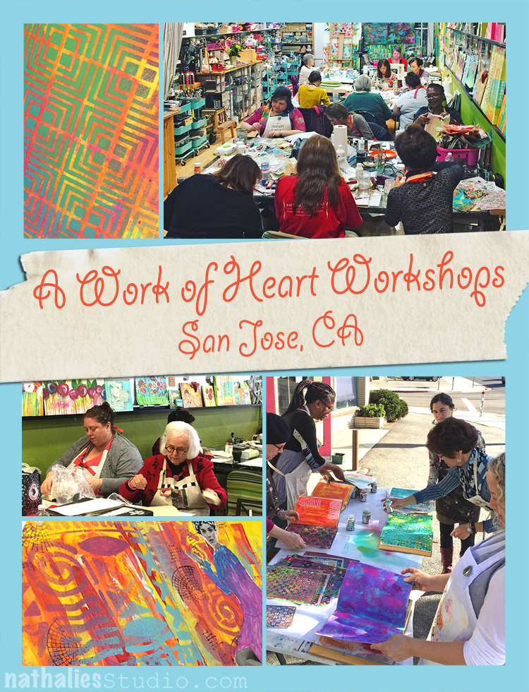
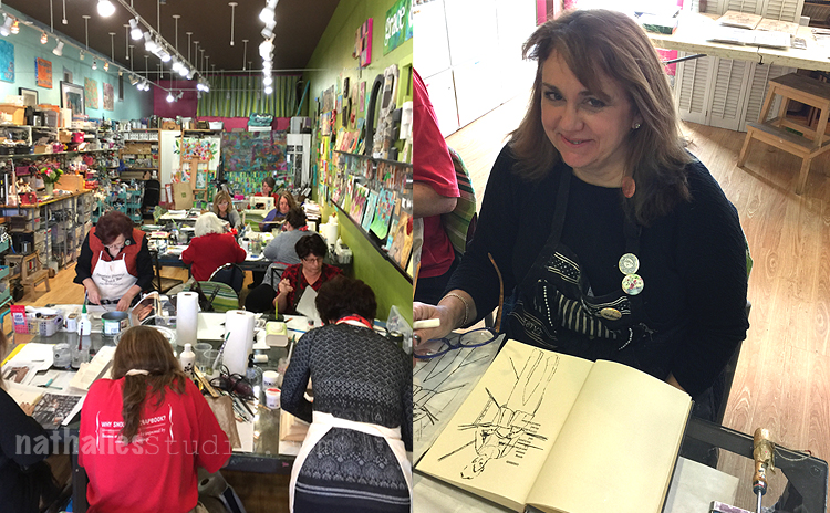
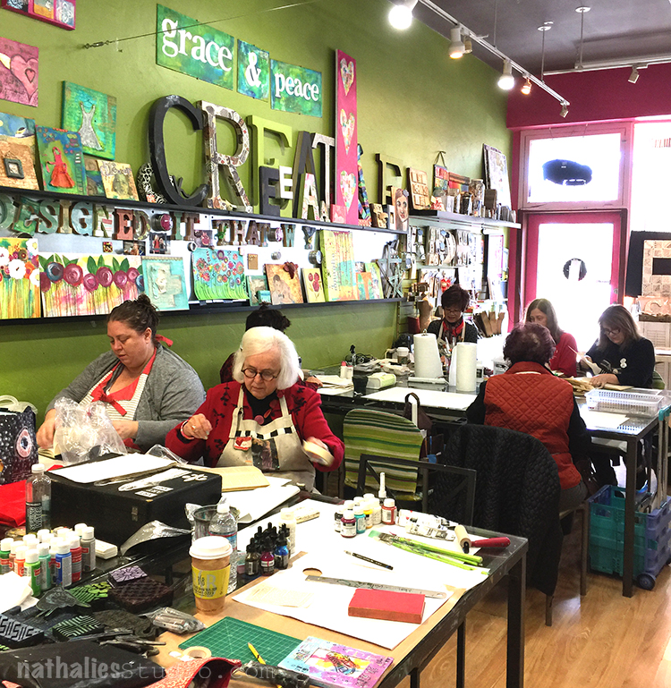
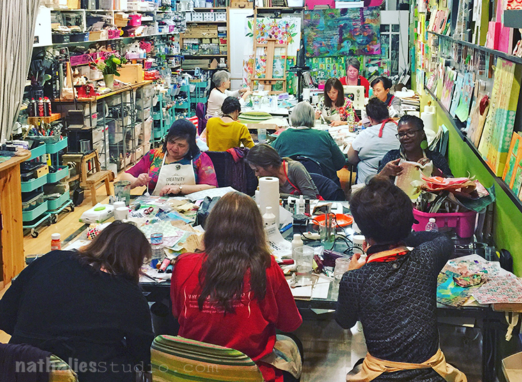
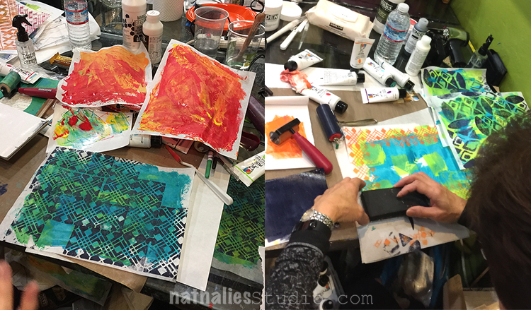
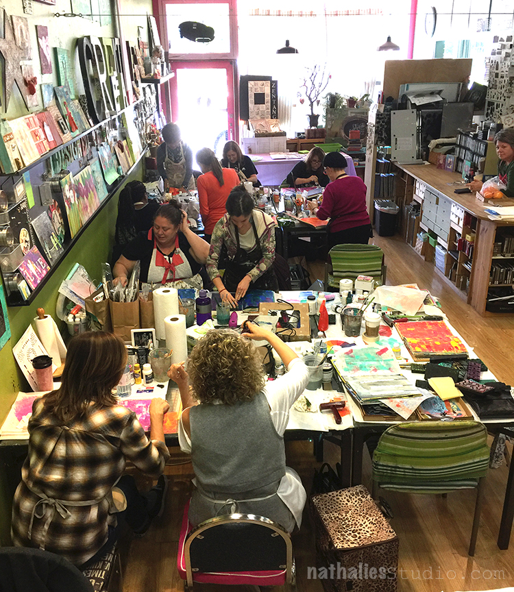
Last week, after attending the Creativation Show, I flew to San Jose and taught three classes there at  A Work of Heart

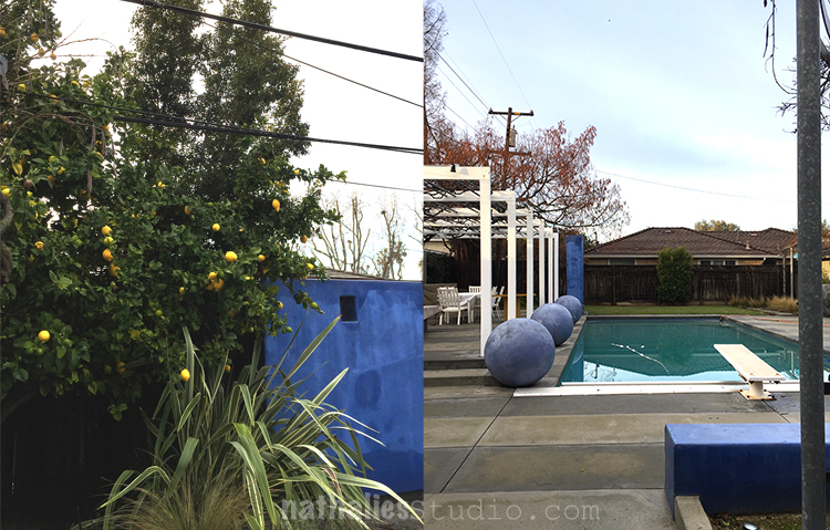
I stayed in a lovely little pool house and this was my view out of my room. I wanna come back in the summer :)

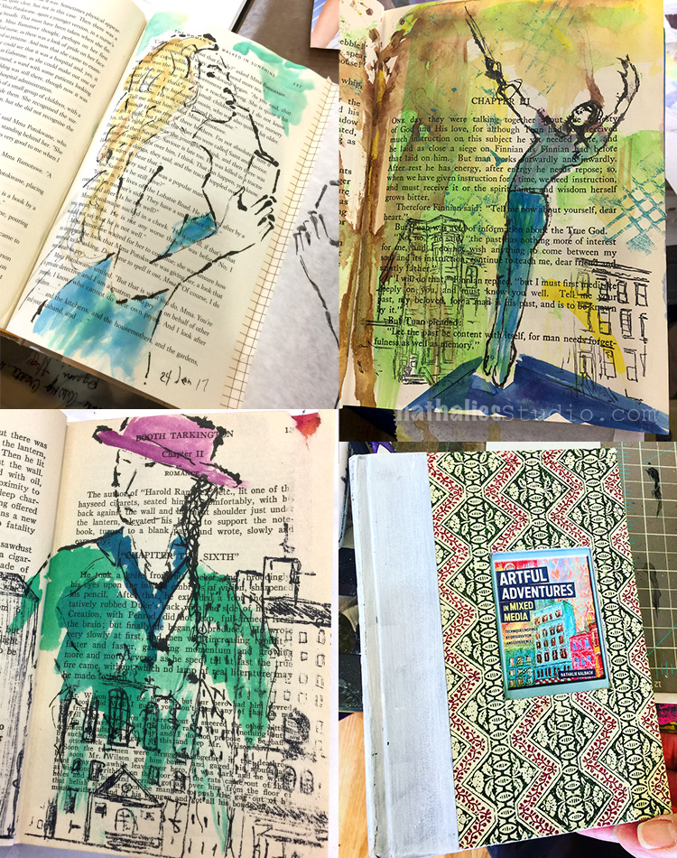
My first class was “Walk With Me” an Altered Book class and it was so much fun to see the student’s take on it

HA – I loved how Julie put my business card with me new book cover behind the window of her book cover :) FUN

It was such a sweet and talented group and I was really lucky because I was terribly sick last week. I was helped with medicine, fresh oranges and tea- thank you girls!!

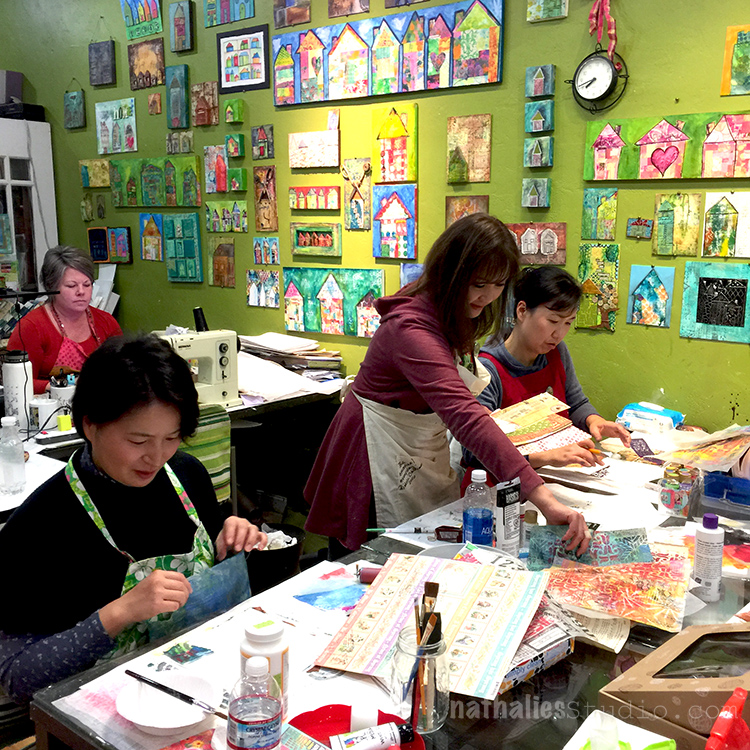
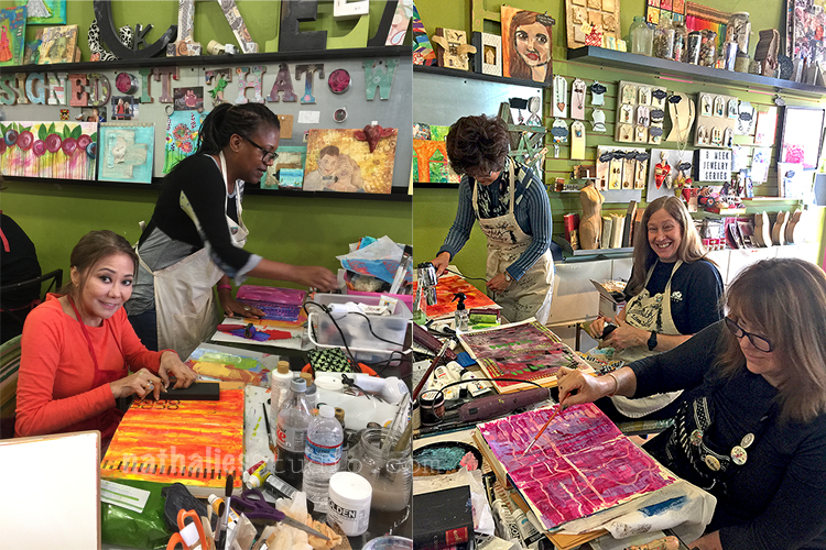
Love the studio space- so much color- so inspiring. Below you see some photos of the “Mixed Media Collage – Play Transform” Class

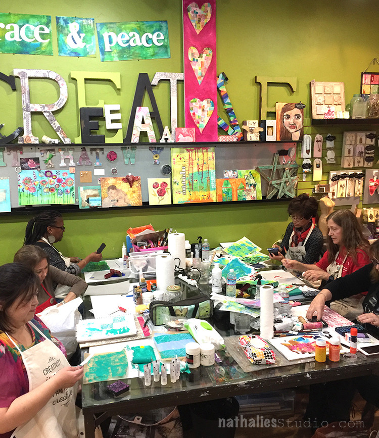
So much beautiful collage paper was being made – color bliss!

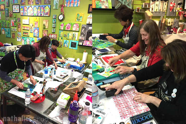
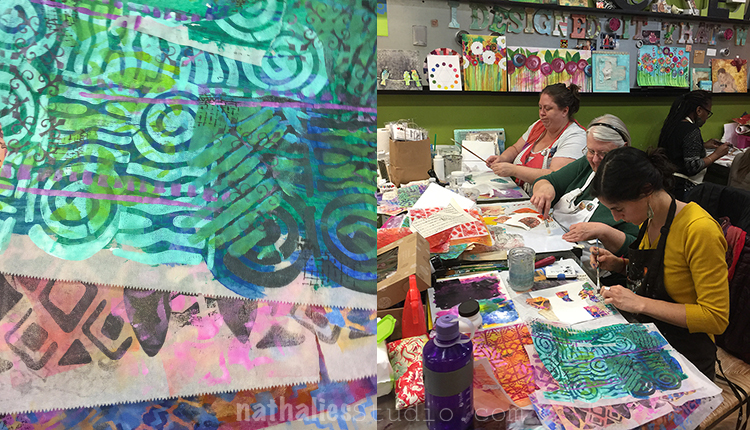
Lots of pattern play too

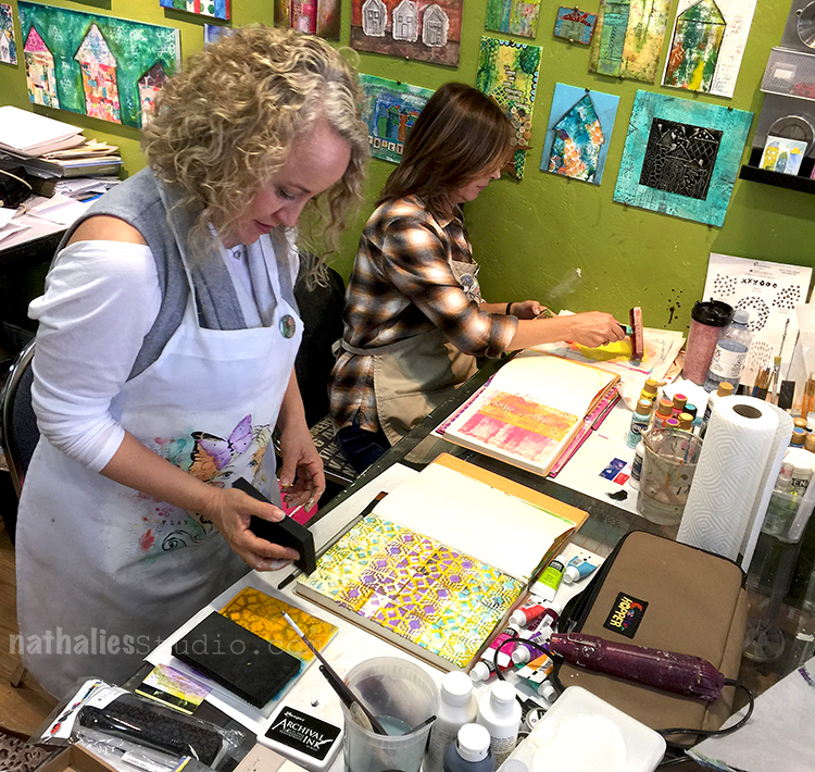
And then on Wednesday I taught my whole day “Artvergnugen – Art Journal ” Class .


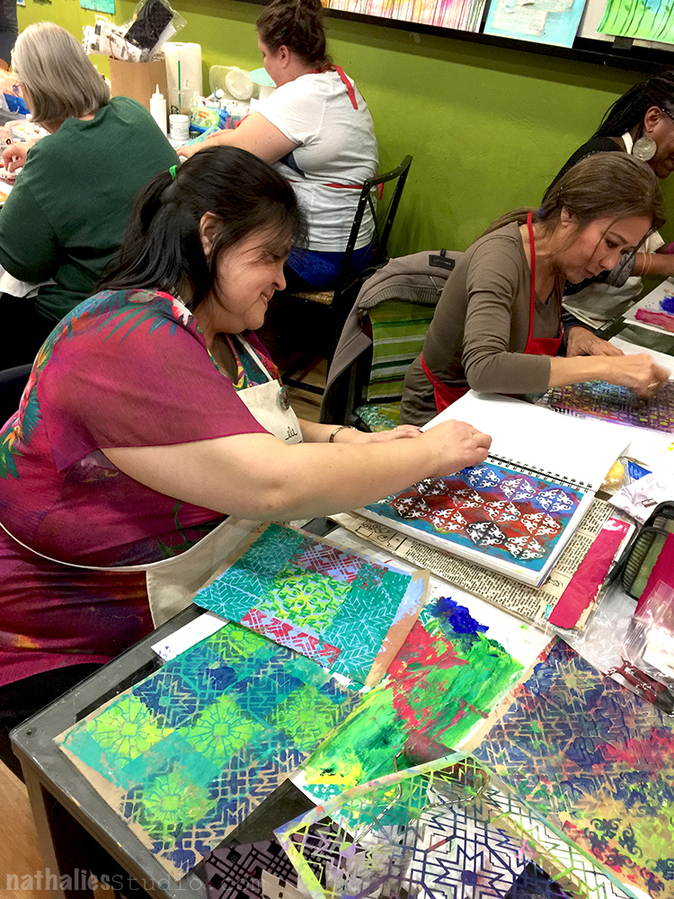
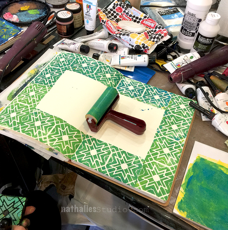
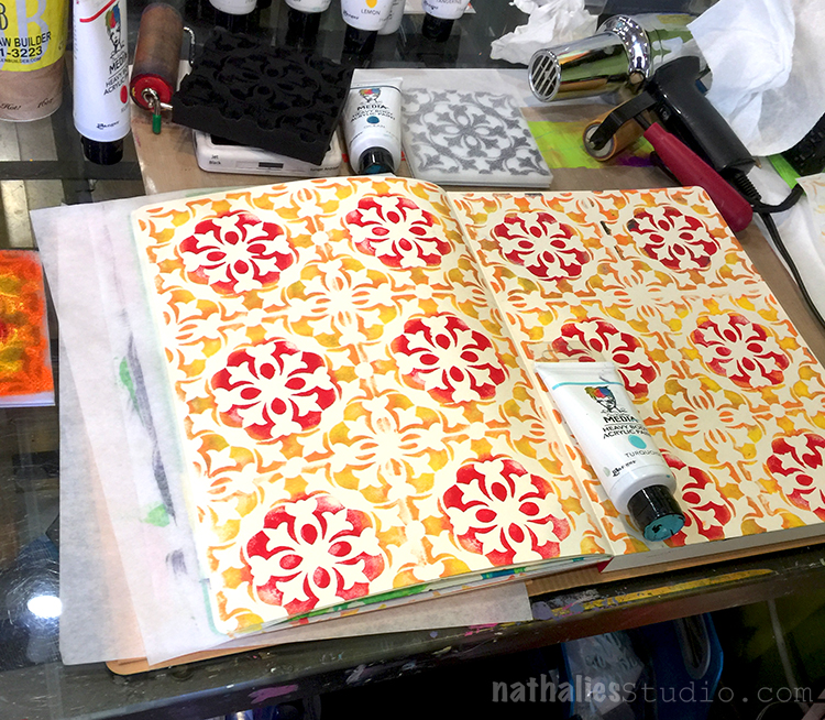
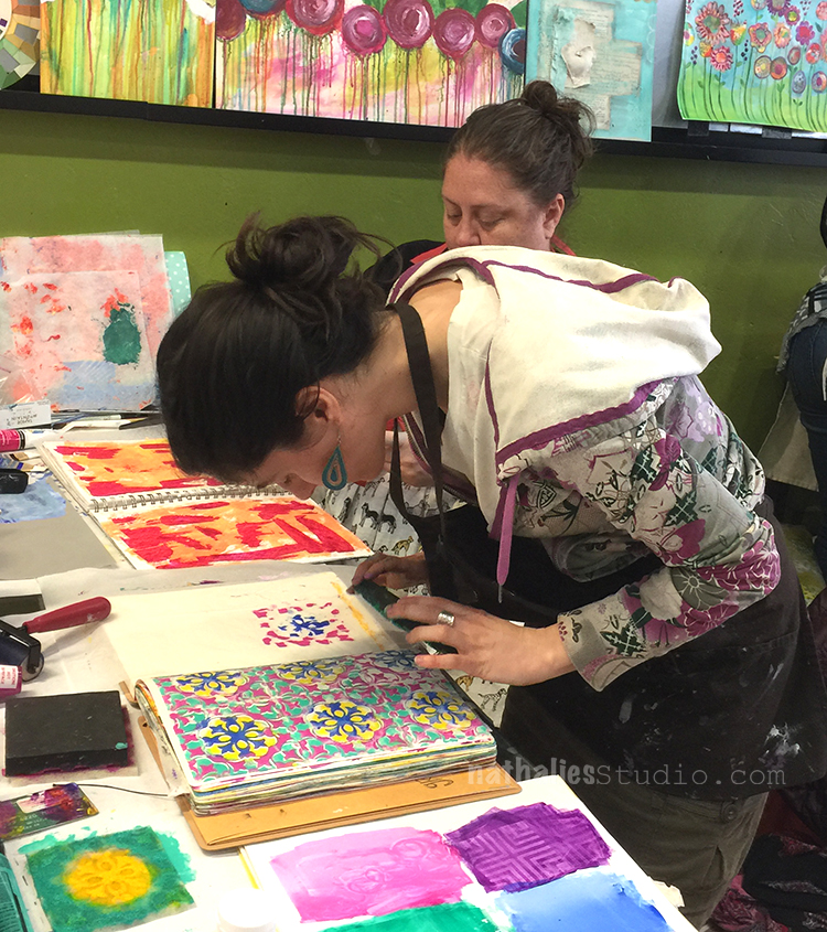
Look at the awesome tile pattern – yum

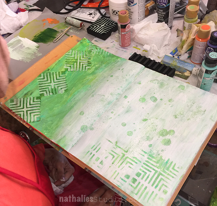
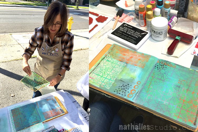
and heaps of layers were added to create beautiful art journal pages.

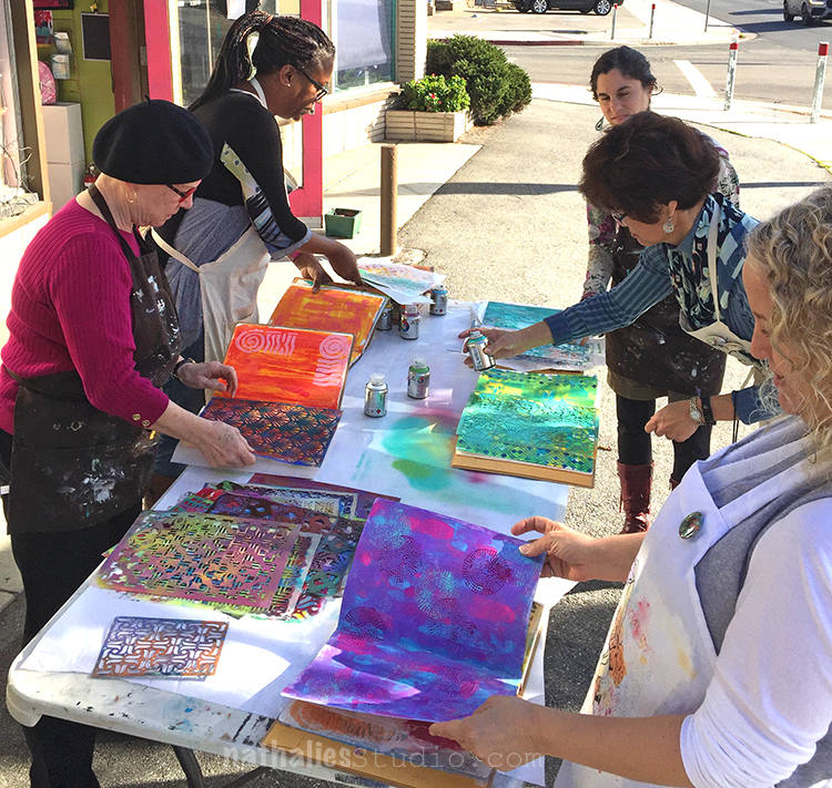
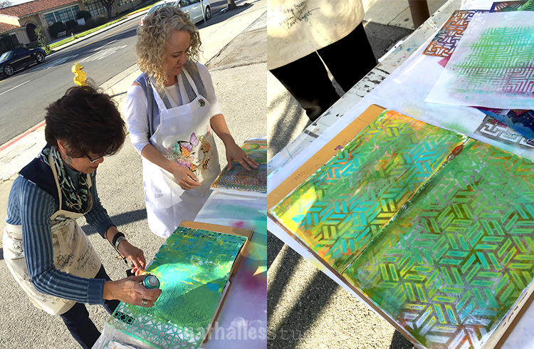
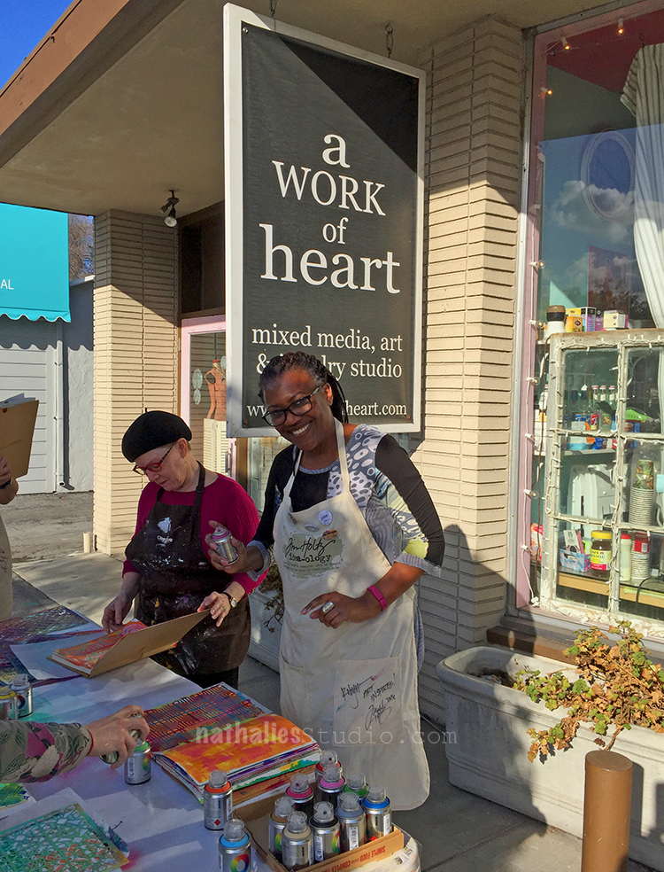
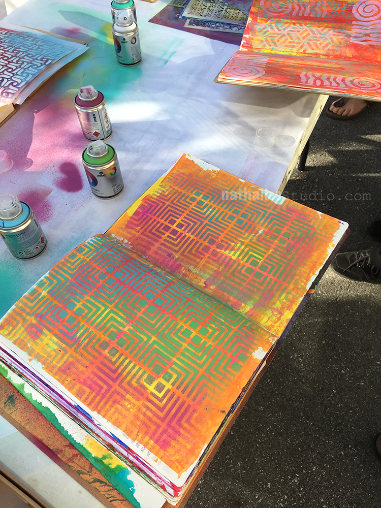
And since the weather was brightening up we could even experiment with spray paint out side – now that was super fun!

I think they liked it a lot ;)

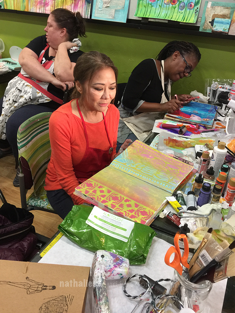
Time to add some finishing touches to the pages :)

And slowly all came together – Art Vergnugen …the pleasure of playing in your art journal ;)

Thank you all for a wonderful time- you were truly inspiring and amazing!

And here is my wonderful host Andrea – Thank you so much for having me Andrea, I am looking forward coming back  :)

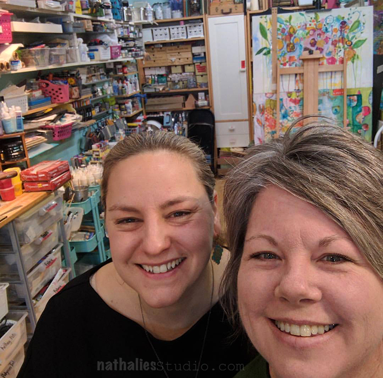
Do you want to take an In-Person-Class with me ?- here is where you can find me in

MARCH: 

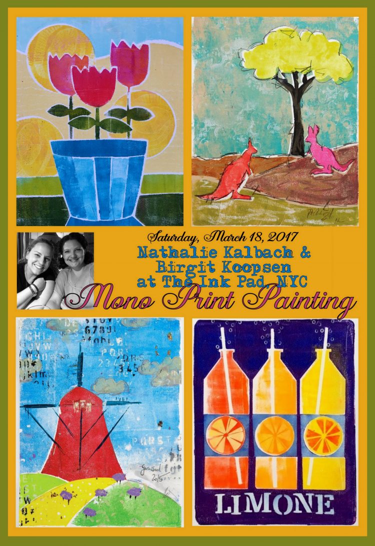
Mono Print Painting with Nat Kalbach and Birgit Koopsen at The Ink Pad in NYC


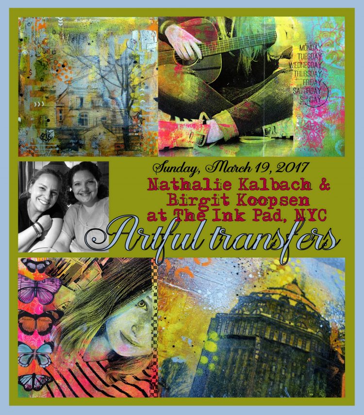
Artful Transfers with Nat Kalbach & Birgit Koopsen at The InkPad in NYC

Color Crush – 3Day Art Journaling Class with Nat Kalbach & Birgit Koopsen at OOAK Artisan Showcase in Syracuse, NY

Check out more workshops this year on my In-Person-Class Page

Have a wonderful day!!!!

Comments (4)

  • Jean Goza

    |

    The workshop was awesome! Learned a lot and had so much fun. Thanks for sharing your photos. So much inspiration and beauty. Looking forward to your next visit to California.

    Reply

    • nathalie-kalbach

      |

      Awe- thank you so much for coming Jean- it was so awesome to finally meet you after “meeting you online” . Looking forward to come back :)

      Reply

  • jbonomo

    |

    Thank you, Nathalie, for making two days of arting so much fun filled with color, inspiration, and learning what is possible. You are one fabulous talented teacher and tempting me to fly out for your upcoming classes. HA!

    Reply

    • nathalie-kalbach

      |

      AWE – thank You Julie! You girls were just so amazing ! I cannot wait to see you again in California or elsewhere :)have a gorgeous weekend!

      Reply

Leave a comment

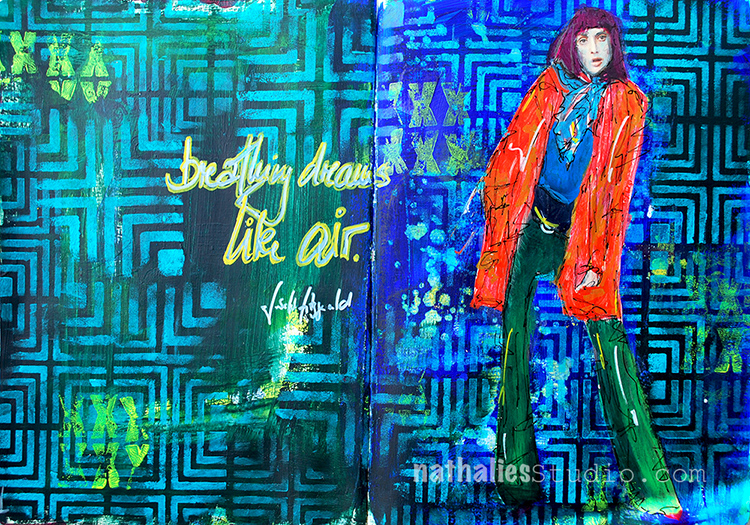
Breathing Dreams Like Air

Dreams, we all have them, or so I hope ;) I have a couple more dreams, right now a very easy one … SUMMER – LOL. Yeah- that is one dream, but of course I have a couple more.

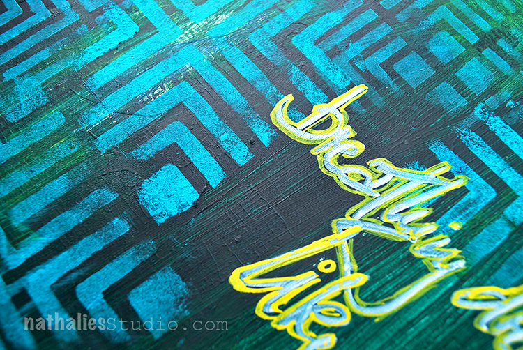
I used my new Manhattan Stencils on this page with acrylic paint- the 9×12 and the 4×4 – different sizes, same pattern- BLISS.

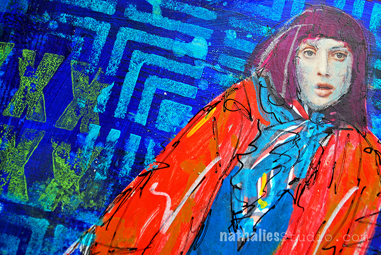
I also used the Grunge XXX Stamp with acrylic paint, yup, that’s how I roll. Just make sure to clean the stamp right away so that you don’t ruin it. Baby Wipe is your friend!

Hope you like my pattern play and you are breathing dreams like air today.

Here is a short list of supplies- some links are affiliate links:


Comments (2)

  • jbonomo

    |

    Love that stencil and the Manhattan stamp too……but seriously, how did i miss the Mark Maker Stamps in class. That’s been on my wish list for awhile….guess I will have to go shopping once again.

    Reply

    • nathalie-kalbach

      |

      Thank you so much Julie – Yeah the Manhattan stencil and stamp are one of my faves – it feels to me super vibrant, just as Manhattan – LOL ! The Mark Maker stamps are out of stock but should be back in stock in a couple days again – I reordered them :)

      Reply

Leave a comment

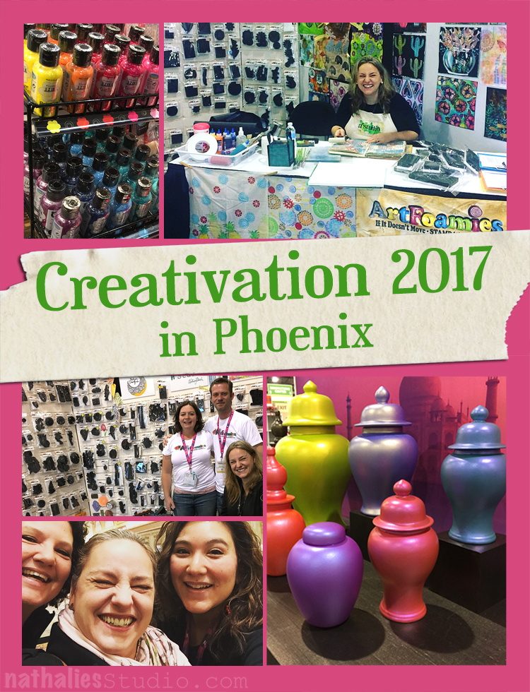
Photos from Creativation 2017 in Phoenix

Last week I went to the Creativation Show in Phoenix. Creativation is a tradeshow, former called CHA for creative arts products industries. I thought I’d share with you some pix from my time there and what and whom I saw :)

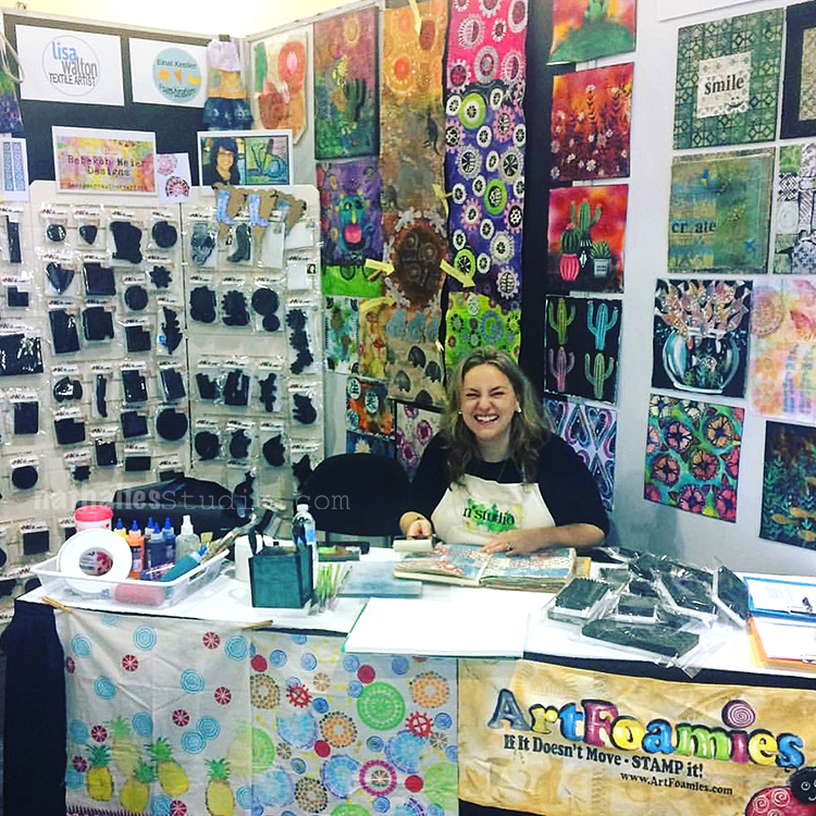
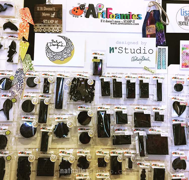
Here I am demoing with my stamps in the ArtFoamies booth. I had such a good time with Emmie and Ian, the owners, and I loved seeing a lot of people coming by to check out the designs and the new Clay and Pottery Versions too.

Here is a short video that Craft Test Dummies recorded of me in the booth …note that I am really sick …to be honest I have no idea how I made it through the show

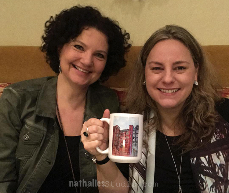
I also have no idea how my sweet friend Birgit Koopsen made it through sharing a room with me ;) I hope she didn’t get sick when she returned home. But we had an amazing time!!! Here we are at breakfast – with one of my art mugs :)

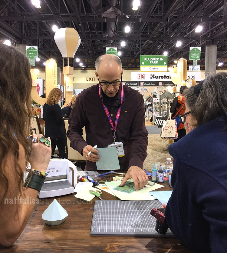
On the way to Phoenix I met Seth Apter at the gate in Newark, which was so much fun , extra chatty time for us – and here he is demoing with his products at the Spellbinder booth.

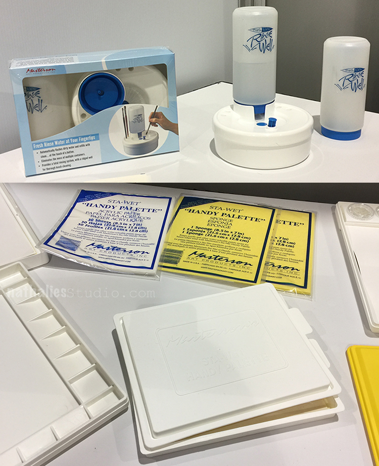
Here are two things that I found and have already ordered – cannot wait to get them. These are by Masterson Art Supplies, a company that was in the new exhibitor section , but is actually already around for over 40 years.

On the top you see the Rinse Well which consists of a plastic bottle that holds 28 ounces of fresh water, a durable plastic base with a well in the center for brush cleaning and a reservoir to hold the used water. Simply pressing the button at the front of the Rinse Well drains the used water into the storage base and automatically refills the well with a clean supply of water. I have to try this – hopefully it saves me a couple journey to the sink :)

On the bottom of the photo above you see Masterson’s Sta-Wet Palettes. The palette is supposed to keep acrylics and other water-based paints moist on the open palette for hours. Once the lid is closed, the paints will stay in workable condition for days, even weeks. A unique sponge and special permeable palette paper provide the paint with a constant source of moisture. I cannot wait to try it and will let you know if and how it worked .

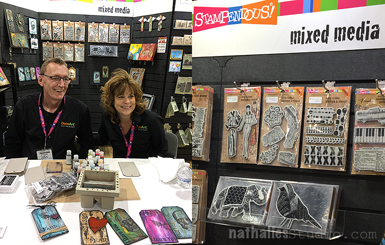
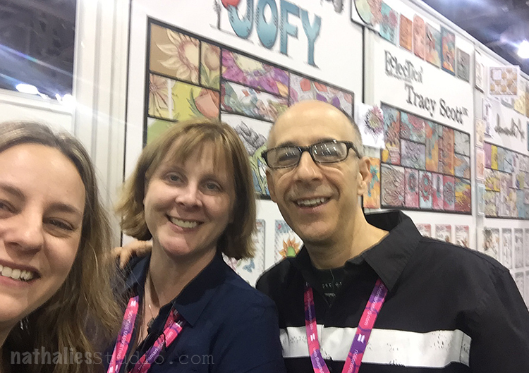
I visited the Stampendous booth shortly, they are still carrying some of my stamp lines and it was fun to see Andy Skinner and Tracy Weinzapfel do their shenanigans.

And we ran into the amazing MaryBeth Shaw and had a fun chat and laughed a lot. Thanks MaryBeth and Carol for the trail mix…that saved Birgit and me from starving later ;)

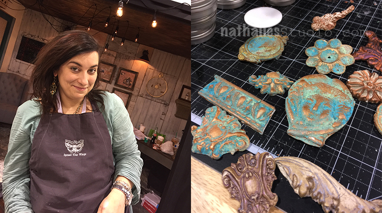
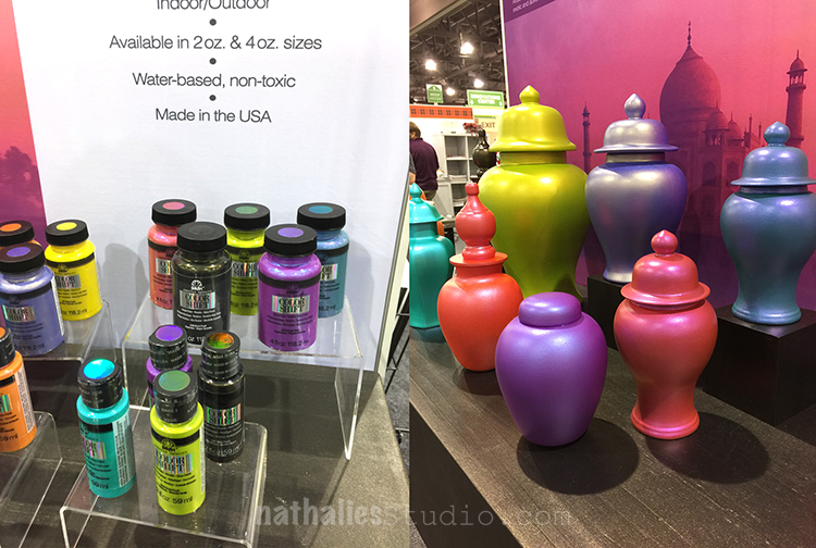
Above is Anna Dabrowska, who showed us her new patina paint set, which was really fun- I liked it a lot!

One of my favorite new supplies is brought to you by the sweet and awesomely talented Dina Wakley! Her new Media Journal has different surfaces inside including burlap, canvas, cotton rag, watercolor paper, and kraft paper. OMG  I so cannot wait to get that puppy art journal into my hand. On the left she is showing some of the amazing pages that Creative Squad team member Cheiron Brandon created in the new album. On the bottom right you see some experimenting by Birgit with Dina’s new Scribble Sticks– they are a lot of fun!

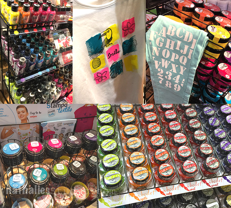
Another booth that made my heart sing, was Aladine. Aladine is a wonderful company from France with different paint products in bright and coordinating colors. From inks, to calligraphy inks, to stamps pads and acrylic paint …they have it all in the yummiest color. But I was especially intrigued by their Textile paint, and paste – which you can see both on the top . I cannot wait to try it out with my stamps and stencils and will let you know how it went soon .

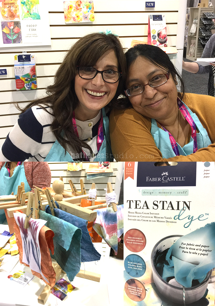
Another highlight was seeing those two beautiful faces!!! Rae Missigman and Mou Saha . I could hang out with them all day. They showed this fun new Tea Stain Dye by Faber-Castell . I loved the muted colors and I already bought some plain sari silk ribbon and cannot wait to play with that a bit.

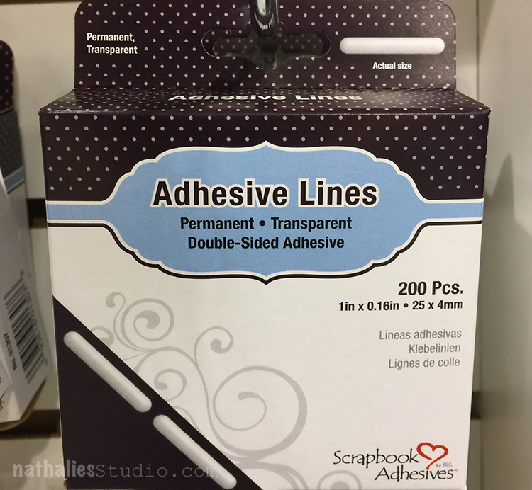
I know that this seems a bit geeky but I love the new Adhesive Lines by Scrapbook Adhesive- I am a sucker for good adhesive :)


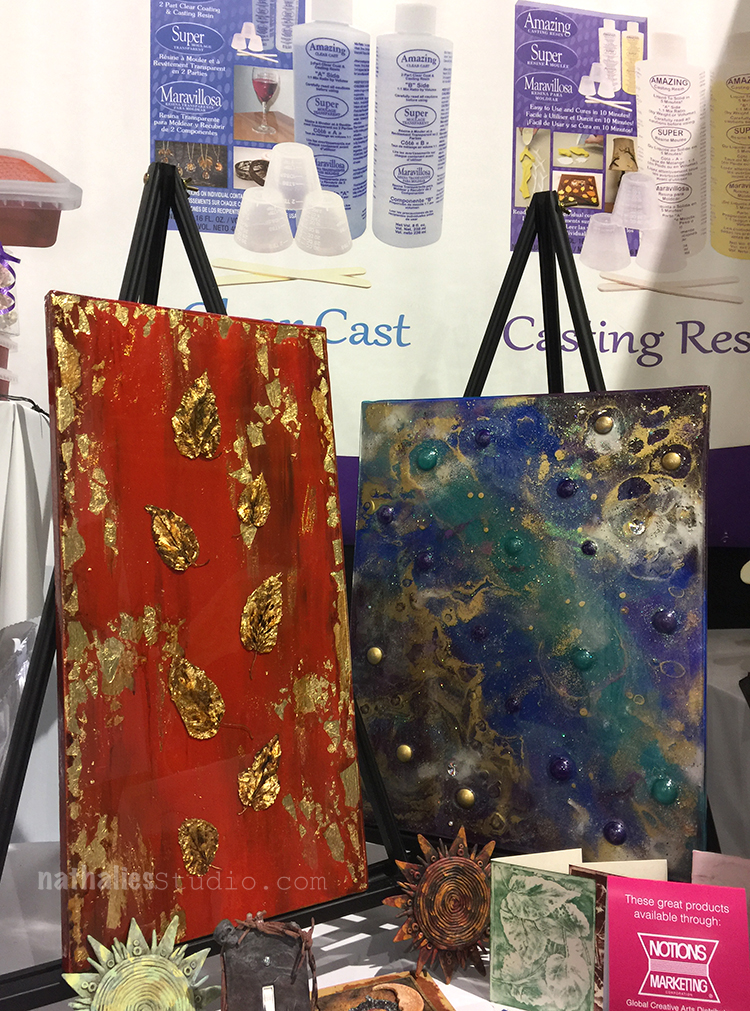
As always I visited my friends from the Alumilite booth and I loved their samples with resin and molds – still on my to-do lists- there I shout it out to the universe I will do some stuff this year – hold me accountable ;)

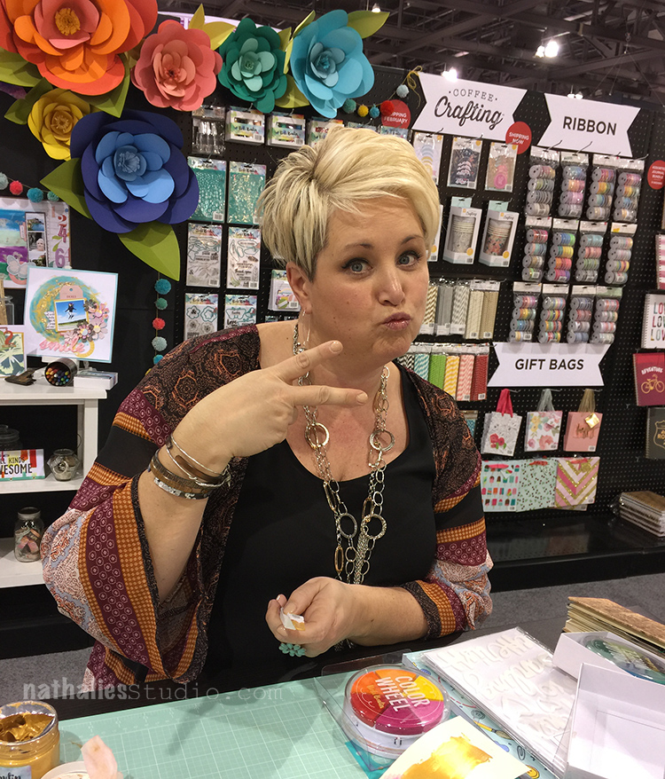
Vicki Boutin came out with a fun Scrapbooking Line with American Crafts in yummie colors and designs. I really liked her new pens in various colors that had a super nice feel to them and seemed to write easily on acrylic paint. I have to play a bit more with those- you can never have enough awesome journaling pens!


Bright and happy colors were everywhere this show- as you know that makes me happy.

Here is a photo of Marjie Kemper (Marjie- so sad it was just a short moment I saw you ) and Seth

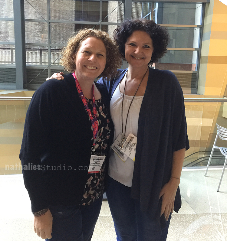
and here is a little break with Rachel Greig from Darkroom Door and Birgit. Always fun to spent time with Rachel! The three of us might have hashed out some plans for 2018 …psssttt ;)

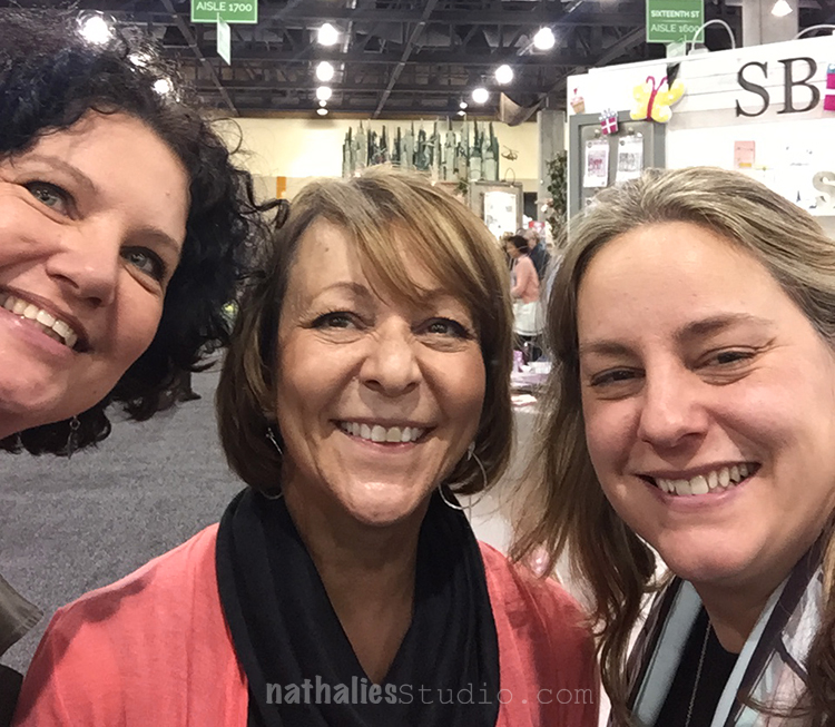
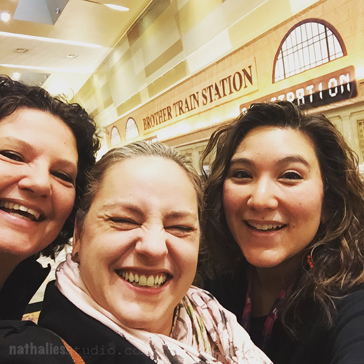
my girls – it was the best to spent so much time together this show!

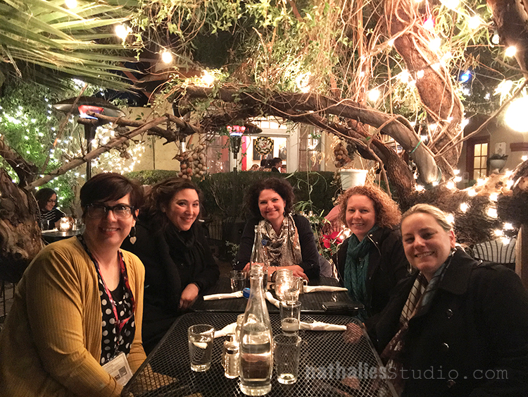
and of course a dinner with these sweet friends outside (under a heating lamp- boy it was cold in Phoenix) was the best of this trip!


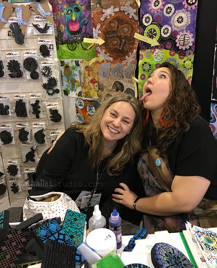
I spent some more time at the ArtFoamies booth …and don’t ask me what Julie is doing there to me…LOL

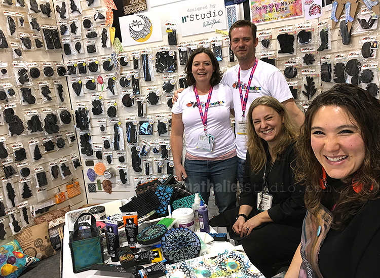
And here is us together with Emmie and Ian in the ArtFoamies booth – love you guys!

That was it. The show was shorter than usual but I do have to say I really enjoyed it. I saw some interesting things, met a huge amount of people and …the most important thing, spent time with my peers and had awesome conversations. I cannot wait to play with all kinds of different new things and share them with you.

What did you see posted about the show that is new and excites you ?

+ Expand this article
8comments

Comments (8)

  • Marjie Kemper

    |

    Awesome pics! So glad to see you if only for a moment. Congrats on your new releases!

    Reply

    • nathalie-kalbach

      |

      Thank you Marjie! Yeah- next time I hope to see you longer. Stay warm today on this snow day :)

      Reply

  • Marie-Anne Raeman

    |

    Hi, i’m so curieus what you and Birgit been cookin for 2018 ….with Rachel…..new yummie stamps maybe….

    Reply

    • nathalie-kalbach

      |

      LOL- not stamps …although that is what all three of us have in common ;)

      Reply

  • Nancy Faulls

    |

    Nat
    I absolutely LOVE my Rinse Well!

    Can’t wait to hear what you think of Sta-Wet. Been thinking about it for a bit.

    Thanks for sharing all the pics…looks like a blast.

    Reply

    • nathalie-kalbach

      |

      Hi Nancy, that is so cool to hear. I just got it and set it up. Did you use it with acrylic paints yet too? I dabbled in watercolor yesterday and that worked very well :) I will let you know about the Sta-Wet – I got it as well but haven’t been painting yet. Cannot wait though! Have a gorgeous week :)

      Reply

Leave a comment

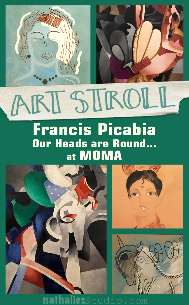
Art Stroll: Francis Picabia at MoMA

Last month I went with some of my friends to the opening of Francis Picabia “Our Heads Are Round so Our Thoughts Can Change Direction” at MoMA
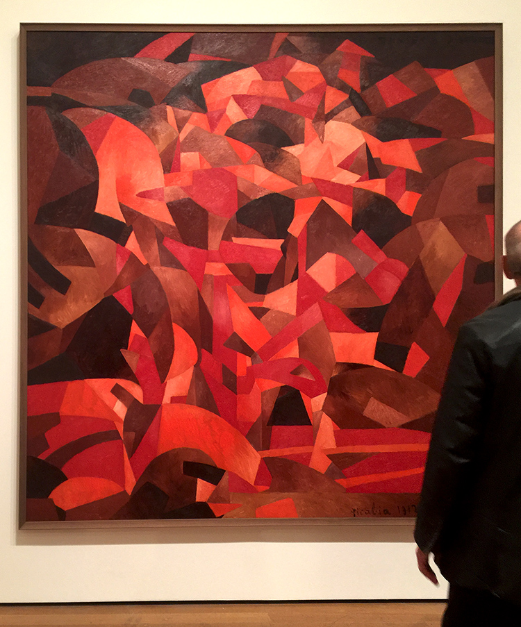
Dances at the Spring II

I had seen a couple of Picabia’s paintings before and love them a lot but to be honest, I didn’t know much of him. My friend Adam, was totally excited because he is a huge Picabia fan and told us, he was waiting for this exhibition for a long time.
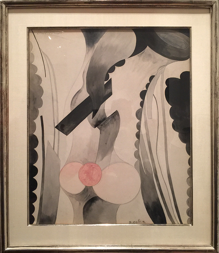
I was pleasantly surprised and loved loved loved the exhibition. Every single one of the rooms in the exhibition offered something different in style and was often challenging.
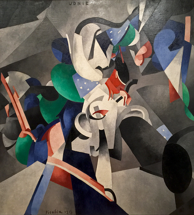
Francis Picabia, 1913, Udnie (Young American Girl, The Dance), oil on canvas

The exhibition covered Picabia’s entire career. He was born to wealth in 1879 and apparently all he did was painting…and partying. He had a lot of humor and was by many, including himself called a Prankster.
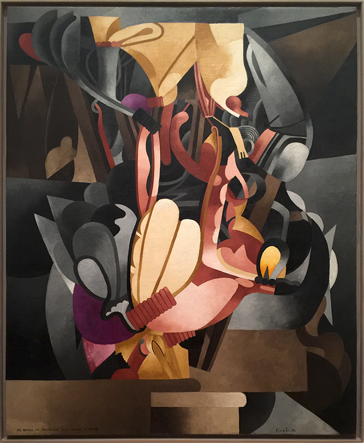
Arriving in the next room all the artwork became very industrial, mechanical and added different materials to the flat canvas. He was also a big part of the Dada-Movement.
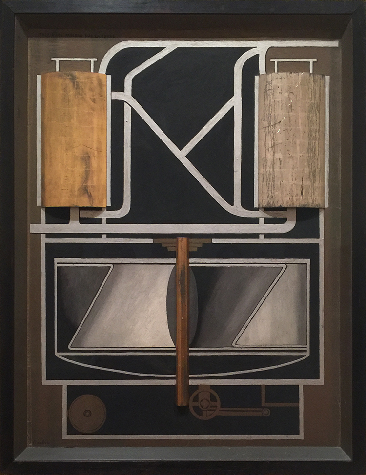
Très rare tableau sur la terre (Very Rare Picture on the Earth) (1915) Oil and metallic paint on board, and silver and gold leaf on wood, including artist’s painted frame
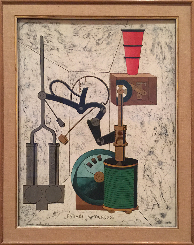
Amorous Parade, Francis Picabia, 1917- Oil, gesso, metallic pigment, ink, gold leaf, pencil and crayon on board.

And then just as you got used to it …everything changes once again
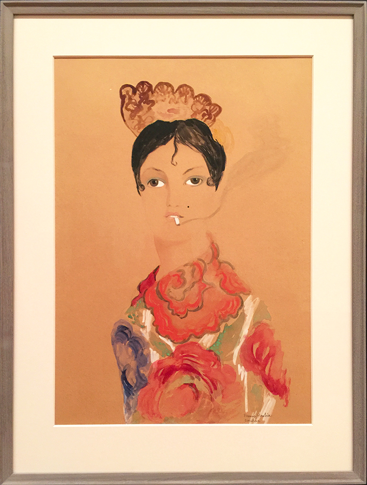
and again
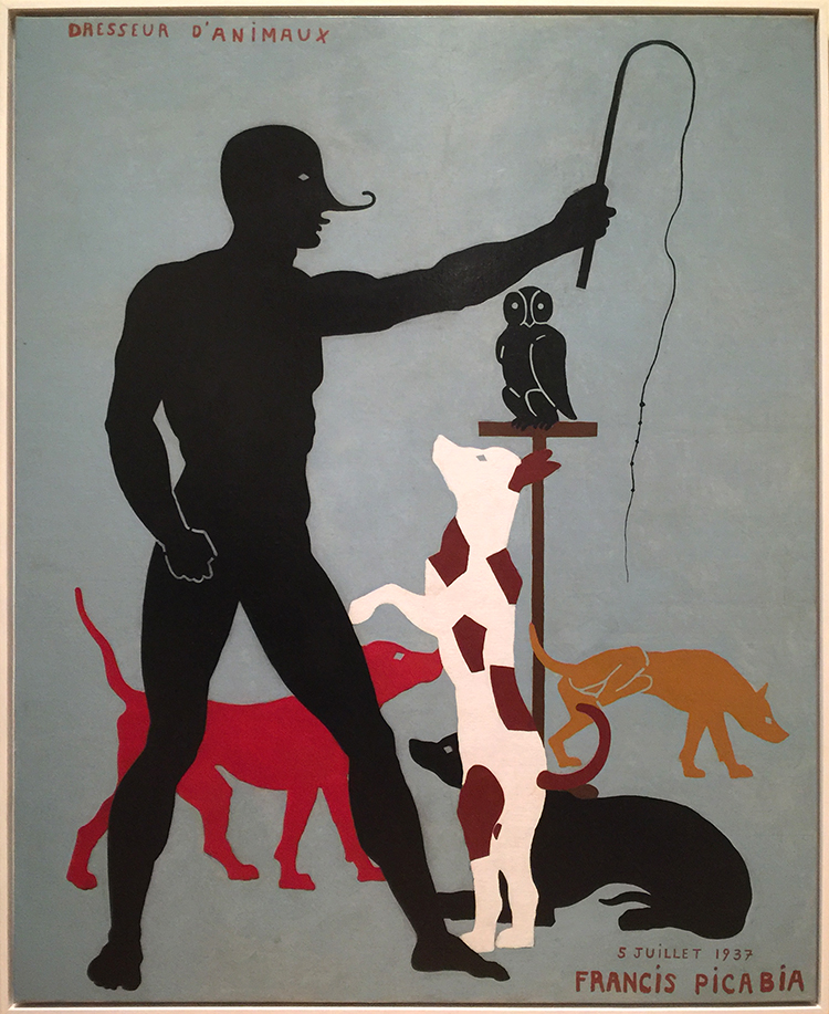
Animal Trainer, Francis Picabia

The above painting is seen as one of Picabia’s typical jokes and mocking fine craftsman ship. The hand of the figure shows prominently bridges – a typical sign of using stencils – and the dogs as well are created with the use of stencils. This was frowned upon on when he painted this – which was in 1923 and not as he also placed as a joke onto the canvas in 1937. Also check out what the yellow dog is doing in the background.
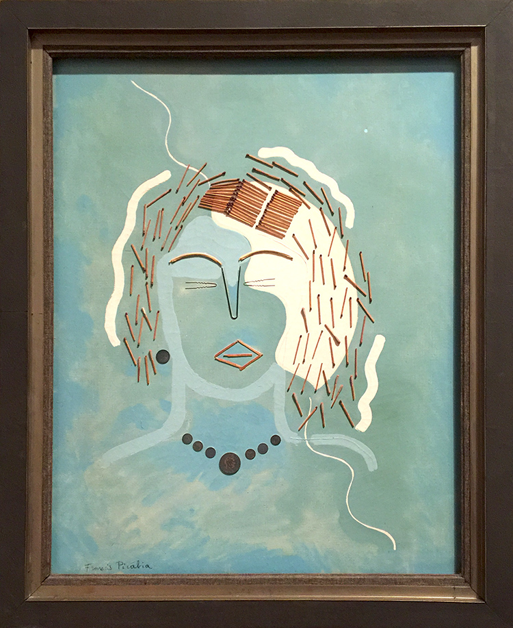
I loved his playful use of unusual materials in the next gallery -like matches and canvas wedges, brushes, coins. It’s been all done before – it is fun – it is humorous and amazing.
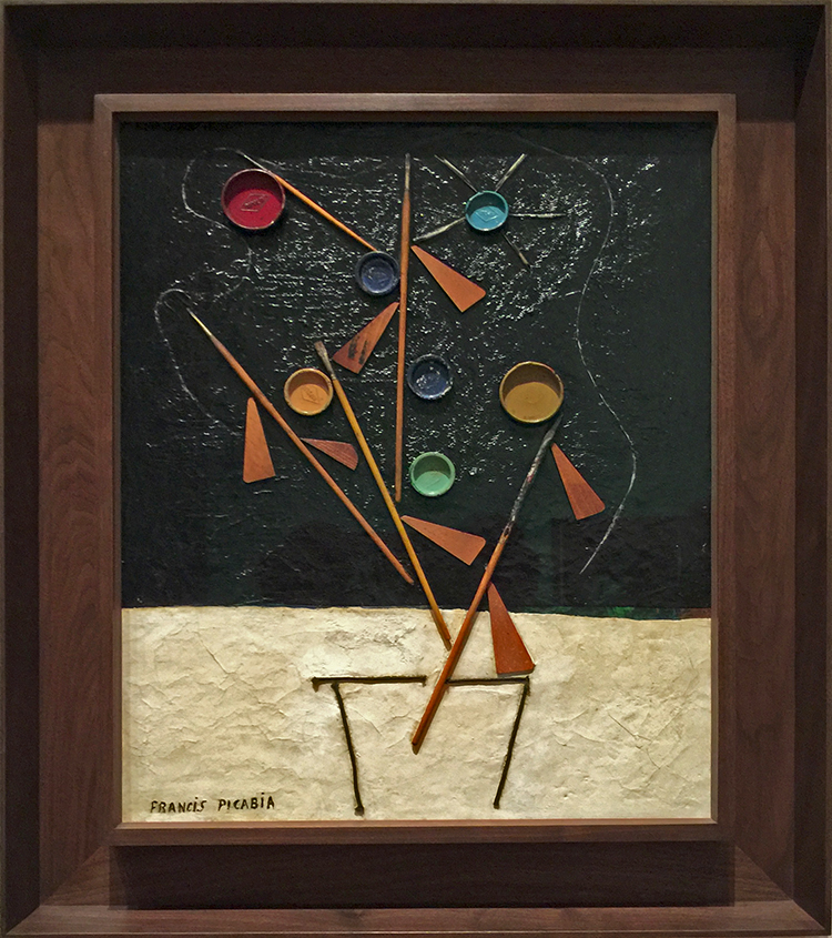
Flowerpot , Francis Picabia, 1924-25. Enamel paint, Ripolin paint-can lids, brushes, wooden stretcher wedges, string and quill toothpicks on canvas.

One gallery was dedicated to his Transparencies 1927 – 1930. I also loved all the different frames- a topic I have talked about in many other posts . They are probably still original because museums weren’t that interested in his artwork up and until the 50s – and so fortunately they did not get destroyed to go with the “museum style frames”
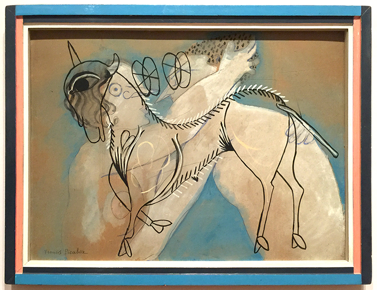
Working in his large new studio in Mougins, Picabia painted his Transparencies by alternating layers of paint with layers of resinous varnish. This process allowed him to lay linear motifs atop one another while keeping them distinct. These richly layered, multi referential compositions interweave an often dizzying array of con tour images drawn from such diverse sources s Renaissance painting, Catalan frescoes, and the popular culture of the day.
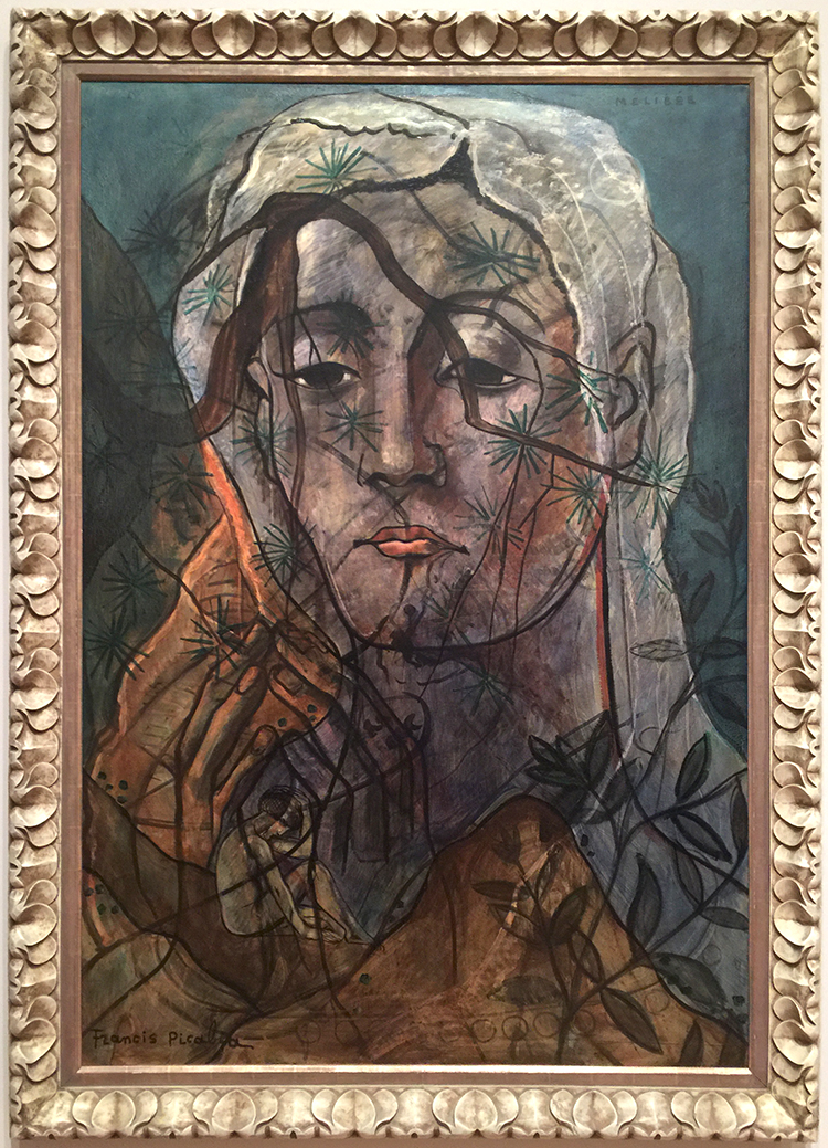
 

Mélibée

Picabia’s unorthodox application of unusual materials sometimes resulted in surfaces that could be interpreted as damaged or in need for restoration. In fact, these effects were often deliberately induced by him. In Portrait of a Woman- shown below, Picabia enhanced some of the bumps with dark paint, purposefully amplifying the paints’s already pronounced topography.
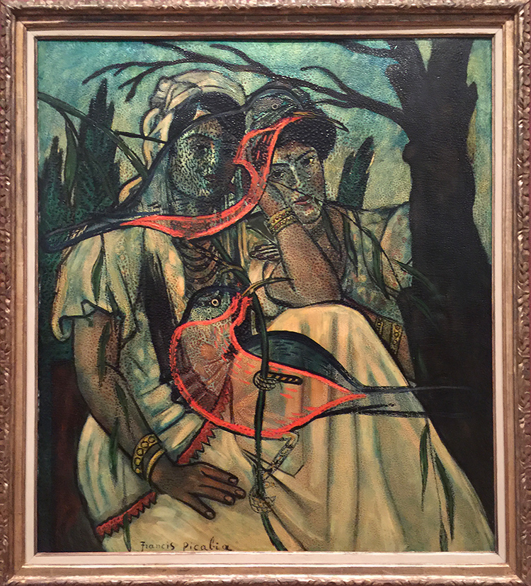
Portrait of a Woman, Francis Picabia, 1935-37 -Oil on Canvas
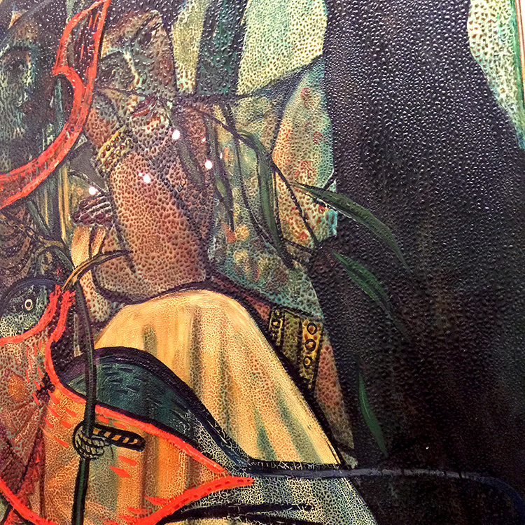
Isn’t that amazing? And then…it changes again
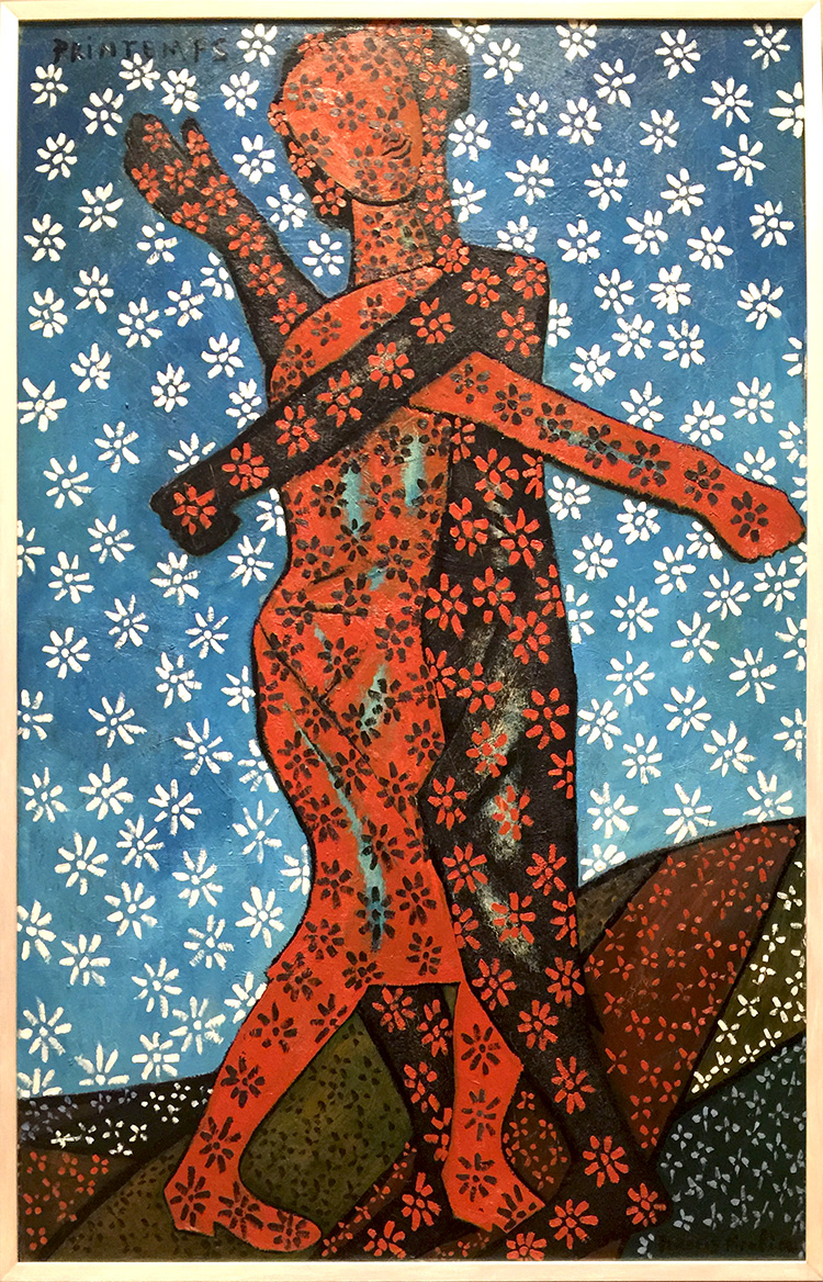
Spring, Francis Picabia, 1937-38/c.1943 . Oil on wood

And again

The Adoration of the Calf, Francis Picabia, 1941-42, oil on board.

Although Picabia was a resolutely apolitical artist, it is difficult not to read this painting and its cynical vision of the worship of false idols as an engagement with contemporary politics.
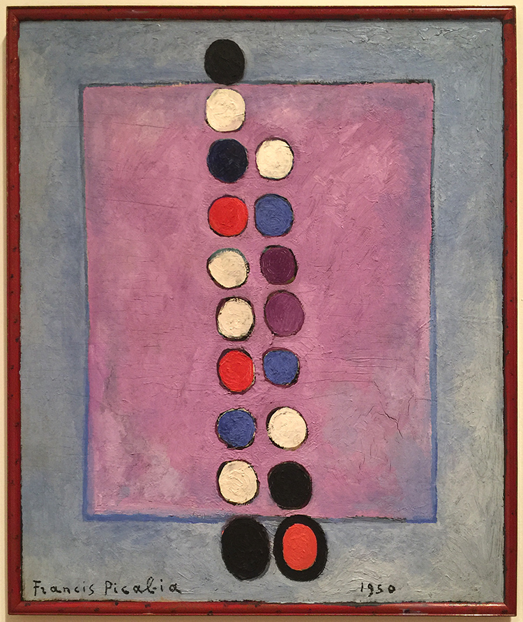
Symbol, Francis Picabia, 1950, Oil on canvas

“If you want to have clean ideas, change them as often as you change your shirts.” (Francis Picabia). Our life changes, in that I guess we are consistent and so was Francis Picabia in his art.

If you are in the area make sure to visit this exhibition before it closes in March. I will definitely be back to see it once more :) I hope you enjoyed this little Art Stroll.

 

Comments (2)

  • Linda Faber

    |

    Thanks, again, Nathalie, for a great tour of an intriguing exhibit. I love his abstract pieces! This artist is new to me and I wish I could get up to NYC (oh but it’s too cold for me now) to see it. And….last year you introduced me to Anselm Kiefer….whose name has been popping up in so many places, and is now on exhibit in Miami! As a retired teacher myself, I love getting these inspirations and knowledge from you….and I know it must be a kick for you as well.
    Linda

    Reply

    • nathalie-kalbach

      |

      thank you Linda, for joining me :) Ha- it is cold here right now …not my favorite thing about NYC ;) Ohhh I have to come to Miami for the Kiefer Show- he is one of my very very favorites!!! Have a gorgeous week, Nat

      Reply

Leave a comment

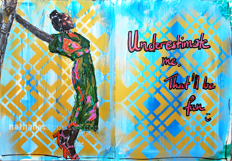
Go ahead, underestimate me! – sassy Art Journal Spread ;)

I thought it was funny :) And I love Lupita Nyong’o and I wanted to use her image from a magazine.
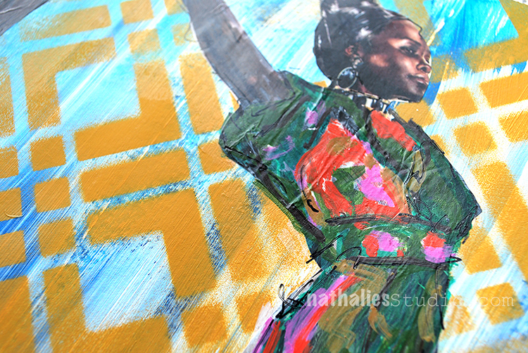
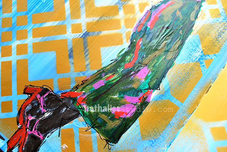
I used my new Chicago Stencil and sprayed over it with acrylic spray paint.

I used different markers to paint over the magazine image. When I applied the magazine image, it crinkled up a bit, which I add to “oops, oh – good now it has some wrinkles and texture- good”

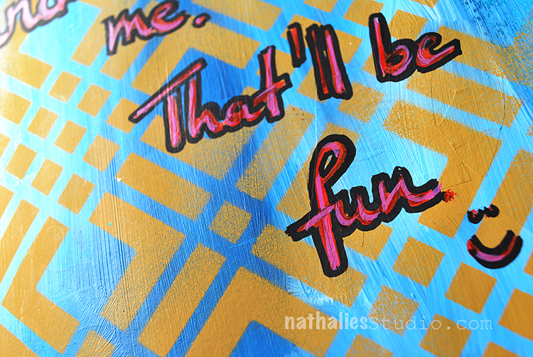
I added the journaling with a red and pink marker and traced the outside of the letters in black. I like the page- even though it is a pretty simple one in terms of layering

Here are the supplies I used – some links are affiliate links:


Wishing you a gorgeous day!!!!

Comments (6)

  • Julie B

    |

    Love this (and even better in person)……can’t wait for the stencil; love how clean the image from this stencil is with spray paint and the quote cracks me up. Thank you!

    Reply

    • nathalie-kalbach

      |

      Thank you Julie! HA and now that you played with spray paint in my class…maybe you are on it yourself ;)

      Reply

  • LauraB

    |

    yaaaassss, Queen, yaaaaasssss!

    Reply

  • Barb Charlotte, NC

    |

    Very creative. Thanks for sharing.

    Reply

Leave a comment

Be Happy – ArtFoamies for Clay and Pottery!

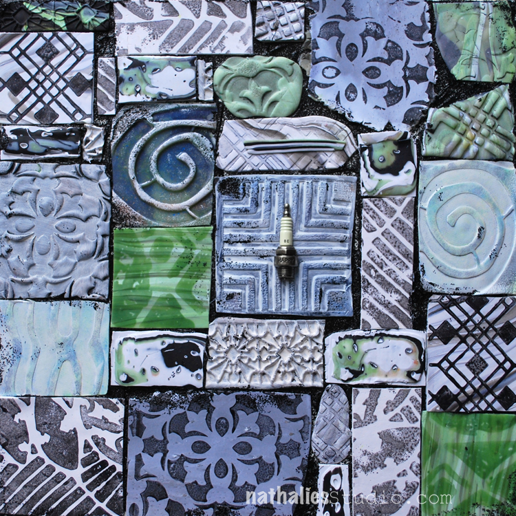
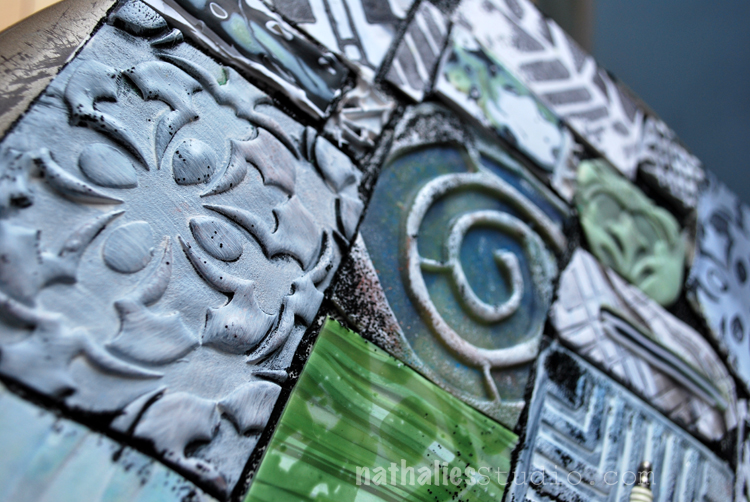
I made this piece for the ArtFoamies booth at Creativation (a Craft and Hobby Convention). Additional to my Foam Stamp Designs as you know them, ArtFoamies just released my designs also in a more sturdy and harder foam form so that they can also be used for pottery and clay. What a great excuse to try those and have a play date with  my friend and neighbor Donna Greenberg who is an amazing Polymer Clay Artist. What a lucky ducky I am with such a great teacher! Check her amazing work out!!!

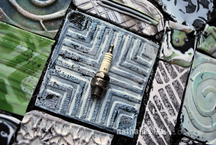
While those stamps work very well with paper clay, Donna showed me that for Polymer Clay I would have to use some softer versions to get a nice impression. I played around with all kinds of fun and new to me stuff. I made impressions directly into the polymer clay, for example here with the Manhattan Foam Stamp for Clay.

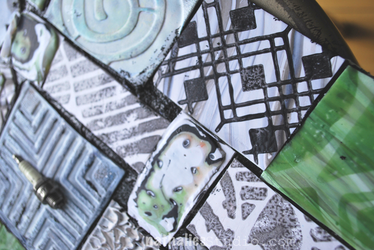
I stamped with some liquid polymer clay on top of polymer clay- ohhhh I love this! See the Versailles Stamp on the bottom.

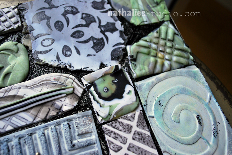
Here are some more varieties of impressions with Versailles and the Batik Stamp.

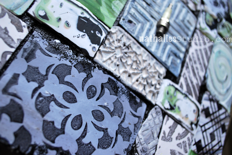
On the top right you can see the Chicago stamp stamped with liquid Polymer Clay.

I cut the pieces and mounted them with Black Lava onto a board. I totally love all the texture and the outcome. One of my favorite pieces and a big stretch for me working with a material I have never worked with before. You can buy the Clay versions of my stamps directly at ArtFoamies – I carry all the normal Foam Stamps as well :) I cannot wait to play a bit more with those – next up is paper clay.

Are you working with Clay, Polymer Clay or Pottery and would you use those?

Comments (4)

  • Marna

    |

    Excellent! I love working with textures and clay and have used embossed wallpaper with patterns in my pieces. Can you describe how you used the liquid clay?

    Reply

    • nathalie-kalbach

      |

      thank you Marna. I used it like paint on top of the foam stamp and stamped with onto the still non baked polymer clay. Then I baked it. Love the visual and actual texture this created and the liquid polymer clay is just slightly sitting on top of the polymer clay piece.

      Reply

  • joi

    |

    Just mind boggling Nat – how INCREDIBLE. These are WONDERFUL. Never even imaged such wonders as these! Xj.

    Reply

    • nathalie-kalbach

      |

      awe- thank you so much Joi – glad you like it :) Have a gorgeous weekend!

      Reply

Leave a comment

Life is tricky

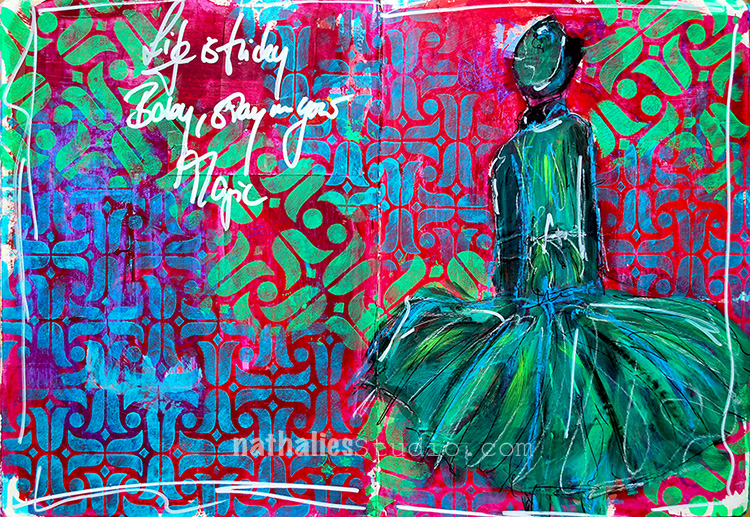
Life is tricky, Baby, stay in your magic.

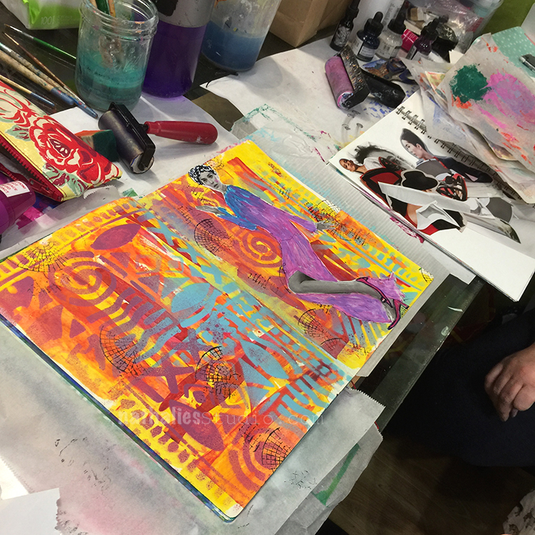
I had a good time creating this page when I wasn’t really cheery but playing with those colors and with my new Amsterdam Stencils – 9×12 and 6×6 – made me happy again :)

I used red and green as complimentary colors on purpose to make everything pop a bit more. I applied acrylic paint with a foam stamp through the stencils.

I love that the pattern is slightly different in the 6×6 stencil and the tulips are also bigger- different size, different pattern but same elements – an easy way to tie the design together and apply some layering.

I used a small brush to paint over the magazine image and added some highlights with pastels – I love how the blue pastel pops off the dress.

Here is the supply list- some links are affiliate links:


I hope your day is super magic today!

Comments (12)

  • jbonomo

    |

    Stunning page! This stencil is one of my favorites (there are too many favorites like Chicago) and thank you for your color theory tutorial at AWOH. I love how everything pops off the page. Me thinks that your next venture will be high couture.

    Reply

    • nathalie-kalbach

      |

      Awe- thank you Julie! It was wonderful to have you at AWOH!!!!

      Reply

  • sunmoongal

    |

    Hi, love this spread. Have to get some stamps!

    Reply

  • Linda Faber

    |

    Wow! I so love this page! So dynamic in color and style. Great stamps too.

    Reply

  • joi

    |

    What SUPER pages Nat. Love your sentiment and the neat dress PLUS your amazing patterns and colors! Xj.

    Reply

    • nathalie-kalbach

      |

      Awe- thank you Joi – I want to own that dress :) Have a wonderful day !!!

      Reply

  • Sandra

    |

    Nathalie, I’ve signed up for one of your classes at Artiscape this year. Excited to meet you. Will your stencils and foam stamps be available for sale there?

    Reply

    • nathalie-kalbach

      |

      Sandra, so happy you will be there and I will meet you! I think stencil and foam stamps as well as my rubber stamps will be there – I am in the midst of organizing that ;)

      Reply

Leave a comment