Free shipping for customers in the US ends TODAY, December 14th at 11:59pm EST: If your cart totals more than $25 of physical products in my online shop HERE, you can get free shipping in the US.
Just enter the coupon code FREE25SHIP when you are checking out and all those goodies will get shipped to you for free!
Free shipping for customers in the US: If your cart totals more than $25 of physical products now through Monday (December 14th, 2020) in my online shop HERE, you can get free shipping in the US. Just enter the coupon code FREE25SHIP when you are checking out and all those goodies will get shipped to you for free! Who doesn’t like a little free this time of year?
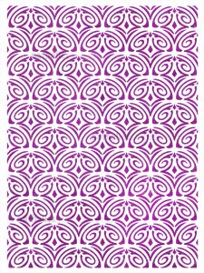
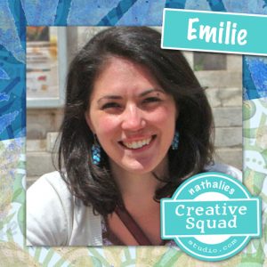
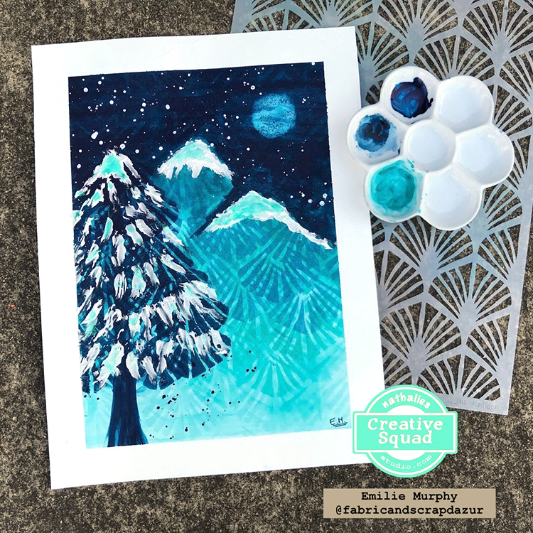
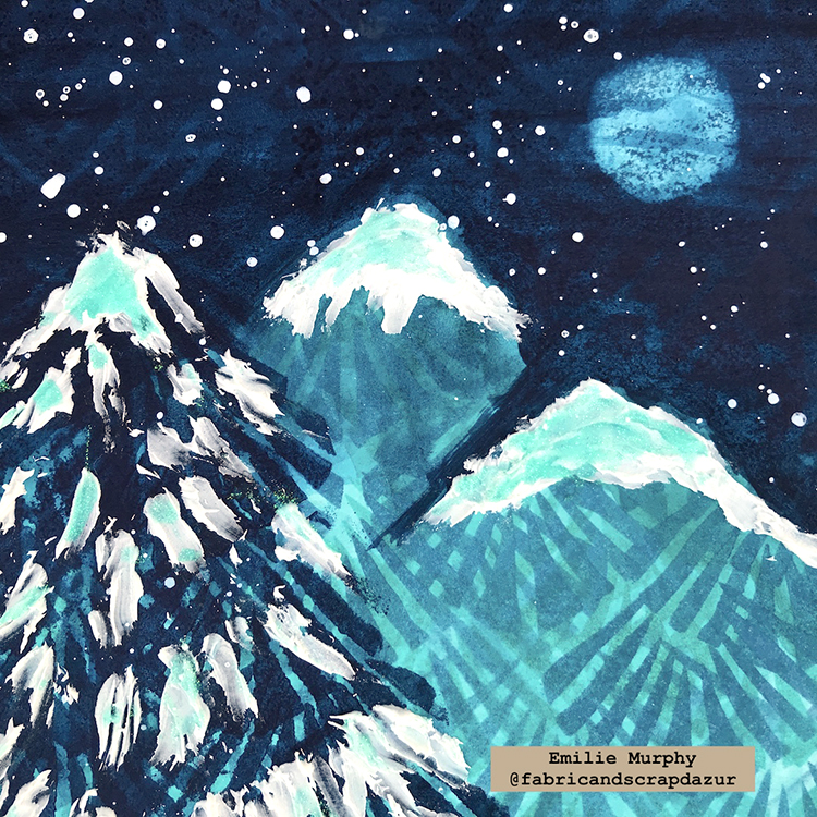
Hello from my Creative Squad! Today we have a magical nighttime winter scene from Emilie Murphy to share with you. Emilie is using my Art Deco Wallpaper and Toledo 4×4 stencils for this one and our theme: Light & Shadow – In art and maybe also in life, the balance between light and shadow is an important consideration. Play with this equilibrium in your art and show us how the two sides work together.
Hi there! Hope you are doing well.
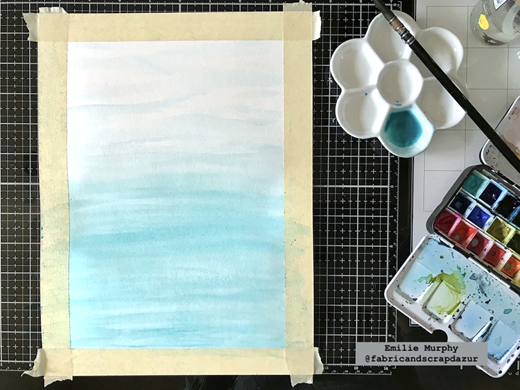
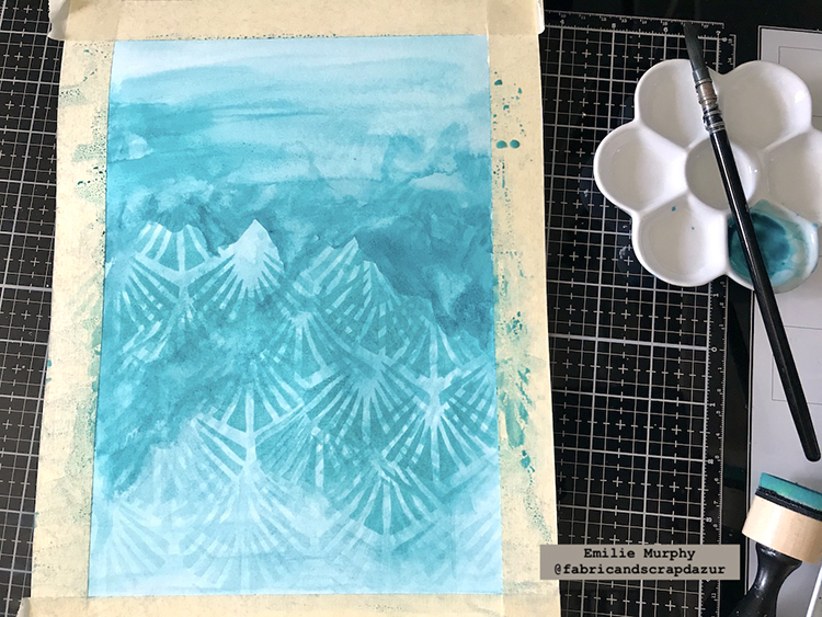
As the theme of the month is “Light and Shadow”, it made me think right away of a winter scene during a snowy night in the forest, where we can see the shadows of trees and some light coming from the moon.
I started with a light wash of “Turquoise green” watercolors from bottom to top.
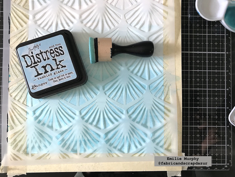
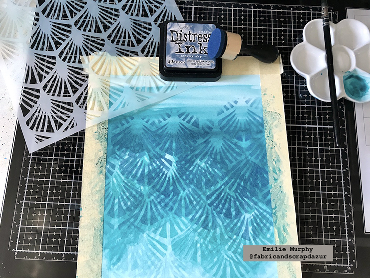
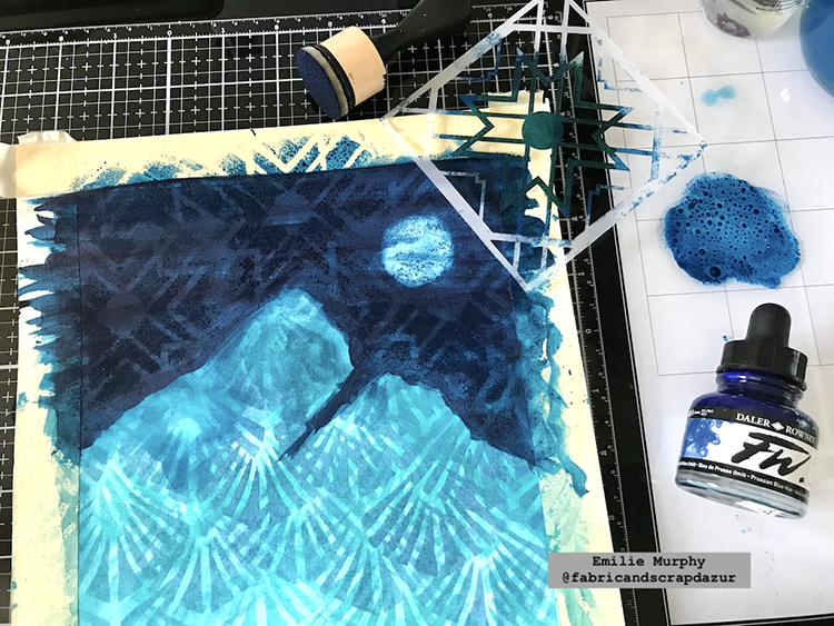
I laid down my “Art Deco Wallpaper” and applied some “Tumbled Glass” distress ink to keep a tone-on-tone effect.
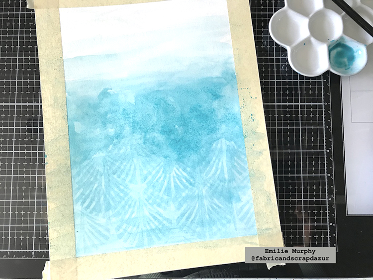
I added more watercolors slightly darker than the first layer. As a result, I mixed some “Turquoise green” with a little bit of “Phthalocyanine Turquoise”.
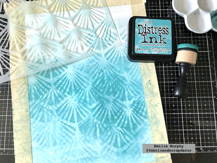
Again, I laid down my stencil and applied some “Peacock Feathers” distress Ink.
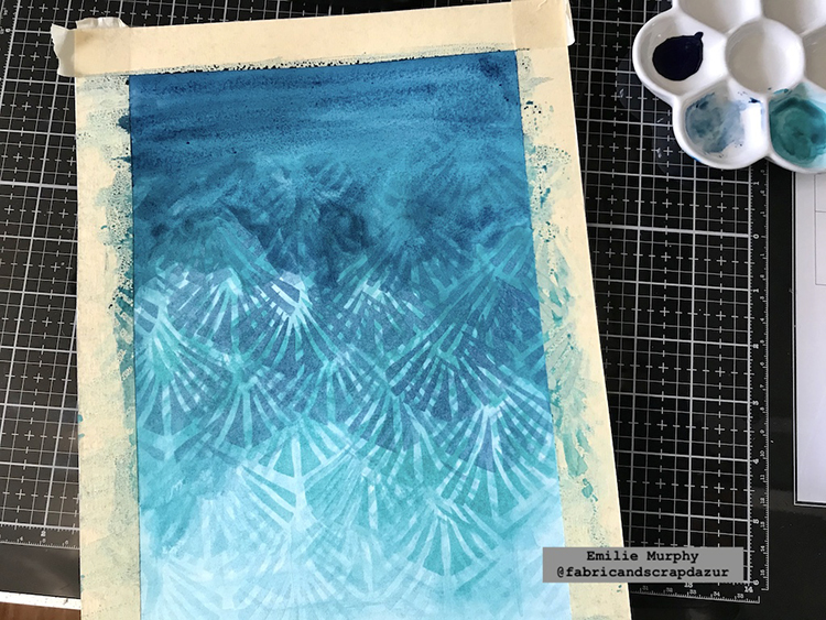
Working in layers, I repeated the previous two steps at the top again, but this time by darkening my watercolors using only “Phthaocyanine Turquoise” and “Stormy Sky” distress ink.
I started to apply on the top some “Indigo” watercolor to make the sky visible finishing my bluish gradient from bottom to top.
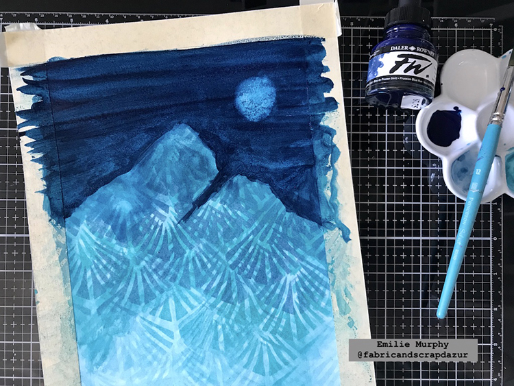
Then, I darkened the sky with some “Prussian Blue” acrylic ink and created some mountains. Next, I wiped off some paint with a rag just before it dried to make it appear as a full moon.
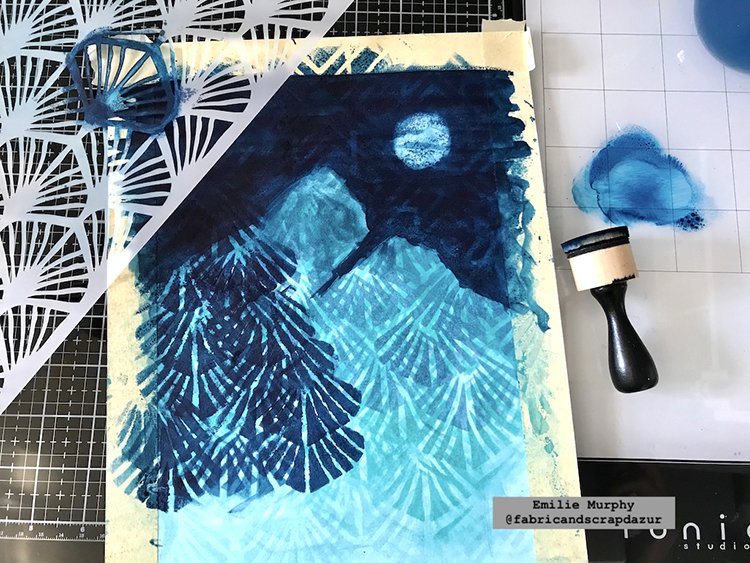
To finish the background I laid down the “Toledo 4×4” stencil and applied some “Prussian Blue” acrylic ink only on the sky part. It gives a subtle glow effect.
I applied again some “Prussian Blue” acrylic ink through the “Art Deco Wallpaper” stencil to make a tree in the foreground.
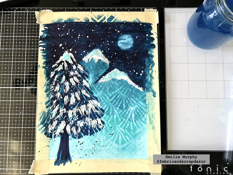
To finish up my painting, I applied some modeling paste on the summit of the mountains and on the tree with a plastic knife. I also applied some glitter glue on top and some splatters to get more interest.
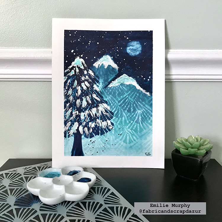
Hope it gets you inspired. I always try to use my stencils in different ways. I think this is a very simple painting project that gives a WOW look. You can leave it like it is or frame it and hang it out on your wall. Have fun!
Thank you Emilie! Love how you used the stencil to create the mountains and tree!
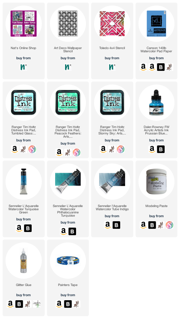
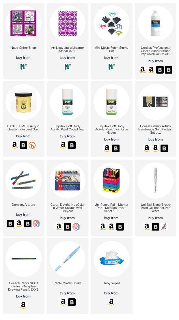
Give it a try: you can find all my Stencils in my Online Shop and here are some of the other supplies Emilie used:
Don’t forget to check out Nat’s Creative Squad on Instagram too: Each week we post projects, ideas, and inspiration for mixed media art.
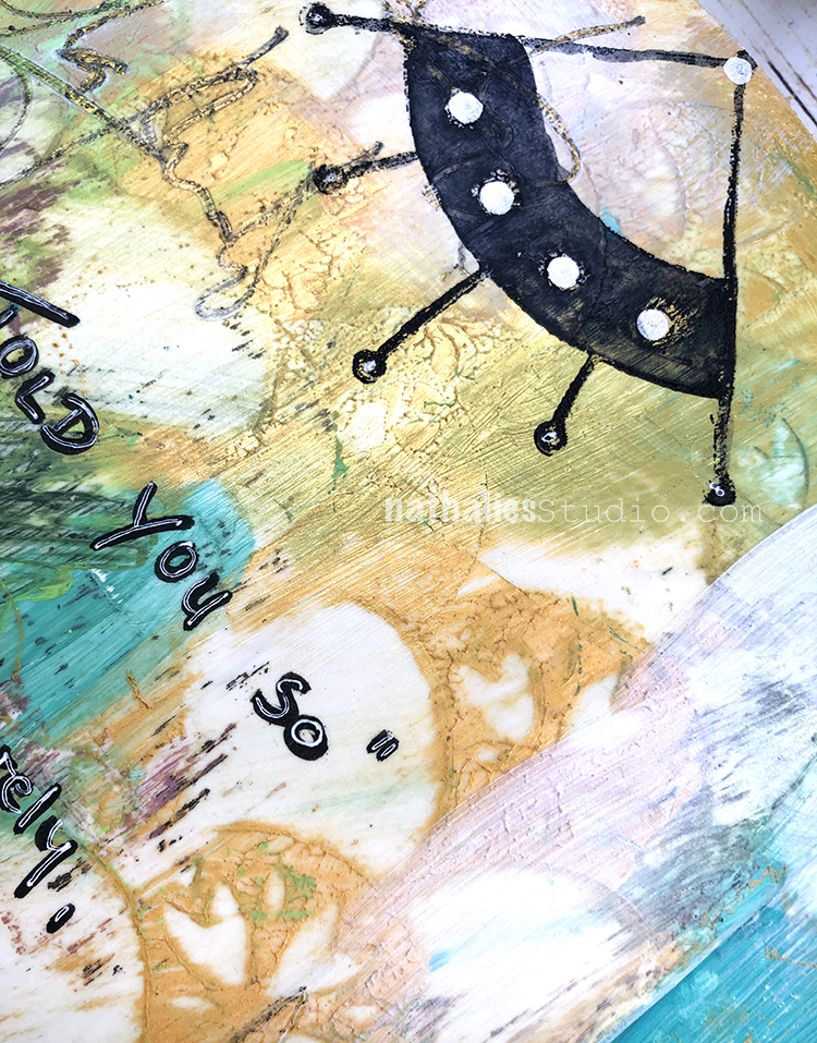
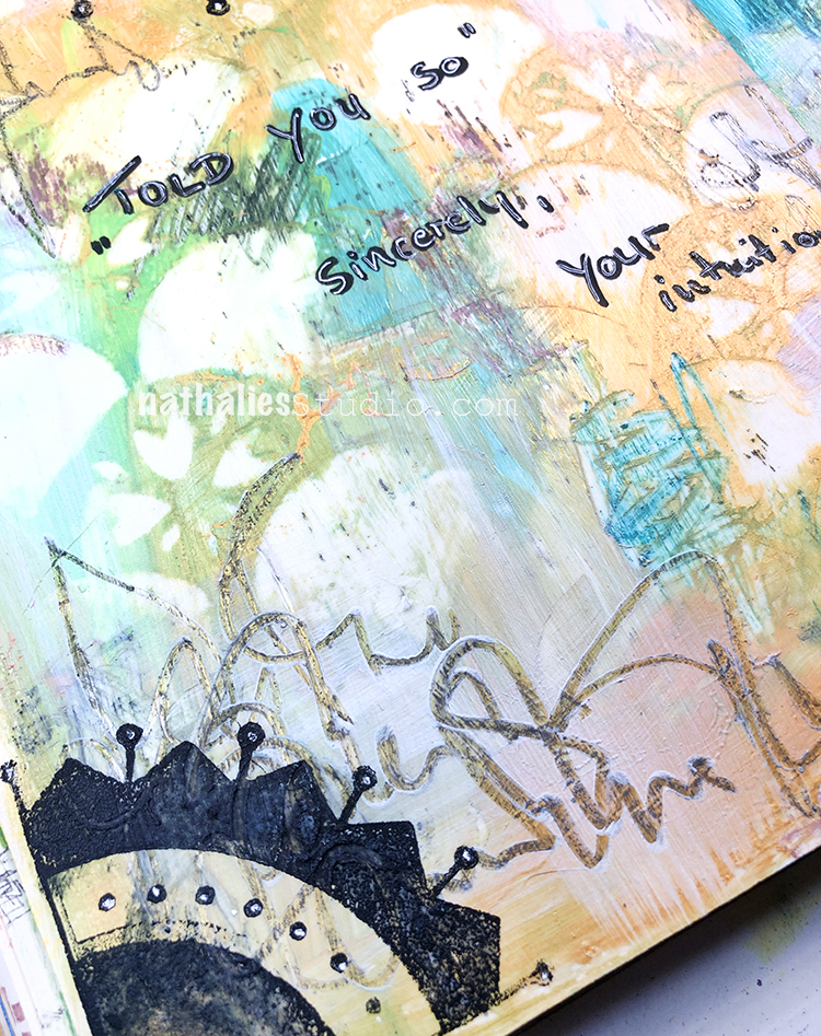
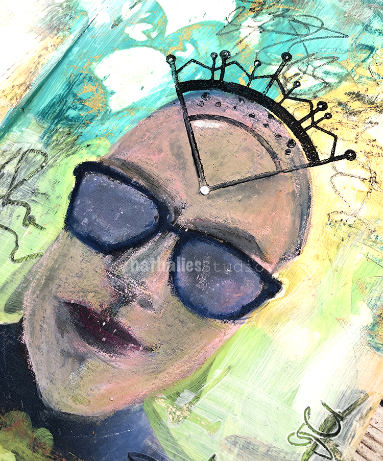
Grabbed this art journal which I hadn’t used in a while and found this page which had a transfer which wasn’t that great (the initial photo didn’t have enough contrast). It seemed like i had given up on that one, so I figured it was time to take care of it again.
I used acrylic paint in teal and lime green as well as gold gesso by Daniel Smith to color in the background, then layered my Art Nouveau stencil on top and used a baby wipe to take away some areas.
I used Honsell soft pastels into the still wet acrylic paint for some scratching and color, and also used a soft pencil to add some obscured writing. I let it dry and then painted it with clear gesso to add tooth but also to seal the pastels that did not dry into the wet acrylic paints.
I then used Derwent art bars and Neo Colors II to paint over the face – using a water brush to blend the wax bars but also leave some dry wax marks for texture.
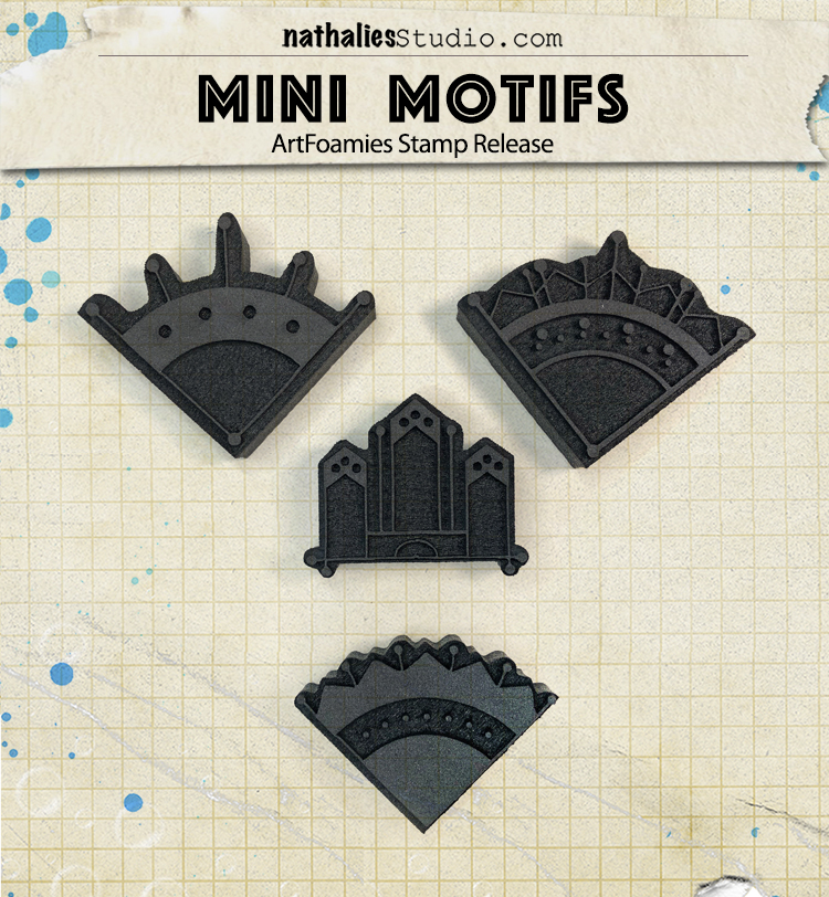
Lastly I added some stamping with my new Mini Motifs foam stamps and acrylic paint and journaled with a posca marker and white signo pen.
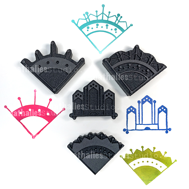
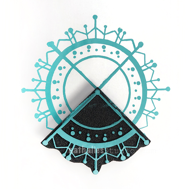
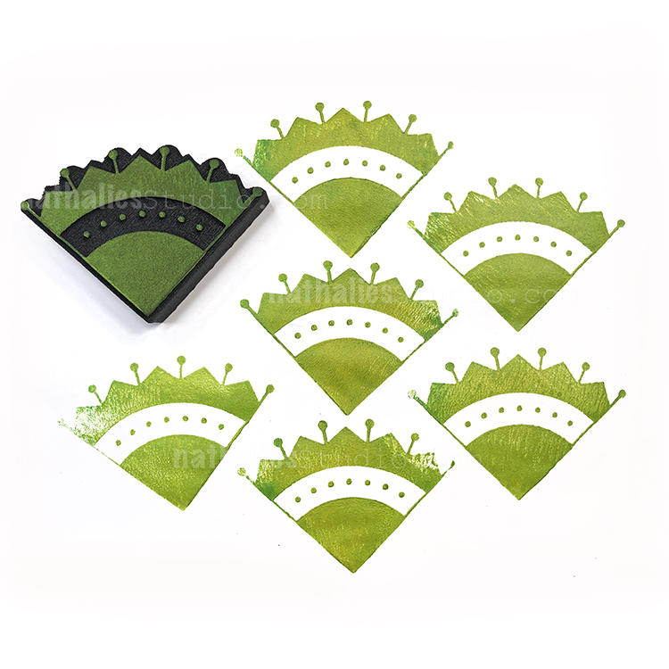
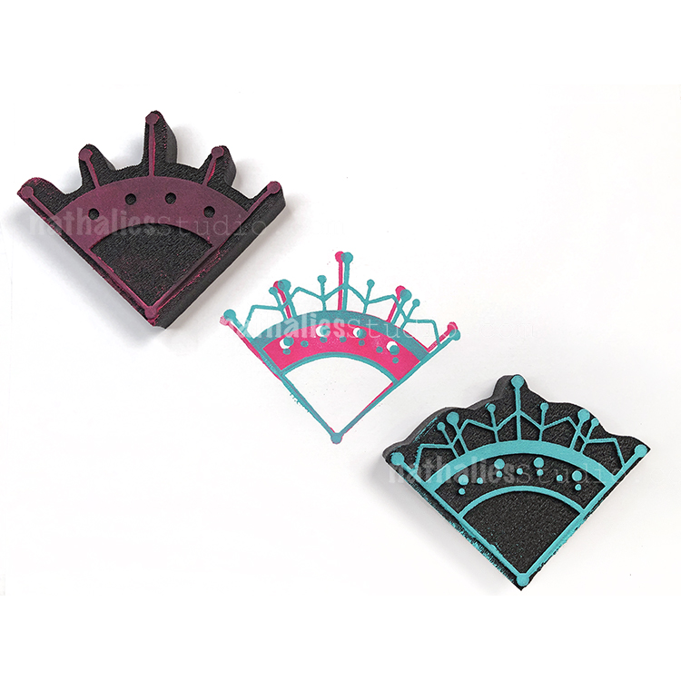
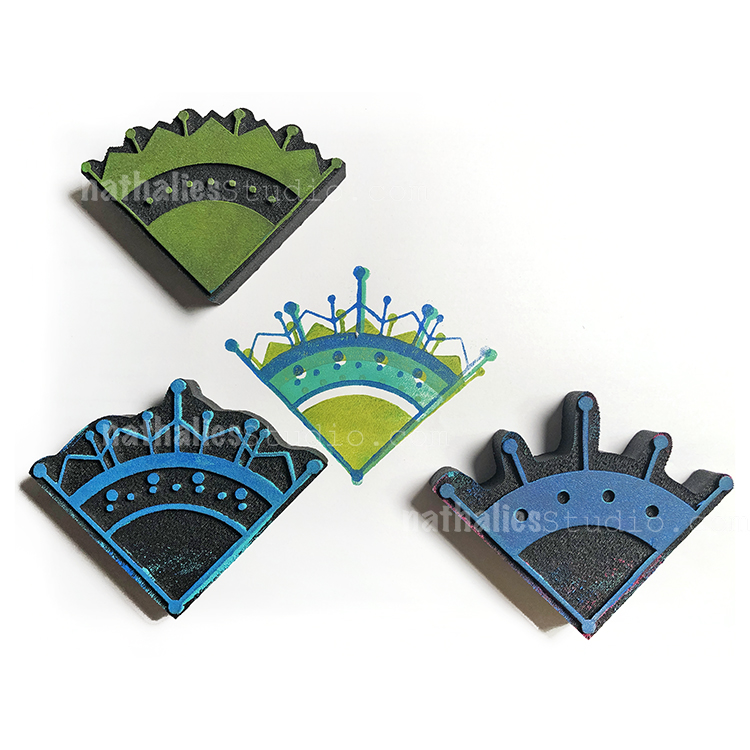
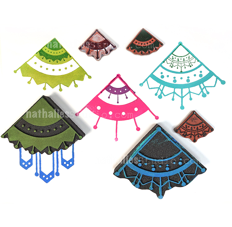
Each of the 4 Mini Motifs stamps in the set is inspired by some of the designs on an old fireplace in my home. I love the idea of drawing inspiration from this bit of history and thinking about the craftsman who carved the designs so long ago.
The triangle shaped ones are fantastic for layering up. I also discovered that they work great with the Mini Motifs Rubber Stamp Set!
I wanted to share a little Flip Through video of my newly finished art journal.
I keep about 4-5 journals at the same time so they are always filled with an eclectic mix. This one highlights some pages that later became sketches for original paintings. You may also spot pages that are from some of my Online Workshops.
Do you keep several art journals at once or do you work through one at a time?
That was wonderful Nathalie. Thank you so much for sharing. I watched it several times too. Loved that you explored different perspectives. Each page is unique.Explored your art work and was super impressed.
Rita
Wow, this is gorgeous! The flip was a little too fast for me though. Had to watch it several times, but fun!
Loved seeing the Klimt pages again too.
Linda
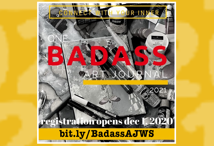
Registration is open for One BADASS Art Journal – an online workshop I am teaching in! This is hosted by Tiare Smith and includes 16 teachers and 17 lessons to help you unlock your inner artistic badass.
The workshop begins February 1st, 2021 and goes for 4 months through May 31, 2021. Afterwards it is completely self-paced and you have lifetime access to videos and lessons to help you get a bit more confident with your artmaking. Find out more and register HERE.
Here’s what you can expect: Step-by-Step Mixed Media Tutorials, Video Tutorials, Downloadable PDFs, Wonderful for beginners or anyone who wants to embrace their inner BADASS.
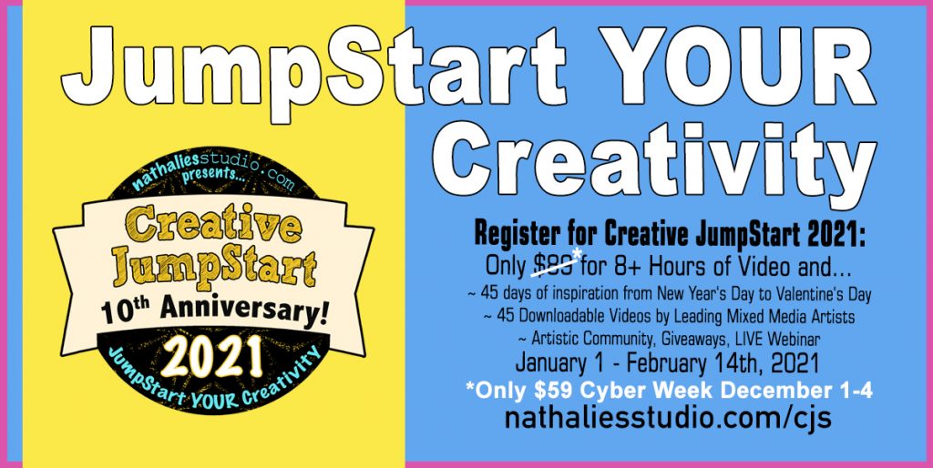
Creative JumpStart 2021 is also on SALE now – just $59 with Cyber Week pricing through December 4th at 11:59pm EST. This is our BIGGEST Creative JumpStart ever with 45 different artists and 45 mixed media lessons designed to JumpStart YOUR Creativity.
Sign up now and get ready for a new lesson each day from New Year’s Day through Valentine’s Day. Our theme this year is Storyteller and our artists are sharing their stories through artistic techniques and projects designed to inspire you in 2021 and beyond.
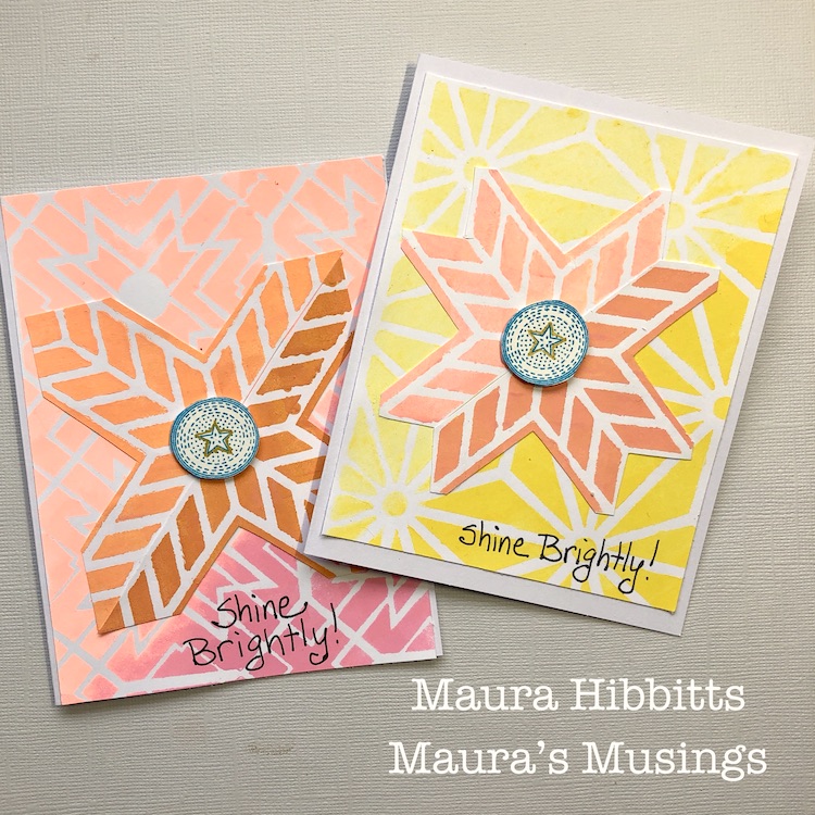
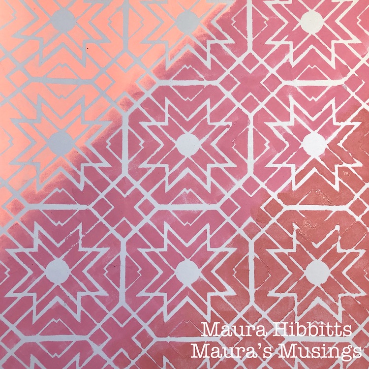
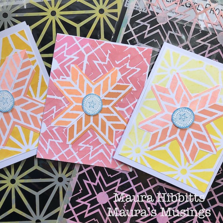
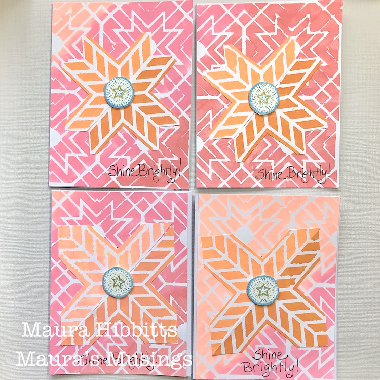
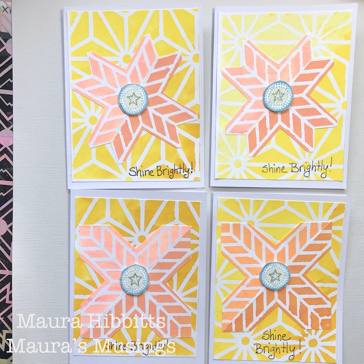
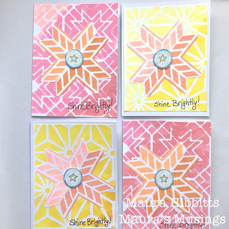
Hello from my Creative Squad! Today we are kicking off a new monthly theme with Maura Hibbitts. She is bringing us some lovely holiday cards in some perhaps untraditional colors, shaking things up to finish up 2020 with my Star Struck, Toledo, and Santiago 4×4 stencils, my Small Circle Jumble rubber stamps, and our theme: Light & Shadow – In art and maybe also in life, the balance between light and shadow is an important consideration. Play with this equilibrium in your art and show us how the two sides work together.
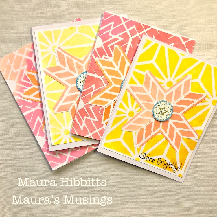
Light and Shadow, dark and light…as the days get shorter and the shadows longer I’m feeling the need for more light in my life. I watch the strip of sunlight on my deck railing in the morning outside of my work window (It was all lit in the summer), and then the shadows as they expand across the yard during the day. Each day will get shorter until the Winter Solstice on December 21. This year, more than ever, I am looking forward to our shift again to more daylight. These thoughts also prompted me to challenge myself to work with bright colors that I would not normally choose – yellow and pink. So, I’ve ended up making eight holiday cards in very non-traditional colors, check it out.
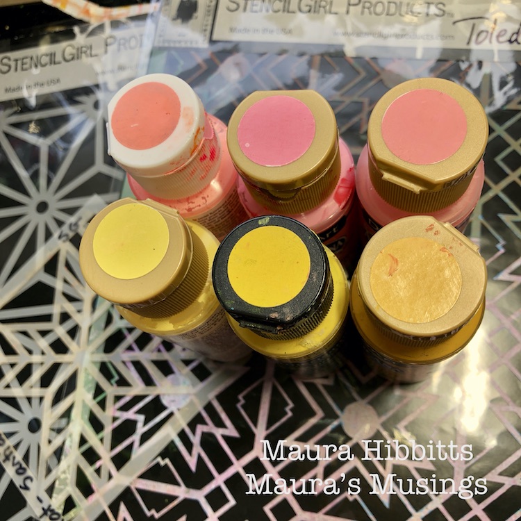
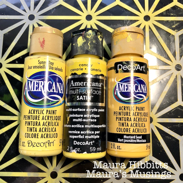
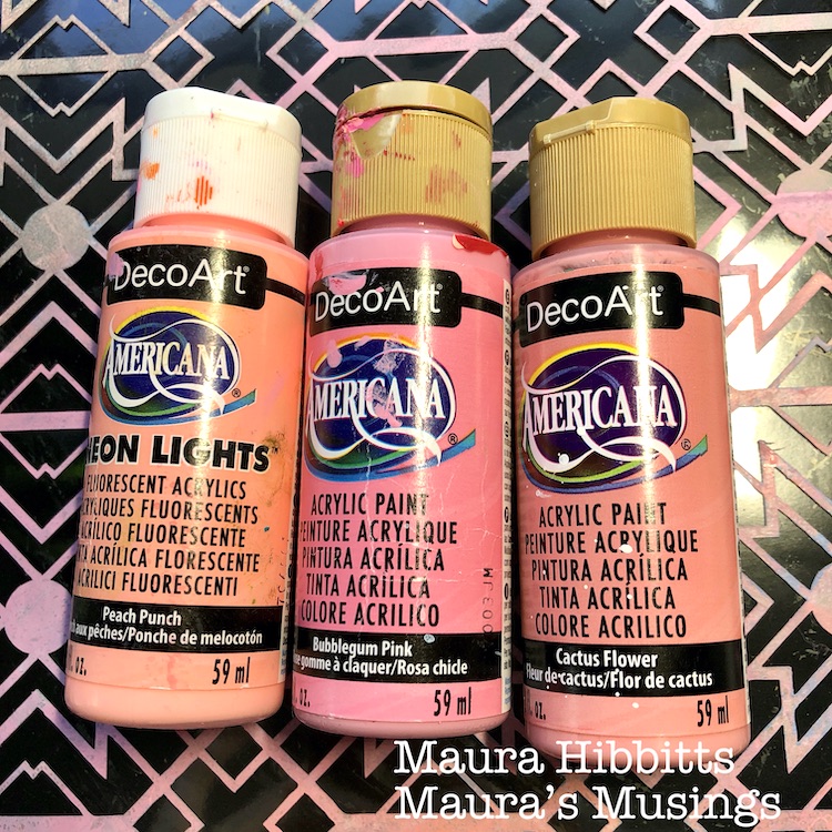
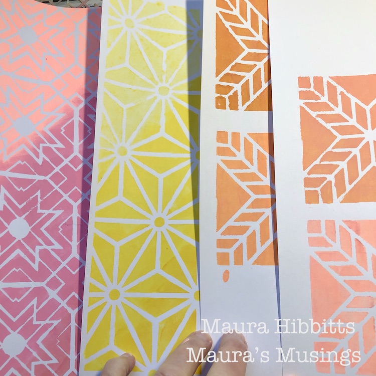
I started by going through my stash and pulling out paints in varying shades of pink and yellow, so I would have a blend from dark to light.
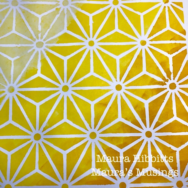
Nat’s Star Struck stencil seemed to call for the yellows, so I dabbed the colors in with a cosmetic sponge onto white cardstock, starting with the lightest in the top left, and working my way to the darkest in the lower right. Light and shadow, along with a bit of ombre.
Next up are the pinks. where I repeated the previous step, only this time I used Nat’s Toledo stencil.
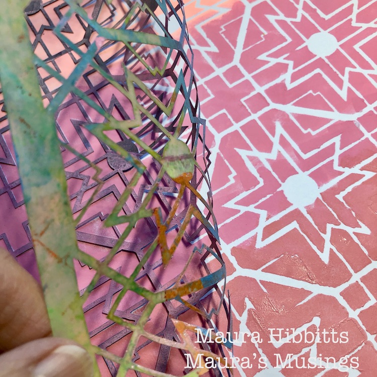
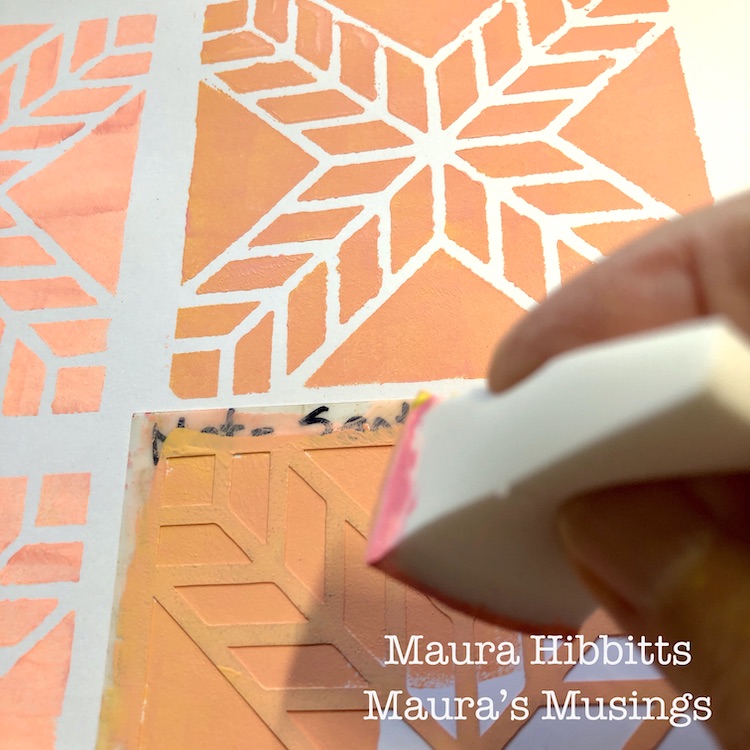
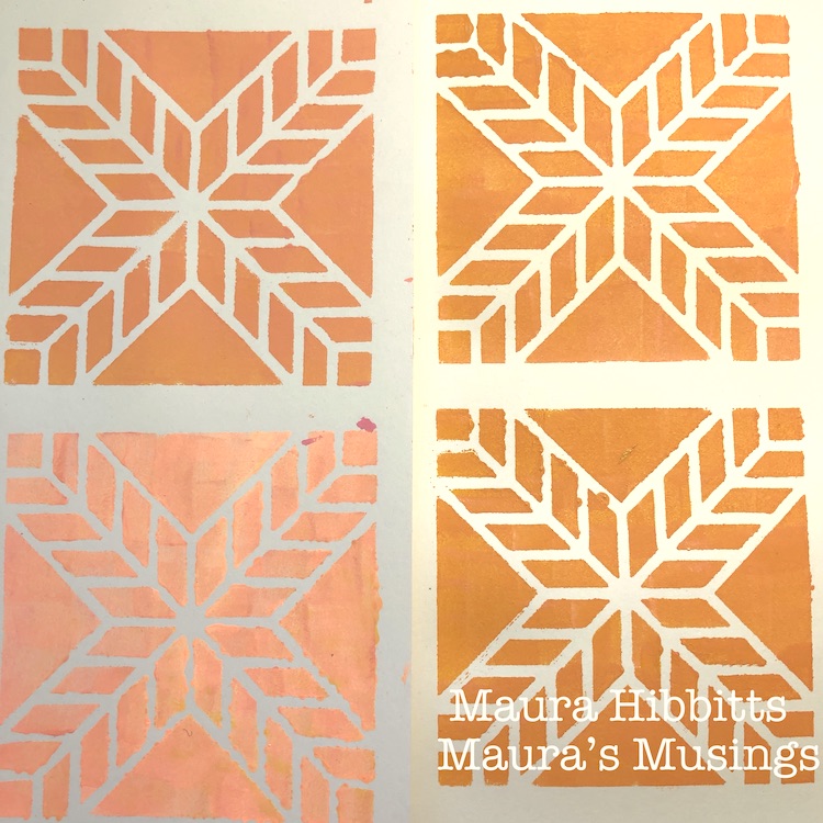
I decided I wanted to create a focal point, so I mixed varying shades of peach and orange, by blending the yellows and pinks, and used Nat’s Santiago 4×4 stencil. My goal was to have a mix of light and dark (shadow) shades.
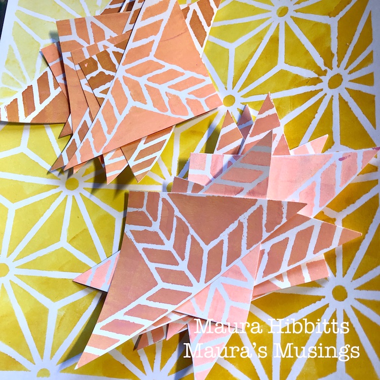
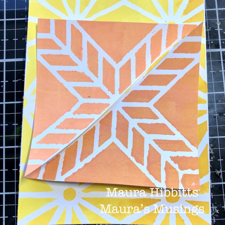
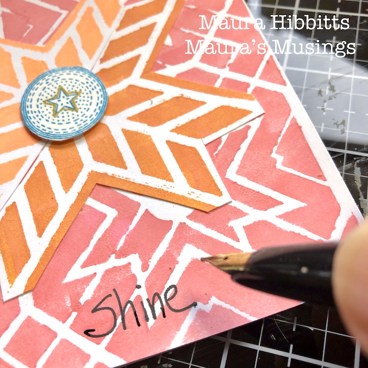
Now that everything is painted and stenciled, it’s time to start building the cards. I cut the large sheets of stenciled yellows and pinks into fourths to use as the card background. Next, I cut out the Santiago mini squares, and cut them diagonally in half. I laid the two parts together, decided I wanted more of the background to show, so cut out parts of the smaller stenciled papers. I glued the papers onto the cards using a PVA glue.
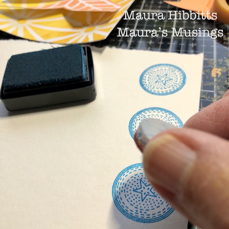
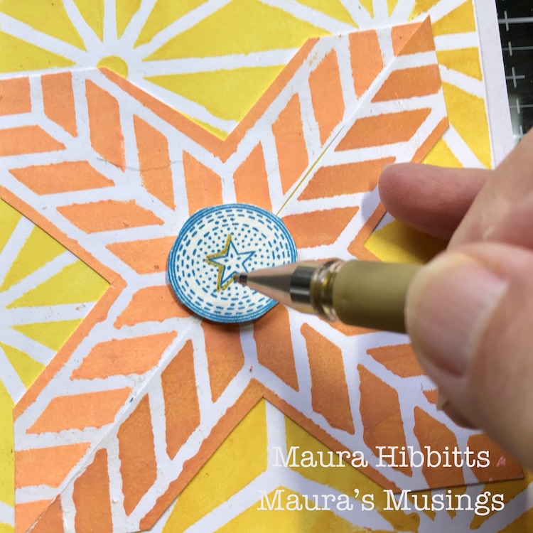
I felt that I needed one more pop of color, so I stamped Nat’s Circle Drive Positive small stamp onto watercolor paper with blue ink. I cut these out and popped them up on the center.
Now for the final touches – a bit of sparkle with a gold pen, where I outlined the star shape, and hand lettered words “Shine Brightly!” I love to use a Platinum Carbon ink pen over dry paint, but any permanent black pen will work.
I aimed to use the colors to give a feel of light and shadow, so I worked both the background and focal piece from lightest on the top left, to darkest on the bottom right. What do you think, did it work?
And there you have it, a set of eight cards in a bright array of yellows and pinks. These might be very non-traditional Christmas cards, or maybe Solstice cards. Another thought is to save them, and randomly send them out in the dark days of winter to bring a ray of light to someone. I hope this inspires you to observe the light and shadow in your life and let it guide your creative endeavors. Wishing you health, joy, and light this holiday season! – Maura
Thank you Maura! We love how your colors make these patterns pop. And nontraditional holiday colors seem perfect for this crazy year :)
Give it a try: you can find all my Rubber Stamps and Stencils in my Online Shop and here are some of the other supplies Maura used:
Don’t forget to check out Nat’s Creative Squad on Instagram too: Each week we post projects, ideas, and inspiration for mixed media art.


That was wonderful Nathalie. Thank you so much for sharing. I watched it several times too. Loved that you explored different perspectives. Each page is unique.Explored your art work and was super impressed.
Rita
Reply