Creative Squad: Dear Mother Earth – Maura Hibbitts

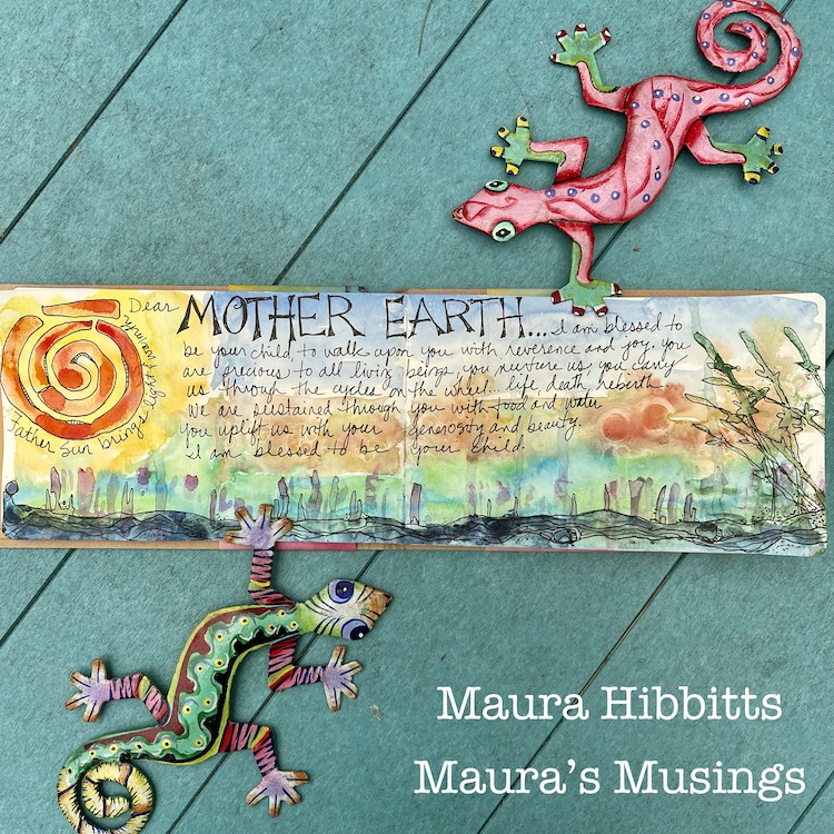
Hello from my Creative Squad! Today we have a really beautiful art journal spread from Maura Hibbitts that shares her thoughts on our planet using my Far Out, Groovy, and Batik Pattern 2  foam stamps and our theme: Dear Mother Earth – Our planet Earth is an amazing and beautiful gift to all of us. Let’s write her a letter, telling her just how we feel. This could be an actual letter/mail art, an art journal page, or some other mixed media project.


I feel like I have always been a child of nature. I grew up playing outside, roaming the woods, climbing trees, making art creations with whatever was at hand, leaves, twigs, nuts, and even making my own “ink” from charcoal and berries. Earth Day 1970 (yes, I know you are getting an idea about my age, lol) was a pivotal event in my life. I remember being in high school, and marching through the village in support of the earth. I had many arguments with my father, me being on the side of the environment, while he was on the side of industry. I don’t know that we ever resolved it, but one thing we had in common was gardening and growing our own food.

I came out of high school at the very beginning of the environmental movement. I studied forestry and worked in the field for a while, but quickly realized I enjoyed teaching about the environment more, so went back to school to teach science, earth sciences being my main focus. The paths in my life have curved and varied from those early days, but I still hold the earth close to my heart, and believe I have passed that love on to my sons.

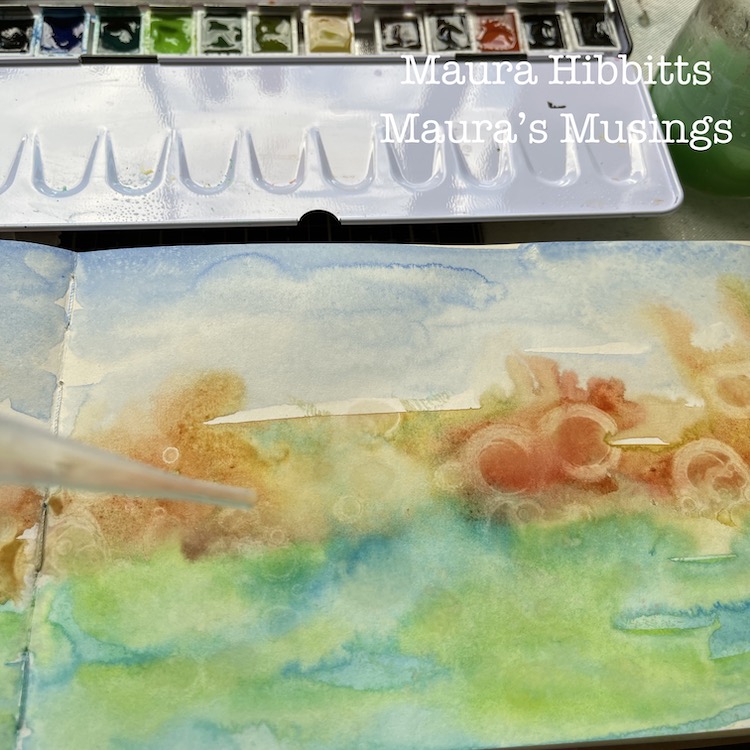
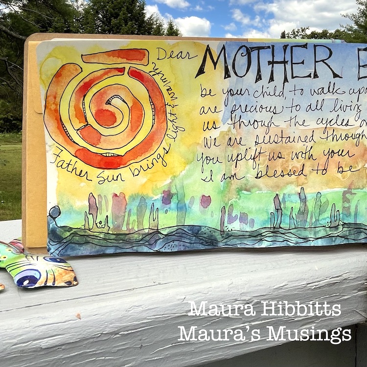
I decided to work in watercolor for this month’s project, the earth is covered in lots of water after all. I started by misting water onto the pages of the art journal, then blending layers of color across the pages, letting them bleed into each other.

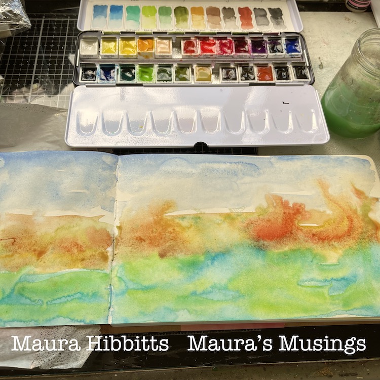
While the watercolor was still wet, I used a pipette and rubbing alcohol (over 90%) and dripped it onto the wet paint. It is really neat to watch it move the paint out like a resist. Let dry completely. Tip: you can speed it up with a heat tool if you want. When I do that, I heat both sides of the paper to remove the moisture.

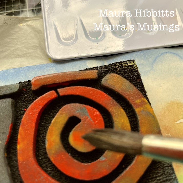
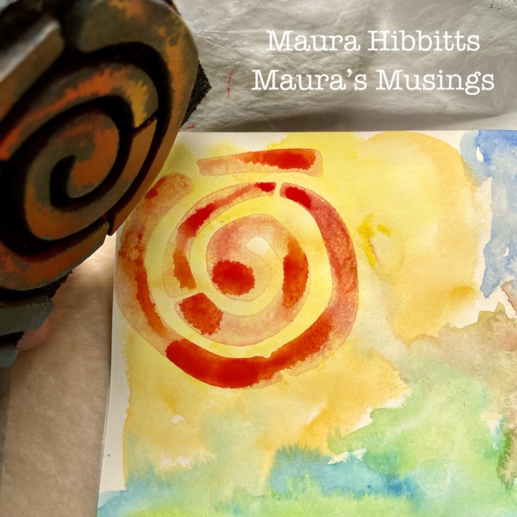
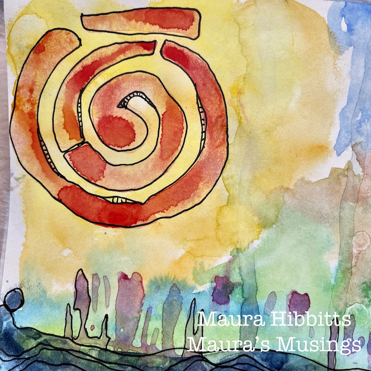
I played around with adding inks, but decided to continue with watercolor, so brushed on some orange and red to the Batik 2 circle area of the ArtFoamie. I stamped this into the yellow area of the page.

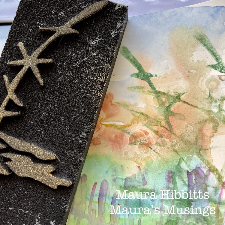
I added visual texture across the bottom of the page with the Far Out ArtFoamie and purple watercolor. Watercolor works very well with the ArtFoamies.

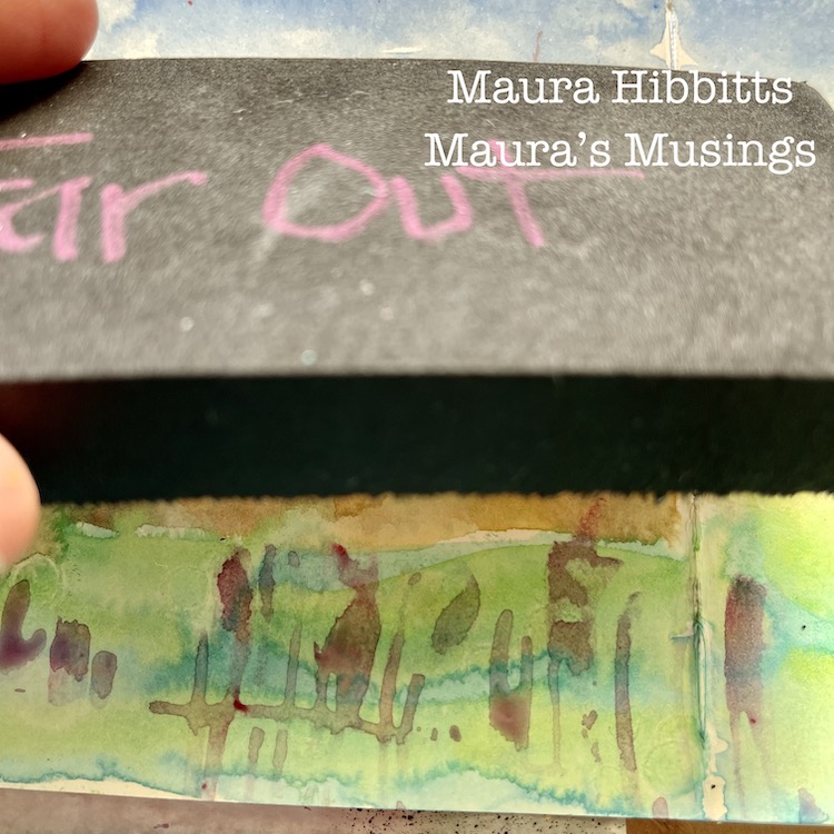
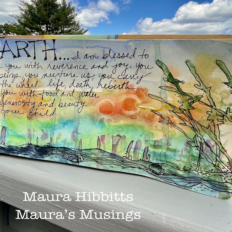
On the far right, I wanted to create the illusion of plants, so I use the Groovy ArtFoamie and a mix of green watercolors. The first stamping is boldest, then the second and third are lighter, which gives a bit of depth.

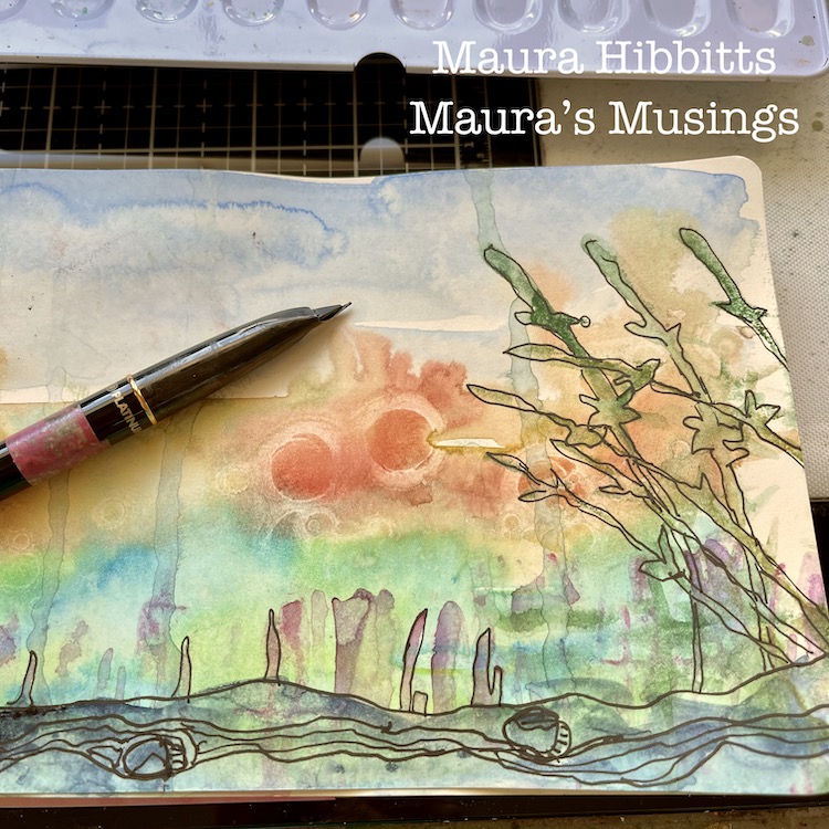
I love to doodle over watercolor. Be sure everything is completely dry, or you can mess up your pens. I like to use a carbon ink pen for a nice bold black.

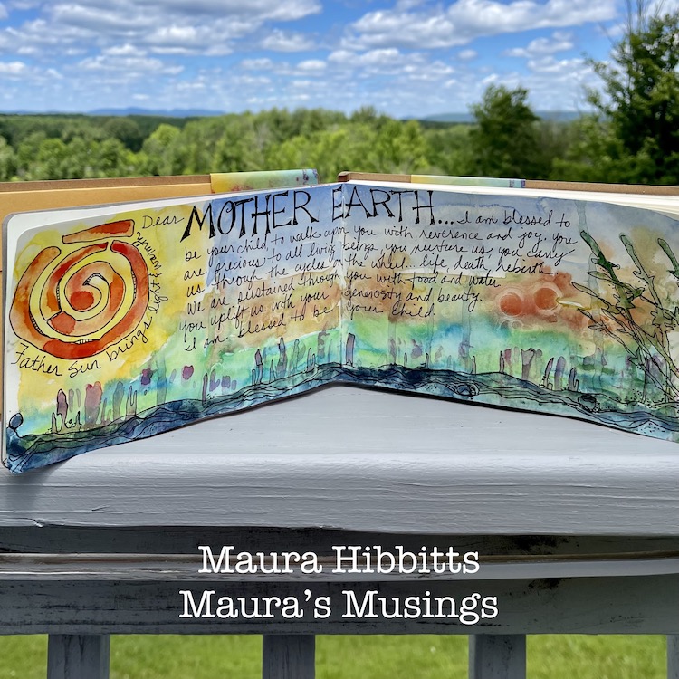
My final step was to journal ideas I have about Mother Earth. I went with whatever came into my mind and just wrote them in my own handwriting. Don’t be afraid to use your own handwriting in your work, it adds such a personal element, unlike typed or stamped words. It’s not perfect, but neither are we, and that’s ok.

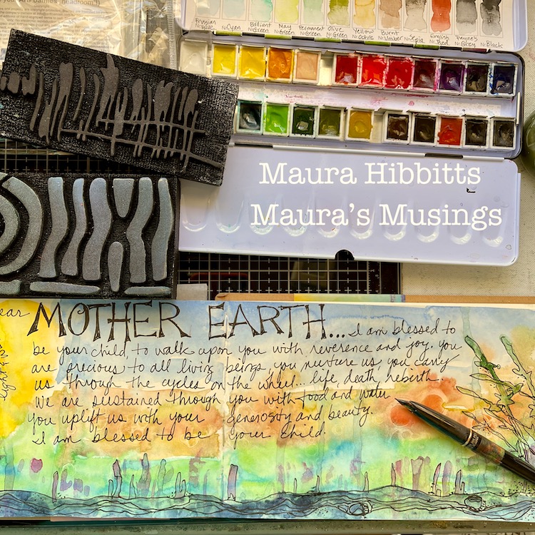
Step back from your work, and you begin to see things in it that were unplanned, for example, on the very left at the bottom, a figure seems to be emerging from the base. Maybe my mind was thinking about life emerging from the Earth’s oceans so long ago. Our Earth is precious and deserves our respect, it is after all, our only home. Happy Earth Day, everyday! – Maura


Thank you Maura! The beauty of this page is a real testament to your passion for the Earth – love how you handled the materials and incorporated the stamp designs in such a naturalistic way.

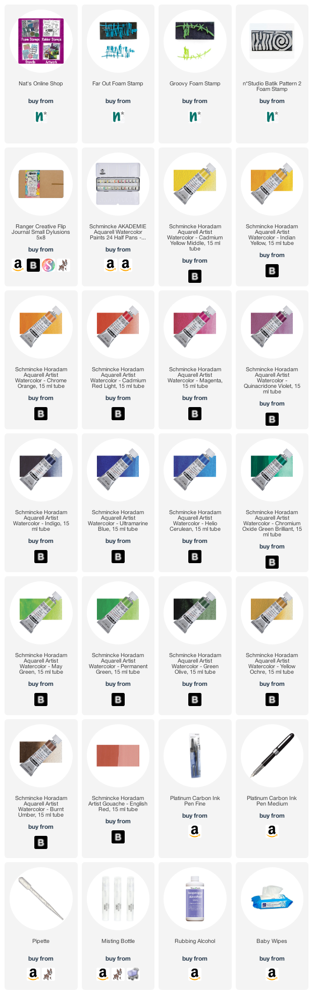
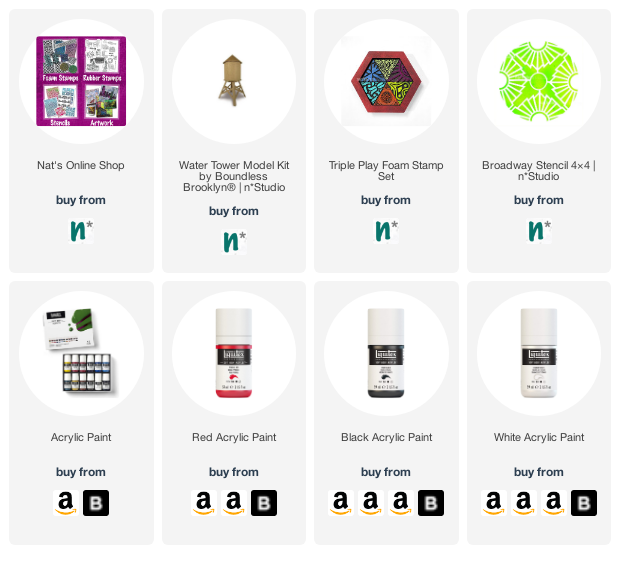
Give it a try: you can find all my Foam Stamps in my Online Shop and here are some of the supplies Maura used:

Comments (3)

  • Jo - Let's Art Journal

    |

    Wow, such stunning pages! Your painting looks amazing, so beautifully executed and I loved seeing how it came together too ?. Happy August and creative wishes! Hugs, Jo x

    Reply

  • Sue Clarke

    |

    What a fun page and what a delightful story about your first Earth Day Maura!
    I remember mine as well. I was in elementary school at the time, but I must say that you look much younger than I do.
    My son has always enjoyed his earth sciences and is headed to college to study environmental sustainability.

    Reply

    • Maura Hibbitts

      |

      Sue, so nice to hear your thoughts! Thank you! Sounds like Earth Day had an impact on you and your family. I am glad we can pass that along to our children. hugs, Maura

      Reply

Leave a comment

LAST DAY – Nat’s Birthday Bonanza Sale

Sale ends TODAY, July 5th at 11:59pm EDT, 2021, so hurry hurry hurry into the Online Shop! You can save 20% off qualifying physical products (stencils, rubber stamps, foam stamps, Moonlight Duo ink pads, Boundless Brooklyn cardboard models, and more!) – just use the coupon code BONANZA20 when you check out, while supplies last.

Here is a link to the shop – ENJOY!!!

Leave a comment

ArtCollab – Register for July 6th Zoomcast

The next ArtCollab zoomcast chat with Sarah Matthews and I is coming up on Tuesday, July 6th at 12noon. This time we are talking about a fundamental need of all people, including artists… It is REST! Yes even artists need to take a break and we’re chatting about how we juggle that along with everything else we have going on in life. Register HERE for ArtCollab Episode 5 – The Art of Self Care.


What is on the plate for ArtCollab Episode 5? The Art of Self Care – Let’s not forget to take time to breathe, reset, and make sure that our artistic practice is aligning with our purpose. It is time to talk about the Art of Self Care! As artists we have a go go go mentality and frequently wear many different hats as we juggle various projects, obligations, and revenue streams. When you are this busy, it is easy to forget to take breaks, but we are here to remind you that self care is crucial to success. We’ll discuss how to make sure rest is a part of the schedule and share our personal favorite ways to take a break. Most importantly, we’ll talk about how rest can help refine your focus as an artist – allowing you a moment to reflect on what you are creating, why you are creating, and any adjustments that you might need to make.

Register HERE to Attend

Are you new to ArtCollab? Each month my friend and fellow artist Sarah Matthews and I get together for a live zoomcast to discuss art topics and to share with you some of our current artistic collaborations. We cover a range of topics and each episode opens up a conversation that is often greater than what we planned. Last episode we tackled the Art vs Craft debate and we got into heavy discussion about our role as artists and using art as a platform and tool for social change. You can check out this and other past episodes of ArtCollab here in the Community tab on the website. See you at the next ArtCollab.

Leave a comment

Nat’s Birthday Bonanza Sale – Time to Celebrate!

Guess who has a birthday coming up… Yours Truly! I’d like you to all come for a celebration – my Birthday Bonanza Sale in my online shop :) It’s kind of a tradition at this point, and a pretty nice one I think. Here is the deal:

You can save 20% off physical goods (stamps, stencils, books, Moonlight Duo ink pads, Boundless Brooklyn cardboard models, and lots more) from now through 11:59pm EDT July 5th, 2021. Just use the coupon code BONANZA20 when you check out and qualifying purchases will be on sale for you. Easy as birthday pie!

Here is a link to the shop.

What’s on sale? How about some of my Stencils like Flower Maze or Art Deco Empire?


Popular Foam Stamps like the limited edition Love Story and Triple Play are also included in the sale:


Maybe you’re a Rubber Stamp fan? Check out Cardboard and Hex Set Large:


Or poke around my favorites like the Billboard Model or Moonlight White ink pad:


There are lots of items to choose from, so I hope you visit the online shop HERE and take a look around. The sale ends July 5th and is valid while supplies last!!! Enjoy!

Leave a comment

Feeling the Love – Love Knots

I love embroidery and stitching as an added element in mixed media. A while back I even designed a whole set of rubber stamps along those lines called Embroidery because I think faux stitches are pretty great too. One of those stamps became a real favorite of mine because it is just so simple and perfect for expressing love: my Love Knots stamp. 

Just a line of embroidered xxxooo says it all, in a nice sweet and sincere way. I of course use it a lot for cards because hey, that’s a place that usually calls for some love, right? In my Deck of Cards Challenge I created this little number using Love Knots and Running. You can check it out here.


Another card I made a bit more grungy – definitely my style – using the Love Knots stamp. Even if you’re not so good with lettering, you can just throw a little xxxooo onto a card and ta-dah! Instant message :) Here’s the post.


Tags are another go-to surface that works perfectly with the smaller details of rubber stamps. I combined the Love Knots stamp with some real embroidery here in this post. Very fun to follow stamp designs with actual stitching.


If I’ve got a dark or intense background going on, I like to use a white ink pad like the Moonlight White with Love Knots. In this art journal page I needed some unifying marks to pull things together and the stamp was the way to go. You can see the entire spread here and why I chose this particular stamp too.


And I will wrap this up with some of my favorite cards from Creative Squad alum Marsha Valk who was inspired by her town and it’s connection to the artist Mondrian. Read the story and see pics of her town here in the original post. I love how Marsha uses Love Knots as a border element in these cards, filling them in with my E-train, Hydrant, Running, and Torn Layers stamps too.


I hope you enjoyed seeing my Love Knots stamp in action :) xxxooo

Leave a comment

Interrogating Fear – Art Journal

“We climbed slowly towards the greatest of our terror of that time, we want to expose ourselves to fear and interrogate it. ” – My Brilliant Friend

Are you interrogating your fears? Pretty hard to do but they say it’s one of the best ways to overcome things. I was mulling it over when I created this page.

I still have paper from my Suminagashi Session so I used one of those prints as a background. Suminagashi is a Japanese paper marbling technique that is very doable at home and yields some beautiful results for collage, bookbinding, art journaling etc.

For the facing page, I used a sheet I made with my Kyoto and Tokyo stencils along with Distress Oxide inks and a blending tool. The sketch I made on normal printing paper, and then adhered on top with a glue stick. 

Here are some of the supplies I used:

Comments (1)

  • Sue Clarke

    |

    What a wonderful design and quote!

    Reply

Leave a comment

Creative Squad: Primary Colors – Judi Kauffman

Hello from my Creative Squad! Today we have a clever post from Judi Kauffman using my Triple Play foam stamps, Broadway stencil, and a mini water tower model (including its envelope AND scrap pieces) and our theme: Primary Colors: Red, Blue, and Yellow it’s your time to shine. Let’s get back to the basics of color and light and play with primary colors. It’s elementary my friend! 


When I heard that this month’s theme is all about primary colors I knew I was going to want to head in a different direction. Instead of using all three, I’d focus on just one – RED, my favorite color, plus basic black and pure white.

Or perhaps it was because I was thinking of the old children’s riddle: What is black and white and red all over? A newspaper! (Red…Read…) Sorry! I couldn’t help myself.

I thought it would be fun to use not only the pieces from the Water Tower Model kit I received but the negative shapes AND the sturdy envelope in which they were packed. Double the fun.

***TIP: If you are going to decorate the envelope be sure to take a photo of the assembly instructions BEFORE starting to paint and stencil!

Randomly paint the model pieces, envelope, and negative shapes with white paint. It’s okay that some of the original board remains visible.

Randomly add red paint to the model pieces, envelope, and negative shapes.

Center the Broadway stencil on the roof piece and use black paint to stencil the pattern. Use black paint and your choice of triangle stamps from ArtFoamies Triple Play to randomly stamp all remaining pieces of the tower, the negative shapes, plus the envelope.

Assemble the tower per instructions. Add the negative shapes to the roof of the tower.

Option: Instead of securing the roof, don’t use the criss-cross piece of board that acts as a structure to hold it in place; just perch it on top so you can hide candies or jewelry inside the tower!


Thank you Judi – love the idea of using the packaging and leftovers too!!! And look at that great use of pattern and layering!

Give it a try: you can find all my favorite cardboard models, Foam Stamps, and Stencils in my Online Shop and here are some of the supplies Judi used:

For more from the Creative Squad check out Nat’s Creative Squad on Instagram too: Each week we post projects, ideas, and inspiration for mixed media art.

Comments (3)

  • Marilyn C. Lojek

    |

    Judi:
    Hard to believe you only used one of the primary colors! It’s really cool and a great way to give a gift to that someone special. Thanks for sharing your creativity and how to use every piece provided.
    Marilyn

    Reply

  • jean marmo

    |

    Wow – this is so cool! Love the details and using the extra pieces!!

    Reply

    • jean marmo

      |

      Judi – I was going to email you but couldn’t find your email address. Do you still have mine? Was hoping to catch up!

      Reply

Leave a comment

Pattern Monday 06 – Video from my Ledger

Happy Monday everyone – time for another pattern in my big vintage ledger! For this one I used my Lady Liberty and Hope Tag stamps. I’m getting ready for July 4 in the US with this one :) Check it out in the following video:


Here is a look at the finished pattern and the stamps I used:

Now it’s your turn. Here are the supplies I used:

Leave a comment

Stroll Through the Hood – June 2021

Strolls through my hood get me out of my studio, they help me get unstuck and often I get inspired by what I see and get new ideas to create something. It is part of my philosophy about Artful Adventures in Mixed Media – which is the subject of my book. Here are some photos that I gathered in the last couple weeks.

Love this cute coffee place – once in a while I stop here with a friend and sit out side and admire the color combo.

You wouldn’t wanna miss this picture of Bobby Pretzel showing his insanely big tongue, no?

Fun – I would love something like this at the side of our house !

Check out the windows on this super cute house – swoon!!!!

And the top – the scallops , the lines – all of it.

This building just struck me a bit over the top …like let’s put some gigantic columns up just for “good measure” LOL. It looks even more ridiculous in person but I bet the inside of the house is pretty cool.

I love this street- the houses are like from a Victorian novel and the trees are gorgeous- take away the cars and you are almost back in time.

Love the bold color choices here. Lately it is been such a fad to paint entire houses in dark black or dark blue without any distinction for the trims, cornices, porches and roofs – especially some of the Victorians and old brick houses and I find it eye-rollingly annoying. I love black – don’t get me wrong and I and I am cool with non historic color choices for those houses but urgggghh. The only thing worse for me is vinyl siding …so if you paint your hole vinyl sided house black, you improved it slightly LOL. I am not an expert but I predict in about 2 years everyone is tired of that look and repaints. It just makes a house loose all it’s character and is as if you put a formless tent over yourself …Baby show those curves and wonderful assets of a house :) …and if you do not know what I mean – I will make sure to incorporate a picture next time. And if you have done this to your house lately – your house is of course the exception – and I know it is looking awesome :)

Comments (4)

  • TIFFANY ARP-DALEO

    |

    Thanks for sharing your cute hood! It reminds me of our little nook in San Diego!

    Reply

  • Sue Clarke

    |

    OMG, the texture that you captured on Bobby Pretzel’s tongue. LOL
    I so enjoy your strolls Nat.
    I love to see older homes that look like those.
    There really aren’t many at all in my small town.
    When I worked in Salem, MA I used to like to walk down Chestnut Street and look at the details on the huge houses that used to be owned by captains of ships. The different colors are interesting for sure.
    Just for the record, my house has siding, but is just a regular house built in the 1990’s.

    Reply

    • nathalie-kalbach

      |

      haha- the texture is hilarious :) Yeah, I am not a meanie about the siding – I mean more that it was such a fad in the 40s and 50s to wrap those super old houses in siding and it always makes me wonder what is underneath.

      Reply

Leave a comment