Blog: Acrylic paint

On The Flip Side – Canvas

NatKalbach_OnTheFlipSide01

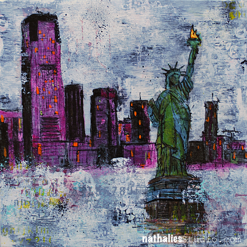
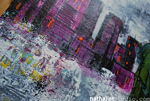
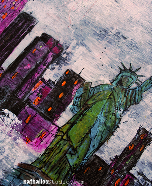
My new canvas “On The Flip Side” – Jersey City in the background and “our” Lady Liberty . Why “our”? Well…it is in our yard and faces New York…go figure ;)

What a symbol this statue carries, how much hope and how many dreams are connected with it – amazing.

NatKalbach_OnTheFlipSide02

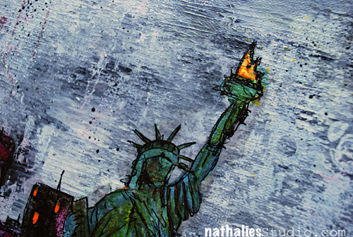
I can see her from my studio window and from the deck and it makes me always happy… What a view when I had my brand new green card in my pocket and we looked for an apartment…it was like a promise for good times to come. So far there are very good times… maybe Lady Liberty is my token of luck ;)

NatKalbach_OnTheFlipSide03

I played with a different background this time and I like the outcome a lot.

NatKalbach_OnTheFlipSide04

Have a wonderful and promising day !

Nat

LogoBlogSignature

nSupplies


Comments (10)

  • Kelly Belton

    |

    Wow Nat, I really love this. The colours are beautiful, the painting is beautiful. I think you’re on to something with that Lady Liberty inspiration thing- it really seems to work for you! This is my favorite. More please!

    Reply

  • Gina Sismilich

    |

    Nat – that is a fabulous painting! Really love it

    Reply

  • Laurie Hunt

    |

    Hi Natalie. I don’t leave comments all that often but I’m out in the “blogosphere” always with an eye on what you are doing. I have to say that I am loving your recent canvases of your jersey city home. I especially like what you’ve done with this one. I agree this new background is a keeper. But then I’m a sucker for blues and purples! Lady liberty is also an American icon that I love. I remember seeing her as a kid being amazed that she was green and not shiny brass or copper like the little replicas that I had seen!

    Reply

  • Denise Spillane

    |

    Wow Nat, this is so beautiful! It is sort of the view my dad had from his office in the twin towers. No he wasn’t there for 9/11 he had already passed but I know he would love this painting. Maybe even more then me, that is up for debate. I sure love it.

    Reply

  • Kathy P.

    |

    This is so awesome, Nat, and I am thrilled that you have ‘fallen in love’ with our lady….she is truly something special. I am jealous that you can just look out your window and see her every day!

    Reply

  • Brend

    |

    Love the Statue of Liberty ! I love taking out of town visitors on the Beast cruise (it’s a 30 minute high speed boat ride)for an up close view of her and the skyline.

    Reply

  • Amante del Papel

    |

    is a stunning work!

    Reply

  • Sue Clarke

    |

    How awesome is that for a view to wake up and create to!
    Thanks for sharing your canvas…nice one.

    Reply

  • Laura Strack

    |

    This is so beautiful, Nathalie! What an inspiring view you have from your studio. No wonder your art just keeps getting more gorgeous.

    Reply

Leave a comment

Photos of the Acrylics Demystified Workshop

NatKalbachAcrylicsDemystifiedWS

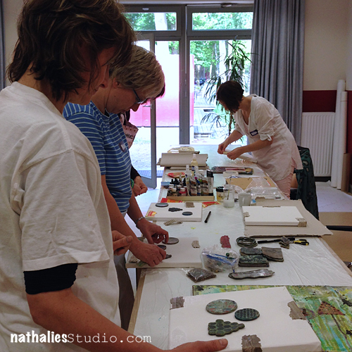
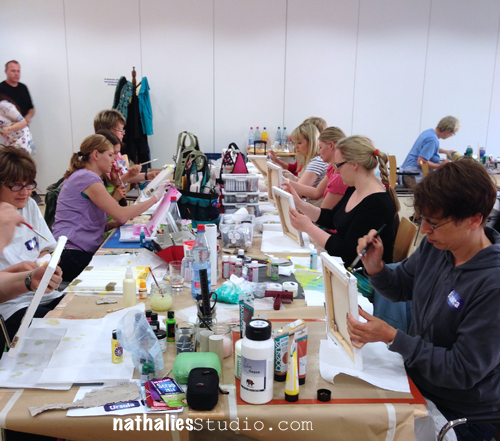
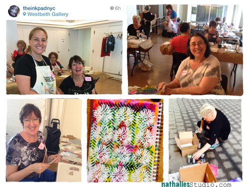
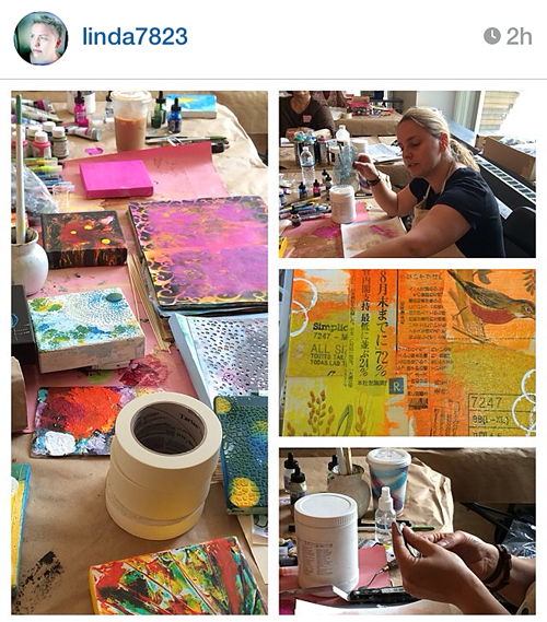
It was such a great and fun day teaching my Acrylics Demystified Workshop for The Ink Pad in New York City. As with most of the bigger group workshops it took place at the Westbeth Community Room which is the perfect location for those kind of workshops- huge space, lot’s of light, outdoor space and a little kitchen included.

NatKalbach_AD01

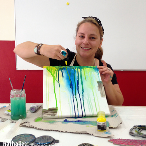
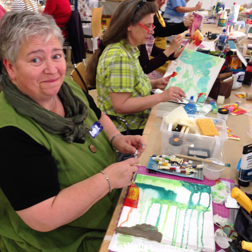
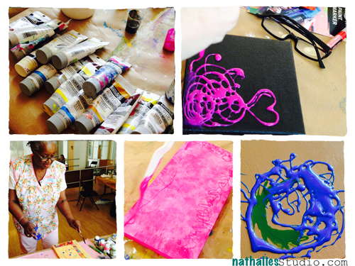
We talked a lot about Liquitex Acrylic Paints and Acrylic Inks and Markers. About art supply labeling and the main groups in acrylics.  And then started playful by pooling, puddling and stringing with Liquitex Pouring Medium and String Gel. I showed how to make acrylic skins and demonstrated several possibilities of using them. Perfect way to get over the White Canvas Horror :)

NatKalbach_AD02


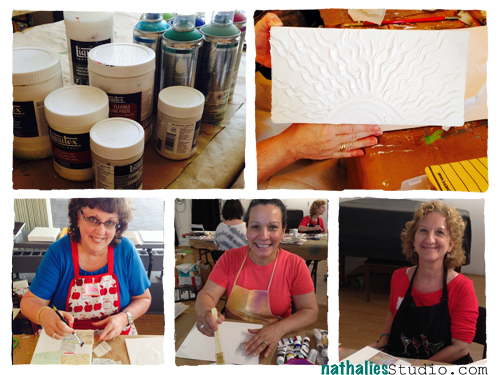
Then we sculptured our way up using Liquitex Flexible Modeling Paste -look at Karen’s awesome canvas on the top right and then we explored the possibilities of making your own glazes and playing with layers, translucency and colors in collages.

NatKalbach_AD03

We used Ceramic Stucco, Super Heavy Gesso, Natural Sand played with different Transfer Techniques and it was fun to see how all these little techniques and informations sparked a load of creative ideas for future work and exploration in the heads of my wonderful smiling students.

NatKalbach_AD04

Lastly we did a bit spray painting with Liquitex Spray Paints in the end to cool down outside  .

NatKalbach_AD05


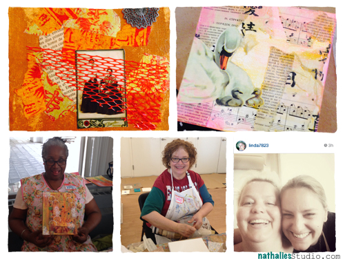
To finish the workshop off I asked everyone what their favorite Acrylic was and which techniques. I was happy to hear that about everything was mentioned at least once with some clear winners on the Liquitex String Gel, Liquitex Super Heavy Gesso and the Liquitex Gel Medium & Varnish and for the techniques Glazing, Texture Creating and Painting with Newspapers 

NatKalbach_AD06

thank you girls for such an amazing and fun workshop day . An extra thank you to Linda Brun from Norway who was on vacation in NYC and when she heard I was giving a class signed up. This really touched me especially since she has taken a couple workshops with me in Paris, Belgium and Norway already…so she totally knew what she got herself into ;) Thank you for spending your vacation day with me!!!


I wish you a gorgeous and creative day

Nat

LogoBlogSignature

Comments (6)

  • Ellie

    |

    Nat do you teach this class on-line? I’d be interested in learnng more about acrylics from you.

    Reply

    • nathalie-kalbach

      |

      Ellie, it is in the planning- keep an eye out for it on my blog :) I will announce it there!, Nat

      Reply

  • Amante del Papel

    |

    I hope one day, took one of your workshop!

    Reply

  • Sue Clarke

    |

    Are you sure that Ms. Brun didn’t come to NYC just to take the course with you? Now that would be a compliment! Looks like you ladies had a splashing good time.

    Reply

    • nathalie-kalbach

      |

      LOL Sue – I am sure there is more to see in NYC when my workshops ;)

      Reply

Leave a comment

Photos of my Workshops at the Baltic Sea in Germany

Einfaches CMYK

It was such a fun trip to Germany and see friends and family but mainly to teach again at the Ostsee Scrap Event in Boltenhagen at the Baltic Sea. Just as last year it was a really intimate and gorgeous 3-Day event with round about 25 wonderful students located in a holiday village with a 2 minutes walk to the beach.

I had a blast. Thank you to all my students for coming and being open to try new things and dive right into paints – you rocked it :) Also thank you to Daniela for another amazing event – as last year I had a great time and the organization was exceptionally well done. And last but not least: Thank you to Liquitex for supporting the event and my workshops with wonderful materials – it is not a secret that their products are very dear to my heart and that they make it a breeze to get the results you are going for in your art work!
NatKalbach_OSS01

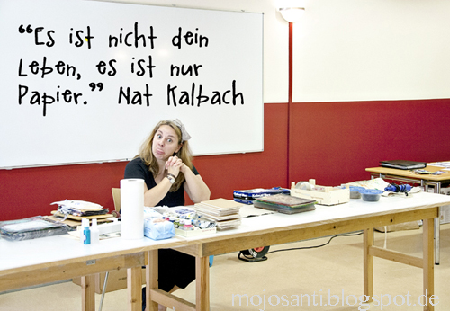
Since my students were mostly scrapbookers and a lot of them were dabbling for the first time into Mixed Media, I made sure they understand the essential message of this weekend …which somehow they really took to heart – LOL. They took this photo of me (thank you Sandra!) “It is not your life, it is just paper!” so overcome your fear of trying things and if they do not work as you want them , so what?- get over it! ;)
NatKalbach_OSS02

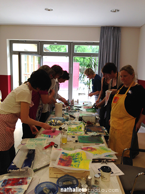
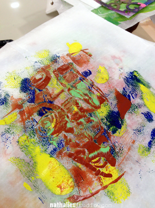
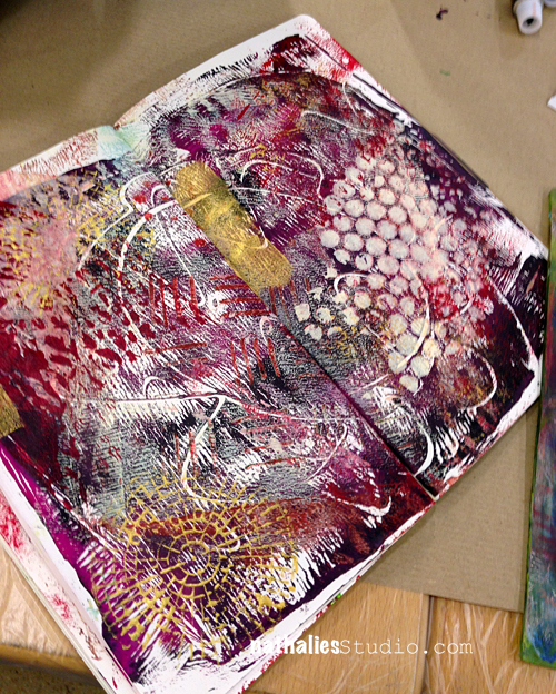
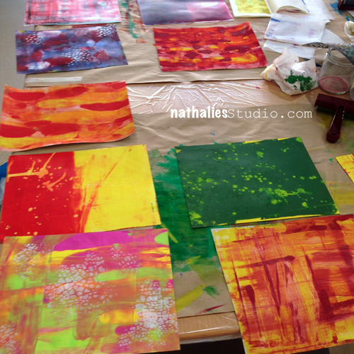
We started with a fun mono printing workshop, adding loads of texture and layers and just to loosen up :)
NatKalbach_OSS03

NatKalbach_OSS04

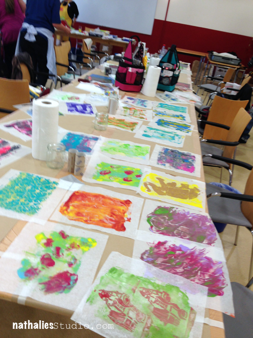
and soon the whole room was covered every where with prints and papers and booklets and they liked just playing and trying new things.
NatKalbach_OSS05


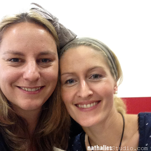
Here is Dani the wonderful organizer, who also made sure we would eat loads of yummie German food in between…oh man I filled up on sausages and German cake- LOL…I guess I missed that ;)
NatKalbach_OSS06

Next up was a canvas workshop – here is another photo collage I stole from Sandra :)
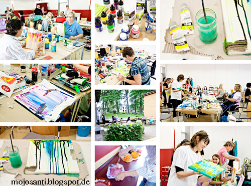
NatKalbach_OSS07

We used mostly Acrylic Paints and Acrylic Inks by Liquitex to get a nice background and then worked with my Stampendous Stamps and found objects on top of it.
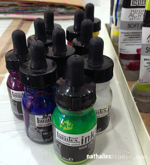
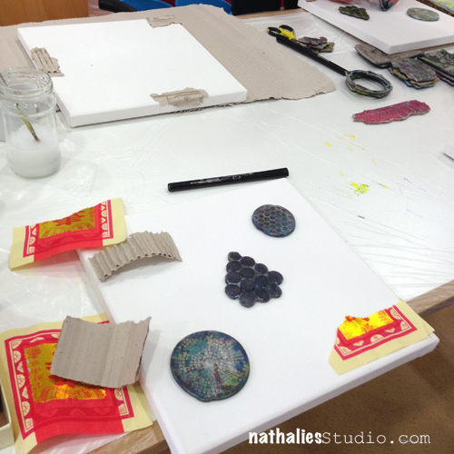
NatKalbach_OSS08


NatKalbach_OSS09

NatKalbach_OSS10

NatKalbach_OSS11

NatKalbach_OSS12

NatKalbach_OSS13

NatKalbach_OSS14

NatKalbach_OSS15

NatKalbach_OSS16

NatKalbach_OSS17


It was so much fun to see them play with different colors and motifs and incorporating my stamps in different ways. Pure bliss and I heard some canvases are already hanging on walls :) Here is a group photo
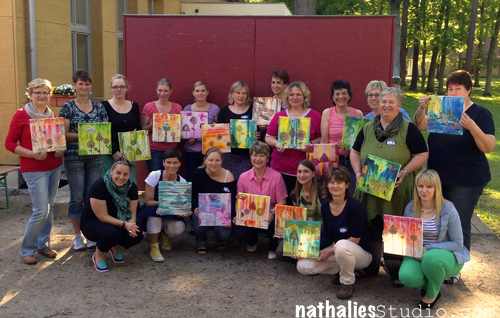
NatKalbach_OSS21

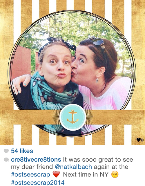
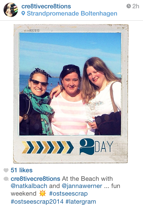
In between I was able to dip my toes into the Baltic Sea with Andrea Gomoll and Janna Werner, who also taught there. Melanie Hoch was somewhere…she was another wonderful teacher at the event and kept hiding from us ;) just kidding ;) It was wonderful to spent some time with all three of them – I find it always super special to meet other creative teachers and exchange thoughts and support each other.
NatKalbach_OSS18

NatKalbach_OSS19

NatKalbach_OSS20


The last workshop I taught was an art journal technique workshop and the girls were ready for it on the last day :)
NatKalbach_OSS22


NatKalbach_OSS31

NatKalbach_OSS32

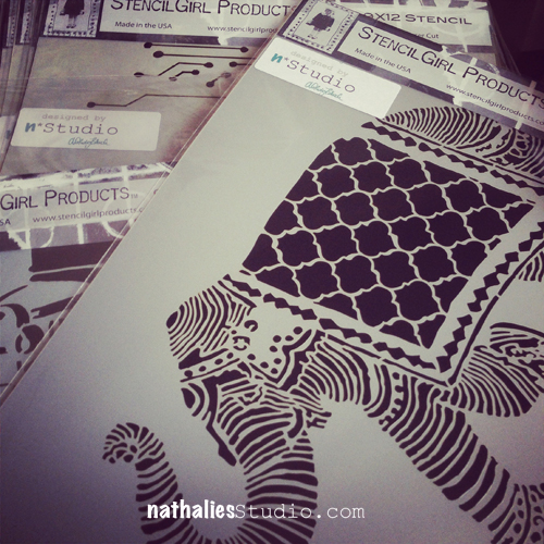
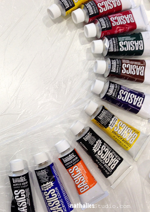
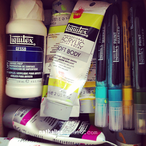
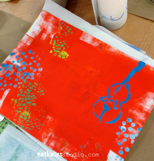
We used a lot Acrylic Paints and Acrylic Markers Markers as well as my Stencils by StencilGirl Products and my Stamps by Stampendous.
 

NatKalbach_OSS23

NatKalbach_OSS24

NatKalbach_OSS25

NatKalbach_OSS26

NatKalbach_OSS27

NatKalbach_OSS28

NatKalbach_OSS29

NatKalbach_OSS30

that was it…if you made it with all the pictures till here…you need a break and should do some art ;)

Have a gorgeous day

Nat

LogoBlogSignature


Comments (4)

  • Natalie Strauß

    |

    Sooo schöne Fotos.Ich schwelge immer noch in Erinnerung.Die Workshops waren so klasse.Bis hoffentlich ganz bald.
    Lg Natalie

    Reply

  • Sandra

    |

    The weekend was so much fun. Just love how you teach :). Hugs, Sandra

    Reply

  • Sue Clarke

    |

    Yes I made it all the way through and now I will go play in my art journal.
    Those canvases are awesome and I especially like the pic of you and the other lady with “duck lips”.

    Reply

  • Seth

    |

    Great work made by everybody and it looks like all these workshops were a lot of creative fun.

    Reply

Leave a comment

Guest Designer at Ruby Rock-It

Thank you Ruby Rock-It for having me as a Guest Designer this month. It was fun to play again with Scrapbooking Paper and here are two Scrapbooking Layouts I created for them :)

NatKalbach_KL_01

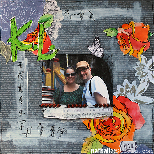
K.L.
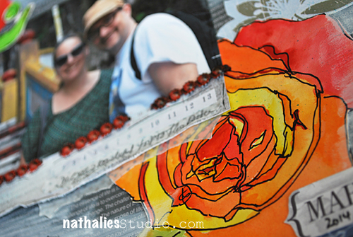
I used the Year in Review April page as a base and toned it down here and there with Gesso. I also scribbled some marks on there. I cut out the flowers of the Mother Nature Point in Time Paper and colored three of them with watercolor.
NatKalbach_KL_02
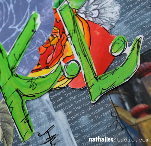
I also cut out Flowers of the Mother Nature Royale and Mother Nature Flutterby Paper as well as the beautiful butterfly. I layered different paper and vellum a the bottom of the photo. The title which is short for Kuala Lumpur where the photo was taken is hand painted with a brush and acrylic paint and then doodled on with a black journaling pen.
NatKalbach_KL_03
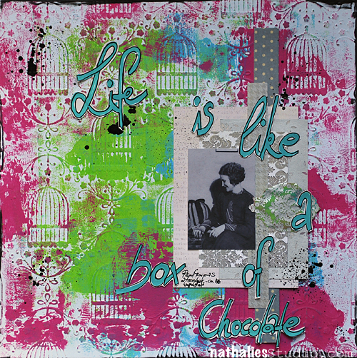
Life is like a box of chocolate
For this layout I used the beautiful Mother Nature Cardstock and painted with some Liquitex Acrylic Paints over it.
NatKalbach_LifeIs_01
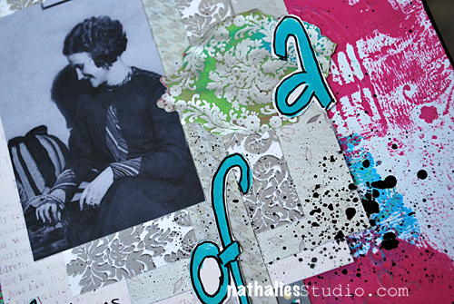
 I also painted the back of some of the Damask Vellum and cut out one of the damask shapes.
NatKalbach_LifeIs_02
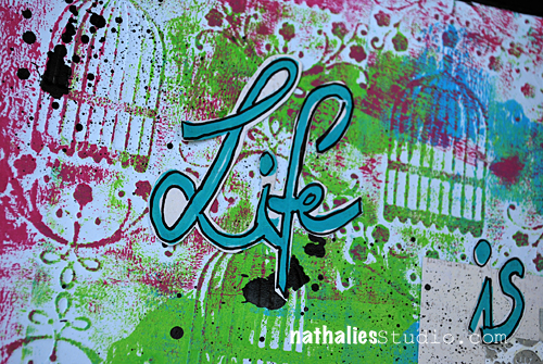
I layered stripes and rectangles of the Floral Vellum, Mother Nature Royale and Year in Review June Paper. I wrote the title with a Liquitex Acrylic Marker on the Mother Nature Royale paper, traced it and cut it out for a nice extra hand made touch.
NatKalbach_LifeIs_03
I splattered some Liquitex Acrylic Ink onto the layout to give it a bit contrast with black and make the colors more pop.
Ruby Rock-It was so nice to offer a giveaway – Bella! Year In Review collection! – here is a picture of it – go give them some Like-Love on their Facebook Page in return and tell them you come from me – so they know ;)
打印
Hope you have a gorgeous day with lot’s of chocolate …I mean…who doesn’t like chocolate?
LogoBlogSignature


Comments (8)

  • Gunvor

    |

    Love what you did with the scrap book papers, especially the Kuala Lumpur one – awesome colours!

    Reply

    • nathalie-kalbach

      |

      thank you Gunvor :) I know it is rare to see me scrapbooking nowadays :)

      Reply

  • Kathy P

    |

    Awesome pages, Nat….happy to see you do scrapbook pages as well as your terrific mixed media…..great melding!

    Reply

  • Amante del Papel

    |

    What a fantastic color you decide to use!

    Reply

  • Jackie P Neal

    |

    Nat, great layouts! am wondering how your Aunt is doing? Hope all is well…hugs

    Reply

  • Laura Strack

    |

    Fun layouts. Love the pops of color on the neutral background on the first L/O. You’re so talented!

    Reply

  • Sue Clarke

    |

    I really like the way that you did the title and yes, chocolates are awesome!

    Reply

Leave a comment

A Thousand Dreams …in my art journal

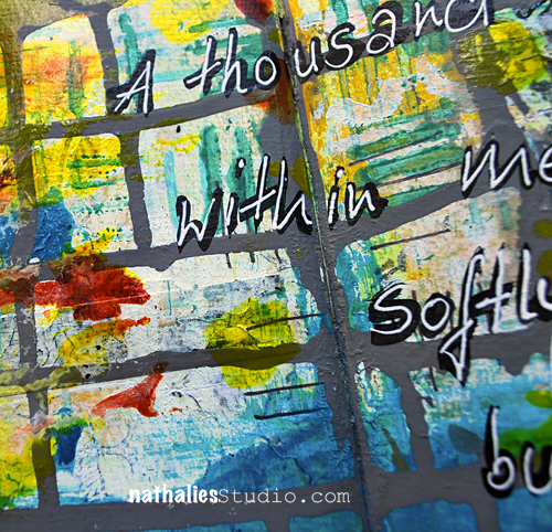
NatKalbach_AThousandDreams01

A thousand dreams within me softly burn

Arthur Rimbaud

NatKalbach_AThousandDreams02

The format of my new art journal is fun- but it is hard to photograph the double spread – I will figure it out ;)

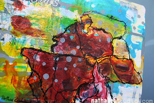
I played with Liquitex Pouring Medium and Acrylic Paints and Inks to see what happens, loved the effects and saw flowers- which I then outlined with a black pen. I added a thin layer of clear gesso over the pouring medium parts as in an art journal otherwise the pages will stick together like crazy and destroy parts of the pages when you try to open it again. Works quite well and you do not loose too much of the shiny-ness.

NatKalbach_AThousandDreams03

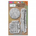
Also loved playing with the templates included in my Stampendous Wired Stamp Set. I heard that some people do not see that there are template stencils in the stamp sets, there are :) – don’t throw the packaging away with them!

Have a gorgeous day!

Nat

LogoBlogSignature

nSupplies


Comments (2)

  • Amante del Papel

    |

    Is just amazing!

    Reply

  • Sue Clarke

    |

    Clear gesso…another supply that I now “need”.
    That red flower is so natural looking. I like how you designed it with the black ink.

    Reply

Leave a comment

Standing Strong Canvas or… Blog Hop with Dina Wakley

Dina Blog Hop Graphic


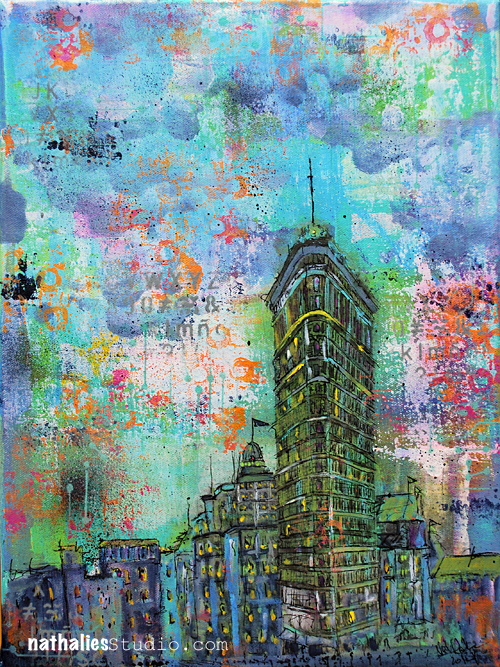
I am very proud of and happy for my friend Dina Wakley who just launched her own signature line of acrylic paints with Ranger. So when she asked me if I would participate in a blog hop and show some work using her paints, I said of course yes.

NatKalbach_FlatironNYC01

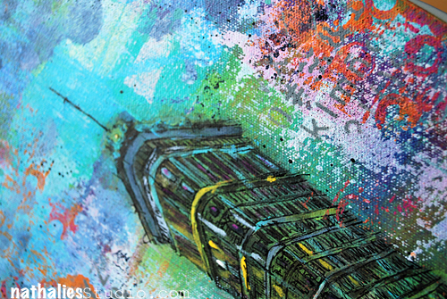
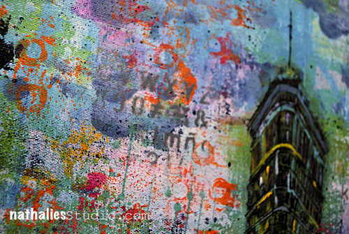
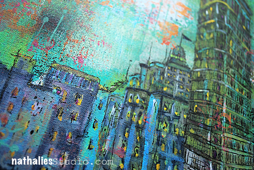
I had planned on doing a canvas on the Flatiron Building in NYC – as many others I find it highly intriguing – the more as I learned through the PBS show “Treasures of New York” about it’s history.


NatKalbach_FlatironNYC02

The name “Standing Strong” is the name my artist friend Tanya Watts Wedhorn gave it after I posted a sneak on my Facebook page and asked people to help me with a name. She is fighting returning cancer and what she said really touched and resonated with me„I remember seeing this building when visiting New York and it just seemed like a building that has really had to stand it’s grounds in a quick growing and changing city. It reminds me of strength and not changing for anything or anyone. So my title would be Standing Strong! Xxx“ Stand Strong Tanya – Lot’s of Love!!

NatKalbach_FlatironNYC03

I had fun painting with Dina’s paints, and using her brushes and the Gesso and Gel Medium.  Love the colors she included in her line- I used almost all colors she sent me.

NatKalbach_FlatironNYC04

Check out the other, super amazing Mixed Media artists that are participating in this blog hop today – and be sure to not miss the giveaway of two complete sets of the paints on Dina’s Blog:

Dina Wakley http://www.dinastamps.typepad.com
Dyan Reaveley http://dyan-reaveley.blogspot.com/
Roben-Marie Smith http://www.robenmarie.com/
Mystele Kirkeeng http://www.mystele.com/
Dawn Sokol http://www.dblogala.com/
Julie Fei-Fan Balzer http://balzerdesigns.com/
Nathalie Kalbach http://www.nathaliesstudio.com/  Permalink: http://wp.me/p3Cnxf-4nr
Kirsten Varga http://www.smilingeyestudio.blogspot.com/
Traci Bautista http://www.treicdesigns.com/

Hope you enjoy the artwork created with Dina’s new line!

Have a gorgeous day

Nat
LogoBlogSignature

nSupplies


Comments (72)

  • Barb

    |

    Natalie,
    This is a fabulous email. I have not been able to download any of the videos you have posted. Just wanted you to know.
    Thank you so much for sharing your creative world and talent.

    Reply

  • Gemma maggs

    |

    Wow……such a beautiful interpretation of such an intriguing building…..your colours are so vibrant and perspective is amazing. I love it. It’s a great advert for Dina’s paints xxx

    Reply

  • stephanie

    |

    Great pieces. Would love to win some paints and supplies.

    Reply

  • Gerrina

    |

    Wow, you’ve made a fantastic artwork! Did you know that in Antwerp there is a smaller cornerbuilding aswell? (Near the Groenmarkt) Thanks for the inspiration!

    Reply

  • Cynthia Clark

    |

    Love your painting. I agree about the Flatiron building, it’s wonderful.

    Reply

  • Janice

    |

    Wonderful! A real treat for the eyes. You are so talented!

    Reply

  • Amy King

    |

    Thanks for sharing your painting! I am so looking forward to trying Dina’s new products!!

    Reply

  • Gerrittina

    |

    Wauw, you have painted an amazing sky. I really love it!

    Reply

    • Gerrittina

      |

      please, remove this one. My mistake.

      Reply

  • Gerrittina

    |

    Wauw, you really painted an amazing sky. Love this one.

    Reply

  • Tracy

    |

    That background is incredible! The colors, textures, layers are fantastic!

    Reply

  • Julie T

    |

    Wow your canvas is amazing.

    Reply

  • Theresa

    |

    what a lovely canvas! The buildings, the flat iron building is great so detailed!

    Reply

  • M.Austen

    |

    Your buildings look amazing!! Can’t wait to try Dina’s new line of paints, brushes, and stencils!

    Reply

  • Ruth L

    |

    Your canvas looks so nice Nathalie, and Dina’s colors are matching your building composition.

    Reply

  • Gina Lighton

    |

    What a beautiful paint and Dina’s paints look so awesome. Best of luck to your friend Tanya.

    Reply

  • Dara Lynn

    |

    Gorgeous painting Nat!! I want to thank you for all you do for us out here!

    Reply

  • Kathy

    |

    I LOVE that building and LOVE your interpretation of it! So colorful and vibrant! Beautiful work!

    Reply

  • lulu

    |

    Wonderful painting! Great symbol of strength. Best wishes to your friend.

    Reply

  • Jackie P Neal

    |

    Nat- this canvas is stunning! I believe this is officially my favorite! And a very lovely gesture for the title for your friend! Sending good thoughts and juju for her health-

    Reply

  • Gabriele

    |

    Love that painting. Cool perspective, and of course cool colours!!

    Reply

Leave a comment

Among Mad People or …Art Journaling Keeps Me Sane

NatKalbach_AmongMadPeople01

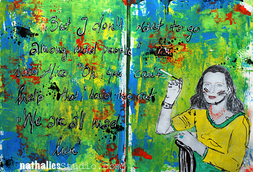
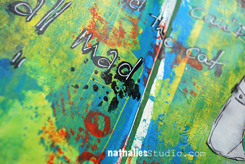
“But I don’t want to go among mad people”, said Alice. “Oh, you can’t help that”, said the Cat “We are all mad here”

Alice’s Adventures in Wonderland, Lewis Carrol

NatKalbach_AmongMadPeople02

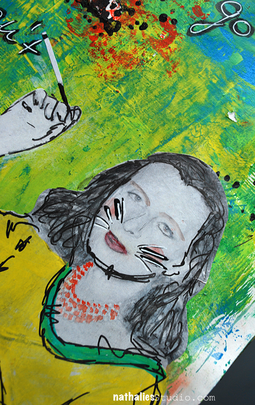
I smothered the background in paint and let it all out  – MAD ;)

NatKalbach_AmongMadPeople03

Have a gorgeous day and go make some art today!

hugs

Nat
LogoBlogSignature

nSupplies


Comments (2)

Leave a comment

If You Have Good Thoughts – Art Journal

NatKalbach_GoodThoughts01

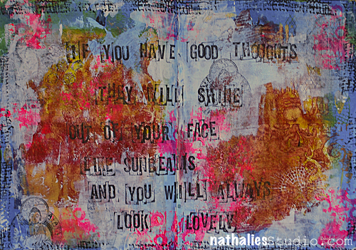
If you have good thoughts, thy will shine out of your face like sunbeams and you will always look lovely.

*Robert Dahl*

NatKalbach_GoodThoughts02

This background started out with a mono printed background demoing in a workshop and from there I added layers of layers, hiding, revealing and adding

NatKalbach_GoodThoughts03

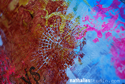
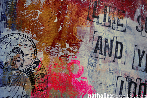
There is a lot of texture on this spread. And I used this fluorescent pink , which is a new obsession of mine- LOL. I know some people HATE it …I used to too but somehow it speaks to me at the moment  and I love to explore with which unusual color combinations it can look good with :)

NatKalbach_GoodThoughts04

I hope you have a wonderful day …I am so giddy about the spring finally being here….Cannot even tell you :)

hugs

Nat
LogoBlogSignature

nSupplies


Comments (1)

Leave a comment

Abstract Mini Canvases

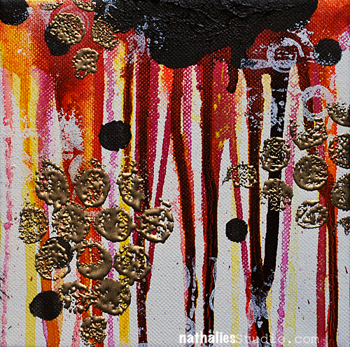
NatKalbach_AbstractMinis01

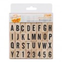
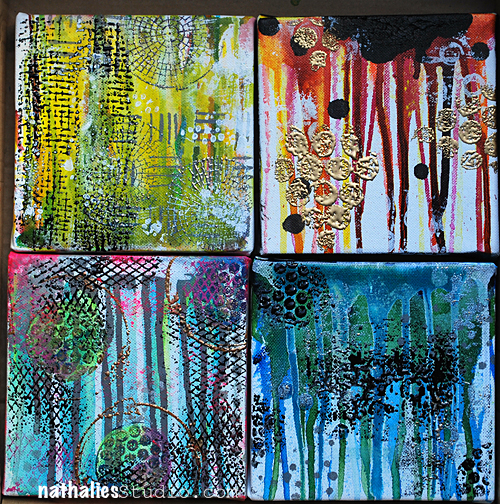
I am on my way to NAMTA Art Materials World in Pittsburgh today. Stampendous! will have a booth there too and these are some mini canvases I created using my Stampendous! Signature stamps.

NatKalbach_AbstractMinis02


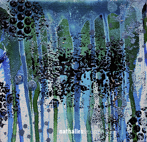
Basically I created a background for each canvas with different color combinations using Acrylic Inks or Soft Body Acrylic Paint – having some fun dripping and dropping

NatKalbach_AbstractMinis03


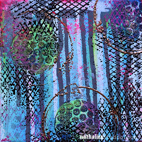
Using the templates that are included in my stamp packages with Soft Body and/or Heavy Body Acrylic Paints I added another layer.

NatKalbach_AbstractMinis04


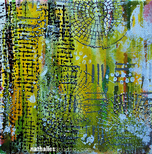
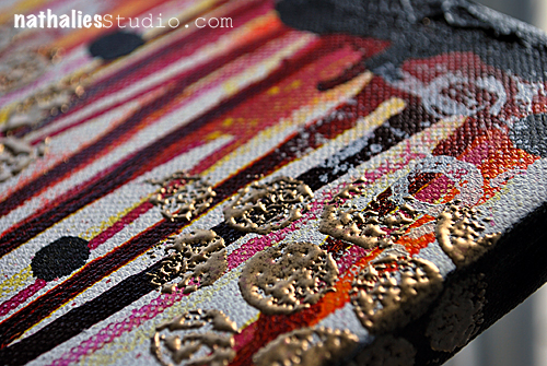
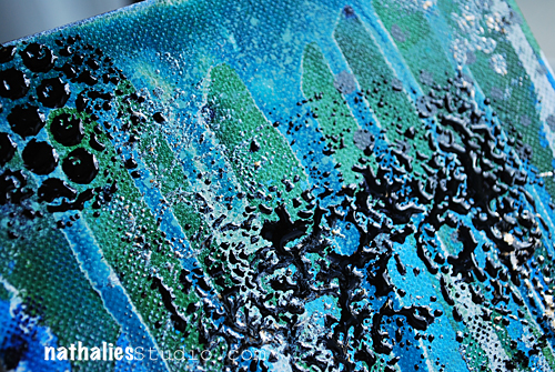
For the third layer I used the Stamps with an Embossing Pad and added various Aged Embossing Powders on top of it.

NatKalbach_AbstractMinis05


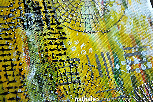
Carefully heat embossed it as to not burn canvas and/or acrylic paints

NatKalbach_AbstractMinis06


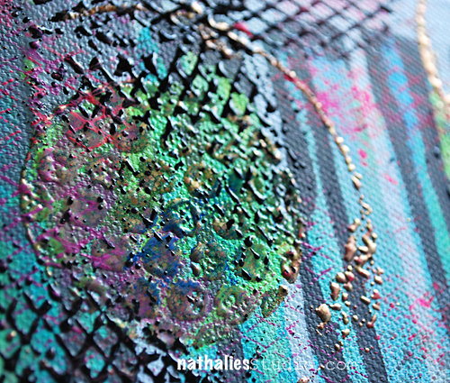
I love the texture this creates

NatKalbach_AbstractMinis07


I then used the stamps with acrylic paints and added some colors here and there and tied some elements together

NatKalbach_AbstractMinis08


I had loads of fun with those canvases

NatKalbach_AbstractMinis09

Here are all the supplies I used:

nSupplies


have a wonderful day – I am sure that I will share some photos of the convention next week – I am looking forward seeing inspiring stuff and meeting some artist friends.

Nat
LogoBlogSignature


Comments (5)

Leave a comment