nathalie-kalbach

On whom to marry – Art Journal

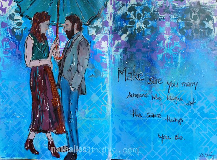
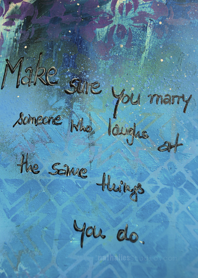
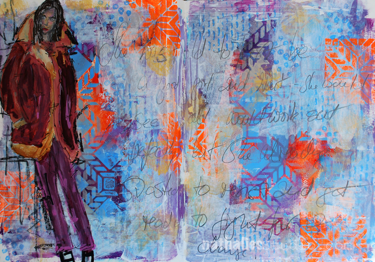
“Make sure you marry someone who laughs at the same things you do” J.D. Salinger.

Agreed :) and that is one of my favorite things about my marriage- my husband and I can laugh at the same silly things together which probably have other’s just roll their eyes.

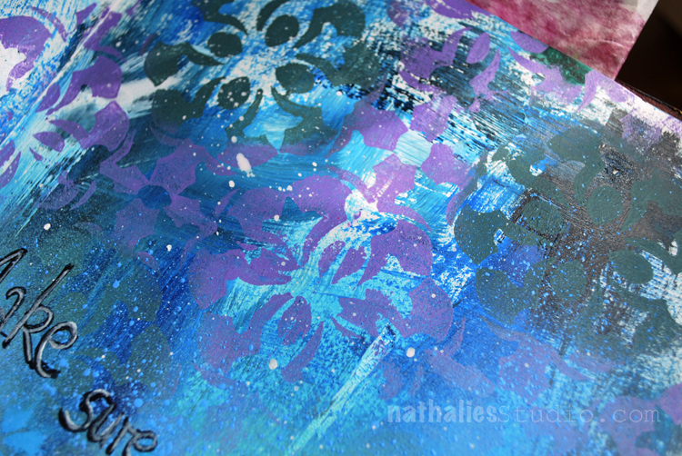
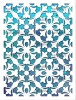
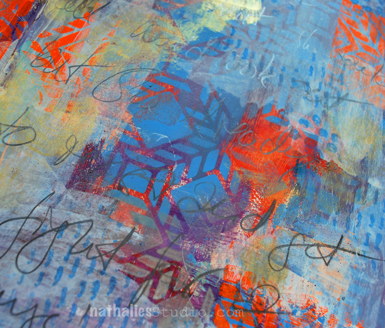
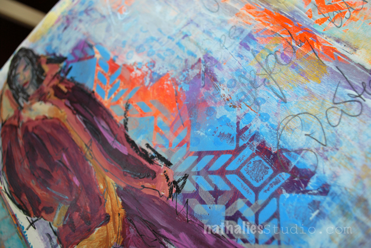
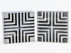
I used the Versailles Stencil oversprayed with different acrylic spray paint colors on the top.

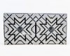
For the bottom part I used the Toledo Foam Stamp stamped with some acrylic paint. and then journaled on top.

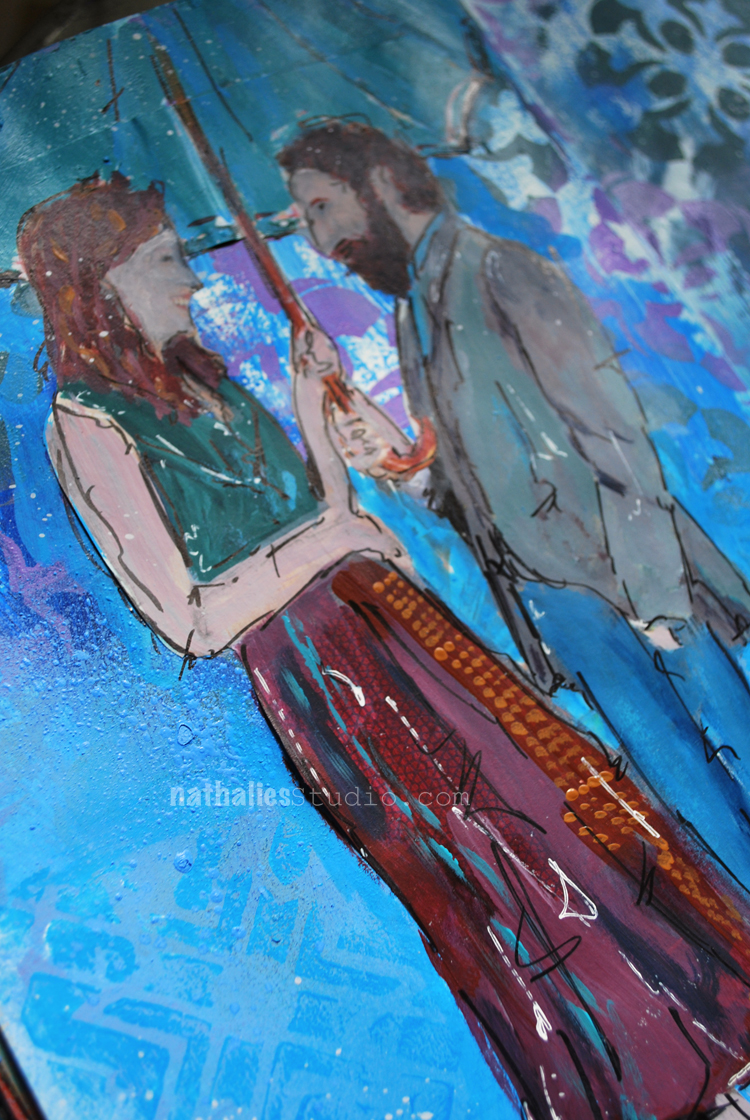
I used a catalogue image and painted over it with acrylic paints and markers. The faces are a bit …ahem- scary- LOL- but hey…another thing I can laugh about and I am sure my hubs would too ;)

Here are some of the supplies I used in this spread- some links are affiliate links:

P.S.  I cannot believe my wonderful friend Birgit Koopsen from the Netherlands is coming already next Thursday and we cannot wait for our workshops at The InkPad  there are still a couple seats left – check it out when you are in the area and join us!!!!

You can also get a special deal by signing up for both classes ! what are you waiting for  – two Europeans at once :)

Wishing you a wonderful day filled with laughter :)

Comments (2)

  • Torsa Saha

    |

    Beautiful project for a snowy friday!! ❤❤

    Reply

    • nathalie-kalbach

      |

      Thank you so much Torsa!Stay warm today and have a wonderful weekend!

      Reply

Leave a comment

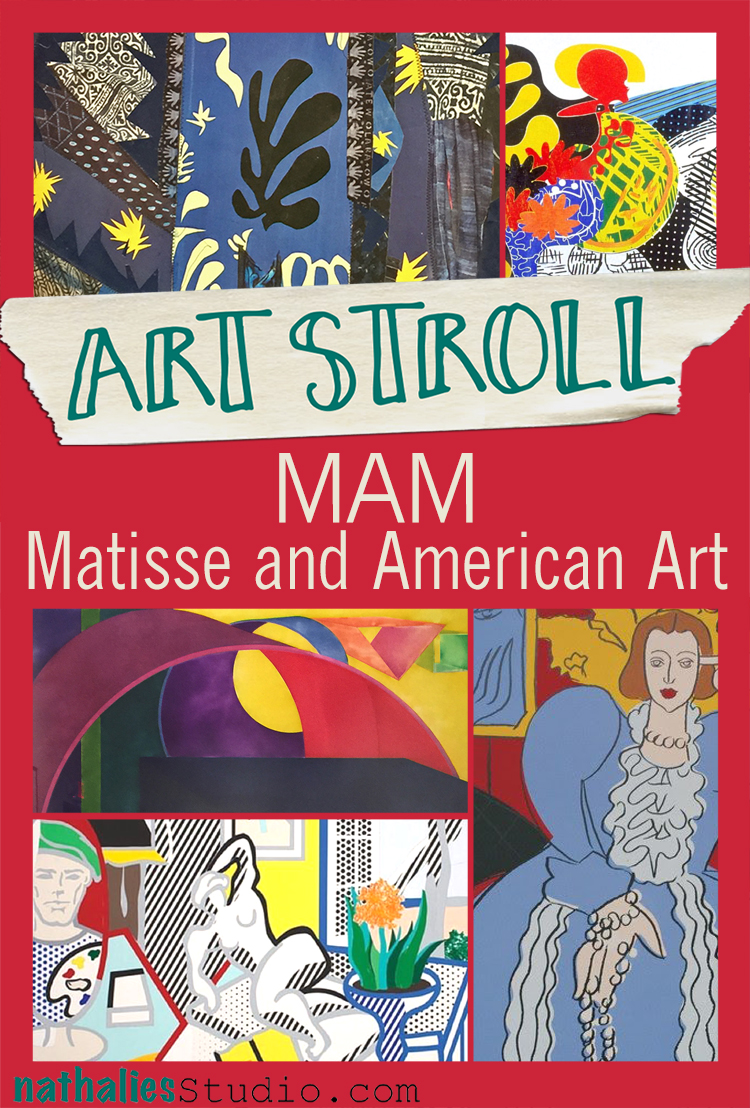
Art Stroll: Matisse and American Art at MAM

A couple weeks ago my friend Heather pinged me on a Sunday morning and said “Hey, I need to see art today – let’s go to a museum”. I had seen a news report on the exhibition “Matisse and American Art” at the Montclair Art Museum and since I use Matisse as an inspiration for my classes sometimes, I convinced her to go there with me. It was soooo worth it!

The exhibition strives to explore Henri Matisse’s influence on American Artists from 1905 to the present. The list of profilic artists inspired and influenced by his work is immense and the exhibition showed in an interesting way how some artists explored some of his work  for a while and some of them took it even further and let it immerse into their own style.
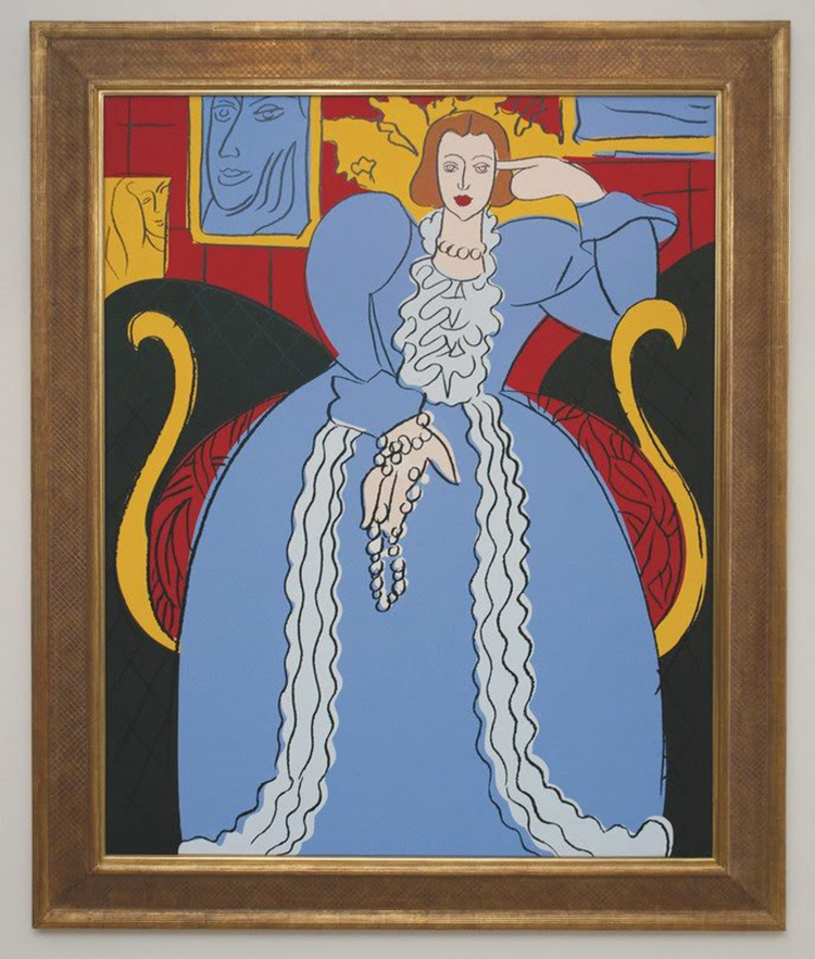
Andy Warhol – Woman in Blue (After Matisse), 1985, synthetic polymer paint and silkscreen inks on canvas.

This painting by Warhol was directly inspired by the Woman in Blue by Matisse from 1937 and even though it is pretty much copied from Matisse down to the colors red, yellow, blue, black, and white, you can see the flatness of the painting so typical for Warhols techniques and the hand holding the necklace says Warhol to me.
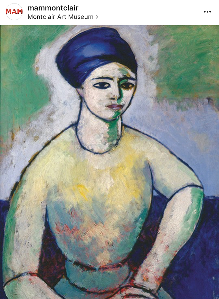
Morton Livingston Schamberg- Studio of a Girl, ca. 1912 – Oil on Canvas

Schamberg traveled extensively in Europe and he must have seen many Matisse paintings during his time there. The paining reminds of Matisse’s painting Painting of Madame Matisse. The Green Line.
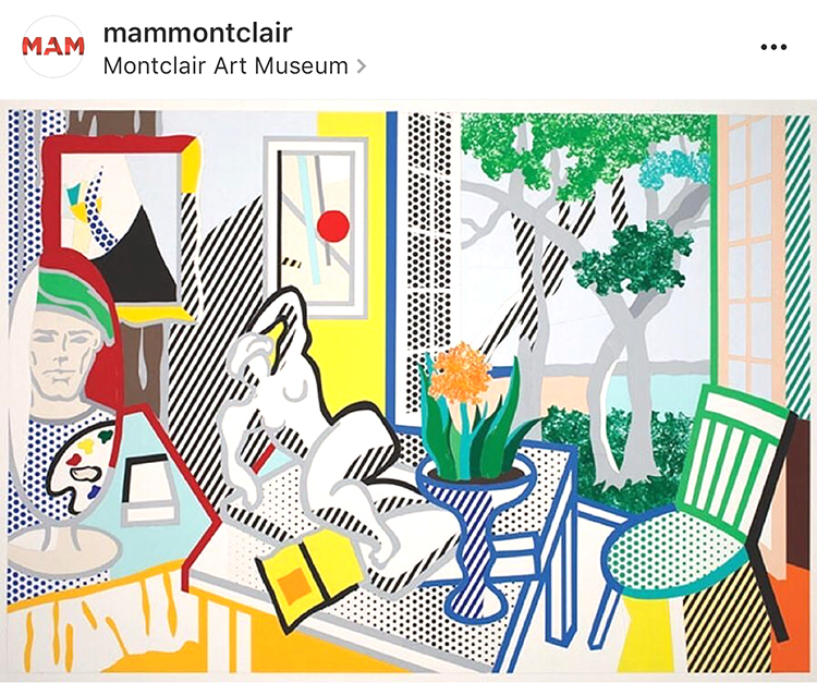
Roy Lichtenstein – Bellagio Hotel Mural: Still Life with Reclining Nude (Study), 1997 cut -and pasted, painted and printed paper on board.

Roy Lichtenstein had a longtime interest in Matisse and Picasso and many references to their artwork can be seen in his work like the simplification of form or direct references of elements in Matisse’s paintings. In this painting parts of his studio, the open window, the patterns.
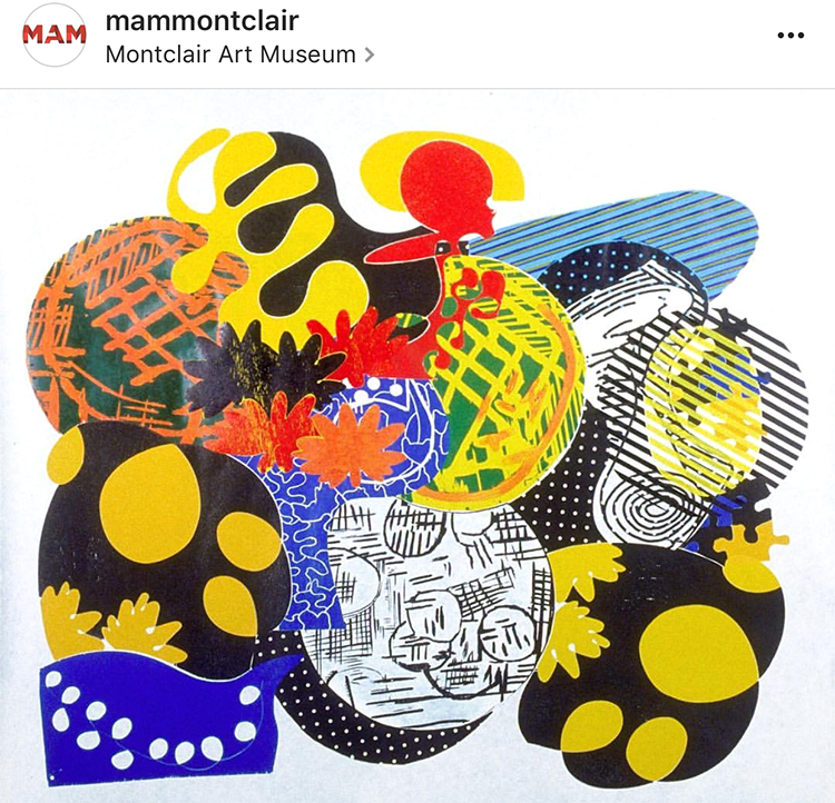
Judy Pfaff – Six of One-Melone, 1987 – Color Woodcut

In her installations, prints and sculpture, Pfaff translates Al Held and Henri Matisse’s theories of color into her own visual language. Pfaff says that Matisse gave her “courage” and has been ” the source of how to teach and how to see”.

On a little side note: Heather and I saw this woodcut different than in the image above. It was hung upside down from what you see here and we remember this so well because Heather actually had a very strong reaction of dislike to the artwork and we stood in front of it discussing why. When we later talked about the exhibition and this piece with our friends we opened the exhibition catalogue to discover that it was displayed as above, and further research had me find it is also displayed differently on the artist website as well as on the MAM instagram account (I used their image above) . Heather like different display in the catalogue also way better than how we actually saw it.  So this haunted me for days and finally I wrote MAM and asked if there is a reason for hanging it the other way (artist instruction that it can be hung any way) or if this was an overseen mistake by the technical staff who hung the artwork. And here is their answer:

“Thank you for writing to the Montclair Art Museum. We had been in conversation with the artist about this issue since the exhibition installation, and have just now heard back. The image used in the catalogue and online was provided by and checked by Crown Point Press; when unpacked the artist’s signature placement indicated that it instead by installed as you saw it. Judy Pfaff has now confirmed that the way the artwork is hung is correct, and you’ll find that all publicity and use of the image going forward will be corrected.”

And so apparently the way we saw it as below – is the right way (btw- it is now changed on the Artist website as well) :)
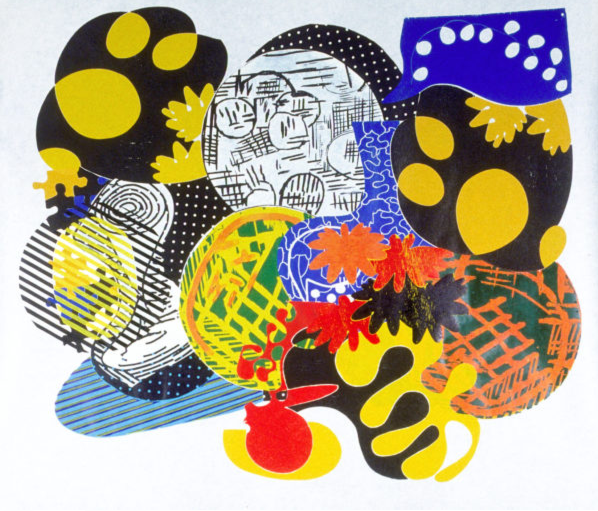
Now which way does speak more to you? I actually liked it the “wrong” way in the catalogue and instagram page better than the way it is hung and apparently now supposed to be hung. the shapes feel more organically and right – and the forms are more balanced for me in the top version. But hey ….who argues with the artist. But I thought this was interesting.
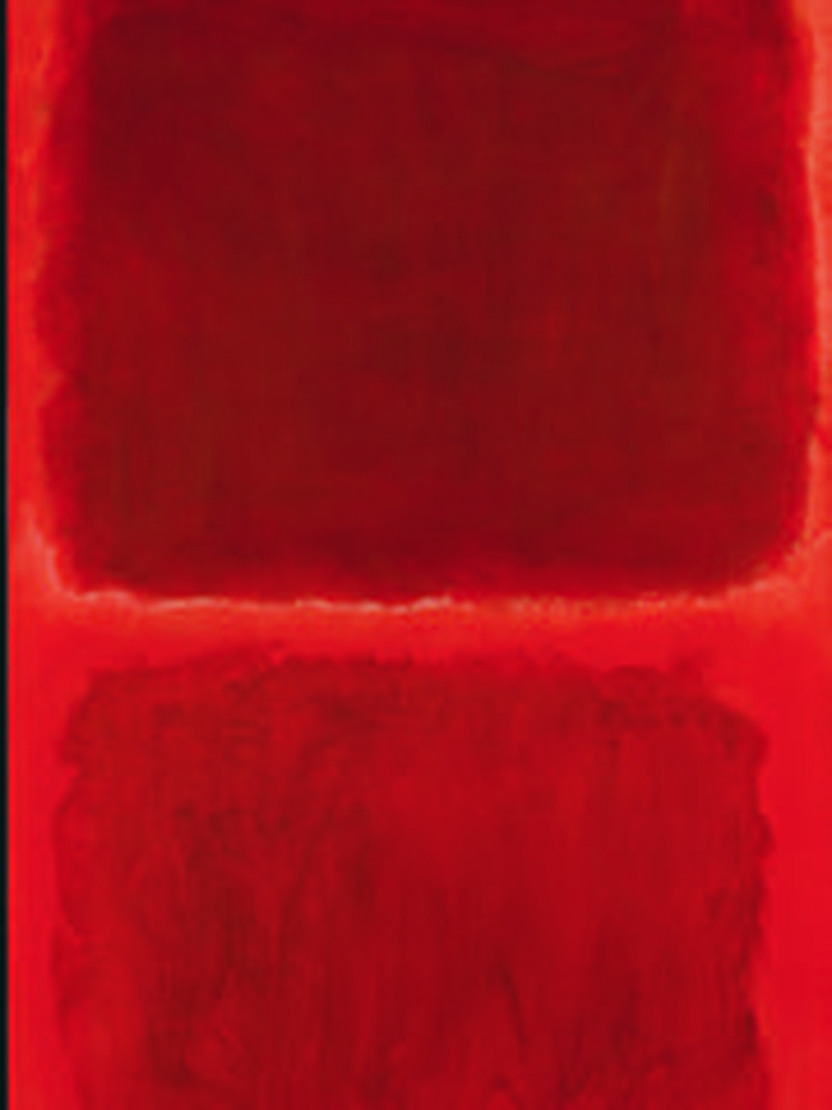
 

Mark Rothko, No. 44 (Two Darks in Red), 1955 – Oil on Canvas

Mark Rothko called Matisse “the greatest revolutionary in modern art”. Rothko studied Matisse’s The Red Studio (1911) after MoMA had acquired it in 1949. He went to the museum and every day for several months just to stand in front of the picture. While viewing the painting he said ” You became that color, you became totally saturated with it as if it were music” .
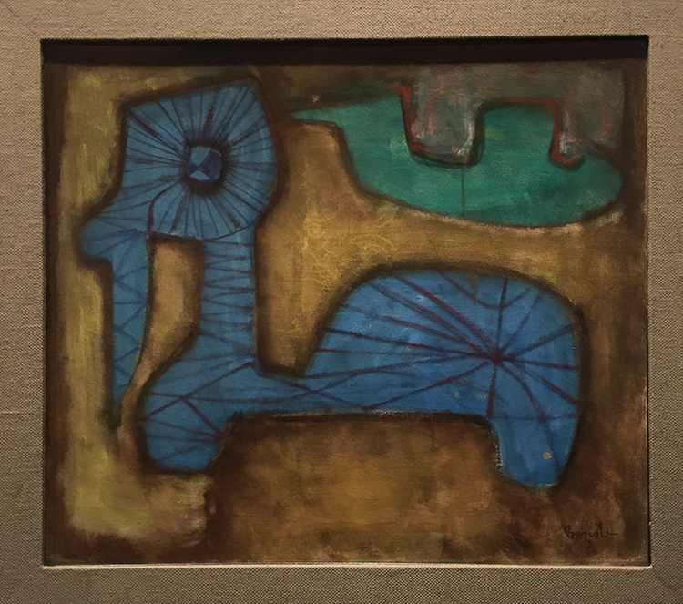
William Baziotes, Toy Animal – 1947 – Oil on Canvas.

Baziotes was so inspired by his visit to the Matisse retrospective at MoMA in 1931 that he resolved to move to New York to study art. Baziotes’ basic shapes and luminous color recall many of the plant and human forms that populate Matisse’s work.
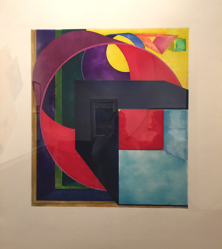
Al Held – The Space between the Two – 1992 – print

Al Held studied and used Matisse’s ideas about color, form, structure and scale.
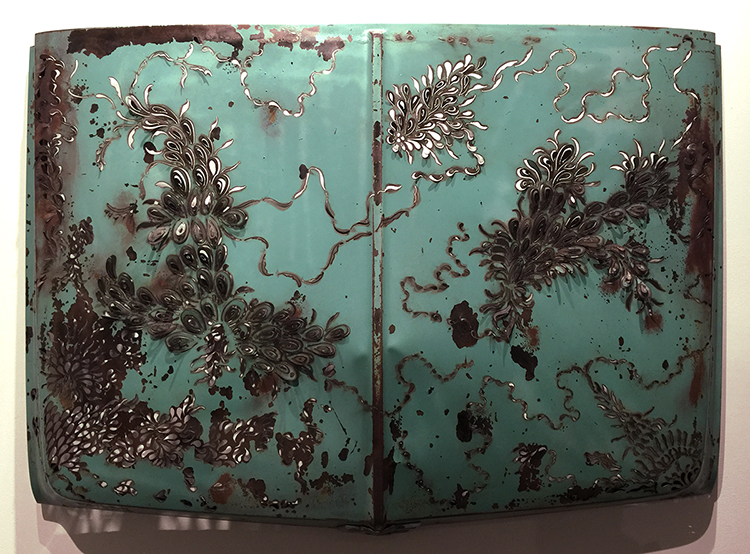
Denice Bizot, Urban Flora, 2014 – 1960s Chevrolet truck hood cut with plasma torch

Bizot’s organic shapes are reminscent of Matisse’s paper collage cut- outs of the late 1940s and early 1950s.
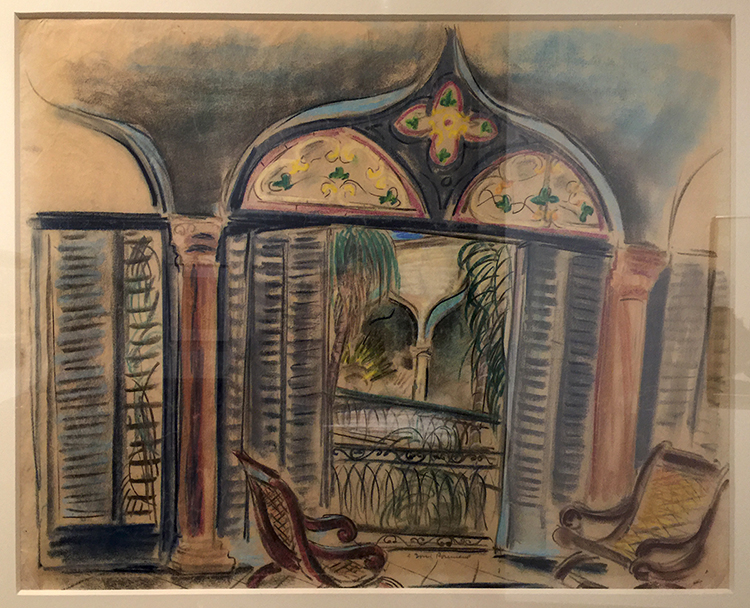
Doris rosenthal, Gran Terrazo, ca. 1920-1922 -Pastel on Paper

This painting shows Rosenthal embracing Matisse’s vibrant color and idyllic subject matter. Matisse often used windows as a vehicle for exploration into color, light and interior versus exterior space.
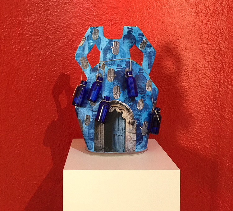
Janet Taylor Pickett, Indigo Bottle Dress – Charms and Inspirations – Acrylic, digital photograph, glass bottles with written messages and twine on shaped Arches Paper.

Picket’s creative conversation with Matisse spans her entire  career.
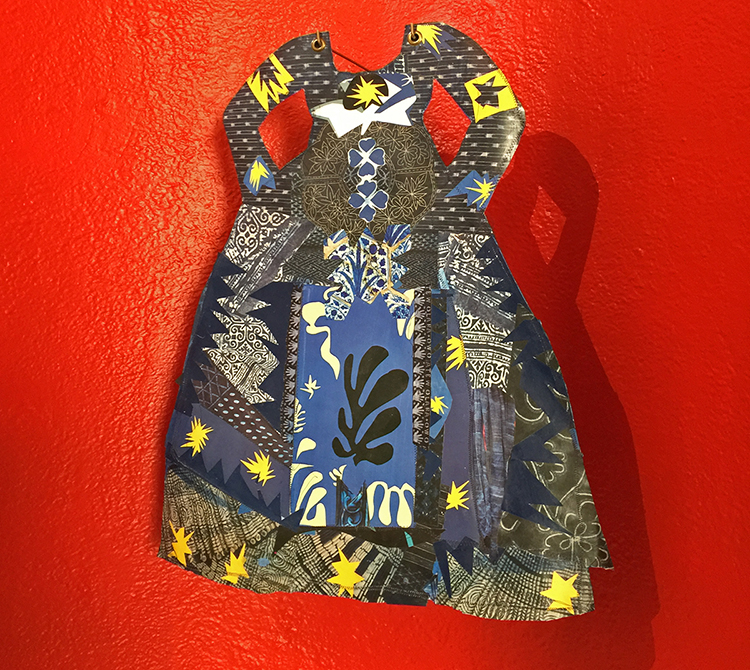
Janet Taylor Picket, Dressing in Context 2, 2015  – Collage of various papers, thread and acrylic on Arches paper with grommets.
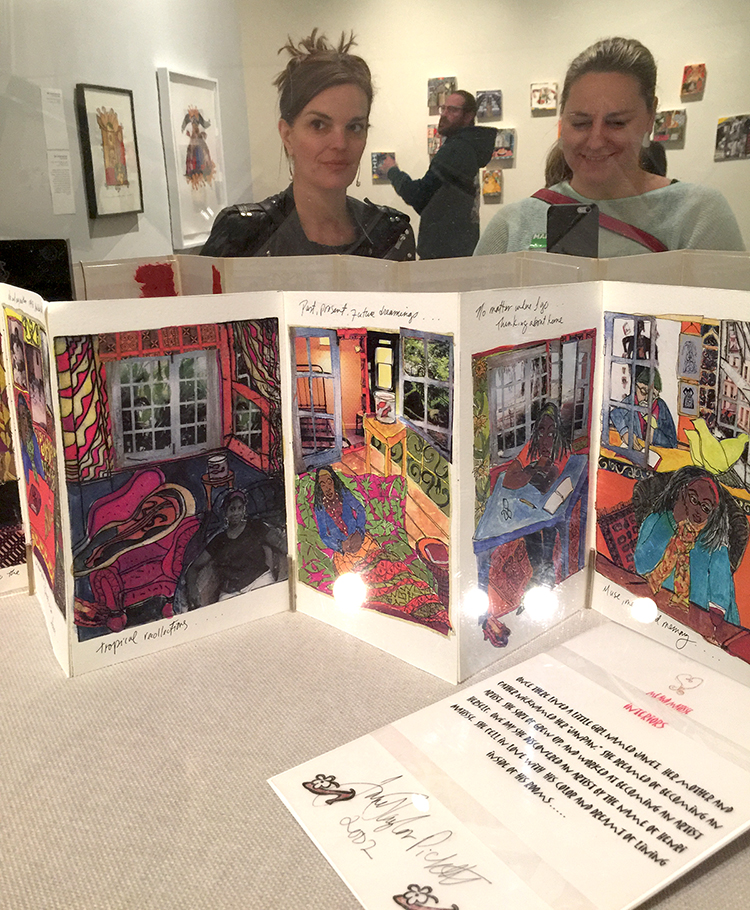
Janet Taylor Pickett, Me & Matisse, 2003 -04 – Handmade book

In this book, Taylor Pickett’s aspirations to become an artist are combined with her travels abroad to France and her longing for home, which she characterizes as “a metaphor, an idea for finding my voice as an artist”.
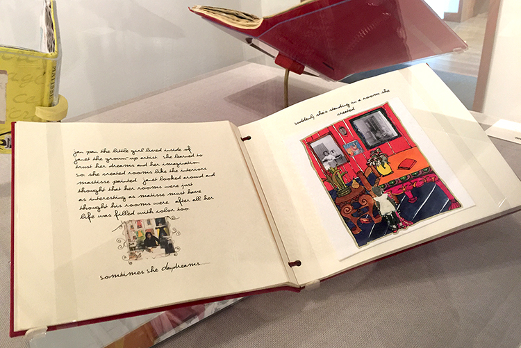
As you might imagine the books made me swoon and I want to do something like this !

It was an amazing and inspiring exhibition. I loved seeing all the different ways how other artists were inspired- and still are inspired by Matisse . I came home from the exhibition totally recharged and explored different – Matisse-inspired- things in my studio for several days.  It made me yet again so aware of our differences and our connections – magical! I was also surprised what a wonderful Museum this is and what a huge amount of artwork from even more than the shown well known artists (couldn’t show all) like Stuart Davis, Milton Avery, Richard Diebenkorn, Helen Frankenthaler, Hans Hoffman, Robert Motherwell and many more the museum was able to show for this exhibition. I for sure have this museum on my list and if you are in the New Jersey area- check out this exhibition which is still on view until June 18, 2017.

I hope you enjoyed this little Art Stroll and found some inspiration in it!

Comments (6)

  • Sue Clarke

    |

    Indigo bottle dress is super cool and I would love to have it in my bedroom.
    As to Judy Pfaff’s – Six of One-Melone I do not like it hung the “correct” way…seems off to me.
    Funny how that works.
    I always enjoy strolling with you Nat.

    Reply

    • nathalie-kalbach

      |

      I loved that dress too, Sue …I actually also want the red little alcove in my bedroom :) I agree with you on Six of One Melone! Have a gorgeous weekend!

      Reply

  • Jean Goza

    |

    Always enjoy your Art Strolls. Invariably I find new artists that inspire me. And Matisse has always been a favorite of mine so I enjoyed seeing other artist’s inspiration from his work. Regarding your question on Judy Pfaff’s Six of One Melone piece, I definitely like the “upside down” version better. The balance of the “correct” version feels off to me. It feels as if the larger components of the piece want to “collapse” into the small red and yellow area at the bottom. As you said, you can’t argue with the artist. It’s always fascinating to me the different emotional responses people will have to a piece of art.

    Reply

    • nathalie-kalbach

      |

      thank you Jean! Yes- I agree on the composition and how it feels better the “wrong” way. I am also fascinated that people have different emotional responses to art – sometimes certain artists use symbols or subject matters that resonate differently depending if you have the same cultural background as the artist which I find very interesting to discover with friends when going into museums.

      Reply

  • Bea

    |

    Really interesting…thanks…

    Reply

Leave a comment

I Hope Your Lips Are All Smiles Today – Art Journal

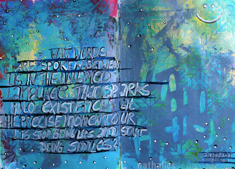
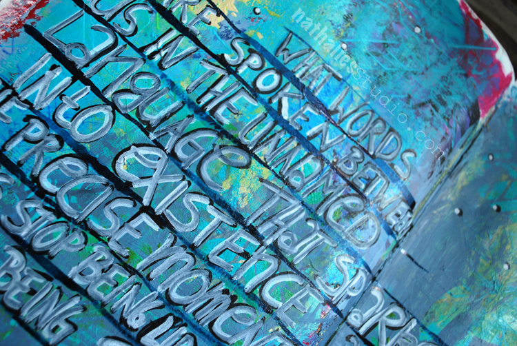
“What words are spoken between us in the unnamed language that sparks into existence at the precise moment our lips stop being lips and start being smiles?” Tyler Knott Gregson

I recently discovered Tyler Knott Gregson and his poem is just so beautiful I  had to use it in my art journal. Check him out – he has an instagram account where he posts daily his inspirational poems and his book

Wildly into the Dark: Typewriter Poems and the Rattlings of a Curious Mind is on pre-sale now and I cannot wait to hold it in my hands. 

The background was just a bit of play with color and the Santiago Foam Stamp- but I loved the background and I decided- this is it. You know…you can do that too right ? LOL- don’t forget you are the boss of your own Art Journal – so background – foreground – who cares. For the journaling I used a Striper Brush – basically a brush with super long hair – which you can use to create long lines. I used it with acrylic ink and practiced a bit to alternate the the pressure onto the brush while moving it, to create a variation in the thickness of the line. I like this –  it was a good exercise and I really like how the journaling in between came out :)

Here are some of the supplies I used for this spread- some links are affiliate links:


I hope your lips are all smiles today :)

Comments (4)

  • Sue Clarke

    |

    Nat, I like the words and sometimes simple is better. I try to laugh as much as possible and smiling usually comes natural to me when I look into another person’s face. Have a cheery day creating.

    Reply

    • nathalie-kalbach

      |

      Awe- I love that Sue! Smiling people always make me happy :) Have a cheery day as well!

      Reply

  • Jean Goza

    |

    Nice layout. Especially like the yellow peeking through the blue. Thanks for sharing info on Tyler Knott Gregson. A beautiful quote. I will definitely look at more of his work.

    Happy day to you!

    Reply

    • nathalie-kalbach

      |

      thank you Jean – yeah I think you will like his work – I also love how he writes and types on paper pieces he finds. Happy Day to you too <3

      Reply

Leave a comment

Resist – Art Journal Spread

Some of my thoughts on how sometimes women are told to behave in a certain way and be a good girl and how this actually never really resonated with me :)

The background was painted in a very bright orange and purple and layered the Santiago Stencil on top and sprayed with a blue spray paint over it. I applied some light yellow and white gesso in a think layer here and there to tone it down.

I stamped with the Grannies and Running  Stamps and archival ink for some marks. Next I picked up the orange again stamping with the Santiago Foam Stamp on top of some areas.

I used a pencil for the journaling.

Here are some of the supplies I used- some links are affiliate links:


Have an amazing day my friends!

Comments (2)

  • Sherry Canino

    |

    Beautiful art journal spread and message ❤❤❤

    Reply

Leave a comment

Taking a deep Breath – Art Journal Spread

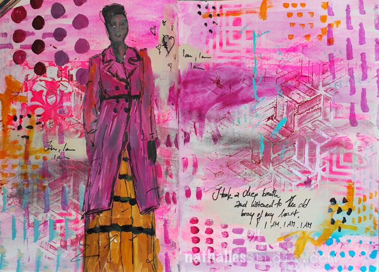
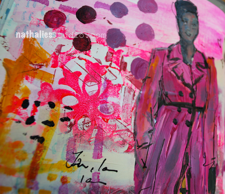
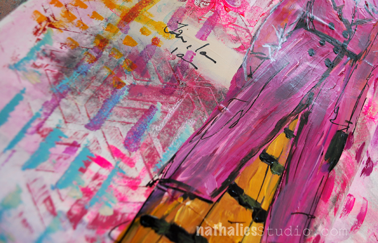
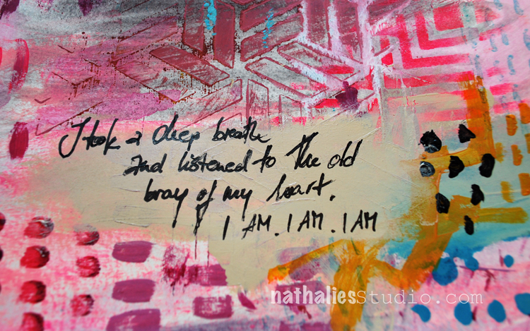
“I took a deep breath and listened to the old bray of my heart. I AM I AM I AM” – Sylvia Plath

I love this quote so much – it made me somehow happy and silly pink ;)

For this spread I wanted to play with visual juxtaposition a bit:

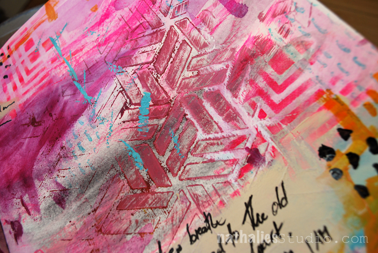
For the background I added to some areas a wash with watercolors in a grey tone and pink. I love how the watercolor has a soft look, while the later applied acrylic paint is more textured.

I used different stamps and stencils- mainly my Kassel stencil with some left over paint from a different spread on top dabbed onto the page, as well as the Manhattan Stencil through which I applied some pink paint with a cosmetic sponge.

I stamped with the Versailles Foam Stamps here and there to give it a bit of  a feminine touch – also to break with the very linear and geometric patterns of the Kassel and Manhattan stencil.

I added some marks with the Satin Doll and Running  Stamps and Archival Ink. I added also some hand made marks – I always love the play with “perfectly” repeating marks and handmade marks.

To make sure the journaling doesn’t get lost in the background I applied some Unbleached Titanium acrylic paint with my finger – big enough to write with the Fude pen on top.

I really like how this page turned out – I think I will play a bit more with this concept.

Here is a list of the supplies I used – some links are affliliate links


Have a gorgeous day !!!

Comments (6)

  • Sherry Canino

    |

    I love it !!! And the quote ❤❤❤

    Reply

  • sherri scott

    |

    Nat, nice girly, gilrly page with all that texture and pink

    Reply

    • nathalie-kalbach

      |

      LOL- yeah isn’t it ;) Have a wonderful weekend Sherri!

      Reply

  • Torsa Saha

    |

    Stunning!! Can’t wait to meet you ?

    Reply

    • nathalie-kalbach

      |

      Thank you so much Torsa! Looking forward meeting you too! :)

      Reply

Leave a comment

Artful Adventures in Mixed Media or Thoughts on being a Writer at last

Pinch me, guys! My childhood dream has come true. When I was a little girl and people asked me what I wanted to do when I grew up I didn’t answer “be an artist” – I said I wanted to become a writer.

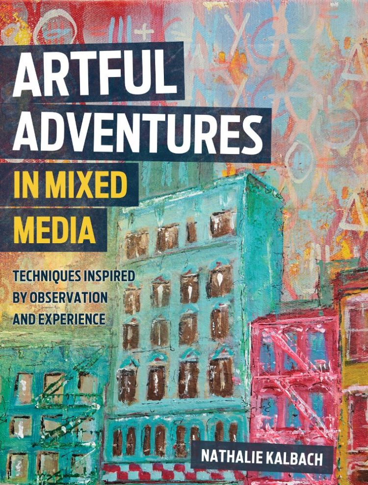
I took a lot of detours, and even if it wasn’t in my original plan I became an artist AND a writer. My book, Artful Adventures in Mixed Media – Art and Techniques Inspired by Observation & Experience, is going to be released on June 8th, 2017, and is now on PRE-SALE.

I’d like to share the back-story…

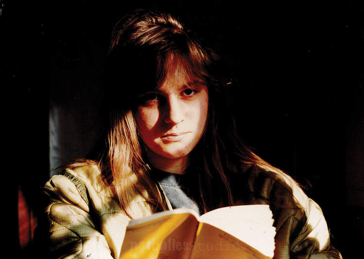
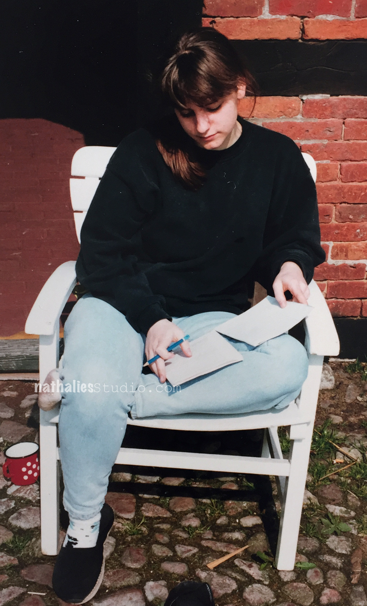
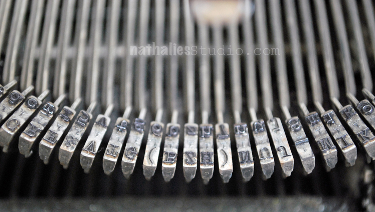
My father passed away when I was a baby and my mother had to work a lot to take care of us. Neighbors who lived in the apartment below ours took a liking to me and I spent hours with them almost every day – they became my honorary Aunt Isabell and Uncle Günther. They had a living room with floor-to- ceiling bookshelves on all sides, they took me to the library and helped me get my first library card. I read to them and with them, everything I could get my hands on. And I wrote stories! In fourth grade my teacher sent one of my stories to a national school magazine, it was printed. I was sooooo proud. In my teens I got an old typewriter, heavy as lead, but I banged on it with gusto, starting – but never finishing – epic novels.

I was going to study journalism, I had big plans, but for some reason (perhaps a practical streak) I decided to study law. Well…at least I did a lot of writing as a paralegal, but legal arguments weren’t very interesting. I knew that writing a book would be awesome, but I wasn’t sure what story I would tell.

Things changed when I left the legal world, became a full-time artist, designer, blogger and teacher and then moved to the States. I wrote for my blog, so things were beginning to brew. And this time when I thought about a book I knew it would be about mixed media. A student in my Creative JumpStart 2016 class wrote that she’d like to ‘jumpstart me right back’ and suggested I should write a book about the things that I was already writing about on my blog. This email was so well-timed. It gave me the nudge I needed to write and send a book proposal. (Thank you, Denise G.)

A year later, here I am, an author. Artful Adventures in Mixed Media – Art and Techniques Inspired by Observation & Experience! It took me and the publisher a long time to decide on the title. (They considered calling it Uber Artful Adventures, but maybe they figured that could look like a manual for self-employed drivers so that one didn’t pass muster.)

So, what’s this book of mine about?

It’s an invitation to YOU to go on an Artful Adventure with me. I wrote it to reach everyone I can’t meet in person with my classes, to share the methods that make mixed media accessible to all, no matter their skill level. It’s about the process from inception to realization, how observations and experiences can be turned into works of art. I give practical guidelines and oodles of examples of how I find inspiration, how I gather and keep my ideas in sketchbooks, journals and photos, and what materials go on the journey with me in an Art-on- the-Go kit.

In each chapter there are techniques and step-by- step instructions for projects – stencils, layering, collage, textured painting, mono-printing, photo manipulation, and more, to ensure that the reader can go on their own Artful Adventures and create their own meaningful mixed media artwork!

I cannot wait to finally hold the book in my hands and I cannot wait for you to read it. I am scared and excited at the same time and sometimes just thinking about it makes me jump up and down …To everyone who has followed my blog, taken my classes, shared this journey – YOU made this book possible and for that I thank you!

Comments (18)

  • Julie B

    |

    Linda said it best. I,too have been blessed with attending one of your live classes and being able to say “yes, I can do this!”. Love, love, love your teaching style, wisdom, humor, laugh but what is this about an accent? Thank you for sharing your backstory. You worked hard to realize your dreams and could not be happier for you and anxiously awaiting my per-ordered copy (hope you will visit next year so I can get it autographed). Congratulations!

    Reply

    • nathalie-kalbach

      |

      Thank you so so much Linda- you are the best! I had such a good time with you- your enthusiasm is contagious. And I think I will be back ;) and I cannot wait to see you again! Loves!
      Reply

  • Sherry Canino

    |

    This is so beyond exciting!!! A huge congratulations to you!!! I can not wait to get a copy and thank you for sharing your story with all of us. It’s an honor to be here cheering you on and I so can’t wait to meet you in person it’s all I can think about lol ❤❤❤. Congrats again !!!????

    Reply

    • nathalie-kalbach

      |

      I cannot wait to meet you either! thank you so much for all your support- you are amazing. Have a wonderful week!

      Reply

  • Gill K

    |

    Congratulations on writing your book. It will be great to have, as I can’t get to any of your classes. I enjoy reading your blog & seeing your art. Thank you.

    Reply

  • Natalya Aikens

    |

    What a great story Nat! Can’t wait for my autographed copy!!!

    Reply

  • Maura

    |

    Nathalie, what a wonderful and inspiring story that led you to realizing your dream of becoming an author! Kudos!!!!

    Reply

    • nathalie-kalbach

      |

      Awe- thank you so much Maura – you are the best! Looking forward seeing you in a couple weeks at Color Crush!

      Reply

  • Sue Clarke

    |

    How WONDERFUL for you and your readers Nat!!!
    Your creativity rocks my world and now I can have it in a book to cherish, hold, read and use.
    Can’t wait to get my copy.
    And congratulations for achieving another dream.

    Reply

    • nathalie-kalbach

      |

      Aweee- Sue!!! You are a big part of this! Thank you for all your support throughout all those years!!! <3 Big hugs and I wish you a wonderful weekend!

      Reply

  • Nancy G.

    |

    Congratulations on your book and pursuing your dream. Life doesn’t take us in straight lines, yet it gets us to where we need to be. Your story is inspiring.

    Reply

    • nathalie-kalbach

      |

      Thank you so much Nancy! You are wonderful and I agree – no straight lines in life :) Have a wonderful weekend!!!

      Reply

  • Linda Corbin Young

    |

    I am so very proud of you and so honored to have attended your classes, absorbed your wisdom, reveled in your humor (and your completely comprehensible accent, thank you!). You’ve given me inspiration, courage to try new techniques, and so many skills. Can’t wait to have you autograph my copy of this masterpiece!

    Reply

    • nathalie-kalbach

      |

      Awe, Linda- thank you so much – you are amazing and always so supportive! I always love having you in my classes and I hope I will see you in OK again in June …right after the book is out :) Big hugs and have a wonderful weekend!

      Reply

  • stephanie

    |

    Thanks for sharing more about yourself and the inspiration behind the book. So excited for you!

    Reply

Leave a comment

Impossible to Forget – Art Journal Spread

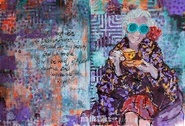
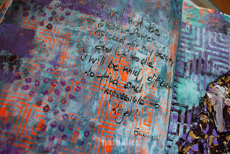
“I will not be another flower, picked for my beauty and left to die. I will be wild, difficult to find and impossible to forget!” – Erin Van Vuren

I loved the quote when I found it – and I had to include it in my art journal.

The background was a VERY purple background – LOL- so I toned it down a bit by using some Baltic Blue Acrylic Paint and gesso over some of the areas. I used my Manhattan positive and negative Foam Stamp set as well as the Manhattan Border Foam stamp for a pattern. To break the very linear pattern up a bit I used the Grannies Rubber Stamp.

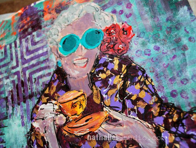
I painted over a magazine image that I had saved , using acrylic paints and some markers. That was fun. A different color scheme when usual for me but it is totally my cuppa tea :)

Here are some of the supplies I used – some of the links are affiliate links:


Have a beautiful day!

Leave a comment