nathalie-kalbach

Artful Adventures in Mixed Media – Interview with Julie Fei-Fan Balzer

Julie Fei-Fan Balzer is part of my book Artful Adventures in Mixed Media and I thought it would be interesting to hear more about her and some of her thoughts. Grab a seat and a cuppa , or listen to this interesting conversation which I think you will enjoy. We are talking about things like

  • How Julie started painting
  • Blogging as part of our daily routine
  • Changing career paths and what was the hardest about it
  • Curiosity means Growing
  • Theater and Theater stage sets
  • Her artwork in the book
  • Eye Obsessions
  • Dinosaurs

Artful Adventures in Mixed Media Interview with Julie Balzer from Nathalie Kalbach on Vimeo.

I hope you enjoyed the interview- let us know what you think about some of the topics.

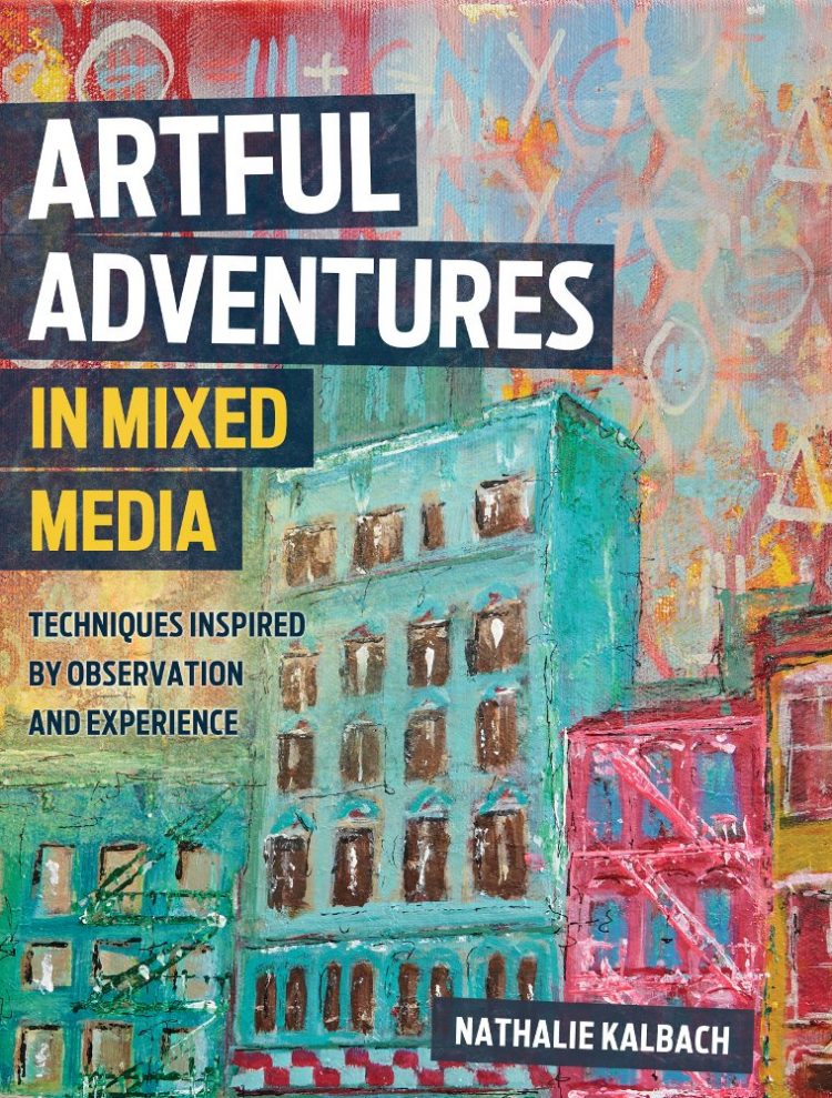
You can Pre-Order Artful Adventures in Mixed Media now

Comments (6)

  • JoAnn Campisi

    |

    My two favorite artists, side by side. What could be better. Loved the interview and the easy way with which you interact.

    Reply

    • nathalie-kalbach

      |

      So glad you enjoyed the interview, JoAnn – have a wonderful day!!!

      Reply

  • Nancy G.

    |

    What a great conversation.

    Reply

    • nathalie-kalbach

      |

      So glad you enjoyed it Nancy! have a wonderful start into the week!

      Reply

Leave a comment

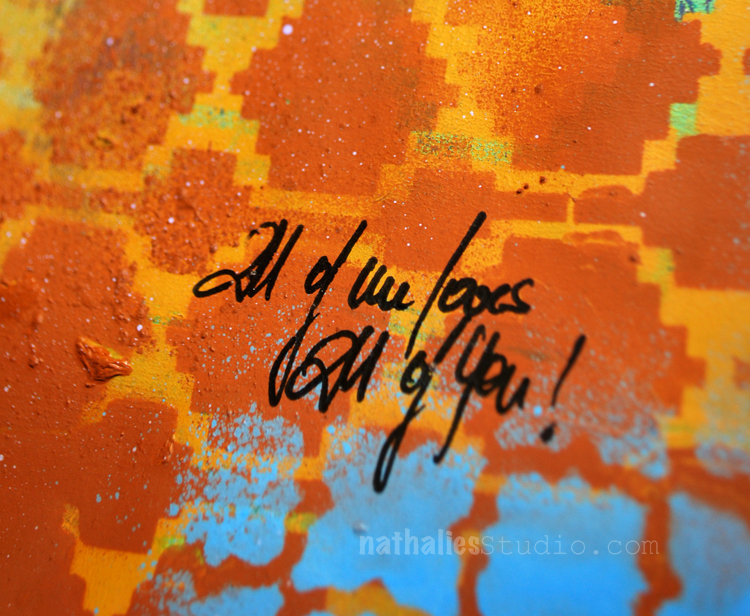
All of Me Loves All of You – Art Journal

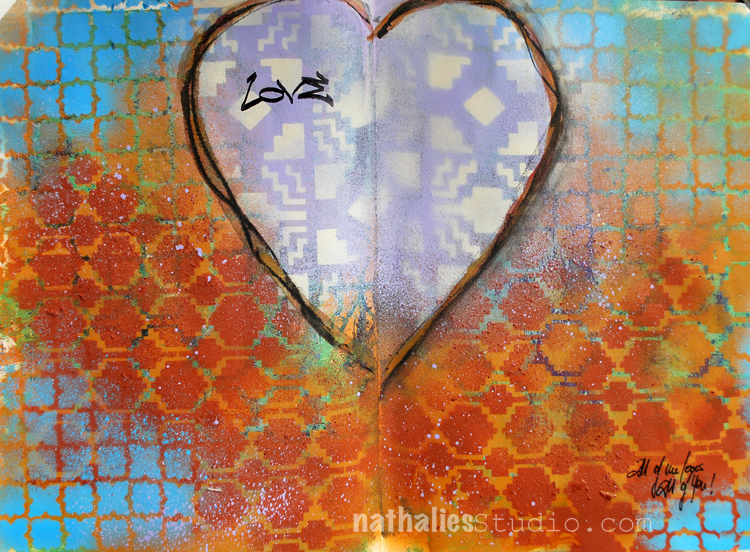
I guess I have spring feelings- LOL. I love this – “All of Me Loves All of You” .

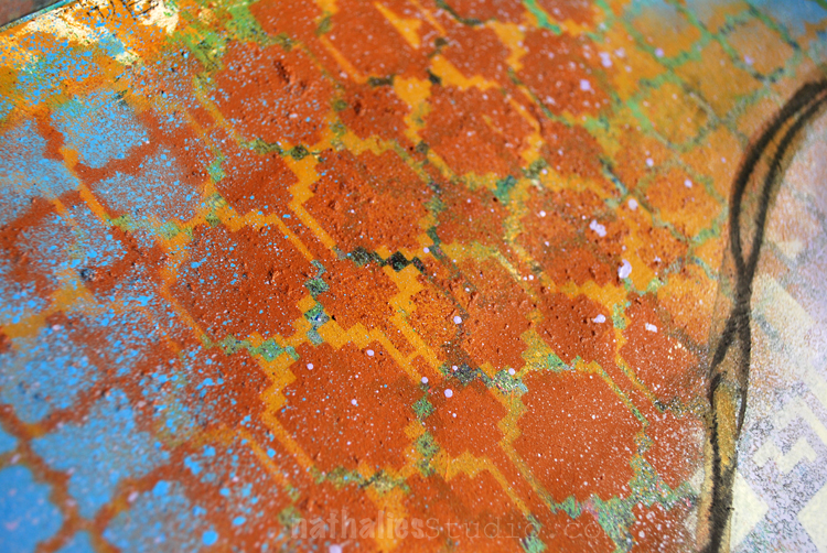
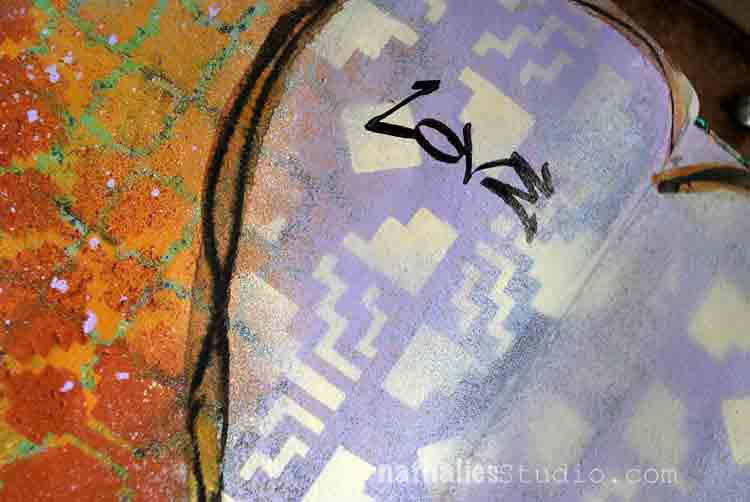
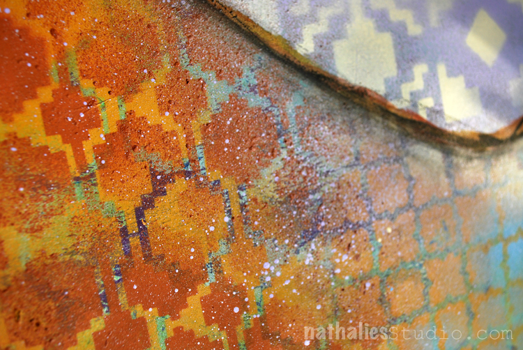
This was a quick but fun spread using different acrylic spray paints over three different stencils.

I like how the stencil pattern of Santa Fe, Granada and Mesa Verde look so good together – I want a blanket with this :)

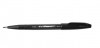
I added the journaling with a Fude pen and stamped with the Love Tag stamp into the heart.

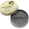
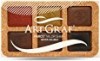
To define the heart a bit more I traced it with some Artgraf Pigments -dry and wet.

I think I found a new color combination I like :)

Here are some of the supplies I used for this spread- some links are affiliate links:


Comments (4)

  • Joi@RR

    |

    This page looks 3D. It seems to me like I am looking thru a screen and there are some lovely orange flowers and then the sky. The sky looks far away – 3D to me!!! Orange is my favorite color and that deep sky blue looks so yummy with it here. I REALLY am enjoying this journal creations Nat. Thanks bunches for your inspiration! Xj.

    Reply

    • nathalie-kalbach

      |

      Thank you Joi ! I love what you see in the artjournal spread! Have a gorgeous day Joi!

      Reply

  • Sue Clarke

    |

    I love my Fude pens and the color combo of rust and blue has been a fav of mine. I wouldn’t have thought to use the purple with it but I like it.

    Reply

    • nathalie-kalbach

      |

      sue, that is so true- it was a surprise for me too how much I liked the color combination. It is fun to sometimes try out new things – this is a good reminder for me :)

      Reply

Leave a comment

Stroll Through The Hood – March 2017

Time for a Stroll Through the Hood . Strolls through my hood get me out of my studio, they help me unstuck and often I get inspired by what I see and to get new ideas to create something.

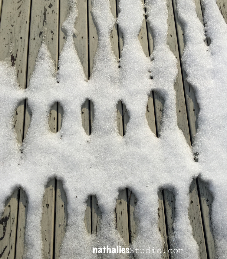
I loved the pattern and texture the melting snow created on our deck …I do not care for the snow so much though …I am glad when it is really spring weather again :)

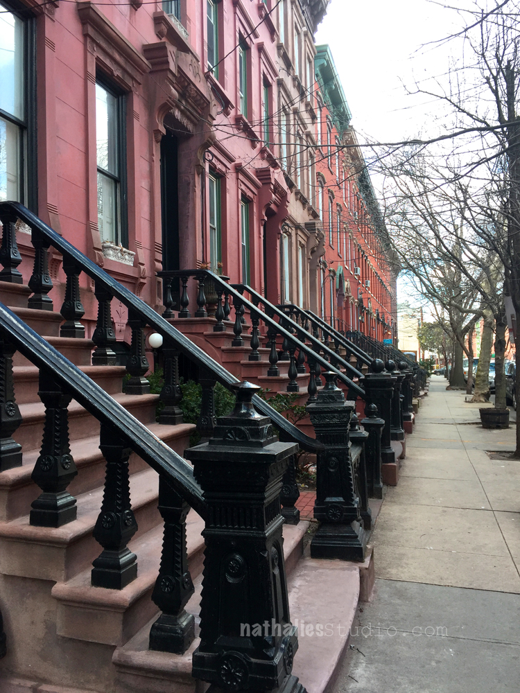
I love the row of brown stones on our street – the beautiful stairways and all those windows and differently colored stones – and soon the trees will be green too – wohoo

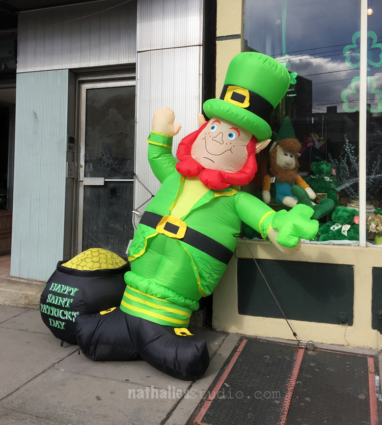
This made me laugh – I am not a big fan of those blow up figures – especially around the winter holidays (sorry!) and I was glad it was over…but nope- should have know there is one for St. Patrick’s Day too – LOL.

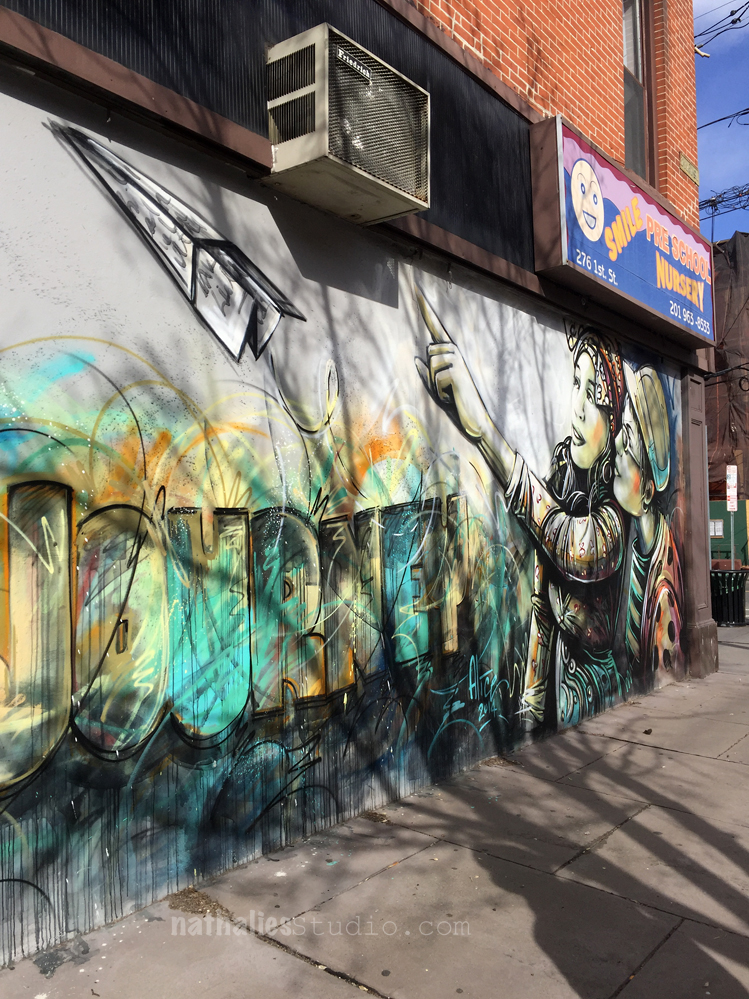
Loving this mural by Alice Pasquini – the colors but especially also the lettering!


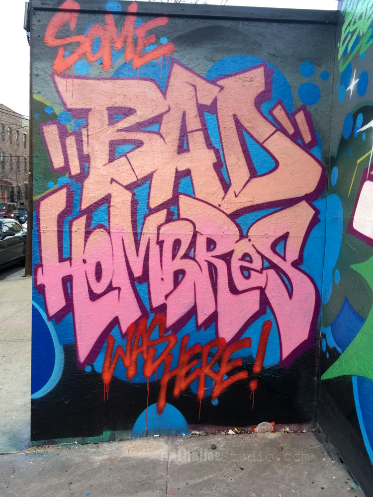
And this one on a construction fence made me laugh !

Cannot wait for warmer weather and more strolling around -it always help me get unstuck and get new ideas or process ideas :)

Have a beautiful day

Comments (6)

  • Sandi

    |

    Hi, Nat, love strolling with you. This month was wonderful. See ya next month on the hood

    Reply

    • nathalie-kalbach

      |

      Thanks for joining me Sandi :) See you next month in the hood ;)

      Reply

  • Joi@RR

    |

    I always love your walks almost BEST of all Nat. The brownstones are WONDERFUL. I see things like that sometimes on TV but seeing your photos just makes them really real. They are soooooo pretty. Love the black on the stairs. And the street art is just so amazing to me. You don’t see much of that around here at all… if ever. Loved this post – thank you! Xj.

    Reply

    • nathalie-kalbach

      |

      Awe- so glad you like the strolls Joi! Thank you for taking a walk with me :)

      Reply

  • Sue Clarke

    |

    I just love brownstones and take pics of them when we go into Boston.
    That snow pattern is pretty cool as well.
    I always enjoy your strolls.

    Reply

    • nathalie-kalbach

      |

      Thanks for strolling with me Sue! My big dream is to live in a Brownstone some day- but I guess I keep on dreaming for now ;)

      Reply

Leave a comment

Art Stroll: A Revolutionary Impulse – MoMA

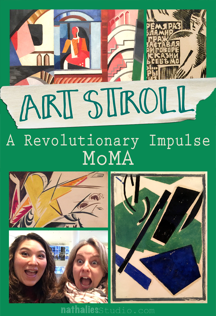
A couple weeks ago my friend Julie Fei -Fan Balzer was in town and we had an awesome day filled with good food, chats, laughter and of course…Art. We went to MoMA to see A Revolutionary Impulse – The Rise of the Russian Avant-Garde – a title that couldn’t make it in it’s entirety into my blog title- LOL.
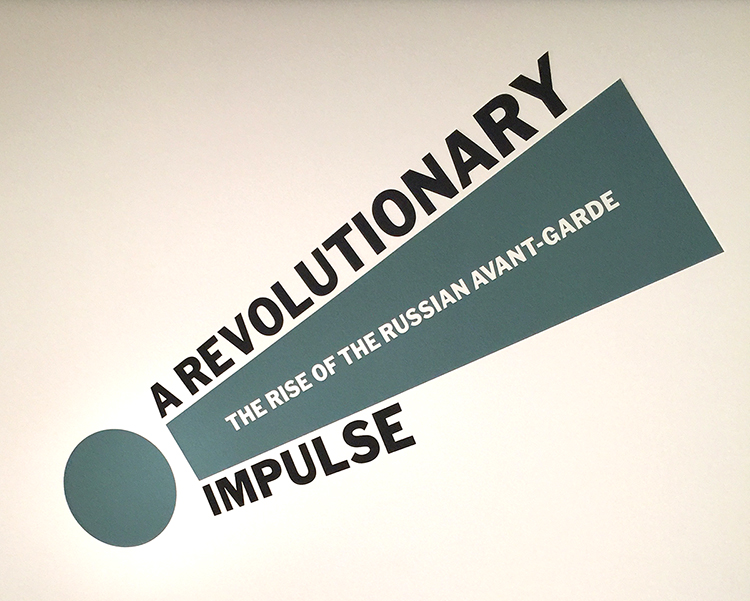
“During the early 1910’s under the tsarist autocracy (in Russia) that had ruled for three centuries, avant-garde artists sought to overthrow entrenched academic conventions by experimenting with complex ideas that would transform the course of modernist visual culture. In 1915 as World War I raged, an abstract mode of painting called Suprematism abandoned all concrete pictorial references….With the October Revolution of 1917, Lenin’s party took command. Avant-Garde artists put individual expression aside and developed a structured abstract language called Constructivism which they hoped could be embraced by the masses. Constructivists rejected easel painting in favor of practical objects like ceramics, posters and logos. …By the late 1920s, the government, now headed by Stalin, had placed restrictions on all aspects of life, including the arts, and was commissioning artists to produce propagandistic books, posters and magazines touting Soviet achievement….This exhibition spans the years 1912 to 1935…Conceived in response to changing socio-political and artistic conditions, these works probe the many ways and object can be revolutionary.” From MoMA’s wall text about the exhibition
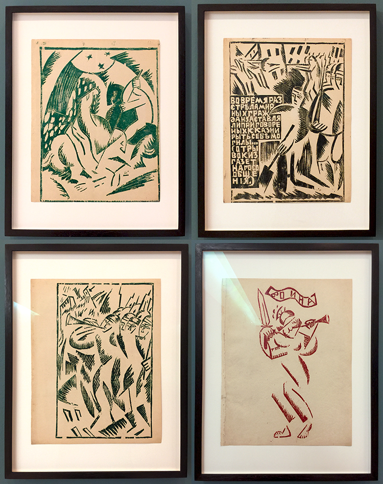
Olga Rozanova, War, 1916 – Linoleum cut illustrations out of a a book with ten illustrations.

The imagery for those lino-cuts is influenced by the abstracted forms of Cubism and Futurism but also by traditional Russian motifs. I was intrigued by the very simplistic way she created figures with crosshatching and just some hints of form here and there which your eye completes yourself as a person or else.
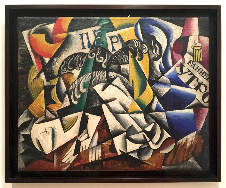
Lyubov Popova, 1914, Subject from a Dyer’s Shop – Oil on Canvas.

Note that Lyubov is another woman …
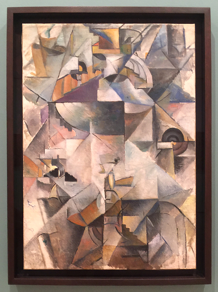
Kazimir Malevich, Samovar, 1913, Oil on Canvas. “A year later Malevich was painting cubes and lines and circles and balancing them in ways that had no relation to anything but geometry and the will to make something new. Malevich called his art “Suprematist,” hoping that it would have supremacy over forms found in nature.”
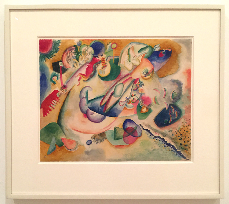
Vasily Kandinsky, Improvisation, c. 1915 – Watercolor and pencil on paper
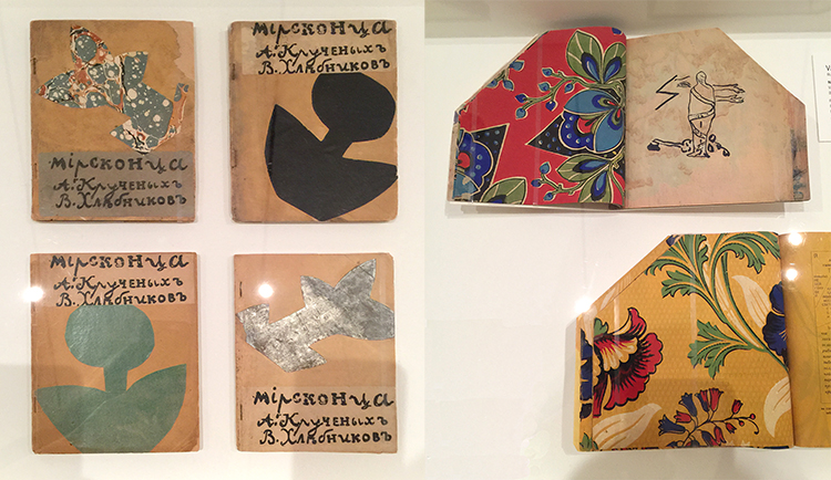
Various artist: Natalia Goncharova, Mikhail Larionov, Nikolai Rogovin, Vladimir Tatlin -Mirskontsa (Worldbackwards)-1912

These books were made with wall paper and I really love the shapes  too.
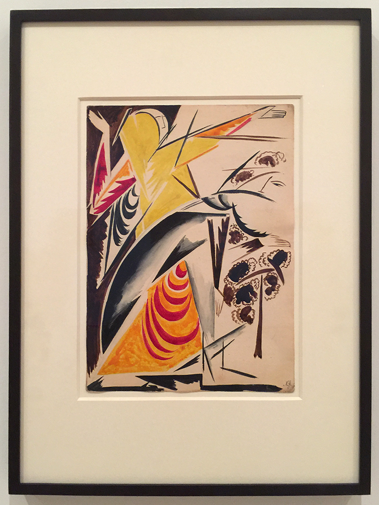
Natalia Goncharova Spanish Dancer –(c. 1914) . Isn’t this beautiful?

And then things changed…
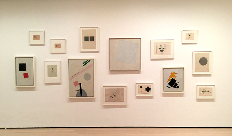


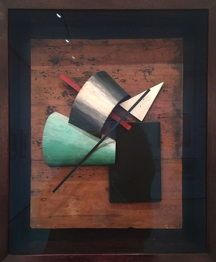
Jean Pougny, Suprematist Relief-Sculptures, 1920s – Painted wood, metal and cardboard, mounted on wood panel. I did love this one – I wish it wasn’t behind a glass
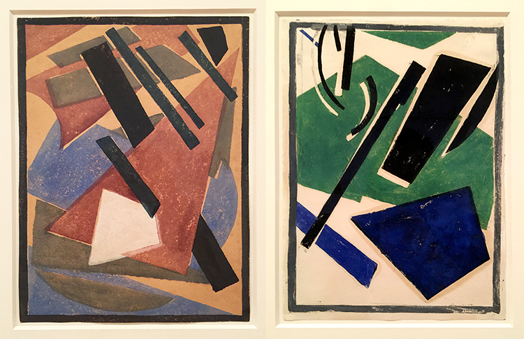
Lyubov Popova, Six Prints ca. 1917-19 – linoleum cuts with watercolor and gouache additions

A pioneer of the avant-garde, Popova developed a style in the late 1910s that combined floating forms inspired by Cubist collage and by Suprematism. She called this print series – there are four more- “painterly architectonics” . She wanted to depict layered shapes, so that they seem to be continually shifting and rotating.
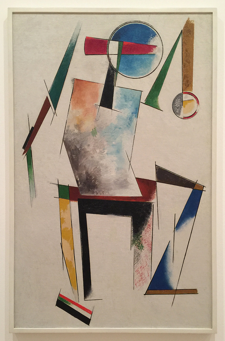
Varvara Stepanova, Figure, 1921 – This is in MoMA’s permanent collection and I always loved this one. BTW …another woman :)
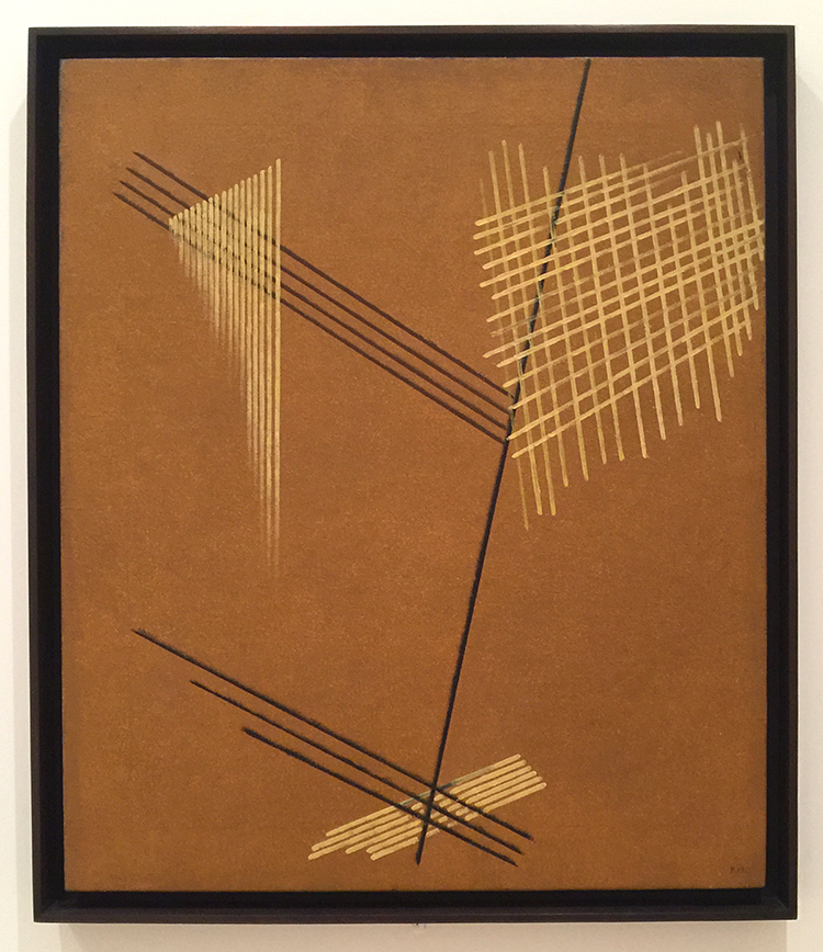
Aleksandr Rodchenko, Non-Objective-Painting 1919, Oil on Canvas


I love the crosshatching and the expanding lines.
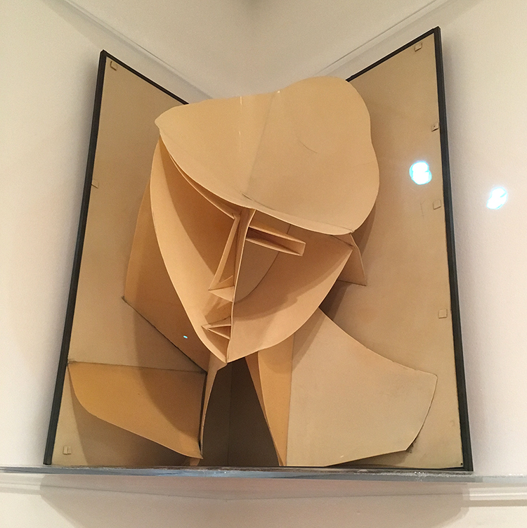
Naum Gabo, Head of a Woman, 1917-20 – Celluloid and Metal
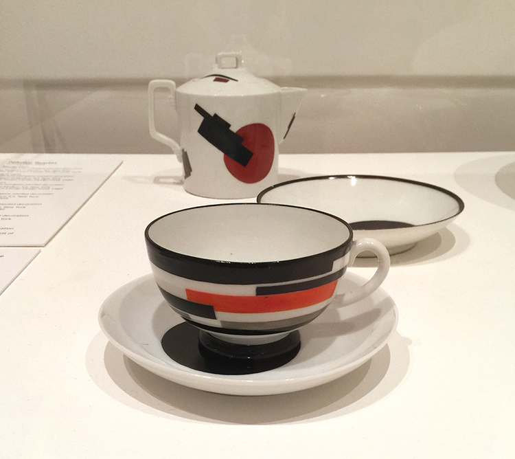
Nikolai Suetin – 1923

In 1917 the Bolsheviks seized control of the government and took over the State Porcelain Factory which used to manufacture porcelain for tsars in Petrograd (now St. Petersburg). Suetin a Suprematist artist was invited to make decorative designs for existing porcelain found in the factory. These ceramics, once meant for imperial tables, were now reimagined for the proletariat.

I would totally wanna have this set and use it – and I find it so interesting how the forms and shapes painted on canvas speak so much more to me on this tea set.
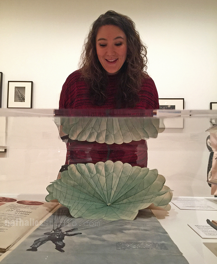
How cool is this pop-up parachute ? The reflection of it is also a bit funny – guess I made Julie a new outfit ;)
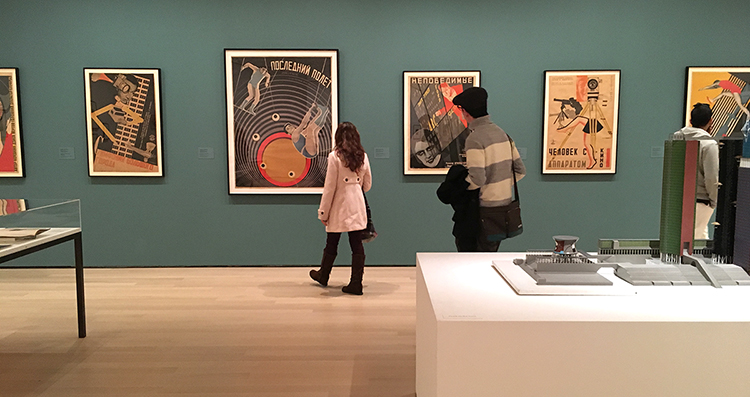
I enjoyed this exhibition. The most eye catching fact for me was just how many women were in this exhibition since modern women artists are very underrepresented at MoMA. I regret that the exhibition is coming to an end, as I feel there is so much about this that I didn’t quite grasp and I more or less just floated around in this exhibition with a semi knowledge of the political time the art was created in Russia and a lacking mind for the ideas behind Suprematism and Constructivism. But you know what…I will be ok …I was still inspired ;)

Comments (2)

  • Sue Clarke

    |

    That tea set is great and Julie’s new outfit is interesting. Glad to see that you two had fun with art again!

    Reply

Leave a comment

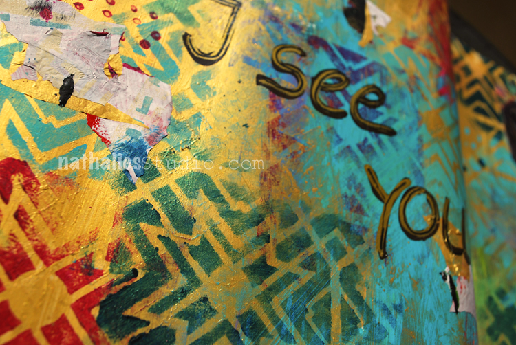
I see you … or SAWUBONA Art Journal

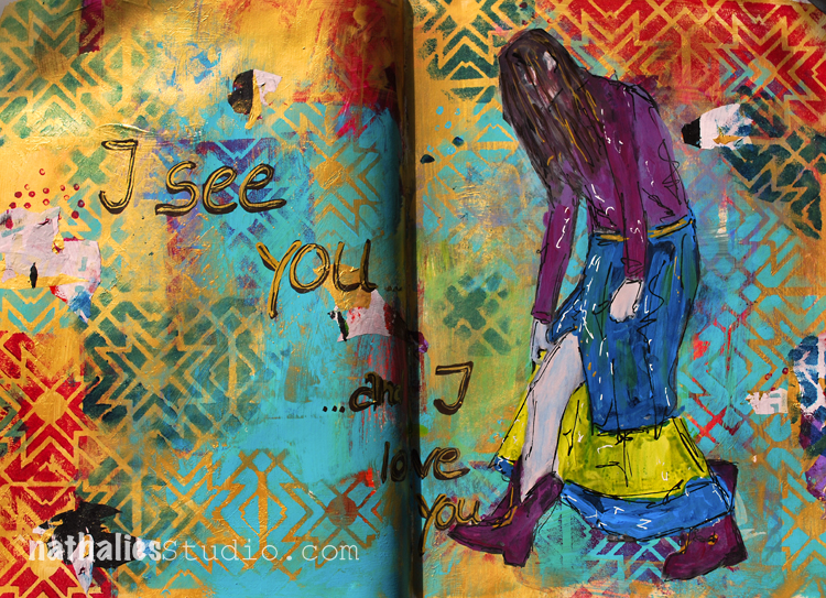
I see you …and I love you!

I recently learned that African Zulu has a greeting  “Sawubona” which means “I see you. It says, “I see your personality. I see your humanity. I see your dignity and respect.”

I feel strongly we need to learn to see and love people again and see their humanity even if they are different from us.

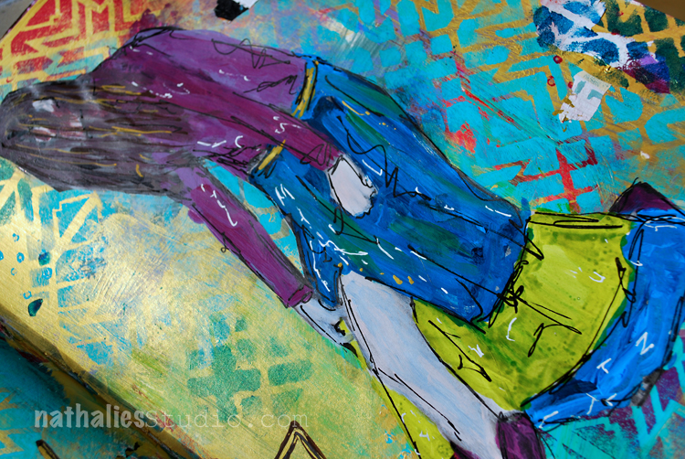
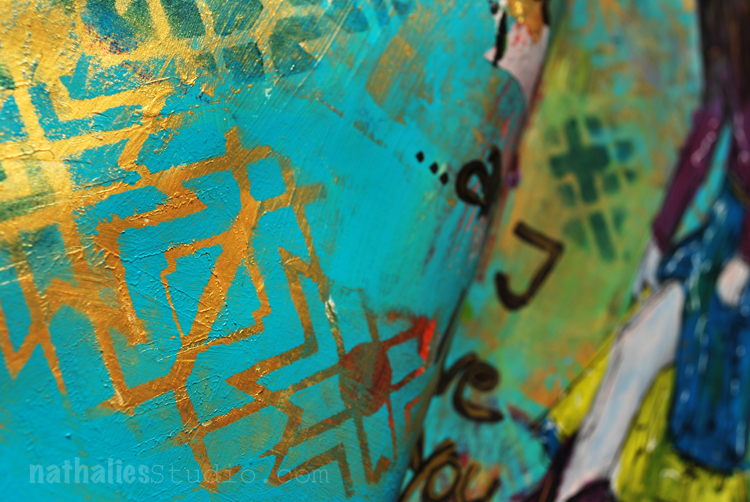
I played a bit with gold gesso and acrylic paint as well as with my Toledo Stencil.

I love how the teal paint looks on the gold – probably my favorite part of this spread :)

Guess I will have to do more of this combination – At first I didn’t care to much for the dark green and red with the gold in this spread but I can live with it…mhhh – I see it – and I love it ;)
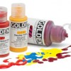
Here are some of the supplies I used for this spread – some links are affiliate links:


I wish you a gorgeous day!

Comments (4)

  • Sherri Scott

    |

    Nathalie, you have such a caring heart and spirit, no wonder you make such beautiful art

    Reply

    • nathalie-kalbach

      |

      Awe- Sherri, you are so sweet!!!! I hope I see you soon again!!! <3

      Reply

  • Sue Clarke

    |

    Love that greeting and how you used the gold Nat.

    Reply

    • nathalie-kalbach

      |

      thank you sue! have a wonderful rest of the week and stay warm – hope you didn’t get too much snow!!!

      Reply

Leave a comment

Art Journal Flip Through 3/2017

It’s been a while since I did an Art Journal Flip Through. I am keeping about 4-5 journals at the same time, sometimes I send one out to a publisher and then it takes a couple months before I get it back or I work in several at the same time – anyway- this one in the video started in late 2014 and I did the last page this March in 2017 and I think it is interesting to see how my style changed in one book.

Art Journal Flip Through 3/2017 from Nathalie Kalbach on Vimeo.

I am having a hard time with some of the pages in the beginning – thinking “oh boy” – which I guess is normal when you look at older work- LOL. But I also see some things thinking “oh, I should do this again” .

Hope you enjoyed this- have a gorgeous day!

Comments (6)

  • Joi@RR

    |

    Oh wow – I remember seeing some of those the first time!!! How fun was this??? FUN FUN FUN. Smiling Big. Thanks bunches for sharing Nat. Xj.

    Reply

    • nathalie-kalbach

      |

      Thank you Joi , it is fun to look back at those older page! Thank you for watching :)

      Reply

  • JoAnn Campisi

    |

    Thank you for sharing – wonderful art journaling.

    Reply

  • Rachel Greig

    |

    So inspiring Natalie! Thanks for the flip through!! Loved seeing all of your pages together like that. :)

    Reply

    • nathalie-kalbach

      |

      thank you so much Rach ! hope all is well in Australia :)

      Reply

Leave a comment

Mono Print Painting Fun

Next Thursday my sweet friend Birgit Koopsen is coming from the Netherlands and I cannot wait to see her. Besides some girlfriend time and sightseeing we are also teaching several workshops together, one is a Mono Print Painting class  at The Ink Pad in

NYC  on March 18th, based on a technique we came up with after we went to see the H.N. Werkman exhibtion when I visited her in the Netherlands.

I wanted to incorporate some of my class samples in an art journal and here are some samples of what I was doing last week.

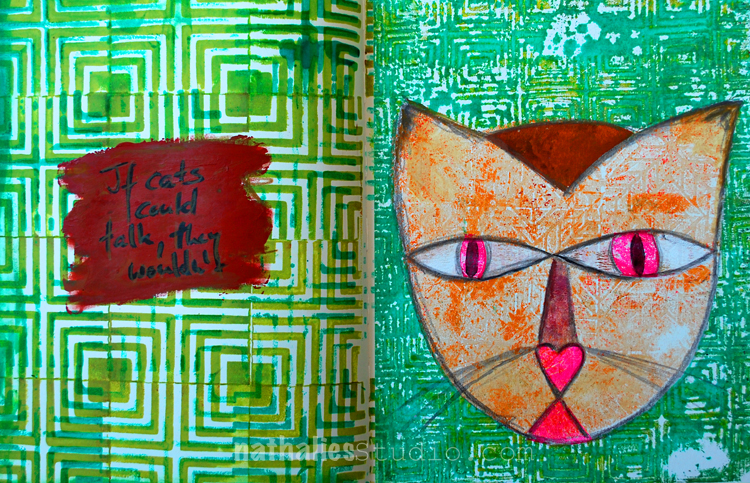
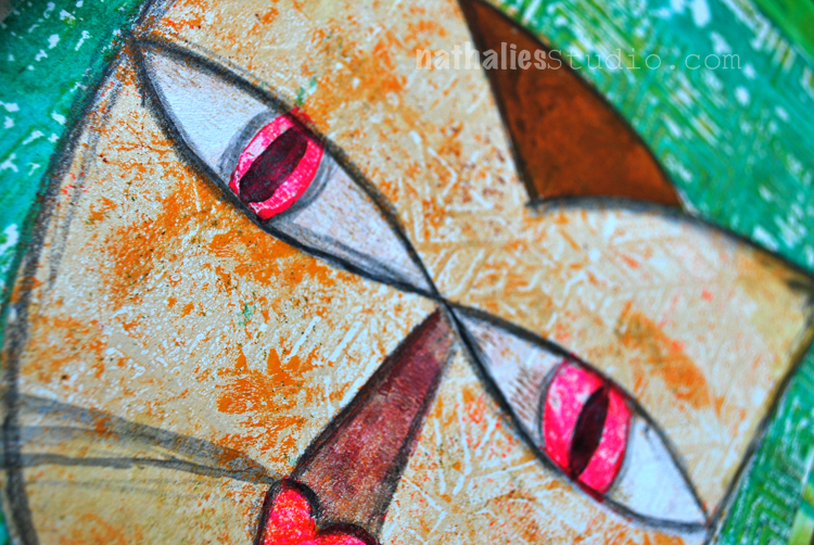
The cat below is of course inspired by Klee :) and I picked up the Manhattan Border pattern in the print on the lest side with the Manhattan Tile Stamp.

I am kind of liking the idea of incorporating the prints which you do not want to hang on a wall or else into the art journal …you see some really raw experimentation with this here :)

This is the stare in my face I wake up to in the morning …ah the joy of being a cat owner- LOL

This one was of inspired by Matisse – the left is the Mono Print Painting using the Versailles Stencil and on the right you can see the smaller pattern with one of the Versailles Foam Stamps.

It is really addicting to play with those Mono Print Paintings and Birgit and I have heaps of techniques to apply to them – and you get two teachers with different ideas on this :) There are still some seats left- so if you are in the NYC area- join us for this Mono Print Painting Class March 18th or the Artful Transfers Class March 19th …or even both (special price) !

Have a wonderful day

Comments (4)

  • stephanie

    |

    hope you have some of these techniques in your Artiscape classes too. :)

    Reply

    • nathalie-kalbach

      |

      I will teach loads of techniques on all of the classes there :) Looking forward seeing you – woohoo.

      Reply

  • Lisa Flaherty

    |

    Wow, wow, WOW!! This Mono Print Painting class looks Ah-maze-balls!!! If instantaneous travel were a thing, I would sooooo be there!! <3

    Reply

    • nathalie-kalbach

      |

      Awe- Lisa- it would be so awesome to have you!!! Have an amazing week!

      Reply

Leave a comment

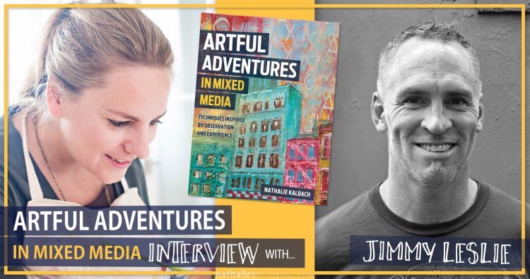
Artful Adventures in Mixed Media – Interview with Jimmy Leslie

Jimmy Leslie is part of my book Artful Adventures in Mixed Media and I am so super stoked about the artwork and thoughts he contributed, that I wanted to interview him a bit more in depth. Grab a seat and a cuppa , or listen to this extensive but super interesting conversation which I think you will enjoy. We are talking about things like

  • Does the world need art?
  • Thoughts on mentoring
  • Is art work?
  • Jimmy’s Sketchbook
  • Jimmy’s Artful Adventures
  • Why we should embrace WEIRD
  • Art is Problem Solving
  • Who is Lloyd? and
  • How we look at artwork

Artful Adventures in Mixed Media Interview with Jimmy Leslie from Nathalie Kalbach on Vimeo.

I hope you enjoyed the interview- let us know what you think about some of the topics.

You can find Jimmy and more of his artwork here:

nstudiowebsitesocialmediablognstudiowebsitesocialmediainstagramnstudiowebsitesocialmediablog

You can Pre-Order Artful Adventures in Mixed Media now


Comments (6)

  • Joi@RR

    |

    Thank you Nat. Super neat. So excited about your book :) Xj.

    Reply

  • Jackie

    |

    Loved the interview! I enjoy “getting to know the artist” videos. Thanks for sharing this with us…and look forward to more.

    Reply

    • nathalie-kalbach

      |

      yeah- so glad you enjoyed the interview Jackie! there are more coming soon :)

      Reply

  • kimnstudio

    |

    Loved listening to this – not only was it full of great tips on how to get inspired, it was just enjoyable to learn more about Jimmy and to hear his funny stories. If you’re in an art rut or just need some positive vibes, I recommend listening to this :) And a note for Jimmy: I would absolutely be interested in watching a video series about a cross country bike trip / sketching / laundry conserving / Artful Adventure so get your go pro’s ready for your summer trip!

    Reply

    • nathalie-kalbach

      |

      yeah- so glad you enjoyed the interview! I had so much fun and found it so interesting as well!

      Reply

Leave a comment