Art Journal

Inspired by Jean-Michel Basquait

InspiredbyBasquiat

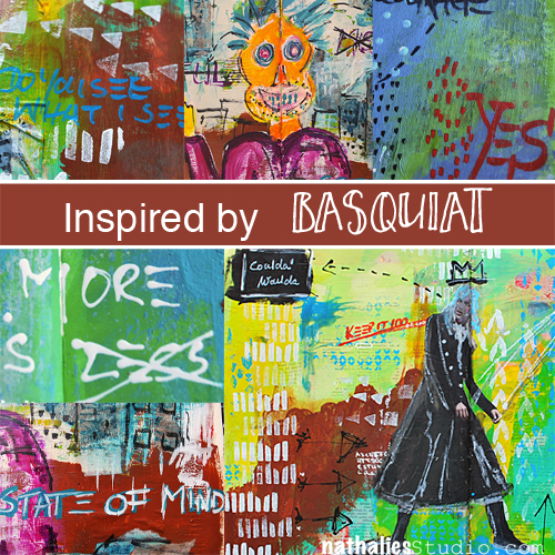
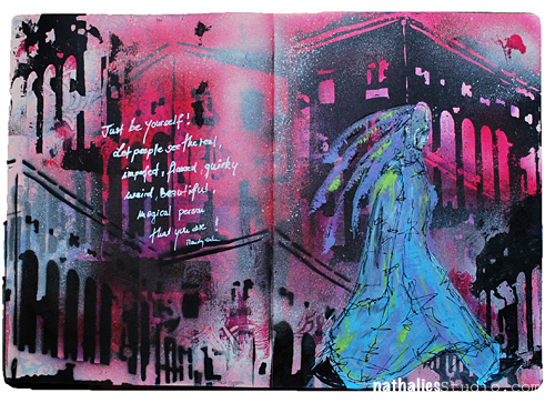
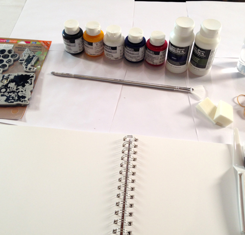
You might have read about my Art Stroll to the Basquiat: Unknown Notebooks Exhibition at the Brooklyn Museum. It was a very inspiring Art Stroll and so I started to try to implement some of Basquiat’s elements into my art journaling since I saw this substrate as the best fit for it.
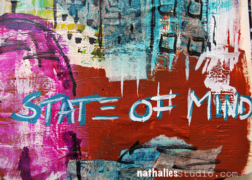
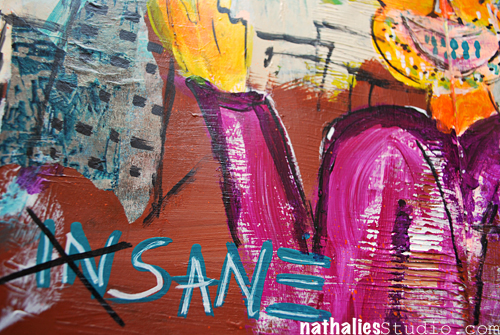
– State of Mind –

Kalbach_StateOfMind01

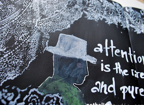
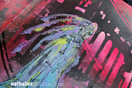
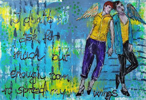
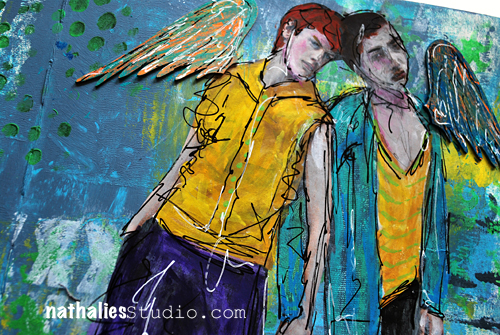
Prominent in his work is the use of figures or heads …something I usually not do and though this really turned out weird and hilarious- it made me laugh in a good way and I like it a LOT. And hey, anything that puts a smile later on your face was well worth doing it – so this wasn’t wasted time.

Kalbach_StateOfMind02

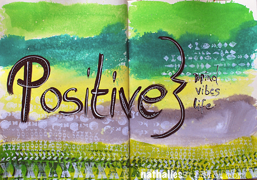
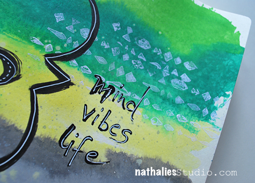
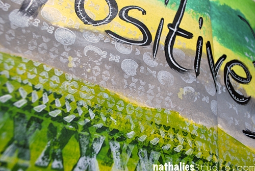
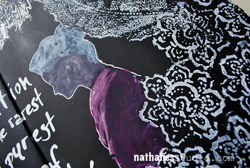
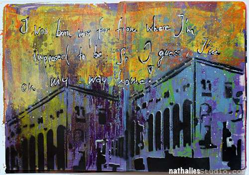
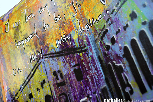
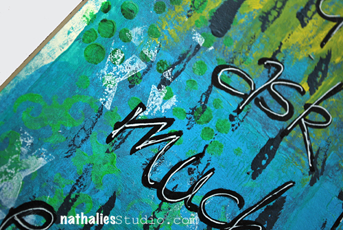
I also used Basquiat’s way of layering paint on top of drawn or written areas, highlighting or hiding elements.

Kalbach_StateOfMind03

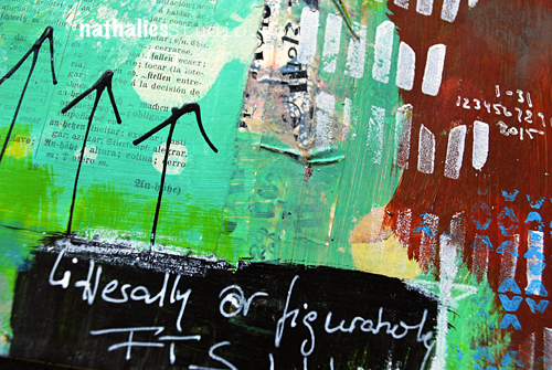
I was super intrigued by Basquiat’s way of writing the letter E with just three horizontal lines – I shamelessly copied that and love it a lot :)
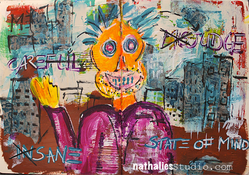
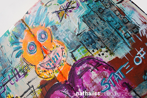
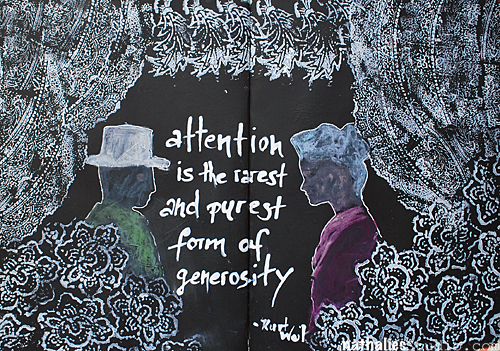
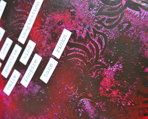
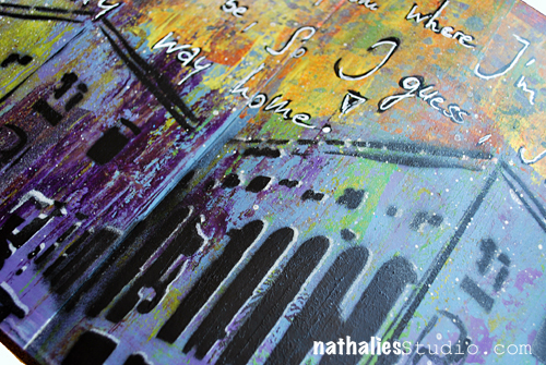
Kalbach_StateOfMind04

– Full Circle –

Kalbach_FullCircle01

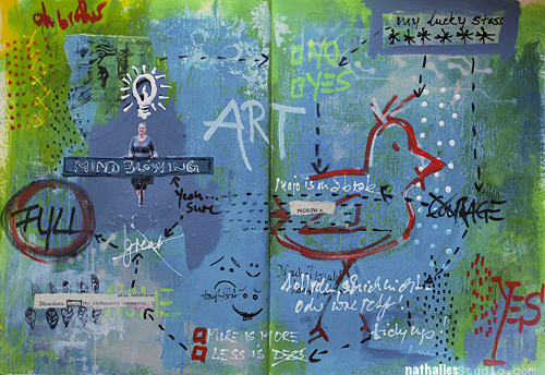
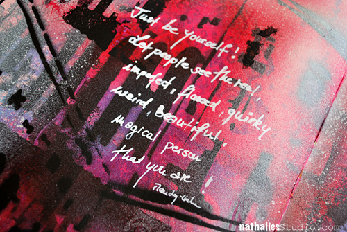
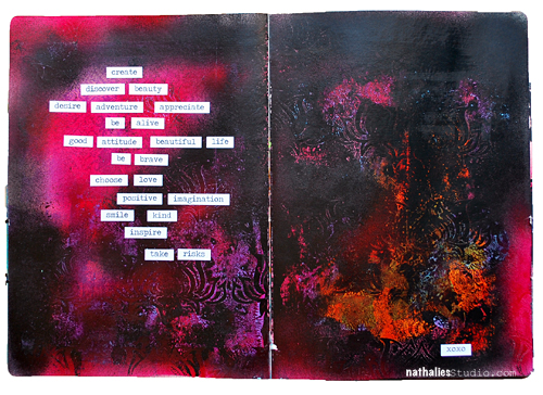
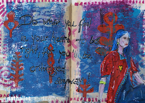
Then one day I was really really unmotivated and as we say in German “bocklos” which doesn’t translate well – but kind of means” not being in the mood for anything”.  I thought of Basquiat’s way of jotting down overheard conversations and/or thoughts and I used snippets of my thoughts while working on the spread. It was actually quite fun and freeing.


Kalbach_FullCircle03

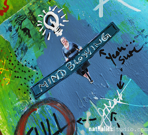
While this is not a spread that I find particularly beautiful – LOL -I can read this as a diary entry and it got me over my uninspired mood. I might do this more often and will gave this particular way of art journaling the name  “Visual Brain Farts” . No worries- I won’t share all my visual brain farts with you ;)
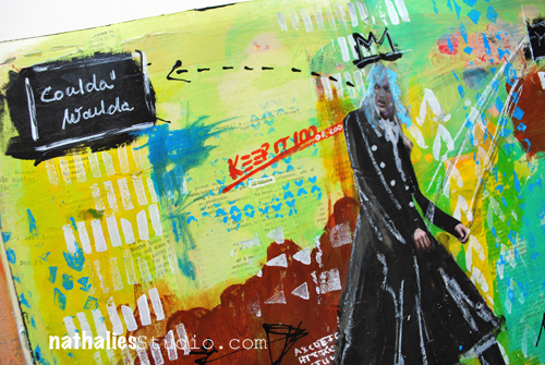
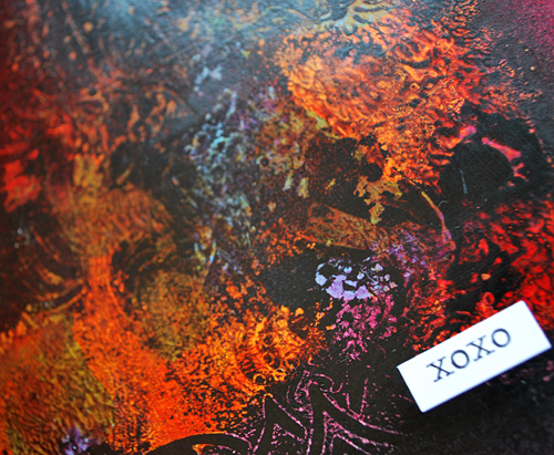
Kalbach_FullCircle04

– Coulda Woulda –

Kalbach_couldawoulda01

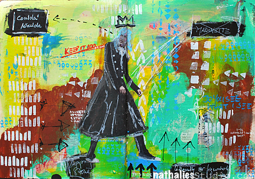
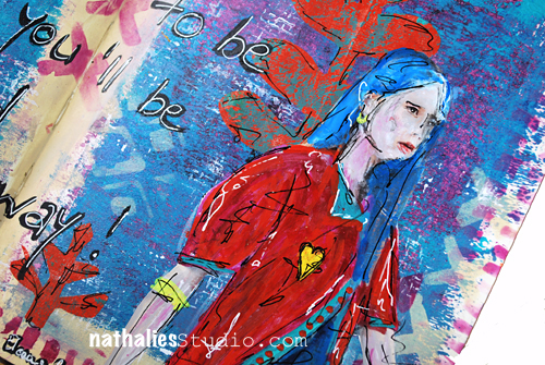
Ok …maybe I lied about not showing more visual brain farts ;) But I actually combined the thought-jotting with my usual art journaling style. And I like the outcome a lot.

Kalbach_couldawoulda02

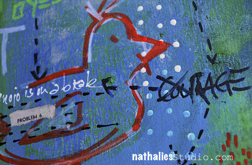
I also incorporated more collage elements as I saw with Basquiat’s work.

Kalbach_couldawoulda03

And repeated patterns and marks. And I might have “stolen” his signature crown.

Kalbach_couldawoulda04

I enjoyed this process – I was inspired by Jean-Michel Basquiat’s work and translated what inspired me into my own art work and I am keen on taking it further. I love how this rejuiced my Mojo!

Which artist do you think fits your style and could you take as an inspiration to get a new kickstart?

Comments (5)

  • padkins

    |

    I think this is one of my new favorites. I am loving the symbology and mark making. Thanks.

    Reply

  • florenceturnour

    |

    I like scary orange face guy. He looks maniacally happy.

    Reply

  • gloz

    |

    Okay, I looked and was a little scared! His work seems angry to me. I like the written areas, but not sure how I am going to handle the scary faces! But I will give it a try. I like many of the mixed media with warm and cool colors and text partially hidden multiple layers peaking through and I usually like things with a theme. I also like Western landscape paintings by current artists Lorenzo Chavez and Frank Serrano.

    Reply

  • Terisa

    |

    Impressionism – Van Gogh, Manet, Monet, Cezanne
    Natural settings, brilliant colors, purposeful brush strokes

    Reply

Leave a comment

Positive Everything or … In My Art Journal Today

Natkalbach_Positive01

Positive Mind, positive vibes, positive life

Truth!

Natkalbach_Positive02

I used Liquitex acrylic inks for the background. In order to make sure that the ink can be blended a bit longer and also does not create big blobs where ever you apply them first, I usually mist the background with some water.

Natkalbach_Positive03

I used my Mark Maker Stampset by Stampendous with soft body paints to create some patterns and tie the different colors together. I love the textured and dimensional look those stamps get when used with acrylic paint.

Here are the supplies:

nSupplies


Do you own any of my stamps? Share what you created with them – I would love to see!!!

Comments (4)

  • susan salyer

    |

    I am loving all the products you all carry. I love journals far more than cards and now I will have to try new products and stamps..I just love this hop!

    Reply

  • Autumn

    |

    Such amazing texture, love the white on this colorful background!

    Reply

  • D.Ann C

    |

    Truth, indeed! Fab colors!! Coming here from FL via Stampendous : )

    Reply

  • Denise Spillane

    |

    Love this page. I am a green/teals gilt and I want to pet it. Hee hee. And of course positive is always good.

    Reply

Leave a comment

Attention or… In My Art Journal Today

NatKalbach_Attention01

Attention is the rarest and purest form of generosity – Kurt Weil

NatKalbach_Attention02

The page spread I used for this, was covered with different colors and and some collage from a class demo and I wasn’t super keen on keeping it, so I covered the page up with black gesso, giving it a nice smooth black coating. Then I pulled out my Stampendous n*Studio Fiesta stamp set and a white Ink pad and created some pattern repeatedly stamping each individual stamp in clusters – kind of forming a drop curtain.

NatKalbach_Attention03

I also used the stencils and mask included in the stamp set and outlined the man and woman silhouette with a white Signo pen, then added some color with Derwent Artbars inside and blended the colors with a waterbrush. I love the effect of the Artbars (water-soluble wax bars) on top of the black gesso. For the quote I simply dipped my bamboo sketching pen into white acrylic Ink and kept writing.

It was fun – and I love how the white pops off the black and I had lot’s of fun using the stamps in this way.

Here is a supply list

nSupplies


Are you doing lot’s black and white themed art journal pages? I feel drawn to it although I am a total color gig ;)

Comments (1)

  • Joi@RR

    |

    This is a WONDERFUL new take with your FIESTA stamp set Nat. Love how you made them look like curtains around the folks. It looks like they are inside their living room chatting with a planter of flowers under their window!!!! The FIESTA set is my fav so this was a great way to start my morning with it and you! Hugs. j.

    Reply

Leave a comment

The Real Weird Magical Person … Or In My Art Journal Today

NatKalbach_justbeyourself01

Just be yourself! Let people see the real, imperfect, flawed, quirky, weird, beautiful, magical person that you are!

YES!

NatKalbach_justbeyourself02

I used some smaller stenciling and paints in the background – leaving a lot of white space. Then I took the building stencil I made and used in my Art Journal spread last week again – this time playing with the negative and positive usage. I brushed some magenta acrylic ink over the spray painted areas as this always sets it off so nice.

NatKalbach_justbeyourself03

For the journaling I use a fine line pen and filled it with white acrylic ink.

Very grungy spread but also happy- and I might fall more and more in love with the building stencil :)

nSupplies


Comments (2)

  • Joi@RR

    |

    Easier said than done! Great message and what a SUPER journal page Nat. Love the “architecture” in the background – looks so good with the colors you chose. The quirky person in the front is perfect. Really special creation…. soooo inspiring. j.

    Reply

    • nathalie-kalbach

      |

      True – it is easier said than done- but hey…we keep trying ;) Thank you!

      Reply

Leave a comment

XOXO … or …In My Art Journal Today

NatKalbach_XOXO01

create, discover beauty, desire adventure, appreciate, be alive, good attitude, beautiful life, be brave, choose love, positive imagination, smile, kind, inspire, take risks !

XOXO

NatKalbach_XOXO02

I used one of my favorite quick texture techniques for the background. I painted the background with different Soft Body paints, let it dry, and then used Liquitex Spray Paint over it in black and magenta. Using my Lilly Wallpaper Stencil I pressed into the still wet spray paint and lifted the stencil off right away – sometimes I just pressed the stencil down, sometimes I moved it a bit. The pressing and lifting actually lifts off the spray paint under the Spray Paint creating a gorgeous stencil effect revealing the background again (picture above). The pressing and moving creates a wonderful marbled effect (picture below).

NatKalbach_XOXO03

I used some Tim Holtz Ranger Stickers (supplies in detail below) and since they wouldn’t stick for a long time on the acrylic painted background I applied some Matte Medium underneath and on top the sticker area.

Here are the supplies I used

nSupplies


Have a beautiful day!

Comments (3)

  • Sue Clarke

    |

    LOVE the colors and the texture.
    I’ve been playing around more with paints these days in my art journal.

    Reply

  • Joi@RR

    |

    I can always count on you Nat for some new teachings!! Wow – this is soooo fun. Your background is FABULOUS… you did it so wonderfully. Ok – going to read this again…. love it. Thanks bunches… happy weekend. j.

    Reply

    • nathalie-kalbach

      |

      Glad you like it Joi – hope you will give it a try- it is really fun! <3

      Reply

Leave a comment

On My Way Home or… In My Art Journal Today

NatKalbach_OnMyWayHome01

I was born very far from where I’m supposed to be, so I guess, I ‘m on my way home!

NatKalbach_OnMyWayHome02

For this art journal spread I had created a grungy background with acrylic paints – using different shades and tints of purple and some accents of green and yellow. I had created a building stencil out of a sheet of Grafix Dura-Lar and sprayed first with white and then a bit offset with black spray paint through it to create a little white border and some dimension.

NatKalbach_OnMyWayHome03

I then changed the top of the page picking up the green and yellow and adding some more grunge to it. I like how it turned out – I think I might be obsessed again with building stencils ;) For the journaling I used a Liquitex Marker and then traced it with a white Signo pen.

nSupplies


Comments (2)

  • Joi@RR

    |

    Your building artwork has always been my favorites Nat. You are the only person I have ever seen that can make a building look incredible – colorful, interesting, alluring, even mysterious. LOVE LOVE LOVE this… the colors are incredible and WOW – the building is totally FABULOUS. j.

    Reply

Leave a comment

I don’t ask for much but …or … in My Art Journal Today

NatKalbach_Spread01

“I don’t ask for much but enough room to spread my wings” – I love this – and isn’t that the truth as an artist and as a person – all you need is room to spread your wings.

NatKalbach_Spread02

While thinking of the quote, I painted the background loosely with soft body paints:  paynes grey, brilliant blue and yellow azo and then stenciled with green permanent using the What’s the point and Ornamental stencil.

NatKalbach_Spread03

Stamping in white was done with a pigment ink pad -loved how it popped off the page. I should have heat set the stamped images though as it took forever to dry on the acrylic paint and I smeared it accidentally when adding the images. Markers were used on the images. The wings are chipboard wings which I found in one of my drawers …I have to use up some of my chipboard- I hoarded a lot of chipboard shapes thinking one day I will have the best opportunity to use it – hey but the best opportunity is now ;)

Here is a list of what I used

nSupplies


Comments (4)

  • Joi@RR

    |

    Definitely a unique one! The background is super – so YOU – Nat. Your sentiment made me “think”!!! I like it. It never took much room for me to spread my wings… but I know folks that take lots of room! Somehow I put you in that category Nat. You are so talented and have so much to give in so many different ways… I’m hoping you have an abundance of room to “fly high” when you need it! j.

    Reply

    • nathalie-kalbach

      |

      Awe – thank you Joi! I think we all need space to fly – gladly enough I am surrounded by wonderful people in my live- including my blog readers- that give me loads of space to fly- thank you:) Nat

      Reply

  • JackieP Neal

    |

    way cool Nat! I always dig your palettes!! hugs “)

    Reply

Leave a comment

Criticized Anyway or …In My Art Journal Today

Critizied01_NatKalbach

Do what you feel in your heart to be right, for you’ll be criticized anyway! – Eleanor Roosevelt

Critizied02_NatKalbach

This resonates with me right now a lot. Very quick spread – I brayered the colors on then stamped and stenciled using my Batik Stencil and Wired Stamp Set.

Critizied03_NatKalbach

I cut out some shapes out of deli paper that I had used to print off access paint on the Printing Plate. I love deli paper as it makes for wonderful collage elements.

Now that I am back for a while and cut back on traveling for the second half of 2015, I cannot wait to dive into creating more – I missed my studio :)

What are you working on right now?

nSupplies


Comments (4)

  • Joi@RR

    |

    YEAH – it will be fun to see you create more Nat. I’m excited. But… I did love traveling “with” you too. Love this page – and the fact that you did it fast is encouraging! Great quote and so true. Glad you are safely back home. Hugs j.

    Reply

    • nathalie-kalbach

      |

      thank you Joi :) No worries- LOL- the next travels are being cooked up…but for now I am happy at home. What a beautiful summer this is!

      Reply

  • Kathy P

    |

    A truer quote never spoken! Great page! And I agree, while it is great fun to travel, the sweetness of it comes when returning home! Enjoy the rest of your summer, Nat!

    Reply

    • nathalie-kalbach

      |

      Thank you Kathy! Hope you are enjoying your summer too!!!

      Reply

Leave a comment

Photos of the Art Journaling Live 2015 Event

AJL_Banner_300x250

Exactly 48 hours after I landed in Newark after my trip to Europe, I was back at the airport to head out to Arlington, Texas for the Create Art Journaling Live 2015 Event. After a mayor delay  and a pretty insane flight – which I add to my “gotta great travel story to tell ” repertoire I arrived late in Dallas. As I had a dinner date with my sweet friend Julie and Margaret and Jackie, I went by taxi right to the restaurant from the airport. Only…due to a major miscommunication, I went to the wrong restaurant in Plano and not in Dallas. Which left me alone and pretty much throwing a pitty party for myself and exhausted on a parking lot in the middle of nowhere in Texas. But good friends don’t let you hanging and so Julie, Margaret and Jackie drove to get me. In the end my very first huge pile of Smoked Texan BBQ Ribs and a good drink as well as lots of laughter made me feel as if the world was still awesome ;) Thank you girls <3

The next morning the event took place – and Julie Fei-Fan Balzer, Dina Wakely, Mary Beth Shaw and I taught some fun Art Journaling Techniques.

Natkalbach_AJL01

We had 75 students and it was so much fun to see so many familiar faces in the round. Thank you for coming – that was awesome!

Natkalbach_AJL02

The classes and the students were video graphed during the day and in a couple months you can actually purchase the whole event as a class DVD. I will keep you posted.

Natkalbach_AJL03

As you can see we were sitting a bit on a high podest (here is Dina in action) – which was a bit awkward since we couldn’t walk around or move much- and if you know me I am usually bouncing around like a rubber ball  in my classes. But it was the way it needed to be for the filming. The students could see everything on a big screen and followed along and it was fun to see what they are doing too.

Natkalbach_AJL04

We other teachers sat in the back of the room playing around in our journals.

Natkalbach_AJL05

Here are Jackie and Margaret and Katie all named Margaret on their tags- which made me laugh big time! So wonderful to meet them!

Natkalbach_AJL06

As I said it was awesome to see many familiar faces too – makes me always super happy!

Natkalbach_AJL07

Here I am on my “throne” – I was really nervous before the whole thing, I have never taught such a big class and on top being on camera too – but then I forgot the cameras and kept on going …and melting…as you can see the huge light.

Natkalbach_AJL08


Natkalbach_AJL09

And below is the reason why I never do manicure. I believe those hands looked good about 2 minutes on camera

Natkalbach_AJL11

And here are the four of us after the event!

Natkalbach_AJL10

That was fun! Thank you to all of our students,  Cloth Paper Scissors for having us and the fun video team. Thank you also to Liquitex for sponsoring the huge amount of acrylic media in the class kits and to Stampendous for sponsoring one of my stamp sets for the students!  I will keep you posted on the release of the DVD/Download :)

Have a gorgeous day

Comments (6)

  • Susan Schultheis

    |

    WOW! 4 of my fave artists. Maybe one day you will have your Art Journaling Live a little closer to Maryland?? I sure it was a fantastic everything.

    Reply

    • nathalie-kalbach

      |

      That would be cool Susan. I would love to come to Maryland. Who knows :)

      Reply

  • Joi@RR

    |

    Welcome Home Nat! Dear me… you are off and running again fast! This was fun to see – although I hate to think of you alone in Texas at the wrong restaurant – ugh. Glad you were rescued :) You look GREAT on your throne!!!! Love the last picture of the four of you together – great smiles!! Looks like it was a great success. REST…. if you can! j.

    Reply

    • nathalie-kalbach

      |

      LOL- thank you Joi- yep I am glad I got “rescued” ;) I did rest a bit after the event – and I am fully energized but a bit lazy now ;)

      Reply

  • Denise Spillane

    |

    I can confirm that this was a fun and fabulous event! I would do it again in a minute! The only thing better would be two days so we could have more time withe each of you!

    Reply

    • nathalie-kalbach

      |

      Denise, thank you so much for coming! It was so good to see you and I agree- a two day event would be fab!

      Reply

Leave a comment