Nat

Hello my friends and welcome to a post from new Creative Squad member Josefine Fouarge! Josefine brings us a gorgeous art journal page that shows off how well complimentary colors play together. She also rocks my new Central Avenue Positive Negative foam stamp set and this month’s theme: Colors Are My Friends – Let’s kick off the new Creative Squad with a celebration of color! What are your favorite, go-to signature hues? Let’s go bold and bright this month and use color to ring in a new season of inspiring projects!
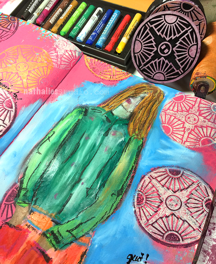
Colors are my friends, definitely! My favorite one depends on my mood, but usually I tend to pick orange or green tones. Today I wanted to use my favorite color combination though, which is orange and blue. These are complimentary colors, which means they naturally work well together.
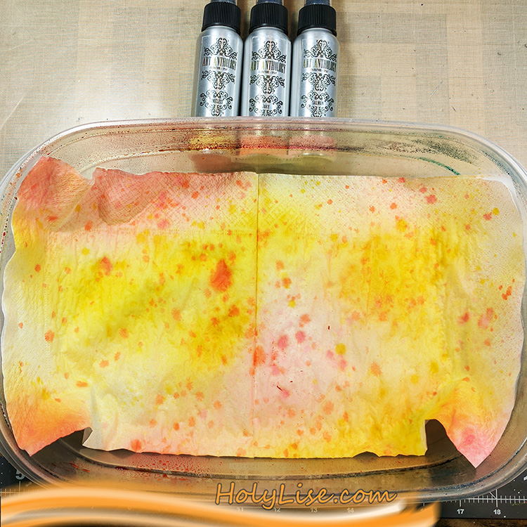
Since today I have something with flowers in my head, I wanted to use the new circle foam stamps to create a flower in my art journal. I started by spraying some color onto a few napkins and letting them dry for a few minutes.
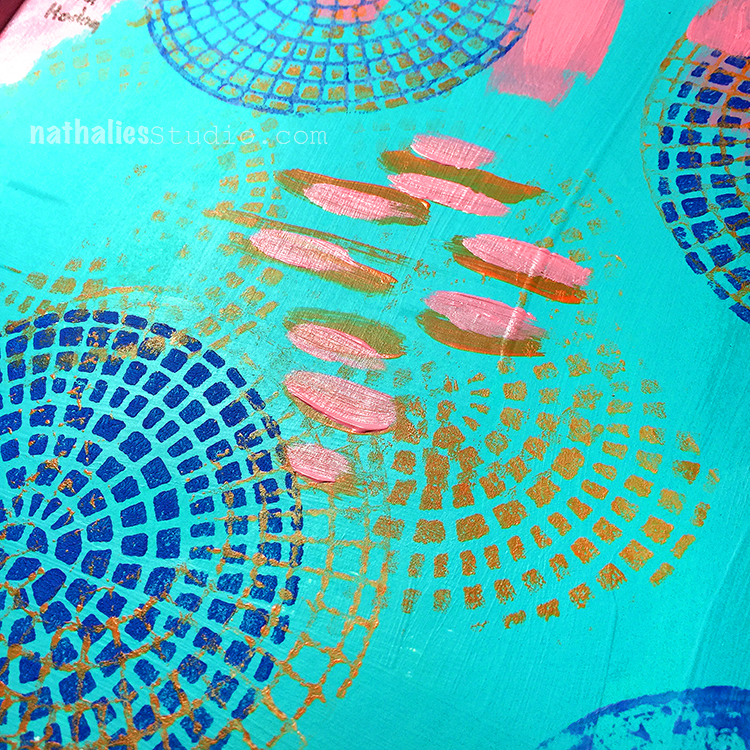
While I was waiting for the napkins to dry, I worked on the background of my art journal page. I started with the focal point, so I stamped the outline of the Central Avenue stamp using Versamark ink and heat embossed it using bright orange embossing powder. Then I stamped the inside of the stamp also with Versamark ink and heat embossed it with a gold embossing powder.
This stamp is rather easy to align, even though it’s a round shape. You can see where the main line goes through the middle and you just need to ensure that the little squares of the negative stamp match the squares on the paper. If you look at the stamp from the side while trying to position it on the paper, you’ll know what I mean.
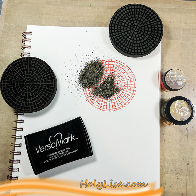
After heat setting the focal point, I chose a turquoise acrylic paint and mixed it with some white to make it even lighter. After adding the paint to the foam stamp using a brayer, I stamped the outline to the left and right of my focal point. Next, I stamped the inside in a row below and above the first row and switched again for the next row – and so on till the paper was full of circles.
Now I outlined the page with a black acrylic pen and scribbled following poem around it, as messy as I could:
To see the world in a grain of sand
and heaven in a wildflower,
hold infinity in the palm of your hand
and eternity in an hour.
-William Blake-
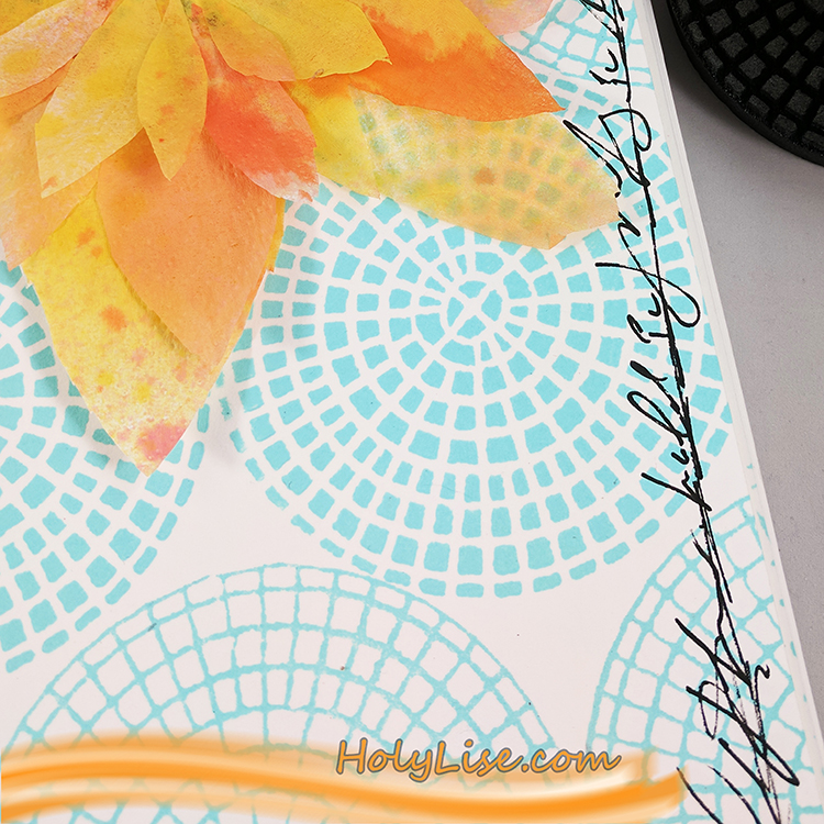
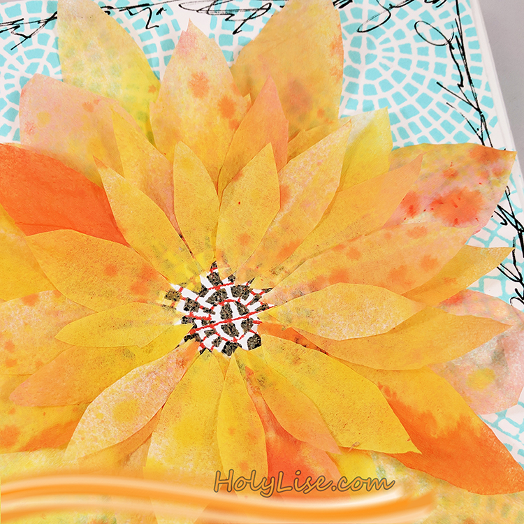
To finish up my flower, I cut several petals from my napkin and adhered them carefully around the focal point circle.
If you look closely, you’ll see that I adhered just one layer of the napkin to the page, so the embossing powder shimmers through the paper.
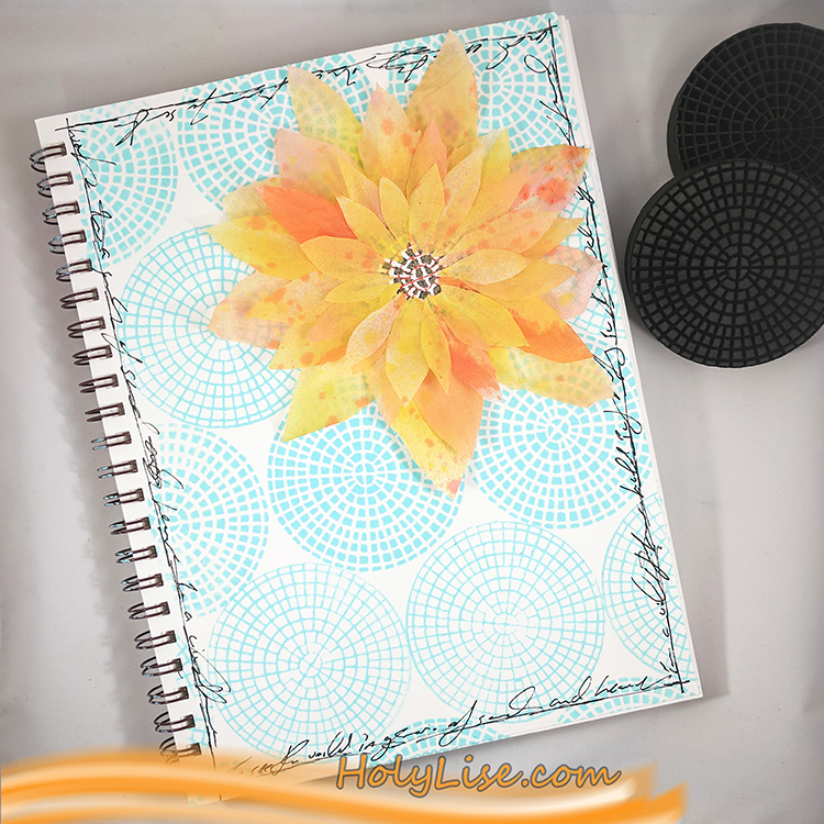
Here is the entire page. I just love the contrast of orange and blue and can’t get enough of it! Yummy!
Thank you Josefine for such a lovely page and for sharing the poem too! In addition to her art journal and some paper napkins and glue, Josefine used the following supplies (some are affiliate links):

Play along with us too: I love to see how you interpret our monthly themes. Email me how you used my stencils and stamps with the theme and email me an image – I would love to share your projects in my next “n*Spiration From Around the Globe“.
Gorgeous color choice of light blue and peach/yellow!
Thanks for sharing your art Josefine.
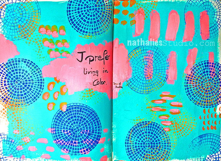
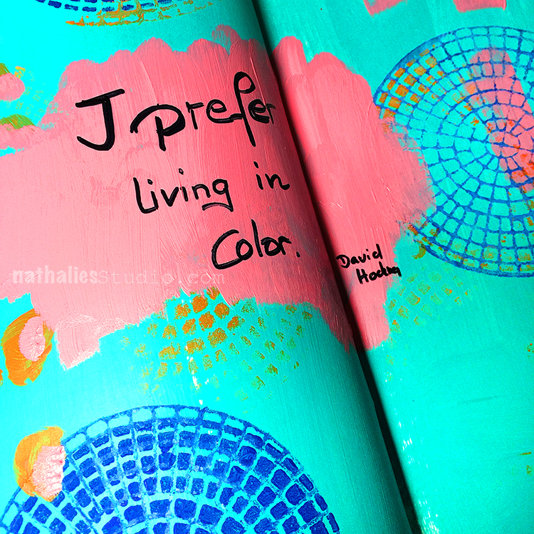
“I prefer living in color” – me too David Hockney- me too. I do love Hockney’s use of colors and I was going for it in this art journal spread
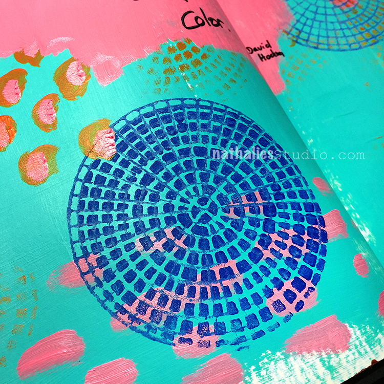
I used my brand new Central Avenue Pos+Neg. ArtFoamies . It comes with two designs- are bold one and a more fine lined one.
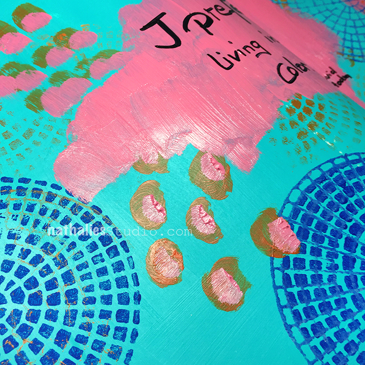
I love using the paint on top of the stamp also only partly to get some areas more lightly as a hint of the stamps
This was fun and an easy creative boost in the morning.
Here are the supplies:
Wishing you a wonderful colorful day !
Happy Saturday to you and a little happy thought from me :) For more inspiration, check out my book Artful Adventures in Mixed Media.
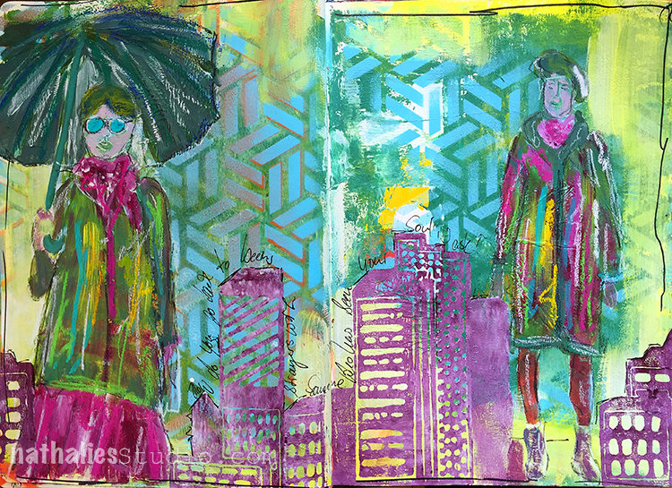
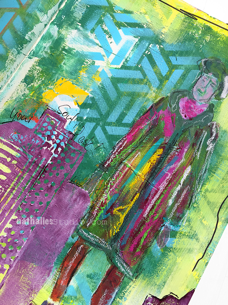
“How do you get back to being strangers with someone who has seen your soul I ask?”
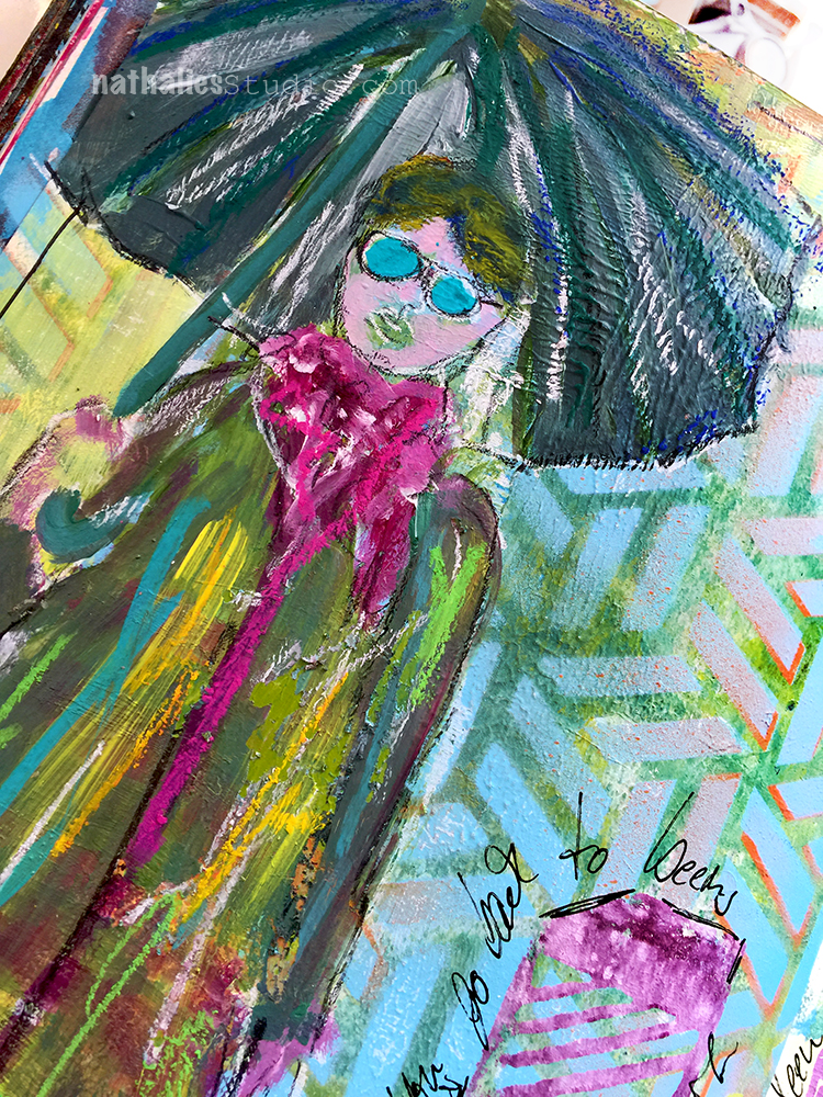
I was just playing around in my art journal with my new Midtown ArtFoamies Set and some acrylic paint and spray paint. This was fun.
The background was pretty built up with paint that I had scrapped off into my journal during various painting sessions and at first it bothered me a bit that I got all those uneven and flaky areas- but now I like it :) All a matter of adjusting your mind ;)
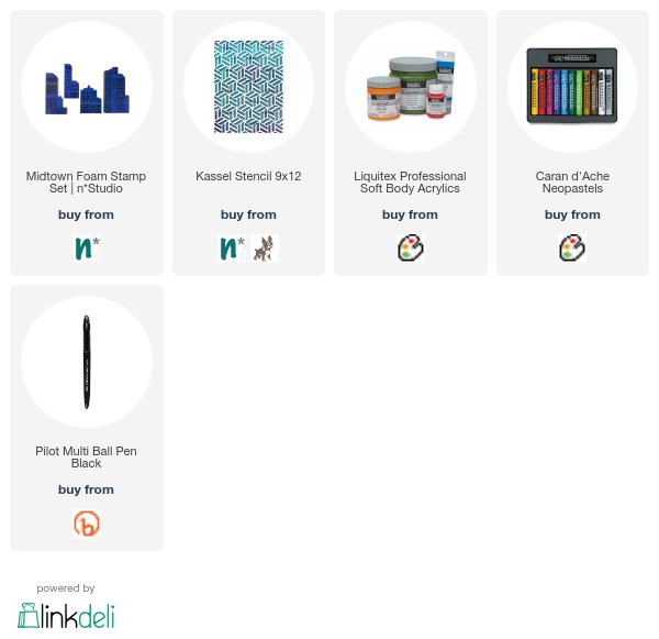
Here are the supplies I used for this spread
Wishing you an amazing day!!!
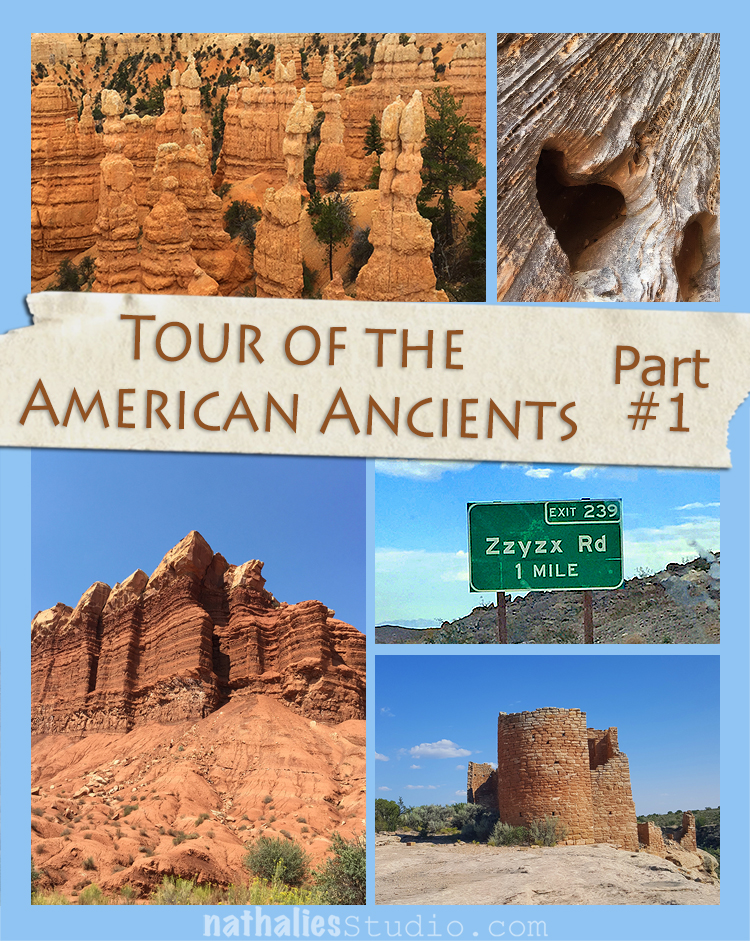
Last month my husband and I set out for our vacation – a road trip through mostly the South West of the U.S. We drove about 2,300 Miles and had an amazing time hitting many spots we went to before and a lot of new ones. We called it the Tour of the American Ancients because we visited many historical sites. It was awesome and so inspiring and I would love to share with you some highlights, spread out over the next couple weeks in three parts :) Join me on this Artful Adventure – Here is Part #1
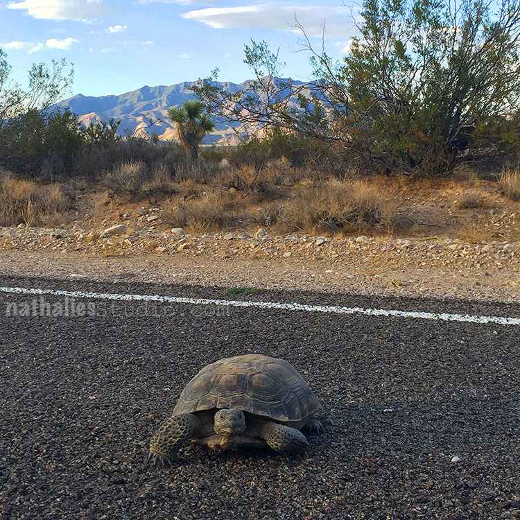
This little guy was crossing the street in Nevada. The Desert Tortoise of the Mojave Desert is endangered and we have not seen one the two times before we were here- but this time we were lucky. We saw two Jack Rabbits right before, so maybe they were on a race. Needless to say we named the tortoise “Cecil” ;)
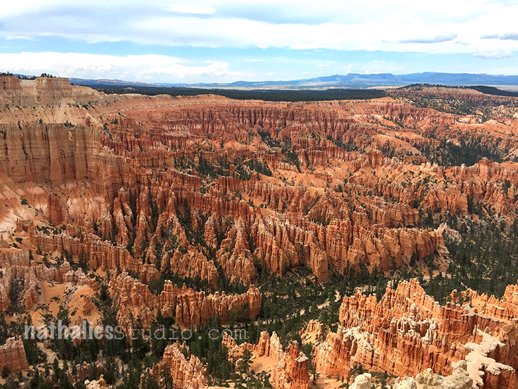
We visited Bryce Canyon, Utah yet again only for a short stint – we promised ourselves next time to really spent some time here and hike- it is so beautiful.
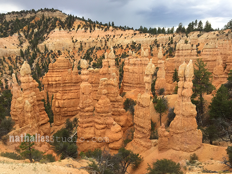
Those hoodoos had the most interesting gradated coloration – love it.
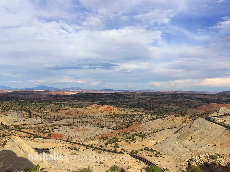
We drove on Highway 12 which is located near the north end of the Grand Staircase – Escalante in southern Utah. The views are breathtaking (and so is the driving- LOL). Highway 12 is the 2nd on the list of “Most Beautiful Highways in the World“. Apparently the Grand Staircase-Escalante National Monument is planned to be stripped of it’s Monument status and protection.
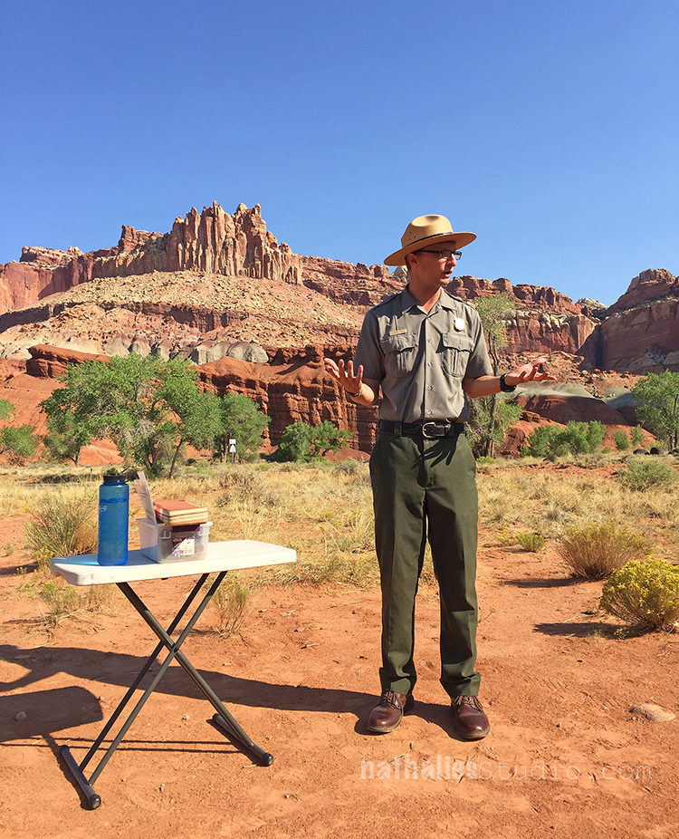
We had a great time at Capital Reefs National Park , Utah last time and planned a day of hiking there. We stayed for two nights. We started the early morning off with a Ranger talk about Geology and it was super interesting and made us unterstand the area and different layers better.
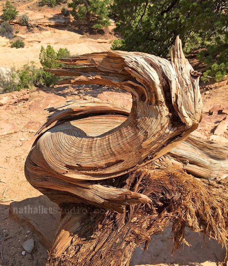
While hiking I make sure to take a lot of photos so that I can take a breath ….eh I mean..for inspiration of course ;) Gnarled bent tree trunks- the texture and movement- so beautiful.
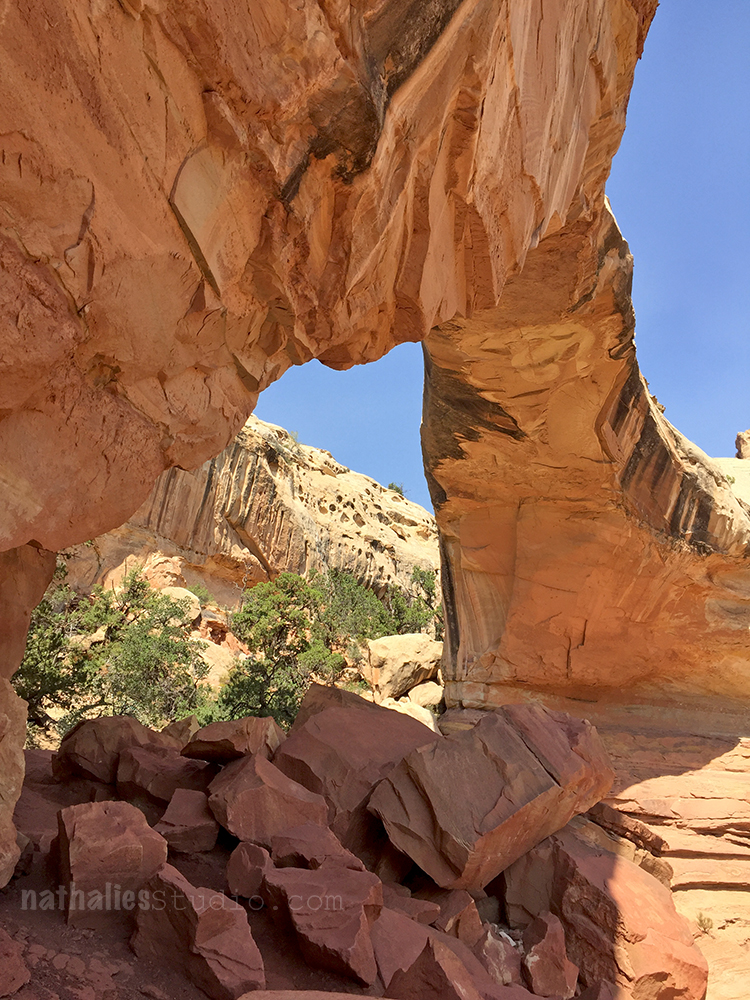
We hiked up to a natural bridge and then through a Canyon.
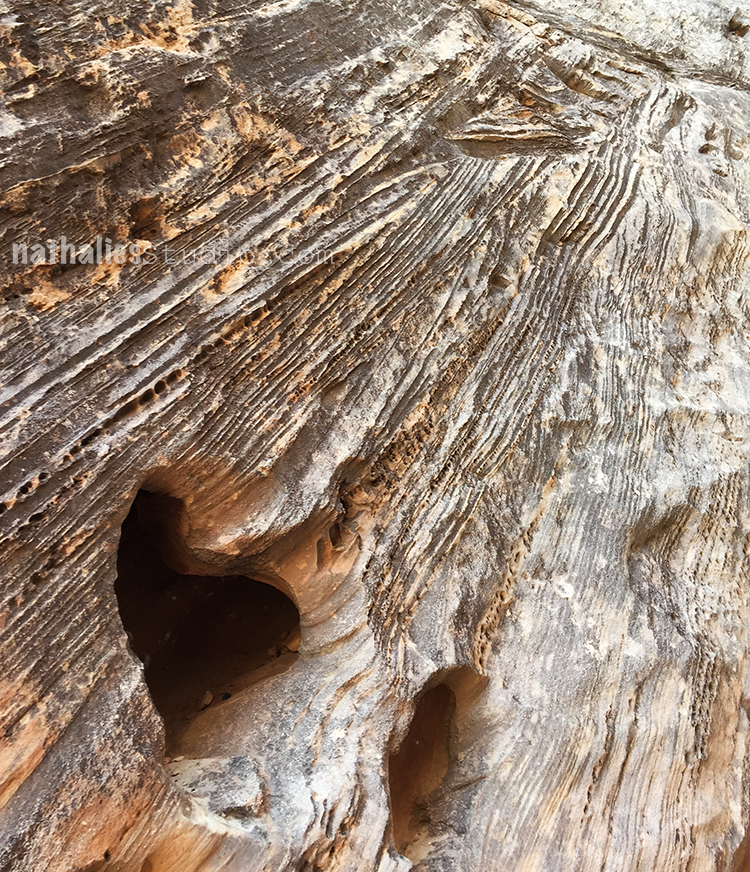
Look at the rock texture and doesn’t the hole look like a heart?
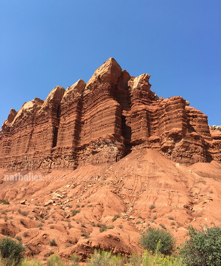
This formation looks like a nice layered chocolate cake …or maybe I just started to hallucinate as it was SOOOoooooo hot ;)
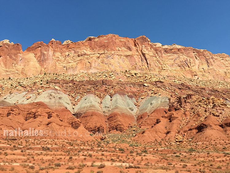
I just couldn’t get over the different layers and texture and the colors. I am not very well known for using a lot of earth tones in my work -but this trip definitely made me want to try it out.
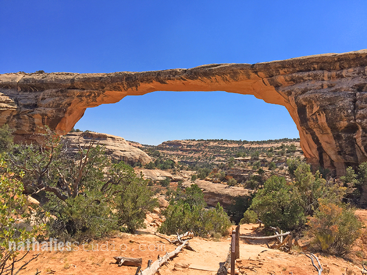
We drove on and stoped at Natural Bridges National Monument in Utah. We had a lunch picnic under this natural bridge – one of our – so it felt – 200 hundred sandwiches on the trip ;) There is something so serene and wonderful to eat outside in nature and just be silent (well…besides the crunch of the salad) while taking it all in.
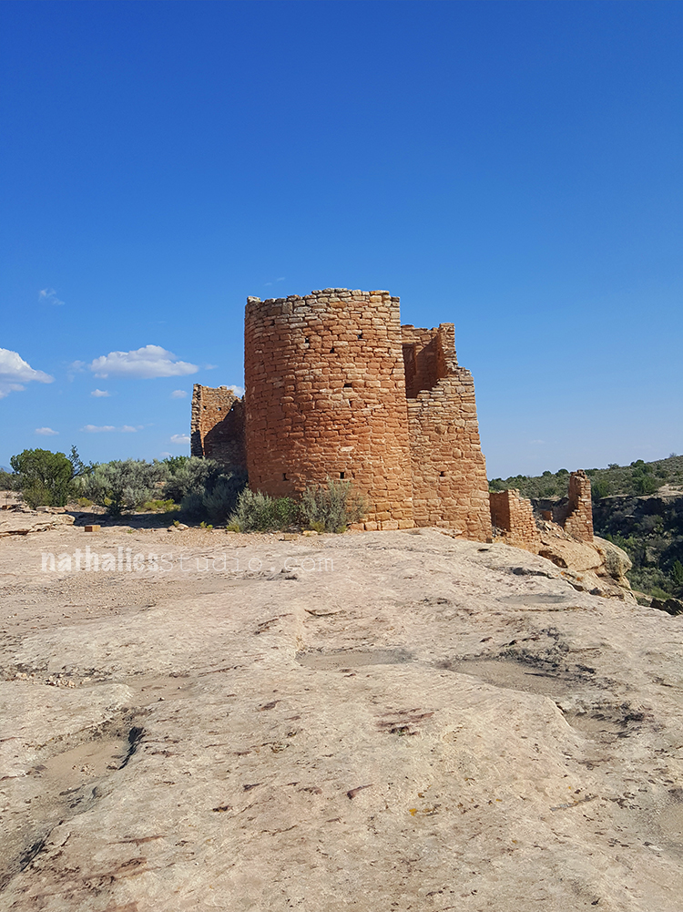
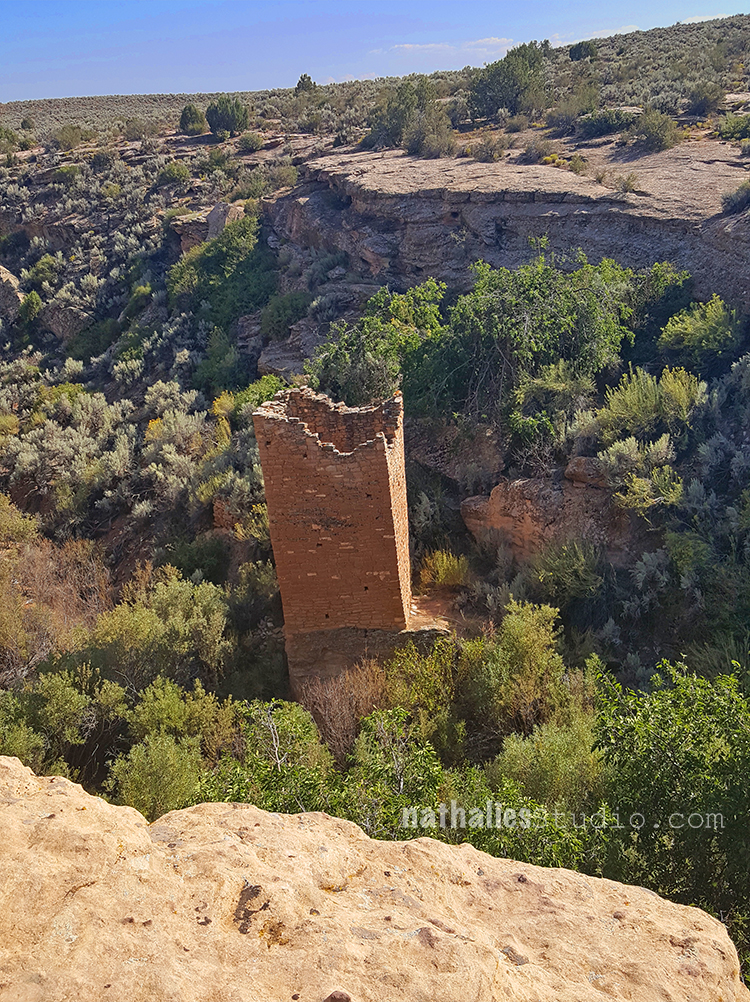
Our next stop was Hovenweep National Monument in Colorado and Utah- which was a new one for us. In the area are six prehistoric villages built by ancestral Puebloans between A.D. 1200 and 1300 and it was stunning to see those buildings at their locations. This tower building above reminded me a lot of some of the old castles of the time you see in Europe and I find it fascinating that at the same time on different continents the same structures were erected.
What a part of the history of this country – and ….this park was almost empty – nada nothing …and a lot of people did not seem to know about it.
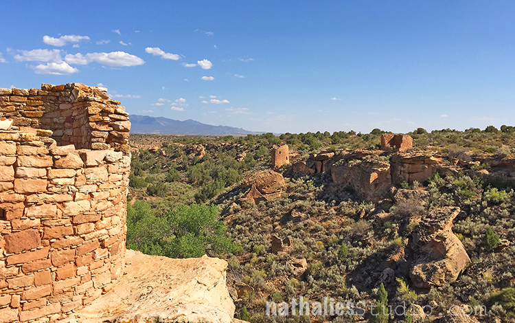
It is a magic place and I am so happy we went. I wish we could have stayed over night – it is supposed to be pitch black and the perfect place for star gazing. I took lot’s of notes, and sketched- just as I describe in my book Artful Adventures in Mixed Media and I cannot wait to see what parts of this trip might make its way into my artwork. More from our trip to come – hope you enjoyed this little adventure.
Wow great photos! We loved the Fairyland feel of Bryce Canyon too x
Thank you Jan! So true- Bryce has a fairland feel!
I just love that gnarled wood and yes, it’s a heart!
Stopping to take pics (and breathe)…funny.
Tehehehe- Sue – you gotta do what you gotta do to convince the other half that you are not really out of breath ;)
AMAZING and inspirational photos! Thanks so much for sharing. Just like you I don’t usually use a wealth of earth tones in my artwork, but these photos have me planning to in the near future. Thanks.
Thank you so much Deb!
Aren’t we all juggling a lot and try to not drop the balls? This is what my art journal spread is about.
I used my new Broadway Positive and Negative ArtFoamies with this one and I so so love the pattern.
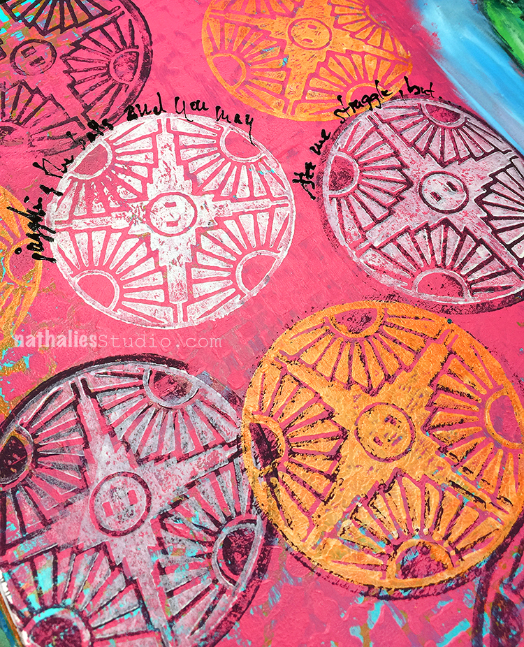
I had also fun playing with orange, pink, blue and purple – a combination that just made me happy :)
Here are the supplies I used:
Wishing you a wonderful day!
Hello from the latest edition of the Creative Squad! Today we have a post from veteran member Marsha Valk, who makes excellent use of my new Broadway Positive Negative foam stamp to dress up an apron. We hope you’ll join us in creating with this month’s theme: Colors Are My Friends – Let’s kick off the new Creative Squad with a celebration of color! What are your favorite, go-to signature hues? Let’s go bold and bright this month and use color to ring in a new season of inspiring projects!
Colours really are my friends. I love them all dearly, and I could never, ever pick just one favourite! But as much as I love the entire rainbow, it doesn’t mean all my friends have to come out to play every single time. It’s OK to pick just one for a heart to heart now and then.
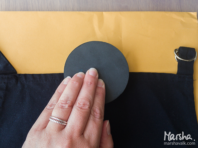
I invited a couple of my fabric paint colours for a playdate. I couldn’t find a light, neutral coloured apron to print on, so I got a black one instead. During a short test run on paper, Yellow saw that the black background would shine through and cancelled on me.
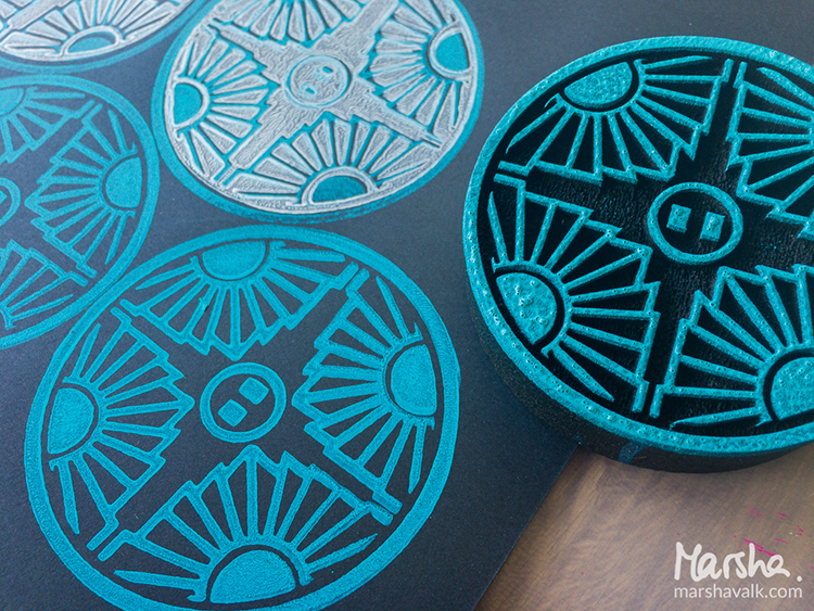
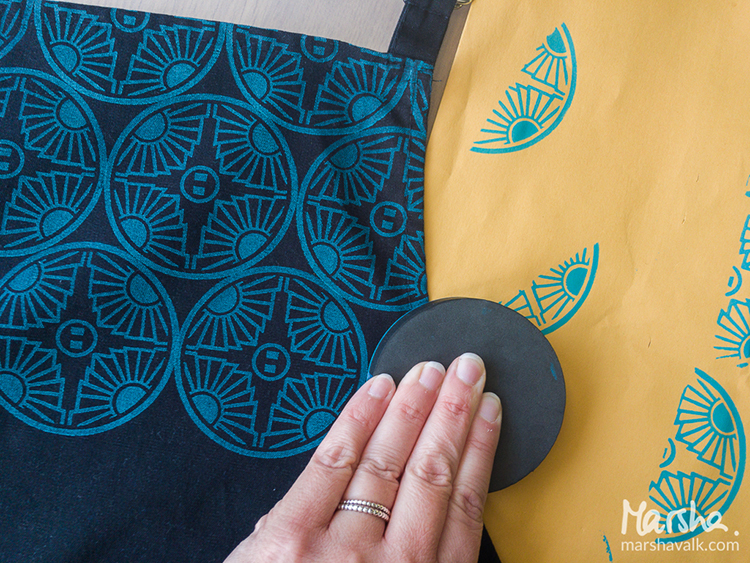
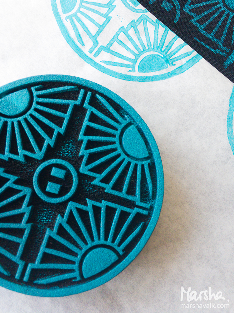
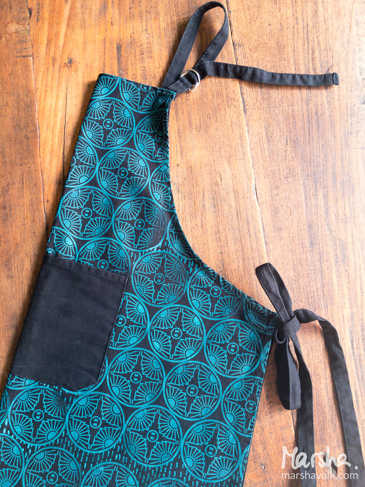
I mixed Teal with a bit of White fabric paint and applied it to a StampBuddy. It acts as a stamp pad: gently dab the foam stamp into the foam of the StampBuddy to get an even distribution of paint on the stamp.
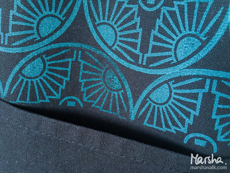
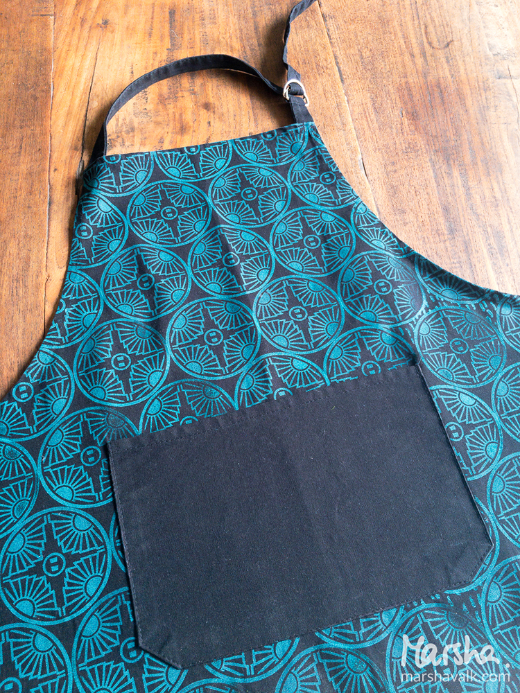
Then I started stamping a pattern with Nat’s Broadway foam stamp onto my pre-washed black 100% cotton apron. I liked what I saw!
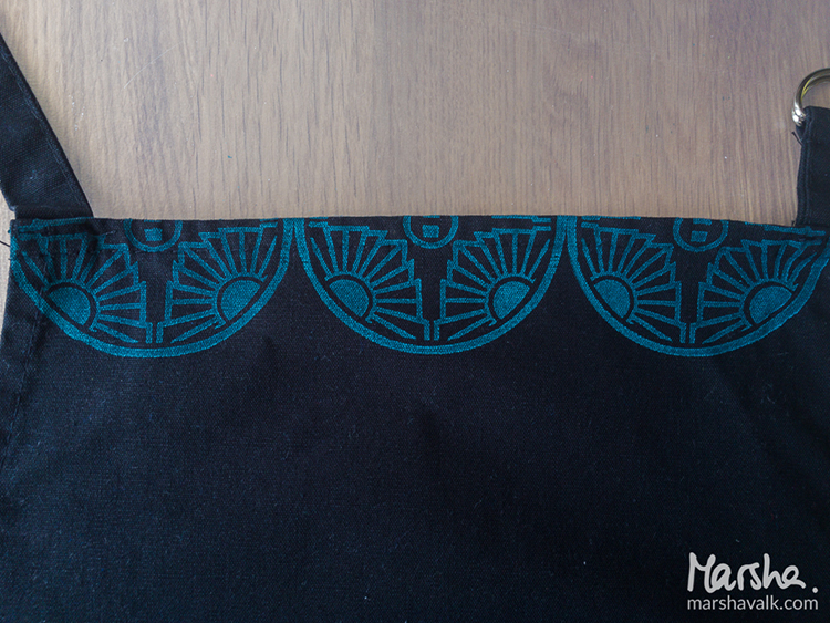
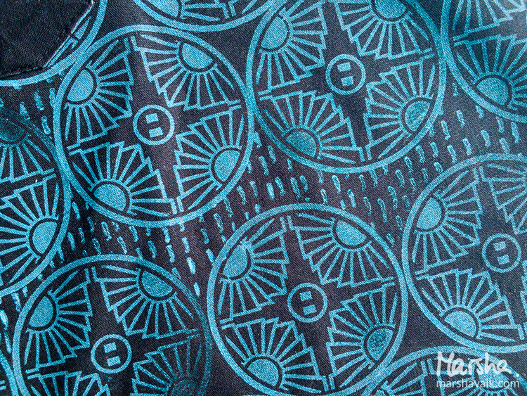
Pink was waiting to have a go too, but once we saw the denim-like look of the Teal/White prints, we agreed not to interfere.
I covered the pocket with deli paper to prevent the paint from seeping through while I stamped around it. The plan was to make it look like the pattern continued behind the pocket. It didn’t prevent me from making the stamped design go a bit askew here.
I decided to leave it as it was and once the whole apron was stamped, I filled some of the open spaces with another pattern with the Running stamp from Nat’s Embroidery Cling Rubber Stamp Set.
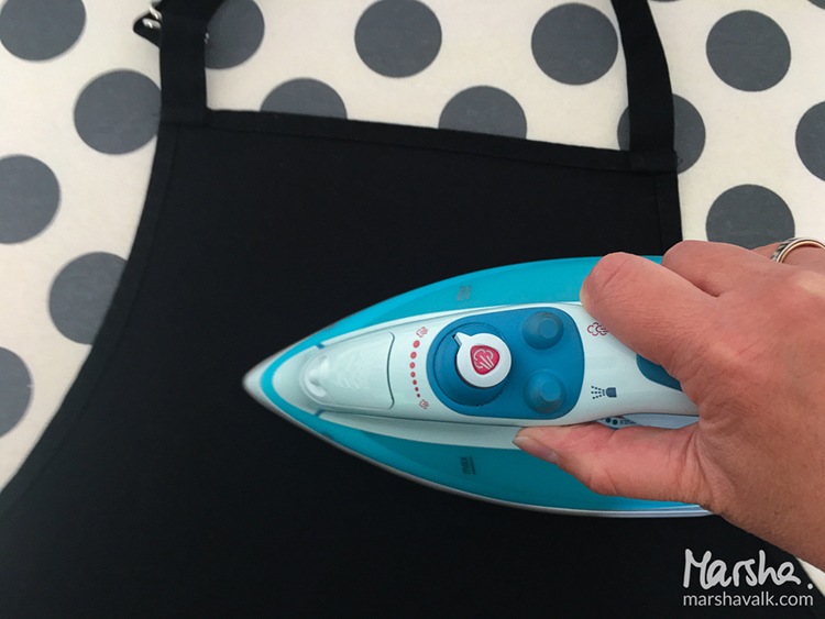
Most fabric paints have to be fixated to make it (machine) washable. The paint I used had to dry for 30 minutes before I could fixate it by ironing the fabric with an iron on medium heat.
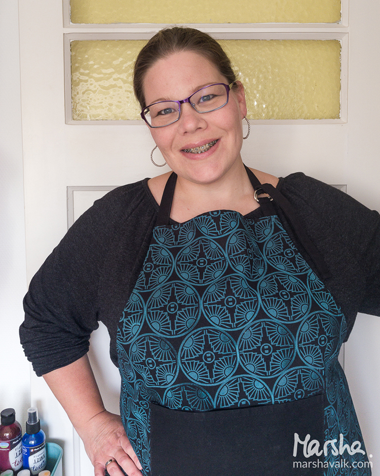
OMG Marsha this is the coolest apron EVER! I want one :) In addition to a StampBuddy, Marsha used the following supplies (some are affiliate links):
Play along with us too: I love to see how you interpret our monthly themes. Email me how you used my stencils and stamps with the theme and email me an image – I would love to share your projects in my next “n*Spiration From Around the Globe“.
[…] month’s theme over at Nathalie’s blog was Colors are my Friend and I created a floral page for my art journal using her foam […]
Reply