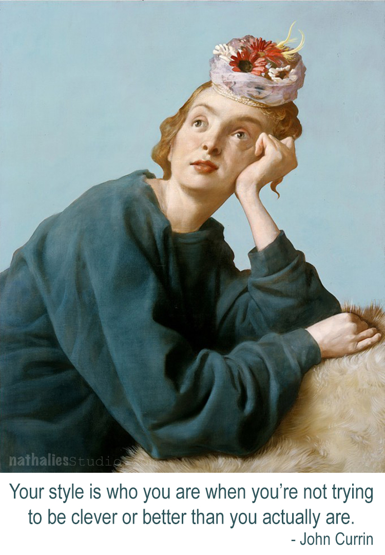
Nat

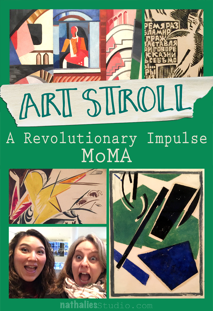
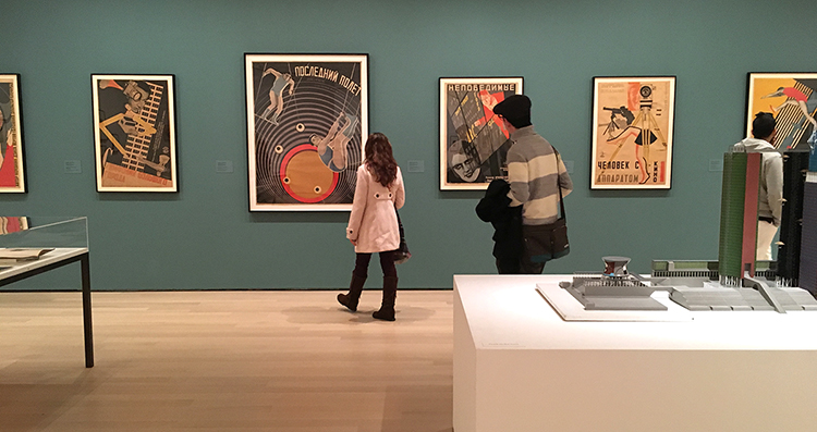
A couple weeks ago my friend Julie Fei -Fan Balzer was in town and we had an awesome day filled with good food, chats, laughter and of course…Art. We went to MoMA to see A Revolutionary Impulse – The Rise of the Russian Avant-Garde – a title that couldn’t make it in it’s entirety into my blog title- LOL.
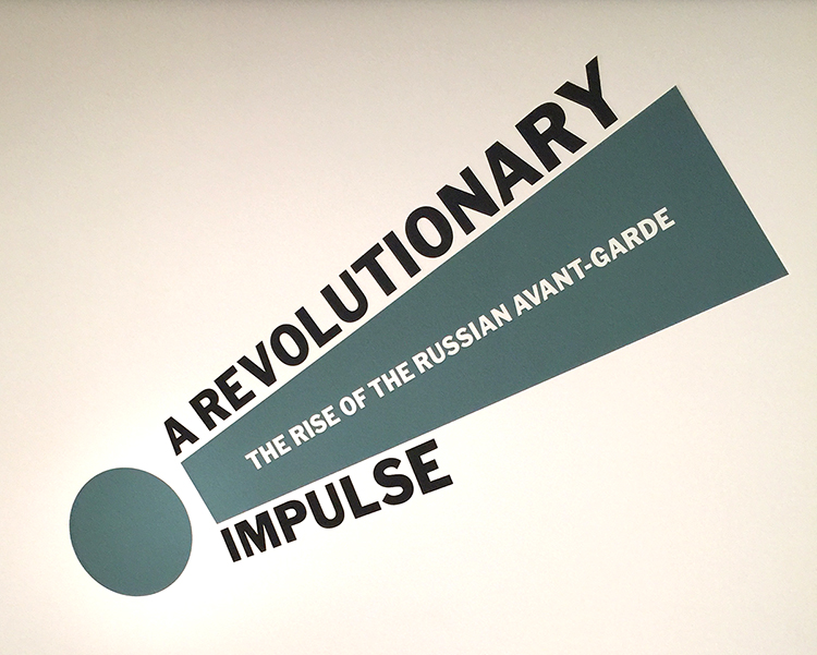
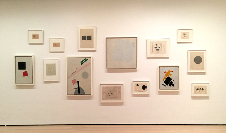
“During the early 1910’s under the tsarist autocracy (in Russia) that had ruled for three centuries, avant-garde artists sought to overthrow entrenched academic conventions by experimenting with complex ideas that would transform the course of modernist visual culture. In 1915 as World War I raged, an abstract mode of painting called Suprematism abandoned all concrete pictorial references….With the October Revolution of 1917, Lenin’s party took command. Avant-Garde artists put individual expression aside and developed a structured abstract language called Constructivism which they hoped could be embraced by the masses. Constructivists rejected easel painting in favor of practical objects like ceramics, posters and logos. …By the late 1920s, the government, now headed by Stalin, had placed restrictions on all aspects of life, including the arts, and was commissioning artists to produce propagandistic books, posters and magazines touting Soviet achievement….This exhibition spans the years 1912 to 1935…Conceived in response to changing socio-political and artistic conditions, these works probe the many ways and object can be revolutionary.” From MoMA’s wall text about the exhibition
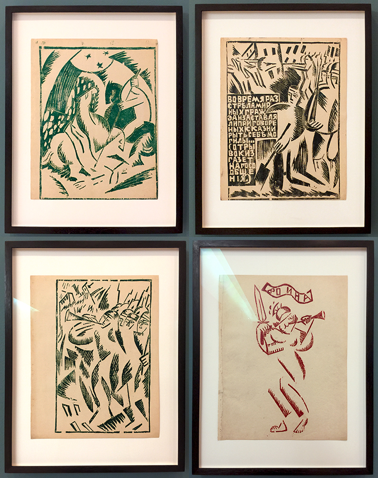
Olga Rozanova, War, 1916 – Linoleum cut illustrations out of a a book with ten illustrations.
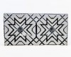
The imagery for those lino-cuts is influenced by the abstracted forms of Cubism and Futurism but also by traditional Russian motifs. I was intrigued by the very simplistic way she created figures with crosshatching and just some hints of form here and there which your eye completes yourself as a person or else.
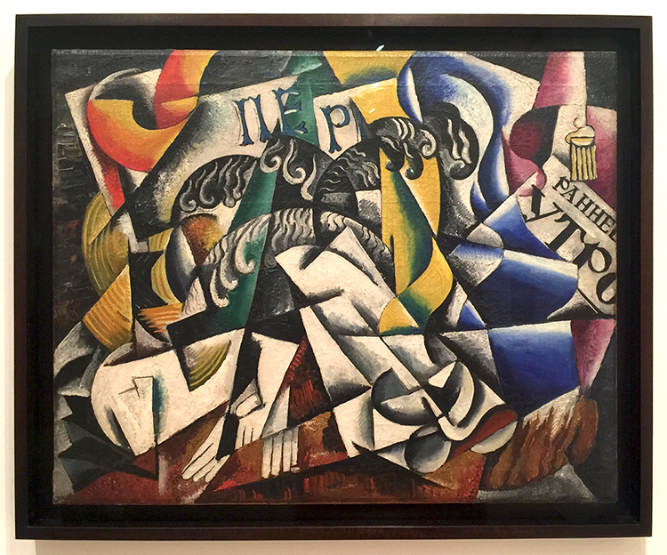
Lyubov Popova, 1914, Subject from a Dyer’s Shop – Oil on Canvas.
Note that Lyubov is another woman …
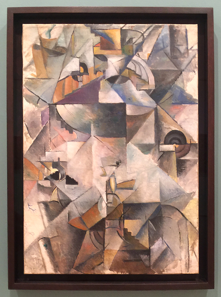
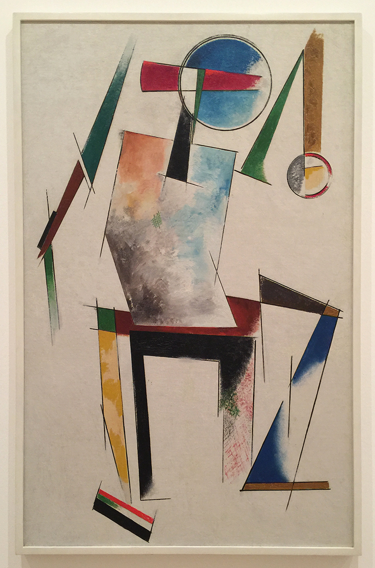
Kazimir Malevich, Samovar, 1913, Oil on Canvas. “A year later Malevich was painting cubes and lines and circles and balancing them in ways that had no relation to anything but geometry and the will to make something new. Malevich called his art “Suprematist,” hoping that it would have supremacy over forms found in nature.”
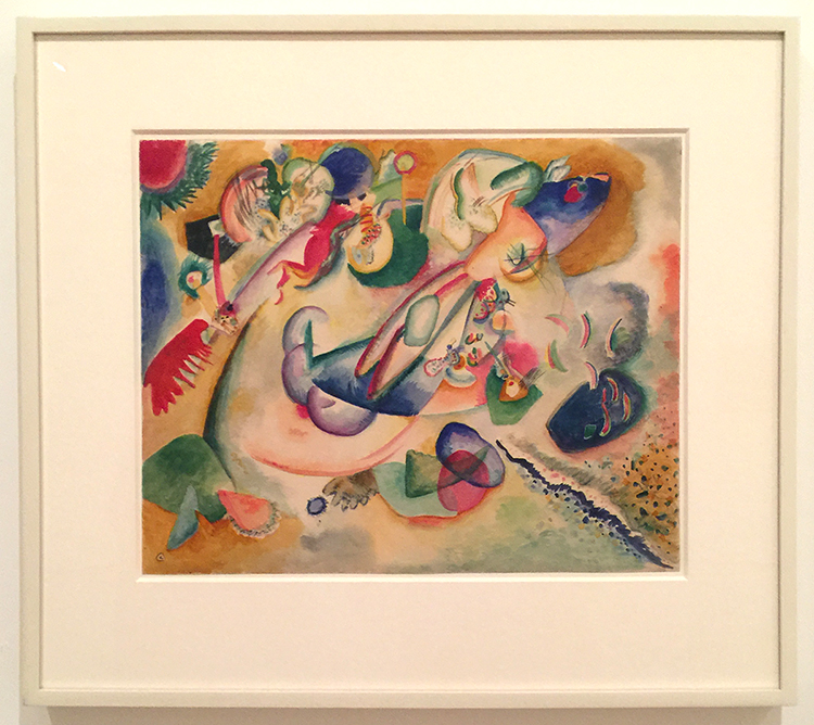
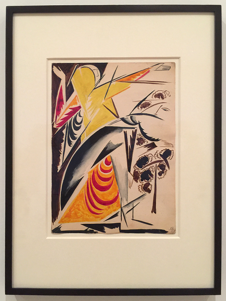
Vasily Kandinsky, Improvisation, c. 1915 – Watercolor and pencil on paper
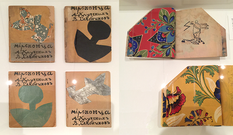
Various artist: Natalia Goncharova, Mikhail Larionov, Nikolai Rogovin, Vladimir Tatlin -Mirskontsa (Worldbackwards)-1912
These books were made with wall paper and I really love the shapes too.
Natalia Goncharova Spanish Dancer –(c. 1914) . Isn’t this beautiful?
And then things changed…
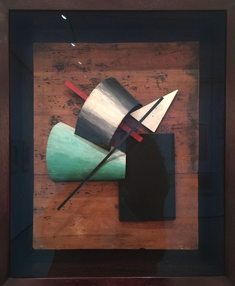
Jean Pougny, Suprematist Relief-Sculptures, 1920s – Painted wood, metal and cardboard, mounted on wood panel. I did love this one – I wish it wasn’t behind a glass
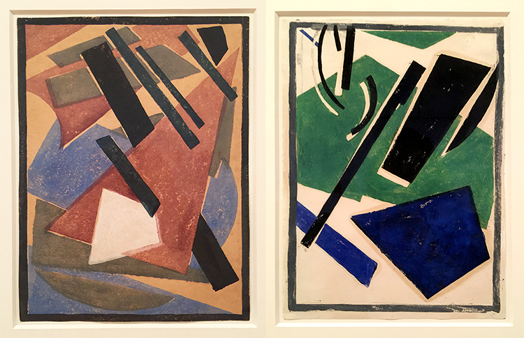
Lyubov Popova, Six Prints ca. 1917-19 – linoleum cuts with watercolor and gouache additions
A pioneer of the avant-garde, Popova developed a style in the late 1910s that combined floating forms inspired by Cubist collage and by Suprematism. She called this print series – there are four more- “painterly architectonics” . She wanted to depict layered shapes, so that they seem to be continually shifting and rotating.
Varvara Stepanova, Figure, 1921 – This is in MoMA’s permanent collection and I always loved this one. BTW …another woman :)
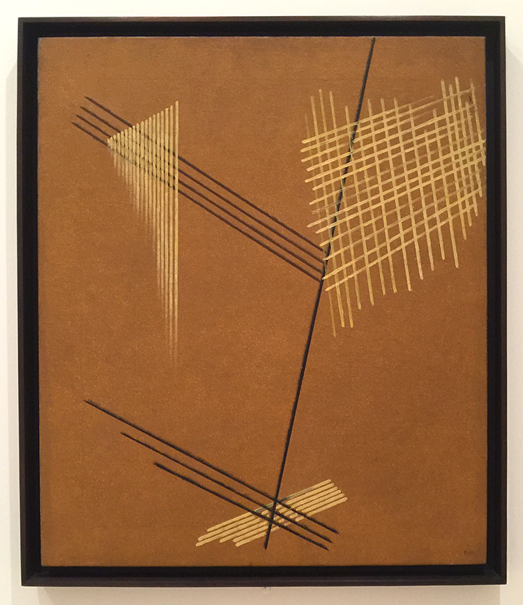
Aleksandr Rodchenko, Non-Objective-Painting 1919, Oil on Canvas
I love the crosshatching and the expanding lines.
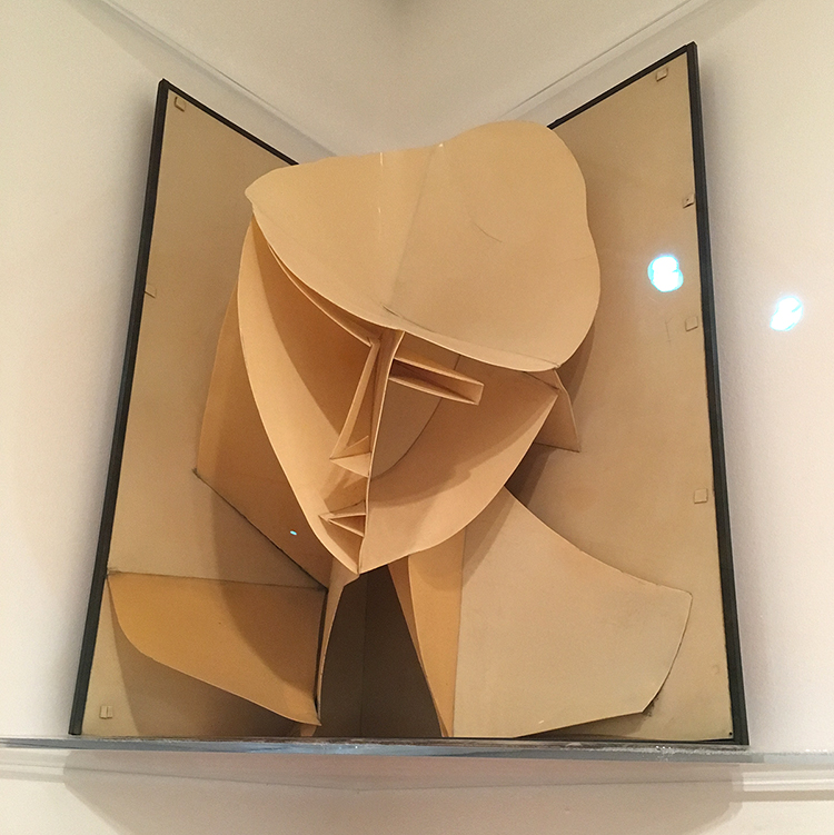
Naum Gabo, Head of a Woman, 1917-20 – Celluloid and Metal
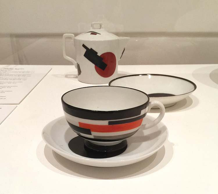
Nikolai Suetin – 1923
In 1917 the Bolsheviks seized control of the government and took over the State Porcelain Factory which used to manufacture porcelain for tsars in Petrograd (now St. Petersburg). Suetin a Suprematist artist was invited to make decorative designs for existing porcelain found in the factory. These ceramics, once meant for imperial tables, were now reimagined for the proletariat.
I would totally wanna have this set and use it – and I find it so interesting how the forms and shapes painted on canvas speak so much more to me on this tea set.
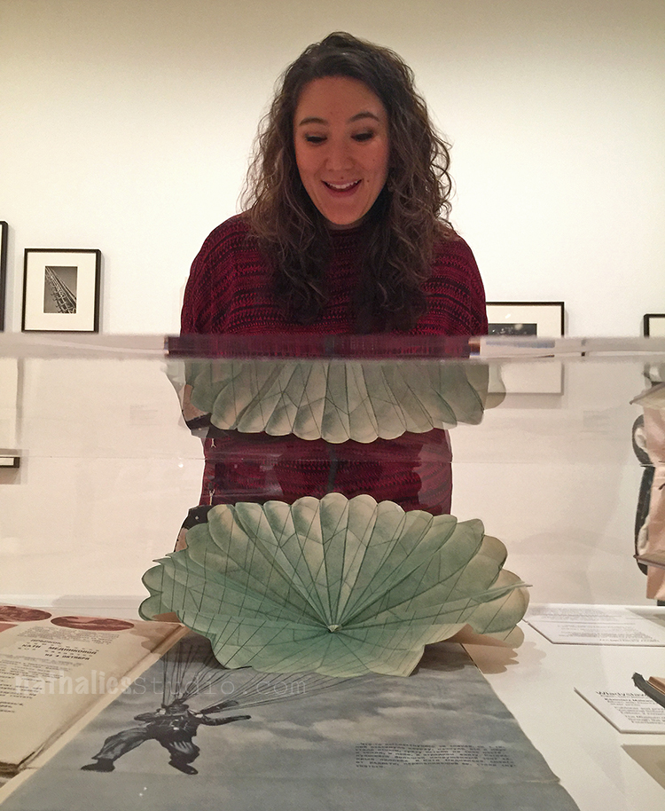
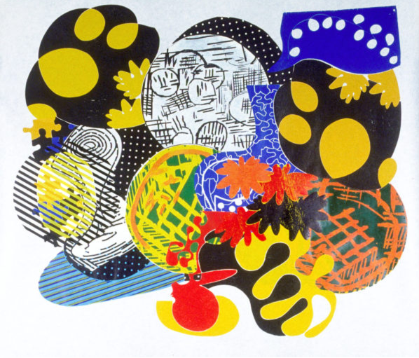
How cool is this pop-up parachute ? The reflection of it is also a bit funny – guess I made Julie a new outfit ;)
I enjoyed this exhibition. The most eye catching fact for me was just how many women were in this exhibition since modern women artists are very underrepresented at MoMA. I regret that the exhibition is coming to an end, as I feel there is so much about this that I didn’t quite grasp and I more or less just floated around in this exhibition with a semi knowledge of the political time the art was created in Russia and a lacking mind for the ideas behind Suprematism and Constructivism. But you know what…I will be ok …I was still inspired ;)
LOL- Interesting ;)
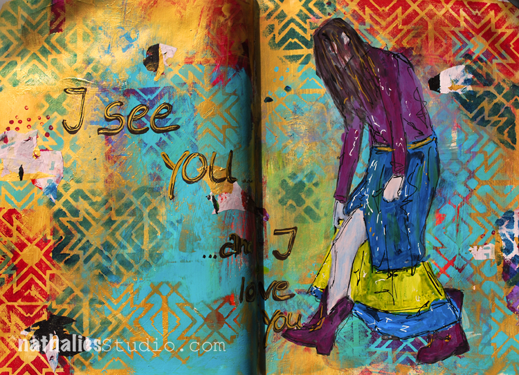
I see you …and I love you!
I recently learned that African Zulu has a greeting “Sawubona” which means “I see you. It says, “I see your personality. I see your humanity. I see your dignity and respect.”
I feel strongly we need to learn to see and love people again and see their humanity even if they are different from us.
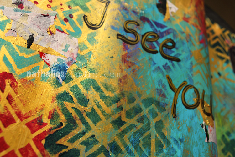
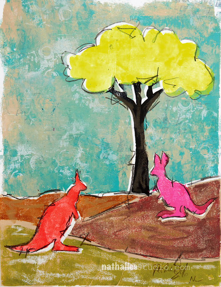
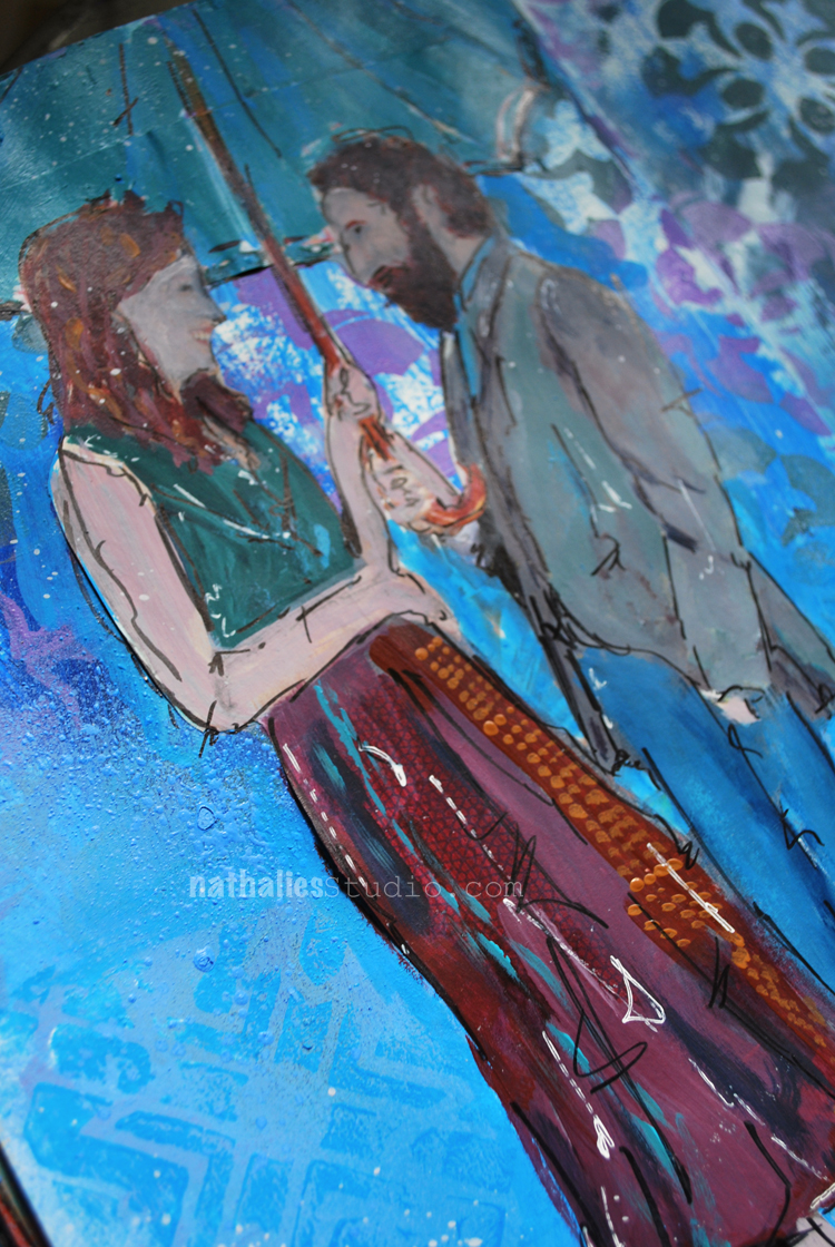
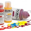
I played a bit with gold gesso and acrylic paint as well as with my Toledo Stencil.
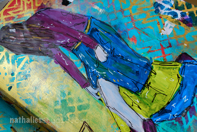
I love how the teal paint looks on the gold – probably my favorite part of this spread :)
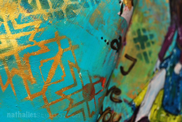
Guess I will have to do more of this combination – At first I didn’t care to much for the dark green and red with the gold in this spread but I can live with it…mhhh – I see it – and I love it ;)
Here are some of the supplies I used for this spread – some links are affiliate links:

I wish you a gorgeous day!
Nathalie, you have such a caring heart and spirit, no wonder you make such beautiful art
Awe- Sherri, you are so sweet!!!! I hope I see you soon again!!! <3
Love that greeting and how you used the gold Nat.
thank you sue! have a wonderful rest of the week and stay warm – hope you didn’t get too much snow!!!
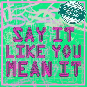
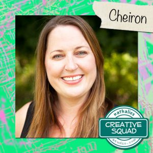
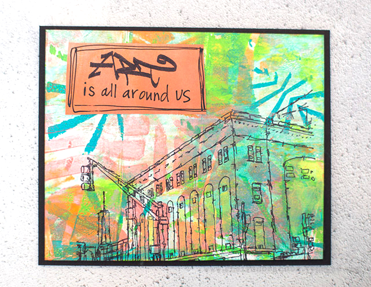
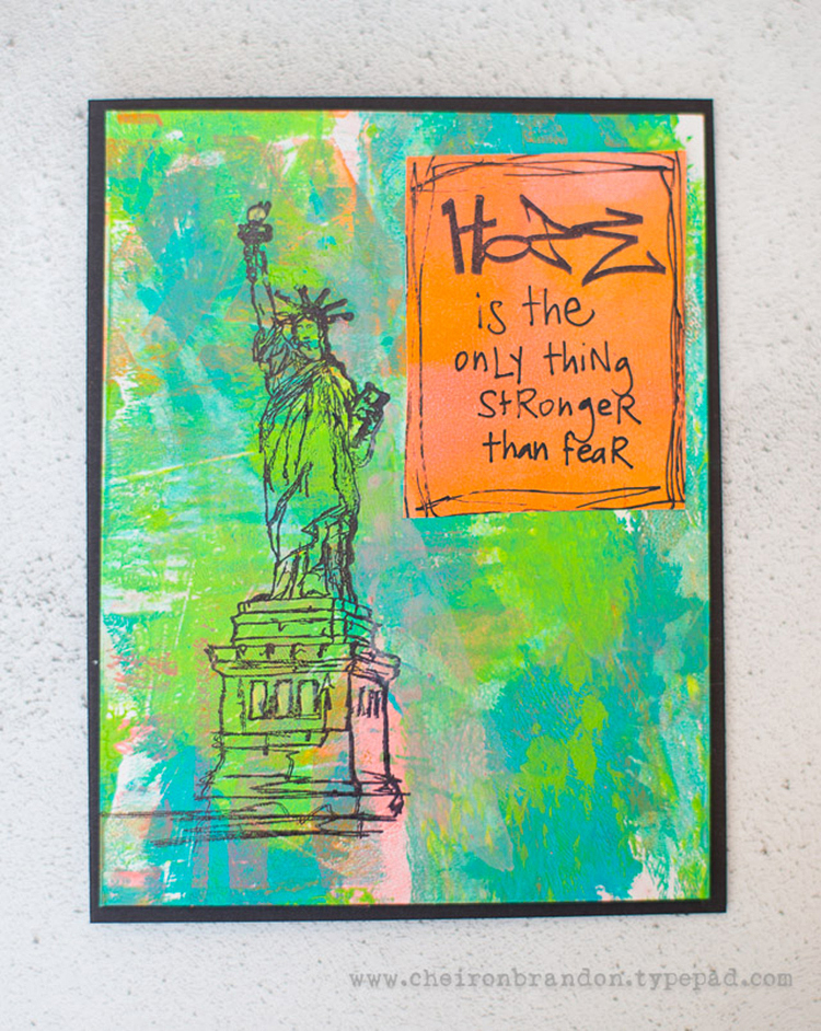
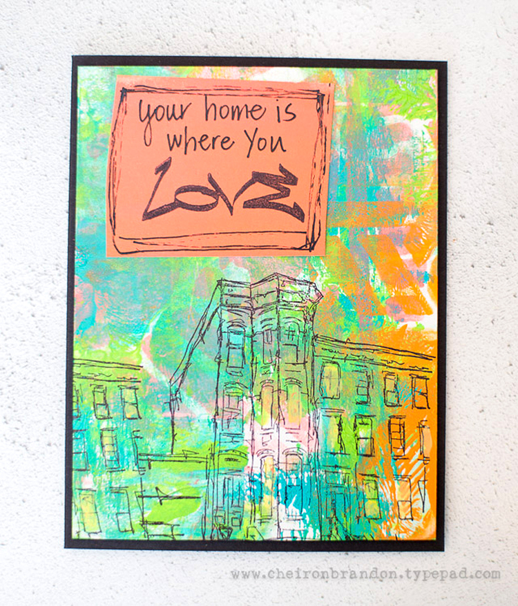
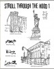
Happy Tuesday! This week Cheiron Brandon from my Creative Squad is sharing 3 gorgeous cards that use my Stroll Through the Hood #1 cling stamp set, and my Beacon and Kassel stencils. Cheiron took a more subtle, but also uplifting, approach to this month’s theme Say it like you Mean it – Let your unique voice be heard and tell us what’s on your mind. Be bold. Be yourself. We all have something to say and sometimes we need to shout it!
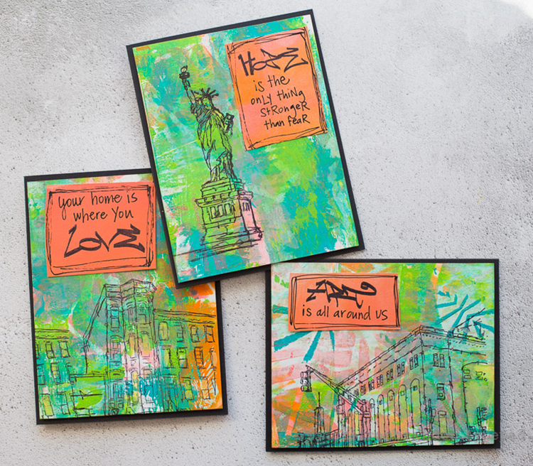
Hi there! Cheiron here with my post for the March theme… Say it Like You Mean it. I know it is great to be big and bold and say what you mean, which is what I do almost all of the time. Today I thought I’d go a bit smaller with some subtle messages that can be sent in the mail. I love Nat’s new stamps, especially the graffiti words from Stroll Through the Hood #1 and I have incorporated them all into a set of gelli printed cards for you today.
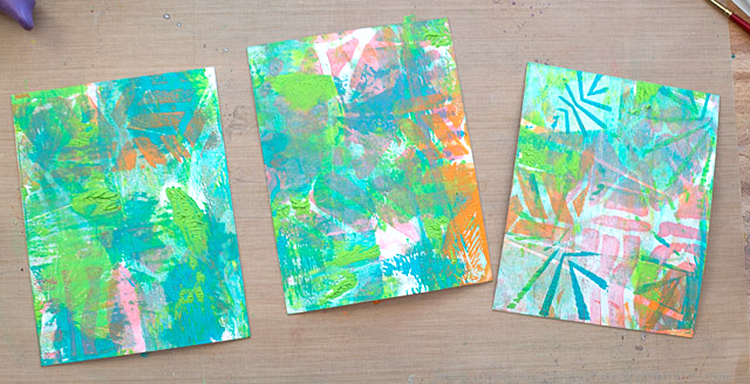
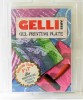
I gelli printed a few panels using the Beacon and Kassel stencils to serve as my background:
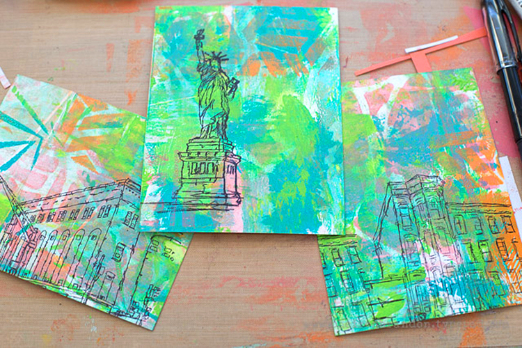
Then I stamped the Powerhouse, Lady Liberty, and Brownstone stamps onto each:
I painted some printed paper with a brayer then stamped it with the different tag stamps: Art, Hope, and Love, and added some handwritten words and outlining to make little quotes for my cards.
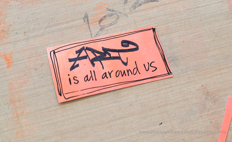
I then mounted each gelli printed panel onto a black card base, then adhered the quote to each. Such a simple way to send a thoughtful message.
Thank you Cheiron for sharing such lovely designs with us – those colors are absolutely gorgeous. And I couldn’t agree more with your quotes. In addition to various papers, adhesive, and a black pen, Cheiron used these supplies – some links are affiliate links:
These are beautiful Cheiron! and so do-able! Thank you!
It’s been a while since I did an Art Journal Flip Through. I am keeping about 4-5 journals at the same time, sometimes I send one out to a publisher and then it takes a couple months before I get it back or I work in several at the same time – anyway- this one in the video started in late 2014 and I did the last page this March in 2017 and I think it is interesting to see how my style changed in one book.
Art Journal Flip Through 3/2017 from Nathalie Kalbach on Vimeo.
I am having a hard time with some of the pages in the beginning – thinking “oh boy” – which I guess is normal when you look at older work- LOL. But I also see some things thinking “oh, I should do this again” .
Hope you enjoyed this- have a gorgeous day!
Oh wow – I remember seeing some of those the first time!!! How fun was this??? FUN FUN FUN. Smiling Big. Thanks bunches for sharing Nat. Xj.
Thank you Joi , it is fun to look back at those older page! Thank you for watching :)
Thank you for sharing – wonderful art journaling.
Thank you so much JoAnn! <3
So inspiring Natalie! Thanks for the flip through!! Loved seeing all of your pages together like that. :)
thank you so much Rach ! hope all is well in Australia :)
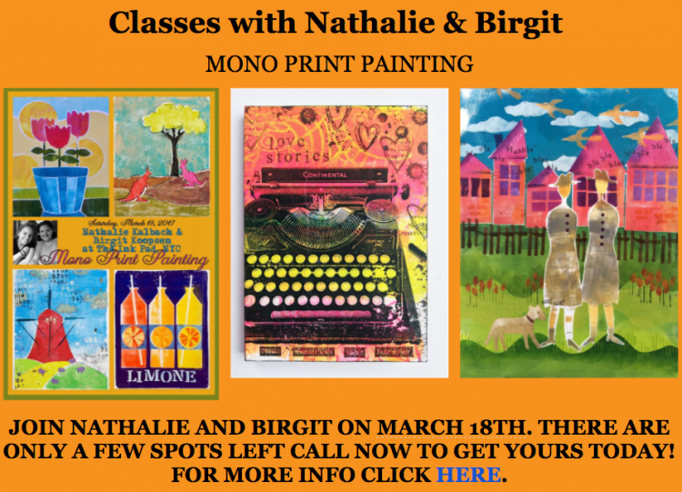
Next Thursday my sweet friend Birgit Koopsen is coming from the Netherlands and I cannot wait to see her. Besides some girlfriend time and sightseeing we are also teaching several workshops together, one is a Mono Print Painting class at The Ink Pad in
NYC on March 18th, based on a technique we came up with after we went to see the H.N. Werkman exhibtion when I visited her in the Netherlands.
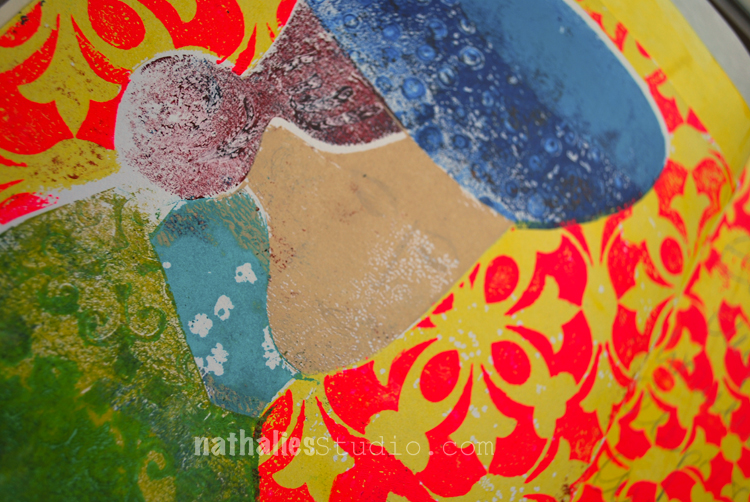
I wanted to incorporate some of my class samples in an art journal and here are some samples of what I was doing last week.
The cat below is of course inspired by Klee :) and I picked up the Manhattan Border pattern in the print on the lest side with the Manhattan Tile Stamp.
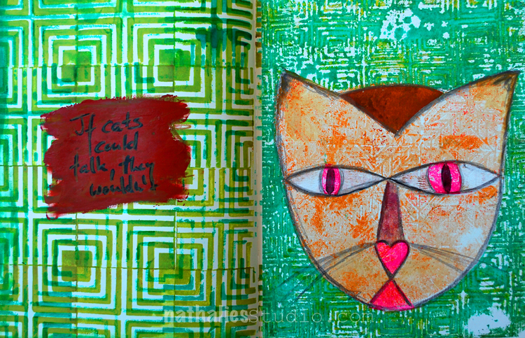
I am kind of liking the idea of incorporating the prints which you do not want to hang on a wall or else into the art journal …you see some really raw experimentation with this here :)
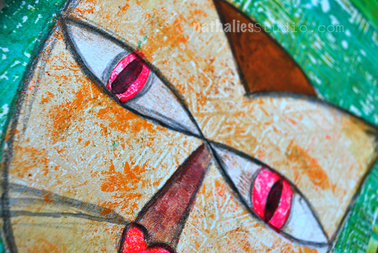
This is the stare in my face I wake up to in the morning …ah the joy of being a cat owner- LOL
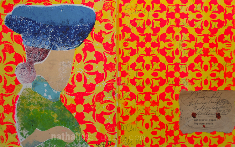
This one was of inspired by Matisse – the left is the Mono Print Painting using the Versailles Stencil and on the right you can see the smaller pattern with one of the Versailles Foam Stamps.
It is really addicting to play with those Mono Print Paintings and Birgit and I have heaps of techniques to apply to them – and you get two teachers with different ideas on this :) There are still some seats left- so if you are in the NYC area- join us for this Mono Print Painting Class March 18th or the Artful Transfers Class March 19th …or even both (special price) !
Have a wonderful day
hope you have some of these techniques in your Artiscape classes too. :)
I will teach loads of techniques on all of the classes there :) Looking forward seeing you – woohoo.
Wow, wow, WOW!! This Mono Print Painting class looks Ah-maze-balls!!! If instantaneous travel were a thing, I would sooooo be there!! <3
Awe- Lisa- it would be so awesome to have you!!! Have an amazing week!
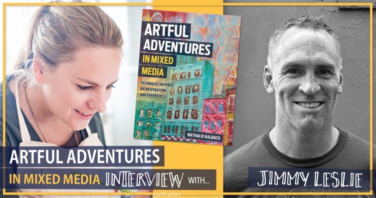
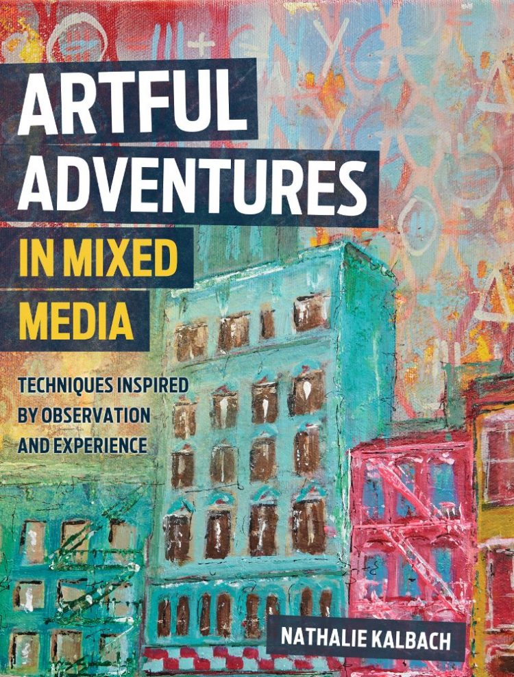
Jimmy Leslie is part of my book Artful Adventures in Mixed Media and I am so super stoked about the artwork and thoughts he contributed, that I wanted to interview him a bit more in depth. Grab a seat and a cuppa , or listen to this extensive but super interesting conversation which I think you will enjoy. We are talking about things like
Artful Adventures in Mixed Media Interview with Jimmy Leslie from Nathalie Kalbach on Vimeo.
I hope you enjoyed the interview- let us know what you think about some of the topics.
You can find Jimmy and more of his artwork here:
![]()


You can Pre-Order Artful Adventures in Mixed Media now
Thank you Nat. Super neat. So excited about your book :) Xj.
Thank you so much Joi !!!
Loved the interview! I enjoy “getting to know the artist” videos. Thanks for sharing this with us…and look forward to more.
yeah- so glad you enjoyed the interview Jackie! there are more coming soon :)
Loved listening to this – not only was it full of great tips on how to get inspired, it was just enjoyable to learn more about Jimmy and to hear his funny stories. If you’re in an art rut or just need some positive vibes, I recommend listening to this :) And a note for Jimmy: I would absolutely be interested in watching a video series about a cross country bike trip / sketching / laundry conserving / Artful Adventure so get your go pro’s ready for your summer trip!
yeah- so glad you enjoyed the interview! I had so much fun and found it so interesting as well!
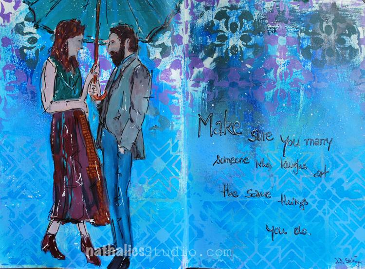
“Make sure you marry someone who laughs at the same things you do” J.D. Salinger.
Agreed :) and that is one of my favorite things about my marriage- my husband and I can laugh at the same silly things together which probably have other’s just roll their eyes.
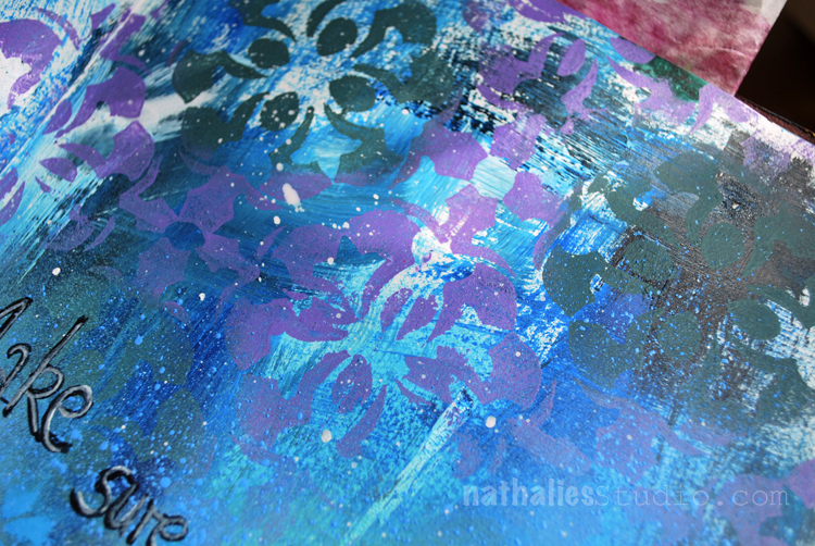
I used the Versailles Stencil oversprayed with different acrylic spray paint colors on the top.
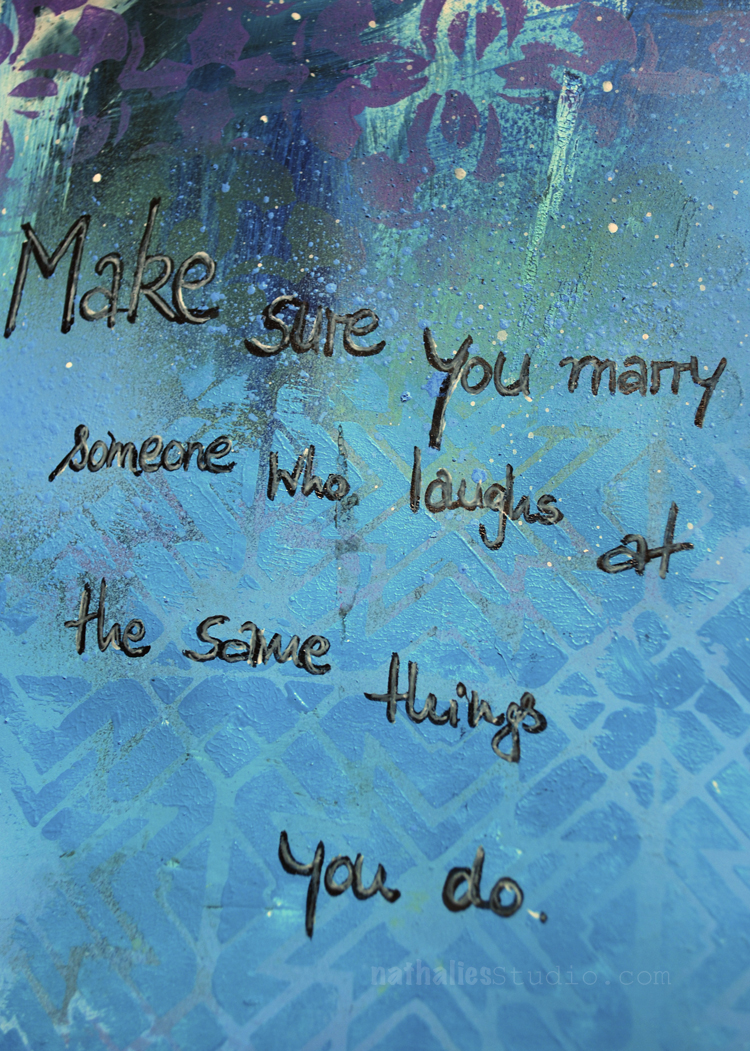
For the bottom part I used the Toledo Foam Stamp stamped with some acrylic paint. and then journaled on top.
I used a catalogue image and painted over it with acrylic paints and markers. The faces are a bit …ahem- scary- LOL- but hey…another thing I can laugh about and I am sure my hubs would too ;)
Here are some of the supplies I used in this spread- some links are affiliate links:
P.S. I cannot believe my wonderful friend Birgit Koopsen from the Netherlands is coming already next Thursday and we cannot wait for our workshops at The InkPad there are still a couple seats left – check it out when you are in the area and join us!!!!
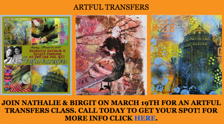
You can also get a special deal by signing up for both classes ! what are you waiting for – two Europeans at once :)
Wishing you a wonderful day filled with laughter :)
Beautiful project for a snowy friday!! ❤❤
Thank you so much Torsa!Stay warm today and have a wonderful weekend!
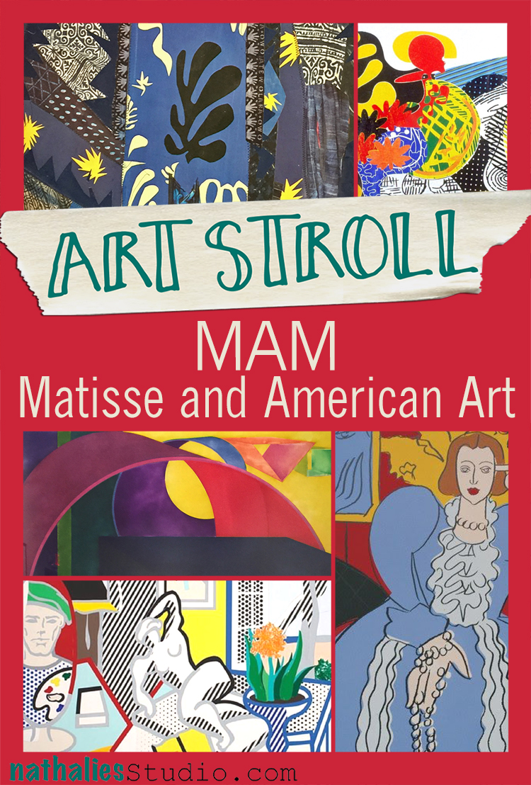
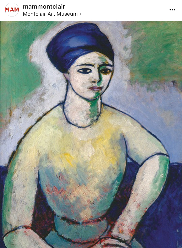
A couple weeks ago my friend Heather pinged me on a Sunday morning and said “Hey, I need to see art today – let’s go to a museum”. I had seen a news report on the exhibition “Matisse and American Art” at the Montclair Art Museum and since I use Matisse as an inspiration for my classes sometimes, I convinced her to go there with me. It was soooo worth it!
The exhibition strives to explore Henri Matisse’s influence on American Artists from 1905 to the present. The list of profilic artists inspired and influenced by his work is immense and the exhibition showed in an interesting way how some artists explored some of his work for a while and some of them took it even further and let it immerse into their own style.
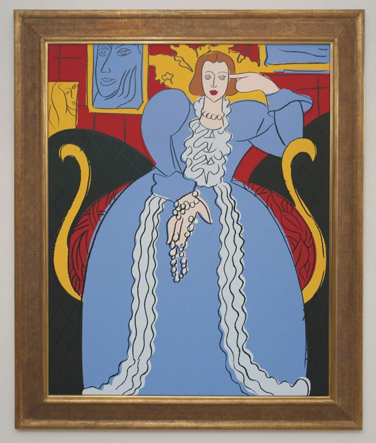
Andy Warhol – Woman in Blue (After Matisse), 1985, synthetic polymer paint and silkscreen inks on canvas.
This painting by Warhol was directly inspired by the Woman in Blue by Matisse from 1937 and even though it is pretty much copied from Matisse down to the colors red, yellow, blue, black, and white, you can see the flatness of the painting so typical for Warhols techniques and the hand holding the necklace says Warhol to me.
Morton Livingston Schamberg- Studio of a Girl, ca. 1912 – Oil on Canvas
Schamberg traveled extensively in Europe and he must have seen many Matisse paintings during his time there. The paining reminds of Matisse’s painting Painting of Madame Matisse. The Green Line.
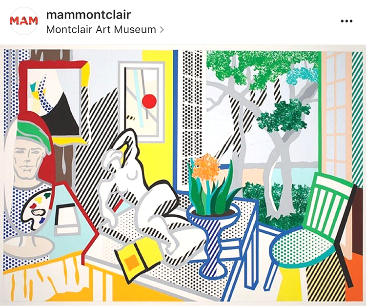
Roy Lichtenstein – Bellagio Hotel Mural: Still Life with Reclining Nude (Study), 1997 cut -and pasted, painted and printed paper on board.
Roy Lichtenstein had a longtime interest in Matisse and Picasso and many references to their artwork can be seen in his work like the simplification of form or direct references of elements in Matisse’s paintings. In this painting parts of his studio, the open window, the patterns.
Judy Pfaff – Six of One-Melone, 1987 – Color Woodcut
In her installations, prints and sculpture, Pfaff translates Al Held and Henri Matisse’s theories of color into her own visual language. Pfaff says that Matisse gave her “courage” and has been ” the source of how to teach and how to see”.
On a little side note: Heather and I saw this woodcut different than in the image above. It was hung upside down from what you see here and we remember this so well because Heather actually had a very strong reaction of dislike to the artwork and we stood in front of it discussing why. When we later talked about the exhibition and this piece with our friends we opened the exhibition catalogue to discover that it was displayed as above, and further research had me find it is also displayed differently on the artist website as well as on the MAM instagram account (I used their image above) . Heather like different display in the catalogue also way better than how we actually saw it. So this haunted me for days and finally I wrote MAM and asked if there is a reason for hanging it the other way (artist instruction that it can be hung any way) or if this was an overseen mistake by the technical staff who hung the artwork. And here is their answer:
“Thank you for writing to the Montclair Art Museum. We had been in conversation with the artist about this issue since the exhibition installation, and have just now heard back. The image used in the catalogue and online was provided by and checked by Crown Point Press; when unpacked the artist’s signature placement indicated that it instead by installed as you saw it. Judy Pfaff has now confirmed that the way the artwork is hung is correct, and you’ll find that all publicity and use of the image going forward will be corrected.”
And so apparently the way we saw it as below – is the right way (btw- it is now changed on the Artist website as well) :)
Now which way does speak more to you? I actually liked it the “wrong” way in the catalogue and instagram page better than the way it is hung and apparently now supposed to be hung. the shapes feel more organically and right – and the forms are more balanced for me in the top version. But hey ….who argues with the artist. But I thought this was interesting.
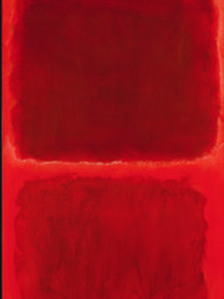
Mark Rothko, No. 44 (Two Darks in Red), 1955 – Oil on Canvas
Mark Rothko called Matisse “the greatest revolutionary in modern art”. Rothko studied Matisse’s The Red Studio (1911) after MoMA had acquired it in 1949. He went to the museum and every day for several months just to stand in front of the picture. While viewing the painting he said ” You became that color, you became totally saturated with it as if it were music” .
William Baziotes, Toy Animal – 1947 – Oil on Canvas.
Baziotes was so inspired by his visit to the Matisse retrospective at MoMA in 1931 that he resolved to move to New York to study art. Baziotes’ basic shapes and luminous color recall many of the plant and human forms that populate Matisse’s work.
Al Held – The Space between the Two – 1992 – print
Al Held studied and used Matisse’s ideas about color, form, structure and scale.
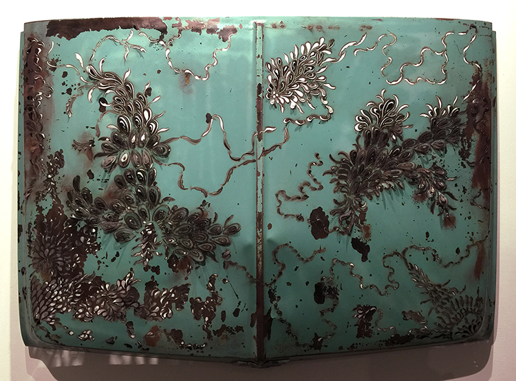
Denice Bizot, Urban Flora, 2014 – 1960s Chevrolet truck hood cut with plasma torch
Bizot’s organic shapes are reminscent of Matisse’s paper collage cut- outs of the late 1940s and early 1950s.
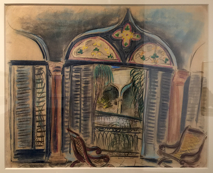
Doris rosenthal, Gran Terrazo, ca. 1920-1922 -Pastel on Paper
This painting shows Rosenthal embracing Matisse’s vibrant color and idyllic subject matter. Matisse often used windows as a vehicle for exploration into color, light and interior versus exterior space.
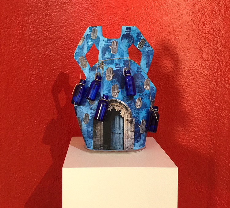
Janet Taylor Pickett, Indigo Bottle Dress – Charms and Inspirations – Acrylic, digital photograph, glass bottles with written messages and twine on shaped Arches Paper.
Picket’s creative conversation with Matisse spans her entire career.
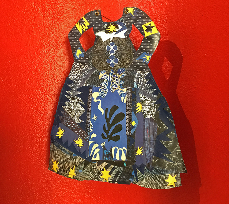
Janet Taylor Picket, Dressing in Context 2, 2015 – Collage of various papers, thread and acrylic on Arches paper with grommets.
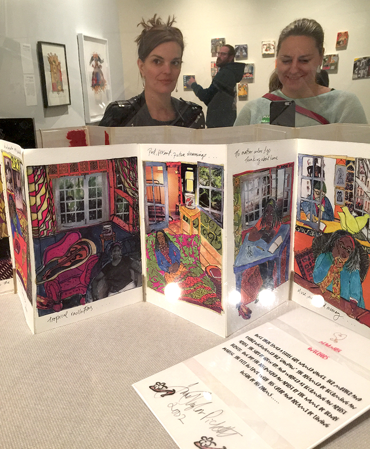
Janet Taylor Pickett, Me & Matisse, 2003 -04 – Handmade book
In this book, Taylor Pickett’s aspirations to become an artist are combined with her travels abroad to France and her longing for home, which she characterizes as “a metaphor, an idea for finding my voice as an artist”.
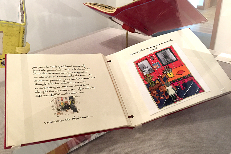
As you might imagine the books made me swoon and I want to do something like this !
It was an amazing and inspiring exhibition. I loved seeing all the different ways how other artists were inspired- and still are inspired by Matisse . I came home from the exhibition totally recharged and explored different – Matisse-inspired- things in my studio for several days. It made me yet again so aware of our differences and our connections – magical! I was also surprised what a wonderful Museum this is and what a huge amount of artwork from even more than the shown well known artists (couldn’t show all) like Stuart Davis, Milton Avery, Richard Diebenkorn, Helen Frankenthaler, Hans Hoffman, Robert Motherwell and many more the museum was able to show for this exhibition. I for sure have this museum on my list and if you are in the New Jersey area- check out this exhibition which is still on view until June 18, 2017.
I hope you enjoyed this little Art Stroll and found some inspiration in it!
Indigo bottle dress is super cool and I would love to have it in my bedroom.
As to Judy Pfaff’s – Six of One-Melone I do not like it hung the “correct” way…seems off to me.
Funny how that works.
I always enjoy strolling with you Nat.
I loved that dress too, Sue …I actually also want the red little alcove in my bedroom :) I agree with you on Six of One Melone! Have a gorgeous weekend!
Always enjoy your Art Strolls. Invariably I find new artists that inspire me. And Matisse has always been a favorite of mine so I enjoyed seeing other artist’s inspiration from his work. Regarding your question on Judy Pfaff’s Six of One Melone piece, I definitely like the “upside down” version better. The balance of the “correct” version feels off to me. It feels as if the larger components of the piece want to “collapse” into the small red and yellow area at the bottom. As you said, you can’t argue with the artist. It’s always fascinating to me the different emotional responses people will have to a piece of art.
thank you Jean! Yes- I agree on the composition and how it feels better the “wrong” way. I am also fascinated that people have different emotional responses to art – sometimes certain artists use symbols or subject matters that resonate differently depending if you have the same cultural background as the artist which I find very interesting to discover with friends when going into museums.
Really interesting…thanks…
thanks for visiting Bea!


That tea set is great and Julie’s new outfit is interesting. Glad to see that you two had fun with art again!
Reply