Nat

Hello from my Creative Squad! This month the squad is playing along with Creative JumpStart 2020 and sharing their Artistic Super Power with you. Here we have Maura Hibbitts sharing hers: Colorful Imagination. Her fun little notebook uses my Signals and Art Deco Empire stencils and our theme: Super Power – this month we are joining Creative JumpStart 2020 and exploring our Artistic Super Powers. It could be your unique technique or style, the way you like to use a medium or tool, or maybe your way of approaching artmaking. What is yours and show us how you use it.
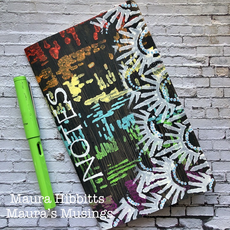
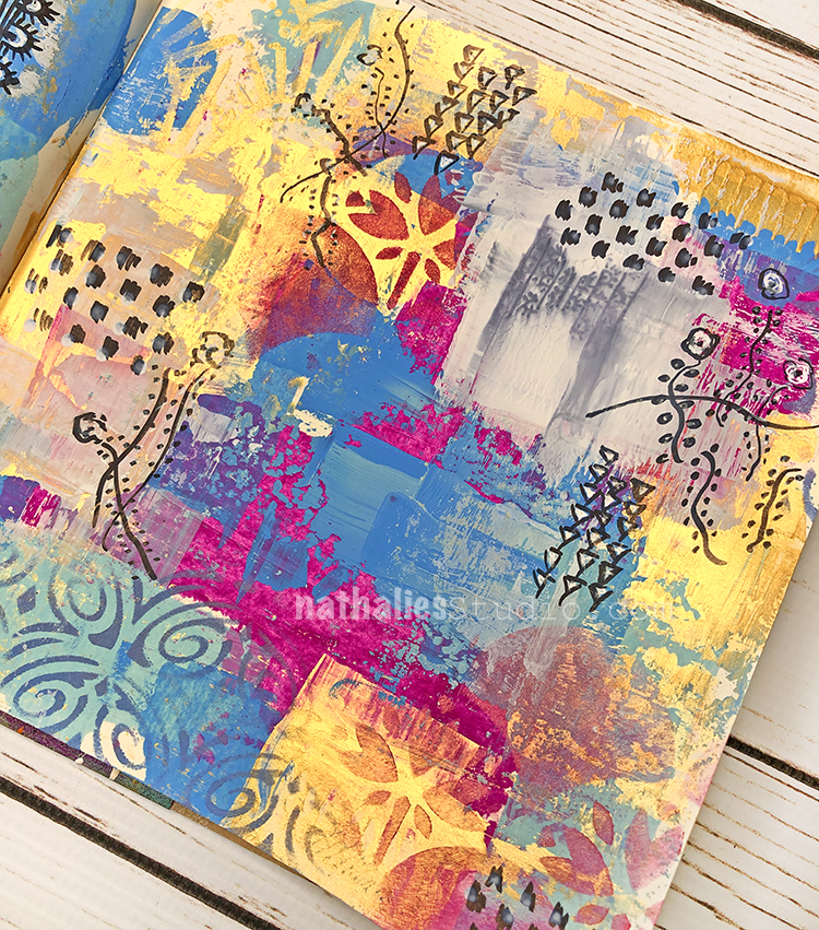
Many wishes for good health, peace, joy and creativity in the new year! Can you believe it’s already 2020? Wow, the time does fly! I’ve been so inspired by all the amazing artists at Creative Jumpstart. I think it just gets better and better every year…now to find the time to play. So, when I started thinking about what my creative super power was, I thought of how much I love color, and that it is often something people comment on when they see my work. I also thought about how much I like to use my imagination, where ideas can come from books, movies, dreams, nature, and the everyday world around me. So, I am calling my superpower “Colorful Imagination.” The outside of my notebook is super colorful, and the blank pages inside are just waiting for my imagination.
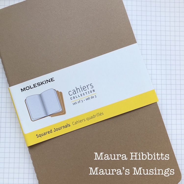
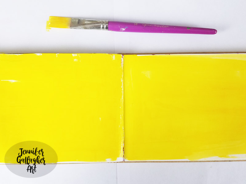
I’m using one of my favorite little notebooks by Moleskine (any blank notebook will do).
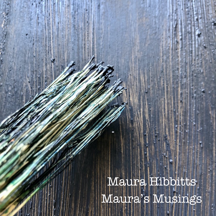
First step in transforming the cover is to paint a layer of black gesso, and run a Hakeme brush over it to create texture. (An alternative to a Hakeme brush would be to use a small broom.)
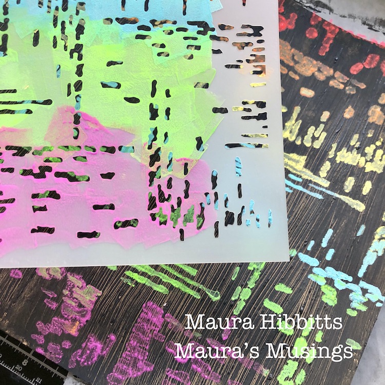
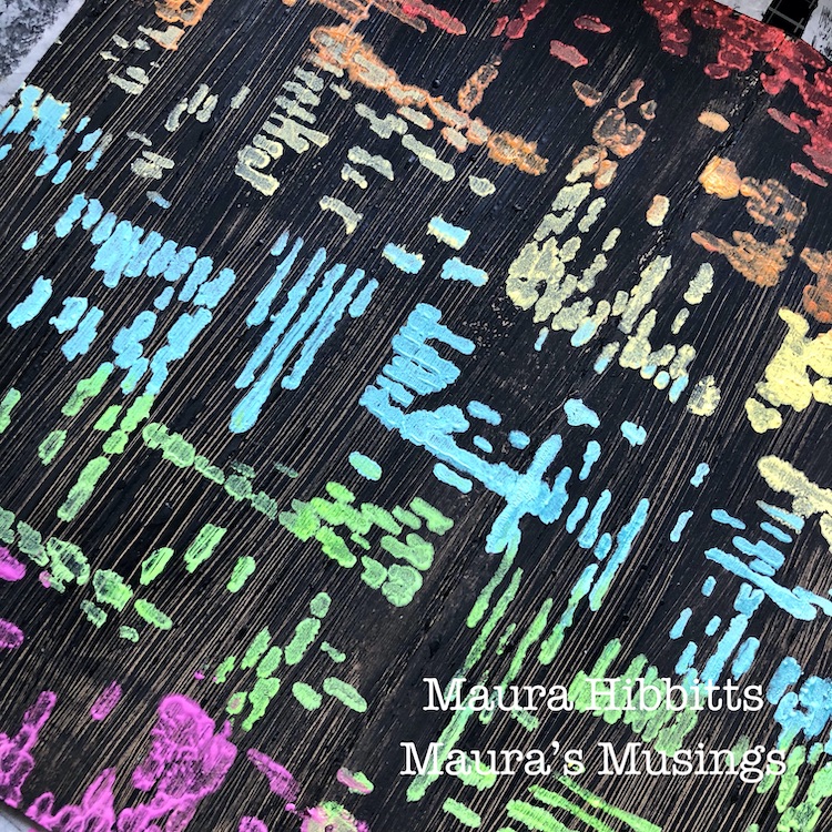
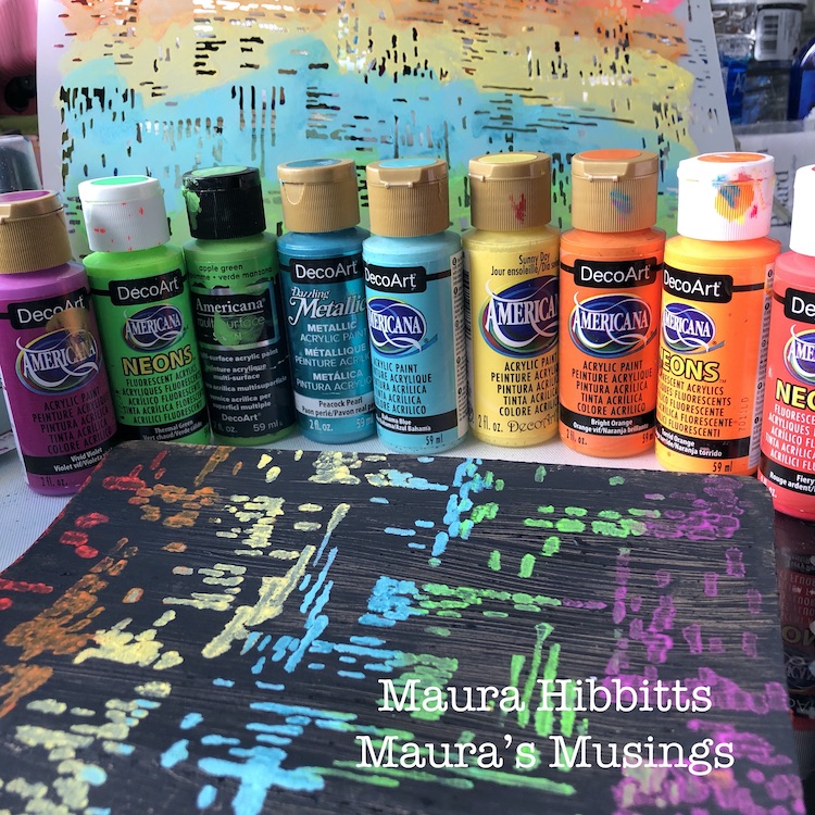
The Signals stencil and an array of rainbow colors goes over the dry gesso, starting with red. I really like using cosmetic sponges to apply acrylic paint through a stencil. When I need to change color, I just snip off the end, and have a “new” one to use.
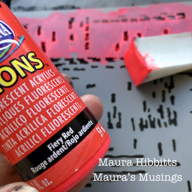
I continued stenciling the colors of the rainbow down the notebook…red, orange, yellow, blue, green, violet…Oops! There goes that rebel green jumping out of order again!
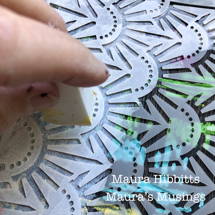
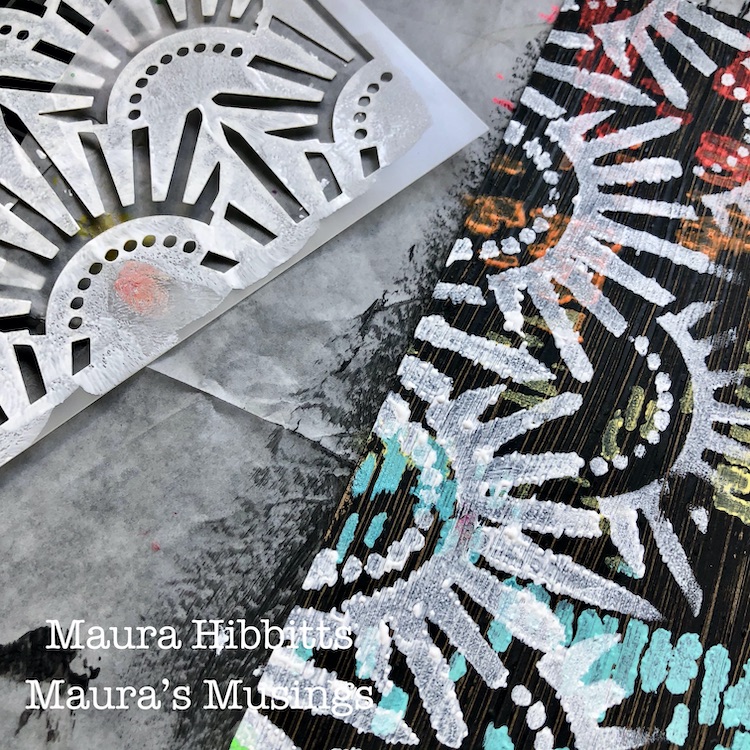
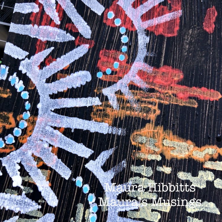
Nathalie’s new stencil designs are awesome, and I had to use the Art Deco Empire too, how could I not? I decided to use white paint and stencil around the sides and bottom.
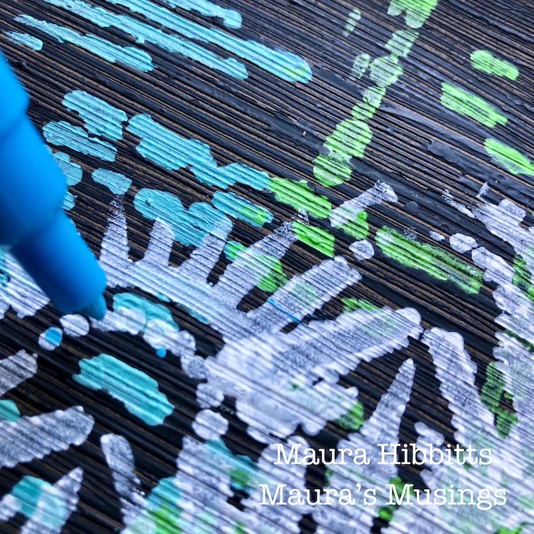
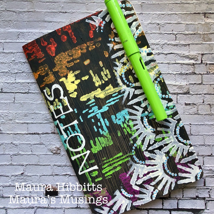
Final touch is a bit of work with Posca paint pens. I went over the dots with turquoise blue, and hand lettered NOTES along the side with white.
Here’s a look at the array of supplies I used to make my notebook. How about clipping a fountain pen onto the notebook in a matching color…oh yes, in that rebellious green, I see.
I called upon my Creative Jumpstart Super Power – Colorful Imagination – to make my notebook. Every color of the rainbow (yes I know, not in order…that must have been my imagination playing with me) is dancing across the cover with the Signals stencil. Those blank graph papers are calling to my imagination to fill this with ideas and sketches…I can’t wait! Why not find your own creative super power by checking out this year’s Creative Jumpstart 2020? Wishing you a creative and imaginative year! – Maura
Love your colorful notebook Maura and how you mixed up the patterns – very cool!! And definitely a super power of yours! Thank you so much !!!
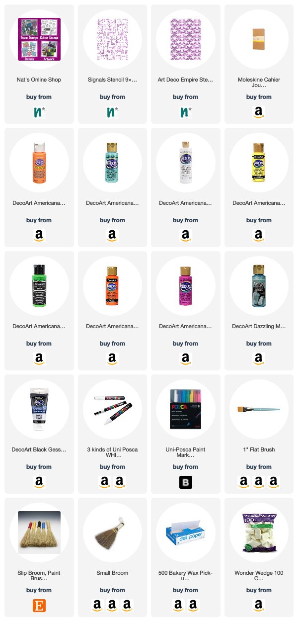
Want to give Maura’s project a try? You can find all my Stencils in my Online Shop and here are some of the other supplies Maura used:
Feel inspired? Playing along with Creative JumpStart and the Creative Squad? Working on something yourself that you’d like to share? I love to see how you interpret our monthly themes. Email me how you used my stencils and stamps with the theme and email me an image – I would love to share your projects in my next “n*Spiration From Around the Globe“.
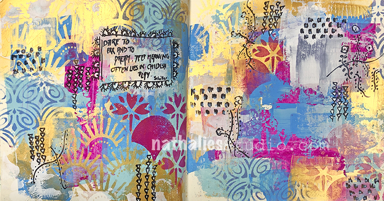
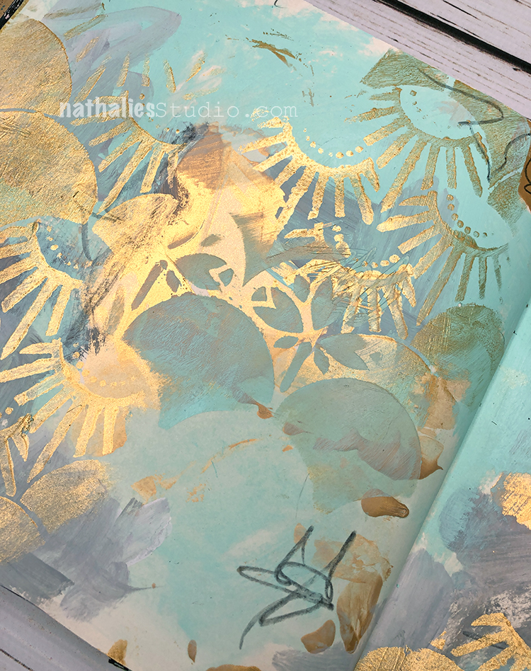
“Dare to err and to dream. Deep meaning often lies in childish play.” – Friedrich Schiller. I love this quote and it’s great motivation to just play when you are creating and see what magic may happen.
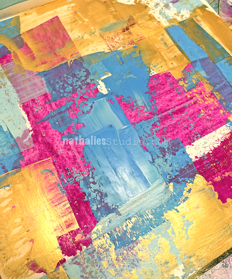
For my vibrant background I used Gouache, Gold Gesso, and White gesso.
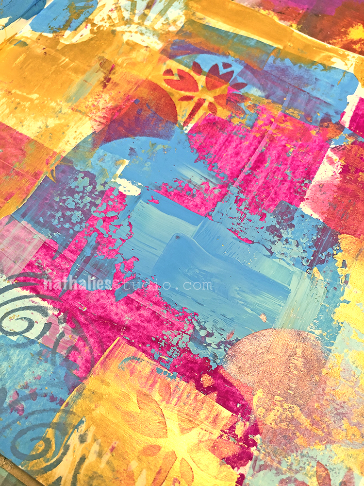
Then I went in with my Art Nouveau Wallpaper and Art Deco Fairview stencils for some subtle pattern elements here and there.
For my mark making I used a fude pen and a white signo pen.
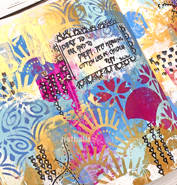
I put a light coating of white down before adding my quote and framed it with some more quirky mark making.
Here are some of the supplies I used:
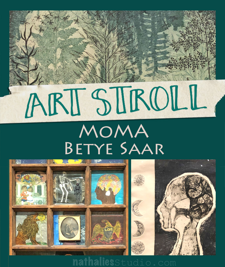
During the holiday season my husband and I want to a MoMA evening with Jazz for members. There is nothing better than the word Jazz to get the man out – LOL- just kidding ;) I think because of some snow right before we went the museum was empty- it was awesome. We finally also saw the Betye Saar exhibition. Betye Saar is known for her assemblage and collage work. Saar explores both the realities of African-American oppression and the mysticism of symbols through the combination of everyday objects. “I’m the kind of person who recycles materials but I also recycle emotions and feelings,” the artist has explained. “And I had a great deal of anger about the segregation and the racism in this country.”
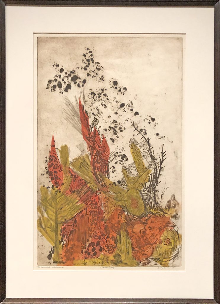
The Wounded Wilderness, 1962 – Etching with relief printing.
She became interested in printmaking when she was studying design. It became her segue from design to fine art.
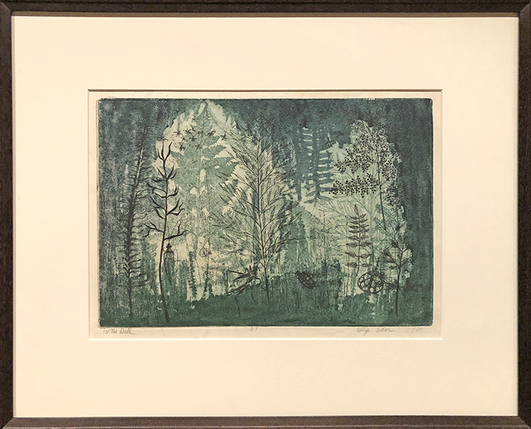
In the Dell, 1960 – Etching.
Her pieces were fascinating!
The Quick & the Dead, 1964 – Etching and collagraph with hand addtions and embossing with stamped ink
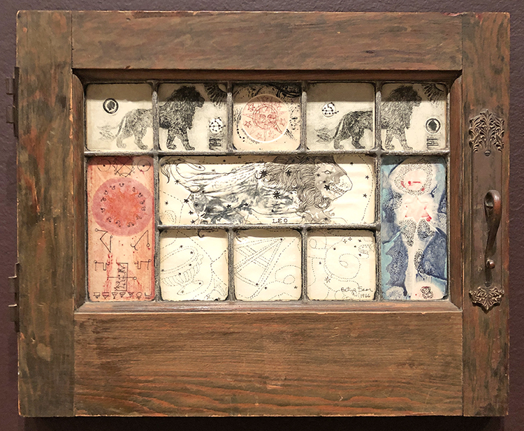
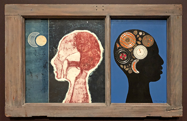
Mystic Window for Leo, Assemblage, etching
Saar found this window and used images of the leo and sky charts as this is an important symbol for her. I loved this so much!

Black Girl’s Window, 1969, wooden window fram with paint, cut-and-pasted printed and painted papers, daguerreotype, lenticular print and plastic figurine.
A silhouette of her head with floating moons and stars; an etching (her own) of a lion, her birth sign; a tintype of a woman who could be her Irish grandmother; and, at the center, a novelty shop Halloween skeleton alluding to her father’s death when she was a child, a loss she says she still lives with.
“Even at the time, I knew it was autobiographical”, Saar said of her now -iconic assemblage Black Girl’s Window. “It is like a diary of my life”
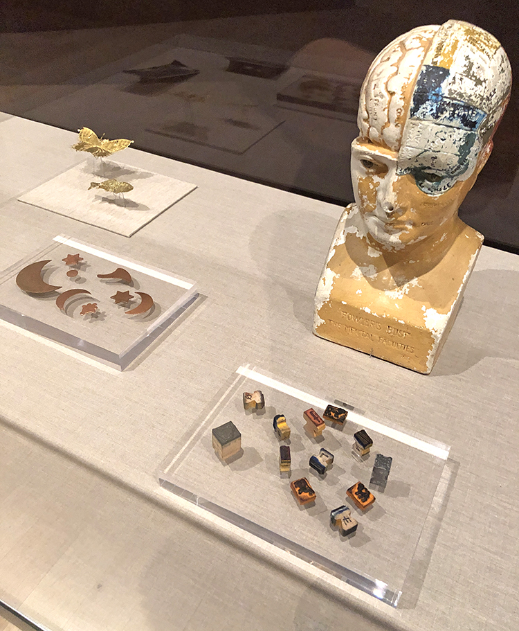
Saars printing materials – it was so interesting to see those and then try to find them again in her various prints.
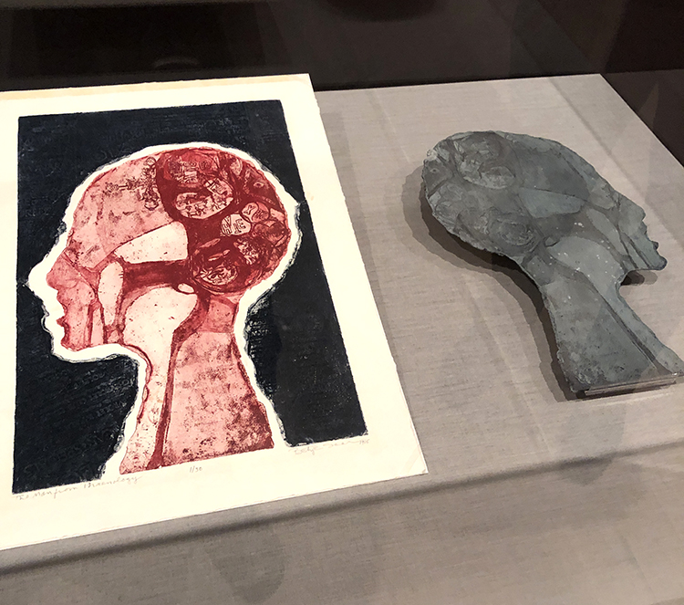
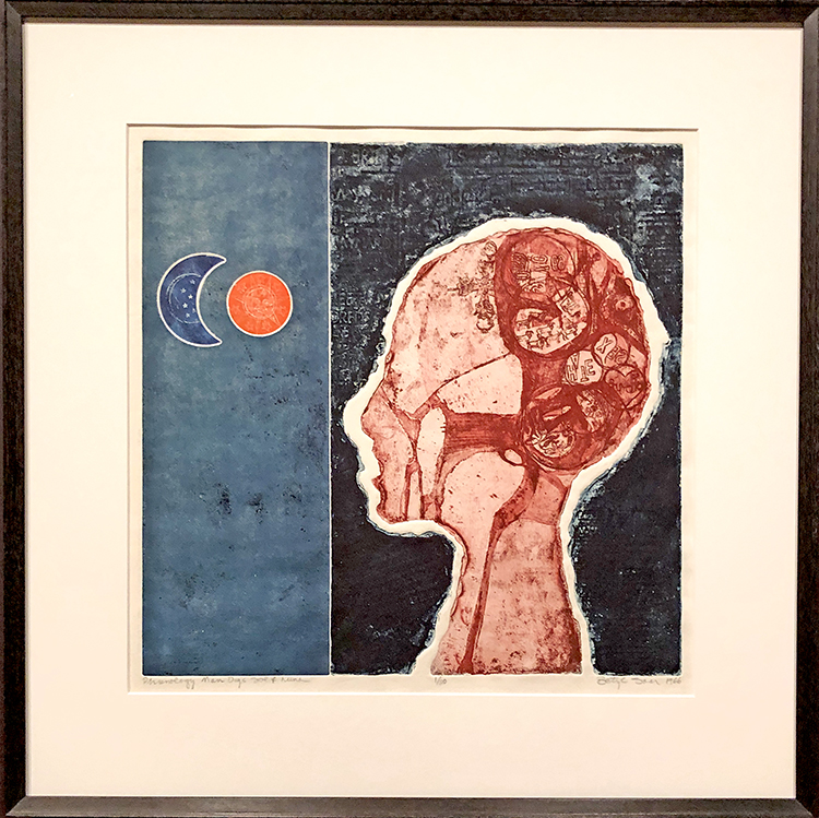
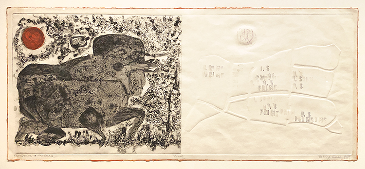
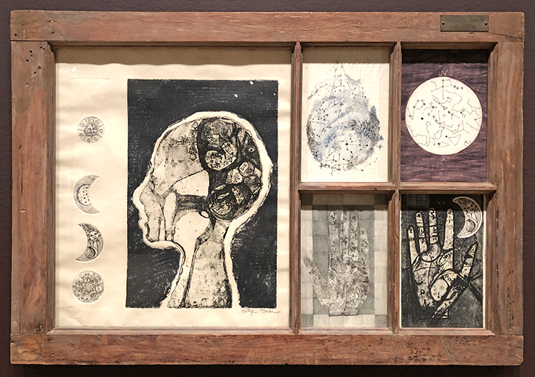
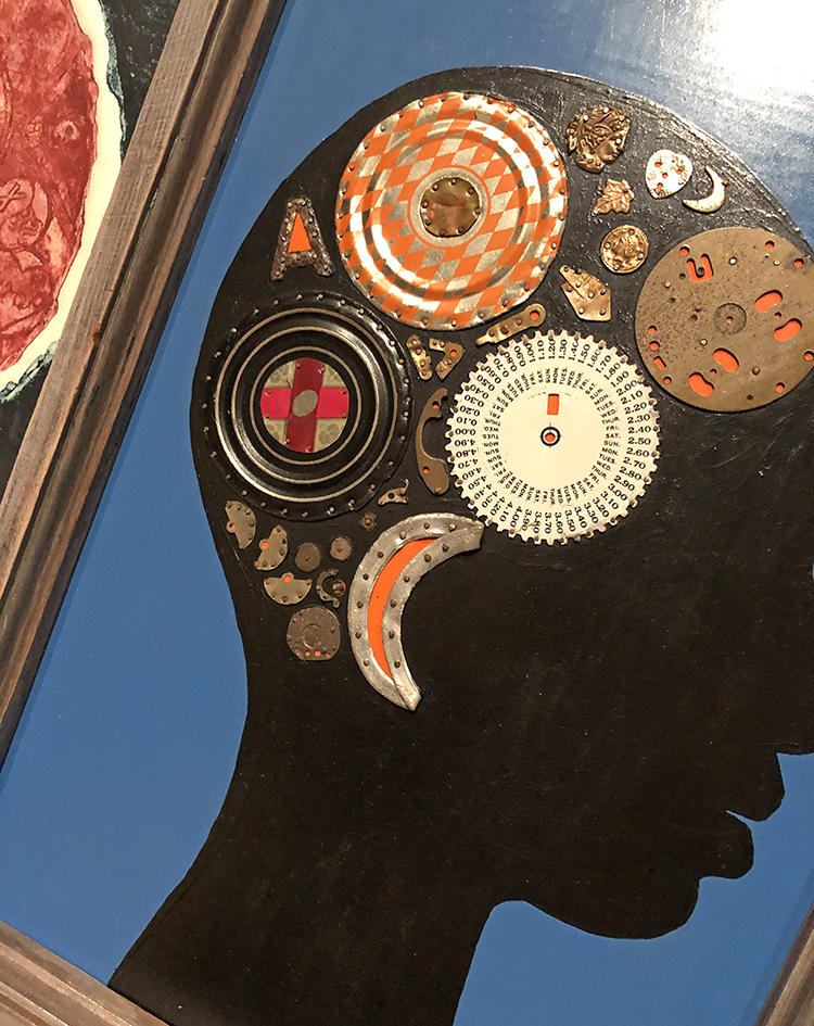
Phrenology Man Digs Sol y Luna1966, Etching with relief-printed found objects
“Phrenology, a pseudoscience that has been definitively debunked, links portions of the human brain to different character traits and capacities. It gained popularity in the nineteenth century and was cited by proponents of slavery and segregation as proof of the inferiority of African Americans. That a black woman adopted this motif in her work may seem subversive, but according to Saar, she was attracted to phrenology as a map of the unknown, in keeping with her interest in astrology and palmistry. Her own Phrenology Man, who appears in this print and several others, has the words “SEX” and “HATE” tumbling through his mind, together with animals, flowers, and astrological signs.”
The Phrenologer’s Window II, 1966 – Wooden Window frame with cut-and-pasted printed paper, acrylic paint, and found objects on board
“You can make art out of anything.” Betye Saar
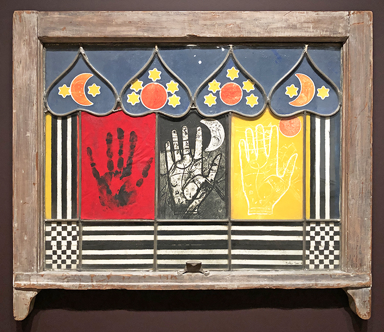
The Palmist Window, 1967 wooden window frame with cut-and-pasted printed paper and fabric with charcoal and acrylic paint
loved this
So happy to share with you today a special video interview I did with one of our Creative JumpStart 2020 teachers: Jen Crossley. I have known Jen for a few years now and have had the pleasure of teaching with her in the past. This is her 3rd time teaching with CJS and I am happy to have you get to know her a bit better now. In this interview Jen talks about loving to create from a very young age, then a professional start with paper arts, and finally moving to metal and found objects. She describes how art making helps her get a release from the pressures of life. She also talks about using vintage items and the stories and history that those items may or may not bring to a project.
Thank you Jen!
You can learn more about Jen on her website.
And now it is your turn to make a commitment to creative play this year: Sign up TODAY for Creative JumpStart 2020 and get 31 different mixed media lessons from 31 Super Hero Artists like Jen. Hope to see you in the CJS classroom soon :)

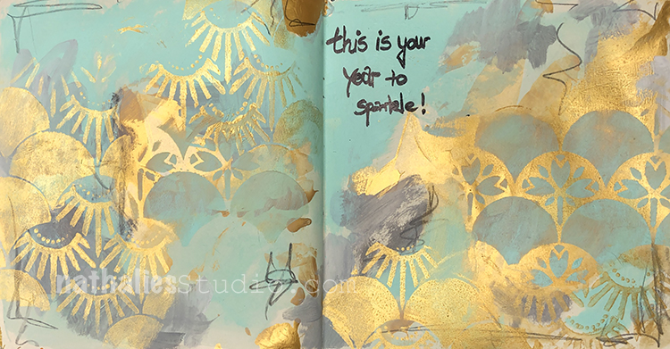
This is your year to Sparkle! – I love all the possibilities that the new year brings, with maybe a fresh start and a burst of energy and enthusiasm.
For my background I used heavy body acrylic paints and white gesso, but also I used the Gold Gesso by Daniel Smith for some serious sparkle with my Art Nouveau Wallpaper and Art Deco Summit stencils.
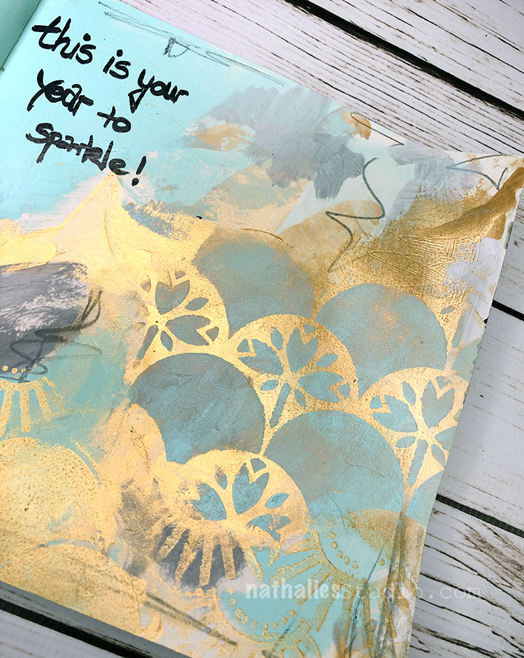
I hope you are ready to sparkle :)
Here are some supplies I used:
What a lovely spread, it looks very oriental. I almost expect to see a stork flying by on the pages, very pretty.
Love the effect of the gold – I too have Daniel Smith Gold Gesso but have not gotten the results you did – will give it another go. BTW, CJS2020 is phenomenal. Thank you for making it happen!
Hello from my Creative Squad and today we are happy to have a post from Jennifer Gallagher to start us off this month. Jennifer is using her artistic Super Power – Layering, along with my new Space Age Modern stencil and this month’s theme: Super Power – this month we are joining Creative JumpStart 2020 and exploring our Artistic Super Powers. It could be your unique technique or style, the way you like to use a medium or tool, or maybe your way of approaching artmaking. What is yours and show us how you use it.
I am so honored to kick off a new year of Creative Squad posts with this month’s theme, in honor of Creative JumpStart,with my artistic superpower – Layering! Understanding how to layer your paints, inks and sprays will help you create delicious texture and design that can be used in your art journals, card-making, and other mixed media projects. A lot of people are intimidated by layering and think there must be some magic formula, but I promise you it’s super easy. This tutorial will lead you through creating an art journal page with many layers of acrylic paint and art spray perfect for learning the basics of layering. Let’s get started.
In my small dylusions journal I started by laying down a thin layer of white gesso. You can work in your dylusions journal without this step, but I find that it adds a little bit of tooth and texture that I like. Once dry, I dipped a good size paint brush into water and dropped a very small drop of fluid acrylic paint in Diarylide Yellow onto the pages. Spread the paint around with your wet brush.
While the paint was still wet, I gently rubbed a baby wipe across the surface to remove some of the depth of color.
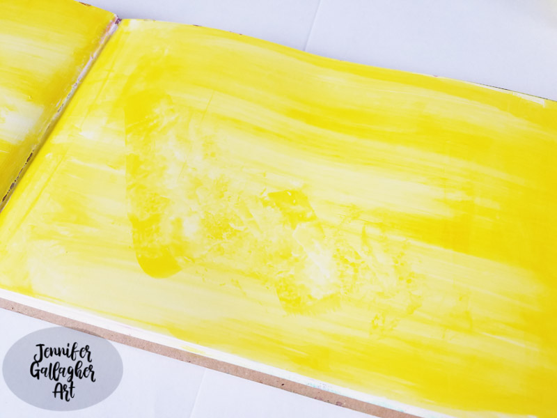
Next, I dipped a large palette knife into white acrylic paint and scraped it across the pages. This step beats back some of the depth of color and gives us some of our white space back.
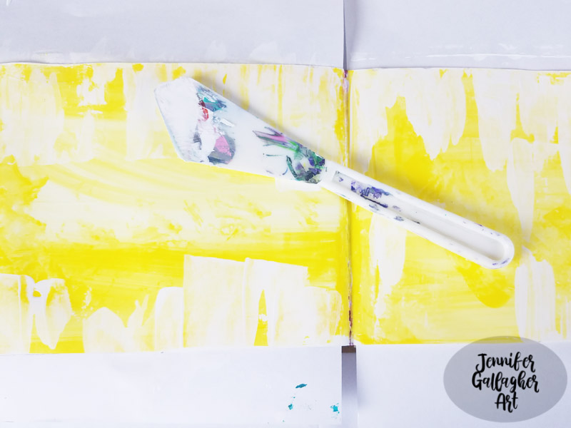
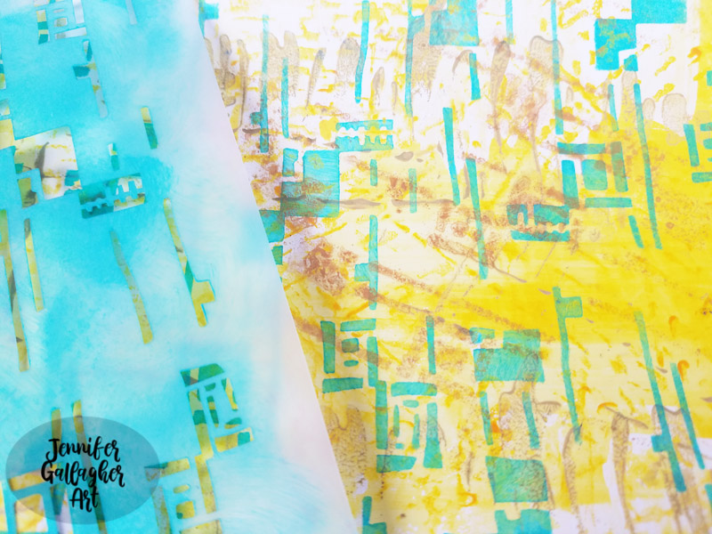
Another great way to add texture with layering is foam stamps. Here I’ve used Nat’s foam stamp Signals with Diarylide Yellow to add the dashed lines across the pages.
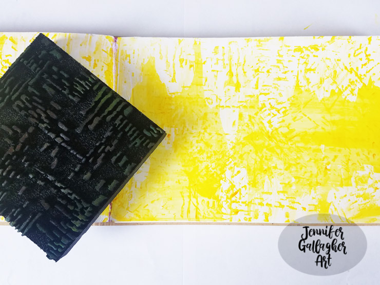
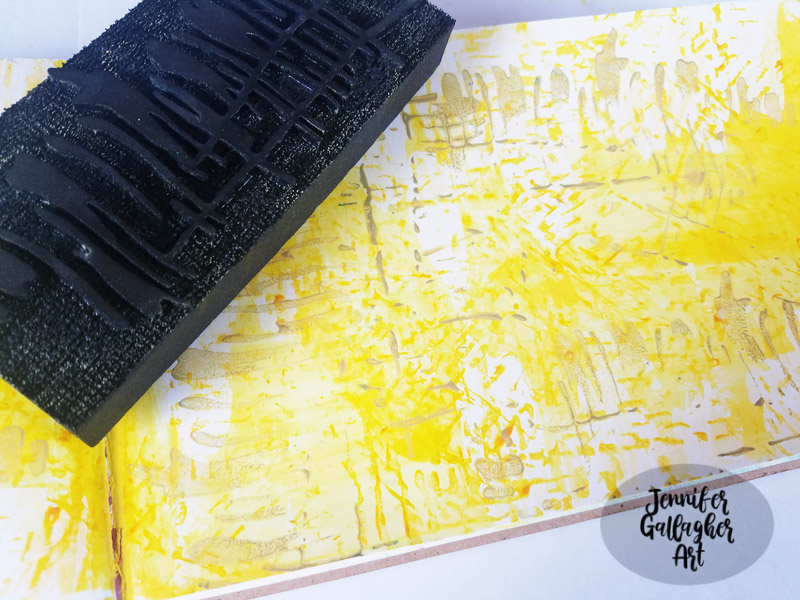
Next, I stepped up the size of the foam stamp design to a larger pattern. Using Nat’s foam stamp Far Out, I applied a darker yellow being sure to vary the pattern by turning the foam stamp in different directions.
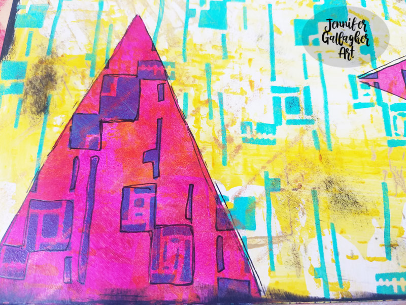
So far we have a great textured background. This is when I add my main background design with a stencil. I’ve picked Nat’s new stencil release, Space Age Modern. Using a small blending tool, I applied LIquitex Basics Acrylic in Bright Aqua Green through the stencil. This color is the perfect compliment for our background.
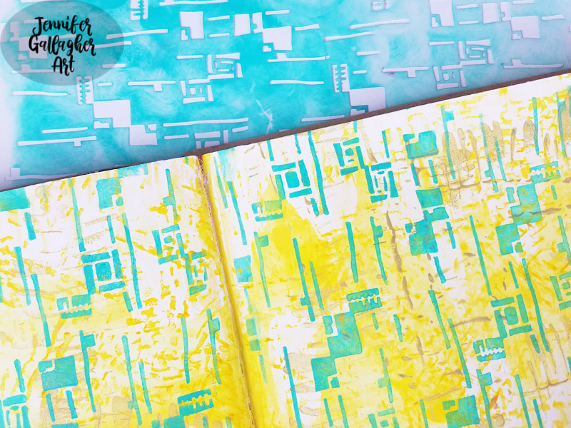
Looking at the page I decided that I should apply a light metallic to the page to push the green into the background a little more. I laid the Space Age Modern stencil back down and sprayed Marabu mixed media art spray in gold here and there.
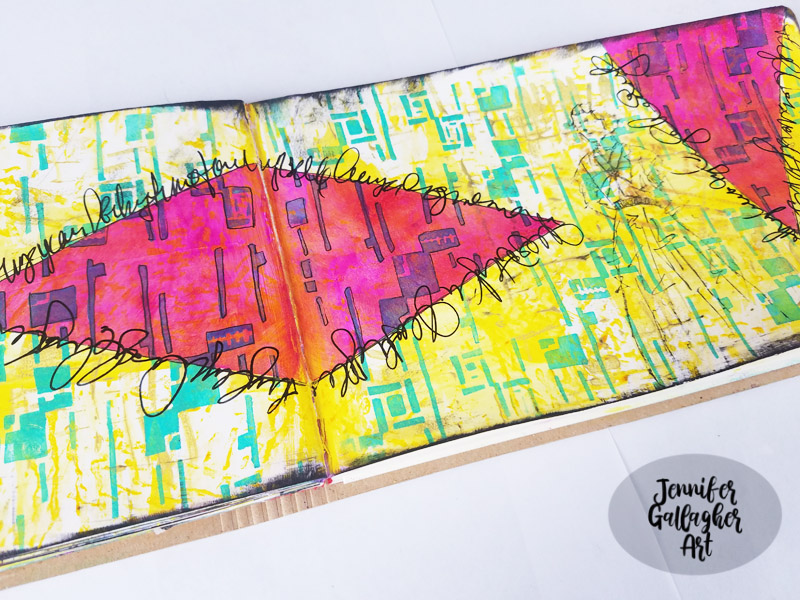
I still had the hand made triangle stencil I used for last month’s Christmas card tutorial lying on my desk and decided it would be fun to integrate it into this art journal page. With a small blending tool I applied Liquitex Basics quinacridone magenta through the triangle stencil. I used a small amount of paint. I was not trying to totally cover the background but apply a thin coat of paint and allow the background to shine through.
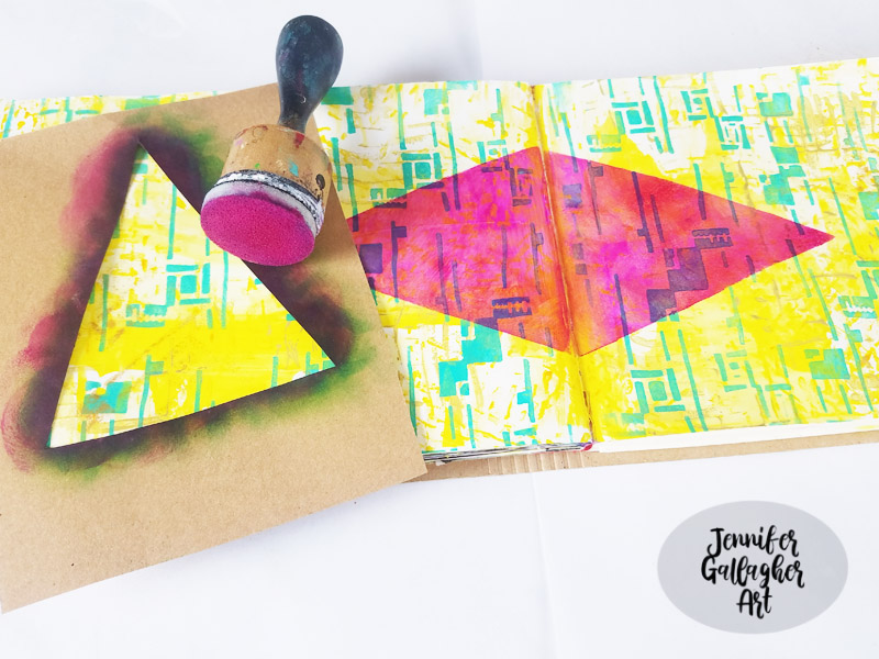
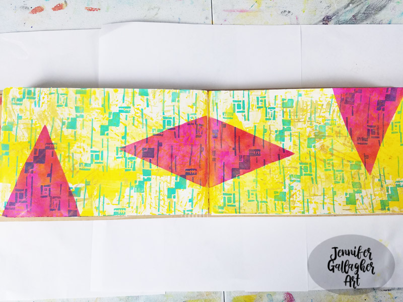
I applied a black edge all around the art journal spread pages with black acrylic and then added some doodling around with a black gelly roll pen.
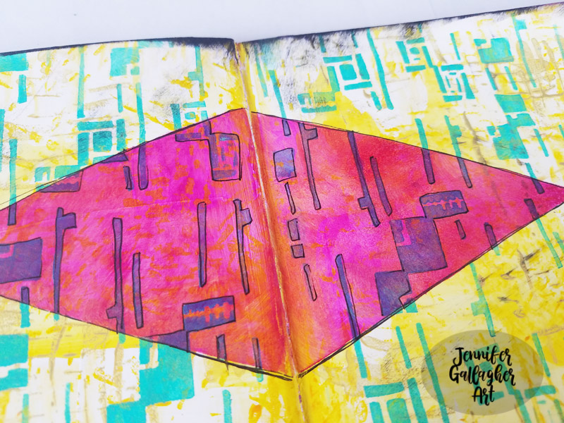
I stamped Nat’s Millie stamp on the right hand page in black ink.
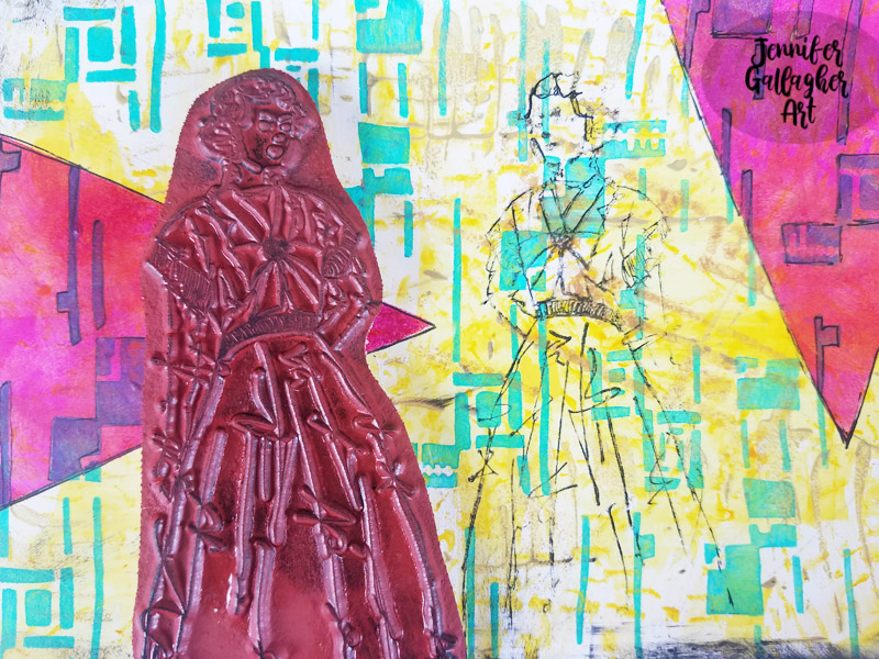
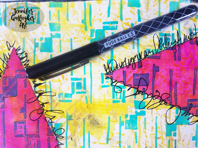
Using a black fudeball pen I did some journaling around the triangles.
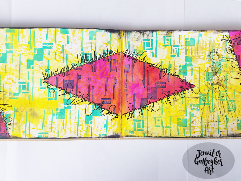
I hope you have enjoyed this tutorial. It’s a new year that will be filled with tons of creative inspiraton from the Creative Squad so be sure to follow along and share what you create.
Thank you Jennifer – just love how the magenta is transparent and changes the colors underneath. Gorgeous page that really shows off your Super Power :)
Give it a try: you can find all my Stencils, Foam Stamps, and Rubber Stamps in my Online Shop and here are some of the other supplies Jennifer used:
Feel inspired? Playing along with Creative JumpStart and the Creative Squad? Working on something yourself that you’d like to share? I love to see how you interpret our monthly themes. Email me how you used my stencils and stamps with the theme and email me an image – I would love to share your projects in my next “n*Spiration From Around the Globe“.
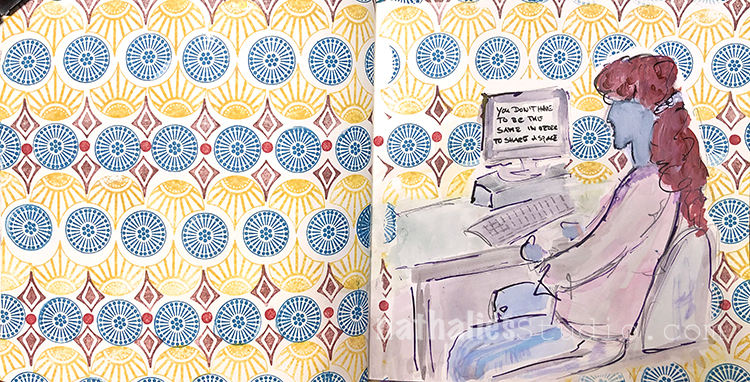
“You don’t have to be the same to share a space.”
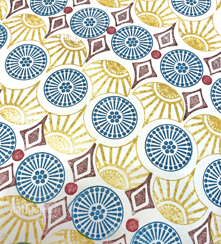
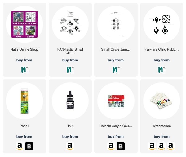
I stamped out a background pattern with my Fantastic Small, Small Circle Jumble, and Fanfare stamps. I used a pencil eraser for some dots in between.
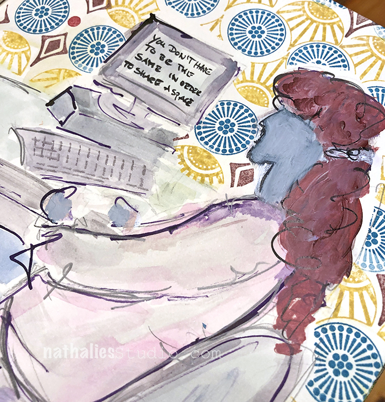
I sketched the figure right on the page with ink and pencil and then filled in with gouache and watercolor.
Here are some of the supplies I used:
I love the colors and the message Nat.
Happy New Year!
Reply