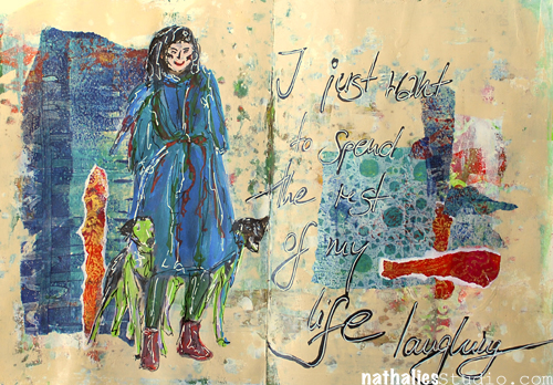
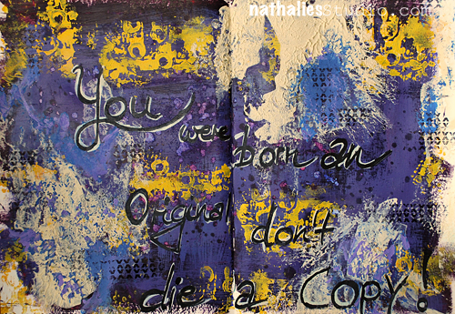
It has become a tradition of mine and other blogger friends to wind down the year with some Top “insert number”- Lists of work , posts and photos, before the year ends. It makes me go back and look at what I have done and accomplished and it also makes me dwell in memories. Too often we forget about the things we did and accomplished throughout the year- often just bashing ourselves for not fulfilling all the wonderful new year’s resolutions from last year. Maybe this makes you wanna do it too – if so – share 
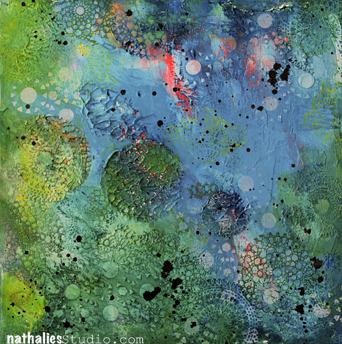
2014 was definitely a year I did more work on canvas than any other years before – here are my personal top five canvases:
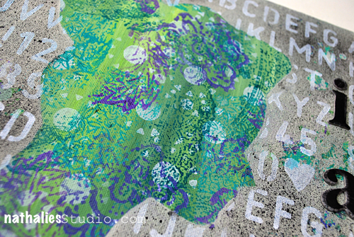
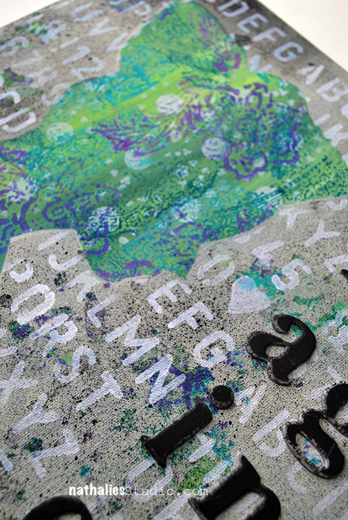
1. On The Flip Side
This one might be my absolute favorite of the year – it has a lot of personal meaning for me and that might be actually the only reason why it is a favorite- LOL- the personal meaning – although- I do like that I for a change was also working in a bit different color rage than usual.
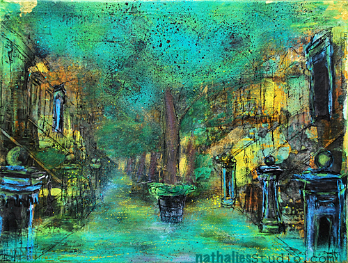
2. The Powerhouse
I like this one because of the colors and …because I stopped- LOL. I wasn’t sure in the beginning if that was done and then I decided to let it go and I am so happy I did. This canvas taught me that it is ok to have long breaks in between and come back after a while, just to decide to call it finished.
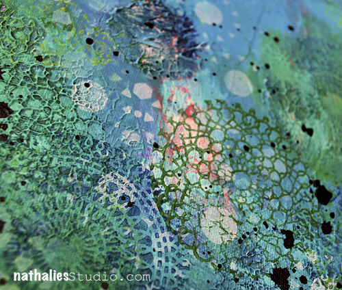
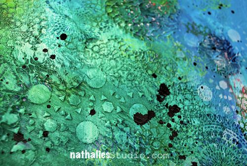
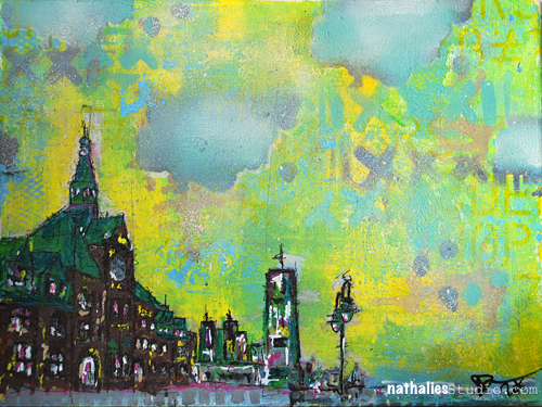
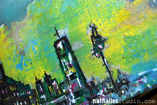
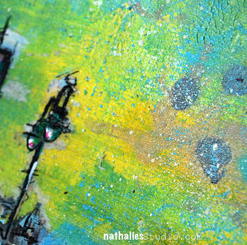
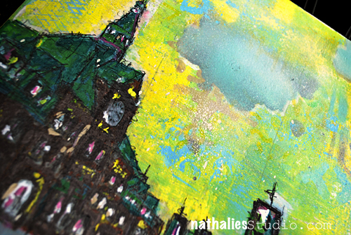
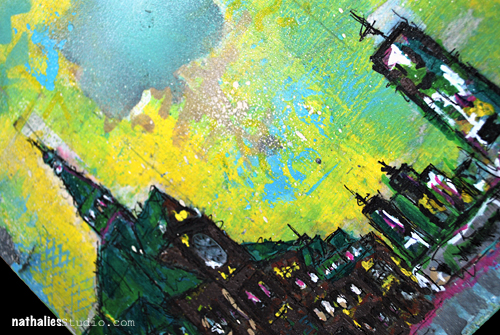
3. Standing Strong
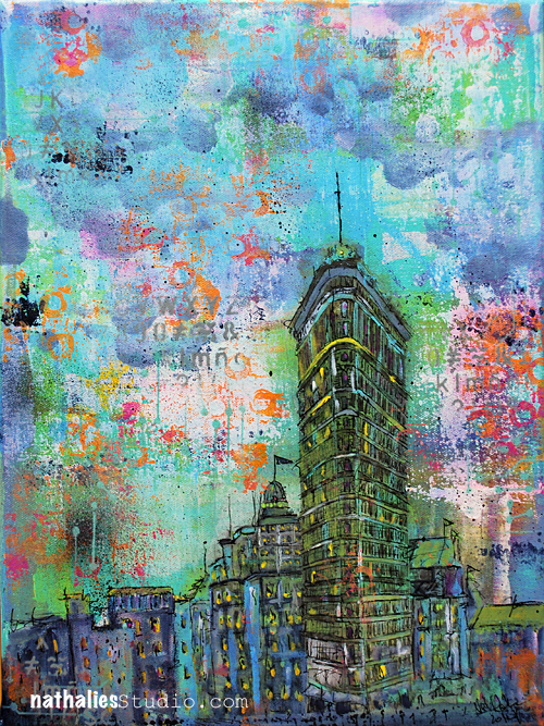
This canvas does not have as much texture as usual- but I did like creating it a lot. I started mixing very intrigue parts of buildings with undefined parts and it gave me a push from there on to explore this a bit more.
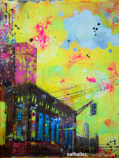
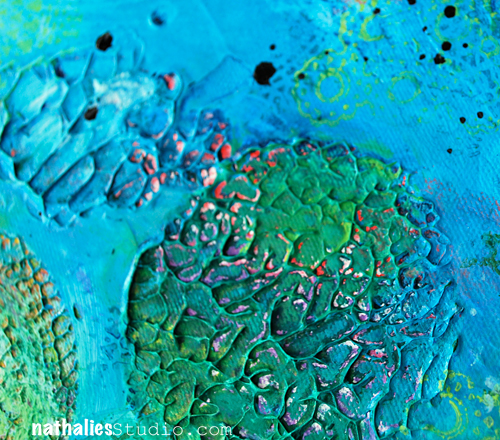
4. Everything is Gentrified
This painting gave me a lot of headaches- meanwhile and after – I do love it -but I learned a lot about light sources. How important it is in which light you work and in which light you then maybe hang it. It is a painting that needs a well lit area and it changes it’s looks during the day from vibrant and uplifting to dark and oppressing. For sure interesting for me and while not perfect- it goes with the topic and title.
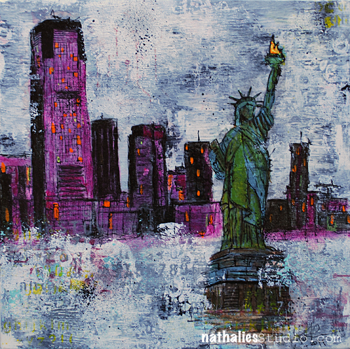
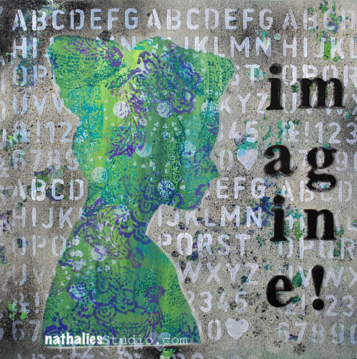
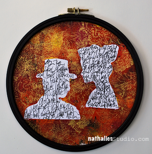
5. In the Same Boat?
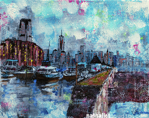
This one was also a canvas of headaches – LOL. I had a finished picture in my head when I started it- which was a huge mistake and then I also started mixing some colors which at first I totally did not like. It took me forever to finish this work up- the canvas was sitting on the easel and I would look at it contemplating for weeks if I should just paint over it. And then I didn’t …and it grew on me – and now I really like it -I do like the colors I mixed …another canvas that taught me to be patient.
What I learned:
2014 marks definitely a year where I feel I have learned to be patient with me, my skills and my work. I also learned that I shouldn’t give up too early on something.
My goal for 2015:
All of those canvases are a smaller scale (12×24 is I think the biggest one- still not having the U.S. sizes in my head- LOL) – so my goal for next year is to go bigger – so we will see :) . I started a bigger canvas a couple weeks ago- I will show you the process in a couple days. It feels pretty daring to me but is a lot of fun :)
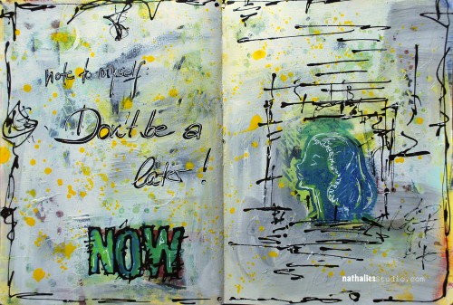
Hope you enjoyed this little journey – next up will be photos and art journal pages!
have a gorgeous day


Comments (2)
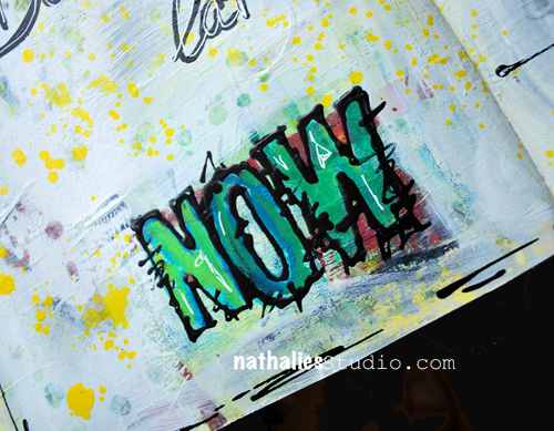
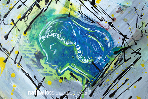
Joi@RR
| #
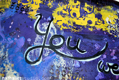
Now is good Nat – it spells WON – backwards!!! At to me… you are always a WINNER at everything you do. I like this pages because of there is lots of white so your incredibly artistic doodles show up so well. The colors are nice – clean – like a new beginning – no build up – open – free – ready for a NEW NOW! j.
Reply
Sabine Schneider
| #
Oh, ich bin oft auch ein later…..Tolle Seite!!!!
Liebe Grüße, Sabine
Reply