Blog: Art Journal

Built A Door – Art Journal

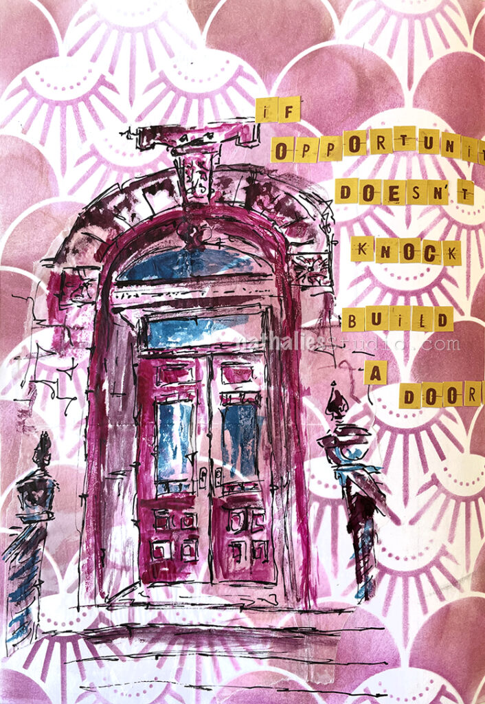
“If opportunity doesn’t knock, build a door.”

I used Ranger Distress Ink with a cosmetic sponge over the Art Deco Summit stencil for my background. It was from back when I first got my prototype and tested the stencil and then kept it in my collage stash.
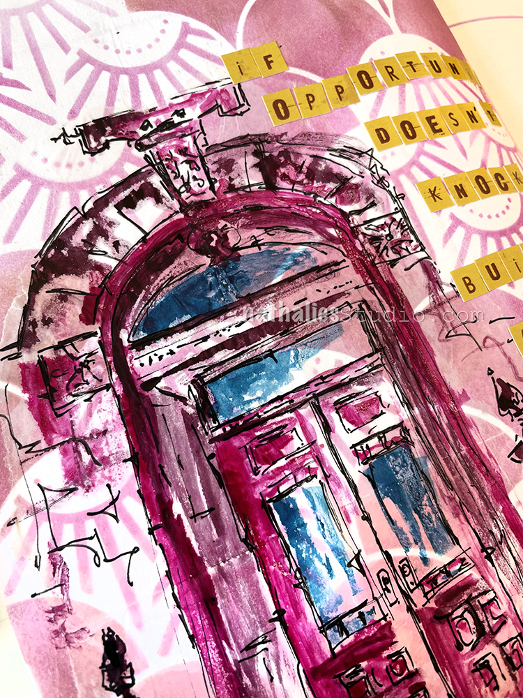
Then I sketched with a Posca fine marker on deli paper, and used acrylic ink by Liquitex with a brush to color some areas in. This is actually the entrance to our home and it is just one of many sketches as I am intrigued by all the details.

As the background stencil design was made with Distress Ink, I thought it would be better to use a glue stick (my fav almond scented one) to adhere the deli paper – Distress Ink easily reactivates and smears with matte medium. I personally really do not like the look of the deli paper on the background here though. I usually love sketching on deli paper because a) it takes the stress away of messing up a nice background and b) it also give a fun effect with it’s kinda semi transparent look… but I always strive for a very smooth transition without hard edges when applying it and the glue stick did not work the same way as matte medium would have in this case to make that transition. Oh well… LOL. Don’t switch a winning horse…
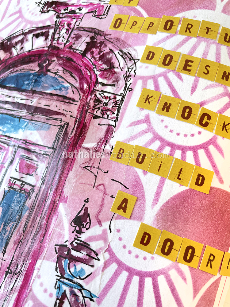
The letter stickers are still left overs from a company I used to work with but doesn’t exist anymore. I still love them but it is time to use them up.

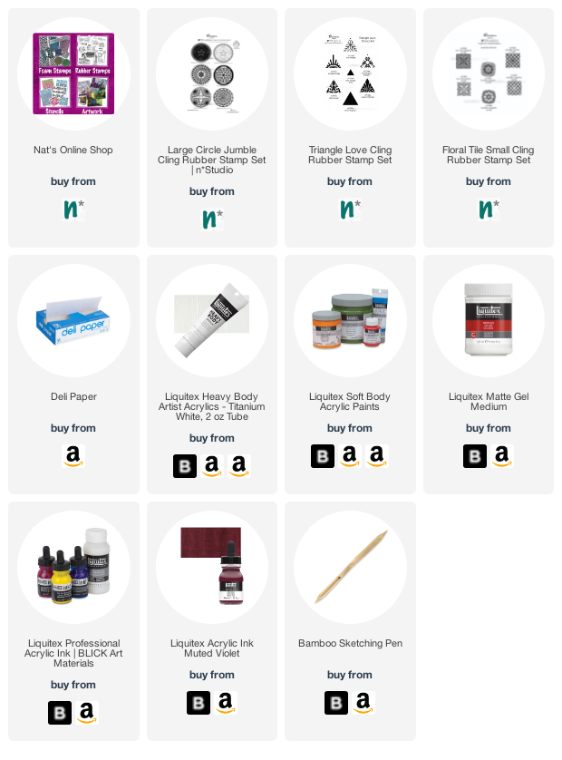
Here are some of the supplies I used:
Comments (1)

  • Sue Clarke

    |

    Love the door and the quote!!!

    Reply

Leave a comment

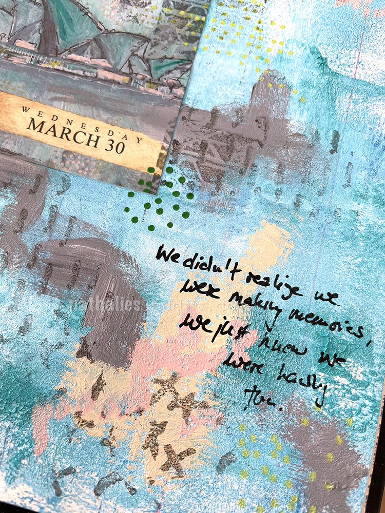
Making Memories – Art Journal

“We didn’t know we were making memories, we just knew we were having fun.”

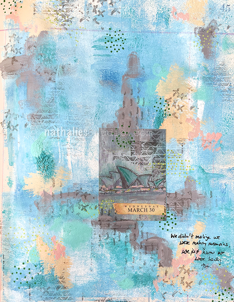
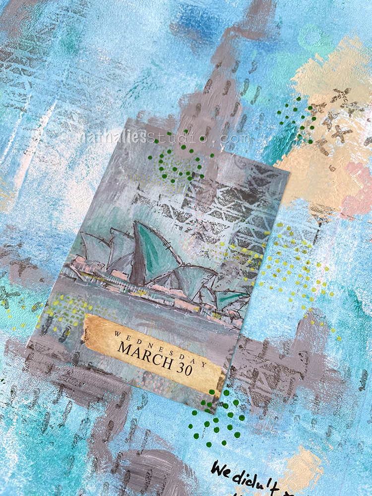
This is using another page from the sold out Artist Almanac Calendar (the original painting is still available here though). It was fun getting inspired by this older artwork of mine, depicting the Sydney Opera. It made me not only revisit the way I created the background, but also the visit to Sydney itself.

In fact I was there twice and I remember how much I loved strolling through the Botanical Garden right there as well as seeing Herbie Hancock in the Opera. Pretty cool btw, sitting in the nose bleed seat wayyyyyy up high, last row with my back to the wall, and Herbie so tiny down on stage. And yet it didn’t matter – the sound being so phenomenal in this building. I digress though LOL!

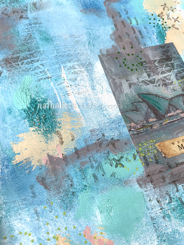
I used some heavy bodied and soft bodied acrylic paints right out of the tube on the page, and then blended the colors with a brayer. It is one of my favorite ways to create texture on canvas, but since this is in my ledger, I took a piece of paper and carefully dabbed it on the background to flatten the peaks of paint out a little bit.

I used some acrylic markers to add marks and also my Embroidery stamp set for added mark making. I love the mixture of a repetitive stamp as well as a hand made mark.

Here are some of the supplies I used:

Comments (2)

  • Sue Clarke

    |

    Nat, I just love that background! I find it funny when people say we’re making memories as they are doing an activity…of course you will look back on them…but it IS just fun! Much later one will realize just how much the activity was enjoyed=wonderful memories. I don’t know if I made any sense, but I agree with your sentiment.

    Reply

    • nathalie-kalbach

      |

      I totally get it! we do not set out with that premise from the beginning, it just turns out that way.

      Reply

Leave a comment

Summer Dreams – Art Journal

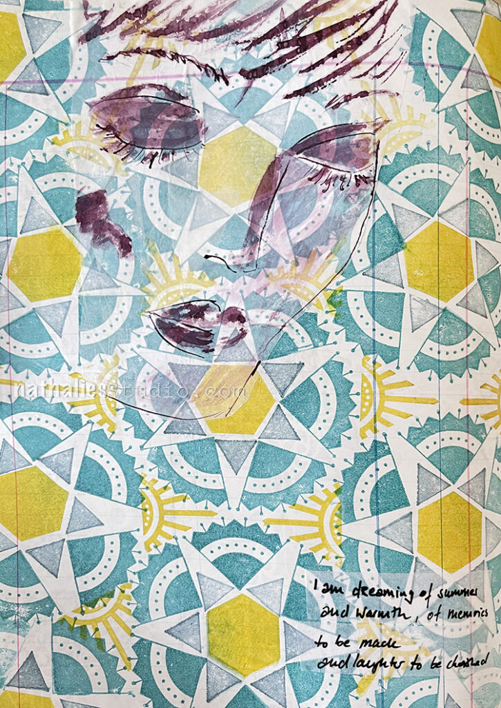
I was really dreaming of summer while I played with this page in my art journal, right as we had another cold spell here.

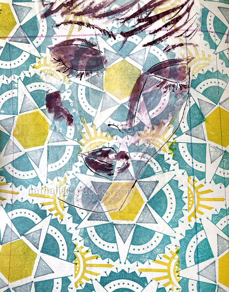
I enjoyed having a little pattern play with some stamps from my Triangle Love set, my Mini Motifs set, and the Solid Hex Small rubber stamp too. Isn’t it fun to see how they all fit together? I used Versafine ink pads for the stamping.

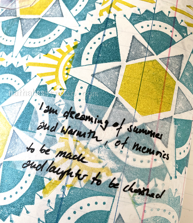
My journaling was done on some blank, transparent washi tape that I just love – but still don’t remember where I got it.

I drew the face with a bamboo sketching pen (a favorite drawing tool of mine) and acrylic ink on deli paper. I adhered the sketch with fluid matte medium and really let the pattern shine through.

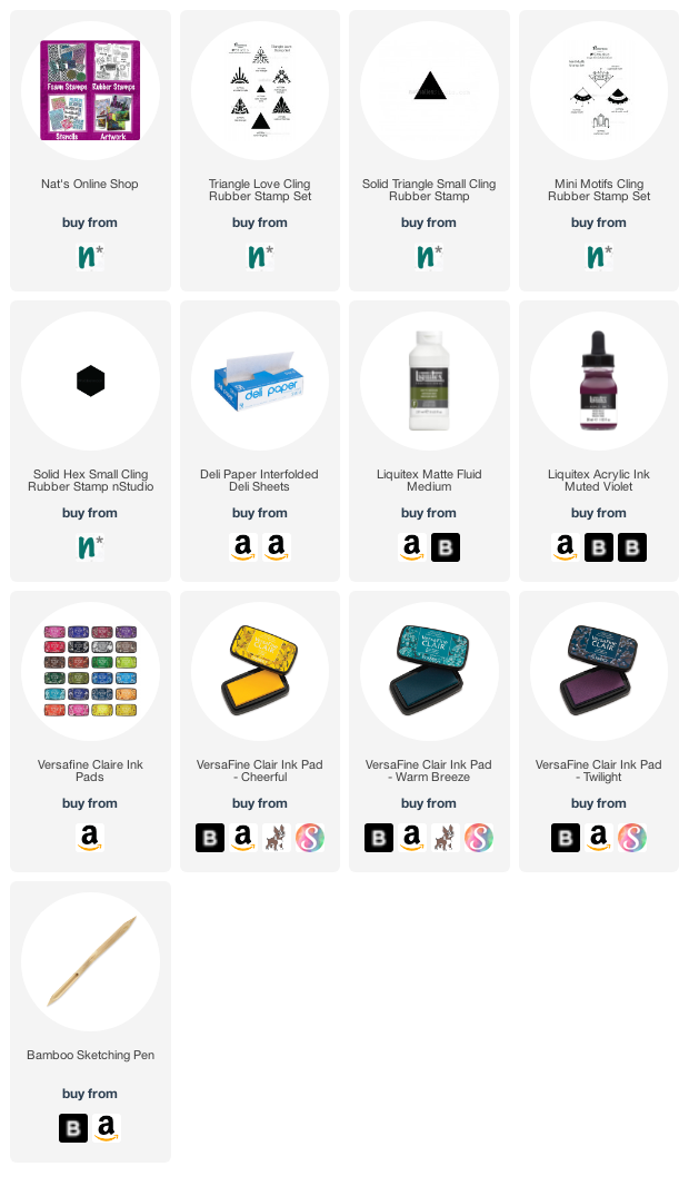
Here are some of the supplies I used:
Leave a comment

Doesn’t Hurt You – Art Journal

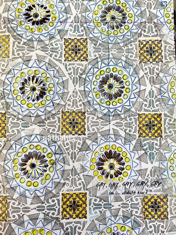
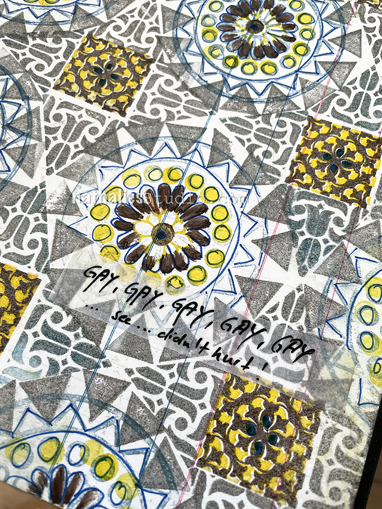
This one would have probably turned out a bit better if I had used different colors for the different stamps – maybe rainbow colors – but it was fun to explore and I really love some of the elements.

I used the Versailles stamps in the Floral Tile Small set with yellow and brown inks, the Solid Triangle Small stamp and the Amsterdam Triangle from the Triangle Love set, as well as the Valley Road stamp from the Large Circle Jumble set. I do think a different circle stamp would have worked better with the Versailles and Amsterdam stamps but I am glad I tried – I had lots of fun making this page. And even though you might not like it… it doesn’t hurt you! LOL

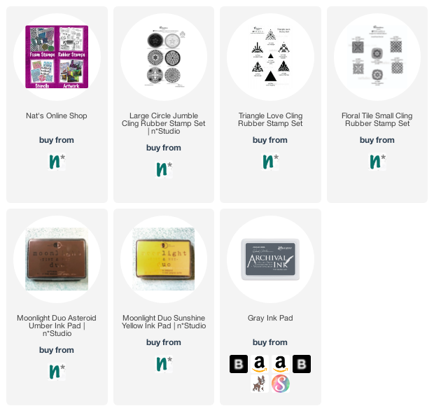
Here are some of the supplies I used:
Leave a comment

Judgement Day – Art Journal

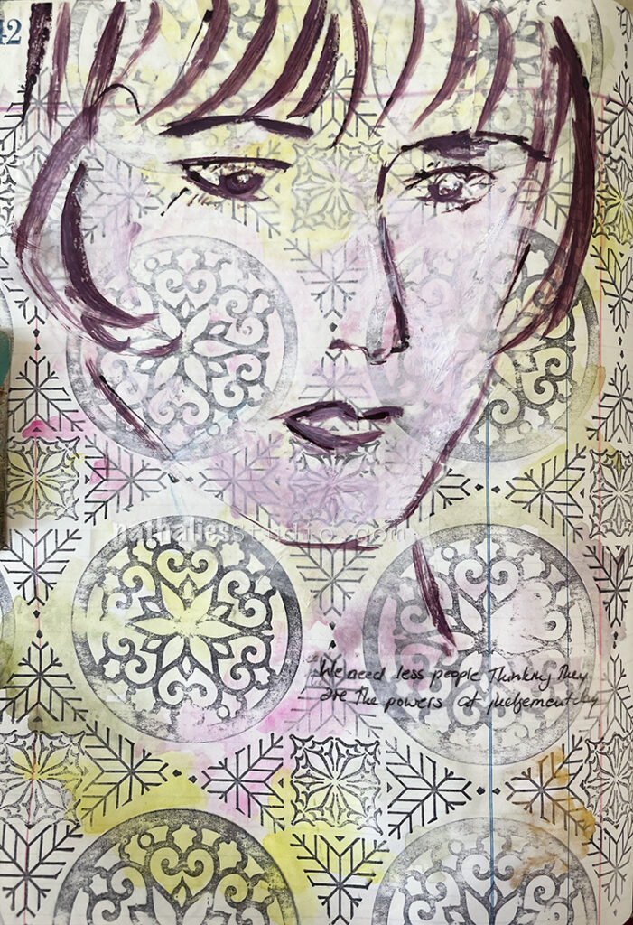
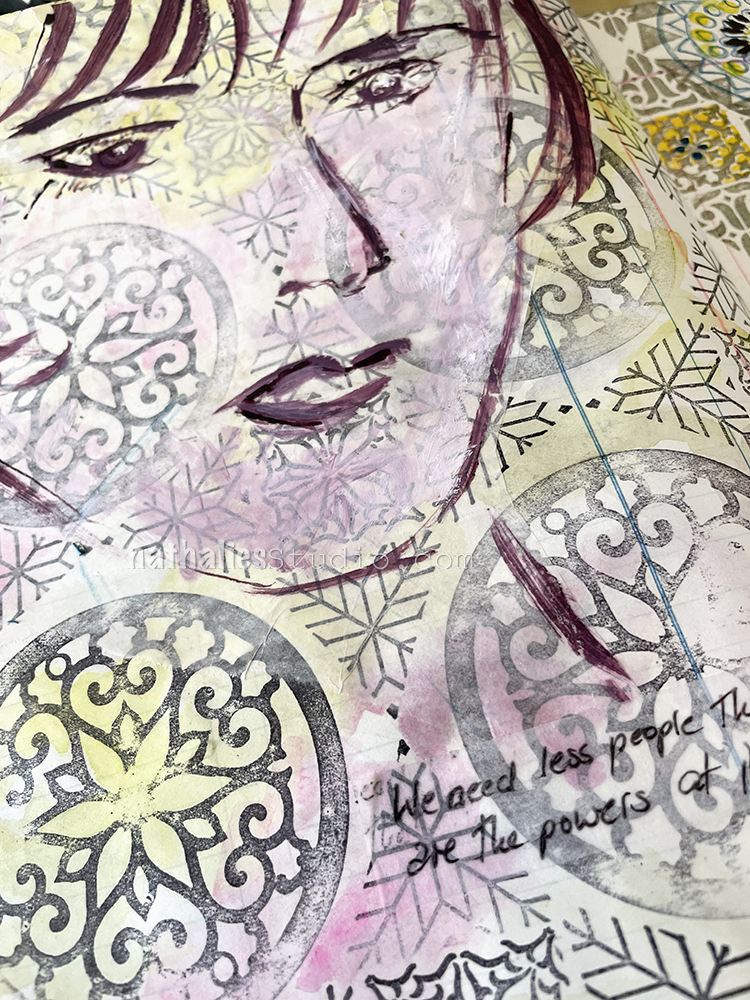
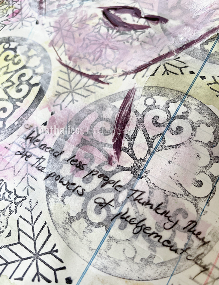
“We need less people thinking they are the powers on Judgement Day”

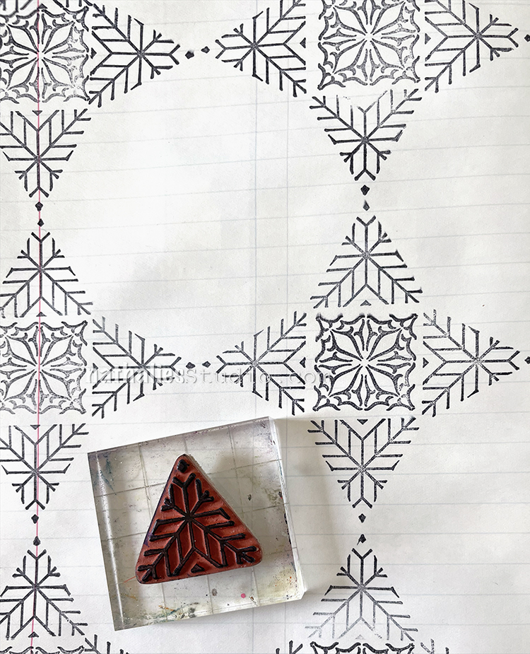
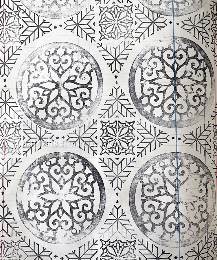
I wanted to pick up the way I created the pattern for the Hypocrites art journal page, but this time I chose different patterns out of each stamp set – my Large Circle JumbleTriangle Love, and Floral Tile Small rubber stamp sets.

I stamped right onto the background with black archival ink and then used Daniel Smith watercolors on top. This works because the archival ink is waterproof.

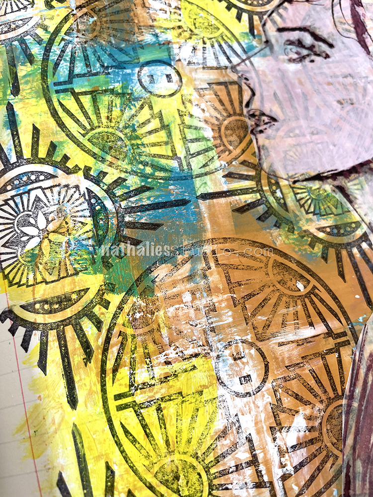
Then like the Hypocrite page I did a sketch with muted violet ink on deli paper, added some white acrylic paint into the ink to add to the face and make the background less prominent, after I added the deli paper to the background with liquid matte medium.

For the journaling I used the tissue paper-like strips with adhesive backing that I found recently. I still don’t remember where they came from and what they are. I wish I did as I am growing found of them LOL

Here are some of the supplies I used:
Leave a comment

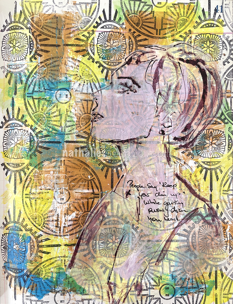
Hypocrites – Art Journal

“People say ‘Keep your chin up’ while gently pushing down your head.”

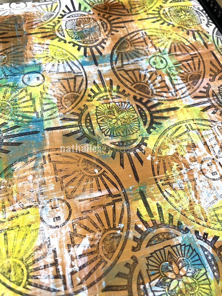
Using a credit card, I put down some colors with different viscosities – heavy body Liquitex white acrylic paint, soft body gold and blue acrylic paint, as well as some yellow acrylic ink, picking it up with the card and scraping the colors partly into each other. The white heavy body paint stayed wet and pliable for a longer time making for some really nice grungy marks.

After the paints dried I added different stamps, my Large Circle Jumble, Triangle Love, and Floral Tile Small rubber stamps, to create a pattern.

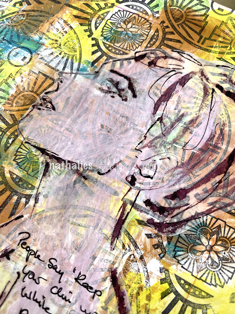
Then I sketched with a bamboo sketching pen and muted violet ink on deli paper.

As the background was very dark and prominent – unlike in the Things Change art journal page – I added some white acrylic paint mixed into the violet ink in a thin manner so that the background would still look through but not take over and “hide” the sketch. I adhered it with gel fluid medium.

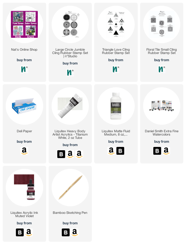
Here are some of the supplies that I used:

Leave a comment

Things Change – Art Journal

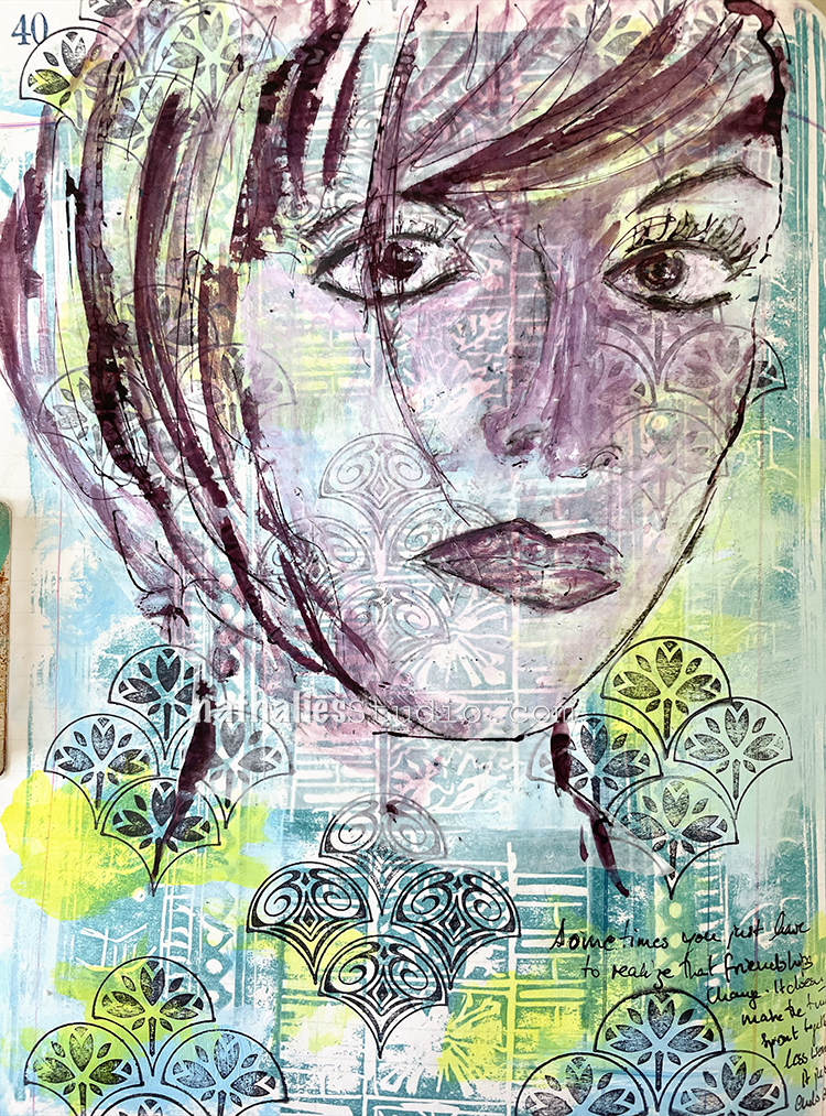
In this page I was just reminiscing that sometimes friendships change throughout the years and that is ok, it doesn’t lessen the good times, it is just a different path.

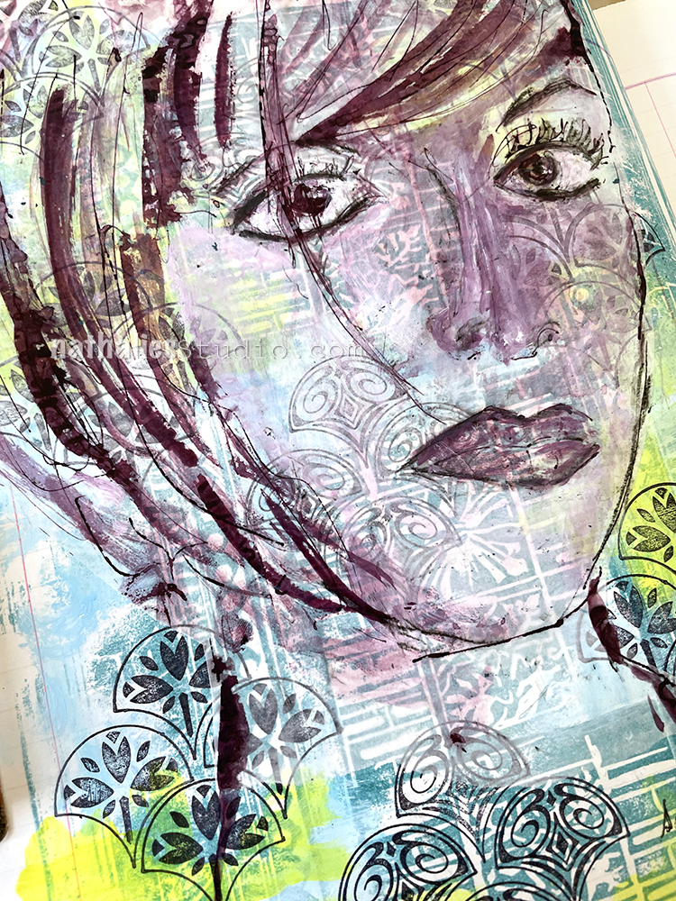
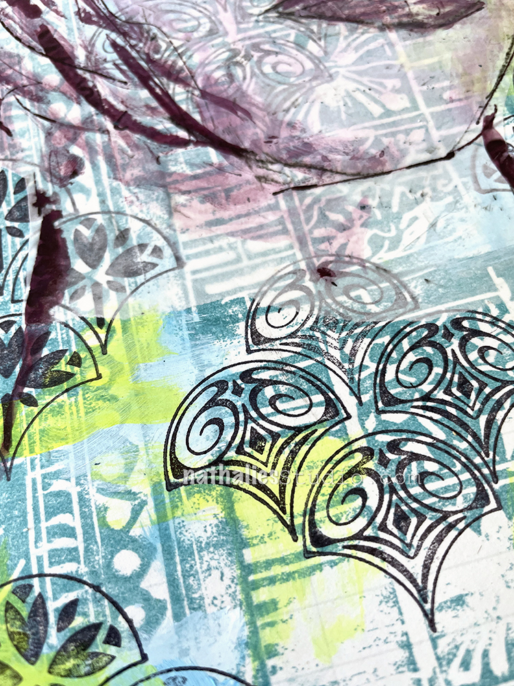
I started out the background with layering some of the architectural stamps I had carved a long time ago, using versa fine ink to stamp with them. Then I added a bit of yellow and light blue acrylic paint in some of the gaps to brighten it up. Next I stamped a pattern with my Fan-tastic Small rubber stamps and archival ink in black and added a sketch in ink done on deli paper. As you can see, I had a bit of a nose job struggle …but I am cool with it LOL. You just have to let go sometimes.

I adhered the deli paper with Liquitex matte fluid medium. I love when the background fades a little bit behind the deli paper but still comes through.

Here are some of the supplies I used:
Leave a comment

A Fire Looms – Art Journal

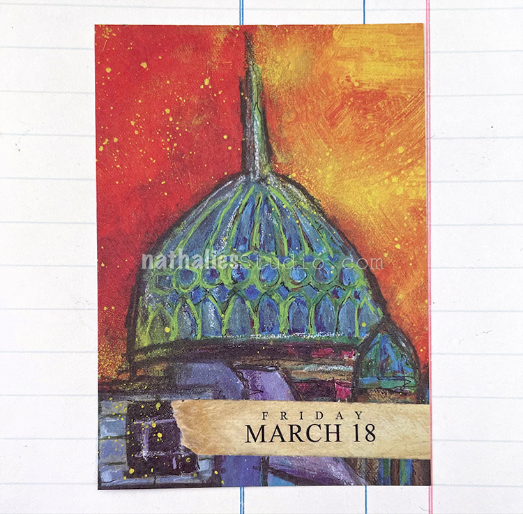
Again I used the sold out Artist Almanac to begin my page. Although it’s sold out, the original painting is still available here ;)

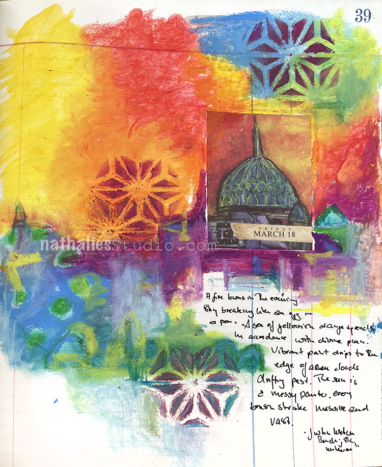
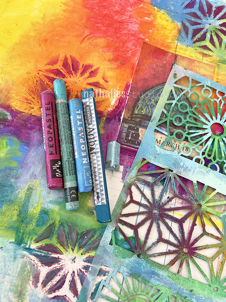
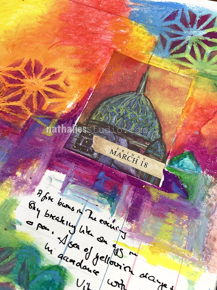
When I unpacked my art supplies in the new studio I realized I hadn’t used my wax water soluble Neo Colors and Derwent Artbars in a while and thought this calendar page would be the perfect inspiration piece to use these vibrant, highly pigmented supplies with.

I started by just layering some of the shapes and forms I saw in the page and that was just to get me going. I layered more and more color on top, blending the different colors with water and making some marks. I used the ATC Mixup Stencil and rubbed some of the color over it and used my finger to work it.

I left some space for journaling as I know that it is not a good idea to write on top of the waxy material – just doesn’t go together, and found this wonderful poem and decided to use a part of it:

“A Fire burns in the evening sky

Breaking like an egg in a pan

A sea of yellowish orange spreads in accordance with divine plan

Vibrant paint drips to the edge of ashen clouds drifting past

The sun is a messy painter

Every brush stroke is massive and vast’’

Justin Wetch – Bending the Universe

Here are some of the supplies I used in the page:

Comments (2)

  • Robin Seiz

    |

    I love the bright colors in this!

    Reply

Leave a comment

A Look Back – April Flowers

A Look Back – Here in the US they have a saying that goes “April showers bring May flowers” but hey, I’m ready for the flowers now LOL. My neighborhood is right there with me and in fact there are trees and bulbs making a colorful show every where I look. So I thought I’d also search for blooms in my art journals from years past and we could have a little flower show.

So here we go, April Flowers for all of you :)

Let’s kick things off with some good advice that a friend once told me. This art journal page was from way back in 2014 and I started with a spray painted background and layered on some acrylic marker drawings of plants that I had done. I think the simple style of it really matches the sentiment quite nicely.

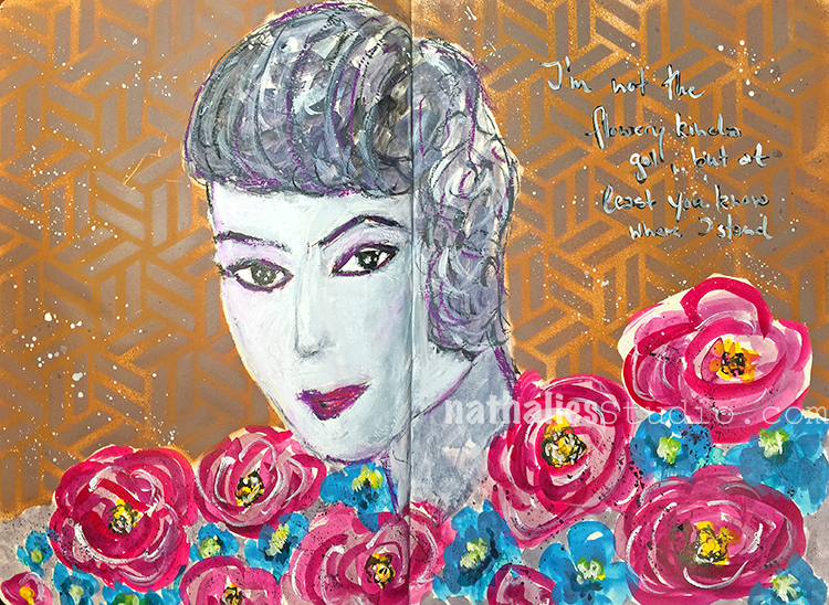
Skip forward to spring 2018 with this art journal page. My background uses my Kassel stencil and then I painted those blooms with acrylic paint and gouache. I might not be flowery (like the journaling says), but I sure do love fresh flowers and always try to have some around the house to brighten things up.

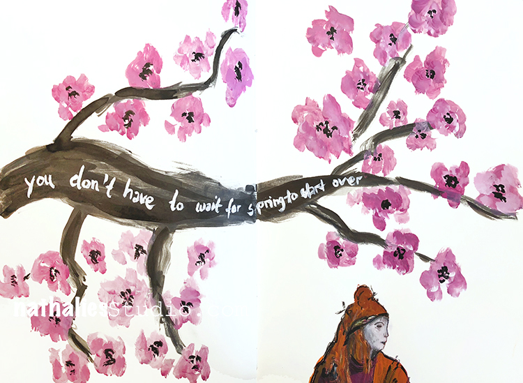
Also that year I became smitten with all the pink cherry blossoms in my hood. They were everywhere and so I picked up a brush, some acrylic paint and acrylic ink, and created this art journal page. The scale of the flowers may be a little generous, but my enthusiasm for them couldn’t have been bigger!

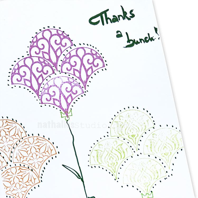
Does painting flowers seem a bit intimidating? One of the easiest ways to create a few blooms is to use a stamp like my Fan-Tastic Small rubber stamps and just add a stem. Instant flowers that are perfect for card making or wherever. This card was from my Deck of Cards (greeting cards that is) challenge back in 2019 here on the blog.

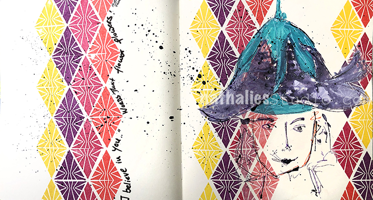
And lastly, flowers never have to be pigeon-holed. They are too fun and happy to just be in a bunch or a vase. Why not wear one like a hat? Why not? It’s your art journal. You can do whatever you like just like I’ve done in this page from 2020. I created a nifty pattern background with my Triangle Love stamps and then added my whimsical drawing of a girl wearing a flower hat.

I hope you enjoyed this little bundle of flowers from me to you and maybe it’s inspired you to add a floral element to what you’re creating.

A Look Back is a blog series to show you some projects and posts that you may have missed – sometimes going WAY back in the archive. I think it’s fun to revisit a few ideas that we haven’t seen for a while. I’m excited to see how a little look back might inspire something new in the future :)

Here are some of the supplies I used:
Leave a comment