Each new glimpse is determined by many, many glimpses before. It’s this glimpse which inspires you — like an occurrence. And I notice those are always my moment of having an idea that maybe I could start a painting… As a matter of fact, I’m really slipping, most of the time, into that glimpse. I’m like a slipping glimpser.
-Willem de Kooning
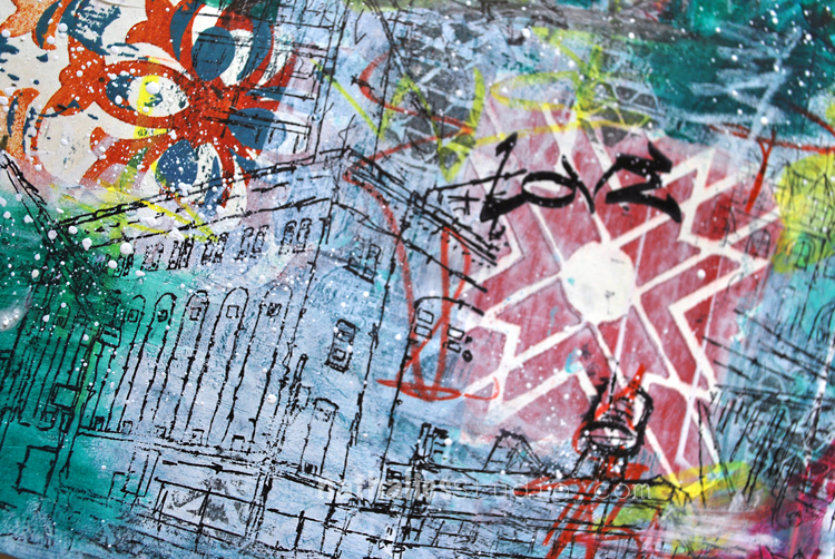
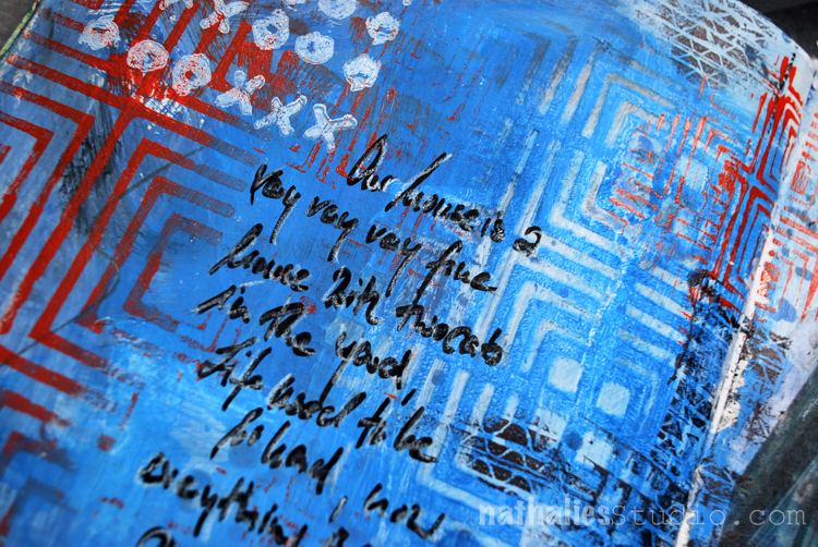
I had such a fun time playing with this spread. Some stamping with the Versailles and Toledo Foam Stamps and Acrylic Paint .
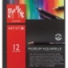
I also played with my newish Caran’d Ache Museum Aquarelle Pencils – I basically dipped them in water and then went to town creating color blocks and marks. LOVE how vibrant they are !
I love the grungy look of this spread – I am super happy how it turned out. Here are some of the supplies I used – some links are affiliate links
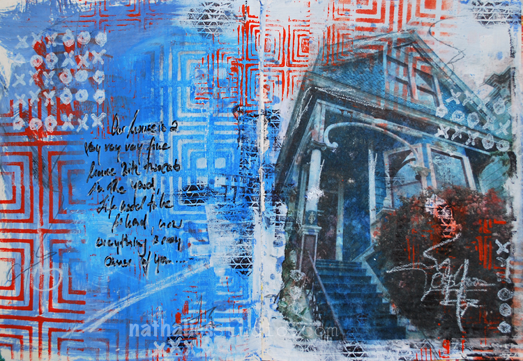
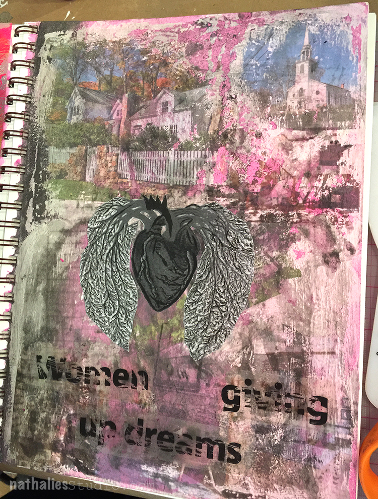
Every once in a while when I see a house I would really love to live in I have this song by Crosby Still Nash and Young in my ear. My father used to listen to this song a lot and somehow cute houses and this song will always be connected. I saw this gorgeous house in San Francisco and took a photo of it.
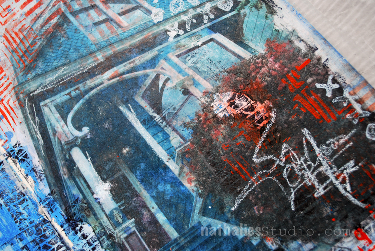
I did a Transfer into my art journal and playing with the imperfection of the transfer stamped into the gaps with my Tread and Torn Layers cling Stamp as well as with my Manhattan Border Foam Stamp.
On the left side of the spread I used the Manhattan Stencil and removed some of the wet blue paint underneath the stencil with a baby wipe.
Here is a complete list of of the supplies I used -some links are affiliate links:
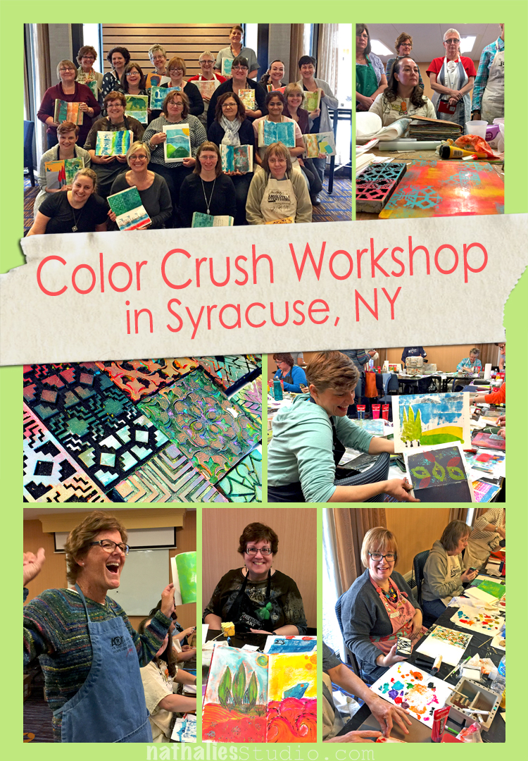
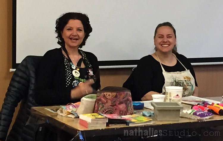
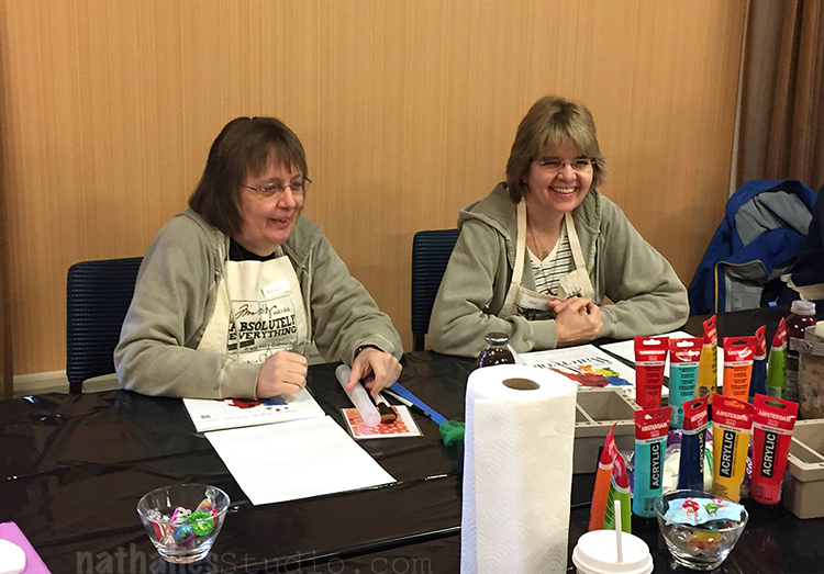
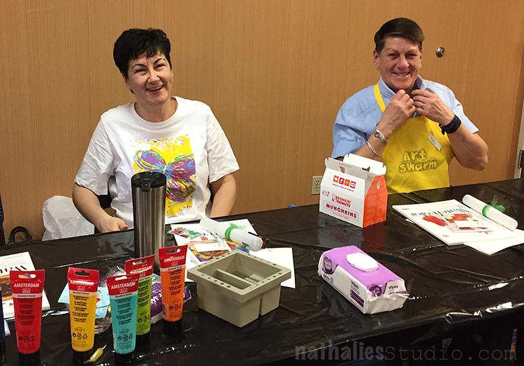
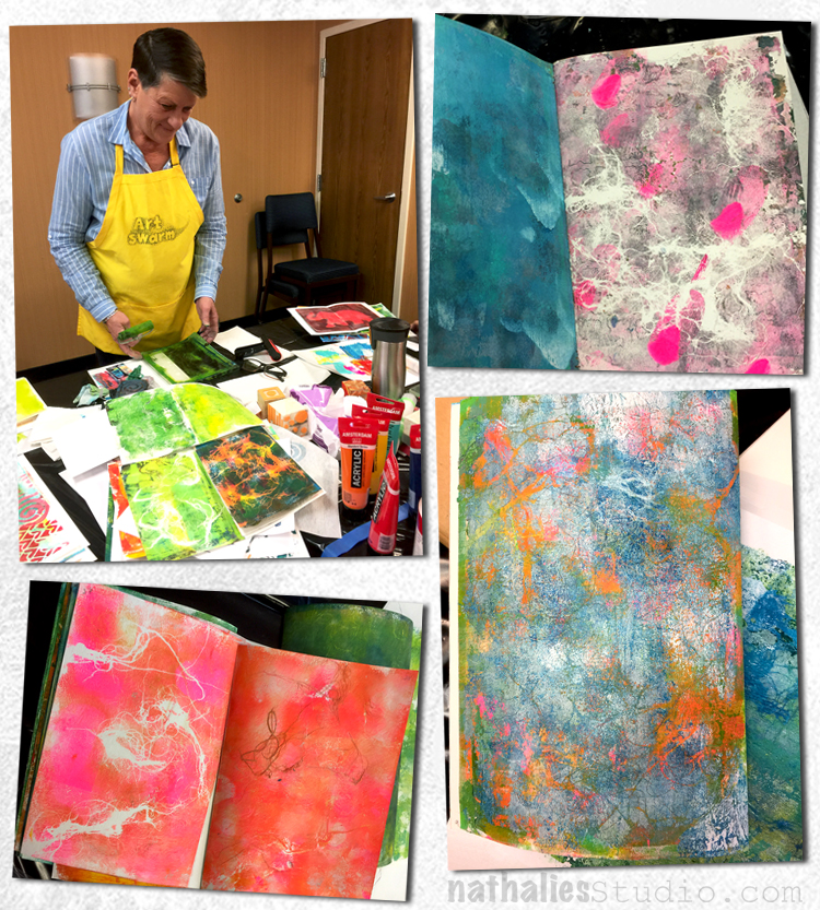
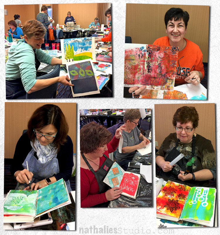
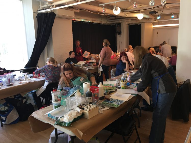
WOW …what an amazing 3-day Workshop organized by OOAK and held by my sweet friend Birgit Koopsen and me.
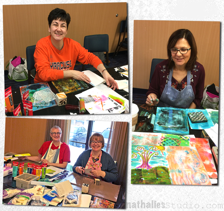
Color Crush was the name of the workshop and 21 super sweet, sharing, caring and fun students joined us for this retreat!
Friends attended, Friends were made and
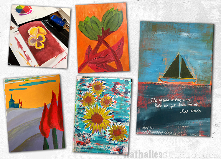
the first day was all about color theory and exercises to work with color and get it really down :)
It was a great date with color and pattern
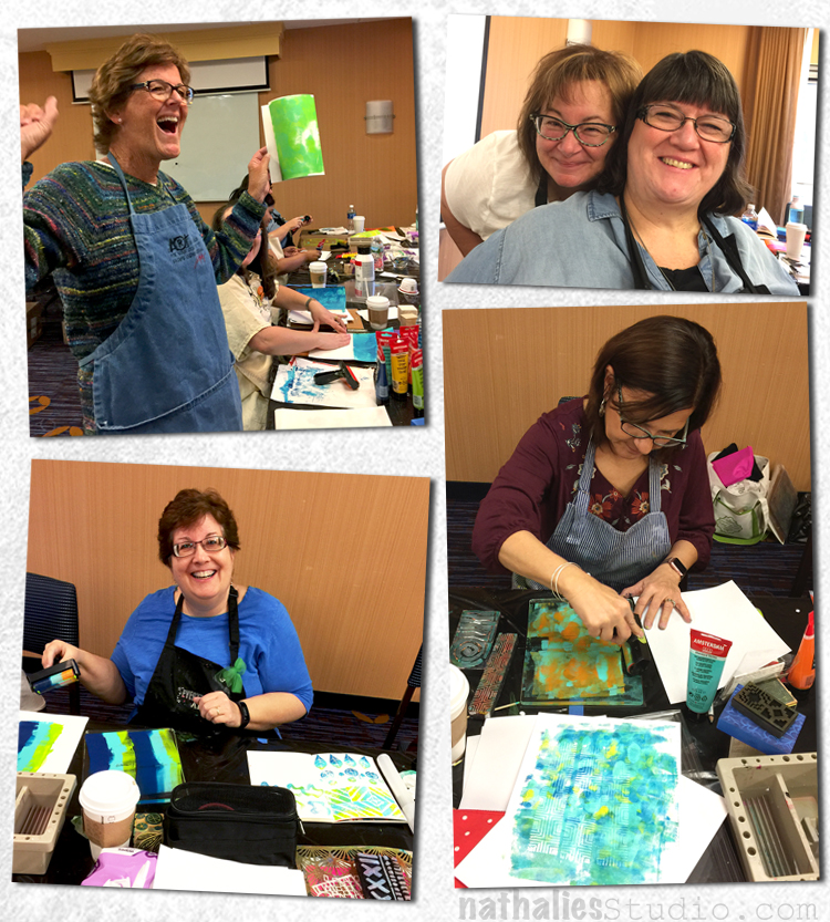
and even if some of the exercises forced some of our wonderful students to get out of their comfort zone…the spirit was upbeat and color crushing.
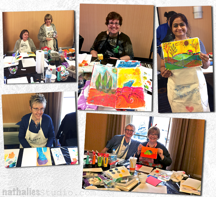
Look at all these smiling happy faces.
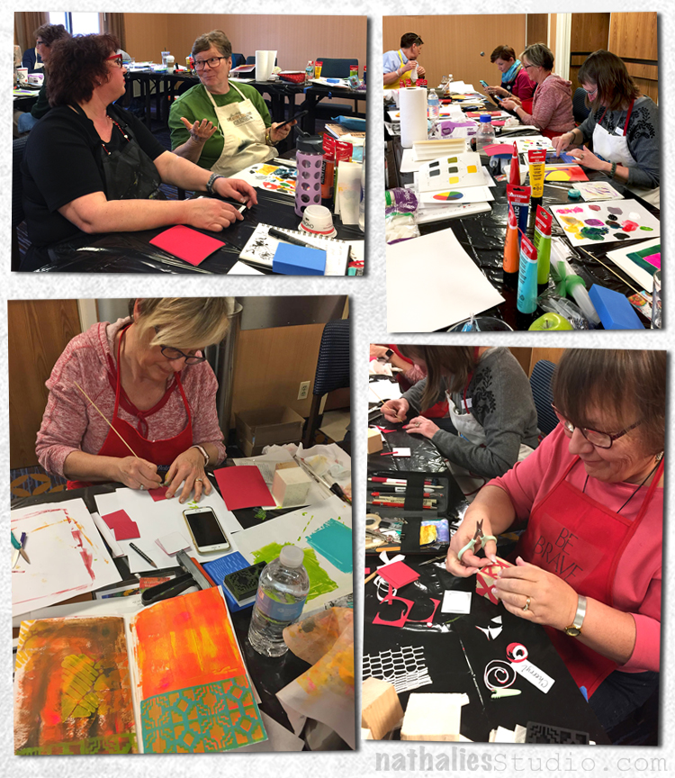
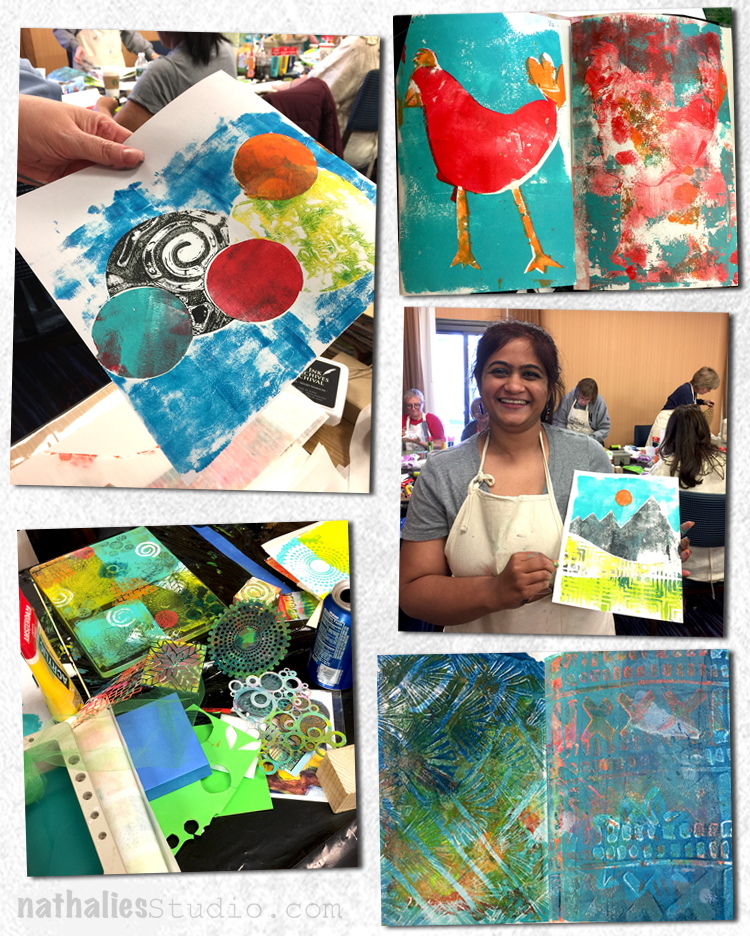
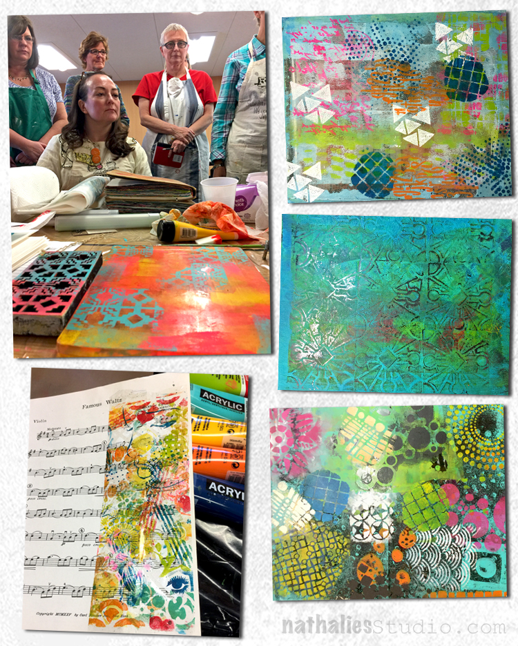
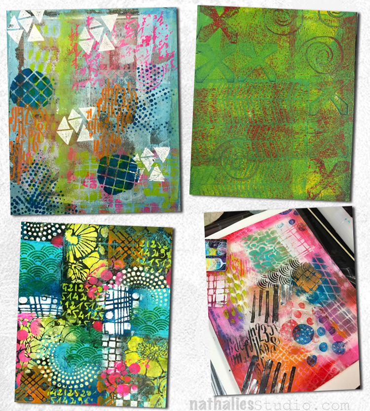
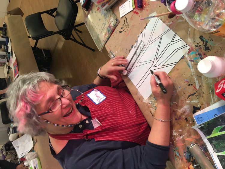
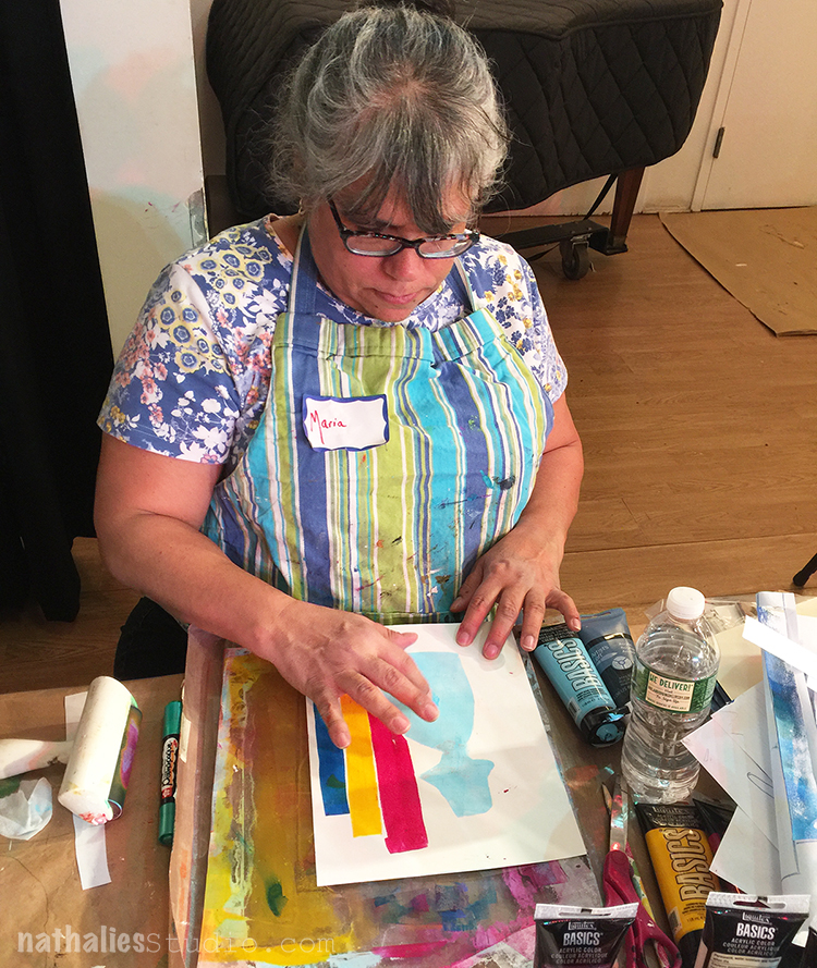
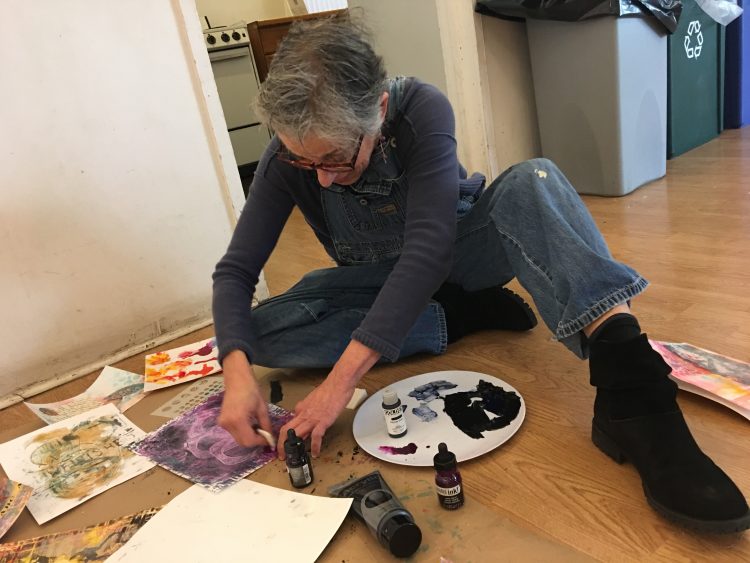
The second day was all about …well Color of course but also Mono Printing. Because knowing your colors really helps getting the results you want.
We marbled …and…
we mono print painted just a little bit…since this is usually a full day class.
And created fun backgrounds. And for some …it was the very first time mono printing- YEAHHH.
We composed some beautiful collage material and made some cleaning tasks artful and enjoyable ;)
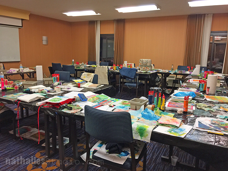
And late in the evening of day two, when all the students were gone to dinner …Birgit and I sneaked in to have a happy look at this colorful classroom. We might have been like little kids in the candy store seeing all the work.
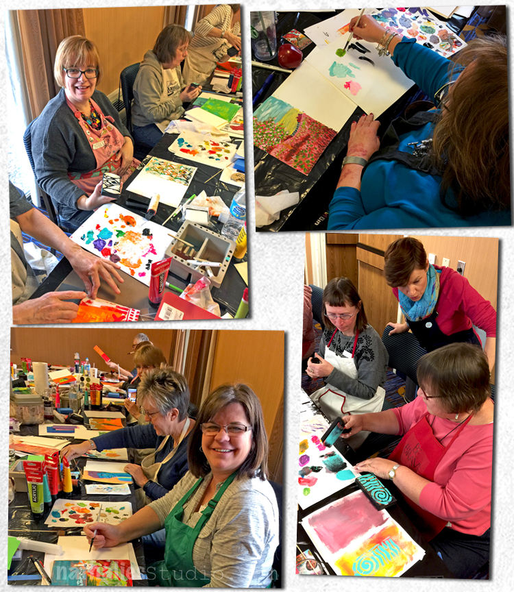
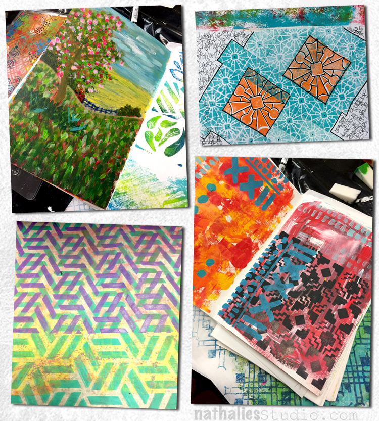
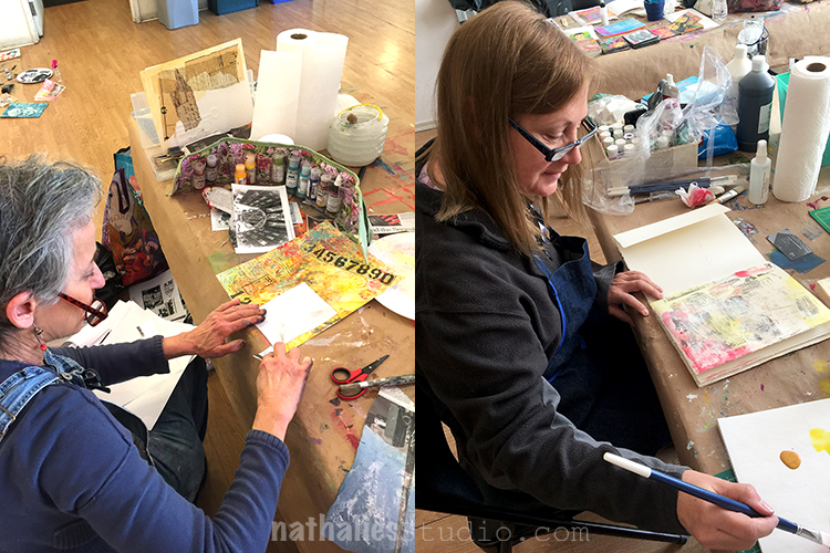
On the third day we bound an art journal together out of all the single pages we worked on so far and started finishing up some of the pages
It was pretty cool to see the group combining Birgit’s and my techniques with their own style- so inspiring and stimulating!
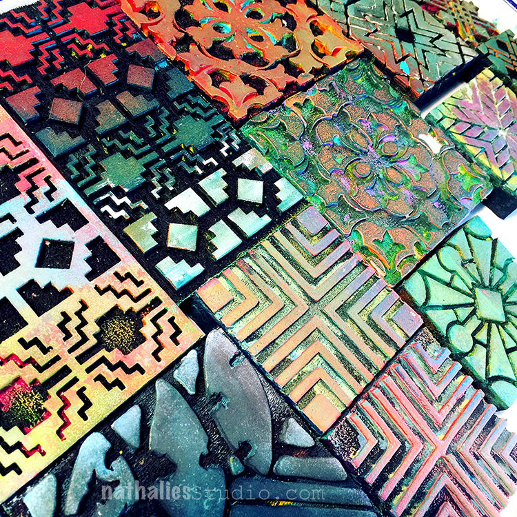
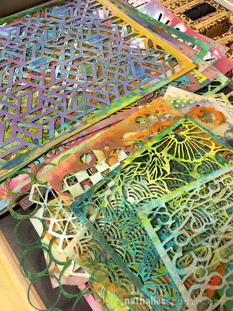
Look at the well used ArtFoamies and StencilGirl Stencils!
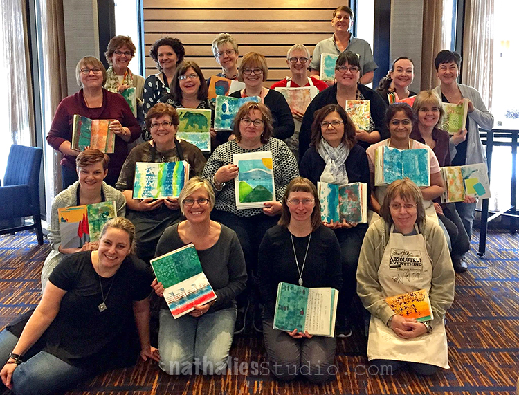
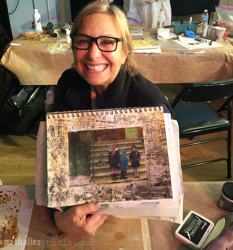
And here is our group – minus two who had to leave earlier – with their favorite pages in their art journal!
Thank you so much for coming to Birgit’s and my Color Crush workshop. It was a real pleasure to spend so much time with you creative souls and get to know you better! You inspired me a lot and I couldn’t wait to get back into my studio, it was such an uplifting time. Thank you also to Shelley from OOAK and her awesome team for inviting us and organizing this great event! And last but not least a big hug to my friend Birgit – love co-teaching with you and looking forward to our new plans ;)
Hope you enjoyed the photos of this workshop! If you want to know where I teach next- check out my In-Person Class Schedule – in the next couple weeks.
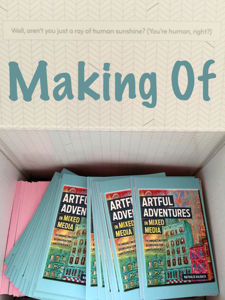
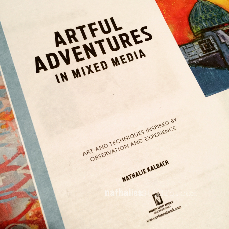
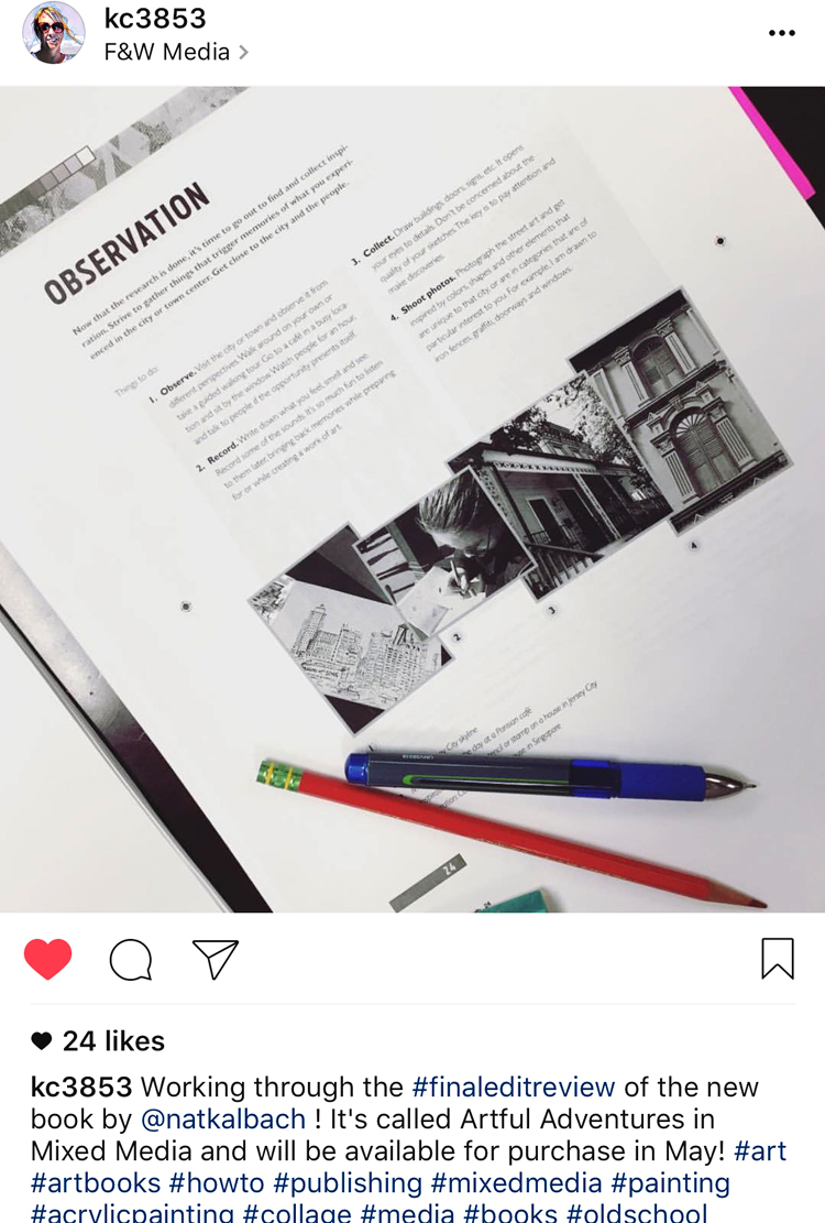
Besides writing my book Artful Adventures in Mixed Media I also found it fascinating what steps are involved in writing a book like this, how much time it takes and how many people are involved in this process. I thought you might also find it interesting and so here we go:
It all started late October 2015 when I sent in a Book Outline/Proposal to the Publisher. Well “started” might be a bit of a lie, because writing a proposal and put that all together actually means I have had a couple weeks to think about my idea and lay it out in a proposal.
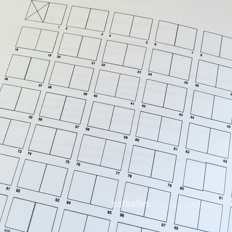
By December my book was approved and I received the contract. Boy – I cannot tell you how excited I was. With the contract came the outline of deadlines and the 1st one approaching right in January 2016 – The Page Plan. A page plan is a detailed sketch for every single page in the book. That one was a hard one , because I hadn’t even started writing yet, but it really was the foundation for my book and helped me determine how I wanted to structure the book. It is also important for the editor to see that you actually can fill every page.
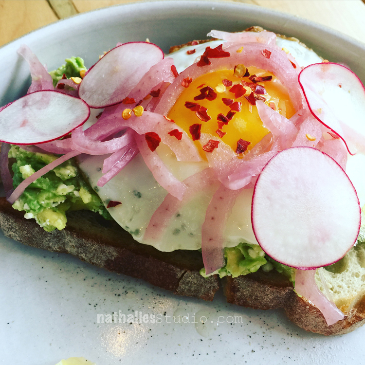
The next big deadline was June 2016 to send in all preliminary step-outs as well as the artwork for the photoshoot. Every single day from January to June I was writing and creating art work for the book. I ate a lot of avocado toast ….in a cafe close by because for the writing I often went there. It really helped me focus- as weird as it sounds.
For the techniques shown in the book I had to create all the physical step outs for the photo shoot. It took a lot of time to create these – especially since you have to create things several times in different stages.
Everything from the artwork, to the step outs and the materials used, had to be labeled and bagged and then made ready to be shipped before the shoot.
The Photoshoot in June was a huge fun – I met my editor Noel in person and I got to work with Christine again, who was shooting every single step out for the book. I also met the designer for my my book to talk about how I would envision it and a lot of other people involved in my book from the Marketing Department to the Managing Editor etc.You can read more about the shoot here.
We went through the photoshoot quicker than planned and so the video team who knew me already from my DVD shoot suggested we should spontaneously also do a video shoot for a trailer for the book. I love how this came together- check it out :)
After the shoot I checked the manuscript again to see where the actual photos would go, and I finalized the text for the step outs. In August my manuscript was due in it’s entirety.
Then it went back and forth several times between me and the editor. In October the book went to the Copy Editor and in November I finally got to see a first glimpse of the cover and of the design of the book. I seriously cried – it was so cool too see and it started feeling so much closer to the actual book.
And then in January 2017 I received the book with all the graphics, design and photos for a final review before it went a last time for a final review to the managing editor . Another highlight.
Finally in February the book went to the printer and Artful Adventures in Mixed Media will be released in June 2017. It is on Pre-Sale now :) Quite a journey, isn’t it? Over 1 1/2 years – and I am sooo antsy now- LOL – I want it out and I cannot wait to hold it in my hands ;)
Wow that is a long process, but so worth it. I can’t wait to get my copy! You need to seriously pat yourself on the back. If I were to attempt something like that it would take me forever – starting with just finding a clean spot in my work area to take a photo! Lol
P.S. If you should ever decide to sell the canvas that is on the cover of your book, can I be offered the right of first refusal? (like I would refuse? LOL!) I LOVE THAT PIECE!
Wow! The amount of time to make this book is like giving birth twice. Thank you for showing the behind the scenes process and kudos to you for making it. I can’t wait for my copy of it and preoordered it when you came out to teach at AWOH. I’m so excited for you!
I was astonished by the process & ALL the hard work that it entails! You & Julie are SO talented so it’s no surprise that you wrote this book.
So VERY proud of you!
In awe of your talent from central IL
Nancy
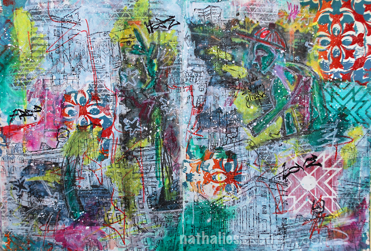
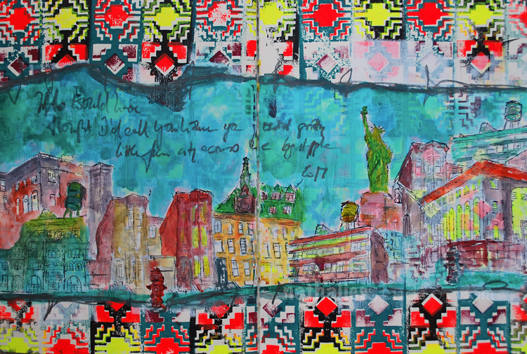
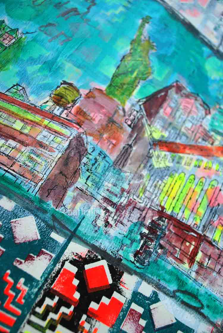
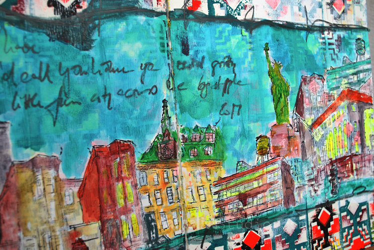
“Who would have thought I’d call you home you weird gritty little fun city across the Big Apple.”
This spread started out as a demo page in a workshop to show how to use two patterns of the Santa Fe Positive and Negative Foam Stamp set and it was very busy as you can imagine.
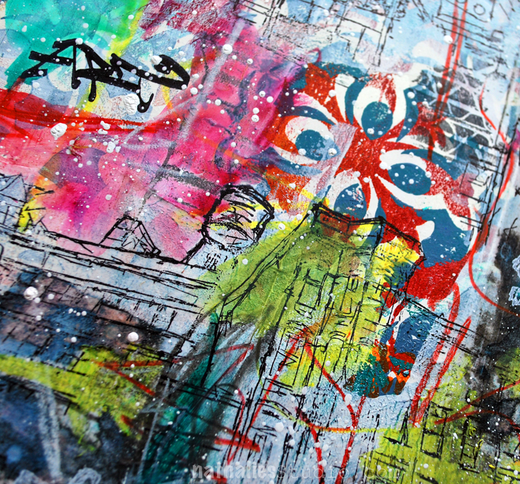
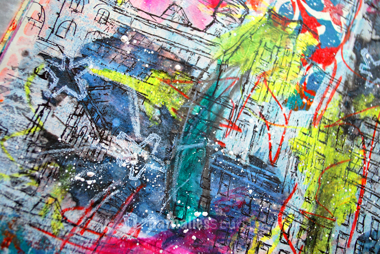
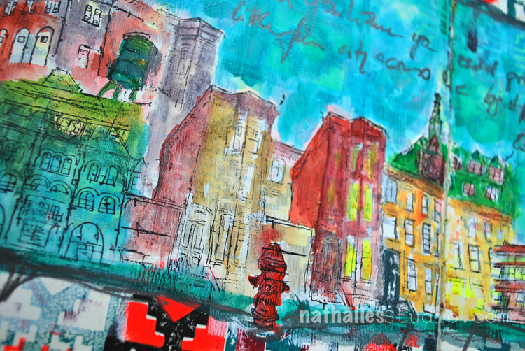
So I covered a middle put up with white gesso so that the pattern was still visible but in a very subtle way. I stamped a city scene with my Stroll Through The Hood 1 and Stroll Through the Hood 2 stamps onto the white gessoed areas.
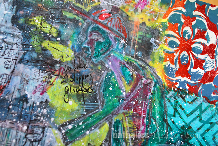
Using fluid acrylics I colored the stamped images in. I dipped the Derwent Inktense Pencil into water for the journaling.
It is a bit crazy but fun. Here are the supplies I used for this spread – some links are affiliate links.
To me… this is the epitome of YOU Nat. The city, the colors, the ambience, and the statue of libery… if I were to see this in an art gallery – I would know it was YOU. LOVE THIS. Xj.
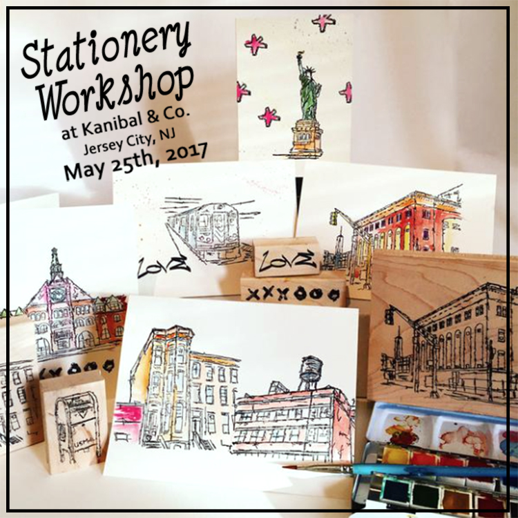
Join me in my home neighborhood of Jersey City, at one of my favorite local boutiques – Kanibal & Co, for an evening stationery class utilizing stamping and watercolor techniques. Participants will use my new custom Jersey City + NYC stamps to create handmade cards with watercolor accents. Included in the class cost: all the materials to create 10 custom cards + envelopes. Refreshments will be served.
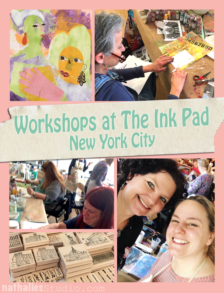
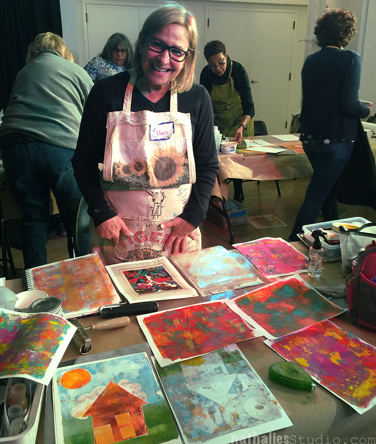
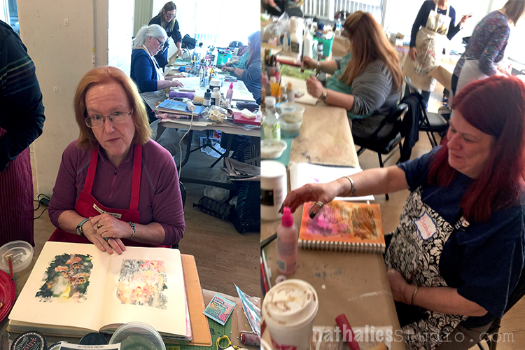
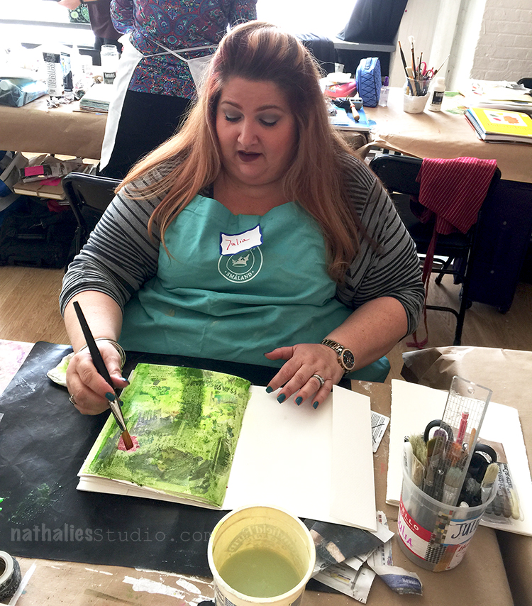
Last weekend my friend Birgit Koopsen and I taught to classes at The Ink Pad in New York City and we in both classes a wonderful group of 16/17 students and a huge amount of fun. They were all so amazingly talented and it is a pleasure to spend time with.
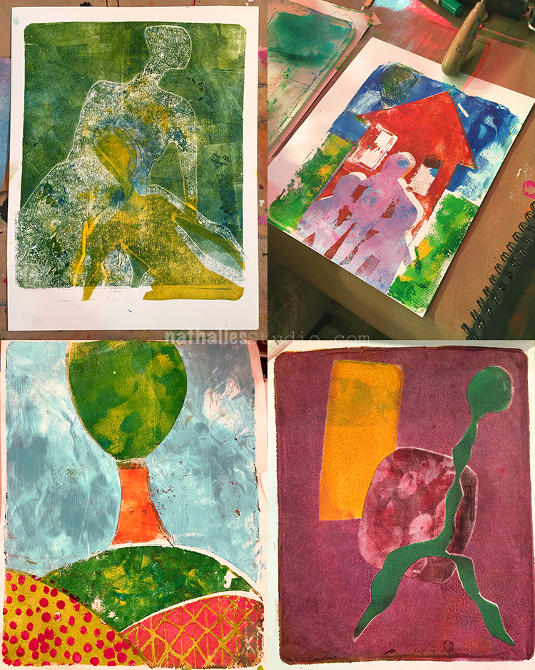
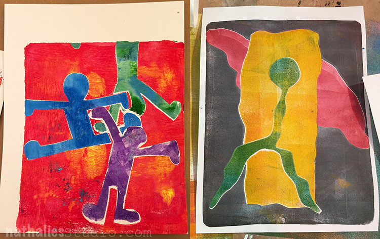
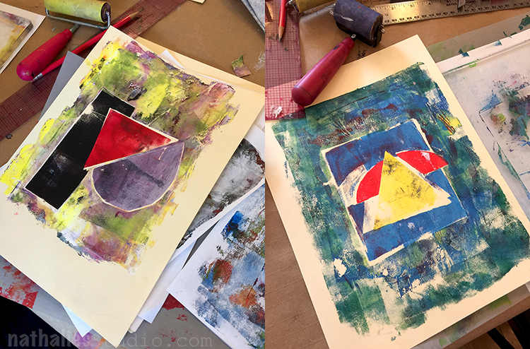
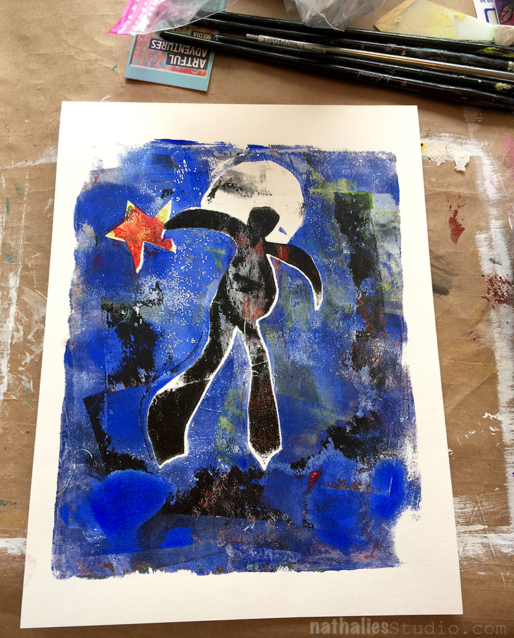
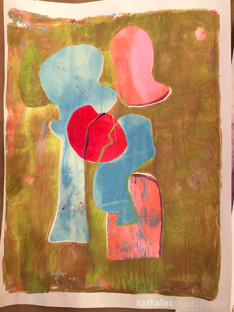
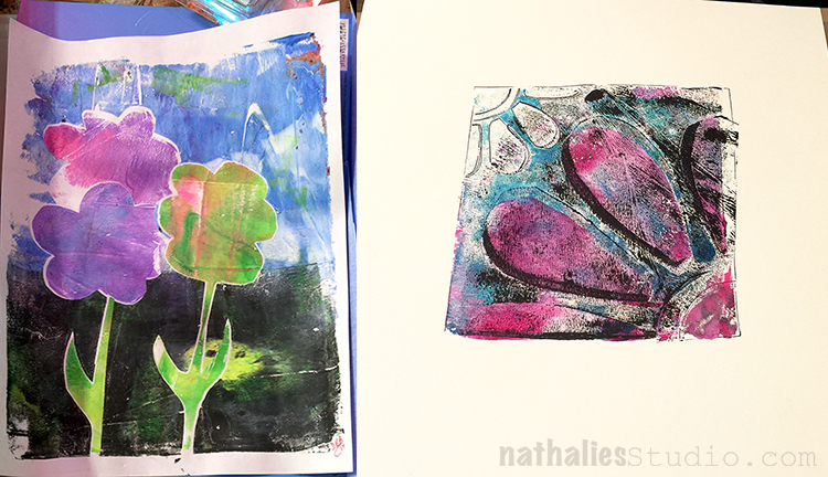
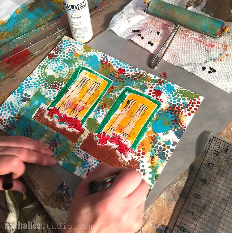
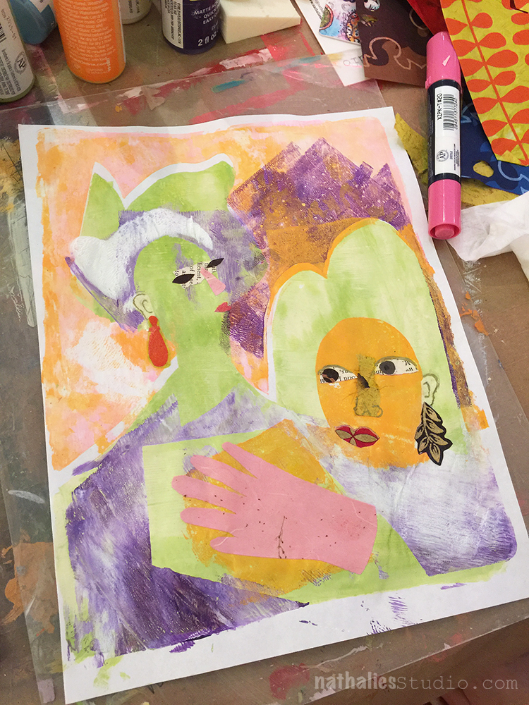
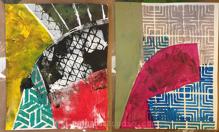
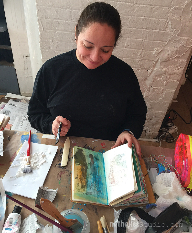
Here are some pictures of the students and their artwork from the Mono Print Painting class we taught on Saturday:
It is always fun to see how different everyone interprets the techniques and samples.
so much color and happy figures and shapes:
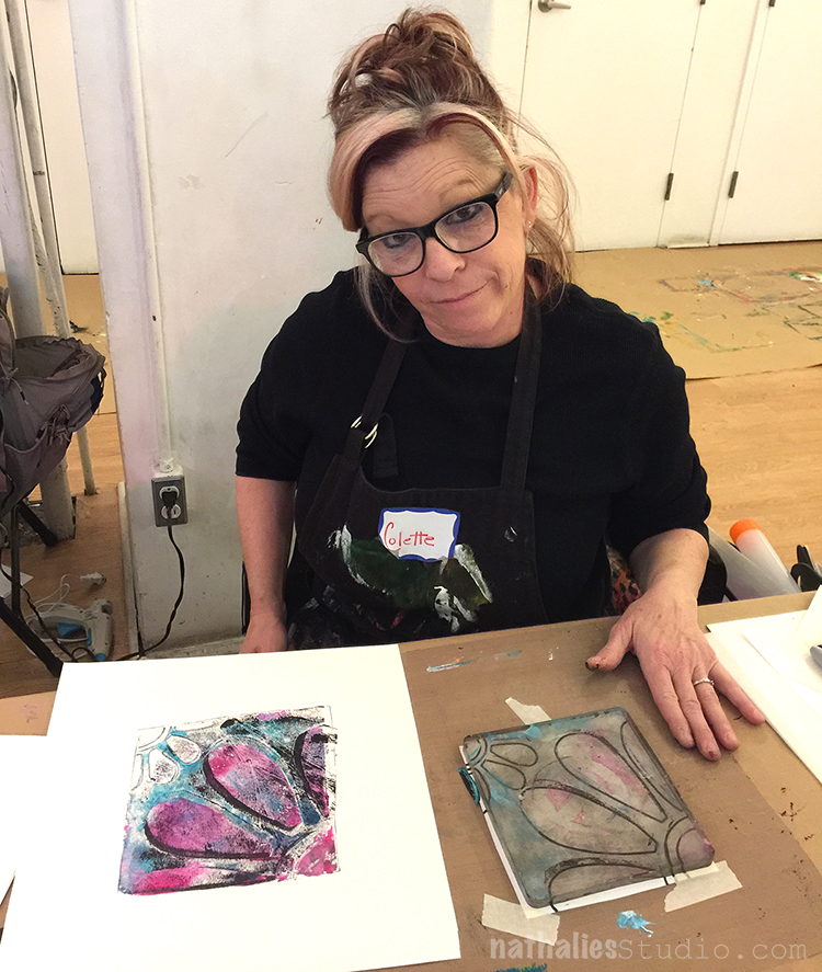
And sometimes “mistakes” turned out into the most beautiful pieces …but Colette still gave me the “fun” eye ;)
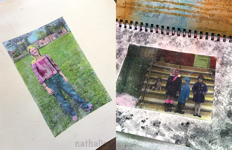
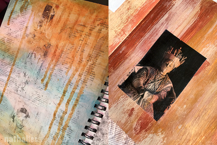
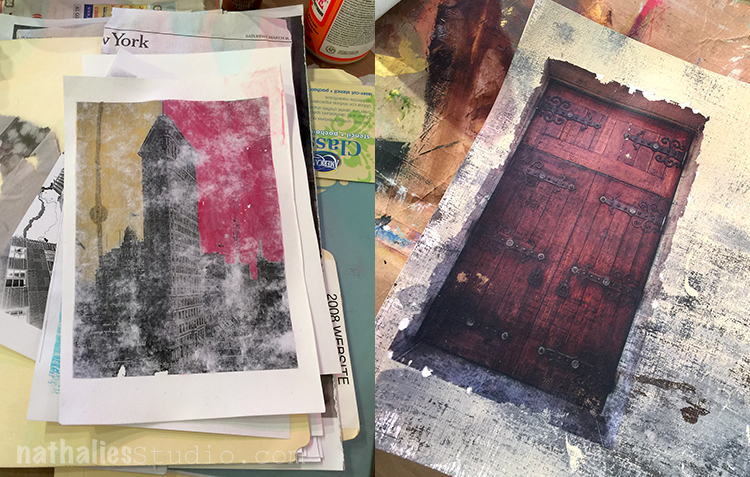
On Sunday we taught our Artful Transfers class showing all kinds of different transfer techniques for your art journal.
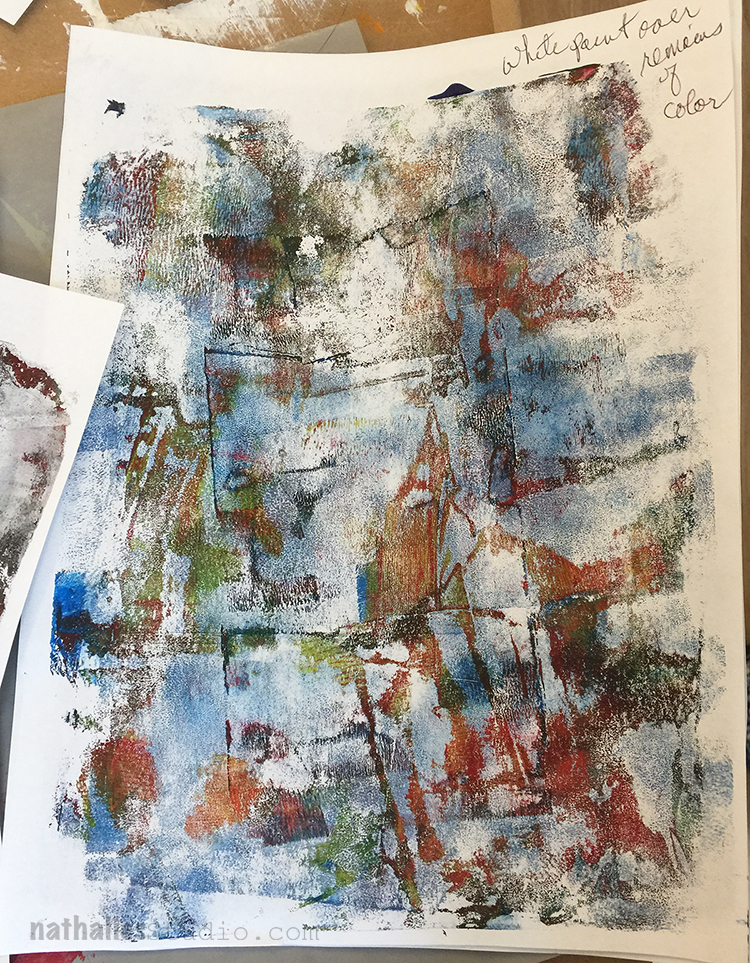
From grungy transfers to almost perfect transfers there was something for everyone.
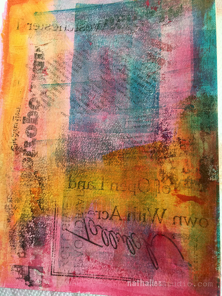
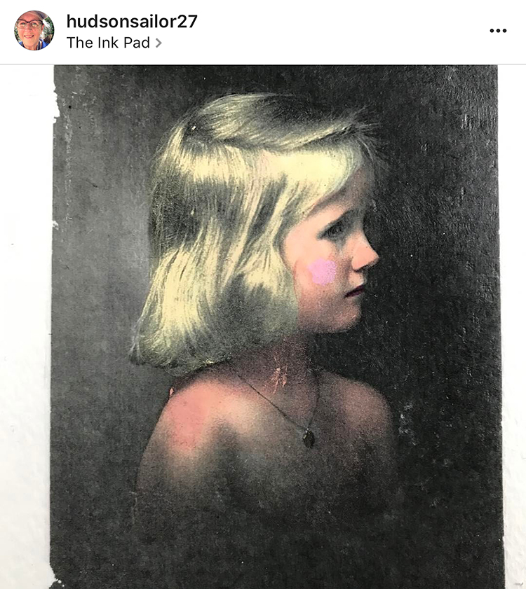
Here is a great background transfer page – such a wonderful start for a journaling page
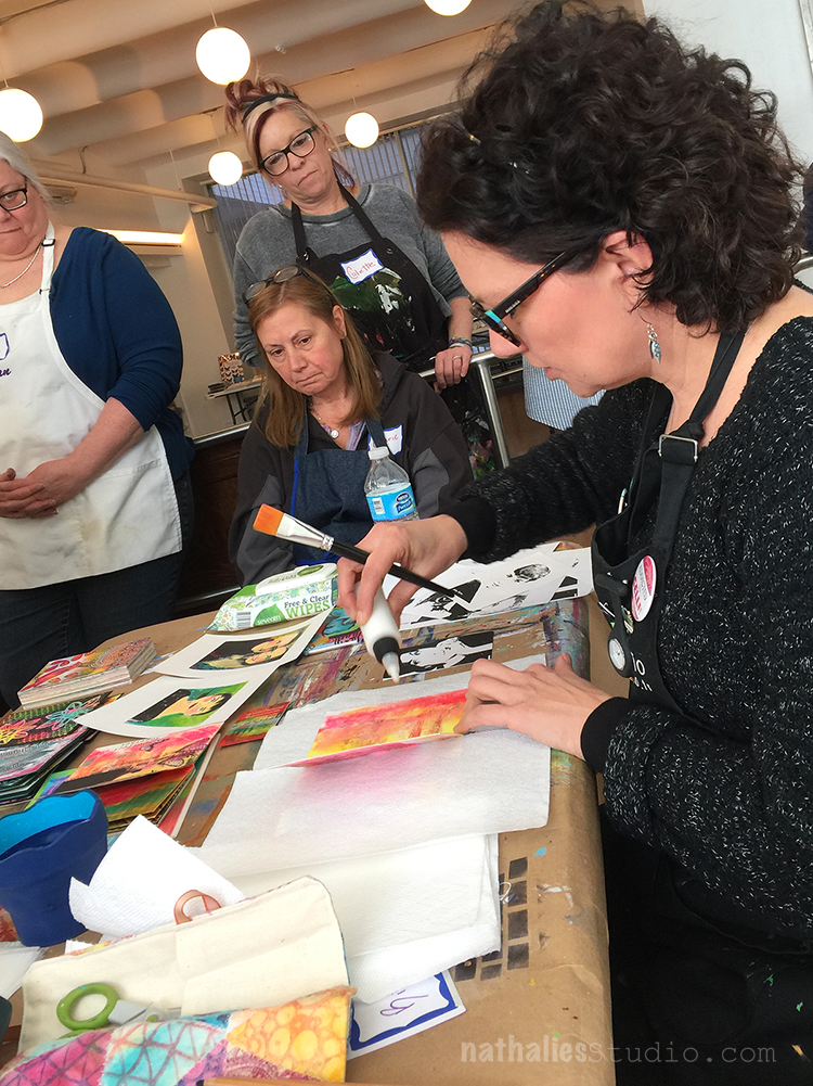
Birgit in action
Aren’t those cool?
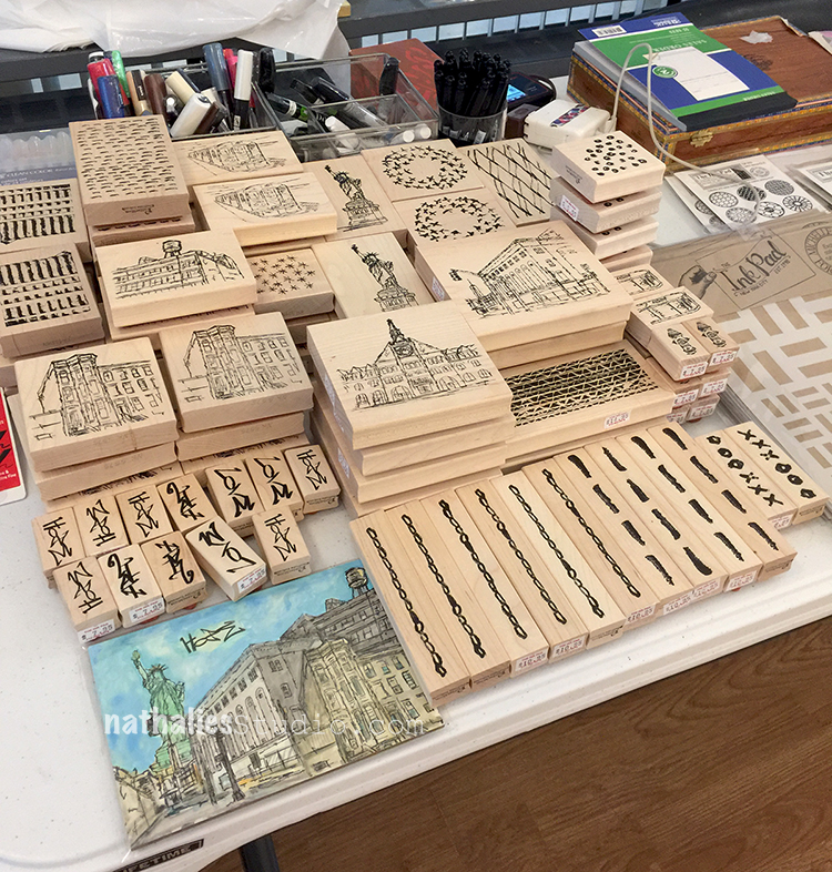
It was also great to see my RubberMoon stamps as wooden stamps have arrived at The Ink Pad – woooohooo.
Birgit and I had a wonderful time with all of you – and thank you Anna for having us at The Ink Pad . We hope we will see you all on- or off-line soon again.
The photo (about 7 down from the top) keeps catching my eye…something about the browns and blues…I just love the combo!
Looks like a fun and creative day. I really hope to make it to one of your workshops in the future Nat.
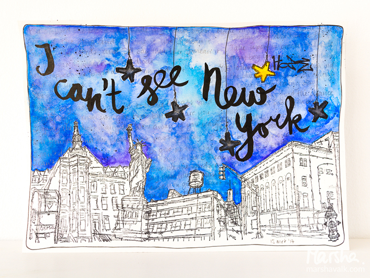
Welcome to another post from my Creative Squad! Today we have a beautiful piece from Marsha Valk who used my Stroll Through the Hood #1 and #2 cling stamp sets to give her personal take on this month’s theme Say it like you Mean it – Let your unique voice be heard and tell us what’s on your mind. Be bold. Be yourself. We all have something to say and sometimes we need to shout it!
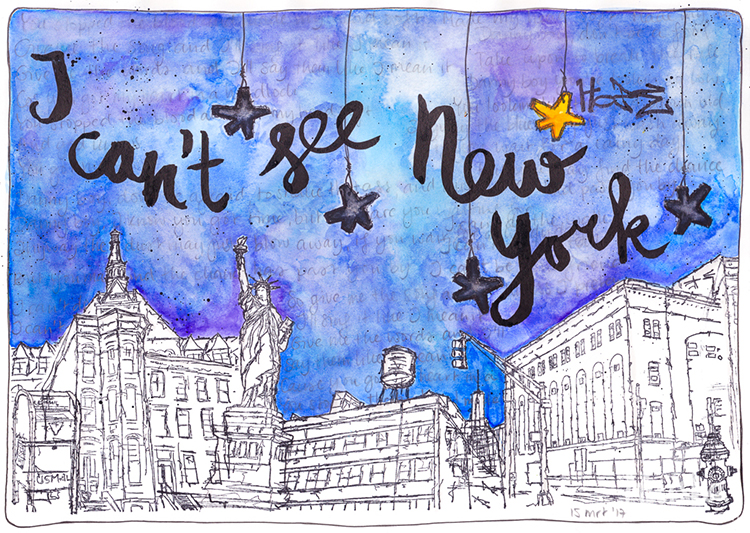
There are a lot of things on my mind: work and business, national politics, environmental and sustainability issues and even something as mundane as interior design. At this moment, as I’m typing this, current affairs in the US just aren’t in the forefront of my mind. But the Stroll Through the Hood #1 set is about a stroll through urban America. Not urban the Netherlands… So what was I going to do? I didn’t want to make another ‘I don’t want to’ spread. So I decided to turn off my mind and let the theme and the stamps do the talking.
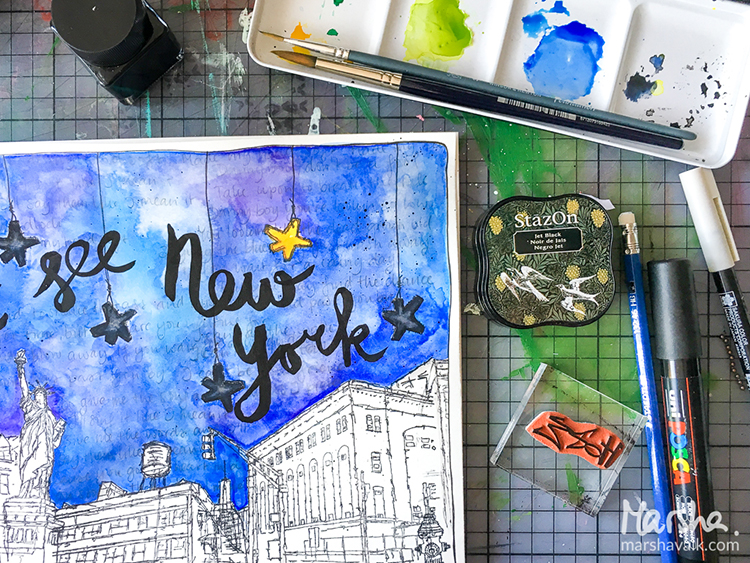
Each time I read the theme ‘Say it like you Mean it’, I have a bad case of ear worm: the song ‘Sewn’ by The Feeling instantly starts playing in my head. But… I wasn’t sure what to do with it and I started thinking about songs that fitted the New York City feel of the stamps. And because I’m not currently in an empire state of mind, I thought of ‘I can’t see New York’ by Tori Amos. Also not sure about that song, I decided to go with both songs. They certainly were on my mind now!
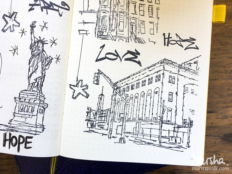
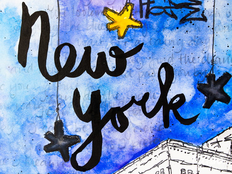
I stamped some of the images in a notebook whilst I was working out what to do and that’s where the idea for the stars hanging from the sky came from. Then I stamped an urban scene at the bottom of the page.
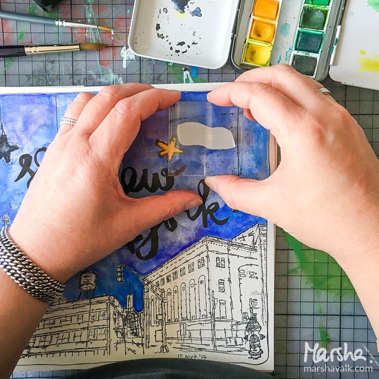
Whilst I watercoloured the sky, I thought: you can’t see the city if there is no light. So that’s when I coloured the stars black. But the brief was to use one of the tag stamps and I chose ‘Hope’, so I felt that at least one star should shine its light.
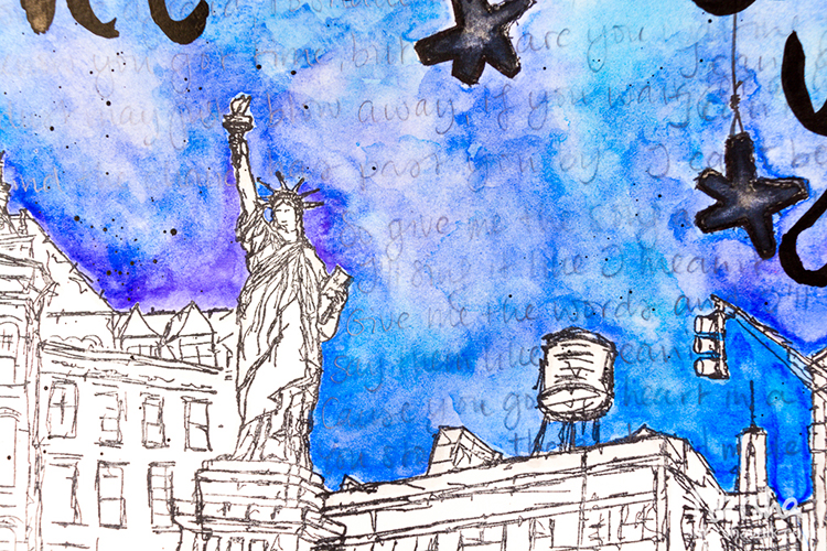
In the end I needed to decide whether I wanted to colour the urban scene. I didn’t want to make it a black cityscape and colouring it would make it too visible, so I only added light grey lines and kept the rest bare.
The penciled and smudged words are the lyrics of ‘Sewn’ and the title in india ink refers to the Tori Amos song.
Thank you Marsha! We can always count on you to take the theme and really pull it apart to see what it means to you :) And the results are a gorgeously composed scene with beautiful colors and a couple surprises – like that cute suspended Star Tag lighting up the night sky. Marsha used these supplies – some links are affiliate links:
Play along with us! I love to see how you interpret our monthly themes. Email me how you used my stencils and stamps with the theme and email me an image – I would love to share your projects in my “n*Spiration From Around the Globe“.
Nice take on the guidelines Marsha. I can’t help but hear the Billy Joel song I’m in a New York State of Mind while reading your words. Now I’ve dated myself for sure. The stars are a nice addition.





















Comments (2)
Sue Clarke
| #
The layers and layers are awesome.
I must challenge myself to doing a page with this many layers!
Reply
nathalie-kalbach
| #
Yeah- do it! it is so much fun !
Reply