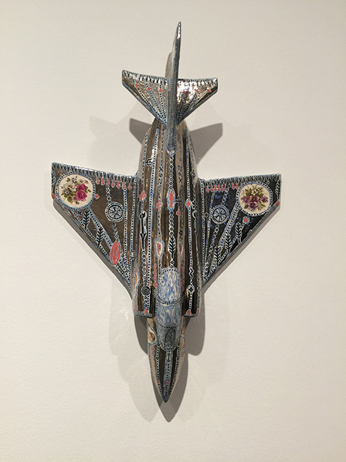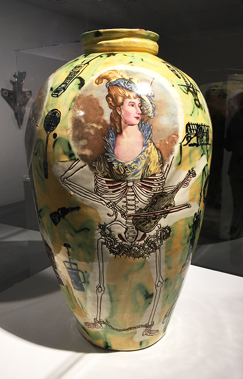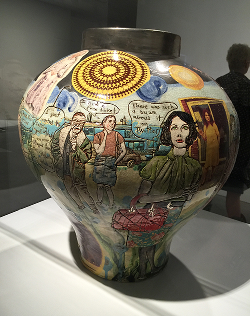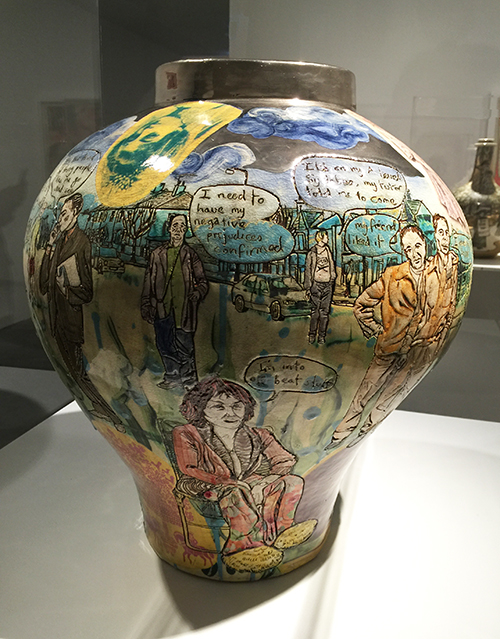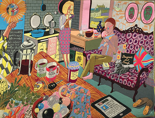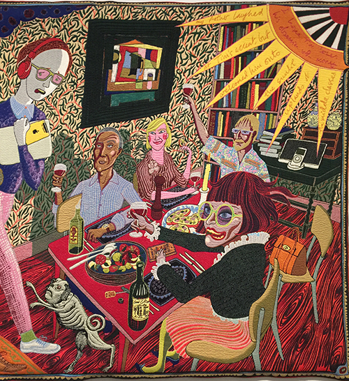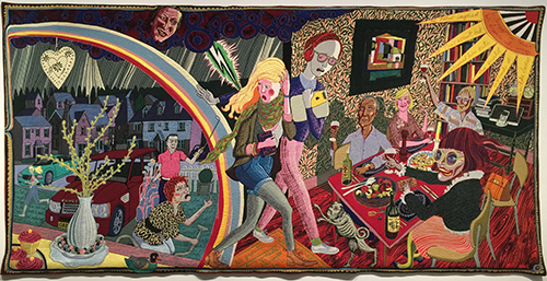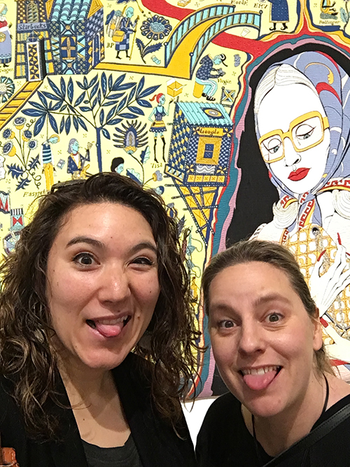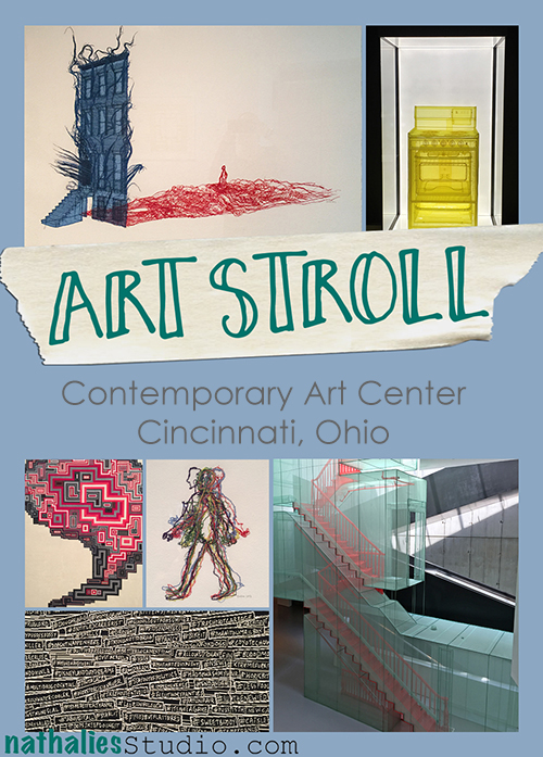
Art Stroll: Contemporary Arts Center in Cincinnati, Ohio

Art Stroll ContemporaryArtCenterCin

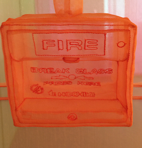
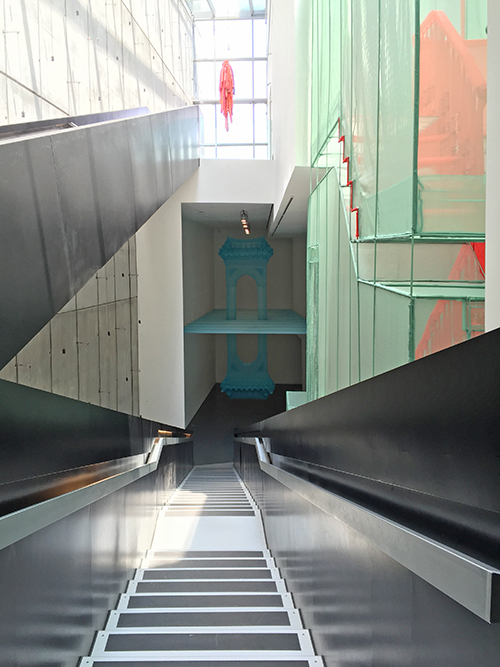
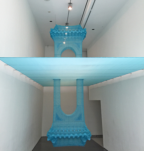
When I was in Ohio for the photoshoot for my book, I was able to visit the Contemporary Arts Center in Cinci and boy was that an inspiring and amazing visit! The Do Ho Suh exhibition was just breath taking.

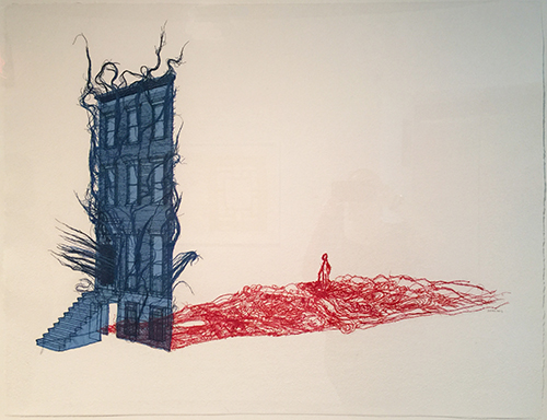
Do Ho Suh was born and lived in Seoul, and then in South Korea, New York, Berlin, London and other cities in the world. Being away from home caused him to reexamine what exactly home meant to him and made him more aware of its value. This focus continues to influence his work. “I want to carry my house with me all the time like a snail.”

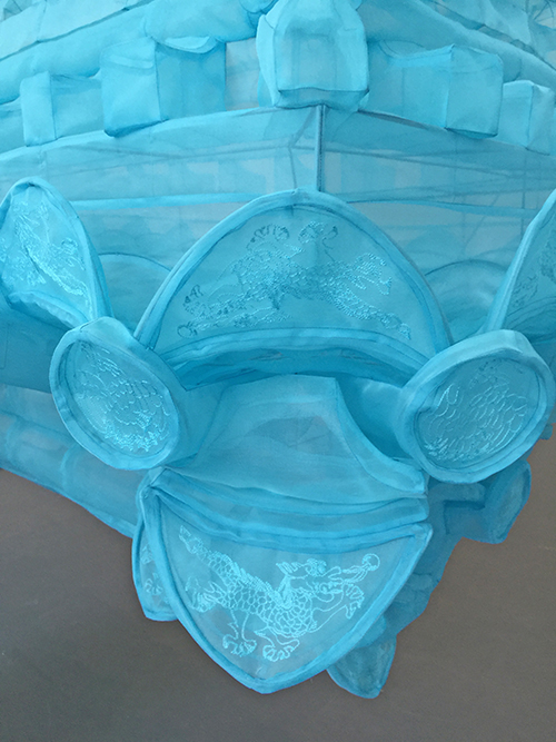
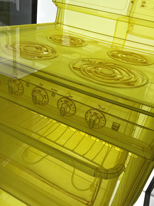
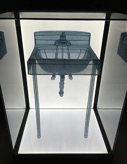
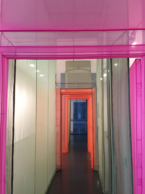
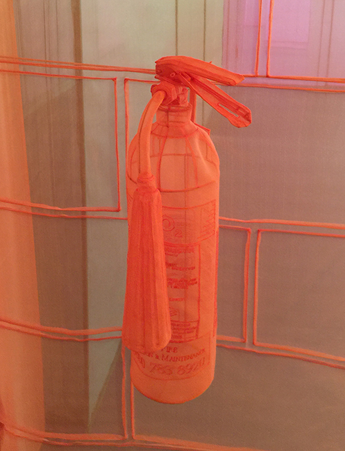
Most of his live sized installation of places he lived at are made of translucent polyester fabric and stainless steel tubing and wire and walking through these installation give you a feeling of ghostly remembrance of other places.
KalbachCin03

Do Ho Suh, Wielandstr. 18, 12159 Berlin, Germany – 3 Corridors, 2011
KalbachCin02

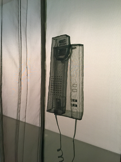
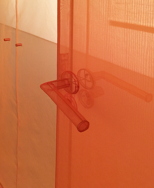
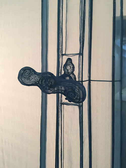
It was interesting how familiar the Berlin-Apartment felt to me- I knew the door handles- the windows, the intercom – things that I have had in apartments I lived at in Germany.
KalbachCin04

KalbachCin05

KalbachCin06

The craftman ship was also just crazy- the  embroidered little details that made you want to touch the items – invoking an even more familiar feeling when just the shape.
KalbachCin07

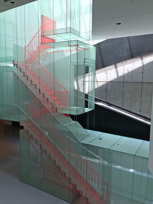
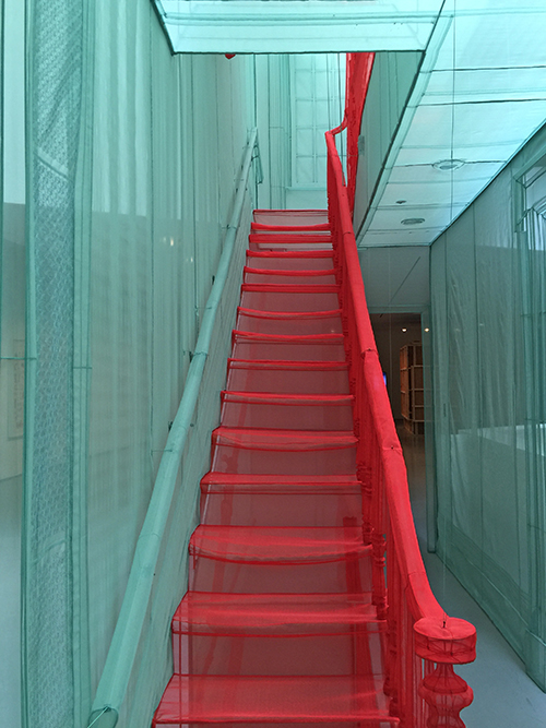
“I’m interested in transitional spaces [staircases, bridges, doorways] rather than destinations. They connect to different spaces, but at the same time they separate the spaces. I truly believe that life is a passageway.”

This is a live sized hallway of an apartment building in New York.
KalbachCin08

348 West 22nd Street, New York, NY 10011, USA Apartment A, Corridors and Staircases – Do Ho Suh

Polyester fabric, stainless steel. 2011
KalbachCin13

KalbachCin09


KalbachCin11

Reflection – Do Ho Suh – Polyester fabric, stainless steel tube, 2005 to 2011
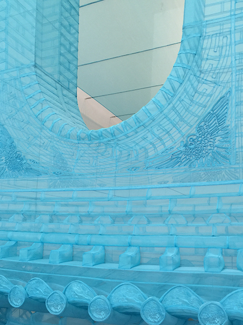
KalbachCin12

KalbachCin14

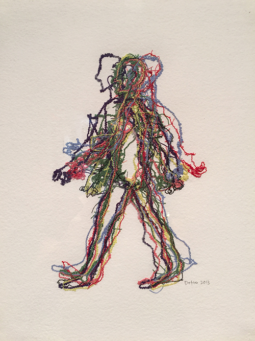
The exhibition also showed some artwork – watercolor paper with embedded cotton threads.
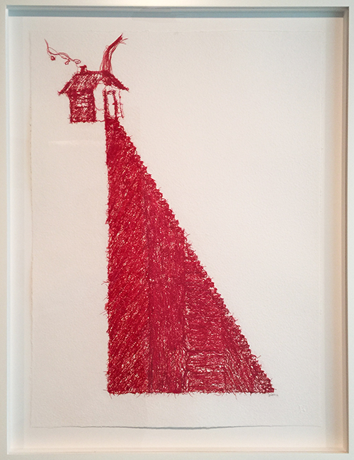
KalbachCin19

KalbachCin20


KalbachCin24

Rubbings of a radiator on sheer transparency paper.
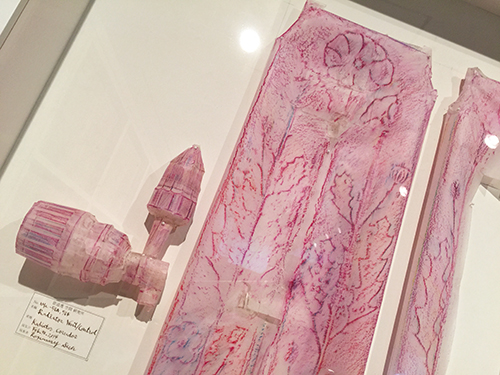
KalbachCin25

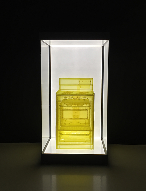
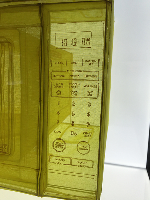
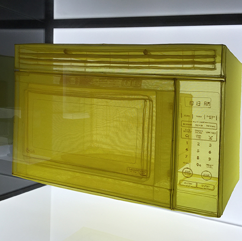
Below are some artifacts from the places he lived. He invites us into his homes and introduces us to the everyday items, memories and emotions that dwell within.
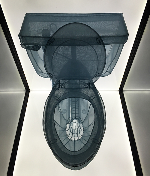
KalbachCin26

KalbachCin27

KalbachCin29

KalbachCin28

I found this concept so interesting – because you get so used to all those things- and I have moved quite a bit in my live- even continents as you know and I can remember funny things in the places I lived- like the old fire oven of the timber wood house we lived in – I would love to have a rubbing of that oven or a sheer fabric installation, or the metal door with swirls we had in my first student-apartment in Hamburg. When you move a lot, you have to make yourself constantly home at different places and after a couple moves it is not dependent on location anymore. It starts with some familiar items you bring along- but mostly for me it is where the man and the fluffy cat are and when you start having local friends you get a fuzzy feeling of “yes, this feels like home” . I feel at home here- but I also long for my home in Hamburg but is more the longing for a memory of a home.
KalbachCin30

KalbachCin31

I know the word “home” means different things to different people. For Do Ho Suh, home can be reconstructed through fabric and memories of architectural space. For others, the smell of warm soup or the sound of a creaky door may elicit a memory. I think it is such an interesting topic to discover with art, Do Ho Suh created memories of homes that he could fold together and put in a suitcase and bring to a new place. I create art of the places around me to get familiar with the area and make it home.

What does home mean to you? Is it tied to a location or feeling?

Comments (8)

  • Barbara Greve

    |

    I lived in Seoul Korea for about a year when I was younger; ok, MUCH younger. I was so blown away by the complete lack of space. People live in little huts right up next to big freeways and their homes are very small so that they have one room but it changes into many different rooms; like they’re living room becomes several bedrooms. I can see why a lot of these mudane things can seem almost mystical to him and he makes these highly intricate woven scuptures out of them. I really love this exhibit. Thank you for sharing!

    Reply

    • nathalie-kalbach

      |

      How amazing that you lived for a year in Korea- that must have been such a great experience! Glad you liked the artstroll.

      Reply

  • Joi@RR

    |

    So very interesting and unique. I can’t even imagine creating something like these. Hehehehe – that potty was so fun!!! Thank you, once again, for bringing your world to us Nat..

    In our 44 years of married life, hubby and I have moved over 100 times. We have rented, purchased, shared and even been homeless! For me – home is simple. Bloom where you are planted!

    Today – home for me is my sweet hubby, my computer and my paints. ALL OF YOU are HOME to me – sharing art daily and hearing your stories. It’s enough. Hugs, j.

    Reply

    • nathalie-kalbach

      |

      Awe can relate about what you say about home :) hugs back to you!

      Reply

  • Rae

    |

    So this may be my favorite art stroll you have shared so far. I love it so much. Home is VERY special for me as well and this was just amazing! I would love to see it one day. Thank you for sharing with us! xx

    Reply

    • nathalie-kalbach

      |

      So glad you liked it :) One day we will go on an artstroll together :)

      Reply

  • Sue Clarke

    |

    HOME is when I am feeling at peace (within myself) at any location and/or when I’m with my husband, son and dog. More a matter of who I’m with and how I feel than where I physically am. Although it does feel nice to “get home” after being away on vacation. Have a wonderful day at home OR away Nat!

    Reply

    • nathalie-kalbach

      |

      This is so true Sue!!! have a wonderful day wherever you are at the moment too, Sue!

      Reply

Leave a comment

Say Yes to New Adventures – Cheiron Brandon

CS August Say Yes

It’s Tuesday and time for my Creative Squad to share a project with you with this month’s theme: “Say Yes to New Adventures”. Throughout the month of August, the team will use any of my n*Studio Stamps and Stencils they would like to use to interpret the theme. Here in the northern hemisphere, summer is coming to a close and it’s about time to seize the days and go on a little adventure before hibernation! With this in mind, the team will create something that celebrates the spirit of adventure.

This week we bring you Cheiron Brandon and the adventure she went on to create a beautiful art journal page!

—————————————————————————————————

Cheiron August Headshot

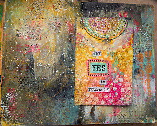
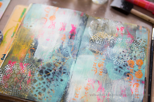
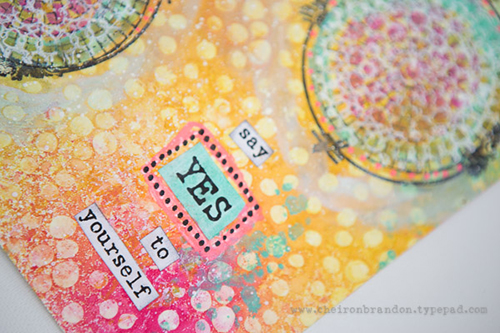
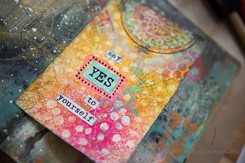
Hi there, Cheiron here with my August project for the n*Studio Creative Squad. This month, I tried a new adventure in my art journal, and it did not come out as I planned at all, but I will show you how I got it back to something I could use :)  Here is my finished art journal page with a fold out in the center for journaling:

cheiron- august n_studio 1

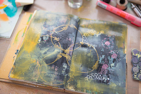
It did not always look like this, I started with a much brighter page and I did not like how the writing came out at all, so I painted over it with black:

cheiron- august n_studio 5

cheiron- august n_studio 6

I added many layers to the page with lots of different stamps using Distress Paints that I applied to the stamp with a foam blending tool:

cheiron- august n_studio 7

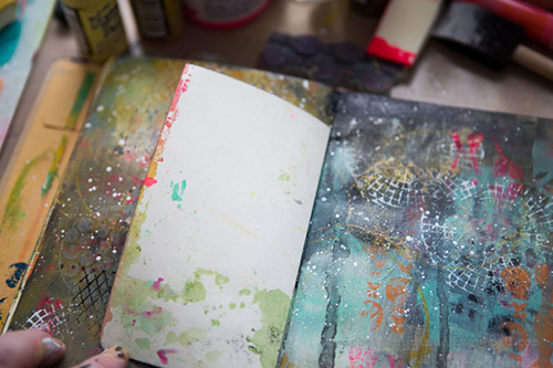
I also had a page from another project that was an adventure gone wrong, so I cut it up and added it to the page so I could use the back for journaling:

cheiron- august n_studio 8

cheiron- august n_studio 4

cheiron- august n*studio 9

The lesson for me this month, is that every adventure whether it be small or big does not always work out, but you should just keep taking new adventures!

—————————————————————————————————

Cheiron’s art journal spread turned out beautifully with all those layers, and the adventure it took to get there was definitely worth it.

Cheiron used the supplies listed below (some are affiliate links):

SuppliesCJS

Maybe you will even play along with us -I would love to see how you interpret our monthly themes. Email me how you used my stencils and stamps with the theme and email me an image – I would love to share your projects in my next “n*Spiration From Around the Globe“.

See you next Tuesday for another project from the Creative Squad!

Comments (1)

  • Miriam Prantner

    |

    Love how it turned out and how you were able to fix what you didn’t like. Loving the contrast between the background and the insert too!

    Reply

Leave a comment

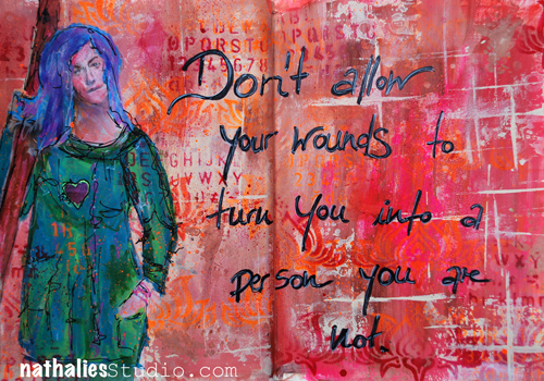
Don’t Allow or… In My Art Journal Today

Photo1

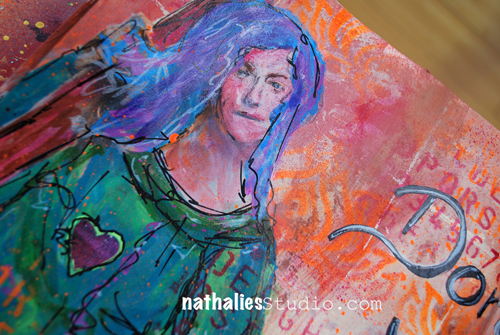
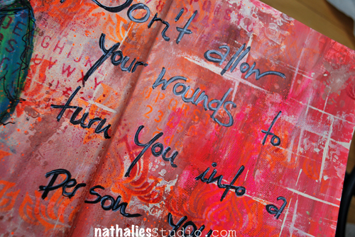
“Don’t allow your wounds to turn you into a person you are not.”

I loved creating this page!

Photo6

I used acrylic paints, stencils and stamps for the background and found a magazine image that fit to my quote and painted over with markers and charcoal stick.

Photo7

I love that with art journaling you can tell a story but without revealing the whole story- that is the way how I prefer it. Everyone one does it differently- and if you want to write a lot- than that is the right way too – I just happen to rather hide it a bit more :)

Here are all the supplies I used – some of the links are affiliate links.

SuppliesCJS


Hope you have a wonderful day!!!!

Comments (3)

  • Sue Clarke

    |

    Art journaling is my therapy when needed.
    Nice page and message Nat.

    Reply

  • Joi @RR

    |

    Wow – probably just what I needed to hear Nat. Lately I have had a few bumps in the art world and it has made me step back a bit. I need to remember your journal page today. Great background and your gal looks perfect for the sentiment! Thanks bunches. XXj.

    Reply

  • Rae

    |

    Good advice Nat! Love your art journal pages so much! xx

    Reply

Leave a comment

New In-Person Classes in Maryland, NYC and California!

I have couple workshops coming up the next months and I cannot wait to teach more again after taking a break a couple months to get my book done :)

QueensInkWS

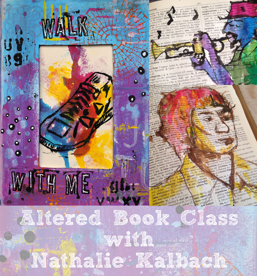
Super excited that I will be teaching October 21-22 at The Queen’s Ink in Savage, Maryland.

Friday October 21, 2016 – 11am-3pm

Walk With Me – Altered Book Class

WalkWithMeAd2

Registration Open Now


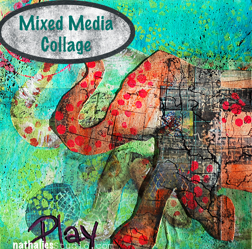
Friday October 21, 2016 – 5pm-9pm

Play – Transform – Mixed Media Collage Class

MixedMediaCollage

Registration Open Now


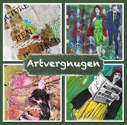
Saturday October 22, 2016 – 10am – 6pm

Artvergnugen – Art Journaling Class

ArtvergnugenAd

Registration Open Now


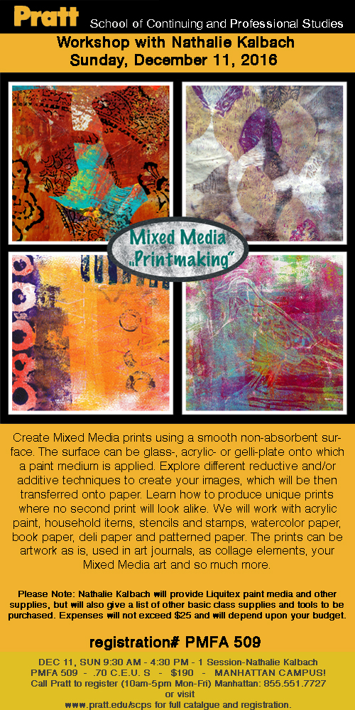
I am teaching one workshop this fall at Pratt

Sunday December 11, 2016 – 9.30am – 4.30pm

Mixed Media- Printmaking

Printmaking11Dec2016Workshop

Registration now open – phone: 855.551.7727


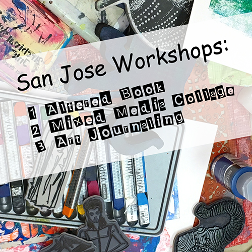
WorkshopsSanJose

And- also super excited about teaching in San Jose January 24-25, 2017 at A Work of Heart

Tuesday, January 24, 2017 – 10am – 3pm

Walk With Me – Altered Book Class

WalkWithMeAd2

Registration Open Now


Tuesday, January 24, 2017 – 5.30pm – 9pm

Play – Transform – Mixed Media Collage Class

MixedMediaCollage

Registration Open Now


Wednesday January 25, 2017 – 10am – 5pm

Artvergnugen – Art Journaling Class

ArtvergnugenAd

Registration Open Now


I hope I will some of you at any of my In-Person Workshops !

Have a wonderful day

Leave a comment

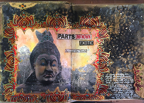
Say Yes to New Adventures – Gwen Lafleur

CS August Say Yes

It’s Tuesday and time for my Creative Squad to share a project with you with this month’s theme: “Say Yes to New Adventures”. Throughout the month of August, the team will use any of my n*Studio Stamps and Stencils they would like to use to interpret the theme. Here in the northern hemisphere, summer is coming to a close and it’s about time to seize the days and go on a little adventure before hibernation! With this in mind, the team will create something that celebrates the spirit of adventure.  Maybe they took a trip recently that included some unexpected twists and turns, maybe they like to live the adventurous life every day, or maybe their idea of adventure is as simple as trying a new brand of tea. Whatever they do to “live on the edge” is appropriate fodder for this one.

This week we bring you Gwen Lafleur‘s gorgeous art journal spread that might inspire you to journey to far-off places!

—————————————————————————————————

Gwen August Headshot

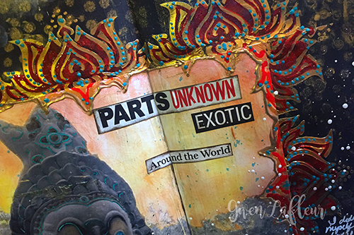
This month’s theme around new adventures might as well have been tailor made for me! For most of my life I’ve never really considered myself an adventurous person… I’m not interested in thrill seeking or eating really bizarre foods, but in the last few years I’ve realized that I’m much more adventurous than I ever thought; I love to travel and see new places, try new food, and explore new cultures. I try and take a trip every year, and pretty soon I’m taking a really big, slightly off the beaten path kind of trip that’s been in the works for about two years! Thinking about that, I really wanted to make an art journal page that would demonstrate my love of travel adventures.

Adventure Art Journal Spread - Close-up 1 - Gwen Lafleur

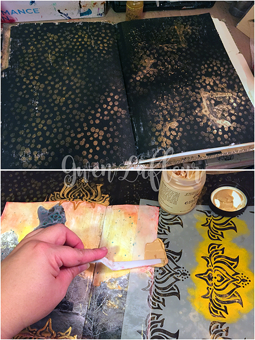
To start, I gesso’d the pages of my 9×12 handmade journal with black gesso and when that was dry, I took Nat’s What’s the Point? stencil and some gold spray ink and added lots of gold dots all over the background.
Adventure Art Journal Spread - Steps 1-2 - Gwen Lafleur
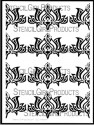
I had already chosen my photo for this spread – I used a picture I took in Cambodia two years ago that I altered and tinted in a class with Seth Apter. I used matte medium to adhere that firmly to the page. When that was dry, I used the Lily Wallpaper stencil along with some gold embossing paste to create a frame all around my photo. I did this in two shifts so that I didn’t mess things up trying to stencil with wet paste on the page. I love the effect I got from that! I also glued in some travel and adventure words and phrases I’d cut from a magazine to really reinforce the theme.
Adventure Art Journal Spread - Steps 3-4 - Gwen Lafleur
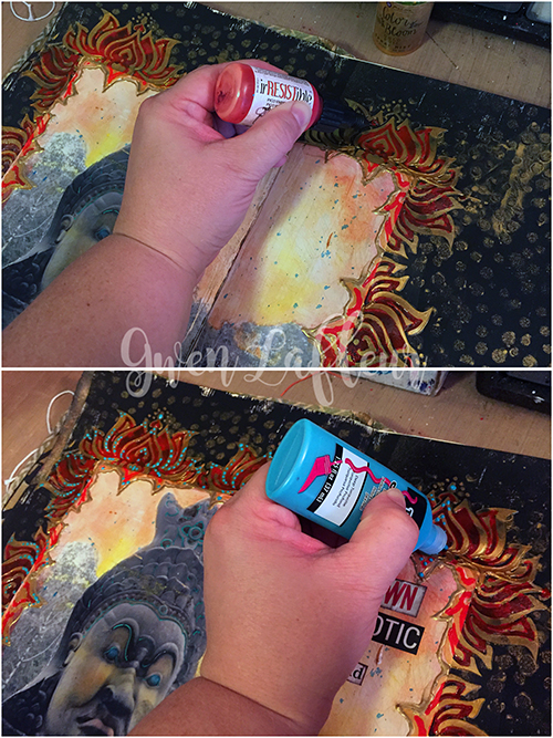
When all of the embossing paste was dry, I used an irRESISTible Pico Embellisher in Morocco to color in the open areas in the stenciled frame. This was a fun way to pull another color out of my photo and add some visual interest. Of course, that was followed up with dots made with dimensional fabric paint (I can’t resist the dots!) Just a side note, when I use dimensional paints (or really anything glossy,) I lightly wax the finished spread so the pages don’t stick together.
Adventure Art Journal Spread - Steps 5-6 - Gwen Lafleur
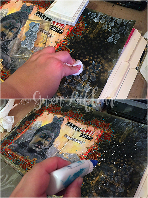
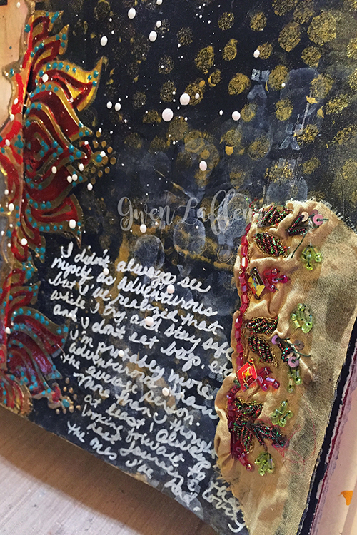
I wanted to add a few more finishing touches before doing my journaling. I used some white ink with an image from Nathalie’s Marks rubber stamp set and stamped in a few places around the page. Then I took a baby wipe and knocked the ink back a bit so that it wasn’t quite so strong and competing with the photo. I threw some clear embossing powder over it and heated since I still wanted to work on top (you need to heat set or emboss pigment inks on top of acrylic, otherwise they’ll wipe off with mediums, baby wipes, etc…) Finally, some splatters of white paint to kind of unify the whole thing. Then I just added my journaling with a white pen, glued on a few scraps of sequined fabric, and edged the page with gold ink. Voila! Finished art journal spread!
Adventure Art Journal Spread - Close-up 2 - Gwen Lafleur
I hope you enjoyed today’s project… I know I did! Now I’m off to begin my countdown for my next adventure!
Adventure Art Journal Spread - Gwen Lafleur
—————————————————————————————————

Gwen’s art journal spread is so dreamy and exotic – it really reminds me why I love traveling to new places and seeing different cultures.

Gwen used the supplies listed below (some are affiliate links) as well as a Stampin’ Up white craft ink pad:

SuppliesCJS

Maybe you will even play along with us -I would love to see how you interpret our monthly themes. Email me how you used my stencils and stamps with the theme and email me an image – I would love to share your projects in my next “n*Spiration From Around the Globe“.

See you next Tuesday for another project from the Creative Squad!

Comments (3)

  • Anna Friesen

    |

    Gwen, amazing techniques!! You amp everything up to a new level! Does this gold embossing paste keep its sheen? I find many gold mediums are lackluster once dry.

    Reply

  • Denise Spillane

    |

    Oh Gwen, this is so wonderful. I am so enamoured with your style, so exotic and lovely! I love these stencils by Nathalie too! I bought them the mini ute I saw them in a class with Nat.

    Reply

    • gwenlafleur

      |

      Thanks Denise – I really appreciate that! Nathalie definitely has some awesome stencils, doesn’t she?

      Reply

Leave a comment

Demos at The Ink Pad in NYC

KalbachInkPadCollage

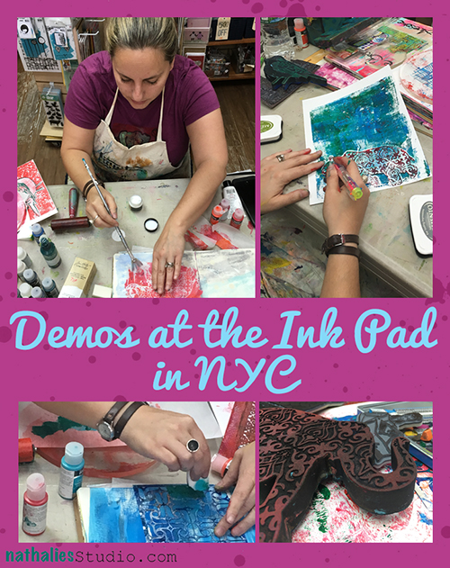
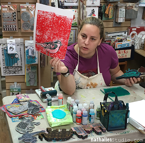
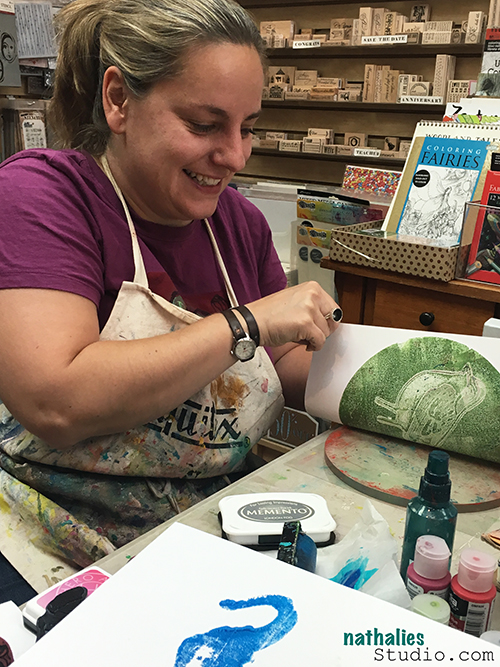
Last month I had a fun afternoon demoing with my stamps at one of my favorite stores – The Ink Pad in New York.

KalbachInkPad01

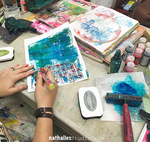
I showed some easy and fun Gelli-Printing tricks with acrylic paints and foam stamps

KalbachInkPad05

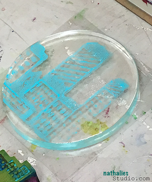
having lot’s of fun with a round plate and using dye inks

KalbachInkPad04

playing with small round printing plates

KalbachInkPad06

having an Elephant in the room

KalbachInkPad02

doing some collage fun

KalbachInkPad03

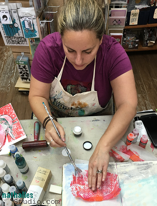
and stenciling

KalbachInkPad07

and of course taking over the whole store and making a big mess :)


We did a FB Live Stream right from the store on my Facebook Page of some fun techniques – you can see the store, some wonderful people and the store in action if you want :) It was a lot of fun and thank you to all that came, the people who watched the video and joined and Anna and Jane from the InkPad!!!

Comments (4)

  • Julie B

    |

    Looking forward to meeting you in Cali in a couple of months! Thank you for the video/tutorials.

    Reply

    • nathalie-kalbach

      |

      Yeah- so looking forward meeting you in Cali too- it is going to be loads of fun!

      Reply

  • Linda Faber

    |

    Thanks, Natalie, for the great demos! Just what I needed, a refresher lesson on using my gelli plate. I will definitely have to visit that NY store!

    Reply

    • nathalie-kalbach

      |

      Glad you liked it Linda- and yes yes – The Ink Pad is worth a visit in NY :)

      Reply

Leave a comment

Creative Ice Breaker – Morning Art Journal Play Video #4

In the mornings I play in my art journal to get myself into the creative groove and break the ice – so to speak- and get ready to paint. I recorded and fast forwarded my morning ritual for this video – and hope you enjoy it. Take it as what it is – a morning art journal play- not a tutorial ? – BTW- I had to buy a new camera and as you might see, I am still trying to get used to it. I learned a lot about it during the video- so bear with me on the bit of a weirdo-focus-color-format journey in this video – I promise it will be better next time.

Creative Ice Breaker VIDEO IV July 31, 2016 from Nathalie Kalbach on Vimeo.

Here are the supplies I have used in my Creative Ice Breaker video above – some links are affiliate links.

SuppliesCJS

Don’t forget that this is the last day of the Blogiversary SALE with 20% off of online workshops (like Creative Jumpstart 2016), DVDs, and select items (including all the stampsandstencils) from the n*Store online.  The sale prices are reflected in the store now.

Happy Blogiversary sale

I hope you enjoyed the video ? Have a wonderful and creative day

Nat

Comments (2)

  • Kathy Gledsdale

    |

    I could not believe it when you started putting gesso over that lovely background, I was almost shouting at the screen, but what a lovely page you created and how wrong I was, gorgeous.

    Reply

    • nathalie-kalbach

      |

      LOL- Kathy-I didn’t know I could make you almost shout at the screen ;) glad you still liked the page. Honestly I liked the background too but I was thinking- ah let’s roll with it :)

      Reply

Leave a comment

New Mixed Media Painting – Flat Iron Building

FlatIron01

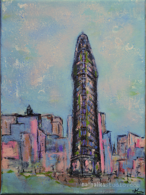
I finished this new painting of the Flat Iron Building in NYC which is 12″x16″. I had a good time with it, especially trying to get a bit into a different color scheme and using pastels. I was definitely inspired by the Art Stroll through the Degas Exhibition at MoMA.

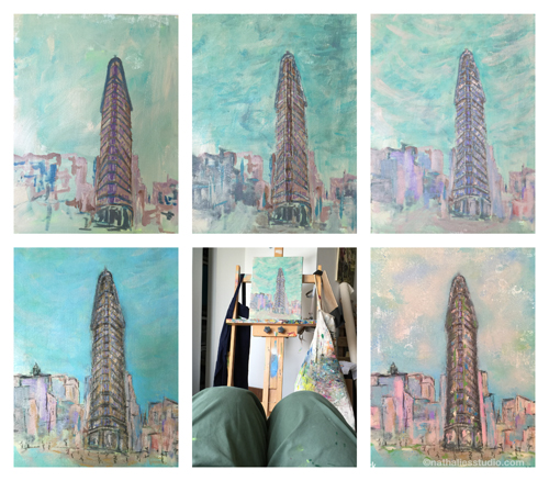
ProgressFlatIron

This is a little photo collage showing the progress of the painting from underpainting, to adding more details, to changing things, over staring it down to finishing it up :) .

FlatIron012

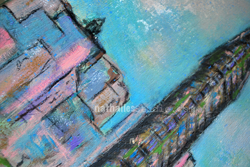
Besides Acrylic Inks, Acrylic Paints and Acrylic Markers, I also used Charcoal Marker and Graphite.

FlatIron013

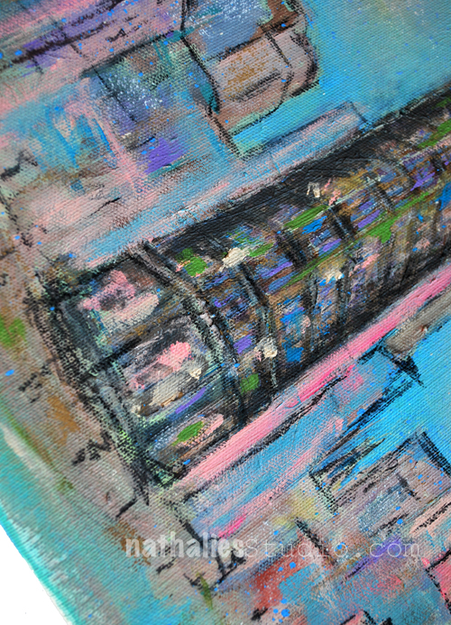
I added some finishing touches with PanPastels. It was fun – and I am very drawn to this color palette.

For those of you who want to know what I used specifically – as always a supply list- some links are affiliate links.

SuppliesCJS


Let me know if you find the process of a painting interesting to see- if so I will incorporate those collages more often !

Don’t forget that I have a Blogiversary SALE right now going on with 20% off of online workshops (like Creative Jumpstart 2016), DVDs, and select items (including all the stampsandstencils) from the n*Store online.  The sale prices are reflected in the store now.It ends tomorrow night!

Happy Blogiversary sale

Have a beautiful day!

Comments (4)

  • Rae

    |

    This might be my favorite one yet Nathalie. The colors are amazing and there is just something very real and alive in it! LOVE it! xx

    Reply

    • nathalie-kalbach

      |

      Awe- thank you so much Rae ! Hope you have a gorgeous weekend!

      Reply

  • Brenda

    |

    I like the color palette as well. I also enjoyed seeing the pictures of the different stages of the painting. Do you usually take pictures of the different stages for reference when working on a painting? Great painting!
    Reply

    • nathalie-kalbach

      |

      thank you Brenda! Yes I do take photos in between to see the evolvement of it and also where I might have taken a different turn- but also to check on color values and because it is just a different view to see it through the camera.

      Reply

Leave a comment

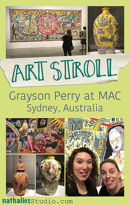
Art Stroll: Grayson Perry at MAC in Sydney, Australia

KalbachPerryCollage

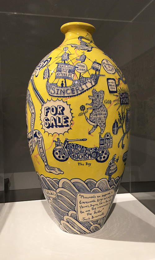
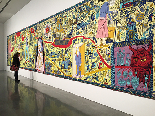
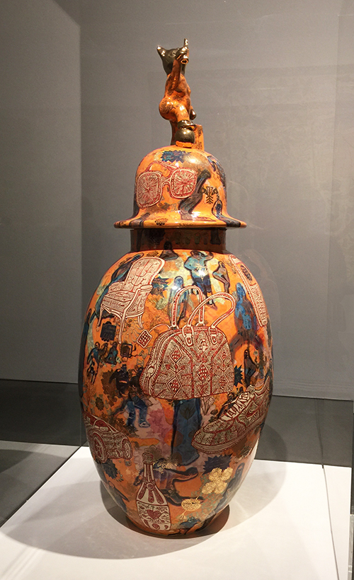
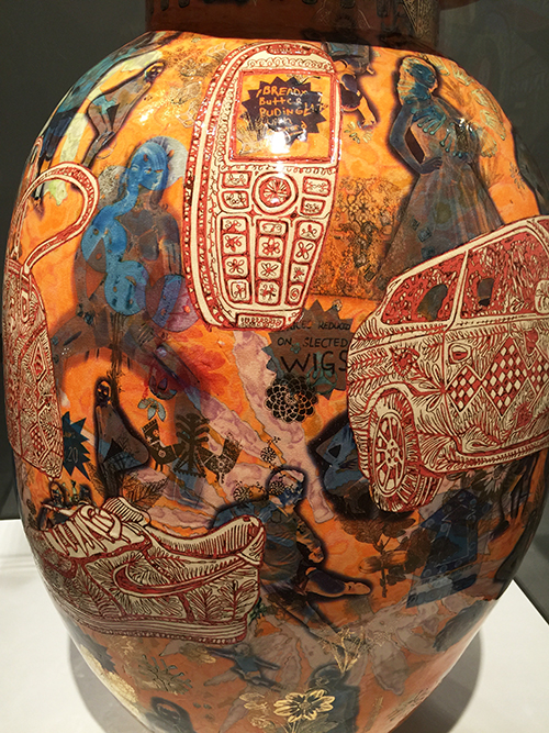
A couple of months ago, I was in Australia and visited a couple museums but I wanted to spread out the posts for you a bit- so finally I would like to take you on an art stroll through Grayson Perry’s exhibition at MAC in Sydney.

“Grayson Perry is one of the best known British artists of his generation, acclaimed for his ceramics, sculptures, drawings, prints and tapestries. With a keen eye for detail and a love of the popular and vernacular, Perry infuses his artworks with a sly humour and reflection on society past and present.” (MCA)

KalbachPerry02

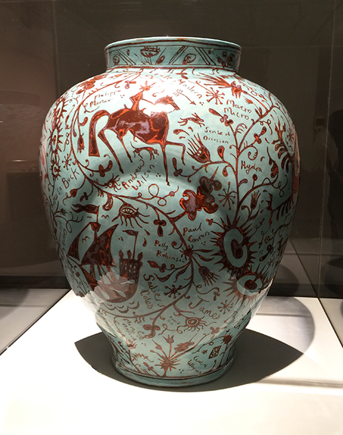
I love how Grayson Perry celebrates craft and wants to get rid of the idea of high art and low art.

In this ceramic he combines heraldic images with important names and dealers in the art world.


KalbachPerry05

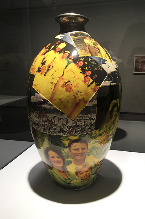
For Perry Art and Craft are very firmly linked.

KalbachPerry06

X92, 1999

KalbachPerry08

Woman of Ideas 1990, glazed ceramic

KalbachPerry12

KalbachPerry13

KalbachPerry14

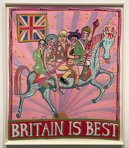
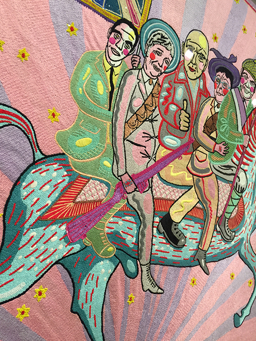
Britain is Best, 2014 – hand embroidery, silk, glass beads, sequins, cotton thread.

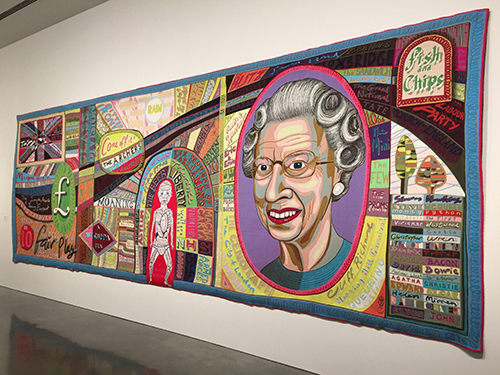
Insanely amazing and again – a message on a wall tapestry.

KalbachPerry15

KalbachPerry16

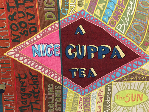
Comfort Blanket 2014- tapestry

KalbachPerry17

KalbachPerry18

KalbachPerry19

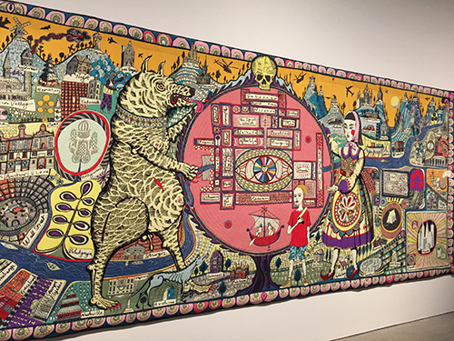
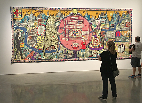
Map of Truths and Beliefs 2011 – acrylic  wool and cotton tapestry

As you can see the scale of the work was massive!

KalbachPerry20

KalbachPerry21

Perry says “It is not about being perfect, it is about a give and take between the maker and the material, and the imagery they are using. It is a conversation. Often the most interesting thing happens, is when you allow the material to fight back.” This really speaks to me!

KalbachPerry22

KalbachPerry23

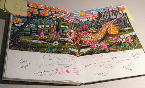
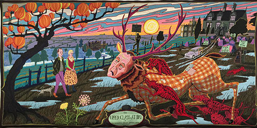
Part of the exhibition was also a great range of Perry’s sketchbooks. He says that drawing in his sketchbook is an almost daily activity and when he puts an idea down he takes it very seriously. No idea is wasted and there will come a point when he will make a work from the drawing. He has a backlog of categories of objects he wants to make.

KalbachPerry10

I loved seeing his sketchbook above and then the actual tapestry that came out of it!

KalbachPerry26

KalbachPerry27

KalbachPerry28

KalbachPerry29

This was truly a treat – I hope some day Perry makes it to the U.S. as I could have spent hours at the exhibition looking at the messages, the imagery – the connection of craft and art. His artwork is inspiring and amazing and his thoughts on society, art and craft are very interesting and appealing to me.

And on this note ….one last goof ball pic from Australia :)


KalbachPerry32

I hope you enjoyed this art stroll!

Comments (3)

  • Joi@RR

    |

    Heheheh – you two gals ALWAYS make me giggle when you are together!!! This was so interesting to see Nat. Amazing creative thinking – wow. Just kept looking and looking!! Thanks bunches for such great photos and post. Xj.

    Reply

  • Sue Clarke

    |

    Love the tapestries! Especially fun to see the leap from the page to the wall. I enjoyed this stroll.

    Reply

  • Kim

    |

    One of my favorite Art Strolls – such a thought-provoking artist! I’m with you – I would love to see more of his work and to really spend time taking it all in. Seems like he also has a sense of humor :) Thank you for sharing both the imagery and some of the big themes behind the work!

    Reply

Leave a comment