Meet our Creative Squad!


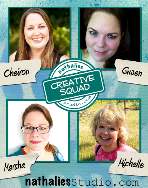
Creative Squad Intro ImageI’m super excited to introduce you to the newest addition of my n*Studio Site:  the Creative Squad!  Maybe you remember that I posted recently that I need to get some help as I am really busy working on my book (details to come later this year) and I feel sometimes there is not enough hours in the day to do all the things I want to do. So,  I reached out to some of my most creative friends to help me out.  And thankfully, four of them agreed!  I am so excited to have these super talented and wonderful friends as a support. Over the next several months, the Creative Squad will be helping with posting some inspiration for you on the blog.

At the beginning of each month, our Creative Squad will be given a theme to work around and a stamp or stencil from my store to use.  Then every week, a different Creative Squad member will post a mixed media project of their own design, inspired by the monthly theme and using one of my new products. And maybe you will even play along -we would love to see how you interpret the theme!

Meet the Creative Squad!

Cheiron Brandon

Cheiron Brandon

Gwen Lafleur

Gwen Lafleur

Marsha Valk

Marsha Valk

Michelle Rydell

Michelle Rydell

Please stop back every Tuesday to the blog for the latest project ideas from the Creative Squad – it is going to be super inspiring and fun!

Comments (10)

  • Maura

    |

    Awesome idea! Congratulations to the fantastic team!

    Reply

  • Jenny Petricek

    |

    Wonderful news–and congrats to all! Can’t wait to be inspired!!

    Reply

  • Joi@RR

    |

    Hello hello to all four of you Creative Squad gals! THIS is VERY exciting. I have to admit…I’m a bit envious though. Helping Nathalie seems like the ultimate creative fun!! I will be ENJOYING your work, for sure.

    So happy that you are doing this Nat. YEAH!!! Your Creative Squad looks SUPER FINE. I’m excited for you and for all of us reaping the benefits too!! XX j.

    Reply

  • Marit

    |

    What a creative group of women you have in the squad Nathalie… their projects will be awesome for sure! Congratulations ladies, have fun!
    Reply

  • JoAnn

    |

    Sounds like fun – anything you do Nathalie is ok by me!

    Reply

  • Gwen L.

    |

    Thanks for the welcome! So excited to be joining the team!

    Reply

  • Sue Clarke

    |

    Congrats and welcome to the new creative squad!
    I’m looking forward to getting inspiration from you.

    Reply

  • Michelle LaPoint Rydell

    |

    Thanks for having me on your squad Nat! I’m so excited to be creating with this talented group of women! We are going to have fun!!!

    Reply

  • marsha.

    |

    Yay! :-D So happy to be on (in?!) your Creative Squad with these three fabulous artists!!!

    Reply

  • Sanna

    |

    congratulations!!! can´t wait to see what you make!!!

    Reply

Leave a comment

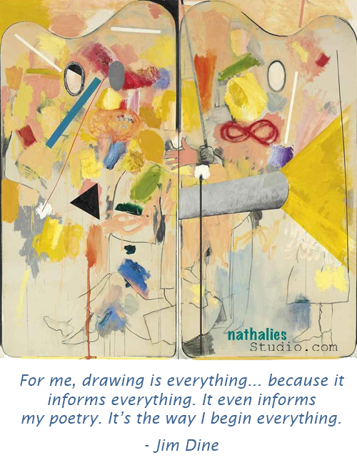
Artist Quote of the Week – Jim Dine

QuoteDine

Comments (1)

  • lori-ann-davis

    |

    Love Jim Dine! His sculpture can be such fun, though at times a bit on the creepy side of cool lol. There are a few of his pieces in the collection at Frederik Meijer Gardens and Sculpture Park where I have been a volunteer for several years. A while back we even had a large exhibit of his work in our gallery as well as the permanent pieces in the park. They always make me smile as I walk by them.

    Reply

Leave a comment

The American Dream – Mixed Media Painting

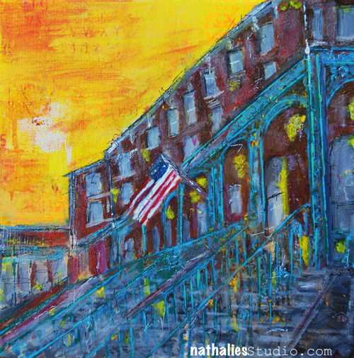
TheAmericanDream_01

I finished a new painting inspired by a street here in Jersey City that I heard being referred to as the New Orleans Row.

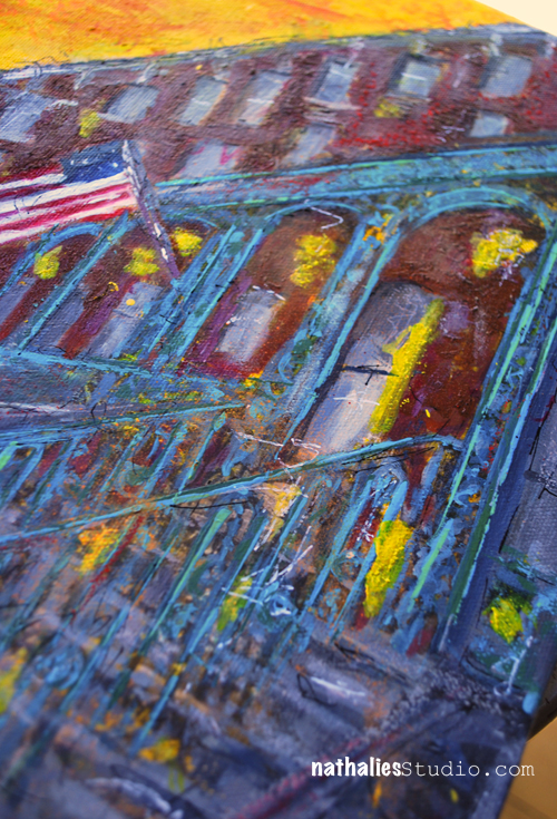
I used a acrylic paints, spray paints, markers, acrylic media as well as some pastels and wax bars for highlights – I had a good time :)

TheAmericanDream_02

This painting took quite some time – I had to let it sit longer periods of times to see if I would still think it was done and it was even hanging on the wall for a while to see how I would like it then. When do you know a painting is done? Well…when I stop dropping the vacuum cleaner when passing by because I need to change or add something ;)

SuppliesCJS


Comments (5)

  • Gina Sismilich

    |

    I love that painting. Your city scenes just get better and better.

    Reply

  • Joi@RR

    |

    Totally laughed out loud when I read your dropping the vacuum statement – you are so cute!!! Well – you already know that I ADORE this painting. YOU – dear Nat – just are THE BEST at this type of city scape work. I honestly believe you could go down as an “old master” someday for doing these. They are so unique and intriguing. Looking at this one… I feel like I can see inside…. and I want to put my foot on those steps right NOW. It just CALLS to me – asking me to come inside. The colors are just STUNNING… so perfect in every way. And I know in my mind that the yellow strokes are supposed to be reflections of the sky/sun but they add such a magical and happy aura to the painting. And the yellow lights high up on the porch could also be hanging flower baskets – in my mind!!! There is nothing dark about this building – to me – it is warm and bright and full of life. JUST LIKE YOU!!!! Ok – I will stop rambling but I truly think this is a WORK OF ART that will someday be NOTICED. Hugs. j.

    Reply

  • Rebecca Buchanan

    |

    Depth and complexity and yet such a wonderful ethereal quality to this. Beautiful painting–love it!

    Reply

  • Jean Marmo

    |

    I love this! The buildings are wonderful!

    Reply

  • Deborah A. Pierro

    |

    Hi Nat–I love the painting. I especially love your paintings of buildings and cityscapes. I do exactly what you do to decide if a painting is finished. I think that’s what most artists do. Best to you!

    Reply

Leave a comment

Put a Stamp on it or… Check it out

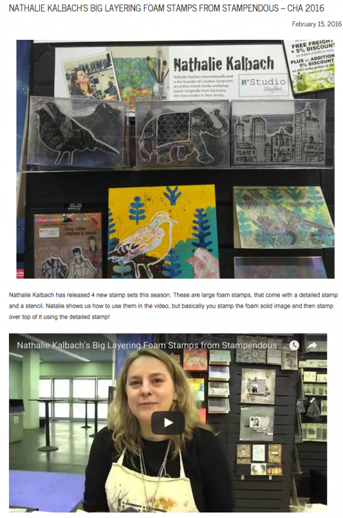
Today is all about stamps :) Stamps on Video and about Stamps in a podcast:

Christine Urias from ScrapTime visited me at the Stampendous booth at CHA – Check out her video of me

Screen Shot 2016-02-16 at 6.13.37 PM


Thank you Christine for coming by and doing such an awesome job every year to cover what is new at CHA – always fun to see you and Mark!

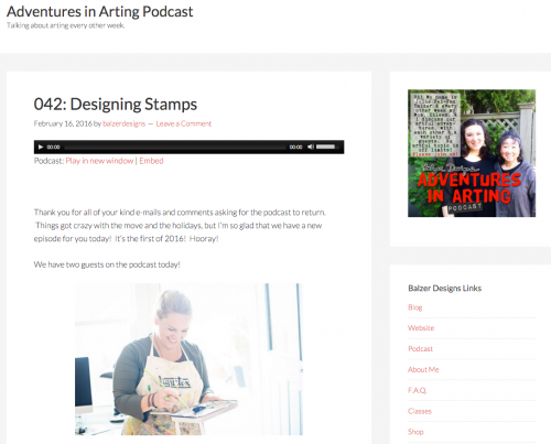
And now…if you are tired of seeing me …how about  listening to my kraut-accent on this Adventures in Arting Podcast hosted by Julie Fei-Fan Balzer. Julie, Rachel Greig and I talk about how we each started designing stamps, both the why and the how of how we each design stamps, the experience of seeing work that people make with our stamps, the appeal of stamping in general, and we give some stamping tips too!

Screen Shot 2016-02-16 at 6.20.48 PM


Thank you Julie for having me and to Julie and Rachel for this fun and interesting discussion about stamps.

I hope you enjoyed the visual and auditory stamp information !

Which kind of stamps would you love to see?

Comments (5)

  • Joi@RR

    |

    What a great demo video and I sooooo loved seeing you in action Nat. Delightfully fun. Your stamps sets are just amazing to me…. I can’t wait to have a day to just play with mine. XX j.

    Reply

  • Gunvor

    |

    I love them! And they’re on their way to me now!!!! If I’m real lucky I’ll have them today so I can start playing with them this week-end!

    Reply

    • nathalie-kalbach

      |

      Yeah! I hope you will share with me what you made with them, Gunvor!

      Reply

  • Jean Marmo

    |

    Such fun! I LOVE your stamps!!!
    Reply

Leave a comment

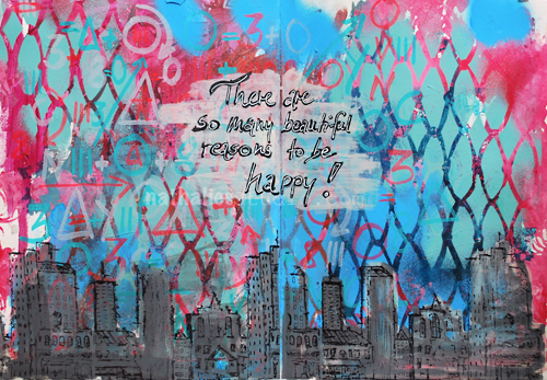
Many Beautiful Reasons or … In My Art Journal Today

AJ_HappyReasons_NatKalbach_01

“There are many beautiful reasons to be happy!”

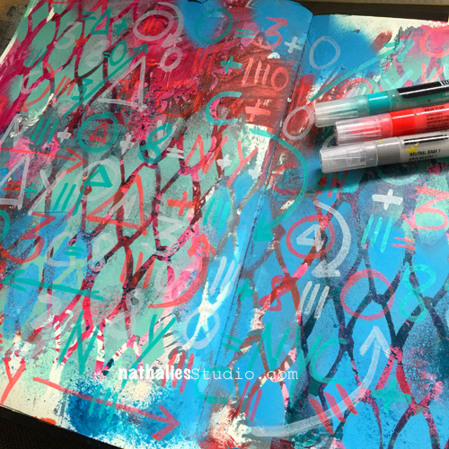
Like ….playing in your art journal :) I had a good time creating a funky grungy background and layering it up with some marker marks.

AJ_HappyReasons_NatKalbach_05

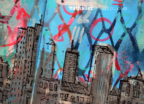
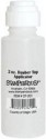
I re-explored the Stampendous Dauber Applicator which comes empty and can be filled with whatever liquid you want. They have a little foam dauber on top. I filled the bottle with part black soft body paint and some white acrylic ink to get a grey and also a more fluid paint and used the dauber to apply paint onto the Urban Scribble Foam Stamp. I love how quick this works and especially with generic colors it is an easy way to keep on hand for working with foam stamps. When done with the dauber, simply wipe off access paint from the felt and close up to prevent the felt to dry up with acrylic paint. So far this worked well :)

AJ_HappyReasons_NatKalbach_03

I stamped with the Urban Scribble rubber stamp and archival ink on top.

What made you happy today?

Here is a list of the supplies, I used for the art journal spread above.

SuppliesCJS


Comments (4)

  • Joi@RR

    |

    What a great project Nat. Love the unique background and of course…. your amazing city scape. Here is what this brought to my mind…. Your city is protected by a very sturdy, unbreakable chicken wire type fence. So it is safe – in every way. Even safe to wonder the streets – day or night. There is never anything to fear in this city because all of are like mind. There are so many reasons to be happy. It’s my version of a CREATIVE KALBACH CONCEPTION of KINDRED URBAN CONNECTIONS. Heheheheheh!!! I KNOW… I’m a silly girl but that’s what I thought!!! Hugs. j.

    Reply

    • nathalie-kalbach

      |

      Joi, you always see the coolest things- I love it!!!! loves, nat

      Reply

Leave a comment

Art Stroll – Garcia Torres at MoMA

Art Stroll Garcia Collage

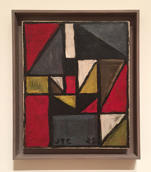
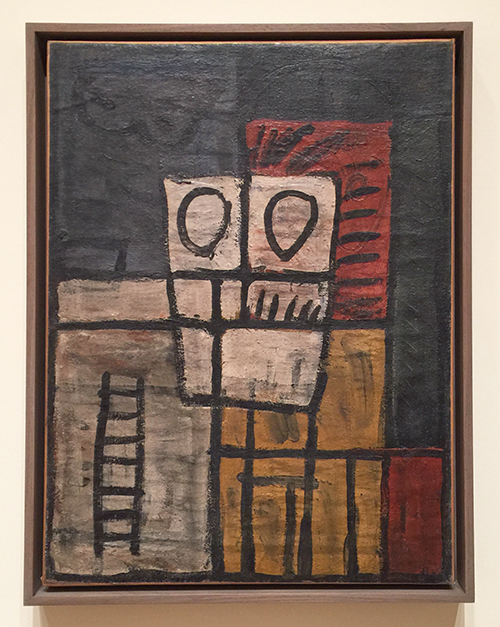
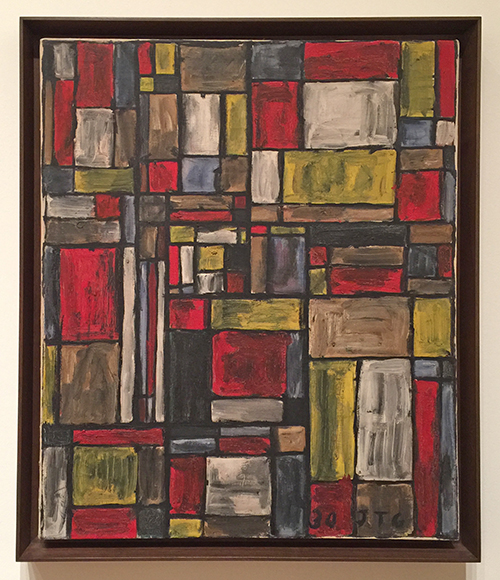
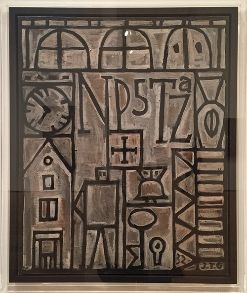
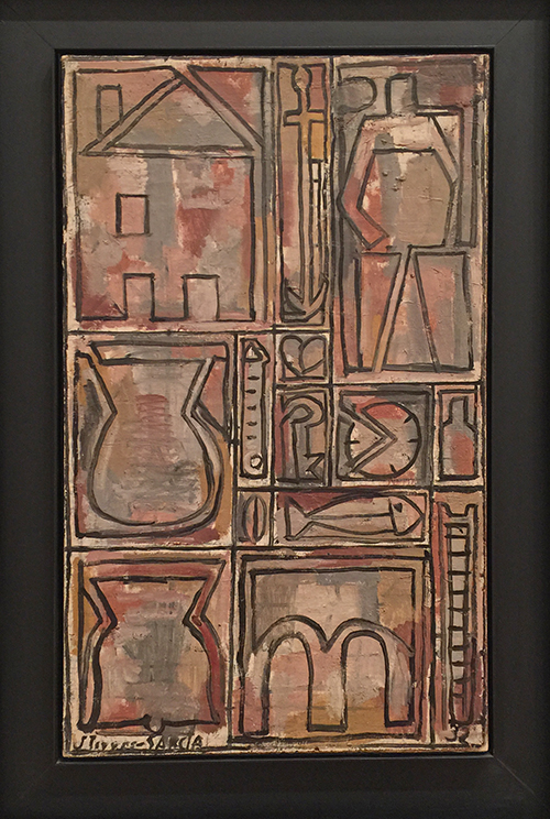
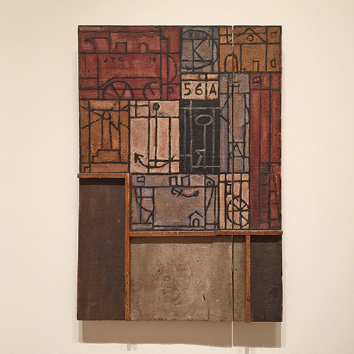
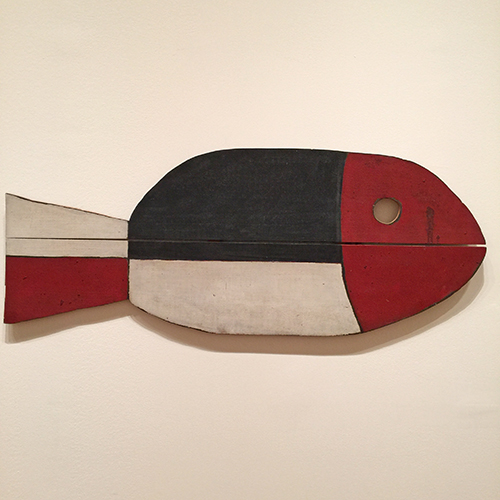
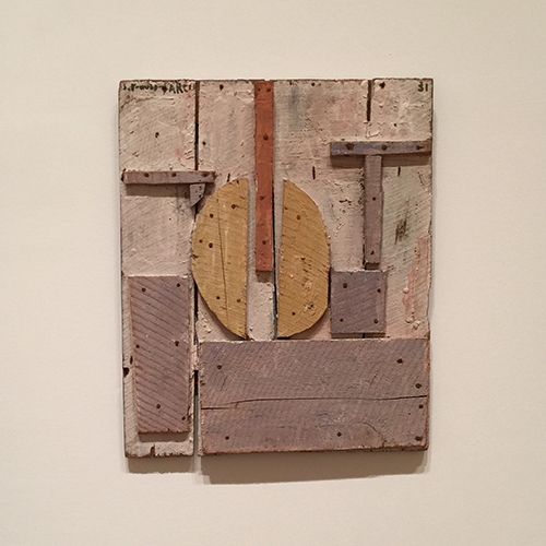
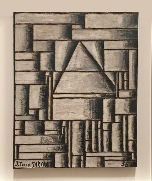
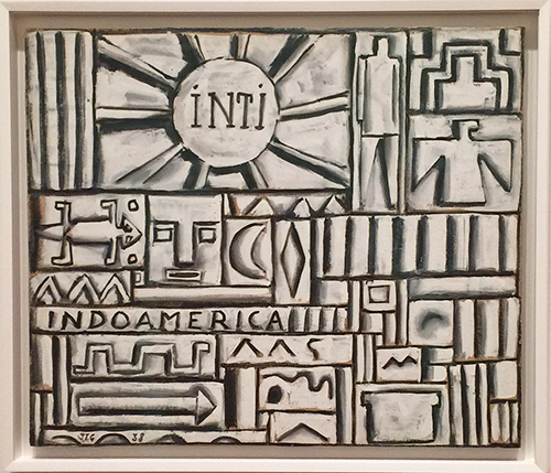
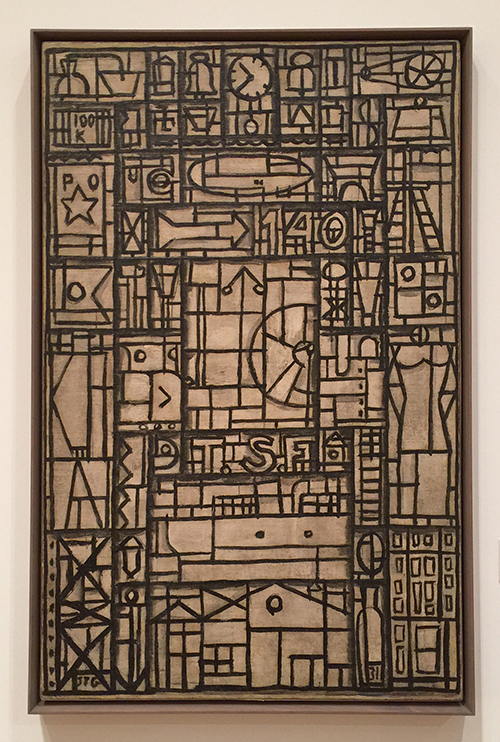
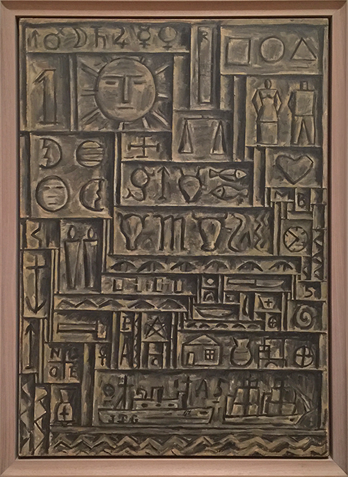
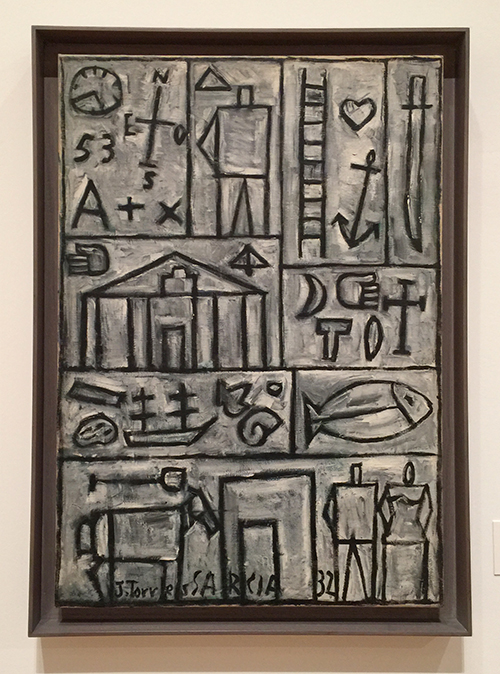
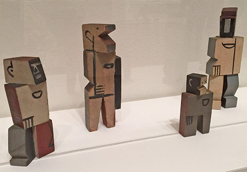
A couple months ago I went to MoMA with my friend Julie Fei-Fan Balzer and I was excited to see the Joaquin Torres-Garcia exhibition since I fell in love with his work a couple months before in Argentina at Malba. Torres-Garcia was an Uruguayan painter and sculptor. He lived in Barcelona with his family in 1891, traveled a lot in his life and was friends with Picasso, Duchamp and other important artists. What I love about his work is how versatile and symbolic it is.

Kalbach Garcia 01

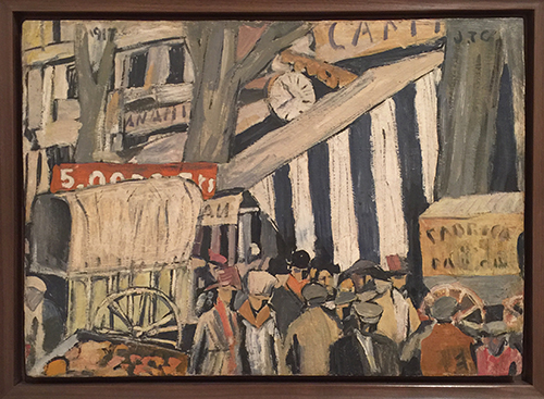
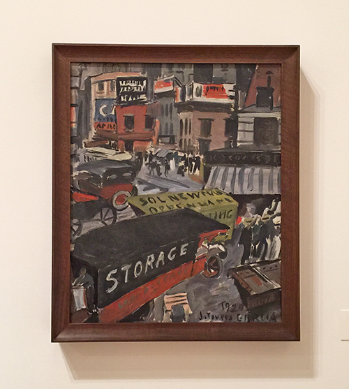
Fourteenth Street, 1920 – Oil on board

Kalbach Garcia 02

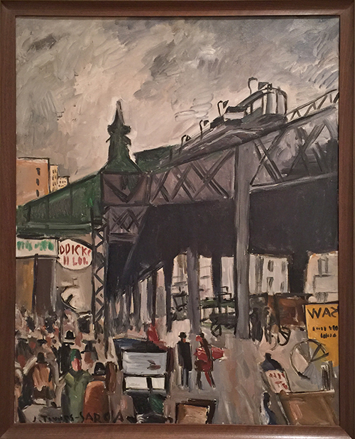
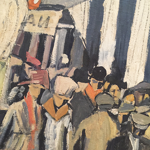
I love his New York City Scenes- they are so lively and I love that he put more detail on signs and writing than on faces – yet you totally get the vibe of the city.

Kalbach Garcia 24

Kalbach Garcia 25

Kalbach Garcia 03

Aren’t those the coolest? I want them all!

Kalbach Garcia 04

I love his very limited color palette.

Kalbach Garcia 05

Construction with triangle, 1929 – Oil on canvas

Kalbach Garcia 06


Kalbach Garcia 07


Kalbach Garcia 15

Structure with struck forms, 1933 – Tempera on board.

Kalbach Garcia 08

Kalbach Garcia 09

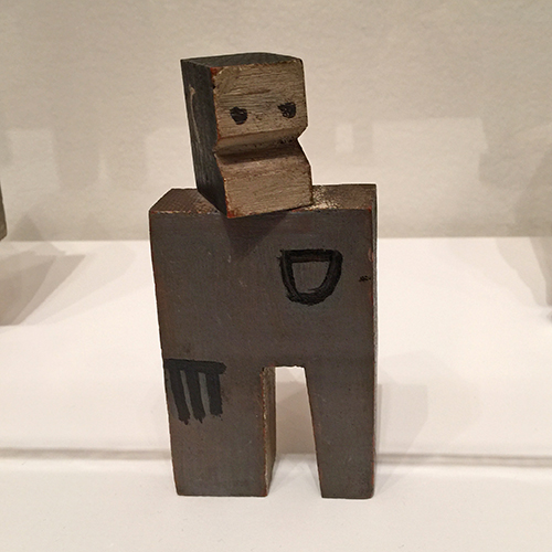
His use of wood pieces – It makes me want to find old pieces of wood and paint on them.

Kalbach Garcia 10

Kalbach Garcia 13


Kalbach Garcia 18

And working in black, white and grey…even though I am such a bright color nerd, this makes me want to do it.

Kalbach Garcia 11

Kalbach Garcia 12

Kalbach Garcia 16


Kalbach Garcia 14

Constructive composition,1931 -Oil on canvas

Kalbach Garcia 17

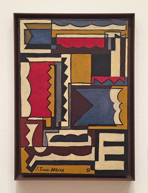
Composition, 1932 – oil on canvas


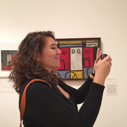
Oh looksie…there is Julie :) I miss her and our MoMA strolls.

Kalbach Garcia 20

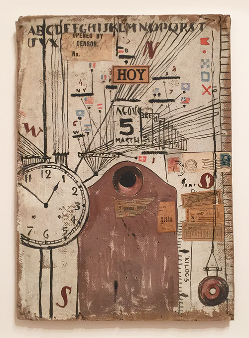
The one below is one of my favorite. The collage elements, the flags, the ephemera, symbols- I just love it!

Kalbach Garcia 21

It was a great art stroll and I really enjoyed seeing more of Garcia Torres after my visit to Malba. I am sure I will refer to his artwork in one of my future works – stay tuned :)

Do you find his work inspiring?

Comments (8)

  • Joi@RR

    |

    I’m like Gayle – love traveling with you Nat. And yes – this was definitely inspiring. I am really thankful to learn about these different artists and I enjoyed seeing all of these very much. You know… you already do his type of city art… it reminds me of you a lot. Thanks bunches for such a great post. XX j.

    Reply

  • Gayle

    |

    Again, thank you SO MUCH for expanding my art-appreciation horizons. These works have a neolithic flavor mixed in with primitive hieroglyphics and brings one back to the universality of images and symbols — before language started creating barriers. I can definitely see how this style can be incorporated into mixed media and am anxious to experiment with this concept. I love travelling with you via your blogs!

    Reply

    • nathalie-kalbach

      |

      Gayle, So glad you like the work and inspiration by Torres. And yes – I agree- images and symbols- what a wonderful way to communicate in art. Thank you for traveling along!

      Reply

  • Sue Clarke

    |

    I like the wooden sculptures but not much inspiration for me sorry to say.
    You and Julie give me plenty of inspiration (especially with all your new products)!

    Reply

    • nathalie-kalbach

      |

      sorry to hear you didn’t find inspiration in his work but so happy you are here :) hugs, nat

      Reply

  • Joyce

    |

    I enjoyed this presentation of the artist. Food for thought.

    Reply

Leave a comment

Upcoming in March: Workshop in Oklahoma!

ArtRulesWorkshopNat

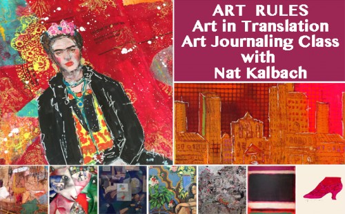
Just a short reminder that I am teaching March 4-6, 2016 – Art Rules- Art in Translation – at My Heart’s Fancy in Edmond, Oklahoma – there are still a couple seats open and it is one of the few in-person workshops I am teaching this year due to the book:

Let’s explore several master artists and get inspired by their artwork and techniques to create wonderful and unique art journal pages.Whether it be Andy Warhol’s cheating technique or Rothko’s amazing color combinations, there are many different Master Artists whose masterful skills can serve as a starting point for your own artwork.  Find out what you like and what works for you.  Learn about opacity and layering, colors, troubleshooting, mixing materials, making your own tools, creating backgrounds and patterns.  We will work with acrylic paints, inks, markers, wax bars and other paint media to create dimension and texture.  We will make the most of stencils, stamps, mono printing plates and generic tools to make our own mark.  Get ready to Rule Your Art Journal!

Class hours:
Friday, the 4th: 4 pm to 8 pm
Saturday, the 5th: 10 am to 6 pm (1 hour for lunch)
Sunday, the 6th: 10 am to 2 pm

More details and Sign-Up Information here


I am looking forward to come back to Maura’s store and see many familiar faces again and hopefully some new ones too :) It was such a blast last time!

Have a beautiful day you all!


Comments (2)

  • Jenny Petricek

    |

    Workshop sounds great! I wish so much that you could come and teach in Wisconsin!
    Reply

    • nathalie-kalbach

      |

      That would be fun Jenny! If you ever hear of a place in Wisconsin- let me know :)
      Reply

Leave a comment

More hours or …. In My Art Journal Today

AJ_MoreTime_NatKalbach01

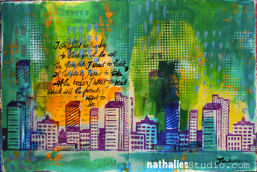
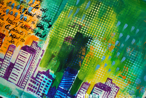
“I still find each day too short for all the thoughts I want to think, all the walks I want to take, all the books I want to read and all the friends I want to see!” John Burroghs

Apparently I didn’t find the day too short to repeat myself but was at the same time not concentrated enough to write everything grammatically right in my art journal spread -LOL – can you spy it? Oh man, embarrassing but …oh well… here you go … the real deal;)

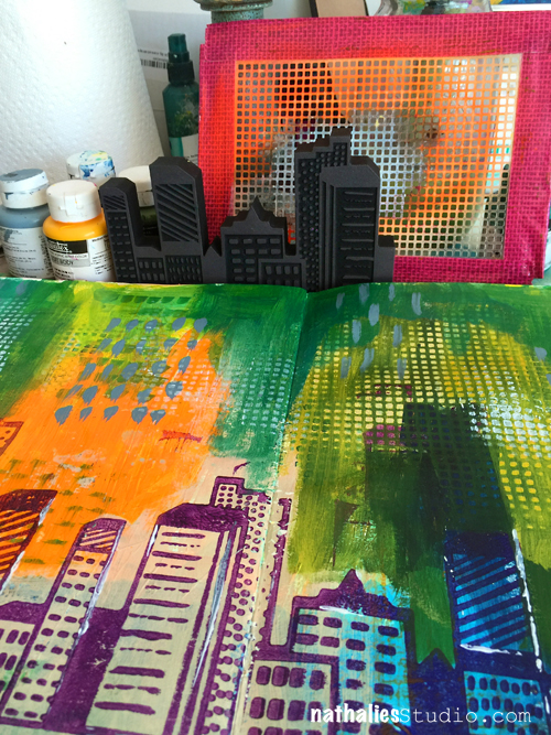
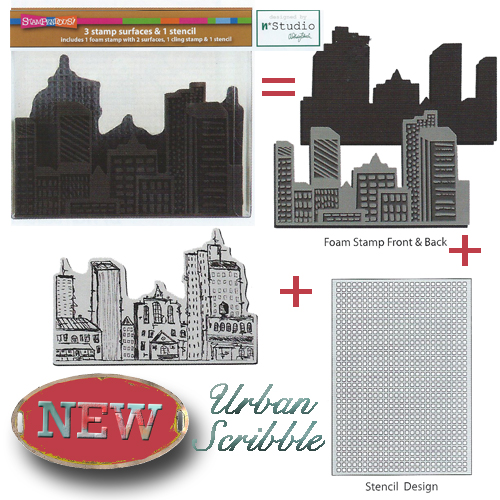
I played with different greens and yellow and orange acrylic paint and stamped the city shape using the pattern art of my Urban Scribble foam stamp with purple as a nice contrast to the orange. I applied the paint with a brayer to the foam stamp- goes quick and easy.

AJ_MoreTime_NatKalbach03

As you can see in the WIP (Work In Progress) Picture above I added a little border to my stencil in the set with duct tape as to prevent over spraying when using the stencil with spray paint. Here I just added paint to the surface, then placed the stencil on top and rubbed areas of paint off with a baby wipe – at other spots I stenciled through the stencil.

Urban Scribble Stamp Set

For the Journaling I used a bamboo sketching pen and black acrylic ink- I love to write with the pen …so much, that I like to double my words ;)

AJ_MoreTime_NatKalbach02

What would you do if you had more hours in the day?

Here is a list of the supplies, I used for the art journal spread above.

SuppliesCJS


Comments (2)

  • Joi@RR

    |

    No one can make a skyline look like you Nat. This is just INCREDIBLE. The background is sooo YUMMY and the colors so BRILLIANTLY FABULOUS. I LOVE LOVE LOVE this and your urban scribble. No – can’t see any mistakes at all. GORGEOUS to me. HAPPY VALENTINE’S DAY sweet Nathalie. You are dear to me. ❤❤j

    Reply

  • Kim Collister

    |

    Loved your post and your journal pages! Great Color!
    XO

    Reply

Leave a comment