Nat


Hello from the Creative Squad! Today we have a post from Jennifer Gallagher that is definitely from the heart :) She is using my Large Hex rubber stamp set and this month’s theme: Whole Lotta Love – Who or what sets your heart aflutter this time of year? Let’s pay tribute this month to those warm fuzzy feelings of love and create something that celebrates that universal emotion.
This month we are feelin’ the love with a “Whole Lotta Love.” As soon as I read the prompt for this month, I got super sappy with an art journal page dedicated to my sweet husband. It is the time of year where we celebrate those that we love and show our appreciation for them. This page does just that. Let’s get started.
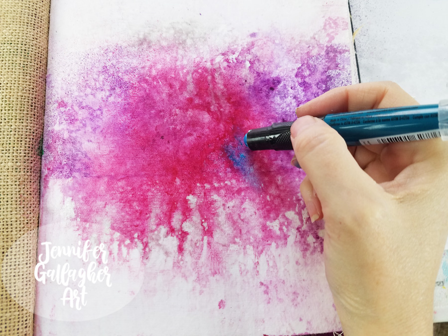
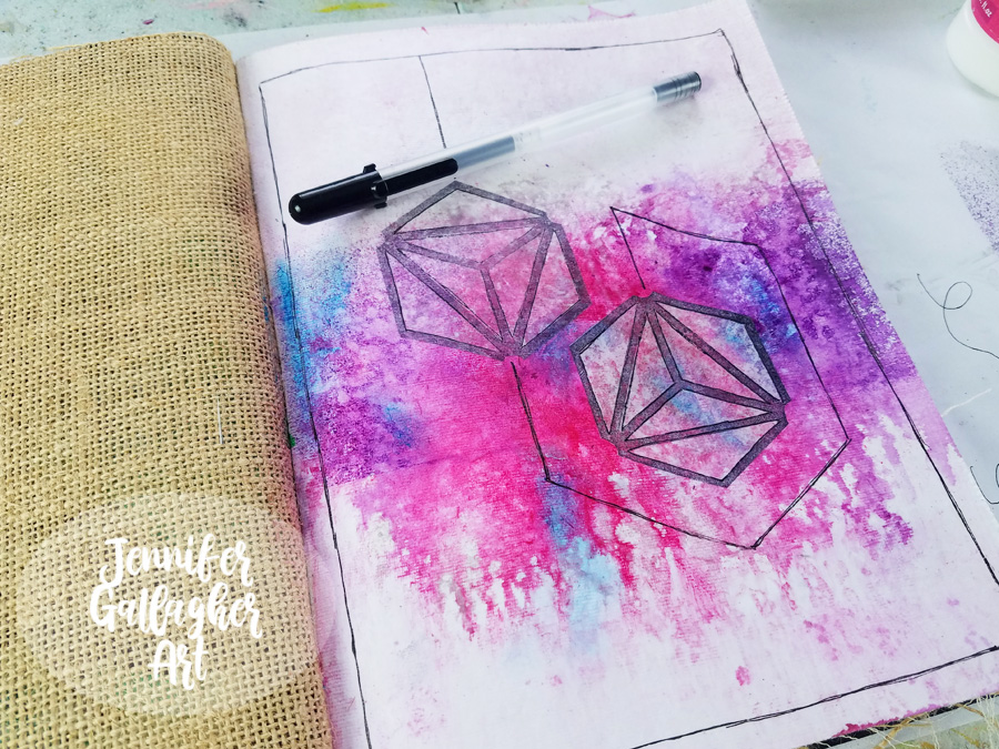
I am working in my Dina Wakley Media journal on one of the cotton rag pages. Before starting, I applied two coats of clear gesso to this page to prepare the surface. Once the gesso was dry, I chose a few colors of Marabu Art Spray and got to work. First I applied Cherry Red and then Aubergine. I protected the top and bottom of the page with some scrap paper to concentrate the color through the center of the page.
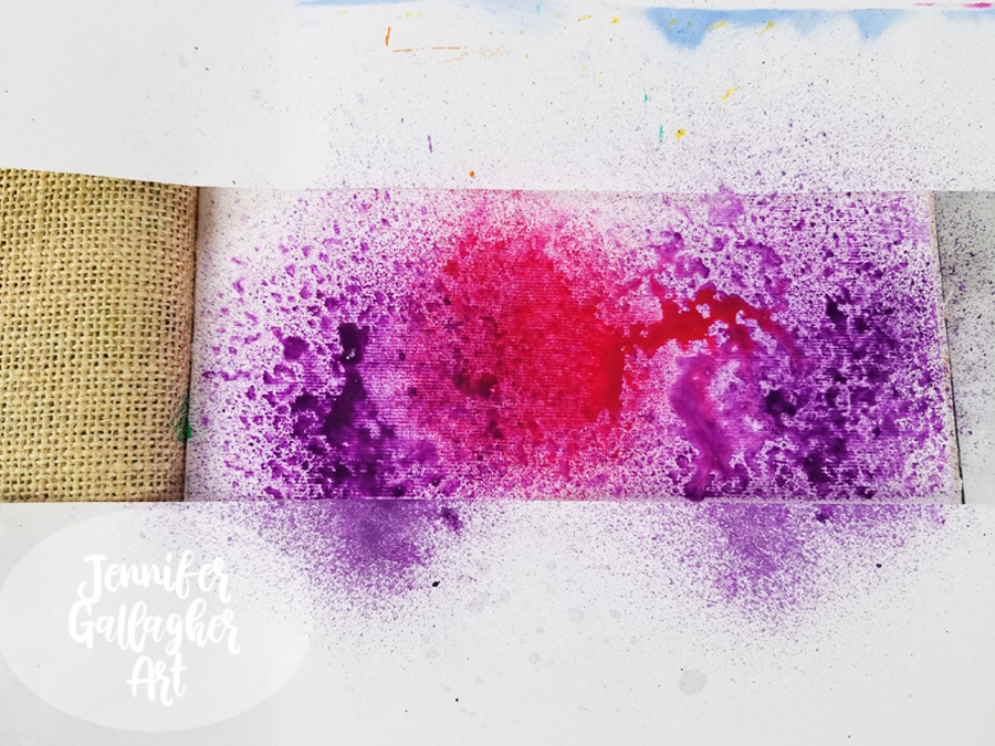
To encourage mixing and movement, I applied a small sprtiz of water into the art sprays.
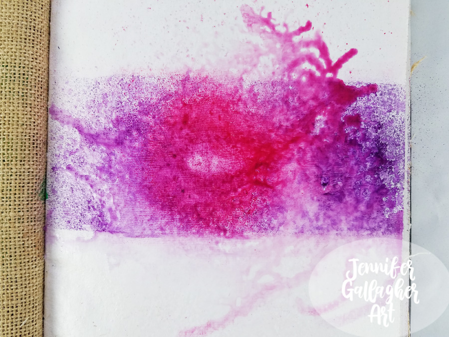
I dabbed up any excess moisture and then applied Marabu Art spray in silver.
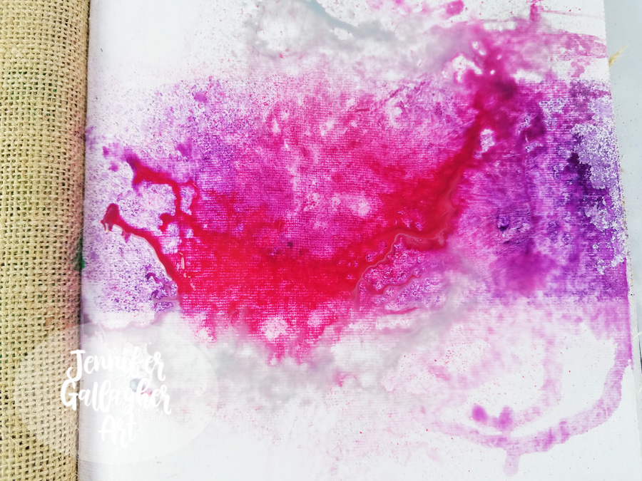
Then, over a towel I keep for art project clean-up, I tipped the book up and let the art spray trickle down the page until a good bit of the moisture was on the towel. Then I tipped the book the opposite direction to allow drips at the top of the page.
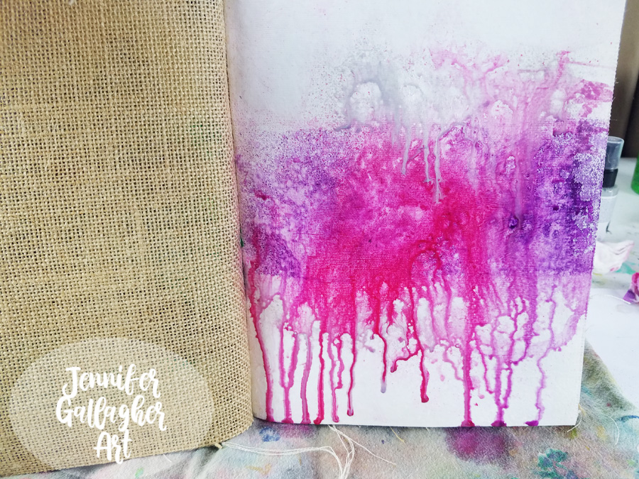
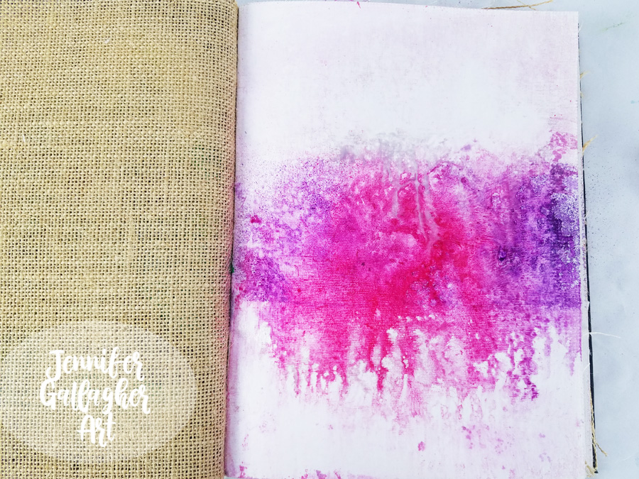
As soon as I finished letting it drip, I took a baby wipe and wiped the top and bottom of the page until it was pretty close to white again. I am not scrubbing hard or looking for perfectly white background areas. I just want to get a lot of the color off the top and bottom section. We are left with a far more organic looking page.
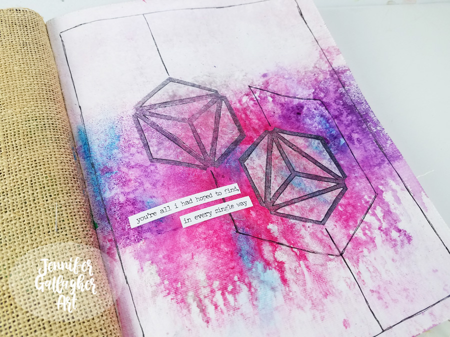
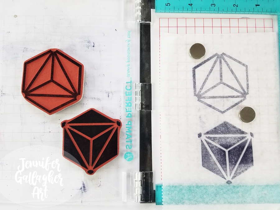
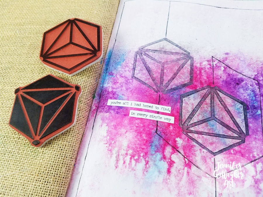
Using a stamp platform, I stamped Nat’s large Diamond Hex Positive and Negative stamps onto deli paper with black archival ink. I ended up only using the positive images.
Next, I went back to the completely dry background with a Marabu Art Crayon in Aqua Green and applied a little color here and there. Art crayons are soft enough to spread with your finger.
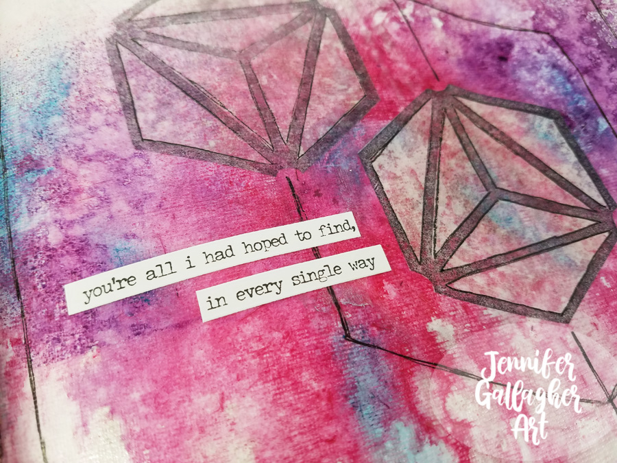
I cut out two of the positive stamped images and figured out where I wanted to place them. These images represent my husband and I.
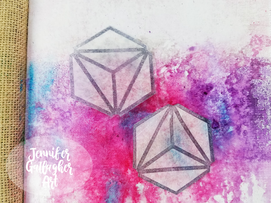
Once I settled on the placement, I applied them to the background with matte medium.
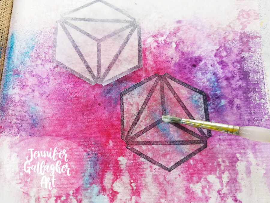
Using a Sakura Black Gelly Roll pen, I connected the shapes with lines and carried it around the page.
I chose a sentiment from a set of Tim Holtz Small Talk stickers and applied it to the page.
I hope you enjoyed this tutorial and found it a source of inspiration for your own art journal. Stamping on deli paper is a fun technique that you should try at home. Being inspired by love has reminded me how much I love sharing my ideas and processes with all of you. Thank you for stopping by.
Thank you Jennifer! Awww that definitely warms our hearts and makes us want to do our own little tributes in our art journals :)
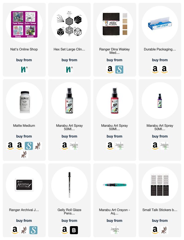
Give it a try: you can find all my Rubber Stamps in my Online Shop and here are some of the other supplies Jennifer used:
Feel inspired? Working on something yourself that you’d like to share? I love to see how you interpret our monthly themes. Email me how you used my stencils and stamps with the theme and email me an image – I would love to share your projects in my next “n*Spiration From Around the Globe“.
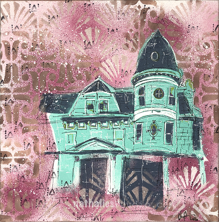
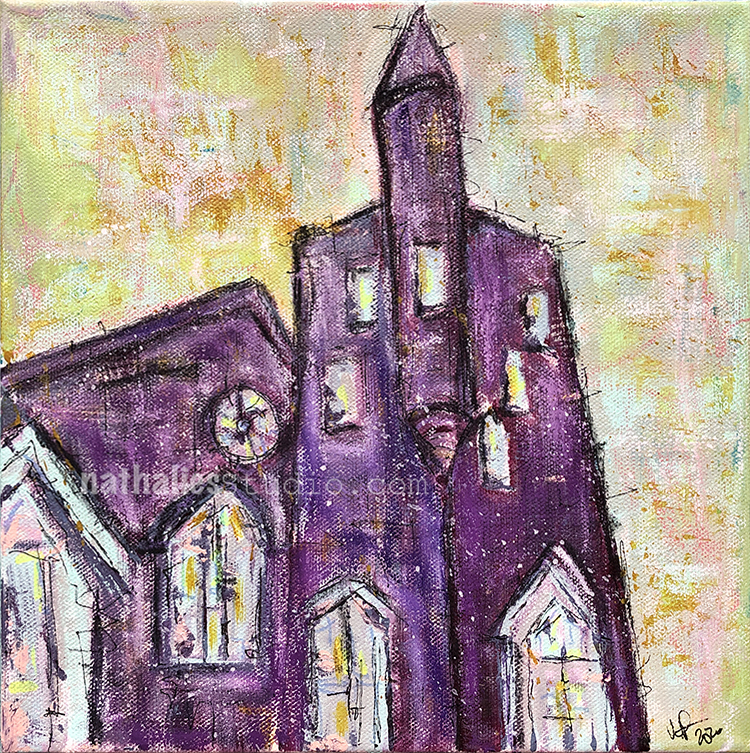
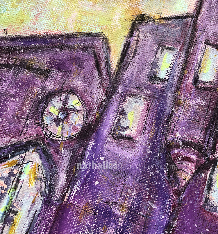
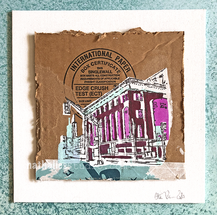
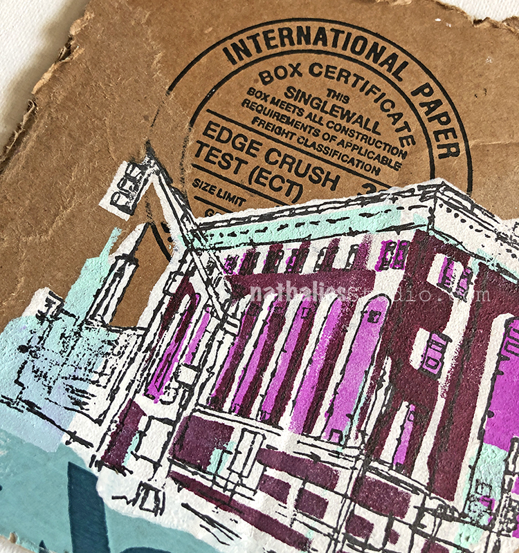
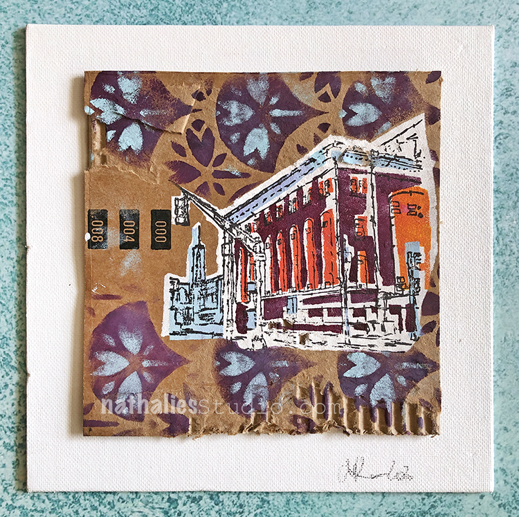
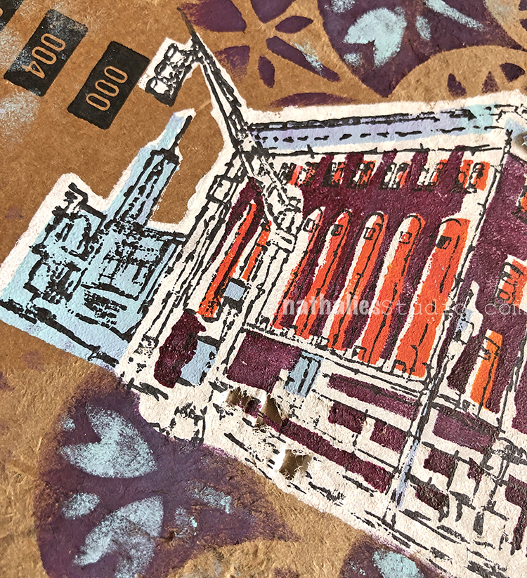
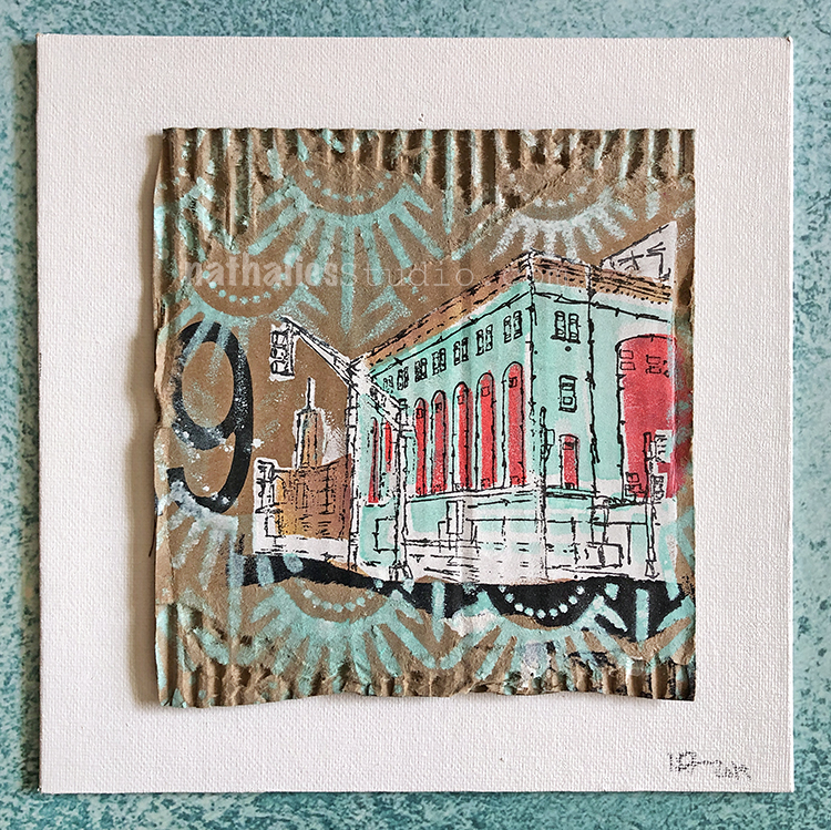
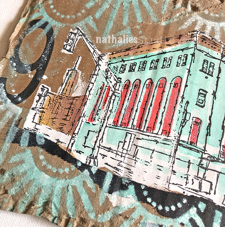
This victorian building in my new neighborhood has seen quite some changes.
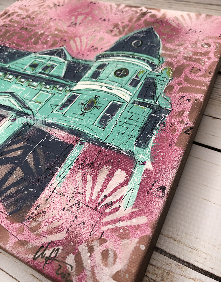
The push and pull of old and new keep fascinating me and expressed this through color and pattern and the layers to recount this story of change.
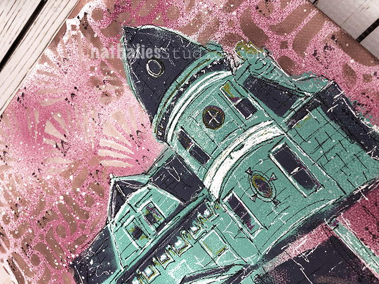
What could this building tell?
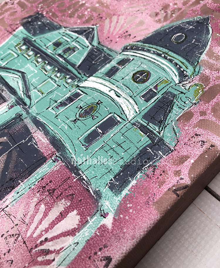
Push & Pull is made with stencils, stamps, spray paint, acrylic paint, and markers on 10″x10″ on extra deep 1.5” canvas.
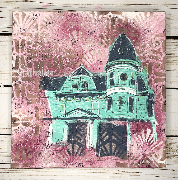
It is available for sale in the store here and is looking for a new home :)
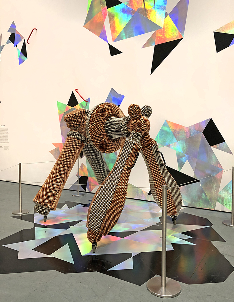
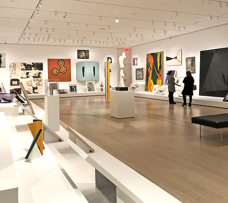
In December on a snowy afternoon my husband and I went to a member evening with Jazz and open galleries and I guess because it was snowing the museum was almost empty. It was a total treat to walk almost alone through the galleries.
Funky!
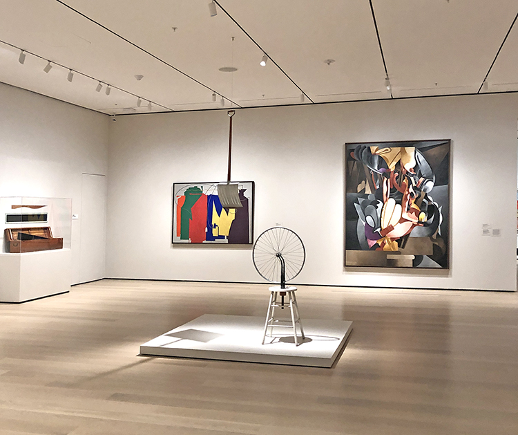
Seeing this in an empty room …RARE
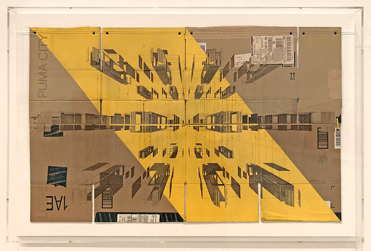
Swoon – This piece by Giuseppe Lignano, – Foladable 1 – 2016 – Laser Cut Cardboard with Inkjet print and Enamel Paint inspired me to those pieces.
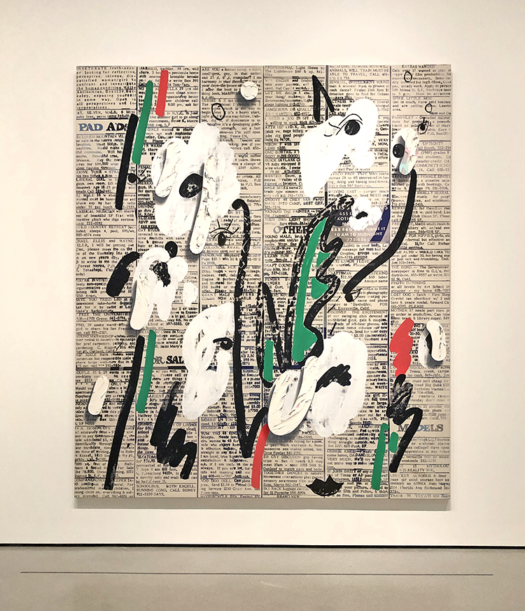
Laura Owens, Untitled, 2013 – I love this so much -the stenciled newspaper – the thick impasto flowers .
More empty gallery bliss.
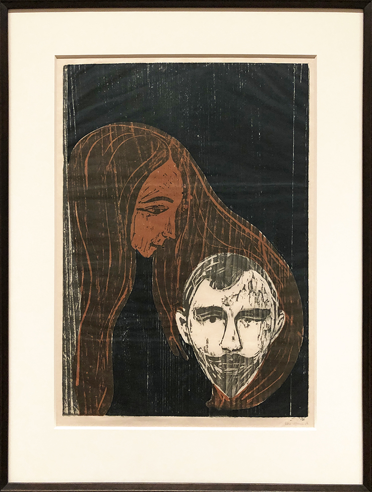
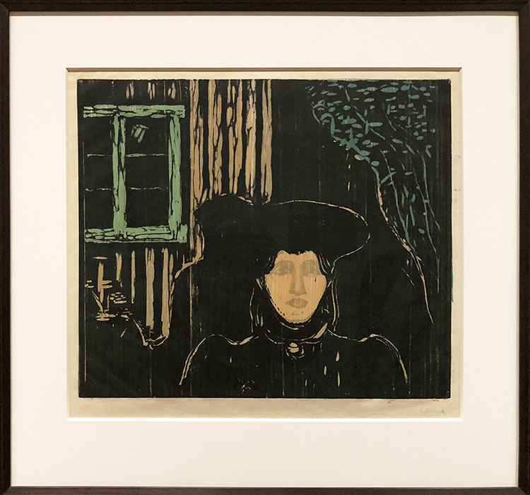
Gorgeous wood cut prints by Edvard Munch!
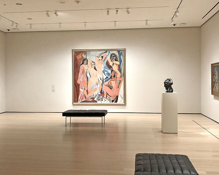
Picasso’s Ladies on their own
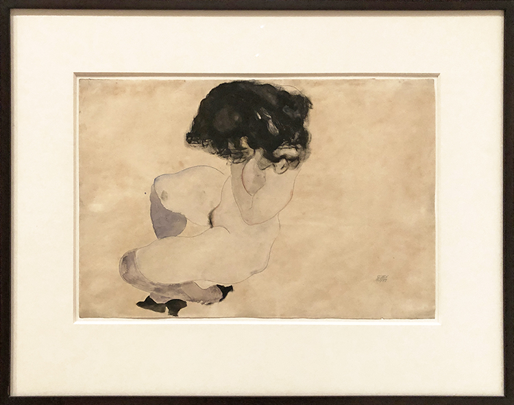
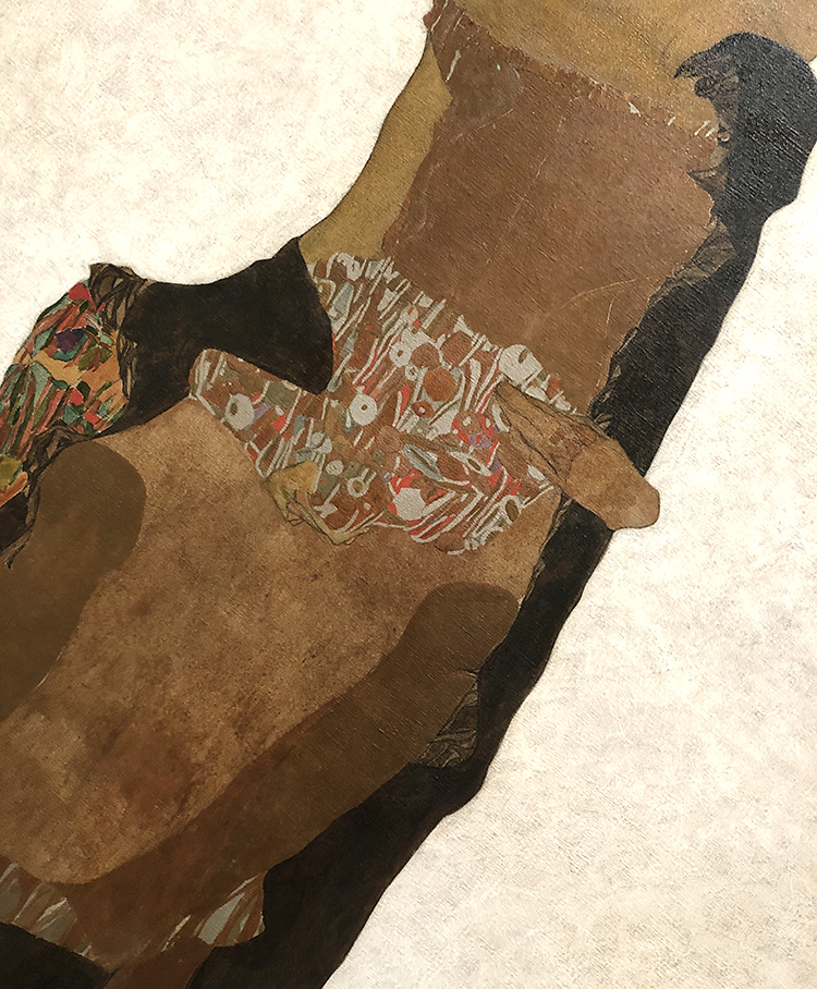
Egon Schiele, Nude with Violet Stockings and Black Hair (Akt mit violetten Strümpfen und schwarzem Haar)
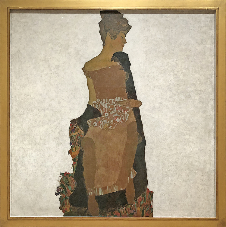
Egon Schiele, Portrait of Gerti Schiele, 1909 – I love this and I love how you can see how influenced Schiele was in in his style by Gustav Klimt.
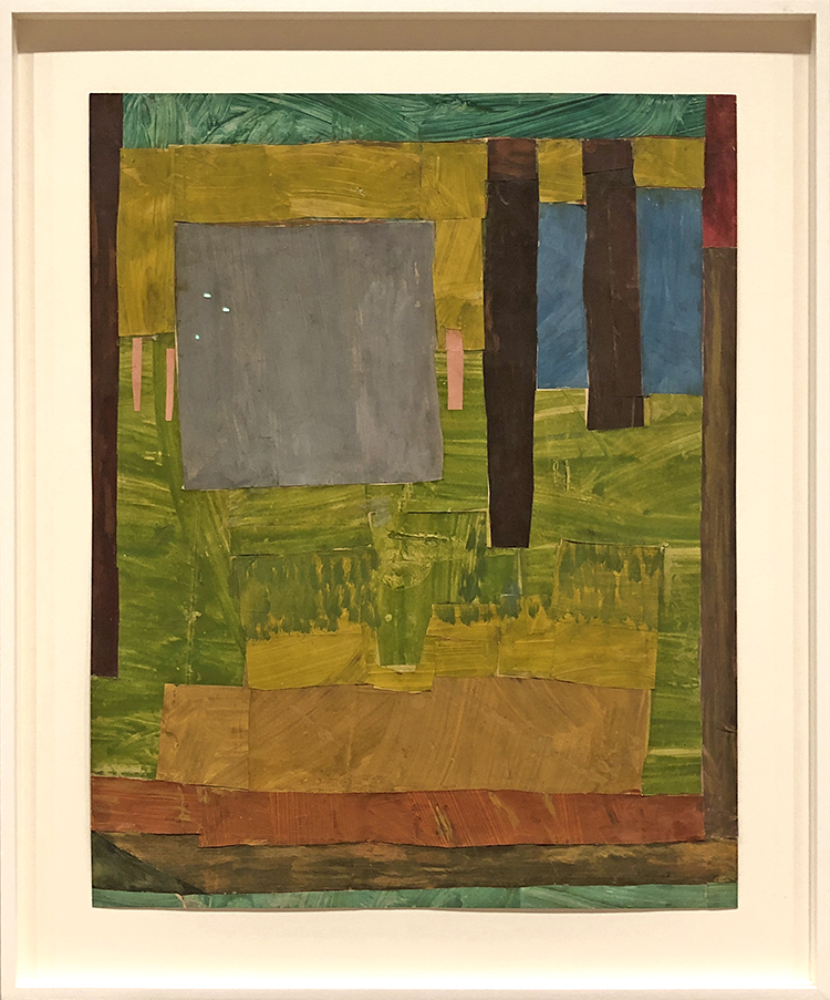
Vanessa Bell, Composition – 1914 Gouache, watercolor, and colored paper on cut-and-pasted paper
YESS – I really love that MoMA finally makes an effort to show more female artists
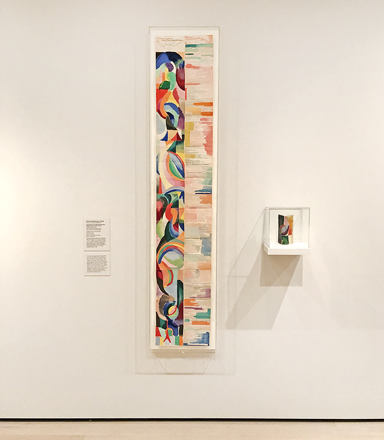
Sonia Delaunay-Terk, La Prose du Transsibérien et de la Petite Jehanne de France (Prose of the Trans-Siberian and of Little Joan of France) 1913
Delaunay-Terk and Cendrars transformed the traditional book format from a handheld volume that is read sequentially from page to page into an object that unfolds accordion-style—a dazzlingly colorful, nearly seven-foot-long sheet on which text and illustration can be apprehended all at once. While Cendrars’s poem appears on the right, in various typefaces and colors, Delaunay-Terk’s geometries cascade down the left, and the blank spaces around the text have been stenciled with color as well.
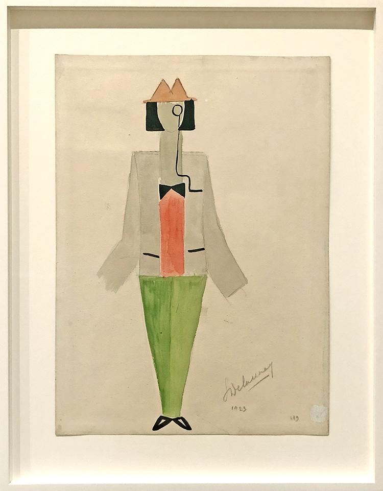
Sonia Delaunay-Terk , 1923 Tristan Tzara with Monocle
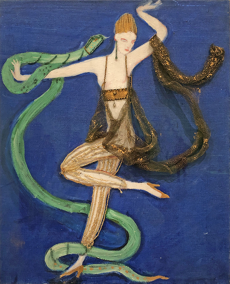
Florine Stettheimer, Euridice and the Snake – 1912 – Costume design – Oil, beads, and metal lace on canvas
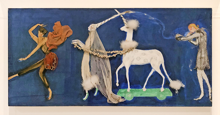
Florine Stettheimer, Gorgette, 1912 – Costume design
Stettheimer wrote the libretto and designed the costumes for this unrealized ballet.
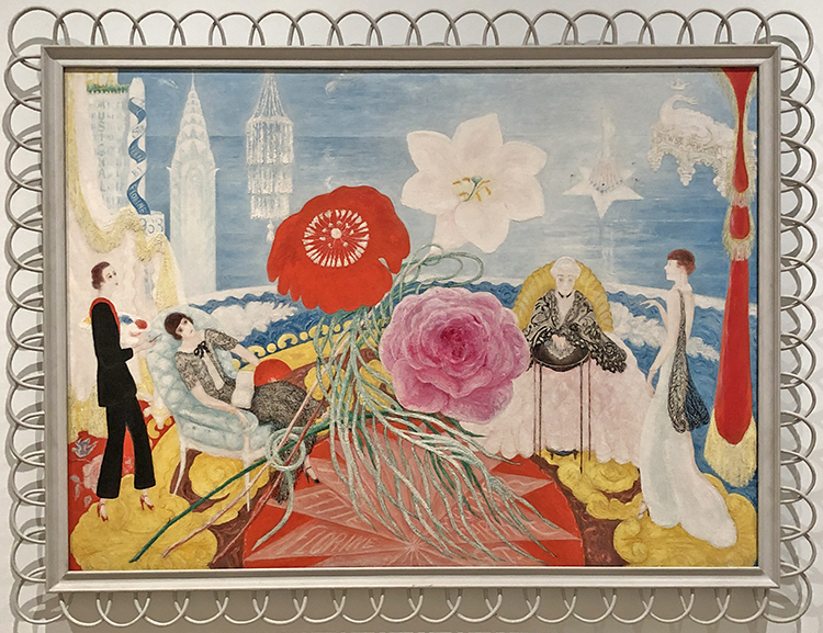
Florine Stettheimer, Family Portrait II, 1933
An artist, playwright, set designer, and poet, Stettheimer led a Manhattan salon where she entertained, exhibited her work, and shared her poems with her favored circle of artists. In Family Portrait, II, she combines images of herself, her sisters (who ran the salon with her), and her mother with symbolic elements wittily representing their individual personality traits. Among those she chose for herself are the RCA building (30 Rockefeller Center, known today as the GE Building) and Radio City Music Hall, each identifiable by the text the artist has inscribed on it. In focusing on her family, the painting typifies Stettheimer’s concern with the personal, which seems to have endlessly inspired her. Her attention to detail extended to choosing the frames that would best set off her vibrant paintings—in this case an unusual construction of white wicker.
Francis Stark, Chorus Line 2008 – Cut-and-pasted printed and colored papers on paper.
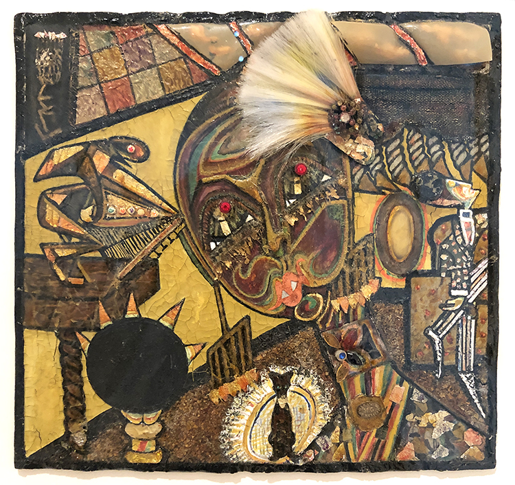
Baroness Elsa von Freytag-Loringhoven – 1923-1926 Dada Portrait of Bernice Abbott, Gouache, metallic paint, and tinted lacquer with varnish, metal foil, celluloid, fiberglass, glass beads, metal objects, cut-and-pasted painted paper, gesso and cloth on paperboard.
Fernand Legér, 1922 – costume desing for the ballet Skating Rink
People??? just kidding ;)
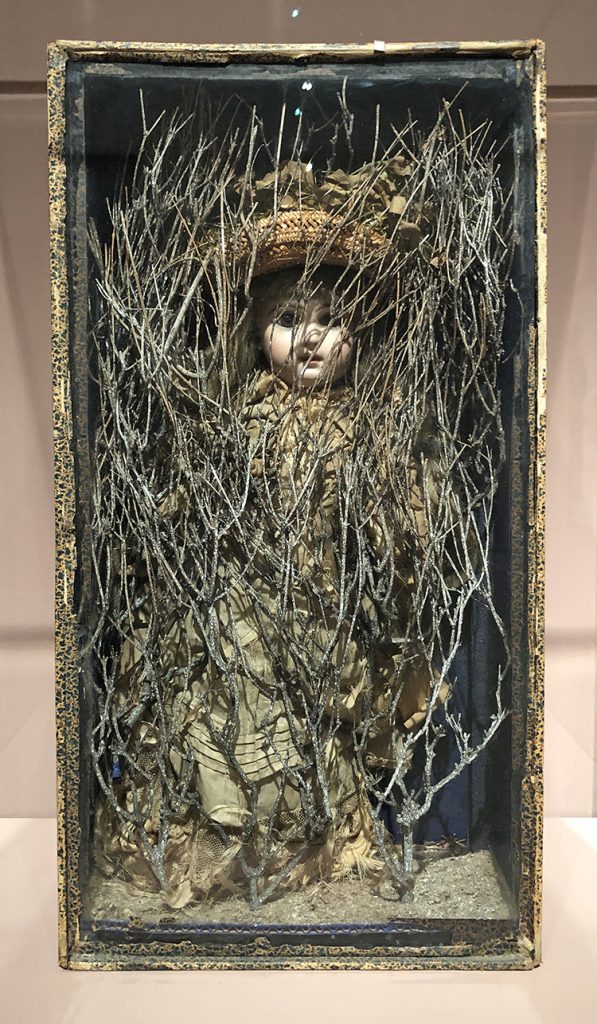
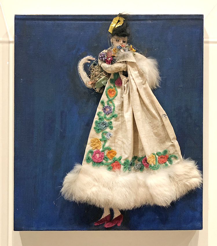
Joseph Cornell, Untitled (Bébé Marie) 1940s, Papered and painted wood box with painted corrugated cardboard bottom, containing doll in cloth dress and straw hat with cloth flowers, dried flowers and twigs, flecked with paint.
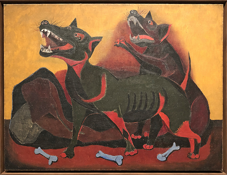
Rufino Tamayo, Animals 1941
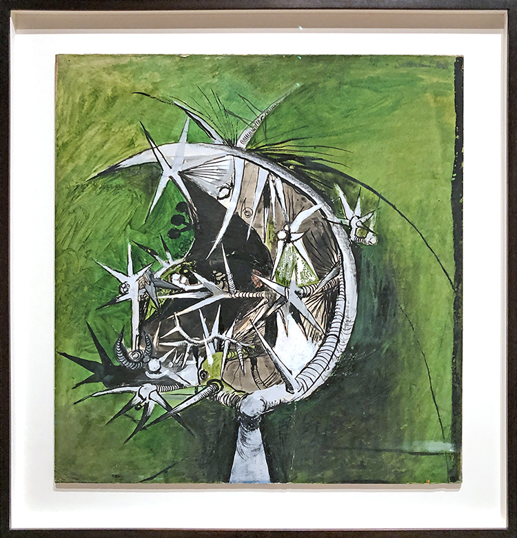
Graham Sutherland, Thorn Head 1945 – Gouache, chalk and ink on paper on board
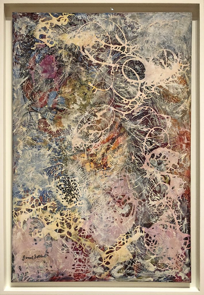
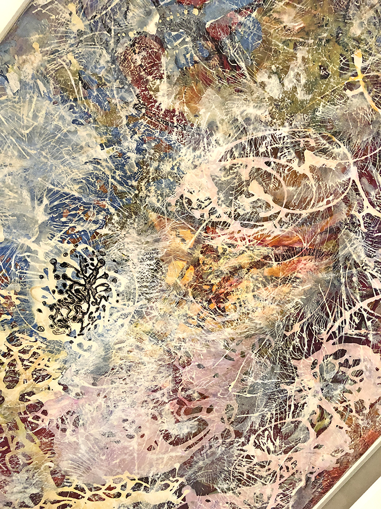
Janet Sobel, Milky Way 1945 – Enamel on Canvas
“In the end we’ll all become stories.” – Margaret Atwood
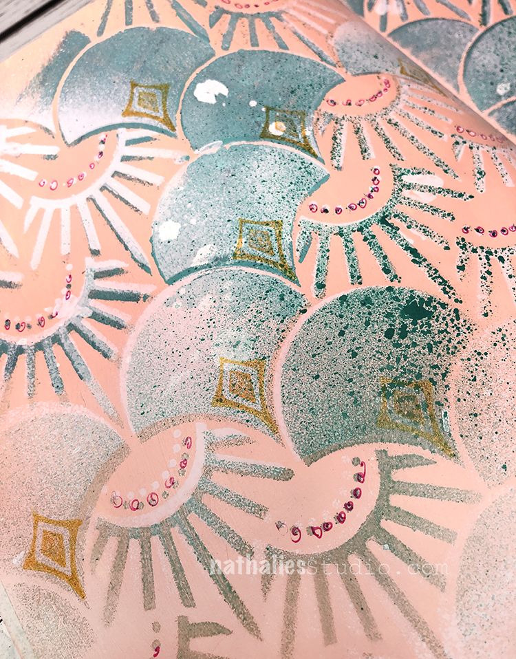
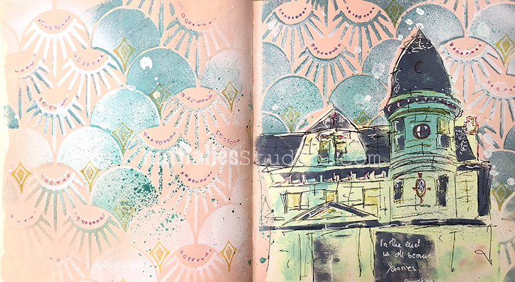
I used Liquitex spray paints with my Art Deco Summit stencil for the background. I also found that my Fanfare rubber stamps fit nicely into that stencil pattern to give a little more detail to the pattern.
For the house I used a handmade stencil and then went back in with a fine tip Molotow marker for the sketchy lines and doodle marks etc.
Here are some of the supplies I used:
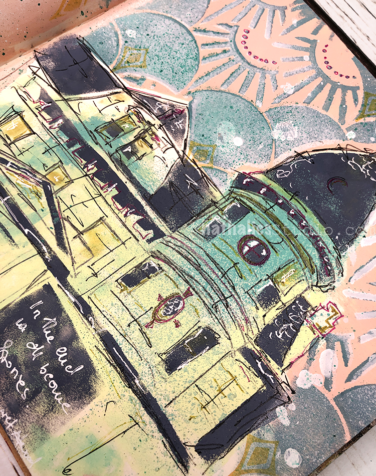
This painting is inspired by a beautiful wood church in my neighborhood.
I just recently was inside the church as it also showed some artwork of local artists during the Jersey City Art and Studio tour.
I am not easily taken by church buildings anymore …don’t get me wrong, but as a European I have had my share of stunning and OLD churches- but this one is breathtaking and unique – I had to paint it.
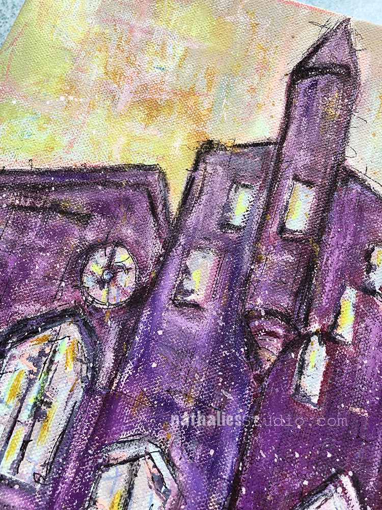
I used Acrylic paints, Markers, charcoal, oil pastels for this painting. I am right now painting a series of paintings inspired by my Strolls through the Hood – and I am having a lot of fun with it.
Hello from my Creative Squad! Today we have a post from Linda Edkins Wyatt sharing her super power – recycling! That’s something we could all do more of :) Linda is using my Art Nouveau Wallpaper and Tokyo stencils and this month’s theme: Super Power – this month we are joining Creative JumpStart 2020 and exploring our Artistic Super Powers. It could be your unique technique or style, the way you like to use a medium or tool, or maybe your way of approaching artmaking. What is yours and show us how you use it.
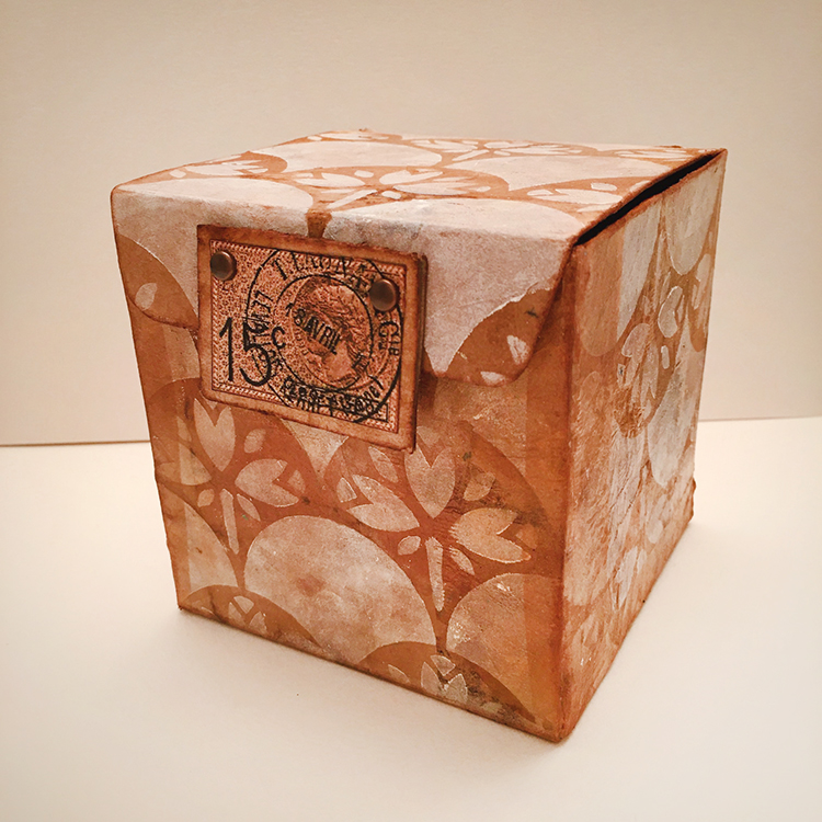
What’s My Superpower? Recycling!
For the New Year and new decade, Nat had us thinking about what our art superpower is. As a mixed media artist, I think of myself as a “jack of all trades, master of none” since I dabble in any and all art forms. So, choosing an art superpower was hard. I paint, draw, make jewelry, stencil, stamp, design fabrics, build stuff, putter in PhotoShop®, take photos and pretty much try all kinds of art. None of my art skills are quite at a superpower level so I was stumped. In both my daily life and my art life, I love to recycle and often repurpose bags, boxes, packaging and other materials into my artwork. With that in mind, I decided to embrace recycling as my superpower and use recycling to showcase Nat’s new stencils from StencilGirl®.
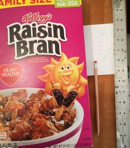
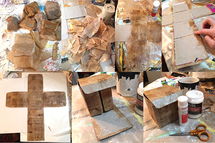
I save wrapping paper, newspapers, magazines, ribbons, teabags, strings, packaging materials, and all kinds of boxes, especially cereal boxes, which I often use to make journals, tags and ATCs. This time, I pulled a family-size empty Raisin Bran box out of my recycling stash and started thinking about making a gift box or Artist Trading Cube.
I decided to make a small sketch of a cube on paper to figure out how the six sides would fit together and where the folds, tabs, and cuts should go. Once that was done, I drew it to scale on the inside of the opened Raisin Bran box, designing a 4” cube. In pencil, I marked the areas that I would keep with “OK” and put an X through the sections I would cut away. I left some tabs to tuck in at the sides and top.
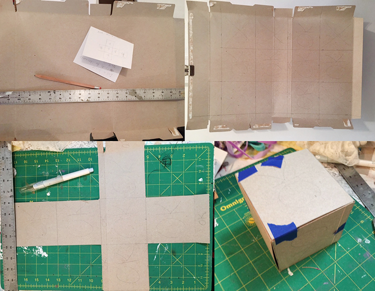
Using a Cricut exacto knife and my green cutting mat, I very carefully sliced the cereal box according to my plan. The 4” square box that emerged, once I cut and folded it, was a little flimsy, so I made a duplicate, then glued the colorful sides together. I also cut the interior pieces just a little smaller (about 1/16” smaller on all sides) so that there would be less bulk when I folded the sides and flaps. Once the piece was dry, I folded the box up carefully to be sure it was designed properly. (I kept thinking of those Iowa IQ tests we took in elementary school where they gave you a flat shape made of dotted and solid lines and ask you what it would be as a 3-dimensional object. My art brain was kind of exploding but I pushed on ahead.)
Structurally, it worked out well: the angles were 90 degree and it all fit together even better than I expected. No wonky edges or crooked sides!
Now for the fun part…decorating my little Raisin Bran box! I decided to double the recycling fun and glued recycled (dry and empty) teabags over the gray box shape. For this project, I used bags from black tea, but I often use turmeric tea or black cherry for color variety.
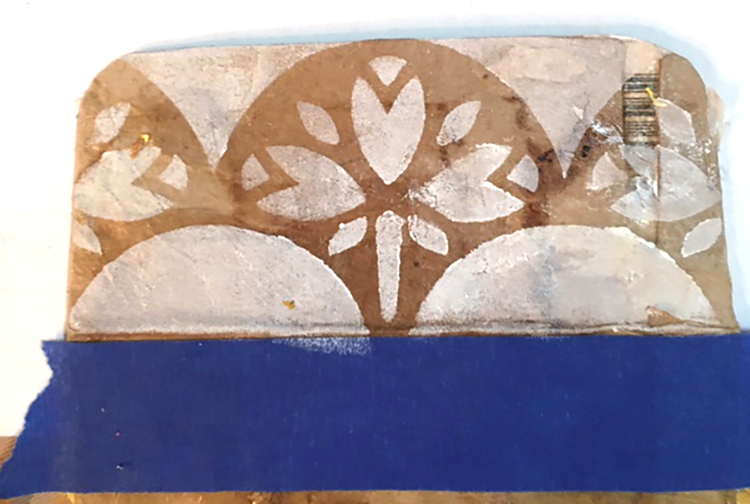
Next, I tested the new stencils. On an interior flap, I used Titanium White Liquitex Basics white acrylic and sponged it through the Art Nouveau Wallpaper stencil. I loved the effect, and decided to use that technique and stencil all over the exterior sides of the box.
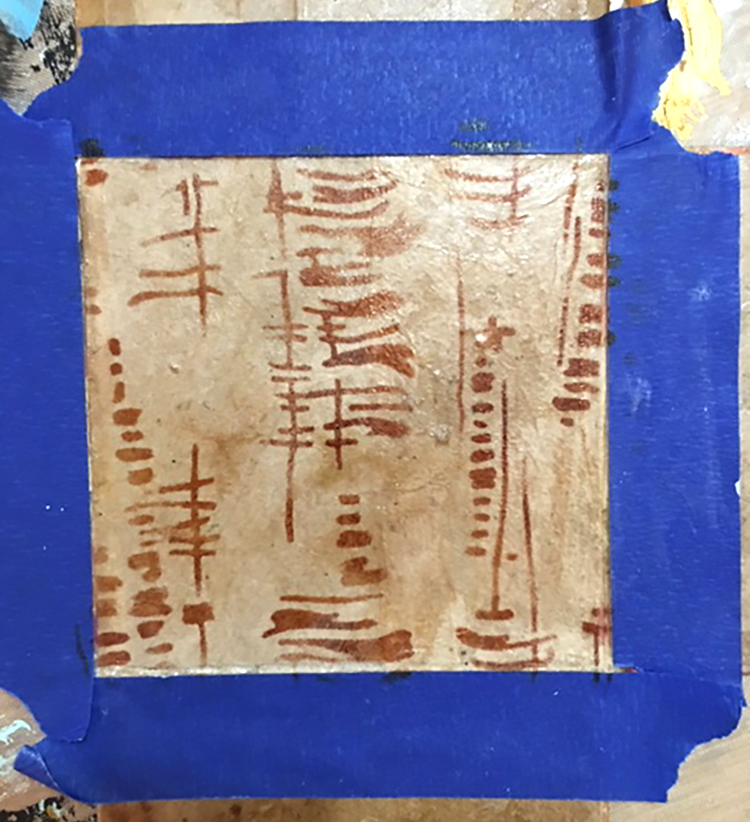
I also wanted to test the new Tokyo stencil, so I taped off the section that would be the interior bottom and tested the Tokyo design with sepia Archival ink on a fingertip dauber. That looked great too, so I decided to use the Tokyo design throughout the inside.
I had a little “oops” sad moment when I realized that I had stenciled the Art Nouveau Wallpaper stencil going the wrong direction on some of the exterior panels. I didn’t mind that the left and right sides were upside down (it added a little visual interest) but the very front was also upside down!
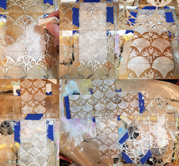
Rather than giving up, I decided to cover the upside-down area of the front with sepia Archival ink. It matched the teabag color perfectly and covered the imperfectly stenciled section perfectly! Later, I carefully positioned the stencil (facing the correct direction this time!) and again used white paint with a cosmetic wedge to reapply the Art Nouveau Wallpaper stencil.
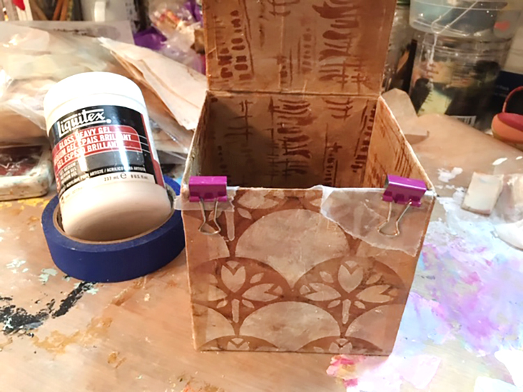
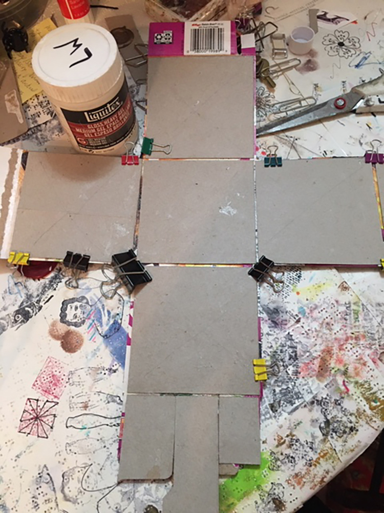
I glued the box and tabs together with Liquitex gloss heavy gel, used small clips and little pieces of waxed paper to keep the clips from sticking to the box, and left it overnight to dry. I also added some extra strips of teabag on the untabbed sides to reinforce the box.
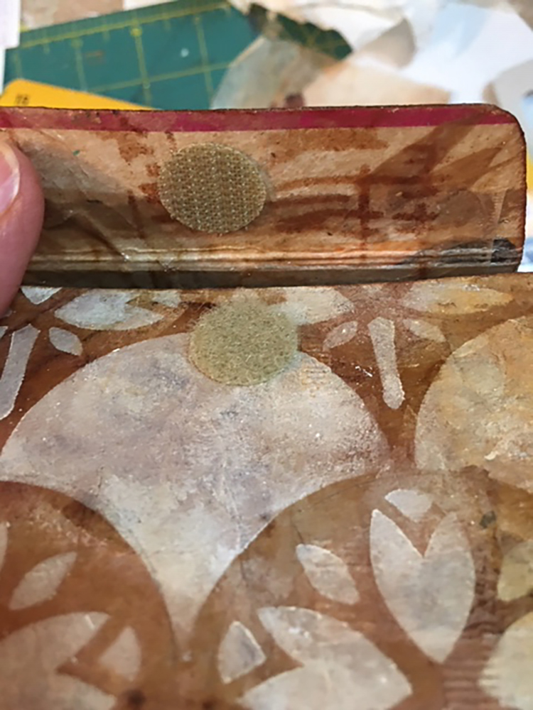
It needed a closure and I thought about what style to use. I could have simply tucked the top front tab inside the box and called it done…but I didn’t. Since the box is cardboard, I also didn’t want to use something that would wear out, shred or rip over time. The perfect solution was sticky-backed Velcro. I chose some round pieces of tan Velcro from my stash, which matched quite well. I aligned each piece of Velcro carefully, removed the backing, and pressed it in place. It worked perfectly, but I still felt it needed a little more visual interest for the closure.
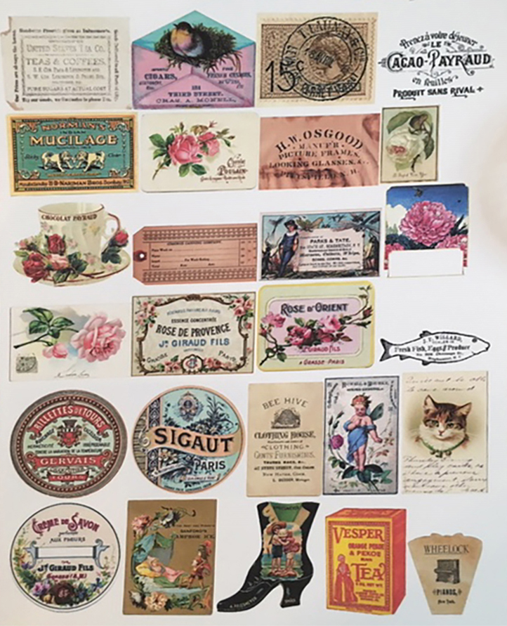
One of my textile design teachers often shouted, “More is More!” to the class, and thinking of her, I decided to embellish the box further. I wanted the closure to be pretty, easy to open, but still hold securely. There was something old-fashioned about the combination of teabags with the Art Nouveau Wallpaper stencil, so I went through my electronic file of vintage images from The Graphics Fairy, printed a sheet of images sized to a 2” scale, then “auditioned” them to see which would go best with the little box.
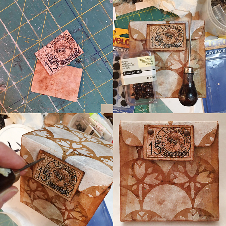
I settled on an image of a French postage stamp and postmark—it was the right color, shape and, I think, actually from the Art Nouveau era. I wanted the closure to have some depth and durability, so I used a small piece of corrugated cardboard cut about ½” larger than the postmark design, covered it with a teabag, edged it with sepia ink, then glued the stamped postmark to the center. I attached the rectangular vintage stamp with the heavy gel at the edge of the front tab, but also added two brads for extra strength and visual interest. Finally, I darkened all of the edges of the box with sepia ink applied using a fingertip dauber.
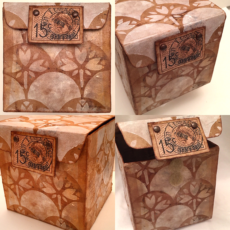
Would you ever guess that this adorable little Art Nouveau-inspired treasure box was once a family-sized box of Raisin Bran?
Thanks Linda! Love the idea of giving a cereal box a second life!
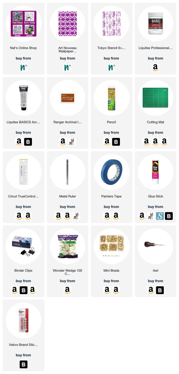
Want to give Linda’s project a try? You can find all my Stencils in my Online Shop and in addition to a discarded box, some cardboard, and a used and dry teabag, here are some of the other supplies she used:
Bravo Linda! Brilliantly designed. I love this project, cereal boxes, tea bags, NATS’s steciks and that stamp! I’m swooning.
My Powerhouse Prints inspired by my Stroll Through the Hood are now available in my store.
They are about 6×6” and mounted on 8×8” canvas board.
They look really good as one piece or in a series and can be either put into a frame of your taste or with Canvas Board Hanging Tape.
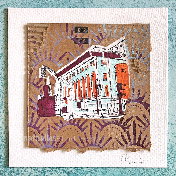
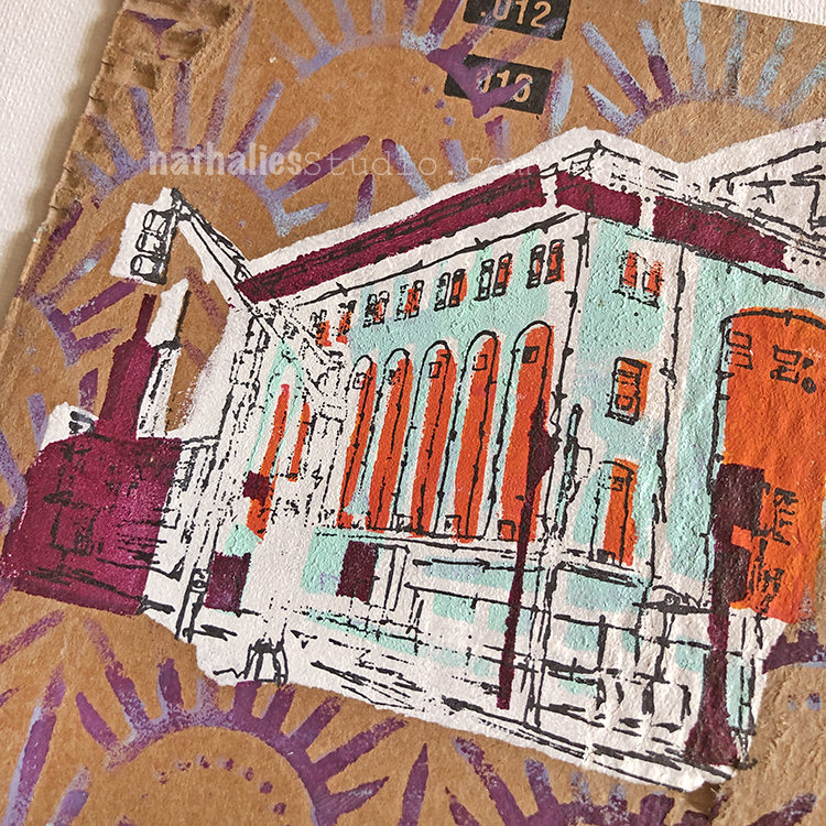
This series is from my Creative JumpStart 2020 video.
And I had a ton of fun making those!
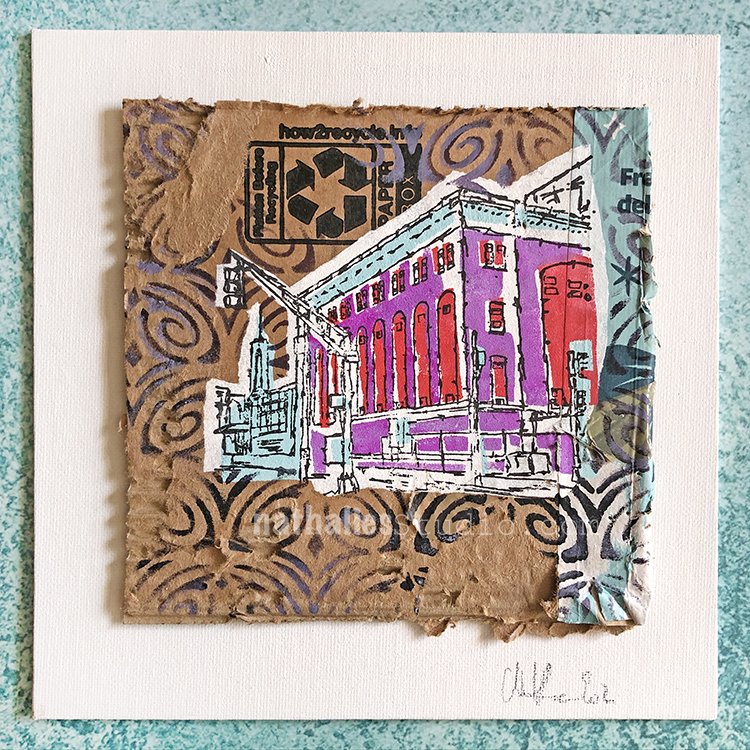
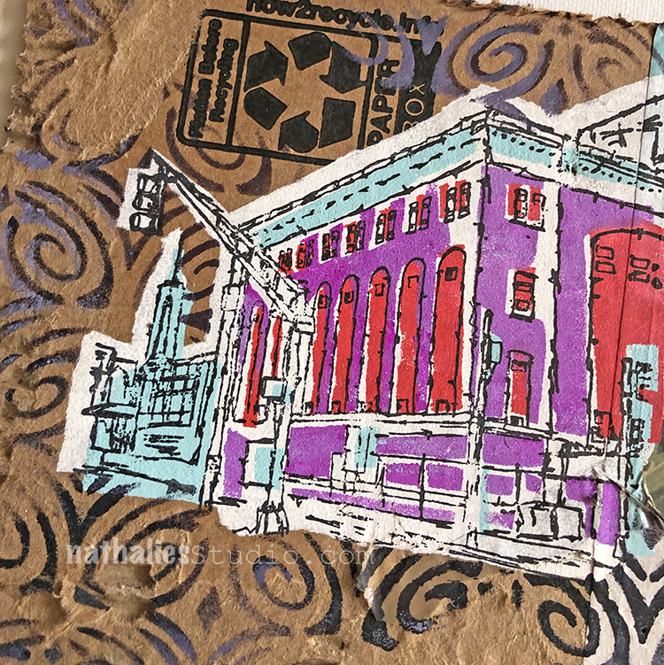
It would make me happy to know that someone gives the one or other piece a new home! Check them out in my store area with Original Artwork.
I love the challenge of stenciling on a rough and distressed surface. These are beautiful and I’d love to try that technique!
This is a fabulous piece of art! The background looks like fire works
Reply