Blog: Art Journal

I am in Love … or In My Art Journal Today

NatKalbach_InLove01

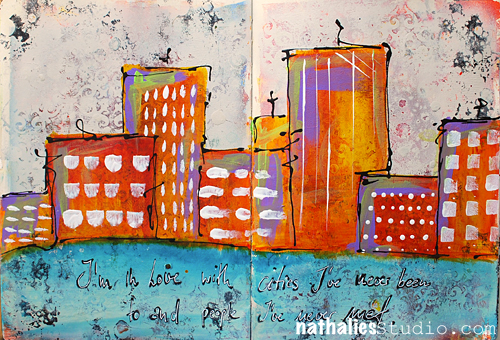
I’m in Love with cities I’ve never been to and people I’ve never met.

It is true. I love to travel and I love to meet new people …but I also love to go back to places and to see people I know again.

NatKalbach_InLove02

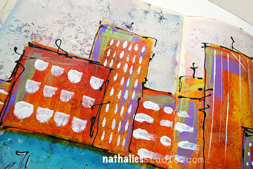
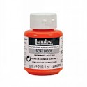
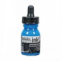
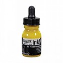
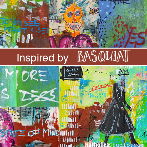
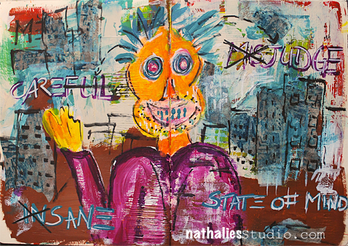
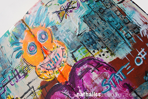
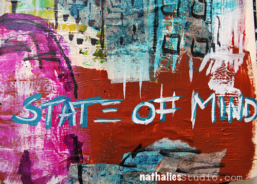
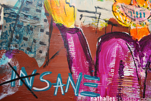
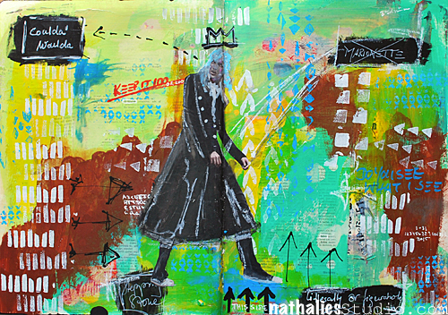
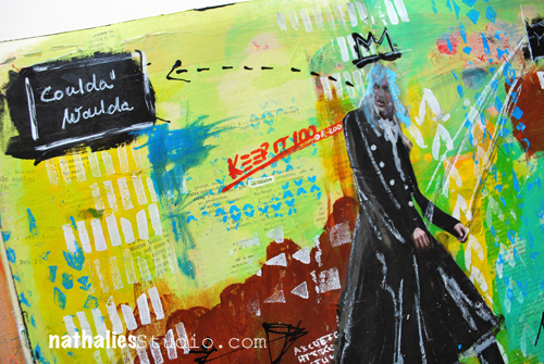
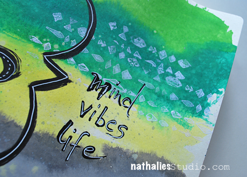
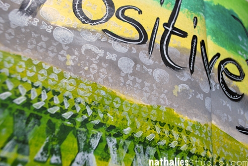
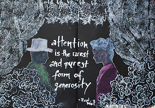
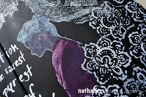
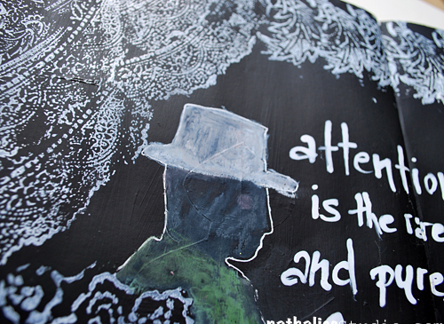
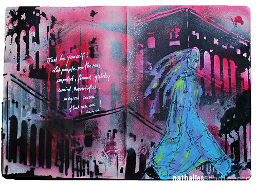
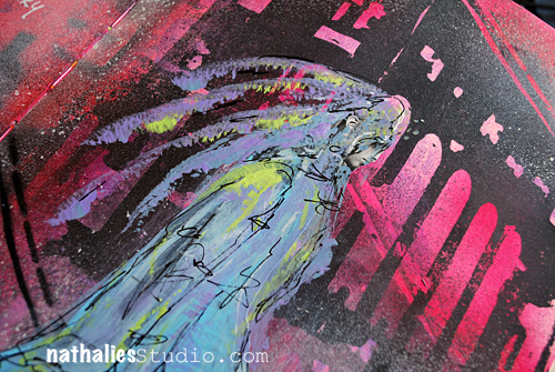
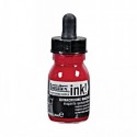
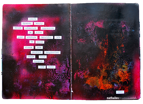
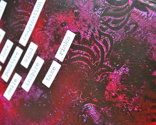
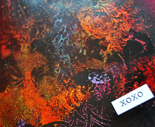
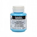
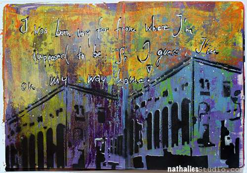
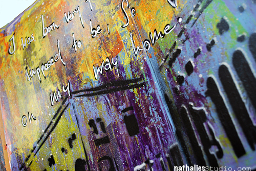
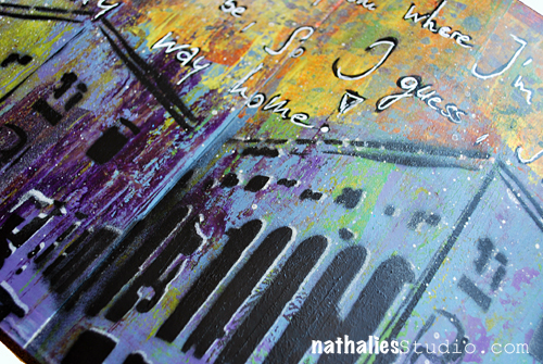
I love the texture of this spread. I had painted the background with red and yellow acrylic paint and stenciled with my Ornament Wallpaper Stencil and some Spray Paint. The spray paint left a nice dimension on the background. So I lightly covered the whole spread with Liquitex Titanium Spray Paint – leaving the painted area peak through a bit but also create a nice textured area of the stencil. It gave it a bit of a grungy shabby chic look….if I want to label this look – LOL . Then I took some Liquitex Acrylic Inks and started painting the city skyline as well as the water- choosing contrasting colors to make it more pop. I mixed the Yellow Azo and Naphthol Crimson for a nice orange right on the spread, as the spray painted area was less absorbent than paper and left me longer time to work on it. I added some green and purple accents in the houses with Soft Body Paints. For the Windows and marks in the houses I used my Filbert brush and Fan Brush in different ways- it was fun to limit myself to the brush as a tool in creating those elements.

NatKalbach_InLove03

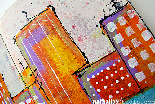
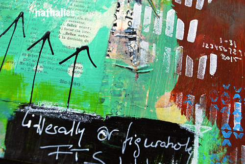
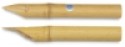
I used a Fine Line Applicator filled with Black Acrylic Ink and Black Soft Body Paint and added the scribbly lines around the houses. The quote was written with a black marker and then overwritten with a white Signo pen.

Do you like to travel?

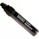
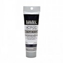
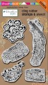
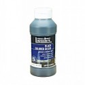
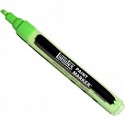
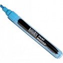
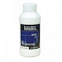
Here is a list of all supplies I used:

nSupplies


Have a wonderful day

Comments (7)

  • Joi@RR

    |

    I only like to travel – WITH YOU!!! I seldom leave the ranch but I soooo love your posts when you travel Nat. Oh well heck – I love all your posts but I do enjoy seeing all your photos of the sights and the things that you do. AND… you know – I always love your skyline projects. This one is no exception. LOVE LOVE the bright colors and the wonderful backgrounds. Great way to start my week – seeing your SUPER FINE post. Hugs. j.

    Reply

    • nathalie-kalbach

      |

      Joi – I see- I want to see pictures of a real ranch in the States- share some pictures with me :) Have a gorgeous day and hugs to you too, Nat!

      Reply

  • cat2468

    |

    Hey Nat!!
    I am a country girl who grew up on a farm. So it never ceases to amaze me how drawn I am to cityscapes……especially yours!! And the large piece you did before you moved here (sorry, my memory sucks these days!!) it was a waterfront/city painting for a contest?) despite my embarrassment I shall forge on to tell you how much that piece blew me away!! Maybe that’s where my memory went!!! Love your work and teaching style!! Hope to catch more on-line classes!l. Having trouble getting this comment to post!!! I’ll try later!!!
    Cat

    Reply

    • nathalie-kalbach

      |

      hi Cat, thank you so much for your wonderful words. I did a couple paintings before I moved to the States- maybe you find the particular one here in the gallery: http://nathaliesstudio.com/ngallery/ I hope I see you in class :) Have a wonderful day!!!

      Reply

  • cat2468

    |

    Hey Nat!!
    I am a country girl who grew up on a farm. So it never ceases to amaze me how drawn I am to cityscapes……especially yours!! And the large piece you did before you moved here (sorry, my memory sucks these days!!) it was a waterfront/city painting for a contest?) despite my embarrassment I shall forge on to tell you how much that piece blew me away!! Maybe that’s where my memory went!!! Love your work and teaching style!! Hope to catch more on-line classes!
    Cat

    Reply

  • Sue Clarke

    |

    I love to travel and wish that I could do more of it.
    It’s so fun to meet new folks and see that we are really after the same things in life.
    Plus the different designs and colors in different areas are inspiring.
    Nice colors in this art journal page Nat.

    Reply

    • nathalie-kalbach

      |

      Thank you Sue! I love that we can find so many things in common with many other people we have yet to meet :)

      Reply

Leave a comment

Inspired by Jean-Michel Basquait

InspiredbyBasquiat

You might have read about my Art Stroll to the Basquiat: Unknown Notebooks Exhibition at the Brooklyn Museum. It was a very inspiring Art Stroll and so I started to try to implement some of Basquiat’s elements into my art journaling since I saw this substrate as the best fit for it.

– State of Mind –

Kalbach_StateOfMind01

Prominent in his work is the use of figures or heads …something I usually not do and though this really turned out weird and hilarious- it made me laugh in a good way and I like it a LOT. And hey, anything that puts a smile later on your face was well worth doing it – so this wasn’t wasted time.

Kalbach_StateOfMind02

I also used Basquiat’s way of layering paint on top of drawn or written areas, highlighting or hiding elements.

Kalbach_StateOfMind03

I was super intrigued by Basquiat’s way of writing the letter E with just three horizontal lines – I shamelessly copied that and love it a lot :)

Kalbach_StateOfMind04

– Full Circle –

Kalbach_FullCircle01

Then one day I was really really unmotivated and as we say in German “bocklos” which doesn’t translate well – but kind of means” not being in the mood for anything”.  I thought of Basquiat’s way of jotting down overheard conversations and/or thoughts and I used snippets of my thoughts while working on the spread. It was actually quite fun and freeing.


Kalbach_FullCircle03

While this is not a spread that I find particularly beautiful – LOL -I can read this as a diary entry and it got me over my uninspired mood. I might do this more often and will gave this particular way of art journaling the name  “Visual Brain Farts” . No worries- I won’t share all my visual brain farts with you ;)

Kalbach_FullCircle04

– Coulda Woulda –

Kalbach_couldawoulda01

Ok …maybe I lied about not showing more visual brain farts ;) But I actually combined the thought-jotting with my usual art journaling style. And I like the outcome a lot.

Kalbach_couldawoulda02

I also incorporated more collage elements as I saw with Basquiat’s work.

Kalbach_couldawoulda03

And repeated patterns and marks. And I might have “stolen” his signature crown.

Kalbach_couldawoulda04

I enjoyed this process – I was inspired by Jean-Michel Basquiat’s work and translated what inspired me into my own art work and I am keen on taking it further. I love how this rejuiced my Mojo!

Which artist do you think fits your style and could you take as an inspiration to get a new kickstart?

Comments (5)

  • padkins

    |

    I think this is one of my new favorites. I am loving the symbology and mark making. Thanks.

    Reply

  • florenceturnour

    |

    I like scary orange face guy. He looks maniacally happy.

    Reply

  • gloz

    |

    Okay, I looked and was a little scared! His work seems angry to me. I like the written areas, but not sure how I am going to handle the scary faces! But I will give it a try. I like many of the mixed media with warm and cool colors and text partially hidden multiple layers peaking through and I usually like things with a theme. I also like Western landscape paintings by current artists Lorenzo Chavez and Frank Serrano.

    Reply

  • Terisa

    |

    Impressionism – Van Gogh, Manet, Monet, Cezanne
    Natural settings, brilliant colors, purposeful brush strokes

    Reply

Leave a comment

Wanderlust 2016 – NEW Online Workshop

unnamed

Super Excited :) In 2016 I am one of the teachers of a new Online Workshop Wanderlust 2016!

Wanderlust is a whole year long journey – an online event offering you videos from 24 guest teachers and 2 resident teachers one every week (each one downloadable and with PDF instructions provided), 50 amazing videos, which will run for over 50 hours in total, access to a forum with an amazing and friendly community, inspirations, challenges, discussions, galleries, workshops, giveaways and generous discounts from our partners. The perfect alternative to in-person classes!

Follow the teacher’s reveals every day on Everything Arts Social Media.

Every day somebody new!

As far revealed are: Kate Crane, Teresa McFayden, Rachel Greig, Beckah Krahula, Joanne Sharpe, Flora Bowley, Mystele, Andy Skinner, Finnabair, Birgit Koopsen, Lindsay Weirich, Magda Polakow, Carolyn Dube, Stephanie Schutze, Maryia Potapovich, Jennifer Lee and Leslie Wood and myself

unnamed

If you’d like to join us on this year long art journey click here for details!

w16_af_6_200x400-2

Cannot wait and I am looking forward sharing my tutorial with you and being part of this wonderful artful journey :) Hope you will join me!

Comments (3)

  • Kasia

    |

    It’s an honour to have you on the team! Thank you Nathalie for going on this journey with us :)

    Reply

  • Stampendous Stamps

    |

    Wow, Nathalie!! Sooo exciting! This will be a wonderful journey!

    Reply

Leave a comment

Positive Everything or … In My Art Journal Today

Natkalbach_Positive01

Positive Mind, positive vibes, positive life

Truth!

Natkalbach_Positive02

I used Liquitex acrylic inks for the background. In order to make sure that the ink can be blended a bit longer and also does not create big blobs where ever you apply them first, I usually mist the background with some water.

Natkalbach_Positive03

I used my Mark Maker Stampset by Stampendous with soft body paints to create some patterns and tie the different colors together. I love the textured and dimensional look those stamps get when used with acrylic paint.

Here are the supplies:

nSupplies


Do you own any of my stamps? Share what you created with them – I would love to see!!!

Comments (4)

  • susan salyer

    |

    I am loving all the products you all carry. I love journals far more than cards and now I will have to try new products and stamps..I just love this hop!

    Reply

  • Autumn

    |

    Such amazing texture, love the white on this colorful background!

    Reply

  • D.Ann C

    |

    Truth, indeed! Fab colors!! Coming here from FL via Stampendous : )

    Reply

  • Denise Spillane

    |

    Love this page. I am a green/teals gilt and I want to pet it. Hee hee. And of course positive is always good.

    Reply

Leave a comment

Attention or… In My Art Journal Today

NatKalbach_Attention01

Attention is the rarest and purest form of generosity – Kurt Weil

NatKalbach_Attention02

The page spread I used for this, was covered with different colors and and some collage from a class demo and I wasn’t super keen on keeping it, so I covered the page up with black gesso, giving it a nice smooth black coating. Then I pulled out my Stampendous n*Studio Fiesta stamp set and a white Ink pad and created some pattern repeatedly stamping each individual stamp in clusters – kind of forming a drop curtain.

NatKalbach_Attention03

I also used the stencils and mask included in the stamp set and outlined the man and woman silhouette with a white Signo pen, then added some color with Derwent Artbars inside and blended the colors with a waterbrush. I love the effect of the Artbars (water-soluble wax bars) on top of the black gesso. For the quote I simply dipped my bamboo sketching pen into white acrylic Ink and kept writing.

It was fun – and I love how the white pops off the black and I had lot’s of fun using the stamps in this way.

Here is a supply list

nSupplies


Are you doing lot’s black and white themed art journal pages? I feel drawn to it although I am a total color gig ;)

Comments (1)

  • Joi@RR

    |

    This is a WONDERFUL new take with your FIESTA stamp set Nat. Love how you made them look like curtains around the folks. It looks like they are inside their living room chatting with a planter of flowers under their window!!!! The FIESTA set is my fav so this was a great way to start my morning with it and you! Hugs. j.

    Reply

Leave a comment

The Real Weird Magical Person … Or In My Art Journal Today

NatKalbach_justbeyourself01

Just be yourself! Let people see the real, imperfect, flawed, quirky, weird, beautiful, magical person that you are!

YES!

NatKalbach_justbeyourself02

I used some smaller stenciling and paints in the background – leaving a lot of white space. Then I took the building stencil I made and used in my Art Journal spread last week again – this time playing with the negative and positive usage. I brushed some magenta acrylic ink over the spray painted areas as this always sets it off so nice.

NatKalbach_justbeyourself03

For the journaling I use a fine line pen and filled it with white acrylic ink.

Very grungy spread but also happy- and I might fall more and more in love with the building stencil :)

nSupplies


Comments (2)

  • Joi@RR

    |

    Easier said than done! Great message and what a SUPER journal page Nat. Love the “architecture” in the background – looks so good with the colors you chose. The quirky person in the front is perfect. Really special creation…. soooo inspiring. j.

    Reply

    • nathalie-kalbach

      |

      True – it is easier said than done- but hey…we keep trying ;) Thank you!

      Reply

Leave a comment

Australia, Perth ! Mixed Media Circus Tour, 2016

SquareCollage-PERTH-500

Julie Fei-Fan Balzer and I are so thrilled to add The Scrapbook Store in Perth to our tour in Australia next year. We will be teaching our 3-Day Art Journal Adventure Workshop April 1-3, 2016 there. You can register now!

Here is a little video about the workshop …our philosophy …and the circus you can expect ?

Or download this pdf which tells you some details and the timetable about our class at The Scrapbook Store.

MMC_Student_Information_Perth

We hope if you are in the area you come and join us for the fun! We cannot wait to meet you!

Comments (2)

  • Joi@RR

    |

    So cute – you two will make your workshop INCREDIBLE together… wow. j.

    Reply

Leave a comment

XOXO … or …In My Art Journal Today

NatKalbach_XOXO01

create, discover beauty, desire adventure, appreciate, be alive, good attitude, beautiful life, be brave, choose love, positive imagination, smile, kind, inspire, take risks !

XOXO

NatKalbach_XOXO02

I used one of my favorite quick texture techniques for the background. I painted the background with different Soft Body paints, let it dry, and then used Liquitex Spray Paint over it in black and magenta. Using my Lilly Wallpaper Stencil I pressed into the still wet spray paint and lifted the stencil off right away – sometimes I just pressed the stencil down, sometimes I moved it a bit. The pressing and lifting actually lifts off the spray paint under the Spray Paint creating a gorgeous stencil effect revealing the background again (picture above). The pressing and moving creates a wonderful marbled effect (picture below).

NatKalbach_XOXO03

I used some Tim Holtz Ranger Stickers (supplies in detail below) and since they wouldn’t stick for a long time on the acrylic painted background I applied some Matte Medium underneath and on top the sticker area.

Here are the supplies I used

nSupplies


Have a beautiful day!

Comments (3)

  • Sue Clarke

    |

    LOVE the colors and the texture.
    I’ve been playing around more with paints these days in my art journal.

    Reply

  • Joi@RR

    |

    I can always count on you Nat for some new teachings!! Wow – this is soooo fun. Your background is FABULOUS… you did it so wonderfully. Ok – going to read this again…. love it. Thanks bunches… happy weekend. j.

    Reply

    • nathalie-kalbach

      |

      Glad you like it Joi – hope you will give it a try- it is really fun! <3

      Reply

Leave a comment

On My Way Home or… In My Art Journal Today

NatKalbach_OnMyWayHome01

I was born very far from where I’m supposed to be, so I guess, I ‘m on my way home!

NatKalbach_OnMyWayHome02

For this art journal spread I had created a grungy background with acrylic paints – using different shades and tints of purple and some accents of green and yellow. I had created a building stencil out of a sheet of Grafix Dura-Lar and sprayed first with white and then a bit offset with black spray paint through it to create a little white border and some dimension.

NatKalbach_OnMyWayHome03

I then changed the top of the page picking up the green and yellow and adding some more grunge to it. I like how it turned out – I think I might be obsessed again with building stencils ;) For the journaling I used a Liquitex Marker and then traced it with a white Signo pen.

nSupplies


Comments (2)

  • Joi@RR

    |

    Your building artwork has always been my favorites Nat. You are the only person I have ever seen that can make a building look incredible – colorful, interesting, alluring, even mysterious. LOVE LOVE LOVE this… the colors are incredible and WOW – the building is totally FABULOUS. j.

    Reply

Leave a comment