Blog: New York City

A Tourist in NYC

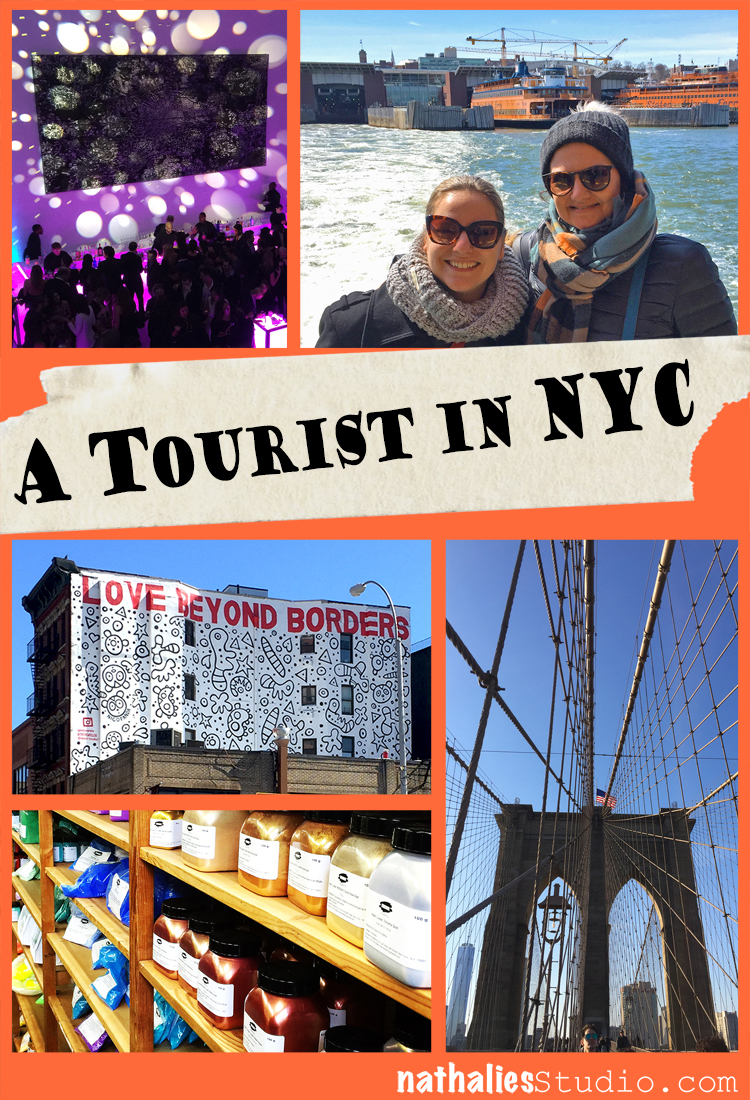
Having my friend Birgit Koopsen visit me a couple weeks ago brought the opportunity to play tourist in NYC. Living so close to Manhattan (a 10 minute path ride) makes you often just go in for your goals and chores and forget to explore it the way you would if you wouldn’t live to so close. Since Birgit was already here a couple years ago – I was able to show her some different things. Here are some fun highlights :)

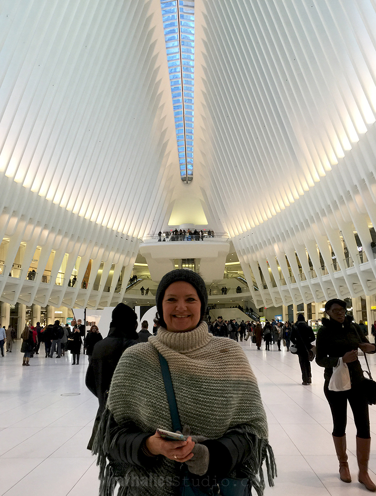
Last time Birgit was here the WTC station wasn’t yet finished …I always rush through it …On the first day we went to the Russian Vodka Room for dinner  (it is a fun place – piano player, good food and drinks included- a great place when you are around the Broadway for a show) before

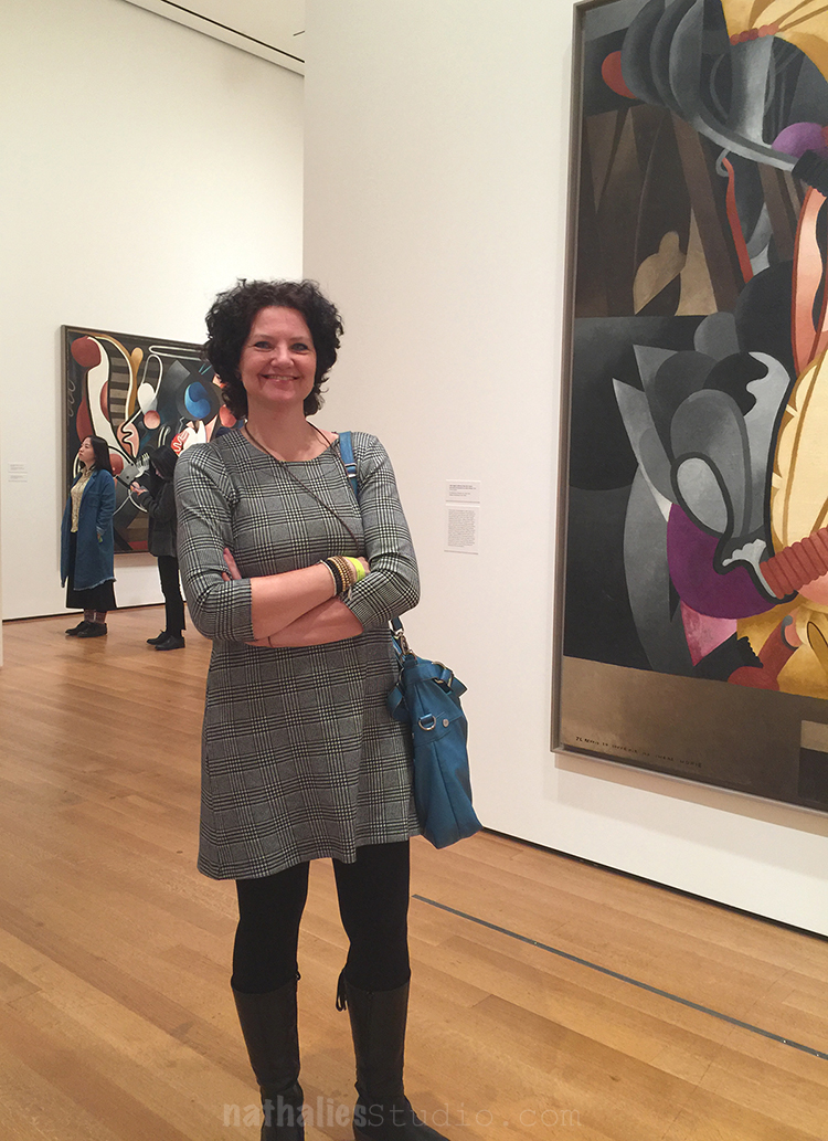
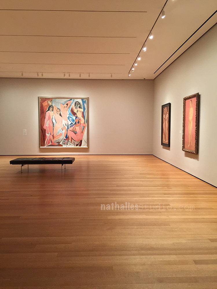
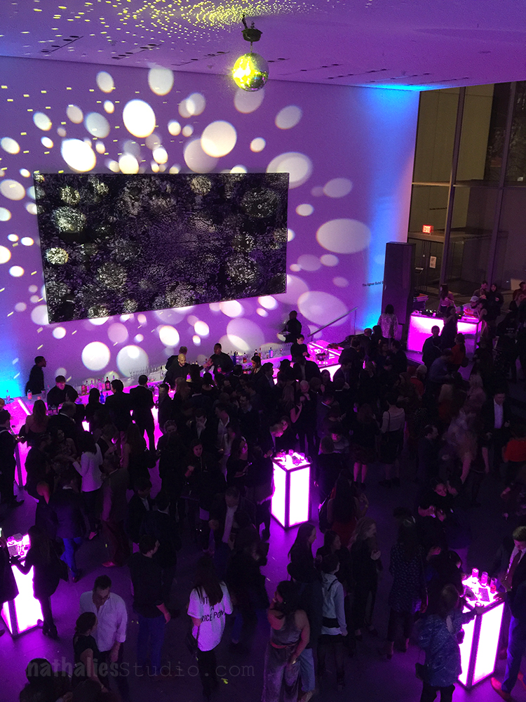
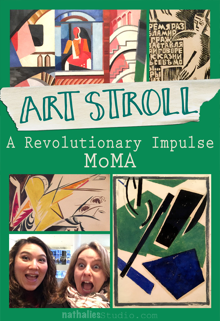
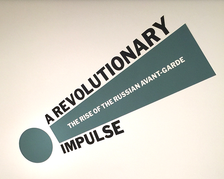
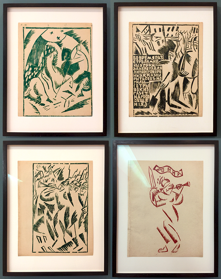
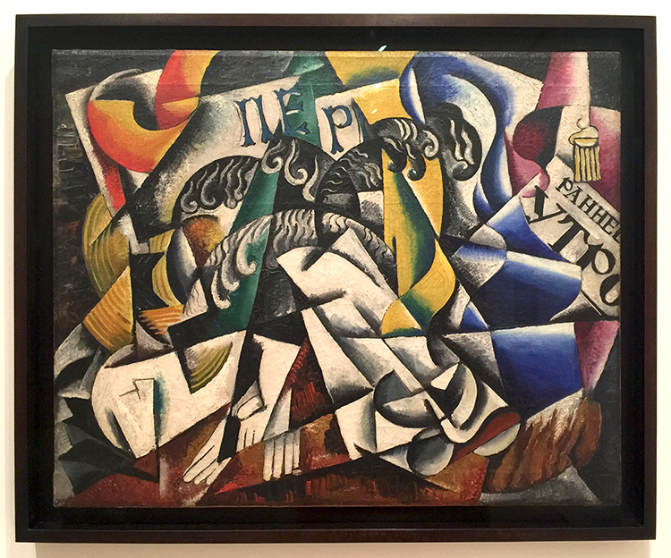
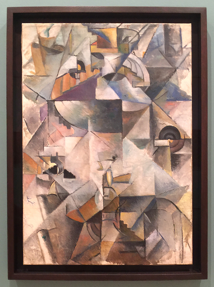
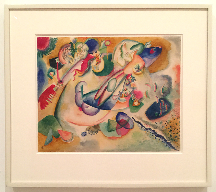
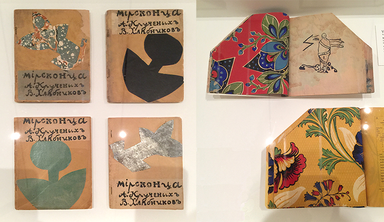
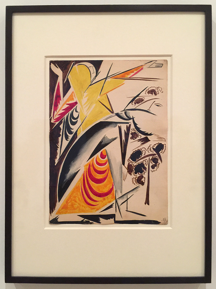
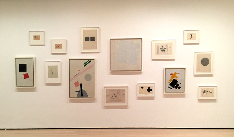
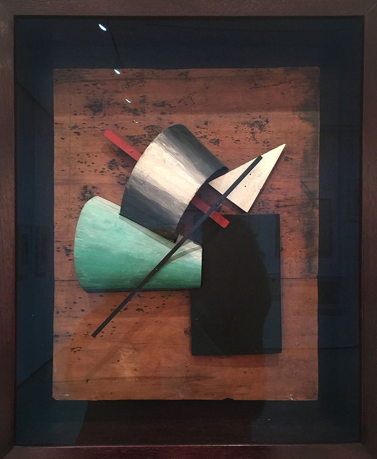
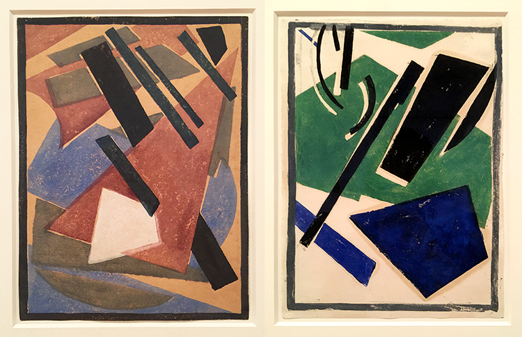
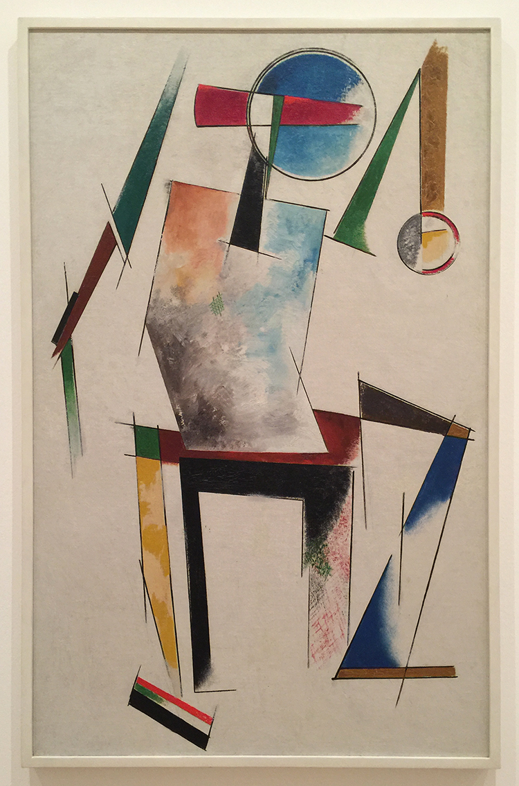
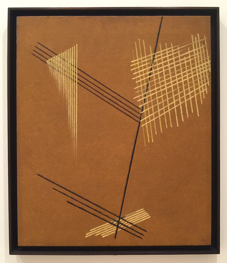
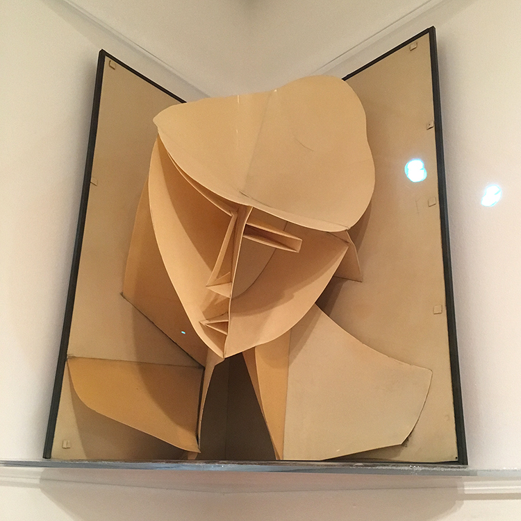
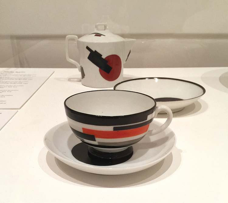
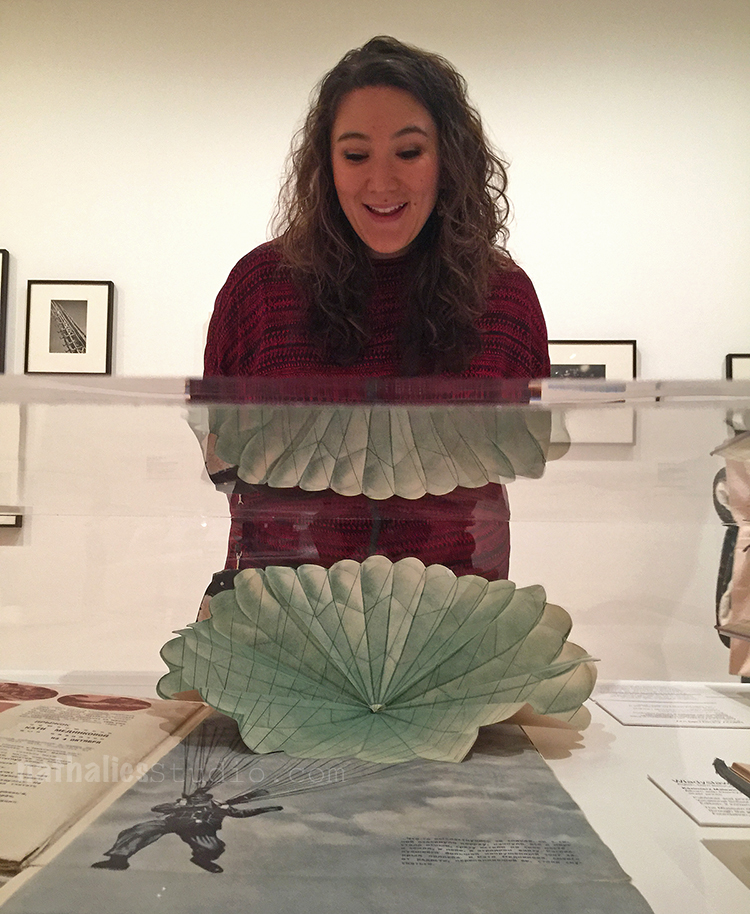
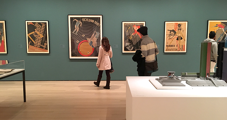
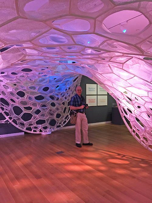
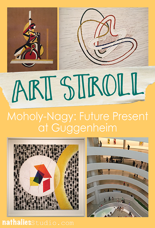
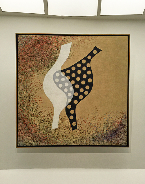
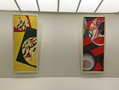
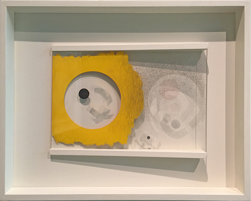
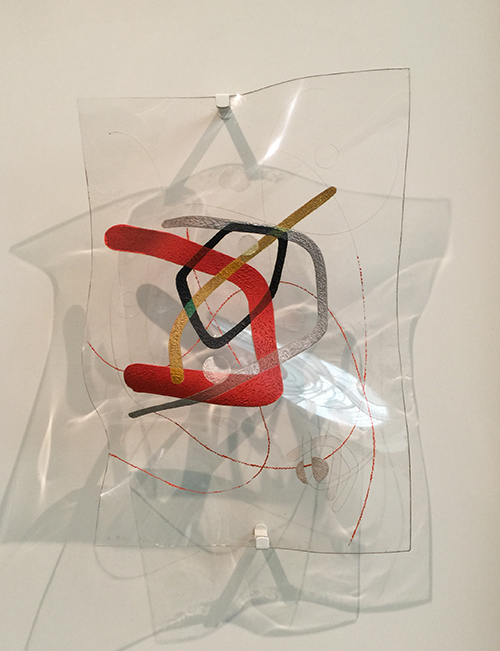
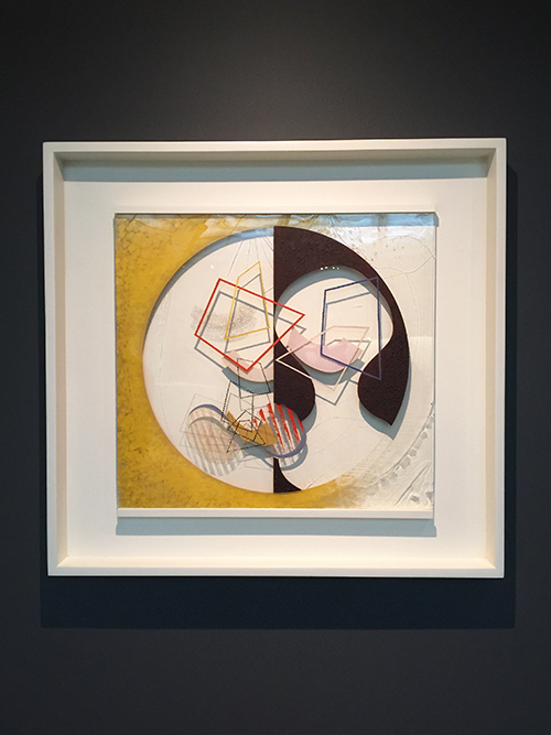
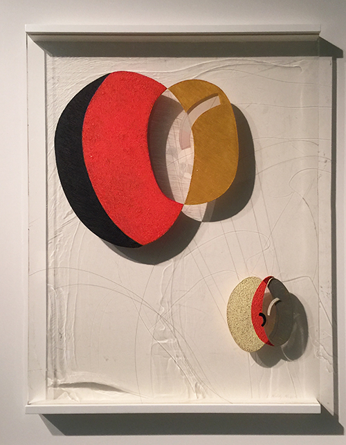
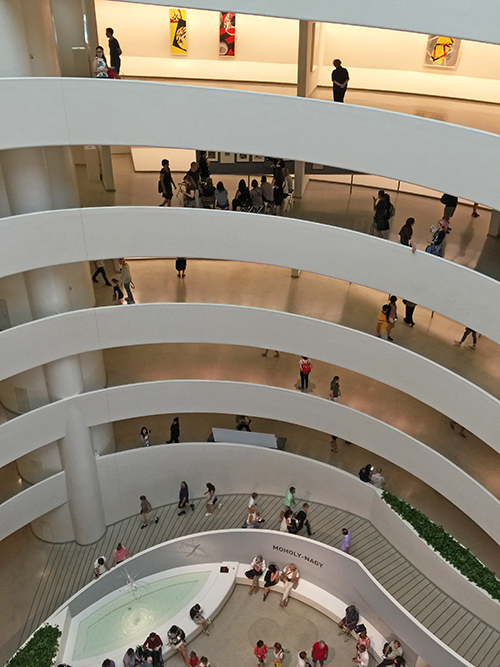
going to a MoMA Party with my friend Kim and we had the galleries almost to ourselves – so cool. It was great to go to the Picabia show for a third time :) I still saw new things and it is always awesome to talk with artsy friends about art.

The party was ok – young rich NYC kids – meh … but you know – look at the gallery above – ALL OURS

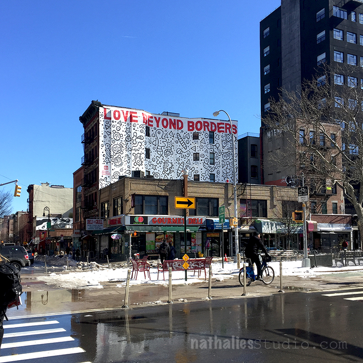
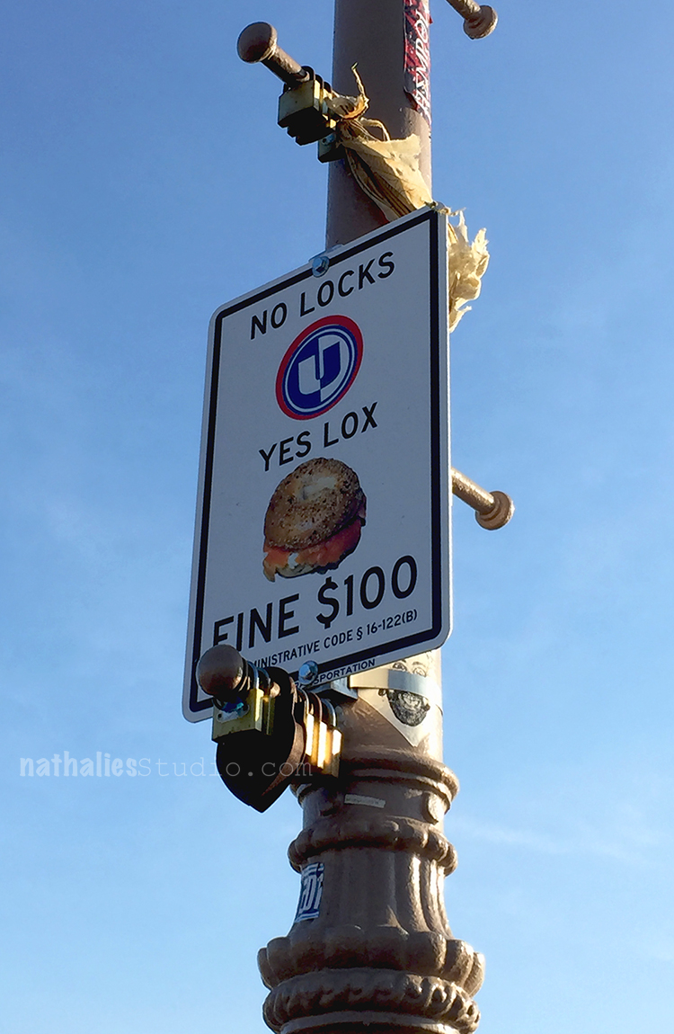
On another day we explored the East Village a bit (ok ok …I got lost …but hey…it is the best way to get to know a hood- LOL)

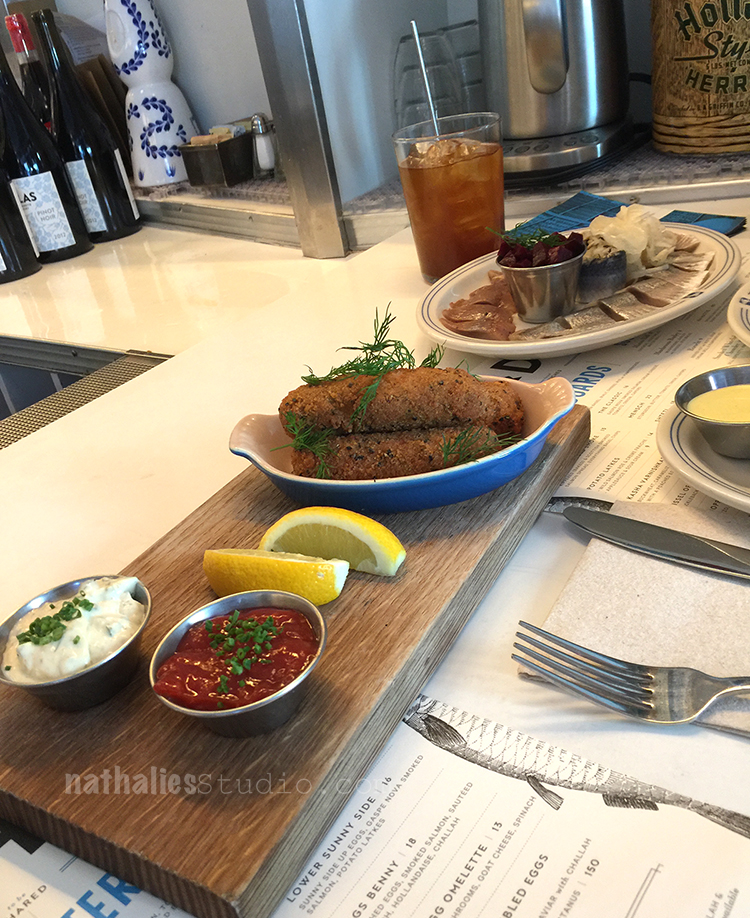
and went to Russ & Daughters – ohhhh yummie. The store exists for over 100 years – the Cafe offering their yummie delicatessen was opened a couple years ago.

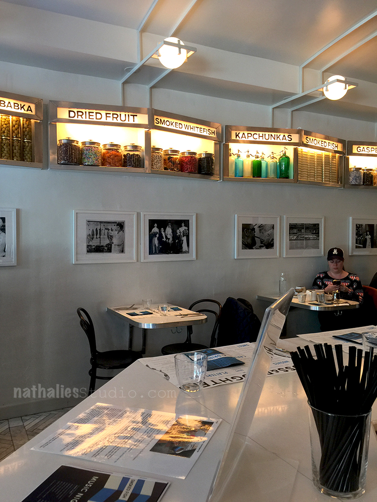
We couldn’t stop eating (as we both love pickled fish and fish and pickles and potatoes latkes and dessert)  and we bought loads of their fish in store too which we indulged throughout the week at home …heaven :)

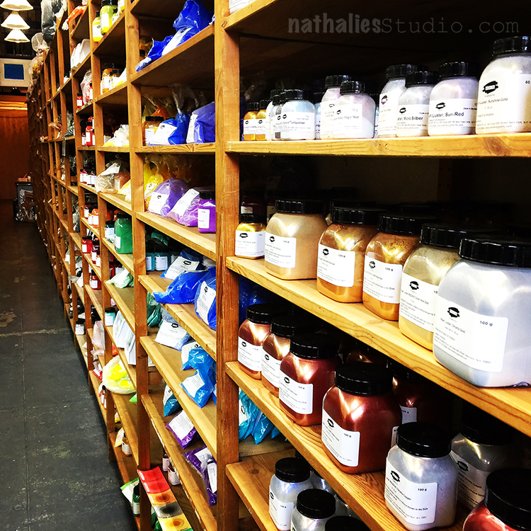
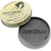
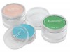
We went to Kremer’s Pigment– oh still my heart. A gem open since 1977 in the middle of a buzzing city- a candy store for artists

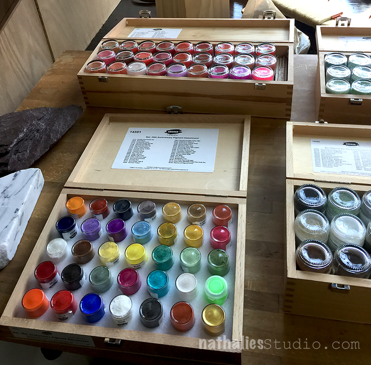
you can buy pigments there and they make their own watercolors. But they also offer workshops on how to make your own watercolors and gesso. I heard those classes are fantastic.

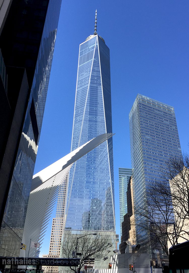
We went one day downtown

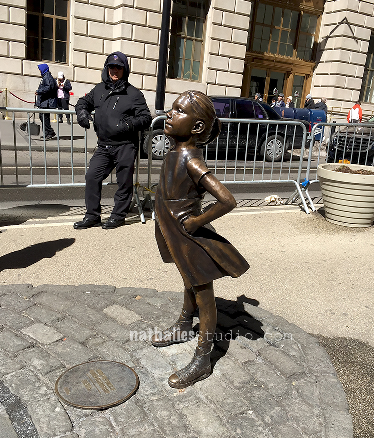
saw the Fearless Girl facing the Wall Street Bull (tons of people there- CRAZY!- that was the moment I turned back into a Jersey/NY girl and had to contain myself from just pushing through the crowd to be able to walk)

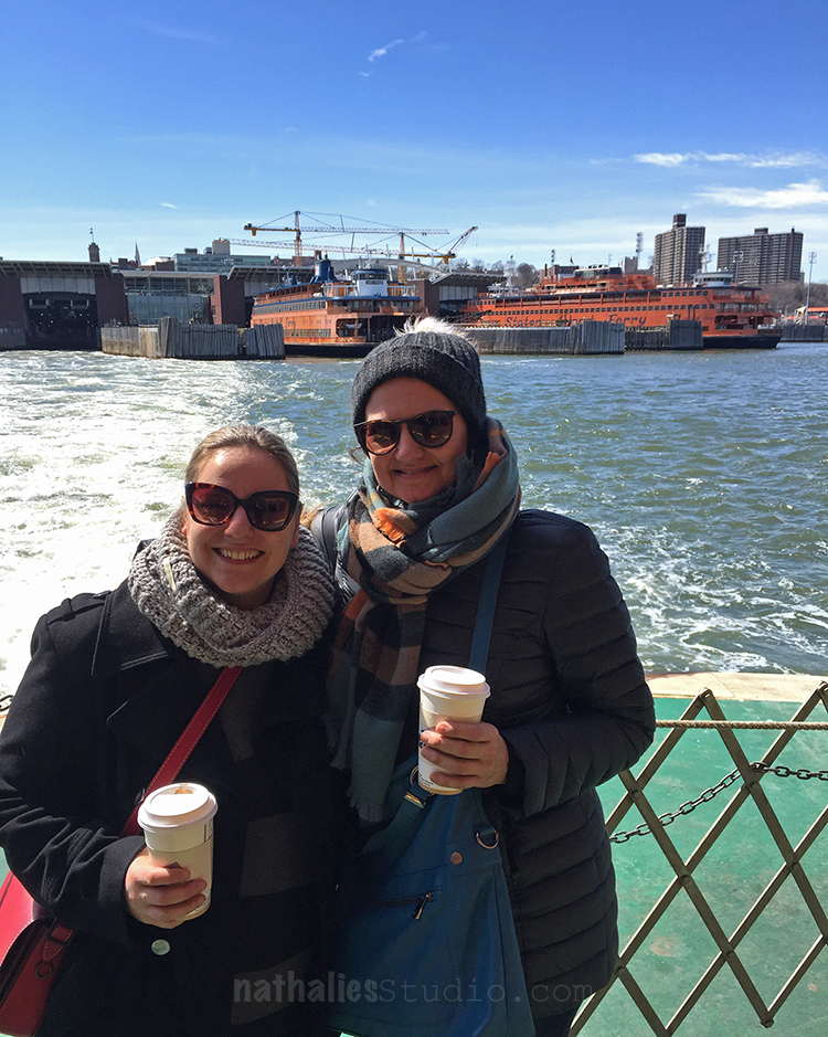
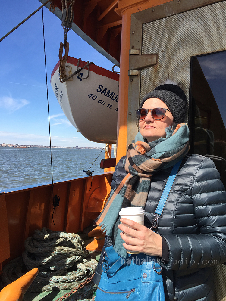
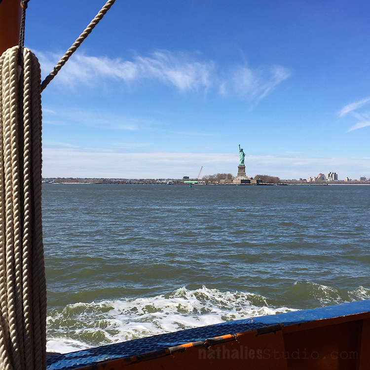
We took a Staten Island Ferry Ride- free and with the best picture opportunities of Manhattan, Jersey City, The Statue of Liberty and Ellis Island

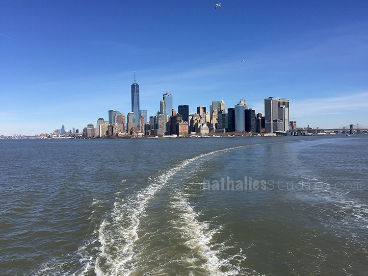
And just enjoyed the sun and glorious day

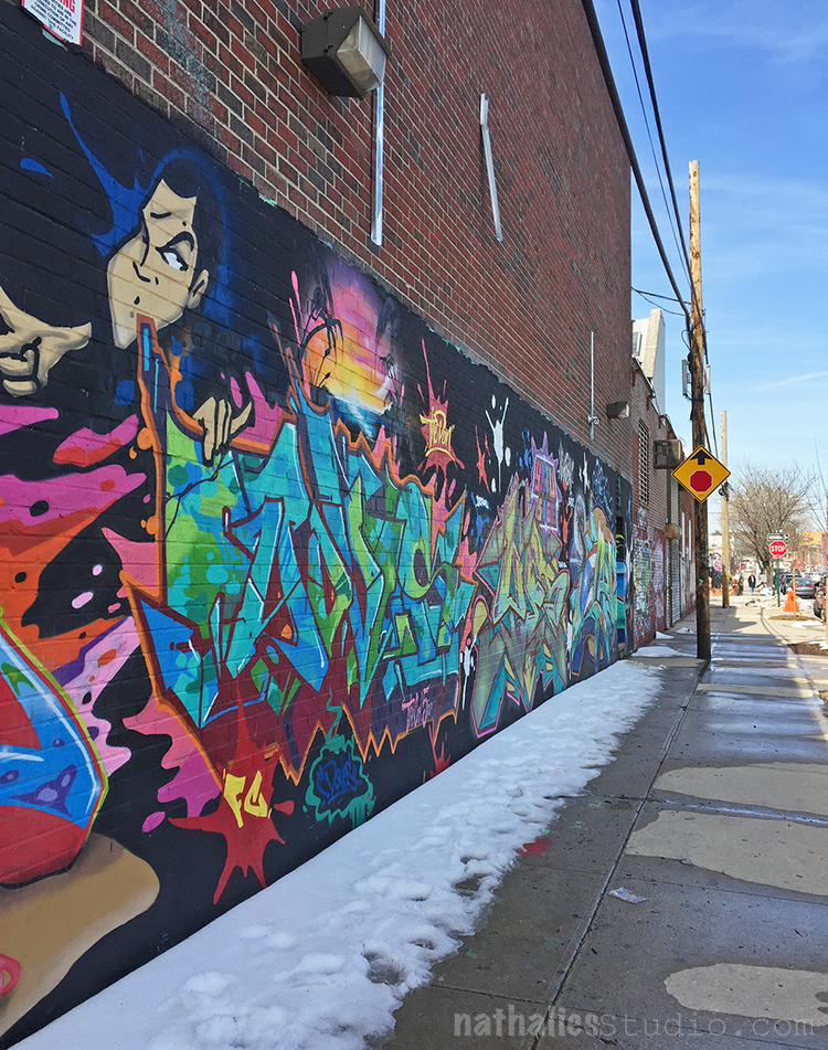
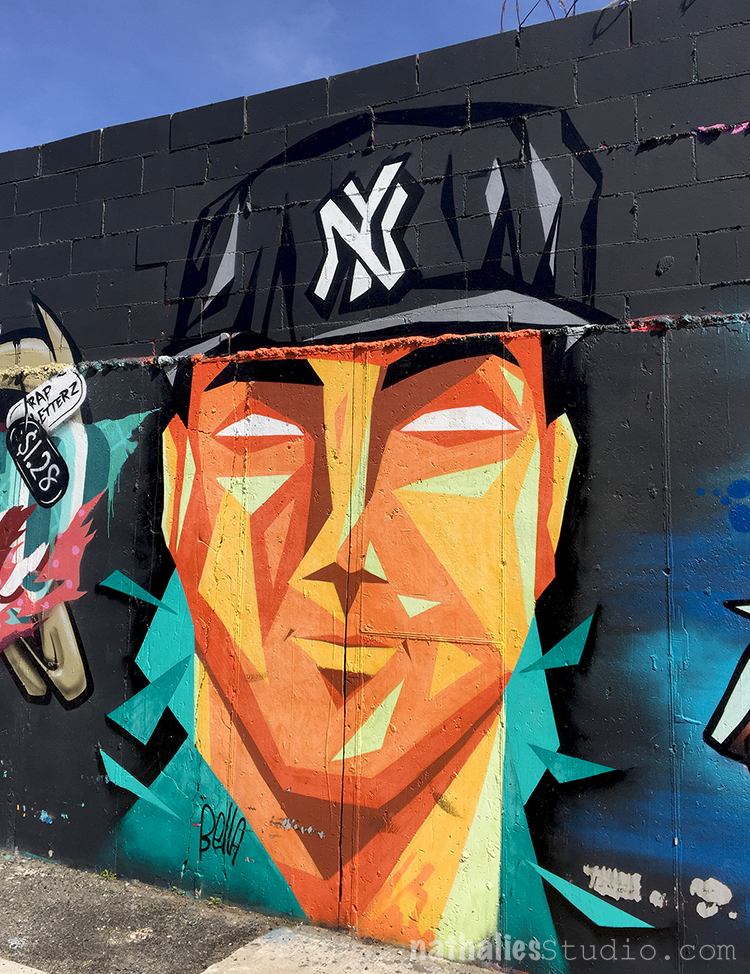
Another day we meet a friend of mine in Brooklyn – Bushwick
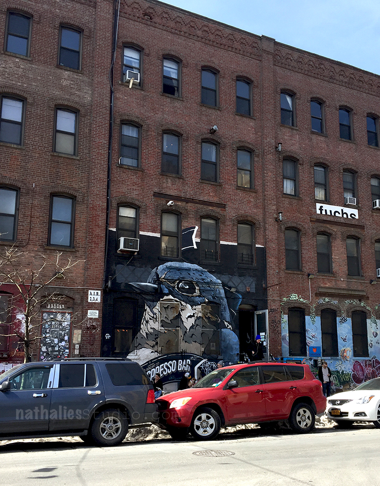
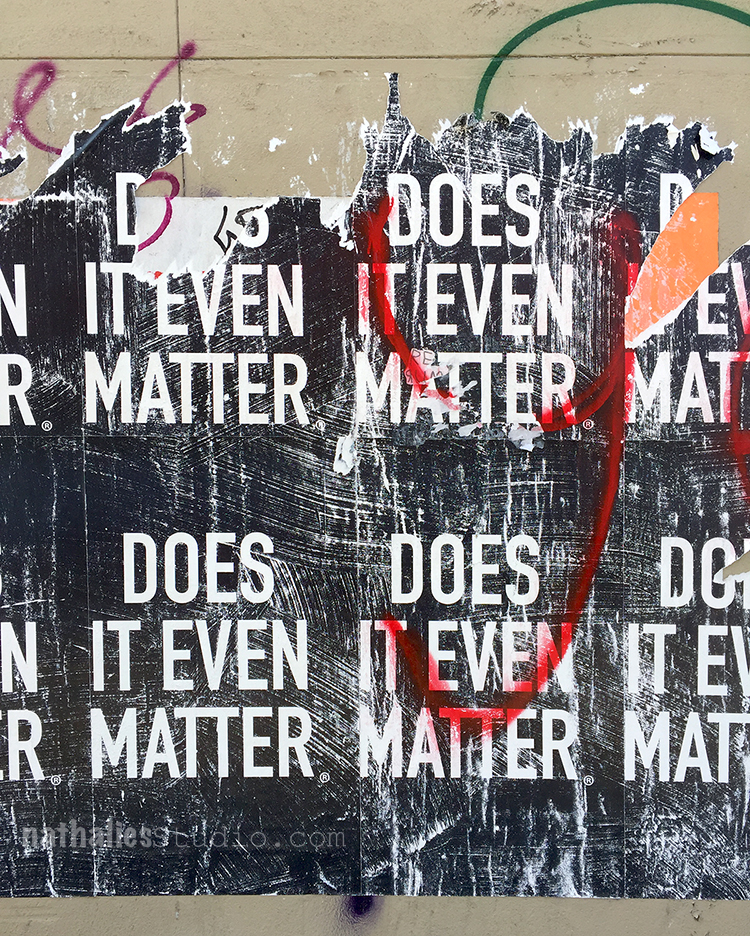
strolled around

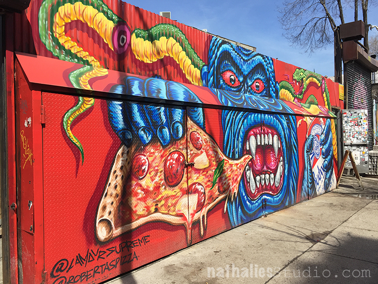
and had Pizza at the Roberta’s – sitting outside in the garden – yummie!

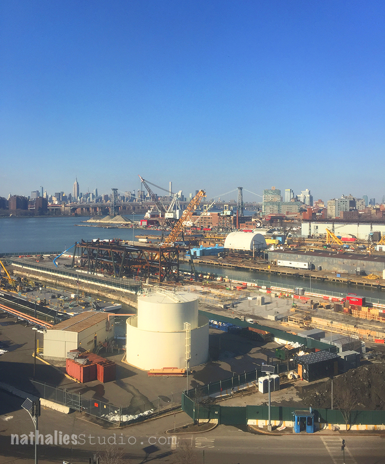
And then went to the Brooklyn Navy Yard to visit my friend and artist Adam in his studio to see some of his amazing artwork .

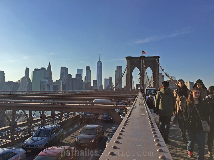
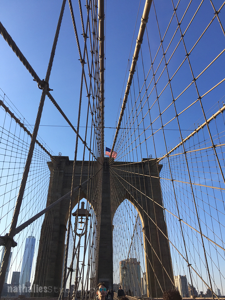
and then walked through Vinegar Hill to the Brooklyn Bridge which we crossed at the perfect time of the day with beautiful light

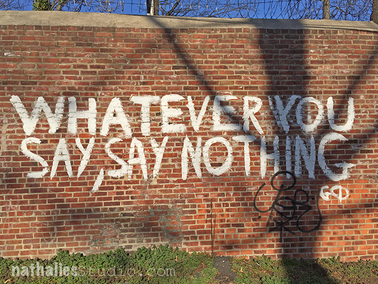
And who says New Yorkers have now humor ;)

We also did a Cheese Tasting in our local cheese store- all cheeses made by female cheese makers in the U.S. and spent some time in my hood. I really enjoyed having Birgit here and I miss her already :)

Hope you enjoyed the little sightseeing tour, I know we did !

Comments (10)

  • Torsa Saha

    |

    Love the small sightseeing through NYC !! Love you both !! Hugs !!

    Reply

    • nathalie-kalbach

      |

      Thanks for joining Torsa! Huge hugs back to you and a wonderful start into the week!

      Reply

  • susan debourguignon

    |

    oh, thanks so much for my armchair visit! i will get there someday. we will definitely visit Kremer Pigments and then have a lovely meal at Russ & Daughters. i don’t eat fish (just don’t care for it) but i will still have to make tough choices for lunch or dinner. and what a treasure of a trip to MoMA! Nathalie, thanks again for all that you share with us … we appreciate your nourishing art information!!!
    s

    Reply

    • nathalie-kalbach

      |

      Thank you for coming with us Susan :) There are loads of yummie things on the menu at Russ&Daughters – their Potato Latkes- yumm and …hey…their sweets ….delicious :) Have a wonderful rest of your week!

      Reply

  • Sue Clarke

    |

    Love Fearless Girl and looks like you had a great visit with Birgit. I can’t believe that you are that close to NYC.
    Thanks so much for sharing our pics Nat.

    Reply

    • nathalie-kalbach

      |

      Thank you Sue – yeah it was a fantastic time with her. It pays off to live so close (15min with public transportation) – as I always say ” it is awesome to be quick in and awesome to be quick out” ;)

      Reply

  • Cindy Langston

    |

    Ohhh…thank you so much for this post Nat! My husband and I will be making our annual trip to NYC in a couple of weeks and we are always on the look out for new things to see. You have definitely added to our list with your post. Would love more off the beaten path ideas if you want to share!

    Thanks…Cindy

    Reply

    • nathalie-kalbach

      |

      thank you Cindy, I am glad you enjoyed the post and wish you and your husband an amazing time in NYC!

      Reply

  • Joi@RR

    |

    Loved every INCH of this post Nat. The art, the food, the sights and best of all… the story of your time together. Never having been to that part of the country – it’s all just AMAZING. Thanks so much for sharing. Xj.

    Reply

    • nathalie-kalbach

      |

      thank you Joi – it was a super fun time! NYC is a great place to visit :)

      Reply

Leave a comment

Art Stroll: A Revolutionary Impulse – MoMA

A couple weeks ago my friend Julie Fei -Fan Balzer was in town and we had an awesome day filled with good food, chats, laughter and of course…Art. We went to MoMA to see A Revolutionary Impulse – The Rise of the Russian Avant-Garde – a title that couldn’t make it in it’s entirety into my blog title- LOL.

“During the early 1910’s under the tsarist autocracy (in Russia) that had ruled for three centuries, avant-garde artists sought to overthrow entrenched academic conventions by experimenting with complex ideas that would transform the course of modernist visual culture. In 1915 as World War I raged, an abstract mode of painting called Suprematism abandoned all concrete pictorial references….With the October Revolution of 1917, Lenin’s party took command. Avant-Garde artists put individual expression aside and developed a structured abstract language called Constructivism which they hoped could be embraced by the masses. Constructivists rejected easel painting in favor of practical objects like ceramics, posters and logos. …By the late 1920s, the government, now headed by Stalin, had placed restrictions on all aspects of life, including the arts, and was commissioning artists to produce propagandistic books, posters and magazines touting Soviet achievement….This exhibition spans the years 1912 to 1935…Conceived in response to changing socio-political and artistic conditions, these works probe the many ways and object can be revolutionary.” From MoMA’s wall text about the exhibition

Olga Rozanova, War, 1916 – Linoleum cut illustrations out of a a book with ten illustrations.

The imagery for those lino-cuts is influenced by the abstracted forms of Cubism and Futurism but also by traditional Russian motifs. I was intrigued by the very simplistic way she created figures with crosshatching and just some hints of form here and there which your eye completes yourself as a person or else.

Lyubov Popova, 1914, Subject from a Dyer’s Shop – Oil on Canvas.

Note that Lyubov is another woman …

Kazimir Malevich, Samovar, 1913, Oil on Canvas. “A year later Malevich was painting cubes and lines and circles and balancing them in ways that had no relation to anything but geometry and the will to make something new. Malevich called his art “Suprematist,” hoping that it would have supremacy over forms found in nature.”

Vasily Kandinsky, Improvisation, c. 1915 – Watercolor and pencil on paper

Various artist: Natalia Goncharova, Mikhail Larionov, Nikolai Rogovin, Vladimir Tatlin -Mirskontsa (Worldbackwards)-1912

These books were made with wall paper and I really love the shapes  too.

Natalia Goncharova Spanish Dancer –(c. 1914) . Isn’t this beautiful?

And then things changed…


Jean Pougny, Suprematist Relief-Sculptures, 1920s – Painted wood, metal and cardboard, mounted on wood panel. I did love this one – I wish it wasn’t behind a glass

Lyubov Popova, Six Prints ca. 1917-19 – linoleum cuts with watercolor and gouache additions

A pioneer of the avant-garde, Popova developed a style in the late 1910s that combined floating forms inspired by Cubist collage and by Suprematism. She called this print series – there are four more- “painterly architectonics” . She wanted to depict layered shapes, so that they seem to be continually shifting and rotating.

Varvara Stepanova, Figure, 1921 – This is in MoMA’s permanent collection and I always loved this one. BTW …another woman :)

Aleksandr Rodchenko, Non-Objective-Painting 1919, Oil on Canvas


I love the crosshatching and the expanding lines.

Naum Gabo, Head of a Woman, 1917-20 – Celluloid and Metal

Nikolai Suetin – 1923

In 1917 the Bolsheviks seized control of the government and took over the State Porcelain Factory which used to manufacture porcelain for tsars in Petrograd (now St. Petersburg). Suetin a Suprematist artist was invited to make decorative designs for existing porcelain found in the factory. These ceramics, once meant for imperial tables, were now reimagined for the proletariat.

I would totally wanna have this set and use it – and I find it so interesting how the forms and shapes painted on canvas speak so much more to me on this tea set.

How cool is this pop-up parachute ? The reflection of it is also a bit funny – guess I made Julie a new outfit ;)

I enjoyed this exhibition. The most eye catching fact for me was just how many women were in this exhibition since modern women artists are very underrepresented at MoMA. I regret that the exhibition is coming to an end, as I feel there is so much about this that I didn’t quite grasp and I more or less just floated around in this exhibition with a semi knowledge of the political time the art was created in Russia and a lacking mind for the ideas behind Suprematism and Constructivism. But you know what…I will be ok …I was still inspired ;)

Comments (2)

  • Sue Clarke

    |

    That tea set is great and Julie’s new outfit is interesting. Glad to see that you two had fun with art again!

    Reply

Leave a comment

Join Birgit Koopsen and Me in March at The Ink Pad in NYC

Birgit and I will be teaching at The Ink Pad in NYC on March 18 and March 19, 2017! Come and join us

mono-print-painting-workshop-ink-pad

Let’s push mono printing to a whole new level.

Join us for a day long class in Mono Print Painting. We will dive into the basics of mixed media mono printing first and will introduce you to our Mono Print Painting technique inspired by H.N. Werkman. We will show you different ways on how to create elaborate and layered mono printed paintings using self made tools as well as stamps and stencils. We will share with you thinking process on developing the technique and how we put our own personal spin on it, so that you can take this even further.

Register here

—————————————————

artful-transfers-workshop-ink-pad

Join us for a fun day of exploring and incorporating different transfer techniques into your art journal pages. The imperfect look of transferred imagery in your art journal opens up so much creative potential. Not only are there many different ways to actually transfer images, there are also many different ways to treat those transfers in your art journal. We will show you our favorite techniques and how you can make your art journal pages even more meaningful by using artful transfers.

Register here

We hope to see you there!

If you are looking for an In-Person Class with me check out my upcoming classes

Leave a comment

Photos of the Workshop at The Ink Pad, NYC

kalbachartrulescollage

I had such a wonderful time teaching my Art Rules Workshop at The Ink Pad in NYC. It was a two day workshop and we explored lots of wonderful artists.

kalbachartrules01

We created a huge amount of pattern using my new ArtFoamies designs which were …quite liked :)

kalbachartrules02

We played with color combinations

kalbachartrules03

and pushed and pulled layers in our art journals

kalbachartrules04

kalbachartrules05

and ….even played with some not yet released supplies …can you spy them ?

kalbachartrules06

The second day we had to move into a different class room due to a little mistake by Westbeth but due to the amazing organization skills of Anna from The Ink Pad and our wonderful and helpful students, that wasn’t a big deal and we actually liked our second home a lot – it was a real printmaking studio.

kalbachartrules07

It was such a wonderful group of students,

kalbachartrules08

lots of laughter during the class

kalbachartrules10

and happy faces

kalbachartrules11

and beautiful artwork

kalbachartrules12

each student exploring their own style.

kalbachartrules13

Combining new and old techniques

kalbachartrules14

and getting out of the box to be rewarded with awesome results.

kalbachartrules15

Aren’t they the cutest?

kalbachartrules16

kalbachartrules17

kalbachartrules18

kalbachartrules19

kalbachartrules20

kalbachartrules21

Beautiful finished art journal pages  make me happy  …and I assume the students too :)

kalbachartrules22

kalbachartrules23

Thank you all so much for joining me, you rocked. And a huge thank you to Anna from The Ink Pad -it is always wonderful to teach for you!!! Cannot wait for the next time at The Ink Pad!

Would you like to come to one of my In-Person? Check out my next workshops at The Queen’s Ink in Maryland and more on my In-Person Workshop Page.

I would love to have you!

Comments (5)

  • Joi@RR

    |

    So love seeing you and your students at work Nat. And YES… beautiful outcomes. I know you were a great blessing to them all. Xj.

    Reply

  • Anne Lemay

    |

    These photos are a treasure – they truly capture the fun we had as well as our creative work. Your teaching – and your Art Foamies – rock!

    Reply

    • nathalie-kalbach

      |

      Anne, it was so wonderful to have you ! You guys were amazing and I had the best time- right back at you – Your rock !

      Reply

  • Michelle Ward

    |

    WOW! Looks like a super fun class! Look at all those happy faces and layers and layers of great pattern. I spy some amazing stencils and stamps!! Well done girl!

    Reply

    • nathalie-kalbach

      |

      thank you Michelle! We had a great time and you know those guys are always fun!

      Reply

Leave a comment

Art Stroll: Cooper Hewitt Design Museum, NYC

kalbachchcollage

A couple weeks ago I went on an Art Stroll with my friend Andrew and he suggested we should visit the Cooper Hewitt Smithsonian Design Museum. Well – I haven’t been there yet- so of course I was up for it!
kalbachch01

And boy was I glad went- it was so much fun and so worth it- btw- it almost right at the Guggenheim where we did another Art Stroll that day, so if you are ever in the area :)

kalbachch03

Upon our entry we received a big pen which, we were told has two functions.

  1. to use on certain interactive stations to do your own designs and
  2. to save the information of everything you saw and want to keep track of and the designs you created

Or as a very sweet guard said to me: “You can collect the whole museum and take it home with you!”

HOW COOL IS THAT . Big shout – I loved it. It definitely changed the way how people including us viewed the museum. You weren’t so focused on writing things down or photographing everything – and yes I know there are avid hater of the fact- but this is how information and things get consumed nowadays and I feel as this was the smartest most amazing way of a museum to embrace it, go with it and make it better for everyone! People do not feel they are missing out on taking home the memory ..they take the whole museum home *wink

kalbachch04

Here is Andrew in front of a wall paper creator – I made a simple one for him

kalbachch06

Here he made one for me. I like it ….maybe just one tiny section of a wall because I might get a bit 70s if I’d had this all over my walls- but it is fun !

kalbachch09

Love this poster *wink

kalbachch10

here is Andrew creating a vase.

kalbachch11

Poster Generation Vielfalt, Götz Gramlich 2014. I loved this- this is how our election posters look like during our election time in Germany – which lasts only a couple weeks- oh boy you wish *wink. Often times those posters change over the time either by weather or by protesters. So the design of Gramlich for an election was actually a play on that.  Gramlich’s poster series Generation Vielfalt was designed for the progressive political party Generation Heidelberg. The posters were displayed over time to show a transformation. Here, the second poster in the series shows the image partially torn away to reveal a new message underneath. I love the idea of revealing a new message by tearing away a layer on the top.

kalbachch13

This is a Graffiti v-neck tee and pants. It was designed by Melitta Baumeister. I think it has my name written on it – how cool is that. If I’d longer legs I would take it home with me- but the tee would do *wink . Definitely a reminder for me to do some more wearable art!

kalbachch14

This is a magazine. It was designed by Theseus Chan and printed byAlsOdoMinie and made for WORK. Its medium is die-cut offset lithography over silver foil on paper. Andrew and I agreed it would make for a really cool siding for an art journal.

kalbachch15

This is Andy standing in a PolyThread knitted textile pavilion. It was designed by Jenny E. Sabin. Its medium is 3d seamless whole garment digitally knit cone elements; photoluminescent, solar active and drake yarns; twill tape; aluminum tubing. Now that is a mouthful and pretty pretty amazing.

kalbachch16

These are prints by Kyuha Shim.

kalbachch17

kalbachch19

upon closer inspection you see that they are made with stamps- so so so cool!!!! I almost squealed.

kalbachch20

Shim created these ninety-two custom rubber stamps to produce his series of prints Seeing through Circles (2013) above. The stamps have with visual densities that roughly match the brightness or darkness of sixty corresponding pixels. Printing the stamps together creates a texture similar to digital printing.

kalbachch21

This sculpture was designed by The Haas Brothers, Nikolai Haas andSimon Haas and collaborator: The Haas Sisters of Monkeybiz andMonkeybiz.

glass beads, wire, wood, mixed fiber stuffing, and cast bronze

The colors made me happy and I would have loved this as a toy as a kid!

kalbachch22

Some beautiful textile pattern design!

kalbachch23

loved this airy piece …and forgot to use my pen on it – so ….unfortunately I have no information on who designed it but I thought it was really

kalbachch24

kalbachch25

Sou Fujimoto Architects created this series of models for the 2015 Chicago Architecture Biennial. Called Architecture Is Everywhere, the project discovers architectural possibility in found objects and everyday materials. Simple artifacts such as a lottery ticket, an ashtray, or a ring of binder clips become intriguing structures when placed on pedestals with tiny human figures. In the words of Sou Fujimoto, “This is kind of a funny trial to expand our ideas of architecture beyond our usual understanding.”

kalbachch26

This looks way cooler in person -you have to see it. It mad me giggle !

kalbachch27

That a treasure of inspiration was found in this museum. I am getting all excited again while writing the post and looking at the photos again.

Hope you enjoyed this Art Stroll! There are more to come soon !

What was the last museum exhibition you went to that knocked you off your socks?

+ Expand this article
3comments

Comments (3)

  • Kim

    |

    So cool to explore design in such a hands on way!

    Reply

  • Natalya Aikens

    |

    I love that museum! And I haven’t been there for a while, tis time…. Thank you for my virtual visit!!

    Reply

  • Sue Clarke

    |

    First of all, how exceptionally cool is that pen to take the museum home with you?! Unfortunately I don’t get to museums as often as I would like to, but the last time I was in one it was in Washington, D.C. and the art of super cool and different. This one piece which was a series of TV’s stacked on top of each other (to show the Vietnam War and how America saw it on TV) really made me stop and think. Just a stack of TV’s used as art (and very well arranged I must say). In this post I especially liked the small humans arranged on the screws and such. Thanks, once again Nat, for bringing art straight to my computer for me to see. Love it!

    Reply

Leave a comment

Art Stroll: Moholy-Nagy: Future Present at Guggenheim

KalbachNagyCollage

The retrospective of Laszlo Moholy-Nagy at the Guggenheim – Future- Present- was Andrew’s and my second stop for an art stroll a couple weeks ago.

KalbachNagy01

Meandering from bottom to top in a spiral his work developed from the 20s to the mid 40s in front of the viewers eyes.

KalbachNagy27

KalbachNagy28

The Bicyclist (Still Life) Moholy-Nagy, 1920-22, Oil on Canvas

I loved seeing this and how the geometric shapes evolved into something else with time.

KalbachNagy26

Yellow Circle and Black Square (Gelber Kreis und schwarzes Quadrat) by Moholy-Nagy, 1921, Oil and Graphite on Canvas

KalbachNagy23

Moholy-Nagy believed that art could be a vehicle to for social transformation and was combining technology and fine art elements. He experimented with a wide variety of mediums.

Coming from the Dadaglobe Exhibition Art Stroll just a couple hours before- we loved seeing the artwork below. Moholy-Nagy who was born in Hungary-Austria in 1895 moved to Berlin in the 1920s where he met the Dada artists who influenced his work.

KalbachNagy22

Between Heaven and Earth (Zwischen Himmel und Erde) by Moholy-Nagy, 1923, Photomontage (gelatin silver prints, including one photogram; photomechanical reproductions and graphite)  on paper

KalbachNagy21

Slide (Rutschbahn) by Moholy-Nagy, 1923, Photomontage (cut and pasted printed papers, sprayed gouache, ink and graphite) on board

I also loved his modern and funny advertisements. Again of course it is only funny when you can read German

KalbachNagy20

but so the one on top here says “everyone is born naked to this world and should not be disadvantaged in the daily struggle of existence by ugly clothes. The birthright that everyone should access to good clothing was realized by SS (Schröder-Spezial) ” – I guess they had a way longer attention span for advertisements back then – lol

KalbachNagy19

The top here is showing off the good material their clothes are made off and …and the one on the bottom let’s you know if you walk around with open eyes you will spot how superior the clothes of this menswear house is.

Advertisements for Schroeder-Spezial – a menswear chain store, 1930

KalbachNagy18

Advertisement for the London Underground, 1937


KalbachNagy17

CH Beata I by Moholy-Nagy, 1939, Oil and graphite on canvas

In 1937 he was appointed to head of New Bauhaus in Chicago and later he opened his own School of Design there. I love seeing traces of the beginning artwork still there but developed more into something else.

KalbachNagy16

KalbachNagy15

Space Modulators:

KalbachNagy13

Moholy-Nagy’s technique of suspending Plexiglas sheets with clips or rails several inches in front of white panels allows light to pass through the clear areas while the painted passages generate modulated shadows that become part of the composition. He described this process: “I scratch lines on the back of the transparent sheet and rub color in; the same I do wit the front, rubbing another color it. Light does then what I could not do. A sparkling, vibrating color effect through the addition of the shadows which produce mixtures as no one could on the palette.”

KalbachNagy12

At times, he would manipulate the Plexiglas, as with the work above, by heating the plastic sheets – sometimes in his kitchen oven – and then shaping them by hand to enhance their capacity to distort light and imply undulating movement. Moholy-Nagy died at the age of 51 of leukemia.


KalbachNagy09

Leuk 4 by Moholy-Nagy, 1945, Oil and graphite on canvas

This painting was done a year before his death and is depiction cancer cells. Without context it looked not sad – but knowing the context it made me sad . But here we have another prove of how art can reflect something that happens in the artists live in a symbolic and hidden way- if you wouldn’t see the name of the painting – you might not really know.

More Space Modulators:

KalbachNagy08

KalbachNagy07

KalbachNagy06

KalbachNagy05

KalbachNagy04

The Guggenheim was the perfect setting for this retrospective and enjoyed it a lot. It is timeless art and even though it has nothing to do with my own style and taste I appreciated his thoughts, ideas and development of his style.


KalbachNagy02

KalbachNagy03

And from here Andrew and I set out for another stop on our crazy art stroll that day… but that is for a different post *wink

Hope you enjoyed this Art Stroll today !


Comments (4)

  • Karen Amdur

    |

    Nice to revisit the exhibit which is fabulous.
    Just saw it at LACMA in LA.
    Thx for creating your tour.

    Reply

    • nathalie-kalbach

      |

      So glad you enjoyed seeing it again -Love that it was also in LA! Thank you for your visit Karen!

      Reply

  • nathalie-kalbach

    |

    Glad you enjoyed it Joi :) I wish you a wonderful weekend as well! Nat

    Reply

  • Joi@RR

    |

    Sooo interesting Nat. I just wanted to keep looking at each piece – they just draw you in but in such a different way. It felt more like looking at architectural pieces somehow!!! Between Heaven and Earth made me laugh – pretty neat!!! And the advertisements were fun. Really a treat to see your stroll and that fabulous building too. Thanks bunches. Have a super weekend. j.

    Reply

Leave a comment

Demos at The Ink Pad in NYC

KalbachInkPadCollage

Last month I had a fun afternoon demoing with my stamps at one of my favorite stores – The Ink Pad in New York.

KalbachInkPad01

I showed some easy and fun Gelli-Printing tricks with acrylic paints and foam stamps

KalbachInkPad05

having lot’s of fun with a round plate and using dye inks

KalbachInkPad04

playing with small round printing plates

KalbachInkPad06

having an Elephant in the room

KalbachInkPad02

doing some collage fun

KalbachInkPad03

and stenciling

KalbachInkPad07

and of course taking over the whole store and making a big mess :)


We did a FB Live Stream right from the store on my Facebook Page of some fun techniques – you can see the store, some wonderful people and the store in action if you want :) It was a lot of fun and thank you to all that came, the people who watched the video and joined and Anna and Jane from the InkPad!!!

Comments (4)

  • Julie B

    |

    Looking forward to meeting you in Cali in a couple of months! Thank you for the video/tutorials.

    Reply

    • nathalie-kalbach

      |

      Yeah- so looking forward meeting you in Cali too- it is going to be loads of fun!

      Reply

  • Linda Faber

    |

    Thanks, Natalie, for the great demos! Just what I needed, a refresher lesson on using my gelli plate. I will definitely have to visit that NY store!

    Reply

    • nathalie-kalbach

      |

      Glad you liked it Linda- and yes yes – The Ink Pad is worth a visit in NY :)

      Reply

Leave a comment

New Mixed Media Painting – Flat Iron Building

FlatIron01

I finished this new painting of the Flat Iron Building in NYC which is 12″x16″. I had a good time with it, especially trying to get a bit into a different color scheme and using pastels. I was definitely inspired by the Art Stroll through the Degas Exhibition at MoMA.

ProgressFlatIron

This is a little photo collage showing the progress of the painting from underpainting, to adding more details, to changing things, over staring it down to finishing it up :) .

FlatIron012

Besides Acrylic Inks, Acrylic Paints and Acrylic Markers, I also used Charcoal Marker and Graphite.

FlatIron013

I added some finishing touches with PanPastels. It was fun – and I am very drawn to this color palette.

For those of you who want to know what I used specifically – as always a supply list- some links are affiliate links.

SuppliesCJS


Let me know if you find the process of a painting interesting to see- if so I will incorporate those collages more often !

Don’t forget that I have a Blogiversary SALE right now going on with 20% off of online workshops (like Creative Jumpstart 2016), DVDs, and select items (including all the stampsandstencils) from the n*Store online.  The sale prices are reflected in the store now.It ends tomorrow night!

Happy Blogiversary sale

Have a beautiful day!

Comments (4)

  • Rae

    |

    This might be my favorite one yet Nathalie. The colors are amazing and there is just something very real and alive in it! LOVE it! xx

    Reply

    • nathalie-kalbach

      |

      Awe- thank you so much Rae ! Hope you have a gorgeous weekend!

      Reply

  • Brenda

    |

    I like the color palette as well. I also enjoyed seeing the pictures of the different stages of the painting. Do you usually take pictures of the different stages for reference when working on a painting? Great painting!

    Reply

    • nathalie-kalbach

      |

      thank you Brenda! Yes I do take photos in between to see the evolvement of it and also where I might have taken a different turn- but also to check on color values and because it is just a different view to see it through the camera.

      Reply

Leave a comment

Scenes from the n*Studio and Demo at The InkPad

ScenesNatStudioJuly

A little peek into my studio

top row: Berlin Tacheles Painting, Embroidery Sampler, Beginning of a new Flatiron Building Painting

middle row: gathering and sorting the supplies for my book photo shoot, playing with paint and stamps and deli paper

bottom row: 4th July card with a hand carved stamp, packing up my artwork for my book for the photoshoot


And I hope you will join us either in person or on facebook !

Inkpaddemo

Come on down to The Ink Pad in New York City to meet me on
Tuesday July 19, 2016 from 4pm – 7 pm
I will do a free demo with my Rubber & Foam “Stamp and Stencil Sets” from Stampendous!. And I will sign my new DVD’s with ArtistsNetwork.com. And …if you cannot make it to the shop, join us for a Live Facebook Peek into the fun around 5pm from my Nathalie Kalbach n*Studio facebook page !

Have a wonderful day

Comments (2)

  • Joi@RR

    |

    Loved seeing the ‘scenes’ from your studio Nat. The paintings look wonderful – love your city paintings – always! Congratulations on the fun things you are doing ie: book, dvd etc. Sooooo excited for you and so enjoy watching you climbing towards your dreams. XXj.

    Reply

    • nathalie-kalbach

      |

      Awe- thank you Joi – you always write the sweetest and encouraging comments. Thank you for your support <3

      Reply

Leave a comment