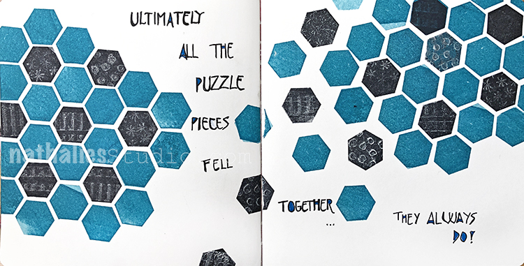
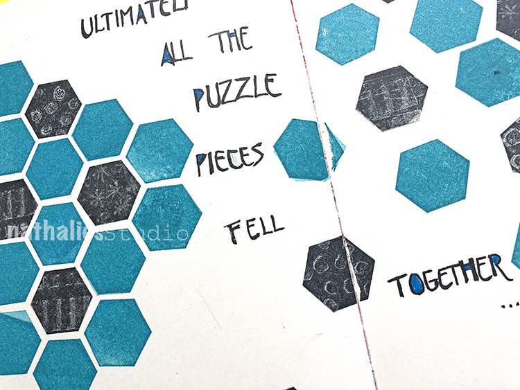
“Ultimately all the puzzle pieces fell together… they always do!”
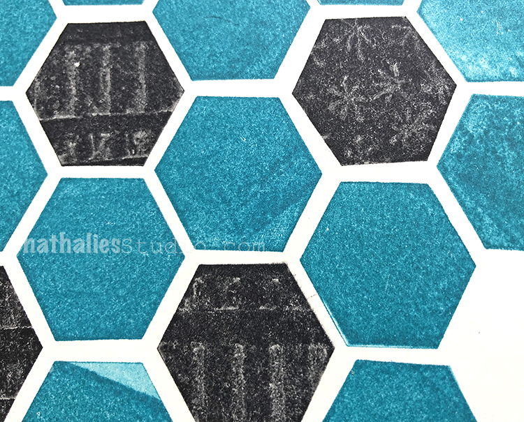
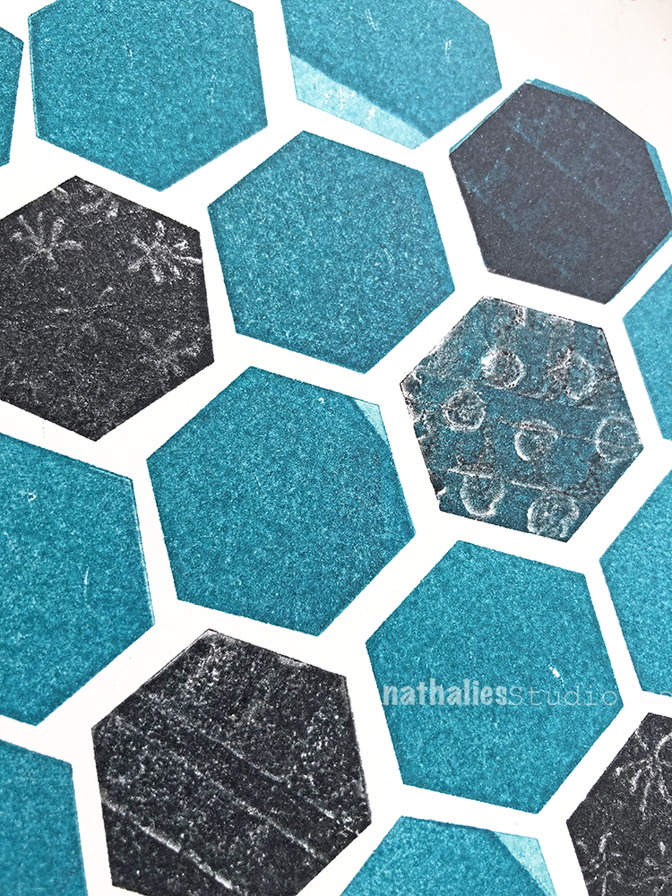
I used the stamp kissing technique with this art journal spread – inking up my Solid Hex Small stamp, then pressing a patterned stamp (here my Grannies, Star Fish, and Blocks stamps) into it to remove ink, and then stamping the hex onto my paper. It’s a great way to use solid and patterned or textured stamps together.
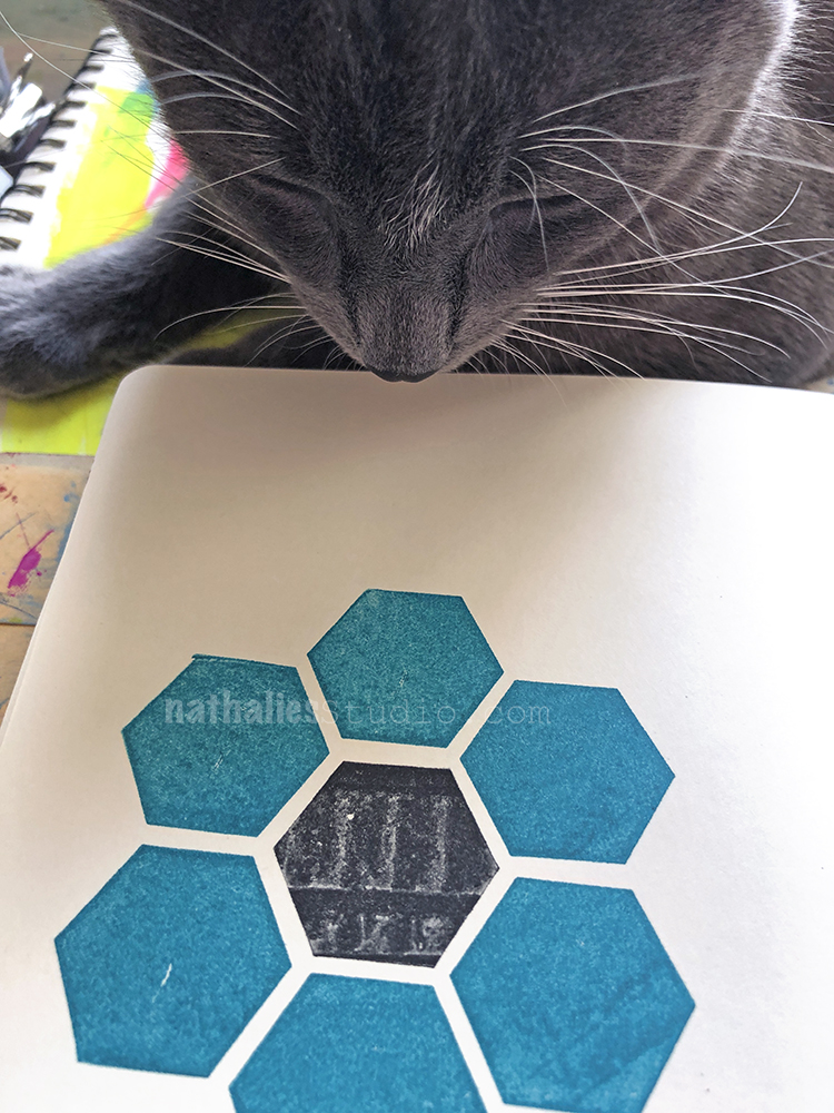
Oh look who showed up to give his kitty inspection? Pretzel always likes to get involved in the studio lol
I tiled up a pattern using plain Solid Hex Small stamps with teal ink and then went back into some with the stamp kissing in black ink.
I love that the stamp kissing gives a bit of grungy effect – almost looks like static on an old black and white tv or an old pixelated photocopy.
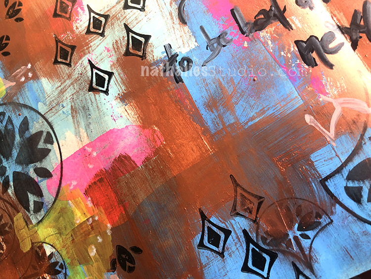
To finish it off I did my journaling with Winsor Newton fine liners.
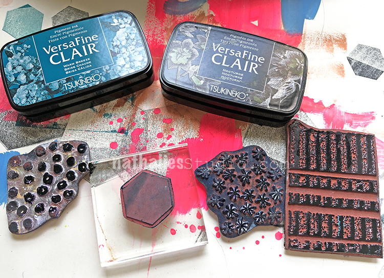
Here are some of the supplies I used:
And I hope you join me on Wednesday October 16th at 3pm EST for a Kaffeeklatsch chat on Facebook! I’ll be broadcasting live from my new studio and catching up with you on everything that’s been going on around here :) Stop by and say Hello!!!
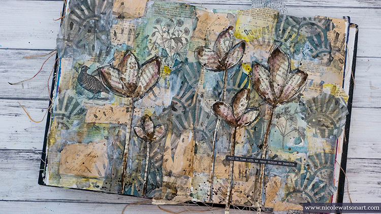
Hello again from my Creative Squad. Today we have a very special post from one of our NEW squad members: Nicole Watson! We are so happy to have Nicole on the team and are excited to share her incredible talent with you! Her project today is an art journal page that will have you swooning over layers :) She is using my Broadway Fan Positive Negative foam stamps and this month’s theme: Your Biggest Fan – Let’s give a shout out to someone who is doing an amazing job. In a world obsessed with Me Me Me it’s important to take a look around sometimes and give some encouraging words to another, and not just in your art and craft making :) Be their Biggest Fan!
I have to admit that I had more of what I wanted to do with the stamps in mind before figuring out how I was going to tackle the theme this month! For some reason I was really struggling just who or what I was going to pick to focus my journal page on, but as I was working on my concept, it clicked.
My idea was to create layers on my journal pages that looked like old wall paper through the years. This concept was partially inspired by binge watching Downton Abbyand looking at old photographs with my dad noticing how my grandma’s wallpaper on the stairs changed through time.
Here is a video for you and a writeup below:
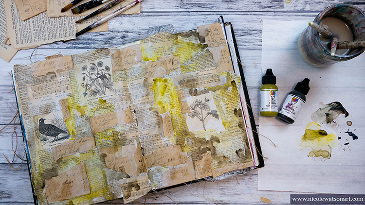
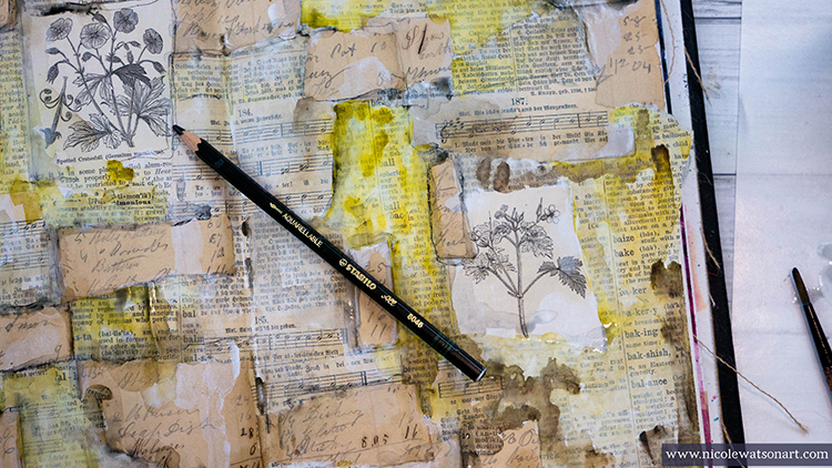
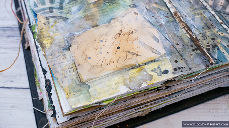
After gessoing my pages, I covered them with bits and pieces of book pages. I chose a variety to give that look of different wallpapers from encyclopedia pages showcasing the images, to a German songbook and a dictionary. Then I topped those off with bits of handwritten text from an old notebook and ledger. Next, I used some watered-down gesso to push some of the pages back and have areas that paint would cling a little differently.
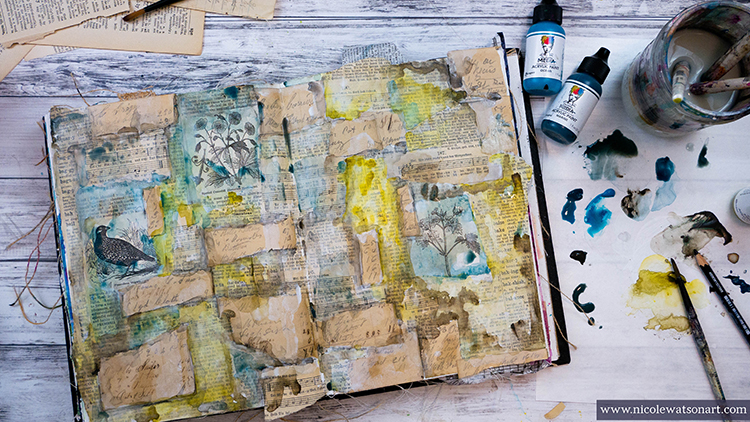
Once all the gesso and matte medium was dry, I began to add color to the pages mixing the colors with umber to add an old, grungy feel. I watered down the paint in places to allow it to flow and mingle with the other colors. After it was dry, I added some shadowing around some of the papers with the stabilo all by tracing and then activating it with water.
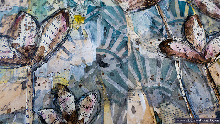
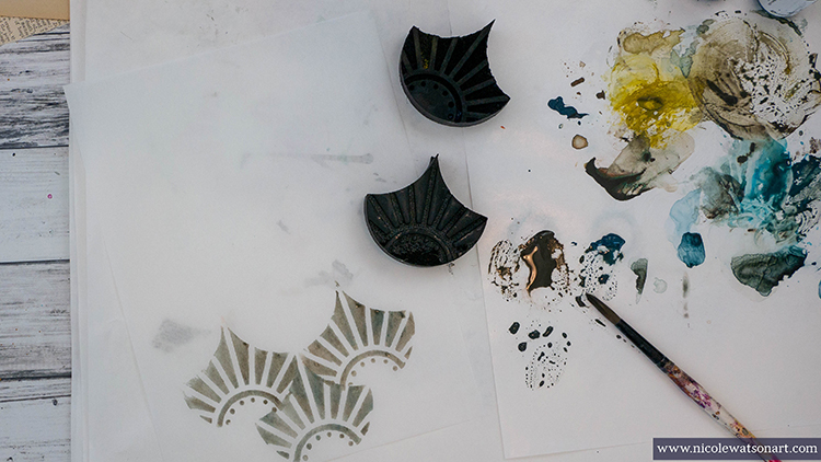
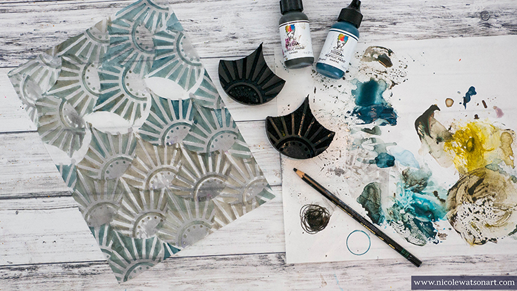
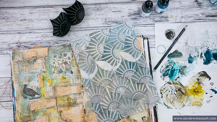
To create the final layer of wallpaper, I used Nat’s Broadway Fan Positive Negative Foam Stamp. I didn’t want to stamp directly on my previous layers, because I didn’t know exactly where to put the stamp, and wanted a more torn look than a perfect stamped image. So, I stamped both the positive and negative images on tissue paper, one with paint and the other with stabilo! To stamp with the stabilo, simply scribble onto a slick surface (like palette paper) and add water to make what I like to call, a stabilo puddle!
I stamped the pattern both vertically and horizontally on the tissue paper, because the paper only tears well in one direction. Then, I tore the paper apart and stuck it to my journal pages. I wanted to extend the pattern a bit, so I stamped some additional fans with the stabilo puddle directly on the journal pages.
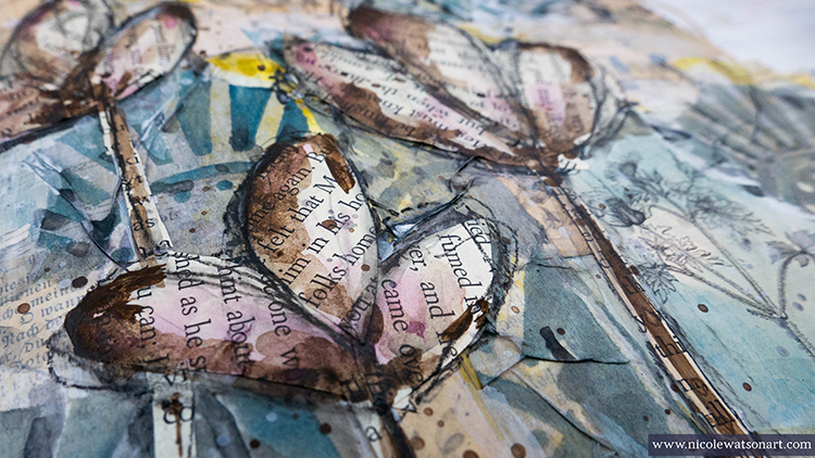
Then, I needed to figure out where to take these pages next and how to attach the theme. I drew some flowers with my charcoal pencil (so I could wipe them off as needed!) and painted them in. I didn’t like how this turned out, so I cut flower petals and stems from book pages and covered them up! I added some gesso here and there for some more white, splattered some of it, filled in the flowers with some sepia ink and a tiny bit of eggplant paint, splattered the ink and then thought about my pages.
It was hard for me to nail down who/what I’m the biggest fan of. My interests and fandom change yearly and sometimes even daily! I am a huge fan of all of the wonderful artists that I’ve connected with over social media, different musicians, musicals, shows, and movies.… and, well, coffee. This reminded me so much of those wallpaper layers. We often have a change of heart or something we like …. but those layers are still there creating the picture of who we are. It’s fun to tear them back and reminisce.
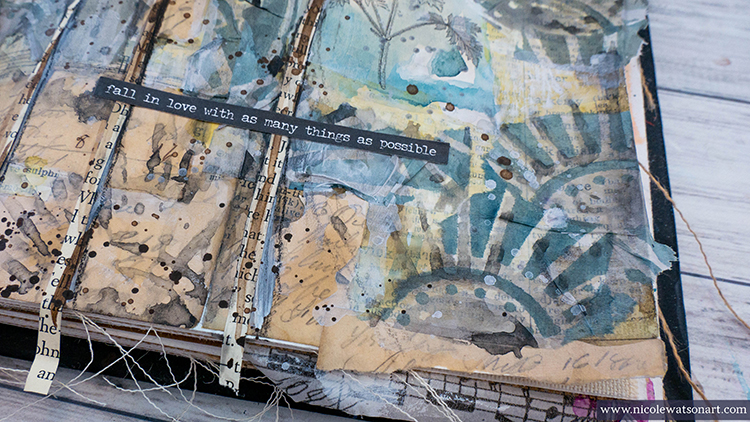
I topped my pages off with a sticker that expressed how I was feeling perfectly: fall in love with as many things as possible.
Thank you Nicole! Love hearing your thoughts behind your creative process and then seeing the beautiful results :) Want to give Nicole’s project a try? You can find all my Foam Stamps in my Online Shop and in addition to book paper, here are some of the other supplies she used:
Feel inspired? Working on something yourself that you’d like to share? I love to see how you interpret our monthly themes. Email me or tag me #natkalbach how you used my stencils and stamps – I would love to share your projects in my next “n*Spiration From Around the Globe“.
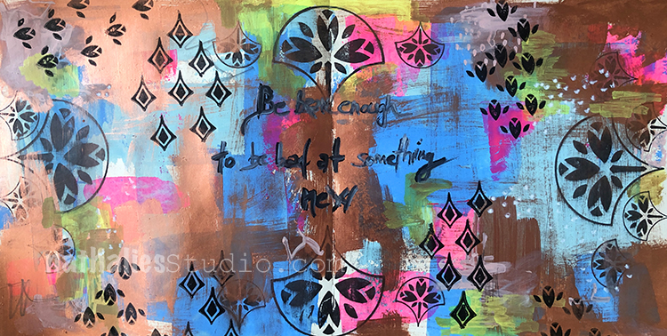
“Be bad enough to be bad at something new.” – This quote totally makes me wanna just go for it when trying something new. Who cares?!
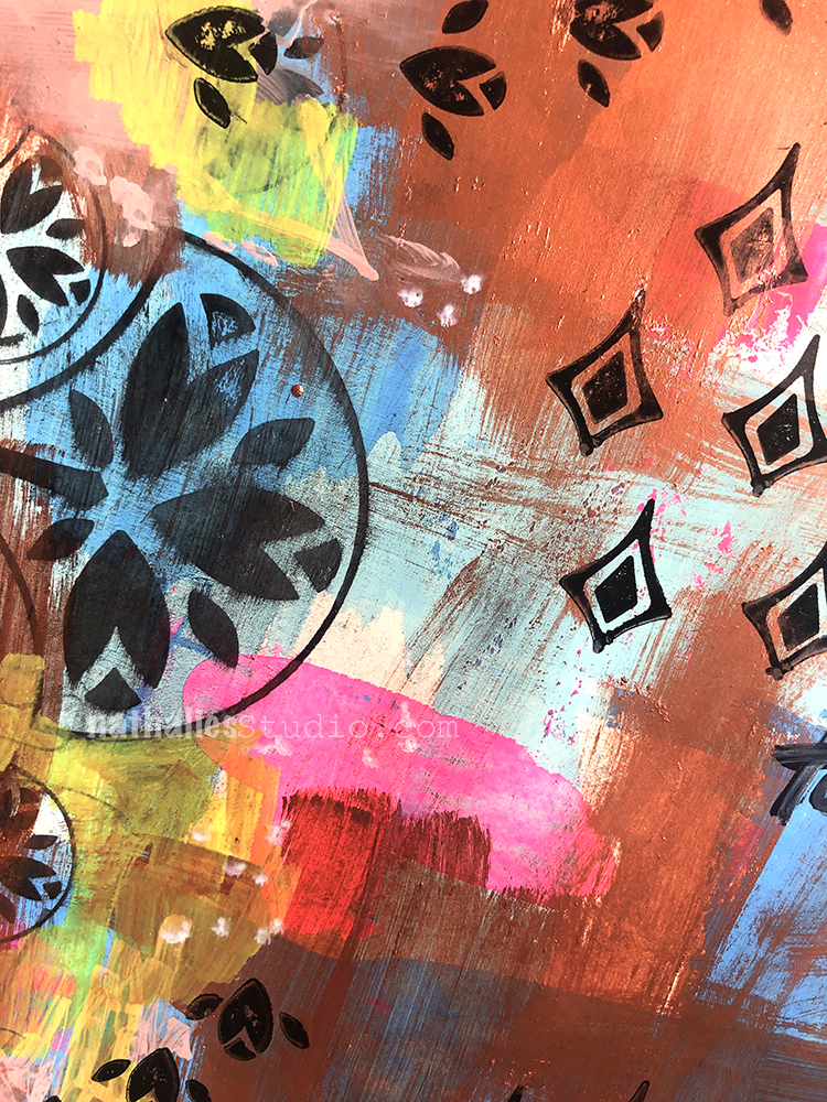
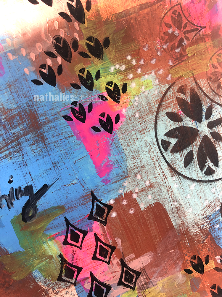
This one is all about yummy layers. I started with a thin layer of Holbein gouache, and stamped with my Fanfare and Fantastic Small and Large rubber stamps.
Then I dry brushed the copper paint (I made the paint in this class) over parts of it after stamping, added some markmaking and journaling with markers.
I love the play back and forth with all the layers.
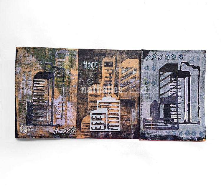
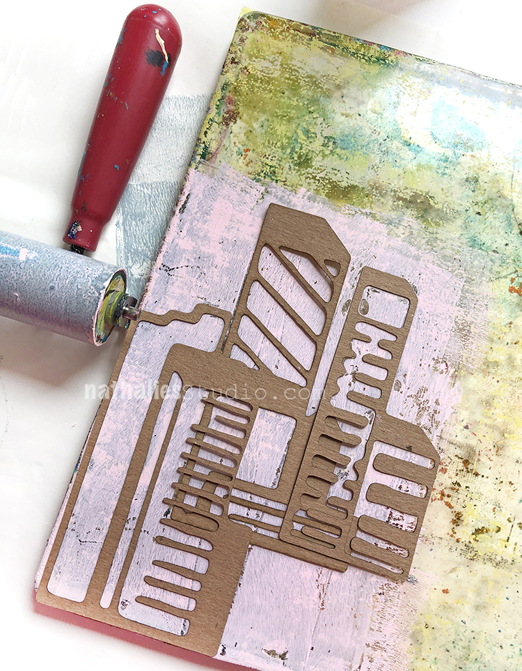
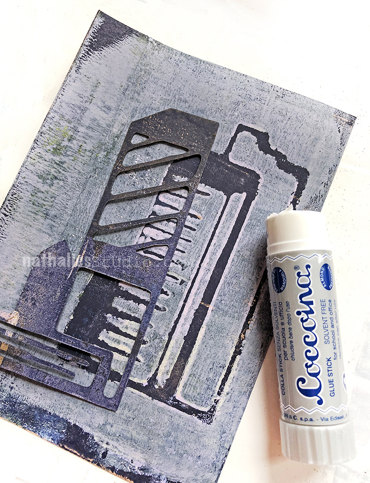
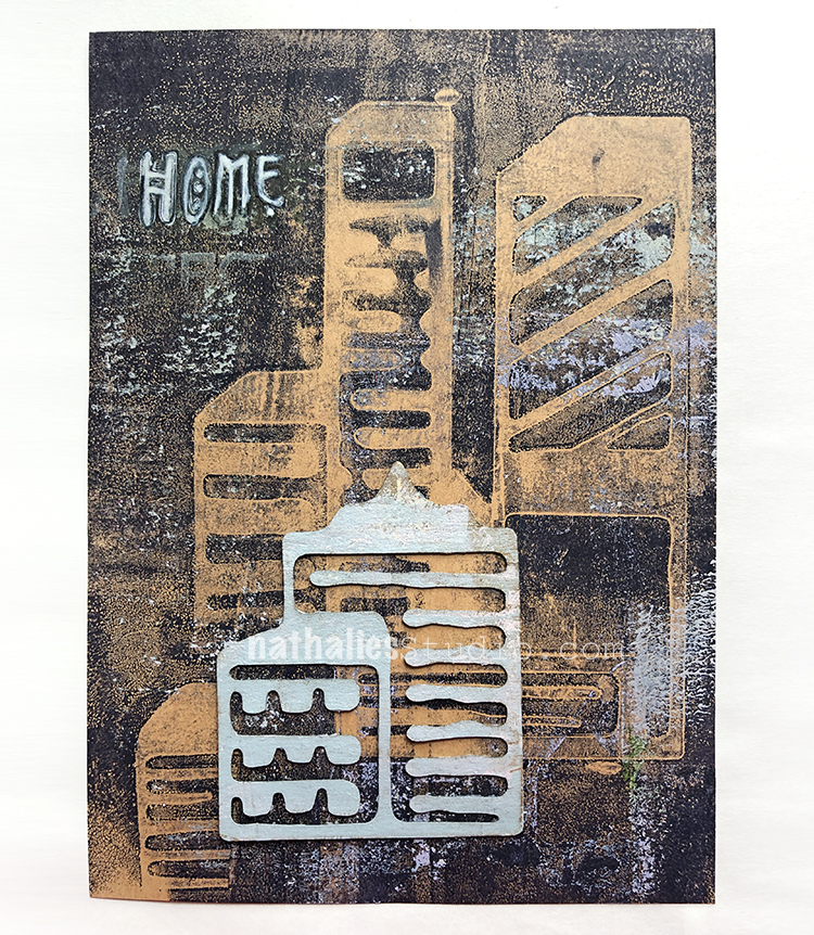
I thought I would make a few cards using a monoprinting technique with my new Mixed Media Chips.
On a gelli plate I rolled out some acrylic paint with the Midtown 1 and Midtown 2 chips.
Then I printed directly onto blank cards. To attach the chip, I used Coccoina glue stick. I always loved this glue stick- smells a bit like almonds and I am so happy that I found it now also available in the states. It is great for paper and thin paper embellishments.
In addition to my nice and grungy monoprint I also stamped part of the My Home rubber stamp on this one.
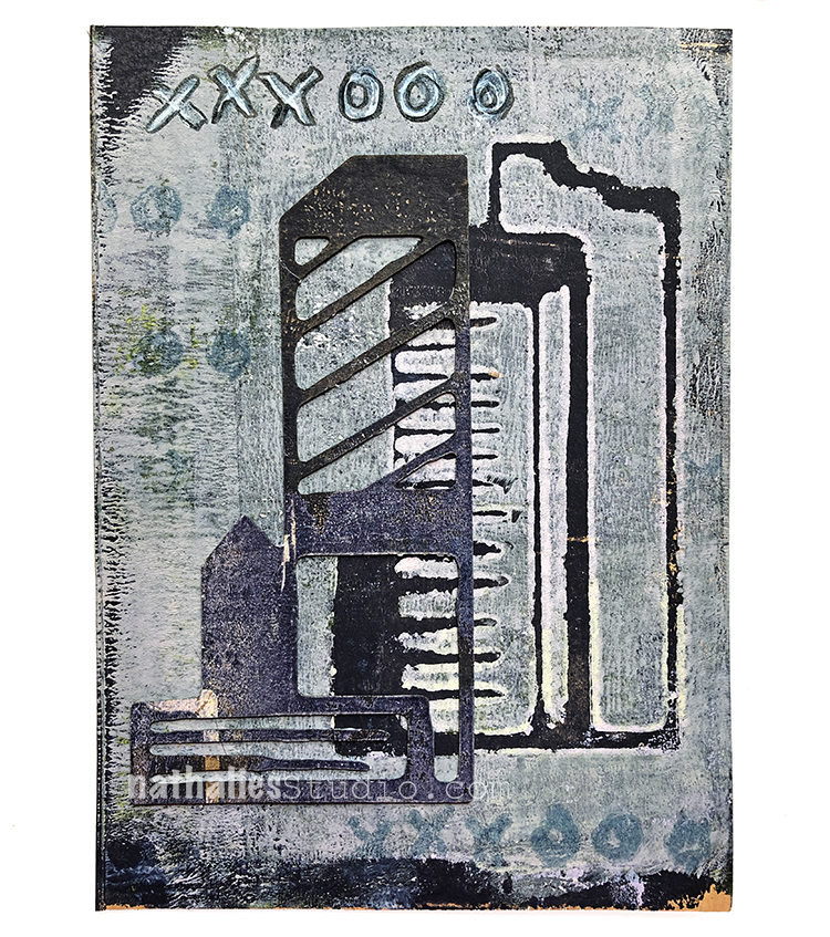
This one I snuck in my Love Knots stamp for the xxxooo.
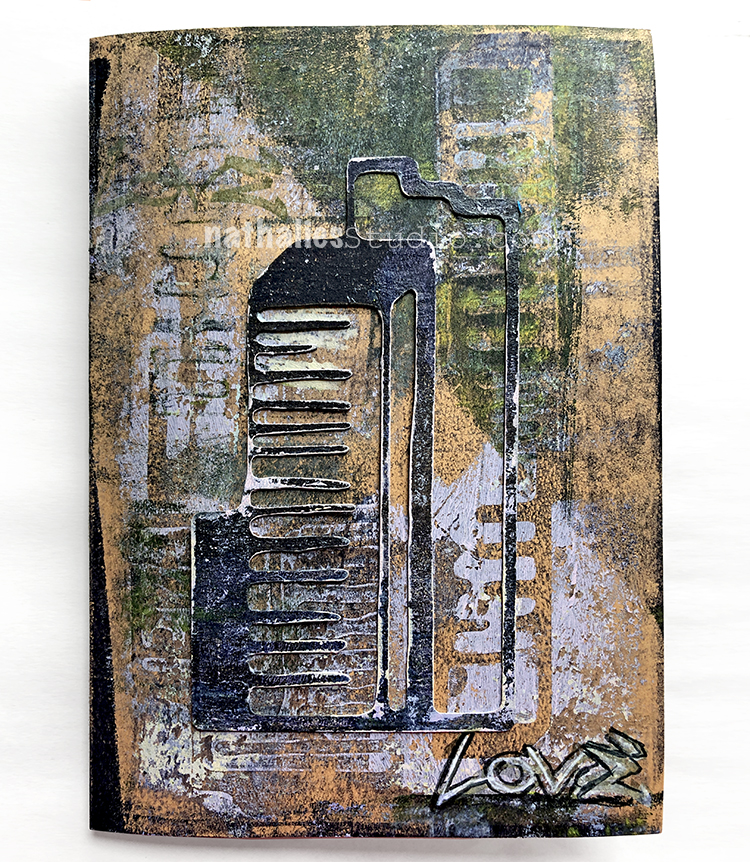
And this one got really yummy grungy and then I also added my Love Tag stamp. I’m really happy with how they turned out, especially with the addition of the painted Mixed Media Chips.
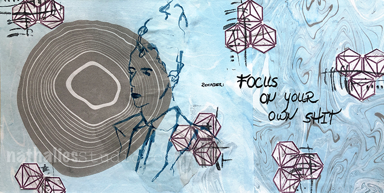
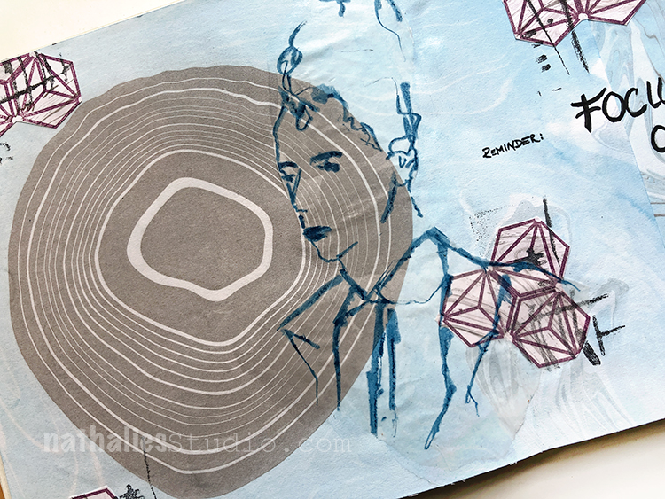
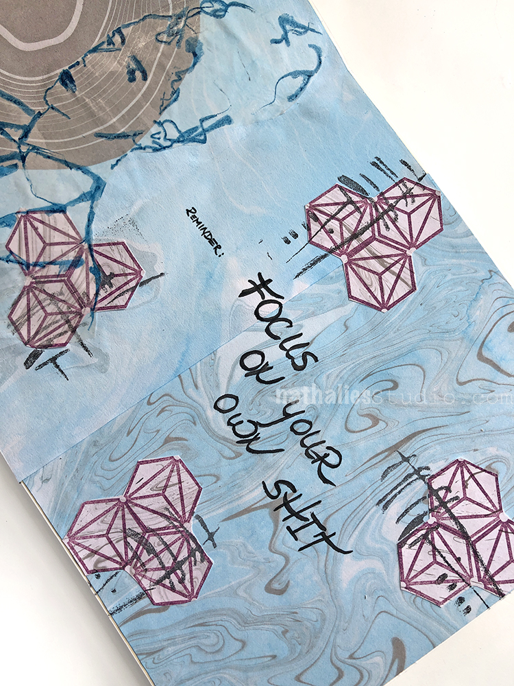
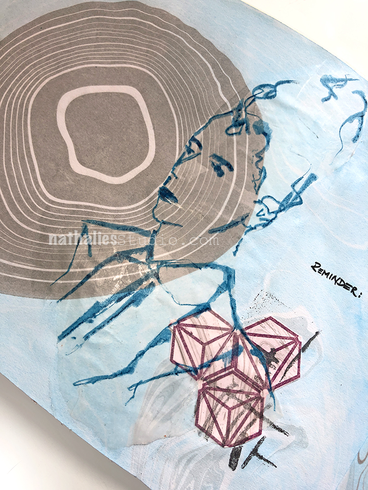
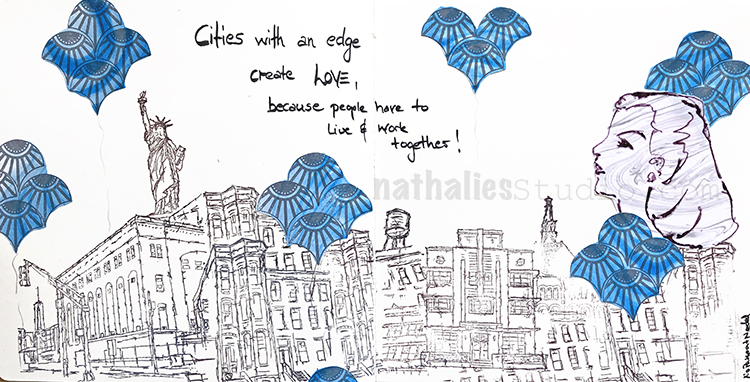
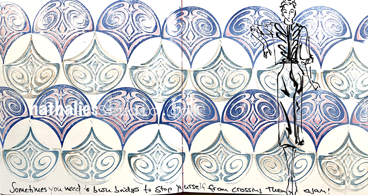
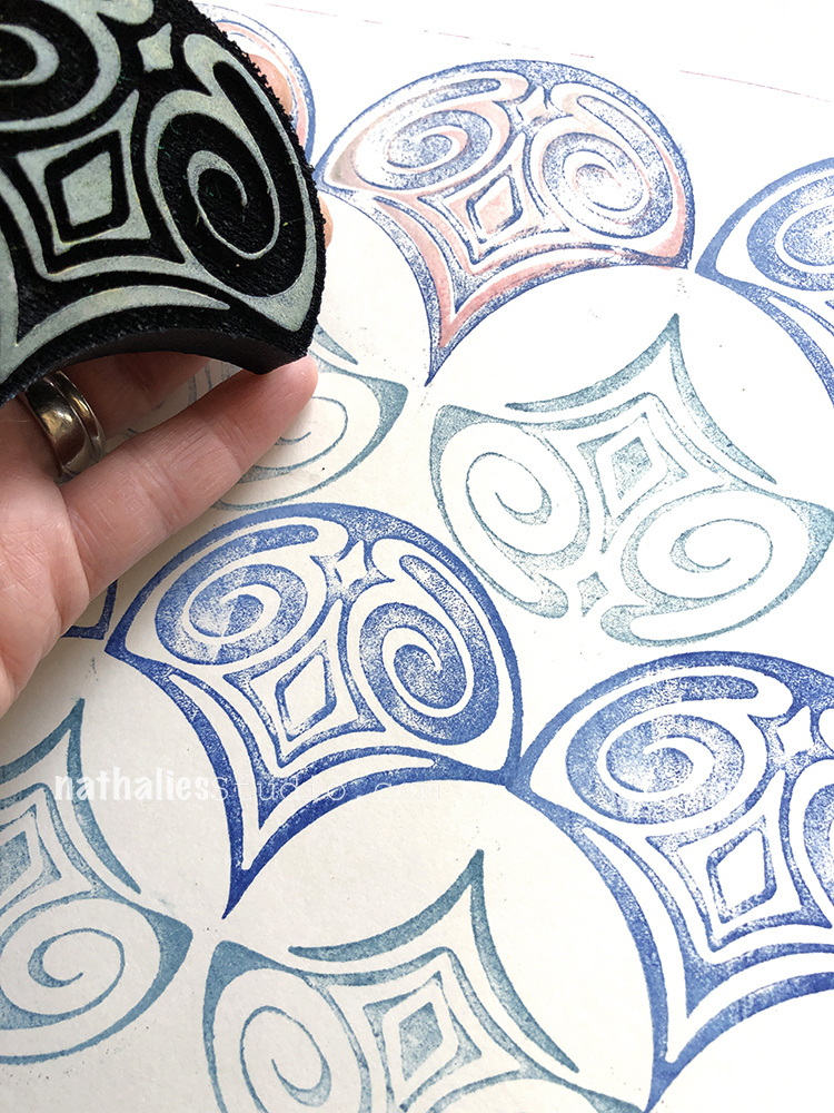
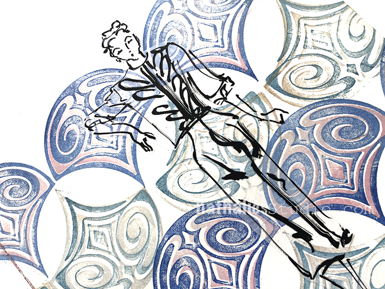
I used my Suminagahsi paper -and pasted two different sheets into my journal as the background. And I added a sketch on Deli paper.
I stamped on one of the Suminagahsi papers with my Hex Small stamp and cut them out. After adding them to the page I also stamped my Gnarly foam stamp over top to tie everything together.
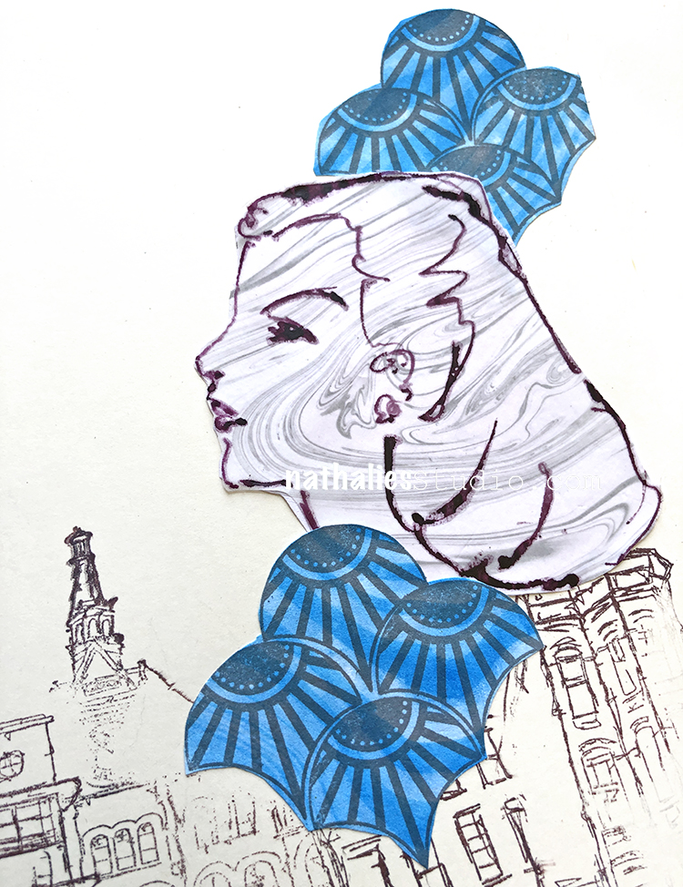
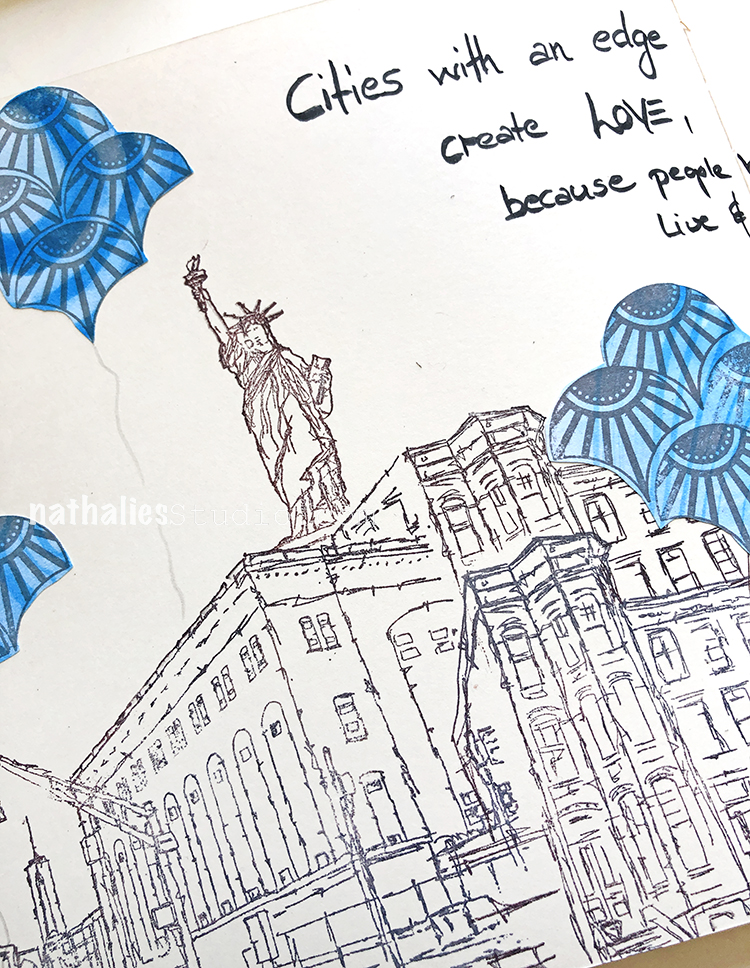
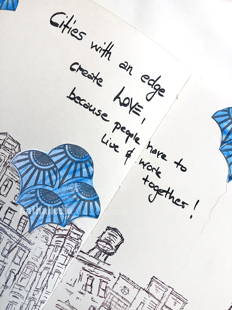
“Cities with an edge create love, because people have to live & work together!”
I used my suminagashi paper that I marbled for collage – both in the figure and in the blue “balloons” that I stamped with my Fan-tastic Small rubber stamps.
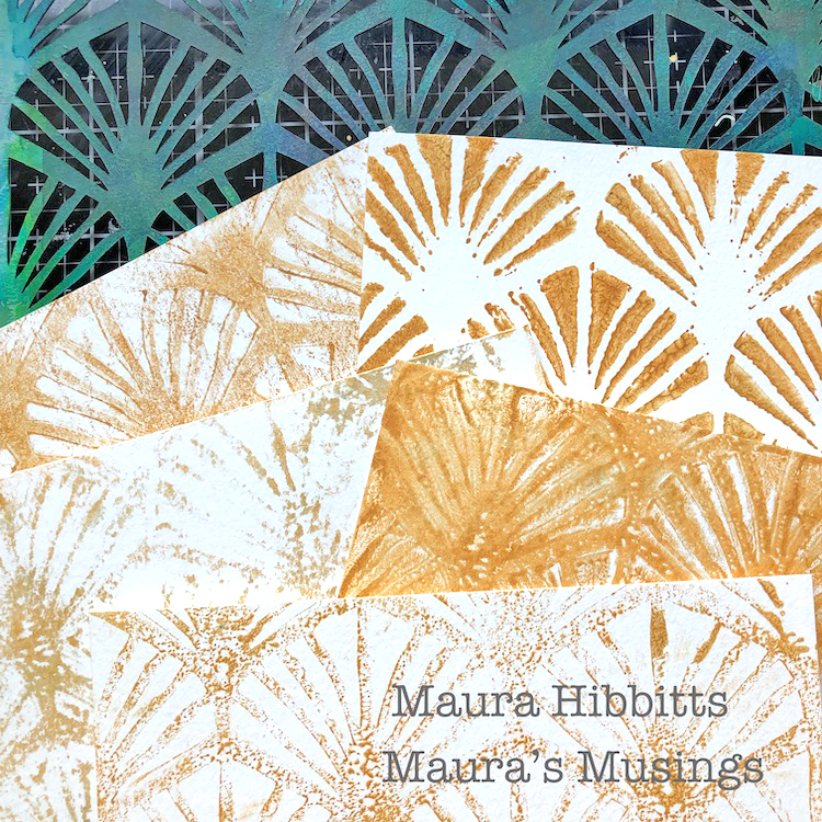
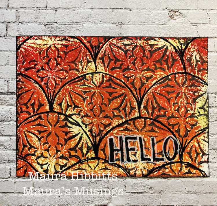
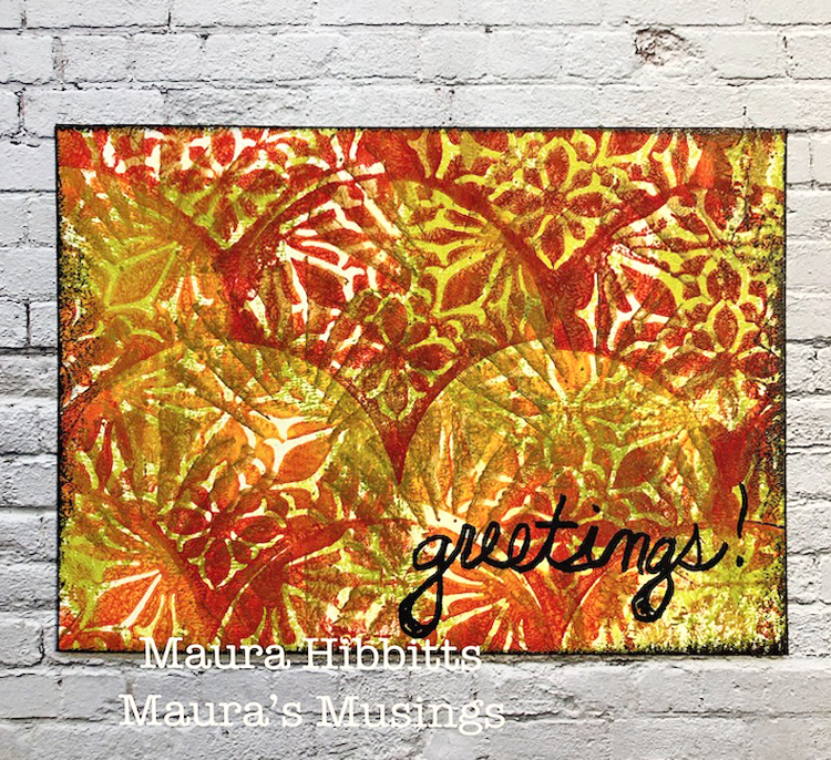
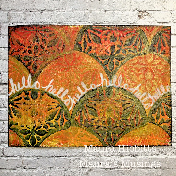
Hello from my Creative Squad! Today we have a series of cards from Maura Hibbitts that will inspire you to send a greeting to everyone in your life :) Maura is using my Van Vorst Fan Positive Negative foam stamps, my Art Deco Wallpaper stencil, and this month’s theme: Your Biggest Fan – Let’s give a shout out to someone who is doing an amazing job. In a world obsessed with Me Me Me it’s important to take a look around sometimes and give some encouraging words to another, and not just in your art and craft making :) Be their Biggest Fan!
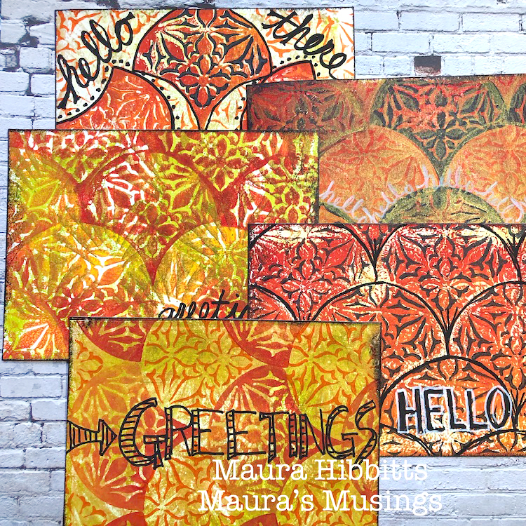
How do you choose the most awesome person in your life, or who has inspired you the most? I would have to include my family, friends, artists, musicians, authors and many more. Some days it might be the barista handing me my much needed coffee, or the mechanic fixing my car so I can get back on the road. Many days it is not even a person, but the natural world…Mother Earth. So I decided instead of focusing on just one person, that I would create some postcards that I can send to a few people and let them know how much they mean to me. The trees are dressing themselves in beautiful autumn colors where I live, and that inspired me to choose my color palette for this project. Happy Fall everyone!
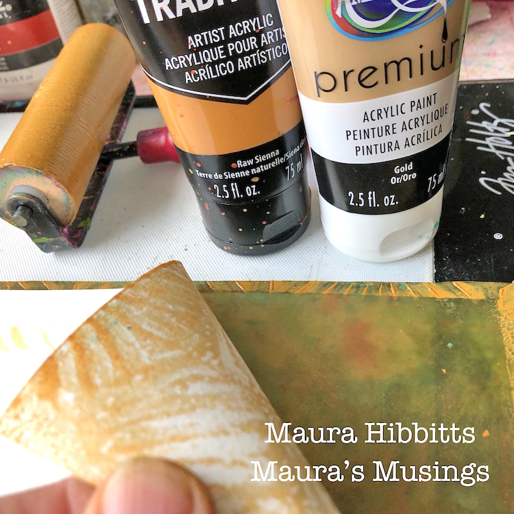
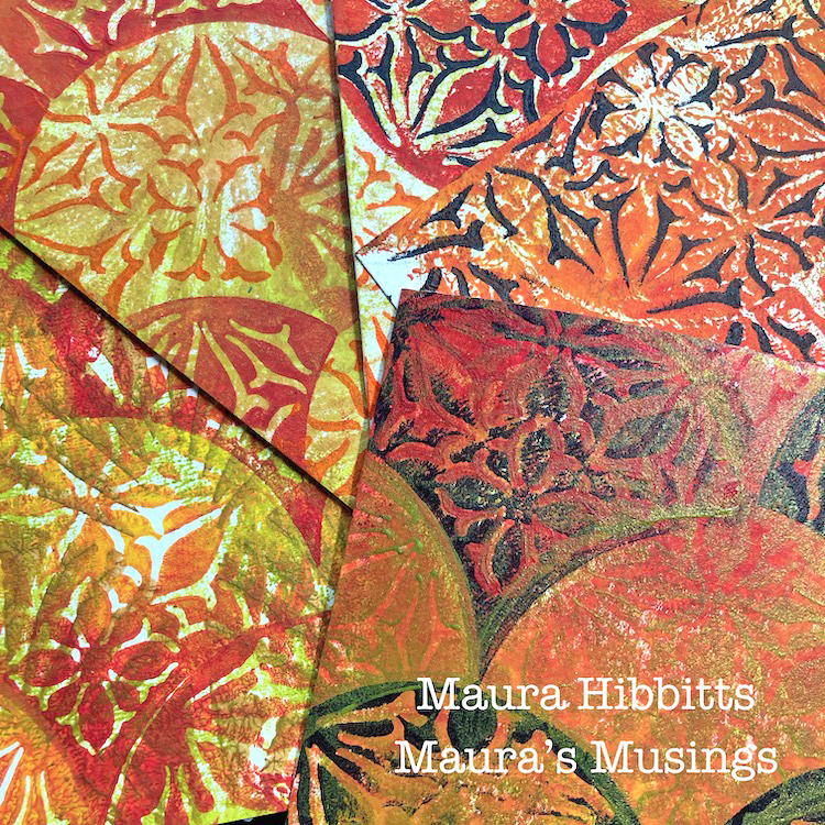
I cut large sheets of watercolor paper into 4.5 x 6 inch rectangles for my post cards. I began by blending Raw Sienna and Gold acrylic paints on my gel plate with the brayer, and laid the Art Deco Wallpaper stencil on top. First pull was a paper over the stencil, then, lifting the stencil and pressing it down on a second sheet. I finished up with several pulls on the gel plate. Check out the wide variety of designs you can get by switching it up just a bit.
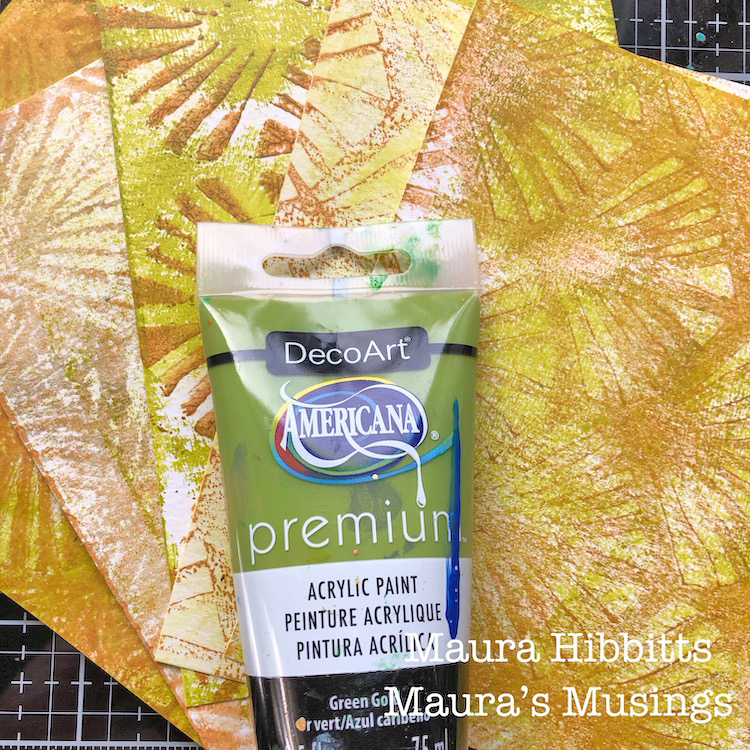
When you look closely at the trees, you can still see the green under a lot of the bright colors, so I wanted to add a bit in. I put a light layer of Green Gold on the gel plate and lightly pressed my papers over it. I also used a baby wipe with the extra paint and blended it in here and there.
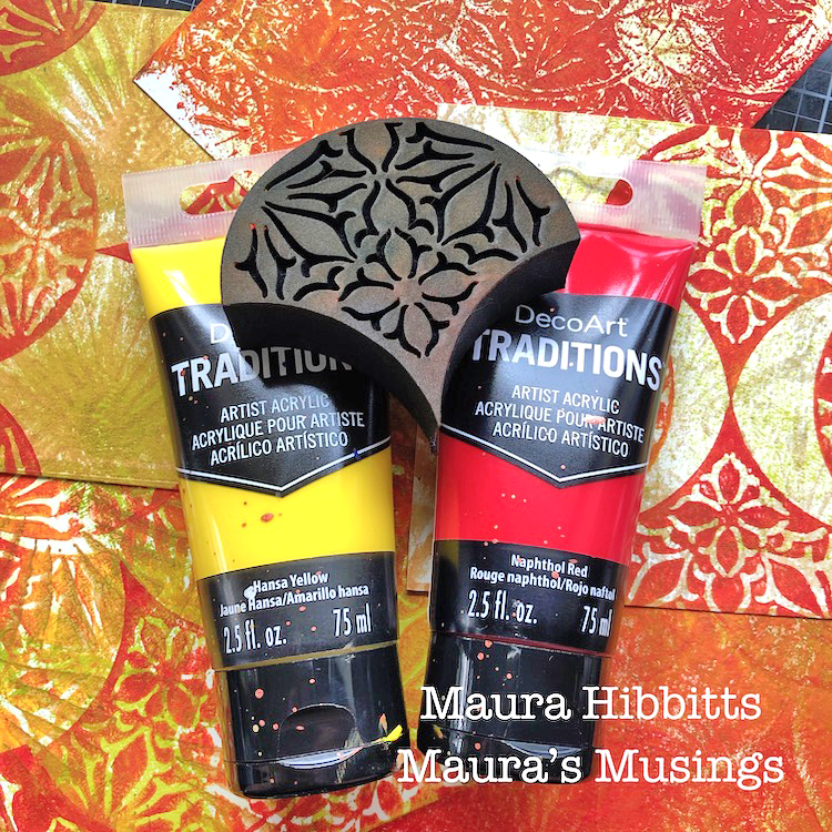
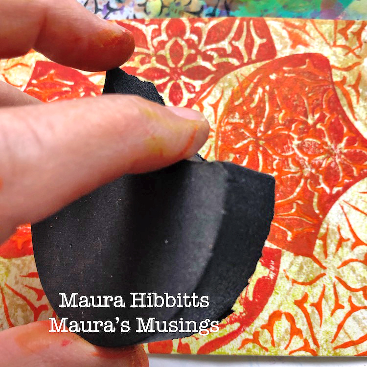
Now comes the fun! I put a layer of Napthol Red at the bottom of the gel plate, and a strip of Hansa Yellow at the top, then blended them with the brayer. I stamped into this with the Van Vorst Fan Positive Art Foamie and began stamping my postcards in a variety of patterns. TIP – whenever you stamp with paint, clean the stamp off right away. I use baby wipes, a mister if I need it, and sometimes an old toothbrush if it is not all coming off.
Next up, stamping with the Van Vorst Negative Art Foamie. On some cards, I used Cadmium Orange Hue, on others Payne’s Grey, some I mixed in a bit of Gold, and others I left alone. I wanted a variety. I messed up on one card, so even went back in and stamped the positive with the grey and green gold to “fix” it.
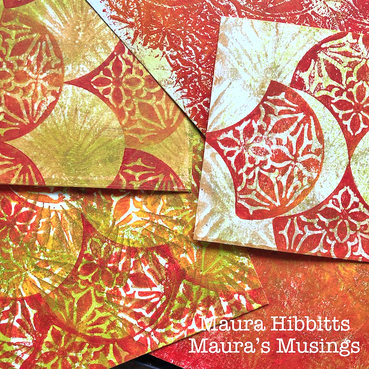
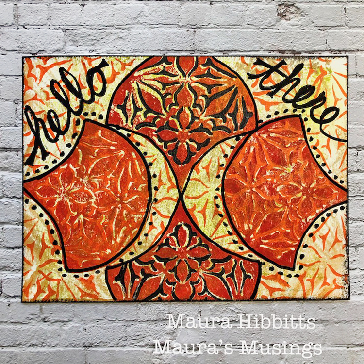
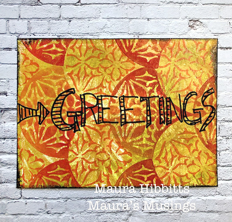
I added detail and words with black and white Posca paint pens, and edged the cards with black archival ink. I wanted to be sure to use all waterproof materials since these will be going through the post.
Just look at what you can do with two stamps, a stencil and a few paints! I would have a completely different set of postcards if I switched out my materials. Hmmm, I may just have to make a set with my favorite color palette – green, blue and purple. Why not give it a try yourself and make a set of cards or postcards to send to someone you admire?
My set of postcards in autumn colors and fun designs are ready for me to tell a few people how much I admire them…after all, I am their biggest fan! (and isn’t the fan shape a perfect tie in to this theme?) I hope you have fun thinking of who you admire, and creating a little something special to let them know! – Maura
Thank you Maura! We absolutely love these autumn colors and your message :) Want to give Maura’s project a try? You can find all my Foam Stamps and Stencils in my Online Shop and here are some of the other supplies Maura used:
Feel inspired? Working on something yourself that you’d like to share? I love to see how you interpret our monthly themes. Email me or tag me #natkalbach how you used my stencils and stamps – I would love to share your projects in my next “n*Spiration From Around the Globe“.
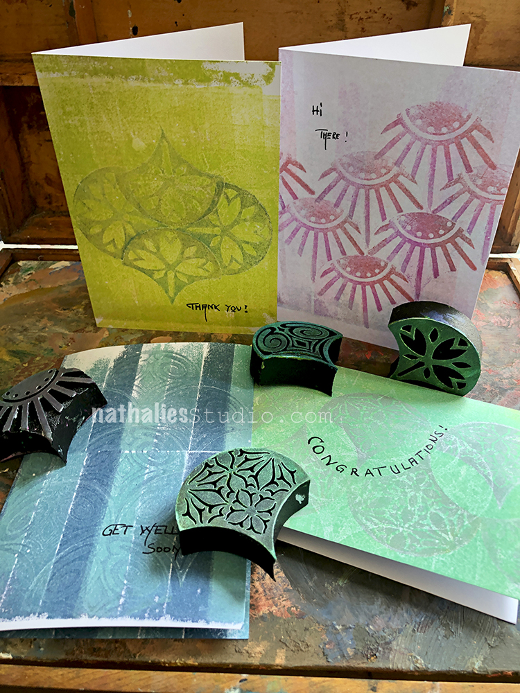
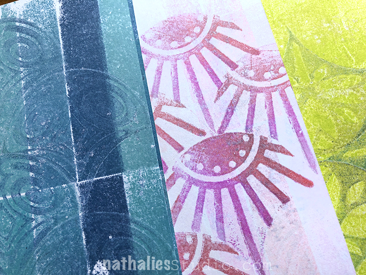
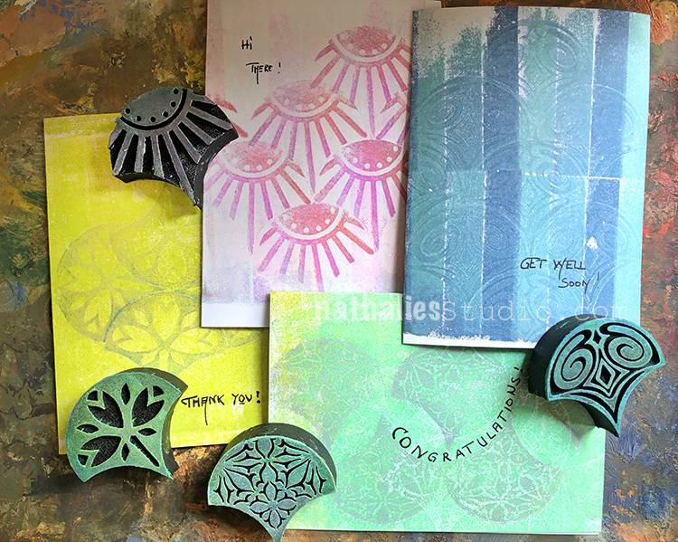
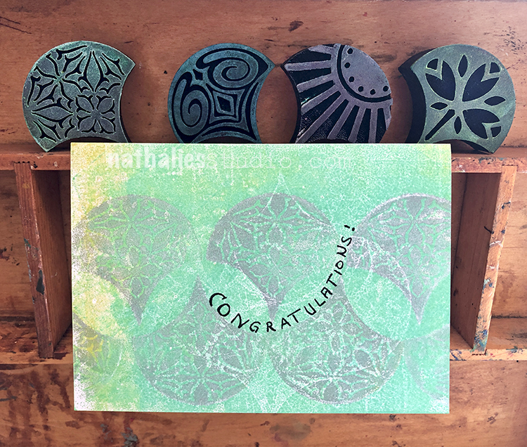
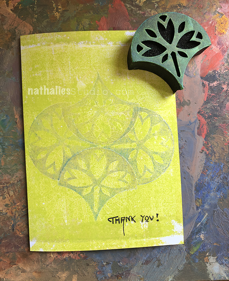
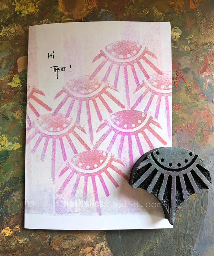
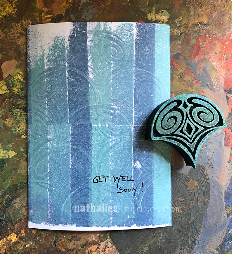
I thought it might be nice to play with my Mini Fan Set foam stamps and a Gelli plate to make a few cards.
I used Hero Arts ink pads as well as Memento inks on the gelli plate and then just stamped into the inked up plate and put the cards on top.
I used a fountain pen for my sentiments – lots of options here so I made a variety.
Here are some of the supplies I used:
And don’t forget: today is the final day to sign up for my new online workshop Artful Adventures with Andy Warhol at the Early Bird price! Early Bird Pricing ends TONIGHT, October 7th at 11:59pm EST. This workshop will show you how to interpret some of Warhol’s techniques into your own art journaling and artwork. Collage, repetition, stamp carving and more will be covered. Join us in the classroom! Class begins TODAY!

I look forward to seeing more of your art Nicole.
This art journal spread is great. Layers and layers!
Reply