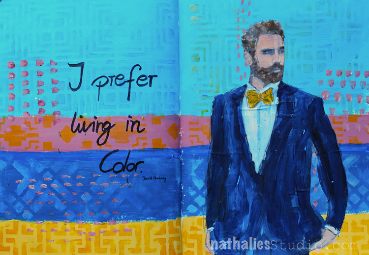
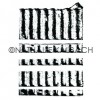
An unusual color combination for me but inspired by David Hockney – a very straightforward but fun page with some stencil play.
Here are the supplies I used:


I think I want to discover this color combination a bit more. Do you like it?
Nat

An unusual color combination for me but inspired by David Hockney – a very straightforward but fun page with some stencil play.
Here are the supplies I used:
I think I want to discover this color combination a bit more. Do you like it?
The Sustainable Souls Project is a monthly artist collaboration inspired by sustainability issues, concerns, ideas, and thoughts. Each month, they pick a sustainability topic and create awareness through art, using the monthly theme as inspiration. Projects may include art-journaling, mixed media, assemblage and more. The idea is to create awareness around Sustainability through art, one paint stroke at a time! As this is a topic close to my heart I am happy to participate this month.
This month’s theme is
Alternative Energy, Solar, Wind, Water, Biogas- and here is an art journal page I created with the topic in mind:
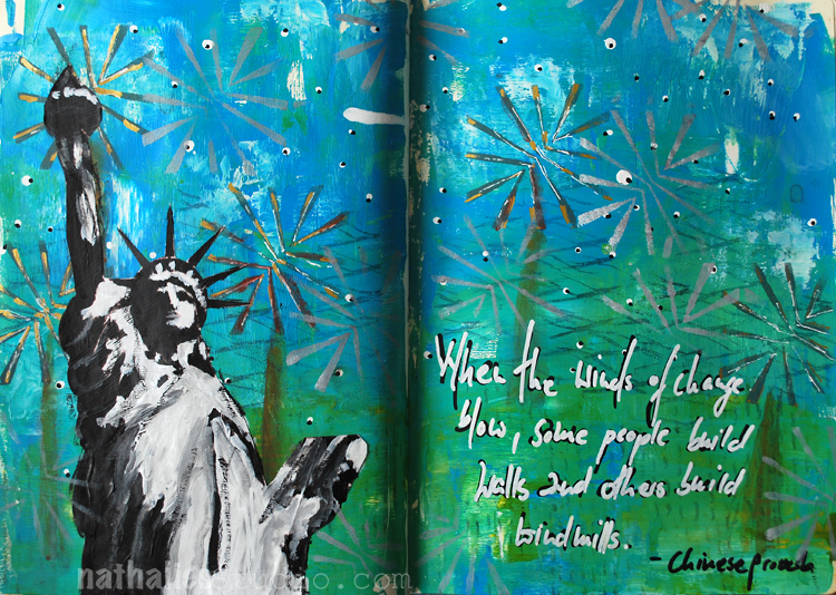
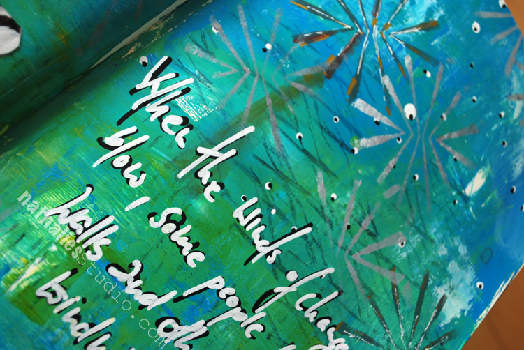
I found this quote on pinterest a while ago and I remembered it instantly when I saw the topic of this month. “When the winds of change blow, some people build walls and others build windmills.”
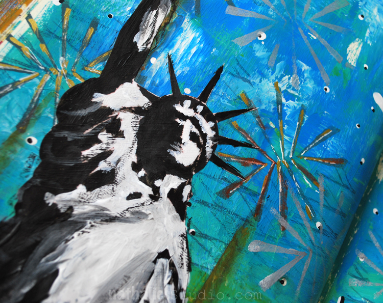
To represent the windmills I used part of my Beacon Stencil . Renewable Energy has been a topic in Germany, where I come from, for a very long time – in fact Germany is called ” the world’s first major renewable energy economy”. As of the beginning of 2017 30% of Germany’s power is now generated by renewable sources, with a long-term target of 80% by 2050. This increase of renewable energy has resulted in plummeting energy costs which is a nice side effect even for those that do not believe that our planet has only a certain amount of resources and that there is no Planet B .
Do I find windmills an eye sore? An interesting question which I have been asked before …Not really …I guess as I am used to seeing them especially coming from a flat windy northern part of Germany with loads of those windmills. I find them more attractive, safer and can live better with them than living next to a nuclear power plant…that is for sure. I hope that more countries will explore and invest in renewable energy and make it a goal to mostly use it in the near future. For me it just makes sense, more sense than building a wall.
Better than walls! So true. I don’t mind windmills at all and it only makes sense to use more renewable energy.
Unfortunately President Trump doesn’t see a need to use alternative energy (oil is just fine)…sorry to start a rant…I like your page very much and the quote too. Have a happy weekend Nat!
I am with you! Have a great weekend too Sue!!!
Oh Nat! What a beautiful spread and I love your words and story behind the page. I agree, windmills are much more attractive and sustainable! I wish the US would support sustainability more…but hopefully we are creating awareness, one art piece at a time. ♥
Awe- thank you Tina! Love your motto – creating awareness, one art piece at a time
Wow Nathalie I just love this post. Very moving and inspiring. Your art is breathtaking and as for me I love windmills. I personally think they are beautiful certainly much nicer looking than some smoke stack pumping out black smoke. And the quote you used I totally love. Green in large amounts is my “struggle color” and I love how you used it here !!! Thanks for sharing your art and inspiration with us ❤❤❤
thank you so much Sherry for you wonderful words! I agree on the windmills versus smoke stack pumping out black smoke. Have a gorgeous week!
In the mornings I play in my art journal to get myself into the creative groove and break the ice – so to speak- and get ready to paint. I recorded and fast forwarded my morning ritual for this video – and hope you enjoy it. Take it as what it is – a morning art journal play- not a tutorial.
Creative Icebreaker #8, April 2017 from Nathalie Kalbach on Vimeo.
Here is the art journal spread I created in the video
Here are the supplies I have used in my Creative Ice Breaker video above – some links are affiliate links.Please note that my Manhattan Minis will be available soon- some select stores carry them already (The InkPad, Scrapbook Centrale) and I will soon too :) )
I hope you enjoyed the little glimpse into my morning warm up play! Have a wonderful and creative day!
I love your creative ice breakers they are so fun to watch you create!!! Thanks for sharing and such a beautiful page !!! xxoo
Awe- thank you Sherry! have a gorgeous and sunny weekend
Lots of things are going through my mind lately and this quote in my art journal truly resonates with me.
I just received my new Dina Wakley Art Journal yeahh. I was so impatient to finally hold it in my hands ever since I saw it at the AFCI (former CHA) show in January. If you haven’t seen the journal yet, it has different surfaces including burlap, canvas, cotton rag, watercolor paper, and kraft paper. It won’t be my everyday journal, as I love to work in double spreads, but it is a great journal for forcing me out of my box with its fun opportunities and possibilities of paint applications. I am so stoked about it.
This spread was created on a watercolor spread in the book- I love the texture . I also played with some of Dina’s paints. I layered my hood stamps and colored them in.
For the stars in the sky I used my Star Fish stamp with some white ink and finished the spread with the quote written with a white sharpie.
Here are some of the supplies I used for this spread:
I wish you are wonderful day <3
Beautiful page !! ??
Thank you so much Torsa <3
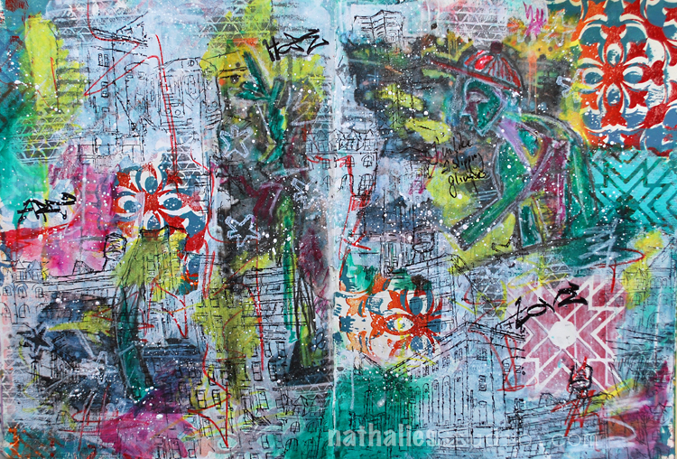
Each new glimpse is determined by many, many glimpses before. It’s this glimpse which inspires you — like an occurrence. And I notice those are always my moment of having an idea that maybe I could start a painting… As a matter of fact, I’m really slipping, most of the time, into that glimpse. I’m like a slipping glimpser.
-Willem de Kooning
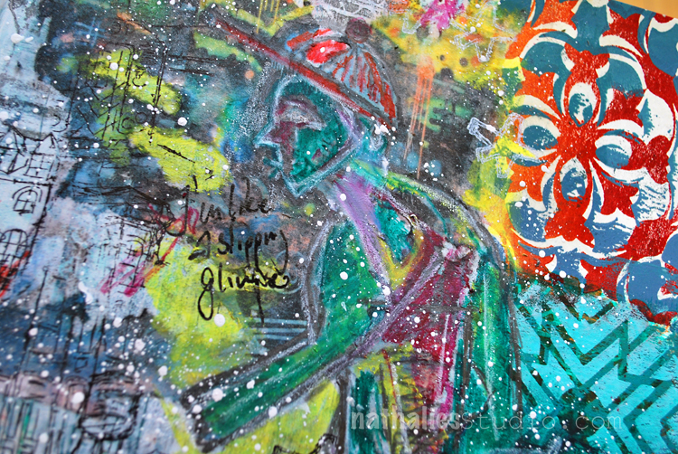
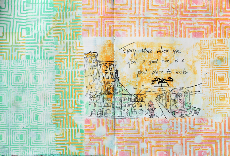
I had such a fun time playing with this spread. Some stamping with the Versailles and Toledo Foam Stamps and Acrylic Paint .
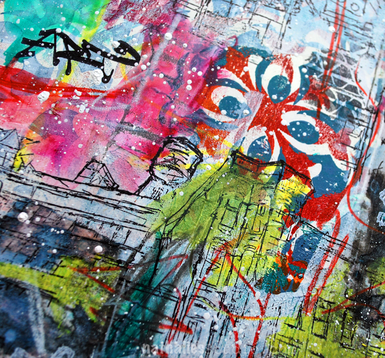
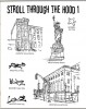
I transferred some parts of a photo of a graffiti wall I took in San Francisco with Gel Medium and stamped in between with the Stroll Through The Hood 1 and Stroll Through the Hood 2 as well as the Cardboard Stamp Sets.
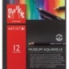
I also played with my newish Caran’d Ache Museum Aquarelle Pencils – I basically dipped them in water and then went to town creating color blocks and marks. LOVE how vibrant they are !
I love the grungy look of this spread – I am super happy how it turned out. Here are some of the supplies I used – some links are affiliate links
The layers and layers are awesome.
I must challenge myself to doing a page with this many layers!
Yeah- do it! it is so much fun !
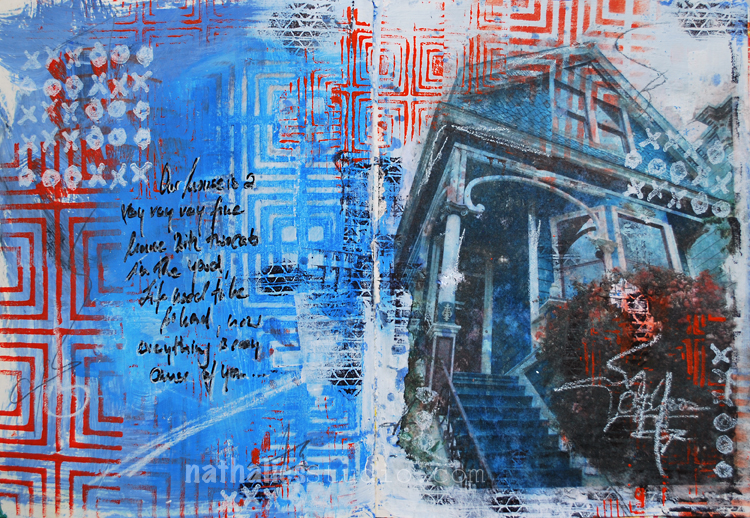
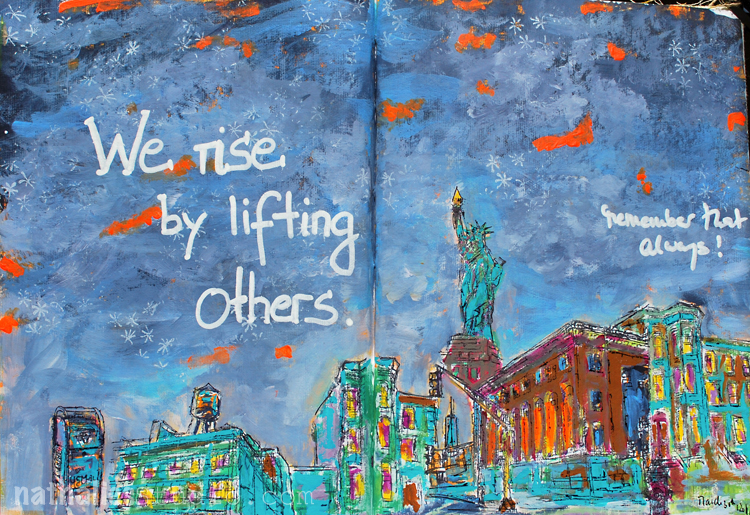
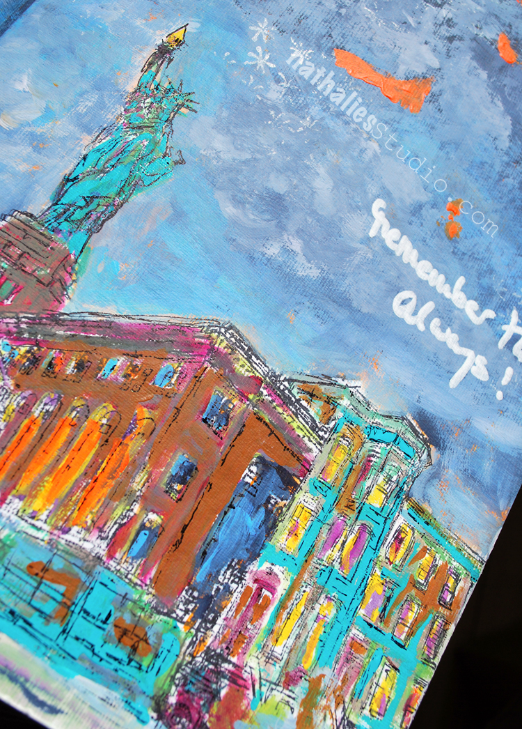
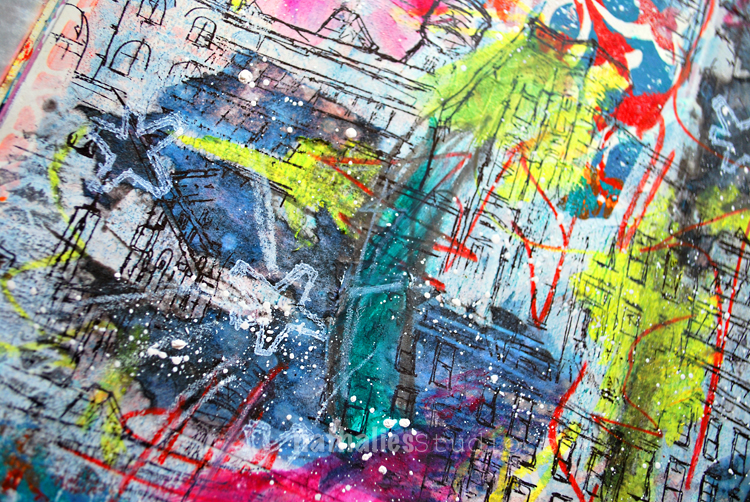
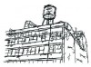
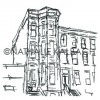
Every once in a while when I see a house I would really love to live in I have this song by Crosby Still Nash and Young in my ear. My father used to listen to this song a lot and somehow cute houses and this song will always be connected. I saw this gorgeous house in San Francisco and took a photo of it.
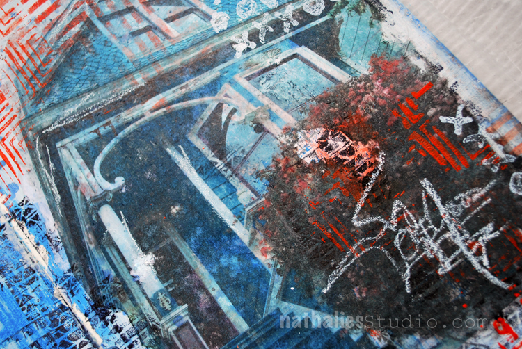
I did a Transfer into my art journal and playing with the imperfection of the transfer stamped into the gaps with my Tread and Torn Layers cling Stamp as well as with my Manhattan Border Foam Stamp.
On the left side of the spread I used the Manhattan Stencil and removed some of the wet blue paint underneath the stencil with a baby wipe.
Here is a complete list of of the supplies I used -some links are affiliate links:
Have a gorgeous day
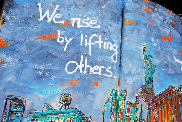
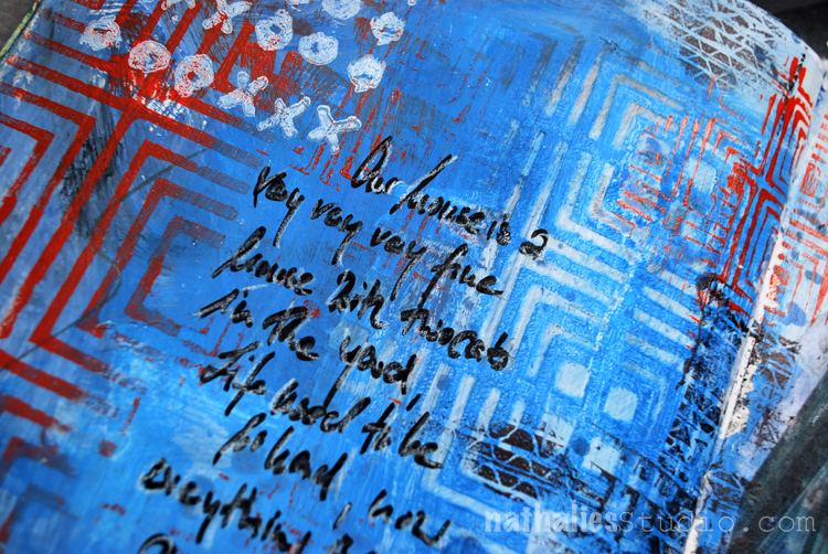
“Who would have thought I’d call you home you weird gritty little fun city across the Big Apple.”
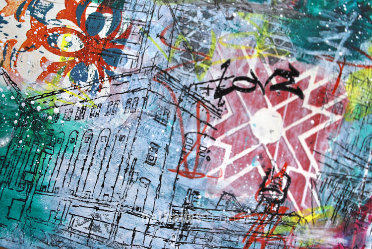
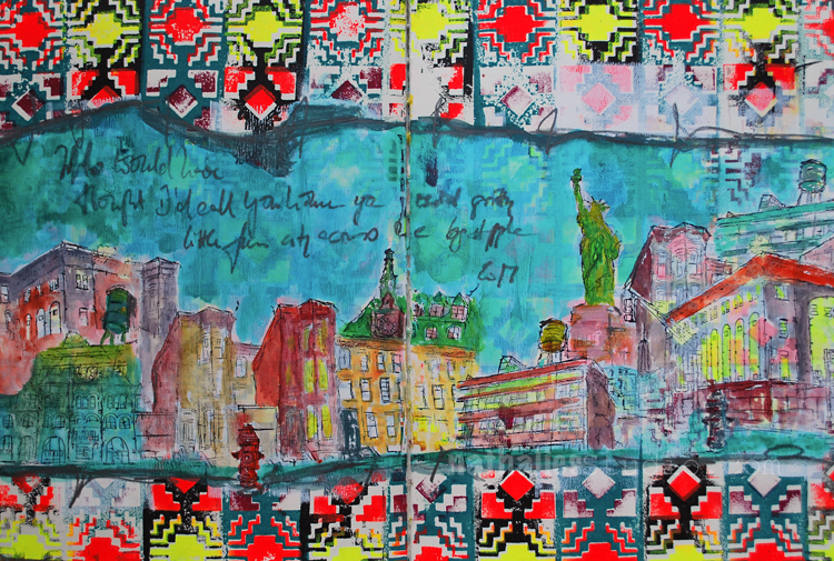
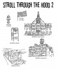
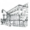
This spread started out as a demo page in a workshop to show how to use two patterns of the Santa Fe Positive and Negative Foam Stamp set and it was very busy as you can imagine.
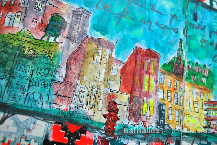
So I covered a middle put up with white gesso so that the pattern was still visible but in a very subtle way. I stamped a city scene with my Stroll Through The Hood 1 and Stroll Through the Hood 2 stamps onto the white gessoed areas.
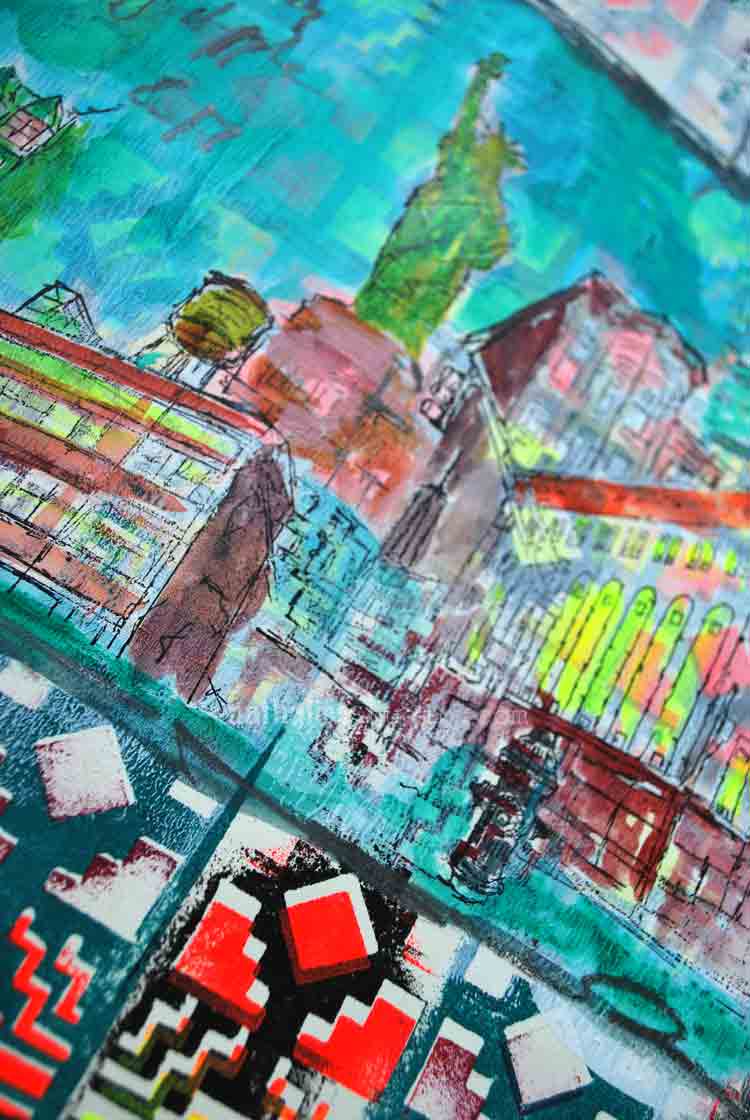
Using fluid acrylics I colored the stamped images in. I dipped the Derwent Inktense Pencil into water for the journaling.
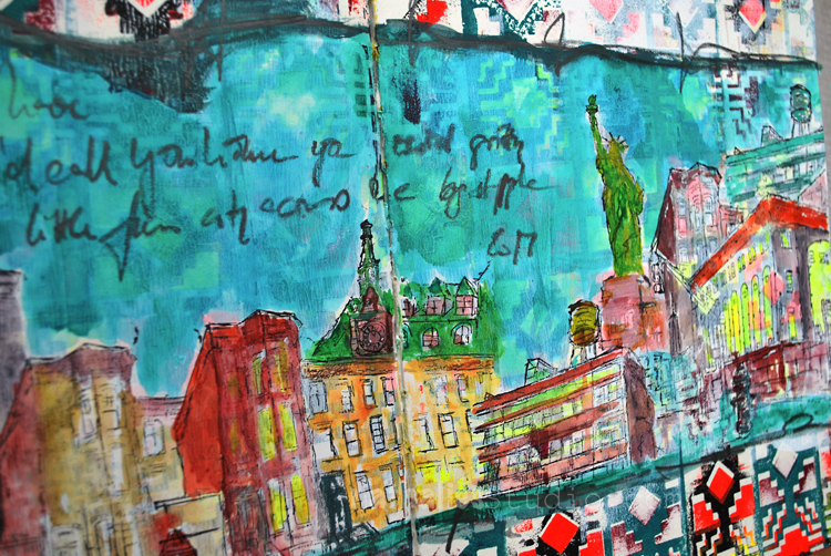
It is a bit crazy but fun. Here are the supplies I used for this spread – some links are affiliate links.
Wishing you a wonderful day!
To me… this is the epitome of YOU Nat. The city, the colors, the ambience, and the statue of libery… if I were to see this in an art gallery – I would know it was YOU. LOVE THIS. Xj.
Thank you Joi! Hope you have a wonderful start into the week! Happy Monday
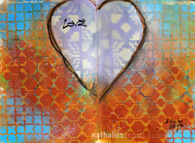
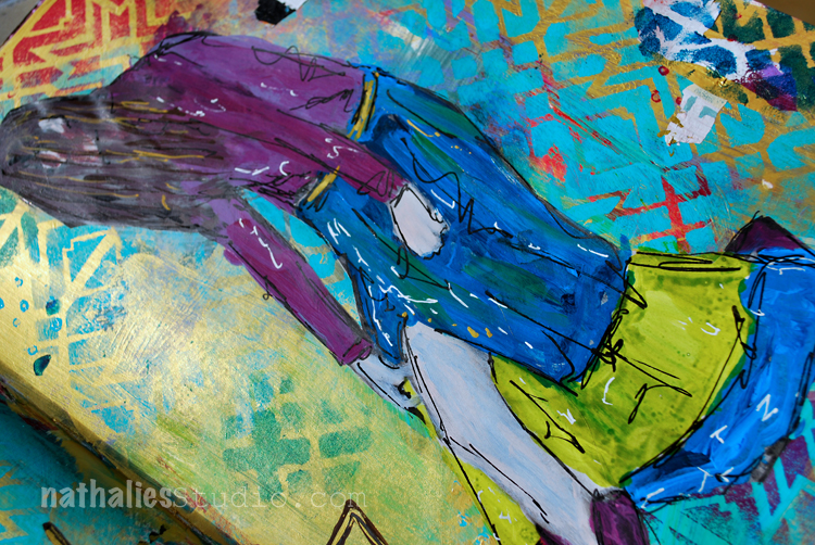
I guess I have spring feelings- LOL. I love this – “All of Me Loves All of You” .
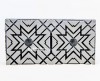
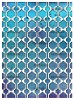
This was a quick but fun spread using different acrylic spray paints over three different stencils.
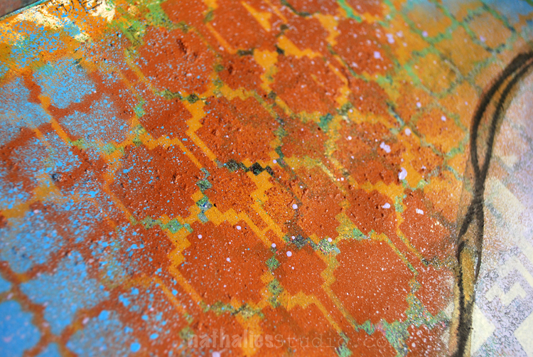
I like how the stencil pattern of Santa Fe, Granada and Mesa Verde look so good together – I want a blanket with this :)
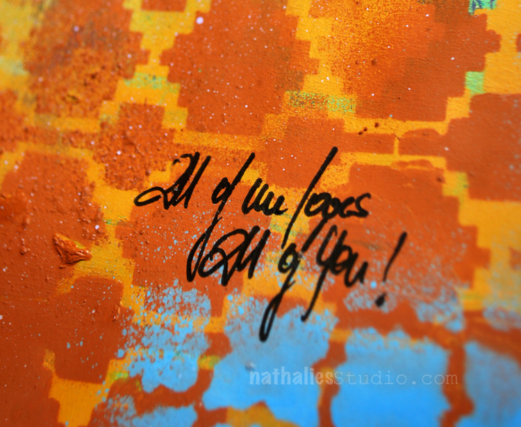
I added the journaling with a Fude pen and stamped with the Love Tag stamp into the heart.
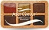
To define the heart a bit more I traced it with some Artgraf Pigments -dry and wet.
I think I found a new color combination I like :)
Here are some of the supplies I used for this spread- some links are affiliate links:
This page looks 3D. It seems to me like I am looking thru a screen and there are some lovely orange flowers and then the sky. The sky looks far away – 3D to me!!! Orange is my favorite color and that deep sky blue looks so yummy with it here. I REALLY am enjoying this journal creations Nat. Thanks bunches for your inspiration! Xj.
Thank you Joi ! I love what you see in the artjournal spread! Have a gorgeous day Joi!
I love my Fude pens and the color combo of rust and blue has been a fav of mine. I wouldn’t have thought to use the purple with it but I like it.
sue, that is so true- it was a surprise for me too how much I liked the color combination. It is fun to sometimes try out new things – this is a good reminder for me :)
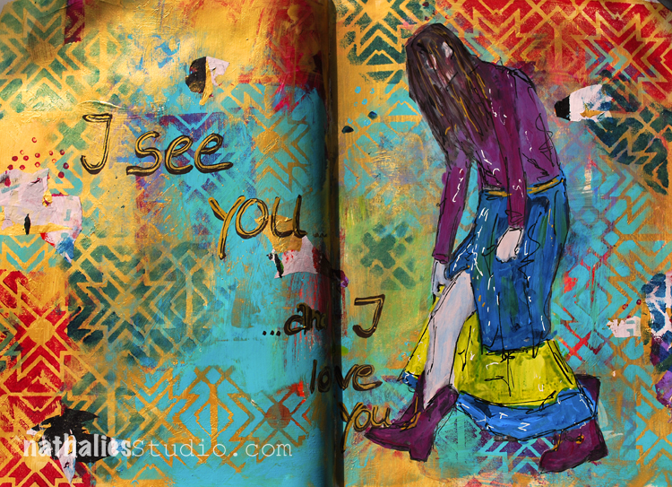
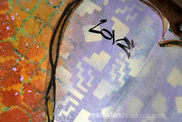
I see you …and I love you!
I recently learned that African Zulu has a greeting “Sawubona” which means “I see you. It says, “I see your personality. I see your humanity. I see your dignity and respect.”
I feel strongly we need to learn to see and love people again and see their humanity even if they are different from us.
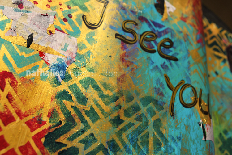
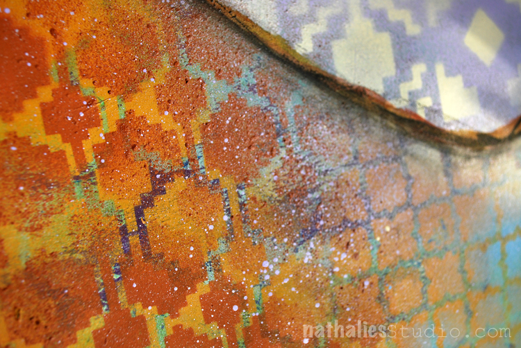
I played a bit with gold gesso and acrylic paint as well as with my Toledo Stencil.
I love how the teal paint looks on the gold – probably my favorite part of this spread :)
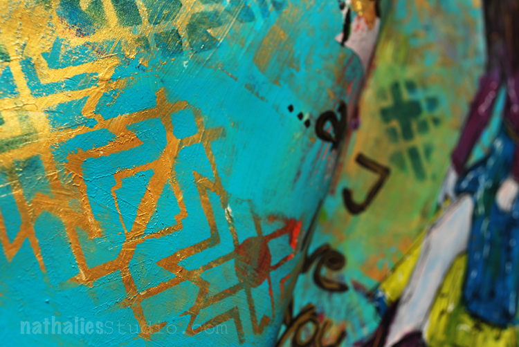
Guess I will have to do more of this combination – At first I didn’t care to much for the dark green and red with the gold in this spread but I can live with it…mhhh – I see it – and I love it ;)
Here are some of the supplies I used for this spread – some links are affiliate links:
I wish you a gorgeous day!
Nathalie, you have such a caring heart and spirit, no wonder you make such beautiful art
Awe- Sherri, you are so sweet!!!! I hope I see you soon again!!! <3
Love that greeting and how you used the gold Nat.
thank you sue! have a wonderful rest of the week and stay warm – hope you didn’t get too much snow!!!


Comments (2)
Sue Clarke
| #
Since you asked Nat, I must say that I’m not wild about that color combo but I enjoy seeing any thing that you’ve created.
Reply
nathalie-kalbach
| #
Ha- I understand it is a “weird” combo :) Have a wonderful week Sue!
Reply