Love…It’s in the little things

NatKalbach_LoveShadowbox_01


Happy Valentine’s Day to all of you!

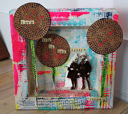
How about a funky Love shadowbox today?

NatKalbach_LoveShadowbox_02


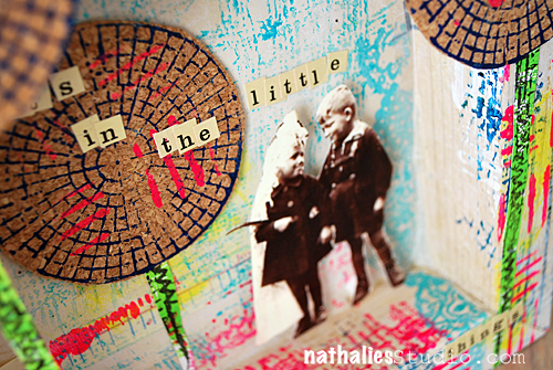
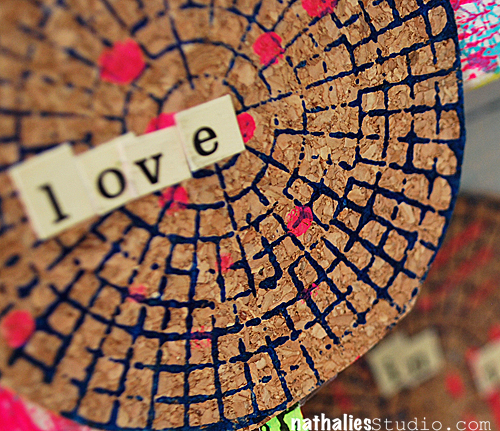
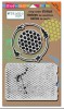
I whitewashed the wooden canvas with gesso – as I wanted to have the wood grain still peaking through and then stamped right onto it and used the template in my stamp set with different acrylic colors. I also included some of my old beloved Hambly Rubons and some Prima Washi Tape. I cut out some of of my stamped images for the stems and stamped also on cork again – I just love the look of acrylic paint on cork. I put a supply list for you below.

NatKalbach_LoveShadowbox_03

Lot’s of Love to you!

nSupplies


hugs

Nat

LogoBlogSignature

Comments (6)

  • Cindy Gay

    |

    Love the layout Natalie!

    Reply

  • Laura Strack

    |

    Those stamped cork flowers are too cool. Happy Valentine’s Day!!

    Reply

  • Jan B

    |

    Okay, that is SO stinkin’ CUTE! Love the color, the dimension and, yeah, the acrylic on cork.

    Happy Valentine’s Day! :)

    Reply

  • Michelle

    |

    Girl!! This is fabbo!! Love your new stamp designs- congrats!! Keeping it moving over there! So glad for you!

    Reply

  • Sue Clarke

    |

    Love the paint on cork. And I recognize that couple from The Whatevers.

    Reply

Leave a comment

Painty Fun at Bizzy B’s in Toronto, Canada

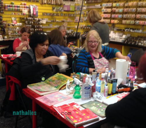
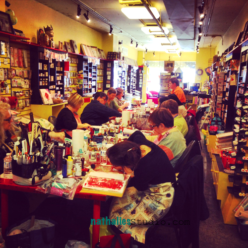
It was so much fun to come back for the third time to Bizzy B’s in Toronto and teach some workshops. Barb and Tony, as well as the amazing students make me always fell super welcome – love coming back- it is a special treat to be reinvited :)

NatKalbachBizzyShrubbery17


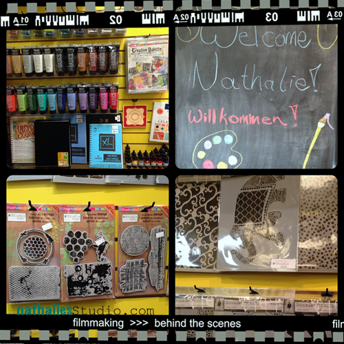
I was pretty stoked to see my Signature Stamps with Stampendous! and Stencils with StencilGirl Products on the “Nat”Wall. It was fun incorporating them in my workshops and seeing the students playing with them was the coolest ever!

NatKalbachBizzyShrubbery15


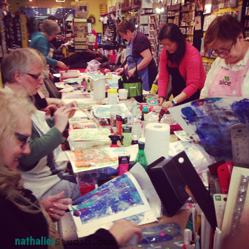
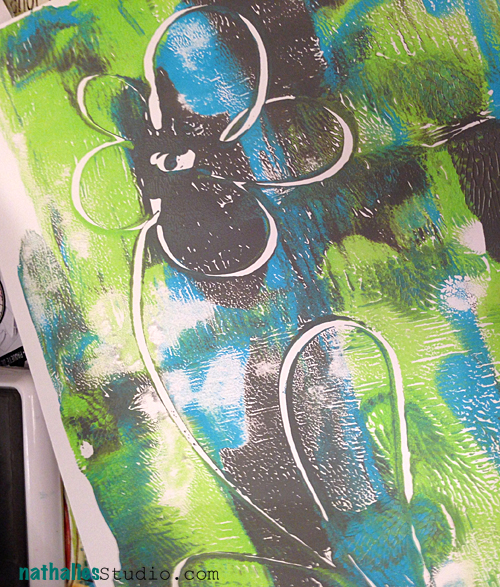
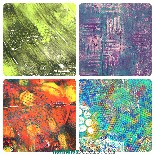
We played also with the new Creative Palette by Stampendous! for Mono Printing on Friday

NatKalbachBizzyShrubbery16


NatKalbachBizzyShrubbery14

NatKalbachBizzyShrubbery13


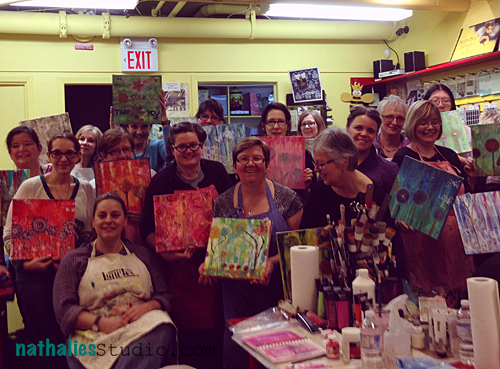
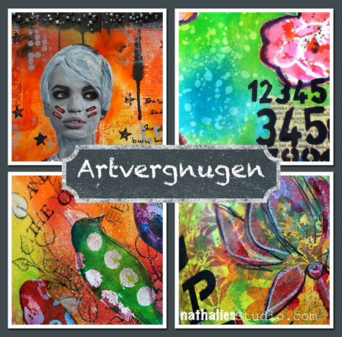
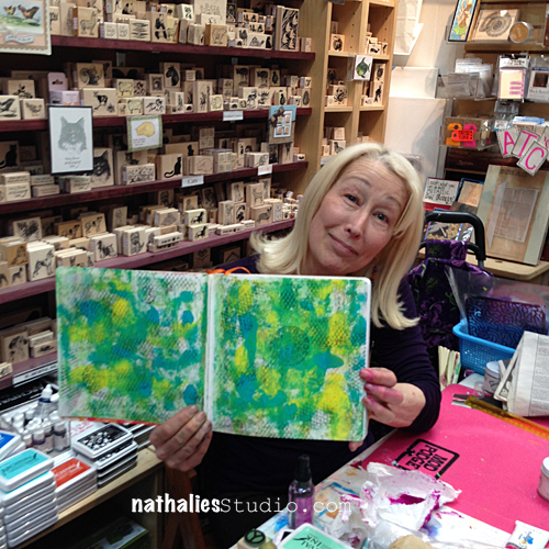
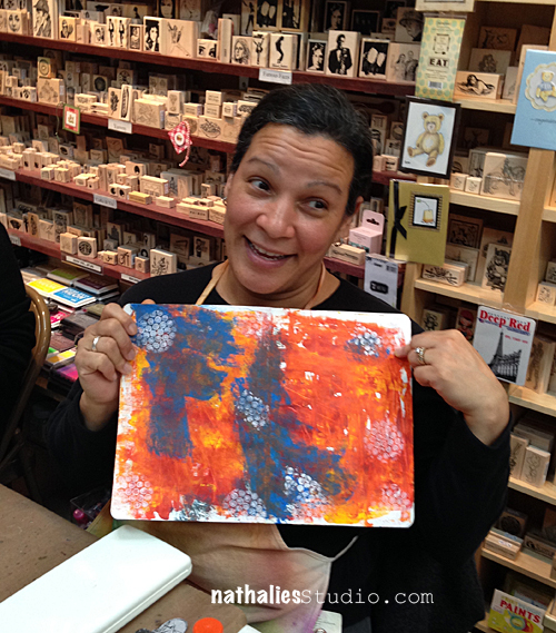
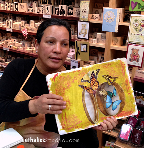
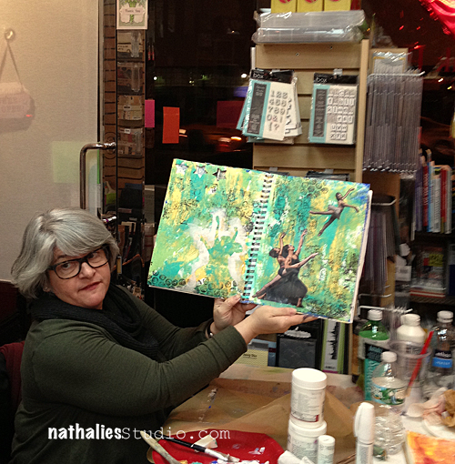
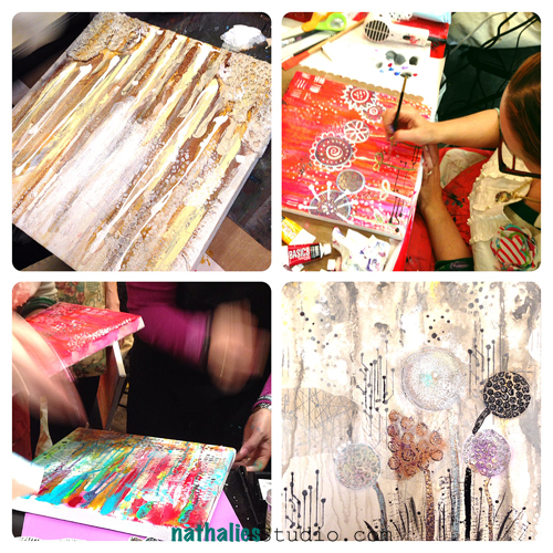
Saturday we were going fully into Artvergnugen :) – a six hour Artjournal Class – it was so much fun!

NatKalbachBizzyShrubbery9

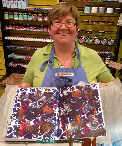
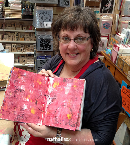
This is Marg – she traveled all the way from Newfoundland for the second time to take my class- Thank you Marg- that is a LONG way – I love your smile and creative fun!

NatKalbachBizzyShrubbery10

NatKalbachBizzyShrubbery11

NatKalbachBizzyShrubbery5

NatKalbachBizzyShrubbery6

NatKalbachBizzyShrubbery7

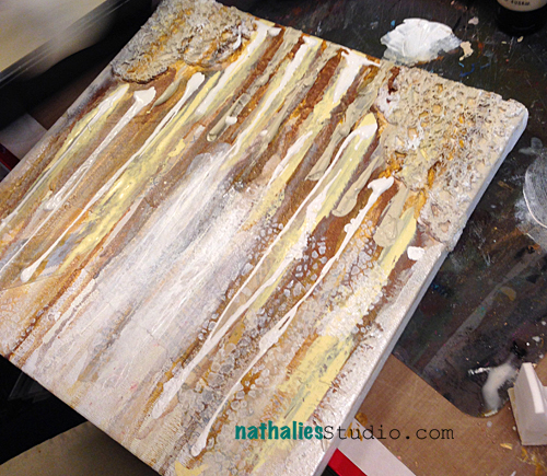
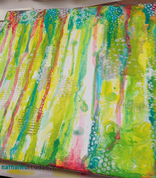
And sunday we had a wonderful Canvas Class- loved again to see all the 22 different canvases created with the same materials and technique


NatKalbachBizzyShrubbery4

NatKalbachBizzyShrubbery3

NatKalbachBizzyShrubbery1


NatKalbachBizzyShrubbery18

Thank you Barb and Tony from Bizzy B’s and my sweet Canadians for having me again – you inspired me !

huge hugs

Nat

LogoBlogSignature

Comments (9)

  • Krista

    |

    Hi Nathalie, hope you are feeling better. I see you are working with the Creative Palette. How do you get detailed prints? I M not having much success? Thanks!

    Reply

    • nathalie-kalbach

      |

      Kristia, I like it. I am not sure what might cause your problems- but it might be “too much” paint. Roll out thinner layers- you really do not need much paint for the prints. Hope that helps. nat

      Reply

  • nurse-ratchet

    |

    It was truly an amazing weekend…if anyone is wondering whether to take a workshop from Nat…never ever hesitate, Nat is a generous, inspirational task master, oh, I mean teacher. Your stamps are amazing, and your stencils sooo much fun to use!! Thank you, Nat and Barb and Tony and all the ladies that came out to play with us!,

    Reply

  • margm3c

    |

    I had so much fun. Learn a lot. Thanks Nat. Cannot wait till next time!

    Reply

  • Stampendous Stamps

    |

    Nathalie, it’s so great to see your photos of these classes! They’re just terrific and everyone looks like they’re having so much fun! Thanks so much for sharing our products with the world, we make a great team!!

    Reply

  • Felicia Aaron

    |

    Nathalie, I so wish I lived closer and could have been a part of the wonderful time it looks like you guys had! That studio looks FABULOUS!!! Wish it was around the corner from me!!! Maybe not…..I wouldn’t have a paycheck left!!! LOL!!! Thanks for sharing your fun, creative time!

    Reply

  • Marjolaine Walker

    |

    Looks like you had an amazing time, love all your new products!

    Reply

  • scrapinsue

    |

    I must get that crackle stencil!
    Lovely art journal pages and looks like a fun and creative time.

    Reply

Leave a comment

Artvergnugen at The Ink Pad in NYC – March & April

NatKalbach_ArtvergnugenAd


The new dates for Artvergnugen at The Ink Pad in New York City are up for March and April :

  • Session Three: Spray Ink Splash! – March 7th
  • Session Four: Stencil Madness! – April 25th

It starts the moment you sit down, an experience that is distinctly Art Journaling. A quick exhilaration, a sense of control, the art media’s surprising responsiveness as if they were simply an extension of you.

There is a word for this creative experience: Artvergnugen ! Artvergnugen is what makes your journal a piece of art.

Join Nathalie once a month and play each time with a different art medium or supply. Learn techniques, tips and tricks to take your art journaling further and turn it into Artvergnugen.

You will have to bring basic supplies – list on The Ink Pad Website – while Nathalie will bring the art medium/supply of the month for you to share. Sign up for as many of the sessions you want but be quick – space is limited.

Have an amazing day

nat

LogoBlogSignature

Leave a comment

designed by n*Studio features: Adrienne Ford

NStudio-Features

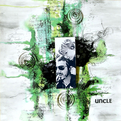
One of the things that make me really giddy is when I spy someone using my new stamps by Stampendous or also my Stencils with Stencil Girl Products :) So I thought once in a while I would feature the work of those wonderful talented people with a new Series called: designed by n*Studio features:…..

And today I feature: Adrienne Ford

Adrienne 043

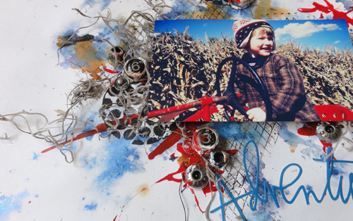
Adrienne is part of the Stampendous! Designteam and when I saw her amazing work with my stamps in the catalogue I fell instantly in Love with her colorful yet grungy style.


AdrienneFordUncle01


It all just comes naturally and organic together- I love it!

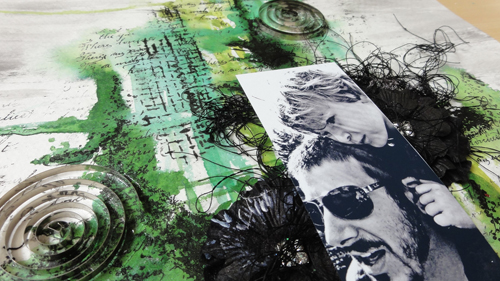
AdrienneFordUncle02

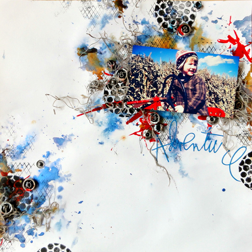
I love how Adrienne also includes threads and fabric and even enhances the tactile look of the stamps

AdrienneFordadventure01


I also love how she makes the photos blend so perfectly with the background- AMAZING

AdrienneFordadventure02


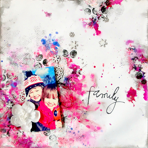
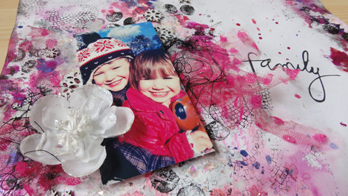
And I love the hint of color here and there which makes the black stamped images pop out even more

AdrienneFordFamily01


And…her kids are so adorable!

AdrienneFordFamily02


Thank you Adrienne for sharing your amazing work with my stamps with me!

Make sure to visit Adrienne’s Blog for more inspiration and if you have done something with my stamps or stencils I would sure love to see :)

Here are the n*Studio Product Adrienne used:

nSupplies


Have a wonderful day!

hugs

Nat

Comments (10)

  • Ursula

    |

    Schick, schick :) – und endlich gibts die Stempelchen auch hier in good old germany in meinem LieblingsShop zu kaufen :)) Werde ich sie also auch bald testen können – Jepp
    LG Ursula

    Reply

  • Amante del papel

    |

    I want this stamps there are so amazing!!!

    Reply

  • Jackie P

    |

    Glad that you featured Adrienne’s art- so very cool~ and yes, her children are adorable! I have my stamp set picked out and on the TO BUY list!
    Nat, Can you tell me what colour tea/or green or turquoise that is that you used on your banner at the top of your page? I simply adore that shade! It POPS!!!! “)

    Reply

    • nathalie-kalbach

      |

      I assume – since I never keep track of my colors that I use ;) – that it was Liquitex Cobalt Teal- if that is the one you are pointing too ;) In any event- these are all Liquitex Colors.

      Reply

  • darlene

    |

    Cool to feature artists Nathalie. I definately am crazy about your new stamps as I like the raw, organic look…and I’m fascinated with what Adrienne did using them.

    Reply

  • Laura Strack

    |

    Adrienne is a true artist! Wow, love the way she blended her photos into her background. The stamping is amazing and all the texture, perfect Layouts!

    Reply

  • jjflair

    |

    “Whoa,” I said out loud, “She is badass.”
    And, my hubby came over to see what I was looking at, and he agreed. And, we stared in awe together and had a great convo about art and style and texture and media. Super inspiring! Thank you!!

    Reply

  • Nurse Ratchet

    |

    FabUlous art…fabUlous stamps!!

    Reply

  • Misty

    |

    Adrienne is amazing!!! Those layouts are gorgeous and oh so unique!

    Reply

Leave a comment

Snake Bite Kit ArtJournal Page

Natkalbach_SnakeBite01


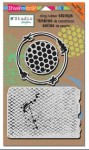
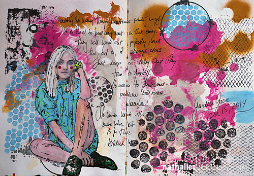
I love this color combination – it was kind of an accident but a happy one – when I was just playing with different templates and stamps of my Stampendous Stampsets while in California.

Natkalbach_SnakeBite02


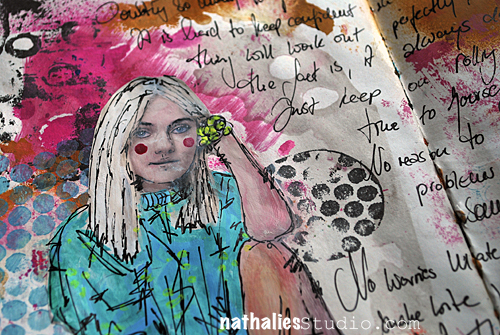
It is a rare journal page of mine with lot’s of journaling but I just felt like it in that moment :) And the title? It is a sentence I used in my journaling and that I heard in Australia when I checked in into a hotel “The snake bite kit is in the kitchen, Mate – no worries” I thought that was hilarious – time to use this phrase ;)

That is the beauty of an art journal- you can do with it whatever you want- quotes, lot’s of journaling, no journaling, just a title, symbols- it is yours – no rules! It is your art journal: OWN IT!

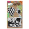
Here are the stamps and supplies I used:

nSupplies


Have a wonderful day

huge hugs

nat

LogoBlogSignature

Comments (4)

  • ilapola

    |

    Beautiful art journal page, Nathalie!

    Reply

  • scrapinsue

    |

    “The snake bite kit is in the kitchen”…a phrase that I’ve never heard. LOL
    While working in my art journal this morning I thought to myself “who would enjoy looking at these pages?”. Kinda bummed out I realized that I loved looking at them and creating them and isn’t that who they are for. Silly me.

    Reply

  • Louison

    |

    I love!! It’s beautiful!!

    Reply

  • andrene

    |

    I love the color combo – will have to store it away on my mental palette! I’m not sure why but this page has a very calming effect for me…hmmm. Great job achieving the look of snakeskin with stamps….you nailed it!

    Reply

Leave a comment

A Farewell to the Prima Education Team

Although it was my own decision I am a bit sad to say good bye to the Prima Education Team. I have been with Prima since 2007 and had a fun time teaching Prima Workshops, creating CHA Projects, CHA Demos and other stuff. Seven years is a long time though and I feel it is time for a change – but today I would love to look back and show some of my favorite projects and workshops throughout those years with Prima.

Probably my all time favorite Prima Workshop I taught because it has so much personal meaning to me, is my Altered Book Class – I taught it throughout 2013.

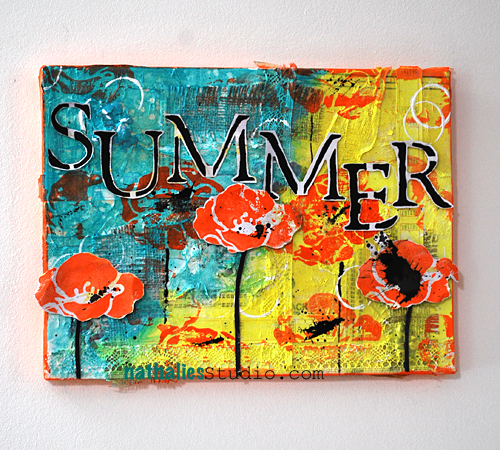
This Canvas Workshop is another favorite of mine and I have taught it last year and will teach it again next month in Malaysia.
Summer06

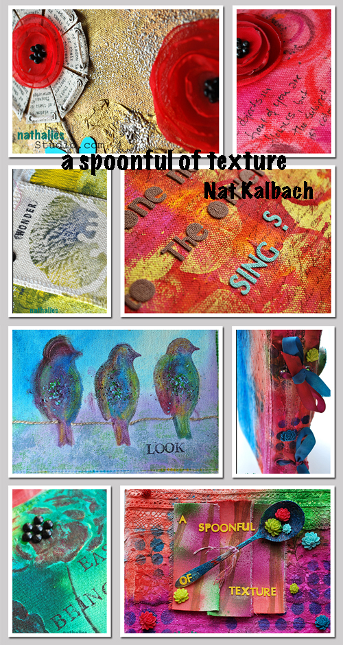
I loved this online Prima Class I did with Donna Downey in 2012 called “A Spoonful of Texture” – it is about texture – and it has a spoon on the cover…so what is not to love about it- LOL
NatKalbachSpoonfulTexture

I did have a lot of fun creating this little Sardine Tin for CHA2012

This card I made in 2009 and which was part of a blog tutorial for Prima, is still one of my favorite cards- as you can see I have always had a heart for funky bold colors ;)
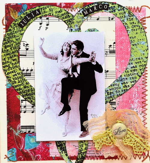
This layout which I created in 2008 showed my love for texture and gesso already :) – funny when I look at all those projects I realize that my style was always evident

This Family Getaway Canvas which I taught in 2007/2008 was a big hit- and I still have it hanging on my studio wall

this is another layout from 2008 which was published in Somerset Memories- Loved painting on the paper – gosh I loved the bright Prima Papers so much :)
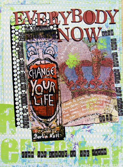
everybodynow_blog


And this mini album class ” A Wonderful World” was also special for me because I taught it in NYC and that was in 2009 – the first time I taught a workshop in the U.S. – who would have thought I would ever live here- LOL.
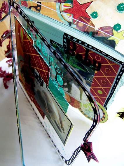
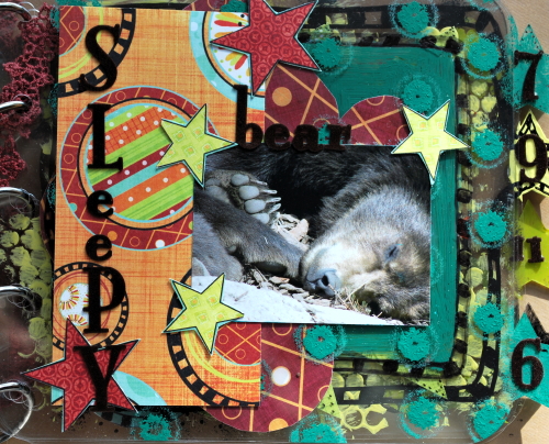
WonderfulWorld_10Bookoverview

ScraptasticWonder_07


Thank you Prima for having me for such a long time and actually believing in my skills as a teacher in the first place back in 2007 when I probably barely knew what I was doing in Europe ;) . Thank you also for inspiring me with your amazing products all those years to create projects and workshops which are still dear to my heart and meaningful to me. Thank you also to all my wonderful Education Team Colleagues- I have had a wonderful time whenever I saw you and spent time with you! A special thank you to Sharon, Cari and Denny – you three have been throughout all those years a wonderful support and I am happy to have been working with you guys!

Wishing you all a wonderful and prima ;) day

huge hugs

Nat

LogoBlogSignature


Comments (14)

  • ceciscrap

    |

    What a awesome review!! ((I know that sardine tin. ;) ))

    Reply

  • Jeanne

    |

    Natalie, your work is so happy. I love the bright colors and texture. Hopefully I will be able to take one of your classes some day!

    Reply

  • andrene

    |

    The Summer canvas is one of my favorites of yours! A great walk down memory lane – most were familiar to me but some I have not seen so thanks for sharing them. I am certain that you will be sorely missed in the Prima community!

    Reply

  • scrapinsue

    |

    I have enjoyed the creations that you have made with Prima products. Their thick paper is still one of the things that I use sparingly from my stash. My Family Movie Night Canvas is still hanging in my kitchen and is a favorite with visitors to our house. You did Prima proud and they supported you while you learned to fly a little higher.

    Reply

  • Laura Strack

    |

    Bitter-Sweet goodbyes are the toughest ones, but sometimes in order to grow you have to make huge changes. I know everyone at Prima wishes you nothing but the best on your journey, and you undoubtedly will be greatly missed. I am just so thankful for Art Venture 2014 and all the memories it holds. Now, I will have to plan a trip to New York. Bummer. Lol. Hugs and good luck on all your new endeavors!!

    Reply

  • Jan B

    |

    I still have and LOVE my clear album from your “It’s a wonderful World” class. It was SO great meeting you then and sitting under your wonderful, inspiring – and fun – teaching! You’ve been inspiring me since the SIStv days. And now I can’t wait to see you again on March 1st at the Ink Pad class! You did Prima proud…and I’m sure you’ll continue to inspire and educate as your journey continues in different directions. See you soon! :)

    Reply

  • Sharon

    |

    What a beautiful review! I loved going through the projects with you again. I remember so many of them! We will miss you so much. Wishing you nothing but the BEST!!! Xoxo -Sharon

    Reply

  • limor

    |

    Your talent is out of this world mama! your future is so bright still in this ever changing industry!!! Absolutely adore you and your fabulous fun spirit! I’m not saying good bye but rather see you soon!!! xoxoo

    Reply

  • jackiepn

    |

    thanks for sharing Nat- truly some awesome pieces of Art!

    Reply

  • michelle-s

    |

    I am so grateful for Prima for putting your talent into my life and art. Sometimes we just have to move on and forward in our life to new adventures and moments.

    Reply

  • Ruth L

    |

    Amazing projects and a great look-back!

    Reply

  • nancy-k

    |

    you have made so many wonderful things for prima over the eyars…you will be missed.

    Reply

  • Birgit_Koopsen

    |

    Tough decision! But you know what they say: when you close one door others will open! I’m sure it is the right choice for you my sweet friend! xxx

    Reply

  • Amante del Papel

    |

    wow is really amazing!

    Reply

Leave a comment

Malaysia Workshops – Contest !!!

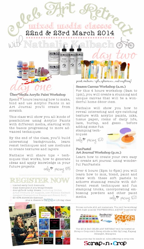
I am so excited to be in Malaysia next month – March 22-23rd, 2014 to teach some fun Mixed Media Workshops. The even is organized by the amazing Scrap’n Crop and they had this wonderful idea for a contest to win a 1/2 day seat at the event and more! so if you are in the area and you would like to win- check it out!

SnC 2014 Celeb Art Retreat Poster 460


To all of my visitors today who enter the context- Welcome – so thrilled to have you! Good Luck to you and I hope I will see many of you at the wonderful event in Malaysia!

huge hugs

Nat
LogoBlogSignature


Comments (6)

  • Eva Ng

    |

    I deserve to win SnC’s 2014 CELEB ART RETREAT with Nathalie Kalbach 1/2-day workshop on 23rd March 2014 because I wanted to explore more in mixed media as I just started a piece & it is a great opportunity for me to be more “artistic” & a platform for me to try something more.

    Reply

  • Joanne Wong

    |

    I deserve to win SnC’s 2014 CELEB ART RETREAT with Nathalie Kalbach 1/2-day workshop on 23rd March 2014 because it would be an amazing opportunity for me to learn this new form of arts and crafts from a pro :)

    Reply

  • jackiepn

    |

    I won’t be in the area, but wanted to say WOO HOO! –Nat!
    Awesome for you and for all that will be able to go and play! have fun! hugs “)

    Reply

  • scrapinsue

    |

    I will not be in Malaysia so I don’t want to enter the contest but it sure sounds like fun. Unless of course airfare is included. LOL

    Reply

  • Yuzz Yusof

    |

    I deserve to win Scrap-n-Crop’s 2014 celeb retreat with Nathalie Kalbach 1/2 day workshop on 23rd March 2014 because I would love to learn all her tips, techniques and her layers of work is an explosion of texture, dimension and jewel tone colors.

    Reply

  • namizam muda

    |

    “I deserve to win SnC’s 2014 CELEB ART RETREAT with Nathalie Kalbach 1/2-day workshop on 23rd March 2014 because this is my new craziness towards the art media area. love to play colours and see how i can create with the stuff around me. cant wait till the day we play with all of them.

    Reply

Leave a comment

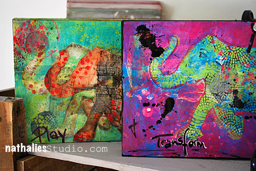
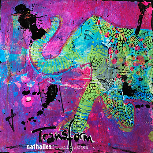
Elephant Collages or…how to play and transform

NatKalbachCollages

Last week I was playing with some collages for the upcoming workshop where I will co-teach with my sweet friend Julie Fei-Fan Balzer at The InkPad. The class is sold out – sorry – there is a waiting list.

NatKalbachPlayCollage01


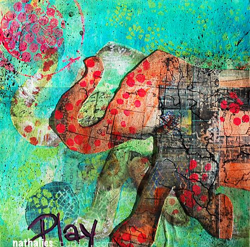
As you might know I love elephants- hence the Elephant stencil I created for Stencil Girl Products.

NatKalbachPlayCollage02


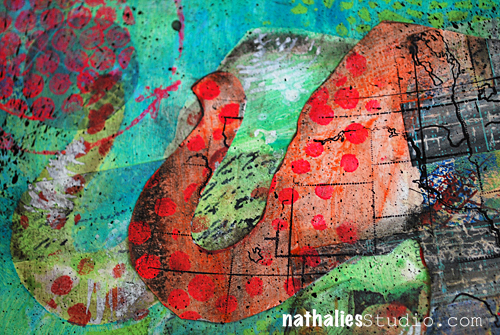
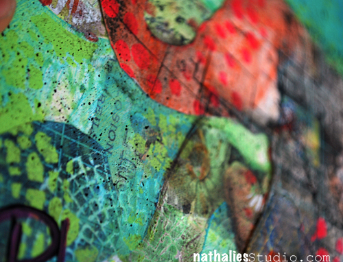
I played with lot’s of paint and also the What’s The Point Stencil here as well as with some of my new Stampendous  stamps.

NatKalbachPlayCollage03


And with mostly the same materials I created this collage – which looks totally different

NatKalbachTransformCollage01


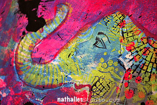
I used also Jamie Dougherty’s beautiful Bloom Girl Stamp in the collage- can you see where? :)

NatKalbachTransformCollage02


That was fun – I am going to do more of those. I mounted both on a wooden canvas – which was a tip by Julie.

Which one of the two do you like better?

Here is a list of some of the things I used


huge hugs

LogoBlogSignature


Comments (15)

  • Marcia

    |

    The elephants are STUNNING. I love the intense color, the layers, all of it.

    Reply

  • giseladeister

    |

    Ich liebe Deinen Elefanten. Leider hat ihn hier niemand.
    Beide Werke sind sehr schön, aber der Elephant ” Play” gefällt mir am besten.

    Reply

  • darlene

    |

    Now that I see this work I’m extra happy that I have the elephant stencil. Excited about your new mesh stamps too. This is beautiful work. Sounds like a wonderful workshop.

    Reply

  • Caroline Duncan

    |

    These both are outstanding and so gorgeous!!! I cant pick one to be my favorite… I think they look terrific together. Now the elephant stencil is on my must have list!!! LOL Congrats that your Ink Pad class is sold out! Maybe you’ll come down to NC or VA, closer than the Ink Pad and I’d be there in a flash!!

    Reply

  • Denise Spillane

    |

    Love these. I love everything about them. The colors are yummy and so much texture. I have the elephant from club and will try some of this. I want to make my guest room black and white with accessories like your elephants bright and beautiful colors!

    Reply

  • jackiepn

    |

    Both elephants are gorgeous- but I have to admit- Transform is my FAV! I love that colour combination!!!

    Reply

  • Mary K. Parker

    |

    Love colors of play best, but overall I like transform. The elephants eye is closed in play and that just looks more restful instead of playful…unless he’s playing hide & seek.

    Nope I didn’t see the doll stamp, I did like how it looks like they have rough skin though.

    Reply

  • Donna Sullivan

    |

    Love Play! But the use of polka dots on both are so much fun!

    Reply

  • andrene

    |

    Both are fabulous in their own way. I love the details and the bloom girl stamp in the elephant on Transform. But my eye is immediately drawn to the Play canvas each time I look at them. I think its because of the more subtle details in the elephant and background and the softer colors. Very pretty!

    Reply

  • scrapinsue

    |

    Wow, I didn’t notice the stamped image for what it is until you pointed it out. Very clever use of it. I am more drawn to the one on the left…PLAY because of the colors. I really like when you use these colors in your art. The pink is just too bright for me even though I do like the title of TRANSFORM. Kinda amazing how you can get such different results using the same materials.

    Reply

  • ddhurlbut

    |

    Your “transform” canvas is my favorite but they are BOTH beautiful! I love elephants too, got to get that stencil now, you’ve inspired me once again Nathalie! Thank you.

    Peace,
    Donna

    Reply

  • Janet

    |

    I love your elephants. Sophie’s eye works perfectly on the one! Beautiful textures and layers!

    Reply

  • jessicap1972

    |

    really lovely canvasses you did make. I and also my son love the elephant stencil.

    Reply

  • Sabine

    |

    Nice work, Nat!
    I like the “play”-painting better because of the colours. The pink one is a little too bold for my liking.
    Bit as I like elephants really much I would take both of them and hang them to my walls :-))
    Sabine

    Reply

Leave a comment

Photos of Artvergnugen at the InkPad

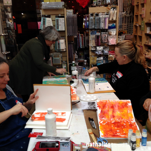
Last Friday was the first of my ongoing once a month evening class at The InkPad in New York City.

NatKalbachTIP01


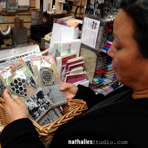
Every month I teach about a special medium or supply and I bring it for an ongoing Artjournal Class. This time the theme was Stamping :) So I brought my new Stampendous Stamps and showed some techniques how you can incorporate them in your artjournal. so much fun to see them in the store and to see how people liked them :) – here you see Ana having a hard time deciding…

NatKalbachTIP02


I love the intimacy of the class- since the evening classes take in  the tiny but wonderful store (the weekend class are taking place in an out-of-store location) – there is only room for 8 students. It is a wonderful way finding out what expectations of a class exist and I loved being able to talk to each one and having them show their results and talk about it.

NatKalbachTIP03


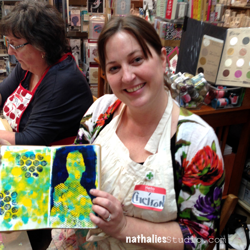
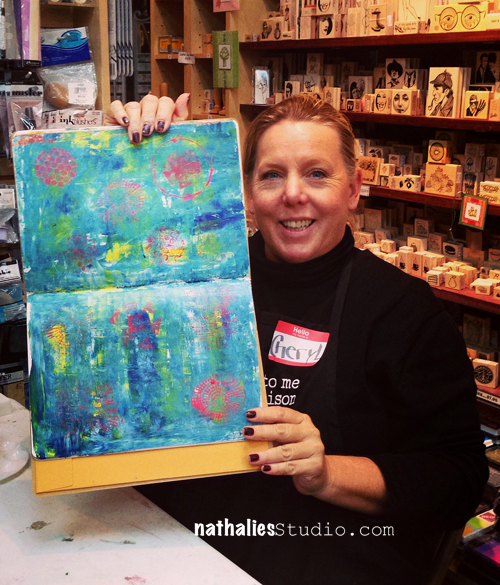
Here is Cheiron showing her two page spread playing with different techniques – love the color combination

NatKalbachTIP04

NatKalbachTIP05


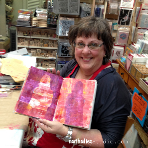
Diane playing with backgrounds and the stamps- especially love her silhouette outcome.

NatKalbachTIP06


Sandra playing with the latest Whatever Photo- love the sentiment!

NatKalbachTIP07


Robin showing her wonderful background- great base for an art journal page!

NatKalbachTIP08

NatKalbachTIP09

Ana with some beautiful color combinations and I love how she framed the second spread with the stamps – it looks so organic.

NatKalbachTIP10


Karen’s wonderful spread- I love how all fits perfectly together!

NatKalbachTIP11


Love Cheryl’s spread which totally reminds me of a Monet painting

The next session on February 20th, 2014 is about Mono printing and already full – sorry- there is a waiting list at The InkPad. If you are interested in the upcoming sessions in March and April sign up for their Newsletters so you don’t miss out to sign up.

On another note :

Scavenger Hunt Button

today is the start of fellow Stencil Girl Products Artist Jessica Sporn’s awesome Stencil Scavenger Hunt. Check it out- she posts every day this week a new design and let’s you guess which stencils by Stencil Girl Products she used.. you can win something too- so check it out ;)


Wishing you a wonderful start into the week!

hugs

Nat

LogoBlogSignature


Comments (5)

  • Laura Strack

    |

    Looks like a great time was had at your first class. Lucky Ladies! I’m not surprised that the next one is already full either. NYC is on my bucket list so one day I will happily join in all the fun.
    Reply

  • kat82ren

    |

    wow this look so amazing!

    Reply

  • scrapinsue

    |

    What a fun size for a class and the work/stamping that folks did is so crisp and colorful. I especially like the texture that your new stamps give to a page.

    Reply

  • Jessica Sporn

    |

    that class looks amazing and I see some wonderful and familiar faces there! Thanks for sharing about the scavenger hunt too!

    Reply

  • Caroline Duncan

    |

    The class looks like it was great and everyone’s creations are just beautiful and such a variety of pages!

    Reply

Leave a comment