Creative Squad: Primary Colors – Maura Hibbitts

Hello from my Creative Squad! Today we have a really thoughtful card project from Maura Hibbitts that explores some pretty important ideas along with our theme this month: Primary Colors: Red, Blue, and Yellow it’s your time to shine. Let’s get back to the basics of color and light and play with primary colors. It’s elementary my friend! This month we are also pleased to be partnering with Grafix who supplied the squad with some cool products to try out. Read on:


Oddly enough, I don’t reach for just primary colors that often, I think I must like them better blended together to make green, purple, orange, and the myriad of colors they create. So, I find it a bit of a challenge to just focus on primary colors, but I did…with just a touch of blending (I couldn’t help myself, lol). I’m also using Grafix products for the first time, and they are wonderful! I tried out a number of mediums and they worked beautifully.

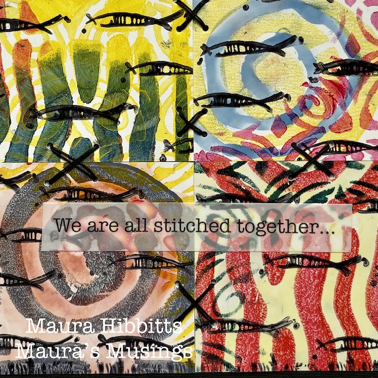
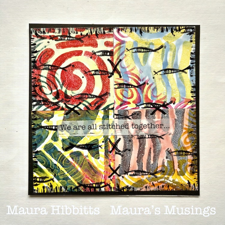
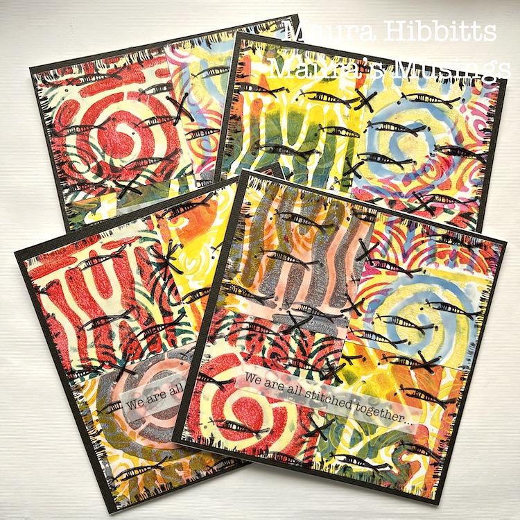
I started creating, thinking of the ocean and my longing to go there again. I was also thinking about my friends in education and the upcoming end to a very challenging year. Somehow this translated into the schools of fish I stamped on the cards. But then, I thought about how everything is interconnected on our planet, from the fish in different oceans, to the people of different lands, and I added some stitches. It’s inter-esting how our creative process can begin with a simple thought, yet end up very complex by the time we finish.

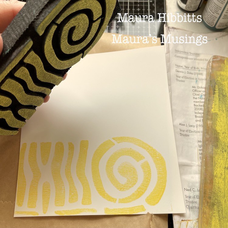
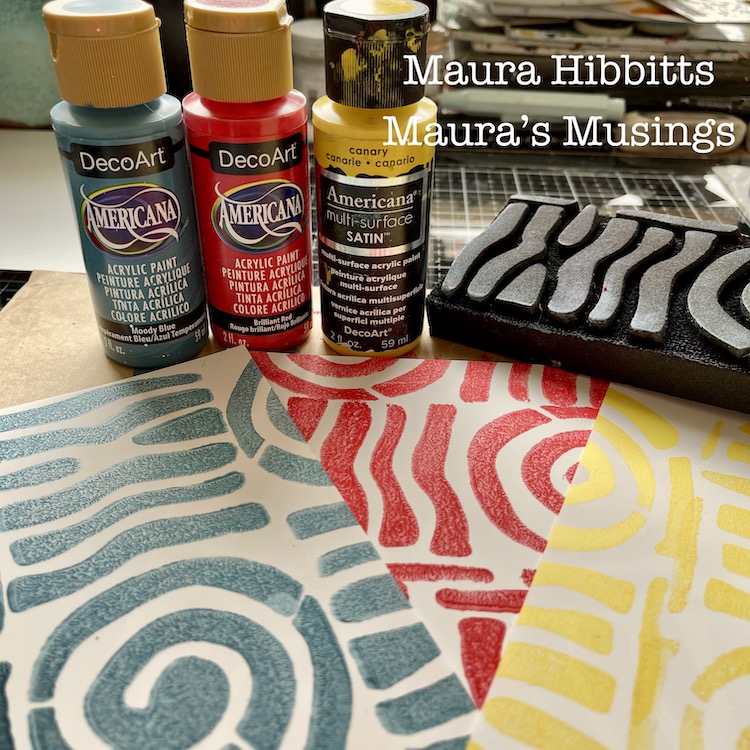
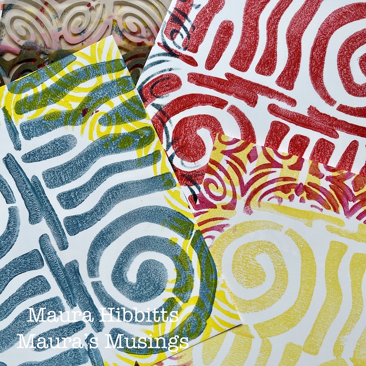
I started my project by cutting the 12 x 12 sheet of Grafix Craft Plastic into four sec-tions. (6 x 6), then stamped three of them with a single paint color of yellow, red, or blue with Nat’s ArtFoamie Batik 2 stamp. I find it easy to roll out some paint on a gel plate, and press the ArtFoamie into that, to get a clean image.

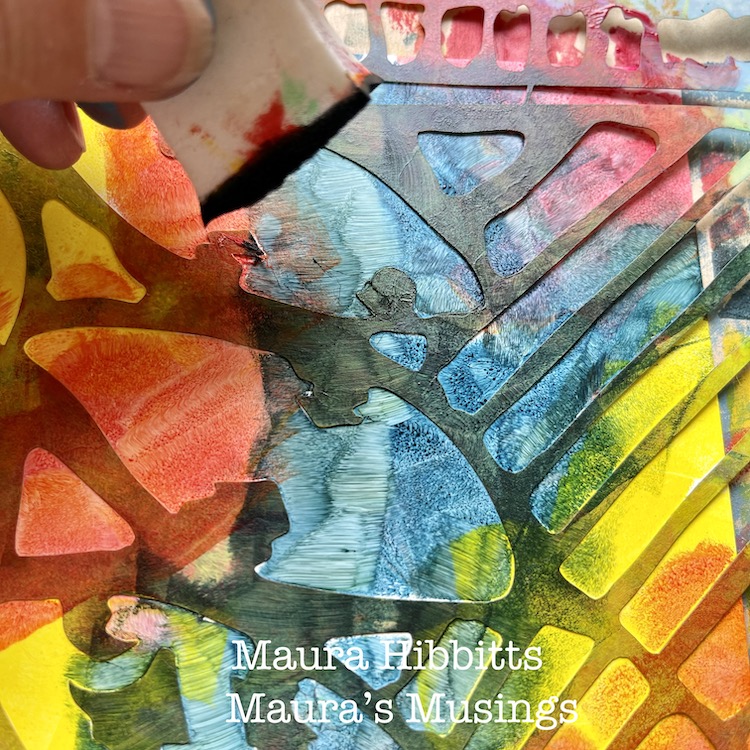
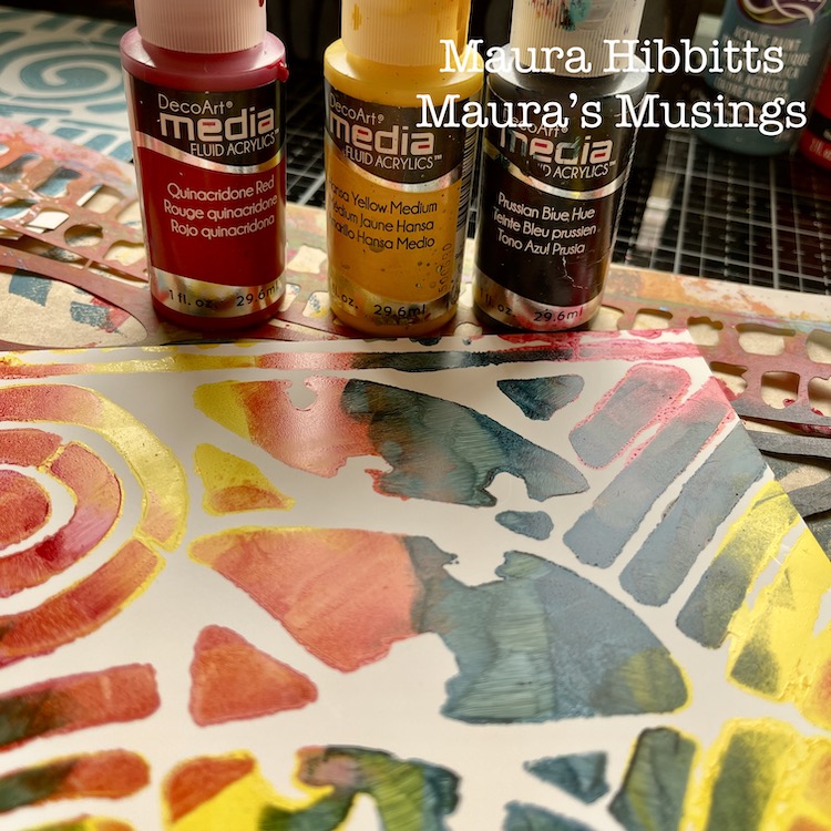
For the fourth section, I decided to use the Batik stencil (a favorite!), fluid acrylics in red, yellow, and blue, and dab in the color with a cosmetic sponge. I couldn’t resist a bit of blending here.

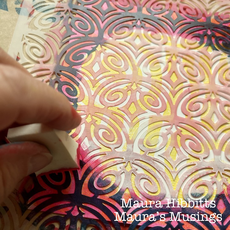
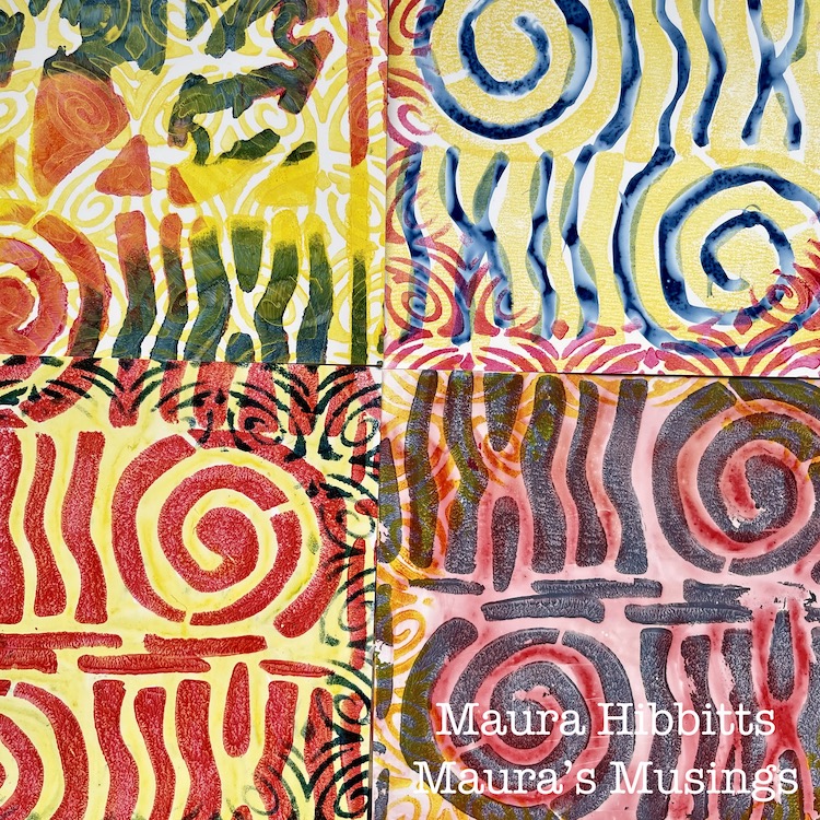
Next, I decided to go around each stamped piece with a contrasting color, using the Art Deco Fairview stencil. I just added the design around the edges, and left a circular open area on the plastic.

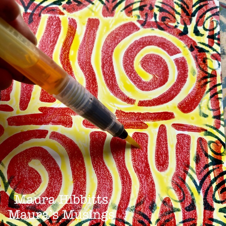
I found that acrylic paint works beautifully with the Grafix plastic, so I thought, why not try watercolor next? I painted watercolor onto each section with blue, red or yellow.

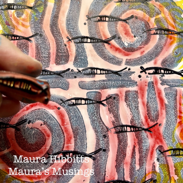
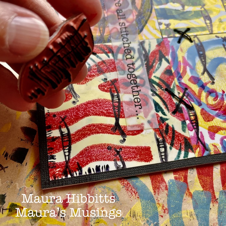
To create my “schools of fish”, I used the Neato rubber stamp with black archival ink, and repeatedly stamped the image across the pages.

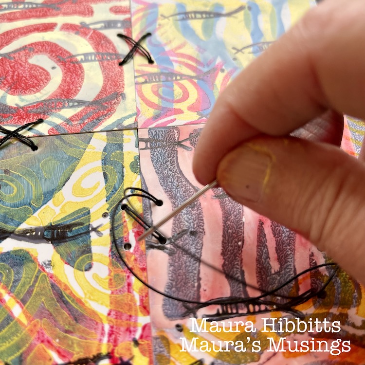
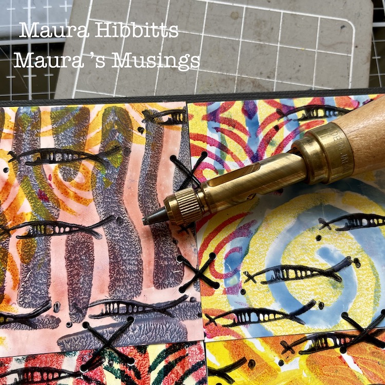
Then, I cut each section into fourths, just slightly smaller than 3” squares. I adhered four different squares to a backing. I cut a 12 x 12 black card stock into fourths for this base. Next, I punched holes to do some stitching, using a Japanese screw punch (or you could use an awl). I stitched X’s with heavy black thread onto the cards, tucking the ends onto the back and holding them in place with scotch tape.

To finish the card design, I framed it using the edge of the Far Out rubber stamp and black ink. I stamped the partial image around all edges.

As I was working, I started thinking of how we are all connected, and came up with the quote to put on my cards “We are all stitched together…” I typed up my words, and printed them onto the Grafix Computer Matte film using an inkjet printer. I adhered these to the card fronts using a clear adhesive, so the design underneath would be visible.

Then, the final step was to adhere my card tops. I cut 12 x 12 card stock in half, scored it and folded it into a 6 x 6 card. One reason I decided to not work directly on the card itself was the stitching. It shows through the back, and by doing it separately, I end up with a nice, neat card. Hint: remember, if you mail square cards, the postage is a bit higher…or you can put it into a kraft mailer.

It’s the common threads that pull us all together, like color – yes, primary colors too, which are connected to all colors. Other threads that bind us are music, art, words, friendships, family, and so many more. Remember, we are all stitched together…

I wish you joy in searching for the stitches and threads in your life, Maura


Thank you Maura – loved how you shared your thought process along with such clear step by step instructions. These cards are so meaningful AND beautiful!!!

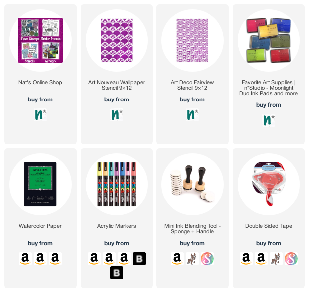
Give it a try: you can find all my Rubber Stamps , Foam Stamps, and my Stencils in my Online Shop and here are some of the supplies Maura used:

Leave a comment

Pattern Monday 02

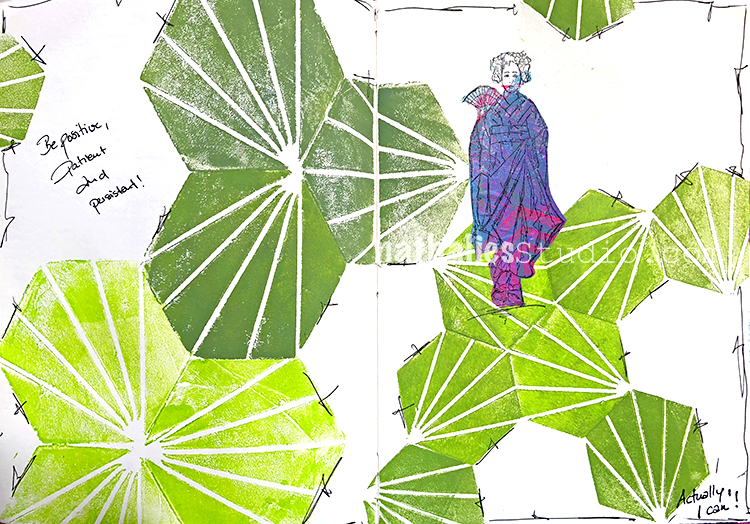
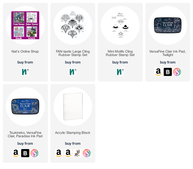
Time for another pattern in my big vintage ledger! This one I used my Fan-Tastic Large and Mini Motifs stamps and an acrylic block to speed up the process. Check it out:


Here is how it came out:


Here are some of the supplies I used:

Leave a comment

Stroll Through the Hood – May 2021

Strolls through my hood get me out of my studio, they help me get unstuck and often I get inspired by what I see and get new ideas to create something. It is part of my philosophy about Artful Adventures in Mixed Media – which is the subject of my book. Here are some photos that I gathered in the last couple weeks.

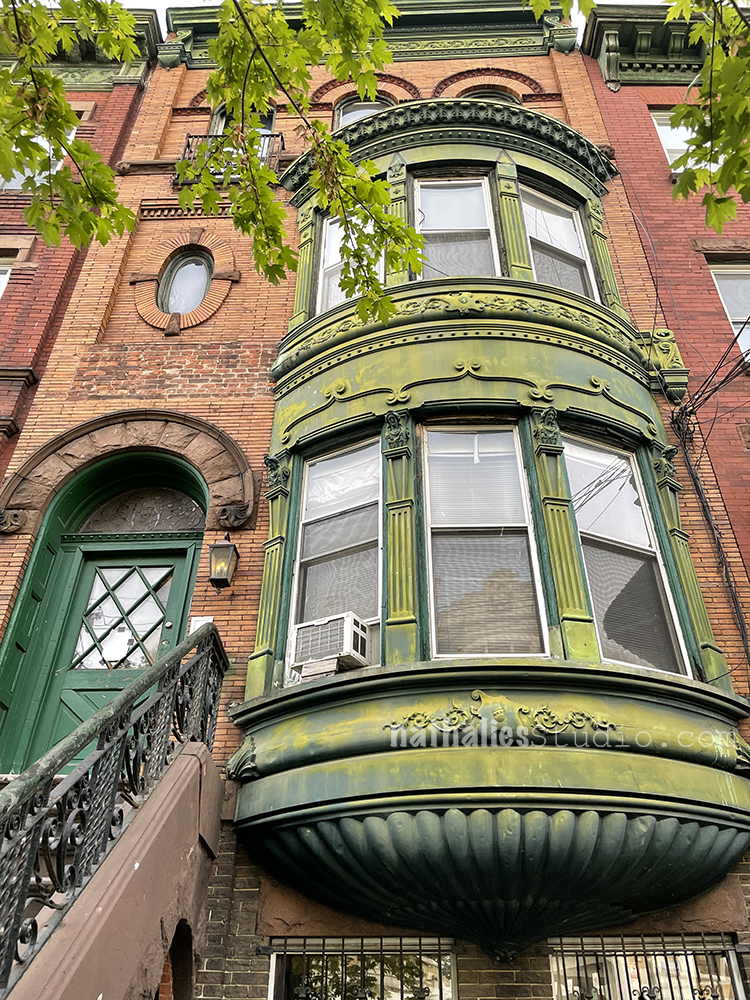
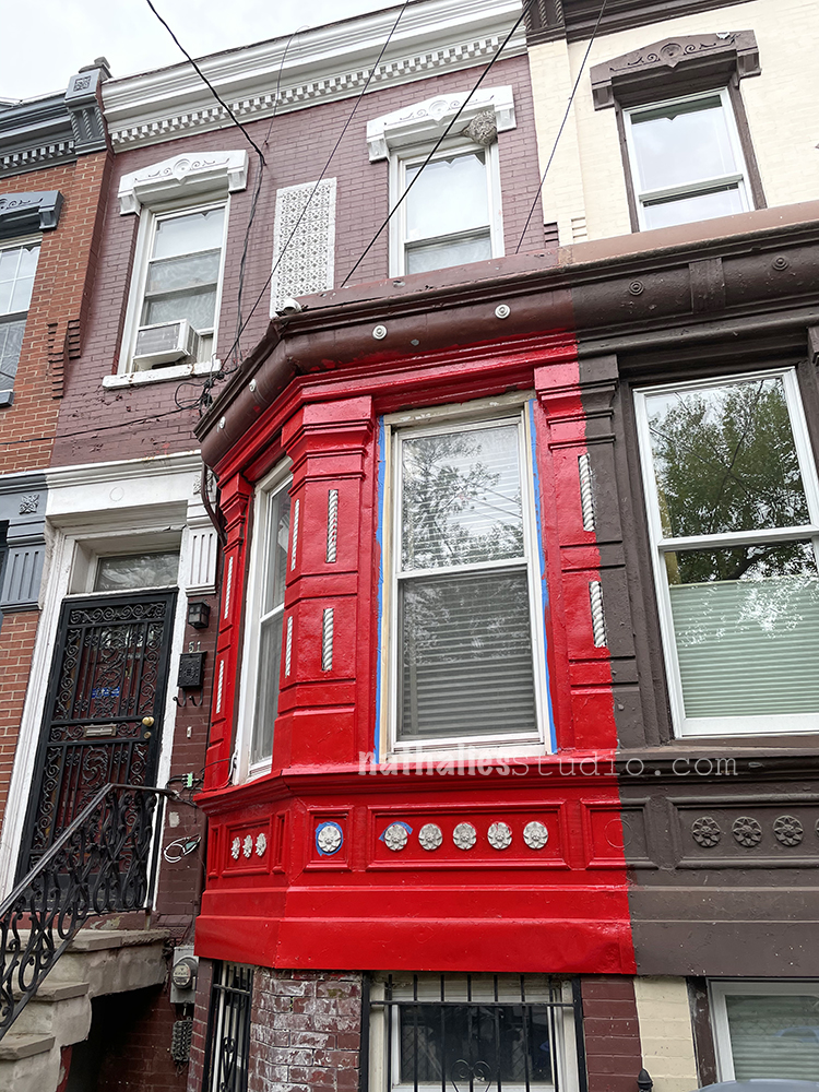
Love the facade – those details on the bay windows – be still my heart.

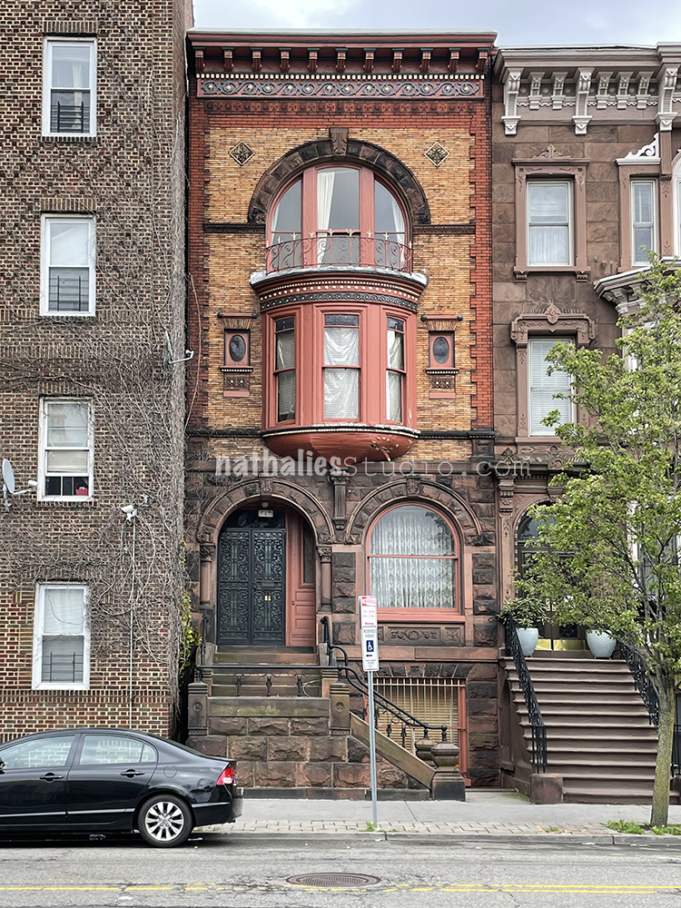
Which reminds me of this one – I love love love the balcony on top – and the cornice swoon. Every time walk to the post office to drop off your packages- I swoon over this house.

Speaking of Bay Windows- I loved this pop of color on this one. These little town houses are so cute and the brick work and the little terra-cotta (the white painted ones above the bay window between the second floor windows) tiles are amazing.

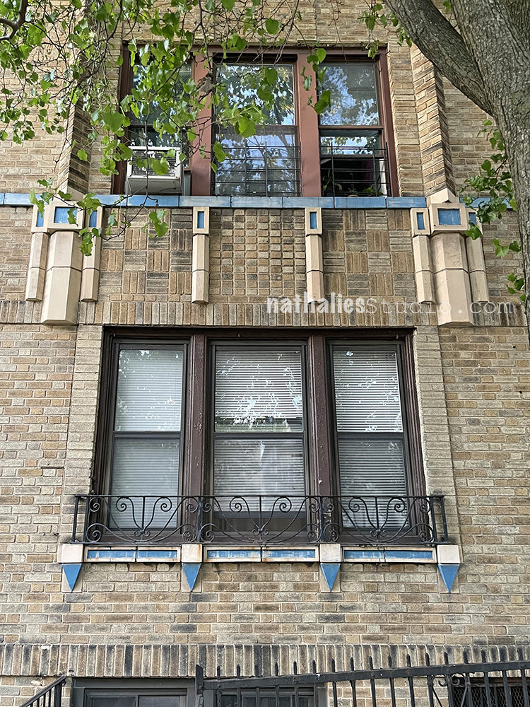
I also love the details on this art deco apartment building. It is a very simple brick house but the blue details are stunning.

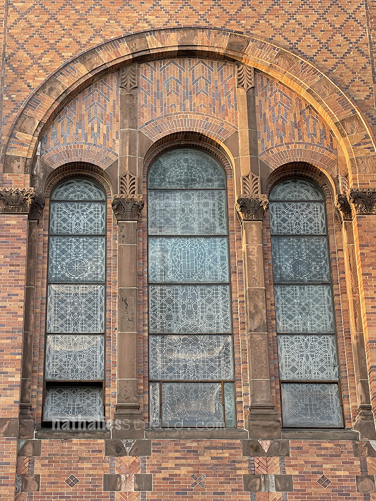
This church with it’s magnificent brick details is amazing by itself- but look at the details of the windows. I hope someday soon I can go back in and take some inside photos -before the pandemic I never hit a time where there wasn’t a mass inside.

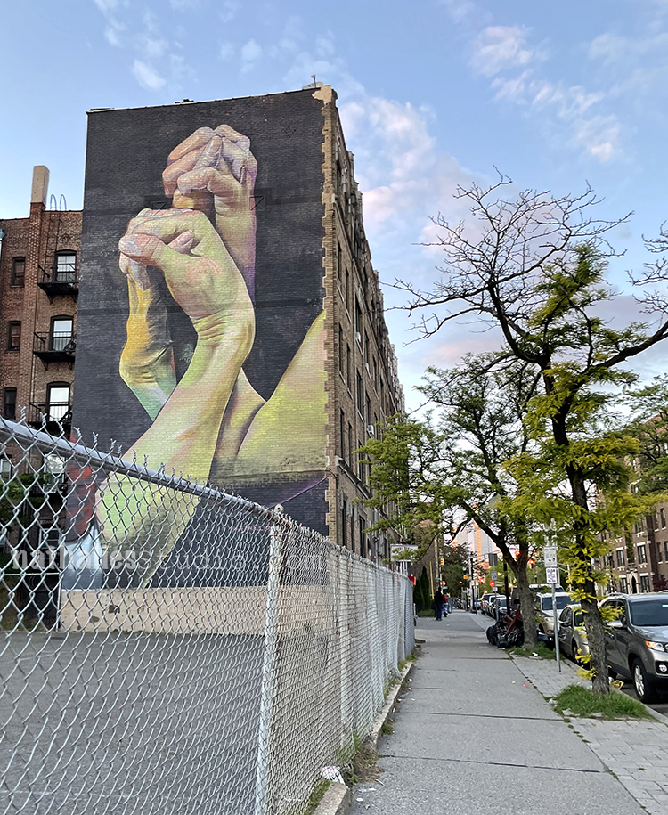
My favorite Mural ….

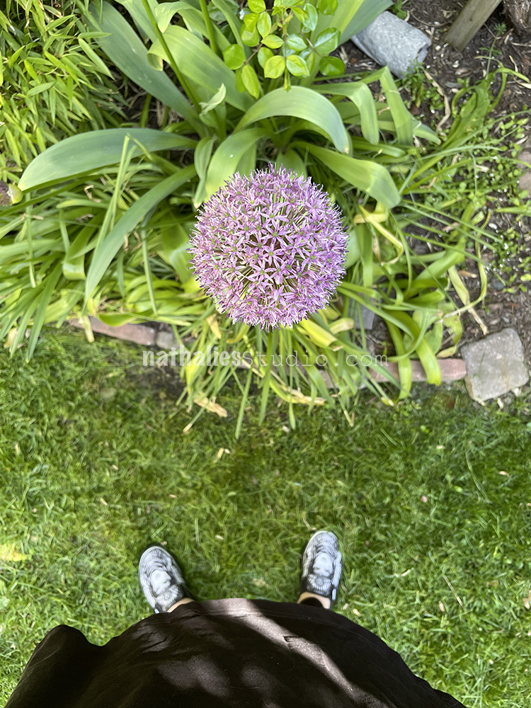
If you have followed me for a while you might recall I love Alliums- this one is gigantic again and I am so happy to say hello to my old friend !

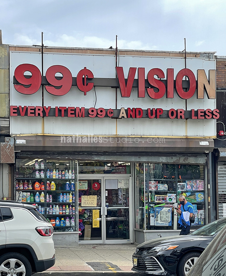
This sign made me really chuckle – I think I am overcomplicating my pricing system – LOL- what do you think ;)

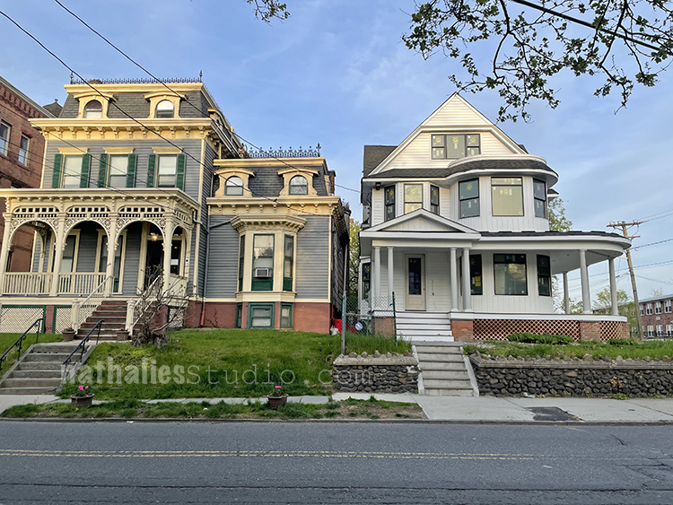
This house which I actually thought would be just torn down now looks as if it is getting restored. I am curious to see what happens. Which reminds me

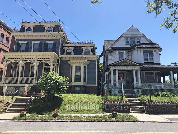
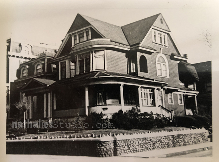
I showed this photo a while ago – the house on the right has been in this boarded up abandoned State for years and years.

The house built in 1901 used to belong to a very well off Dr. Muller who apparently was very well off and used to travel to Europe every year- apparently he did about 22 Atlantic crossings. He was on one of his big Europe travels right when WWII broke out and was trapped on a German ship not being able to get back home and was met with a lot of press when he finally managed to get home via some other countries and landed in Hoboken.

Anyway- look what happened over the winter – they fixed it up. I dare to say there is probably not much left of the original house and I wish I could have seen what it looked like underneath the horrid aluminum siding but part of me is a little bit happy that it is still standing.

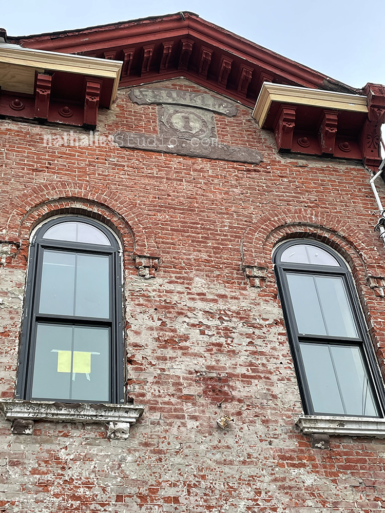
Speaking of pleasant surprises – this house in my neighborhood – a former firehouse is being restored as well

Look at the gorgeous brick and the cool Firehouse sign being revealed again. It is so much fun to see those buildings come to live again. This was it this month – up and until next month – I hoped you enjoyed the stroll. 

Comments (4)

  • Bev Gwinn Jones

    |

    What a marvelous hood it is ! Thanks so much for the stroll, 3 houses in my historic hood are under renovation can’t wait to see them finished ????

    Reply

  • Berit Gustavsson

    |

    Hi

    Love Your ” Stroll through the Hood”. I like New York and it’s naighborhoods. Thanks for sharing.

    Reply

  • Debbie in AZ

    |

    I love your strolls through the hood! They are the main reason I read your blog. I love how you find inspiration in the every day. Thank you very much!

    Reply

  • Sue Clarke

    |

    I so love your strolls!
    I guess you had something to do with the blue accents.
    You will tell us which one at some point?
    That 99 cent sign is very amusing.

    Reply

Leave a comment

Do Better – Art Journal

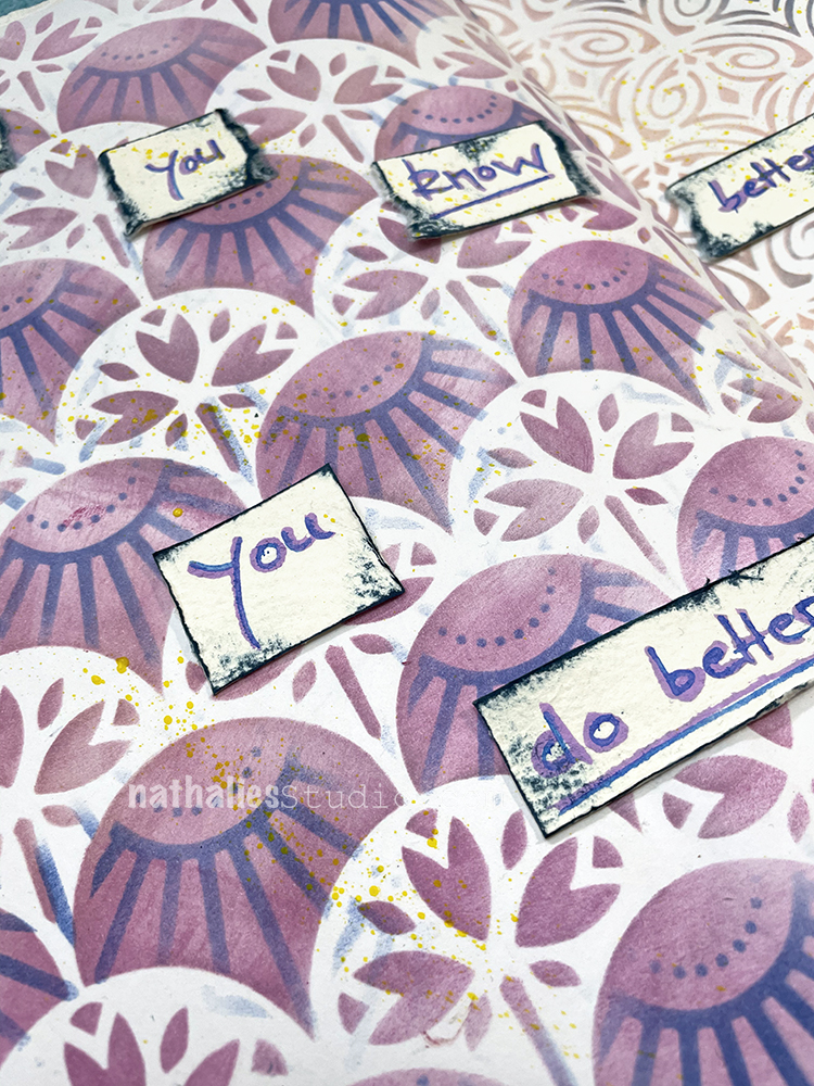
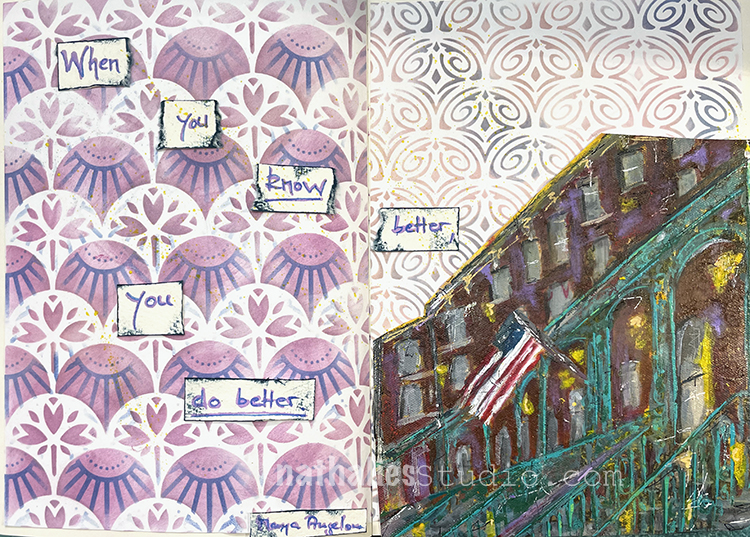
“When you know better you do better.” – Maya Angelou

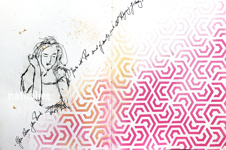
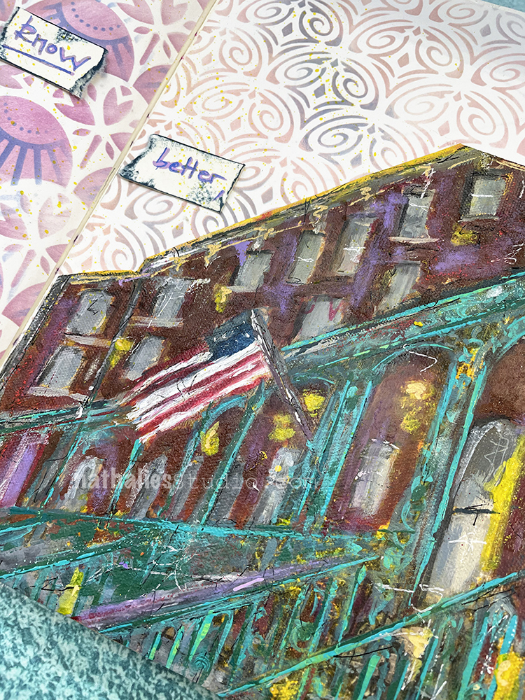
My background is from papers where I had used my Art Deco Fairview, Art Nouveau Wallpaper , and Art Deco Empire stencils and Moonlight duo ink pads with a blending tool. I attached them with double sided tape and then GASP when I reorganized my studio I cut up a painting – just the part I liked and added it to the art journal – can you believe it?!?

The quote was written with acrylics marker on watercolor paper which I cut out and then adhered. 

Here are some of the supplies I used:
Leave a comment

Creative Squad: In the City – Jordan Hill

Hello from my Creative Squad! Today we have a super cool project from Jordan Hill using a mini billboard model and my Triangle Love rubber stamps. Our theme is: In the City – Although we aren’t traveling much these days, let’s reminisce about a time we traveled to another town or city. Think about the flavor of the place and let that guide your color and design choices.


Hello, everyone! I’m very excited to be back with my project for May 2021. This month I was working with the Billboard Model Kit, which I found to be a lot of fun and an interesting change of pace from the style of work that I usually do.

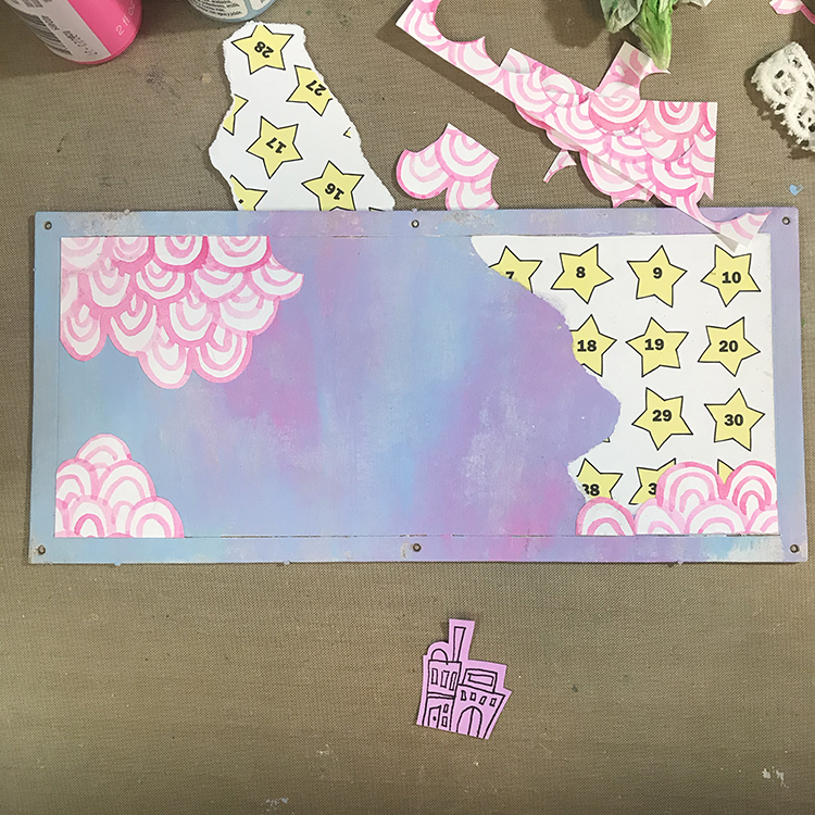
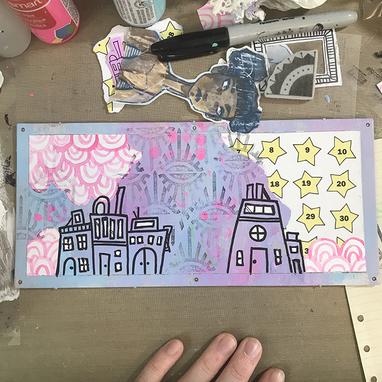
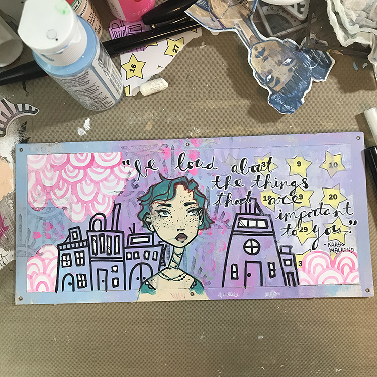
I decided to begin my project by decorating the flat billboard part of the model. In order to do this, I used some white gesso to prep the chipboard surface, then used CraftSmart craft paints in Pale Blue and Neon Pink to create a background that reminds me of some of the colors of lights you might see in the city at night.

In order to create this particular background, I tried to work quickly and allowed the paint colors to blend together as I applied them to the chipboard. The two colors I chose created a pretty soft purple when mixed, which added a bit more depth to the background colors. After the acrylic paint had dried, I then added a few pieces of collage (some star paper I found at a thrift store and some hand painted neon pink arcs) that reminded me of graffiti.

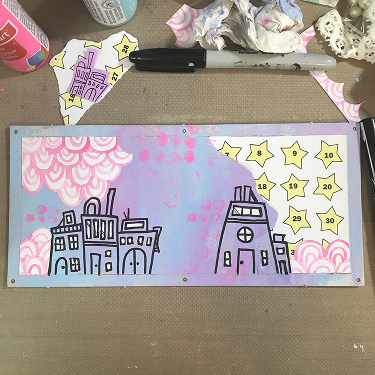
Next, I knew I wanted to incorporate the theme of “In the City” in the form of some freeform building doodles. Using a Sharpie, I drew squares, rectangles and arches to represent the shapes of houses, windows and doors. I then used some leftover neon pink paint I had on my palette and the tip of my finger to add some dots to the background. I also added some white to the windows of the houses to help them stand out a bit more.

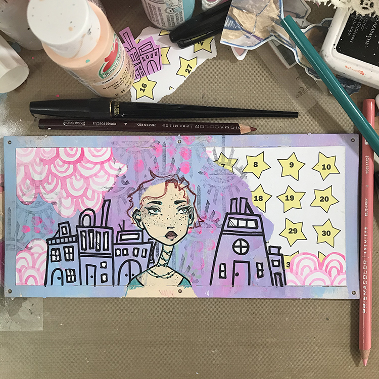
After I had my buildings in place, I knew I wanted to add some more pattern and texture to the background. In order to do this, I chose Nathalie’s “Empire Triangle” rubber stamp to stamp over the entire background. Since there was already a lot going on, after inking up my stamp, I stamped once on a separate scrap of paper before applying it to my background. This gave me a much more muted effect, which I quite like.

Next it was time to add the figure. I played around with the idea of collaging a face onto this piece, but ultimately decided to draw a new one from scratch. I did this in much the same way as I typically do, by first blocking in the shape of a face with acrylic paint, then sketching over the top in colored pencil. This time however, I did opt to use an Aquamarine Prismacolor pencil for my sketching as opposed to my typical navy or deep purple. I then inked the illustration and sketched in some hair.

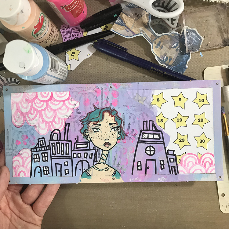
The next step was to add color to the hair I sketched in previously. I chose to go with CraftSmart Aqua for this step; I recently discovered I have three bottles of this paint in my possession, and I wanted to use some of it up! It also just so happened to coordinate with the colored pencil I had already used to draw the face and it had a nice contrast with the pre-existing colors of the background.

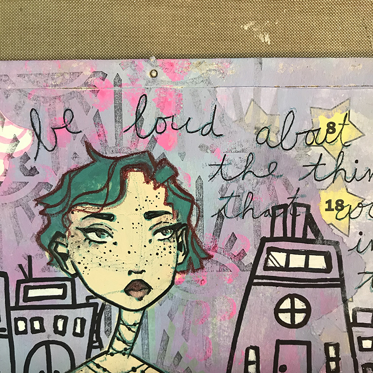
As I reached this point in the project, I knew I wanted to add a quote. This particular model feels very much like a display piece, so I felt that some motivational words would work well. In order to add the words to the piece, I chose a thin ink pen and wrote my quote in a large cursive font. This is the first part of the typical style of lettering that I recreate frequently in my artwork.

The second part of this lettering style is to simply thicken one edge of the cursive writing. You can use the same thin ink pen to do do this, or you can choose to go for a brush pen in order to fill more space more quickly (this is what I chose to do on this particular project). Once I was happy with the lettering, I then used a white gel pen to outline the text in order to make sure it stood out from the background enough to be legible.

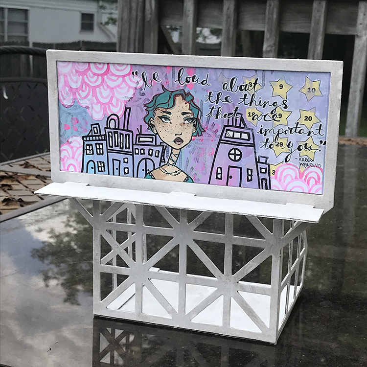
Finally, it was time to actually put the model together! I painted all of my chipboard pieces white before I started assembly, since I felt that the color would fit my project better. Then, I simply followed the instructions to create this fun display piece that I’m definitely going to enjoy using as a part of my studio decor!

I hope you all enjoyed following the process of creating this project!


Thank you Jordan! I just love your color palette on this and watching you build your composition – it works great for the billboard!

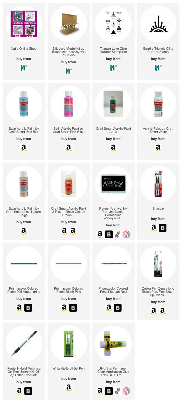
Give it a try: you can find all my Rubber Stamps and those cool Cardboard Models in my Online Shop and in addition to some collage papers, here are some of the supplies Jordan used:

For more from the Creative Squad check out Nat’s Creative Squad on Instagram too: Each week we post projects, ideas, and inspiration for mixed media art.

Comments (1)

  • Sue Clarke

    |

    I really like this Jordan and how you explained what you did…simple enough for me to be inspired by them.

    Reply

Leave a comment

Don’t Quit – Art Journal

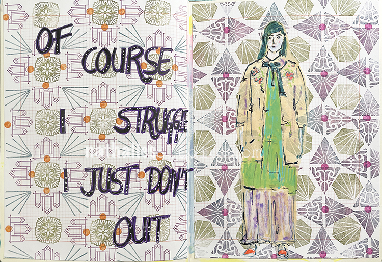
“Of course I struggle. I just don’t quit.”

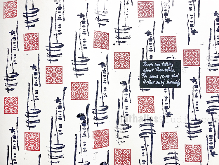
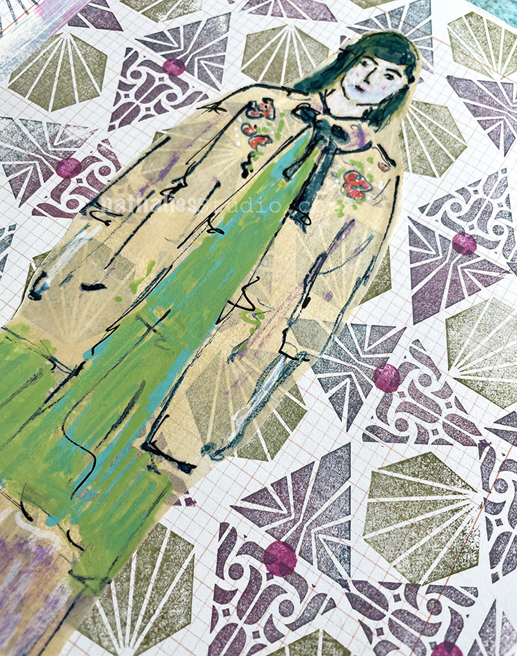
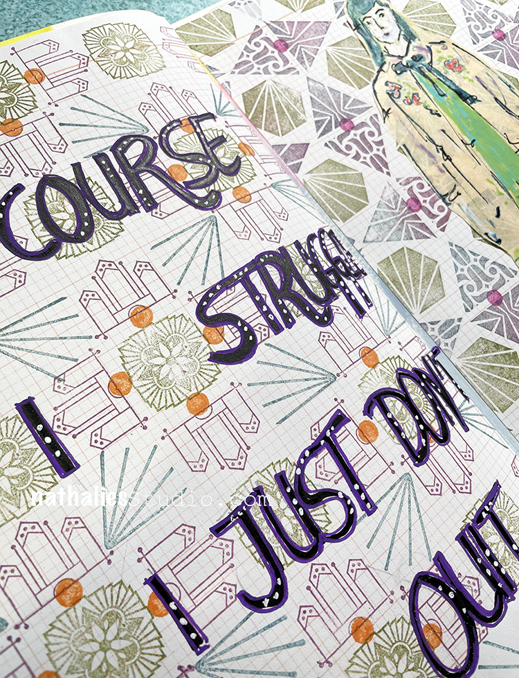
I used grid paper to play with some patterns that I had stashed away – it fell into my hands while reorganizing the studio so time to use it again. I adhered it with doublesided tape and then stamped with Moonlight Duo ink pads and some of my favorite stamps for pattern making: Triangle Love, Hex Set Small, Mini Motifs, and Floral Tile Small. For the dots? A pencil eraser. And then I sketched my figure using a bamboo sketching pen, acrylic inks and markers on deli paper.

I added my quote with Posca markers to finish things off.

Here are some of the supplies I used:
Leave a comment

ArtCollab -Episode 3 and Upcoming

Thank you to all who joined us for the ArtCollab Episode 3 zoomcast – Sarah and I loved having you there as we talked about our topic “I can’t do it” and how to get past that mindset and move to a much more healthy and productive one. Although we try to cover some big topics of discussion, we also just love getting together, joking around, and sharing a nice time with all of you. Check it out:

Here is what we covered:

In this third episode we kick things off by sharing some of the April ArtFoamies Challenge posts from Instagram. Then we jump right into our topic for the day and talk about how our own similar life experiences have helped us move past the negative mindset of “I can’t do it.” We also offer additional suggestions on how to get beyond it such as just jumping in, starting small, and using accountability with a partner or friend who you share your goals with. We discuss how the TV show The Great Pottery Throwdown actually has some really useful lessons in it with regards to this topic, and we talk about the benefits of taking classes in a new discipline and how you can always get something out of the experience. Finally, we both agree that as soon as someone says, “You can’t do that”, that is the ultimate motivation. To close, we share what we made with the items from the boxes we exchanged last episode and we introduce the topic for Episode 4.

Join us for Episode 4: Art is Serious, Craft is Fun – Tuesday, June 1 at 12noon EDT(NYC time)
We’ll be tackling that big debate: What is Art and what is Craft? Is there even a difference? What do the two terms mean to us? Everyone has different ideas about this topic and we want to discuss this live and see where it goes. We’ll talk about how our definitions may influence what we create and why we create, and how we perceive and react to audience expectations. Finally we’ll look at some art that may make us uncomfortable (or not) and chat about those feelings.

Register to join.

Leave a comment

Spill your heART – Episode 3 and Upcoming

Wow – did you catch the latest episode of Spill your heART? If not, you can enjoy the recording below. In Episode 3 we tackled the topic: Social Media – Taming the Beast with my stellar panel of artists: Jimmy Leslie, Iris Fritschi-Cussens, and Julie Fei-Fan Balzer. It was an informative but also super fun time to chat with these 3 professionals on their take.

Recap: In this Spill your heART webinar we talk about why we use social media, how we set boundaries, our own ways of dealing with comparison, the importance of meaningful interaction, and the question of authenticity. Hear 4 different perspectives on Social Media, and how we “Tame the Beast” as professionals, artists, business owners, and human beings.

Whenever you miss an episode or want to revisit, you can find recordings of past episodes and info about upcoming Spill your heART episodes here in the Community section of my website. To always have the latest news on webinars, be sure to sign up for my monthly newsletter here.

Next Episode:

Coming Soon: This time I’m getting together with Gwen Lafleur, Mystele Kirkeeng, and Marsha Valk to talk about why we make art with Episode 4: What’s the Point – Purpose vs Journey. Join us on Friday, May 28th at 12noon EDT. Register here today.

We will discuss What’s the Point – why are we making art? Are you creating for a purpose or is your goal to focus on the journey? Are you somewhere in between? Everybody creates for a different reason and as professional artists (and hobby artists too) that may include a blend of reasons. We’ll explore the why and then also the aftermath – what do you do with it all afterwards. Selling, personal collections, gifts, the closet, and the trash will all be on the table.

Leave a comment