Blog: Scrapbooking

designed by n*Studio features: Adrienne Ford

NStudio-Features

One of the things that make me really giddy is when I spy someone using my new stamps by Stampendous or also my Stencils with Stencil Girl Products :) So I thought once in a while I would feature the work of those wonderful talented people with a new Series called: designed by n*Studio features:…..

And today I feature: Adrienne Ford

Adrienne 043

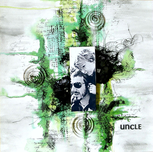
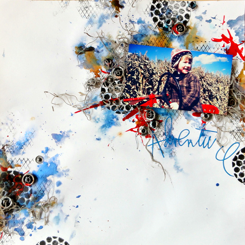
Adrienne is part of the Stampendous! Designteam and when I saw her amazing work with my stamps in the catalogue I fell instantly in Love with her colorful yet grungy style.


AdrienneFordUncle01


It all just comes naturally and organic together- I love it!

AdrienneFordUncle02

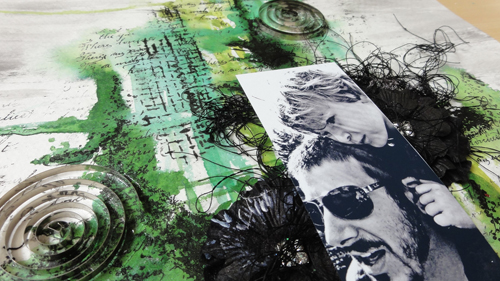
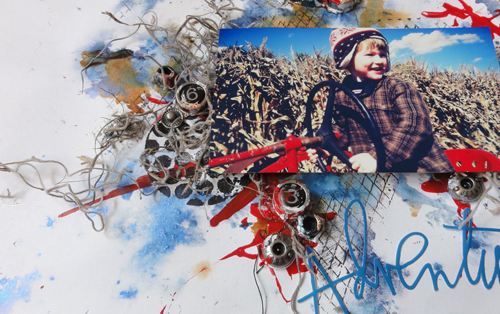
I love how Adrienne also includes threads and fabric and even enhances the tactile look of the stamps

AdrienneFordadventure01


I also love how she makes the photos blend so perfectly with the background- AMAZING

AdrienneFordadventure02


And I love the hint of color here and there which makes the black stamped images pop out even more

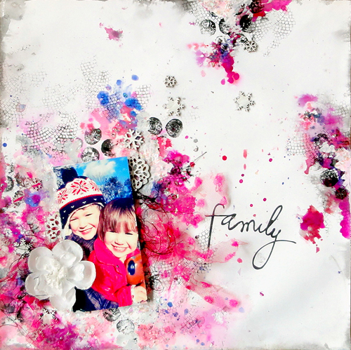
AdrienneFordFamily01


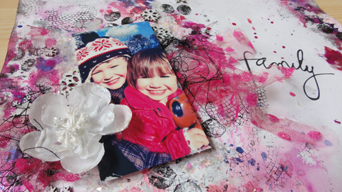
And…her kids are so adorable!

AdrienneFordFamily02


Thank you Adrienne for sharing your amazing work with my stamps with me!

Make sure to visit Adrienne’s Blog for more inspiration and if you have done something with my stamps or stencils I would sure love to see :)

Here are the n*Studio Product Adrienne used:

nSupplies


Have a wonderful day!

hugs

Nat

Comments (10)

  • Ursula

    |

    Schick, schick :) – und endlich gibts die Stempelchen auch hier in good old germany in meinem LieblingsShop zu kaufen :)) Werde ich sie also auch bald testen können – Jepp
    LG Ursula

    Reply

  • Amante del papel

    |

    I want this stamps there are so amazing!!!

    Reply

  • Jackie P

    |

    Glad that you featured Adrienne’s art- so very cool~ and yes, her children are adorable! I have my stamp set picked out and on the TO BUY list!
    Nat, Can you tell me what colour tea/or green or turquoise that is that you used on your banner at the top of your page? I simply adore that shade! It POPS!!!! “)

    Reply

    • nathalie-kalbach

      |

      I assume – since I never keep track of my colors that I use ;) – that it was Liquitex Cobalt Teal- if that is the one you are pointing too ;) In any event- these are all Liquitex Colors.

      Reply

  • darlene

    |

    Cool to feature artists Nathalie. I definately am crazy about your new stamps as I like the raw, organic look…and I’m fascinated with what Adrienne did using them.

    Reply

  • Laura Strack

    |

    Adrienne is a true artist! Wow, love the way she blended her photos into her background. The stamping is amazing and all the texture, perfect Layouts!

    Reply

  • jjflair

    |

    “Whoa,” I said out loud, “She is badass.”
    And, my hubby came over to see what I was looking at, and he agreed. And, we stared in awe together and had a great convo about art and style and texture and media. Super inspiring! Thank you!!

    Reply

  • Nurse Ratchet

    |

    FabUlous art…fabUlous stamps!!

    Reply

  • Misty

    |

    Adrienne is amazing!!! Those layouts are gorgeous and oh so unique!

    Reply

Leave a comment

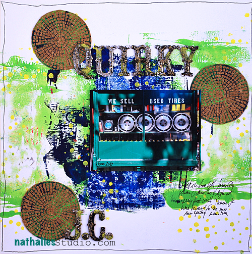
Quirky J.C. or Mish Mesh Stamp Set

Let me share another layout I did with the third of my sets of  my signature stamps for Stampendous! for CHA

NatKalbach_QuirkyJC01


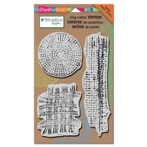
For this layout I used my Mish Mesh Stampset:

MishMesh MishMeshBack


It comes with a free template which I used here and there with yellow.

I started out with some mono printing using the new Stampendous! Creative Palette – stamping into it with my stamps and then using the two colored stamps on cork. I cut out the cork circles and added them tot he layout. I applied Stampendous Aged Embossing Enamel on top of the letters – I love how you can grunge things up with it – also added some yellow acrylic paint on the letters to repeat the color.

The sight where they sell these tires was one of the first ones when I visited Jersey City for the first time last year and hahhaa- you bet I thought that would be a good spot to live if they have stores like that ;)

want to know where my stamps arrived so far? – I started a list of the stores carrying them – so check it out. If you stock them as a storeowner let me know :)

Here are the supplies I used with this Layout:

nSupplies


Have a beautiful day

hugs

nat


LogoBlogSignature

Comments (2)

  • Laura Strack

    |

    Ooh, cool, I’m close to one of the stores that’s carrying your stamps! I’m gonna have to plan a small road trip :) I love the Mish Mesh stamp set!

    Reply

Leave a comment

Simply BOLD or…Grunge Stampset

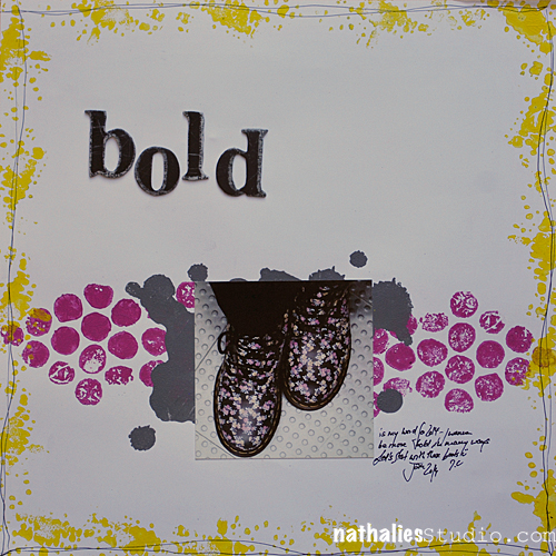
This is another layout which I did for the Stampendous! CHA booth to showcase my new Stampset Grunge.

NatKalbach_Bold01


I know….pretty unusual for me, right? I do love the simplicity though- as my emphasis was on my word of the year: BOLD – I needed a statement like layout ;)

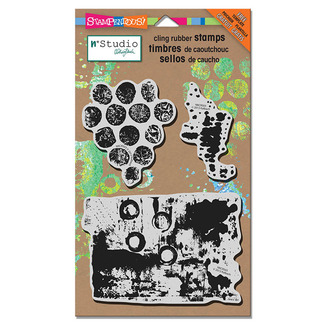
I used as said the Grunge Stampset

GrungeNatKalbachGrungeTemplate


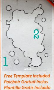
and the included free 2 piece template.

NatKalbach_Bold02

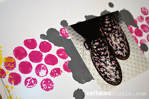
I used the stamps and the template with acrylic paint – my favorite way to use stamps and those stamps are just perfect for it.

Here are the few supplies I used:

nSupplies


Wishing you a gorgeous weekend

hugs

nat

LogoBlogSignature


Comments (8)

  • Eniko

    |

    I love the directness of this layout, Nat! Wonderful colors & that footwear is perfection!

    Reply

  • gunvor

    |

    Fabulous page! Love the simplicity and the colours. I can’t wait till I get those stamps – I think they’ll go really well with ink too!

    Reply

  • Kirsten Alicia

    |

    Fantastic page!!

    Reply

  • Pitchoune57

    |

    so beautiful page, bye from France
    Pitchoune

    Reply

  • Sue Clarke

    |

    I like this simple LO. I assume that these are your shoes. It’s been a while since you talked about your love of shoes on this blog.

    Reply

  • Louison

    |

    I love your page; so beautiful!!!

    Reply

  • nurse-ratchet

    |

    I have yours stamps and they ARE amazing!!

    Reply

  • kat82ren

    |

    I want your stamps, there are amazing!!!

    Reply

Leave a comment

Always Half Full or…Wired Stampset

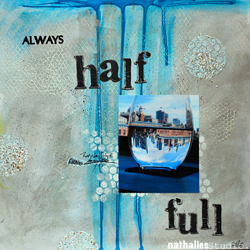
How about, I start sharing some of my projects I did for CHA for my brand-new Signature line of stamps with Stampendous! ? It was lot’s of fun creating this layout:

NatKalbach_Alwayshalff01


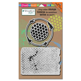
For this layout I used my Wired Stamp set:

WiredNatKalbach_WiredBack


It comes with a free template which I used behind the photo

NatKalbach_Alwayshalff02


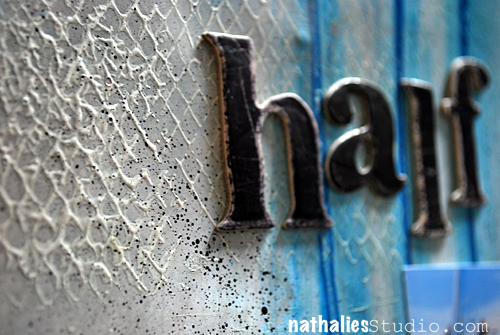
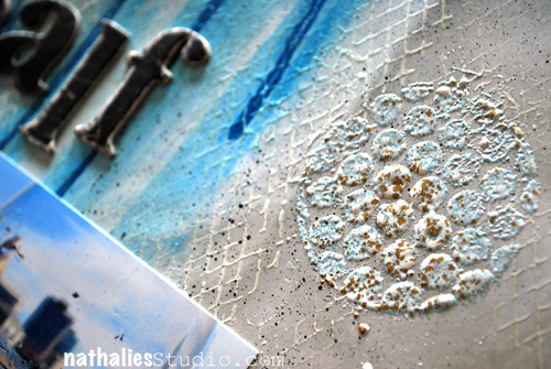
I had stamped with Gesso on white card stock – let it dray and then added Liquitex Acrylic Inks with a cosmetic sponge and also by dropping it down the top.

NatKalbach_Alwayshalff03


I also used the stamps embossing with Stampendous Aged Enamel – love the 3-D Effect.

I will show you some more projects and techniques over the next weeks with my stamps – also I will share some projects other people including the wonderful Stampendous Design Team did with my stamps. If you want to know where to get my stamps– I started a list of stores here – and I will add as I get notes from Stores that they arrived. If you are a store owner and carry my stamps- please let me know -so I can add you :)

Here are the supplies I used with this Layout:


Have a beautiful day

hugs

nat


LogoBlogSignature

Comments (10)

  • Laura Strack

    |

    Awesome stamps, Nat! Woohoo!!

    Reply

  • Kimmie Hogan

    |

    I LOVE LOVE LOVE your new line of stamps. They’re so much fun. Being the stamp junkie I am, (no, seriously I need a 12 step program) I cannot wait to add these to my stash. They will certainly be well loved and used frequently.
    Love the spread btw. And Thanks for putting up the supplies you used. That is really helpful. Congrats on the new line. (((HUGS)))

    Reply

  • gunvor

    |

    Lovely LO! I love the colouring effekts and the texture. Cannot wait til I get those stamps.

    Reply

  • kat82ren

    |

    it’s a beautiful page!

    Reply

  • Kirsten Alicia

    |

    That looks wonderful, the texture is fab. Love your new stamps.

    Reply

  • andrene

    |

    A really beautiful layout – love that shade of blue and the drippage! Your stamps are truly fabulous and I can’t wait to get my hands on them.

    Reply

  • scrapinsue

    |

    I have recently swore off buying any more new stamps but this set might have changed my mind. Very cool LO and it makes me think of snow on a sunny day.

    Reply

  • Mandy Collins

    |

    congratulations on the launch of your new products, love the results you can achieve with textures

    Reply

Leave a comment

12 Days of California Part III: CHA 2014 Trends & Observations

As every January Winter CHA was a must-go for me to see and observe trends and new products , for meetings and seeing friends. It was four days of insanity but I love it :)

Here are some of the trends I spotted:

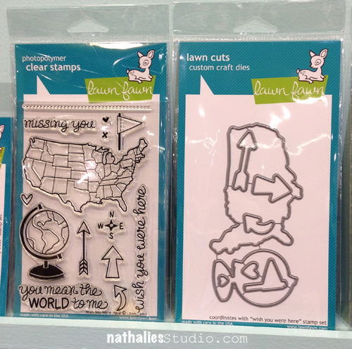
  • Die Cuts with matching stamps or other products they can work well with  – Dies are hip and everywhere. Often times they accomplish an already existing product by a company – like Elisabeth Crafts Designs (Shimmer Sheets etc.) with the new licensed Karen Burniston Dies or Lawn Fawn Stamps with matching Dies
  • Wooden and other natural looking embellishments
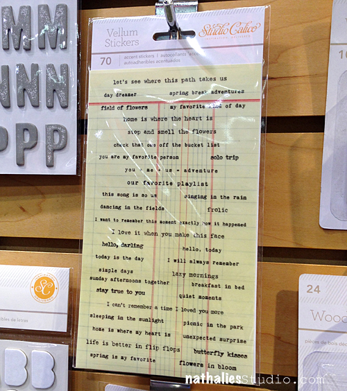
  • Globes, Typewriters, Maps, Location Signs
  • Everthing Project Life related: Paper, Tags, clear bags, small alphas
  • Vellum and Washi Paper
  • Mixed Media products- paints, stencils, media – everything that can be used with Paint Products
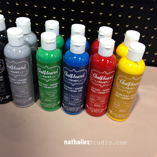
  • Cork, Chalkboard, Canvas, Burlap

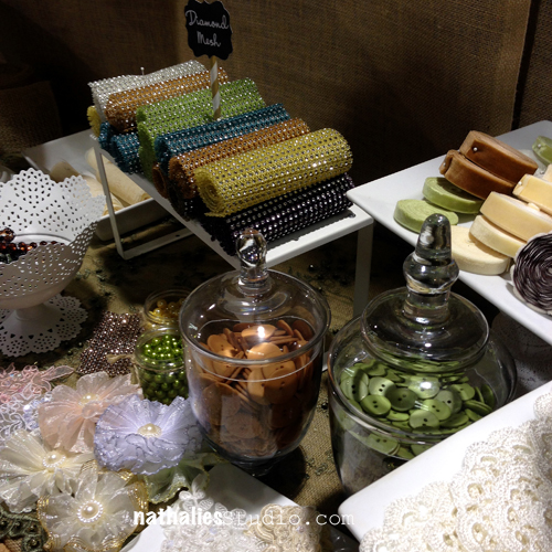
Another visible trends was that several companies were approaching the market differently –Several companies did not do the typical Scrapbooking Products,  it was more about accessories for Scrapbooking, homedecor and DIY  – like Hazel & Ruby with their Wall Stencils and gift paper wrapping, or Cosmo Cricket with beautiful Mason Jar additions and gift bags or Mon Ami Gabby with their natural versatile looking ribbons, rhinestone mats, crepe paper.
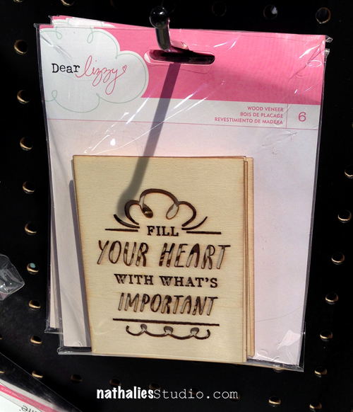
NatKalbach_CHA2014_03


NatKalbach_CHA2014_06


NatKalbach_CHA2014_04


NatKalbach_CHA2014_05


NatKalbach_CHA2014_07

My Personal Faves at CHA2014

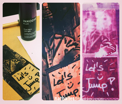
Lumi – Solar Printing at home- it was so much fun. I visited a class too and there will be a blog post about it coming soon :)
NatKalbach_CHA2014_14

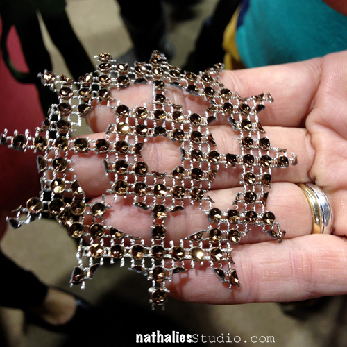
Mon Ami Gabby had rhinestone mats which can be used with die cut machines. I do hope they will get  better website- but I do love their products and the booth was beautiful!
NatKalbach_CHA2014_09

NatKalbach_CHA2014_10


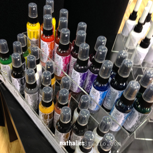
Tsukineko – now Imagine Crafts Irresistible Sprays – Resist Texture Spray- do I have to say more- yum!Cannot wait to get my hand on those and play with them
NatKalbach_CHA2014_01

NatKalbach_CHA2014_02    

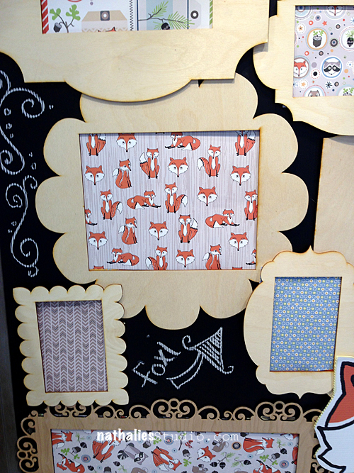
Loved this paper – it was my fave…and like a total beginner I have no idea which company it was because I didn’t write it down nor did I take a photo of the label..if someone can tell me- I would be happy- LOL :)
  NatKalbach_CHA2014_08  

Observations

  • Other than the paper above and some of other papers, most of the paper was a bit disappointing for me – the color scheme seemed to be throughout the same as well as the clipart – very few exceptions.
  • Spray paints with and without texture – Prima’s new Spray Paint- I will post about it soon, Imagine Crafts – it seems still on the up
  • The two main trends are Project Life and Mixed Media and everything seems to revolve around these two trends.
  • Lots of chalkboard muted matte pastel paints e.g. American Crafts- or the Earth Safe Booth
  • a lot of companies were not at CHA this time – Big booths like EK Success and other companies like Maya Road were missing totally. UPDATE: It was brought to my attention that Maya Road was at CHA. I missed their booth apparently totally and when I was talking to others they said also they didn’t see them- I should have fact checked this of course- so I do apologize. I am a fan of Maya Road- so having me pointing this out was a matter of sadness – happy to hear though they were there!
  • I had the feeling that the booths were in general less project and more product driven – there was way more creative output the years before and all in all the booths were a bit more plain then the years before. I am not sure how I feel about this because the art and design work usually made me most excited about the products.
  • Meeting people is the best about CHA – it is the time to talk, celebrate and network and I would not want to miss it anymore


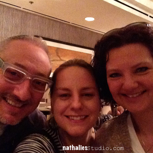
JumpStarter Joe Rotella and Birgit Koopsen and I at breakfast
 

NatKalbach_CHA2014_11


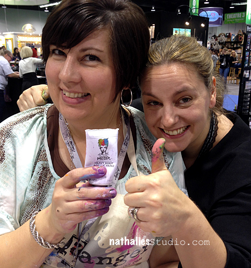
JumpStarter Dina with her new paint line- so proud of her and cannot wait to try them!
NatKalbach_CHA2014_18


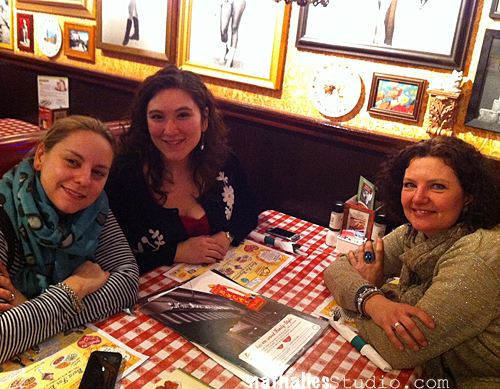
JumpStarter Julie Fei Fan Balzer and Birgit Koopsen – since Birgit is my bestie she is on a lot of photos ;).
NatKalbach_CHA2014_13 

Birgit with JumpStarter Catherine Scanlon
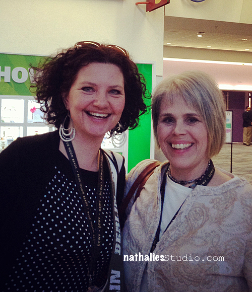
 NatKalbach_CHA2014_15


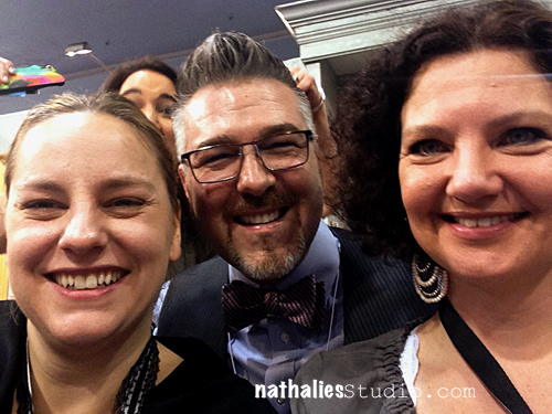
Denny from Prima who did such a fantastic job organizing the event and a little photo bomber- lol- that would be Limor Webber  NatKalbach_CHA2014_16
 

The amazing Suze Weinberg- another JumpStarter – visiting me at the Stampendous booth – she is sooo cool!
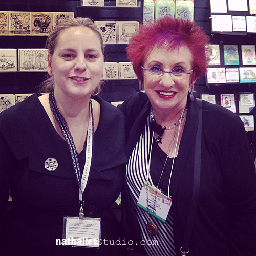
NatKalbach_CHA2014_17 

JumpStarter Pam Carriker, Birgit Koopsen and Mary Beth Shaw – we had so much fun trying to get a photo of us jumping…you cannot see a thing in that blurrr- LOL
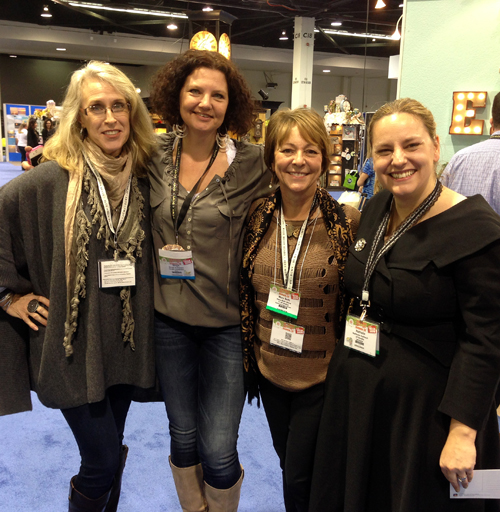
NatKalbach_CHA2014_19


I will be dabbling on some of the products I found at CHA here and there in future blog posts. I am looking forward to next year already!

The next posts from California will be about our mini vacation doing arting with Birgit Koopsen, Jenn Mason and Julie Fei-Fan Balzer – watch out for crazy posts ;)

Have a gorgeous day

Nat

LogoBlogSignature

Comments (7)

  • ruby t

    |

    I did an image search on google and came up with another woman having ta similar image of a booth with those designs that were at the Houston Quilt Market Nov 2013.
    http://www.seasonedhomemaker.com/2013/11/houston-quilt-market-2.html
    She does not indicate which company. So it is a company who produces fabric and paper…narrows it down just a little…
    Another woman at CHA says the exact thing that Natalie says…I forgot to write it down:
    http://janiceaileen.blogspot.com/2014/01/cha-megashow-2014-part-2.html
    She says she *thinks* it is AdornIt
    At least you have the name Woodland Critters
    that is all I have got

    Reply

  • andrene

    |

    OK-I spent, I know, 2 hours searching every paper company I could think of and watching all the CHA peek videos I could find to no avail. I haven’t a clue who makes that adorable collection! So if you find out, please let us know because I will be all over it!
    As for this releases papers & collections, I think there are some really nice ones coming out. The new Prima’s are gorgeous. Finnabairs new collection “Cold Country” is beautiful (gotta have it). And I’m loving Lawn Fawns stripes and dots. Thanks for the photos – I need to look out for those irresistible sprays!

    Reply

  • SusanJane

    |

    “Other than the paper above and some of other papers, most of the paper was a bit disappointing for me – the color scheme seemed to be throughout the same as well as the clipart – very few exceptions.”

    I’ve noticed this trend, too. What are all these companies thinking? I cannot imagine this homogeny is going to be profitable. It certainly demonstrates shortsighted planning. I’ve only bought a few sheets of paper this past last year and none of them were the “in” colors and patterns.

    Is it declining sales that are making these companies get pallet conservative?

    Reply

  • kat82ren

    |

    Thanks for showing us so many beautiful things!

    Reply

  • Laura Strack

    |

    I enjoyed your take on CHA! Thanks so much. I keep hearing that Scrapbooking is on the decline. I can’t help but wonder why? What can we do about it? Maybe more folks are going digital, IDK, but what can we do to get the younger generation involved and loving it, is the question?
    Hugs, Laura

    Reply

  • morningdove

    |

    loved your post – since never been so fun looking into CHA thru your eyes. looking forward to your posts on products. CJS is amazing this year and I am on fire. so funny when I printed out my list sheet of daily workshops I also go Jan 22, transparencies and giveaway on the list. like Santa I am checking off my list to make sure I try all the teachers tech and do the givewawys. great job nat.

    Reply

  • scrapinsue

    |

    I enjoyed this post so much Nat. Thanks for taking the time to give us the details. I have to say that most of the scrappy stores within an hour drive of me have closed at this point. My friends and I see that the scrapbooking (in the more traditional sense) seems to be on the decline. Mixed media and products for home decor are on the rise around here. So at least we are on the same page as CHA. LOL

    Reply

Leave a comment

12 Days of California Part I: Prima Art*Venture

NatKalbach_ArtVenture11

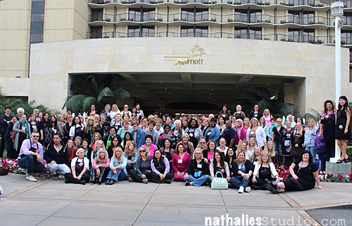
I am back from my 12 day long trip to California – it was insane…as in insane work and fun! Well…always good if you can combine both words fun AND work. I am exhausted but nonetheless I want to share some events along the trip- let’s start with the Prima Art*Venture Workshop Retreat. 160 students – 2 days- six workshops – fun…and a toast voice.

NatKalbach_ArtVenture02


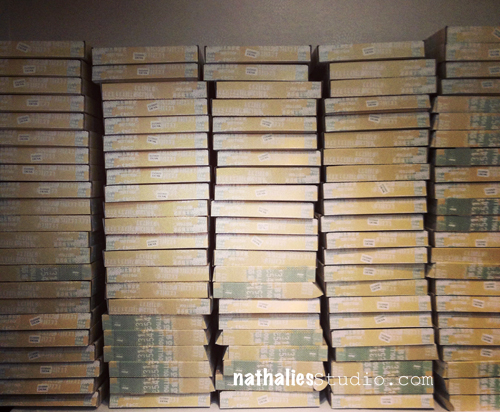
We set up the class rooms till late night the day before the event – look at all the class kits:

NatKalbach_ArtVenture01


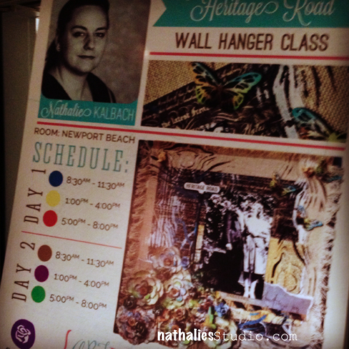
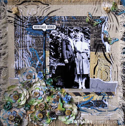
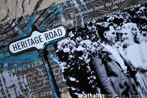
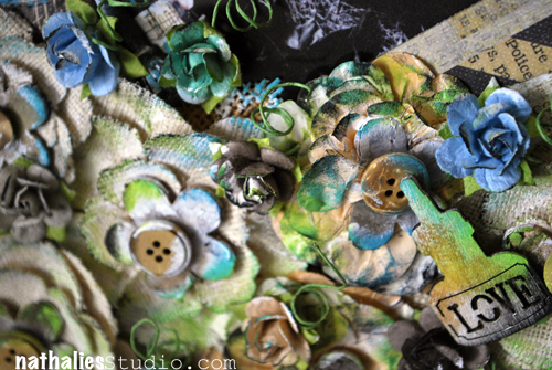
I taught a Wallhanger Class with the new Stationer’s Desk Line by Prima – here is the project and some details
NatKalbachHeritageRoad01

NatKalbachHeritageRoad02

NatKalbachHeritageRoad03

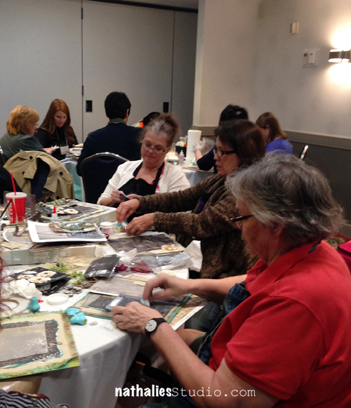
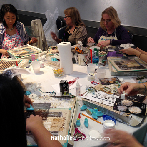
I had a great time with the wonderful students attending the classes – from all over the country and also from Europe and Asia- so amazing!

NatKalbach_ArtVenture03

NatKalbach_ArtVenture04

NatKalbach_ArtVenture05


160 Students- 160 different ways to create the wall hanger- here are just two:

NatKalbach_ArtVenture06

NatKalbach_ArtVenture07


It was fun spending time with the other teachers and friends from Prima including Sharon, Carrie, Anna, Steffi, Jamie, Limor and Frank as well as Denny who did such a fab job on organizing the event. Thank you also to Elena and my two wonderful helpers Cam and Lisa from Charity Wings– you girls rocked!

NatKalbach_ArtVenture08

NatKalbach_ArtVenture10

NatKalbach_ArtVenture09


lunch


(last picture stolen from Sharon ;) ) I did not take that many photos – I am missing most of my sweet people- but oh well- LOL- sorry ;)

Thank you all – also for taking care of me when I got food poisoning or whatever it was what made me sick and dizzy at the end of my fifth class – I am glad I was able to at least finish the instructions and laying down for half an hour in between really helped me to be able to go through the rest of the day and last class.


Tomorrow I will tell more about my class at CHA and the debut of my stamps with Stampendous :)

have a gorgeous day

hugs

nat

LogoBlogSignature


Comments (8)

  • kat82ren

    |

    Congrats Nath and much day like this!

    Reply

  • Laura Strack

    |

    Hi Nathalie, Thank you for all the fun and expert technique advice at Art Venture 2014. This canvas has to be one of my most favorite canvas’ that I’ve ever made!! I can’t wait to give it to my precious Daughter n Law for her Birthday next week.
    Honored to have been one of the 160 students, grateful for all that I learned and I will always cherish the time we spent together. So glad you are a designer for Prima and also excited to see your own stamp line and all the beautiful things that you will create and share from Stampendous. So very cool!!
    So happy for you! Big Hugs,
    Laura

    Reply

    • nathalie-kalbach

      |

      Laura- it was so cool to finally meet you- you are so much fun! Thank you for coming and your awesome support. You rock! huge hugs! -nat

      Reply

  • marjiekemper

    |

    Your class was GREAT, Nat, and I was so impressed you got through all six classes with a voice still intact. So sorry you were ill that day!

    Reply

    • nathalie-kalbach

      |

      Ahhh -thank you Marjie – it was so good to have you and I am so glad you suitcase finally made it!!! nat

      Reply

  • Kirsten Alicia

    |

    Great photos, love the projects. I’m glad you had such a wonderful time, hope you’re going to get some rest this week.

    Reply

  • scrapinsue

    |

    What a wonderful canvas and wow…160 students!
    Sorry to hear that you got sick but nice that friends were supportive.

    Reply

Leave a comment

Embossing Tape Technique

CJSUberMediaOWSLOGO

Those of you who were part of the Creative JumpStart 2013 saw the videos that me and my artist friends posted on my website throughout January. The videos are not available here anymore, since I have to make room for new fun things to come ..still thinking ;) …but I thought it would be nice to repost my 10 technique videos over the next couple weeks- so that you have access to them whenever you want.

And now let’s jump to the first video in my Über*Media Creative JumpStart 2013 Workshop which was on how to create Embossing Tape- a technique I do love a lot for the fun effects you can get.

If you have no external speakers on your pc – turn up the volume a lot (the audio is very low in this video)

This and the other techniques are part of some of my Über*Media Online Classes. They are there to free your creativity with techniques and how-to’s that go beyond one certain project. I want you to learn something new that you can adapt to your own style and can use for many projects to come.

Über*Media classes are dedicated to different kinds of media that cross a variety of materials.

I do have several Über*Media Workshops available right now for example Über*Media -PanPastel, -Acrylic Paint, -Gesso, -Acrylic Ink and -FoamStamplifier.

For my Creative JumpStart Über*Media Workshop I will show you some of my favorite Über*Media Techniques that you can use in your Mixed Media, Scrapbooking, Altered Art and/or ArtJournal Projects.


And here are the supplies I used in the video:

nSupplies

I hope you enjoyed this little technique.

Have an amazing day!

nat


Comments (9)

  • Carmen Lucero

    |

    Thanks for making these videos available – I wasn’t able to complete the projects, so it’s nice to have a second opportunity! You rock!!

    Carmen L

    Reply

  • Amante del Papel

    |

    Nat thank you so much, for sharing this videos is very useful!
    Reply

  • Denise spillane

    |

    Loved this. I like to make my own tapes so this is another to add to my bag of techniques

    Reply

  • Denise spillane

    |

    Loved this. I like to make my own tapes so this is another to add to my bag of techniques

    Reply

  • Kathy Gledsdale

    |

    Thanks for sharing this! x

    Reply

  • Kathy P

    |

    Thanks for bringing this back, Nat! I need the refresher for sure….there were so many awesome techniques in this class, and I missed seeing it here!

    Reply

  • muriel

    |

    How nice to post the techniques again. It helps to refresh inspiration. I can’t wait to see what you are preparing.

    Reply

  • Donna

    |

    Thanks for sharing this technique here, I saw it and tried it in January and somehow FORGOT about it shortly thereafter!
    Hope you are settling in well here in USA.
    Peace,
    Donna

    Reply

  • Gunvor

    |

    That technique is soo cool! Thanks for reminding me!

    Reply

Leave a comment

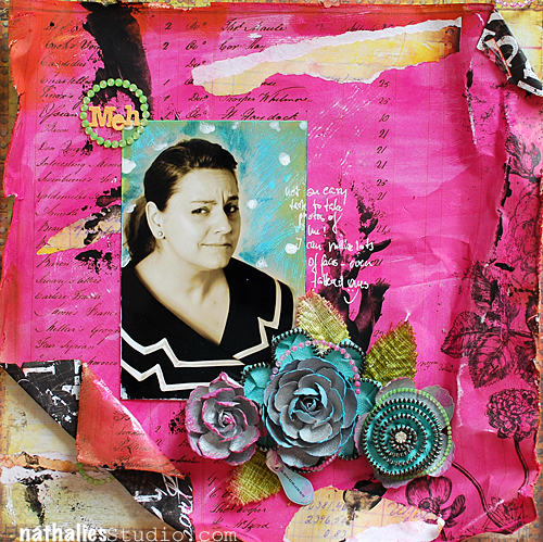
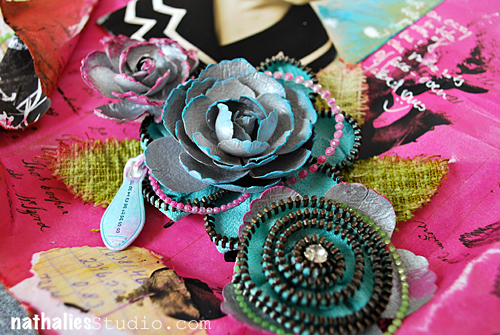
MEH or …Published in Prima Art Zine

This layout was published in the My Prima Place idea art-zine Volume 8 . I used a photo from my fun photo shoot with Andreas Muhme a couple months ago. If you want to know what caused this Expression on my face – read my article “Definitely Not Germany’s Next Top Model

NathalieKalbach_MEH_DistressingTool01


The article was about the different uses of the Prima Distress Tool.

NathalieKalbach_MEH_DistressingTool03


I would say I distressed the heck out of those Prima Products- LOL ;)

Here is what I used in detail :

nSupplies


Hope you have a non-meh day ;)

Nat
LogoBlogSignature

Comments (6)

  • Jackie

    |

    WOW Nat!
    Congrats for you! You sure are rockin the Art world! Loving everything you are doing and love the inspiration you are sending out!
    One more thing, I really do appreciate and Love the way you display your products used in a piece- thanks so much!
    hugs “)

    Reply

  • Laura Strack

    |

    This is a gorgeous canvas and so is the lady in the photo!

    Reply

  • Denise

    |

    This is a great layout. I just love everything about it. You are too cute in it. It looks like you are trying not to giggle
    Reply

Leave a comment

Stencil Blog Hop – Stand Up Bass

NatKalbachStencilbloghop


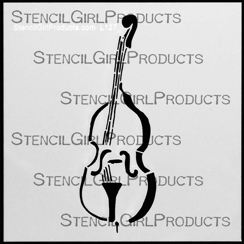
Welcome to my 5th Stencil  Blog Hop! This time I invited 5 wonderful artist friends to hop along with me and show case my 6×6 inch StencilGirl Products StandUp Bass Stencil.

StandUpBass Stencil


And I give away one StandUp Bass Stencil! Comment here for an entry into this giveaway! And if you also comment on all the other listed blogs I will  give you an entry into the giveaway for each blog you comment on–how cool is that! You have six chances to win it. Leave a comment on each of the listed blogs and on my blog  and let us know how you like the projects and I will pick randomly one lucky winner. You have time to comment till August 27, 2013 – midnight EST.

Edited on August 31, 2013: The winner is Cyndi from CeeCee Studio, Congratulations. Cindy, please email me with your postal address so I can get this stencil sent out to you :) , Nat


Edited September 23, 2013: Although I tried hard to get the winner’s addy – I never heard back. I will do a new drawing from a different post soon as I am sure someone else will be happy to receive the stencil :)

Here are my friends joining me this time :

Louise Nelson: My rocking friend from Australia- cannot wait myself to see what she has up her sleeves this time :)

Carmen Sanchez: Cuchy always has the most fun ideas – she is a wonderful artist from Madrid, Spain

Carolyn Dube: rocks the stencils on the StencilGirl Products Creative Team!

Michelle Hernandez: did a wonderful project last week already with my typewriter stencil- I cannot wait what this amazing Scrapbooker is doing this week

Maria McGuire: another stencil queen and the Creative Team Leader at StencilGirl Products


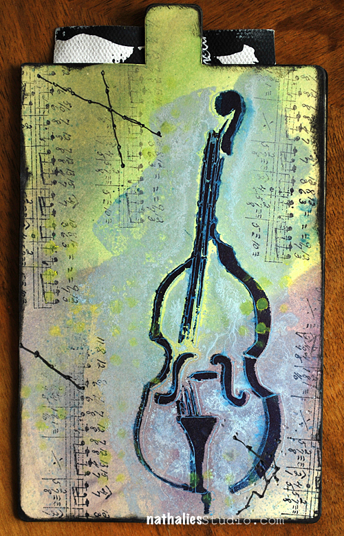
Why a StandUp Bass? Well…that is what I see when I walk into my husband’s music room next to my studio. I love this instrument. It is massive and beautiful and I love the sound of it too. I thought it can represent so many things like music, art, harmony, it is a good birthday card theme etc.

Here is what I created for today:

NatKalbach_StandupBass11

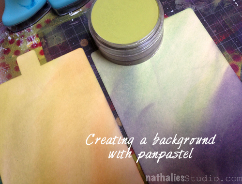
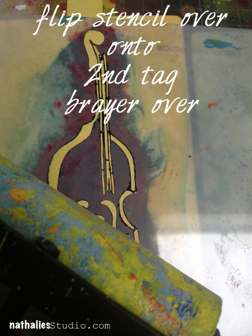
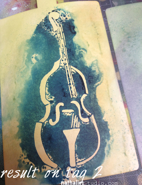
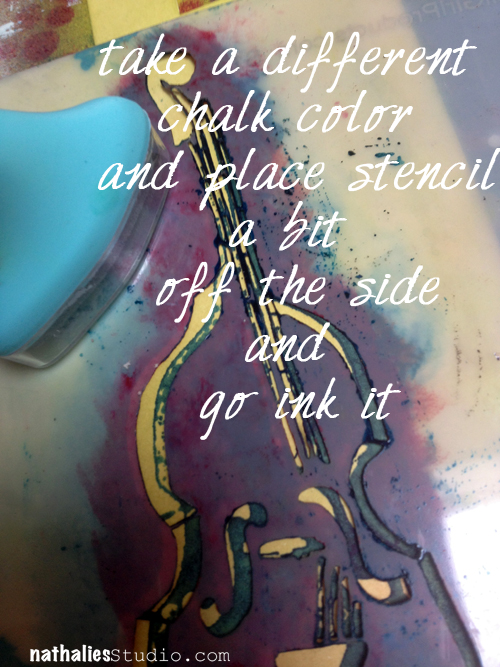
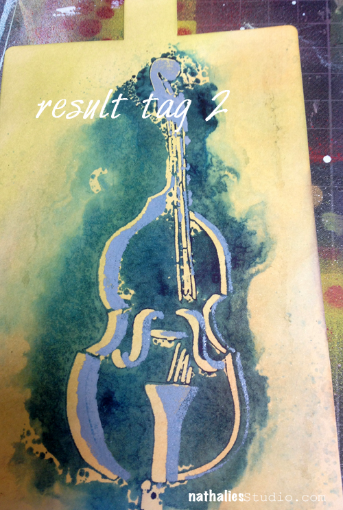
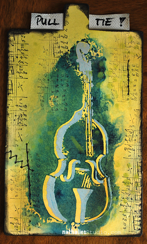
This is a gift card holder. I created it using two manila tags and here is how:

NatKalbach_StandupBass01


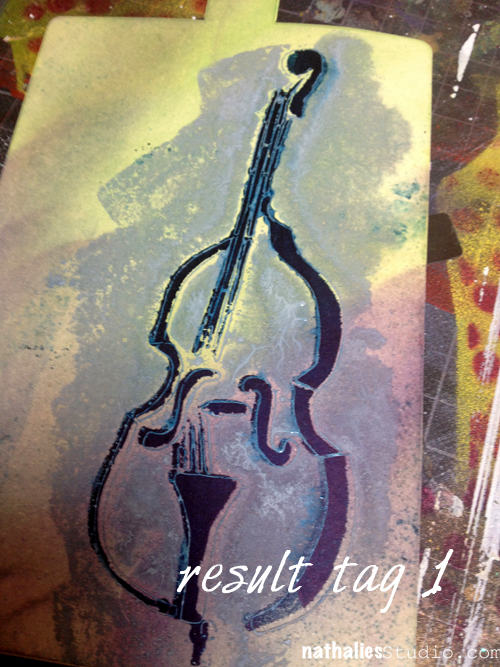
Starting with Tag 1

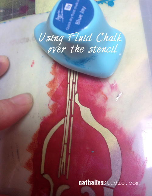
NatKalbach_StandupBass02


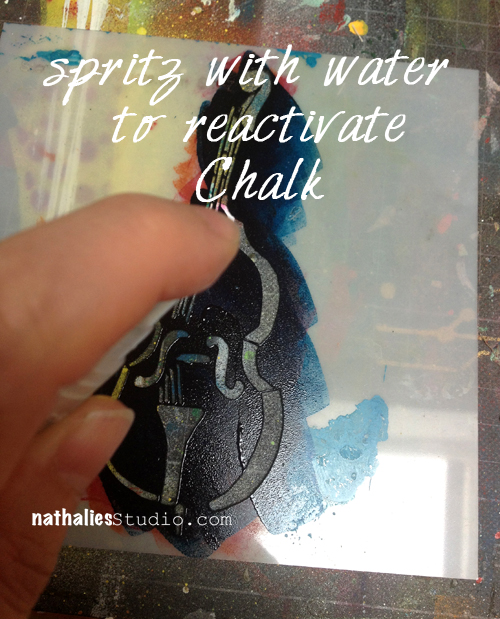
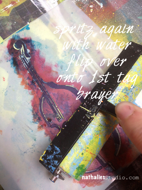
After you used the chalk through the stencil on tag one- you have a lot of access of chalk on top of the stencil

NatKalbach_StandupBass04

NatKalbach_StandupBass05


NatKalbach_StandupBass06

NatKalbach_StandupBass07

NatKalbach_StandupBass08


NatKalbach_StandupBass09

NatKalbach_StandupBass10


and here is the other side of the gift card holder after spicing it up with some fun stamps etc.

NatKalbach_StandupBass12


Here are the supplies I used:

nSupplies

Now hop on over to my friends and check what they did and comment for some changes to win the stencil :)

Louise Nelson

Carmen Sanchez

Carolyn Dube

Michelle Hernandez

Maria McGuire


Have Fun

Nat

LogoBlogSignature

Comments (55)

  • Nancy Sapp

    |

    Nat – LOVE your stencils! You’re so talented. Would LOVE to win any of them! I hope U pick my name…
    Grandma Nancy Sapp

    Reply

  • Carmen Lucero

    |

    Nat, it looks like I just commented, but it was back in August. Thanks for the second chance to win the cello. I love the technique you used of double stenciling!

    Carmen L
    cal8007 at aol dot com

    Reply

  • Susan Stimson

    |

    Love the techniques! I especially like how the bass looks when using a second color and offsetting it a little and stamping.

    Reply

  • Carmen Lucero

    |

    What an amazing technique, Nat! I believe in not wasting anything! Love the gift tag and the stencil for what it stands for!

    Hugs,
    Carmen L

    Reply

Leave a comment