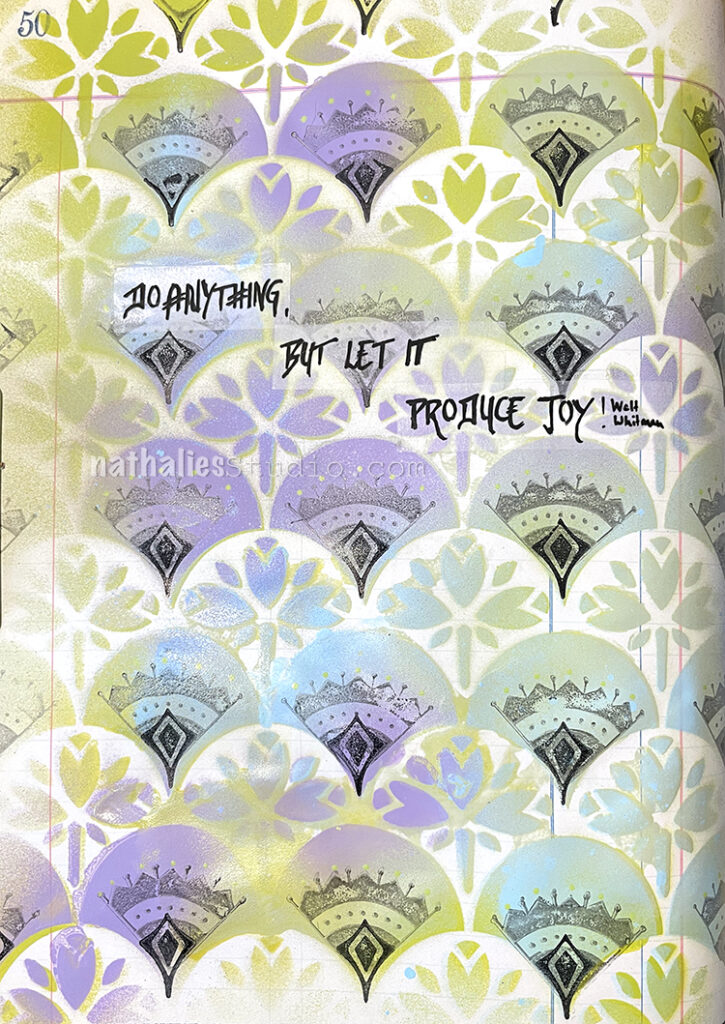
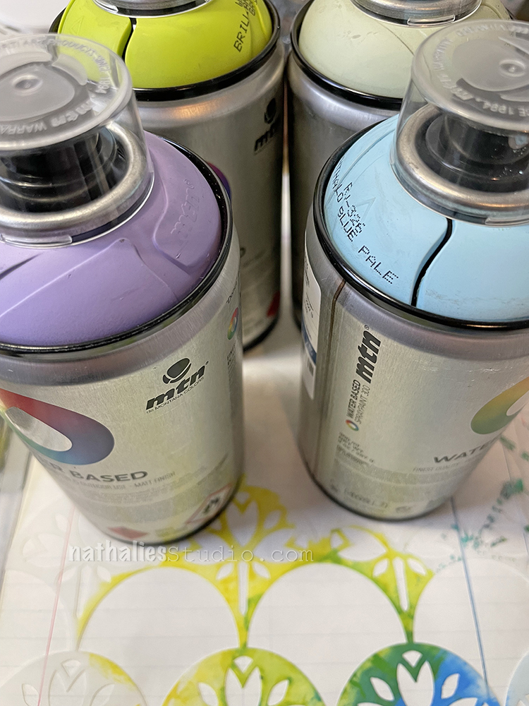
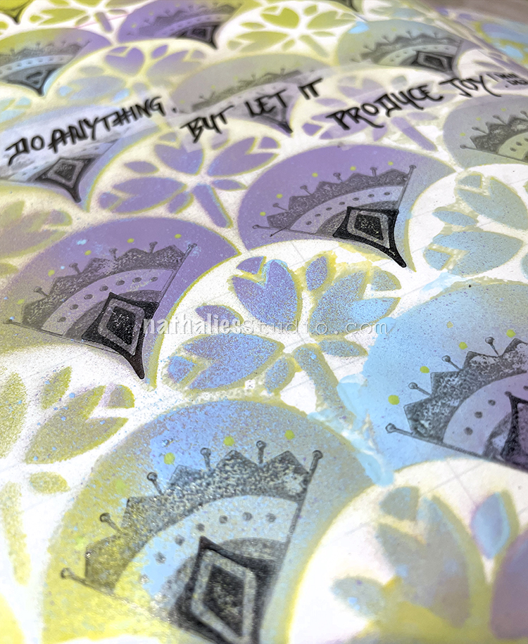
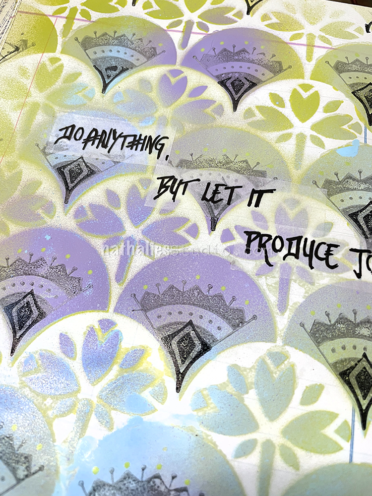
I used four different colors of acrylic spray paint to layer up over the Art Nouveau Wallpaper stencil. I flipped the stencil right over to the adjacent page – more about that page later – so that I could get a nice print of the surface as well.
I used some Versafine in black and grey to stamp with one of the Mini Motif rubber stamps and one of the Fan-fare stamps into the solid fan areas.
For my journaling I used the tissue like stripes with a thin Posca pen.
This was a very fast but fun page. I love spray paints – they have such an instant effect and if you are using the low odor ones with a mask and in a well ventilated room, you can create forever using your stencils and layering them up, or mixing them as I did with stamps. Just as Walt Whitman says “Do Anything, but let it produce joy.“
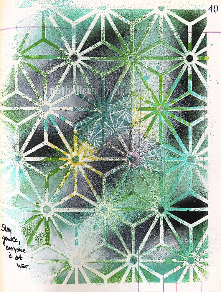
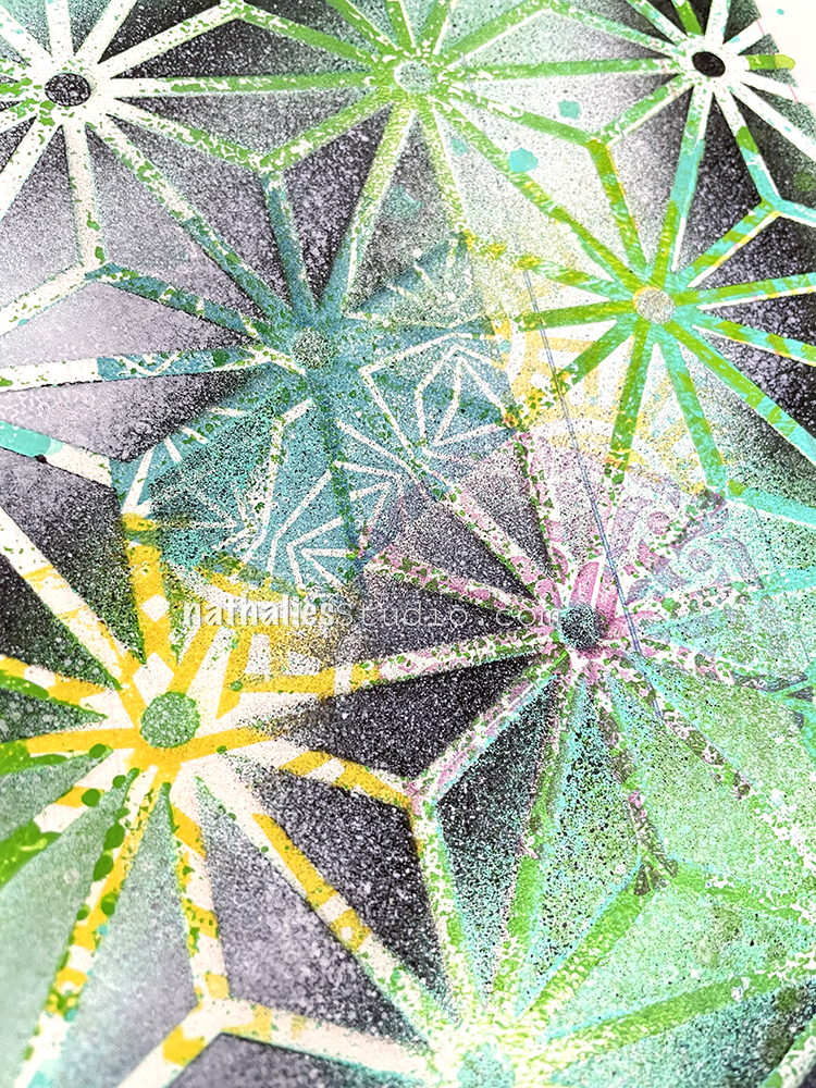
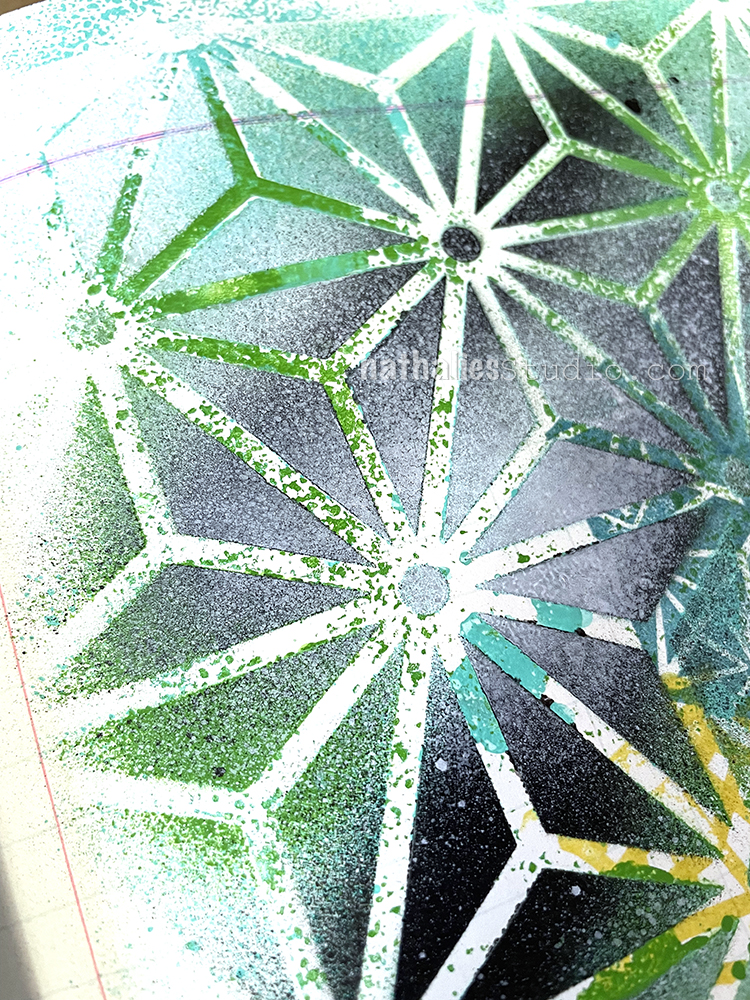
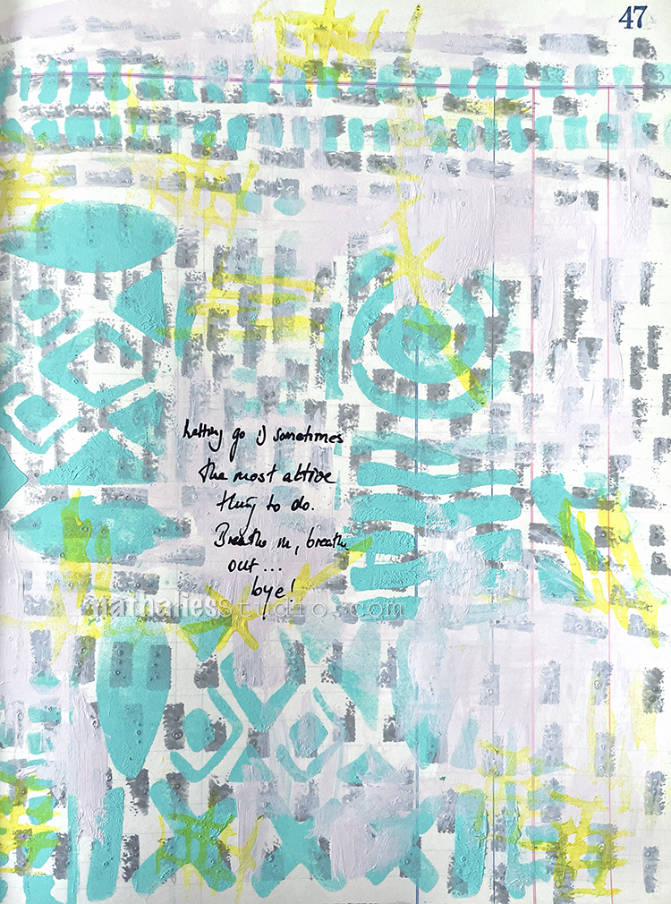
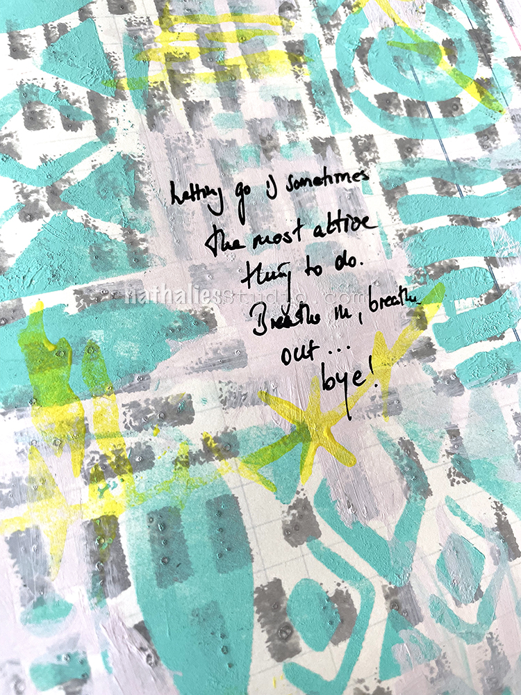
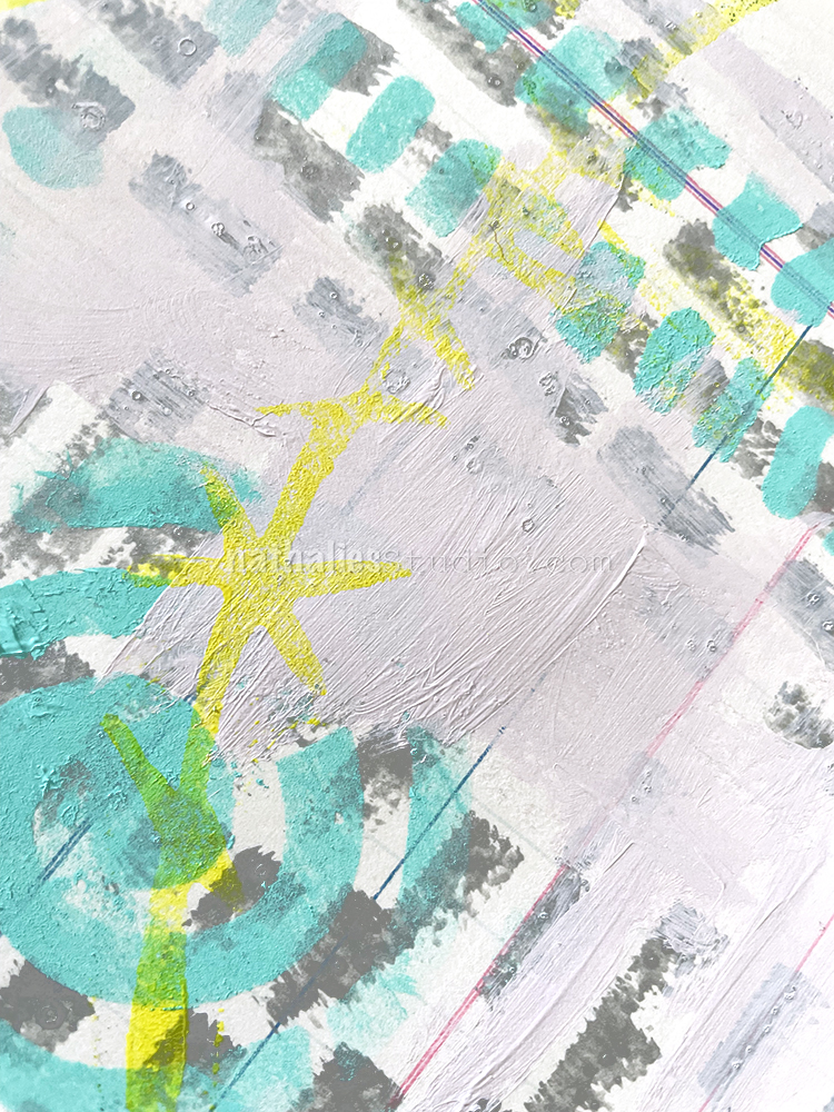
For this spread I used the Star Struck stencil that was still wet from applying spray paint over it for the It’s Worth It art journal page. I flipped it over and pressed it onto the next page in the ledger, which created an uneven reverse print, mostly visible with the green structure of the stencil on the top right. I love getting inspired by something I was working on earlier and not just starting on a blank canvas, so to speak.
My first idea was to stamp into the Star Struck areas with my Triangle Love stamps and some Versafine – which worked out nicely but it was a bit off. So I layered the Star Struck stencil back on top, basically covering up what I had printed before and used the same colors yet again but tried to spare most of the area that was stamped.
I love the effect and I definitely want to play more with the flip flop stencil technique :) There is also a slight dimension to the built up spray paints which is hard to see in the photos, but I love it and I think I want to explore this a bit more on some of my bigger paintings as well as for the backgrounds.
Hello from my Creative Squad! Today we have a post from Jordan Hill who is sharing an art journal spread inspired by one of her favorite books and using my ATC Mixup stencil and our monthly theme: Lost in a Book.
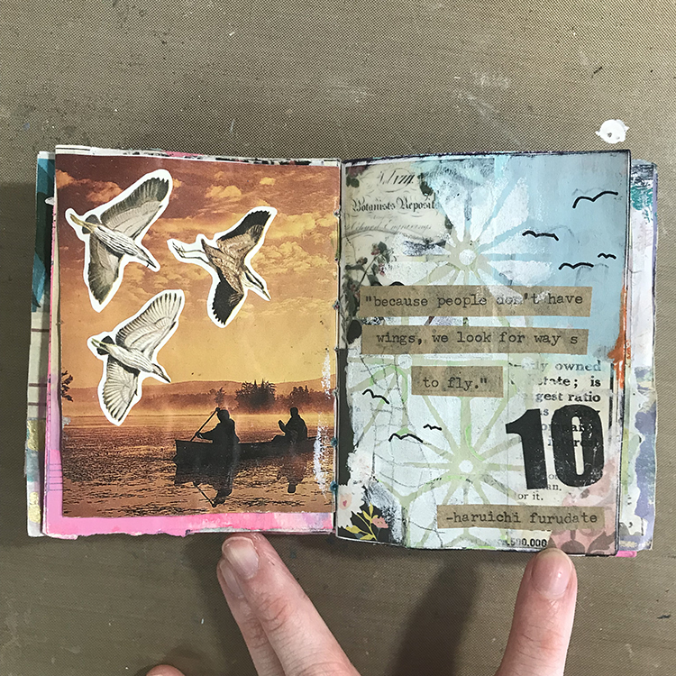
Hello everyone, I’m excited to be back with you for April! Initially, I wasn’t sure how I wanted to approach this month’s theme of “Lost in a Book”. However, after much thought, I decided to base my project on the manga series Haikyuu!!, which is my favorite series of all time. At its core, Haikyuu!! is a story about a high school volleyball team, but it is steeped in symbolism and contains some of the best character writing I’ve ever seen. Let’s get started!
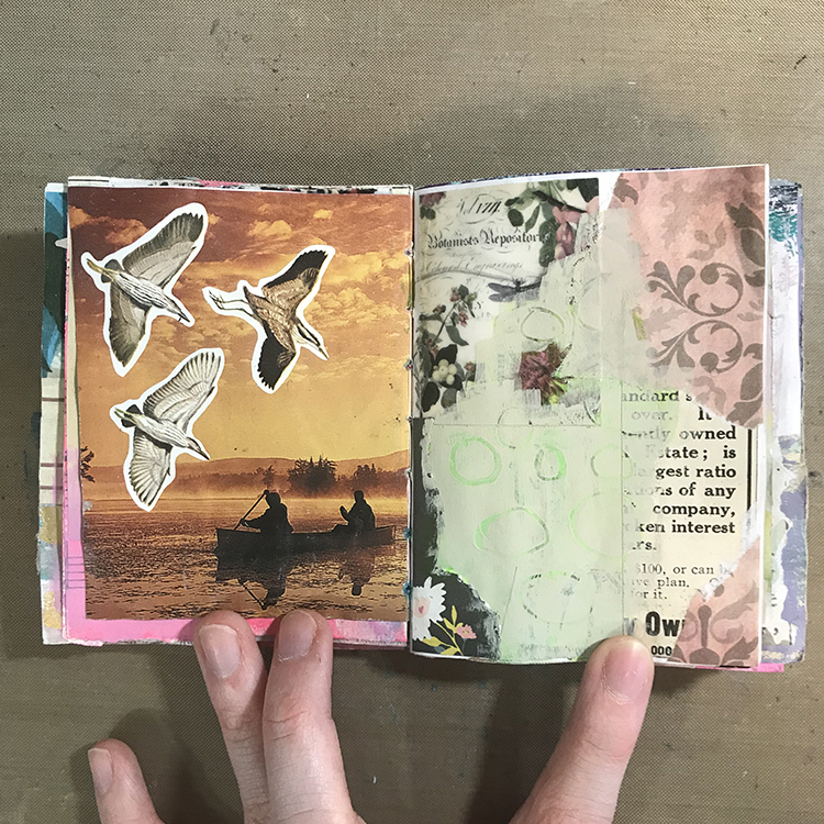
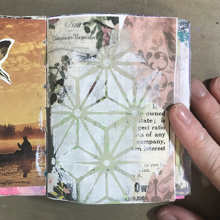
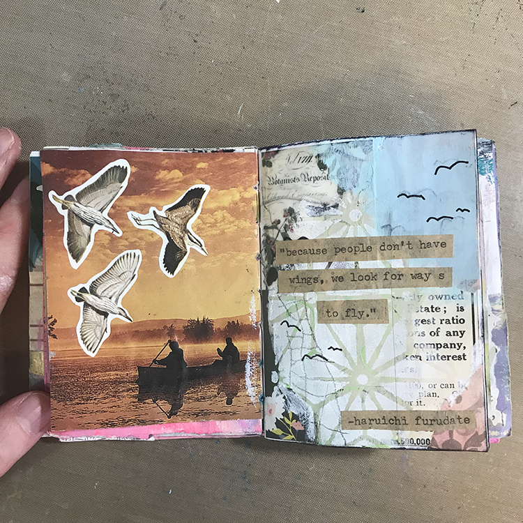
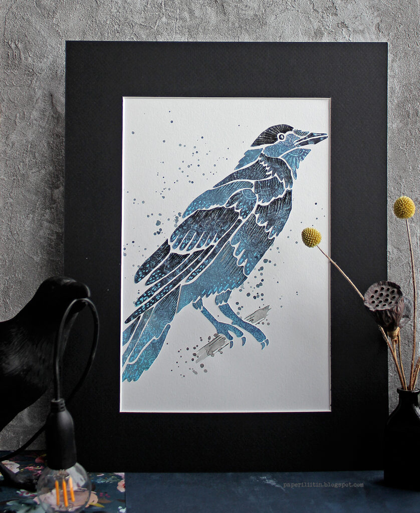
First things first, I selected a page to work on. I liked the birds on the left side of this spread, since birds (especially crows) are a reoccurring visual theme in Haikyuu!! On the right side of the spread, I had previously glued down a number of scraps of paper. To attempt to blend some of these scraps together, I used CraftSmart acrylic paint in the color Suede and painted over the edges of the pieces. I then used the back end of my paintbrush to scrape through the paint and create some subtle circles.
Next, I used Nathalie’s ATC Mixup Stencil with some white acrylic paint and a makeup sponge to add patterning to the painted sections of the page. Though it’s not exact, these shapes did vaguely remind me of the segments of a volleyball.
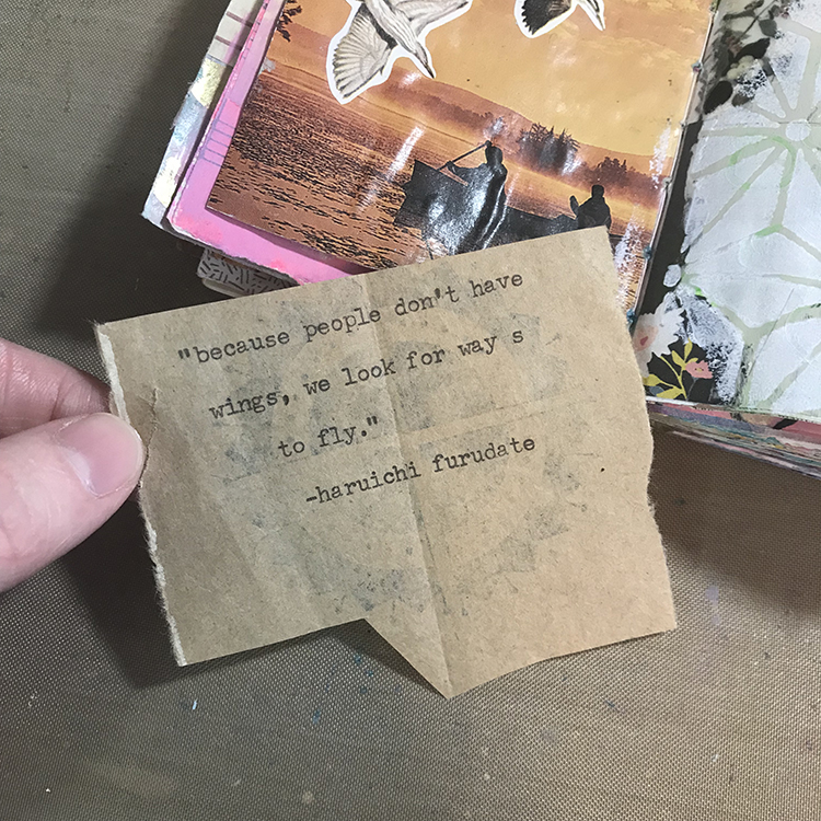
I knew that I wanted a quote to be the main focal point of my page, so I used my typewriter to type one out onto a scrap of brown paper bag. This is one of my favorite quotes from the series; I find it very beautiful, and it has stuck with me for many years. It only made sense to incorporate it into one of my journals.
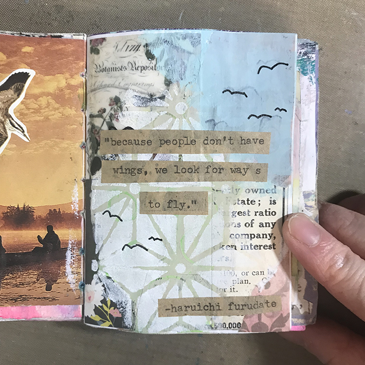
At this point, I decided that I wanted some blue paint in the upper right hand corner of the page in order to represent the sky. I selected the color “Cloudless” by the brand Apple Barrel, and used a paintbrush to apply it to my page. I then cut out the quote from the last step and glued it down. Then, using a black pen, I added a few “bird” shapes to some areas of the page I thought could use a bit of interest. I specifically chose to do seven birds in order to represent the number of starting players on a volleyball team.
Next, I wanted a border of sorts, so I used an Archival Ink Pad in Black to brush along the edges of the page. I then used a graphite pencil to make some light marks along the left side. I have been experimenting with similar marks in some of my recent work, and I felt as though it could be interpreted as a volleyball net.
To add some finishing touches to the page, I used an orange oil pastel to add a hint of color, since the jerseys in Haikyuu!! are orange and black. Next, I added a Mod Podge image transfer of the number 10, to represent the number of the main character’s jersey. I also used Nathalie’s ATC Mixup Stencil once more to apply the paint ever so slightly over top of the blue section in order to blend it in a little better. I was then ready to call this page done!
I hope you enjoyed following along with the process of this little spread in my journal and that you are able to find something in it to inspire your own work!
Thank you Jordan – I loved how you used various visual elements to symbolize important aspects of the book. The finished page is really interesting with the different layers of media and meaning.
Give it a try: you can find all my Stencils in my Online Shop and in addition to collage elements from her stash, here are some of the supplies Jordan used:
Looking for more projects? Follow the Creative Squad on Instagram here.
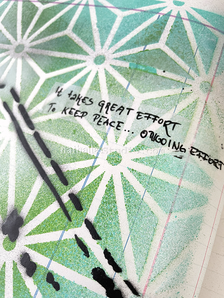
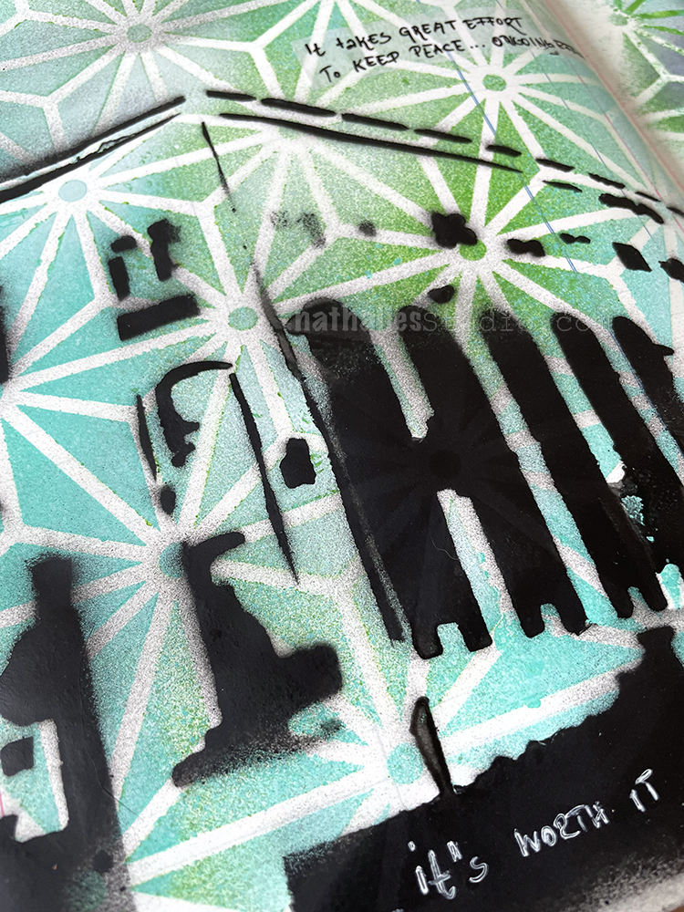
I love the look of spray paint with my Star Struck stencil, especially when it’s applied with different spray paint colors. Here I used a teal and a green as well as some white on it. I then layered an old hand cut stencil on top and sprayed with black spray paint.
I was listening to a podcast about the war in Ukraine and the reporter was saying that it takes great effort to keep peace in the world, ongoing effort. It just struck me in that moment and so I wanted to keep this in my journal, being that the journal is often a reflection of thoughts, emotions, things I hear, read or what is happening …
I found one of my fat Liquitex markers in Silver and as I rarely use those anymore I wondered if it was still working. It had been laying in the drawer for years.
So I started doing some marks on the paper and wow indeed it was still ok. I love how the big marker leaves a nice textured impression. To be honest this is probably the only way I would use them as they don’t really work with my own current style and artwork, but it was interesting here in my art journal today.
I layered my Batik stencil on top and added some acrylic color over it, then stamped with my Jazzed and Groovy foam stamps and then added more acrylic paint again.
It was fun to just play a little bit with layering – something I like to do often as it makes you see things in a different way and discover new connections.
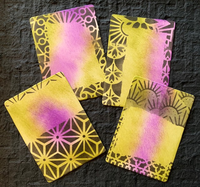
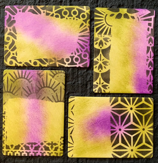
We’ve got an extra project from Creative Squad member Judi Kauffman for you today. If you enjoy sending notes in the mail or even tucking little cards in lunchboxes or laptop bags with a special note on them then this is definitely for you :) Judi is on a roll with my ATC Mixup stencil with these and rocking all the patterns. Read on!
If you’re like me, far too often all attention is paid to the exterior of the cards I make and the interior is left blank, getting at most a line or two and my signature. I thought it was about time I do something different so while I was stenciling insert cards for my early April “Lost in a Book” library pocket project, I stenciled a big bunch of extras to keep handy for stamping with a birthday, anniversary or other sentiment, or for adding a hand-written note to the inside of some of my upcoming folded note cards!
These are larger than ATC size, but this same idea would work at 2.5 x 3.5 as well. Masking the center area with torn paper before stenciling the rest of the surface provides interesting open spaces for writing or stamping and for adding collage or found poetry.
Thank you Judi – love the combination of color and bold pattern on these. They are also a great reminder when you’re working on a larger project to keep some cards, tags, or ATCs around to stencil, stamp and work on as well.
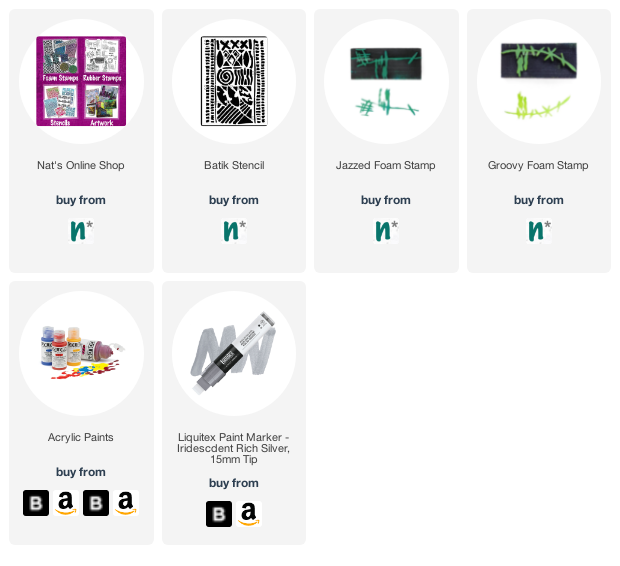
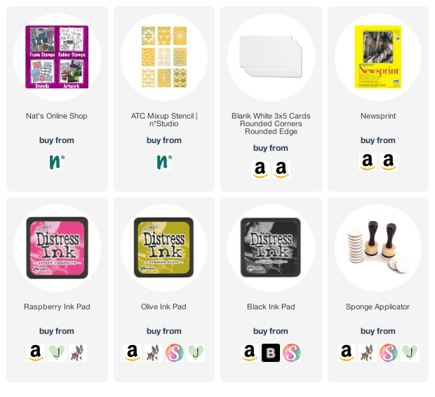
Give it a try: you can find all my Stencils in my Online Shop and here are some of the supplies Judi used:
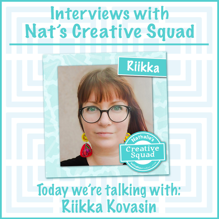
How well do you know our Creative Squad? Each week one of our talented design team members shares a project with us and we have come to know and love each of their individual artistic styles. BUT we realized that maybe we could learn a bit more about what makes each of these lovely artists tick. So, we decided to do a quick interview with each. Read on and stay tuned for a new interview each month :)
Welcome Riikka Kovasin! Riikka is from Helsinki, Finland and has been on the Creative Squad since April 2021. She always amazes us with the variety of forms that her projects take on and the beautiful videos she creates to accompany them. Let’s learn more!
1. How old were you when you first started making art? What is an early artmaking memory?
Not sure it’s art but my earliest memory of presenting a drawing to a stranger was when I was perhaps three and I had drawn a picture of my family to the nurse at a child health clinic (in Finland a child’s growth is checked in these clinics regularly until school starts and a child is then moved to school health services). But the nurse wouldn’t believe I had drawn it! I thought there was something wrong with the drawing, but instead she was hesitant to believe I had drawn such a complex picture with circles at that age. After she put me to draw rectangles, triangles, and circles she believed it was my doing. I have no memory of the drawing, but I remember the feeling of her not believing and then the agony of drawing the shapes and they turned out horrid in my mind, but she was excited! Like the whole situation then turned upside down.
I’ve always loved making stuff, drawing, and crafting. I started going to this “art school” when I was seven and continued until I was fourteen. It was great to experiment with different techniques and materials! I studied in a polytechnic and graduated as a Bachelor of Culture and Arts. When my first daughter was born in 2009, I found scrapbooking and through that mixed media when my other daughter was born in 2010.
2. If you are an art journaler, when did you start your first art journal?
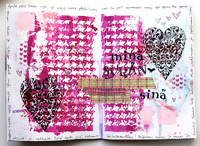
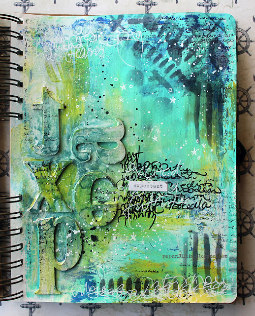
Oh my. I do a lot of various kinds of projects, but I do journal, too. From my blog I could find a post where I write that the page in that post is my very first art journal page. It’s from June 2012. During that June and July there seems to be more pages like the first one. The included picture here is that of the second ever art journal page. But then, at least according to my blog, there’s a big gap with journal pages as the next ones are from 2015. Those start to be more “me” than the first tries. The other picture is from a page from 2016.
3. What is one technique you just rediscovered or learned that you are now using all the time again?
These come and go as I revisit an old post, an old journal or otherwise stumble upon something. Something I’ve recently come to love is Infusions, so at the moment they seem to be my “go to” way of breaking a blank page.
It’s not a technique, but the same goes with colors, too. I tend to linger in a color scheme for a while and then pick a new pair that I then use all the time. The latest one has been blue and brown, but it seems like I’m in a turning point while writing this. Next one might be black, white, and brown, inspired by DeeDee Catron. Or then something else entirely!
4. Describe your artistic style in 3 words.
Before those three words, I must say that I can’t be brief! They call me “Ruuneperi” at work after a Finnish writer and poet Johan Runeberg that means I’m long worded. Give me an essay to write – no problem! Ask me to do an abstract – I’m in trouble.
“Happy painty fingers” was something I wrote on aprons of participants in my workshop back in the day, could that be it?
5. What are some of the biggest influences on your art?
In a way I think I need to say materials, mediums, and tools. As those effect the colors I’m choosing, patterns I’m creating and the feel I have on my fingertips when creating. Then of course my mood, what’s on my mind when I start to create and such, but that’s a part of everyone’s process.
I do follow a lot of accounts in Instagram, too, so I’m influenced by those as well. It’s always a balancing act, as I’m sure you all know. I love to see what others do and create but on the other hand I don’t want to be too much influenced. But of course, everything I see gets absorbed and catalogued in my brain so it would be foolish of me to think I’m not influenced.
6. Favorite color 5 years ago? Favorite color now?
It seems that I partly was too eager to share this! LOL! But my constant, all-time favorite is blue/turquoise. If I need to pick more precise shade, then something like teal or the tone of weathered copper. So, I guess five years ago my favorite was the same – teal.
Now, like I mentioned earlier, my favorite combo is blue and brown, but then the blue is more of a sapphire tone, a lot less green. Just to have another color mentioned, maybe at the moment my favorite color is a warm tea tone brown.
When it comes to clothes, though, I hardly ever use anything but black.
7. Show us where you create.
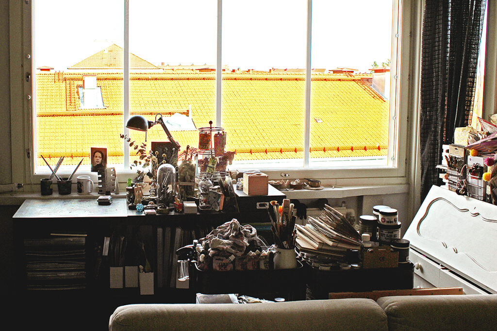
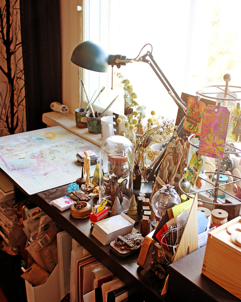
I create in the corner of our living room, in front of a huge window. I love the light it brings to the space! I do all my photography in front of it, too. My space consists of an Ikea shelving unit, two trolleys, and a little writing cabinet my grandfather made for me over 20 years ago. I do my videos on top of the living room table, though.
If you want to take a tour to the past and present, here’s some blog posts of the space along the years. Here’s the 2013 version, then the 2014 version, and finally one from 2019. The photos here are recent, from 2022 – I really should clean and organize the trolleys again!
8. What are your 3 favorite Creative Squad projects that you’ve created?
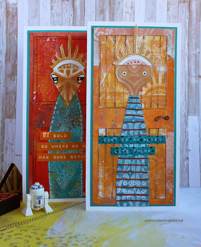
I looked at the projects, and I have to say that one of my favorites is the very first pair of cards I created for the Squad! They are quirky, colorful, and fun – at least I think they are. They were a joy to make and take photos of. And even more fun to send out!
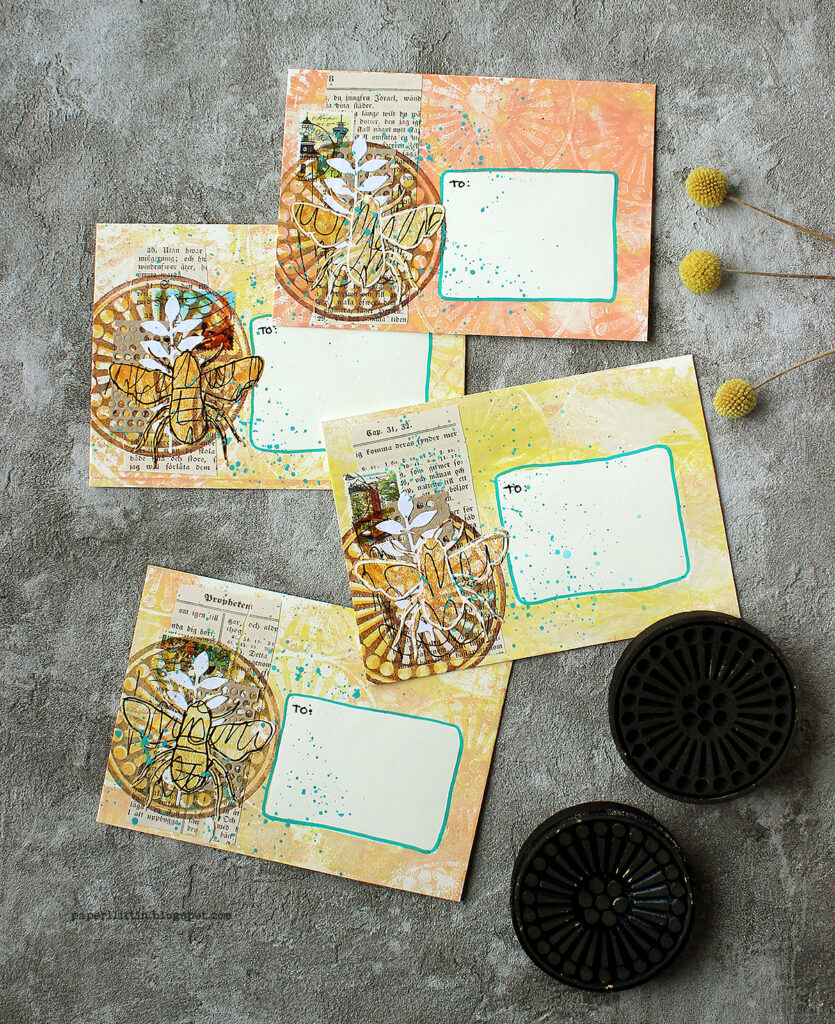
The other favorite are these envelopes for a couple of reasons. I love using an analogous color scheme and usually steer away from complimentary colors in a project. This is a good example of that – quite a limited color palette, lovely earthy tones. And again – they were so fun to send out!
And then I had no other choice for the third favorite as the raven piece! I do love those birds and like I mentioned in the post, have a small collection of pieces depicting them. If you’d want to give me a present with any reason, a raven inspired craft project is always a safe bet!
9. Describe the perfect artistic day for you.
Funny you should ask; I think I’m having one today as I write this! Not that I have actually done anything with paints or inks, but I love the flow of today. Normally I’m at work during the week and sometimes weekends, too, but those Saturday shifts then mean a day off during the week. Kid of a day to myself as I have the apartment just for me as everyone else is at school or work. Such a day is usually my “art day”, although it might include finishing editing, writing, or proof-reading. In such a day I love that I have worked ahead so I can take my time to finish things.
But a perfect art day should include some joyous splashing with mediums, too. Happy painty fingers, you know? So, I think the perfect day would start with a slow morning, then working with the computer and everything would just flow, no writer’s block, no glitches with software… Then a lunch, maybe continue a little, and then a nice walk in sunny, crisp spring weather (I’m not a fan of summer). Then later finish the day with some actual art making! It could be just slapping some paint to a canvas or journal or a more finished project.
I guess the biggest thing would be the sense of ease, the lack of any hurry whatsoever.
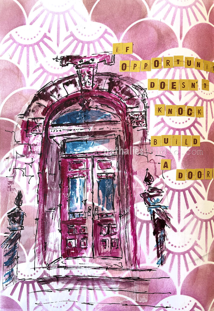
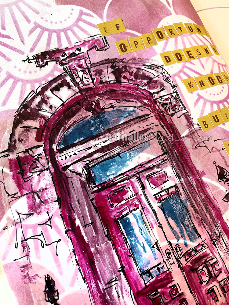
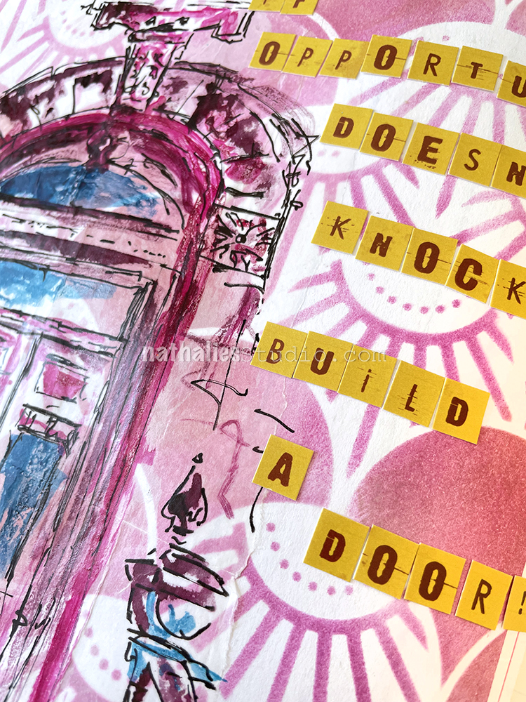
I used Ranger Distress Ink with a cosmetic sponge over the Art Deco Summit stencil for my background. It was from back when I first got my prototype and tested the stencil and then kept it in my collage stash.
Then I sketched with a Posca fine marker on deli paper, and used acrylic ink by Liquitex with a brush to color some areas in. This is actually the entrance to our home and it is just one of many sketches as I am intrigued by all the details.
As the background stencil design was made with Distress Ink, I thought it would be better to use a glue stick (my fav almond scented one) to adhere the deli paper – Distress Ink easily reactivates and smears with matte medium. I personally really do not like the look of the deli paper on the background here though. I usually love sketching on deli paper because a) it takes the stress away of messing up a nice background and b) it also give a fun effect with it’s kinda semi transparent look… but I always strive for a very smooth transition without hard edges when applying it and the glue stick did not work the same way as matte medium would have in this case to make that transition. Oh well… LOL. Don’t switch a winning horse…
The letter stickers are still left overs from a company I used to work with but doesn’t exist anymore. I still love them but it is time to use them up.
Hello from my Creative Squad! Today we have a post from Robin Seiz who is sharing an art journal page inspired by a book that has helped her on her artistic journey and may be something you will want to pick up too, so read on! Robin is using a bunch of my stencils (Grove Street, Central Ave, Park Blvd, Broadway, Valley Road, ATC Mixup, and Signals) and our theme: Lost in a Book.
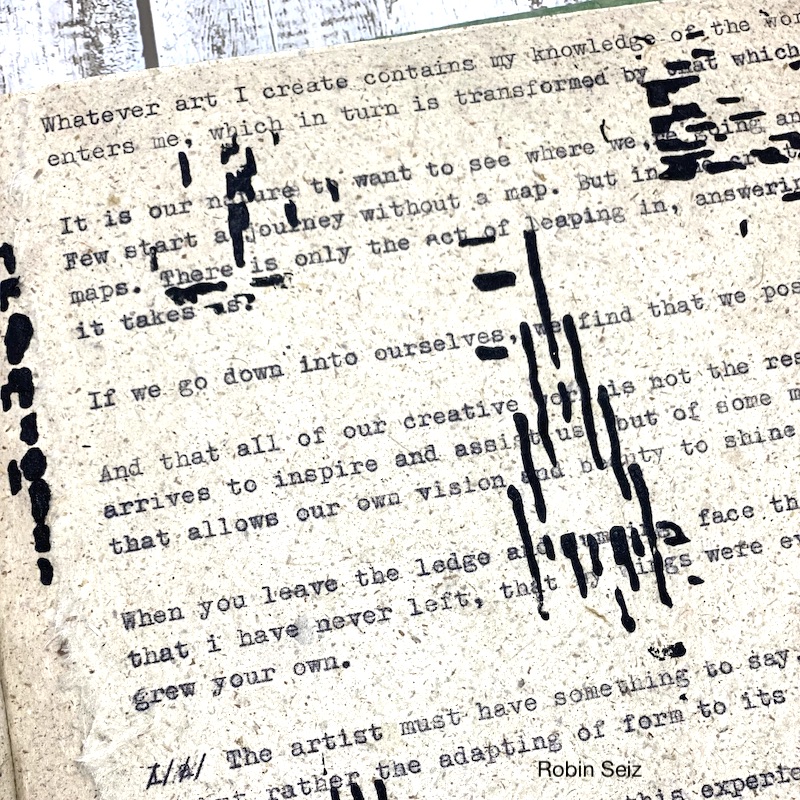
Hello friends, This months theme, “Lost in a Book” was such fun. The hardest part of this project was choosing the book. I love to read and there are so many books I have enjoyed. I chose a book that is on my studio table right now, Marry Your Muse. – Making a lasting commitment to your creativity, by Jan Phillips. This book was one of the first books I read when I started my journey into mixed media. It’s easy to read and has suggested exercises at the end of each chapter. I admit that I didn’t do all of them, but I did choose a few. I know that I have enjoyed a book when I find myself writing in the margins and highlighting as I go along! This book offered a significant number of nuggets.
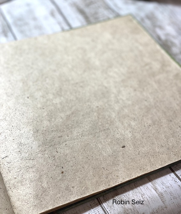
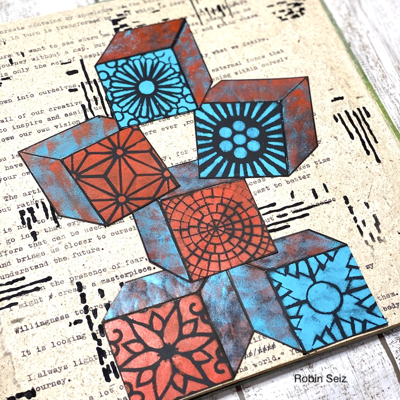
Although I’m not much of an artjournaler, it seemed an appropriate substrate for this project. I chose to represent the book through building blocks. There were considerable amounts of useful information which helped inform my mixed media practice, each piece building on one another.
To begin my project, I went through the book and chose the nuggets that were most meaningful to me. I ripped a piece of paper from the journal and loaded it into my old fashioned, pink, Olympia typewriter. I typed many of the key learnings I had highlighted when I first read the book. The paper is heavily textured and the black old fashion type was perfect for this paper.
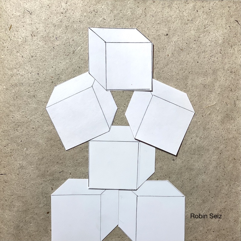
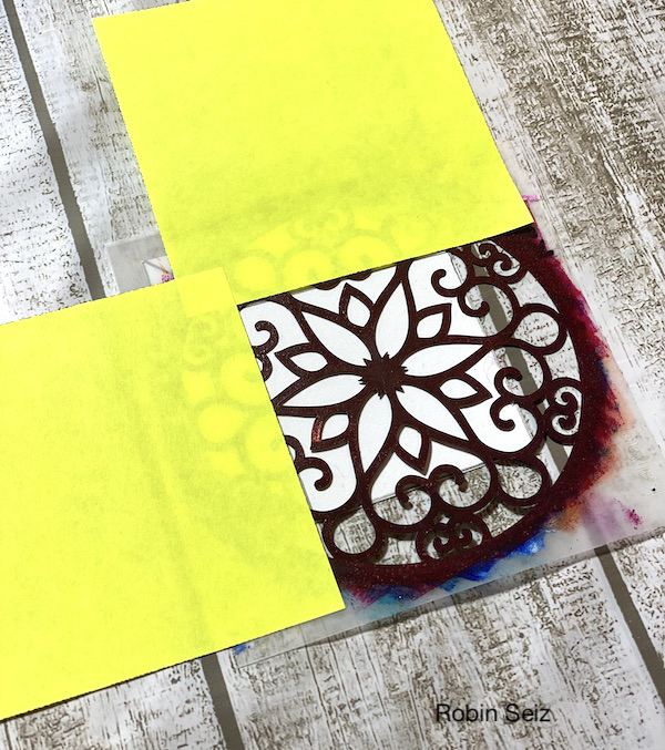
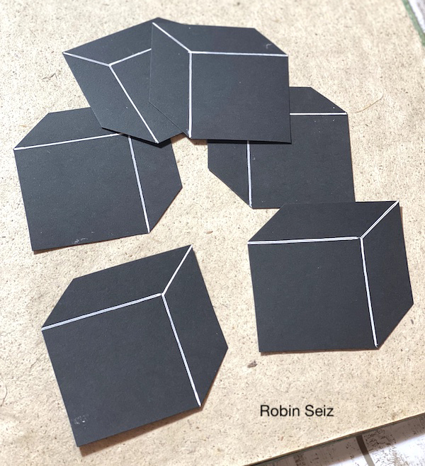
Next I drew the blocks on white construction paper and cut them out. I laid them out to make sure the size would fit on the page and to play around with the composition.
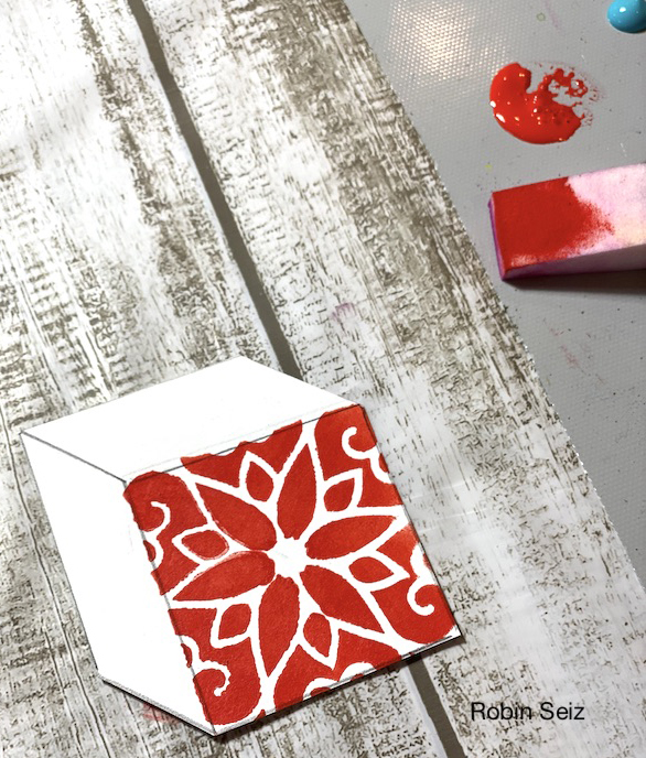
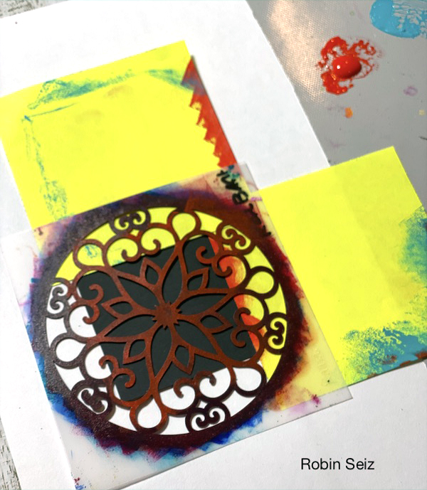
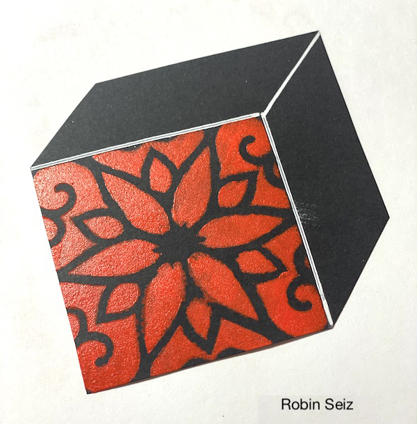
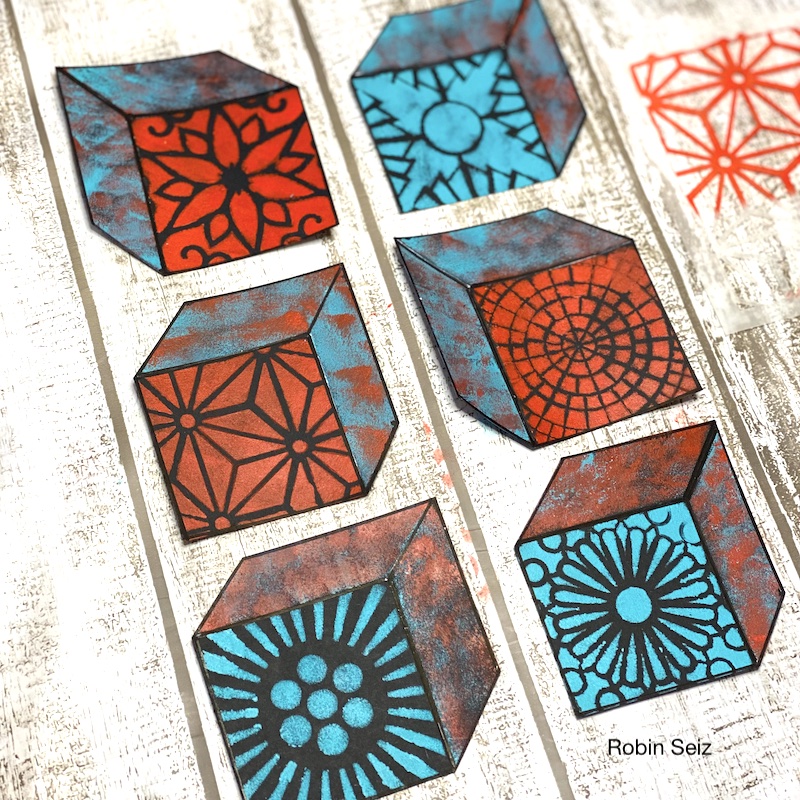
I wanted each block to have a primary face (like you see on children’s blocks) so I used Nathalie’s 4×4 stencils, her ATC Mixup stencil, a makeup sponge, and post-its to mask the sides of the block. This created the face I was looking for on the block. I used Teal and Pyrrole Red Light — these colors are my go to colors right now. I love how they stand out! On the sides and top of the block, I again, used post-its to mask and sponged on both colors.
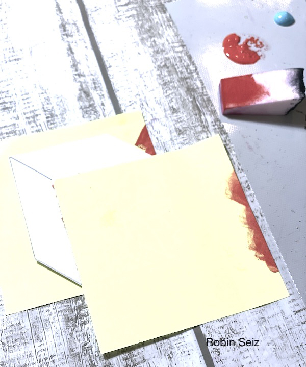
Once I completed the first block with the print on the front and coordinating colors on the sides, I realized I didn’t like the white blocks. The stencil print didn’t pop, so I started again and created black blocks from black card stock. The two colors I chose really stand out on the black and I was much happier with the result. TIP: Don’t be afraid to change mid-stream on a project. Part of what I learned in this book is to just follow your muse, she will take you to the right places if you listen.
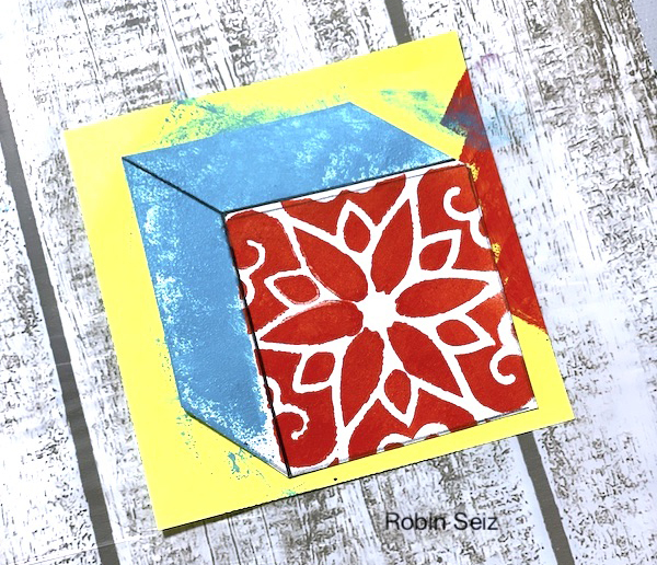
Once the blocks were painted, I used a black Posca Marker and ruler to outline the outer edges of each block. This created more dimension, making the blocks look 3-D.
Next I blended some light moulding paste and Liquitex Black acrylic paint. With a soft spatula, I applied it through Nathalie’s Signals Stencil to break up all the lettering and add more texture.
For the final step, I stacked the blocks and adhered them to the page with my adhesive gun.
I hope you think about your favorite book (childhood or adult) and give this project a try. Please tag me with what you create. I can’t wait to see it!
Thank you Robin! Love this suggestion for our reading list and seeing you change it up despite the work you already put in is a great suggestion when you realize it needs to go in a different direction.
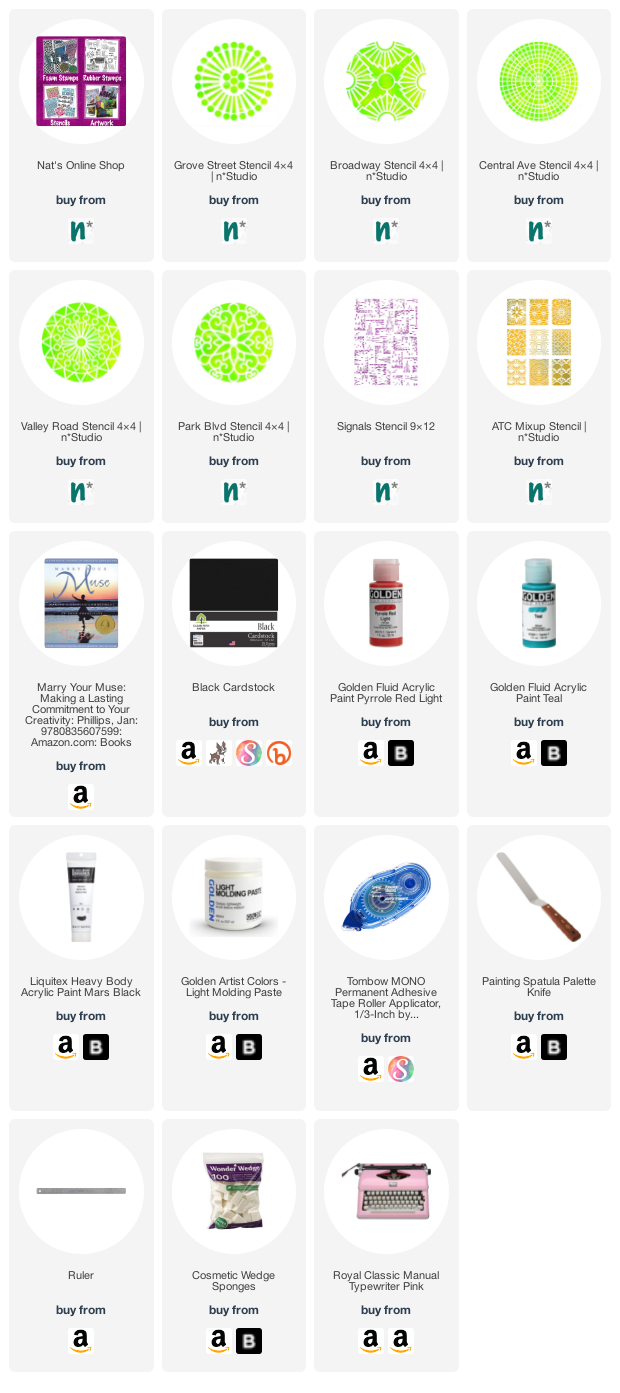
Give it a try: you can find all my Stencils in my Online Shop and here are some of the supplies Robin used:
Looking for more projects? Follow the Creative Squad on Instagram here.

Love the door and the quote!!!
Reply