As every January Winter CHA was a must-go for me to see and observe trends and new products , for meetings and seeing friends. It was four days of insanity but I love it :)
Here are some of the trends I spotted:
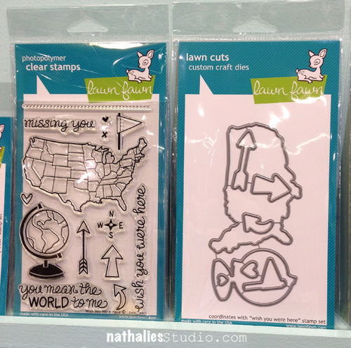
- Die Cuts with matching stamps or other products they can work well with – Dies are hip and everywhere. Often times they accomplish an already existing product by a company – like Elisabeth Crafts Designs (Shimmer Sheets etc.) with the new licensed Karen Burniston Dies or Lawn Fawn Stamps with matching Dies
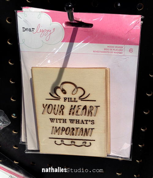
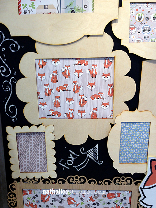
- Wooden and other natural looking embellishments
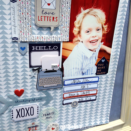
- Globes, Typewriters, Maps, Location Signs
- Everthing Project Life related: Paper, Tags, clear bags, small alphas
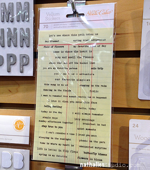
- Vellum and Washi Paper
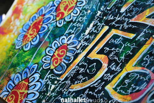
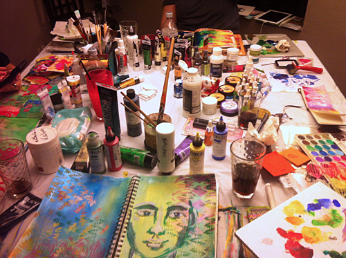
- Mixed Media products- paints, stencils, media – everything that can be used with Paint Products
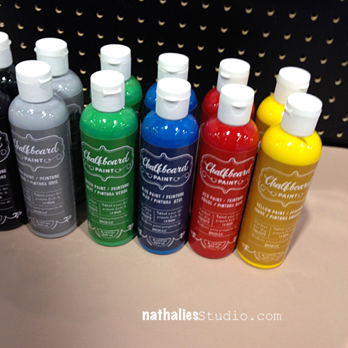
- Cork, Chalkboard, Canvas, Burlap
Another visible trends was that several companies were approaching the market differently –Several companies did not do the typical Scrapbooking Products, it was more about accessories for Scrapbooking, homedecor and DIY – like Hazel & Ruby with their Wall Stencils and gift paper wrapping, or Cosmo Cricket with beautiful Mason Jar additions and gift bags or Mon Ami Gabby with their natural versatile looking ribbons, rhinestone mats, crepe paper.
My Personal Faves at CHA2014
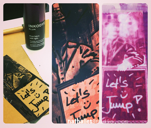
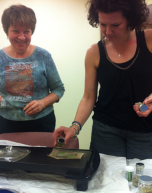
Lumi – Solar Printing at home- it was so much fun. I visited a class too and there will be a blog post about it coming soon :)
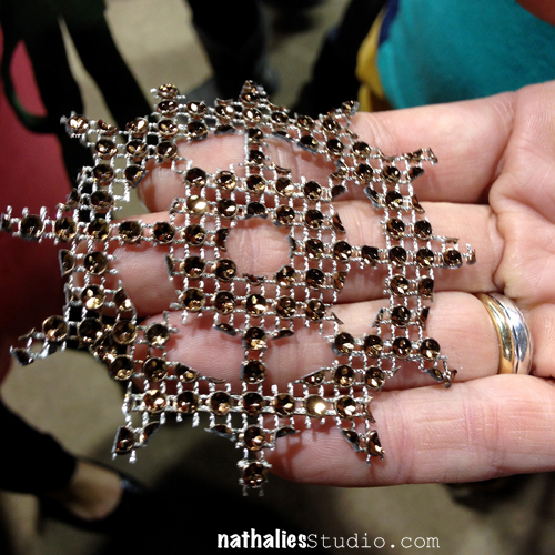
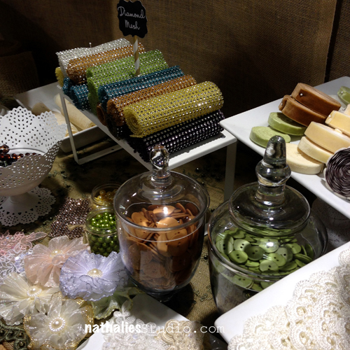
Mon Ami Gabby had rhinestone mats which can be used with die cut machines. I do hope they will get better website- but I do love their products and the booth was beautiful!
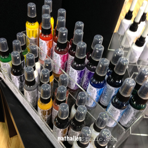
Tsukineko – now Imagine Crafts Irresistible Sprays – Resist Texture Spray- do I have to say more- yum!Cannot wait to get my hand on those and play with them
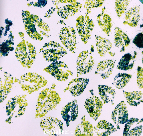
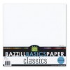
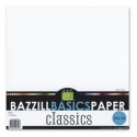
Loved this paper – it was my fave…and like a total beginner I have no idea which company it was because I didn’t write it down nor did I take a photo of the label..if someone can tell me- I would be happy- LOL :)
Observations
- Other than the paper above and some of other papers, most of the paper was a bit disappointing for me – the color scheme seemed to be throughout the same as well as the clipart – very few exceptions.
- Spray paints with and without texture – Prima’s new Spray Paint- I will post about it soon, Imagine Crafts – it seems still on the up
- The two main trends are Project Life and Mixed Media and everything seems to revolve around these two trends.
- Lots of chalkboard muted matte pastel paints e.g. American Crafts- or the Earth Safe Booth
- a lot of companies were not at CHA this time – Big booths like EK Success
and other companies like Maya Road were missing totally. UPDATE: It was brought to my attention that Maya Road was at CHA. I missed their booth apparently totally and when I was talking to others they said also they didn’t see them- I should have fact checked this of course- so I do apologize. I am a fan of Maya Road- so having me pointing this out was a matter of sadness – happy to hear though they were there!
- I had the feeling that the booths were in general less project and more product driven – there was way more creative output the years before and all in all the booths were a bit more plain then the years before. I am not sure how I feel about this because the art and design work usually made me most excited about the products.
- Meeting people is the best about CHA – it is the time to talk, celebrate and network and I would not want to miss it anymore
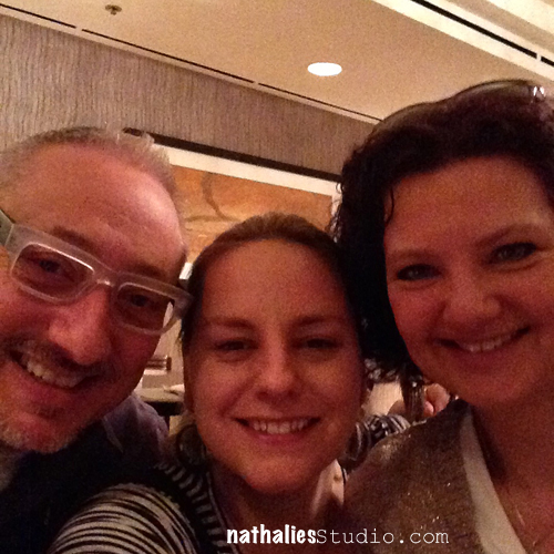
JumpStarter Joe Rotella and Birgit Koopsen and I at breakfast
JumpStarter Dina with her new paint line- so proud of her and cannot wait to try them!
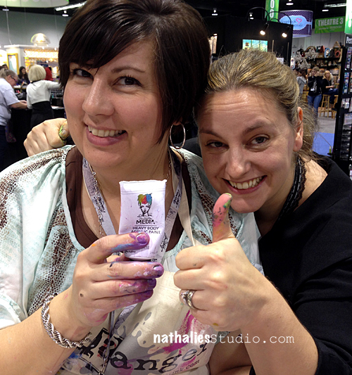
JumpStarter Julie Fei Fan Balzer and Birgit Koopsen – since Birgit is my bestie she is on a lot of photos ;).
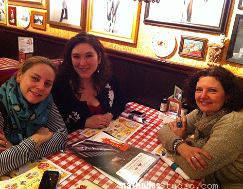
Birgit with JumpStarter Catherine Scanlon
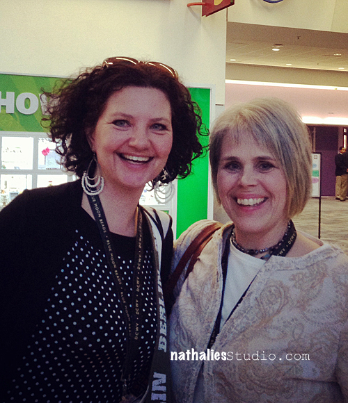
Denny from Prima who did such a fantastic job organizing the event and a little photo bomber- lol- that would be Limor Webber 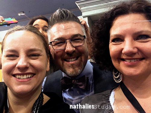
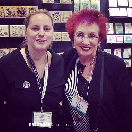
The amazing Suze Weinberg- another JumpStarter – visiting me at the Stampendous booth – she is sooo cool!
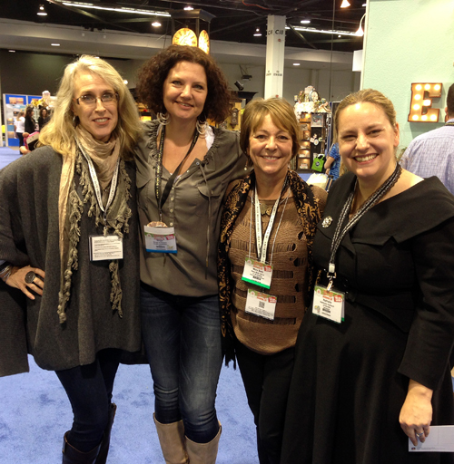
JumpStarter Pam Carriker, Birgit Koopsen and Mary Beth Shaw – we had so much fun trying to get a photo of us jumping…you cannot see a thing in that blurrr- LOL
I will be dabbling on some of the products I found at CHA here and there in future blog posts. I am looking forward to next year already!
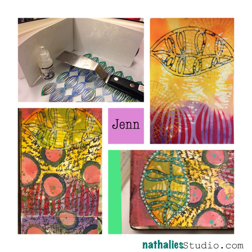
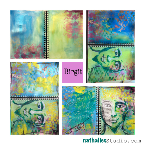
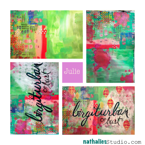
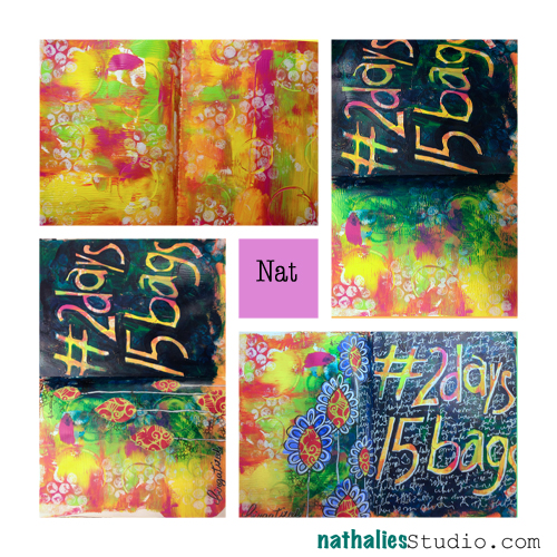
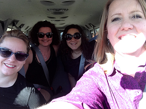
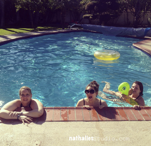
The next posts from California will be about our mini vacation doing arting with Birgit Koopsen, Jenn Mason and Julie Fei-Fan Balzer – watch out for crazy posts ;)
Have a gorgeous day
Nat






















Comments (15)
Marcia
| #
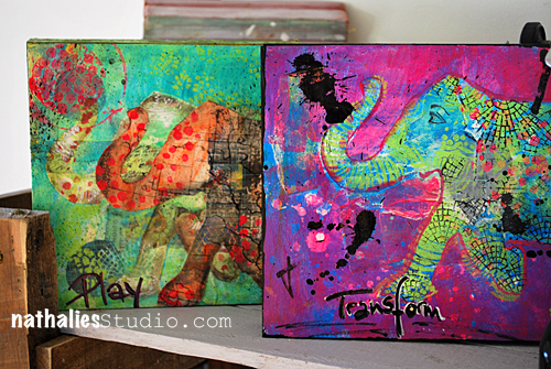
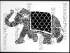
The elephants are STUNNING. I love the intense color, the layers, all of it.
Reply
giseladeister
| #
Ich liebe Deinen Elefanten. Leider hat ihn hier niemand.
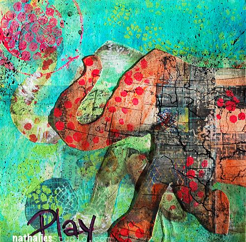
Beide Werke sind sehr schön, aber der Elephant ” Play” gefällt mir am besten.
Reply
darlene
| #
Now that I see this work I’m extra happy that I have the elephant stencil. Excited about your new mesh stamps too. This is beautiful work. Sounds like a wonderful workshop.
Reply
Caroline Duncan
| #
These both are outstanding and so gorgeous!!! I cant pick one to be my favorite… I think they look terrific together. Now the elephant stencil is on my must have list!!! LOL Congrats that your Ink Pad class is sold out! Maybe you’ll come down to NC or VA, closer than the Ink Pad and I’d be there in a flash!!
Reply
whyducks
| #
Lovely
Reply
Denise Spillane
| #
Love these. I love everything about them. The colors are yummy and so much texture. I have the elephant from club and will try some of this. I want to make my guest room black and white with accessories like your elephants bright and beautiful colors!
Reply
jackiepn
| #
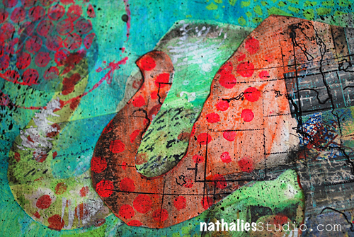
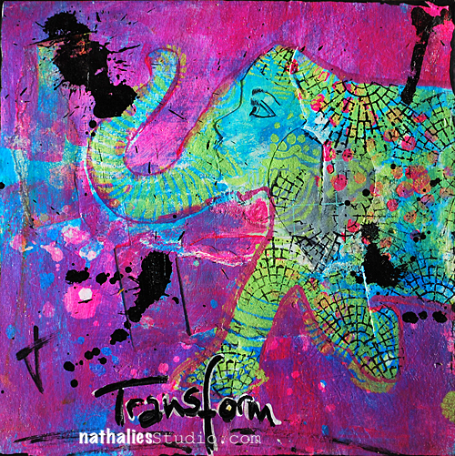
Both elephants are gorgeous- but I have to admit- Transform is my FAV! I love that colour combination!!!
Reply
Mary K. Parker
| #
Love colors of play best, but overall I like transform. The elephants eye is closed in play and that just looks more restful instead of playful…unless he’s playing hide & seek.
Nope I didn’t see the doll stamp, I did like how it looks like they have rough skin though.
Reply
Donna Sullivan
| #
Love Play! But the use of polka dots on both are so much fun!
Reply
andrene
| #
Both are fabulous in their own way. I love the details and the bloom girl stamp in the elephant on Transform. But my eye is immediately drawn to the Play canvas each time I look at them. I think its because of the more subtle details in the elephant and background and the softer colors. Very pretty!
Reply
scrapinsue
| #
Wow, I didn’t notice the stamped image for what it is until you pointed it out. Very clever use of it. I am more drawn to the one on the left…PLAY because of the colors. I really like when you use these colors in your art. The pink is just too bright for me even though I do like the title of TRANSFORM. Kinda amazing how you can get such different results using the same materials.
Reply
ddhurlbut
| #
Your “transform” canvas is my favorite but they are BOTH beautiful! I love elephants too, got to get that stencil now, you’ve inspired me once again Nathalie! Thank you.
Peace,
Donna
Reply
Janet
| #
I love your elephants. Sophie’s eye works perfectly on the one! Beautiful textures and layers!
Reply
jessicap1972
| #
really lovely canvasses you did make. I and also my son love the elephant stencil.
Reply
Sabine
| #
Nice work, Nat!
I like the “play”-painting better because of the colours. The pink one is a little too bold for my liking.
Bit as I like elephants really much I would take both of them and hang them to my walls :-))
Sabine
Reply