Creative Squad

Creative Squad: Extracurricular Activities

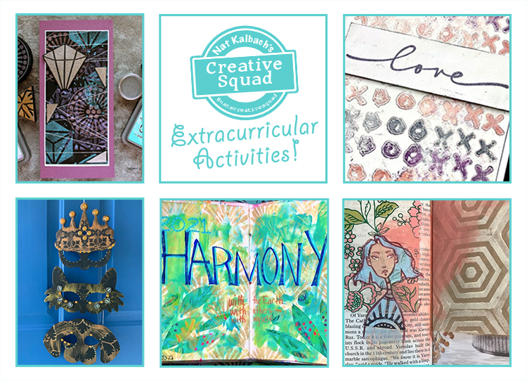
Hello from my Creative Squad! Today we have a special roundup of Creative Squad Extracurricular Activities that I’d like to highlight for you. My Squad is awesome as you know – so much talent and creativity, and on top of all that they are just really, really good peeps :) And they often post extra stuff they are working on on their social media and It stops me in my tracks because it just shows how much they all love what they do. They can’t stop creating lovely things!

Let’s have a looksie at some of the projects that caught my eye.

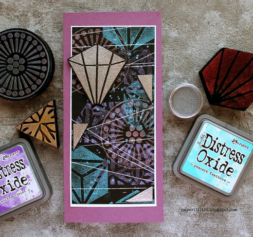
Riikka Kovasin posted this beauty and I love the magical layering she creates on the dark background with my Grove Street, Triple Play, and Mini Hex Set foam stamps. It looks very space age and cosmic – sooooo cool!

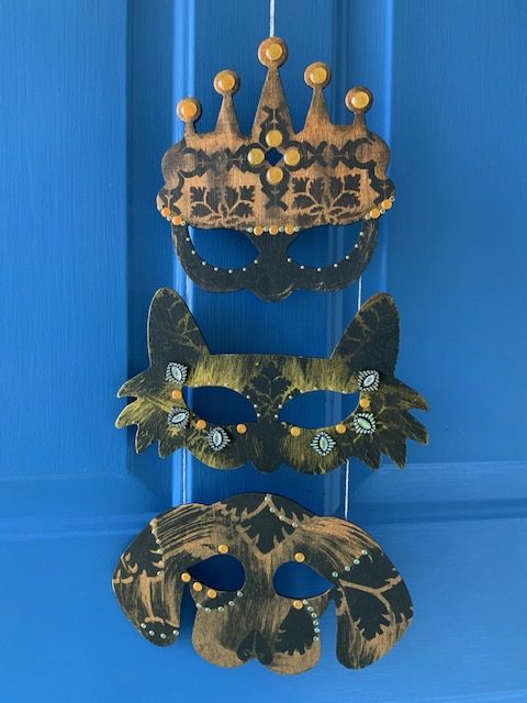
What did you do with your leftover Halloween masks? Judi Kauffman connected her trio of Masquerade masks from last month’s project into this nifty hanging decoration that she can bring out for Mardi Gras too!

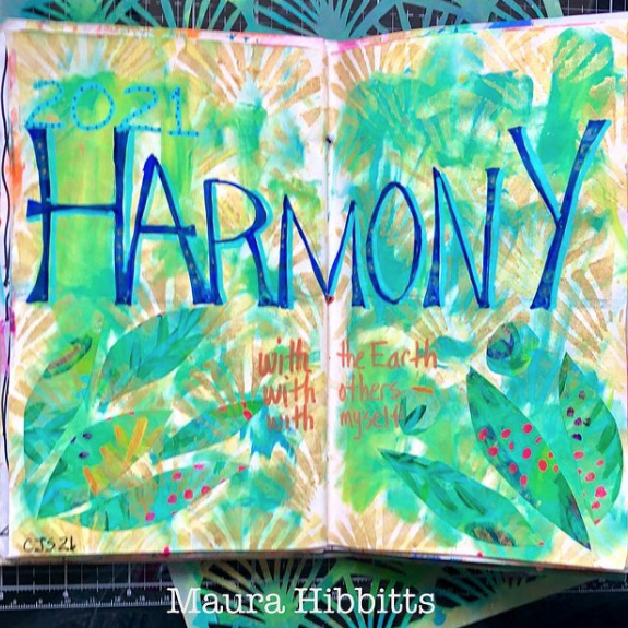
At the start of this year while Maura Hibbitts was playing along with Creative JumpStart 2021, she created this art journal page with her word for the year, Harmony. Love the botanical background she created using my Art Deco Wallpaper stencil and leaf motifs, a reminder to live in harmony with the Earth, others, and herself :)

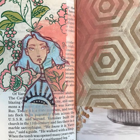
Jordan Hill posted this art journal page featuring collage elements, one of her distinctive character drawings, my Space Oddity foam stamp, and a beautiful peachy color to tie everything together. The mix of floral with geometric is really interesting in this spread!

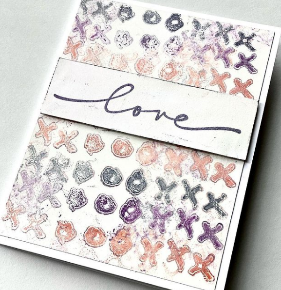
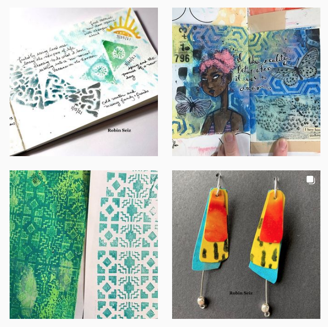
Let’s end with some love and this card from Robin Seiz. I think the muted colors and bit of grunge make this a pretty sophisticated design. She is using a gelli plate and my Love Knots rubber stamp to get her message across.

I hope you enjoyed this roundup of Creative Squad Extracurricular Activities! Please follow our team (their links are above) and also be sure to follow Nat’s Creative Squad on Instagram for weekly content from this stellar group of artists!

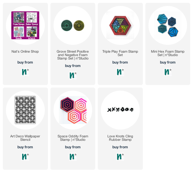
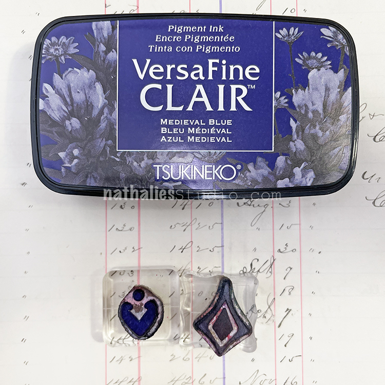
Here are the supplies they used:
Comments (1)

  • Robin

    |

    Thanks for featuring this Nat! Your stencils and stamps are a pleasure to work with; such great designs!

    Reply

Leave a comment

Pattern Monday 21 – Ledger Video

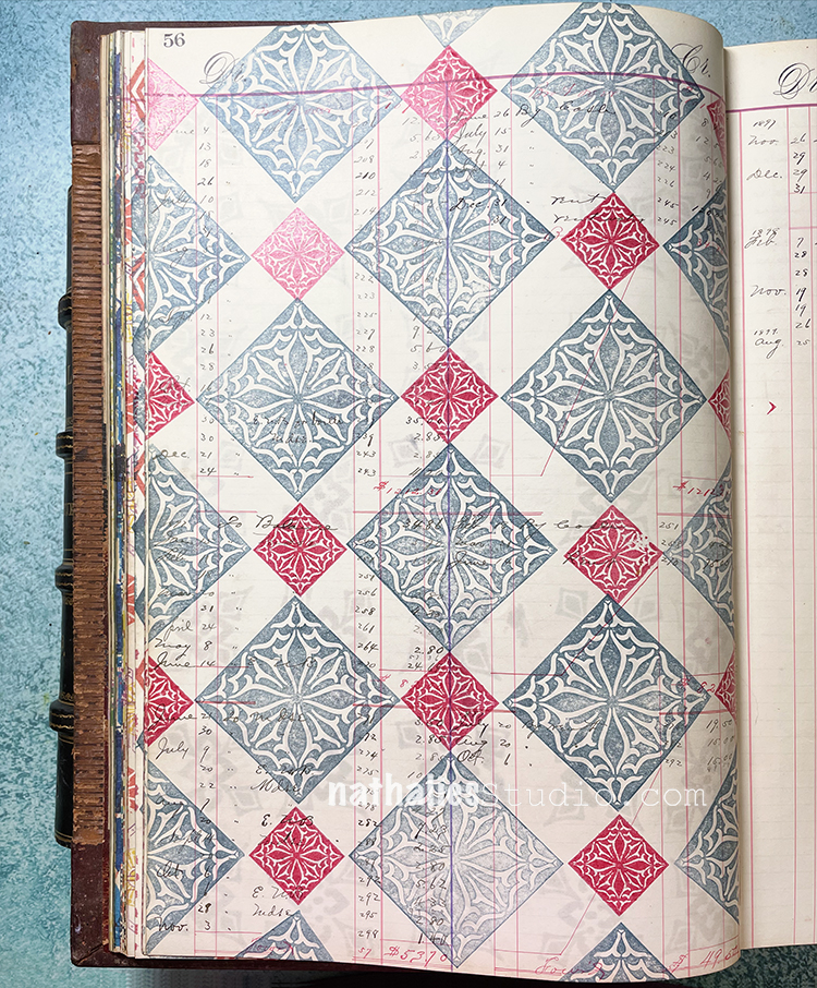
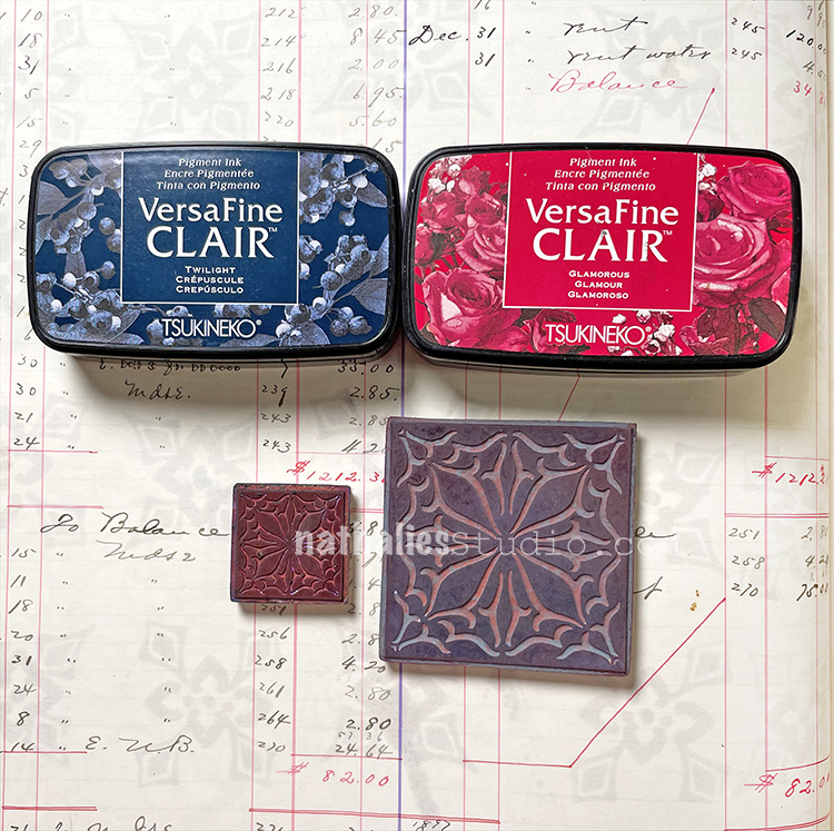
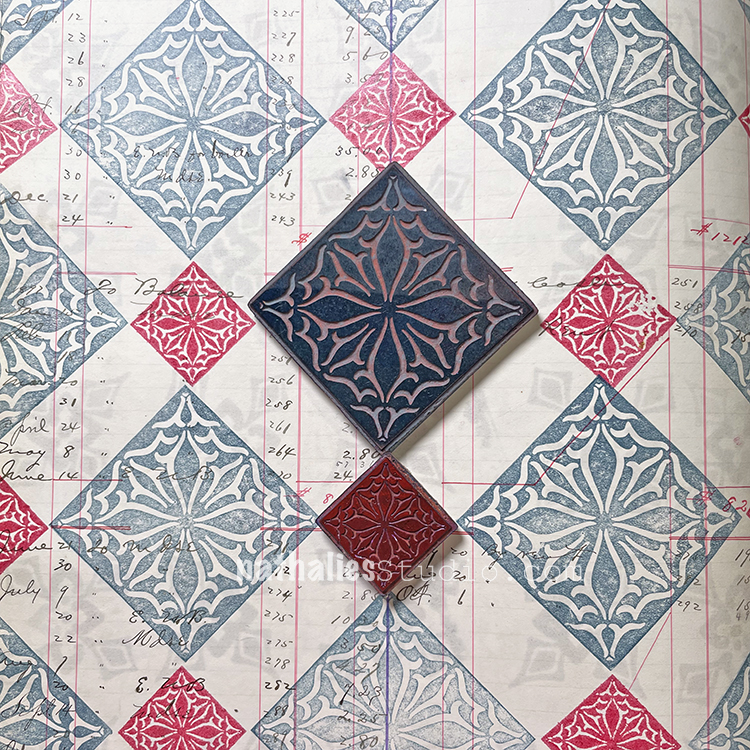
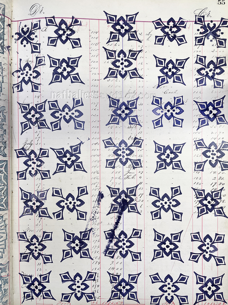
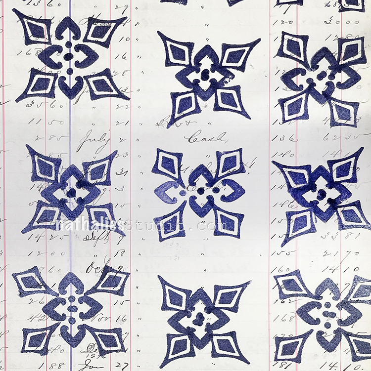
Pattern Monday time and today I’m working in my big vintage ledger and playing with scale. I’m using the Van Vorst stamps from my Floral Tile Large and Floral Tile Small rubber stamp sets and in the end, the negative space becomes an important part of the pattern too.

Here is another look:

Now it’s your turn! Give it a try with these supplies:

Leave a comment

ArtCollab: Showing Gratitude on Nov. 2

The next LIVE ArtCollab zoomcast is Tuesday, November 2nd at 12noon ET (NYC time) and Sarah Matthews and I will be talking about some of the people in our lives who have helped us get to where we are today, and saying a big Thank You! Register to attend HERE.

Here is a little overview of what we have planned and you can be sure that the conversation will take us to other places as well – it always does :)

Sometimes you have people in your life who have been a big part of the journey that you are on today. Maybe they mentored you somewhere near the beginning when your sense of direction wasn’t yet clear. Perhaps they were there along the way, helping you to make important choices and to see the possibilities. Maybe they got you back on track when you swerved and faltered. We want to acknowledge these people in our lives and talk about the incredible impact they have had in making us who we are today. Nobody is on this journey alone and it is time that we spend a little time Showing Gratitude.

Register HERE to Attend

What is ArtCollab?

ArtCollab is a monthly zoomcast with artists Sarah Matthews and Nathalie Kalbach (and occasionally other special guests too). Each episode Sarah and Nat get together, collaborate on all sorts of unique artsy projects, share their process and offer updates and sneak peeks along the way, and of course they chat about all stuff art-related and topics that go way beyond that too. ArtCollab is a real life look into the process of creating, collaborating, and the ins and outs of living an artistic life that is touched by others.

Join in for an entertaining and inspiring interlude into the world of two artists who are working together in conversation and practice.

LIVE ArtCollab zoomcasts happen the first Tuesday of the month.

Sign up for my newsletter HERE so you do not miss the next episode!

Leave a comment

Art Stroll: Glass House, New Canaan

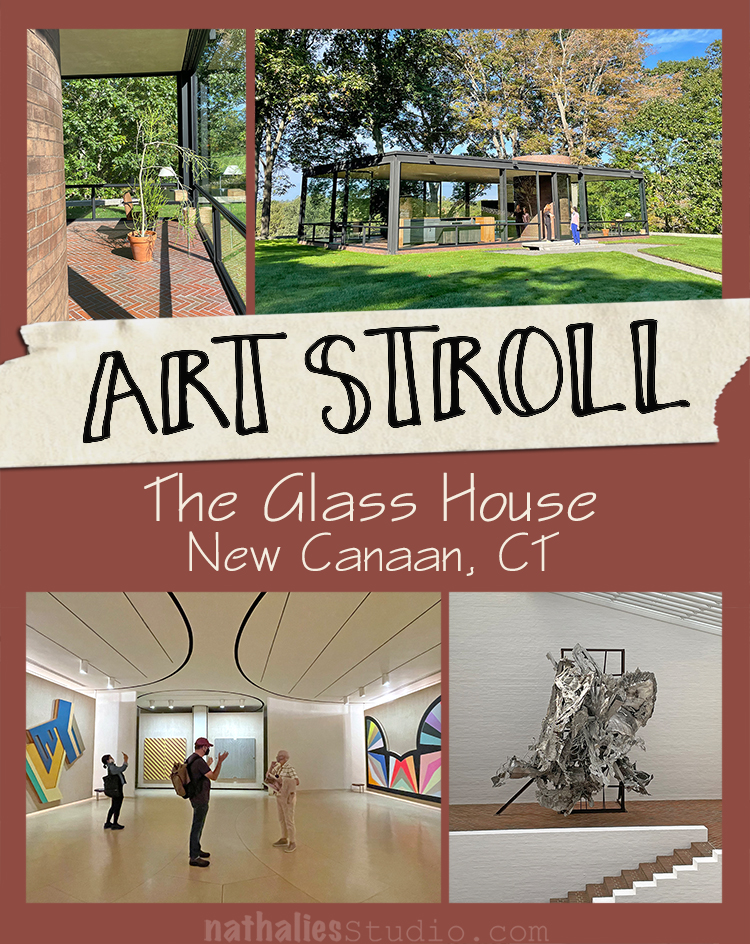
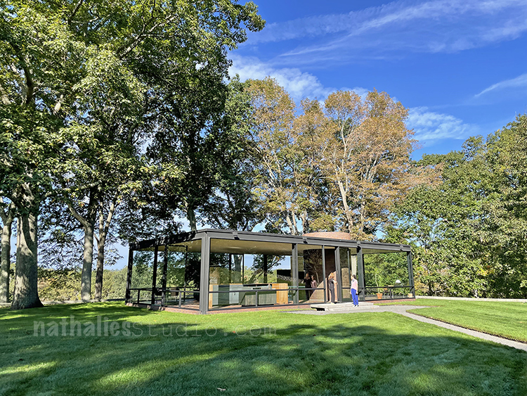
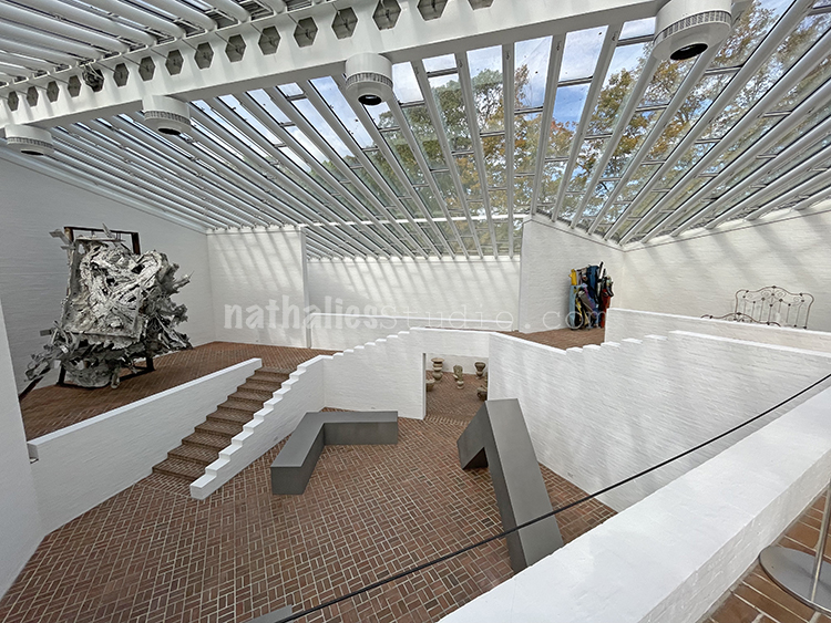
A couple weeks ago we took a day off and went to New Canaan in Connecticut to see Philip Johnson’s Glass House.

The Glass House was built in 1949 and Philip Johnson actually lived in it until his death in 2005.

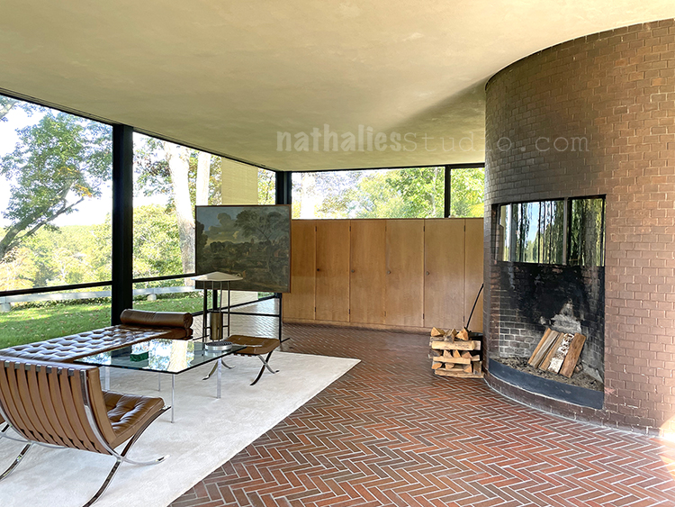
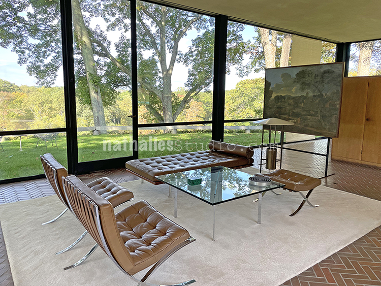
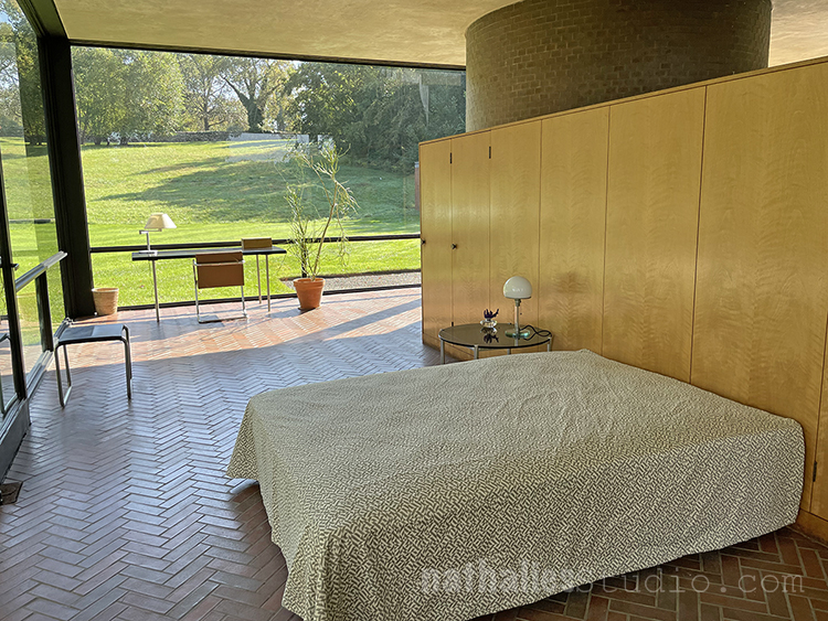
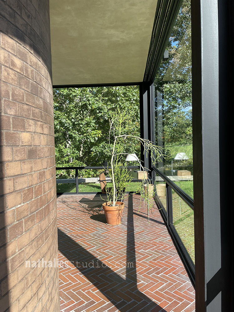
It is an incredible building – it feels like you are part of the surrounding and it felt surprisingly cosy and livable in there.

It is amazing to think that this design is from 1949 and yet it feels just timeless. I would also not say no to those Barcelona Chairs of course ..but they weren’t offered to me :)

Apparently you can kind of donate your way into spending a night in the house …for only 30K Dollars it is yours for a couple hours …but I think you can skip that experience and just visit the grounds

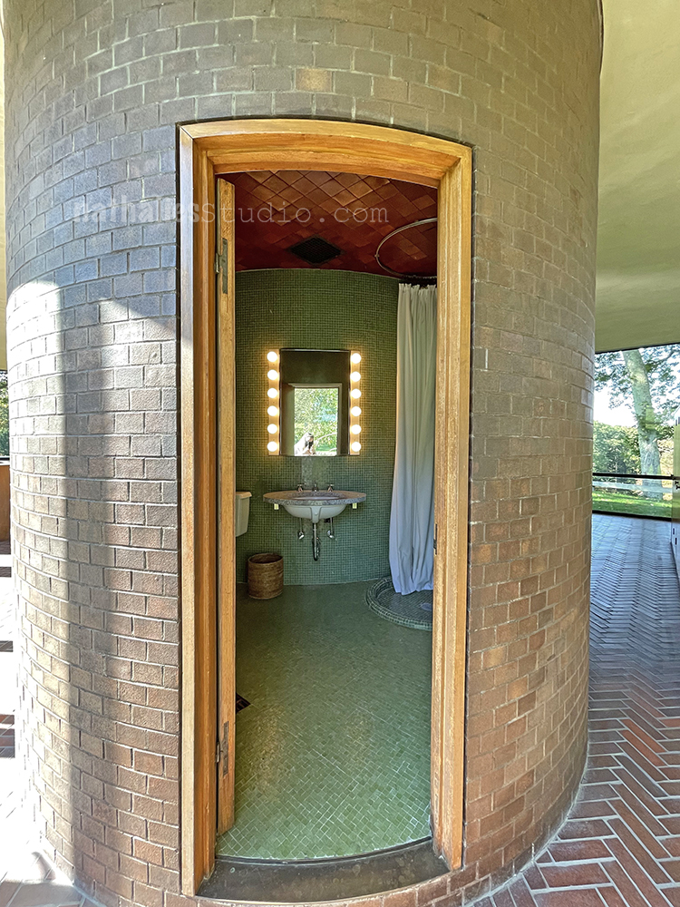
A round bathroom – how cool is that!

I liked the spot of the desk.

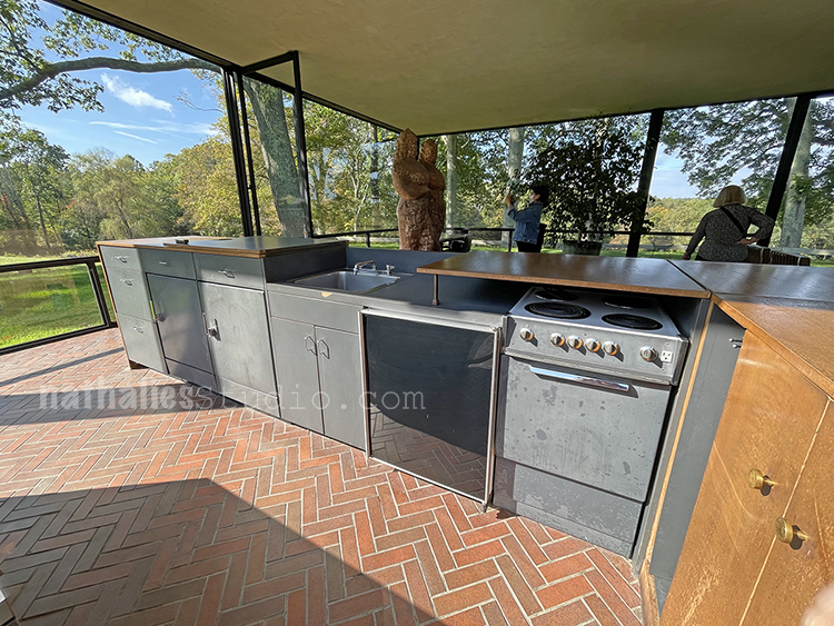
And the ingenuity of the kitchen – the counter top can be put down and up above the sink and stove !

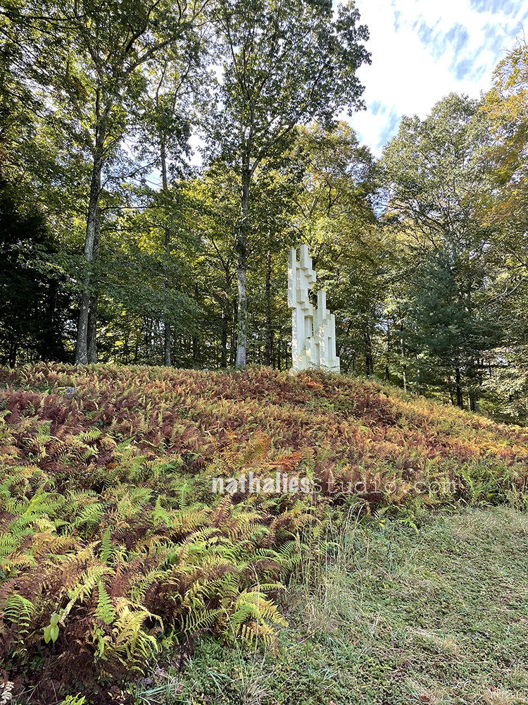
Apparently many famous people climbed this sculpture, the Monument to Kirstein Lincoln, and signed it on the top. There is also an inscription on the top – which is not revealed, you have to climb it, but that is actually forbidden. Probably a good idea as it is not a very safe structure. As many aren’t on the property – Philip Johnson apparently liked to play with “Safe Danger”

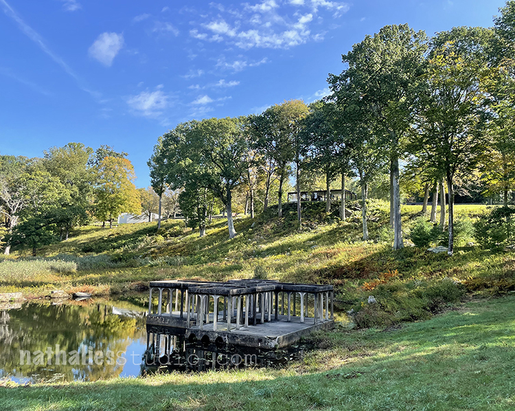
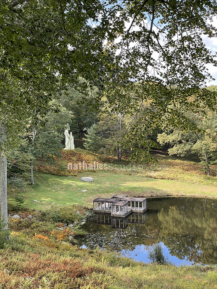
At the lake down a hill you can find a pavillion which upon approach reveals to be a trick of perspective and scale: It is much smaller when you would think when you are up the hill and in fact – if you were allowed to go in even my 5.3ft self would have to crouch.

I thought that was fun and playful .

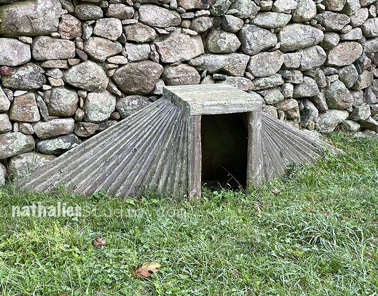
Can you guess what this is? It is a dog house …we had to ask. When I showed this photo to my friend Bill, who is also an architect, he knew right away it is a dog house …I guess that is how architects envision one LOL.

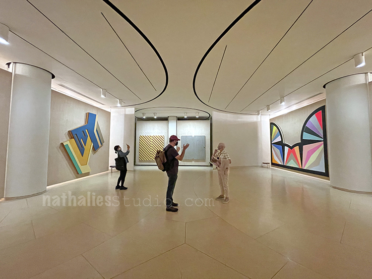
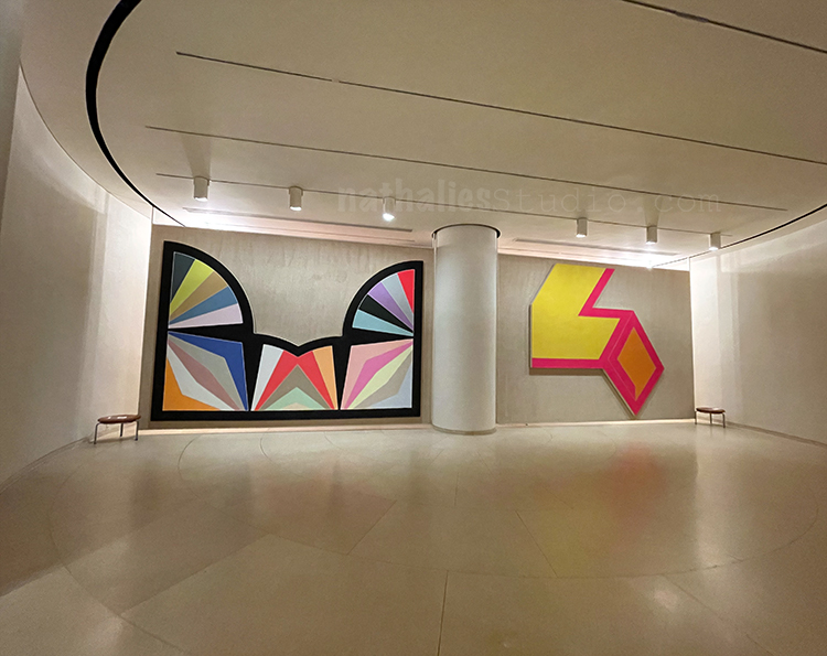
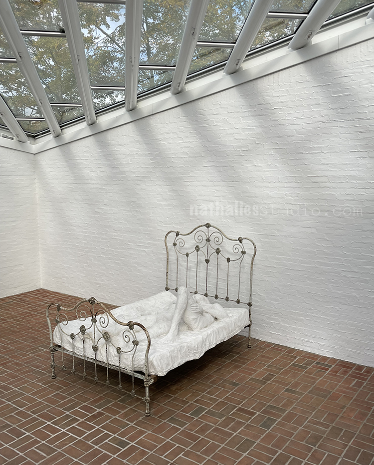
The painting gallery looked almost like a bunker from the outside – very interesting inside- three circular display rooms- with rotating racks – so like a rolodex system you can display art or prepare new exhibitions without long closing times. Genius!

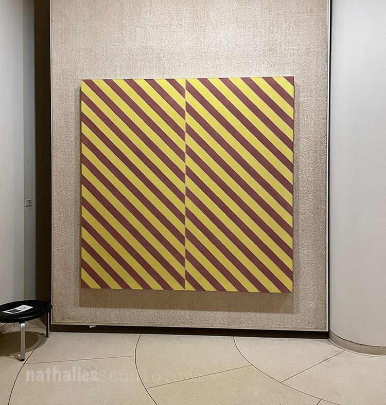
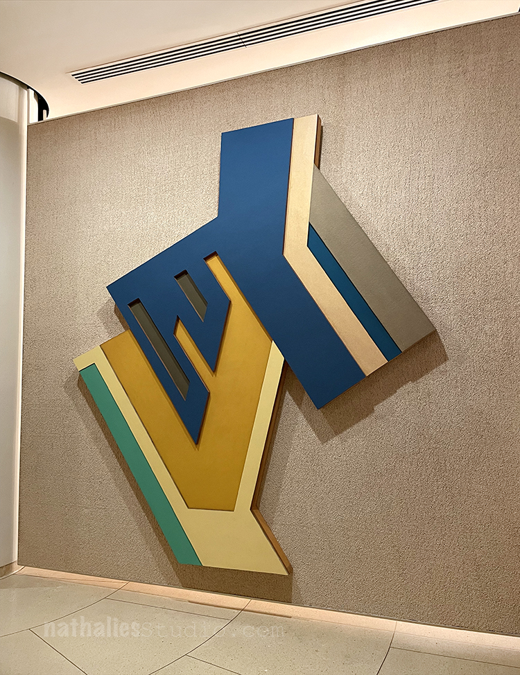
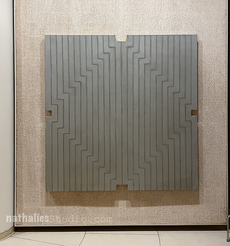
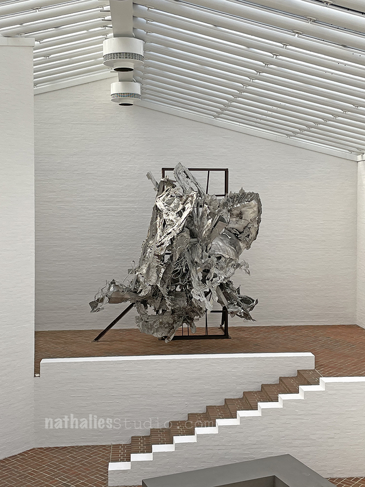
Johnson’s collection of Frank Stella’s Art through the years was on display

It was interesting to see how Stella’s art changed to more 3dimensional art over the course of the years.

And also to more colorful art.

The piece above is the oldest piece in the collection.

Another building on the ground is the Sculpture Gallery – it was mostly closed off but you could still see most of the pieces.

Loved this one – I am not sure whose this is – I guess I can do some more research but maybe one of you knows :)

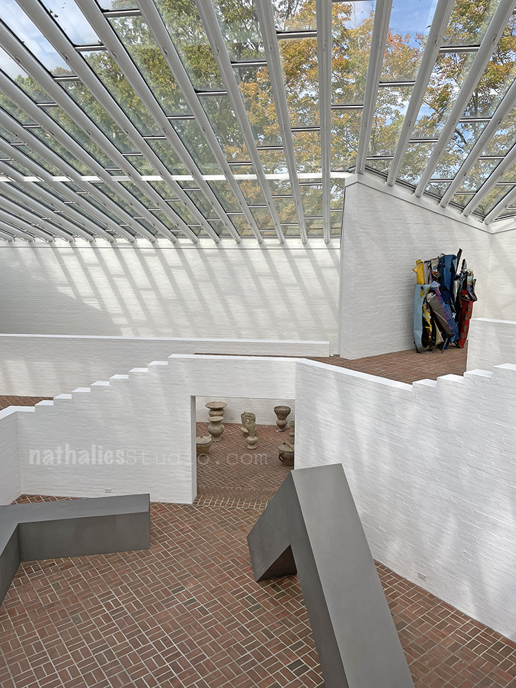
It was an interesting building but again- you were not allowed to walk it – apparently it is a bit of a safety concern with the very low walls on the sides and the perspective being a bit off.

I do love Johnson’s use of brick!

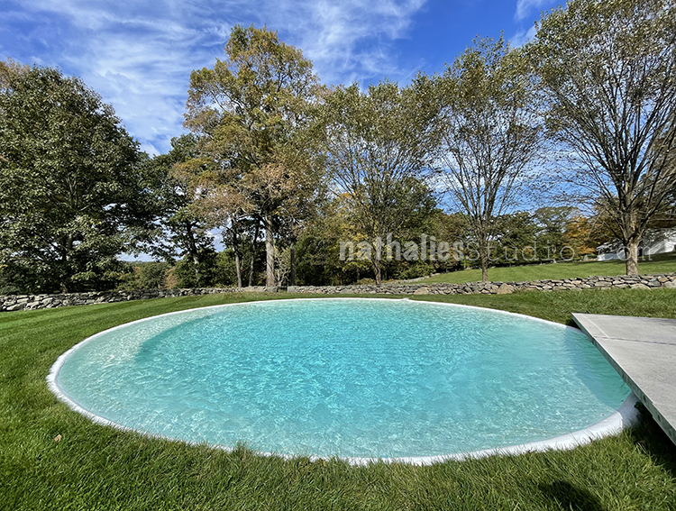
The swimming pool in front of the Glass House- another token to “Safe Danger” – being the pool is shaped like a cone and there is only one small spot you can get out easily. The lore has it that teenagers used to jump the wall to the property and do some diving and then be a bit surprised LOL.

I really enjoyed the trip – full disclosure- upon doing some more research later into you Philip Johnson, I found out he had some profound crazy political views- he was a Hitler admirer during World War II and his inspiration for the Glass House came from a burned house in Poland during World War II . That was a total damper for me after a great day there. It is always an interesting discussion how art should be viewed distanced from the artist’s life or not …hard if the inspiration as usual comes from your own life and views. In a way I am glad I experienced the day without this knowledge – I think I would have looked at it through a different lens. Nonetheless I find it important to see these places and acknowledge that while the art or architecture itself may be good, interesting, important- we also need to acknowledge and know about the circumstances, history, inspiration that lead up to them.

Comments (1)

  • Sue Clarke

    |

    Love that pool! Quite the unique house. I must say that his political views do put a damper on the experience.

    Reply

Leave a comment

Just Human – Art Journal

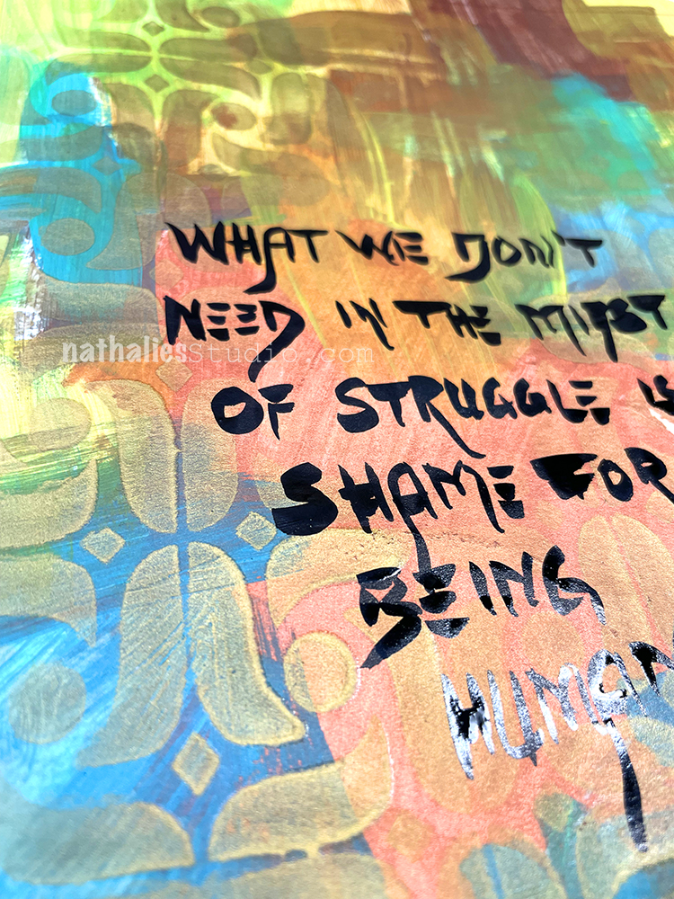
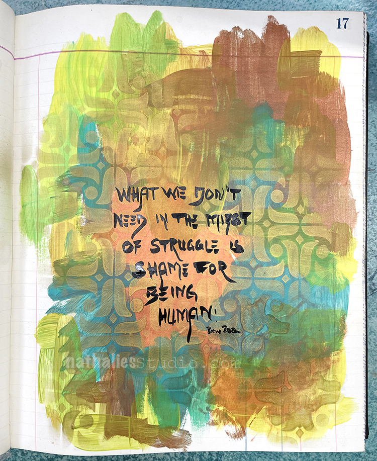
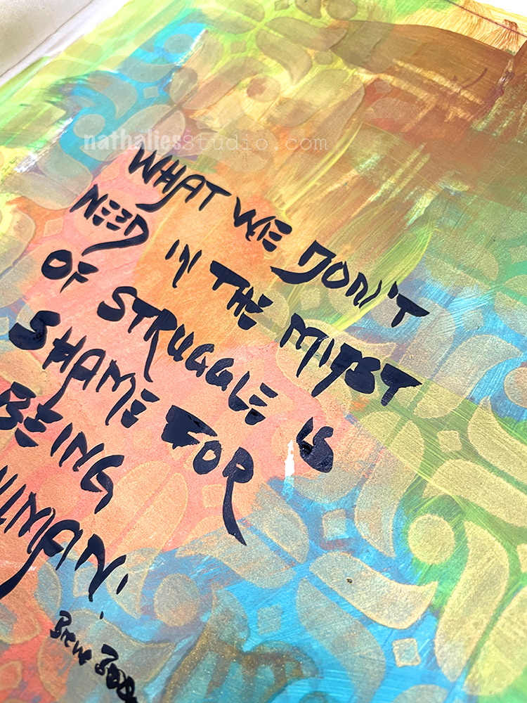
“What we don’t need in the midst of struggle is shame for being human.” – Brene Brown

This is just a simple art journal page: I had some leftover paint on the ledger and then I used my Amsterdam Stencil with new spray paint – Mtn water-based gold spray paint. I wanted to try it out and was pleasantly surprised by how the metallic spray paint actually created some real texture.

I finished up the page with a Fude pen for the journaling.

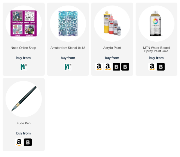
Here are the supplies I used:
Leave a comment

Come Visit – Art Journal

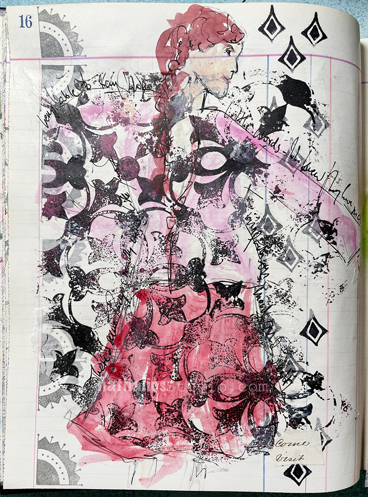
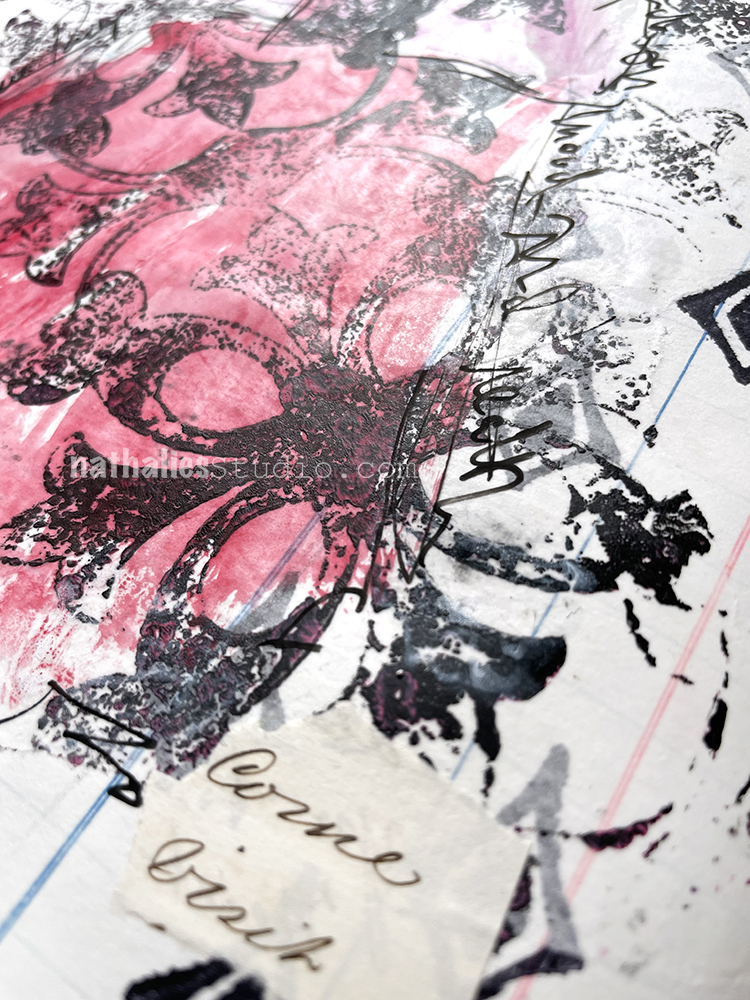
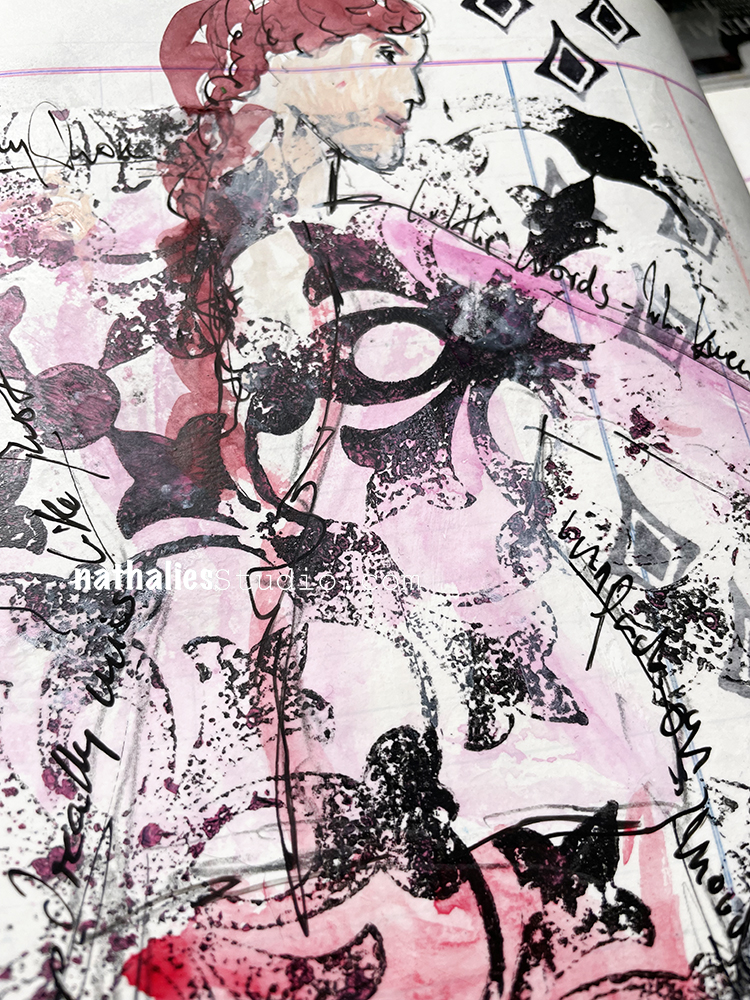
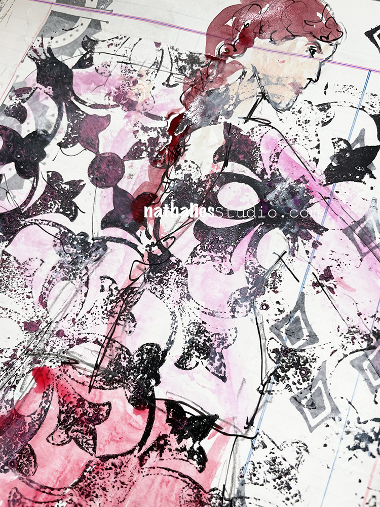
“Come Visit” – and then some journaling reminiscing about how little I knew a while ago how much I love to say those words. I miss my friends in Germany and further away. Two little words – so much weight.

The “come visit” were a leftover from an old letter that I had used as collage material and the two words were in different sentences on top of each other and it was like a sign (wwahhhahaa – insert glorious music and sunshine here ;) ).

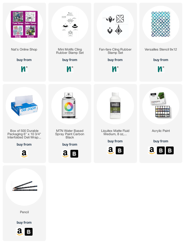
The background was stamped with my Mini Motifs and Fan-fare rubber stamps. Then I added a piece of deli paper on which I had “cleaned” a stencil that had spray-paint on it from an earlier page, creating a nice textured print of the Versailles stencil. I adhered it over the background with liquid matte medium and then sketched the lady on top.

I actually liked her better in pencil but was afraid it might not be visible enough so I added some color with acrylic paints. I am not too happy with that, as I did not think about how the acrylic paint would be taken by the glossy side of the deli paper. Oh well, it is what it is and a good reminder to think ahead sometimes. Or… just go with it… I can revisit this another time ;)

Here are the supplies I used:
Leave a comment

Creative Squad: Masquerade Party – Jordan Hill

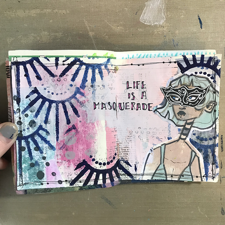
Hello from my Creative Squad! Today we have a post from Jordan Hill who is sharing with us an art journal page using my Art Deco Empire stencil and our October theme: Masquerade Party – Let’s play with disguises, the technique of masking, or maybe creating a bit of mystery this month. Not everything is what it seems, and it can be an interesting artistic trick to obscure or reveal in your artwork.


Hello everyone! When I first heard about this month’s theme of “Masquerade Party”, I was extremely excited! It’s the sort of theme that’s right up my alley, and I knew I would have a lot of fun with it. I hope you enjoy following along with me as I create this month’s project!

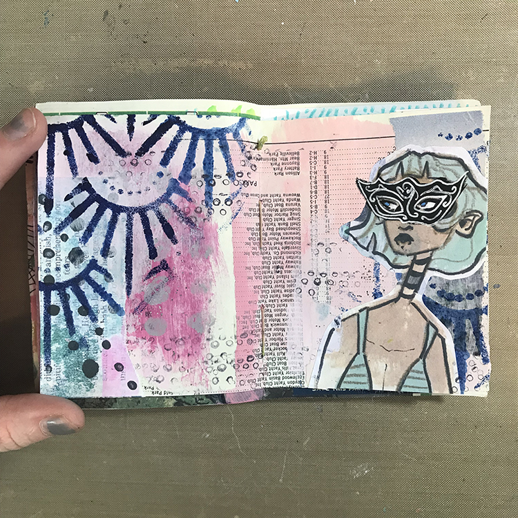
I started things off by flipping through one of my art journals to find a spread that I wanted to work on. This particular background consisted of a few pieces of collage, some pink acrylic paint and a bit of glitter paint. Something about this spread was calling to me, so I decided to go with it!

Next, using Nathalie’s Art Deco Empire Stencil, a foam makeup sponge, and some dark blue acrylic paint, I added some texture over different parts of my spread. I selected this dark blue color specifically because I knew it would contrast well with the soft pink of the background.

I then selected a collage image to use as my focal point for the page. For my example, I used a scan of my own artwork, but you could get a similar effect by using magazine images or photographs. It might be fun to play around with photos of yourself, or of family and friends!

Now it was time to introduce the “Masquerade Party” theme to this spread! I first sketched out the general shape of a mask over my figure’s eyes. Then, using black acrylic paint, I painted over top of my collage image in order to create a masquerade mask! Once the black acrylic paint was dry, I used a white gel pen to add some details to the mask; swirls and spirals are a great way to give a filigree effect without having to be too precise.

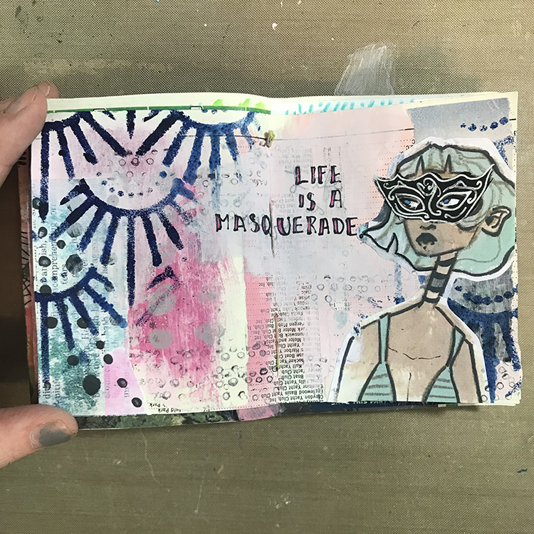
I also took this time to add some small circles over my page with a fine point pen. This added a bit of extra texture to the background, particularly in areas where I felt it was looking a bit plain.

I was then ready to add words! At first, I tried to write directly over the preexisting background, but the numbers and letters from the collage paper were a bit overpowering. In order to fix this, I took some more pink acrylic paint and added a second layer to the area where I wanted to add my words. This second layer gave me a more opaque space to write. I also decided to supplement my typical black lettering with some magenta, in order to tie the words together with the spread a bit more.

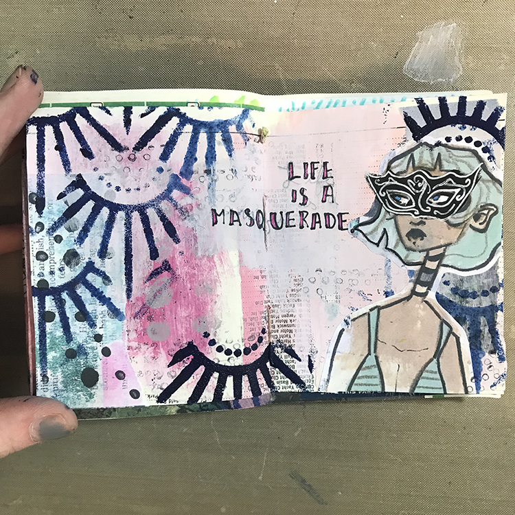
At this point, I was starting to feel as though I was losing a bit of the stencil design, so using the same dark blue paint, I re-added Nathalie’s Art Deco Empire Stencil to a few places around the spread. For the upper right element, I also flipped the stencil upside down and placed it so it would appear almost crown-like over the head of my figure!

To wrap everything up and tie it all together, the final step was to draw a scratchy border around the edges of my page. I added a few dots along these scratchy lines in an attempt to replicate the pearls and jewelry you might see at a Masquerade Party, and I was ready to call this spread done!

I hope you all enjoyed following along with my process this month and I hope you consider experimenting with some of the ideas yourself!


Thank you Jordan – so cool to see one of your characters donning a mask for the occasion! And look at that gorgeous background too :)

Give it a try: you can find all my Stencils in my Online Shop and in addition to collage papers here are some of the supplies Jordan used:
Follow the Creative Squad on Instagram for weekly posts, artwork, and inspiration.

Comments (1)

  • Robin

    |

    Jordan, I love this months journal page you created. The mask gives it such an expressive look. Loved reading your process too!

    Reply

Leave a comment

Pattern Monday 20 – Ledger Video

Sometimes Mondays just feel like a Monday and that is definitely how I’m feelin’ after this Pattern Monday in my big vintage ledger.

I was using my Fan-Fare rubber stamp set, one of my favorite go-to sets, but I am the first to admit that this is one of the worst patterns ever. As you might see in the video I dropped the ink pad right at the beginning and then there are so many mistakes… I wasn’t going to give up but it is also zero zen LOL. And that is why you get a super sped up version of this one. Let’s get this Monday over with.

Here is another look:

Here are the supplies I used:
Leave a comment

Stroll Through the Hood – October 2021

Strolls through my hood get me out of my studio, they help me get unstuck and often I get inspired by what I see and get new ideas to create something. It is part of my philosophy about Artful Adventures in Mixed Media – which is the subject of my book. Here are some photos that I gathered in the last couple weeks.

Floating through the universe – love this mural by bedbugs_in_love

Looks like this sad building gets a new make over…now I am not an expert but ..I am not sure this looks like a great construction job …but maybe I am wrong … this former beauty is looong gone and while I am all up for saving houses – this makes me a bit scratching my head.

Early Bird – well wasn’t*t that early when I shot the photo on a morning walk – I always love how construction fence plywood becomes a canvas in this city.

A mural by Clarence Rich

This mural is I think by Derek Rue – not one hundred percent sure and should have checked the tag as well.

I love a good ghost sign – I think these are actually two ghost signs layered.

Audrey Hepborn looking at me from a basement window

This gate used to be part of the Armory here in Jersey City and is now freestanding in a park.

The sadly dilapidating train station at Liberty State Park- which brought hundreds of Immigrants arriving at Ellis Island to the rest of the country.

My friends with a big message – as every year we all have to go protest the ridiculous efforts by a golf club billionaire to get his greedy paws onto parts of our public land at Liberty State Park to expand with a couple holes.

It seems like a now brainer to finally sign the Liberty State Park Protection act …but alas … here we are again.

Earlier this month the Jersey City Art and Studio Tour took place and I was so happy to see the wonderful installation of Rhian Swierat in person. Her work is so stunning!

And those sculptures by Josh Urso caught our eyes and are so intriguing !

An amazing and huge vinyl banner by woolpunk – stunning work!

It definitely was nice to just walk around and see some local artwork. Next year I want to participate again but this year it was just to stressful to get ready for it and I really enjoyed having the opportunity to see other people’s work :)

That was it for this month – hope you enjoyed the little stroll and see you soon again strolling the hood :)

Comments (3)

  • Sue Clarke

    |

    I love the family/community tree mural!
    Also, the arch…So many stories come to mind of the number of people who have gone through it and what they’ve seen.
    Thanks for another inspiring stroll Nat.

    Reply

  • jeanette sclar

    |

    RE: pic #2, the house renovation…It
    s not so much that it’s a poor job but the owners clearly could not afford to retire the wood shingle cladding (Many $$$$ and high maintenance, cleaning and sealing it every few years for yet more $$$). They opted to go with metal siding because it is so much cheaper and requires almost no maintenance, just one and done! Sad because it’s a shingle style beauty, but I can certainly relate to the issues of the pocketbook.

    Reply

    • nathalie-kalbach

      |

      it is a developer/ houseflipper not a house owner who wants to renovate! Has nothing to do with a single family person’s pocket book – more with a developer making sure to fill their pocket book ;)

      Reply

Leave a comment