Inspiration from Around the Globe


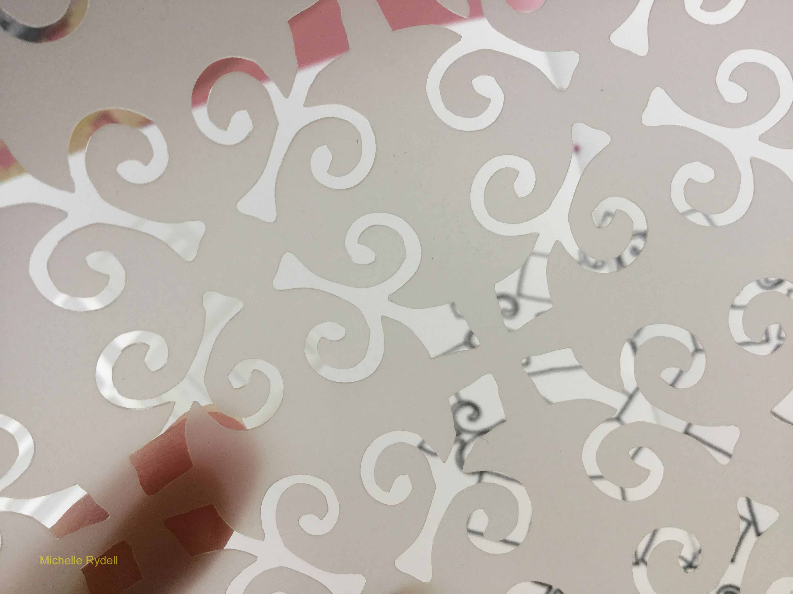
This Tuesday we’re taking a break from our Creative Squad (they will be back next week with a new theme to play with!) to bring you some super fun projects from around the world. As you may know, my stamps and stencil designs are available for purchase online and maybe even in your local craft store, so crafters and mixed media artists and art journalers from around the world are using them. I am always excited to see how YOU use my products in your own projects. I am even more excited to share some of the beautiful and creative examples of these projects with you today. Enjoy this inspiration from around the globe!

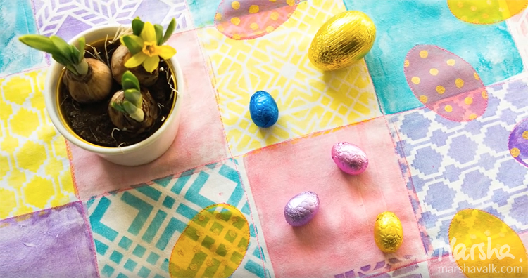
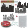
First we have a super fun idea from one of our Creative Squad members, Marsha Valk from the Netherlands, for an Easter-themed table runner. Although Easter was last month, this is still a fantastic way to use my stencils on a project that can dress up your table for any occasion. Marsha uses a whole slew of my stencils, including Buenos Aires, Santiago, Mesa Verde, Manhattan, Amsterdam, Toledo, and Chicago for a variety of cool patterns.

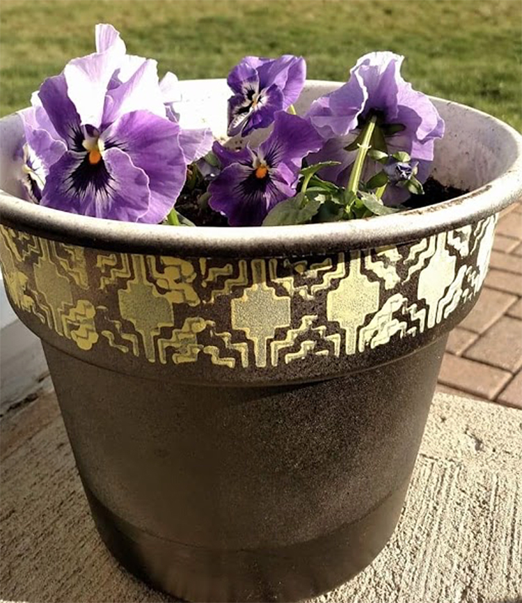
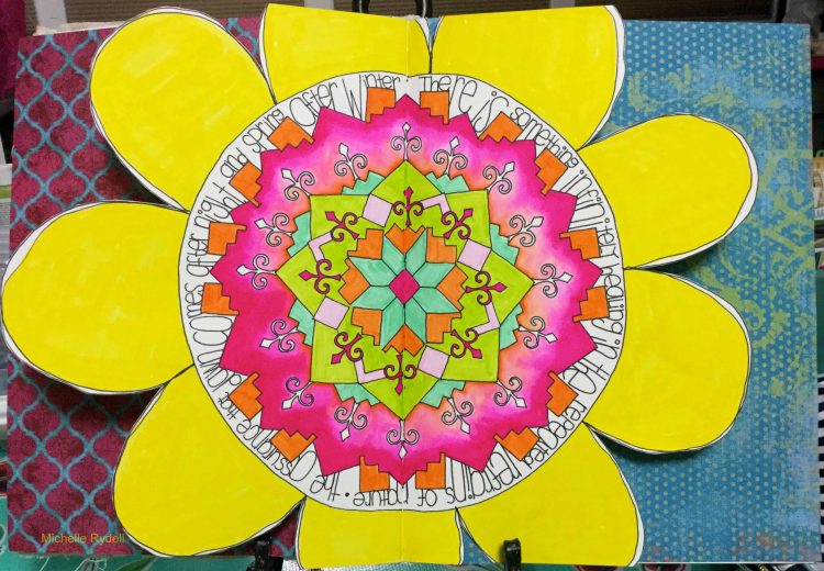
In honor of Spring, we have a gorgeous stenciled flower pot from Jean Dunning of Connecticut using my Santa Fe stencil. If you like this idea, stay tuned – we coincidentally have a similar project planned here at nStudio later this month ;)

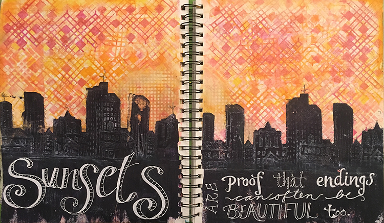
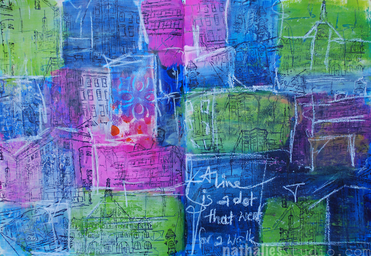
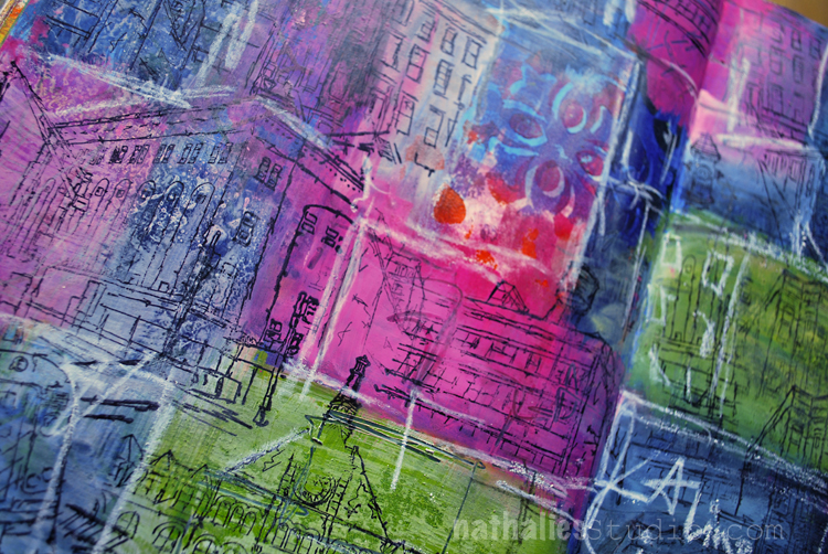
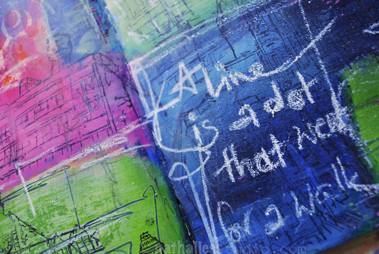
Here’s an art journal page from Angie Winkler in Oklahoma using my Urban Scribble stamp set and my Chicago Positive Negative foam stamp set to create a beautiful urban sunset. I love the contrast and colors on this one, and the creative use of the Chicago stamps for the sky!

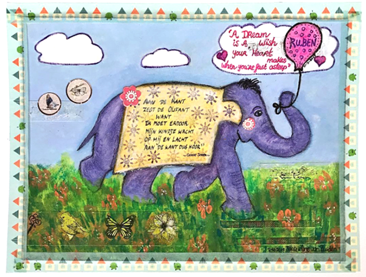
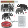
From the Netherlands, Jacqueline van Zuiden brings us a really cute gift for her new great nephew that all started with my Elephant foam stamp. It’s super happy and I love the message :)

Join us again next Tuesday for another great project from one of our Creative Squad members!  They will be working with a new theme for May.  And in the meantime, share with me what you’ve been working on with my stamps and stencils.  I would love to feature your project in an upcoming post!


Leave a comment

A Line is a dot…on a stroll – Art Journal Spread

” A line is a dote that went for a walk” – Paul Klee. A lot of lines in this spread -strolling around.

This was a demo spread which looked a bit sad, so I painted the areas in different colors, stamped with different stamps of my RubberMoon Stroll Through the Hood sets and then added some marks and journaling with a white China Marker. China Markers are great to write on acrylic paint.

Here are some of the supplies I used – some links are affiliate links


Speaking of walks- have you done a walk lately that inspired you?

Comments (2)

  • Sue Clarke

    |

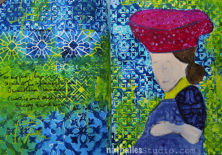
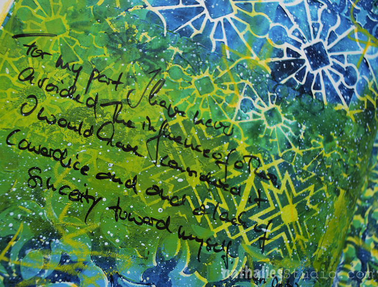
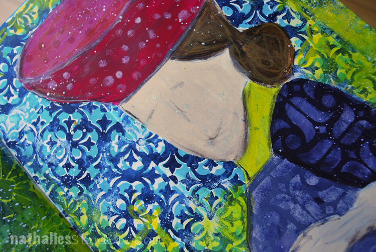
    What great quote and I like your version of it…especially since your strolls are so inspiring.
    I’ve been sick in the house for almost a full week and I can see the buds on the trees starting to bloom.
    So my short walks out to my yard with my dog have inspired me by seeing these buds and my chicks and hens which are growing very well. Peace.

    Reply

    • nathalie-kalbach

      |

      Awe- thank you Sue! I am so sorry to hear you are sick- hope you feel better soon!!! huge hugs, nat

      Reply

Leave a comment

No Reason to Avoid Influence – Art Journal Spread

“For my part I have never avoided the influence of others. I would have considered it cowardice and a lack of sincerity toward myself” Henri Matisse

Some stamping with several of my ArtFoamies Stamps including my new super cute Versailles Positive and Negative Mini Stamps. I used only two colors of the stamping and once I filled up both pages, I painted with some yellow acrylic ink over part, which turned green over the blue and stayed yellow in the white off -set stamped areas.

I like how this spread turned out- it was fun. Here are some of the supplies I used – some of the links are affiliate links:


Have a wonderful creative day!

Comments (2)

  • Julie B

    |

    Love the mix/matching of the various sizes of Versailles stamp with a little Buenos Aires for interest. Thank you again for the inspiration.

    Reply

Leave a comment

Art is a Line Around Your Thoughts

This is an art journal spread entirely inspired by Gustav Klimt- the patterns and colors.

I love breaking up stenciled patterns with hand drawn patterns. I also loved playing with all the different shapes and doodles- it was a very relaxing page to create .

You also see I am still on a little Gold-Hype :) Here are the supplies I used in this spread -some links are affiliate links:

What are your favorite shapes to draw?

Comments (6)

  • Julie B

    |

    EEK! LOVE THIS! Absolutely love the layers, colors, texture, shapes and design. Love how the gold gesso pops the page. Thank you once again for the inspo!

    Reply

    • nathalie-kalbach

      |

      awe thank you so much, Julie! cannot wait to see all your go,d adventures :)

      Reply

  • Shelley Graham Turner

    |

    Loving your gold hype! The mix of gold and orange, with the black and white pops? YUMMY!

    Reply

  • Torsa Saha

    |

    It’s amazing!!

    Reply

Leave a comment

Back for Workshops at My Heart’s Fancy in Oklahoma

Wohooo- so stoked to be back again at My Heart’s Fancy in Oklahoma for three workshops

June 16, 20172:30 pm – 6:00 pmStroll Through the Hood – Mixed Media Wall Hanging

Let’s create a beautiful little wall hanging for your home, office, or beyond! We will begin by creating a colorful, patterned background. Then we’ll take it further by adding scenery using stamps, graphite, paints and other supplies. Finally we will add detail and highlights to pull the landscape together. We will be working on Ampersand Clayboard which offers a special and exciting surface to create your Mixed Media work on.

Register here


June 17, 201710:00 am – 5:00 pmThe Magic of Acrylics – Technique & Abstract Painting Class

Join me for a full-day class exploring all kinds of different Acrylic Media – from Dumbledore to Merlin, from Acrylic Paints to Acrylic Inks, from String Gel to Pouring Medium, from Modeling Past to Black Lava and other fun stuff!

Learn their magic – and put an end to the mystery of how to use these amazing helpers in your Mixed Media and/or Art Journaling projects. The first half of the class will be technique based and in the second half you will put your own spell onto 3 abstract canvas paintings. After this class you will have a lot of fun waving your new magic acrylic wand whenever you create!

Register here


June 18, 201710:00 am – 5:00 pmWhat’s Cooking – Art Journal Class

What makes an Art Journal spread, or for that matter a work of art, work?

Let’s explore in a playful and creative way the Principles and Elements of Art, using Mixed Media tools and supplies. Think of the principles as you might think of a recipe: a starting point to which we add the right ingredients – the elements – to make your art journal pages more interesting. Develop your individual recipes, which will result in your very own style. – LET’S GET COOKING!

Register here


I hope to see you there! And if you cannot come- check out where I am teaching in the next couple weeks

Leave a comment

Art Stroll: Whitney Biennal 2017

The 2017 Whitney Biennal, the 28th installment of a survey of American art, features sixty-three individuals and collectives with various art styles. This Biennal has been highly controversial and after much consideration I decided to not show any of the most controversial pieces …simply because I haven’t made up my mind about them myself and it is really complicated. All I can say is that the work in question in the article I linked up to made me sick to the stomach. So I keep this Art Stroll more on the inspirational and fluffy side.

These wall hangings and sculptures by collaborative duo KAYA, painter Kerstin Brätsch and sculptor Debo Eilers are made of of melted plastic, leather straps, oversized grommets, paint and stainless-steel towel bars.

I liked the connection of sculptural and painterly work and the mix of materials.

I found them intriguing even if some people called those wall hangings a hot mess.

The cabinet above was also by them – it reminds me of lockers in a gym as well as a swimming pool at the same time. Also the piece below- which I assume is made with resin .


Kaari Upson …yep these are paper roll towels. Kaari turns stained paper towel rolls and upholstered furniture with the help of urethane, pigment and aluminum into lush sculptures.

OK- I lied- not all inspirational – LOL- this one on the left was just weird and gross and I don’t care if that makes me an idiot. This installation by Pope.L’s with 2,755 slices of bologna with a photo pinned to its walls – I didn’t get the whole thing – the explanation with the artwork revealed at the same time as being done using “made up data”. What’s the point?

OK- now …back to inspiration …The paintings in the gallery below are by Sarah Hughes.

Most of the paintings are done with oil, acrylics, enamel and dye. I love the vibrant colors!

The next group of paintings are by Carrie Moyer.

She begins a painting often by creating small collages from cut paper, pours acrylic  and then mixes in glitter.

I loved the texture and colors and shapes

Definitely one of my favorite artworks of the show.

The window and sculptures in this room are by Raul de Nieves

For this site-specific wok de Nievies covered the windows with “stained glass” panels which he created using paper, wood, glue tape beads and acetate sheets.

The sculptures are based on shoes …and amazingly beaded and and put together.

It was weird and beautiful.

That was it …. a very soft art stroll of an exhibition that was filled with controversial discussions and artwork which I did not show here. If you are going…you will be seeing a lot of different things and if you went, I would love to hear your thoughts.

Comments (2)

  • Sue Clarke

    |

    As I look at some of those wall hangings it occurs to me that I tend to look more deeply at art that disturbs me (that I’m not drawn to since it’s pretty and in “my” color schemes). These photos fit the bill. Disturbing art brings about some great discussions. TFS Nat.

    Reply

    • nathalie-kalbach

      |

      Sue, I agree, that art that is unusual or disturbing invites for a longer dialogue with the viewer. Unless it is smelly bologna slices …then that is just gross and makes you run- LOL.

      Reply

Leave a comment

Live Like It’s Spring – Michelle Rydell

Hello from the Creative Squad! The monthly theme is Live Like it’s Spring – Springtime is when Mother Nature kicks it into high gear. It’s the time to wake up and approach life with renewed energy.  Let’s join Mother Nature in this reawakening and create some things in the Spirit of Spring! Today Michelle Rydell is playing with different parts of my stencils  to celebrate spring with a gorgeous mandala. Check out her nifty beautiful idea to use stencils!


When I heard that the theme for this month was about springtime, the first thing I thought of was flowers! Then I took out my Wanderlust stencils to see what I could see. I love looking deeply into Nat’s stencil patterns, because you can see so many patterns within patterns. This time, what I saw was a cute little tulip within the Santa Fe Stencil. Do you see it too?

That gave me the idea to create a springtime mandala with the little tulips as a starting point. I’m creating this spread on watercolor paper in a 9” x 12” journal. The guideline I’m setting for myself is to only use bits and pieces from the following Wanderlust stencils: Santa Fe, New Orleans, and Manhattan. Here’s the step-by-step…

I started with the basic diamond shape (from the Santa Fe) in the middle, tracing it with pencil in the middle of the page. Then I drew a line straight out from each point and side of the diamond. Then added a “tulip” at the end of each line…

From there I just started building outward with various shapes from the stencils; first tracing with pencil, then going over it with pen, once I knew I liked the way it looked.

When I reached this point, I started to see the center of a giant daisy emerging! I found a quote that felt perfect to tie the mandala in with springtime. I drew a circle around the mandala, leaving a little room to add the quote to the inside of the circle. In case it’s hard to read, here’s what it says…

“There is something infinitely healing in the repeated refrains of nature – the assurance that dawn comes after night, and spring after winter.” ~ Rachel Carson

Then I drew the petals, to complete the flower…

Colored it in with tombow markers…

And cut the shape of the flower out, so you can see the journal page before and after behind it.


Wow – I love how all those different parts of the stencils created something new and beautiful – stunning, Michelle! She used these supplies – some links are affiliate links:


Play along with us! I love to see how you interpret our monthly themes. Email me how you used my stencils and stamps with the theme and email me an image – I would love to share your projects in my “n*Spiration From Around the Globe“.

Comments (2)

  • Sue Clarke

    |

    It’s amazing how a crafty person can create such beauty while using different pieces of this stencil.
    Thanks for the ideas Michelle as I tend to create “in the box”.

    Reply

  • Julie Tucker

    |

    This is gorgeous! LOVING how you assembled that flower!!!!!!!!!!!

    Reply

Leave a comment

Living in Color a la Hockney

An unusual color combination for me but inspired by David Hockney – a very straightforward but fun page with some stencil play.

Here are the supplies I used:


I think I want to discover this color combination a bit more. Do you like it?

Comments (2)

  • Sue Clarke

    |

    Since you asked Nat, I must say that I’m not wild about that color combo but I enjoy seeing any thing that you’ve created.

    Reply

    • nathalie-kalbach

      |

      Ha- I understand it is a “weird” combo :) Have a wonderful week Sue!

      Reply

Leave a comment