nathalie-kalbach

My new Crackle Stencil with Stencil Girl Products

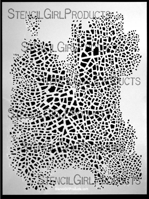
Yeahhhh – my next two stencils are out with Stencil Girl Products. Let me show you the one I am the most excited about- it is my dream stencil- the one I always wanted to have – my Crackle Stencil

NathalieKalbach_CrackleStencil

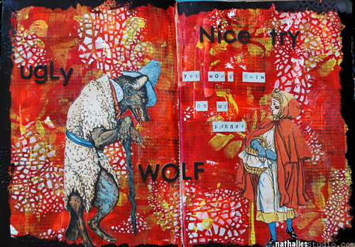
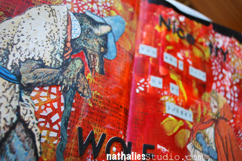
Here is an art journal page using the stencil with light modeling paste

NathalieKalbach_CrackleRH01

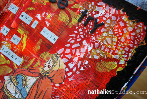
It dries quick and it is a great way to apply the crackle effect to all kinds of surfaces and not just acrylic painted surfaces.

NathalieKalbach_CrackleRH02

The stencil is 9×12 inches and I love that you can use it the size as is or just parts as I did to add some texture and a layer here and there.

NathalieKalbach_CrackleRH03

I so hope you like it too :) Here is what I used to create the art journal spread:

nSupplies

Thank you for letting me share my crazy excitement. Huge hugs and a wonderful day – I cannot wait to show you more!

Nat


Comments (26)

  • kromacrackle

    |

    Nice crackle pattern, instant effect, very clever! I thought something mysterious was going on in the shower …

    Reply

    • Nathalie Kalbach

      |

      Thank you Helen! :) Your kroma crackle is still my fave :) It is the not knowing and the surprise that makes it the best- plus of course..nothing can replace real crackles!!!

      Reply

  • marja

    |

    Wow your pages are wonderful and your stencil fabulous. Love it
    lovely greet
    Marja

    Reply

  • Linda Kittmer

    |

    Congrats Nat! It’s a great stencil and the page you did with it is fabulous!

    Reply

  • Mary C. Nasser

    |

    This is great! Congratulations!
    I really want to try this one in my map paintings!!

    Reply

  • Jessica Sporn

    |

    So cool! LOVE this stencil and LOVE the fairy tale page!

    Reply

  • Judy Shea

    |

    This is just beautiful. So glad someone finally came up with a great crackle stencil.

    Reply

  • julie

    |

    Awesome – this is on my list to buy!

    Reply

  • mjmarmo

    |

    Wonderful stencil!

    Reply

  • muriel

    |

    Aaaaaaaaah! Great! I want it too. I am waiting for all your stencils to have been released to order them.

    Reply

    • Nathalie Kalbach

      |

      Thank you Muriel :) It will now take about 1 or 2 months before we release the next :)

      Reply

  • Laura

    |

    Aargh! I want it!!
    :)

    Reply

  • Michaela

    |

    wunderschön!!Kommt direkt auf meine “haben-will-Liste”
    LG Michaela

    Reply

    • Nathalie Kalbach

      |

      Oh ich freue mich :) Ganz liebe Grüße in den Süden! Nat

      Reply

  • Riikka

    |

    Great stencil indeed! :)

    Reply

  • weevon

    |

    What a great stencil. Love it! Totally crackles me up. LOL I really enjoyed the way it looked on your page.

    Reply

  • Sue Clarke

    |

    I do believe that I must have this one in my stencil collection. It can keep Julie’s stencils company.

    Reply

    • Nathalie Kalbach

      |

      And you spied it on the “Shower” page a couple days ago :))) Good eye!

      Reply

  • Suzanne Bouchard

    |

    WOW! Absolutely fabulous and just when I told myself that I should stop buying stencils!!!!

    Reply

  • Cathy Augros

    |

    Wow! This is gorgeous! Love the stencil and the colors! That stencil is sooo detailed; it must gave taken you forever :-). Where did you get the cut-outs of Red and the Wolf? Or did you draw these? Yikes….

    Reply

  • Kathy P

    |

    Well, you know we are all going to want that one, Nat…and the next one…and the next one……LOVE how it looks on your pages! Congrats on creating a great new design in a product so many of us love!

    Reply

  • M. Carmen - Cuchy

    |

    A new fave, until you release another one hehehe. That looks like real crackles. Great!
    The page is absolutely stunning, Nat. Awesome background and love the text hahaha.
    Bring them all in june!!! muacks!

    Reply

    • Nathalie Kalbach

      |

      Besos my sweet girl! And yes I will bring them in June for Art Mesa :)

      Reply

Leave a comment

Stroll Through the Hood

NathalieKalbach_Strollhood_Logo

A lot of times I get asked what inspires me. And one of my key answers is always “a stroll through the hood”. It might be street art, it might be thoughts or feelings connected with certain sights, it might be stuff I find to buy…in one way or the other you might find the photos, the thoughts, the feelings, the colors or anything from those strolls in my art journal, a mixed media project or a scrapbooking layout.

I would love to show you once a month what inspired me while strolling through my neighborhood. I hope you like the little insights into my daily life where I live (Hamburg, Germany). This is also a wonderful way for me to remind myself on the inspiring things in the hood. Maybe you get inspired by those posts and even invite ME to a stroll in YOUR hood – feel free to grab the logo and leave a comment for me on the post and share!

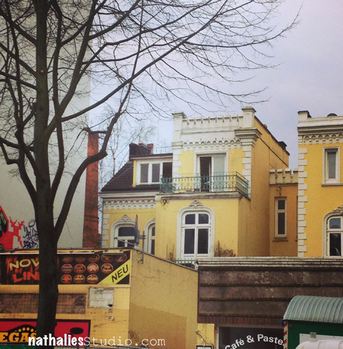
While walking to the grocery store I caught sight of this awesome graffiti car- how fun!

NathalieKalbach_GraffitiCar


This house is getting torn down right now. Very sad- I always loved this house. I used to live for many years right next to it.


NathalieKalbach_byehouse


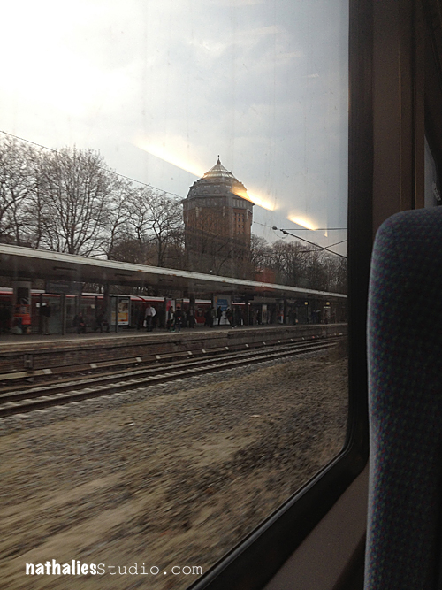
my subway stop…love the old water tower. I saw this when I came home from a trip in the train, passing fast by – made me happy to be home soon.


NathalieKalbach_Wasserturm


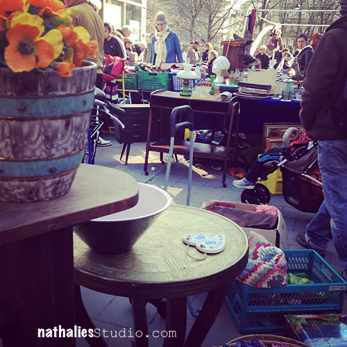
Saturday Flea Market – love strolling there after grocery shopping – It is always inspiring and you find lot’s of stuff…like a letterpress cabinet ;)


NathalieKalbach_Fleamarket


This made my friend Sandra and me laugh forever, we nearly wet our pants. Taken in clothing store here -in the changing area. On the right it says “Please do not hang anything on the lightbulbs, thanks”.


NathalieKalbach_usabilty


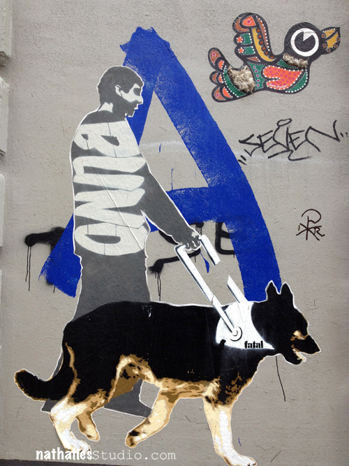
I recognized the bird from a different place when I posted some street art photos from the hood a couple of weeks ago.


NathalieKalbach_Blind


Taken in the park around the corner. It is called “Planten un Bloomen” – which is the name in a regional language called Plattdeutsch (a kind of Low German not often spoken anymore – if someone here once in a while really starts talking in Plattdeutsch- I understand ZERO). English and Plattdeutsch have a lot of similarities since they come from the same language origin. So you can probably get the sense of the name “Planten un Bloomen” :)


NathalieKalbach_PlantenBloomen


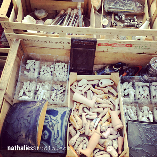
Wonderful treasure store …unbelievable what you can find there! I got some really cool old stamps there.

NathalieKalbach_DollsStamps


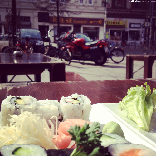
Since we are not getting too much sun here …as soon as the sun is out and even if it is freezing cold- everyone sits outside for lunch or for coffee, to watch what is going on outside …in the hood.


NathalieKalbach_sushi


Hope you liked it- see you next month in the hood ;)

hugs

Nat

Comments (11)

  • Enikö

    |

    Love seeing you stroll through the neighborhood! I’ve always been intrigued by Hamburg since I read about the Beatles hanging out there in their youth, LOL! I live on a small rural island (Martha’s Vineyard is off the coast of Massachusetts in the US) so it’s very different from where you live…perhaps I’ll post a little tour one day.

    Reply

    • Nathalie Kalbach

      |

      Ohhh I always wanted to go to Martha’s Vineyard. Some day :) Yes yes take me on a tour :)

      Reply

  • Carrie

    |

    Thanks for the glimpse into your world! My husband and mother-in-law have some relatives in Niedersachsen who speak Plattdeutsch, I think. I haven’t met them, but my mother-in-law told me about Plattdeutsch, and how different it is.

    Reply

  • fran

    |

    love that expression “the hood” I haven’t heard it before.

    Reply

  • Anna Ely

    |

    Thanks for showing us around your “hood”! It’s been 20 years since I was in Germany last….would so love to go back again! I may just have to take a stroll around mine and share!

    Reply

  • Suzanne Bouchard

    |

    Wonderful! Thanks for sharing your neighborhood! I loved the store that sells old stamps. WOW!

    Reply

  • Sue Clarke

    |

    I love “walking” through your hood Nat. That car is awesome and I wonder if my hubby would like to change our mini-van to match it. I especially like to see your pics since we do not live in the city and only get to Boston about 6 times a year.

    Reply

  • weevon

    |

    Thank you for the walk thru your hood! Love seeing places I have never been, especially the places you would never see in a tour.

    Reply

  • Marsha.

    |

    <3!

    I love walking in my city and there is always something to see and think about. But it's not half as cool and inspirational as your neighbourhood!

    Reply

  • Michelle Guest

    |

    Very cool tour… I love seeing your neighborhood… I love the store you call the treasure store- those are the best places to find unexpected treasures!

    Reply

Leave a comment

Stencil Test Drive Cascading Leaves or…Forget Perfection

Jessica Sporn asked me  and some other artists to be part of her Stencil Test Drive featuring her amazing new stencils for Stencil Girl Products.

Stencil Test Drive Logo

Today along with some others I will show you the use of the Cascading Leaves Stencil. I love this stencil. You can either use it as it is in whole or use little parts of it here and there or even make a frame.

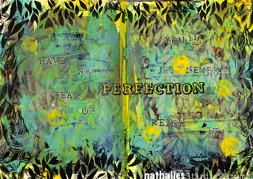
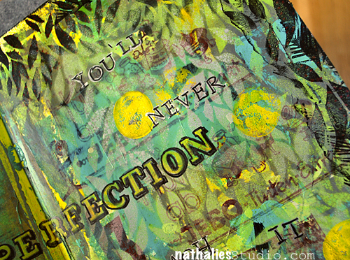
Perfection_NatKalbach

In my art journal spread I used it for the background several times layered up with acrylic spray paints and I loved how beautifully the stencil created a deep dimensional feel. I touched it up with some letterpress images, oil based inks and markers. Then I used the stencil for framing the spread.

Have No Fear Of Perfection. You’ll Never Reach It

Salvador Dali.

PerfectionDetail_NatKalbach

Supplies: Stencil Girl Productions Cascading Leaves Stencil, Letterpress Blocks, Tissue Paper, Liquitex Acrylic Paint, Liquitex Professional Spray Paints, Liquitex Professional Paint Markers, Louise Nelson Feather Stamp, Speedball Oil Base Block Print Ink.

Don’t forget to check what all the other artists created with the stencil and also get the chance to win a giveaway on Jessica’s Blog.

Jessica Sporn

Michelle La Point Rydell

Judy Shea

Roben-Marie Smith

Have a wonderful day

Nat

Comments (17)

  • Gunvor

    |

    Oh, I really love this spread! It “ooooozes” with life! I think I have to get this stencil (too),

    Reply

  • Lynn Cohen

    |

    Another lovely page! Hey to Jessica for awesome leaves!

    Reply

  • wandahentges

    |

    Wonderful spread!!!!

    Reply

  • Maria McGuire

    |

    Really love how you used the stencil as a border–beautiful spread!

    Reply

  • Kay Wallace

    |

    And excellent way to “drive” this stencil, Nathalie! Love the border that you have created to frame this brilliant quote! Way to go!

    Reply

  • Linda K

    |

    love the effect you achieved by using the spray paint-fabulous!

    Reply

  • Carolyn Dube

    |

    What a forest of joy you’ve created! You’ve created such depth with this stencil!

    Reply

  • Gina Sismilich

    |

    Beautiful pages. I am really loving those leaves in black. They make a neat frame.

    Reply

  • Jessica Sporn

    |

    This is really great Nat – love all the dimension, the colors, the border, and the quote. Beautiful!

    Reply

  • Sue Clarke

    |

    The stencil works great as a border Nat. The quote of course is “prefect” (ha ha).

    Reply

  • Judy Shea

    |

    I love how you used this as a border. So many ways to use it and I love what you did here.

    Reply

  • Michelle LaPoint Rydell

    |

    Hi Nat! I LOVE LOVE LOVE what you did with the stencil! Those colors are totally awesome, and the leaves border makes the page feel like a jungle I could walk right into. Beautiful work!

    Reply

Leave a comment

Inspired by Shane Koyczan or…for the bullied and beautiful

NathalieKalbach_Luggage01

I saw this TED talk by Shane Koyczan. I think it is amazing. Shane Koyczan makes spoken-word poetry and music. This video is powerful and touching!

From “To This Day”

“…and if you can’t see anything beautiful about yourself
get a better mirror
look a little closer
stare a little longer
because there’s something inside you
that made you keep trying
despite everyone who told you to quit…”

[ted id=1687]

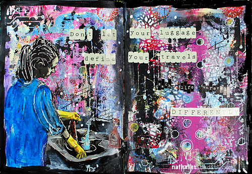
And he said something else on his website which I loved so much that it inspired me to this art journal page.

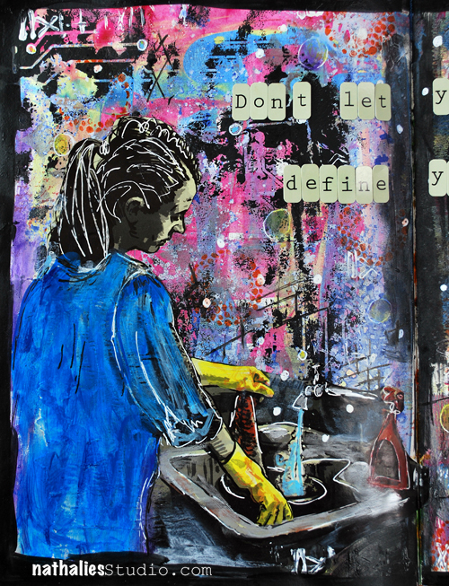
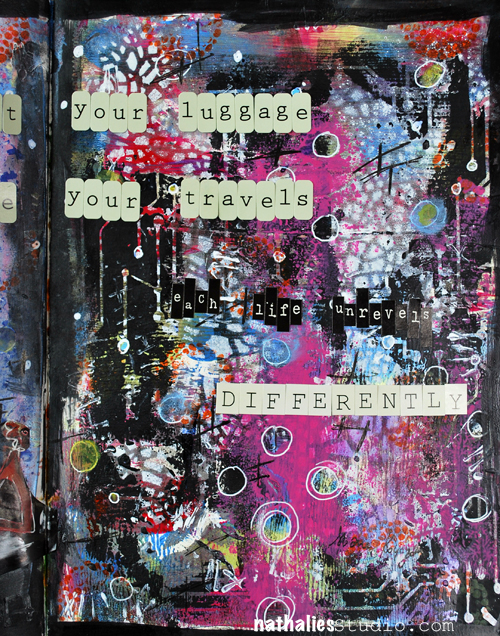
“Don’t let your luggage define your travels, each life unravels differently.”

NathalieKalbach_Luggage02

So true!

NathalieKalbach_Luggage03

Thank you Shane for this amazing inspiration and for being such an enrichment and encouragement to other people’s life through your art!

Have a wonderful day!
huge hugs
Nat

Comments (4)

  • Martha Richardson

    |

    TFS…I needed THAT message today! Love the page…but…it’s the quote that really grabs me <3

    Reply

  • Sue Clarke

    |

    I continue to love the TED videos that you post Nat. The woman on this page just grabs me. Maybe I can relate to her doing the dishes. Wonderful and different from what you usually share with your fans.

    Reply

  • Michelle Guest

    |

    I just listened to his ted talk… It is very good… Your art is beautiful!

    Reply

  • muriel

    |

    How I love your page, the colours, the building and what inspired you. Thanks for the link to the talk. I came upon TED two years ago and was so pleased I did; they have such great talks by amazing people.

    Reply

Leave a comment

My Favorite Mixed Media Essentials: 6. Spray Paints

I often get emails asking me about my favorite tools or supplies and I actually love those emails because they make me think of why I tend to use some things all the time.

Is it laziness? What is it about these items that make me grab for them whenever I create a Mixed Media Project?

One of the answers that came up for almost all of them is “I use them because of their versatility of usage” . That is an easy guess for an answer- LOL- since I named my favorite Online Workshop series Über*Media playing on the fact that you can use some items so MANY different ways.

But let me take you the next couple weeks on a little journey on my favorite Mixed Media essentials and explain why I could bathe in them and show you where I used them.

If you missed the other posts in this series – you can catch up here 

6. Spray Paints
NathalieKalbach_FaveSprayPaints

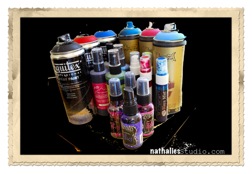
I am a big fan of spray paints. If you say spray paint…you get me interested…keep that in mind if you ever want to get my attention during a conversation ;) I have neglected spray paints a bit in my workshops in the last year, simply because I have been teaching sooo much with a certain spray paint, that I had to step away a bit from teaching with it. But in my personal playing I use spray paints in almost EVERY Mixed Media project.

I tried many different spray paints and right now I stick to the ones in my list below…but it might change over time here and there. Some of the spray paints are better for certain uses. But it doesn’t make the spray paint bad if a certain technique can’t be as well archived as with another one. I refer to this as to flour in baking in your kitchen. There are different kind and grades of flours you can buy. You need a different grade flour for pizza dough and bread then for biscuits and cakes- it doesn’t make one flour bad…it just is something to know and keep in mind to get the result you aspire !

Here are my thoughts and uses- a supply list at the bottom

What I love about Spray Paints:

  • there is a huge variety of different spray paints out there and for every technique or liking there is the right one 
  • you can create beautiful background mixing spray paint colors
  • once you know their specifics you can use them with other paint media for some really cool effects and techniques
  • you can create vibrant art using spray paint colors
  • you can evenly spray all kinds of materials with the right spray paint 
  • you can use stencils in an amazing way with them which is different from the outcome of using them with acrylic paints
  • you can afford them- even if some come as a pretty big investment in the beginning, most are pretty long living and highly pigmented – they go a long way
  • you can create layers with spray paints and add dimension in a way that is not always as easy as with other paint media
  • you learn to use the sprays super fast and get the first awesome results quick. If you take a bit time later learning more about your spray paint and it’s specifics you have a power medium in your hand
  • like with stamping, the outcome is not always perfect, which makes it for me more desirable to use as you embrace the outcome not striving always for perfection
  • you can add visual texture with spray paints
  • you can use it to quickly to alter embellishments or alphabets so they fit your projects

Here are some examples:

Revealing fabric texture with Maya Mists

revealing gesso texture
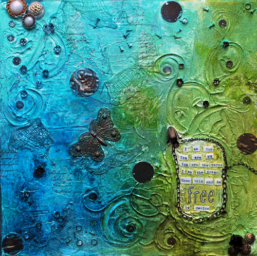
Layering using Ranger Color Wash

using spray paints with stencils on a canvas board
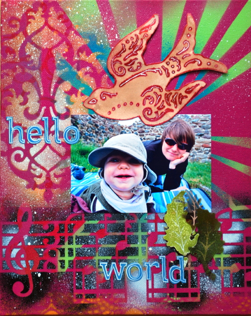
Using Golden Montana Spray for an outdoor plant pot

Grungy background with Liquitex Professional Spray Paints

Using as an accent on simple scrapbooking pages

using spray paints to change the color and mood of a patterned paper for a scrapbooking layout

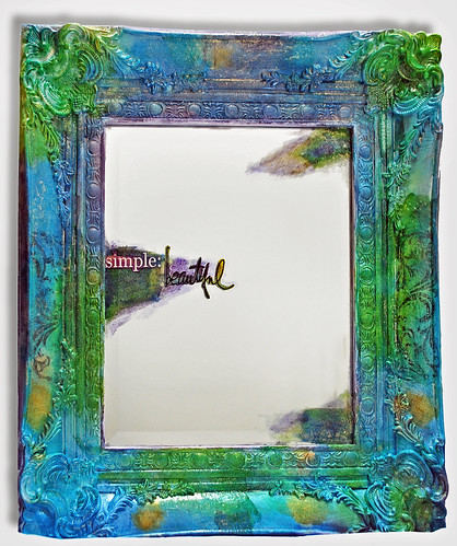
using spray paints to alter home decor items -like this mirror
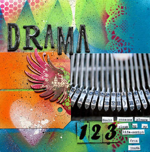
layering it on with Golden Montana for my own pattern paper
using spray paints on fabric

using Dylusions Ink Sprays with Derwent Art Bars

using Liquitex Professional Spray Paint to highlight small areas
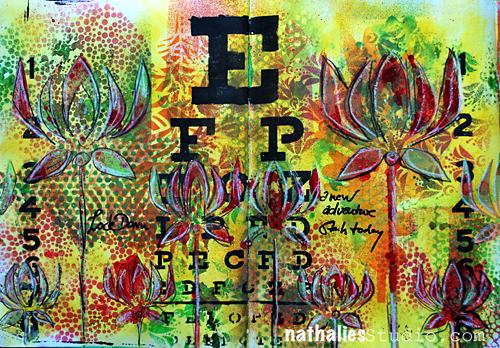
LockDown01

using spray paint to change embellishments and alphabets color and appearance

Art Journal Background
Another Homedecor Canvas with Liquitex Professional Spray paints
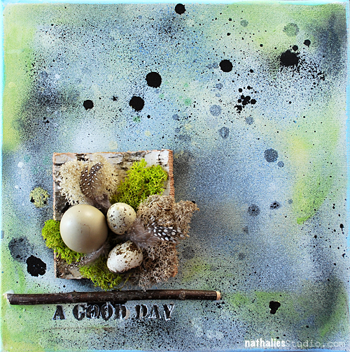
EasterCanvas_NatKalbach02

boy- that was hard to just pick a few…are you still with me?

My favorite Spray Paints at the moment:

As always in this series- the answer to this question is based on my preferences, my style and my experiences.

Dylusions Ink Sprays are my go to sprays when I work inside and can and want to use spray paints that are going to be water reactivated. Meaning once I put something wet on top, the colors will reactivate again. This means if you work with for example gel medium or other wet media on top, it will get activated again and bleed. Some people do not like that…but I say, it is what you need to know about your spray paint and then you can use it for your advantage. I love using Dylusions for ghosting techniques or to blend in other colors and paint media. The vibrancy of those colors is amazing. And you can use them inside, without a mask and you can wash it off if it goes somewhere else when your project ;) I also have to say that clogging wasn’t an issue for me yet with these spray paints probably because they are dyes. If the colors are used on wall art though – say canvases, the colors tend to evaporate quick in sunlight though at least if there are on top of acrylic media, so I stopped using them on canvases that I hang on the wall.

Maya Road Mists – I love that those colors are also very vibrant, some have a nice shimmer, which I used to love a lot but I am now getting away from the too shiny shimmering stuff.  Seems my magpie times are a bit over ;) What I love about Maya Mists, which are pigment based is, that you can heat set them, so they won’t get reactivated anymore, meaning they are permanent then and therefore can be used on fabric that might get wet or washed too. Like the Dylusions you can use them inside and they cover for example chipboard in the best possible way. Actually they are my favorite when working with chipboard. The clogging is bearable – it happens- and it is nothing you can prevent forever with any given pigment spray paint. Yes…sometimes you force it by not spraying the “right way”….but often times it is just the way those spray nozzles are made that you cannot prevent the spray paints from clogging. They are wonderful on Gesso-ed surfaces- so that is their plus in comparison to the Dylusions but some techniques like the ghosting have on the other hand a better outcome with the Dylusions. So…see it is all about what you want to archive.

Aidorondack Color Wash – these are also water based textile dyes to use on porous surfaces. Like the Maya Mists you can use them on fabric and they can get heat set so that you make them permanent. They are translucent dyes but they cover pretty well. They are VERY concentrated and can be diluted with water a lot and still keep the color and vibrancy. They hold FOREVER. My bottles are very old- probably 5 -6 years (big bottles ;))  and the colors are still awesome and good to use. When you dry them the colorshift is not that high- they stay very vibrant– which I like too. For me it is important that a spray paint is not turning dull once I heat it. So that is definitely a plus here.

Liquitex Professional Spray Paints are my absolute favorite at the moment -but that is also based on my acrylic paint high right now. These spray paints are acrylic based and highly pigmented. They take a bit practice to use..but oh wait till you get the hang out of them ;) Once they are dried they are permanent…as said they are acrylic paint based. They are super vibrant. They can be mixed with acrylic paints and the color shift is very low. Meaning you see the color wet as you will have the color dried- you get what you see :) Sometimes I am not sure if they are already dried as they shine so much and didn’t change the look much from wet to dry. They dry quick too – which I love, no heating required. They are low odor – which means you can use them in small quantity inside in a very well ventilated area. I recommend on top wearing a mask (I have several windows around and a skylight over my spraying station – so I do not always use a mask if I only use small doses- but do not recommend not using one, don’t sue me…use a mask !). The down side is that the spray nozzles of the Liquitex Professional Spray Paints clog easily due to the acrylic paint drying in the cap. The tip is that you should clear the tube and nozzle after using it by turning it upside down and spraying until it comes out clear. That doesn’t help always- but since the spray caps are industry standardized ones, I just buy them at a graffiti store in bulk (super cheap). I am not sure if in the States there is anything like a graffiti store- LOL- but Liquitex also offers replacement caps.

I also loved to use Golden Montana Spray Paints before Liquitex came out with their Professional Spray Paints. If you want to use the Golden Montana Spray paints you need to know that you can really ONLY use them outside and definitely have to wear a mask on top. I also dislike now that the odor of them hangs in the projects for a long time – which is not the case with using the Liquitex Professional Spray Paints.

For cleaning your fingers I actually recommend using Ranger’s Scrubbie I have never found a better thing to clean my hands after spray painting and believe me I tried A LOT.

nSupplies

The next part in the series is already in the planning. Which Mixed Media topic of favorite supplies would you like to see covered by me in this series?

huge hugs

Nat

Comments (11)

  • Julie Filatoff

    |

    Hi, Nat: Our art journaling group is getting together this weekend and trying a variety of dye, ink, and spray paints, including homemade. Your article is very helpful–thanks!

    Reply

  • Enikö

    |

    Love these examples! Thanks for sharing your “tricks of the trade”!

    Reply

  • Rob Keogh

    |

    Thanks for such a great post Natalie, very helpful. <3

    Reply

  • Kathy P

    |

    Your posts ALWAYS contain the most interesting and informative tips, Nat~ This one will be one of my most faves, as a newbie to mixed media! I have some of these paints, but want to try the Liquitex spray just because YOU recommend it! You rock!

    Reply

  • Sue Clarke

    |

    Love love Love this post Nat. I started to use spray paint because of you! I am loving the Dylusions sprays right now. And BTW…I still want that mirror.

    Reply

  • Darlene K Campbell

    |

    Wonderful of you to provide such a detailed summary of spray paints. Always a plus to have an artist share experiences about different products so we don’t waste time and money researching. Love when we help each other. Thanks.

    Reply

  • Gerd Andersson

    |

    Thank you so much, for this useful description about sprays! I love all your art pieces! As I’m new to embossing that would be something to know more about or maybe it could be a new workshop.

    Reply

  • hedwig

    |

    You could clean the nozzles from the liquitex spray paint with nailpolish. Put them in a jar, close the lid and leave them overnight in the nailpolish. That is what grafiti artists do, i saw it on YouTube ;)

    Reply

    • Nathalie Kalbach

      |

      yes– but it doesn’t work always- and I even more dislike the odor of nail polish ;) But it is a good tip -thanks Hedwig.

      Reply

  • Michelle Guest

    |

    Paints…

    Reply

Leave a comment

Take a Shower Art Journal Page…or Negative Circuit Stencil

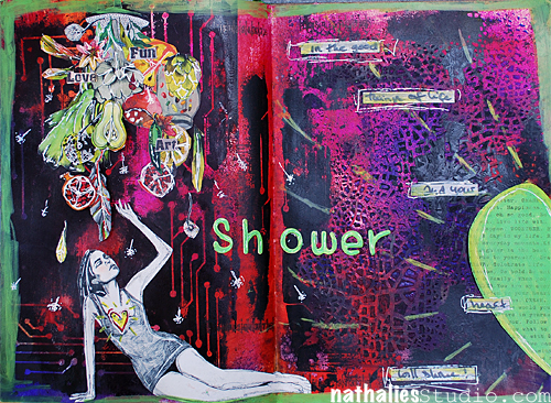
Loved creating this art journal page using my new Stencil Girl Product Circuit Stencil

NathalieKalbach_CircuitShower01

The Journaling says “Shower in the good things of life and your heart will shine”.

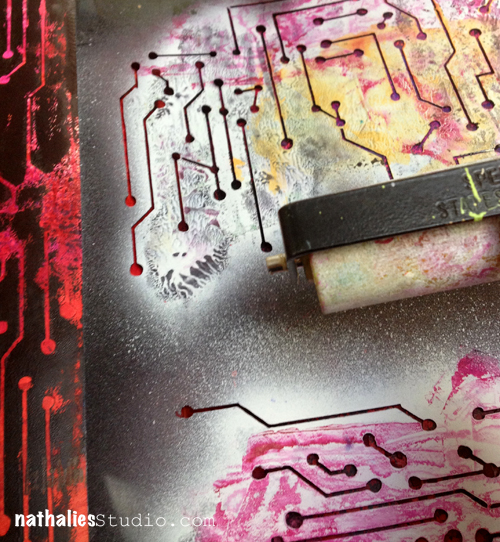
I had created a background with Dylusions Spray Paints and had it in my art journal for later usage. Something I do often when I spray a stencil is using the excess paint on top of the stencil for a different project as a negative.

Here I had sprayed  onto a different page in the art journal with Liquitex Professional Spray paint

IMG_4611

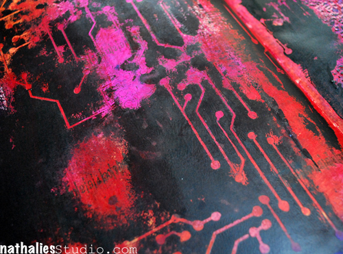
I then simply flip the stencil over to a different page- either already prepared with a painted background or onto a white one – and brayer over it to get the excess paint over.

NathalieKalbach_CircuitShower05

Which can then result in something like this

NathalieKalbach_CircuitShower03

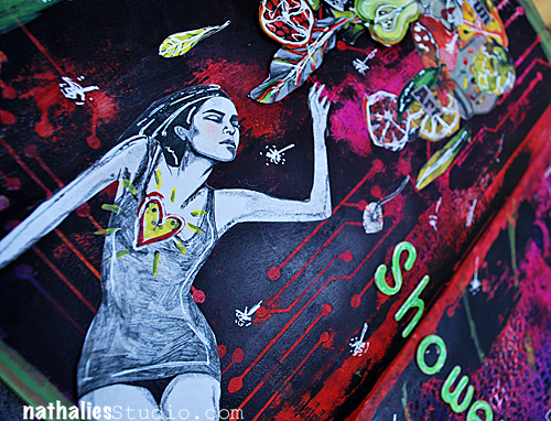
And then I took it from there to create my art journal page. And yes…I might be I am biased regarding my own stencil but boy do I love the negative outcome of it too. So basically you get a pretty cool two-in-one design.

NathalieKalbach_CircuitShower02

BTW…did you spy something else on the page? ;) ;) ;)

nSupplies

Have a wonderful day!
huge hugs
Nat


Comments (12)

  • PyssligaSara / Sara Önneby

    |

    Hi!
    I just love this Art Journal. :) And the stencil – WOW! :) I can barely wait for Scrap-Perra to get them at his store.

    I wanted to ask you if it is ok, for you, if I borrow this page for a lift challenge for the Swedish inspirational blog http://www.swescrapbook.blogspot.com Me and my DT members will be using it as an inspiration, and create an Art Journal from that. Is that ok?

    Reply

    • Nathalie Kalbach

      |

      Sara, thank you :) Yes it is ok- as you asked :) – please link the image back to me though and say that it is mine . Thank you :) nat

      Reply

      • PyssligaSara / Sara Önneby

        |

        Of course I will link back to you. :) And I’ll give you a heads up when it is posted on the blog. Thanks for inspiring. :)

        Reply

  • Sue Clarke

    |

    Not sure what you are referring too since there is lots of fun stuff to reference Nat.
    The woman is pretty awesome and the fruit looks like it might be a stamp.

    Reply

  • rains

    |

    beautiful. I know this is not what you’re looking for but I saw the beautiful girl in the fantastic retro 50’s style bathing suit – a suit that I am looking for right now before we go to the beach on Sun.!

    Reply

  • Cyndi

    |

    Totally freaking fabulous!! Hoping to see your stencils at my local store soon!

    Reply

  • Jean Marmo

    |

    Love how you do that with the stencil!

    Reply

  • Marjie Kemper

    |

    Great pages! That stencil looks awesome with the negative print.

    Reply

  • Nurse Ratchet

    |

    Hmmmmm…love this piece Nat !! What did you use for the Crackle effect!!!!

    Reply

  • Michelle Guest

    |

    Hmmmm… Crackle stuff or fruit from ? (candy wrapper?)

    Reply

Leave a comment

Art Venture 2014 in Anaheim, California

Wohooo :)

ArtVenture Announcement


ArtVenture Details


Click here for full details and to register!

Have a wonderful day!
huge hugs
Nat

Comments (4)

  • marjiekemper

    |

    Sweeeeeeeet! You’ve made my day with this news and I have just registered… really looking forward to these days of fun and education before CHA.

    Reply

    • Nathalie Kalbach

      |

      WOOOWw- that is sooo cool!!!! Cannot wait to see you there !!!

      Reply

  • mjmarmo

    |

    Wow – this looks amazing!

    Reply

  • Anne Porretta

    |

    Nat, we need a smiling picture of you!

    Reply

Leave a comment

Definitely not Germany’s Next Top Model or…Photoshoot

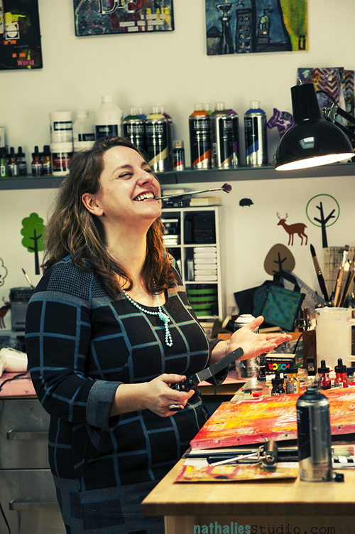
About a month ago, I had a photo shoot with Andreas Muhme, a great photographer from Hamburg. I wanted to have some new photos for my website since the one that is staring at you right now at the right hand side is a bit outdated and it also feels as if I am the most serious person in the world…which I am not …;) I picked Andreas because I loved his portraits of artists and also his apparent liking in 50s style photos, which as some of you know is something that appeals to me as well. Andreas took a lot of time talking with me ahead of time to get to know me better and I also showed him my studio since we were going to shoot some photos here.

NathalieKalbach_MuhmeShoot01


Then we had a whole day where he shot some photos first in my studio and later in his studio. We had a lot of fun! I also learned a lot about me this day.

First of all…since I never really do make up…well at least not a lot…it is actually not a good idea trying to change that on the day of a photo shoot. I am no exception with minimalistic makeup in Germany…but I might be an exception that even putting on foundation is a big task for me ;) After the shoot I actually plunged in and took a little make up course…but I wanted a natural look…which strikes me in retrospective weird..because why all this effort to look natural instead of just being natural…LOL. We women are funny creatures ;)

NathalieKalbach_MuhmeShoot02


Second, kudos to Andreas who did an awesome job with that.: I had this weird thing in my head going on between what I wanted the photo show of me… but also I wanted the photo to be me. Well…you know…that is sometimes not easy to get – hahahahaha. Because I am no Germany’s Next Top Model with a natural posing flow in her favorite 50s dress, looking smashing hot without make up but still looking fun and approachable and just like her ;)

NathalieKalbach_MuhmeShoot03


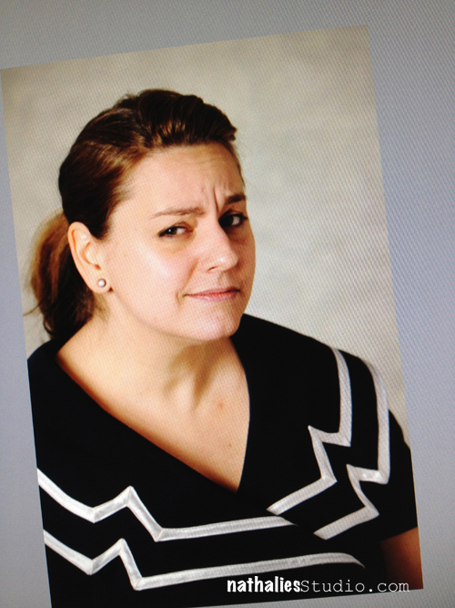
Third, what my friends and I would say is typically me…is not what you my readers and students say is me ;) I posted the above picture – which is of course an outtake  but I actually really like this picture just as a snapshot and it made Andreas and me laugh a lot. It was a look I gave him after a lot of shots and commands like : “smile  but don’t squint your eyes”, turn your head a bit”, “can you change your expression?”… – LOL – yes I can! . I showed this picture on facebook jokingly and my friends that know me very well were saying, “This is so you !” and they were laughing with me. But some of my students and readers were saying, what a terrible picture this is and that this is so not me. Maybe because you never saw me frown…also known as Nat’s Thinking-Wrinkle Face…and come one Dudes…you gotta be able to make fun of yourself and laugh a bit too!

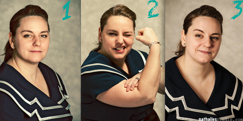
NathalieKalbach_WhichOne


Besides my studio shot which is on the top of this post- these are my three favorite photos from that day. I know of course already which one is going to be my new professional headshot…but let me know…which one of the three do you think portraits me the way I am the best?

Thank you again to Andreas for a wonderful day and awesome photos and all your patience – LOL- looking forward to our outside photo shoot ;)

Hugs

Nat

Comments (46)

  • Jeanne Kelly

    |

    How fun!! I like the muscle photo. Caption “make Art…or else”
    Ha, ha! I LOVE the photo of you in your studio with a paint brush in your mouth – you are adorable !!!!!!!

    Reply

  • marjiekemper

    |

    What a cool shoot! I vote for #2 for authencity’s sake!

    Reply

  • Sabine

    |

    The shot in the studio is the best of all of them. It is fun and you look great!
    If I had to choose from the 3 photos below, I would take #2 because the others are too serious for my linking. #2 shows you as the kick-ass funny girl that you are …. as far as I can tell.

    Reply

  • andrenesmith

    |

    Which is you (the online/blog personality)? Why #2 of course!! Out of the 3 I like #1 the best as a professional photo. But on this post, I LOVE the one of you in the studio. Its is fun and having your studio as the backdrop is perfect.

    Reply

  • Donna

    |

    It looks like you had a fun time with Andreas and got great photos too! I like #3 and look forward to seeing which one YOU chose!

    Peace,
    Donna

    Reply

  • Bill Auld

    |

    The studio shot shows your joy Nat. Your joy is who you are.

    Reply

    • Kelly Belton

      |

      I totally agree!

      Reply

  • Kelly Belton

    |

    Nat, the studio shot is fantastic! Of the three others I really like #3. It is just a really engaging image of you – and you look like you are welcoming the viewer into a conversation with you. Beautiful!
    (But you know I love the controversial one the best.) I am envious of how natural you are in these photos – fabulous!

    Reply

  • Birgit Kunte

    |

    Ach nööööö, ich mag das im Studio am liebsten, das bist du sooooo du. Die anderen sind Portrait-Fotos, sie sind schön und ich musste echt schmunzeln bei allen, aber DU bist auf dem Foto im Studio. Ganz liebe Grüße Birgit – und danke fürs michzumschmunzelnbringen

    Reply

  • Gunvor

    |

    My favourite is the studio picture – I just love all that it´s telling about you and your art. Of the three at the bottom I just love #2. But whatever photo you chose – you rock! And I’m soo looking forward to seeing you in Stockholm in august.

    Reply

    • Nathalie Kalbach

      |

      I am looking forward seeing soon too!!! We will have lot’s of fun!

      Reply

  • Micki

    |

    oh oh oh I love the one of you in your studio. LOVE it. You loo natural, that you love to laugh. Plus I like it because it’s a candid shot, not posed. Actually all of the pics are great :-)

    Reply

  • Donna

    |

    Totally the studio shot!!

    Reply

Leave a comment

Family Moments with the Circuit Stencil

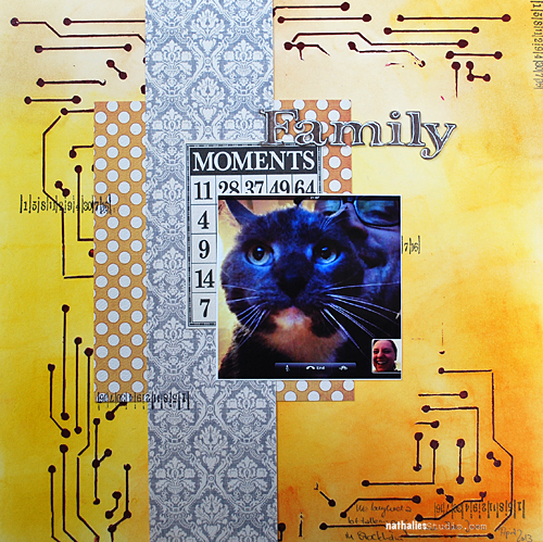
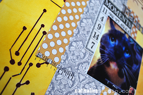
Hold your horses ;) I show you a  Scrapbooking Layout today which is using my new Circuit Stencil with Stencil Girl Products. Thank you all for your amazing and wonderful comments – they mean a lot to me :)

NathalieKalbach_CircuitFamilyMoments01

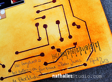
Still laughing about this photo which shows the three of us doing a Facetime call when I was teaching in Stockholm. I used some Liquitex Heavy Body Acrylic Paint and swiped it with a Palette Knife over the Circuit Stencil onto a white sheet of Cardstock.  I love the texture the Heavy Body Acrylic Paint gives when used with a stencil.

NathalieKalbach_CircuitFamilyMoments02

I used Tim Holtz Distress Inks with a Blending Tool and colored in the background over the stenciled area and then applied the Papers. I love how you can also use the Circuit Lines as a guideline for the journaling.

NathalieKalbach_CircuitFamilyMoments03

Several of you asked where to buy the stencil – you can either buy it directly from Stencil Girl Products but I also know that there are a couple of stores interested in stocking them. I am sure once there are more designs revealed ;) I can provide you with links of stores that carry them. I am working on a page for my Stencils on the blog. Sooooonnn – LOL -the back and forth with the testing takes a bit longer when you sit over the pond ;)

nSupplies

Have a wonderful day!
huge hugs
Nat


Comments (7)

Leave a comment